Transatlantic excess mortality comparisons in the pandemic Janine Aron and John Muellbauer1
←
→
Page content transcription
If your browser does not render page correctly, please read the page content below
Transatlantic excess mortality comparisons in the pandemic

Janine Aron and John Muellbauer1

25 August 2020

 Abstract:
In a previous article, we considered key issues for comparing rates of excess mortality between
countries and regions, with an application to European countries. This article compares the U.S. with
Europe, and U.S. regions with the main European countries. The U.S. policy-makers had multiple
advantages over European countries, such as Italy and Spain, in responding to the first wave of the
Covid-19 pandemic: more time to react, with excess deaths lagging three weeks behind, and a
younger, less densely-populated, less urban population. With the further passage of time, medical
knowledge about Covid-19 has improved, health and testing capacities have been built up and
practical experience has allowed both the private precautionary responses of citizens and of public
policies to develop. This should have given countries and regions, for example, the U.S. South, the
West and the Midwest, together accounting for 83 percent of the U.S. population, and where the
spread of virus occurred later, a further advantage over those caught up in the first pandemic wave.
Despite this, a comparison for the whole of the U.S. with Europe, excluding Russia, shows that the
cumulative rate of excess mortality in 2020 was higher in the U.S.. And for the U.S. Northeast, the
most comparable U.S. region, being closest to major European countries in the timing of the
pandemic, and in population-density, age and urbanisation, the plausible measures of excess mortality
prove substantially worse than for the worst-affected countries in Europe. These findings contradict
recent claims by the U.S. President.

1. Introduction

This article compares the direct and indirect death toll stemming from the Covid-19 pandemic for the
whole of the U.S. versus Europe and compares the most-affected U.S. region with the main European
countries. Such comparisons are often used to try to compare the effectiveness of pandemic policy in
the different areas. However, it is important to compare like-for-like. The timing of the pandemic in
the comparator region or country should be similar. And it is important that underlying structural
differences should be controlled for.

U.S. policy-makers have had multiple advantages over European countries, such as Italy and Spain, in
responding to the first wave of the Covid-19 pandemic. First, there was more time to react, with excess
deaths lagging three weeks behind. With the further passage of time, medical knowledge about Covid-
19 has improved, health and testing capacities have been built up and practical experience has allowed
both the private precautionary responses of citizens and of public policies to develop. Second, Europe
is disadvantaged by having an older population than the U.S. and the population density is also far
higher in Europe and the large cities in Europe have higher population densities than large cities in the
U.S.. Europe may have an advantage, however, in structural differences associated with inequality,

1Janine Aron and John Muellbauer are Senior Fellows of the Institute for New Economic Thinking at the Oxford
Martin School and members of the Leverhulme Centre for Demographic Science, University of Oxford. We are
grateful to Dr. Jessica McDonald of FactCheck.org for highlighting the current relevance of the issue and working
with us. Her article can be found here: Trump Touts Misleading and Flawed Excess Mortality Statistic. We thank
Our World in Data, especially Charlie Giattino, for providing much of the data.

Janine Aron and John Muellbauer (Oxford University)                                                            1
poverty and racial discrimination in affecting the incidence of Covid-19, see Hardy and Logan (2020).2
Arguably, the Northeastern census region of the U.S., consisting of 9 states3, provides a good
comparator in population size, density, age composition, urban-rural structure and the timing of the
pandemic with the larger European countries: Germany, France, the UK, Italy and Spain. For regions
such as the U.S. South, the West and the Midwest (together accounting for 83 percent of the U.S.
population), where the spread of virus has occurred later and where, in the South and the West, excess
deaths were trending upward in June and July, there should be an even greater advantage over those
caught up in the first pandemic wave.

The most rigorous way to compare the death toll of the pandemic is to use the excess mortality data.
Excess mortality is a count of deaths from all causes relative to what would normally have been
expected. Excess mortality data avoid miscounting deaths from the under-reporting of Covid-19-
related deaths and other health conditions left untreated. In a pandemic, deaths rise sharply, but
causes are often inaccurately recorded, particularly when reliable tests are not widely available. The
death count4 attributed to Covid-19 may thus be significantly undercounted. Excess mortality data
include ‘collateral damage’ from other health conditions, left untreated if the health system is
overwhelmed by Covid-19 cases, or by deliberate actions that prioritise patients with Covid-19 over
those with other symptoms. In a pandemic, measures taken by governments and by individuals also
influence death rates. For example, deaths from traffic accidents may decline but suicide rates may
rise. Excess mortality captures the net outcome of all these factors.

The European Union including the UK has a population of around 513 million while that of the U.S. is
around 330 million. Given that the EU population is not only larger but also older than that of the U.S.,
one should expect a substantially higher count of excess deaths for Europe, other things being equal.
At the very least, in comparing excess deaths between countries, one would expect an adjustment for
population size. But, even when comparing two countries with the same age-specific mortality rates,
the per capita count of excess deaths will be higher in the country with the older population. Thus,
simple per capita excess mortality comparisons put the U.S. in a misleadingly favourable light.

Excess mortality data can be used to draw lessons from cross- and within-country differences and help
analyse the social and economic consequences of the pandemic and relaxing lockdown restrictions.
Our previous work in Aron et al. (2020),5 with an application to European countries, assessed the
comparability of data on excess mortality between countries and regions: it reviewed the available
data sources, and compared and contrasted different statistical measures of excess mortality. For
country comparisons (where under-recording may differ), policy-makers should examine robust
measures expressed relative to the benchmarks of ’normal’ deaths. The most sensible way to compare
excess mortality across countries or regions is to use the P-score, which is defined as the actual weekly
deaths minus the ‘normal’ weekly deaths and taken as a percentage of these ‘normal’ weekly deaths.
This gives a statistic that is easily understood and compared across countries (see discussion in Aron
et al., 2020). If we are comparing on a weekly basis for example, ‘normal’ deaths are typically defined

2 Hardy, B. and T.D. Logan. 2020. “Racial economic inequality amid the COVID-19 crisis.” Brookings Report, 13
August,2020.
3 The nine states are Maine, New York, New Jersey, Vermont, Massachusetts, Rhode Island, Connecticut, New

Hampshire, and Pennsylvania.
4 See webpage: COVID-19 Dashboard by the Center for Systems Science and Engineering (CSSE), Johns Hopkins

University.
5 Aron, J. and J. Muellbauer alongside C. Giattino and H. Ritchie. 2020. “A pandemic primer on excess mortality

statistics and their comparability across countries.” Guest post, Our World in Data, University of Oxford, June
29, 2020.

Janine Aron and John Muellbauer (Oxford University)                                                          2
as a five-year average of the same weeks in the previous five years. 6 ‘Normal’ death rates reflect
persistent factors such as the age composition of the population, the incidence of smoking and air
pollution, the prevalence of obesity, poverty and inequality, and the normal quality of health service
delivery. One advantage of the P-score is that it takes into account such differences in ‘normal’ deaths
between countries or regions.

We previously argued that P-scores were the most robust indicators for comparing excess mortality
statistics across countries, and certainly preferable to per capita rates of excess mortality (see Aron et
al., 2020).7 However, even P-scores need to be interpreted with care. For example, while P-scores are
less affected than per capita excess deaths by the differences in the age composition of the
population, they are not completely immune to such differences. The Covid-19 pandemic has
disproportionately more severe outcomes for the elderly. Excess mortality computed for all ages will
therefore favour countries such as the U.S. with a lower fraction of elderly in the population.8

2. Comparing rates of excess mortality for the U.S. as a whole and Europe as a whole

In this section, we compare measures of excess mortality for the U.S. as a whole with Europe. We use
data from the Human Mortality Database (HMD)9. The HMD is a highly reliable data source, with clear
metafiles, and it includes data for 26 European countries and the U.S.. The coverage of Europe consists
of all EU countries, excluding Cyprus, Greece, Ireland, Malta and Romania, but adds Iceland, Norway,
Switzerland, ‘England and Wales’ and Scotland. It therefore includes the UK, except for Northern
Ireland. In our calculations below we exclude Slovenia (population about 2.1 million), as the weeks
covered are too incomplete. The total population of the included countries is 484 million, compared
with 513 million for the EU plus the whole of the UK. ‘Normal’ mortality for each week is calculated as
the average for that week in the previous five years.10 The weekly count of excess deaths is then
calculated as the actual deaths for that week minus the ‘normal’ number of deaths. For weeks where
excess deaths are estimated to be negative, a count of zero is used instead. This avoids the problem
of undercounting recent deaths which could contribute to finding spuriously negative rates of excess
mortality.11

We choose to compare cumulative excess mortality for a 17-week period for both the U.S. and Europe,
and compute both per capita cumulative excess mortality and the P-score (that is, the ratio of
cumulative excess mortality to cumulative ‘normal’ mortality). The period chosen begins effectively in

6 In some of the data produced by the CDC, a more sophisticated definition of ‘normal’ deaths is used, adjusting
for trends and seasonal effects in the past mortality data.
7 In the referenced article, Aron et al. (2020), we survey the different measures of excess mortality and whether

they can plausibly be compared. EuroMomo, see website, produce Z-scores for some European countries,
though some are for portion of the countries only. Excess deaths in a Z-score are scaled by the standard deviation
of ‘normal’ deaths. EuroMomo do not publish excess deaths or the standard deviation of ‘normal’ deaths at the
country level. In principle, Z-scores cannot be compared across countries with very different population sizes.
8 It is sensible therefore to supplement country comparisons for all ages with comparisons for particular age

groups. Forthcoming posts on the website of Our World in Data will do this.
9 See HMD’s Excess mortality website.
10 The one exception is for Germany, where the HMD data only cover the last 4 years, so that the average is over

four years.
11 Setting negative excess deaths to zero also has the advantage of reducing a second bias. The fine Spring

weather in Europe in 2020 probably contributed to lower death rates than the average for the previous five
years. This may have contributed to apparently negative estimated excess mortality in some European countries
and biased downward the early impact of the pandemic. By replacing such observations in March by zero, the
bias is reduced.

Janine Aron and John Muellbauer (Oxford University)                                                             3
the first week of March and ends in the last week of June.12 The starting point reflects the first week
in which excess deaths associated with the pandemic became significant in Italy. The end-point is
chosen because of missing data for some European countries for later weeks and because recording
lags in the U.S. data 13 make the later observations less accurate. Table 1 shows the comparative
results. Table 1 shows data for population, the number of ‘normal’ deaths and excess deaths in the
period, and the two measures of rates of excess mortality: the per capita measure of excess deaths
and the percent of ‘normal’ – the P-score measure.

Table 1: Comparison of cumulative excess mortality in the U.S. and Europe

                                                                                                                    Cumulated
                              Cumulated sum      Cumulated sum      Per capita ‘normal’     Per capita excess
               Population                                                                                          P-score (%) of
     Country                 of normal deaths    of excess deaths   deaths (per million)   deaths (per million)
                (millions)                                                                                        excess mortality
                                                   For weeks 10-26 of 2020 (effectively, March to June)
       US         330            900,338             182,883               2728                  554.19                20.31
     Europe       484           1,527,548            243,538               3156                  503.18                15.94

Sources: The P-scores are calculated by the authors using the Human Mortality Database, see metafile, for the European
countries; the ‘normal’ or expected weekly deaths are defined as the average for the previous 5 years, except for Germany
where the previous 4 years are used.
Notes: (i) See the text and Figure 1 for the 24 countries included in the definition of Europe. (ii) Cumulative P-scores cover
the weeks 10-26. Data are available for the U.S. to week 31, but given reporting lags, are liable to undercount mortality in
recent weeks because of lags in registration. Data for some key European countries end in week 26. (iii) Negative excess
deaths were set to zero. (iv) See other notes under Table 2.

It is clear that because of its older population, Europe has more ‘normal’ deaths per capita than the
U.S., see Table 1, column 5. The preferred P-score measure of excess mortality takes that into account
(see section 2). The P-score shows that excess mortality in Europe was 22 percent lower than in the
U.S. But even on the cruder per capita figure, excess mortality in Europe was 9 percent lower than in
the U.S.. This is despite the advantages in terms of preparedness that the later spread of the pandemic
has conferred on the U.S, in terms of improved medical knowledge, health and testing capacities, as
explained above.

Moreover, population density is also far higher in Europe, and the large cities in Europe have higher
population densities than large cities in the U.S.. 14 We know from city-level excess mortality
comparisons by the Financial Times, the Economist and the New York Times, that, for large cities,
excess mortality rates are far higher than for the country in which they are located. Clearly, dense
living and working conditions make social distancing harder to achieve and made it easier for the
Covid-19 virus to spread. These multiple advantages held by the U.S. should have led to lower rates of
excess mortality in the U.S. than in all of Europe, instead of which they are far higher than in Europe,
see Figure 1, which shows the full range of rates of excess mortality across European countries.

12 To be precise, it begins in week 10 (the week ending March 8 in Europe and March 7 in the U.S.) and ends in
week 26 (the week ending June 29 in Europe and June 28 in the U.S.) using HMD data.
13 The CDC’s Excess Mortality website shows the lags in the data, which are much worse for some states than

others.
14 See the Our World in Data urbanization site. For example, in 2013 the EU 28 (28 countries) had 121 inhabitants

per sq. km, while the U.S. had 36. London and Paris had far higher population densities than New York or Los
Angeles, which are the most densely-populated cities in the U.S..

Janine Aron and John Muellbauer (Oxford University)                                                                         4
By contrast, it has been erroneously claimed as a fact by the U.S. President that the U.S. has 33 percent
less excess mortality than ‘Europe’,15 whereas our figures suggest the opposite: that Europe had 22
percent less excess mortality than the U.S., on the most reasonable measure of the rate of excess
mortality.
Figure 1: Cumulative P-scores of excess mortality comparing the U.S to Europe, for weeks 10 to 26.
Cumulative P-scores for U.S. vs. Europe
weeks 10-26 of 2020
40.00
35.00
30.00
25.00
20.00
15.00
10.00
5.00
0.00
Netherlands
Norway
Italy
Denmark
Sweden
Portugal
Iceland
Austria
Luxembourg
Switzerland
Lithuania
Bulgaria
Belgium
Estonia
Latvia
Slovakia
Europe
Spain
Hungary
Poland
United States
Finland
Germany
England & Wales
Scotland
Czech Republic
France
Sources: The P-scores are calculated by the authors using the Human Mortality Database, see metafile, for the European
countries; the ‘normal’ or expected weekly deaths are defined as the average for the previous 5 years.
Notes: (i) Cumulative P-scores cover the weeks 10-26. Data are available for the U.S. to week 31, but given reporting lags,
are liable to undercount mortality in recent weeks because of lags in registration. Data for some key European countries end
in week 26. (ii) Negative excess deaths were set to zero. (iii) See other notes under Table 2.
15 After commenting on the rise in the stock market since March, Trump said: “At the same time, Europe has
experienced a 40 percent higher excess mortality than the United States. And I will say that that’s a significant
number.” (12 August 2020). “Europe has seen 40 percent more excess mortality than the United States compared
to a non-pandemic year.” (13 August 2020); “Europe by contrast has experienced a 40% higher rate of excess
mortality than the United States.” (17 August 2020). He subsequently revised down his claim to a 33 percent
higher rate in his news conference on 19 August and again on 23 August in his White House press briefing. The
following websites are the sources for these quotes:
https://www.whitehouse.gov/briefings-statements/remarks-president-trump-press-briefing-081320/;
https://www.whitehouse.gov/briefings-statements/remarks-president-trump-press-briefing-august-13-2020/ ;
https://www.rev.com/blog/transcripts/donald-trump-speech-transcript-minnesota-august-17;
https://www.whitehouse.gov/briefings-statements/remarks-president-trump-press-briefing-august-19-2020/;
https://www.whitehouse.gov/briefings-statements/remarks-president-trump-press-briefing-august-23-2020/.
Janine Aron and John Muellbauer (Oxford University) 5It is not clear whether Donald Trump was referring to this kind of percentage and over what period he was comparing excess mortality. It is plausible that he was thinking of excess deaths per capita.16 But it is unclear how he was defining ‘Europe’. There could be a clue from Trump’s 11th August news conference, in which he referred to the U.S. having a higher ‘at risk’ population and the ‘fact’ that the U.S. has “1.5 million residents of nursing homes, about five times that of other European countries”. According to the European Commission, in 2017, there were approximately 3.7 million long-term care beds in nursing and residential care facilities in the 24 EU Member States where data was available (this excludes Belgium, Denmark, Cyprus and Portugal, where recent information was unavailable).17 According to the World Health Organisation (the WHO), in 2013 there were 230 thousand such beds in Italy, 370 thousand in Spain, 900 thousand in Germany and 550 thousand in the UK (using 2015 data).18 With ageing populations, the more recent numbers of care home beds are likely to be higher. It seems that Italy or Spain best fit Trump’s claim that the U.S. had about 5 times as many residents in nursing homes. Hence, it may be that Italy or Spain were the countries that Trump had in mind in his intended comparison with ‘Europe’. To put the facts into the context of individual countries, Figure 1 compares P-scores for the U.S. and Europe with those of the individual European countries ordered from the highest to the lowest, with Spain and ‘England and Wales’19 the countries with the highest excess mortality. Comparing a country as large and as heterogeneous as the U.S. with an individual country in Europe, where in the worst- affected countries the pandemic arrived earlier, is inappropriate. Indeed, the data show that despite the European disadvantages, many individual countries experienced lower rates of excess mortality than the U.S. as a whole. We turn next to a more relevant comparison, of the worst-affected region of the U.S. with the worst-affected countries in Europe in the pandemic’s first wave. 3. Comparing excess mortality in the U.S. Northeast with European countries in the pandemic’s first wave. In Aron et al. (2020), we compared, for the five worst-hit European countries the weekly P-scores and the cumulative P-scores for a period of 11 weeks, capturing the main impact of excess deaths in the first wave of the pandemic. The starting dates vary by country between week 10 (the week ending March 8) and week 13 (the week ending March 29) of 2020. For the U.S. and the U.S. Northeast, the equivalent 11 weeks to compare with the European countries would be from week 13 to 23. 20 We construct and compare the P-scores in Table 2 for the U.S. and the Northeast region (comprising nine states), with the European countries with the highest P-scores – Spain, England and Wales, Scotland, Italy, Belgium, the Netherlands, Sweden and France – and with Germany, with the lowest P-score among large European countries. According to the CDC data used to construct these P-scores, the Northeast suffered by far the highest rate of excess deaths in the first wave of the pandemic, with a P-score of 76 percent. This compares with P-scores ranging from 55 percent for Spain to 5.5 percent for Germany for the like-for-like comparison of the 11 peak weeks of the pandemic. Table 2 also presents corresponding numbers for per capita excess mortality, which shows that the. The U.S. Northeast had the highest per capita excess mortality as well as the highest P-score. 16 A fact check by Jessica McDonald, Trump’s Missteps on COVID-19 Mortality, of earlier comments by Trump on Covid-19 deaths per capita indicates his previous use of per capita figures. 17 See Eurostat: Healthcare resource statistics - beds . 18 See the WHO’s website: European Health Information Gateway . 19 In Aron et al. (2020), we were able to separate data for England and find England to have had the highest P- scores in Europe, marginally above Spain. This was confirmed in a comprehensive comparative European study by the ONS (July 30, 2020). But with Wales having a substantially lower P-score than England, that for the combination of England and Wales is marginally lower than Spain’s. 20 The Center for Disease Control (CDC) defines the week ending on Saturday, so week 13 ends on March 28. Janine Aron and John Muellbauer (Oxford University) 6
The weekly profiles of P-scores for the U.S. Northeast and of the U.S. as a whole are shown in Figure
2. They suggest that while deaths had almost returned to normal levels by week 23 in the Northeast,
this was not so for the U.S. as a whole. In Figure 3, we contrast the weekly pattern of P-scores in the
Northeast and Italy. It illustrates both the later arrival of the pandemic in the U.S. and the greater
severity of the consequences in the Northeast. A comparison of excess mortality for the four census
regions of the U.S. makes clear the even later spread of the pandemic in the other regions of the U.S.,
see Figure 4.

Within the U.S. Northeast, the cumulative P-score of 76 percent across weeks 13 to 23 means that for
every 100 ‘normal’ deaths, there were 76 additional deaths in those 11 weeks in 2020. Within the
Northeast, New York State including New York City had the highest P-score at 122, followed by New
Jersey at 109, and Connecticut at 85. Within NY State, NY City had a P-score of 233, while the state
excluding the city had a P-score of 62. As noted earlier, this pattern of large, densely-populated cities
experiencing much worse mortality than the rest of the nation has been repeated round the world.

Figure 2: Weekly profiles of P-scores: the U.S. Northeast and the U.S. as a whole, weeks 10 to 30.

Source: Data for the U.S. and the U.S. Northeast (aggregating data for its 9 states) come from the CDC’s Excess Mortality
website. The CDC uses models incorporating trends and seasonal to estimate normal or expected deaths.
Note: Data are available to week 31, but given reporting lags, are liable to undercount mortality in recent weeks.

Janine Aron and John Muellbauer (Oxford University)                                                                    7
Table 2: Cumulative P-scores for the 11 peak pandemic weeks for the U.S., the U.S. Northeast and major
European countries.

                                                              For peak 11 weeks
                                                                                          Population
                                           The peak      Cumulated
                            Countries                                   Excess deaths      (millions)
                                           11 weeks      P-score of
                                                                         (per million
                                                           excess
                                                                         population)
                                                          mortality
                              US**           13-23          24.6             449             330
                         U.S. NE region      13-23          76.2            1415              56
                              Spain          10-20          54.9            1032             46.8
                          England and
                                             13-23          53.6             989             59.4
                            Wales
                            Scotland         13-23          40.9             874              5.5
                              Italy          10-20          39.8             832             60.5
                            Belgium          11-21          37.9             758             11.6

                          Netherlands        10-20          30.2             569             17.1

                            Sweden           13-23          28.0             509             10.1
                             France          10-20          22.4             427             65.3
                            Germany          13-23           5.5             126             83.8

Sources: The P-scores are calculated by the authors using the Human Mortality Database, see metafile, for the European
countries; the ‘normal’ or expected weekly deaths are defined as the average for the previous 5 years. The P-scores are
calculated by the authors for the U.S. and U.S. Northeast (aggregating data for its 9 states) from the CDC’s Excess Mortality
website; the CDC uses models incorporating trends and seasonal to estimate normal or expected deaths. This is a different
definition of ‘normal’ deaths from that used in previous section and for the European countries; note also the differences in
weeks covered. Moreover, though HMD data for the U.S. are sourced from the CDC, they come from the Fluview site and
differ slightly from those on the CDC’s excess mortality website.
** Note that the U.S. as whole is included for reference but cannot provide a like-for-like comparison
                                                                                                   with individual European
countries over this time frame, since at least two of its four regions (the South and the West) comprising 62 percent of its
population, experienced a far later spread of the pandemic, and all four regions have not returned to zero excess mortality.
The Northeast U.S. region can be fairly compared over this time frame with individual European countries.
Notes: (i) Cumulative P-scores cover the 11 peak weeks shown in column 2. (ii) Negative excess deaths were set to zero. (iii)
The European country ordering is by cumulative P-scores; the countries shown have the highest P-scores in Europe, apart
from Germany, which has the lowest among the large economies. (iv) HMD only report for ‘England and Wales’, not
separately for each; they report for Scotland, but not Northern Ireland. (v) HMD use deaths by week of occurrence for all
the above countries, except the UK, where deaths by week of registration are used. (vi) For the U.S., the CDC define a week
as ending on Saturday. For Europe, HMD define a week as ending on Sunday, except for ‘England and Wales’, which is Friday,
see their metafile.

Janine Aron and John Muellbauer (Oxford University)                                                                        8
Figure 3: Weekly profiles of P-scores for the Northeastern U.S region and Italy, weeks 10 to 26.
U.S. Northeast and Italy - showing the lags in onset of the
pandemic
P-scores of excess mortality for weeks 10-26
160
140
120
100
80
60
40
20
0
5 10 15 20 25 30
U.S. Northeast Italy
Sources: Data for the U.S. Northeast (aggregating data for its 9 states) are from the CDC’s Excess Mortality website. The CDC
uses models incorporating trends and seasonal to estimate normal or expected deaths. Data for Italy are from the Human
Mortality Database, see metafile, for the European countries; the ‘normal’ or expected weekly deaths are defined as the
average for the previous 5 years. The P-scores are calculated by the authors.
Notes: (i) P-scores cover the weeks 10-26. Data are available for the U.S. to week 31, but given reporting lags, are liable to
undercount mortality in recent weeks because of lags in registration. Data for Italy ends in week 26. (ii) Negative excess
deaths were set to zero. (iii) The CDC define a week as ending on Saturday. HMD define a week as ending on Sunday, see
their metafile. (iv) See other notes under Table 2.
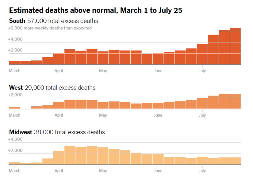
Janine Aron and John Muellbauer (Oxford University) 9Figure 4: Excess deaths across the four U.S. regions (actual deaths minus normal deaths) Source: Denise Lu: ‘The True Coronavirus Toll in the U.S. Has Already Surpassed 200,000’,The New York Times, (13 August 2020). Figure 5 contrasts cumulative P-scores for the U.S., the Northeast region and the nine states within this region. The P-score for the U.S. as a whole for weeks 13 to 23 was 24.6, far lower than for the U.S. Northeast and most of the states within. However, it is premature to make like-for-like comparisons between Europe and the U.S. as a whole. This is because the data suggest that, particularly in the South and the West, excess deaths were rising strongly in June and July, suggesting the first wave of the pandemic was far from over by week 23, i.e. the week ending 6 June, as we saw in Figure 4. Genome research on the pandemic suggests that Europe was the source of most of the infections that began to be seen in New York in early March. Judging by the three-week lag between the initial rise in excess mortality in Italy and Spain and that in the U.S. Northeast, the U.S. administration had around three weeks more warning time than the public authorities in Italy and Spain, where the pandemic first struck heavily, see Figure 3 comparing weekly P-scores for Italy and the Northeast. The higher rate of excess mortality in the U.S. Northeast in Table 2 (see also Figure 2) could suggest that this lead time was not well spent in building up defences and developing policy to combat the pandemic. For the other three regions, policy makers have had even greater lead times. Janine Aron and John Muellbauer (Oxford University) 10
Figure 5: Cumulative P-scores for the U.S. Northeast and the states within it, and for the U.S. as a whole.

                           Cumulated P-scores of excess mortality
   125

   105

    85

    65

    45

    25

     5

   -15

                            Cumulated peak weeks: 13-23         Cumulated weeks: 10-26

Source: Data for the U.S. and the U.S. Northeast (aggregating data for its 9 states) come from the CDC’s Excess Mortality
website. The CDC uses models incorporating trends and seasonal to estimate normal or expected deaths. This is a different
definition of normal deaths from that used in section 2 in making comparisons with Europe.
Notes: (i) Negative excess deaths were set to zero. (ii) The final week is week 26 to avoid errors for more recent weeks
because of lags in registration.

4. The longer view

By now, much has been learned globally about the nature of the virus, how it spreads, and which
medical and other interventions have proved helpful. There has been time to build up capacity in the
health care system, in PPE, in testing and tracing capabilities, and in mask provision to the general
public. There is every expectation that, in wealthy countries, mortality rates for those infected will
have declined relative to those seen in March, April and May. This decline should imply that
cumulative P-scores measured to the end of 2020 will decline for all the countries and regions
considered.

While it is difficult to predict the relative P-scores of excess mortalities for the U.S. and European
countries at the end of 2020, we do have some preliminary indications. Figure 2 showed weekly P-
scores for the U.S. and the Northeast up to week 30 (the week ending July 25), using CDC data that
adjust for lags in reporting data. These scores have been on an upward trend since mid-June. Figure 4
showed excess mortality for the four census regions of the U.S. to week 30 also based on CDC data,
showing the regional pattern of weekly excess mortality. All these U.S. regions show rising excess
mortality up to week 30 except the Midwest, where levels have been stable but positive.

Janine Aron and John Muellbauer (Oxford University)                                                                  11
To contrast these recent trends in excess mortality with those in Europe, we turn to the data of
EuroMOMO21, which estimates measures of excess mortality for 24 countries or regions in Europe,
which are also adjusted for reporting lags. Despite recent reports of rises in rates of infection in
Europe, especially among younger people, excess mortality summed over the reporting countries,
which cover much of Europe, has remained flat since mid-June.
Unless the adjustments for reporting lags in Europe and the U.S. are seriously wrong, the findings
above suggest that when the revised data up to week 30 are in, the U.S./Europe comparison will be
even less favourable to the U.S.. This is a preliminary indication of the likely trend for the rest of the
year, which suggests too, that the U.S. will perform worse than Europe for 2020 as a whole.
An initial flavour may be obtained from Figure 6. This figure compares cumulative P-scores for weeks
10 to 26 (the end-point chosen to avoid data recording lags from biasing the results) with the P-scores
computed for the 11 earlier main pandemic weeks. (Table 3 shows the values for the weeks 10-26.)
Figure 6 shows major declines in P-scores for European countries and for the U.S. Northeast comparing
the longer period ending in week 26 with the earlier data. While P-scores decline everywhere for the
longer, later time span, Figure 6 shows a much smaller decline for the U.S. as whole, given the recent
rise in excess mortality in the South and the West. As indicated above, the same exercise extended in
due course to week 30 when later data have arrived, would almost certainly show even sharper
declines in European countries, compared with the U.S.
Figure 6: Cumulative P-scores for the U.S., the U.S. Northeast, and major European countries for the 11 peak
pandemic weeks compared with scores for weeks 10 to 26.
Cumulated P-scores of excess mortality
80
70
60
50
40
30
20
10
0
Cumulated peak weeks Cumulated weeks: 10-26
Sources: The P-scores are calculated by the authors using the Human Mortality Database, see metafile, for the European
countries; the ‘normal’ or expected weekly deaths are defined as the average for the previous 5 years. The P-scores are
calculated by the authors for the U.S. and U.S. Northeast (aggregating data for its 9 states) from the CDC’s Excess Mortality
website; the CDC uses models incorporating trends and seasonal to estimate normal or expected deaths.
Notes: (i) Cumulative peak week P-scores cover the 11 weeks shown in Table 2, column 2. (ii) Negative excess deaths were
set to zero. (iii) The European country ordering is by cumulative P-scores; the countries shown have the highest P-scores in
Europe, apart from Germany, which has the lowest among the large economies. (iv) The final week is week 26 to avoid errors
for more recent weeks because of lags in registration. (v) See other notes under Table 2.
21 see EuroMomo website.
Janine Aron and John Muellbauer (Oxford University) 12Table 3: Cumulative P-scores for weeks 10 to 26 for the U.S., the U.S. Northeast and major European
countries.
For weeks 10-26
Population
Cumulated
Countries Excess deaths (millions)
P-score of
(per million
excess
population)
mortality
US** 18.0 510 330
U.S. NE region 50.8 1467 56
Spain 36.8 1037 46.8
England and
34.7 999 59.4
Wales
Scotland 27.3 908 5.5
Italy 26.5 832 60.5
Belgium 25.4 769 11.6
Netherlands 20.6 581 17.1
Sweden 19.7 557 10.1
France 15.2 435 65.3
Germany 3.9 139 83.8
Sources: The P-scores are calculated by the authors using the Human Mortality Database, see metafile, for the European
countries; the ‘normal’ or expected weekly deaths are defined as the average for the previous 5 years. The P-scores are
calculated by the authors for the U.S. and U.S. Northeast (aggregating data for its 9 states) from the CDC’s Excess Mortality
website; the CDC uses models incorporating trends and seasonal to estimate normal or expected deaths.
** Note that the U.S. as whole is included for reference but cannot provide a like-for-like comparison with individual European
countries over this time frame, since at least two of its four regions (the South and the West) comprising 62 percent of its
population, experienced a far later spread of the pandemic, and all four regions have not returned to zero excess mortality.
The Northeast U.S. region can be fairly compared over this time frame with individual European countries.
Notes: (i) Cumulative P-scores cover the weeks 10-26. Data are available for the U.S. to week 31, but given reporting lags,
are liable to undercount mortality in recent weeks because of lags in registration. Data for some key European countries end
in week 26. (ii) Negative excess deaths were set to zero. (iii) See other notes under Table 2.
5. The bottom line
We have compared the cumulated excess mortality for the U.S. and Europe, measured both by the
excess mortality per capita and by the percentage of excess mortality relative to ‘normal’ deaths. Our
definition of Europe has a broad coverage of included countries. Using the Human Mortality Database
as the common source, we find that excess mortality up to the end of June 2020 was notably lower in
the Europe than in the U.S., see Table 1 and Figure 1. By the P-score, excess mortality in Europe was
22 percent lower than in the U.S.; even on a cruder per capita figure, excess mortality in Europe was
9 percent lower than in the U.S.. This is a surprising finding for two reasons. First, the pandemic arrived
later in the U.S. giving the policy makers more time to react. Moreover, over time, medical knowledge
about Covid-19 has improved, health and testing capacities have been built up and practical
experience has allowed both the private precautionary responses of citizens and of public policies to
develop. Second, the lower population density, age structure and degree of urbanisation in the U.S.
than in Europe should have resulted in lower mortality associated with the pandemic. Our findings
contradict claims by the President that Europe had a 33 percent higher rate of excess mortality than
the U.S..
Janine Aron and John Muellbauer (Oxford University) 13We also compared the Northeast census region of the U.S., which is much closer than the rest of the U.S. to European countries in population, population density, age structure and degree of urbanisation, and also in the timing of the first wave of the pandemic. The first wave began around three weeks later than Italy’s first wave, see Figure 3, with a broadly similar duration of around 11 weeks. Comparing the 11 peak pandemic weeks for each, we found that the Northeast had substantially higher rates of excess mortality than the most severely affected countries in Europe, see Table 2. For example, contrasting the P-scores with the worst affected European country, Spain, the Northeast region had 28 percent proportionately-worse excess mortality (i.e. a P-score of 76.2 percent versus 54.9 percent for Spain). Data for June and July in the U.S. South and the West show rising counts of excess mortality, and in the Midwest and the Northeast no sign of a decline. This suggests that as the year proceeds, the relatively higher rates of excess mortality for the U.S. as whole when compared with Europe will worsen still further. The U.S. is currently the worse performer, but by the end of 2020, the gap between the U.S. and Europe will probably have widened further. Janine Aron and John Muellbauer (Oxford University) 14
You can also read