Ekahau Site Survey & Heatmap Visualizations

                                   7.04.2016
←
→
Page content transcription
If your browser does not render page correctly, please read the page content below
Ekahau Site Survey & Heatmap Visualizations
7.04.2016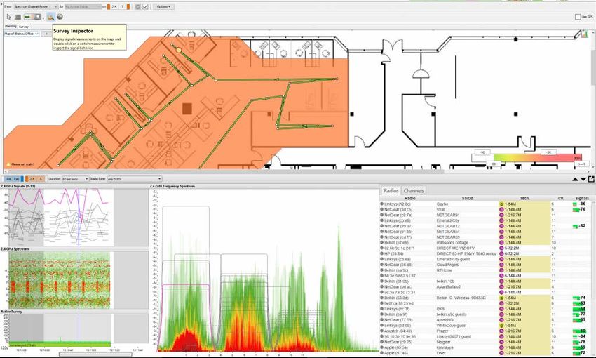
Contents
Executive Summary ........................................................................... 4

Introduction ...................................................................................... 4

        What do we mean by visualizations?............................................ 4

        What are the different types of Ekahau Site Survey (ESS) visualizations?
        .............................................................................................. 4

Signal Strength ................................................................................. 5

        What is signal strength? ............................................................ 5

        How is signal strength displayed in Ekahau Site Survey (ESS)? ....... 7

        Why is signal strength important for a Wi-Fi network? .................... 8

        What signal strength should I design my network to? .................... 9

AP Selection ...................................................................................... 9

Interference / Noise .......................................................................... 11

Signal to Noise Ratio (SNR) ................................................................ 15

        What is Signal to Noise Ratio (SNR)? .......................................... 15

        Why is SNR important? ............................................................. 15

        What is a good SNR value? ....................................................... 16

        How does Ekahau Site Survey visualize SNR? .............................. 16

Data Rate ........................................................................................ 17

        How are data rates determined? ................................................ 18

        How does Ekahau Site Survey calculate data rate? ....................... 24

Channel Overlap ............................................................................... 29

        What is Channel Overlap? ......................................................... 29

                                                                                                           2
                               Copyright © 2016 Ekahau, Inc. All rights reserved.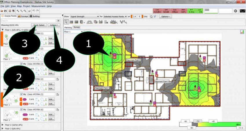
Channel Overlap on 2.4 GHz...................................................... 29

        Channel Overlap on 5 GHz ........................................................ 30

        What happens when channels overlap? ....................................... 31

        How much is too much Channel Overlap? .................................... 33

        So, is the 2.4 GHz band dead then?............................................ 33

        How does Ekahau Site Survey visualize Channel Overlap? ............. 34

Channel Coverage............................................................................. 35

Channel Bandwidth ........................................................................... 37

Number of APs ................................................................................. 39

Associated Access Point ..................................................................... 41

        What does the visualization look like? ......................................... 41

        What should you look for? ......................................................... 43

Spectrum Channel Power and Spectrum Utilization ................................ 44

        Spectrum Channel Power .......................................................... 44

        Spectrum Utilization ................................................................. 45

        Visualization Options ................................................................ 46

        Survey Inspector ..................................................................... 46

Contact ........................................................................................... 48

                                                                                                         3
                               Copyright © 2016 Ekahau, Inc. All rights reserved.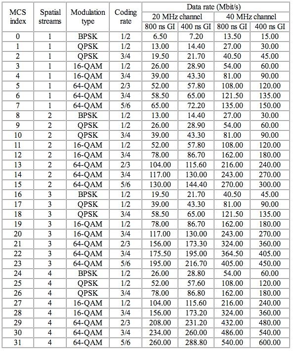
Executive Summary
What are visualizations? What do the Ekahau
visualizations mean? How can I optimize my
design for each visualization? The
abovementioned questions are discussed in detail
further in this paper.

Introduction
What do we mean by visualizations?

Visualizations are graphical representations of simulated (planning) or measured data
(survey) overlaid on a floor plan that is imported by a user to depict the physical structure
in which the wireless network is being or has been deployed. The graphical display helps the
user understand and interpret the data more effectively than trying to decode an exorbitant
amount of tabular data.

What are the different types of Ekahau Site Survey (ESS)
visualizations?

Currently there are 19 ESS visualizations that can be selected to help design, verify, and/or
troubleshoot your Wi-Fi network:

   •   Associated Access Point – predicts where the client devices will be associated, or,
       if Hybrid Site Surveys have been made, displays the actual associated access point
       throughout the survey.
   •   Capacity: Clients per AP – displays how the end user devices would be distributed
       between the access points.
   •   Capacity Health – displays whether the network meets the Capacity Requirements.
   •   Channel Bandwidth – displays channel bandwidth to better visualize your 802.11n
       and 802.11ac network characteristics such as channel bonding.
   •   Channel Coverage – displays the channel of the AP with the strongest signal
       strength in each location.
   •   Channel Overlap – shows how many APs are overlapping on a single channel in the
       given area.

                                                                                                4
                          Copyright © 2016 Ekahau, Inc. All rights reserved.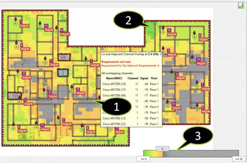
•   Data Rate – displays the speed at which the client device and the AP are
       communicating.
   •   Interference / Noise – displays interference/noise as a result of co-channel
       interference and other noise that may have an impact on performance.
   •   Network Health – provides a summarized overview of the network based on
       whether defined network requirements are met or not.
   •   Network Issues – displays which network requirement fails in a given location.
   •   Number of APs – shows how many APs are audible in a given location.
   •   Packet Loss – displays the relative packet loss % over the floor map, as measured
       from the last 10 packets.
   •   Round-Trip Time – shows the round trip time of the ping packets over the floor
       map.
   •   Signal Strength – displays the signal strength of the selected set of APs in dBm. By
       default, the signal strength of the strongest AP per location is displayed.
   •   Signal to Noise Ratio (SNR) – shows the ratio of the signal strength relative to the
       noise.
   •   Throughput (Max) – displays the theoretical maximum net throughput (excluding
       overhead) per location, given ideal circumstances and a single user accessing the
       network.
   •   Difference in Interference – shows the interference difference in measured values
       between the Primary and Secondary surveys in a given location.
   •   Difference in Signal Strength – shows the signal strength difference in measured
       values between the Primary and Secondary surveys in a given location.
   •   Difference in Number of APs – shows the change in the number of APs between
       the Primary and Secondary surveys in a given location.

Signal Strength
To kick off the series on visualizations we will focus on one of the most recognizable and
important requirements when designing a wireless network: signal strength.

What is signal strength?

People often mistakenly refer to signal strength as Received Signal Strength Indicator
(RSSI) value, which is an indication of the power level at the receiving antenna (e.g. Wi-Fi
client device). While RSSI can give you an indication of how strong a signal is relativistically,

                                                                                                    5
                           Copyright © 2016 Ekahau, Inc. All rights reserved.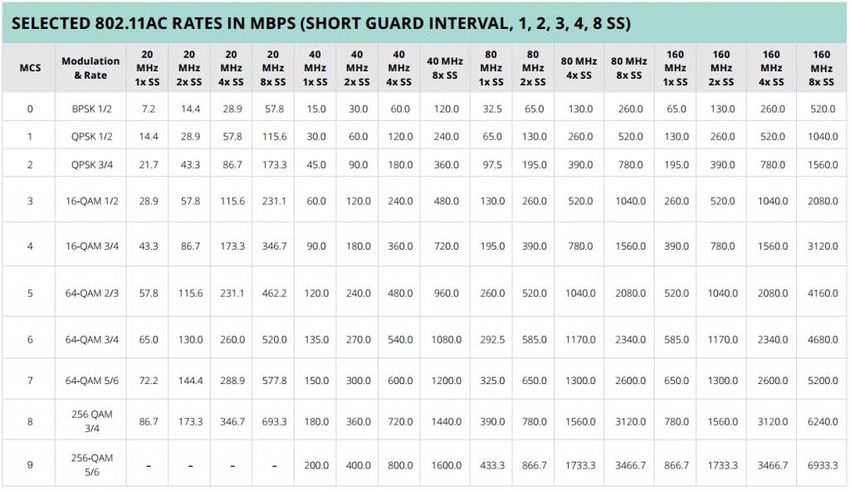
it does not provide an absolute measurement. There is no standardized method of
determining RSSI between vendors, leading to each providing different RSSI values for the
same environment. When engineers refer to power levels in dBm or mW, it is the actual
measured signal strength and not a relative calculation as with RSSI.

What is dBm or mW?

Short answer: dBm is decibels relative to 1 milliwatt and mW is a milliwatt (one thousandth
of a watt). The next obvious question is: what are watts and decibels? A watt is a unit of
power named after the Scottish engineer James Watt that is used to express the rate of
energy conversion or transfer with respect to time. It can be calculated relative to an
object’s velocity as Joules per Second (J/S) or in terms of electromagnetism as the rate at
which work is done when one Ampere of current flows through an electrical potential
difference (Volt), aka Watt = Volts x Amperes. A decibel is a logarithmic unit used to
express a ratio between two values. The decibel is used to conveniently represent very large
or small values and allow for simple mathematical calculations that would otherwise be
difficult for most humans. For the sake of saving time and not derailing the purpose of this
post, I recommend checking out WLAN Pros’ “Easy dB Math in 5 Minutes”
(http://www.wlanpros.com/easy-db-math-5-minutes/) to understand how to work with
dBms.

                                                                                               6
                          Copyright © 2016 Ekahau, Inc. All rights reserved.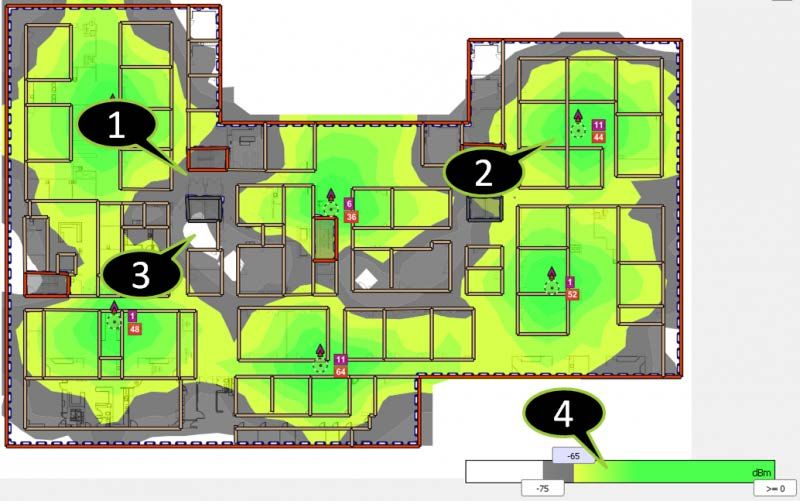
How is signal strength displayed in Ekahau Site Survey (ESS)?
In ESS the signal strength visualization displays the signal strength of the selected set of
Access Points (APs) in dBm. By default, the signal strength of the strongest AP per location
will be displayed. To display the signal strength for just one or few access points, select
“Show Signal Strength for Selected Access Points” and click to select APs from the map or
from the AP list as shown in the screenshot below. More about the AP selections on our next
blog post.
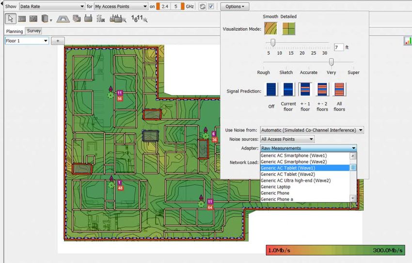
Signal strength has the following options accessible via the Visualization Options:
• Viewed Signal allows you to disregard the signals from the strongest access points,
visualizing the second or third strongest signals instead of the strongest one. This is
useful for visualizing AP failover scenarios and redundancy.
• Signals at Channel limits the signal strength visualization to only show the signals
at a selected channel.
• Adapter selection allows you to visualize the signal strength as the selected adapter
would “see” it. For example, the signal strength may be sufficient using a high-
quality network adapter, but may not be sufficient using a wireless VoIP phone with
different antenna characteristics.
7
Copyright © 2016 Ekahau, Inc. All rights reserved.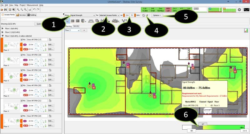
Below is an example of a signal strength visualization:

   1. Signal strength does not meet the requirement. The signal strength is below -65
       dBm and the visualization is greyed-out.
   2. High signal strength.
   3. Low signal strength. The signal strength is below the cutoff value (-75 dBm) and the
       visualization is not shown.
   4. Click or slide to adjust the signal strength visualization requirements, range, spacing,
       and coloring. Right-click for more options.

Why is signal strength important for a Wi-Fi network?

Generally speaking, a higher signal strength will result in higher data rates. For any given
receiver, higher power levels are required to support higher data rates. The reason for this
is that different data rates use different modulation techniques and encoding; as the data
rates get higher the encoding is more susceptible to corruption. Of course, there are also
other factors that determine the data rate, such as Signal to Noise Ratio (SNR),
interference, client Wi-Fi adapter compatibility (i.e. 802.11a/b/g/n/ac), and more.

                                                                                                 8
                          Copyright © 2016 Ekahau, Inc. All rights reserved.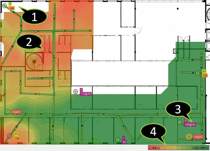
What signal strength should I design my network to?

It depends. Seriously, there is no absolute correct power level that meets the needs of all
networks. A VoIP deployment will differ from basic connectivity coverage, which in turn will
differ from a dense high speed environment.

So, where can you determine what your signal strength requirements should be? You first
need to determine what data rate is required given the client application needs. For
example, HD video streaming will require higher data rates than typical web browsing. Once
you know what data rate you would like to design towards, you then need to find the
corresponding signal strength required to operate at that data rate.

To find the signal strength value required for a given data rate, a good place to start is the
vendor-specific data sheets/design guides. Often, vendors list the signal strength and SNR
required for a given data rate or Modulation and Coding Scheme (MCS) index in such
documents, which may be posted on their website. If they are not listed, you can try to ask
one of their representatives for recommendations. Each vendor has their own recommended
signal strength for a given data rate or application. For instance, one vendor may
recommend designing their VoIP solution at -67 dBm (perhaps the most widely-used value
for VoIP deployment if I had to choose one), while another may say -70 dBm. In most cases
the values will differ only by a couple dB.

A common practice is to design for signal strengths in the -65 to -70 dBm range with two or
more APs overlapping throughout the coverage area. However, please note that every
design is different and you need to consider capacity (number of clients), applications (HD
video, Audio streaming), use cases (VoIP vs. Data), link quality, and more when
determining a proper signal strength threshold. Many vendors have design guides that can
help define requirements based on the network needs. This is often an iterative process of
determining network needs and defining signal strength, SNR, and other parameter
requirements.

AP Selection
For a summary, check out the video below, where I walk through the selection of Access
Points and touch on the various Access Point visualizations within ESS.
https://www.youtube.com/watch?v=O94NZaEfuUU

                                                                                                 9
                           Copyright © 2016 Ekahau, Inc. All rights reserved.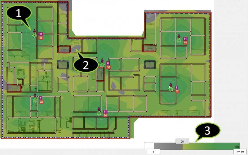
After discussing signal strength in our last blog post within the visualization series, it is a
good time to discuss how to view the results for a particular set of Access Points (APs) to
study the performance of those in particular. By viewing the Heatmap of just one or a few
APs, you can gather a greater understanding of their performance. For instance, in the case
of signal strength, viewing the Heatmap of one AP will help you determine the coverage
area of that individual AP and identify areas of concern such as a wall or structure that
impedes the signal propagation.

Within ESS, the displayed visualization is selected using the two drop-down menus above
the map window. The default visualization is Signal Strength for My Access Points. The first
drop-down menu selects the visualization type, for example signal strength or data rate.
The second drop-down selects what access points will be included in the visualization. If you
want to visualize signal strength for one access point only, for example, you would select
Show Signal Strength for Selected Access Points and just select the AP for which you want
to see the signal strength.

   1. Visualization type
   2. Access point selection
   3. Quick band selector
   4. Visualization refresh
   5. Visualization options
   6. Legend

                                                                                                  10
                           Copyright © 2016 Ekahau, Inc. All rights reserved.
The screenshot below shows the signal strength visualization for two selected Access Points.
The selected APs will be designated by an orange circle around the AP on the floor plan and
highlighted in orange on the AP list on the sidebar.
1. Access Points can be selected via three methods:
2. The Pointer (Edit) tool and left clicking the AP on the floor plan
3. Left clicking the AP from the AP list on the sidebar
4. Using the Quick Select button on the sidebar
5. Select All from the Actions button on the sidebar
Access Points can also be deselected using the same methods as selection, with the
exception of choosing Select None instead of Select All from the Actions button.
Interference / Noise
Our next scheduled blog in the Visualization series was Signal to Noise Ratio (SNR), but it
seemed more sensible to discuss Interference / Noise before we covered the topic of SNR.
As SNR is a ratio of the Signal Strength with respect to Noise, it is important to understand
where the noise measurement comes from first.
11
Copyright © 2016 Ekahau, Inc. All rights reserved.In RF theory, the noise floor is the measurement of the signal created from the sum of all
noise sources (Intentional and Unintentional Radiators). This may include thermal noise,
cosmic noise (the Big Bang), atmospheric noise (thunderstorms), and other natural sources.
In 1926, John B. Johnson and Harry Nyquist first measured this thermal noise at Bell Labs,
and was thus named Johnson-Nyquist noise. Based on discoveries by Johnson and Nyquist,
the thermal noise power can be calculated as:
PdBm = 10 log10 (kBTΔf x 1000)
Where the factor of 1000 represents the power given in milliwatts (rather than watts), kB is
Boltzmann’s constant (1.38×10⁻¹³ J/K), T is temperature, Δf is the bandwidth in hertz over
which the noise is measured. The formula can be further simplified by assuming room
temperature (T=300K):
PdBm = -174 + 10 log10 (Δf)
When calculated for Wi-Fi channels we get the following results:
Bandwidth (Δf) Thermal Noise Power Notes
20 MHz -101 dBm 802.11 20 MHz channel
40 MHz -98 dBm 802.11n/ac 40 MHz channel
80 MHz -95 dBm 802.11ac 80 MHz channel
160 MHz -92 dBm 802.11ac 160 MHz channel
12
Copyright © 2016 Ekahau, Inc. All rights reserved.In addition to thermal noise, interference and noise can be caused by Wi-Fi radios (both
your network and other networks), cordless phones, baby monitors, video devices,
Bluetooth devices, ZigBee, microwaves, RADARs, radio jammers, heavy machinery, cellular
harmonics, and countless other devices. Some of these sources may be considered
Intentional Radiators (IRs) and others considered Unintentional Radiators or Incidental
Radiators. An Intentional Radiator is any device that is deliberately designed to transmit
radio waves (ex. Wi-Fi APs, Bluetooth devices, baby monitors, RADARs, etc.). An
Unintentional Radiator is any device which creates radio waves unintentionally (ex. Electric
motors, transformers, spurious emissions, etc.).
The measured noise floor is the sum of the thermal noise for a given bandwidth and any
additional noise in the environment. In the case of a 20 MHz channel, the best possible
noise floor is -101 dBm. However, due to added noise (especially in 2.4 GHz) it is often
much higher.
Ekahau Site Survey shows interference / noise levels in two ways:
• As measured by the Wi-Fi adapter
• As calculated co-channel interference
13
Copyright © 2016 Ekahau, Inc. All rights reserved.By default, ESS uses the noise measured by the Wi-Fi adapter when visualizing surveyed
data, and when a fully supported external adapter is used for site surveys.
1. Very low or no interference
2. High interference
3. Low interference
4. Adjust interference visualization value range, colors, etc.
Note that a Wi-Fi adapter is not an accurate interference / noise measurement device. The
wireless NIC only transmits and receives 802.11 data and not raw ambient RF signals. So,
how is the noise/SNR reported by the wireless NIC if it cannot be measured? The Wi-Fi
adapter vendor have come up with methods to estimate the noise floor. Vendors use
sophisticated algorithms to calculate noise based on bit error rates and other factors. In
other words, the Wi-Fi adapters are only capable of measuring noise as a result of 802.11
devices. In ESS, noise measurements are bounded to 20 MHz channels with all subchannels
of the client channel scanned and the average interference/noise measurement is used. For
accurate noise measurements (i.e. non-802.11 devices noise included), please use the
Ekahau Spectrum Analyzer (see http://www.ekahau.com/wifidesign/spectrum-analyzer).
14
Copyright © 2016 Ekahau, Inc. All rights reserved.When a recommended Wi-Fi adapter is not used, then the interference / noise levels are
estimated with an algorithm based on APs operating on the same/adjacent channels (Co-
Channel / Adjacent-Channel Interference). ESS determines the amount that the interfering
AP channel mask overlaps with the client associated AP via an integral. This provides the
interference as a weighted total of the Received Signal Strength Indicator (RSSI) value. The
total interference is the sum of all the interfering APs weighted calculation. The total
interference is then scaled based on the Network Load Factor within the Visualizations
Options. With 0% network load, the interference will be calculated to be 0 and with 100%
network load the total sum of interference will be used.
Signal to Noise Ratio (SNR)
Previously in our Visualization blog series we touched on Signal
Strength and Interference/Noise. While each of these are important criteria, the Signal to
Noise Ratio (SNR) is often a better barometer for deploying a high quality wireless network.
What is Signal to Noise Ratio (SNR)?
In simple terms, SNR = Signal Strength – Noise. For example, a signal level of -60 dBm is
measured near an AP and a typical noise level of -90 dBm is in the given area, then the
resulting SNR would be 30 dB. Note that the SNR is measured in dB, instead of dBm. This is
because SNR is a difference in two logarithmic values.
As discussed in previous blog posts, the signal strength measured at the client device
decreases as the range to the AP increases because the free space path and obstructions
that attenuate (reduce) the signal. Additionally, interference/noise can be caused by too
many APs and non-802.11 devices (microwaves, RADARs, A/V devices, Bluetooth devices,
etc.). Either one or both, signal strength or noise, can affect the resulting SNR. For instance,
if the noise is stable at -90 dBm and the signal strength decreases from -60 dBm to -80
dBm, then the SNR will decrease by 20 dB (-60–90 = 30 dB versus -80–90 = 10 dB).
Why is SNR important?
SNR directly impacts wireless network performance. Higher SNR values means that signal
strength is stronger in relation to the noise level, which allows for more complex modulation
15
Copyright © 2016 Ekahau, Inc. All rights reserved.techniques resulting in higher data rates and fewer retransmissions. As SNR declines, so do
data rates and throughput.
What is a good SNR value?
Similar to our discussion of signal strength, every vendor has their own threshold for SNR
required for a given data rate or Modulation and Coding Scheme (MCS). It is first necessary
to determine what applications will be used on the network to in turn know what data rates
you require to support such applications. Once you know what data rates you need to
support the clients on the network you can determine what SNR is required to operate at
those data rates.
Generally speaking, the following is a summary of the various SNR levels:
1. > 40 dB – Excellent quality, always associated, highest data rates
2. 25-40 dB – Very good quality, always associated, high data rates
3. 15-25 dB – Good quality, always associated, good data rates
4. 10-15 dB – Ok quality, usually associated, lower data rates
5. 0-10 dB – Low to no signal, usually not associated, very low data rate to nothing
It’s important to note again that the more complicated methods of modulation are used the
more performance is susceptible to noise. In the case of 802.11n or ac networks, this is
important to recognize that higher SNR values are required to achieve the highest data
rates (MCS values).
Because of the variations in use cases it is difficult to say there is a SNR value you should
always design to. Generally speaking, however, values greater than 20 dB will provide a
good connection and maintain associations.
How does Ekahau Site Survey visualize SNR?
Ekahau Site Survey calculates SNR with the following procedure:
1. Select AP where the client would associate to using association logic. This defines
where the channel is. The logic used is to associate to the AP based on which gives
the best data rate as a result of the parameters of the AP and client. If data rates are
16
Copyright © 2016 Ekahau, Inc. All rights reserved.the same, we use SNR as a comparison and if SNR is also the same we use signal
strength.
2. Take the signal strength from the associated AP.
3. Take the interference/noise (measure/simulated) in the given area.
4. SNR is calculated as signal strength from associated AP (step 2) – interference/noise
in area (step 3).
Below is an example of SNR for a predictive plan of an office building:
1. High SNR
2. Low SNR – SNR is below 20dB requirement and the visualization is greyed-out
3. Click to adjust SNR visualization cut-out and requirement grey-out values, spacing,
coloring, and color range
Data Rate
Data rate is the speed at which the client device and the Access Point (AP) communicate
with one another. It is important to note that the data rate must be supported on both the
client device and the AP in order to operate at that rate. For instance, if the AP only
17
Copyright © 2016 Ekahau, Inc. All rights reserved.supports data rates up to 54 Mbps (802.11g) and a client device is capable of supporting up
to 300 Mbps (802.11n), then the data rate for communication will be limited to 54 Mbps.
The higher the data rate, the greater the amount of data is expected to be transferred
between the client device and the AP in a given period of time. In 802.11 networks, the
advertised data rate is the theoretical maximum at which the devices are able to
communicate. However, the net data throughput between the two devices is typically less
than half of the advertised data rate. This will be discussed in greater detail in a future blog
post on the throughput visualization.
Data rate is often presented in Megabits per second (Mbps), which is the measure of data
transfer speed representing one million bits in one second. This is not to be confused with
Megabytes per second (MBps), which represents one million bytes per second with bytes
equaling 8 bits of information.
How are data rates determined?
Date rates are tied to the capabilities of the physical-layer connection capabilities. The
modulation techniques, channel bandwidth, coding rate, number of spatial streams, guard
interval size, etc. all play a role in the determining the supported data rates.
802.11ag supports data rates up to 54 Mbps using Orthogonal Frequency-Division
Modulation (OFDM) 64-QAM (Quadrature Amplitude Modulation), while 802.11b only
supports up to 11 Mbps using Direct-Sequence Spread Spectrum (DSSS) Complementary
Code Keying (CCK) modulation. The modulation types and schemes are out of the scope of
this blog, so I will not go down that rabbit hole but I recommend reading further about
modulation via the CWNA program and study guides or various online resources readily
available. In short, higher order modulations allow for more data to be transmitted,
however they are more susceptible to noise.
For the purposes of this blog I will focus on the two most recent 802.11 protocols, 802.11n
and 802.11ac. 802.11n is capable of data rates up to 600 Mbps with 4 spatial streams,
64-QAM, 5/6 coding rate, 40 MHz channel bandwidth, and a 400 ns Short Guard Interval. A
table showing the various supported data rates for 802.11n is shown below:
18
Copyright © 2016 Ekahau, Inc. All rights reserved.802.11ac is theoretically capable of data rates up to 6993 Mbps! with 8 spatial streams,
256-QAM, 5/6 coding rate, 160 MHz channel bandwidth, and a 400 ns Short Guard Interval.
This is optimistic, because as we discussed, environmental radio properties affect data rates
making it unlikely that a client will ever be able to receive such a high data rate in real-
world scenarios. A more practical and reasonable data rate for corporate environments with
a high density deployment would be 4 spatial streams for a data rate of 346.7 Mbps @ 20
19
Copyright © 2016 Ekahau, Inc. All rights reserved.MHz (720 Mbps @ 40 MHz). A table showing the various supported data rates for 802.11ac
is shown below:
So, what exactly does all this mean?
Data Rate = Number of Spatial Streams x Channel Bandwidth Factor x MCS Factor
(Modulation type/coding rate) / Guard Interval Factor
Spatial Streams rely on Multiple Input Multiple Output (MIMO) technology, which refers to
using multiple antennas for receiving and transmitting a single data stream. This allows a
single data stream to be inverse-multiplexed over multiple RF spatial streams to increase bit
rates. Spatial multiplexing is used to break down data into multiple signal streams, each of
which transmits on a separate spatial stream. 802.11n supports up to 4 spatial streams,
while 802.11ac supports up to 8 spatial streams.
Channel Bandwidth can affect the data rate by aggregating multiple channels. 802.11n can
operate with 20/40 MHz channels, while 802.11ac can operate with 20/40/80/160 MHz
channels. The channel bandwidth factors are as follows: 20 MHz (52), 40 MHz (108), 80
MHz (234), 160 MHz (468).
20
Copyright © 2016 Ekahau, Inc. All rights reserved.Modulation Coding Scheme determines how many bits can be encoded on an RF sub-carrier
using phase- and amplitude-shifting techniques. Higher orders of MCS can encode more
bits, resulting in higher bit rates; however, they are also more susceptible to errors caused
by noise. For 802.11ac the MCS Index table can be seen below:
MCS Index MCS MCS Factor
0 BPSK ½ 0.5
1 QPSK ½ 1
2 QPSK ¾ 1.5
3 16-QAM ½ 2
4 16-QAM ¾ 3
5 64-QAM 4
6 64-QAM ¾ 4.5
7 64-QAM 5
8 256-QAM ¾ 6
9 256-QAM 6.67
Guard Interval increases data rates by shorting the amount of time required to wait
between data frames. In 802.11ac, the Long Guard Interval (LGI) factor is 4 and Short
Guard Interval (SGI) is 3.6.
21
Copyright © 2016 Ekahau, Inc. All rights reserved.Let’s take an example connection between an AP and client both capable of 4 spatial
streams, 40 MHz channels, 256-QAM 5/6 coding rate, and a Short Guard Interval.
Data Rate = 4 Spatial Streams x 108 (40 MHz BW) x 6.67 (MCS Index 9) / 3.6
(SGI)
The resulting data rate is ~800 Mbps for the described 802.11ac connection. This of course
is the maximum supported data rate and assumes a minimum required Signal-to-Noise
Ratio (SNR) value.
In previous blog posts, I discussed the importance of interference/noise and SNR on Wi-Fi
performance. Notably, noise can directly affect the bit-error rate of higher order modulation
schemes. In QAM, the constellation points are arranged in a square grid with equal vertical
and horizontal spacing. Since in wireless communications, data is binary, the number of
points in the grid is usually a power of 2 (2, 4, 8, 16, etc.). By moving to a higher-order
constellation, it is possible to transmit more bits per symbol (combination of several bits in
the constellation). However, if the mean energy of the constellation is to remain the same,
the points must be closer together and are thus more susceptible to noise and interference;
this results in a higher bit error rate. Using higher-order QAM without increasing the bit
error rate requires a higher SNR by increasing signal energy, reducing noise, or both. The
constellations for QPSK and 256-QAM are shown below to illustrate how 256-QAM requires
points that are much closer together than QPSK, which results in an increased susceptibility
to noise when deciphering the points location on the constellation map. A good blog
reference that discusses QAM can be found here:
22
Copyright © 2016 Ekahau, Inc. All rights reserved.(http://community.arubanetworks.com/t5/Technology-Blog/What-is-QAM/ba-p/114747)
QPSK (aka 4-QAM) vs. 256-QAM
Our friends Andrew von Nagy (Revolution Wi-Fi) and Keith Parsons (WLAN Pros) developed
a Wi-Fi SNR to MCS Data Rate Mapping Reference chart:
http://www.revolutionwifi.net/revolutionwifi/2014/09/wi-fi-snr-to-mcs-data-rate-
mapping.html
to quickly identify what SNR values are required for a given MCS Data Rate. Below is a
subset of the chart; please go to the link provided for the full downloadable version.
23
Copyright © 2016 Ekahau, Inc. All rights reserved.How does Ekahau Site Survey calculate data rate?
We now understand how the data rate is determined in the real-world, so how does ESS
display data rate?
Case 1: Calculated Data Rate
By default, ESS displays the calculated data rate for My Access Points.
Data rate is based on the minimum signal strength and SNR. The SNR, on the other hand, is
affected by signal strength and noise.
The signal strength can be calculated based on the predictive design (simulation), or
measured during the site survey.
Noise, on the other hand, can be calculated based on co-channel interference, in case of a
physical site survey, measured by a supported Wi-Fi adapter, such as an Ekahau NIC.
Now therefore, the data rate can be affected (modified) in ESS by using the following
Visualization Options as parameters:
24
Copyright © 2016 Ekahau, Inc. All rights reserved.• Network Load affects the data rate: The higher the network load, the more
interference. The more interference, the lower the SNR, and the lower the SNR, the
lower the data rate.
• Different Adapters have different receiver sensitivity capabilities, and even support
different 802.11 standards. Thus, using different adapters may have a significant
impact on the data rate. For example, an 802.11b adapter can only communicate at
a maximum of 11Mbps
This is a good time to discuss the ESS client adapter capabilities, in which many of our users
have questions about. As discussed in the second bullet above, different adapters have
different capabilities and can impact the data rate. To change the Network Load and Adapter
settings use the Visualization Options menu as shown below:
In adapters.xml conf file (Program Files > Ekahau > Ekahau Site Survey > conf >
adapters.xml), you can define antenna configuration for a client device (e.g. mimo=”1×2”
meaning we have 1 transmit and 2 receiving antennas). Additionally, you can define the
number of spatial streams (e.g. spatialStreams=”1”). Together these limit the spatial
stream count used in data rate calculation for the client. Another configuration is max
Supported Band width definition, which limits the bandwidth this client can support. These
profiles can be used to simulate what the data rate Heatmap would look like for a given
client device.
25
Copyright © 2016 Ekahau, Inc. All rights reserved.An example snapshot of the adapters.xml conf file is below:
…
…
26
Copyright © 2016 Ekahau, Inc. All rights reserved.27
Copyright © 2016 Ekahau, Inc. All rights reserved.The screenshot below shows an example survey project and its data rate visualization.
1. No data transfer possible
2. Low data rate (Red color)
3. High data rate (Green color)
4. Red = 1Mbps Green = 1300Mbps
Note data rate is calculated only for access points that are marked as My APs. If you are
visualizing with the Selected Access Points view, the APs that are currently selected will
work as sources of noise.
Case 2: Measured Data Rate
With the release of ESS 8.0.1, the data rate Heatmap can now display measured data rate
based on the Wi-Fi connection between the active survey adapter and the currently
28
Copyright © 2016 Ekahau, Inc. All rights reserved.connected AP. By default, the visualization is still displayed for the calculated data rate, but
can now be changed to measured data rate via the Visualization Options menu. When
visualizing measured data rate, you cannot adjust the AP selections, of course.
I know this post was a little lengthy, but given the subject you can see we only scratched
the surface. I recommend reading up on MIMO, modulation schemes, and the importance of
SNR in communications systems to further grasps their significance.
Channel Overlap
Channel Overlap, the bane of Wi-Fi engineers everywhere, is a major contributor to the
degraded performance of a Wi-Fi network. Significant channel overlap can cause networks
even with high received signal strengths to perform poorly.
What is Channel Overlap?
Channel Overlap is a result of Radio Frequencies having to share a medium (wireless)
located within the same area.
Channel Overlap on 2.4 GHz
802.11bgn radios utilize the 2.400-2.500 GHz spectrum, which is a 100 MHz subset of the
Industrial, Scientific, and Medical (ISM) radio band. The spectrum is sub-divided into
“channels” with a center frequency and bandwidth. The 2.4 GHz frequency band is divided
into a maximum of 14 channels spaced 5 MHz apart, i.e. Channel 1 is centered at 2.412
GHz and Channel 2 is 5 MHz apart at 2.417 GHz. Depending on the regional regulatory
domain some channels may not be available for use. Within the United States, the Federal
Communications Commission (FCC) only allocates channels 1-11 for use.
Image source: https://en.wikipedia.org/wiki/List_of_WLAN_channels
29
Copyright © 2016 Ekahau, Inc. All rights reserved.Each channel is 22 MHz wide, resulting in a maximum of three non-overlapping channels
within the 2.4 GHz frequency band (within U.S. and majority of the world). For instance,
channels 1, 6, and 11 are non-overlapping in the 2.4 GHz frequency band with 22 MHz wide
bandwidths and 3 MHz spacing between them as seen below:
• Channel 1 Frequency Range: 2.401 to 2.423 GHz
• Channel 6 Frequency Range: 2.426 to 2.448 GHz
• Channel 11 Frequency Range: 2.451 to 2.473 GHz
Depending on the regulatory domain there may be other channel plans that can be used
instead of the standard 1, 6, 11 plan. The image below shows that as long as there is 25
MHz spacing between channels (i.e. 5 channels) then they are considered non-overlapping.
Image source: http://www.wlanpros.com
Channel Overlap on 5 GHz
802.11a/n/ac radios utilize the 5 GHz UNII bands (1,2,2E,3) with 20, 40, 80, or 160 MHz
wide bandwidths. Within the 5 GHz frequency band, channels can be bonded to provide
higher data rates. 802.11n can support 40 MHz bonded channels, while 802.11ac can
support the addition of 80 and 160 MHz bonded channels. The chart below shows the
channels allocated for the 5 GHz frequency bands, note that the channels listed do not
overlap (within reason, the spectral masks may overlap in some cases). Also note that there
30
Copyright © 2016 Ekahau, Inc. All rights reserved.are additional channels being allocated by the FCC for use as unlicensed spectrum that may
not be listed below.
Image source: http://securityuncorked.com/2013/11/the-best-damn-802-11ac-channel-
allocation-graphics/
What happens when channels overlap?
In an ideal design, the APs will never overlap frequency space. The picture below on the left
shows the ideal case where the design utilizes a three channel plan with no APs overlapping,
while the picture on the right shows two APs on channel 1 overlapping in a given area.
Image source: http://www.wlanpros.com
31
Copyright © 2016 Ekahau, Inc. All rights reserved.Channels can overlap completely on the same channel (Co-Channel Interference, CCI) or
partially across adjacent channels (Adjacent Channel Interference, ACI).
A common mistake many inexperienced WLAN engineers make is to configure APs all on the
same channel. If the APs are operating on the same channel, medium contention overhead
will occur. The 802.11 standard uses Clear Channel Assessment (CCA), which causes the
APs to “listen” before they can “talk” to ensure only one radio communicates on a channel
at any given time.
If an AP on channel 6 is transmitting, all nearby APs and clients on channel 6 will have to
defer transmissions. The result is that throughput is adversely affected. Nearby APs and
clients will have to wait their turn to transmit. This unnecessary medium contention is
referred to as CCI, but in fact is more of a cooperation mechanism in which radios take
turns talking. In general, CCI is not a major problem until there are numerous devices
operating on the same channel.
Meanwhile, an even greater issue is that of Adjacent Channel Interference. Some
inexperienced wireless designers will use every available channel and not consider overlap
(i.e. channels 1,2,3,4, etc.). Instead of the devices cooperating as with CCI, with ACI the
devices will add noise to the network causing excessive retransmissions, CRC errors will
increase, and data rates will drop significantly.
An easy way to remember this is to imagine being at a loud dinner table with everyone
speaking at the same time. It is difficult to hear any particular conversation and due to the
noise it is nearly impossible to communicate. This would be an example of ACI, where
devices all talk at the same time. Now let’s take the same example of the dinner table, but
with everyone waiting their turn to speak. Each person will say what they want then another
individual will speak when it is their turn. This is the equivalent of the CCI, where devices
will cooperate with each other by waiting their turn to speak.
Knowing how CCI and ACI work, it is clear that ACI is worse than CCI. At least with CCI
some devices will be able to communicate given their turn, while with ACI in a congested
environment no one will be able to communicate.
32
Copyright © 2016 Ekahau, Inc. All rights reserved.How much is too much Channel Overlap?
It should be noted that it is impossible to avoid all instances of Co-Channel Interference
when using a three-channel reuse pattern at 2.4 GHz, because there is always a certain
amount of signal bleed over between APs on the same channel. If only three channels are
available for a channel reuse pattern, it is pretty much a given that there will be access
points on the same channel within hearing distance of each other.
One of the advantages of using the 5 GHz frequency band is that there are many more
channels. CCI can be nearly completely avoided with a proper 5 GHz channel reuse pattern.
Of course this depends on the channel bandwidths being used. There are a total of ~24
non-overlapping 20 MHz channels (more being added) in the 5 GHz frequency band.
However, if 80 or 160 MHz channels are used then there will likely be channel overlap due
to the limited number of non-overlapping channels.
Generally, it is often recommended to optimize designs for 5 GHz using 20 MHz bandwidths
for high density deployments and if desired/possible 40 MHz for higher data rates.
So, is the 2.4 GHz band dead then?
There has been a lot of talk over the years on the topic of the 2.4 GHz frequency band being
“dead.” There are several viewpoints on the topic, but like anything else with Wi-Fi designs,
it depends.
If the wireless network is located in a dense urban environment or multi-tenant building,
then it is likely there is too many networks to overcome the amount of channel overlap
within the 2.4 GHz frequency space. Also, if the network is designed to support increased
capacity needs then it is likely that there will be numerous APs located near a given area to
support the number of users resulting in channel overlap.
Most Wi-Fi designers take a hybrid approach where they design for both 2.4 and 5 GHz, but
optimize for 5 GHz. APs often support dual band radios where they can be individually
disabled from the controller as necessary. The Wi-Fi designer may reduce transmit power or
just disable some of the 2.4 GHz radios to avoid CCI. The benefit of such an approach is
that you meet the capacity needs with the 5 GHz optimized design, while you still take
advantage of some additional bandwidth of the 2.4 GHz radios.
33
Copyright © 2016 Ekahau, Inc. All rights reserved.My personal belief is why sacrifice available bandwidth when it’s available. This is often a
heated topic among Wi-Fi experts and is a personal design choice.
How does Ekahau Site Survey visualize Channel Overlap?
The Channel Overlap visualization shows how many access points are overlapping in a single
channel in the given area. By default, the visualization displays both Co- and Adjacent
Channel Overlap (CCI & ACI). The channel overlap should be minimized to ensure
interference-free operation. You can also analyze that the primary channels been assigned
properly so that nearby APs can fallback from wide channels to lower non-overlapping
channels for simultaneous transmissions. This can be done by adjusting the Max. Operating
Channel setting under visualization Options. By default, the visualization is shown for the
channel the client would be associated at, but you can also view the channel overlap at a
certain channel.
The following selections will affect the Channel Overlap visualization:
• Overlap Mode allows you to display only the Co-channel or Adjacent channel
overlap or both at the same time.
• Adjacent Channel Mode option allows you to follow commonly accepted channel
planning practices. For example, with the Loose setting, access points on channels
36 and 40 do not cause adjacent channel interference. Respectively, with Strict
setting they would be causing adjacent channel interference.
• Show at displays the channel overlap for the selected channel – By default the
visualization is shown for the channel the client would associated at.
• Operating Channel operation simulates the dynamic channel width adjustment –
For example, adjust to simulate channel overlap when APs fallback from wide
channels to 40MHz or 20MHz channels for simultaneous transmissions.
• Minimum Signal Strength allows you to set a minimum signal strength for an AP
that is to be included in the channel overlap to be visualized – For example, if you
set it to -80, the number of overlapping APs stronger than -80dBm signal strength at
the given channel will be shown.
• Adapter affects the Number of APs visualization, as some adapters are more
sensitive, and can thus hear more APs in a given location than the others.
34
Copyright © 2016 Ekahau, Inc. All rights reserved.1. Multiple overlapping channels on 2.4GHz band
2. No overlapping APs
3. Click to adjust the visualization value range, colors, etc.
Channel Coverage
Continuing our blog series on Ekahau Visualizations leads us to Channel Coverage, which is
a good follow-up to Channel Overlap. The Channel Coverage visualization displays the
channel of the AP with the strongest signal strength in each location. You can use the
visualization to quickly identify the coverage area of each channel and how the neighboring
coverage areas lay out. The per-channel visualization simultaneously displays the primary
coverage area for multiple access points in a contrasting format making it easier to verify
the proper channel plan.
35
Copyright © 2016 Ekahau, Inc. All rights reserved.This visualization can be useful when trying to determine how to handle Channel Overlap
visually. You can also see what channels occupy an area and their signal strengths by
hovering over the map for several seconds on multiple visualizations, Signal Strength and
Channel Overlap in particular. I recommend reading the Channel Overlap blog
post (http://www.ekahau.com/wifidesign/blog/2015/07/10/ekahau-site-survey-heatmap-
visualizations-part-7-channel-overlap/) to understand how to troubleshoot Channel Overlap
issues.
Channel Coverage has the following options accessible via Visualization Options:
The Adapter selection allows you to visualize the signal strength as the selected adapter
would “see” it. For example, the signal strength may be sufficient using a high-quality
network adapter, but may not be sufficient using a wireless VoIP phone with different
antenna characteristics.
The Show selection allows you to select the visualization shown for the primary channel or
for center frequency channel. Using center frequency channel option allows viewing
channels with higher bandwidth than 20 MHz.
36
Copyright © 2016 Ekahau, Inc. All rights reserved.1. Access points on channel 1
2. Access points on channel 11
3. Click to enable / disable contours
Because the visualization shows the channel of the AP (radio) with the highest signal
strength sometimes it is useful to view the visualization on each of the bands (2.4 / 5 GHz)
separately. To do so, select which bands you want to visualize by left clicking on the “2.4”
or “5” buttons as shown below. The band is active if the button has an orange bar next to it.
Channel Bandwidth
The channel bandwidth of a wireless signal can directly affect the data rate (speed) by
aggregating multiple channels. 802.11n can operate with 20/40 MHz wide channels, while
802.11ac can operate with 20/40/80/160 MHz channels. This however assumes that the
network is designed to avoid co-channel and adjacent channel interference (CCI/ACI), which
would result in reduced data rates. In many (if not all) cases, it is recommended to use 20
MHz channels in the 2.4 GHz band and 20/40 MHz channels in the 5 GHz band. This is due
to the number of non-overlapping channels available for reuse. You can read more
about data rates and channel overlap in previous blog posts.
To better visualize your 802.11n and 802.11ac network characteristics, use the Channel
Bandwidth visualization to see in which areas channel bonding is used to achieve higher
bandwidth and to recognize the area where it could be enabled.
37
Copyright © 2016 Ekahau, Inc. All rights reserved.20MHz Channel Bandwidth
80MHz Channel Bandwidth
40MHz Channel Bandwidth
Click to enable or disable visualization Contours
Sometimes it is useful to view the visualization on each of the bands (2.4 / 5 GHz)
separately, as most of the time the 2.4 GHz band operates with 20 MHz channels and wider
bandwidths in the 5 GHz band. To do so, select which bands you want to visualize by left
clicking on the “2.4” or “5” buttons as shown below. The band is active if the button has an
orange bar next to it.
38
Copyright © 2016 Ekahau, Inc. All rights reserved.Number of APs
The Number of APs visualization shows how many Access Points are audible in a given
location. The number of APs must be sufficient to ensure enough signal overlap in the
network. Overlap is needed for seamless roaming between Access Points, as well as load
balancing.
When we refer to overlap in this context it is in regards to APs being audible to a client in a
given location, which does not factor in the effects of channel overlap. As discussed in a
previous blog, channel overlap is a result of Radio Frequencies having to share a medium
(wireless) within the same area. Channel overlap can be a major contributor to the
degraded performance of a Wi-Fi network. Whereas, channel overlap is the result of APs
operating on the same RF channel, AP overlap (number of APs) is the number of APs
operating in a given area regardless of RF channel.
The number of APs overlapping in a given area is important for several reasons:
AP Failover – If an AP fails, shuts down, is jammed, or otherwise incapacitated then a
nearby AP can provide a backup connection to the clients.
Roaming – For uninterrupted handoffs as clients move between AP cells each AP cell in the
network should overlap with the adjacent cells (APs). This amount of overlap is dependent
on the application, for instance Wireless VoIP deployments may require a larger overlap
39
Copyright © 2016 Ekahau, Inc. All rights reserved.than data-only applications. Typically cell overlaps of 15-20% with 2 or more APs are
recommended. Refer to your wireless vender for their recommended overlap specification.
Load Balancing – If multiple APs are present in the same area, then the load and clients
can be balanced between the overlapping APs.
Capacity – To support greater client density several APs should occupy the same area. This
assumes the APs do not operate on the same RF channel (see channel overlap).
The following selections will affect the Number of APs visualization:
Minimum Signal Strength allows you to set a minimum signal strength for an AP that is to
be included in the number of APs to be visualized. For example, if you set it to -90, the
number of APs audible at stronger than -90 dBm signal strength will be shown. Set the
threshold based on the use case, for instance VoIP roaming may require overlap at -70
dBm.
Adapter affects the Number of APs visualization, as some adapters are more sensitive, and
can thus hear more APs in a given location than the others.
40
Copyright © 2016 Ekahau, Inc. All rights reserved.1. The requirement is not met (grey-out) – Only few audible APs
2. Lots of audible APs
3. Click to adjust the visualization value range, colors, etc.
Associated Access Point
The Associated Access Point visualization predicts where the client devices will be
associated, or if Hybrid Site Surveys have been performed, displays the actual associated
Access Point throughout the survey.
What does the visualization look like?
1. Moving the mouse cursor over each area displays the MAC address and SSID of the
Access Point the client adapter was associated with
2. Each roaming area is represented with different colors
3. Click to enable or disable Contours
41
Copyright © 2016 Ekahau, Inc. All rights reserved.The following Options selections will affect the Associated Access Point visualization:
• Association Mode
• Measured Association: If a hybrid survey has been performed, the actual
associated Access Point is shown.
• Predicted Association – Data Rate: The client is assumed to associate to the AP
with the highest data rate.
• Predicted Association – Signal: The client is assumed to associate to the AP with
the highest signal strength.
• Noise Sources – Select which noise sources contribute to the association selection
criteria (All Access Points, My Access Points, Other Access Points, Selected Access
Points).
• Use Noise From: (Predictive Associations Only) – Choose simulated co-channel
interference or measured noise.
• Adapter (Predictive Associations Only) – affects the Associated Access Point
visualization, as some adapters are more sensitive, and thus may roam differently.
Note that there are various criteria that wireless NIC and AP vendors use for association
logic. Some associate to the highest signal strength, others use data rate, Signal-to-Noise
Ratio (SNR), or some other threshold to determine when to roam to a different Access
Point. An active survey will display the actual AP associations per the wireless NIC (or APs)
used during the survey.
42
Copyright © 2016 Ekahau, Inc. All rights reserved.What should you look for?
The visualization is especially handy for recognizing roaming behavior such as with which
Access Point the wireless network adapters typically associates to in each area. Thus, you
can use the visualization to recognize areas where you might want to consider re-
positioning access points for better load balancing or frequency band steering.
The example below shows the Associated Access Point visualization of a survey for both the
2.4 and 5 GHz bands simultaneously. The different colors represent the different association
areas (different APs) around the map. Looking at the left side of the survey you notice that
the Associated AP is changing relatively frequently.
If the visualization is changed to 2.4 GHz only (via the toggle on the toolbar), it shows that
the survey device was associated to a 2.4 GHz radio. This may be an indication that you
43
Copyright © 2016 Ekahau, Inc. All rights reserved.have something affecting the 5 GHz radios in that area causing the device to prefer the 2.4
GHz radio.
Now that you know that there is an area that the device prefer the 2.4 GHz band, you may
want to troubleshoot that area by looking at the 5 GHz signal strength, Signal-to-Noise
Ratio, channel overlap, and other parameters that may affect the connection.
Spectrum Channel Power and Spectrum Utilization
With the release of Ekahau Site Survey version 8.5, two new visualizations were added to
help characterize the RF spectrum environment. In order to gather spectrum data, an
Ekahau Spectrum Analyzer dongle is required and must be enabled prior to the survey. Only
one band (2.4 or 5 GHz) can be scanned per spectrum analyzer, if both bands are required
to be scanned simultaneously then two spectrum analyzers would be required.
Spectrum Channel Power
The Spectrum Channel Power visualization shows the average total energy for a channel as
measured by a spectrum analyzer. The energy includes both Wi-Fi and non-Wi-Fi signals.
44
Copyright © 2016 Ekahau, Inc. All rights reserved.In other words, how “loud” the transmissions in the spectrum were during the survey. The
power can be originating from either Wi-Fi radios, or from other devices in the same
frequency range. In most production networks, much of the channel power is caused by Wi-
Fi signals. However, there are cases where non-Wi-Fi devices may transmit on the same
frequency as Wi-Fi networks. For example, leaky microwave ovens are known to emit high
powered signals across the 2.4 GHz band causing interference and disconnects for the
nearby Wi-Fi networks. In addition to microwave ovens there are numerous other
intentional and unintentional emitters that may transmit on the Wi-Fi frequency bands, such
as Bluetooth devices, A/V equipment, RADAR, electrical motors, florescent lighting, and
more.
If the survey is performed on a Greenfield environment (i.e. no Wi-Fi networks) and
spectrum channel power is detected, then it is likely there is a non-Wi-Fi device emitting in
that area. It would be recommended that you therefore avoid the channel that is occupied
when designing the new Wi-Fi network to minimize interference.
Spectrum Utilization
The Spectrum Utilization visualization shows the share of the time the spectrum power
measured by the spectrum analyzer is high enough so that the channel can be considered
as occupied.
This Heatmap shows how crowded (i.e. percentage of time) the frequency was during the
survey – taking into account both utilization caused by Wi-Fi, as well as other interferers.
Typically, most of the utilization is originating from Wi-Fi networks, but it’s not uncommon
to find interferers eating up most of the airtime as well.
Some interferers such as microwave ovens, jammers, and any device that constantly emits
will take up a majority of the airtime. Wi-Fi networks on the other hand are often considered
“polite” with regards to airtime fairness. The 802.11 standard is designed to allow devices to
take turns using the frequency space, while other RF technologies have no such restrictions.
Because of this inherent nature of Wi-Fi devices if non-Wi-Fi devices are utilizing the same
frequency more often, then the Wi-Fi network performance will degrade causing slowdowns
and disconnects.
45
Copyright © 2016 Ekahau, Inc. All rights reserved.You can also read