Enhancing Usability Evaluation of Web-Based Geographic Information Systems (WebGIS) with Visual Analytics - Schloss Dagstuhl
←
→
Page content transcription
If your browser does not render page correctly, please read the page content below
Enhancing Usability Evaluation of Web-Based
Geographic Information Systems (WebGIS) with
Visual Analytics
René Unrau
Institute for Geoinformatics, University of Münster, Germany
Christian Kray
Institute for Geoinformatics, University of Münster, Germany

      Abstract
Many websites nowadays incorporate geospatial data that users interact with, for example, to filter
search results or compare alternatives. These web-based geographic information systems (WebGIS)
pose new challenges for usability evaluations as both the interaction with classic interface elements
and with map-based visualizations have to be analyzed to understand user behavior. This paper
proposes a new scalable approach that applies visual analytics to logged interaction data with
WebGIS, which facilitates the interactive exploration and analysis of user behavior. In order to
evaluate our approach, we implemented it as a toolkit that can be easily integrated into existing
WebGIS. We then deployed the toolkit in a user study (N=60) with a realistic WebGIS and analyzed
users’ interaction in a second study with usability experts (N=7). Our results indicate that the
proposed approach is practically feasible, easy to integrate into existing systems, and facilitates
insights into the usability of WebGIS.

2012 ACM Subject Classification Human-centered computing → User studies; Human-centered
computing → Usability testing

Keywords and phrases map interaction, usability evaluation, visual analytics

Digital Object Identifier 10.4230/LIPIcs.GIScience.2021.I.15

Supplementary Material The source code is publicly available at https://github.com/ReneU/
session-viewer and includes configuration instructions for use in other scenarios.

 1      Introduction
Geospatial data has become a critical backbone of many web services available today, such
as search engines, online booking sites, or open data portals [29]. Frequently, these sites need
to visualize geospatial data [11] and enable interaction with the visualizations. The resulting
web-based geographic information systems (WebGIS) have proliferated over the last decade
though they vary regarding their complexity and purpose – from simple map-visualizations of
search results to geographic information systems with extensive functionality (e.g., [4, 14, 25]).
The range of users is equally broad, from novices with little to no knowledge about geo-data
and geo-visualization to experts, who all expect good usability. This variety of applications
and target users for WebGIS gives rise to diverse and potentially conflicting requirements for
the UI [7, 26, 28]. Consequently, designing the user interface (UI) of a WebGIS can be quite
challenging and affect the overall usability of the website considerably [10, 21, 22].
    One of the challenges in this context is the combination of map-based visualizations
with more traditional UI elements (such as menus, buttons, or sliders). Besides some basic
cartographic understanding, the former requires specific map actions (such as zooming,
panning or layer selection) while the latter provides access to map-related and other function-
ality. Treating map actions like any other functionality can potentially cause problems and
misunderstandings. For example, the actual scale and the visible layers of a map may have a
            © René Unrau and Christian Kray;
            licensed under Creative Commons License CC-BY
11th International Conference on Geographic Information Science (GIScience 2021) – Part I.
Editors: Krzysztof Janowicz and Judith A. Verstegen; Article No. 15; pp. 15:1–15:16
                   Leibniz International Proceedings in Informatics
                   Schloss Dagstuhl – Leibniz-Zentrum für Informatik, Dagstuhl Publishing, Germany
15:2   Enhancing Usability Evaluation of WebGIS with Visual Analytics

       significant impact on how successful users are when accessing a WebGIS and considerably
       affect which UI elements users use in which order and how often. To better understand these
       issues and to assess the usability of WebGIS, it is thus essential to evaluate them thoroughly.
       However, many existing evaluation approaches do not explicitly consider interaction with the
       geographic content [16], are lacking a visual representation for exploratory usage [4] or do
       not handle large amounts of data from multiple user sessions [6, 20].
           In this work, we hypothesize that usability evaluations of WebGIS could greatly benefit
       from a holistic and scalable approach that is based on logging map interactions for visual
       analysis by experts. To evaluate the approach, we implemented it as a prototypical toolkit
       and integrated it into a realistic A/B testing scenario. We collected interaction data from 60
       WebGIS users and conducted an expert study focused on analyzing and comparing usage
       patterns in both scenarios, thus evaluating the usability of the WebGIS with our toolkit.
       Unlike alternative methods, such as eye-tracking or screen recordings, our approach explicitly
       considers map interactions, does not require additional hardware and can be deployed at a
       large scale. It can thus complement traditional methods (such as questionnaires) through an
       interactive and profound exploration of usability aspects.
           We make two main contributions: (1) we propose a new approach for usability evaluation
       of WebGIS by applying visual analytics for map interaction data from multiple user sessions
       through a holistic toolkit with integration capabilities for existing applications; and (2) we
       evaluate the proposed approach by integrating our toolkit into a realistic WebGIS to collect
       the required data (N=60) and to then analyze it in an expert study (N=7). In addition,
       we also present insights into the usability aspects of a geovisualization that we used in the
       evaluation.
           The remainder of this paper is structured as follows: First, we provide an overview
       of work related to usability evaluation approaches for WebGIS, software instrumentation,
       and visual analytics. Next, we introduce our approach and briefly discuss its prototypical
       implementation. Section 4 lists our hypotheses and describes the two studies that we
       conducted with regular users and experts in order to evaluate our approach. The penultimate
       sections discuss the implications and limitations of the obtained results and our approach.
       The paper concludes by summarizing our key findings and contributions.

        2     Related Work

       2.1    Usability Issues of WebGIS
       Various use cases have demonstrated the needs for assessing the usability of WebGIS and
       their tools. For instance, Lobo et al. [14] investigated different techniques for comparing
       map layers. Their results showed that specific tools are inferior to others if users have to
       identify missing or modified features. In a different user study for Ethermap [4], participants
       were asked to map flooded areas collaboratively. Although only three out of 36 participants
       did not map actively, the authors could not identify the underlying reasons for this behavior.
       An analysis of these users’ interactions could yield exciting insights into the usability of the
       WebGIS. May and Gamble [17] conducted three experiments for investigating the impact of
       automatic map movements after users clicked a point on the map. Their analysis revealed
       that the evaluation of map movement techniques also depends on the geospatial data that
       might be outside the visible extent after panning or zooming the map. Frequently, evaluators
       use a combination of automatic data collection approaches and traditional methods. Manson
       et al. [16] asked two groups of participants to perform the same tasks in a WebGIS for
       navigation. They logged mouse actions such as mouse-up time as well as the total number of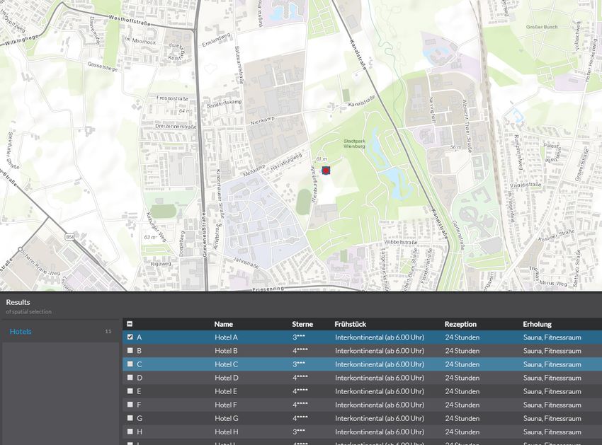
R. Unrau and C. Kray                                                                                 15:3

mouse interactions and applied eye tracking to test the usability of map navigation schemes.
Although they collected information about map interactions, the state of the map (i.e., scale
and extent) was not captured. As a result, the data could only be used to reconstruct the
users’ behavior with traditional UI elements. Ingesand and Golay [8] applied a method
that is similar to the one proposed in this paper. In a remote evaluation, they collected
detailed interaction logs for measuring the performance of predefined tasks and involved user
satisfaction ratings. However, they focused on traditional usability metrics such as error rate
and task completion time but did not consider user strategies for map interactions.
    A review of GIS usability evaluations that are available in the literature revealed that
most findings are related to issues with user guidance and tool usage (53.8% and 51.3% of all
reviewed studies) [30]. In contrast, identified issues that are related to the users’ strategies
were reported only in 15.4% of the reviewed studies. These differences could be related to the
choice of evaluation methods or data collection approaches. The combination of qualitative
knowledge from usability experts with quantitative data processing might facilitate a better
understanding of the underlying user strategies.

2.2    Instrumenting Software for User Testing
Instrumenting software for data collection facilitates the conduction of remote and asyn-
chronous user studies. As a result, the conduction of usability evaluations requires less effort
for experimenters: Once developed, instrumented software can be mass deployed to collect
the required amount of data with little effort. Target users, as well as first-time users of
the software, are tested in their actual real-world environment. Usage data can be collected
and analyzed continuously even for longitudinal studies [12]. Subsequently, the datasets
may be used to compare changes in the UI or to evaluate the learnability and memorability
of users. Finally, instrumented software minimizes experimenter bias and novelty effects.
For example, Atterer and Schmidt [2] implemented a proxy for recording detailed usage
information. By intercepting requests and responses, they were able to perform usability
evaluations. However, graphic-intensive applications, such as web mapping services, pose
new problems: “[...] the central part of the user interface does not consist of GUI elements
which are given ID values by the application programmer, but of a number of anonymous
tiles which contain graphics”.
    Our method extends a recent tool for visualizing WebGIS sessions to identify usability
issues via heatmaps and Sankey diagrams [31]. However, the approach presented in this paper
goes beyond standalone visualizations of user interactions. Instead, it explicitly addresses the
spatial aspects of map interactions by providing a GIS-like concept to explore and analyze
map interactions, thus, applying the concept of visual analytics.

2.3    Visual Analytics
Visual analytics aims to combine data processing and human domain knowledge in interactive
visualizations to generate new insights. Keim et al. [9] define visual analytics as an
“automated analysis technique with interactive visualizations for an effective understanding,
reasoning, and decision making on the basis of extensive and complex data sets.” A common
application of visual analytics is the analysis of movement data. For example, Rinzivillo
et al [23] developed a set of algorithms to cluster large number of trajectories and thus
facilitate visual exploration of movement patterns. However, applications of visual analytics
for evaluating UI interaction data are rare in the literature, especially for graphic-intensive
UIs such as WebGIS. For example, Mac Aoidh et al. [15] made use of visual analytics to

                                                                                                   GIScience 2021
15:4 Enhancing Usability Evaluation of WebGIS with Visual Analytics
analyze implicit interest indicators for spatial data by visualizing map interactions on top
of the actual UI to present their results. The scalability of their approach is limited as the
visualization of mouse movements is restricted to display and compare only three user sessions
at the same time. Coltekin et al. investigated the use of space-time cubes for exploring
eye-tracking recordings which allows users to discover movement patterns in a combined view
[13]. While their results show interesting opportunities for usability evaluations, the authors
state that many users stills struggle to understand and interact with complex 3D views.
3 Approach
The overall goal of our approach is to explicitly consider the state of the map and the
interactions of the user with it while assessing the usability of a WebGIS. The state of the
map can strongly affect the users’ interaction with a WebGIS. For example, the zoom level
of the map may require users to perform many zooming and panning interactions before they
can actually complete a task. Depending on their skill level, a disadvantageous zoom level
might even lead to errors or delays. Map designers can also realize the map content itself via
different geo-visualizations, which in turn may affect user interaction with a WebGIS and
thereby the overall usability. Even if the UI is the same, usability and user performance can
vary substantially depending on the map scale, region, or chosen geovisualization.
An approach that explicitly captures map-related aspects and interactions has the
potential to identify the issues mentioned above, and it thus could help to improve the UI of
future WebGIS. To achieve this goal, we combine tailored data collection and visualization
techniques in a prototypical toolkit for integration into existing WebGIS. In the following,
we provide an overview of our approach and its implementation as a toolkit.
3.1 Data collection
We instrument the code of the investigated WebGIS to log changes of the map’s state, such
as the current center. This procedure requires access to the source code of the application.
The integration of our data-collection component into the existing source code is simple
because most web mapping frameworks already provide access to the required events [24]
and thus result in minimal augmentation of the existing code. For our initial implementation
we logged zoom-in, zoom-out, pan, and select events from the augmented WebGIS. While
zooming and panning events represent traditional map interactions selection, in this case,
means marking a table entry, that corresponds to a features on the map, via a checkbox.
This shows that our tool is capable of logging map interactions as well as interactions with
traditional UI elements. Before the data-collection component sends the user interaction
data to a central database, it adds a timestamp and an anonymous session ID (randomly
generated) to the event.
3.2 Visual Analytics
The session-viewer component of our toolkit provides capabilities similar to a WebGIS as
recorded map interactions represent geospatial information themselves and can thus be
viewed and analyzed likewise. The collected data is visualized via three analysis layers on top
of a basemap and can be toggled on or off via a layer list control as well as spatially explored
by zooming or panning the map (Figure 1). As A/B testing is a standard method to compare
different scenarios with subtle differences in the UI, our toolkit contains separate map views
for each of the two scenarios and synchronizes their state. The interactions of an analystR. Unrau and C. Kray 15:5
with either of the two map views will be synchronized to the other view. Synchronization
includes panning and zooming interactions as well as the selection of visible layers and the
state of additional controls.
The analysis layers that are provided by our toolkit focus on different aspects of the
available map interaction data and allow individual interaction possibilities to filter or
highlight subsets of the data (Figure 1). For this purpose, we make use of traditional task
metrics (task time and interaction count) as well as additional data from questionnaires
(user experience ratings) and combine these with the spatial aspects of map interaction data
(center of current map extent). Further data sources can also be included, such as map entries
that were part of the original user task and might be used as a reference when analyzing
the data. Although other approaches, such as space-time cubes, are possible and should
also be considered, we believe that 2D analysis layers minimize visual cluttering, provide
well-known forms of interaction, and are thus more intuitive. Our pre-tests with a space-time
cube prototype did found that users struggled to compare the position of 3D tracks and
point clouds.
Single Metrics Layer. The locations of all map interactions are displayed as points on the
map and colored based on one of the metrics that can be selected from a menu. For the
evaluation of our toolkit we provided the zoom level, the user interaction count and seconds
since session start as well as the pragmatic, hedonic, and overall quality. In contrast to
previous visualizations of map interactions in the literature [15], this layer helps overcoming
visual cluttering by providing mechanisms to filter and manipulate the representation of the
data. First, the analyst can choose between two color themes (“High to Low” and “Above
and Below”) to highlight outliers or remove noise. Second, a color ramp also acts as a
slider for changing the color-stops of the visualization and allows the analyst to determine
thresholds to emphasize specific points.
The single metrics layer provides an overview of the spatial distribution of the users’ map
interactions. This aspect should reveal new insights compared to traditional metrics as the
density, the accumulation of clusters, and the detection of regions of interest may be used to
detect usability flaws. For example, analysts may identify spatial areas that are important
for the task at hand but are not visited by the users’ of the investigated WebGIS or only
with low zoom levels that cannot reveal much detail.
Relationship Layer. This analysis layer extends the single metrics layer by enabling the
combination of two metrics, and thus the investigation of correlations between them. The
rationale for this layer is based on the limitations of previous studies that struggled to identify
the relationship between usability metrics and user interactions. Using this layer, analysts
can combine one of the three traditional metrics (zoom level, interaction count, seconds since
session start) with one of the UX ratings (pragmatic, hedonic, overall) in our tool. The
session-viewer component of our toolkit automatically creates four categories based on the
analyst’s selection and applies them as a visual variable to the data points on the map. After
selecting a relationship, the widget in the lower-left corner changes to a legend that explains
the visual variable.
This relationship layer supports analysts in evaluating the impact of users’ map inter-
actions on their experience. As a result, this layer might help answer questions such as:
“Where do users who rated the WebGIS as not pragmatic interact with the map initially
compared to users who rated the WebGIS as highly pragmatic?”
GIScience 202115:6 Enhancing Usability Evaluation of WebGIS with Visual Analytics
Figure 1 Theses three screenshots of all three analysis layers (top/center/bottom) show the
data that was collected in our user study (N = 60). The Session-Viewer component of the toolkit
provides two synchronized map views for comparing datasets from A/B testing (left/right). Analysts
can choose between three map layers in the list that may expand and provide further controls.
Furthermore an additional widget for each map view is used to display a legend or manipulate
the parameters. The single metric analysis layer shows the location of map interactions and the
corresponding zoom level (top). Analysts can interact with the data by using the color slider and
histogram in the additional widget. The relationship layer visualizes the combination of two metrics
which can be selected by the analyst (center). The “Aggregated User-Trajectories” layer indicates
the users’ key movements and characteristic stops while navigating the original WebGIS (bottom).
The color variable is used to show whether the movement was a pan or zoom (in/out) action.R. Unrau and C. Kray 15:7
Aggregated User Trajectories. This layer combines the users’ map interactions to actual
trajectories and aggregates these to avoid visual cluttering and allow the detection of key
movements. We adapted and extended the summarization algorithm by Andrienko et al.
[1] that has been initially developed for movement tracks, as the characteristics of map
interactions are similar to such real-world movements. First, the algorithm filters the dataset
based on characteristic points that fulfill specific criteria. These criteria are a minimal stop
duration and a distance tolerance. If the elapsed time between two subsequent points of
a trajectory exceeds the minimal stop duration and their distance is within the tolerance,
the first point represents a characteristic point in the dataset. The same procedure can be
applied to map interactions by considering the time between map interactions (minimal
stop duration) and the distance on the map between two subsequent map extents (distance
tolerance). Second, characteristic points are clustered to generalize single points to areas of
interest and aggregate the data. Again, this step is reasonable for the evaluated data type as
relevant entries on the map result in map interactions that set the current map extent to
locations that are close to those entries and thus represent areas of interest. Third and last,
the initial trajectories are filtered based on the generated clusters. The algorithm removes
every stop that is not inside an area of interest and, thereby, hides short and intermediate
stops while still considering the overall movement.
Our toolkit includes the adapted algorithm and extends the resulting key movements
with a color variable. To distinguish between zooming and panning interactions, we used
the zoom level of both points to calculate the zoom level ratio for the movement. Similar to
the single metrics analysis layer, the analyst can change the color of this variable by using a
slider with an adjacent histogram.
This visualization may help evaluators to understand the users’ approaches for the task
at hand, such as the general movement pattern in a user session. For example, if the task
requires users to visit multiple locations, the analysts can identify if there is potential to
improve the efficiency by optimizing movement patterns between these locations.
3.3 Implementation
The implemented toolkit consists of three components. The data-collection component is
implemented in JavaScript and must be imported and used in the targeted WebGIS. The
instrumentation requires access to and limited knowledge about the source code of the WebGIS.
However, the application programming interface of the data-collection component provides
only one method and is thus easy to use and understand. Next, the data-collection component
sends the captured interactions to a central database (second component). We used the
open-source database engine Elasticsearch 1 as it provides a schema-less index with endpoints
for posting and retrieving data. Consumers of the data-collection component can, therefore,
post custom data fields without adjusting the data model. These capabilities ensure that our
approach is customizable and facilitates the realization of further logging scenarios in the
future with little effort. Last, we used the ArcGIS API for JavaScript 2 to build a WebGIS-like
application (session-viewer component) for consuming, processing, and visualizing the data
from the database as it provides many built-in capabilities for interactive data visualizations.
The source code is publicly available and includes configuration instructions for use in
other scenarios3 . Comparable existing commercial solutions, like Maptiks4 , usually collect
1
https://www.elastic.co/elasticsearch/ accessed June 6th, 2020
2
https://developers.arcgis.com/javascript/ accessed June 6th, 2020
3
https://github.com/ReneU/session-viewer
4
https://maptiks.com/ accessed June 6th, 2020
GIScience 202115:8 Enhancing Usability Evaluation of WebGIS with Visual Analytics
Figure 2 The first group was presented with Figure 3 The second group was equipped
off-screen indicators that reveal map entries which with a common geovisualization that display map
are not visible in the current viewport of the entries as simple dots on the map. The connec-
screen. Our optimized visualization extends the tion between map and table entries is not initially
indicators with an alphabetical coding to simplify available, and users must hover or select table
the assignment of individual values from a table. entries to mentally establish the connection.
aggregated statistics like the average task performance, number of activities, or conversion
rates. In contrast, our approach allows analysts to identify the underlying reasons for these
metrics by comparing users’ individual interactions on an interactive map.
4 Evaluation
In order to evaluate our approach and the prototypical toolkit, we conducted two user studies.
First, we instrumented a commercial WebGIS framework and captured map interactions
from two different geo-visualization approaches (A/B testing) for a localization task with the
data-collection component of our toolkit (user study). The UI for this task was minimal,
and the designed task primarily required users to perform map interactions. By choosing a
real-world WebGIS framework, we determined the feasibility of integrating our tool into an
existing and large code base. The tested geovisualization is an approach for supporting map
users in localizing map entries which are outside the currently visible extent. This scenario
has been chosen to evaluate changes in the UI that could impact the users’ map interactions.
In our second study (expert study), usability experts evaluated the resulting datasets of
the first study by using the session-viewer component of our toolkit. These experts were
given the task to compare both datasets, identify meaningful patterns, and evaluate the
usability after being introduced to the previous user study and our toolkit. We selected
experts with experience in the field of usability and visual analytics to validate the outcome
of our approach. For our studies, we formulated the following three hypotheses:
H0 Off-Screen Indicators increase the efficiency, effectiveness, and satisfaction of users.
H1 The identification of meaningful map interaction patterns via interactive visualizations
is effective and comfortable.
H2 The interpretation of map browsing observations can generate useful and deep usability
insights.R. Unrau and C. Kray 15:9
4.1 User Study: Off-Screen Indicators
For our first study, two groups of participants worked on the same localization task. They
were asked to select hotels that are in a quiet location, close to a park and have a star
rating of at least four. The WebGIS displayed hotels on the map and attributes, such as
the hotel star rating, on a table below it. Participants had to use checkboxes in the table
rows to add or remove hotels from the set of selected results. We created this task layout
to force participants to make combined use of the map and the table. In total, 11 hotels
were available on the map and in the table (A-K), four of them fulfilled the criteria (B, F,
G, J). We chose the initial extent of the map view to show only a subset of all entries and,
thus, made participants interact with the map via pan or zoom actions. The first group
was presented with Off-Screen Indicators (OSI) [3]. OSI are a geovisualization type for
map entries and consist of triangles whose sides can be traced and extrapolated to locate
the off-screen object [5]. Due to the ability of the human brain to recognize shapes, users
can estimate where the legs intersect and thus track the relative position of all map entries
continuously as well as navigate precisely to the desired entry (Figure 2). Besides, the first
group used an alphabetical coding to support the assignment of map entries and table rows.
This coding was displayed as an attribute in the table and also next to the OSI on the map.
The second group used a geovisualization that is common for dynamic maps and highlights
map entries on the map with a symbol. These participants had to mentally match the tabular
representation of entries to the ones on the map (Figure 3). In a between-group user study,
we randomly assigned participants to one of the two groups.
We completed the implementation and testing of the instrumentation for the WebGIS
framework with our data-collection component within less than one day. In total, we added
less than 100 lines of code to the source files of the framework.
Participants. We opportunistically recruited 60 participants during a user conference of
the tested WebGIS framework to participate in our user study. The primary criteria for
participation in our study included basic knowledge and experience with WebGIS (i.e.,
participants were actual end-users). The resulting sample set of participants consisted of
regular users with high levels of motivation and user expertise. We considered the total
sample size of n = 60 sufficient for two different scenarios, based on recommendations
for usability testing [19] and regarding collecting enough data to warrant its non-trivial
inspection by usability experts.
Materials and Procedure. We conducted the study during the mentioned conference in a
quiet area at the conference venue. Our simple usability setup consisted of a laptop computer,
an external monitor, and a mouse that were used by the participants during testing. We
completed all sessions within two days, with our setup remaining in the same configuration
throughout this period.
Similar to the idea of a usability kiosk [18], we invited passers-by to participate in a
10-minute user study that investigated an experimental design for visualizing the relationship
between data in a table and on the map. Before starting with the study, participants were
also asked to read and sign an informed consent form about the anonymously collected data.
Participants sat down in front of our setup that guided them through the required steps
and automatically assigned them to one of our two groups. Next, participants were asked to
rate their experience with GIS on a Likert scale based on the following statement: I have
experience in working with GIS (1: strongly disagree, 5: strongly agree). After the actual
task the short version of the User-Experience-Questionnaire (UEQ-S) [27] was filled out by
GIScience 202115:10 Enhancing Usability Evaluation of WebGIS with Visual Analytics
the participants. This questionnaire asks users to rate their experience based on eight pairs
of terms that can later be used to calculate the hedonic, pragmatic and overall quality of
the tested system (Likert Scale from 1 to 8). Participants could ask for clarification before
pressing a button to start. All participants were able to finish their session with a set of
selected hotels.
4.2 Expert Study: Session Viewer
In our second study, we validated the results of our approach by having actual usability
experts work with the session-viewer component. During this study, the synchronized map
views displayed the collected map interaction data of both groups from the previous user
study next to each other. We chose a minimal stop duration of 3 seconds and a distance
tolerance of 3 kilometers for the aggregation of user trajectories as these values represent
the average values for all map interactions. Experts described, compared, and interpreted
the data by using the provided analysis layers and reported their insights as well as their
evaluation of the toolkit. We also asked experts to rate the precision, efficiency, comfort, and
confidence of their results and the extraction process for each analysis layer. Last, we asked
them to choose their preferred visualization for evaluating the usability of the WebGIS.
Participants. We recruited seven usability experts via a regional user experience meetup
that aims to connect designers, developers, and researchers. Our criteria required participants
to be familiar with GIS software and have experience with usability evaluations of UIs. This
narrow definition of experts resulted in a small set of seven participants, though the size is still
sufficient based on recommendations for expert reviews [19]. All participants had experience
with conducting user studies, 63% had analyzed study results before, and 50% were familiar
with creating concepts for usability evaluations. The average age of our participants was
37 (σ = 5.83), the average experience with GIS 10.6 years (σ = 6.41), and the average
experience with usability evaluations 5.7 years (σ = 6.74). Participants reported using visual
analytics tools in their job, i.e. Google Analytics, The R project, SPSS, and the Microsoft
Suite. Independent of any specific tool, the selected experts reported an average of 5.5 years
(σ = 5.47) of experience with visual analytics tools.
Materials and Procedure. The setup for our expert study consisted of two monitors that
participants used to work with our session-viewer component and to write down comments.
After an informed consent form was signed, we gave participants a questionnaire to enter
demographic data as well as their experience with usability evaluations, GIS applications,
and visual analysis tools. Next, we introduced them to the previously conducted user study,
the concept of OSI, and provided an overview of the traditional task metrics of the user study
(see Result section). Finally, we introduced the experts to the session-viewer, the overall
concept of the synchronized map views and the individual analysis layers in detail by using
the same explanation for every participant. After this introduction, we asked participants
to describe the differences between both interaction datasets and possible reasons for the
underlying user behavior by using our tool and focusing on these three aspects:
1. Spatial distribution of map interactions (extent, density, clusters).
2. “Zoom behavior” of users (order, frequency, zoom level).
3. Relation between map interactions and user experience (spatial correlations).
These aspects were chosen to address the intended purposes of each analysis layer. We asked
participants to always prioritize correctness over speed in their answers and allowed them to
state additional observations and underlying reasons. Finally, they rated each analysis layerR. Unrau and C. Kray 15:11
Table 1 Number of participants (n=60) that selected a hotel as fulfilling the defined criteria.
Bold columns represent hotels that actually fulfilled the criteria.
A B C D E F G H I J K
w/ 3 20 2 1 4 24 26 2 11 26 12
w/o 0 14 0 4 3 25 21 0 19 25 10
on a Likert scale based on the following statement: Spatial visualizations of [analysis layer]
in the used tool allow me to make precise/efficient/comfortable/confident statements about
the usability (1: strongly disagree, 5: strongly agree). The average length of the expert study
sessions was 72 minutes (σ = 15.17).
4.3 Results
Task Metrics and User Experience. For the preceding data collection phase, 60 conference
attendees (44 male, 16 female) participated in our study. The mean age of these users was
38.3 (σ = 10.13), and their self-rated GIS experience on the Likert scale was 4.6 (σ = 0.95,
scale: 1 to 5). The 30 participants who were working on the tasks with OSI (M = 123.5
seconds, SD = 48.6) compared to the 30 participants without OSI (M = 125.9, SD = 71.8)
did not demonstrate significantly better task completion times (t(55) = 0.147, p = .8836).
About 67% of users in the scenario with OSI selected all hotels that fulfilled the required
criteria (Table 1). In the scenario without OSI, the success rate was substantially lower at
47%.
Based on the user experience ratings from our questionnaire, we calculated the pragmatic,
hedonic, and overall quality for both scenarios. The results are mapped to ranges with
a scale between -3 (horribly bad) and +3 (extremely good). There was no significant
difference in the overall scores between with OSI (µ = 0.738; σ = 1.032) and without OSI
(µ = 0.383; σ = 0.879) conditions (t(58) = 1.432, p = 0.157). Although the pragmatic value
in the condition with OSI represented a positive evaluation (µ = 0.925; σ = 1.251), according
to Schrepp et al. [27] the difference to the group without OSI (µ = 0.558; σ = 1.15) was not
significant (t(58) = 1.182, p = 0.242). Finally, there was also no significant difference in the
hedonic scores between with OSI (µ = 0.550; σ = 1.21) and without OSI (µ = 0.208; σ = 0.933)
conditions (t(58) = 1.225, p = 0.226).
In summary, the task was finished with comparable mean completion times (efficiency) by
all groups (contrary to our initial hypothesis H0). The results from the UEQ-S did not lead
to a significant higher user experience (satisfaction). However, the success rate (effectiveness)
for the scenario with OSI was 20% higher than in the scenario without OSI.
Expert Observations and Evaluations. In our subsequent expert study, experts stated that
the toolkit helped them to understand that many of the users’ map interactions formed
clusters around the hotel locations in both scenarios (e.g., Expert 1 and 4). It was clear to
the experts that the underlying reason was the users’ aim to check the surroundings for the
required criteria (E4). However, four out of our seven experts (E2, E3, E6, E7) reported
more dense clusters of map interactions in the scenario without OSI (Figure 1). Experts also
made use of the capabilities of the single metric layer to gain deeper insights into the users’
intentions. For example, the experts reported that the clustered map interactions of the group
without OSI occurred on a higher zoom level (i.e., revealed more map details) compared
to the remaining map interactions of the same group (E2, E3, E6, E7). In contrast, they
said that map interactions of users in the group with OSI generally preferred panning over
GIScience 202115:12 Enhancing Usability Evaluation of WebGIS with Visual Analytics
zooming (“constant zoom levels”) on high zoom levels (“worked more focused”), independent
of the proximity to hotels (E2, E4, E5, E6, E7). Thus many experts concluded that their
map interactions were less clustered and more evenly distributed in the study area (E2, E3,
E4, E5, E6, E7). The majority of experts (four out of seven) stated that this difference
was caused by the OSI, as users in the group without OSI have to zoom out once in a
while to get an overview of remaining hotels, whereas users in the group with OSI already
know the location of the next hotel whose surroundings they want to check (E2, E4, E6,
E7). As a result, E2 reported that working with higher zoom levels requires more panning
interactions as the distance traveled on the map is smaller for each interaction. The same
expert stated that these differences in the users’ map interactions have proven that they
adapt their approach based on the given geovisualization although they might require some
time to learn the new concept. By investigating the user interaction count and the time
spent since session start, E1 and E5 detected that users in the scenario with OSI spent more
time and performed more interactions close to the initial extent of the session. E2 elaborated
on this insight and concluded that while most users with OSI were able to complete the task
faster, some users of this group required notable more time because of the learning phase
that the expert identified with our visual analytics component.
Usability experts found several correlations between traditional metrics and the users’
experience ratings by using the relationship layer. For both scenarios, high overall quality
ratings correlated with low zoom levels (E1, E7). The same experts detected that users with
OSI often gave low UX ratings if they had to zoom at the hotels while the UX ratings of users
without OSI were generally higher around hotels even if they had to zoom in. These experts
thus concluded that the OSI generally allowed users to work more efficiently by performing
fewer zoom interactions although hotels which required them to zoom in possibly reduced
their performance and thus harmed their experience. However, besides this hypothesis, the
insights from the relationship layer were few and three of our seven usability experts stated
that they could not detect any meaningful patterns.
The aggregated user trajectories layer allowed experts to detect additional differences
in the users’ behavior and suggest usability improvements. Looking at the network of key
movements of the group that made use of OSI, our experts identified areas that contain
potential hotels but no interactions of these users. Some experts thus concluded that these
users were able to exclude hotels from their search without having to navigate to their
location in the first place, by using the alphabetical coding (E1, E2, E4, E5, E6). Besides,
the alphabetical coding also helped users to advance more efficiently from the initial extent
to the surrounding hotels (E1).
All experts were able to retrieve insights from our session-viewer component and the
included analysis layers. E1 stated that “the display and synchronization of the two map
views is the ideal solution for comparing A/B testing results for WebGIS”. Most experts
preferred to work with the single metrics analysis layer as it “was easy to use and returned
the most insights” (E1). The visualization of relationships between traditional task metrics
and UX ratings achieved the lowest scores (Table 2) as it was “unfamiliar, complex and
overwhelming” (E3) while the expert scores of the aggregated user trajectories were similar
to those of the single task metrics layer. Three experts understood the trajectories as
complementing these metrics by providing a summarized view with fewer details (clustered
map interactions) but more context information (movements and change of zoom level). The
recruited experts also mentioned that they would like to spend more time with the tool and
could think of using it for other scenarios (E2, E4).R. Unrau and C. Kray 15:13
Table 2 Average expert ratings for analysis layers (scale: 1 to 5).
Single Metric Relationship Trajectory
Precision 3.58 2.72 3.5
Efficiency 2.58 2.58 3.5
Comfort 3.86 2.72 4
Confidence 3.58 2.58 3.67
5 Discussion
Prior studies on mobile devices revealed that OSI result in faster task completion times and
more accurate scores for localization tasks compared to arrow-based or “Halo” interfaces [3, 5].
In contrast, we could not identify significant improvements of the efficiency or satisfaction for
users of OSI, which are extended with an alphabetical coding in our desktop scenario (H0).
The visual analysis of map interactions showed that WebGIS users navigate more efficiently
as they do not have to zoom out to locate map entries and can omit uninteresting entries
earlier. Therefore, we expect improved efficiency over more extended periods if OSI are
applied. Besides, the gained insights could result in concrete steps for improving the usability
of the evaluated WebGIS. For example, the analysis of the spatial distribution showed that
many map interactions are clustered around map entries that were relevant for the task.
Further iterations of the adapted geovisualization could include “shortcuts” that allow users
to click on indicators to zoom in to the corresponding map entries and thus improve the
efficiency. The analysis of the spatial aspects of map interaction patterns shows that our
results go beyond traditional metrics and yield deeper insights.
In terms of visualization design, expert ratings (Table 2) show that our choices were
successful in providing representations and interaction modes that allow experts to effectively
and comfortably identify meaningful map interaction patterns from the given data (H1).
However, the insights from the relationship layer were few, the expert ratings for this
layer low and three of our seven usability experts stated that they could not detect any
meaningful patterns. These ratings could be due to the population that we assessed, with no
previous familiarity and only small training with our toolkit, which may have constrained
the understanding of this particular visualization. Nevertheless, we are confident that this
aspect does not affect the validity of the evaluation. One evidence for this is that experts
generated confident and specific usability insights (Table 2, H3).
The expert ratings as well as the provided feedback also showed that the discovery of
usability insights benefits from the application of visual analytics. In open comments, several
experts reported that they would like to apply the tool in their role for analyzing results
from usability studies because of, for example, the immersive experience, easy and interactive
manipulation of analysis parameter as well as the immediate and visual feedback. We thus
conclude that our approach has the potential to help gaining deeper insights into the usability
of WebGIS in real-world scenarios. However, additional data is required to confirm hypotheses
that are made via our tool. We thus consider our approach as complementary to existing
usability methods, such as think-aloud protocols, experience sampling, or videotaping. By
addressing open questions or validating observations from these methods our approach allows
decision-makers to conduct more focused studies.
The presented approach is highly scalable to scenarios with many more users as the
data is collected automatically and the aggregated user trajectories prevent visual cluttering.
We are confident that our toolkit is also capable of providing usability insights for other
types of map applications. Although our evaluation only covered four basic interactions, the
interaction logging and visualization components can be easily extended to handle other
GIScience 202115:14 Enhancing Usability Evaluation of WebGIS with Visual Analytics
events as well. In particular, any interactive map application with a two-dimensional view
and a given task that focuses on the map element could be instrumented for evaluation via
our tool.
Limitations. In terms of instrumentation, one limitation of our evaluation is the fact that
one of the authors of this paper augmented the WebGIS source code rather than someone
outside the project team. The identification of the relevant code sections and the integration
of our data-collection component requires programming skills and thus might represent an
obstacle for usability experiments. However, the simple interface of our toolkit should make
the instrumentation process straightforward as it does not require extensive knowledge about
the system’s architecture. Hence, we expect the required effort for instrumenting other
WebGIS applications to be similar to the workload reported here.
The selected sample for our study presents an additional limitation of our results. Our
participants were experienced GIS users, the UI was reduced to a minimum and the given
localization task was short. We were thus not able to test how more data may impact
the performance and insights of analysts when working with our toolkit. However, the
interactions for longer tasks could be broken down into smaller semantic chunks for analysis
via our toolkit. As the experience level did not vary much the interaction pattern were fairly
consistent. We plan to address this shortcoming in future work by testing less experienced
users with more complex systems and tasks.
Opportunities. Finally, we think that recent developments in Artificial Intelligence research
could complement our approach very well but not replace the identification of usability issues
by humans entirely. The adaption of the trajectory summarization algorithm for our toolkit
leads to promising results and represents the first step in this direction. However, embedding
the discovered patterns and anomalies in the task’s context requires deep knowledge about
the scenario and the users, which is not captured by approaches such as machine learning.
In contrast, humans can combine the aggregated data with their knowledge about the
participants, tasks, and the visualized information.
6 Conclusion
In this work, we proposed and evaluated an approach that applies visual analytics to map
interaction data, aiming to generate deep insights into the usability of WebGIS user interfaces.
We reviewed previous literature in usability evaluations for WebGIS and visual analytics
and implemented a holistic toolkit that facilitates the conduction and evaluation of usability
studies for WebGIS via interactive visualizations.
Even though our work can only be considered a first step into the investigation of
the benefits of visual analytics for this domain, analysts were able to generate plausible
explanations for differences in descriptive statistics via our tool. In a realistic WebGIS,
they compared users’ map interactions and user experience ratings resulting from two
geovisualizations. The visual analysis of this data facilitated the understanding of the
analysts by showing them that one group of WebGIS users navigated more efficiently as
they did not have to zoom out to locate map entries and could omit uninteresting entries
earlier, which eventually led to higher satisfaction (though not shorter completion times). In
addition, they were able to identify learning phases in users sessions that explain initially
longer task completion times but may vanish after users get more experienced.
The next steps planned for our research include further detailed evaluations with more
complex WebGIS UIs and the application of our approach in a real-world scenario.R. Unrau and C. Kray 15:15
References
1 Gennady Andrienko, Natalia Andrienko, and Stefan Wrobel. Visual analytics tools for
analysis of movement data. SIGKDD Explor. Newsl., 9(2):38–46, December 2007. doi:
10.1145/1345448.1345455.
2 Richard Atterer and Albrecht Schmidt. Tracking the interaction of users with ajax applications
for usability testing. In Proceedings of the SIGCHI Conference on Human Factors in Computing
Systems, CHI ’07, pages 1347–1350, New York, NY, USA, 2007. ACM. doi:10.1145/1240624.
1240828.
3 Patrick Baudisch and Ruth Rosenholtz. Halo: A technique for visualizing off-screen objects.
In Proceedings of the SIGCHI Conference on Human Factors in Computing Systems, CHI ’03,
pages 481–488, New York, NY, USA, 2003. ACM. doi:10.1145/642611.642695.
4 Thore Fechner, Dennis Wilhelm, and Christian Kray. Ethermap: Real-time collaborative
map editing. In Proceedings of the 33rd Annual ACM Conference on Human Factors in
Computing Systems, CHI ’15, pages 3583–3592, New York, NY, USA, 2015. ACM. doi:
10.1145/2702123.2702536.
5 Sean Gustafson, Patrick Baudisch, Carl Gutwin, and Pourang Irani. Wedge: Clutter-free
visualization of off-screen locations. In Proceedings of the SIGCHI Conference on Human
Factors in Computing Systems, CHI ’08, pages 787–796, New York, NY, USA, 2008. ACM.
doi:10.1145/1357054.1357179.
6 Jason I Hong, Jeffrey Heer, Sarah Waterson, and James A Landay. Webquilt: A proxy-based
approach to remote web usability testing. ACM Trans. Inf. Syst., 19(3):263–285, July 2001.
doi:10.1145/502115.502118.
7 Joseph H. Hoover, Paul C. Sutton, Sharolyn J. Anderson, and Arturo C. Keller. Designing
and evaluating a groundwater quality internet gis. Applied Geography, 53(Complete):55–65,
2014. doi:10.1016/j.apgeog.2014.06.005.
8 Jens Ingensand and François Golay. Remote-evaluation of user interaction with webgis.
In Katsumi Tanaka, Peter Fröhlich, and Kyoung-Sook Kim, editors, Web and Wireless
Geographical Information Systems, pages 188–202, Berlin, Heidelberg, 2011. Springer Berlin
Heidelberg. URL: http://dl.acm.org/citation.cfm?id=1966271.1966292.
9 Daniel Keim, Gennady Andrienko, Jean-Daniel Fekete, Carsten Görg, Jörn Kohlhammer, and
Guy Melançon. Visual Analytics: Definition, Process, and Challenges, pages 154–175. Springer
Berlin Heidelberg, Berlin, Heidelberg, 2008. doi:10.1007/978-3-540-70956-5_7.
10 Peter Kiefer, Ioannis Giannopoulos, Vasileios Athanasios Anagnostopoulos, Johannes Schön-
ing, and Martin Raubal. Controllability matters: The user experience of adaptive maps.
GeoInformatica, 21(3):619–641, July 2017. doi:10.1007/s10707-016-0282-x.
11 Menno-Jan Kraak. The role of the map in a web-gis environment. Journal of Geographical
Systems, 6(2):83–93, June 2004. doi:10.1007/s10109-004-0127-2.
12 Jonathan Lazar, Jinjuan Heidi Feng, and Harry Hochheiser. Research Methods in Human-
Computer Interaction. Wiley Publishing, 2010.
13 Xia Li, Arzu Çöltekin, and Menno-Jan Kraak. Visual exploration of eye movement data using
the space-time-cube. In Sara Irina Fabrikant, Tumasch Reichenbacher, Marc van Kreveld,
and Christoph Schlieder, editors, Geographic Information Science, pages 295–309, Berlin,
Heidelberg, 2010. Springer Berlin Heidelberg. doi:10.1007/978-3-642-15300-6_21.
14 María-Jesús Lobo, Emmanuel Pietriga, and Caroline Appert. An evaluation of interactive
map comparison techniques. In Proceedings of the 33rd Annual ACM Conference on Human
Factors in Computing Systems, CHI ’15, pages 3573–3582, New York, NY, USA, 2015. ACM.
doi:10.1145/2702123.2702130.
15 Eoin Mac Aoidh, Michela Bertolotto, and David C. Wilson. Analysis of implicit interest
indicators for spatial data. In Proceedings of the 15th Annual ACM International Symposium
on Advances in Geographic Information Systems, GIS ’07, pages 47:1–47:4, New York, NY,
USA, 2007. ACM. doi:10.1145/1341012.1341071.
GIScience 202115:16 Enhancing Usability Evaluation of WebGIS with Visual Analytics
16 Steven M. Manson, Len Kne, Kevin R. Dyke, Jerry Shannon, and Sami Eria. Using eye-tracking
and mouse metrics to test usability of web mapping navigation. Cartography and Geographic
Information Science, 39(1):48–60, 2012. doi:10.1559/1523040639148.
17 Jon May and Tim Gamble. Collocating interface objects: Zooming into maps. In Proceedings
of the 32Nd Annual ACM Conference on Human Factors in Computing Systems, CHI ’14,
pages 2085–2094, New York, NY, USA, 2014. ACM. doi:10.1145/2556288.2557279.
18 Jakob Nielsen. Usability Engineering. Morgan Kaufmann Publishers Inc., San Francisco, CA,
USA, 1993.
19 Jakob Nielsen and Thomas K. Landauer. A mathematical model of the finding of usability
problems. In Proceedings of the INTERACT ’93 and CHI ’93 Conference on Human Factors
in Computing Systems, CHI ’93, pages 206–213, New York, NY, USA, 1993. ACM. doi:
10.1145/169059.169166.
20 Hartmut Obendorf, Harald Weinreich, and Torsten Hass. Automatic support for web user
studies with scone and tea. In CHI ’04 Extended Abstracts on Human Factors in Computing
Systems, CHI EA ’04, pages 1135–1138, New York, NY, USA, 2004. ACM. doi:10.1145/
985921.986007.
21 Alenka Poplin. How user-friendly are online interactive maps? survey based on experiments
with heterogeneous users. Cartography and Geographic Information Science, 42(4):358–376,
2015. doi:10.1080/15230406.2014.991427.
22 Alenka Poplin, Wendy Guan, and Ben Lewis. Online survey of heterogeneous users and their
usage of the interactive mapping platform worldmap. The Cartographic Journal, 54(3):214–232,
2017. doi:10.1080/00087041.2016.1229248.
23 Salvatore Rinzivillo, Dino Pedreschi, Mirco Nanni, Fosca Giannotti, Natalia Andrienko, and
Gennady Andrienko. Visually driven analysis of movement data by progressive clustering.
Information Visualization, 7(3-4):225–239, 2008.
24 Robert E. Roth, Richard G. Donohue, Carl M. Sack, Timothy R. Wallace, and Tanya M. A.
Buckingham. A process for keeping pace with evolving web mapping technologies. Cartographic
Perspectives, 0(78):25–52, January 2015. doi:10.14714/CP78.1273.
25 Robert E. Roth and Alan M. MacEachren. Geovisual analytics and the science of interaction:
an empirical interaction study. Cartography and Geographic Information Science, 43(1):30–54,
2016. doi:10.1080/15230406.2015.1021714.
26 Robert E. Roth, Kevin S. Ross, and Alan M. MacEachren. User-centered design for interactive
maps: A case study in crime analysis. ISPRS International Journal of Geo-Information,
4(1):262–301, 2015. URL: http://www.mdpi.com/2220-9964/4/1/262.
27 Martin Schrepp, Andreas Hinderks, and Jörg Thomaschewski. Design and evaluation of a
short version of the user experience questionnaire (ueq-s). International Journal of Interactive
Multimedia and Artificial Intelligence, 4(6):103–108, 2017. doi:10.9781/ijimai.2017.09.001.
28 Carol Traynor and Marian G. Williams. Why are geographic information systems hard to
use? In Conference Companion on Human Factors in Computing Systems, CHI ’95, pages
288–289, New York, NY, USA, 1995. ACM. doi:10.1145/223355.223678.
29 Nancy Tsai, Beomjin Choi, and Mark Perry. Improving the process of e-government initiative:
An in-depth case study of web-based gis implementation. Government Information Quarterly,
26(2):368–376, 2009. doi:10.1016/j.giq.2008.11.007.
30 René Unrau and Christian Kray. Usability evaluation for geographic information systems:
a systematic literature review. International Journal of Geographical Information Science,
33(4):645–665, 2019. doi:10.1080/13658816.2018.1554813.
31 René Unrau, Morin Ostkamp, and Christian Kray. An approach for harvesting, visualizing,
and analyzing webgis sessions to identify usability issues. In Proceedings of the ACM SIGCHI
Symposium on Engineering Interactive Computing Systems, EICS ’17, pages 33–38, New York,
NY, USA, 2017. ACM. doi:10.1145/3102113.3102122.You can also read