Measuring global multi scale place connectivity using geotagged social media data
←
→
Page content transcription
If your browser does not render page correctly, please read the page content below
www.nature.com/scientificreports
OPEN Measuring global multi‑scale place
connectivity using geotagged
social media data
Zhenlong Li1*, Xiao Huang2, Xinyue Ye3, Yuqin Jiang1, Yago Martin4, Huan Ning1,
Michael E. Hodgson1 & Xiaoming Li5
Shaped by human movement, place connectivity is quantified by the strength of spatial interactions
among locations. For decades, spatial scientists have researched place connectivity, applications,
and metrics. The growing popularity of social media provides a new data stream where spatial social
interaction measures are largely devoid of privacy issues, easily assessable, and harmonized. In this
study, we introduced a global multi-scale place connectivity index (PCI) based on spatial interactions
among places revealed by geotagged tweets as a spatiotemporal-continuous and easy-to-implement
measurement. The multi-scale PCI, demonstrated at the US county level, exhibits a strong positive
association with SafeGraph population movement records (10% penetration in the US population) and
Facebook’s social connectedness index (SCI), a popular connectivity index based on social networks.
We found that PCI has a strong boundary effect and that it generally follows the distance decay,
although this force is weaker in more urbanized counties with a denser population. Our investigation
further suggests that PCI has great potential in addressing real-world problems that require place
connectivity knowledge, exemplified with two applications: (1) modeling the spatial spread of COVID-
19 during the early stage of the pandemic and (2) modeling hurricane evacuation destination choice.
The methodological and contextual knowledge of PCI, together with the open-sourced PCI datasets
at various geographic levels, are expected to support research fields requiring knowledge in human
spatial interactions.
Since the proposal of “social physics” in 1948 by John Stewart, an astrophysicist who first attempted to reveal
spatial interaction based on the concept of the Newtonian gravitational framework1, research on modeling,
documenting, and understanding human spatial interaction has been a research hotspot in geography and related
fields. From a geographic perspective, human movements form the spatial interactions among places, featured
by both social (population, land use, culture, etc.) and physical characteristics (climate, geology, landscape,
etc.)2. Relationships among places are shaped by constant human movement, and the intensity of such move-
ment further quantifies the connectivity strength among places. Thus, understanding connectivity between two
places provides fundamental knowledge regarding their interactive gravity, benefiting various applications such
as infectious disease modeling, transportation planning, tourism management, evacuation modeling, and other
fields requiring knowledge in human spatial interactions.
However, measuring such interactions at various spatiotemporal scales is a challenging task. Early efforts
(widely adopted until now) to examine spatial interactions adopted survey methods. Researchers used question-
naires to understand spatial interactions, aiming to gauge both long-term spatial movement, such as migration
patterns3–5, and short-term spatial displacement, such as evacuation and traveling6–11. The well-documented
spatial interactions from these surveys contribute to our understanding of how people move across space and
how places are connected; however, such an approach suffers from limitations of small sample sizes12, limited
temporal resolution13, and resource demands14.
The limitations of survey-based approaches largely preclude spatiotemporal-continuous observations in
spatial interactions, therefore inducing discrete place connectivity measurements. However, place connectivity
should not be considered as a fixed spatiotemporal property of places. Instead, connectivity is ever-changing
1
Geoinformation and Big Data Research Laboratory, Department of Geography, University of South Carolina,
Columbia, SC, USA. 2Department of Geosciences, University of Arkansas, Fayetteville, AR, USA. 3Department of
Landscape Architecture and Urban Planning, Texas A&M University, College Station, TX, USA. 4School of Public
Administration, University of Central Florida, Orlando, FL, USA. 5Department of Health Promotion, Education, and
Behavior, University of South Carolina, Columbia, SC, USA. *email: zhenlong@sc.edu
Scientific Reports | (2021) 11:14694 | https://doi.org/10.1038/s41598-021-94300-7 1
Vol.:(0123456789)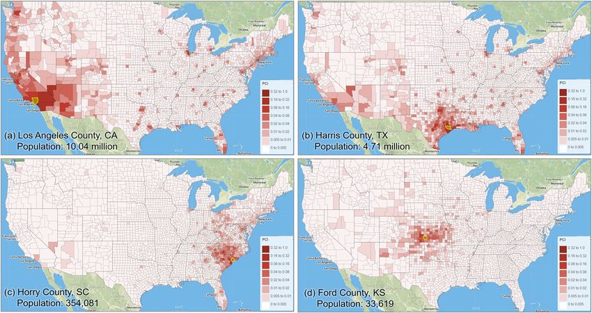
www.nature.com/scientificreports/
and evolving rapidly in modern s ociety15–17. As argued by many, technological advances in the past decades
have greatly facilitated connectivity by weakening geographic l imits18. To capture the temporal nature of spatial
interactions, researchers have emphasized the importance of transportation data that detail people’s moving pat-
terns. Place connectivity has been measured using various transportation means that include airline flows19, 20,
highway traffic21, railway fl ows22, 23, and intercity bus n
etworks24. The rich traffic information and the derived
spatial networks greatly facilitate our understanding of how places are connected via these transportation modes.
However, transportation-based approaches pose new challenges. First, such data are generally difficult to obtain,
as they are often confidential or collected by private companies. Second, the data themselves are mode-specific,
lacking the holistic views of the overall human spatial interactions and place connectivity, which are often
needed in fields such as infectious disease modeling. A notable effort to tackle the latter issue is by Lin et al.23,
who constructed a combined inter-city connectivity measurement based on multiple data sources for nine cit-
ies in China and demonstrated its advantage over the index derived from a single data source. This study offers
valuable insights in understanding how cities are connected using a holistic approach. Due to data availability
issues, however, it is challenging to construct such a combined index that are spatiotemporal-continuous for a
large area (e.g., a country or the entire world) at various geographic settings and scales (e.g., urban, suburb, or
rural; county, state/province, or country).
The emerging concepts of “Web 2.0”25 and “Citizen as Sensors”26, largely benefiting from the advent of geo-
positioning technologies, offer a new avenue to actively and passively gather and collect the digital traces left by
electronic device holders27, 28. For example, passive trace collection involves data obtained from mobile phone
data29, 30, smart cards31, 32, or wireless networks33. The spatial interactions documented from these passively col-
lected traces tend to have high representativeness, given their high data penetration ratios. However, privacy
and confidentiality concerns have been raised for such approaches, as individuals do not intend to actively share
their locational information and are unaware of the usage of the generated positions34, 35.
An approach less encumbered with privacy issues is based on spatial information from social media, a digital
platform aiming to facilitate information sharing that has been popularized in recent years. Owing to their active
sharing characteristics, social media data are less abundant compared to passively collected GPS positions from
mobile devices but are less i ntrusive36, 37, more a ccessible38, and more h armonized39. The huge volume of user-
generated content covering extensive areas facilitates the timely need for summarizing human spatial interac-
tions. Twitter, for example, has quickly become the largest social media data source for geospatial research and
has been widely used in human mobility s tudies40–44, given its free application programming interface (API)
that allows unrestricted access to about 1% of the total t weets45. We believe that the enormous sensing network
constituted by millions of Twitter users worldwide provides unprecedented data to measure place connectivity
at various spatiotemporal scales.
As an essential component in human interaction, social connections that involve online searching, friend-
ships, account following, news mentioning, and information reposting can also contribute to place connectivity
measurement. For example, the co-occurrences of toponyms on massive web documents, news articles, or social
media were extracted to measure city relatedness and c onnectivity46–48. A recent effort from Facebook explores
connectivity measurement among places (called Social Connectedness Index, SCI) utilizing the social networks
constructed from massive friendship links on Facebook49. However, whether or how the place connectivity meas-
ured by social connections differs from the one measured by physical connections is worth further investigation.
In view of the existing studies, gaps still exist in (1) the effort to construct a global place connectivity meas-
urement that is harmonized, multi-scale, spatiotemporal-continuous based on the physical movement of social
media users, (2) examining the utility of the derived place connectivity from a very large area and/or longer
time period in solving some real-world problems, and (3) applications to visualize place connectivity at various
geographic levels with downloadable and ready-to-use connectivity matrices to support a wider community
research needs. Taking advantage of big social media data and the advancement of high-performance comput-
ing, we introduce a place connectivity index (PCI) and an array of PCI datastets based on people’s movement
among places captured from big Twitter data. Specifically, in this study, we computed global PCI from billions of
geotagged tweets aggregated at different geographic levels to reveal place connectivity at multipe scales, including
world country (inter-country connectivity), world first-level subdivision (inter-state/province, and intra-country
connectivity), US metropolitan area (inter-unban area connectivity), US county (inter-city/county connectivity),
and US census tract (intra-city connectivity). We compared population movement derived from Twitter data
with the S afeGraph50 movement data in the US to evaluate how well geotagged tweets captured population move-
ment. We compared PCI with Facebook’s SCI, a popular connectivity index based on social networks, to reveal
the association between spatial interactions and social interactions. We also investigated the spatial properties
of PCI including distane decay and boundary effect.
The utility of PCI is exemplified in two applications: (1) modeling the spatial spread of COVID-19 during the
early stage of the pandemic and (2) modeling hurricane evacuation destination choice. The results demonstrate
the great potential of PCI in addressing real-world problems requiring place connectivity knowledge. Finally,
we constructed massive PCI matrices and launched an interactive portal for users to visualize the strength of
connectivity among geographic regions at various scales. The derived global PCI matrices at various geographic
scales are open-sourced to support research needs. Serving as a harmonized and understandable connectivity
metric, the multi-scale PCI data with the ability to “zoom in” and “zoom out” are expected to benefit varied
domains demanding place connectivity knowledge, such as disease transmission modeling, transportation plan-
ning, evacuation simulation, and tourist prediction.
Place connectivity index. A Place Connectivity Index (PCI) between two places is defined as the normal-
ized number of shared persons (unique Twitter users) between the two places during a specified time period
Scientific Reports | (2021) 11:14694 | https://doi.org/10.1038/s41598-021-94300-7 2
Vol:.(1234567890)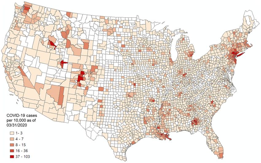
www.nature.com/scientificreports/
Figure 1. Illustration of place connectivity index based on shared social media users.
(e.g., 1 year; Fig. 1). For example, if a user is observed at both places during the time period, the user is consid-
ered a shared user between the two places. PCI can be computed at various geographic scales. For example, a
place can be a county, state, or country. PCI does not aim to capture the real-time population movement between
places (though it is derived from such movement); rather, it provides a relatively stable measurement of how
strong two places are connected by spatial interactions. The strength of the connection between two places can
be determined by many factors, such as geographic distance (the first law of geography; Miller, 2004), transpor-
tation, administrative/regional limits (e.g., states), physical barriers (e.g., rivers and mountains), social networks,
demographic and socioeconomic similarities or differences. The shared users among places derived from Twitter
data can be considered as an observable outcome of the combined force of these factors, and thus is modeless,
with the understanding of Twitter data limitations (e.g., population bias). In this sense, PCI should be calculated
in a relatively long time period (e.g., a year) to gather sufficient information to summarize the general patterns.
Following the general geometric average and normalization s trategy23, 46, 49, the PCI between place i and place
j (denoted as PCIij) is computed by Eq. (1).
Sij
PCIij = i, j ∈ [1, n] (1)
Si Sj
where Si is the number of observed persons (unique social media users) in place i within time period T; Sj is the
number of observed persons in place j within time period T; Sij is the number of shared persons between places
i and j within time period T; and n is the number of places in the study area.
Places with a larger population size tend to have more social media users, and thus tend to have more shared
users among them. The denominator in Eq. (1) is used to normalize the metric based on the relative populations
in the two places. PCI ranges from 0 to 1. When no shared user is observed between two places, PCI equals 0.
If all users in place i visit place j (vice versa) and the two places have the same number of users (or when i = j),
PCI equals 1. PCI provides a relative measurement of how strong places are connected through human spatial
interactions when assuming all places have the same population (social media users). This allows us to compare
PCI among different places to reveal potential spatial, population, and socioeconomic structures. The PCI derived
from Eq. (1) is non-directional. The discussion for a directional PCI capturing the asymmetrical connection
forces between two places can be found in Appendix A.
Results
Global PCI datasets at various geographic levels. The computation of PCI is data- and computing-
intensive as it involves billions of geotagged tweets and millions of place pairs at various geographic levels. To
address this challenge, the computation was performed in a high-performance computing environment42. The
steps for computing the 2019 US county level PCI are detailed in Appendix C. With Eq. (1), PCI was computed
for the following five geographic levels in this study: (1) worldwide country level for 2019, (2) worldwide first-
level subdivision for 2019, (3) US metropolitan area for 2018 and 2019, (4) US county level for 2018 and 2019,
and (5) US census tract level for the New York City and Las Angeles County for 2018 and 2019. An interactive
web portal was developed to visualize a place’s connectivity (PCI) to other places at various geographic levels
(Fig. 2, http://gis.cas.sc.edu/GeoAnalytics/pci.html). The following sections report our findings of the PCI prop-
erties and potential utility exemplified with the US county level PCI and the world first-level subdivision PCI.
Comparing with SafeGraph population movement. One of the key concerns of using social media
data (e.g., Twitter) for human mobility studies is its low population penetration rate. For example, only 24% of US
adults use Twitter (Pew Research Center, 2019), and the public Twitter API only returns about 1% of the whole
Twitter streams. A more detailed descriptive statistics of the collected 2019 worldwide geotagged tweets can be
found in Appendix B. Also, Twitter data show bias in its representativeness of population groups. This issue has
been examined in a few s tudies51–53. In light of these issues, it is important to evaluate how well geotagged tweets
capture population movements (at the county level in this analysis) since PCI is computed from such movement.
For this purpose, we compared the US county-level population movement derived from Twitter to the move-
ment derived from SafeGraph (https://www.safegraph.com), a data company that aggregates anonymized loca-
tion data from various sources. According to S afeGraph54, the data are aggregated from about 10% of mobile
devices (e.g., cellphones) in the US, and the sampling correlates highly with the actual US Census populations,
Scientific Reports | (2021) 11:14694 | https://doi.org/10.1038/s41598-021-94300-7 3
Vol.:(0123456789)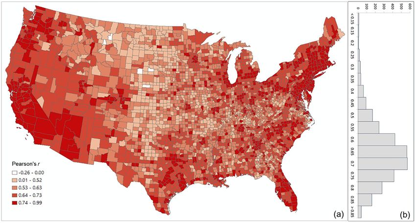
www.nature.com/scientificreports/
Figure 2. Demonstration of PCI at four geographic levels computed with the 2019 global geotagged tweets
zoomed in from world country level to US census tract level. (a) World country level PCI for Japan showing the
inter-country connectivity; (b) World first-level subdivision PCI for Ile-de-France (surrounding Paris), France
showing the inter-country and intra-country connectivity at the state or province level; (c) US county level
PCI for Cook County (Chicago) showing the inter-county/city connectivity; and (d) US census tract level PCI
for Central Park, New York City showing the intra-city connectivity. The PCI maps were generated by the web
portal developed by the authors using Leaflet (version 1.7). The base map is from OpenStreetMap contributors,
licensed under the Open Data Commons Open Database License (ODbL) by the OpenStreetMap Foundation
(OSMF). https://www.openstreetmap.org/copyright.
with a Pearson correlation coefficient r of 0.97 at the county level. Specifically, the data we used in this study are
the publicly available SafeGraph’s Social Distancing Metrics (SDM)50, a census block group level daily mobility
data product going back to January 1, 2019 covering the entire US. Since these data only provide aggregated
mobility information, deriving the shared users among counties is not possible. Alternatively, we computed the
total number of person-day movements between all contiguous US county pairs in 2019 using the SDM (see
Appendix D). To make it comparable, we also computed the total number of person-day movements between
all US county pairs in 2019 using Twitter data (see Appendix E). We then compared, using Pearson’s r, the two
person-day movement datasets by county.
The overall Pearson’s r for all county pairs (n = 1,516,210) between log Twitter person-day movements and
log SafeGraph person-day movements is 0.71. The rationale for using log transformation (with base 10) is to
address the highly skewed distribution of movements among counties (see Appendix F). To reveal the spatial
variations of the relationship for different areas, we further evaluated the association between the two movement
datasets for the county pairs from each county to other counties. The spatial distribution of r illustrates lower
values generally clustering in less populated areas, such as the Great Plains portion of the US (Fig. 3a). This is
as expected, as Twitter data generally suffer in less populated areas due to insufficient tweets collected using the
public free API. The histogram (Fig. 3b) indicates the most repeated r ranges between 0.65 and 0.75.
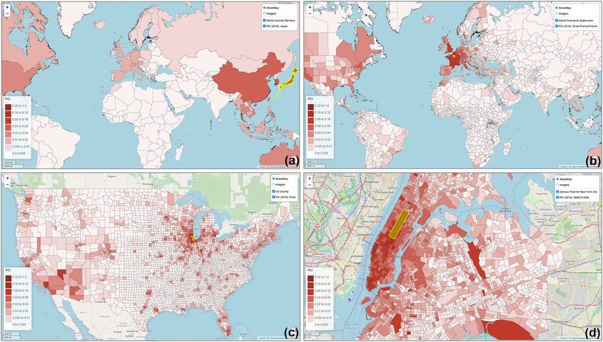
To further examine the associations between the two movement datasets and the impact of county population
size on the associations, we selected four counties with different geographical contexts and populations ranging
from 3300 to 10,000,000 and plotted the Twitter-derived person day movements and SafeGraph-derived person
day movements in 2019 for each county. The scatter plots (Fig. 4) reveal a quasi-linear positive pattern for all
four counties. Consistent with Fig. 3, the r value decreases as population decreases for the four counties of Los
Angeles County, CA (0.88), Harris County, TX (0.87), Horry County, SC (0.82), and Ford County, KS (0.57).
Notably, we observed only a slight drop in r (from 0.88 to 0.82) for Horry County with a relatively small popula-
tion of 354,081. The findings indicate that geotagged Twitter-derived movement has a strong linear association
with SafeGraph-derived population movement and reinforce that geotagged tweets can well capture population
movements among places (counties in this analysis).
Scientific Reports | (2021) 11:14694 | https://doi.org/10.1038/s41598-021-94300-7 4
Vol:.(1234567890)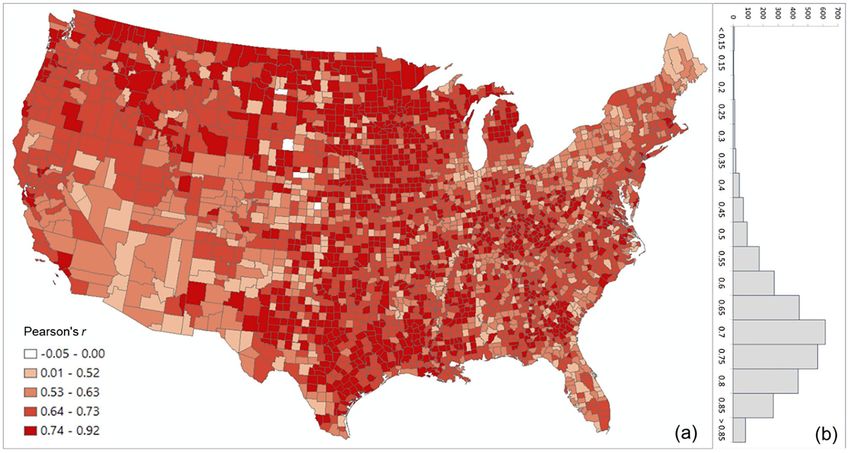
www.nature.com/scientificreports/
Figure 3. Distribution of the Pearson’s r between the log Twitter person-day movements and log SafeGraph
person-day movements for all counties (a) Spatial distribution; (b) histogram. The map was generated using
ArcMap version 10.7.1.
Comparing PCI with Facebook SCI. We contrasted the PCI for each of the US counties with the Face-
book Social Connectedness Index (SCI) d ata49. This comparison allows us to evaluate the hypothesis that places
connected through (social media) friendship links are likely to have more physical interactions (e.g., population
movement). This hypothesis has already been suggested in recent studies55 but not corroborated using SCI data.
Thus, demonstrating this connection is relevant for many reasons, such as understanding spatial behavior under
normal circumstances (e.g., business or commercial relationships, tourism, and migrations) or during extraor-
dinary events such as a pandemic (e.g., the spread of infectious diseases) or a natural hazard (e.g., evacuation
corridors).
As a measure of social connectedness based on friendship links on Facebook, SCI revealed that the majority
of these links are found within 100 miles, showing an intense distance decay e ffect49. The hypothesis of a posi-
tive association between social and spatial connections makes intuitive sense and helps understand population
dynamics at different scales. To evaluate this, we first analyzed the correlation between PCI and SCI using all
county pairs that had both PCI and SCI values (n = 1,702,531). Log transformation was used to address the highly
skewed distribution of the PCI and SCI values among counties. Note that PCI values were multiplied by 1000
before taking the log to avoid negative values. The overall r of 0.62 indicates a strong positive linear association
between social and spatial connections.
Figure 5 shows the scatter plots of log PCI and log SCI in 2019 for the four counties used in the previous sec-
tion, further confirming the positive association of a measure of social connectedness with an index of spatial
connectivity. The scatter plots also reveal that the association between SCI and PCI is not always stronger in
more populated counties (e.g., r for Harris County is 0.66 while for the less populated Horry County, it is 0.75).
To further examine the variations of such association among counties, we computed the Pearson’s r between
PCI and SCI for each county to other counties. Figure 6 shows that strong correlations are generally clustered
in Midwest US, Texas, and Southeast Georgia (Fig. 6a) and the most repeated r ranges between 0.70 and 0.75
(Fig. 6b). The strong association between PCI and SCI confirms the hypothesis that regions connected through
(social media) friendship links are likely to have more physical interactions.
Another interesting observation from Fig. 5 is that the slope of the best-fit line is higher in more populated
counties (e.g., Los Angeles County) than in lowly populated areas (e.g., Ford County), which leads to another
hypothesis that the same amount of change in friendships (SCI) is associated with a larger change in people’s
movement (PCI) in more populated counties, and vice versa. To test this hypothesis, we conducted a linear regres-
sion analysis for each county using SCI as the independent variable and PCI as the dependent variable. The slope
for each county was then derived from the regression models. The county level slope map suggests that larger
slopes are in general observed in more populated urban areas (Fig. 7a). To quantify this, we further associated
the slope with the log county population, resulting in a strong positive relationship with r = 0.83 (Fig. 7b). This
result suggests the relationship is not only valid in the four counties but is also valid at the US county level in
general, confirming our hypothesis. One potential reason behind this pattern might be explained by the nature
of urban areas and their style of life, particularly in the US, where urban sprawl means that much of the daily
Scientific Reports | (2021) 11:14694 | https://doi.org/10.1038/s41598-021-94300-7 5
Vol.:(0123456789)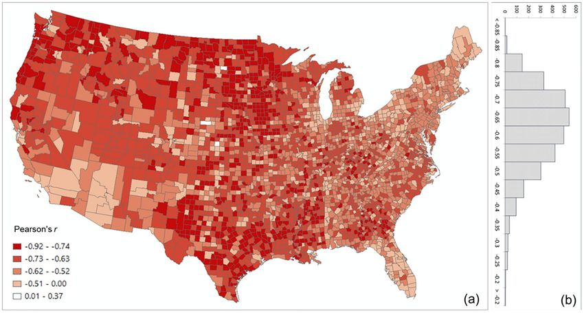
www.nature.com/scientificreports/

                                            Figure 4.  Scatter plots of log Twitter-derived person day movements and log SafeGraph-derived person day
                                            movements in 2019 for the four selected counties with varying populations. (a) Los Angeles County, California
                                            (CA), including Los Angeles metropolitan area. 2019 population: 10.04 million; (b) Harris County, Texas (TX),
                                            including Houston city. The most populous county in TX. 2019 population: 4.71 million; (c) Horry County,
                                            South Carolina (SC), including the popular beach destination Myrtle Beach. 2019 population: 354,081; and
                                            (d) Ford County, Kansas (KS), including the small Dodge City. 2019 population: 33,619. Population data were
                                            derived from the American Community Survey (ACS) 5-year Data (2015–2019).

                                            mobility in these areas is intercounty, and therefore reflected in PCI. In addition, the proximity to airports in the
                                            more populated areas allows for a much more rapid connectivity with the rest of the country.
                                               Our findings also suggest caution about the relationship between these two variables. Although PCI and
                                            SCI are positively associated, one cannot substitute one for the other, as they represent different phenomena:
                                            social versus spatial behavior. Although same amount of change in friendships (SCI) is associated with a larger
                                            change in people’s movement (PCI) in more populated counties, more studies are needed to better understand
                                            the driving forces (e.g., urban–rural, demographic, and socioeconomic factors) behind such associations. We
                                            believe PCI is an important addition, as it involves a new standardized measure of spatial connectivity based on
                                            population movement.

                                            Distance decay effect. Our analysis revealed that PCI expresses a clear distance decay effect. In other
                                            words, the spatial connectivity between two distant places is likely to be lower than that observed between two
                                            near counties. However, there are some nuances in this broad assertion. Figure 8 illustrates the association
                                            between log PCI and the log distance for each county to all other counties. The map (Fig. 8a) shows that less
                                            populated (rural) areas of the Midwest, Pacific Northwest, or Texas have a stronger negative association between
                                            PCI and distance, meaning that these communities are more tightly knit with surrounding areas than with

          Scientific Reports |   (2021) 11:14694 |               https://doi.org/10.1038/s41598-021-94300-7                                                    6

Vol:.(1234567890)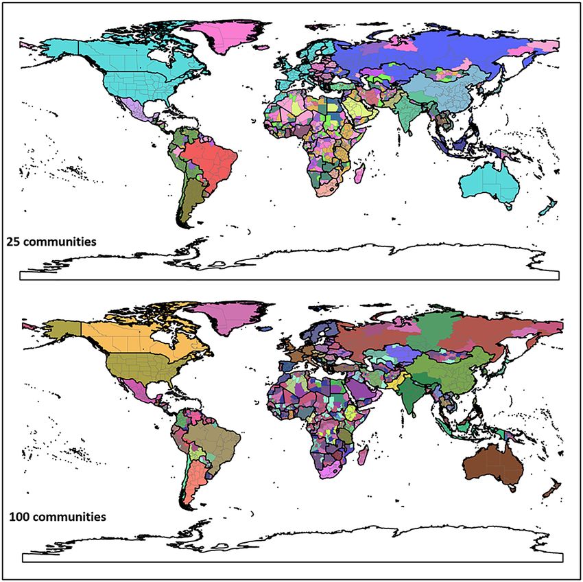
www.nature.com/scientificreports/

                                  Figure 5.  Scatter plots of log PCI and log PCI for the four counties.

                                  more distant communities (stronger distance decay effect). This phenomenon is also reflected in Fig. 9, where
                                  R2 values of the power-law function decrease dramatically from lowly populated Ford County (0.494) to Harris
                                  County (0.154) to highly populated Los Angeles County (0.065). Pearson’s r was not used as the scatter plot, as
                                  the relationship is nonlinear. It should be noted that population size is likely a compounding factor that goes
                                  along with urban centers (e.g., metropolis) with large airports.
                                     The maps in Fig. 10 depict how the selected four counties are connected to other counties based on the PCI,
                                  which agrees with the above observations. On the other hand, Fig. 10 also shows that highly populated and
                                  touristy urban areas (well connected through airports), such as New York City, Miami, Orlando, Chicago, or
                                  Las Vegas, act as poles of attraction for people from distant locations. This is clear in Fig. 10a, where we can see
                                  how Los Angeles County, for instance, is more closely linked through spatial interactions with the New York
                                  City metropolitan area than with some California or Nevada counties. This behavior is also easily detected in
                                  Fig. 9 through the outliers of the point distributions in Los Angeles County.

                                  Boundary effect. Inspired by Bailey et al.49, we also considered the effect of administrative borders shap-
                                  ing spatial connectivity. A higher PCI between a county pair indicates a strong relationship geographically. In
                                  a general sense, people tend to travel to their adjacent counties more frequently than non-adjacent counties.
                                  However, do the residents near the state border prefer the in-state counties as their destinations rather than the
                                  adjacent county across the state border? Or are the out-of-state counties more attractive? If state borders have a
                                  role in explaining spatial connectivity, people will tend to travel more within their home states than in neighbor-
                                  ing states, even when the distance is fixed.
                                      To evaluate the state boundary effect for each of the four counties, we first ran a linear regression with the
                                  following variables: the distance between the county and all other counties in the contiguous US (distance), a

Scientific Reports |   (2021) 11:14694 |               https://doi.org/10.1038/s41598-021-94300-7                                                   7

                                                                                                                                               Vol.:(0123456789)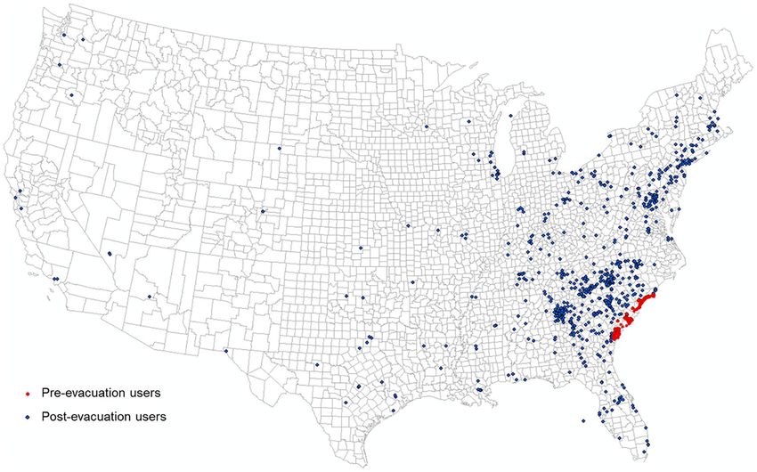
www.nature.com/scientificreports/

                                            Figure 6.  Distribution of the Pearson’s r between log PCI and log Facebook SCI for all counties (a) Spatial
                                            distribution; (b) histogram. The map was generated using ArcMap version 10.7.1.

                                            Figure 7.  Examination of the hypothesis that same amount of change in friendships (SCI) is associated with a
                                            larger change in people’s movement (PCI) in more populated counties: (a) Distribution of the regression slope
                                            between log PCI and log Facebook SCI. (b) Correlation between regression slope and log county population for
                                            all counties. Population data were derived from ACS 5-year Data (2015–2019). The map was generated using
                                            ArcMap version 10.7.1.

                                            categorical variable (same_state), and PCI (as the dependent variable). The result indicates that the same_state
                                            variable shows a strong positive effect (p < 0.001) on PCI even after controlling for distance (Table 1). This implies
                                            that these four counties are more tightly (spatially) connected with other counties within the same state, even
                                            when compared to nearby counties in other states.
                                                To test whether existing state borders are similar to the borders formed when we grouped together the US
                                            counties into communities (clusters) based on their spatial connectivity (i.e., PCI), we used a hierarchical agglom-
                                            erative linkage clustering method to create such homogenic spatial connectivity communities and compare
                                            them with the state administrative division of the US. Hierarchical agglomerative clustering groups county pairs
                                            based on their distance in feature space. In our experiment, the “distance” is defined as the inverse of PCI, which
                                            means a low PCI in a county pair has a long distance, and vice versa. In the beginning, every county is viewed
                                            as a separate community, and the two closest communities are combined into a new community. Distances of
                                            combined communities will be updated by the average of distances between county pairs of community pairs.

          Scientific Reports |   (2021) 11:14694 |               https://doi.org/10.1038/s41598-021-94300-7                                                     8

Vol:.(1234567890)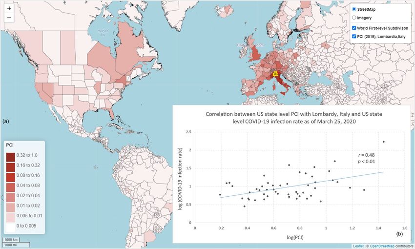
www.nature.com/scientificreports/
Figure 8. Distribution of the Pearson’s r between log PCI and log distance for all counties (a) Spatial
distribution, (b) histogram. The map was generated using ArcMap version 10.7.1.
The clustering stops when all counties are combined into a target number of communities. We chose 75, 48, and
20 clusters as the targeted number of communities.
As shown in Fig. 11, most resulting distinct communities in the three maps are spatially contiguous, revealing
the strong spatial connectivity of neighboring counties, an obvious consequence of spatial proximity. However,
the resemblance of these three maps with state boundaries is quite remarkable across many areas, supporting
the assertion that state boundaries do play a decisive role in shaping the spatial behavior of the population. For
example, we can see how several clusters in the southwest US are essentially the state boundaries. Also, many
other smaller clusters also respect the actual state boundaries. This pattern holds in the three maps with different
cluster sizes. When clustering to a relatively small number of communities (i.e., the 20-community map), spatial
proximity still plays a role. Some adjacent states are merged into large contiguous regions. For example, Fig. 11
shows that there is a large cluster in the middle US. When clustering to a relatively large number of communities
(i.e., the 75-community map), some connected large regions split into states such as California and Nevada. It
is worth noting that PCI may be skewed due to low Twitter user numbers. For example, PCIs of less populated
counties may be higher if a few active Twitter users happen to live there. This might, to some extent, explain
the large number of spatially disconnected counties merged into the same cluster in the north-central US. We
believe that further geographic and socioeconomic studies are needed to better explain the connectivity of the
clustering results. For example, the Rocky Mountains hinder the travel from the central US to the west, and the
modern ground transportation systems in the Great Plains may facilitate travels in the central US, so that the
states in the middle US have more connectivity (see the 20-community map). There may be other causal factors
that determine individuals’ travel associations, such as families, political/religious, agricultural community and
state allegiance, and some may be more or less important in different regions of the country. Identifying drivers
of social behaviors in such a large region is beyond the research scope of this paper.
Figure 12 shows the hierarchical agglomerative clustering of 2019 PCI for the worldwide first-level subdivi-
sions with two different numbers (25 and 100) of targeted communities (the clustering results for 50 and 200
targeted communities can be found in Appendix G). The country boundaries could be clearly observed in both
maps. The results also reveal that the groupings with the 25 communities are consistent with what many people
perceive as connected regions (e.g., US with Canada and Europe). However, once into the 100 level, the divi-
sions between east and west start to emerge. Another interesting finding is how unconnected the regions in
Africa are, though the country boundary effect is still observable. However, it should be cautious that whether
such disconnection resulted from the sparsity of Twitter data in Africa countries (elaborated in the Discussion
section) needs further investigation.
In summary, the different regions identified in the US and the world using the agglomerative clustering not
only demonstrate the boundary effect of PCI, but also suggest that PCI can potentially be used as a tool in region-
alization analysis to reveal how places are connected and regions are formed at different geographic scales. In
addition, a strong state boundary effect was also observed in social connectivity with Facebook S CI49. These two
findings are likely related. Using PCI or SCI as a proxy for travel behavior is a first step at understanding causal
factors for travel or social connectivity. We do not know which one drives the other or if there are other variables
Scientific Reports | (2021) 11:14694 | https://doi.org/10.1038/s41598-021-94300-7 9
Vol.:(0123456789)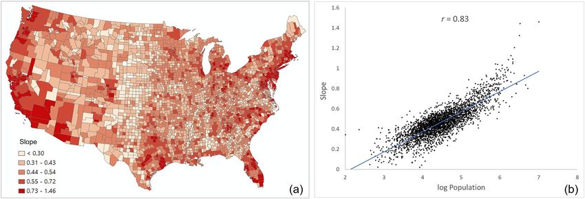
www.nature.com/scientificreports/
Figure 9. Scatter plots of PCI and distance for the four counties.
conditioning this behavior (e.g., socio-spatial factors based on institutional or administrative circumstances).
Further studies are needed to better understand the boundary effect of PCI and its connections with SCI.
Applications. PCI can potentially be applied in various fields that can benefit from a better understanding
of human movement at varying spatial scales, such as infectious disease spread, transportation, tourism, evacu-
ation, and economics. Two examples are provided to exemplify how PCI can be used to analyze and predict
infectious disease spreading and hurricane evacuation destination choice.
Spatial spread of COVID‑19 during the early stage. Westchester County was an early (March
2020) hotspot of COVID-19 in the US57. Early confirmed cases and a high infection rate to family and friends
increased social tension that residents from Westchester and surrounding areas were reportedly fleeing a way58.
On the global scale, Lombardy, Italy was an epicenter of the COVID-19, with the first cluster of cases detected
on February 21, 202059. The travel restrictions between the US and Europe were not in place until March 12,
202060. In this application example, we explored the relationship between the spread of COVID-19 and PCIs of
the two epicenters at the US county level on a regional scale (Westchester County, NY) as well as the state level
on a global scale (Lombardy, Italy).
Given that the incubation period of COVID-19 is about 2 to 3 weeks61, the number of cases confirmed before
the end of March was used in the later calculation to capture the spread of COVID-19 in early and mid-March
for the US county level analysis. Figure 13 shows the county-level infection rate (number of confirmed cases per
10,000 people) as of March 31, 2020. The number of confirmed cases is based on the New York T imes62 database,
and the total county population is based on the ACS 5-year e stimation63. Dark red spots show the hotspots of
COVID-19 confirmed cases. Westchester County and surrounding New York City areas were the main hotspots
at the end of March.
Scientific Reports | (2021) 11:14694 | https://doi.org/10.1038/s41598-021-94300-7 10
Vol:.(1234567890)www.nature.com/scientificreports/
Figure 10. The selected four counties (highlighted with yellow boundaries in the maps) and their PCIs with
other counties in the contiguous US. Population data were derived from ACS 5-year Data (2015–2019). The PCI
maps were generated by the web portal developed by the authors using Leaflet (version 1.7). The base map is
from OpenStreetMap contributors, licensed under the Open Data Commons Open Database License (ODbL)
by the OpenStreetMap Foundation (OSMF). https://www.openstreetmap.org/copyright.
Los Angeles County Harris County Horry County Ford County
Coefficient SE Coefficient SE Coefficient SE Coefficient S.E
Intercept 0.0059*** 0.0008 − 0.0075*** 0.0007 0.0078*** 0.0003 − 0.0073*** 0.0003
Same state 0.0495*** 0.0017 0.0170*** 0.0010 0.0273*** 0.0010 0.0170*** 0.0006
Distance − 8.3E−07 − 4.5E−07 − 3.6E−06*** 6.9E−07 − 4.5E−06*** 2.5E−07 − 4.9E−06*** 3.7E−07
Adjusted R2 0.24 0.16 0.33 0.45
Observations 3008 2932 2446 1788
Table 1. Regression results for the four counties using the same_state as an independent variable and PCI
as the dependent variable, controlling for the distance between counties. *p < 0.1, **p < 0.05, ***p < 0.01. The
county centroid was used for the distance calculation between two counties (distance unit: mile).
Figure 11. Results of the hierarchical agglomerative clustering of PCI with 70, 48, and 20 targeted numbers of
communities for the contiguous US. Each unique color depicts a community. Counties of less than five Twitter
users in our dataset are ignored (white areas). The maps were generated using GeoPandas version 0.90.0 with
Python (https://geopandas.org/).
To explore whether outbreaks of COVID-19 in the US are related to people who fled away from New York
Scientific Reports | (2021) 11:14694 | https://doi.org/10.1038/s41598-021-94300-7 11
Vol.:(0123456789)www.nature.com/scientificreports/
Figure 12. Results of the hierarchical agglomerative clustering of PCI with 25 and 100 targeted numbers of
communities for the worldwide country first-level subdivisions. Each color depicts a community. Boundary data
ADM56. The maps were generated using GeoPandas version 0.90.0 with Python (https://
was retrieved from G
geopandas.org/).
City in early March64, we used a linear regression model to examine the relationship between COVID-19 infec-
tion rate (as a dependent variable) and the connectivity between a given county and Westchester County using
four measurements, including PCI computed with 2018 and 2019 Twitter data, respectively, Facebook SCI as
of August 2020, and 2020 SafeGraph movement data (the person-day movements computed with the method
in Appendix D using data from January to March, 2020). Note that PCI was scaled by 1000 in the regression
models to ease the result presentation. Table 2 shows the results of the four linear regression models. For all four
measurements, positive relationships are significant at the 0.01 level. Among these four measurements, PCI for
both 2018 and 2019 showed the highest adjusted R2 of 0.24 for both years. In other words, 24% of the variance of
COVID-19 infection rate in each observed county can be explained by PCI alone. SafeGraph movement results
in an adjusted R2 of 0.13. Facebook-based SCI shows the lowest adjusted R2 of 0.08, though the coefficient is still
significant (p < 0.01).
Regression models controlling for the effect of geographic distance were also conducted with the four human
mobility measurements. Results show that all four measurements still show significant positive correlations with
the COVID-19 infection rate (p < 0.01; Table 3). The adjusted R2 for SafeGraph-derived movement and Facebook
SCI remain unchanged, and the coefficient of the distance variable is not significant (p > 0.1). The adjusted R2
for both 2018 and 2019 PCIs only slightly increased by 0.01, from 0.24 to 0.25. While the distance variable is
significant in these two models, its impact on the infectious rate is relatively weak given the small coefficient
values (β = 0.00087 for 2019 PCI and β = 0.00091 for 2018 PCI). We remark that PCI calculated with historical
Scientific Reports | (2021) 11:14694 | https://doi.org/10.1038/s41598-021-94300-7 12
Vol:.(1234567890)www.nature.com/scientificreports/
Figure 13. US county level COVID-19 cases per 10,000 people as of March 31, 2020. COVID-19 case data were
downloaded from NYT G ithub62. The county population was retrieved from the ACS 5-year estimates (2014–
2018). The map was generated using ArcMap version 10.7.1.
SafeGraph (2020)
2019 PCI 2018 PCI Facebook (2020) SCI Person-day movement
Coefficients SE Coefficients SE Coefficients SE Coefficients SE
Intercept 1.63496*** 0.11603 1.60351*** 0.12215 2.26827*** 0.12262 2.47287*** 0.13615
PCI/SCI/SafeGraph 0.22505*** 0.00931 0.21112*** 0.00901 0.00013*** 0.00001 0.00040*** 0.00003
Adjusted R2 0.24 0.24 0.08 0.13
Observations 1847 1755 1847 1497
Table 2. Regression result using COVID-19 infection rate as the dependent variable, and PCI, SCI, or
SafeGraph as the predictor variable. *p < 0.1, **p < 0.05, ***p < 0.01.
SafeGraph (2020)
2019 PCI 2018 PCI Facebook (2020) SCI Person-day movement
Coefficients SE Coefficients SE Coefficients SE Coefficients SE
Intercept 0.73883*** 0.22272 0.67638*** 0.23186 2.19947*** 0.23329 2.43267*** 0.24346
PCI/SCI/SafeGraph 0.23706*** 0.00960 0.22307*** 0.00931 0.00013*** 0.00001 0.00040*** 0.00003
Distance 0.00087*** 0.00019 0.00091*** 0.00019 0.00007 0.00020 0.00004 0.00022
Adjusted R2 0.25 0.25 0.08 0.13
Observations 1847 1755 1847 1497
Table 3. Regression result using COVID-19 infection rate as the dependent variable, and PCI, SCI, or
SafeGraph as the predictor variable controlling for distance. *p < 0.1, **p < 0.05, ***p < 0.01.
Twitter data of either 2018 or 2019 exhibits similar performance in the two models, suggesting the stability of
place connectivity measured by PCI.
In the global scale analysis, we examined the association between the 2019 US state level PCI with Lombardy,
Italy and US state level COVID-19 infection rate (number of cases per 100,000 people) as of March 25, 2020,
2 weeks after the US placed travel restrictions with Europe. The state level PCI indicates the connectivity strength
between each of the 50 US states and Lombardy, Italy (Fig. 14a). As shown in Fig. 14b, PCI with Lombardy
Scientific Reports | (2021) 11:14694 | https://doi.org/10.1038/s41598-021-94300-7 13
Vol.:(0123456789)www.nature.com/scientificreports/
Figure 14. Global scale analysis of PCI and COVID-19 infection rate. (a) Map showing the 2019 world first-
level subdivision PCI between Lombardy, Italy and US states (and other parts of the world); (b) Correlation
between the log US state level PCI with Lombardy, Italy and log US state level COVID-19 infection rate
(number of cases per 100,000 people) as of March 25, 2020. COVID-19 case data were downloaded from
NYT Github62. The state population was retrieved from the ACS 5-year estimates (2014–2018). World first-
level subdivision boundary data was retrieved from GADM56. The PCI maps were generated by the web
portal developed by the authors using Leaflet (version 1.7). The base map is from OpenStreetMap contributors,
licensed under the Open Data Commons Open Database License (ODbL) by the OpenStreetMap Foundation
(OSMF). https://www.openstreetmap.org/copyright.
exhibited a strong positive association with the US state level COVID-19 infection rate at the early stage of the
pandemic (r = 0.48, n = 50, p < 0.01).
Findings in this application suggest that the multi-scale PCI, computed from historical Twitter data, is a
promising indicator in predicting the spatial spread of COVID-19 during the early stage, outperforming more
current Facebook SCI (data as of August 2020) and SafeGraph-derived person-day movement data (from January
1 to March 31, 2020) at the US county level.
Hurricane evacuation destination choices. Evacuation of coastal residents has been an effective and
urricane65. Understanding where coastal residents are evacu-
important protective action before the arrival of a h
ating helps in evacuation route planning and resource a llocations66. Residents of a county are likely to evacu-
ate to a county where they have established relationships (friends, colleagues, familiar lodging stays, etc.). The
preexisting relationships would be expressed by the PCI or SCI. In this section, we examined the association
between PCI (computed using the 2019 Twitter data) and people’s evacuation destination choice using Hur-
ricane Matthew in 2016 as a case study. We hypothesize that people are more likely to evacuate to a county that
has a high PCI with the evacuation county (the county being evacuated). For comparison, we also tested the
hypothesis that people are more likely to evacuate to a county that has a high SCI with the evacuation county.
Hurricane Matthew was a Category 5 hurricane that visited the east coast of the US at Category 1 in early
October 2016. Evacuation orders for coastal counties under potential impact were placed by the governors of
Georgia, South Carolina, and North Carolina on October 4, 2016. Twitter users were selected as individual evacu-
ees for testing our hypothesis. The evacuation identification procedure followed the study area and evacuation
timeline determined by Martin et al.67 and Jiang et al.37. In this study, we identified 272 evacuated individual
Twitter users from Chatham County, GA, and 241 evacuated users from Charleston County, SC. All selected
users had evacuated more than 50 miles away from their original coastal counties, and all of their destinations
were not in the potential impact zone. The 272 evacuated individuals leaving Chatham County ended up in 120
destination counties, and the 241 Charleston County evacuees ended up in 118 destination counties (Fig. 15).
To test our hypotheses and the potential of PCI in predicting evacuation destination choice, we used lin-
ear regression to model the relationship between the number of evacuated users in the destination counties
Scientific Reports | (2021) 11:14694 | https://doi.org/10.1038/s41598-021-94300-7 14
Vol:.(1234567890)www.nature.com/scientificreports/
Figure 15. Hurricane Matthew evacuation estimation using geotagged Tweets. Red dots indicate user locations
during the pre-evacuation period (October 2–4, 2016). Blue dots show user locations during the post-
evacuation period (October 7–9, 2016). The map was generated using ArcMap version 10.7.1.
Charleston County PCI Charleston County SCI Chatham County PCI Chatham County SCI
Coefficients SE Coefficients SE Coefficients SE Coefficients SE
Intercept 0.28676 0.23274 1.63200*** 0.32877 − 1.66645** 0.63781 2.57697*** 0.69610
PCI/SCI 0.09611*** 0.00606 0.00003*** 0.00000 0.19071*** 0.01927 0.00001 0.00001
Distance 0.00019 0.00030 − 0.00047 0.00047 0.00115 0.00083 − 0.00155 0.00112
Adjusted R2 0.71 0.29 0.47 0.04
Observations 118 118 120 120
Table 4. Regression results for the number of evacuated users in the destination counties (dependent variable)
and PCI (or SCI) of the county pairs between evacuation county and each of the destination counties. *p < 0.1,
**p < 0.05, ***p < 0.01.
(dependent variable) and PCI of the county pairs between Charleston County (origin) and each of the destina-
tion counties (n = 118). Note that PCI was scaled by 1000 in the regression models to ease the result presenta-
tion. Distance between the evacuation county and each of the destination counties were used in the regression
model as controls. SCI was tested by replacing PCI in the regression model for comparison. The same model
configuration was used for Chatham County (n = 120). Table 4 shows the regression results for the four models.
For both counties, PCI shows a significant positive association with evacuee counts (p < 0.01). SCI shows a
significant positive association with evacuee counts for Charleston County (p < 0.01), but the coefficient is not
significant for Chatham County (p > 0.1). The distance variable is not significant for all four models (p > 0.1). The
PCI model for Charleston County has an adjusted R2 of 0.71, indicating 71% variance can be explained by PCI.
However, the adjusted R2 value for SCI has a much lower value of 0.29. For Chatham County, the PCI model has
an adjusted R2 of 0.47, while the adjusted R2 value for the SCI model is only 0.04. This application demonstrates
the potential of using PCI as a factor in modeling hurricane evacuation destination choice. The comparison of
PCI and SCI shows that PCI outperforms SCI in this application scenario.
Discussions
The evidence of spatial inter-dependency is increasingly apparent across scales, captured by the digital records
of growing human mobility and socioeconomic activities. Geotagged social media data record many space–time
social contexts where people perceive, act, and interact with each other, allowing researchers to quantify how
specific locations are mentioned and related in physical, virtual, and perceived worlds. As a popular social
networking platform, Twitter records a substantial portion of human communication and events at various
Scientific Reports | (2021) 11:14694 | https://doi.org/10.1038/s41598-021-94300-7 15
Vol.:(0123456789)www.nature.com/scientificreports/
space–time scales. The geotagged tweets can reveal where people visit, with a much larger sample size than
conventional surveys38.
This research employs global geotagged Twitter data to delineate the spatial interactions between places by
developing PCI. The results show that geotagged tweets can be used to reveal global place connectivity at various
geographic levels. At the US county level, PCI has strong correlations with other data streams such as SafeGraph
and Facebook. Compared to the latter two data sources, Twitter data are more openly available overtime at the
individual level. The open-sourced global PCI datasets at various geographic levels can thus provide invalu-
able opportunities to explore human behavior and social phenomena. As demonstrated by the two application
examples, PCI can be used for research in infectious disease and hurricane evacuation that benefit from a better
understanding of human movement.
The world should be portrayed as networks instead of the mosaic of c ities68. As a classical and fundamen-
tal research topic, the interactions between locations convey the urban or regional spatial structure. The PCI
computed from billions of tweets offers promising opportunities to measure and compare intra- and inter-city
connections and flows. Also, PCI can be linked to other large geotagged data, such as Yelp and Transportation
Network Company data, to reveal a more completed picture of spatial structure dynamics. Combined with PCI,
the place hierarchy and spatial clusters can be revealed based on both virtual and physical interactions. As place
connectivity changes over time, the PCI can be updated on a yearly basis if Twitter continues to provide a free
API for geotagged tweet access. Researchers can also compute their own PCI of interested geographic scales and
time periods following the approach developed in this paper. Besides PCI, the person-day movement derived
from geotagged tweets is able to capture the frequencies a twitter user appeared in both places during a year,
which can subsequently be used to indicate the potential purpose of users’ spatial activities and further infer the
types of place connectivity.
Although the outcome of the behavior of PCI largely matches our expectations and with the results of other
big social data sources, using social media data to identify spatial interaction has the following limitations. We
caution that studies using the open-sourced PCI datasets should be aware of such limitations when interpreting
the results. First, research using social media has been criticized for being biased for representing specific popula-
tion groups. For example, young adults are more likely to use Twitter, compared to their older c ounterparts12, 51, 52.
Second, the correlation between PCI and other indicators from social networking platforms in the US is largely
relevant to the cultural and policy context. Hence, the results may not be readily generalized or used for pre-
diction in other areas. Further studies are needed to evaluate the PCI for geographic areas other than the US.
Third, episodic events, such as holidays and hurricanes, would largely attract/hinder users’ movement to specific
places. It might distort the connectivity if data is only collected for short periods, and thus affect the accuracy
and consistency of measurement results. This issue can be addressed by computing PCI over a relatively long
period (e.g., 1 year or longer) or filtering out the data during the affected time period. Lastly, geotagged tweets
are unevenly distributed across space and time, which also affects the reliability of such measurements. The data
sparsity issue is caused by a variety of factors such as population density, Internet accessibility, and governmental
policies on social media. More studies are needed to evaluate the performance of PCI at different geographic
areas and scales by associating and comparing it with other data sources and testing it with other applications;
and ideally, mitigating for the effects of the spatial variation in geotagged tweets.
Despite these limitations, to the best of our knowledge, Twitter data is the most accessible dataset offering the
opportunity to extract worldwide human movement at various spatiotemporal scales for a relatively long time
period. By open-sourcing the global PCI datasets at various geographic scales, we call for more efforts to tackle
these issues and further validate PCI following the suggested future studies and beyond.
Conclusions
The relationships among places are shaped by dynamic human movement, whose intensity further quantifies the
connectivity (strength of the linkages) among places. With the advances in technologies in the past decades, the
connectivity among places is ever-evolving dynamically, thus demanding spatiotemporal-continuous observa-
tions with harmonized approaches. Fortunately, the emergence of big social media data, benefiting from the
advent of geo-positioning techniques and the popularity of social media platforms, offers a new venue where
collecting human spatial interactions becomes less-privacy concerning, easily assessable, and harmonized.
In this study, we introduced a global multi-scale place connectivity index based on people’s spatial interactions
among places revealed from worldwide geotagged Twitter posts. Defined as the normalized number of Twitter
users who shared spatial interactions during a specified time period, the proposed PCI is a harmonized and
spatiotemporal-continuous place connectivity metric, expected to benefit various domains requiring knowledge
in human spatial interactions. The interactive web portal aims to facilitate place connectivity visualization and
provide downloadable connectivity matrices to support research needs.
To better understand the characteristics of PCI, we conducted a series of experiments using PCI and other
data sources. An overall Pearson’s r of 0.71 between the population movement derived from Twitter and Saf-
eGraph (10% penetration in the US population) reveals that geotagged tweets can well capture the population
movement at the US county level. The comparison between PCI and Facebook SCI (a popular connectivity
index based on social networks) with an overall r = 0.62 suggests a strong connection between spatial interac-
tions and social interactions, confirming the hypothesis that “regions connected through many friendship links
are likely to have more physical interactions between their residents”55. Like many connectivity measurements
that are bounded by the first law of geography, we found that PCI generally follows distance decay form tested
at the county level, while the distance decay effect is found weaker in more urbanized counties with a denser
population. This phenomenon can be explained by the existence of long-distance transportation facilitates (e.g.,
airports, railways, and bus stations) that, to some extent, express a hierarchical diffusion relationship rather than
Scientific Reports | (2021) 11:14694 | https://doi.org/10.1038/s41598-021-94300-7 16
Vol:.(1234567890)You can also read