Measuring Long-Term Displacement using Facebook Data
←
→
Page content transcription
If your browser does not render page correctly, please read the page content below
Measuring Long-Term Displacement using Facebook Data
             Eugenia Giraudy (Facebook), Paige Maas (Facebook), Shankar Iyer (Facebook), Zack
                          Almquist (Facebook), JW Schneider (Facebook), Alex Dow (Facebook)

INTRODUCTION
Every year, disasters caused by natural hazards displace millions of people from their homes. In 2018 alone
17.2 million new people were displaced by disasters globally, accounting for approximately 61% of all new
internally displaced people (IDPs).1 These people face similar challenges to those displaced by other causes
(e.g. conflict, violence, and human rights violations): they often lose their homes, assets, and income, they
are at a higher risk of physical attack, sexual assault, and abduction, and they are frequently deprived of
adequate shelter, food, and health services.2
To address these issues, humanitarian organizations need to be able to have accurate data on how many
people have been displaced and how that number varies over time. Furthermore, they need to be able to
identify important locations from and to which people have been displaced. However, humanitarian
organizations often lack accurate data to quantify the proportion of people who have been displaced, as
well as where these populations ended up after a crisis. As climate change increases the frequency and
severity of natural hazards, response organizations require improved data to better understand the
dynamics of disaster displacement.
In this paper, we present a novel approach for using aggregated and anonymized Facebook location data
to measure displacement patterns in the weeks and months after disasters. This methodology has been
developed through a collaboration between the Internal Displacement Monitoring Centre (IDMC) and
Facebook as part of the Disaster Maps initiative.3 The displacement maps described here leverage Facebook
location-history (LH) data. LH is an opt-in setting in the Facebook app, where people consent to sharing
location data in order to enable location-based services (e.g., Nearby Friends, location-based ads) and
social-good products like Disaster Maps.4 Individual-level LH data is sensitive, and misuse could
compromise the privacy and safety of individuals and communities. In this paper we explain the privacy
protection mechanisms we use in order to protect the safety of Facebook users.
This paper will also explore the insights we have found in two specific crises: Cyclone Fani in India and
Bangladesh and Typhoon Hagibis in Japan. For Japan we present insights we have obtained after fielding a
survey to those that have been displaced by the typhoon. Last, we compare our data to estimates collected
by IDMC and explore potential hypotheses that could explain why these estimates are different.

1 “Global Report on Internal Displacement 2019”, Internal Displacement Monitoring Centre, accessed on February 19, 2020
https://www.internal-displacement.org/global-report/grid2019/
2“Question     and      answers       about     IDPs”,      OHCHR,          accessed      on       February      6,      2020
https://www.ohchr.org/EN/Issues/IDPersons/Pages/Issues.aspx
3Disaster Maps share real-time information with response teams, helping them determine things like whether communities have
access to power and cellular networks, if they have evacuated, and what services and supplies they need most. Learn more about
Disaster Maps in https://dataforgood.fb.com/tools/disaster-maps/
4 See Maas et al (accessible at https://research.fb.com/wp-content/uploads/2019/04/iscram19_camera_ready.pdf) to understand
the methodology behind Disaster Maps. It is worth noting that the methodology for Displacement Maps has changed since the
publication of this paper, as explained below.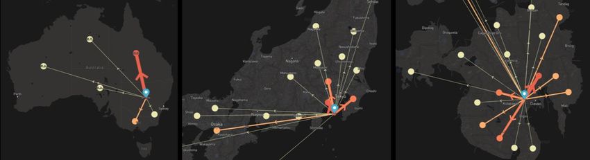
2
FILLING DISPLACEMENT DATA GAPS
In this section we first discuss the methodology co-developed between IDMC and Facebook to estimate
long term displacement after a disaster caused by natural hazards. Second, we analyze how the
displacement maps contribute to fill data gaps.
Displacement Maps Methodology
Facebook Displacement maps leverage GPS-like data in order to measure how many people have been
displaced, as well as in which cities these people have relocated. To do so, our methodology relies on three
steps. First, we analyze people’s normal movement patterns in the 30-day period before the crisis in order
to measure their home and typical distance traveled away from home. Second, we analyze movement
patterns in the two-week period after the crisis and compare them to the pre-crisis movement patterns.
Through this comparison we define initial displacement status in the following way:
● Populations are defined as displaced when they reside post-crisis at least two kilometers away from
their pre-crisis home locations and their typical distance traveled away from home has doubled.5
● Populations are defined as never displaced if either of the above conditions is not met.
● Populations are defined as unknown if they don’t have location data for at least three days in the
two-week period after the crisis.
Last, starting on day 15 after the crisis, we produce daily updates of the population status to count the
number of people displaced and returned, within and across cities, aggregating to a country level when the
city count is too low. Populations that were originally classified as displaced are considered “returned” once
they are observed for three days in a row less than two kilometers away from their home location. See
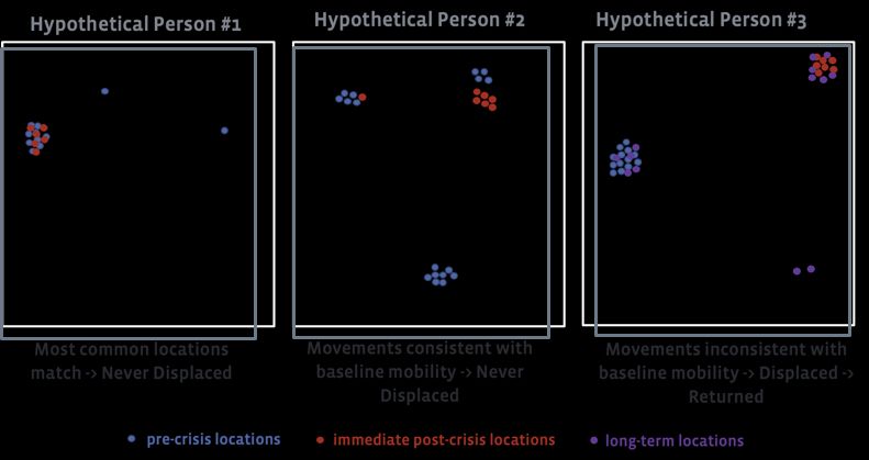
figure 1 below for a graphical intuition on the methodology, and figure 2 for the methodology’s timeline.
Figure 1: Graphical intuition of the Displacement Maps methodology
5It’s important to note that our methodology will miss those people that have been displaced under 2kms. We opted to be
conservative and have this measure in order to avoid misclassifying people that are not displaced into displaced.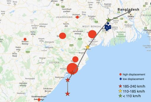
3

                                       Figure 2: Displacement Maps methodology timeline

City to city estimates
Once populations are first assigned to statuses, we aggregate the data into a transition matrix that provides
an overall picture of displacement. In the long-term displacement estimation period, that transition matrix
can then be updated day by day as statuses are updated to tell the aggregate story of displacement and
return. In particular, we produce a city-to-city transition matrix that contains the following information for
each city A:
    ●    the proportion of people from city A who are currently displaced to city B, city C...
    ●    the proportion of people from city A who are displaced within city A itself
    ●    the proportion of people from city A that were once displaced, but have now returned to city A
    ●    the proportion of people from city A that were never displaced
    ●    The proportion of people from city A who are currently unknown
This transition matrix is updated daily and is accessible to partners in the humanitarian space through
Facebook’sour online platform called GeoInsights. There, partners (i.e. Humanitarian Organizations) can
explore the data with an interactive visualization of displacement (see figure 3 below for an example). The
GeoInsights platforms allows partners to click on a city in order to see displacement rates to other cities,
as well as proportions on people displaced, never displaced, returned, and unknown for any given day.

Figure 3: Interactive Displacement Visualization for Australian fires (left), Typhoon Hagibis in Japan (center), and Philippines 2019
                                                        earthquake (right).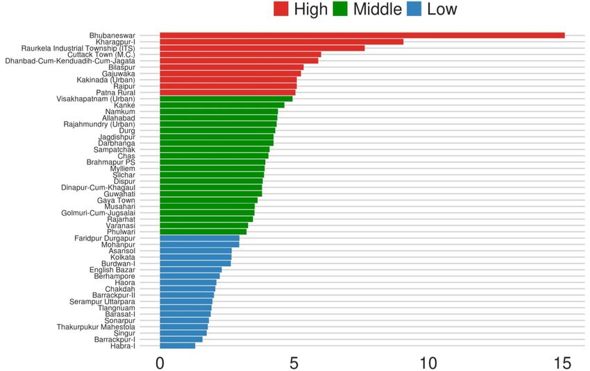
4
Data Gaps
Facebook’s displacement data contributes to the humanitarian community by filling several data gaps. In
particular, this data helps answer three questions that are central to humanitarian organizations:
● How many people have been displaced?
● From where to where?
● For how long?
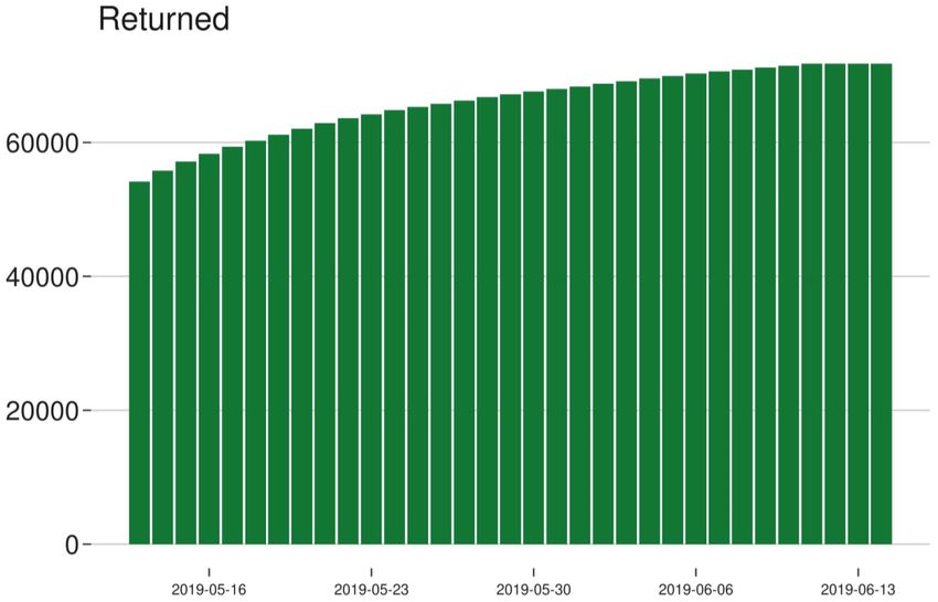
How many people have been displaced?
Our methodology produces daily estimates of how many people have been displaced. This data can be
accessed at the city level, or combined to get estimates for a larger administrative area. For example, figure
4 below shows daily estimates of displaced people after Cyclone Fani in both India and Bangladesh. As the
figure below shows, we see the number of people who we measure as being displaced in 15 days after the
disaster, but it plateaus later on suggesting a large number of people were not able to return to their homes
in the first month after the disaster.
Figure 4: Number of people displaced after Cyclone Fani hit
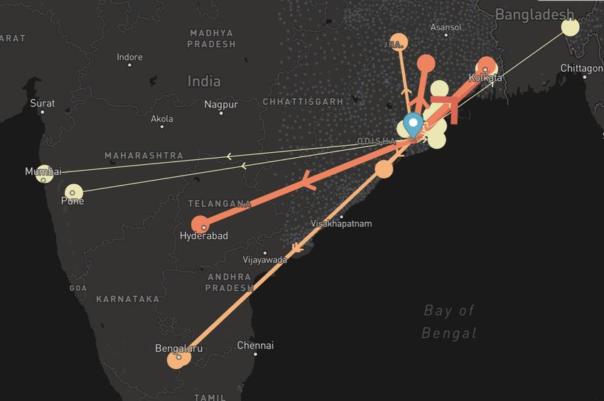
From where to where?
Additionally, our city to city transition matrix, as well as our interactive visualization, allows humanitarian
organizations to understand where internally displaced populations have moved. In the figure below we
see where the people displaced from Bhubaneswar (India) have gone in the days after Cyclone Fani. Wider
(or darker) lines represent more people. This visualization is accompanied by additional quantitative data
on how many people, and what proportions, have displaced to each city. For instance, for this particular
crisis we see that the top three places people went from Bhubaneswar were Kolkata, Barrackpur II, and
Golmuri-Cum-Jugsalai.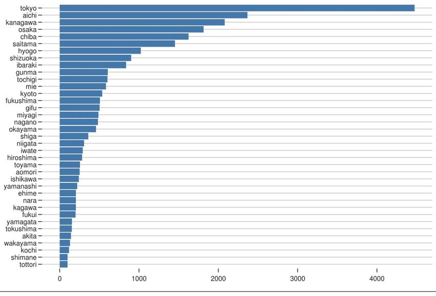
5

                 Figure 5: Number of people displaced away from Bhubaneswar, India on May 13, 2019.

For how long?
Last, our data allows organizations to understand how long people have been displaced and when cities
are starting to recover. By looking at the number of people returned, partners can understand when people
are able to return to their home cities. Figure 6 below shows the daily numbers of returned people in India
and Bangladesh after Cyclone Fani. Using the transition matrix (or the interactive visualization) partners
can also access this data at the city level. For additional context, they can compare these rates of return
across cities in the region.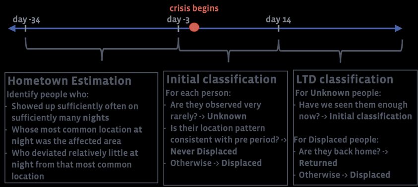
6

                  Figure 6: Number of Daily Returned People after Cyclone Fani for India and Bangladesh

Privacy Protections
Location data is a sensitive source of data and misuse could compromise the privacy and safety of
individuals and communities. For that reason, we take several steps in order to address privacy and security
so that people are protected.Our approach preserves privacy by:
    1. using data collected with the consent of the users
    2. sharing only aggregate, city-level level numbers
    3. obscuring city-to-city transitions that are too infrequent, and
    4. not reporting locations of cross-border migration.
Our methodology for measuring displacement relies on Facebook Location History (LH) data. In order to
provide services to their users, many smartphones and apps regularly collect precise location information
from GPS. In the case of Facebook, people can opt in to sharing precise location information, which is then
used to provide a myriad of services, including helping people find nearby friends, information about
nearby Wi-Fi hotspots, and location-relevant ads (source). This data also enables targeting of AMBER alerts
and prompts to check-in as “safe” after a hazard event. In addition to powering Facebook product features,
this location data, when aggregated and anonymized, can provide insights about how populations are
affected by hazard events as they happen. Users may decide to stop giving consent to the collection of this
data. When this happens, we remove these people from our disaster maps calculations.
Additionally, we aggregate the anonymized individual level data to city-level estimates. Our transition
matrix reports only city-to-city numbers. Our goal here is to tell the aggregate story of displacement and
return without compromising privacy or security of the people represented in the data. To that end, we
incorporate several levels of privacy protection when constructing the transition matrix. First, we do not
report numbers when a city-to-city transition count is lower than 10 people; instead, we aggregate to a
higher administration level (most likely the country level). We also never calculate cross-border migration
data (which can be politically sensitive in a number of cases) and instead aggregate to a “displaced abroad”
category.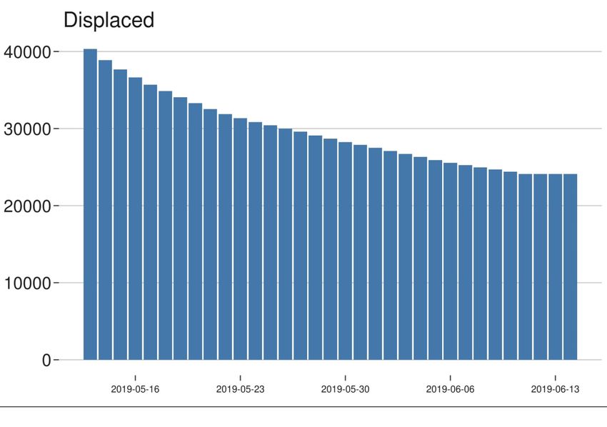
7

CASE STUDIES
In this section we present the estimates produced by our methodology for two specific crises: Cyclone Fani
that affected the areas of India and Bangladesh in May 2019, and Typhoon Hagibis that affected Japan in
October 2019.
Cyclone Fani (India and Bangladesh)
On May 3rd 2019 Cyclone Fani made landfall in the Indian region of Odisha. Fani was the strongest cyclone
to hit this region since 1999, with dire consequences: at least 89 people died in India and Bangladesh, and
the damage costs rose to more than 8.1 billion dollars.6 Additionally at least 1.2 million people were
evacuated from the Odisha region right before the landfall of Fani.7
We used the methodology described in this paper to estimate the number of Facebook users with location
history displaced by the disaster, as well as to understand how the cyclone affected cities in the area
differently. Our calculations estimated more than 94,147 people8 were displaced on May 12, 2019. One
month after the disaster, 71,764 people returned to their homes, while 24,099 were still displaced.
Our methodology allows us also to create city level estimates (see Figure 7). The magnitude of our city
estimates tends to coincide with what we know from the crisis: residents of the most affected cities
suffered the most displacement. The map below (Figure 8) shows in red the cities with the highest
percentage of displacement (with bigger circles for higher levels of displacement) and in blue those cities
with the lowest levels of displacement. The map also includes the trajectory of the Cyclone with the severity
of its winds throughout the trajectory. As this map shows, the cities closer to the most severe stretches of
the Cyclone trajectory had the greatest levels of displacement. Once the Cyclone lost strength, it created
much lower levels of displacement.

6Kumar Hari, Gettleman Jeffrey, and Yasir Sameer, “‘The Worst Is Over’: A Sigh of Relief in India, Mostly Spared by Cyclone”, New
York Times, accessed on February 13, 2020 https://www.nytimes.com/2019/05/04/world/asia/india-cyclone.html
7“India’scyclone Fani recovery offers the world lessons in disaster preparedness”, Prevention Web, accessed on February 13, 2020
https://www.preventionweb.net/news/view/65353.
8   Our estimates always refer to Facebook users with location history enabled.
8

Figure 7: Level of Displacement after Cyclone Fani by City

  Figure 8: Cyclone Fani Path and Displacement Levels
9

Typhoon Hagibis (Japan)
Typhoon Hagibis hit Japan in October 2019 and was the strongest storm to hit Japan in over 60 years. 9
Given the severity of the storm, government officials issued evacuation orders to a significant proportion
of the population. In the figure below, our new displacement maps show large numbers of people leaving
the Tokyo area.

                                Figure 9: Displacement trends from Tokyo after Typhoon Hagibis

Outside of Tokyo, which had the largest number of people displaced, Aichi and Kanagawa also saw high
levels of weather-based displacement. Other prefectures like Tottori and Shimane had much lower
numbers of displacement.

9“Typhoon Hagibis: death toll rises in Japan as ‘worst storm in 60 years’ roars through”, The Guardian, accessed on February 13,
2020 https://www.theguardian.com/world/2019/oct/12/japan-typhoon-hagibis-tokyo-earthquake-rugby-flood-rain
10
Figure 10: Displacement levels by Prefecture after Typhoon Hagibis
When comparing to the estimates collected by IDMC we find a much higher number of displaced people
14 days after Typhoon Hagibis, particularly people displaced within Tokyo. Using shelter figures provided
by the Cabinet Office of Japan, IDMC recorded only 26 people displaced on October 21. Given that the data
from the Cabinet Office of Japan shows that most people have left shelters by October 21, we compare our
numbers to the maximum number of people displaced in shelters which corresponds to October 12-13.
These records show that the city with the largest number of displaced people was Tokyo (76,235), which
corresponds to our numbers. Aichi had 1,978, and Kanagawa 2,107 people in shelters on October 12. The
numbers for the last two cities (right after the disaster) are similar to our estimates two weeks later. It is
worth noting that our methodology is capable of detecting not only displaced people in shelters, but also
people that might be displaced in family or friends’ houses, so differences between official figures and our
estimates are expected. Another advantage of complementing IDMC’s data with our estimates is that it can
help IDMC to better understand flows: as government data might sometimes be incomplete, our estimates
-while they could be of a smaller subset of people- are produced daily and track not only numbers of
displaced and returned people.
Complementing Location Data with Surveys
For Typhoon Hagibis we were also able to run a survey on the Facebook platform. This data helps us not
only validate our displacement maps findings, but also learn new insights that are of key value to
humanitarian organizations. In particular we ran a survey of 20,805 Facebook Users in Japan, between
11/27 and 12/13.
As Figure 11 below shows, 10% of the people surveyed reported leaving their home for more than one
night as a result of Typhoon Hagibis. Of these, 22% reported being displaced for at least 3 days (Figure 12).
Of those leaving for at least one night, 50% reported that they decided themselves to leave their home,
33% reported leaving as a consequence of a family member’s decision, and only 13% left as a consequence
of a government order (Figure 13). Additionally, a majority of displaced people (60%) decided to leave by
car and 22% left by foot (Figure 14). Last, 61% of displaced people reported staying in the same city as their11
home, 20% went to a different city but close to their home city, 14% went to a city far from their home
city, and only 1% was displaced abroad.
Figure 11: Percentage of Respondents Displaced for at least One Night12 Figure 12: Percentage of Respondents Displaced for at least Three Nights
13

Figure 13: Respondent’s Decision to Leave their Home
14

                             Figure 14: Respondent’s Location After Leaving Their Homes

CONCLUSION
The new methodology for displacement maps was co-elaborated between Facebook and IDMC. The main
goal of this collaboration was to accurately measure long-term displaced after a disaster caused by natural
hazards. The new methodology has allowed us to fill several data gaps. First, we are now able to generate
daily estimates in order to produce time series data. This data is central for humanitarian organizations as
it allows them to better understand the progression of displacement after a disaster.
Second, Facebook displacement maps allow users to understand from which cities to which cities people
have been displaced. Partners can achieve this by looking at the city-to-city transition matrix or by using
our interactive displacement platform.
Third, our maps can help organizations understand how long people have been displaced. By reporting the
daily number of people returned partners can now understand when a city has recovered after a disaster
and when they are still struggling. Last, because we generate disaster maps for a wide variety of disasters
— not just big ones — our displacement data can fill gaps where official statistics do not exist.
Last, complementing behavioral data from our displacement maps with survey data can be extremely
powerful to better understand the reasons behind a person’s displacement. These surveys have proved
essential for us to better design our methodology but also to help organizations like IDMC better
understand behaviors after major disasters.
In this paper we showed not only the methodology behind Facebook’s Displacement Maps but also how
we can use this data to interpret two different recent disasters: Cyclone Fani, in India and Bangladesh, and
Typhoon Hagibis, in Japan. For Japan, we additionally presented survey data that complements our
Displacement Maps and helps us, and organizations, better understand the phenomenon.
15 We believe these displacement maps will help our nonprofit and research partners better understand how many people were displaced because of a disaster, as well as where they ended up. Better measuring how many people are displaced, as well as when people are able to return is a first necessary step in order to design proper solutions to internal displacement. We hope that our full list of over 100 NGO and research partners who are already accessing our Disaster Maps will be able to leverage the new Displacement maps to design the best solutions for internally displaced people around the world.
You can also read