MSN Messenger's Whiteboard Cognitive Walkthrough and Heuristic Evaluation Results
←
→
Page content transcription
If your browser does not render page correctly, please read the page content below

MSN Messenger’s Whiteboard
  Cognitive Walkthrough
           and
   Heuristic Evaluation
          Results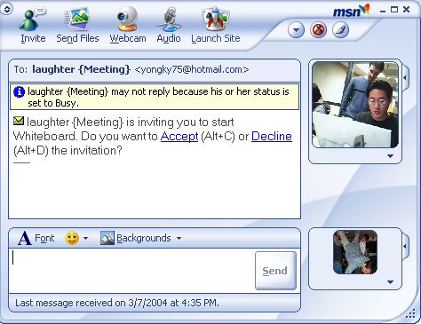
Cognitive Walkthrough and Heuristic Evaluation Results – Page 1

Executive Summary
Whiteboard applications provide a shared graphical workspace for distributed users. Recently,
Whiteboards have been integrated into Instant Messaging (IM) clients, including MSN
Messenger. Although a groupware whiteboard is a recognized business collaboration feature,
its progression into personal communication has been slow. MSN Messenger’s Whiteboard
illustrates this problem–it has been ported from NetMeeting, a communication application, yet
IM users have been hesitant to embrace its unfamiliar interface.
The comparative evaluation and the user survey (completed previously) identified several user
experience issues that needed to be addressed. Namely, the reports uncovered concerns about
the accessibility and the usability of the Whiteboard, and its effectiveness as collaboration
support tool. Guided by personas and scenarios, the current investigation focused on these
issues.
Preliminary recommendations are sorted by the degree of their impact on the user experience.
Ease-of-change is taken in consideration as well, with easily addressable issues shown first. The
suggestions, summarized below, are meant to increase user satisfaction with the Whiteboard
feature and the application at large, thus giving MSN Messenger a competitive edge in the IM
marketplace.
 Area of Concern                   Proposed Solutions
 The Whiteboard is not well            •   adjust the user interface to match MSN
 integrated into the IM                    Messenger’s look and feel
 application
                                       •   make the Whiteboard easily accessible from MSN
                                           Messenger
                                       •   create an application-appropriate help feature
 Drawing tools do not follow           •   modify drawing tools to match evolved standards
 general conventions
                                       •   adjust the look of icons to fit their functionality
                                       •   add keyboard shortcuts
 The Whiteboard is not effective       •   allow greater range of input file formats
 as a graphics editor
                                       •   revamp the positioning of controls to aid common
                                           actions
 The Whiteboard session is hard        •   address the complexity of the startup process
 to set up
                                       •   make the user aware of the delays caused by
                                           internet traffic
 Collaboration support needs           •   simplify collaboration-specific features (e.g.,
 improvement                               locking)
                                       •   provide clear help and/or wizards for user new to
                                           collaboration software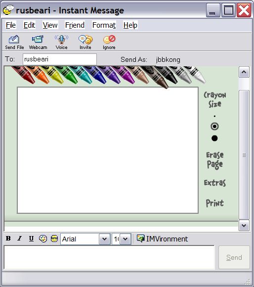
Cognitive Walkthrough and Heuristic Evaluation Results – Page 2

Introduction   MSN Messenger (hereinafter abbreviated as Messenger, a proper noun) is
               Redmond’s answer to the growing popularity of instant messaging (IM)
               applications. As of version 6.1, Messenger adopts a number of collaboration
               features (e.g., application sharing, remote assistance, and Whiteboard) from
               Microsoft’s now-discontinued collaboration software, NetMeeting.
               The Whiteboard allows users to collaborate remotely in a graphical
               medium. Users can create drawings, type in text, or cut and paste image
               screenshots onto the shared canvas.
               This feature has yet to gain widespread popularity among users. However,
               when combined with the audio conversation capability of Messenger, the
               Whiteboard has the potential to become a powerful tool for remote
               communication, and an essential part of an IM experience. Already, it has
               become a staple application for many users. The Whiteboard benefits from
               its similarity to the well-known MS Paint application, yet goes beyond it by
               implementing vector graphics.
               As part of an ongoing summative evaluation of the Whiteboard, we
               conducted a cognitive walkthrough and heuristic evaluations. The
               investigation identified five major focus areas: startup process, integration of
               the Whiteboard with other IM features, drawing tools, extended features,
               and collaboration support. These areas will be further examined during user
               testing.
               The report describes methods of evaluation, followed by a summary of our
               findings coupled with preliminary recommendations. For the benefit of the
               reader, findings that should be addressed first take precedence in the list.

Methods        In order to evaluate the Whiteboard’s interface, three evaluations were
               conducted under different scenarios. The cognitive walkthrough
               concentrated on the startup process, while the heuristic evaluation explored
               two scenarios – formal, based on the needs of a professional persona, and
               informal, one that would appeal to a student persona.
Cognitive      We conducted a cognitive walkthrough to evaluate the Whiteboard’s
 Walkthrough   accessibility from the main Messenger interface. The task of “locating” the
               Whiteboard suited this method particularly well, as it focused on navigation
               towards a specific goal.
               Aided by the Generalized Transition Network (GTN) representation of the
               application, two evaluators analyzed each step in the Whiteboard
               initialization process. They took notes in accordance to the questions
               provided in the cognitive walkthrough form as presented by Lewis et al.
               (1990).
Heuristic      For an evaluation of the Whiteboard itself, we conducted two heuristic
 Evaluation    evaluations for two high-level scenarios: formal and informal collaboration.
               We developed a customized checklist based on categories from Olson
               (2004) and supplemented by elements from Nielsen’s usability heuristics
               (1994). To evaluate the Whiteboard’s collaborative aspect, we also
               incorporated three heuristics from Baker et al. (1990). Nine categories
               emerged as a result. Appendix A presents the checklist as used by the
               evaluators, and Appendix B elaborates on each category, including: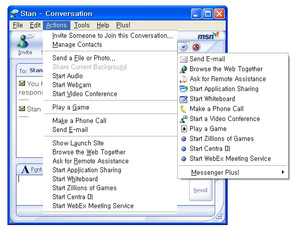
Cognitive Walkthrough and Heuristic Evaluation Results – Page 3

emerged as a result. Appendix A presents the checklist as used by the
evaluators, and Appendix B elaborates on each category, including:
   •   correspondence
   •   consistency
   •   visual display
   •   menu and command structure
   •   feedback
   •   error recovery and prevention
   •   memory load
   •   help and documentation
   •   collaboration support
Evaluations were performed in pairs due to the dyadic nature of the
application and tasks. Evaluators were not in physical proximity to each
other and had to use Messenger as the only mode of communication. They
did not share observations until the end of the evaluation.
Formal collaboration
The formal collaboration scenario was derived from Greg Thompson’s
persona. As a senior hardware engineer who often uses the Whiteboard to
collaborate with remote colleagues, Greg employs audio conferencing to
support his Whiteboard interactions. A typical Whiteboard session for Greg
involves the following steps:
   •   copy-and-paste a Visio drawing into the Whiteboard
   •   use the highlighter tool and remote pointer to coordinate discussion
       around specific parts of the drawing
   •   use the synchronization feature to shift between individual and
       group work
Informal collaboration
The informal scenario had a different orientation to ensure that all remaining
tools and capabilities of the Whiteboard were tested. A different set of two
evaluators looked at the interface through the eyes of a novice user and only
used text chatting to converse.
The scenario was based on Andrea, a college student, and involved
providing driving directions. Testing revolved around:
   •   drawing tools
   •   graphics file import
   •   copy-and-paste support
Cognitive Walkthrough and Heuristic Evaluation Results – Page 4
• screen capture tools
• help features
Though the two pairs looked at different scenarios, the heuristic evaluation
of the Whiteboard was conducted by four evaluators in total, the most cost-
effective number according to Nielsen (1999).
Data Analysis Findings from both the cognitive walkthrough and heuristic evaluations
were categorized using a paper card-sorting technique. We uncovered a
total of 54 distinct issues and grouped them into five functional areas:
1. locating and starting the Whiteboard
2. Whiteboard integration into Messenger
3. basic drawing tools
4. extended drawing tools
5. collaboration tools
Once categorized, sub-themes were identified within each category. These
sub-themes are presented as findings below. After two iterations of
categorizing, 54 issues were distilled into 17 findings.
We ranked these findings along two dimensions: severity ratings (Nielsen,
1999) and ease-of-change. Severity is categorized as:
[4] Usability catastrophe: imperative to fix this before product can be
released
[3] Major usability problem: important to fix, so should be given high
priority
[2] Minor usability problem: fixing this should be given low priority
[1] Cosmetic problem only: need not be fixed unless extra time is
available on project
The ease-of-change rating extended from easy to hard with:
[3] Easy fix: relatively easy to address; involves superficial interface
adjustments
[2] Average: problem could be fixed in a reasonable amount of time
[1] Difficult to address: fix would require a significant system redesign
Clearly, issues scoring high on both scales would have to be addressed first,
while problems of equal severity can be addressed based on how easy the
solution is (with easily-fixed problems being targeted first).Cognitive Walkthrough and Heuristic Evaluation Results – Page 5
Findings We present 17 findings, which are supported by evidence and addressed
with preliminary recommendations.
Findings are sorted on two levels: first by severity and then by ease-of-
change. This order of presentation is meant only as a suggestion on
priority of implementation.
Usability Catastrophes (Severity Rating: 4)
Finding (4) Help doesn’t help.
Evidence Help explains how features are used, but not what they do.
Help includes references to NetMeeting that are not applicable to
Messenger’s Whiteboard. There are references to multiple-participant
interactions that are not possible in Whiteboard.
Unsynchronize Whiteboard pages
1. Click the Whiteboard button to open
Whiteboard.
2. In the Whiteboard toolbox, click the
Unsynchronize button.
Notes
• Whiteboard pages are synchronized by default.
• Synchronization does not affect people's
views of the current page. If you turn off
synchronization and keep working on the
current page, the other participants can view
your actions
Figure 1: Messenger Whiteboard help on ‘Unsynchronize’
Recommendation It is critical that information provided in Help is up-to-date. In particular,
coverage should be enhanced for features that are uniquely implemented
in Messenger Whiteboard such as ‘un/synchronize’ and ‘lock contents’.
These features would lend themselves nicely to wizards that can be either
activated directly by novices or presented upon the first use of the feature.
Storyboard illustrations would also help users understand how to use the
feature.
Finding (4) Behavior of the ‘eraser’ is implemented as a separate editing mode,
inconsistent with most drawing applications. This often causes the user to
erase objects inadvertently.
Evidence The ‘eraser’ icon is almost identical to the ‘selector’. The only difference
is the miniature minus in the corner of the icon.
Figure 2: ‘selector’ and ‘eraser’ icons
Deleting an object requires the user to first select the ‘eraser’ icon then to
click on the target object. This is inconsistent with convention in most
drawing applications.Cognitive Walkthrough and Heuristic Evaluation Results – Page 6
Although the Whiteboard interface is derived from MS Paint, the ‘eraser’
is inconsistent with MS Paint’s erase function, where users can “rub-
erase” parts of an object.
Recommendation Instead of changing the look of the ‘eraser’ icon, we suggest removing the
feature altogether and letting the ‘backspace’ or ‘delete’ keys remove
currently selected objects. This common convention is implemented in
most drawing applications and would be more familiar to users.
Finding (4) The undo function is lacking.
Evidence There is no undo. The only method for error recovery is the ‘undelete’
command, which is limited to recovering deleted objects only. Other
actions such as moving objects or adding objects cannot be reversed.
Recommendation A more extensive error recovery method needs to incorporate an undo
command. This command should allow any executed actions to be
reversed, making the application consistent with usability standards and
encouraging the users to explore the features without any fears.
Major Usability Problems (Severity Rating: 3)
Finding (3) The Whiteboard is hard to locate among other Messenger features.
Evidence There are several inconsistent ways to activate the Whiteboard, and
even advanced users often get confused as to which one to pick. For
example, the Whiteboard is listed in a pull-down menu under an
obscure triangle button, yet the generic right-click menu does not list the
Whiteboard.
The Whiteboard is located in the file menu under ‘Actions’ and not
‘Tools,’ which is a more intuitive location.
The ‘Action’ menu houses 13 items, too many to be scanned effectively.
Figure 3: Try to find the Whiteboard
Recommendation The Whiteboard should be promoted to a more prominent place in the
interface. The ‘Actions’ and ‘Tools’ menus need to be restructured and
shortened. Enhancing the items with mini-icons, as is done in Messenger’s
chat window menus, might make each feature stand out.
Finding (3) In ‘synchronize’ mode, pages can be inadvertently but permanently
deleted.Cognitive Walkthrough and Heuristic Evaluation Results – Page 7
Evidence This finding is best described by presenting a sequence of tasks that
resulted in an irrecoverable error.
1. User 1 is on page 1
2. User 1 selects ‘delete page’
3. User 1 sees warning dialog that once deleted page 1 will be
irrecoverable
4. User 2 switches views to page 2
5. User 1 clicks ‘OK’
6. Page 2 is deleted and cannot be recovered because there is no
undo function
Recommendation The delete page dialog should automatically activate either ‘lock contents’
or ‘unsynchronize’ mode temporarily so that a wrong page will not be
deleted.
Finding (3) Importing graphical content into Whiteboard is inconvenient.
Evidence Whiteboard can only open files in its proprietary ‘.nmw’ file type; it
does not support the common formats such as ‘.bmp’ or ‘.jpg’.
The features that the Whiteboard does provide to import graphics are
hard to find because of incongruous names (e.g., ‘select area’ or ‘select
window’) and icons.
Figure 4: 'select area' and 'select window' icons
The order of tasks dictated by ‘select area’ and ‘select window’ does not
correspond to the user’s workflow. Users must first select the tool, then
select the area or window to be copied instead of selecting the object
first.
Recommendation Support for a standard range of graphic formats is essential for such
image-intensive applications as the Whiteboard.
The “Select” features need to be renamed into something more
understandable, for instance “Paste Screen Image”. The “Select Area” tool
can be replaced by a simpler function that pastes a screen dump onto the
Whiteboard for subsequent cropping. The “Select Window” (better named
as “Paste Screenshot of an Application”) can present a simple dialog that
pastes a shot of a select window.
Finding (3) The Whiteboard’s interface is not consistent with Messenger’s look and
feel.
Evidence Whiteboard’s stark business-oriented interface does not match the
friendly and aesthetically appealing look of Messenger. None of the
graphical conventions such as icons, colors, or window shapes are
consistent.
Initialization of Whiteboard creates two new windows, ‘Sharing Session’
and Whiteboard, breaking with the system paradigm where all
interaction takes place within the chat window.Cognitive Walkthrough and Heuristic Evaluation Results – Page 8
Recommendation A viable first step in merging the Whiteboard’s appearance with its parent
application might be the integration of Whiteboard into the chat window,
as done in Yahoo! Messenger. Yahoo! Implements the Whiteboard as a
chat ‘skin’: the chat window grows to allow space for the extra features.
This solution would end the unnatural coupling of the Whiteboard with
Application Sharing that creates the need for an extra window. It would
also create an environment better suited for collaboration: users who want
to utilize text chatting do not have to switch between different windows to
communicate.
Finally, a single icon should be chosen to represent the Whiteboard in all
menus. There are currently several different icons for the Whiteboard.
Figure 5: Yahoo! Doodle Figure 6: With Messenger, multiple windows clutter the
desktop (‘Sharing Session’, chat, and Whiteboard windows)
Finding Objects on the Whiteboard canvas are difficult to select.
Evidence For lines, the ‘selector’ must be precisely positioned over the object for
selection. It is even more awkward because there is no visual feedback
when a line has been selected.
For all other objects, selection is indicated by very faint gray lines that
are hard to see.
Recommendation Thin lines should become highlighted as the ‘selector’ hovers over them,
or at least when they are selected. For all other objects, the selection
feedback lines should be darkened or thickened to ease visual perception.
Finding Response times are inconsistent, thereby decreasing productivity and
creating chances for miscommunication.
Evidence System response time for refreshing and updating remote Whiteboards
(especially when screen dumps were imported) ranged anywhere from a
few seconds to half a minute.
Recommendation System refresh rate should average around 2 seconds when they are part
of an ongoing task. A status bar should be implemented to notify the users
that a data transmission is in progress.Cognitive Walkthrough and Heuristic Evaluation Results – Page 9
Minor Usability Problems (Severity Rating: 2)
Finding (2) Functionality of the synchronization tool is obscured by its unfamiliarity as
a concept, poor graphic representation, and lack of documentation.1
Evidence The word ‘synchronize’ is not very concrete, and the graphical
representation of the icon does not help negotiate meaning.
Figure 7: ‘synchronize’ icon
Help explains how the feature is used, but not what it does.
Recommendation A dialog box that appears when the user activates the feature (as in the
‘select area’ or ‘select window’ features) would help users understand
functionality of the feature. Alternatively, as mentioned previously, a more
illustrative help document including storyboard illustrations would also
help.
Figure 8: Help dialog for 'select area'
Finding (2) Lack of a finely tuned locking mechanism affects productivity negatively.
Evidence It is very disconcerting to the user when objects that s/he draws move
and disappear without warning.
The locking feature currently only provides a binary state of protection,
i.e., the tool either locks or unlocks all content for the remote user.
Recommendation A better implementation would provide different levels of protection and
locking. For example, each participant could “own” the objects that s/he
created until permission was granted for the remote user to make
modifications.
Finding (2) There are no keyboard shortcuts available for expert users.
Evidence Even though the Whiteboard offers keyboard shortcuts for standard
functions like ‘cut’, ‘copy’ and ‘paste’, there are none for integral
components such as drawing and collaboration tools.
The lack of keyboard shortcuts decreases user efficiency for experts.
When switching between different tools (e.g., from a pen to a
highlighter), the user has to move the mouse cursor to the far left to
select the desired tool and then move back to the desired position on the
Whiteboard to perform the action.
1
Even with the continuous, synchronous checking of the remote user’s Whiteboard made possible by audio chat, it
was hard to understand this feature’s functionality. This hurts collaboration because transitions between tightly and
loosely coupled work (Baker et al., 2002) become awkward.Cognitive Walkthrough and Heuristic Evaluation Results – Page 10
Recommendation Provide more efficient access to commonly used drawing and
collaboration tools by assigning single-key shortcuts (as in Adobe or
Macromedia products). Mapping of the keys should be intuitive and easy
to remember. For example, the system may use ‘H’ for highlighter, ‘P’ for
pen, ‘L’ for line, etc.
Cosmetic Problem Only (Severity Rating: 1)
Finding (1) The blurry distinction between Windows Messenger2 and MSN Messenger
confuses users.
Evidence Users disconnected from the network when the Whiteboard is active are
on rare occasions greeted by Windows Messenger, not MSN Messenger
when they reconnect.
This experience (accompanied by the unsuitable error message “User
has logged on at another location”) is highly confusing for the users.
Recommendation If, for technical reasons, parts of Windows Messenger’s code need to run
in the background, their presence needs to be transparent to the user who
has chosen MSN Messenger as their primary IM.
Finding (1) Initiation of the Whiteboard process is unnatural for the novice user.
Evidence Whiteboard invitations are sent in the same part of the conversation
window normally used for chatting. While this may make the process
more convenient for experienced users, it is disorienting to novices.
Processing this message might take a long time, and they might not think
of clicking the link in the window because no other content in that area
of the screen is clickable.
Recommendation The chat window’s status bar is commonly used for confirmation
messages. The Whiteboard invitation should follow the conventions that
the users are familiar with. Furthermore, the users should be allowed more
traditional keyboard shortcuts, e.g., ‘enter/Esc’ for ‘Accept/Decline’ instead
of ‘Alt+C/Alt+D’.
Finding (1) The page navigation toolbar design is inefficient.
Evidence The ‘delete page’ option is only accessible through the file menu and not
in the page navigation toolbar where users would expect it.
When users are on the first or last page, the ‘previous/next page’ buttons
remain active or ‘clickable’ while they do not produce any change when
clicked.
Figure 9: page navigation toolbar
2
Windows Messenger comes embedded in Windows XP. It shares a similar user interface as MSN
Messenger and provides the “code” for MSN Messenger’s collaboration features.Cognitive Walkthrough and Heuristic Evaluation Results – Page 11
Recommendation The ‘delete page’ button should be added to the toolbar. ‘Previous/next
page’ buttons should either be disabled to prevent unnecessary clicks or
wrap around to the last or first page.
Finding (1) The user accepting an invitation to join the Whiteboard session may feel
lost.
Evidence The only indication of the fact that the Whiteboard is loading is the
noticeable slowdown of the user’s computer.
Recommendation To curtail this moment of anxiety, the system should provide a prompt
(and perhaps a progress indicator) to the user waiting to be connected.
Finding (1) The title bar of the Whiteboard does not accurately represent the status of
the connection.
Evidence
Figure 10: Whiteboard title bar
The Whiteboard title bar misrepresents the connection status by
implying multiple participants can use the Whiteboard when it only
supports dyadic interactions.
In addition, participants receive no notification when remote users
disconnect from the Whiteboard session (other than the change from 1
to 0 in the title bar.
Recommendation The title bar of the Whiteboard should include the name of the remote
participant as opposed to a number that is not longer meaningful within
the context of the Messenger Whiteboard (it was in NetMeeting because it
supported multiple participants). A pop-up dialog should alert participants
when the remote user has disconnected.
Conclusion Results from a previously fielded survey indicated that only 20% of MSN
Messenger users have tried the Whiteboard. It is possible that this
percentage could be higher if the Whiteboard was placed in a more
prominent location within the user interface. Consequently, higher
Whiteboard awareness would most likely effect higher overall satisfaction
with MSN Messenger, as it would add to the range of communication that
the application would support. Users would be particularly pleased if:
• the Whiteboard was more consistent with the look and feel of
MSN Messenger,
• drawing tools were implemented in an effective way, and
• collaboration was straightforward and fully supported.
User testing will be used to corroborate the results from this evaluation.Cognitive Walkthrough and Heuristic Evaluation Results – Page 12
References Baker, K., Greenberg, S., Gutwin, C. (2002). Empirical Development of a
Heuristic Evaluation Methodology for Shared Workspace Groupware.
Drozdetski, S., Kong, J., Kim, Y., Lee, K. (2004). Survey Report.
Nielsen, J. (1994). Usability Engineering. Morgan Kaufmann, ISBN 0-12-
518406-9
Olson, J. (2004). Quick Methods: Checklists, Heuristic Evaluation, Cognitive
Walkthrough. SI 622 Evaluation of Systems and Services Power Point
Presentation.
Nielsen, J. (1999). How to Conduct a Heuristic Evaluation.
http://www.useit.com/papers/heuristic/heuristic_evaluation.html
Nielsen, J. (1999). Severity Ratings for Usability Problems.
http://www.useit.com/papers/heuristic/severityrating.htmlCognitive Walkthrough and Heuristic Evaluation Results – Page 13
Appendix A: Usability Checklist
Based on Olson’s (O) checklist, as supplemented with elements from Nielsen (N). Incorporates
category for shared workspace groupware (Baker et al., 2002).
Scale: 1 (Poor), 2 (Fair), 3 (Average), 4 (Good), 5 (Excellent).
Focus Heuristics Scale
Correspondence speak the user’s language (N)
new terms should be metaphorical & concrete (O)
support natural order of tasks (O)
Consistency perform actions in similar ways (O)
“back up” or cancel in the same way (O)
be consistent with well-known applications, standard
interfaces (O, N)
Visual Display use readable fonts (O)
gestalt principle of proximity (O)
gestalt principle of similarity (O)
consistent use of screen areas (O)
display familiar items in familiar ways (O)
capture user’s attention with error messages (O)
less is more (N)
Menu and support both novice (menu) and experts (shortcuts) (O)
Command
Structure use consistent grammar, verb-object-modifier (O)
make frequently used commands easily accessible (O)
group related commands together (O)
provide clear instructions for maximum efficiency methods
(O)
Feedback keep system response times (O, N)
give feedback for system failure (N)
Error Recovery provide clear & instructive error messages (O)
and Prevention
use multiple-level error messages (N)
provide “undo” capability (O)
doublecheck critical operations (O)
avoid modes (N)
provide clearly marked exits (N)Cognitive Walkthrough and Heuristic Evaluation Results – Page 14
Focus Heuristics Scale
Memory Load minimize user memory load (N)
Help and make help accessible everywhere (O)
Documentation
make help context sensitive (O)
explain “what” and “how” in documentation (O)
make documentation accessible (O)
Groupware (B) provide means for intentional and appropriate gestural
communication
provide protection
manage the transitions between tightly and loosely-coupled
collaborationCognitive Walkthrough and Heuristic Evaluation Results – Page 15 Appendix B: Checklist Category Detail Correspondence Users are likely to have a natural understanding of a task at hand, and the system should cater to that understanding. Terms are an important component, as they should match the user’s vocabulary. The order in which tasks are performed should correspond to the user’s workflow. Consistency Users should expect predictable response from the system. Similar actions should be performed in similar ways. If there exists an established consensus on how a task should be performed in comparable applications, deviations from that method would be confusing. Visual Display The interface should be aesthetically pleasing while avoiding any extraneous features. It also needs to be readable, with the important areas of the screen highlighted visually. Related items should be grouped together and marked in a similar fashion: for instance, the user should expect to see related text entry boxes in the same area of the screen. Menu/Command Structure Instructions are to be clear, and the commands accessible. In order to enhance usability, related actions should be grouped together. Lengthy dialog boxes and messages need to be avoided. At times, users will need to backtrack or exit a particular task. The exits should be clearly marked, and using them should not undermine the stability of the system. Feedback The feedback that the system provides should indicate that the user is proceeding towards the established goals. No change should be allowed to take place without user’s knowledge, and the response time should be reasonable. Errors should be communicated clearly. Error Recovery and Prevention If at all possible, errors should be avoided altogether. Error-prone features, such as modes, are not to be incorporated. Mission-critical operations can take place only after a confirmation. In an event that an error does occur, the user should be given a clear indication and a way to recover. In collaborative setting, one participant should not be given a chance to sabotage the work of others. Memory Load Humans have a limited working memory capacity. For this reason, the system should memorize as many details as possible, especially if they need to be carried over from task to task. An ability to save the state of a system at any point is a paramount feature. Help, Documentation, Training At all times, the user should be supported by a help system that provides assistance appropriate for the current task.
Cognitive Walkthrough and Heuristic Evaluation Results – Page 16

Groupware
Online communication should be as effortless as a face-to-face meeting. Consequently, the
collaboration system has to support or provide alternatives for such actions as gestures and
illustrations. Participants may want to work independently for some time and then go back to
tightly-coupled collaboration. On a more basic level, establishing contact and switching
between methods of information exchange should be straightforward.
You can also read