National College of Ireland - Analysis of Crime in North Dublin Technical Report Technology Management
←
→
Page content transcription
If your browser does not render page correctly, please read the page content below
National College of Ireland
       Technology Management
           Data Analytics
              2020/21
           Ryan Johnston
             X17437624
      X17437624@student.ncirl.ie

Analysis of Crime in North Dublin
        Technical Report
Contents
Executive Summary……..………….……………………………………………...…2
1.0 Introduction…..……..…………………………………………………………….2
   1.1 Background…………...……………………………………………………….2
   1.2 Aims…………....…………………………………………………………...…3
   1.3 Technology…….….…………………………………………………………...3
   1.4 Structure…………….…………………………………………………………4
2.0 Data………………….………………………………………………………….5-7
  2.1 Obtaining the Data……………………………………………………………..5
  2.2 Exploratory Data Analysis…………………………………………………...6-7
3.0 Methodology...………………………………………………………………….8-9
4.0 Analysis……………………………………………………………………...10-11
  4.1 Visualisations………..………………………………………………………..10
  4.2 Statistical Tests……………..……………………………………………..10-11
5.0 Results………………….……………………………………………………12-29
  5.1 Visualisations………..…………………………………………………….12-20
  5.2 Data Mining………….……………………………………………………21-23
  5.3 Statistical Tests……….…………………………………………………...24-29
6.0      Conclusions……………...……………………………………………………30
7.0      Further Development or Research……………………………………………31
8.0      References……………………………………………………………………32
9.0      Appendices………………………………………………………………..33-38
  9.1 Project Proposal…………………………………………………………...32-38
  9.2.    Project Plan…………………………………………………………………39
  9.3 Monthly Journals……………………………………………………….....40-41
  9.4.    Other materials used……………………………………………………..…41

                                                              1
Executive Summary
Crime is an ongoing issue globally. This analysis aims to assist law enforcement or any other
relevant parties, in the analysis of crime in Dublin, focusing on 40 key areas with relevant
study to background motives of crime. North Dublin is be analysed as a key area, compared
directly with South Dublin uncovering trends and incident prevention. Inner city areas have
proven to have more incidents. The top 5 areas of crime are theft, public order, offences
against government, damage to property and environment & drug controlled offences. This
report focuses on external factors of crime including income and poverty, and educational
attainment. These are two key areas that may influence crime.
     The North of Dublin has a mean value of 198 whereas the south has a mean value of 214
for the total value of crimes all time. The top 5 stations in North Dublin are Store Street,
Bridewell, Blanchardstown, Finglas and Coolock. The top 5 stations in South Dublin are
Pearse Street, Tallaght, Kevin Street, Dundrum & Dun Laoighre. These are listed in order
from highest to lowest for the total count of crimes all time.

1.0 Introduction
   1.1. Background
    It was chosen to undertake this exact analysis as crime is evident on a daily basis living
on the North-side of Dublin. Digging deep into the analytics of the types of crime, as-well as
the locations will give an insight as to where the largest volume of crime is occurring and the
most common type. A question that can be asked to determine the accuracy representation of
locations is: Is there only one Garda Station for multiple locations? For example Howth
Garda Station is the only one for quite a distance, will this influence more crime? If people
know that there is no Garda Station close to the area of an incident this may influence crime
as the response time for the Garda might be longer than the response time for incidents with a
Garda Station in closer proximity. Another important note is that if some areas have their
own Garda stations, while others have one station for a larger district, is the crime higher in
these areas or lower? These are potential findings of this analysis. A further in depth
background analysis can be found in the Section 9. Appendices of this document.
    Note: The crime dataset used for this analysis is from 2003-2019 which covers a 17 year
period. When the period ‘all time’ is mentioned it reflects the years of the data, not all time
crime dated outside of this period.

                                                                                              2
1.2. Aims
During this analysis a comparison of the North & South of Dublin, both with 20 locations
each will be analysed to look at types of crime over a period of time per location. These
40 locations are 20 Garda stations for North Dublin and 20 for South Dublin.
- Assess background motives of crime that may have relevance to the study. For
    example, what factors may cause a higher volume of crime e.g. poverty, educational
    attainment etc. Trying to find a link between those to crime using data sets.
- To calculate the top 5 areas of crime in North and South Dublin
- Calculate the mean of north vs south to determine which area crime is occurring more
    and interpret the results.
- Calculate the top 5 types of crime of all time based on the overall value of each.
- Create visualisations that simplify the values for the viewer allowing for more
    efficient understanding and interpretation.
- Create a map visualisation showing locations of each garda station with interactivity.
- Construct a Shiny Interactive dashboard containing a map and data table that updates
    values based on the user selection of a slider bar.
- Carrying out statistical data analysis tests that apply to the data and topic.

1.3. Technology
R will be the main programming language for data manipulation due to its powerful
visualisations and functionality. Python was considered however R was superior for the
types of visualisation needed for this project. Libraries were used in R to help with
reading, manipulating, styling and outputting the data.
    These libraries include but are not limited to:
- Leaflet and Shiny for creating interactive maps and a dashboard,
- TidyVerse to help with data manipulation and querying,
- Ggplot2 for powerful visualisations such as bar plots, line plots and point plots. Also
    GGThemes for styling these plots.
- Flextable for styling data table outputs.
R is just more suited for the purpose of this analysis whereas Python has a wider range
use for software development and automation which is not required for this analysis.
    RStudio is the choice of IDE as it is constructed specifically for the functionality of
the R programming language. All processes within the KDD have been performed in R
Studio.
    Excel was used for the reformatting of many datasets to help with creating
visualisations and performing tests. It was also used alongside Leaflet in R Studio to add
the longitude & latitude coordinates to a map visualisation containing pin-points. These
points were the locations of each Garda Station. This process will be further discussed in
the Data section of this report.
    Tableau was used for some visualisation of the data to use a wider range of tools
rather than just sticking to R.
    GitHub was used for version control in case of any fatal errors. A repository was
    created and Git was used to push the code onto this repository. Commits were made
    regularly as changes were made to the project and the repository was updated
    frequently.
    SPSS was be used for the statistical side of the project, for performing statistical tests.

                                                                                              3
1.4. Structure
The following sections of this report have been summarised into the below headings. These
can be used to help navigate to the preferred section of information based on the content in
each heading summarised below.

2.0. Data
   -   Exploring for datasets within certain topics.
   -   Datasets that were chosen.
   -   How the data was retrieved.
   -   Where it was retrieved from.
   -   How it has been used.

3.0 Methodology
   -   Methodology which was used for the analysis.
   -   Why it was used.
   -   Steps within the methodology and the processes within each.

4.0 Analysis
   -   Software used.
   -   How the objectives were met.
   -   Statistical tests used.

5.0 Results
   -   Output of objectives that were mentioned at the start, supported with the use of visualisations.

6.0 Conclusions
   -   Conclusion as to whether the selected datasets were efficient.
   -   Completeness of the analysis/project.

7.0 Further Development
   -   What would be done differently with more time and experience.

8.0 References
   -   List of references that were used within the project report.

9.0 Appendices
   -   Project proposal.
   -   Project plan.
   -   Monthly journals.
   -   Other materials used.

                                                                                                      4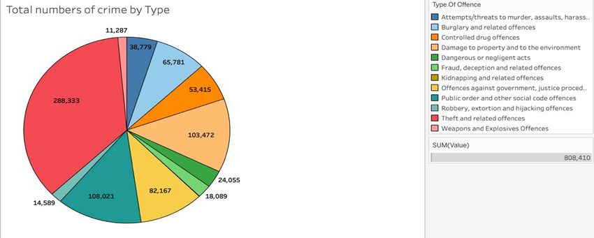
2.0 Data
2.1 Obtaining the Data
After investigating the possible motives of crime, it was apparent that income and education
could have a direct relationship on the volume of crime values. It was decided that having a
dataset containing types of crime, areas and years could work well with an income dataset
containing years and types of income and an education dataset that had the educational
attainment for age groups also containing years for comparison.
        The primary dataset used was sourced on the Central Statistics Office of Ireland and
includes different types of crime offences. Some of the columns of this dataset include the
type of crime, the total number of that crime in a given year and the Garda station the crime
was reported to. This dataset includes the year 2003 up to 2019. This was the period which
was decided to try and match the other datasets too. The crime dataset contains crime values
for the whole Republic of Ireland. This dataset was downloaded directly from the CSO as a
comma separated values file. (Sam Scriven, 2020)

Two secondary datasets were also been downloaded from the CSO.
        First was the Income and Poverty Rates dataset which includes household income and
poverty rates with variables such as the mean disposable income of a household and three
different age ranges that contribute to this dataset. This income dataset period is from 2004-
2019, close to that of the primary dataset. (Tricia Brew, 2020)
        Educational attainment was another dataset that was used and contains 8 age ranges
with a column showing the percentage of attainment for each type of education. The
education dataset contains the year 2009-2020. This has caused some limitation as to what
can be concluded due to the year range not being as wide as the other two datasets.
However it was utilised, as it still contains a wide range of years that can give an insight.
These two datasets were used alongside the primary dataset to analyse whether external
factors have an impact on the frequency of crime. (Sarah Crilly, 2020)

A supplementary dataset was also constructed to aid the crimes dataset.
        A location dataset was created using excel to support the use of a map Visualisation in
R. Google Maps was used to get the latitude and longitude locations of each Garda Station in
North and South Dublin & they were put into excel and saved as a comma separated values
file. This was then loaded into R as a data frame. Leaflet contains native American state
borders as locations when used alongside tMap which is another library in R for constructing
maps. This is non-existent for the locations which were needed for this project so the only
option was to plot each location manually. The exact latitude and longitude locations of the
corresponding Garda Station for each location was and gives insight to the density of Garda
stations in a proximity.

                                                                                                5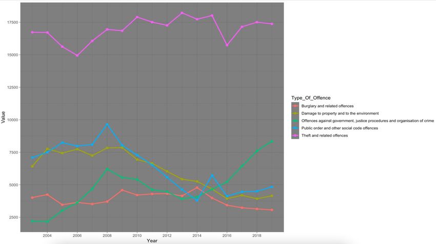
2.2 Exploratory Data Analysis
         Before choosing the primary dataset, it was observed on the source website and
potential findings were questioned. What can this dataset prove? if it can’t prove anything by
itself, how can it be supported to help prove a point. The primary dataset can reveal valid
answers itself however it will reveal more insights when supported by other datasets, which is
why the others were chosen. If the other datasets have no impact on crime after the analysis is
concluded, that is still an important piece of information to take from this project.
         The data was read into R Studio and each column is correct in the type of data, e.g.
‘char’ for words, ‘int’ for numbers etc. Upon analysing the crime data after reading it in, no
null values were present. In the Income dataset, some NA’s were present but only for income
of people aged 0-17 which seemed accurate to progress with as it’s such a wide range of ages
and only people from age 16 would typically work meaning there is a redundancy of ages that
can have an effect on the accuracy. Each column of the dataset was understood and self-
explanatory. The only thing that needed to be done was to filter it to the locations needed for
the analysis.
         All data used is labelled ‘under reservation’ on the Central Statistics Office website
indicating that it is not final. However these datasets were the only ones that could be of any
use for the topic chosen. It is a valid assumption to assume the data is correct based off my
knowledge of the areas in which each Garda station is located in, and weighing up whether or
not it is deemed dangerous, the data seemed to line up to what I expected in this case. The
areas that would be slated in the media through violent crimes had a higher rate of crime
which was expected. The more well off areas had less crime activity which concluded that the
data was accurate to work with.
         Exploratory data analysis findings are included in the results section as visualisations.
These visualisations will answer questions that had been thought of prior to analysing the
data. The exploratory data analysis process was ongoing for the duration of the project as new
findings were discovered as time went on.

Exploratory data analysis was conducted in R as follows;
   1. Crime Dataset
Fig.1. Glimpse function - crime

The glimpse function in R quickly gives insight in to the type of variables and the data within
the variables. The characters and integer types are correctly formatted. This also shows the
total number of rows and columns in the dataset at the start.

Fig.2. Status function - crime

This was used to check for the percentage of NA’s. In the q_na column it is clear that there
are no NA’s present in this data. Unique values can also be observed in the unique column.

                                                                                                6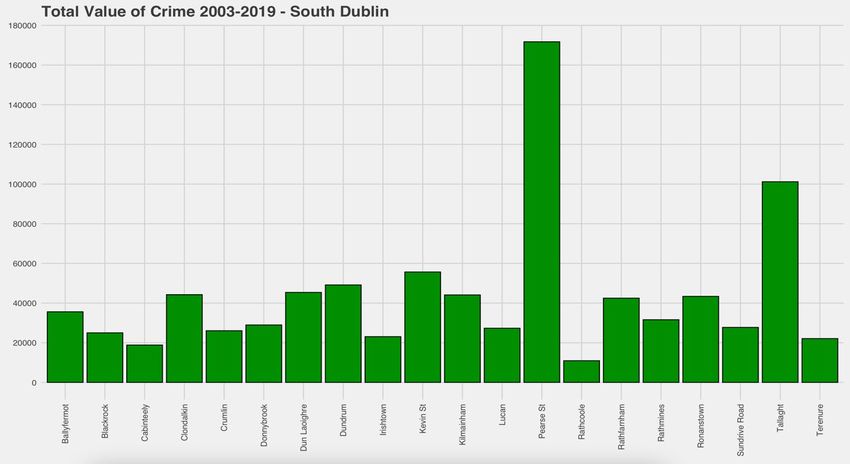
2. Education Dataset
Fig.3. Glimpse function - education

All fields are correct here except ‘Quarter’. This should be an int. The reason it is not an int is
because of the ‘Q2’ at the end of each value. This will need to be changed by removing the
‘Q2’ and parsing the type to ‘int’. The rows and columns can also be observed in the top left.

Fig.4. Status function - education

Similar to the crime dataset, there are no NA’s present in this dataset. There are far less
unique values here which is expected because the dataset is much smaller than the crime one.

    3. Income Dataset
Fig.5. Glimpse function - income

A new observation to make is that the value column in this case is a double. This is due to the
fact that the value is money and money is measured as a double because it contains a decimal
point typically. This is fine and will work similarly to an int so it is the correct type. All of the
rest are correct also. The rows and columns can be seen up the top left.

Fig.6. Status function

An important observation to make here is that there are 64 NA’s in this case. This is due to
the fact that people aged 0-17 were not recorded for household income. These will be left as
NA as it makes no sense to assign them 0 because we can’t assume they made no money,
having the value as Not Available is the best applicable solution in this case as it won’t skew
any results.
        These were basic functions in R to give quick insight for exploratory data analysis. It
can be concluded that each of the datasets are ready and there is no major problems.

                                                                                                   7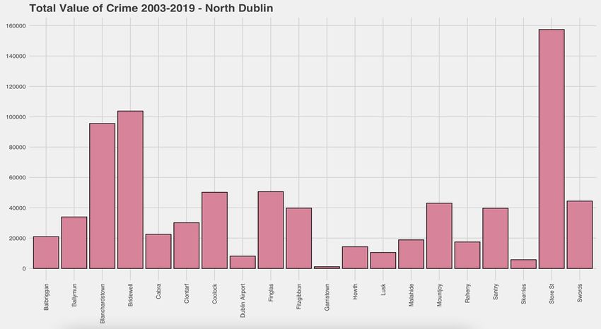
3.0 Methodology
Knowledge Discovery in Databases methodology is what was chosen to follow for this
analysis. This was chosen as it best fits this analysis. The CRISP-DM is more focused on the
business side of things and driving business rules into the implementation which was not a
requirement for this analysis.

                Selection – The data was selected after brainstorming some ideas which were
of interest. Using the Irish Government Database website proved to be useless for this topic
and so the Central Statistics Office website was more suited. Looking through the datasets it
was apparent that some of them were similar with a different additional variable, for example
the dataset that was chosen contains Garda Stations for each year and what was reported to
each one, others had similar data but without the information of where it happened or was
reported to. Having the Garda Station location in the dataset was a great way to conduct a
more specific analysis, focusing on areas, which further allowed me to then introduce other
datasets. A background to crime was explored highlighting possible motives causing people
to commit crime, and datasets were picked based on knowledge gained from this exploration.
        Also within the selection, the full primary dataset was not required as this analysis is
focusing on the Dublin region, so the Dublin Garda stations were selected, 20 from the North
& 20 from the south to use as a comparison. The original dataset had the listings of Garda
Stations all over Ireland so this greatly lessened the new number of observations.

                Pre-Processing – The very first thing was to check for nulls which was done
in the exploratory data analysis. The crime and education datasets contained no NA’s. The
income dataset contained ‘N/A’s’ and it was decided to leave the values as N/A, as no
assumptions could be made for the reasoning behind why they were not available. Assigning
N/A’s with values such as the mean of the column would have skewed the accuracy and gave
different results so it was decided to leave them completely unvalued. Columns were
renamed and removed as necessary to include only what was relevant for the analysis. There
were no major outliers in these datasets and outliers would have been welcomed to the study
as it focuses on crime statistics which can be very high or very low depending on the area.
Extra data frames were made to help analyse certain areas and produce visualisations.
         Other typical tasks that occurred in pre-processing were; sub-setting and filtering,
math calculation such as computing the mean of a range of data, parsing character type fields
to numeric, removing stop words (Q2 at the end of Quarter column in the income dataset) and
aggregation of columns for visualisation purposes. These were all done to help construct new
columns, rows or datasets that would be of benefit to the analysis for interpretation through
visualisations.

                Transformation – The location dataset was created using excel and contained
the latitude and longitude locations of each Garda station. This was joined to the all-time
crime values dataset which was used to create a map visualisation showing the total crimes
between a selected period. The location dataset was joined through a left-join to two data
frames; South location and North location. These datasets were constructed from the main
crime dataset except they only had the Garda station location, year and value of crimes. This
was done for the creation of a shiny dashboard which contains contain the years, locations
and values. The original crime dataset was reduced from 115,056 observations to a total of
8160, 4080 for North Dublin & 4080 for South Dublin. This was done as the 8160 were the
only rows that corresponded to the purpose of the analysis.

                                                                                               8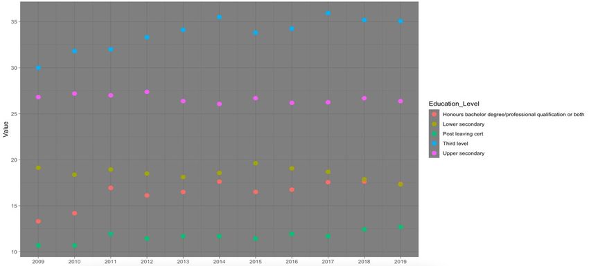
Data Mining
 K-Means clustering was done on all datasets to group the data by similar mean values. The
similar mean values is how the variables were grouped together into a cluster. A K-value was
selected which outputted the total number of groups to be displayed on the cluster
visualisation. This differed for each dataset. Clustering was done on all datasets to see the
different groups within the data easily. Factoextra and Mclust were two libraries installed to
allow for cluster visualisation. (Agarwal, Nagpal, Sehgal, 2013).
   -   Crime value clustering was done separately for the North & South of Dublin to group the
       data together to show areas of high, medium and low crime values. The variables in this case
       were the Garda Stations.
   -   Income clustering was done to group the average household disposable income by year. The
       years were the values in this case.
   -   Education clustering was done to group the different types of education by the most attained
       over the range of years 2009-2019. Each variable in this case were the types of education.

Linear modelling was done to try relationships in the crime dataset in regards to income.
Income was the dependent variable and each type of crime were independent variables. The
crime types were renamed for the process of linear modelling to simplify the task by
including less character dense strings. The dataset for linear modelling was constructed in
excel by joining the income dataset to the crime dataset and writing it to a comma separated
values file. This needed to be done as one variable ‘Type_Of_Offence’ which contained all
12 types of crime needed to be abolished and each crime type needed to be its own variable.
This was too complex to be done in R Studio and would have taken more time than it needed
to as it wasn’t a huge step for the success of the project.
         Two models were made, a full model and a half model. The full model contained all
the types of crime and the half model only contained those that showed as “significant” with
the asterisk beside them in the model output. These models were done to assess the effect of
each type of crime on income to see if there was any relevance between them. This was one
of many ways which correlation & regression were checked between the datasets.

                Evaluation – Upon completing the first 4 processes of the Knowledge
Discovery in Databases model, somewhat of an evaluation was made. R and Tableau were
then used to create visualisations from the data which can evaluate questions within the initial
aims of the project. Visualisations from the data frames constructed in R can be used to
interpret information about the data at ease and efficiently. Some visualisations contain
multiple datasets however most are only constructed using the data within its own dataset.
The graphs that were produced from one dataset such as crime can be compared to a graph of
education to look at the yearly statistics to determine whether high educational attainment
meant lower crime. This is a quick way to evaluate relationships and patterns in the data. The
main evaluation of this analysis will be made from the interpretation of visualisation output.
Visualisations are presented within the Results section of this report.

                                                                                                  9
4.0 Analysis
Data analysis was an ongoing process that was used for the whole duration of the project.
Creating new data frames and joining current ones were made possible through data analysis,
and interpreting the results of the data.
4.1 Visualisation
Visualisation was the main analysis method used for this project. Visualisation enables
efficient interpretation of data like no other method. It is aesthetically pleasing and easy to
interpret by the general public which is why it was used. The crime dataset only contained
one column which had values in it. The rest were just columns that aided the values in terms
of categorisation being the type of crime and periods being the year it occurred. Although
there was only one column, there was a lot of information that could be retrieved from it. The
data frame was exported and reformatted so that each crime had its own column. This
allowed for a deeper analysis into the top types of crime. A leaflet map visualisation was
created which displayed crime values for the 40 locations in Dublin which were colour coded
through pin-point markers plotted on the map. Leaflet uses the Google Maps API to construct
the map that’s displayed. The map contains hover labels to show the location name and an on
click popup label to show the total number of reported crimes for the selected location. This
is a powerful visualisation to represent the volume of crimes per Garda Station in North and
South Dublin. (Farmer and Wasser, 2020)
A Shiny Dashboard was also implemented which contains a slider bar that enables
user interaction. The dashboard was constructed similarly to the map with the hover and pop-
up functionality however it works differently. The data within the pop up changes based on
the users selection of the year on the slider bar. Below the map is a data table which will be
filtered simultaneously with the map through the slider input but also allows for querying
through a search bar to retrieve data on a specific search. This is a powerful visualisation
which offers the greatest insight of the project, it is an innovative aspect that can be used for
real world examples by data scientists within related fields such as criminology.
Tableau was used to create some visualisations to add some variety to the look of the
visualisations for the analysis. Tableau allowed for easier visualisations to be created.
Tableau was initially going to be used for all visualisations but it was more efficient to use R
for them as the data was constantly being manipulated in R and would require writing to csv
files every time to use the data in Tableau.
4.2 Statistical Tests
Statistical tests were only run on the crime dataset. This is because the crime dataset had the
most valuable information for the analysis.
A test for normalisation was the first thing that needed to be done. This was done to
give insight to the type of data being used and the tests that could be run on it. Testing for
normality was done in R using the ggqqplot function and using the Shapiro-Wilk test. Firstly,
Q-Q plots were constructed using a sample set of columns selected at random. The data
within these columns is the number of crimes so it wouldn’t make sense to test them all due
to the similarity. This is why a random sample was selected. The Q-Q plots were constructed
which showed the plots of data against the normality line. It was evident that from
observation of the Q-Q plots, the data was not normally distributed.
Accuracy of these plots was questioned so it was then decided to do Shapiro Wilk
tests. The Shapiro-Wilk test defines the normality based on the P-Value statistic. If P >= 0.05
the data is normally distributed. (Technik, 2019)
10After finding the data was not normally distributed. Non parametric tests were explored and a
Kruskal-Wallis H test was conducted in SPSS. The Kruskal-Wallis H is a one way ANOVA
test which is rank based. This test is used to analyse significant differences between variables.
This test had one grouping variable which was year and 12 independent variables which were
types of crime labelled Crime.1-Crime.12. The Kruskal-Wallis H test outputs a H value
which is the mean rank of the data from the whole observed row. An Asymp. Sig. value is
also a result outputted from this test and represents the significance between each value in the
variable. This can be used to show how significant the change of that particular crime was by
year. If the Asymp. Sig. value > 0.05, it can be interpreted that there was a significant
difference for the values in the variables based on the different years. This can be used to
show if a crime is a reoccurring issue or if it isn’t frequent. (Kang and Kang, 2017)
Spearman’s correlation was also done in SPSS to check for correlation between
income and types of crime that may be influenced by an increase or decrease the income
value. The income value in this test is mean household disposable income which is typically
generated by multiple individuals in a household. This test was done to check the relationship
between the selected types of crime and income to give insight as to whether these types of
crime activity are triggered by income related statistics.
A small amount of statistical tests were performed due to a limitation with the data.
The crime dataset didn’t contain much data that could be tested. However, this data set was
the best crime dataset for Ireland that could be found and it was important for the topic to
keep the analysis on Irish crime data. A workaround for a crime data analysis would be to use
American data as it is constructed differently and contains a lot more information than what
was included in this dataset. The limitation of this dataset was observed at the statistic testing
stage.
115.0 Results
This section includes the visualisation output and explanation for each to give greater
understanding to the findings of this analysis. This section will be broken down into 3
Visualisation, Data Mining and Testing.
5.1 Visualisation
Fig.7. Leaflet map visualisation – total crime values
The above map was constructed using R to show the total number of crimes committed in
each area between the year 2003-2019 which was the years focused on in this analysis. The
markers on the map were created using the latitude & longitude locations of each garda
station in the study. The colour of the markers symbolises the “danger’ of the areas. These
colours were programmed to output as following.
Green – Number of crimes 5 10
These numbers were decided based off the total numbers of crimes for areas which could
contain more crime such as Garda Stations in the City Centre. These Garda Stations would
deal with a lot of theft related crimes as the city centre is a shopping hub.
It’s apparent that Blanchardstown and Tallaght have high values, this may be due to
the fact that they are responsible for crimes within a wider range of areas than some of the
other stations. However this assumption is not entirely accurate as it is evident that Howth is
considered to be “safe” based on the colour of the pin-point map marker. This may be to do
with social class though, for example the housing in Howth is more expensive which may
lead to a different more upper class population of residence. Howth is also a terrain dense
area as it is constructed on a hill which is another factor that may cause the crimes to be low
due to the fact that there is a limited amount of houses. These are factors that need to be taken
into consideration when observing a map like this. The colours were just used to highlight the
total number, not to suggest areas of complete safety.
12Fig.8. Datatable containing Location, Latitude, Longitude and Total Values
The data table above represents the structure of the dataset used to create the Leaflet map
visualisation above. The coordinates for each location represent the exact location of the
Garda Station. The total value is the total number of crimes which is displayed as a pop-up on
the map when a location is clicked and the location value represents the location of each
marker on the map in which the name is displayed upon hovering over the marker.
13Fig.9. Barplot - North Dublin total crime values
Fig.10. Barplot – South Dublin total crime values
The two graphs above were constructed using the barplot function in R. These are made
using the same data that constructed the total crime values map explained previously. The
location with the least amount of crimes is Garristown which is located in North Dublin and
has 1167 total crimes. The value that is the closest match to this in South Dublin is Rathcoole
which has a total of 10946 crimes. This is a major difference in the lowest value. The two
highest values are Store Street in North Dublin and Pearse Street in South Dublin which are
both responsible for shopping districts such as Henry Street and Grafton Street. It was
expected that inner city Garda Stations would have the highest crime values. There is a lot
more variance in the North Dublin chart than South Dublin due to areas like Garristown,
Skerries and Lusk which are all located in the same direction close to the border of County
Dublin.
14Fig.11. Ggplot Geom_Bar – Top 5 areas of crime all time North and South Dublin
The graph above was created to show the top 5 locations for each area for comparison
between the crime values. The North areas definitely outweigh those in the South for the total
number of crimes between the top 5 areas. A total of 4 areas out of the 10 are located within
the city centre. These areas are: Store Street, Pearse Street, Bridewell and Kevin Street. A
high volume of crime is expected here as the population density in the city centre is much
more than in any other location listed.
Fig.12. Ggplot Geom_Bar & Geom_Point - Top 5 Crimes per year
The visualisation above was constructed to show the top 5 types of crime, and there values
per year. It is very evident that the highest number of crimes was Theft & related offences
which gives an explanation as to why the crimes are so high for areas in the city centre. Theft
is a big problem in Dublin and the shopping districts in the city centre are a the area targeted
for this time of crime. All types of crime has increased over the years except offences against
government which is represented by the green line and has increased since 2013
15Fig.14. Shiny Dashboard - Leaflet map and Data table
The visualisation above is a powerful interactive upgrade to the initial all time crime values
represented on a map. This shiny dashboard was created to include a map and data table with
a slider bar to control the data which is shown.
This dashboard features interactivity and reactivity as the slider bar is changed to a
different year or a search is made in the data table search box as demonstrated. The year
slider bar can be moved to filter out the data to only the selected year. It can be seen in the
photo that the year is 2003 and “Howth” is searched in the search bar. Howth is selected on
the map and a pop-up is displayed showing that there were a total of 946 crimes for the year
2003, this is matched in the data table. The values on the data table update with the slider bar
and the values within each map marker. The marker colours also updates to match the values
for the year selected. The marker colouring function is the same as what was used before
except the values needed to be made to a fraction of the size of the ones used on the yearly
dataset.
Information retrieval is simple with the use of this dashboard. A user can gain great
insight into the amount of crime occurring in a particular year if they wish to combine the
information to a separate study. This visualisation could be recommended for real world use
of law officials and data scientists in the Garda. It can be used as a road map to investigate
the areas of higher crime.
16Fig.15. Ggplot Geom_Point - Top 5 Education Level
The graph above shows the top 5 types of education represented as percentage values for
each year. This was constructed to be compared against average crimes which is displayed
below.
Fig.16. Ggplot Geom_Point – Average crimes by year
The plot above was constructed to show the average number of crimes by year matching the
years of the education dataset.
The education dataset was limited to starting at the year 2009. This caused a
limitation as to what could be proved from this. The average crimes dataset was targeted to
only contain the same years as the education and these plots were compared.
2009 contained the highest average of crimes and the lowest percent of Third Level
education attainment. The percentage of honours degree for this year was also at its lowest.
This can indicate that due to people not having qualifications to secure themselves a high
paying job, they could turn to crime to fill the gap in their revenue. This could be drug
offences from trying to sell drugs, theft and burglary offences and even fraud. 2016 were
when crimes were at an all-time low, the change in educational attainment was not significant
enough to justify that crime was a supplement to not securing a job. The two points made
above contradict each other and in reality no assumptions can be made as there appears to be
no link between the data sets when compared this way.
17Fig.17. Ggplot Point & Line plot – Age Group Mean Household Disposable Income
The graph above shows the mean disposable income for each age group which is indicated in
the key at the bottom. The income dataset starts from the year 2004 which is one year later
than the crime dataset. The age group of 0-17 years contains no values as the values for this
variable was NA. As mentioned previously in the report there was nothing that could be done
with these NA’s that wouldn’t cause the data to be skewed and hinder accuracy so they were
left as was.The green line represents the age group of 18-64 years of age which is the age
which most people will spend working, the minimum is approx. €45000 and the max is
approx. €62500. It was expected that the value for this would be the highest of the two
groups. The blue line represents those 65 years of age and over which and due to the value
displayed, this revenue may be generated from pension schemes which is what causes it to be
so much lower than the working group The minimum value for this group is approx. €24800
and the maximum is approx. €33000. Both values are almost half that of the 18-64 age group.
It is evident on the graph that the year 2019 was the peak year for income for both age
groups.
Fig.18. Ggplot Point & Line - Average Mean Household Disposable Income – age groups
added together
The plot above shows the average household disposable income for the two groups combined
mentioned above. This is the sum of disposable income for both age groups. The graph shows
an incline until 2007, then a big dip to 2012 then a peaking incline up to 2019. Where the
total disposable income exceeds €47,000.
18Fig.19. Ggplot Point & Line – Average Mean Household Disposable Income for age groups
added together, with average crime values as a gradient for the plot points.
The plot above is similar to the one explained before except it contains an additional variable.
The average crime values was chosen to be included in this for a quick analysis on whether or
not yearly average crime values are affected by income. The dark blue symbolises the lowest
number of average crimes, the pink/purple colour symbolises the middle number of average
crimes and the yellow symbolises the highest number of average crimes.
An observation of this graph shows that income and crime don’t seem to have any
direct relationship with each other. In 2008 the crime value is at a peak, the income is the 5th
highest on the chart from a total of 16 observations. In 2012 income is at the lowest and the
average crime value seems to be between 200-220. The income then starts to pick up and
peaks in 2019 at close to €47500. At this time, the value of average crimes is close to that of
2012. Between these years at 16 average crimes is at the very lowest at around 180 crimes.
It can be concluded from this graph that income has no effect on the value of average
crimes, but this does not mean it has no relationship with particular types of crime. These will
be further explored in this analysis.
19Fig.20. Pie Chart – showing the 12 types of offence and the density
The pie chart above represents the density for each type of crime based on the reported
incidents of the crime. The labels are the total numbers of crime for that type and the colour
matches the key displayed on the right hand side. A sum was also calculated which shows
there was a total of 808,410 crimes reported within the 17 years(2003-2019). This is an
average of around 47,000 crimes per year. This is a very high value for just 40 Garda Stations
in Dublin and proves the point that crime is a problem.
Fig. 21. Top 5 Types of crime – 2 variables(Year & Value)
Comparing the Theft and Related Offences peak year 2013, to income in 2013. It can be
concluded that there is no direct association with the activity of crime in regards to income
when compared using the graphs.
Damage to Property and to the Environment has decreased by a couple of thousand
from start to finish and when compared alongside the education dataset there is no major
change in the educational attainment to suggest that education has any link to this decrease.
205.2 Data Mining
K-Means clustering was the first data mining technique to be implemented in this analysis. A
K-Means cluster was run on each data set to show the groups within the data. The K value
signifies the number of clusters to be outputted for the visualisation and this was manually
selected for each one. The K-Means clusters group the data based on the nearest neighbour
mean value. Variables with similar means will be grouped closely.
Fig.22. Kmeans cluster - North Dublin Average Crimes. K = 3
The cluster above shows 3 clusters for North Dublin. Cluster 1 contains 3 variables, cluster 2
contains 8 variables and cluster 3 contains 10 variables. The higher the cluster on the graph,
the higher the value.
Fig.23. Kmeans cluster - South Dublin Average Crimes. K = 5
The south cluster contains 5 groups as there are two major outliers to the rest of the data.
Pearse Street and Tallaght have values so much higher than the rest meaning they needed
their own cluster. The means of the values in the 4th blue cluster were too different to
Tallaght and Pearse which is why it was decided to set the K value to 5 for this visualisation.
21Fig.23. Kmeans cluster - All Dublin Average Crimes. K = 3
A cluster visualisation was made to show 3 clusters of data for the 40 Garda Stations in
Dublin. The group with the highest number of values here was the 3rd blue cluster. From this
cluster it can be observed that 5 Garda Stations have a high average value of crime reported
in the analysis.
This can be justified as follows:
Store Street, Pearse Street and Bridewell are all located in the City Centre which is
considered a shopping district. The highest number of crimes committed each year was Theft
related crimes indicating that that played a major role in the value of these locations. Also,
the population density in the inner city is also much higher than suburb areas which would
also influence more crime. Having these three Garda Stations in a reasonably close proximity
to one another means that the likelihood of seeing people committing a crime is higher than
suburb areas that are limited to one station for many kilometres. This is due to the fact that
the number of Guards and patrolling Garda is possibly higher meaning they have a higher
chance of finding any sort of criminal offences being committed.
Blanchardstown and Tallaght are two areas which are isolated from other Garda
stations for quite a distance. They have a larger district region which they need to respond to
which would drive the number of crimes up for these stations. In areas like Coolock, Raheny
and Clontarf that are more close to each other than other stations, they would each operate in
their own radius which means crime from locations out of their jurisdiction won’t be reported
to the wrong police station.
22Fig.24. Kmeans cluster – Average Education Type – All Time. K = 3
The cluster above is constructed based on the all-time values of each education type. There is
a total of 3 clusters. Third level & Upper secondary are the two highest averages and have
similar means. Lower secondary and Honours bachelor degree/processional qualification or
both is contained in the second group and the third group shows the rest. The cluster groups
in this have very different means from one another and it’s visible from how the clusters are
presented.
Fig.25. Kmeans cluster – Average Income Values by Year. K = 3
These clusters are representative of the income value for each year. 2018 & 19 make up the
cluster of the highest income. The other two clusters have 7 values in each and they are
dispersed similarly.
23Linear modelling was used to find relationships between variables in the data, or check if
they even exist. The North Dublin crime dataset was exported and reformatted in excel. This
needed to be done as there was only one variable containing all types of crime, for 12
different types of crime. The dataset was reformatted and each crime type was given a
column to be its own variable. The key for these columns is displayed below;
Fig.26. Key of Crime columns - with explanation as to what crime it the number symbolises.
The data was reformatted so that each variable could be tested individually instead of as one
large column of crimes with thousands of rows. These are the crime types that were included
in the model creation. Two models were constructed, a full model and a half model. The full
model included all of the crime types and the half model only contained crime types that
showed a level of significance within the model through observation of the asterisk at the end
of each output.
The Flextable library was used in R to style the tables for the models. This was done
to make them more aesthetically pleasing and separate them from other visualisations
created.
24Fig.27. Flextable showing model output - Full Model
The linear model above is a full model which means it contains all of the crime variables. The
dependant variable for the models is Income. The independent variables are the crime types.
From the full model output above, it is evident that 6 out of the 12 variables have
significance towards the income value, based on the observation of the asterisks. These
asterisks suggest a level of statistical significance with the regression coefficient. These were
the values which were later chosen for the half model.
The Multiple R-Squared value for this model shows the level of explanation in which
variance in the model can be described. In this model the value is 0.3621. This means that a
total of 36% of the variance in this model can be described. In this case, a low Multiple R-
Squared value does not affect the conclusion of the fit of the model. Due to the fact that the
Adjusted R-Squared isn’t much higher than the Multiple R-Squared, this shows that
overfitting was not an issue for this model. (Frost, 2020)
The F-Statistic in this case is not statistically significant. This means that there is not
much of a relationship between the dependent variable and the independent variables. From
these results and with the inclusion of the P value < 0.05, it can be concluded that this model
is statistically significant
Due to the P-Value being less than alpha at 0.05, this suggests that this is a good fit
model. The result of this model would be to reject the null hypothesis.
25Fig.28. Flextable showing model output - Half Model
The crime variables chosen in this all have some level of statistical significance with the
regression coefficient as implied by the asterisks.
The Multiple R-Squared in this model is 0.3 indicating 30% of the variance can be
described. This is less than that of the full model. The Adjusted R-Squared is again close to
the Multiple R-Squared which indicates that overfitting didn’t occur.
The F-Statistic is also not statistically significant in this model.
The P-Value < 0.05 indicating that there is significance in this model and that the
model is a good fit.
The full model would be considered the best model in this case as the Adjusted R-
Squared value is the highest. This means that the most information captured between these
two models exists in the full model. The Akaike Information Criterion value was calculated
for both models. (Bevans, 2020)
AIC for the full model = 5883.013
AIC for the half model = 5895.166
Although the value is only slightly smaller for the full model, this still suggests that it is a
better fit due to less prediction error.
265.3 Statistical Tests
Fig.29. Q-Q Plots to test for normality – Random selection of crime variables selected
The Q-Q plots above show that the data distribution is not-normal. There are many outliers
on each of the plots. There are too many outliers to even remove to check if outliers are
effecting the normality of the data.
To be absolutely sure the data distribution was not normal, a Shapiro-Wilk normality test was
also done. The P-Value of the Shapiro-Wilk test is used to indicate whether data is normally
distributed or not.
Fig.30. Shapiro-Wilk Normality Test
The P-Value for all tests is < 0.05 which concludes that the data in each of the crime
variables is not-normal. This was used as an indicator for what tests should be run on the
data. The tests which are conducted for data that is not normally distributed are non-
parametric tests.
27Fig.31. Spearman’s Correlation between variables that may have a link to income
Spearman’s correlation was done over Pearson’s-R correlation due to the data being not
normal. Spearman’s correlation is a non-parametric test. The crimes chosen for this data set
were:
Crime 4 - Robbery, extortion and hijacking offences
Crime 5 – Burglary and related offences
Crime 6 - Theft and related offences
These were chosen as they may have some relationship with crime based on logic that money
can attract robbery, burglary, and theft related offences. The correlation was run to look for a
relationship between the crimes and income.
Crime 4 (P=.030 < 0.05. Correlation Coefficient= -.118 < 0 indicating no correlation
but statistical significance between the variables.
Crime 5 (P=0.9 > 0.05. Correlation Coefficient= -0.004 < 0 indicating that there is no
statistical significance between the variables and no correlation.
Crime 6 (P=0.45 < 0.05. Correlation Coefficient= .1096.0 Conclusions
An advantage of this project is the information retained in the visualisations. The
visualisations created can give an insight to people who want to know information about the
topic of crime in Dublin. This analysis provides the service of information retrieval at a level
that can be understood by the general public. This is something that will be appreciated by
viewers with no data science background. This is a key advantage that this project provides.
The complex tasks are done in the back end so that the viewer can view aesthetically pleasing
graphs to gather their information, rather than using maths and coding.
Limitation was a problem in this analysis and was the biggest disadvantage. The two
datasets that were chosen contained not only a limited amount of information, but also a
limited amount of observations. The income data for example only contained 10698
observations for a total of 4183 households. It is not clear where these households were based
but there is a small chance that the locations are primarily Dublin, as they are labelled
Ireland. This hinders the accuracy of the dataset completely. The crime dataset contained
locations but the income one did not. This was the best available income dataset that could be
used, which further explains the point made previously that American data may have enabled
more testing and gave better results with correlation between datasets. The education dataset
also didn’t specify a location which indicates that accuracy with the results from using
education as a cause of crime may not be accurate. It can be concluded that from this
analysis, neither income or education have any effect on the rate of crime. This may be down
to the fact that the data used for each of the datasets didn’t contain a location, or it could be
just a general fact. However it is definitely clear that the accuracy of the results are hindered
by the accuracy of the combined data.
Although there were limitations as to what could be proved from the supplementary
datasets in relation to crime, a lot of information can still be interpreted from this study.
Crime in North Dublin is rampant. It is an every-day issue that occurs in the public eye and
has become somewhat of a norm in reality. Theft related offences are the most common with
the highest volume, and these are only the offences that are recorded.
Committing crime is a job for some. People rely on criminal activity to generate
income, this is particularly evident in disadvantaged areas such as Ballymun, Coolock and
Finglas, where drug dealing is a big issue. The problem with these offences is that they are
harder to catch. Theft in Dublin City is controlled by the use of cameras in stores, this allows
security guards to monitor the store and analyse areas of crime in the store and common times
that they are occurring. Controlled drug sales are harder to catch as there may be a shortage
of cameras where these trades are occurring. This is a known issue although the total offences
recorded in this data does not match the activity of this kind of crime. Drug crime is
definitely one of the most popular forms of crime in Dublin City and access to such products
is as almost easy as the access to legal goods sold in stores.
This analysis was chosen to focus on crime as it is a serious topic. Theft in a store
may not lead to death, but the misuse of drugs or weapons and explosives can. An important
observation to take from this analysis is that all crimes contained in the crime dataset were
only reported offences. The values do not represent that unreported offences that occur. If
every single offence was recorded the value could exceed the values by tenfold. Although
only reported values were recorded, the numbers were still high showing the problem with
crime.
All objectives that were set out were successfully met. This statement defines the
overall completeness of this project. A limited amount of data tests could only be conducted,
this was due to a limitation with the data that was used. If it was known at the start of this
analysis that the data would propose problems down the line, other datasets may have been
introduced for flexibility.
29You can also read