Natural Gas Prices, Electric Generation Investment, and Greenhouse Gas Emissions
←
→
Page content transcription
If your browser does not render page correctly, please read the page content below
Natural Gas Prices, Electric Generation Investment, and
             Greenhouse Gas Emissions
                                            Paul Brehm∗
                                           July 21, 2015

                                               Abstract

          Between 2007 and 2013 the natural gas price dramatically declined, in large part
      due to hydraulic fracturing. Lower natural gas prices induced switching from coal gen-
      eration to natural gas generation; I find 2013 carbon emissions fell by 14,700 tons/hour
      as a result. I also examine newly constructed natural gas capacity, finding that a more
      efficient capital stock led to an additional decrease of 2,100 tons/hour in 2013. I esti-
      mate 65-85% of this new capacity was constructed because of lower gas prices. Using
      a social cost of carbon of $35/ton, I value the total decrease at roughly $5.1 billion.

  ∗
    University of Michigan, pabrehm@umich.edu. For helpful comments and discussions, I thank Ryan Kel-
logg, Shaun McRae, Erin Mansur, Yiyuan Zhang, Sarah Johnston, Aristos Hudson, Alan Griffith, Kookyoung
Han, Maggie O’Rourke, two anonymous referees, Heartland Workshop attendees, and seminar participants
at the University of Michigan. For some Texas data, I thank Reid Dorsey-Palmateer. All errors are my own.

                                                   1
1       Introduction
Natural gas prices have fallen by over 65% from their high in 2008. This decline has been
driven primarily by the large-scale expansion of hydraulic fracturing (fracking) for natural
gas, which has transformed the US natural gas sector. Prior to fracking’s development in
the mid-2000’s, production of natural gas was declining, and projected to decline further.
With very large reserves of shale gas that can be fracked, firms are restricted in the number
of productive wells they can drill only by the capability of their drilling rigs. Consequently,
fracking has greatly increased the amount of natural gas produced in the US and the share
of total US natural gas production from shale gas. From 2007 to 2013, total US natural
gas production increased from 24.7 trillion cubic feet (TCF) to 30.0 TCF and shale gas
production more than quintupled from 2 TCF to 11.9 TCF.1 This long-term shift in the
natural gas sector is still ongoing.
    The reduction in natural gas prices due to the increase in supply from fracking has
led to a large increase in natural gas consumption in the electric sector. Electric utility
consumption of natural gas has increased by 1.3 TCF between 2007 and 2013, or roughly
20 percent.23 Increased natural gas consumption has come at the expense of dirtier coal,
causing a decrease in carbon emissions. Total carbon emissions from electricity generation
declined from 284.7 thousand tons/hour in 2008 to 253.0 thousand tons/hour in 2013. The
decline of 31.7 thousand tons/hour, equal to 11.1% of the total, was due to a variety of
factors – increased renewable generation, slightly decreased demand, lower gas prices, and
increased natural gas generating capacity.
    This paper investigates the effects of lower gas prices, caused by increased natural gas
production, on electric sector greenhouse gas emissions. I ask two distinct questions. I
first examine how falling natural gas prices affect regional carbon emissions from electricity
generation over the short run. Cheaper natural gas replaces relatively more expensive coal in
the generation order; carbon emissions decrease because natural gas releases roughly half of
the carbon that coal releases. I next consider the effect of falling natural gas prices on carbon
emissions through unanticipated generation capacity additions.4 Construction of gas-fired
    1
     EIA, http://www.eia.gov/dnav/ng/ng_prod_sum_dcu_NUS_a.htm.
    2
     2012’s consumption was 2.3 TCF than 2007’s, but consumption fell in 2013 amid slightly higher prices.
   3
     Other uses have seen smaller changes. Residential consumption has increased by about 0.2 TCF and
industrial consumption has increased by about 0.75 TCF (EIA, http://www.eia.gov/dnav/ng/ng_cons_
sum_dcu_nus_a.htm). Net exports have increased by 2.5 TCF, though they remain negative (EIA, http:
//www.eia.gov/dnav/ng/ng_sum_sndm_s1_m.htm). The United States has negative net exports because it
imports more natural gas than it exports, even when accounting for increased natural gas supply due to
fracking. Most imported gas is from Canada.
   4
     During the previous period of low natural gas prices in the early 2000’s there also was a large natural
gas-fired capacity expansion.

                                                     2
power plants has greatly exceeded projections made prior to the dramatic decrease in the
natural gas price. Many of these new gas-fired power plants would not have been constructed
if gas prices had remained high.
I empirically estimate the relationship between carbon emissions and natural gas prices
using a flexible model that also includes electricity demand and a rich set of controls. My
specification allows me to separately identify the effects of lower gas prices and increased
gas-fired generation capacity. I also examine the interaction of these two effects. While
carbon emissions reductions due to low gas prices are only available if prices remain low,
reductions due to new capital stock will likely persist at moderately higher gas prices. This
type of effect has been demonstrated before by Davis & Kilian (2011) in the home-heating
market.
I exploit short-term variation in gas prices to identify the effect of gas prices on carbon
emissions. The primary source of this variation is weather shocks, which influence gas prices
in the short term. Unexpectedly cold weather boosts demand for natural gas because many
US homes are heated using gas. Unexpectedly temperate weather decreases demand. Finally,
unexpectedly hot weather increases air conditioning usage, increasing demand for electricity
(and consequently increasing demand for gas).56
I carefully control for the endogeneity of the price of natural gas. This endogeneity
concern arises due to correlated demand shocks that may directly change both gas prices
and electricity demand. For example, unseasonably warm winter weather may decrease both
gas prices and electricity demand. This would cause my estimates to overstate emissions
decreases attributable to lower gas prices. I control for this by including electricity demand
directly in my specification. Additionally, it is possible that as gas prices fall, electricity
prices may also fall (increasing the demand for electricity and, therefore, carbon emissions).
Including electricity demand in my specification allows me to shut down this channel.
Next, I construct a counterfactual of what emissions would have been had natural gas
prices remained at their higher levels prior to the large-scale application of fracking. In
doing so, I control for renewable production and electricity demand levels. This allows me to
answer my first research question; I find that lower gas prices caused 2013 carbon emissions
to decrease by 14,700 tons/hour.
Falling natural gas prices may also influence carbon emissions through additions of new
5
Although gas prices have decreased over the long term as fracking has become more prevalent, variation
caused by supply changes is difficult to isolate from other trends that change emissions, such as macroeco-
nomic conditions, increasing attention to energy efficiency, and technological improvements. For this reason,
I use short-run variation.
6
Specifically, I exploit short-term variation in weather forecasts. Additional details are available in Online
Appendix A, available at http://www-personal.umich.edu/~pabrehm/.
3capital stock. This new capital stock may displace dirtier coal-fired power plants. I first
determine the portion of new capital stock constructed in response to lower gas prices. This
is a difficult question. I take three different approaches and conclude that 65-85% can be
attributed to falling natural gas prices. In my first approach, I regress construction starts
on gas prices and electricity demand growth. My second approach compares projections of
capital additions from the EIA’s Annual Energy Outlook with actual construction. This
model makes its forecasts using aggregate data – it is a “macro” model. My final approach
compares projections of capital additions from Form EIA-860 with actual construction. The
form uses micro data submitted by utilities and independent power producers.7 I use the
range produced by these three approaches to estimate the amount of new capital stock con-
structed because of low gas prices. I also consider other potential causes of above-expectation
gas-fired capacity construction. It is difficult to conclusively rule them out, but on balance
the evidence points to lower gas prices caused by fracking.
To determine how newly constructed capacity has altered carbon emissions, I rely on
the relationship between carbon emissions and electricity demand. Identification of this
relationship also relies on short-term variation, and weather again is a key source of this
variation.
In order to construct counterfactual emissions where new gas-fired capacity does not exist,
I use my data to determine hour-by-hour electricity generation and carbon emissions from
the new capital stock. Then, I use the coefficients on electricity demand to determine what
marginal emissions would have been if this electricity was instead generated by the existing
power plant fleet. The difference between actual emissions and counterfactual emissions
reveals the emissions savings caused by the new capital stock. I estimate 2013 carbon
reductions from new capacity to be an additional 2,100 tons/hour.
There have been several previous studies of the relationship between gas prices and carbon
emissions. Lu, Salovaara, & McElroy (2012) examine the effect of gas prices on emissions
by EPA region using monthly data over a two year period. They find that between 2008
and 2009, carbon emissions fell by 8.76% in the electric sector, 4.12% of which was due to
falling natural gas prices. However, their paper does not look at new gas-fired construction.8
Cullen & Mansur (2014) estimate the relationship between gas prices and carbon emissions
in order to analyze the industry response to a tax on carbon emissions. While their analysis
7
The Annual Energy Outlook is based, in part, on data from the Form EIA-860. It is combined with
other data in order to make projections.
8
Additionally, I argue that using hourly data over a seven year period, while conducting my analysis
at the NERC interconnection level, allows for a cleaner and more comprehensive analysis. Hourly data is
less reflective of medium-run trends, such as climate policy, than more smoothed monthly data. Even with
hourly data, there is still a concern that medium-run trends affect both the gas price and emissions; the
added years of data allow for the inclusion of a time trend and monthly fixed effects to help control for this.
4relates emissions to the gas price, they do not specifically address the effect of recent gas
price declines on carbon emissions or the effects of new capital stock. 9,10
My paper fits in a broader literature that estimates the effects of natural gas prices on
the power sector (Holladay & LaRiviere 2014 and Linn, Muehlenbachs & Wang 2014). It is
also relevant within the literature that estimates greenhouse gas emissions from the electric
sector (Kaffine, McBee, & Lieskovsky 2013; Callaway & Fowlie 2009; Linn, Mastrangelo, &
Burtraw 2014; Cullen 2013; and Novan 2014).
The paper proceeds as follows. I provide some institutional background to help frame the
analysis (Section 2). Next, I analyze the amount of new generation capacity prompted by
low gas prices (Section 3). I briefly discuss my data (Section 4). I detail my empirical model
and results in Sections 5 and 6. I consider alternative specifications to check the robustness
of my results, then discuss, and conclude (Sections 7, 8, and 9).
2 Background
There are a several institutional details that are important to my analysis. For the vast
majority of American consumers, electricity prices do not vary in real time. Thus, electricity
demand does not adjust in real-time in response to changing wholesale electricity prices
– it is almost completely inelastic in the short-run. Over the medium-run, demand has
the potential to adjust in response. Electricity prices have been relatively stable in real
terms recently. Between 2007 and 2013 the real annual national average price of electricity
fluctuated between 9.35 and 9.98 cents per kilowatt-hour (EIA).11 Electricity consumption
has also been relatively constant. In the discussion section, I examine the potential medium-
run demand response.
It is important to note that manipulation of the price of natural gas is not a concern for
my estimation. Gas power plants are price-takers and are unable to manipulate the price
of natural gas. The natural gas market is large and groups of power plants are unable to
substantially move the market. Additionally, it is the case that power plants with long-term
contracts are not required to burn gas at any individual time. Thus, whether a plant has a
9
Lafrancois (2012) estimates the potential effect of gas-fired power plants constructed before 2006 on
carbon emissions.
10
Engineering models such as Venkatesh, Jaramillo, Griffin, & Matthews (2012) have also looked at this
topic. They use simplified dispatch models to estimate how the marginal supply curve will change. While
this approach has its advantages, it may be less precise for marginal changes. Transmission losses and costs,
bottlenecks, ramping costs, market power, and outages may make it so that some power plants are more
likely to provide power than their marginal cost would suggest.
11
This is across all segments, not just residential consumption. Monthly data has a little more variation.
I use 2010 price levels.
5favorable or unfavorable long-term contract (or no long-term contract) has little bearing on
whether they decide to supply electricity. The opportunity cost of producing electricity is
the spot price of natural gas that firms pay.12
2.1 Interconnection Analysis
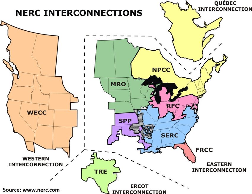
For my analysis, I focus on the NERC interconnection level as in Graff Zivin, Kotchen, &
Mansur (2014). Figure 1 illustrates the location and boundaries of the three interconnections
and regions within each that the NERC oversees. The interconnections are largely separate
entities, with minimal electricity trading between each interconnection. The Western in-
terconnection (WECC) covers most of the territory from New Mexico up to Montana and
west. The Texas interconnection (TRE) covers most of Texas. The Eastern interconnection
is subdivided into six different regional entities that comprise the rest of the United States.
Figure 1
Figure 2 shows power flows between different regions. For reference, one million megawatt
hours over the course of a year are equivalent to an average of roughly 115 megawatts during
every hour. Electricity flows between interconnections (circled) are very small. Regions
with large amounts of power trading, like the Chicago area with eastern parts of the RFC
(denoted by the 102 million megawatt hours), would be inappropriate fits for my model.
While Canada does trade power with the United States, the lines are primarily transmitting
12
For more on gas markets, please see EIA (2001).
6Figure 2
hydroelectrically generated electricity and are full at most hours. Thus, it should have
limited effect on the analysis.
A large amount of regional trading threatens clean identification of this relationship.
To understand this, consider two regions, the Midwest Reliability Organization (MRO) and
the Southwest Power Pool (SPP). MRO has large amounts of coal capacity, while SPP has
a mixture of coal and natural gas. Assume that the regions trade freely and have large
amounts of transmission capacity between them. Additionally, assume electricity demand
remains fixed. As the price of natural gas decreases, more gas and less coal will be burnt.
This would mean that in aggregate carbon dioxide emissions would decrease. However, it
could be the case that power generation has increased in SPP and decreased in MRO, with
SPP sending excess generation to MRO. SPP would then show an increase in emissions at
lower gas prices, while MRO shows a larger than deserved decrease. A system with minimal
trading prevents this potential identification issue.
2.2 Gas Prices and the Dispatch Curve
There has been substantial variation in the natural gas price over the last several years.
The spot price of gas at Henry Hub, the most important trading location, does an excellent
job of capturing this variation. United States gas markets are fairly integrated, with most
other locations trading at a basis against Henry Hub. For example, natural gas in Chicago
7is generally about 10 cents per MMBtu (2-5%) more expensive than natural gas at Henry
Hub.
Figure 3
(a) (b)
Figure 3 examines changes in the natural gas market that have been occurring since 2007.
The panel on the left (a) plots the relationship between the Henry Hub Natural Gas Spot
Price and the quantity of shale gas that is produced in North America. It demonstrates that
as the supply of shale gas has increased, the price of natural gas has decreased. The vast
majority of shale gas is drilled using hydraulic fracturing. Note that the first three years of
shale data were only collected annually, though quantities are generally small. Additionally,
the gas price is a monthly average. This figure depicts the long-term trend, though it obscures
the day-to-day variation in gas prices that is key to my identification strategy.
The panel on the right (b) plots the price of gas at Henry Hub against the Brent oil
price.13 Oil and gas are energy sources that are, to a certain extent, substitutable. Prior
to the large-scale implementation of fracking, oil and gas closely tracked each other, with a
barrel of oil being about ten times as expensive as an MMBtu of natural gas14 . The graph
starts in 1997 when the EIA Henry Hub spot price time series begins, though the relationship
in the early 90’s (using a different measure of the natural gas price) was also strong. In 2008
there was a recession-induced decline in the prices of both fuels. Shale gas production greatly
increased during the recovery, and the relationship between gas and oil prices fractured. Oil
prices surged back to pre-recession levels, while gas prices continued their decline. By the
end of 2013, a barrel of oil was now twenty-five times as expensive as one MMBtu of natural
gas.15
13
Brent oil is the major world oil price. Oil prices in Cushing, Oklahoma are similar, though they have
been slightly lower because of pipeline constraints.
14
That is, oil was about twice as expensive on a per-MMBtu basis
15
For more on the relationship between oil and gas prices, please see Villar & Joutz (2006), Ramberg &
Parsons (2012), and EIA (2012).
8If macroeconomic conditions were the only important changes in energy markets, gas
prices would likely have rebounded similar to the oil price rebound (Hausman & Kellogg
2015). The fractured relationship is possible because oil is traded on a global market, whereas
natural gas markets are regional (Kilian 2015). Fracking has also produced a US oil boom,
but it hasn’t had as large of an effect on the world price of oil because the global oil market
is very large and the oil boom began later. Excess natural gas within the US is unable to
be exported in large quantities outside of North America because of a lack of infrastructure
and high transportation costs. Instead, it is consumed locally at much cheaper prices.
Also included in panel (b) are futures curves from January 2008 for natural gas and crude
oil. The futures curves show that financial markets expected gas and oil prices to retain their
historical relationship over the 2009-2013 period. Financial markets also did not anticipate
the large decline in gas prices.
As discussed in the introduction, total gas production in the US increased by 5 trillion
cubic feet per year, or 20%, between 2007 and 2012. The combination of a large increase in
quantity supplied and a large decrease in the price of natural gas is strongly suggestive of a
large rightward shift of the natural gas supply curve.
The price of natural gas is an important factor in electric-sector carbon emissions. In
some areas of the country, firms bid in real-time to determine who is going to supply the
marginal kilowatt-hour. Nuclear and renewable power plants have very low marginal costs.
As a result, nearly all marginal power is provided by either coal or natural gas-fired plants. In
other areas of the country, a centralized dispatch authority determines which plants produce
power. One of the authority’s main objectives is to minimize generation costs. Changing
fuel costs will prompt a dispatch authority to adjust the generation mix.
Fuel is the primary variable cost at fossil fuel power plants. Moderate to high natural gas
prices usually cause coal to have lower variable costs than coal, making it the first fuel called
upon to generate electricity. At lower gas prices, the marginal cost of electricity generated
from gas will decrease and gas will begin to displace coal in the generation order. This
switching between coal and natural gas is the key mechanism driving the results in this
paper. Switching is able to happen within a period of hours.
3 Cheap Gas and Gas-Fired Capacity Additions
Most forecasters and industry analysts were expecting only very minor gas-fired capacity
increases between 2010 and 2013. Instead, 25.9 GW of gas-fired capacity was added over
this timeframe. It is difficult to isolate the precise effect of fracking on new gas-fired capacity
additions. I take three approaches to answering this question, which all yield similar results.
9First, I run a set of simple regressions that estimate the relationship between the gas price
and construction starts. One weakness of this approach is the limited sample. Next, I
examine projections made by the EIA in their Annual Energy Outlook projections. Finally,
I consider data about potential projects that are filed with the EIA using their EIA-860
form.16 I look at these projections because they were made before fracking; differences from
the projections can plausibly be ascribed to fracking. I estimate that roughly 65%-85% of
these additions likely would not have happened if the gas price had remained at 2008 levels.
A gas-fired power plant takes between 18 and 36 months to construct. Natural gas prices
crashed in mid-2008, suggesting that the earliest gas plants built because of low gas prices
would likely have come online in 2010. While it is likely that a few suspended projects were
restarted and completed by 2009, I do not consider these plants.
My analysis includes both combined cycle and conventional combustion turbines. New
combined cycle plants primarily supplant less efficient coal-fired plants, while new combustion
turbine plants could displace the least efficient coal-fired plants during shoulder periods, as
well as less efficient (oil or gas) peaker plants during peak hours. However, emissions savings
from new combustion turbines are likely to be minimal – new combined cycle plants likely
drive the results in this paper.
It is difficult to disentangle the effects of natural gas prices from contemporaneous trends
such as state renewable portfolio standards, changing environmental regulations, or the great
recession. I briefly consider the effect each of these trends might have had on gas-fired
generation construction. While not definitive, these considerations support the theory that
gas prices were the major driver of gas-fired capacity additions.
3.1 Construction Starts Regression Analysis
I first consider a regression-based approach to determine the relationship between gas prices
and estimated gas-fired construction starts. Prior to the regressions, I use data from Form
EIA-860 to estimate construction starts.17 The data summarizes construction completions
(e.g., 20.1 GW in 2004 and 14.8 GW in 2005); I use an 18 month lead to estimate con-
struction starts for each year (e.g. 17.4 GW in 2003).18 Using lead completions data as an
estimate of construction starts instead of actual construction starts allows me to capture
some intermediate effects. For example, some power plants are begun, but later “indefinitely
16
Note that the AEO projections are based, in part, on the raw EIA-860 data.
17
The raw EIA-860 data are aggregated in the Electric Power Annual (EPA). I use aggregated data in the
EPA because disaggregated data on gas-fired construction starts from the EIA-860 are unavailable for some
years due to changes to EIA’s data collection procedures.
18
I choose an 18-month lead because it allows for the best fit with the available micro data on construction
starts. In Online Appendix B, I provide a range of alternative lead times; results are similar.
10postponed.” Lead completions estimates appropriately account for plants that were indefi-
nitely postponed and later restarted, as well as the lower likelihood of such postponements
when firms expect a long-term supply of inexpensive natural gas.
The Annual Energy Outlook also reports construction completions. Their data is based
on the EIA-860, though it is compiled differently.19 As a check, I use both the EIA-860 and
AEO datasets in my analysis.
I estimate the annual relationship between construction starts and electricity demand
growth and the price of natural gas (using data from 2000-2011). Specifically, I estimate:
LoggedConstructionStarts(Ct ) = α0 + β1 PtN G + β2 ElecGrowtht + t (1)
The price of natural gas and electricity demand growth are the two primary drivers of
gas-fired capacity investments. Gas prices determine the marginal cost of operating plants,
while demand growth helps determine future wholesale electricity prices. I consider two
variations of the dependent variable, using either AEO or EIA-860 data.
A limitation of this estimation is that the number of data points in this time series
is only 11 or 12, depending on the data source.20 More reliable estimates would result
from including additional controls, making the independent variables more flexible, and
adjusting the standard errors. Data limitations prevent these adjustments. Nevertheless, this
estimation allows for a rough look at the relationship between gas prices and construction
starts. I have summarized the results in Table 1.
While the magnitude of the gas price coefficient varies across the regressions (including
the ones in Online Appendix B), it is consistently negative. To determine the counterfactual
construction, I first determine the difference between actual gas prices in each year and the
counterfactual (no-fracking) gas price from 2008. I then adjust construction starts in each
year down by the counterfactual gas price difference multiplied by the gas price coefficient.
This allows me to determine, in rows [c] through [g], what counterfactual construction would
have been.
In 2009, construction estimates do not change because of the way this analysis is con-
structed – it takes more than 12 months to have an effect. However, starting in 2010,
counterfactual construction is frequently lower than it otherwise would have been. Much of
the time it is close to zero or negative. I interpret negative construction to mean that it is
very undesirable to build a gas plant, not that gas plants are being decommissioned. Years
19
The raw EIA-860 data are aggregated in the Electric Power Annual. I use aggregated data because
disaggregated data on gas-fired construction starts from the EIA-860 are unavailable for some years due to
changes to EIA’s data collection procedures.
20
In Online Appendix B I include a scatterplot of these points, as well as a line of best fit.
11Table 1
in which there is positive construction are highlighted.
Finally, I compare actual plant construction from 2010 to 2013 with counterfactual plant
construction. I take the 25.9 GW of stock that was actually constructed and subtract
construction in any year with a positive counterfactual. For example, in column [2], I subtract
(1.5 + 3.6 + 2.8 + 1.7 = ) 9.6 GW that would have been built even if gas prices remained
high. Negative construction is treated as a zero.
Depending on the specification, this analysis suggests either 16.2 or 22.1 GW of gas-fired
capacity was constructed that would not otherwise have been built. Note that the EIA-860
plant data do not include 2013 construction or counterfactual construction.
3.2 Annual Energy Outlook Projections
In the mid-2000s, the EIA estimated that there would only be very modest investment in
natural gas-fired electric generation capacity. The available capital stock would be mostly
sufficient to meet growth in electricity demand. Further, it would not be profitable to invest
12in new capacity while old capacity was working well. The 2007 Annual Energy Outlook
(AEO) projections suggested that there would be roughly 2 GW of natural gas capacity added
during the 2010-2013 timeframe. As Figure 4 shows, this was not a one-year aberration;
projections in surrounding years were also very similar.
Figure 4
However, the solid black column in Figure 4 indicates that actual capacity additions were
substantially above initial projections. The 25.9 GW of capacity that was built between 2010
and 2013 is much higher than these projections.
I next look to see how close previous AEO projections were to actual construction. It
is possible that the AEO’s black box model regularly underestimates short to medium-run
gas-capacity additions. To be conservative and allow for this possibility, I adjust the 2006-
2008 AEO projections up by the amount that previous projections missed by. I view this as
conservative in part because AEO projections are intended to be unbiased. Table 2 details
this analysis.
I look at both five-year (columns [1] to [3]) and ten-year projections (columns [4] to [6])
in the same way. In the top panel I analyze projections made between 2001 and 2004 to
determine how accurate they were. These projections are mostly before the advent of fracking
and are mostly free from its influence. In the five-year projection, total construction averaged
13Table 2 14
147% above projection. Ten-year construction averaged 22% above projection.21
   In the bottom panel, I analyze 2006-2008 projections for construction between 2010 and
2013. All three years projected minimal construction during these years. To adjust for
previous underprojections, I multiply the 2006-2008 projections by ratio of actual/projected
construction that I calculate in the upper panel (row [e], in bold). Even after I adjust for
previous errors (columns [2] and [5]), the expected level of construction was much lower than
actual construction. Adjusting for previous projection errors, this analysis suggests between
18 and 22 gigawatts of natural gas-fired capacity was constructed that would not otherwise
have been.

3.3     Raw EIA-860 Projections
Proposed electricity plants are required to file the EIA-860 form if “[t]he plant will be pri-
marily fueled by energy sources other than coal or nuclear energy and is expected to begin
commercial operation within 5 years.” This form details proposed plants, which are in vari-
ous stages of planning or construction, but are not generally certain to be completed. When
using the raw EIA-860 data, I view it as a soft cap on the possible number of projects
that will be built over the next 5 years.22 To construct a plant within the next five years
that is not already in the database, a firm would need to complete the siting, planning and
construction phases. This can be done, but it requires a very smooth process.
    To determine how many of these projects are completed during pre-fracking (normal)
times, I look at summaries of EIA-860 data from 2001 through 2003. As Table 3 shows,
on average 59% of potential projects were completed during these years. In contrast, when
I look at projections from 2006 through 2008, years that mostly overlap with fracking, I
see that 101% of potential projects are completed. That is, during regular times, half of
all projects are completed. When gas-fired plants become much more profitable because
their marginal costs tremendously decline, slightly more projects are completed than were
planned.
    This suggests that without fracking (and lower gas prices), roughly one half of all projects
would have been completed – the other half was induced by very cheap natural gas prices.
Looking at the most recent projection for which I have five years of actual construction data
(2007), I estimate that 17.5 GW of additional capacity were induced by cheap natural gas.
  21
     Note that these results are driven in part by 2004 projections (row [d]), which are most likely to be
influenced by fracking. I view the inclusion of 2004 projections as conservative.
  22
     This raw data is summarized in the Electric Power Annual.

                                                   15
Table 3
3.4 Alternative Explanations
There are a number of possible alternative explanations for the surge in gas-fired construc-
tion. I now briefly consider several of them. While I am unable to conclusively rule them
out, they do not appear to be the main driver of new plant construction.
3.4.1 State Renewable Portfolio Standards
Renewable Portfolio Standards have been enacted at the state level in twenty-nine of the
lower 48 states (and the District of Columbia). Nineteen states, generally in the mountain
region or southeast, had either voluntary goals or no legislation.23 While standards vary
across states, they broadly seek to increase the amount of power generated from renewable
23
http://www.eia.gov/todayinenergy/detail.cfm?id=4850.
16sources. These standards likely disincentivize gas-fired construction because renewable gen-
eration will cover much of future electricity growth. However, when building new fossil-fuel
plants, they could also incentivize additional gas-fired power plants (at the expense of coal-
fired plants) because gas-fired generation better complements the less predictable nature of
renewable power. Using Texas data, Dorsey-Palmateer (2015) finds that the primary ef-
fect of wind generation is to reduce fossil fuel consumption. That is, the first effect would
likely outweigh the second, and in the absence of renewable portfolio standards, gas-fired
construction would likely have been even larger.
I now look to see if a disproportionate share of construction was in states with renew-
able portfolio standards. The twenty-nine states with standards contained 72% of the US
population. They also constructed 76% of the 227 new gas-fired units built over the 2010-
2013 period (note that plants can have multiple units). This (very broad) overview does
not suggest a large effect due to renewable portfolio standards, as there was also substantial
construction in states without these standards.
3.4.2 Great Recession
The Great Recession began in December of 2007 and ended in June of 2009. In this section, I
have used projections that were issued between 2005 and early 2008. For example, section 3.2
uses the 2007 AEO projection issued in early 2007 before the onset of the recession. Following
the onset of the recession, capital expenditures across the US economy fell substantially. If
the construction projections accounted for the upcoming Great Recession, they likely would
have predicted an even lower amount of new gas-fired power plant construction. That is to
say, while the effects of the Great Recession are not captured in this analysis, the recession
likely muted the effect of lower gas prices.
3.4.3 Changing Environmental Regulations
The Regional Greenhouse Gas Initiative (RGGI) involves ten states in the Northeastern US
(plus PA as an observer). It went into effect in 2009 in an attempt to limit carbon emissions.
Similarly, California implemented a cap & trade program in 2013. These programs will
increase the cost of emitting carbon (up from zero) and some of these costs may be passed
on to consumers in the form of higher electricity prices. The effect on natural gas-fired plants
is ambiguous – they are cleaner than coal-fired generation, but dirtier than renewables. The
twelve states (Northeast plus California) make up about 33% of US population, and have
built 38% of new gas-fired generation units. I do not interpret this finding as evidence that
17carbon regulations have been driving gas-fired investments.24
Coal-fired power plants are the largest source of mercury emissions in the United States.
It is possible that changing mercury regulations have influenced the decision to build gas-
fired plants. At the national level, Mercury and Air Toxics Standards (MATS) are being
developed by the EPA. They were originally proposed in March 2011, but have been under
revision since then. As of April 2015, the standards look like they will be upheld.25 It
is possible that these standards influenced borderline plants to continue completion. It is
unlikely that MATS caused new plants to be conceived and constructed between 2010 and
2013 because of the uncertainty surrounding the revision and the amount of time required
to build a new power plant. Additionally, 2011’s large amount of construction completions,
which was likely unaffected by the MATS proposal, provides evidence that new construction
was economic without the benefit of MATS. However, I cannot conclusively rule out MATS
as a driver of gas-fired construction.
The Clean Air Interstate Rule (CAIR) was originally proposed by the EPA in 2003 with
the aim of reducing emissions of particulate matter, nitrogen oxide, and sulfur dioxide. After
a lengthy legal battle, CAIR was remanded in 2008 and the EPA was ordered to address
several problems with the regulation. The EPA finalized the Cross-State Air Pollution Rule
(CSAPR) in 2011, and phase I took effect at the start of 2015. The primary effect of the law
is to reduce pollution from coal-fired power plants through additional technological controls
or reduced generation. Natural gas plants emit less conventional (non-carbon) pollution
when compared with coal-fired plants. As a result, I expect the net effect of the regulation
to promote gas-fired and renewable generation at the expense of coal. CSAPR and/or CAIR
were designed to affect 31 states and the District of Columbia. These states comprised 75%
of the US population, but only 60% of the new gas-fired construction. I interpret this as
evidence that CSAPR is not the primary driver of new gas-fired construction. States where
CAIR/CSAPR promote gas-fired generation had a lower than representative percentage of
new gas-fired construction.
3.4.4 Alternative Explanations Review
There have been several important changes to the electricity sector over the previous fifteen
years. State renewable portfolio standards and the Great Recession likely disincentivized
gas-fired construction. Changing environmental regulations may have promoted gas-fired
24
Interestingly, California has built more than its share of new generation while the Northeast has built
less. This could be related to population growth that is above the national average in California and well
below the national average in the northeast.
25
http://green.blogs.nytimes.com/2011/12/21/e-p-a-announces-mercury-limits/, http://www.
epa.gov/mats/actions.html.
18construction. However, the affected states do not have a disproportionate share of construc-
tion. The regulations also do not appear timed such that they would substantially affect
construction projections from 2007.
3.5 Inference
Estimating the amount of gas-fired construction that is due to lower gas prices is a difficult
problem. In this section, I have taken three approaches. Using a construction regressions
approach, I estimate that between 16.2 and 22.1 GW of gas-fired capacity were added because
of low gas prices. Using differences from AEO projections, I estimate total additions of 18.0
to 22.0 GW. Finally, using the raw EIA-860 data, I estimate additions to be 17.5 GW. All
three approaches produce similar estimates; I estimate that between 65% and 85% of total
additions were prompted by low gas prices. These estimates are also consistent with the
intuition that greatly reducing marginal production costs (through lower gas prices) will
incentivize firms to increase production capacity. However, it is difficult to disentangle the
effect of natural gas prices from other factors affecting these large capital expenditures. The
remainder of this paper turns to studying changes in carbon emissions from both existing
and newly-constructed plants.
4 Data
Emissions data are collected by the EPA using the Continuous Emissions Monitoring System
(CEMS). CEMS collects emissions data from all fossil fuel power plant units that have
generation capacity of 25 megawatts or greater. Most power plants generate several hundred
megawatts. Only very small generators (producing small amounts of pollution) are not
included; CEMS covers the vast majority of pollutant-emitting electricity generation in the
United States.26 I use hourly data over the 2007 to 2013 period. Figure 5 summarizes
carbon dioxide emissions from these power plants and illustrates the seasonality of electricity
generation. Carbon emissions decrease by a little more than 10% over the time period. A
graph of fossil fuel electricity generation by interconnection looks similar, though electricity
generation has remained relatively constant.27
I use hourly electricity demand data from FERC Form 714. Planning areas are geographic
26
I use generators labeled “Electric Utility,” “Cogeneration,” “Small Power Producer” or “Institutional.”
I consider this the backbone of the electric grid. I exclude a range of industrial plants like “Pulp & Paper
Mill” or “Cement Plant” as they frequently do not list electricity generation, but do emit pollutants.
27
This is anomalous. For several decades prior to the time period, electricity demand grew fairly steadily
by a couple percent every year.
19Figure 5
areas that coordinate electricity load to meet demand. The FERC requires each planning
area to submit this report annually. I map planning areas to NERC interconnections and
then aggregate the data by interconnection, allowing me to control for changing demand. 28
The EIA requires electricity generators to report monthly information via EIA form
923. I aggregate and use monthly net generation from renewable power plants.29 Because
renewable generation does not emit carbon dioxide or sulfur dioxide, it is not captured by
CEMS.
I include data from the National Weather Service on heating degree days (HDD) and
cooling degree days (CDD).30 I take population-weighted averages for each interconnection.
28
For regions where independent system operators (ISOs) report separately from utilities, I only include
data from the ISOs. For example, this means that the northeast is comprised only of data reported by the
NYISO and NEISO, California’s data is predominantly from CAISO, etc.
29
Specifically, I use fuel codes for nuclear, hydroelectric, solar, geothermal, and wind power. This is
consistent with Cullen & Mansur (2014). Less than 1% of generation is reported as a “State-Fuel Level
Increment” without a NERC region. I assign this data to NERC regions. Results are similar if it is omitted.
30
The National Weather Service defines HDD and CDD: ”A mean daily temperature (average of the
daily maximum and minimum temperatures) of 65F is the base for both heating and cooling degree day
computations. Heating degree days are summations of negative differences between the mean daily tem-
perature and the 65F base; cooling degree days are summations of positive differences from the same base.
For example, cooling degree days for a station with daily mean temperatures during a seven-day period
of 67,65,70,74,78,65 and 68, are 2,0,5,9,13,0,and 3, for a total for the week of 32 cooling degree days.”
http://www.cpc.ncep.noaa.gov/products/analysis_monitoring/cdus/degree_days/ddayexp.shtml.
20Finally, I use natural gas spot price data that are collected by the EIA through Thomson
Reuters. They track the natural gas price at Henry Hub.
5 Empirics
My analysis is essentially estimating a production function for carbon emissions. I have
panel data on the electricity-generation industry over a period of seven years and am able
to repeatedly view their emissions decisions. Given gas prices, electricity demand, and other
control variables, I estimate the causal effect of gas price shocks on carbon emissions. I also
estimate the causal effect of newly constructed gas-fired capacity on carbon emissions.
My identification assumption is that short-run changes in gas prices are uncorrelated with
carbon emissions except through dispatch changes. After including appropriate controls,
these price changes are orthogonal to other determinants of carbon emissions. Similarly,
when estimating the causal effect of newly constructed gas-fired capacity, I assume that the
electricity demand coefficients represent the marginal emissions from the power plants they
are replacing. Gas price and electricity demand changes are exogenously caused and the
resulting errors are uncorrelated with carbon emissions.
I run my analysis separately for each hour of the day. As Graff Zivin, Kotchen, &
Mansur (2014) show, marginal emissions can vary widely from hour to hour. If new gas-fired
generators are running overnight they will likely be providing baseload power and replacing
coal power plants. This will have a large effect on emissions. However, if the new generators
are primarily running during peak hours of demand, they could just be replacing older gas-
fired plants, providing minimal emissions savings.
I focus on the interconnection level (Western, Eastern, & Texas). Electricity demand is
reported at the planning area. Due to changes in planning area geography, some planning
areas move from one region to another region or cover multiple regions during my time period.
For example, MISO (a planning area) covers parts of MRO, RFC, and SERC. Because of
this and because of substantial trading across regions (Section 2.1), I do not find it credible
to report individual regional estimates for the Eastern interconnection.
5.1 Decrease in Emissions from Switching
My primary specification is run at the hourly level (t) and is estimated separately for
each interconnection. It estimates the relationship between total (carbon) emissions (T Et )
aggregated across the interconnection and the national price of natural gas (PtN G ), con-
trolling for interconnection-level electricity demand (QE
t ), renewable electricity generation
21(Renewablest ), Heating Degree Days (HDDt ), and Cooling Degree Days (CDDt ). I also
include a flexible time trend (Datet ) and month of year fixed effects (Dm ). Finally, I include
an interaction term between the gas price and the demand spline. I use a cubic spline, s(),
with six knot points to allow for flexibility in the relationship between emissions and the
price of natural gas, electricity demand, renewables, and the time trend. The shape of the
spline does not strongly depend on the number of knots. I choose six to be consistent with
Cullen & Mansur (2014).31
t ) + 1{Pt
T otalEmissions(T Et ) = α0 + s(PtN G ) + s(QE NG
> med(PtN G )} ∗ s(QE
t )
+ s(HDDt ) + s(CDDt ) + s(Renewablest ) + s(Datet ) + γDm + t (2)
I control for electricity demand for two reasons. Most importantly, including demand will
eliminate a major source of possible endogeneity from, e.g., macroeconomic conditions or
weather conditions. If the recent economic downturn were correlated with the fall in natural
gas prices, the results could be biased. The economic downturn would cause lower emissions
through lower gas prices, but also through a decrease in electricity generation. Thus, the
analysis could overstate the decrease in emissions caused by the decrease in the natural gas
price. Similarly, if warmer summers increased gas prices and electricity consumption, they
would cause bias. In this case, higher gas prices would be correlated with higher consumption
and increased coal consumption. This could also cause the analysis to overstate the decrease
in emissions caused by the decrease in the natural gas price.
The second reason that I include electricity demand is that over the medium-to-long
run lower gas prices may cause lower electricity prices, increasing the quantity demanded of
electricity. To the extent that medium run effects exist, including demand as a control allows
me to isolate the first-order effect of gas prices on carbon emissions. While including demand
directly in the model is unconventional, it is appropriate in the electricity sector. This is
because in the short-run, demand is determined exogenously outside the model. That is,
electricity demand is fixed over short time periods because prices are generally not available
in real time.
It is important to control for the level of renewable generation because renewable gener-
ation directly replaces conventional generation. Wind and solar patterns are seasonal and
cause renewable electricity generation to also be seasonal. For instance, in the Western in-
terconnection, winds are strongest around April and are generally much weaker in October.
Therefore, renewable production peaks in April and is much lower in the late fall. Gas
31
For the spline on HDD and CDD I use three knots. The ambient temperature ranges are too small to
allow for six knots.
22prices are also seasonal. Failing to control for the variation inherent in renewable electricity
production would cause bias.
While electricity demand and carbon emissions data are hourly and gas prices are daily,
renewable electricity generation is only available at the monthly level. Renewable generation
has very low marginal costs. As a result, it should always come before gas and coal in the
dispatch order. On a day-to-day level, it is not very correlated with gas prices. Thus, the
lack of granularity in the data will only cause very limited bias in my results.32,33,34
It is possible that failing to control for generator efficiency changes caused by changes
in ambient temperature causes my results to be overstated. This could be the case, e.g.,
because hot days increase both carbon emissions and electricity demand or the gas price.
Hotter days may cause generators to operate less efficiently, directly increasing gas usage
and carbon emissions. They could also increase electricity demand (air conditioning) or the
gas price (more demand for electricity). Controlling for ambient temperature will prevent
this type of bias.
HDD and CDD are better suited to analyze temperature’s effect on generator efficiency
than raw temperature. A raw temperature average could disguise important temperature
heterogeneity. For example, if the Western interconnection had a temperature of 68 F in all
areas, this would result in a raw average temperature of 65 F, HDD of 0, CDD of 0, and
very little effect on generator efficiency. However, it could also be the case that California
is very hot and the rest of the west is very cold. Here, the population-weighted average
temperature would still be 65 F, but the HDD could be 10 and the CDD could be 10.
Generator efficiency would differ from the former case. Using HDD and CDD allows me
to more accurately capture the effect of ambient temperature on carbon emissions through
generator efficiency.
I include month-of-year dummies to control for residual seasonal variation not captured
32
In section 7.1 I check the robustness of this assumption using hourly wind data that are available only
in the Texas interconnection. In all years of my sample, wind, wood, and hydroelectric power are by far
the largest sources of renewable power. For more, please see the EIA’s Electric Power Monthly, table 1.1.A:
http://www.eia.gov/electricity/monthly/.
33
It is possible bias could result from cloudy periods. They are cooler, resulting lower electricity demand
and lower solar-powered generation. The extent to which this causes bias is likely minimal. In 2013 (the
year in my sample with the largest amount of solar generation), solar produced 9 GWh of power in the
United States. Total US generation in 2013 was 4.1 million GWh, making solar responsible for less than
0.01% of total 2013 generation. For more, please see the EIA’s Electric Power Monthly, tables 1.1 and 1.1.A:
http://www.eia.gov/electricity/monthly/.
34
It is also possible that hydroelectric generation is correlated with gas prices. This could happen because
operators are able to produce electricity when gas prices are relatively high within the same month. This
is unlikely because it requires that operators know whether near future prices will be higher or lower than
current prices. Predicting future gas prices is very difficult. To the extent that this hydroelectric generation
is correlated with gas prices, this would work against finding results in this paper. Because operators would
be providing more renewable power when gas prices are high, the gas price spline would be flatter.
23by my renewables data. This might arise because of seasonal generator maintenance. The
flexible time trend is used to control for trends through time. In particular, the generation
mix and international demand for coal are changing slowly over time. Including the time
trend allows me to control for these changes. The time trend is likely sufficient to control
for new capacity additions. While they are important, it is not the case that they are large
relative to the existing generation stock; they increase the generation stock by roughly 6%.35
Note that while I can control for the effect the changing generation mix has on the gas price
spline, it does not preclude me from estimating its effects on carbon emissions. As discussed
below, the effects of the generation mix are estimated by looking at the demand spline.
Marginal emissions, which new gas-fired plants are displacing, could vary with the gas
price because the dispatch order of power plants adjusts as gas prices change. The interaction
term, 1{PtN G > med(PtN G )} ∗ s(QE t ), allows me to examine how high gas prices interact with
the demand spline. The term is a “high gas price demand spline.” It is constructed by finding
the median gas price over my time period and creating a dummy if the gas price is above
the median. I then multiply this dummy by a demand spline to allow for marginal emissions
from demand to vary when the gas price moves above the median.36
Previous literature sometimes uses the ratio of the natural gas to the coal price as an
independent variable. I prefer to omit the coal price because the coal price is in part deter-
mined by the natural gas price.37 If natural gas were more expensive, demand for coal would
be substantially higher. I aim to capture the total effect of increased natural gas supplies
on carbon emissions through gas and coal prices - not only through the price of natural gas
itself. I consider specifications with a coal price in Online Appendix E; results are similar to
those using only gas prices.
The Durbin-Watson statistic suggests that autocorrelation may be an issue. I use Newey-
West standard errors with seven lags. I choose seven lags for two reasons. First, it is a full
week. It is possible that a firm’s decision today (e.g., Tuesday) is correlated with Monday’s
decision, as well as the decision that they took on the previous Tuesday. Second, Greene
(2012) recommends using the fourth root of the number of observations, which in this case
is just under seven.
35
If I use year-of-sample dummies instead of a time trend, the resulting price spline is qualitatively similar,
but somewhat flatter. Gas prices are consistently high in the first two years, and consistently low in the last
four years. The inclusion of year-of-sample dummies causes the estimation to struggle with the transition
between the (pre-fracking) high gas price regime and the (post-fracking) low gas price regime.
36
The median gas price in my sample is about $4/MMBtu. I also run the analysis using $6/MMBtu as
the break point. Results are similar.
37
Note that while fracking causes the coal price to exogenously change, the coal price also changes due
to trends like changing international demand. My specification controls for trends over time, but directly
including the coal price would not allow me to control for these trends.
24Aggregate calculations which combine results from several regressions use bootstrapped
standard errors. I use block bootstrapping with 1,000 replications to mimic the possible
autocorrelation in the data. Where possible, I have compared analytic standard errors with
bootstrapped standard errors for accuracy. They are similar.
5.2 Decrease in Emissions from New Natural Gas Capacity
The key relationship when estimating the decrease in emissions from new natural gas capacity
is between emissions and the electricity demand spline. The CEMS database allows me to
directly calculate how much electricity was generated by newly constructed power plants,
as well as the carbon that was emitted when generating the electricity. This power would
otherwise have been produced by the old generation stock. Using the actual conditions at
the time of power generation, I generate counterfactual emissions by increasing electricity
demand and moving up along the demand spline by the amount of power that new plants are
generating. A simple comparison between actual emissions from the newly constructed plants
and marginal emissions from the counterfactual reveals the decrease in carbon emissions
caused by these new facilities.38
I have aggregated generation from gas-fired plants constructed between 2010 and 2013.
Figure 6 demonstrates that they have played an increasingly large role in US power gener-
ation. New plants are most important in the Eastern interconnection; their contributions
in the Texas and WECC are considerably smaller. By the end of 2013, well over 10 GW of
generation is supplied at any one time by these plants. On average, the US is generating
about 450 GW of electricity – meaning that new gas-fired power plants made up about 3%
of total US generation in 2013.
At this point the reader may be concerned that I do not control for new capacity additions,
which could alter the shape of the gas price or demand splines. This is not likely to be a
problem because the capacity additions are small relative to the existing capacity stock.39
The time trend controls for much of these changes. Any residual bias would work against
finding results in this paper because new gas-fired capacity allows for lower emissions levels
and will flatten the gas price and demand splines.40 A flatter gas price spline would cause
emissions savings from lower gas prices to be (marginally) underestimated. A flatter demand
spline will cause my estimate of emissions savings from new plants to be lower.
38
This approach is similar to the one taken by Davis & Hausman (2014).
39
Between 2007 and 2013, about 50 GW of natural gas capacity was added, relative to the existing
generation stock of about 1,000 GW.
40
New capacity is more efficient than older capacity and is profitable to run at higher gas prices than older
plants. When gas prices drop to the point where switching between coal and gas starts to make sense, the
new plants will be the first to be called upon.
25You can also read