Studying the human mobility patterns in Victoria Pre and Post Covid-19
←
→
Page content transcription
If your browser does not render page correctly, please read the page content below
Studying the human mobility patterns
 in Victoria Pre and Post Covid-19
                        Cameron McLaren
                   Supervised by Dr Arathi Arakala
                Royal Melbourne Institute of Technology

    Vacation Research Scholarships are funded jointly by the Department of Education, Skills and
                  Employment and the Australian Mathematical Sciences Institute.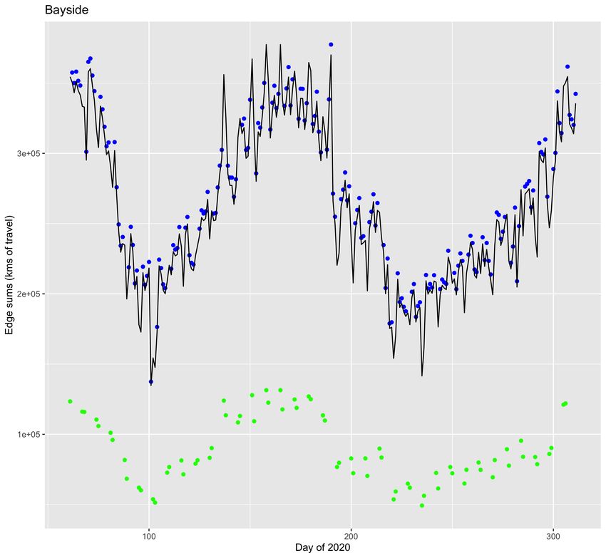
Abstract

    This paper explores the construction of a human mobility network to model the movement of Melbournes
population between the 1st of March and 6th of November 2020. The relationship between human mobility
and the transmission of SARS-CoV-2 is analysed. Pre-pandemic mobility flows between Local Government
Areas (LGAs) were estimated from survey data. These flows were scaled using publicly available data from
Facebook to give an estimate of travel behaviour in Melbourne for 251 days of 2020. Under the model
assumptions, no distinguishing mobility patterns for the populations of worse affected LGAs (Local Gov-
ernment Areas) were identified. This is despite the separate finding of a significant correlation between a
tentative approximation of Covid-19 spread rate and staggered human mobility data, at the level of greater
Melbourne. A comparison is made between the mobility of the populations of LGAs and the relationship
between neighbouring LGAs.

1     Introduction
SARS-CoV-2 was first identified in the Chinese city of Wuhan in late 2019. By January 2020, the spread of
the virus had developed into a global pandemic, affecting many countries including Australia. By the 6th of
November 2020, the pandemic had resulted in over 20,000 Covid-19 cases in the Australian state of Victoria.
A vast majority of infected Victorians lived in the Greater Melbourne region.
In response to the pandemic Australian Governments brought in a host of policies to slow the spread of
the virus. These included quarantines, stay at home orders, travel restrictions, and curfews. These policies
restricting human movement were at times contentious and their implementation was to some extent a po-
litical issue; as their effects impacted peoples economic, mental, and physical wellbeing. In order to do a
cost benefit analysis of these policies, an understanding of the effect these policies had on Covid-19 is essential.

    The report used mobility data from two sources. The Victorian Integrated Survey of Travel and Activity
(VISTA) [1] and Facebooks ”Data for Good program. This data was used to build a mobility network
describing the travel patterns of the populations of 31 Local Government Areas (LGAs) in the Greater
Melbourne region.

1.1     Literature Review
Several different papers have looked at Covid-19 and human mobility using complex networks as a means of
analysis. F. Schlosser et al 2020 explored the effect of Coronavirus on human mobility in Germany. Using
mobile phone data, they were able to build a mobility network describing peoples movement across Germany.
They compared the pre-pandemic human mobility patterns to those during the pandemic. They identified
a reduction in peoples overall mobility. Furthermore, they report a structural change in human mobility
after the onset of the pandemic. People disproportionately reduced long distance travel under pandemic
conditions. These structural changes were linked to reduced disease transmission.[2]

                                                                                                       1
S. Chang et al 2020 analysed the spread of Coronavirus in US metropolitan areas. They used bipartite
networks with links between the populations of geographical subregions connecting to nonresidential places
of significance; such as churches or restaurants. In the regions they studied, it was found human mobility
patterns changed markedly during the pandemic. They were able do identify from mobility patterns that
“disadvantaged racial and socioeconomic groups” had a greater risk of contracting Covid-19. [3]
The use of aggregate mobility data to predict transmission risk has been assessed. C. Zachreson et al 2020
developed a procedure to produce spatial distributions of transmission risk from near-real-time population
movement data. They found that mobility data was most useful in predicting risk at the initial stages of
outbreaks with low case counts. [4]
S Wang et al 2020 conducted an empirical state level study of mobility and Covid-19 in Australia. They
found evidence that human mobility had a time lag correlation with Covid-19 growth rates in Australia.
They also found the strength of correlation between mobility and Covid-19 decreased seven days after the
implementation of mobility reducing policies. [5]

1.2     Initial data exploration
The Facebook Data For Good [6] mobility data consisted of 251 observations for each of the 31 Melbourne
LGAs in this analysis . The mobility metric used by Facebook was the mobility relative to a pre-Covid-19
baseline for each day of the week. For example, all mobility observations for the LGA Whittlesea on a
Monday are relative to the Monday mobility baseline for Whittlesea [7]. The pre-Covid-19 baselines were
based on peoples mobility from the 2nd of February to the 29th of February 2020 . Figure 1 shows the
average relative change in Mobility for Melbourne LGAs from the 1st of March to the 6th of November 2020.
Covid-19 case data was sourced from the State Government of Victorias Department of Human Health and
Services (DHHS)[8]. A time series of confirmed cases is shown in Figure 2. These time series in Figures
1 and 2 are displayed together in Figure 3. The first and second “waves” of the Melbourne pandemic are
visible, as is the human response to these waves; with mobility being reduced in response to restrictions.

2      Methods

2.1     Correlation between mobility and total cases
In Figure 3 the average change in mobility for each LGA is plotted beside the total number of locally acquired
cases for the Greater Melbourne Region. An attempt was made to transform the locally acquired case data
to derive a measure of the rate of transmission of the disease on any given day in the study period. The
disease transmission rate was conceptualised as the new cases found on day t divided by the total active
cases on the day (t − 1). The idea is to find the rate at which new cases are made per active case from the
previous day.

                                                       New cases on day t
                            Transmission rate =                                                            (1)
                                                  Active cases on the day (t − 1)
    Active case data for each LGA was not available for the time period under study. The only LGA level case
data used in this study, is positive tests found each day. The denominator of Equation (1) was approximated

                                                                                                  2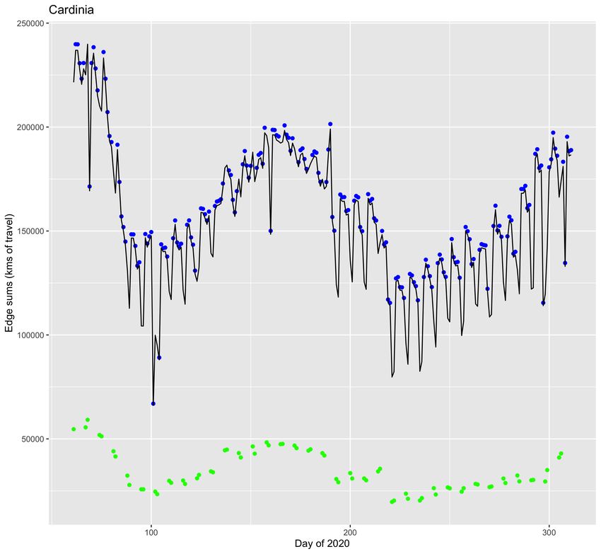
Figure 1: The time series above shows the average change in the mobility of Melbourne LGA populations between
the 1st of March and the 6th of November 2020. This was obtained by taking the arithmetic mean for Facebooks daily
mobility observations on Melbourne LGAs. Yellow shading indicates that stage 3 lockdown restrictions were in effect in
Melbourne, meaning only essential travel was permitted. Red shading indicates stage 4 lockdown, an escalation of stage
3 which includes a 5km limit on most types of essential travel and a curfew. Non shaded regions also have mobility
reducing policies effective, but restrictions are less severe [9][10][11][12] [13] [14].
We observe that in the first instance of stage 3 lockdown, human mobility had already been substantially reduced. This
may have been due to measures brought in prior to stage 3 lockdown or the effect of individual decisions made by
persons and businesses. In the case of the stage 4 lockdown mobility is again already at quite low levels, likely due to a
reintroduction of stage 3 lockdown measures. Mobility is sustained at low levels for the duration of the stage 4 lockdown.

                                                                                                        3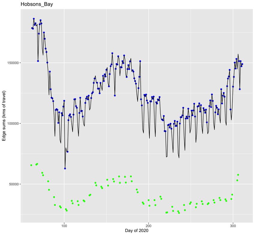
Figure 2: Daily confirmed locally acquired cases. The first wave of the Melbourne pandemic can be seen in April.
Small outbreaks are observable in May and June before developing into the larger second wave in July.

                                                                                                    4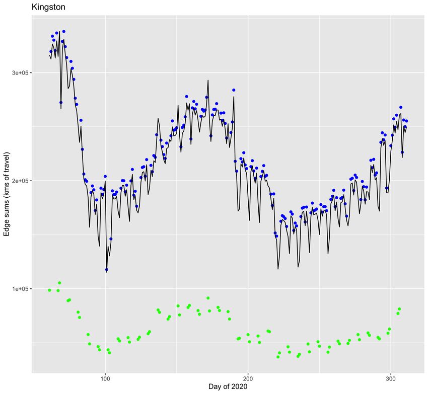
Figure 3: Average change in mobility for 31 LGAs of Greater Melbourne plotted besides daily confirmed locally
acquired cases. Major reductions in mobility can be seen to occur several days after steady growth in cases. A climb
in mobility can be seen in May and June, before the onset of the second wave.

                                                                                                   5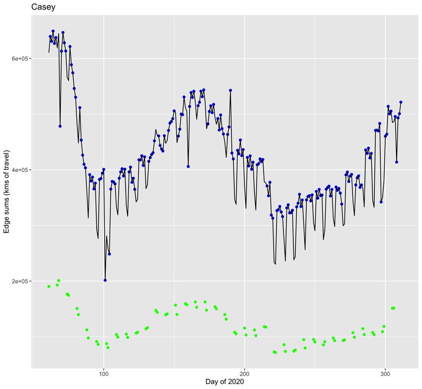
by summing positive tests from some number k days prior to the day for which the rate was to be calculated.
The numerator was approximated by the positive tests found that day.

                                                         Positive tests on day t
                              Transmission rate ≈                                                         (2)
                                                     Σt−1
                                                      i=(t−k) Positive tests on day i

    To explore the effect of k, the transmission rate curve was calculated for a range of different k values.
k ∈ {1, 2, 3, . . . , 50}
    The correlation of the approximate transmission rate with the average mobility change from the Face-
book data was calculated. The average mobility change was staggered, so that the transmission rate was
compared with the mobility j days before. This was motivated by the hypothesis that mobility would have
a time delayed correlation with transmission rate, a result reported by S. Yang et al 2020. The time delay
in days j, was also experimented with for j ∈ {1, 2, 3, . . . , 30}.

    To explore the relationship between the approximate transmission curve and staggered average mobility
change; j and k were experimented with simultaneously. Each of the 30 values of j was tried with each of
the 50 values of k. In all 50 × 30 = 1500 correlations were calculated. This trialling of k and j values was
done not just to look for the best correlation but also to assess the behaviour of Equation (2) and the case
data when k is varied.

2.2        Construction of Mobility network
The data from the Victorian Integrated Survey of Travel and Activity (VISTA) [1] was used to construct
estimates of Pre-Covid-19 mobility flows. The VISTA observations spanned from 2012 to 2018. The survey
results were read into R. The survey data detailed trip information including; where LGAs survey respondents
travelled to, how far they travelled to get there, and the LGA where the respondents lived. As each
respondent filled in all travel done for a day, it was possible to treat the survey as observations of daily
travel behaviour. The average number of kilometres respondents from a particular LGA travelled to get
to locations in the 31 LGAs, in the area of study, was found. This gives a sample average of the amount of
daily travel a respondent living in an LGA made to get to locations in other LGAs. This measurement is
expressed in equation (3).

                                        Sum of trip distances taken by respondents from A to get to B
     mean km LGA A → LGA B =                                                                              (3)
                                                     Total number of respondents from A

    Scaling each of these averages by the population of the LGAs, gave an estimate for the daily kilometres
travelled by each LGA population to the 31 LGAs.

    The VISTA survey contained observations for weekend and weekday travel. These observations were
segregated and used to create two different mobility networks. One mobility network described the pre-
Covid-19 travel behaviour of LGA populations on weekdays, the other the travel on weekends.
This was done because Facebooks mobility observations were given relative to confidential baseline values.
As previously mentioned, each day of the week had its own baseline. This report assumes that the baseline

                                                                                                 6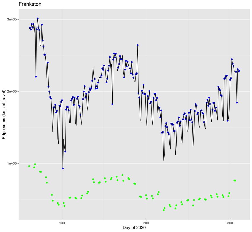
of the Facebook weekday mobility observations can be approximated by the weekday VISTA data; and the
baseline of the Facebook weekend mobility observations by the weekend VISTA data.
Each dataset (Weekend and Weekday) was used to build a network with 31 nodes, each node representing an
LGA. The network had 961 different edges, so every node was connected to every node (a complete directed
graph with loops). These edges represented the total number of kilometres travelled by LGA populations to
get to locations in the 31 LGAs studied. These mobility networks approximated the pre-Covid-19 mobility;
the intended baseline of the Facebook data.
Facebooks data, as previously mentioned, is a measure of the daily mobility of the population of each local
government area [7]. An approximately linear relationship was assumed between Facebooks measure of
mobility and the average number of kilometres travelled by LGA residents in a day. That is, a Facebook
mobility score of .4 for a particular day indicates that residents from that particular LGA travelled around
60% less daily kilometres than they did pre-Covid-19. Under the assumption that the changes in mobility
were purely quantitative (that the structure of peoples movement did not change significantly) the Facebook
data was used to produce mobility flows between LGAs for 251 days of 2020.
This scaling of the pre-Covid-19 mobility networks edge weights is described by equation (4).

                                           F(i,j,t) = f(i,j) × m(i,t)                                    (4)

   Where F(i,j,t) is the edge going from node i and node j in the mobility network modelling Melbourne
travel t days after the end of February 2020. f(i,j) is the estimate the number of kilometres the population
of LGA i travelled to get to LGA j based on pre-Covid-19 VISTA data. m(i,t) is the relative mobility of the
population of LGA i on day t provided by Facebook.

   To put it more simply, a Pre-Covid mobility network was constructed for Greater Melbourne using the
VISTA dataset. This served as a baseline network with edge weights that could be scaled with the Facebook
mobility data. For each day under observation, all movement of each LGA population was scaled down by
the observed change in their mobility. This gave a different mobility network for each day from the 1st of
March to the 6th of November 2020.

2.3      Direct neighbours versus Pre-Covid-19 Mobility Flows
Figure 4 shows the total number of infected persons recorded by the 6th of November 2020 as a proportion
of the total population for each LGA. A visual relationship can be seen between the level of contagion in
a LGA and the level of contagion in its direct neighbours. It appears the level of contagion in an LGA is
positively correlated with the level of contagion in its neighbours.
To further establish this relationship a regression was run. The proportion of persons infected in an LGA
by the 6th of November was used as the dependent variable. The predictor used was the average of the
proportion of infected persons in neighbouring LGAs. This found a strong positive correlation between the
average level of contagion in directly adjacent LGAs and a LGAs level of contagion (p = 8.493e − 13 < 0.01)

   The relationship between pre-Covid-19 mobility patterns and the proportion of population infected by

                                                                                                7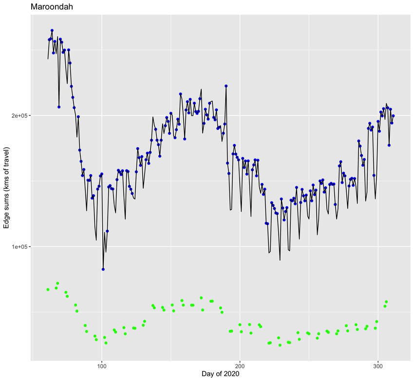
Figure 4: The distribution of Covid-19 cases across greater Melbourne. This represents the distribution of all cases
occuring before the 7th of November 2020. It can be seen that LGAs to the west were worse affected.

                                                                                                      8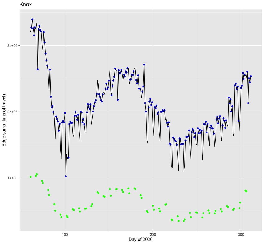
the 7th of November 2020 was also examined. The following method was used. The number of neighbours
n a Local Government area had was counted. Then the n strongest edge weights out of the LGA were
identified. The average of the contagion levels of these n LGAs to which the heavy flows led were calculated.
A regression was then run between the level of contagion in each LGA and the average level of contagion
of the LGAs to which they had strong mobility flows towards. The regression yielded a positive correlation
between this average and the Level of contagion in the LGAs (p = 2.331e(−11) < 0.01)

2.4    Mobility patterns revealed by network
Using the network constructed in Section 2.2 a measure of a LGAs mobility was constructed by summing
all edge weights of each LGA node. This quantity represents the daily expectation for the total number of
kilometres people in other LGAs of Greater Melbourne travelled to get to this LGA; plus the total number
of kilometres people living in this LGA travelled to get to other places. It is a quantification of all travel
that could potentially spread Covid-19 through the population of that LGA.

3     Results

3.1    Mobility and approximate transmission rate
As mentioned in Section 2.1, an attempt was made to draw a correlation between a low confidence ap-
proximation of transmission rate and the average mobility change in Greater Melbourne. This transmission
rate had a parameter k for estimating the number of active cases prior to the start of a given day.
The correlation between transmission rate and the average change in mobility j days earlier was explored.
1500 different combinations of j and k values were trialled. j values ranged from 1 to 30 and k values ranged
from 1 to 50. The strongest correlation was achieved with a k value of 46 and a j value of 18. This is shown
in Figure 5. The Pearsons correlation coefficient between transmission rate and mobility change 18 days
earlier was 0.675. Below is a graph of approximate transmission rate and mobility with (k, j) = (46, 18). To
assess the significance of this correlation, a regression was run using the mobility change 18 days earlier to
predict the transmission rate approximated with equation (2) and using k = 46. This returned a positive
coefficient on staggered mobility with p < 0.001. For reasons mentioned in the discussion, a regression was
run using the mobility change 18 days earlier to predict transmission rate approximated with equation (2)
and using k = 25. This too, returned a positive coefficient for the staggered mobility data with p < 0.001.

3.2    Mobility patterns revealed by network
The two pre-Covid-19 mobility networks, made as described in Section 2.2, were scaled by the facebook
mobility data for each day between the 1st of March 2020 and the 6th of November 2020. This produced
a mobility network for each of the 251 observed days. To quantify the travel that could spread Covid-19
through each LGA (node) on a given day the sums of all edges leading to and from a node were calculated.
This sum was recorded for each LGA for each of the 251 observation days.
This resulted in 31 different time series. However these mobility curves all had roughly the same functional
shape as each other, and indeed the functional shape of the change in mobility curves of the original facebook

                                                                                                  9
Figure 5: Here, the approximate transmission rate calculated using equation (2) with k = 46, is shown in red. Plotted
alongside it is the average mobility change for greater Melbourne 18 days previous. There is a visual correlation between
the transmission rate approximation and the staggered mobility curve. The transmission rate in May and June is lower for
higher values of k. This has the effect of increasing the correlation between the staggered mobility and the transmission
rate approximation.
10Figure 6: Here, the approximate transmission rate, in red, has been calculated with a k value of 25. This value of
k was selected as a likely estimate of the number of days between a person testing positive and their recovery. This was
based on the work of M. Barman et al 2020, who found that recovery time for Covid-19 infected patients in India to be
on average 25 days [15].
The staggered average mobility change for the 31 Melbourne LGAs is shown in blue. This time series has been translated
forward 18 days, so that the date on the x axis is mapped to the mobility change 18 days earlier.
There is a clear correlation between the approximate transmission rate and the staggered average mobility change
throughout the study period, save in May and June. Here small outbreaks between the first and second waves cause the
transmission rate approximation to spike, which contrasts the behaviour of the average mobility change 18 days earlier.
11Figure 7: The distribution of the natural logarithm of the total daily kilometres populations of Greater Melbourne
LGAs traveled to get to other Greater Melbourne LGAs on weekdays. The transformed distribution looks approximately
normal save for the clustering at the positive end.
data; save for weekend observations which reported mobility much lower than their neighbouring weekday
values. The 31 different time series are attached in Appendix A.
The distribution of the natural log of mobility flows in the pre-Covid-19 weekday network is shown in Figure
7. It is approximately normally distributed, although towards the higher end of the distribution there is
evidence the distribution is bimodal. The distribution of the natural log of pre-Covid-19 weekend network
flows is shown in Figure 8. It was roughly the same form as the distribution in Figure 7
4 Discussion
4.1 Cases and Mobility
The results presented in Section 3.1 suggest some level of correlation between the level of human mobility
and the spread of Covid-19. This has been reported in other papers. Figure 5 and Figure 6 show different
approximations of transmission rate. Trialling different k and j values for the highest correlation between
12Figure 8: The distribution of the natural logarithm of the total daily kilometres populations of Greater Melbourne
LGAs traveled to get to other Greater Melbourne LGAs on weekdays. The distribution is roughly the same as the
natural log of weekday travel, albeit with a lower central tendency
13approximate transmission rate and staggered mobility gave k = 46 and j = 18. The k parameter was
conceived as number of days prior to the observed day which to sum cases over to get an approximation of
active cases. The k value that achieved the highest correlation seems too high a value for this. It seems
questionable that the recovery time of individuals from the point after they are tested is 46 days. A study
in India found that recovery time for Covid-19 had a median of 25 days with an 95% confidence interval of
(16.14, 33.86) [15]. It is unlikely that the sum of confirmed cases from the previous 46 days is an accurate
measure of active cases. For this reason a transmission rate estimate with k = 25 was inclueded in the
results. This transmission rate estimate had a significant positive correlation with average mobility change.
The higher correlation for k = 46 is most likely due to the smoothing effect brought about by increasing the
size of the denominator in the transmission rate approximation. This smoothing reduced the transmission
rate approximation for small outbreaks; occurring between the 1st and 2nd waves of cases in Melbourne.
This can be seen by comparing Figures 5 and 6. In Figure 6 the spike in transmission rate is lower between
the two main waves. It seems the strength of the correlation comes from the relationship between mobility
change and the first and second coronavirus waves.
4.2 Model Assumptions
The Facebook data used in the model consisted of a single observation for each LGA for the 251 days
studied. These observations were used to scale down the travel behaviour of the LGA populations. This
travel behaviour was estimated from the VISTA survey data. Scaling down this behaviour uniformly for
each population gave estimates of travel that rely on the following assumption; travel behaviour changed
only quantitatively after the onset of the pandemic. That is, the proportion to which people travelled to
certain places stayed the same, but they travelled less. This assumption is unlikely to be accurate. Victorian
lockdown rules restricted certain types of travel over others. In certain periods the population of Greater
Melbourne could generally only leave their home for four reasons deemed essential travel. This could very
plausibly cause a structural change in peoples mobility patterns.
As can be seen in Appendix A, summing all edge weights of a node (all edges in the ego network) resulted
in a mobility curve roughly the same as the mobility levels reported by Facebook. A salient difference is
that the level of weekend mobility is much lower compared to weekday mobility. Weekend and weekday
mobility are presented in absolute terms in these graphs. The low level of weekend mobility is a function
of two things. Firstly, the pre-Covid-19 baseline network for weekends has significantly lower flows than the
weekday network. Secondly, for many LGAs, Facebooks mobility metric is lower for weekends than it is
for weekdays. This second feature could indicate that the types of travel, or journey purposes, typical on
weekends prior to the pandemic were reduced more than the types of travel on weekdays.
4.3 Direct Neighbours and Mobility
Under Section 2.3 a comparison was made between the average level of contagion in an LGA’s direct neigh-
bours, and the average level of contagion in the LGA’s towards which it had the largest outgoing edges in the
14pre-Covid-19 baseline mobility network. To quantify the strength of the relationship two simple regressions
were run. Each time the dependent variable was the contagion level in the 31 LGAs. The two different
predictors used were the aforementioned averages. Both regressions were significant. Using the average of
the neighbours yielded a more significant result (p = 8.493 × 10⁻¹³ ) than the average of the LGAs towards
which the strongest edges flowed to (p = 2.331 × 10⁻¹¹ ). This seems to imply that geographical proximity
to Covid-19 cases is a better predictor of cases than pre-pandemic mobility flows. This may be because
of structural changes in human mobility, with people reducing travel to more distant LGAs. This possible
explanation is reminiscent of the results obtained by F. Schlosser et al 2020, which found a disproportionate
reduction in the number of long distance trips taken during the pandemic [2].
4.4 Conclusion
Using publicly available data from two sources, Facebooks Data for Good program and the Victorian Govern-
ments Vista survey, a mobility network describing the travel of Melbournes population during the pandemic
was constructed. This network relied on Facebooks mobility observations of the populations of Greater
Melbourne LGAs to scale the pre-Covid-19 travel patterns gleamed from the Vista survey. This was done
under the assumption that the LGA populations travel behaviour remained proportionally the same during
the pandemic. This assumption is unlikely to be accurate, given the findings of other papers [2] [3]. A
marginally more significant relationship was found between LGA Covid-19 case density and the average case
density in neighbouring LGAs, then to the average case density of LGAs with strong mobility flows. This
may indicate that mobility patterns changed during the pandemic so that people travelled to closer areas
proportionally more, however more evidence would be required to support that assertion. Other sources of
publicly available data could be used to improve the mobility models discussed in this paper. The company
Google has released mobility data on attendance of points of interest, which could allow the assumption of
no structural change in mobility to be relaxed.
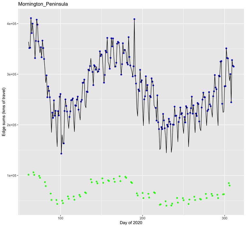
155 Appendix A
This displays the 31 time series for the sums of edge weights for each node. This quantifies travel that could
spread Covid-19 through the population of the LGA. Blue dots are sums for weekdays. Green dots are sums
for weekends. The black line shows the functional form of Facebooks relative mobility curve for the LGA.
1617
18
19
20
21
References
 [1] State Government of Victoria, “Victorian integrated survey of travel and activity.” https://www.dhhs.
    vic.gov.au/coronavirus-testing-data-across-victoria. Accessed: 6-1-2021.

 [2] F. Schlosser, B. F. Maier, O. Jack, D. Hinrichs, A. Zachariae, and D. Brockmann, “Covid-19 lock-
    down induces disease-mitigating structural changes in mobility networks,” Proceedings of the National
    Academy of Sciences, vol. 117, no. 52, pp. 32883–32890, 2020.

 [3] S. Chang, E. Pierson, P. W. Koh, J. Gerardin, B. Redbird, D. Grusky, and J. Leskovec, “Mobility
    network models of covid-19 explain inequities and inform reopening,” Nature, vol. 589, no. 7840, pp. 82–
    87, 2021.

 [4] C. Zachreson, L. Mitchell, M. J. Lydeamore, N. Rebuli, M. Tomko, and N. Geard, “Risk mapping for
    covid-19 outbreaks in australia using mobility data.,” J R Soc Interface, vol. 18, p. 20200657, Jan 2021.

 [5] S. Wang, Y. Liu, and T. Hu, “Examining the change of human mobility adherent to social restriction
    policies and its effect on covid-19 cases in australia.,” International Journal of Environmental Research
    and Public Health, vol. 17, Oct 2020.

 [6] Facebook Inc., “Movement range maps.” https://data.humdata.org/dataset/movement-range-maps.
    Accessed: 12-11-2020.

 [7] Facebook            Inc.,      “Protecting     privacy     in       facebook       mobility    data          dur-
    ing            the            covid-19        response.”           https://research.fb.com/blog/2020/06/
    protecting-privacy-in-facebook-mobility-data-during-the-covid-19-response/.                              Accessed:
    13-11-2020.

 [8] ”Department of Health and Human Services (Victorian State Government)”, “Coronavirus testing
    data across victoria.” https://www.dhhs.vic.gov.au/coronavirus-testing-data-across-victoria.
    Accessed: 12-11-2020.

 [9] Australian      Broadcasting        Corporation,   “Victoria      in   stage   3     coronavirus        shutdown
    restrictions         as      cases   climb    to    821.”        https://www.abc.net.au/news/2020-03-30/
    victoria-stage-3-coronavirus-restrictions-as-cases-rise/12101632.                        Posted Monday 30
    March 2020 at 8:59am, updated Tuesday 31 March 2020, Accessed 12-2-2021.

[10] D. Andrews, “Statement from the premier.” https://twitter.com/DanielAndrewsMP/status/
    1259657780962553856/photo/1. Issued Monday, 11th May 2020.

[11] D. Andrews, “Statement from the premier.” https://twitter.com/DanielAndrewsMP/status/
    1280372803363991552/photo/1. Issued Monday, 7th July 2020.

[12] State Government of Victoria, “Summary of restrictions - move to stage 4 6pm 2nd august 2020.”
    https://twitter.com/DanielAndrewsMP/status/1289795907186122752/photo/1. Issued 2nd August
    2020.

[13] D. Andrews, “Statement from the premier.” https://twitter.com/DanielAndrewsMP/status/
    1317619488779481089/photo/1. Issued 18th October 2020.

                                                                                                        22
[14] D. Andrews, “Statement from the premier.” https://twitter.com/DanielAndrewsMP/status/
1320585543223107584/photo/1. Issued Monday 26th October 2020.
[15] M. P. Barman, T. Rahman, K. Bora, and C. Borgohain, “Covid-19 pandemic and its recovery time of
patients in india: A pilot study,” Diabetes & Metabolic Syndrome: Clinical Research & Reviews, vol. 14,
no. 5, pp. 1205–1211, 2020.
23You can also read