Testing the Value of Salience in Statistical Graphs - Ingenta ...
←
→
Page content transcription
If your browser does not render page correctly, please read the page content below
https://doi.org/10.2352/ISSN.2470-1173.2021.1.VDA-329
                                                                                                         This is a work of the U.S. Government.

Testing the Value of Salience in Statistical Graphs
Mark A. Livingstona , Laura Matzenb , Derek Brocka , Andre Harrisonc , and Jonathan W. Deckera
a Naval Research Laboratory; Washington, DC, USA; b Sandia National Laboratories; Albuquerque, NM, USA;
c Army Research Laboratory; Adelphi, MD, USA

Abstract                                                                  display as a whole should be more salient than the labels for any
     Expert advice and conventional wisdom say that important             parts.” “Only 25% of wedges in a pie graph should be exploded
information within a statistical graph should be more salient than        (if too many are emphasized, the PoS is being violated).” This
the other components. If readers are able to find relevant infor-         advice (of not emphasizing too many items) is repeated multiple
mation quickly, in theory, they should perform better on corre-           times. He warns that a bar graph should not vary the salience of
sponding response tasks. To our knowledge, this premise has not           individual bars arbitrarily. He gives an example line graph where
been thoroughly tested. We designed two types of salient cues             salience is varied intentionally to draw attention to one line out
to draw attention to task-relevant information within statistical         of three. He recommends to ensure that error bars do not make
graphs. One type primarily relied on text labels and the other            less stable points more salient than the stable ones (because error
on color highlights. The utility of these manipulations was as-           bars will be longer when the point is less certain). He advises
sessed with groups of questions that varied from easy to hard. We         to ensure that best-fit lines in scatterplots are discriminable and
found main effects from the use of our salient cues. Error and            more salient than the points. In discussing color, Kosslyn advises
response time were reduced, and the portion of eye fixations near         to “make the most important content the most salient.” He notes
the key information increased. An interaction between the cues            that having every Nth gridline (e.g. 10th) stand out can be help-
and the difficulty of the questions was also observed. In addition,       ful, but no gridlines (emphasized or not) should obscure the data.
participants were given a baseline skills test, and we report the         Pinker [25] arrives at similar advice by starting with the reader’s
corresponding effects. We discuss our experimental design, our            goal. A goal invokes graph schema and gestalt processes, wherein
results, and implications for future work with salience in statisti-      salience will determine the likelihood of encoding a graph feature.
cal graphs.                                                               Encoded features are used to build an interpretation of the infor-
Keywords: Charts, Diagrams, and Plots; Perception; Cognition;             mation conveyed by the graph; thus, salient items are more likely
Salient Cues; Highlights; Human-Subjects Quantitative Studies             to influence the interpretation of the graph.
                                                                                In cartography, Bertin [2] recommends widely-cited guide-
Introduction                                                              lines for presentation of graphics. Hegarty et al. [11] study maps
      Saliency is widely considered useful for emphasizing to             and draw the salience principle from Bertin. Their formulation
graph readers the particular message that a graph’s author wishes         suggests that visual attributes such as color or line orientation
to convey. In this work, we interpret “salient” to mean that an           should be ordered so that important information is visually salient
element has a value in some aspect of its appearance (e.g. color,         compared to contextual information.
intensity, contrast, shape) that is unique among the elements of the            In education, McCrudden and Rapp [22] define selection as
graph. This, in theory, should attract the human perceptual sys-          focusing or directing attention to information in an instructional
tem. There is ample evidence that salient cues in fact draw atten-        message. They note that
tion to graph components. However, there is little direct evidence
                                                                               [I]f attention is not allocated toward important infor-
that cues improve or speed up comprehension of the message.
                                                                               mation, it will not be consciously processed. Similarly,
                                                                               if attention is allocated toward interesting but unimpor-
The Value of Salience in Graphs
                                                                               tant information, those contents can disrupt the coher-
     Statistical graphs are widely used; thus, proper use of
                                                                               ence of the main instructional message.
salience in their presentation is described in the literature of multi-
ple disciplines. In perceptual psychology, Kosslyn [15] states The        They define signaling as the use of cues to increase the salience of
Principle of Salience (PoS) in his eight Psychological Principles         important information. In the work presented here, we focus on
of Effective Graphs:                                                      the use of two such choices, text labels and color, for this purpose.
      The most visually striking aspects of a display will
                                                                          Our Contribution
      draw attention to them (as did this bold type), and
                                                                               We study the efficacy of making task-relevant information
      hence they should signal the most important informa-
                                                                          in a statistical graph salient via the use of text labels, a common
      tion. All visual properties are relative, and thus what
                                                                          but understudied practice. We study a broader range of statistical
      counts as “visually striking” depends on the properties
                                                                          graphs than we generally see in the literature, and we explicitly
      of the display as a whole.
                                                                          evaluate different levels of task difficulty. Our work is similar to
This manifests itself in more specific guidelines; here are several       existing studies on the role of salience in visual information tasks
examples (all quoted from [15]). “Use more salient labels to la-          in that we use color and intensity manipulations, and we study
bel more general components of the display.” “The label for the           expertise as a possible interacting factor.

IS&T International Symposium on Electronic Imaging 2021
Visualization and Data Analysis 2021                                                                                                        329-1
Despite the above and many similar statements in the liter-       did not find that the increased effort affected performance. Based
ature, we see a surprising lack of direct evidence for improved         on his data, we believe Bera used a minimum duration to identify
understanding of statistical graphs in the presence of salient cues.    fixations of at least 200 ms. We set a threshold of 100 ms; this
If salient cues help convey the message a graph’s author intends        minimum has shown to increase the accounted portion of time
for the reader to grasp, then we should be able to gather evidence      when viewing a complex geometric stimulus [21]. We also stud-
that supports this. We undertook to design and conduct an exper-        ied types of statistical graphs that Bera did not.
iment to provide direct evidence. We first describe some related              Klippel et al. [13] asked observers to rate subjective sim-
work, then detail our experimental design. We present statistical       ilarity of star plot glyphs. They found that the introduction of
results and discuss the interpretation of these results, along with     color reduced the influence of shape on the classifications. With-
some potential limitations and extensions to our work.                  out the color, a salient shape characteristic (“has one spike”) was
                                                                        the dominant classification criterion. With the color, more par-
Related Work                                                            ticipants classified shapes with “one spike” into different classes.
      As evidenced by the passages above, there is a widely-held        Star plots are an advanced type of statistical graph. We focus our
belief in the value of salience in various visualization contexts. In   study on mostly simpler graphs, a range of reading tasks, and the
this section, we start our review of related work with user studies     use of text labels as well as color.
and then consider applicable results from eye tracking in visual-             Madsen et al. [19] had participants answer physics problems
ization. We found only a few user studies in the literature, and        using diagrams and unlabeled graphs. People who answered cor-
they are from diverse application contexts. Statistical graphs are      rectly spent a higher percentage of time looking at the relevant
a small portion of the related work.                                    areas of the diagram or graph. However, in a larger follow-up
                                                                        study [20], they found no effect of salience manipulations (via
Graphs and Maps                                                         luminance contrast) and no interaction between these manipula-
      Carenini et al. [4] selected four interventions for bar graphs    tions and prior knowledge of participants. They also did not find
(drawing on [23]): bolding (borders around bars), de-emphasizing        an effect of the manipulations on the percentage of fixation time
(desaturation), adding reference lines, and adding connected ar-        relative to the relevant area. They postulate that the time window
rows. They studied these in an experiment similar to ours. The          (first two seconds) may have been too long to capture the percep-
first two interventions helped identify individual bars; the other      tual effect before cognitive processes (whether correct or incor-
two assisted in identifying bars to be compared. They also var-         rect) exerted a larger influence than the perceptual mechanism.
ied the onset of the intervention; it was either present at the start   Some of their graphs and tasks are similar to some of ours.
of a trial, or it was added to the graph after the graph and then             Hegarty et al. [11] provide further evidence that proper use
the question appeared in sequence. They also measured users’            of salience can affect understanding of complex visual representa-
perceptual speed, visual working memory, verbal working mem-            tions (weather maps). Salience was manipulated by the saturation
ory, (self-reported) expertise, and locus of control. They used two     of the color map for temperature and the thickness of isobars for
classes of task: a task to retrieve a value and compare to a group      pressure. In their first experiment, changes in salience affected
average, and a task to aggregate comparison results. They found         accuracy only after participants learned the meteorology princi-
that more complex tasks took longer and induced more errors,            ples; eye fixations were primarily directed by task and domain
and delayed onset of the cue induced longer response times. They        knowledge. In their second experiment, there was no evidence
found that the de-emphasis intervention was best, with bolding          that participants were drawn to visually salient areas of the maps.
and connected arrow next; reference line was no better (statis-         They conclude that their “research provides evidence for one prin-
tically) than no intervention. Those with high perceptual speed         ciple of cartography and graphics design more generally: Good
performed better; those with low verbal working memory per-             displays should make task-relevant information salient in a dis-
formed more poorly. Toker and Conati [27] later analyzed eye            play” (cf. [15]). They also provide evidence for the mechanism
tracking data from this experiment. They found that those with          of this advantage. Attention was primarily affected by top-down
low perceptual speed spent more time looking at labels. Those           knowledge, and the visual design affected performance through
with low visual working memory spent more time looking at the           facilitation of the processing of visual features that conveyed task-
answer choices and button to submit the answer. Those with low          relevant information. Cartographic maps and the specific use of
verbal working memory needed more time, as they lingered over           saturation to create salience are only a small part of our study. Our
the legend and question and other textual elements of the graph.        use of text labels would likely not work well on maps.
Although there is some overlap with the cues we used, we study
more diverse cues, graphs, and tasks.                                   Diagrams
      Bera [1] examined two ways colors were used improperly                 In Duncker’s radiation problem, readers must surmise from
in bar graphs. He defined overuse of colors as attracting atten-        a diagram how to irradiate a tumor without damaging interven-
tion through changes in color between adjacent bars when these          ing tissue. Using an eye tracker, Grant and Spivey [9] observed
changes carried no meaning (a violation of Kosslyn’s PoS). He           an empirical pattern of gazes to the critical area of this diagram
defined misuse of colors as attracting attention through color con-     that discriminated among readers who hit upon the solution and
trast to areas that are not relevant to a task. Both poor designs       those who did not. In follow-on work, they found that using an
increased the number and duration of fixations on graph compo-          animation to draw attention to this area doubled the rate of suc-
nents not relevant to the task. They also delayed the time to the       cess in comparison to giving readers the original static version of
first fixation on the relevant components. While he noted that          the diagram or a version in which a noncritical feature was ani-
these fixation patterns would induce greater cognitive effort, he       mated. They proposed that the guided visual attention induced by

                                                                                        IS&T International Symposium on Electronic Imaging 2021
329-2                                                                                                        Visualization and Data Analysis 2021
the critical animation likely facilitated the correct insight.          ence questions using graphs. They found that novices spent a
      Thomas and Lleras [26] replicated this work and added an          greater percentage of their time reading the question and the an-
attempt to force this eye movement pattern with a secondary task.       swer choices than experts. They further found that experts fol-
They found that only an order of animated cues that forced the          lowed their planned first three steps in reading a graph (two com-
gaze to cross the diagram led to greater success. That is, cue-         mon approaches were: title/caption–variables–data and variables–
ing the same locations in a sequence that progressed around the         title/caption–question). While non-experts planned the same pro-
outer portion diagram were not sufficient; the gaze had to move         gressions, they did not follow this, and those with lower expertise
in the pattern that was analogous to the solution. Few participants     (even within the novice category) were farther from their plan,
claimed to notice the connection; most appear to have had their         according to the gaze data.
thinking influenced by the eye movements covertly.
      Lowe and Boucheix [17] found no difference in learning            Experimental Design
from an animated representation of a piano mechanism using                   Our fundamental goal was to look for evidence for two ef-
attention-directing cues. They did find a difference in cue obe-        fects of visually salient cues in statistical graphs. First, do these
dience (i.e. strict following of the bottom-up cues). They defined      cues in fact draw readers’ attention to targeted areas of informa-
color cueing as increasing salience of elements which the anima-        tion? Second, does their presence improve readers’ performance
tion’s author wanted to direct attention. They defined anti-cueing      on corresponding response tasks? Our design goals included us-
as lowering salience of elements not desired to be a focus of at-       ing validated tests of graph comprehension, increasing statistical
tention. At the start of an animation, color cueing was more suc-       power by using a within-subjects design, and measuring fixation
cessful at drawing attention than anti-cueing was at limiting the       data to yield insight about the mechanisms that led to the hypoth-
drawing of (incorrect) attention. This difference faded as the an-      esized performance improvement. We discuss the design in detail
imation progressed over time. Although these diagram problems           in the rest of this section. Each stimulus consisted of a graph
are interesting, they are not directly applicable to our work.          image, the text of the question to be answered, and between two
                                                                        and four answer choices. The stimuli were presented on a desk-
Other Applications of Salience                                          top PC running Windows 10, using custom software and a Dell
      Kong and Agrawala [14] describe a system to add user-             U2412MB 24-inch monitor running at 1920x1200 resolution at
specified graphical overlays to graphs. Overlays included refer-        60 Hz. Eye tracking data was received from a GazePoint GP3HD
ence structures such as gridlines, highlights such as outlines, re-     eye tracker running over USB3 at 150 Hz. Synchronization of the
dundant encodings such as numerical data labels, summary statis-        eye tracker data and the stimulus was accomplished through the
tics, and descriptive text annotations.                                 Windows QueryPerformanceCounter function; this clock tick
      In designing a system to automatically understand bar charts,     data is returned with the eye tracker data. We estimated the mean
Elzer et al. [5] applied the salience of elements as one of the “com-   viewing distance as 63 cm, yielding approximately 46.4 pixels per
municative signals in the graphic itself.” They noted highlights in     degree of visual angle (averaging vertically and horizontally).
the form of color, shade, or texture, as well as labels used as an-
notations. They note other sources of salience, such as the tallest     Subject Procedures and Characteristics
bar or the right-most due to being the most recent data on a time-            After giving informed consent, participants sat down and ad-
based axis. Of note for us, they adopted “a GOMS-like approach          justed the chair, keyboard, and mouse to their comfort. The exper-
to estimate the relative effort involved in performing a task.” In-     imenter then adjusted the eye tracker to capture the participants’
dependently, we utilized a Goals, Operators, Methods, and Se-           eyes, which they saw on the feedback display of the eye tracker’s
lections (GOMS) model [3] to identify the most difficult step in        control software. They were asked not to move significantly, in
completing a task and thus most in need of the reader’s attention.      order that their eyes would remain in view of the eye tracker. The
                                                                        GazePoint’s nine-point calibration procedure was then run. Dur-
Eye Tracking and Visualizations                                         ing this, a white dot swept back and forth across the screen, paus-
      Gegenfurtner et al. [7] reviewed eye tracking research that       ing at each of nine points that form a 3x3 grid. The participant
investigated differences in expertise on the comprehension of vi-       was instructed to focus on the dot the whole time. After this ran,
sual representations. They discuss three theories to account for        the control software reported how many of the nine points were
these differences. They develop their argument by then stating          successfully calibrated; if any point was not calibrated, the proce-
findings regarding gaze that would support each theory. Finally,        dure was run again. This was necessary only for one participant,
they assess the accumulated evidence. They found the most com-          and only once.
plete support for the hypothesis that experts optimize the amount             Next, we started our data logging and custom stimulus soft-
of information processed by neglecting task-irrelevant and, when-       ware. Our stimulus software first displayed five test points to
ever possible, redundant information. Of note for our findings          determine the accuracy of the eye tracking data; specifically, we
is that they conclude that task complexity modulates the differ-        needed a tolerance for a fixation point to be considered within a
ence between expertise; smaller differences were found for less         region of interest (described below). On the five test points across
complex rather than more complex tasks. However, there is scant         all subjects, we saw an average of 124 pixels of error, which
overlap between the visual representations they reviewed and our        equals 2.7◦ of visual angle. We felt this threshold would be too
representations. Just two (out of 73) of the studies they reviewed      permissive, but we wanted to make sure that we were able to get
included cartographic maps. We will consider this finding in our        sufficient tracking data. Thus we chose 2.0◦ of visual angle as our
Discussion in the light of the evidence we contribute.                  tolerance for eye tracking data, as described below.
      Harsh et al. [10] tracked users’ gaze as they answered sci-             We recorded data from 28 participants (19 male, 9 female).

IS&T International Symposium on Electronic Imaging 2021
Visualization and Data Analysis 2021                                                                                                      329-3
Table 1. Summary statistics of the item difficulty index for the three groups
The range of ages was 22-70, with a mean and median of 43. We
                                                                           into which we divided queries, showing that the overall difficulty of the three
grouped highest educational degree into Bachelor’s or Associate’s
                                                                           groups was approximately equivalent. Each group contained 18 queries.
degrees (10 participants), Master’s or Professional (9), or Doctor-
                                                                             Group        Mean            Std. Dev.       Minimum         Maximum
ate (9). These demographics were used as independent variables
                                                                             1           0.65056          0.25708           0.20            0.98
in analyses as described in Results. Most participants were native
                                                                             2           0.65222          0.26906           0.24            0.98
English speakers (including two bilingual); the four who were not
                                                                             3           0.64778          0.26249           0.15            1.00
native speakers had a minimum of 30 years speaking English. All
instructions and questions were in English.
                                                                           participants’ performance, we are confident that our estimate was
Independent Variables and Stimuli                                          reasonable. We then assigned questions to the groups manually,
      After calibrating the eye tracker and testing the data quality,      achieving nearly equal summary statistics for the item difficulty
we gave each participant a baseline test of graph literacy skill. For      index values in each of the three groups (Table 1), as well as a
this, we used the Graph Literacy Scale [6] (GLS). It asks questions        nearly equal distribution of graph types among the three groups.
involving bar graphs (four questions), a pie graph (two questions),        This enabled us to compare three approaches to salient cues, since
line graphs (five questions), and an icon array (also called a pic-        the set of questions each participant saw with each salient cue type
tograph or pictogram, two questions). Designed for health care             was of approximately equal (overall) difficulty.
communication, GLS focuses on health care scenarios. But we                      Next, we created a GOMS model [3] for each of the 54 ques-
felt the graph types would yield an accurate test of expertise for         tions. The goal was dictated by the question: find the correct an-
VLAT. Both the skills test and the VLAT graphs in the study fo-            swer. The method generally involved a search for the relevant
cus on domains that we anticipated being outside our participants’         information. The operators varied depending on the type of ques-
areas of expertise (which varied). We had hoped to use the GLS             tion and the type of graph. For example, finding the maximum on
to separate our participants into groups of high and low expertise         a line graph required searching for the highest point along the de-
with graphs. However, as noted in the Results, we do not see this          pendent axis. Searching for the maximum of a single variable in
separation in our data.                                                    a stacked bar graph required searching for the tallest segment of
      The second and final phase of data collection entailed three         the proper series. Our choice of operators assumed that our read-
visual manipulations of groups of graph-reading tasks (of vary-            ers knew how to decode the visual metaphors employed by each
ing difficulty). Each trial featured a graph and a corresponding           graph type; this assumption may have been incorrect for some
question about its data. We chose to adopt all the questions from          graph types for at least some users. When faced with a selection,
the Visualization Literacy Assessment Test (VLAT) [16]. In the             we chose the one we believed to be the most direct path to a solu-
control manipulation, the graphs were unmodified from their pre-           tion. Our GOMS model for the question in Figure 1 is:
sentation in VLAT. In the other two manipulations, certain task-
relevant components in each graph were emphasized with salient               1.   Read the graph title.
cues. Figure 1 shows the control and the two manipulations for               2.   Read the dependent (vertical) axis title.
one question relating to one graph. The VLAT has many graph                  3.   Locate (start of) second half on independent axis (July).
types: bar graph (including stacked and 100% stacked types), his-            4.   Scan up to data point for July.
togram, line graph, area chart (including stacked type), pie chart,          5.   Scan the graph to the right of July to determine the pattern.
scatterplot, bubble chart, treemap, and a chloropleth map. We
                                                                           In the Discussion, we present evidence that our readers did not
edited the text of some questions and answers lightly in ways that
                                                                           follow our models, notably ignoring the title on many, most, or
we believed would improve their clarity for our participants. In
                                                                           even all questions.
the next two subsections, we describe the salient cues and their
                                                                                 Finally, we identified graph components that we felt were
construction, as well as the independent variables created as a re-
                                                                           central to accomplishing the task of answering the question ac-
sult. The VLAT has a defined set of question types; we used this
                                                                           cording to our GOMS model. (We note that different selections in
as an independent variable in our analysis as well.
                                                                           the GOMS model may lead to different graph components being
                                                                           identified.) In the above example, we chose step 3. Again, the
Visually Salient Cues
                                                                           graph as it appeared in VLAT served as a control. We drew two
      First, we divided the VLAT’s questions into three groups.
                                                                           sets (modes) of cues designed to draw attention to these critical
The goal in this division was to create groups of approximately
                                                                           components1 . One set, which we shall refer to as text cues, relied
equal overall difficulty. This enabled us to use a within-subjects
                                                                           primarily on text labels. Clearly, these have a spatial extent which
design to test the effects of different types of salient cues. The first
                                                                           sometimes was deliberately used to enhance the cue’s ability to
issue was that the VLAT has 53 questions; to make the number of
                                                                           assist with steps in the GOMS model. The second set, which we
questions divisible by three, we chose to add a question. Inspect-
                                                                           call color cues, relied primarily on colored shapes to draw atten-
ing the data published with the VLAT, we observed that the area
                                                                           tion to components. Often, these shapes were shapes present in
chart did not have a question of type “Make Comparisons” (using
                                                                           the visual representation; other shapes were drawn over the visual
the terminology of [16]). We created a question to fill this slot. To
                                                                           representation. An example of each cue type appears in Figure 1;
determine approximately equal difficulty for the three groups, we
                                                                           note that although they have similar positions, the cues are not
used the VLAT’s item difficulty index, which is the “portion of the
                                                                           normalized for intensity or salience by any metric. The indepen-
test takers who answered the item correctly” [16] in a pilot study.
                                                                           dent variable Salience Type, with values “No cues,” “Text cues,”
We estimated the item difficulty index for our new question by
comparison to similar questions and the graph type. Based on our              1 Interested   parties may contact the first author for the full set of cues.

                                                                                               IS&T International Symposium on Electronic Imaging 2021
329-4                                                                                                               Visualization and Data Analysis 2021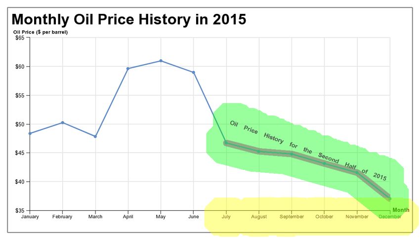
Figure 1.   We designed visually salient cues for the questions in the Visualization Literacy Assessment Test (VLAT) [16]. At the left is a graph with oil prices
(y-axis) for the twelve months (x-axis labels) of 2015, shown with the original line graph from VLAT. In the center is the graph with a text cue added which reads
“Oil Price History for the Second Half of 2015.” At right is the graph with a color cue added to the data for the second half of 2015. These salient cues help direct
the reader’s attention to the components of the graph needed to answer the question “Over the course of the second half of 2015, the price of a barrel of oil
was...?” with answer choices of “increasing,” “decreasing,” and “staying the same.” We measured the effect of visually salient cues like these on the error rate,
response time, and fixations of graph readers.

                                                                                      Table 2. The division of questions into groups yielded approximately equal
and “Color cues,” refers to these cues. Most graph drawing was
                                                                                      difficulty for the three groups. IDI is the item difficulty index in [16]; our
done through the creation of specifications in the HighCharts
                                                                                      added question was set to 0.55. Class Deviation for each class is the sum
language2 ; some was done directly in Adobe Photoshop3 . We
                                                                                      of squared deviations from class mean and for All is the sum of squared de-
also created two sets of examples of all three cue modes; these
                                                                                      viations for the array mean. GVF is the goodness of variance fit (used to
were shown, with explanations, to participants to serve as a tuto-
                                                                                      evaluate Jenks’ natural breaks), which indicates an excellent division.
rial, immediately prior to the main task.
                                                                                        Class         IDI range        Class Deviation             GVF
       Our cues were designed to focus attention on the smallest
                                                                                        Easy          0.75-1.00           0.14318
area that would enable the reader to take the next step in our
                                                                                        Medium        0.47-0.72           0.08729
GOMS model of the solution process. One could argue that high-
                                                                                        Hard          0.15-0.44           0.12309
lighting a specific step in the GOMS model would obviate the
                                                                                        All                               3.52570               0.89972
need to perform any steps prior to it. This would make our choice
of highlighting dependent on the order of our GOMS model,
which in many cases is not a uniquely valid solution. One could
argue that highlighting makes it plainly obvious what the answer                      with the difficulty of the questions. Thus, we used Jenks’ natural
is. However, we reasoned that the entire purpose of providing                         breaks [12] on the item difficulty index to partition questions into
salient cues on top of a graph is to answer a question that the graph                 three groups. This assigned 24 questions to the “Easy” group, the
author is implicitly placing in front of the reader and demanding                     next 15 to the “Medium” group, and the final 15 to the “Hard”
that the reader answer. Thus, the entire purpose of a salient cue                     group. The measure of quality of the partition is goodness of
could be considered to be the author forcing the reader to make a                     variance fit, which has a range of [0..1]. This partition yielded
particular interpretation of the graph. Thus, many of our cues in                     0.8997 (Table 2), considered to be an excellent division. The par-
fact do this. Some of our cues could be criticized as not following                   tition into groups with equal mean difficulty enabled us to com-
standard practice. Although we are not aware of a single standard                     pare performance across the modes of salient cues. This division
for highlighting elements of a graph, it is true that certain common                  by difficulty enabled us to study the interaction of the cues with
practices do not appear in our cues and some uncommon ones do.                        the difficulty of the question.
For example, one common highlight for a bar graph is to assign a
unique color to a bar of interest. But this cue may not focus the                     Region of Interest Construction
reader directly on the value of that bar (which is indicated by the                         To facilitate analysis of gaze data, we need to define a region
top of the bar only). Thus some of our designs may seem unusual,                      of interest (ROI) for each question. We constructed regions with
such as circling the top of a bar. We felt such unusual cues would                    the following procedure. First, we manually selected pixels that
focus the reader on the perceptual task that most directly leads to                   were part of the text or color cues. This was done with a combi-
accomplishing the steps of our GOMS model. Other cues, such                           nation of the Magic Wand and Rectangular Marquee tools in
as highlighting an entire sector in a pie graph (which gives its                      Adobe Photoshop. Next, still using Photoshop, the selections for
value by the angular size), are more in keeping with conceptions                      the text and color cues were merged (set union) into a single selec-
of “standard” practice.                                                               tion. Finally, this single selection for each question was expanded
                                                                                      by 93 pixels (46.4 × 2, rounded) to give us the 2.0◦ of visual an-
Estimated Question Difficulty                                                         gle we needed for the error tolerance for our eye tracking data.
      While the mean difficulty of the three manipulations each                       For a few graphs, the color cue consisted of the outline of a large
participant worked through was approximately equal, we saw                            region (e.g. a sector on the pie chart). In these cases, the above
from the item difficulty index that certain questions were eas-                       procedure resulted in the ROI having a “hole” consisting of pixels
ier than others. We wanted to see if the salient cues interacted                      that were surrounded by the region but not within 93 pixels of the
                                                                                      boundary (and thus inside the ROI). We opted to fill in these holes
   2 https://api.highcharts.com/highcharts/                                           (make them part of the ROI), so that a participant who fixated on
   3 https://www.adobe.com/products/photoshop.html                                    the center of such a region was considered to have looked at a rel-

IS&T International Symposium on Electronic Imaging 2021
Visualization and Data Analysis 2021                                                                                                                              329-5
lus, and processed to identify fixations. When searching for fixa-
tions, we ignored data records for which the tracker reported that
either the left or right eye contained invalid data. In concert with
the eye tracking error noted above, we used a dispersion metric of
2.0◦ of visual angle to determine whether a consecutive sequence
of valid data records was a fixation. Invalid data records did not
end or reduce the time measured for a fixation that otherwise met
the criteria; invalid records were treated as if they simply did not
exist. We recorded the location, duration, and inclusion in a sin-
gle ROI for each fixation. In cases where a primary and secondary
ROI both contained a fixation (e.g. a salient cue near a relevant
axis label), the primary ROI was considered to have been fixated.
Figure 2. Gaze-related regions of interest (ROIs) for the analysis of par- Each participant saw each question once (on one salience manip-
ticipants’ eye tracking data in the three manipulations of the graph reading ulation), so we gathered data from 54 ∗ 28 = 1512 trials.
task shown in Figure 1. These brightly colored ROIs should not be confused
with the salient color cues designed for our study. The number and duration Hypotheses
of participants’ gaze fixations (longer than 100 ms) falling within the color We made the following hypotheses regarding our indepen-
ROIs in this figure were counted. The green region is the primary ROI; the dent and dependent variables.
yellow is the secondary ROI. The size of the ROIs shows the error tolerance 1. Error will be lower with salient cues present than without.
(2.0◦ of visual angle) we chose based on tests of our eye tracking system’s 2. Response times will be lower with salient cues than without.
performance. The gray frame around the graph was not present during the 3. Question difficulty will interact with the salient cues, with a
study; it represents the image boundary to illustrate how ROIs may need to greater reduction in the error for Hard questions.
exceed the image boundary. Also note that the primary and secondary ROI
4. Question difficulty will interact with the salient cues, with a
overlap near the bottom right of the graph; a fixation in this overlap region
greater reduction in the response time for Hard questions.
was considered to belong to the primary ROI.
5. Graph literacy will interact with the salient cues, with greater
reduction in error for readers with low graph literacy.
6. Fixations will more often occur in the primary ROIs with
evant portion of the graph. Had we not done this, the center of a
salient cues present than without.
large, relevant region would have been considered as irrelevant to
the question as the plain white background of the graph. Hypothesis 6 is perhaps the most obvious and follows di-
Our salient cues rarely direct attention to all the graph com- rectly from much of the Related Work. Although only some of the
ponents in our GOMS model for the question. Thus, we labeled related work would support Hypotheses 1 and 2, we believed that
the ROIs described in the previous paragraph “primary ROIs” and the visually salient cues would both keep participants on a correct
created a set of “secondary ROIs.” Secondary ROIs included solution process and move them through it faster. Since the cues
graph components that were (potentially) applicable to methods came directly from the GOMS models for a solution, it followed
to solve the problem, but were not highlighted by our salient cues. that the cues would have these positive effects. Similarly, we
Most often, these included portions of one or both axes (with asso- believed the benefits would be greater when the difficulty of the
ciated labels) as well as a portion of the legend (if present). When question mandated greater skill from the graph reader(especially
questions arose about the inclusion criteria, the first three authors in relation to the skill level the graph reader possessed). Hypothe-
resolved the differences through discussion. These primary and ses 3, 4, and 5 all follow from this belief.
secondary ROIs enabled the dependent measures related to fixa-
tions in the ROIs4 (Figure 2). Results
The ROIs were created on images that spanned the entire We analyzed the results using the ezANOVA package in R.
screen, even though the graph images were smaller. This enabled We report p-values with Greenhouse–Geisser corrections where
us to define ROIs that expanded beyond the image boundaries. needed and effect sizes. Post-hoc correlated t-tests were con-
This allowed us to include fixations that were within the tracker ducted by hand using intermediate values calculated in a spread-
error tolerance of a cue but not within the boundary of the dis- sheet and standard formulas [18]. Error was given a binary value
played graph image (as often happened for components in sec- for each trial, and all trials were analyzed. Response time data
ondary ROIs, such as axes and legends). were analyzed only for those trials on which the response was cor-
rect. While this is common practice, it is often not well-justified.
Dependent Variables The concern is that incorrect answers may indicate a lack of effort
For each data trial, we recorded the (binary) response error, on the part of participants and thus not be indicative of a process
response time, data about the question, and the hardware clock of working towards a solution. Nielsen and Wilms [24] point out
tick counter at stimulus onset and at the time of the response. Eye that this is more likely to be true when the response accuracy is
tracking data was recorded per subject into a log file. As a post- near ceiling (i.e. almost perfect). We do not think this is true of all
process, this log file was split by stimulus, using the clock tick the tasks embodied in the VLAT. However, we did instruct partici-
data to identify beginning and ending data records for each stimu- pants that they must answer each question; we removed the option
(present in VLAT) to “Skip this question.” Thus it is entirely pos-
4 Interested parties may contact the first author for the ROIs. sible that participants read a question, decided that they did not
IS&T International Symposium on Electronic Imaging 2021
329-6 Visualization and Data Analysis 2021know, and simply guessed. Of the 212 errors we recorded (14% significant main effect of age on response time. The younger a
of trials), approximately half (102) were by participants whose bracket’s ages, the faster the response time. These results are in
mean response time did not appear statistically faster on correct line with typical effects of aging [8] on attention, working mem-
responses than on incorrect responses. This behavior could be ory, long-term memory (we note this includes mathematical pro-
consistent with guessing. Therefore, in the analysis presented cedures), and perception; we do not consider them further.
here, we removed incorrect trials when analyzing response time.
We note that one could make an analogous argument about fixa- Discussion
tion data; if the response was incorrect, perhaps the participant did We demonstrated improvement from visually salient, task-
not make a serious effort to identify and process the graph com- relevant cues with a wide variety of graphs, using both text cues
ponents. However, because we are interested in attention that is and color cues, on error, response time, proportion of fixations,
controlled below the level of conscious effort, we included incor- and proportion of fixated time. Intuitively, cues that are designed
rect trials in our analysis of gaze data. We leave for future work to draw visual attention to the relevant portion(s) of a visual repre-
the application of models for differentiating effort on a per-trial sentation ought to lead to improved performance on correspond-
basis [28]. We analyze the percentage of fixations and percentage ing queries through increased attention. To our knowledge, how-
of time spent in ROIs using the same statistical tests. ever, this has not been shown with a broad range of types of sta-
Use of visually salient cues had a main effect on the error: tistical graphs. Previous work showed benefits of cues akin to our
F(2, 54) = 2.587, p = 0.014, η 2 = 0.077. We saw a small reduc- color cues [1, 4] and hypothesized benefits of highlighting text la-
tion in error with both types of cues when compared to no cues bels [27]. Our results offer empirical evidence for this hypothesis.
(17.5% error). Post-hoc testing showed that color cues (11.1%) While we observed significant differences, we note that the
were significantly better (t(27) = 2.875, p = 0.008) and text effect sizes were quite modest. So although we can support Hy-
cues (13.5%) were marginally better (t(27) = 1.795, p = 0.084). potheses 1 and 2, we do not find that the improvement is so large
Salient cues also had a small but statistically significant main ef- that it is certain to have an impact in all applications. Perhaps
fect on the response time: F(2, 54) = 4.426, p = 0.017, η 2 = more notable is the significant interaction between our salient cues
0.055. Responses were slightly faster with both the color cues and the problem difficulty classification levels we assigned. Al-
(17.6 sec, t(27) = 2.786, p = 0.010) and the text cues (18.3 sec, though the effect size is small, the lower error on Hard questions
t(27) = 2.121, p = 0.043) than with no salient cues (21.5 sec). with the color cues (25.9%) versus either no cues (42.6%) or text
These effects support Hypotheses 1 and 2, respectively. cues (40.7%) is of potential value in many applications. This
More interesting is the interaction of the salient cues with the result supports Hypothesis 3. Although we are hesitant to cre-
question difficulty (Figure 3). There was a small but significant in- ate guidelines for graph authoring based on a single experiment,
teraction between question difficulty and the use of cues for error: we think the most likely practical guideline that may eventually
F(4, 108) = 4.688, p = 0.004, η 2 = 0.050. This supports Hy- emerge from our research is a recommendation to add salient
pothesis 3. We did not find a corresponding interaction between cues for difficult tasks. The lack of support for Hypothesis 4 is
difficulty and salient cues for response time: F(4, 100) = 1.018, disappointing, but the main effect of adding visually salient, task-
p = 0.390. Thus we cannot support Hypothesis 4. related cues on response time is sufficiently interesting and of po-
We found a main effect of graph literacy on error: F(1, 26) = tential value on its own. Color cues were on average 19.4% faster
5.058, p = 0.033, η 2 = 0.163. We found a marginal effect on than no cues, while text cues were 15.0% faster.
the response time: F(1, 26) = 4.142, p = 0.052, η 2 = 0.137. To truly understand the differences will require a deeper un-
Those with very high graph literacy were slightly more accurate derstanding of the reasons for success or failure of the individual
and faster than those with high graph literacy. (See Discussion cues we developed. We do not claim that our cues were optimal by
for the reasoning behind these two classes.) However, we did any metric. We drew inspiration from various sources of statisti-
not see an interaction between graph literacy and the use of cues, cal graphics (technical publications, news media, government re-
for either error: F(2, 78) = 1.598, p = 0.209, or response time: ports, school textbooks, etc.). We did not survey the literature for
F(2, 78) = 0.394, p = 0.676, so we cannot support Hypothesis 5. example cues or make our cues (cue distribution) representative
With regard to the gaze data, we found a significant main ef- of what we found. Such an endeavor would be interesting, albeit
fect of salient cues on the percentage of fixations in primary ROIs: tedious, and subject to questions of how well the collected sam-
F(2, 48) = 7.166, p = 0.003, η 2 = 0.118, as well as on the per- ples represent a particular application. We hoped that the baseline
centage of fixation time spent in primary ROIs: F(2, 48) = 7.237, graph literacy skills test would yield insight into how well the
p = 0.002, η 2 = 0.111. Both the text cues (t(24) = 4.339, cues worked for various types of graph readers. But we did not
p < 0.001) and color cues (t(24) = 2.423, p = 0.023) increased have sufficient diversity of reader expertise to study the effect of
the percentage of fixations that occurred in primary ROIs and skill level. Our readers all demonstrated a high degree of graph
the percentage of fixated time (with nearly identical t-tests) that literacy per the median split criterion defined for the GLS [6]. Per-
was spent in primary ROIs (Figure 4). This supports Hypoth- haps because of this, we were unable to support Hypothesis 5. It
esis 6. We see that when the graphs were presented with text is entirely possible that readers of low graph literacy skill (who
cues, participants made a significantly smaller portion of fixations are especially important to measure for fields like education) may
(t(24) = 2.281, p = 0.032) and spent a significantly lower portion yet prove to be helped more by these types of cues.
of time (t(24) = 2.397, p = 0.025) in secondary ROIs (Figure 5). We were able to support Hypothesis 6; we drew readers’ at-
We did not observe a main effect of educational degree or tention proportionally more to the primary ROIs, analogous to
gender. Age had a marginal effect on error; the 45-54 age bracket results with weather maps [11]. This also seems to be a sort of
generated slightly more error than other brackets. There was a contrapositive result to the results of Bera [1]. We also see it
IS&T International Symposium on Electronic Imaging 2021
Visualization and Data Analysis 2021 329-7Figure 3. Left: Error by the type of salient cues and the difficulty of the questions, with the mean for each cue type in gray. The main effect can be seen by
the gray bars, whereas the interaction is most notable in the text and color cues for the medium and hard questions. Right: Response time by the type of salient
cues and the difficulty of the questions, with the mean for each salient cue type in gray. The main effect can be seen by the gray bars. There was no significant
interaction between salient cues and question difficulty for response time.
Figure 4. Left: Percentage of fixations that occurred in primary regions of interest (ROIs) for each of the three salient cue conditions. Right: Percentage of
fixation time spent in primary ROIs for each of the three cue conditions. Participants fixated proportionally more and proportionally longer in primary ROIs with
both the text and color cues.
as in concert with the results with animated salient cues for dia- answered correctly 51% of the time in a pilot study of university
grams [9, 26]. One curious observation is that our readers spent students with at least one course on the topics in the questions.
very little time looking at the graph title; a few were never ob- Counter to the other findings, those who answered incorrectly ap-
served to have fixated on it at all (on any question). This may have peared to err due to top-down misconception of the task rather
occurred because we showed only one graph and one question at a than bottom-up distraction of perceptually salient areas. Their
time; readers may have felt no need to validate the graph’s subject follow-up study [20] did not give sufficient data to indicate the
through its title. Also, only twelve graphs were used for 54 ques- difficulty of their tasks. The tasks in VLAT vary greatly in diffi-
tions, so familiarity could have reduced the number of fixations culty, with an average of 65% correct in the VLAT pilot data [16].
even for those who initially read the title. A more complicated Bera’s tasks were notably easier, with approximately 90% correct
task might alter this behavior. We leave for future work an anal- responses in his study [1]. Bera did not find an effect on per-
ysis of sequences of fixations; however, we did not ask users to formance on his bar graph tasks. Carenini et al. [4] found greater
announce their plan for the graph-reading task (as [10] did), al- differences on the simple tasks, but found differences on both sim-
though we intend to do this in future studies. ple and complex tasks. They also noted a potential ceiling effect,
with 91.4% correct responses overall. Although Madsen et al.’s
Looking across studies that reported results with respect to and Carenini et al.’s results do not appear to fit, we could still
task performance, we see a potential pattern by difficulty that ask whether a reliable comparison might show that this (partial)
echoes the finding of Gegenfurtner et al. [7] with visual repre- order of difficulty we’ve hypothesized is reasonable for a greater
sentations other than statistical graphs. Here, we consider the class of visual representations than Gegenfurtner et al. reviewed.
studies we reviewed in Related Work. Grant and Spivey [9] and (We note that the work of Grant and Spivey is the only overlap
Thomas and Lleras [26] found some evidence of improved per- between their review and our discussion.) A true comparison of
formance on a single task that is known to be challenging without task difficulty does not exist and would be challenging to design.
assistance; they saw successful responses between 20% and 37% But if we and Gegenfurtner et al. are correct, then a mostly con-
with varied groups (and expertise) on a free-response question. sistent pattern of harder questions (for the participants, given their
Hegarty et al. [11] found that performance on a task requiring ex- expertise) yielding a performance difference from visually salient
pertise was affected only when participants had training on the cues could be discerned. This is an important avenue for future
task. Their two-alternative, forced-choice task yielded a propor- research. We advocate for the use of GOMS or similar modeling
tion correct just above chance (when given without instruction). approaches to help resolve the influence of problem difficulty.
The first study by Madsen et al. [19] analyzed questions that were
IS&T International Symposium on Electronic Imaging 2021
329-8 Visualization and Data Analysis 2021Figure 5. Left: Percentage of fixations that occurred in secondary regions of interest (ROIs) for each of the three salient cue conditions. Right: Percentage of
fixation time spent in secondary ROIs for each of the three cue conditions. Participants fixated proportionally less and for proportionally less time in secondary
ROIs with the text salient cues.
We believe it is reasonable to have expected an interaction down knowledge of the task context was the primary influence on
between question difficulty and the use of salient cues (Hypothe- attention may reflect the influences on our graphs and tasks.
ses 3 and 4). In particular, we anticipated cueing would reduce
the nominal degree of effort required for more difficult questions. Conclusion
We conducted analyses of error and response time as a function We found evidence that two types of visually salient cues
of the graph type and as a function of the question type. While can improve the accuracy and response time in graph-reading
we did not find significant results, we note that the group sizes tasks. This is important evidence that documents the effect of two
are in some cases very small. Such unbalanced designs are un- commonly-used types of cues: text labels and colored shapes. It
likely to yield statistical significance. This was not a design goal appears that often, but not always, a mechanism driving this im-
of our study, but it could potentially be a design goal and an in- provement was an increased portion of fixations and fixation time
teresting variable for future studies focused on the various graph on the intended ROIs. We also found that this effect interacts with
types and question types we inherited from VLAT [16] or other the difficulty level of the reading task, wherein the improvement
classifications, such as the often-used types of Bertin [2]. Error was greater for more difficult questions when using color cues.
shows some differences, and so does response time, but they are We did not observe an effect of graph literacy skill within our
clearly not in concert (Table 3). Some cues led to faster response pool of participants, although this may be due in part to the high
and increased error (color cues for clustering tasks), whereas both degree of skill in our sample population. Nor did we see an inter-
text and color cues reduced error but not response time when find- action between graph literacy skill and salient cues, though one
ing extremes. A similar pattern is observed for the task of finding might reasonably hypothesize that cues would be more helpful to
trends. Despite the lack of statistical significance, Table 3 could novices. However, any position on this conjecture is premature,
reasonably lead us to form hypotheses about effects for particu- and we have identified this as an avenue for future work. With the
lar question types and build experimental designs that rigorously data we have collected, one could perhaps analyze thoroughly to
test such hypotheses. A similar argument could be made regard- see how to improve the salient cues we gave. We leave this for
ing the graph type, although the analogous table to Table 3 has future work as well.
even smaller patterns that would lead one to hypothesize about an In conclusion, we have shown that salient, straightforward,
interaction between uses of salient cues and the graph type. task-relevant cues in statistical graphs can improve specific as-
It seems reasonable to conclude that the explanation for per- pects of graph-reading task performance. The sources of this re-
formance with the text cues was that our participants fixated pro- sult in the general population cannot be fully differentiated on the
portionally more and proportionally longer in the primary ROIs. basis of our findings. Our approach offers a structured framework
This result seems consistent with the results with maps [11] and for studying additional factors at play in the effective design of
diagrams [9, 26, 17]. Most importantly for comparison to our graph-reading tasks.
work, it is generally consistent with the results for bar graphs [1]
and star plots [13]. However, we again note the variety of modes Acknowledgments
of salience (color and text in our work, versus color, luminance, The authors wish to thank Joseph Coyne, Ciara Sibley,
line thickness, and motion/animation in other work). All these Noelle Brown, Cyrus Foroughi, the anonymous reviewers, and
cues should lead readers of visual media to fixate more on the the anonymous study volunteers. This work was supported in part
emphasized visual elements. Furthermore, we are not surprised by the Naval Research Laboratory Base Program.
by the slightly greater percentages for the text cues over the color
cues; it generally requires more fixations (and thus longer total References
duration) to comprehend text than geometric shapes [21]. How- [1] Palash Bera. How colors in business dashboards affect users’ deci-
ever, we found no correlation between fixations and error, nor sion making. Comm. of the ACM, 59(4):50–57, April 2016.
betweeen fixations and response time, when the color cues were [2] Jacques Bertin with Marc Barbut et al. Sémiologie Graphique: Les
present. The lack of a consistent effect leads to speculation as diagrammes, les réseaux, les cartes;, revised edition. Gauthier-
to what other influences there are on the error and response time. Villars, 1973. Translated as “Semiology of Graphics” by William
Hegarty et al.’s [11] and Madsen et al.’s [19] observation that top- J. Berg, U. of Wisconsin Press, 1983.
IS&T International Symposium on Electronic Imaging 2021
Visualization and Data Analysis 2021 329-9Table 3. Error and response time broken down by a classification of question types. We collapsed some question types as listed in VLAT [16] into a single
category in order to achieve a within-subjects analysis. No significant effects were found, but there are differences in the performance improvements (or lack
thereof) between the categories.
Error (pct) Response Time (sec)
Question Type(s) No cues Text cues Color cues No cues Text cues Color cues
Find Clusters / Find Anomalies 0.081 0.026 0.108 29.272 22.933 17.936
Make Comparisons 0.198 0.205 0.155 23.541 19.714 18.685
Find Extremum 0.117 0.035 0.009 17.178 15.609 15.456
Find Correlations/Trends 0.167 0.087 0.065 19.399 19.126 17.711
Retrieve Value 0.240 0.215 0.188 23.113 20.217 18.293
[3] Stuart Card, Thomas P. Moran, and Allen Newell. The Psychology tions: Does direction of attention foster learning processes? Learn-
of Human Computer Interaction. Lawrence Erlbaum Assoc., 1983. ing and Instruction, 21:650–663, 2011.
[4] Giuseppe Carenini, Cristina Conati, Enamul Hoque, Ben Steichen, [18] Richard Lowry. Concepts and Applications of Inferential Statistics.
Dereck Toker, and James Enns. Highlighting interventions and user http://vassarstats.net/textbook/, Accessed 30 June 2020.
differences: Informing adaptive information visualization support. [19] Adrian M. Madsen, Adam M. Larson, Lester C. Loschky, and
In Proceedings of the ACM SIGCHI Conference on Human Factors N. Sanjay Rebello. Differences in visual attention between those
in Computing Systems, pages 1835–1844, April 2014. who correctly and incorrectly answer physics problems. Physical
[5] Stephanie Elzer, Sandra Carberry, and Ingrid Zukerman. The au- Review Special Topics – Physics Education Research, 8(1), 2012.
tomated understanding of simple bar charts. Artificial Intelligence, [20] Adrian M. Madsen, Amy Rouinfar, Adam Larson, Lester Loschky,
175(2):526–555, February 2011. and N. Sanjay Rebello. Do perceptually salient elements in physics
[6] Mirta Galesic and Rocio Garcia-Retamero. Graph literacy: A cross- problems influence students’ eye movements and answer choices?
cultural comparison. Medical Decision Making, 31(3):444–457, In Physics Education Research Conf., American Institute of Physics
May/June 2011. Conf. Proc. 1513, pages 274–277, 2013.
[7] Andreas Gegenfurtner, Erno Lehtinen, and Roger Säljö. Expertise [21] Barry R. Manor and Evian Gordon. Defining the temporal threshold
differences in the comprehension of visualizations: a meta-analysis for ocular fixation in free-viewing visuocognitive tasks. Journal of
of eye-tracking research in professional domains. Educational Psy- Neuroscience Methods, 128(1–2):85–93, September 2003.
chology Review, 23:523–552, December 2011. [22] Matthew T. McCrudden and David N. Rapp. How visual displays
[8] Elizabeth L. Glisky. Changes in cognitive functions in human aging. affect cognitive processing. Educ. Psychol. Rev, 29:623–639, 2017.
In Brain Aging: Models, Methods, and Mechanisms, chapter 1. CRC [23] Vibhu O. Mittal. Visual prompts and graphical design: A frame-
Press/Taylor & Francis, 2007. work for exploring the design space of 2-d charts and graphs. In
[9] Elizabeth R. Grant and Michael J. Spivey. Eye movements and prob- American Association for Artificial Intelligence Proceedings, pages
lem solving: Guiding attention guides thought. Psychological Sci- 57–63, July 1997.
ence, 14(5):462–466, September 2003. [24] Simon Nielsen and Inge L. Wilms. Cognitive aging on latent con-
[10] Joseph A. Harsh, Molly Campillo, Caylin Murray, Christina Myers, structs for visual processing capacity: A novel structural equation
John Nguyen, and Adam V. Maltese. “seeing” data like an expert: modeling framework with causal assumptions based on a theory of
An eye-tracking study using graphical data representations. CBE– visual attention. Frontiers in Psychology, 5(1596), January 2015.
Life Sciences Education, 18, Fall 2019. [25] Steven Pinker. A theory of graph comprehension. In Artificial
[11] Mary Hegarty, Matt S. Canham, and Sara I. Fabrikant. Thinking Intelligence and the Future of Testing, chapter 4, pages 73–126.
about the weather: How display salience and knowledge affect per- Lawrence Erlbaum Assoc., 1990.
formance in a graphic inference task. Journal of Experimental Psy- [26] Laura E. Thomas and Alejandro Lleras. Moving eye and moving
chology: Learning, Memory, and Cognition, 36(1):37–53, 2010. thought: On the spatial compatibility between eye movements and
[12] George F. Jenks. The data model concept in statistical mapping. cognition. Psychonomic Bulletin & Review, 14(4):663–668, 2007.
International Yearbook of Cartography, 7:186–190, 1967. [27] Dereck Toker and Cristina Conati. Eye tracking to understand user
[13] Alexander Klippel, Frank Hardisty, Rui Li, and Chris Weaver. differences in visualization processing with highlighting interven-
Colour-enhanced star plot glyphs – can salient shape characteristics tions. In Intl. Conf. on User Modeling, Adaptation, and Personal-
be overcome? Cartographica: The Intl. Journal for Geographic ization, LNCS Vol. 8538, pages 219–230, 2014.
Information and Geovisualization, 44(3):217–231, Fall 2009. [28] Steven L. Wise and Christine E. DeMars. An application of item
[14] Nicholas Kong and Maneesh Agrawala. Graphical overlays: Using response time: The effort-moderated irt model. Journal of Educa-
layered elements to aid chart reading. IEEE Trans. on Visualization tional Measurement, 43(1):19–38, Spring 2006.
and Computer Graphics, 18(12):2631–2638, December 2012.
[15] Stephen M. Kosslyn. Graph Design for the Eye and Mind. Oxford Author Biography
University Press, 2006. Mark A. Livingston, mark.livingston@nrl.navy.mil, is a computer
[16] Sukwon Lee, Sung Hee Kim, and Bum Chul Kwon. VLAT: De- scientist at the Naval Research Laboratory in Washington, DC, USA. He
velopment of a visualization literacy assessment test. IEEE Trans. received his Ph.D. in computer science from the University of North Car-
on Visualization and Computer Graphics, 23(1):551–560, January olina at Chapel Hill. His research focuses on human factors of interactive
2017. graphics systems, recently focused on comprehension and complexity of
[17] Richard Lowe and Jean Michel Boucheix. Cueing complex anima- statistical graphs, plus virtual environments and augmented reality.
IS&T International Symposium on Electronic Imaging 2021
329-10 Visualization and Data Analysis 2021You can also read