TRANSPORTATION DISPARITIES MAPPING TOOL USER GUIDE
←
→
Page content transcription
If your browser does not render page correctly, please read the page content below

@WishfulAnthony

TRANSPORTATION DISPARITIES
MAPPING TOOL USER GUIDE
California Air Resources Board
UCLA Center for Neighborhood Knowlege

Draft Version 4.6.2021
800-242-4450 | helpline@arb.ca.gov
1001 I Street, Sacramento, CA 95814 | P.O. Box 2815, Sacramento, CA 95812
TABLE OF
                                             CONTENTS

           What is the Transportation Disparities Mapping Tool?     03

           How do I use the Mapping Tool?                           04

               Data Highlights                                      04
               Main Navigation Overview                             05
               Basic Widgets                                        06
               Displaying Data in Pop-up Window                     07
               Turning on Data Filtering Tools                      08
               Exploring Data with Spatial Query Tools              09
               Applying a Search Distance                            11
               How do I Export Data? (CSV/Image)                     12

           Transportation Case Examples                             14

              Bikeway Planning in South Bay                         15
              Transit Barriers to Health Care Access in Oakland     17
              Determinants of Active Transportation in California   19
              Heterogeneity Among Disadvantaged Neighborhoods       21

           What else can the Mapping Tool be used for?              22

              Program                                               22
              Policy                                                22
              Practice                                              22

Page | 2
ABOUT THE
TOOL
       What is the Transportation Disparity Mapping Tool?

       The Transportation Disparity Mapping Tool is a project developed
       to better understand transportation disparities and built environment-
       related determinants of health in California. It is a component of larger
       initiatives of the California Air Resources Board (CARB). According to
       Senate Bill 150, CARB is mandated to assess progress toward meeting
       greenhouse gas reduction goals. While striving to meet these goals,
       CARB also aims to ensure all segments of society benefit from CARB’s
       climate change agenda, including disadvantaged communities
       (SB 535 and AB 617). In accordance with CARB goals, this mapping
       tool is a web-based information visualization portal that contains
       indicators related to the causes, characteristics, and consequences
       of transportation disparities. This tool provides useful indicators for
       CARB and other organizations to help fulfill state mandates related
       to climate change, greenhouse gas emissions, and environmental
       justice, and to evaluate progress towards a more sustainable and
       environmentally just future.

       This tool was developed with an advisory committee and analyzed
       four major categories of disparities, including private vehicle
       ownership, public transit, active transportation, and transportation
       networks. The advisory committee, which aimed to provide
       stakeholder engagement, included representation from health
       experts, academics and researchers, and community organizations.
       The advisory committee also assisted in selecting which indicators
       and disparities should be prioritized and with the overall construction
       of the mapping tool. Additionally, a team of researchers and
       academics, led by Principal Investigator Paul Ong of UCLA Center
       for Neighborhood Knowlege (CNK), developed and visualized the
       indicators used in this tool. The development of this guide was funded
       in part by the California Initiative for Health Equity and Action.

       This guide shows where to find documentation and methodology for
       each indicator. It provides guidance on how to navigate the map so
       that the user can work through the features and see the full scope of
       the information.

       As a land grant institution, the authors acknowledge the Gabrielino and Tongva peoples as
       the traditional land caretakers of Tovaangar (Los Angeles basin, Southern Channel Islands),
       and recognize that their displacement has enabled the flourishing of UCLA.

                                                                                        Page | 3
MAPPING TOOL

                                           The Transportation Disparities Mapping Tool is available here.

     Data Highlights

   This mapping tool includes four domains of transporation disparities and multiple built
   environment determinants of health. Here is a select list of the indicators included in each of the
   primary data domains of the mapping tool:

      Transportation                                    Housing
      •    Newer Clean Vehicles                         •   % Multi-Family Housing Units
      •    Vehicles per Household                       •   % Households Paying 50% or More of Income
      •    % Public Transportation for Job Commute          Towards Housing Costs
                                                        •   % Renter-Occupied Households

      Accessibility Measures
      •    Access to High-Quality Transit Locations     Health
      •    Accessibility to Employment Opportunities    •   Traffic Collisions per Weighted Roadways
      •    Jobs-Housing Fit                             •   Primary Care Shortage Areas
                                                        •   Cardiovascular Disease

      Socio-Demo-Econ
      •    Largest Ethnoracial Group
      •    Job Density
      •    Neighborhood Change, Socioeconomic
           Variables

Page | 4
Main Navigation Overview

                          Use the tools on the top corners to navigate the mapping tool. On the top
                          right, there are widgets that allow you to search for an area of interest
                          and on the top left, you will find various tools to conduct your analysis.

                          We recommend exploring the different tools on the platform first before
                          diving straight into the next section of the user guide, which provides
                          detailed information and instructions.

Who to contact?

Please contact CARB at helpline@arb.ca.gov if
you have any questions or feedback regarding
the mapping tool.

                                                                                            Page | 5
How do I use the mapping tool?

           To search for a specific location, type a county, city, zip code, address,
           or place into the search bar and the map will automatically zoom to that
           location. Once you have typed your desired search location, you can
           either select it from the options that appear below the search bar or click
           on the magnifying glass icon to zoom to that location.

           To zoom, use the boxes with the + and - symbols on the lefthand side of
           the map to zoom in and out. Clicking the “+” will zoom in to wherever your
           page is centered around, and clicking the “–” will zoom out. You can also
           place your mouse over a desired location and swipe with two fingers on
           your trackpad to zoom in and out. Alternatively, you can click and hold your
           mouse anywhere on the map while dragging to pan around the screen.

           Click the home button with the home icon at any time to return to the
           original map extent.

           To change the basemap, click on the highlighted icon composed of 4
           white squares titled “Basemap Gallery,” the fifth icon from the left. From
           there, a list of 12 optional basemaps will appear below. You can select
           whichever basemap you prefer and can change the basemap at any
           point without affecting your other selections/zoom.

                                                                          Joel Muniz

Page | 6
Pop-Up Window

Click on any tract within the map and a pop-up window will
appear. Within it, you will see:
     1. The title, indicating what indicator this map is displaying
     2. The unique Census Tract number
     3. What category the specific census tract falls under for your given
        indicator (listed as a decile, number, etc.)
     4. The total population number
     5. Demographics of the population within that census tract.

Press “Zoom to” in the bottom left corner to zoom the map scale to the
selected tract. Press the three dots in the bottom right corner for a list of
options:
     1. “Pan to” re-centers the selected tract to the middle of your screen
     2. “Add a marker” places a marker on the tract so that it may be
         located easily if zoomed out to a greater extent
     3. “View in Attribute Table” will cause the attribute table with
         information to appear at the bottom of your screen which can be
         exported if desired

Close the pop-up window by pressing the X in the top right corner of the
window box.

                                                                                Page | 7
Turning on Data Filtering Tools

     Select the Filter Tool  from the main panel           selected, make sure the switch within the
     of widgets. You can utilize a single filter or a      legend at the top of the filter list is green,
     combination of filters to analyze patterns            indicating that the map has been turned
     across California. Once filters have been             ‘on’.   The various filters operate as follows:

     Geography Filters                                     Accessibility Measures
     •     County is: (select a county)                    •   Access to High-Quality Transit Locations is:
     •     Metropolitan Planning Organization is:              (select an option; consult guidebook) *see
           (select an MPO)                                     note below
     •     SB 535 Disadvantaged Communities is:            •   Availability of Weighted Bikeways per
           (select yes or no)                                  Population is: (select an option; consult
     •     AB 1550 Low-Income Communities is: (select          guidebook) *see note below
           yes or no)                                      •   Availability of Parks & Public Open Space
     •     Area Median Income (Regionally Adjusted)            per Population (Decile) is: (select a range of
           is: (select a percentage range)                     deciles)
                                                           •   Accessibility to Employment Opportunities
     Socio-Demo-Econ                                           (Decile) is: (select a range of deciles)
     •     Median Household Income is Between:             •   Jobs-Housing Fit (Decile) is: (select a range
           (enter a range of values)                           of deciles)
     •     % Poverty is between: (enter a range between
           0 and 100)                                      Housing
     •     Largest Ethnoracial Group is: (select an        •   Housing Unit Density (Decile) is: (select a
           option)                                             range of deciles)
     •     Population Density (Decile) is: (select a       •   % Multi-Family Housing Units is between:
           range of deciles)                                   (enter a range between 0 and 100)
     •     Job Density (Decile) is: (select a range of     •   % Renter-Occupied Households is between:
           deciles)                                            (enter a range between 0 and 100)
     •     Neighborhood Change, Socioeconomic              •   % Households Paying 30 - 49% of Income
           Variables (Decile) is: (select a range of           Towards Housing Costs is: (enter a range
           deciles)                                            between 0 and 100)
                                                           •   % Households Paying 50% or More of Income
     Transportation                                            Towards Housing Costs is: (enter a range
     •     Auto Insurance Premium (Decile) is: (select         between 0 and 100)
           a range of deciles)                             •   Neighborhood Change, Housing Variables
     •     Lending Barriers (Decile) is: (select a range       (Decile) is: (select a range of deciles)
           of deciles)
     •     Newer Clean Vehicles (Decile) is: (select a     Health
           range of deciles)                               •   % with Medicaid Health Insurance Only is
     •     Older Clean Vehicles (Decile) is: (select a          between: (enter a range between 0 and 100)
           range of deciles)                               •   % No Health Insurance is between: (enter a
     •     Clunker Vehicles (Decile) is: (select a range        range between 0 and 100)
           of deciles)                                     •   Life Expectancy at Birth is between: (enter a
     •     Average VMT per Household (Decile) is:               range of values, in years)
           (select a range of deciles)                     •   Traffic Collisions per Weighted Roadways
     •     Average Commute VMT (Decile) is: (select a           (Decile) is: (select a range of deciles)
           range of deciles)                               •   Primary Care Shortage Areas is: (select yes or
     •     Vehicles per Household is between: (enter a          no)
           range of values)                                •   Walkability Index (Decile) is: (select a range
     •     % Households with No Vehicle is between:             of deciles)
           (enter a range of values)                       •   Asthma Prevalence (Decile) is: (select a
     •     % Drove Alone for Job Commute is between:            range of deciles)
           (enter a range between 0 and 100)               •   Cardiovascular Disease (Decile) is: (select a
     •     % Carpooled for Job Commute is between:              range of deciles)
           (enter a range between 0 and 100)
     •     % Public Transportation for Job Commute is      *Both high-quality-transit location and availability
           between: (enter a range between 0 and 100)      of bikeways indicators cannot be reported as decile
     •     % Bike for Job Commute is between: (enter a     rankings due to the nature of the data (see report
           range between 0 and 100)                        for further details). For both of these indicators, the
                                                           higher the filter value the more access to a high-
     •     % Walk for Job Commute is between: (enter
                                                           quality-transit location or more availability of bikeway
           a range between 0 and 100)                      infrastructure. A value of “0” represents no access to
     •     Average Travel Time to Work (Minutes) is        a high-quality-transit location or no availability of
           between: (enter a range of values)              bikeway infrastructure.

     More information for each indicator can be found in the full report, available at: [link placeholder]

Page | 8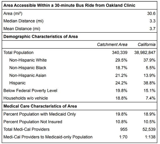
Exploring Data with Spatial Query Tools
The spatial query tool can be used to select and
analyze certain census tracts or groups of tracts.
Shapes can be drawn over the map, then tracts that
intersect with the shape’s area can be analyzed.
There are 10 different methods of drawing points or
shapes, depending on how you want to spatially filter
the data. These specifications can be found under
the “Tasks” section of the spatial query tool:

                        Point: The point tool allows you to place a point anywhere on the map
                        and analyze the census tract in which the point is placed. Select the point
                        icon, then select anywhere on the map. You will see a small gray point
                        appear where you clicked on the map. If you want to place your point
                        somewhere else, simply reselect the point icon and click a new location
                        on the map where you prefer to analyze.

                        Line: The line tool allows you to draw a straight line anywhere on the map
                        and then analyze tracts that intersect with that line. Select the line icon,
                        then click and hold anywhere on the map. Continue holding as you drag
                        your cursor for a desired length and direction over the map. Release when
                        you are satisfied with the line. You should see a blue dotted line appear
                        where you drew. If you want to change the location of your line, simply
                        reselect the line icon and follow the same steps for a new location.

                        Polyline: The polyline tool allows you to draw multiple segments of
                        straight, connected lines anywhere on the map and then analyze tracts
                        that intersect with that line. Select the polyline icon, then click anywhere
                        on the map. Move your cursor to your desired location and click again to
                        complete a segment. Continue clicking and releasing for each segment.
                        Once satisfied with your polyline, double-click to complete the line. If you
                        want to change the location of your polyline, simply click the polyline tool
                        again and follow the same steps for a new location.

                        Freehand Polyline: The freehand polyline tool allows you to draw a
                        freehand line (not necessarily straight) anywhere on the map and then
                        analyze tracts that intersect with that line. Select the freehand polyline
                        tool, then click and hold anywhere on the map. Continue holding as you
                        move your cursor around the map. The freehand polyline will trace where
                        you move your cursor. Release when you are satisfied with the line. You
                        should see a blue dotted line appear where you drew. If you want to
                        change the location of your line, simply reselect the freehand polyline
                        icon and follow the same steps for a new location.

                        Triangle: The triangle tool allows you to draw a triangle of any size
                        anywhere on the map and then analyze tracts that intersect that triangle.
                        Select the triangle tool, then click and hold anywhere on the map.
                        Continue holding as you move your cursor out and in, changing the size
                        of the triangle but remaining centered around your initial click location.
                        Release when you are satisfied with the triangle. You should see a
                        translucent blue triangle appear on the map. You may also simply click
                        and release immediately for a generic sized triangle shape. If you want to
                        change the location of your triangle, simply reselect the triangle icon and
                        follow the same steps for a new location.

                                                                                              Page | 9
Extent: The extent tool allows you to draw a rectangle of any size
            anywhere on the map and then analyze tracts that intersect that triangle.
            Select the rectangular extent tool, then click and hold anywhere on the
            map. Continue holding as you move your cursor around, changing the
            size of the rectangle while one corner remains anchored around your
            initial click location. Release when you are satisfied with the extent. You
            should see a translucent blue rectangle appear on the map. If you want
            to change the location of your extent, simply reselect the extent icon and
            follow the same steps for a new location.

            Circle: The circle tool allows you to draw a circle of any size anywhere on
            the map and then analyze tracts that intersect that circle. Select the circle
            tool, then click and hold anywhere on the map. Continue holding as you
            move your cursor out and in, changing the size of the circle but remaining
            centered around your initial click location. Release when you are satis-
            fied with the circle. You should see a translucent blue circle appear on the
            map. You may also simply click and release immediately for a generic
            sized circle shape. If you want to change the location of your circle, simply
            reselect the circle icon and follow the same steps for a new location.

            Ellipse: The ellipse tool allows you to draw an ellipse of any size on the
            map and then analyze tracts that intersect that ellipse. Select the ellipse
            tool, then click and hold anywhere on the map. Continue holding as you
            move your cursor out and in, changing the size of the ellipse but
            remaining centered around your initial click location. Release when you
            are satisfied with the ellipse. You should see a translucent blue ellipse
            appear on the map. You may also click and release immediately for a
            generic sized ellipse shape. If you want to change the your ellipse’s
            location, reselect the ellipse icon and follow the same steps.

            Polygon: The polygon tool allows you to draw a polygon of any size or
            shape with straight edges anywhere on the map and then analyze tracts
            that intersect that polygon. Select the polygon tool, then click anywhere
            on the map. Move your cursor to your desired location and click again to
            complete a segment. Move and click again to add another side.
            Continue adding your desired number of sides then double-click when
            you are satisfied. Note that the polygon must have at least 1 side (two
            clicks) making a line. If you cross sides over one another, a negative area
            may appear. You should see a blue translucent polygon specifying the
            areas of analysis appear on the map. If you want to change the location
            of your polygon, simply click the polygon tool again and follow the same
            steps for a new location.

            Freehand Polygon: The freehand polygon tool allows you to draw a
            polygon of any size or shape with anywhere on the map and then analyze
            tracts that intersect that polygon. Select the freehand polygon tool, then
            click and hold anywhere on the map. Move your cursor to draw a
            freehand polygon shape and release when completed. If you cross sides
            over one another, a negative area may appear. You should see a blue
            translucent polygon specifying the areas of analysis appear on the map.
            If you want to change the location of your polygon, simply click the tool
            again and follow the same steps for a new location.

            Clear: If at any point you want to clear a drawn shape, either select your
            desired tool and redraw, or press the red icon with the exclamation point
            within a triangle to clear the drawn shapes.

Page | 10
Applying a Search Distance
1. After a shape is drawn, you can specify a search
distance to increase the area of analysis. Check the
box labeled “Apply a search distance” and type a
number and select the units.
2. You will see your shape along with a slightly more
translucent blue border around it, visualizing the
specified search distance. If you do not want a
search distance, either uncheck the box or type a
value of zero.
3. Once satisfied, you may rename the resulting
layer (optional). Then select the green button at
the bottom labeled “Apply”
4. Upon pressing “Apply”, the tool will bring you to the
“Results” section of the spatial query tool and zoom
to the selection of tracts that you selected with your
shape. You can then click on any tract in the list to
zoom to that specific tract.
5. To show or hide the information about a tract in the
results window, click on the small up arrow in the
upper right corner of the tract’s information section.
If you want to display or hide the information for all
tracts, press the symbol consisting of lines and an
arrow. This will either collapse or expand all results
depending on if you have your information sections
open or closed currently.
Note:
You can only draw one singular spatial-filter shape at any time.
Once you begin to draw a new shape, whether of the same
type as the previous shape or a new type, your old shape will
Page | 11
disappear and be replaced by the new drawing.How do I export data?
How do I export as a CSV file?
Click on the small black box with the arrow at the bottom
of the page to bring up a table with data on indicators
by census tract. You can drag the top of the table up and
down to change how much of it you want to see, and at
any point you can click the black arrow again to hide the
table and return to the map view.
Within this table, you can choose to filter the tracts by
clicking “Options” -> “Filter”. You can also choose to show
or hide column options by clicking “Options” -> “Show/
Hide columns” then checking the columns you desire in the
window that pops up.
To export the data table as a comma separated value file
(.csv), click “Options” -> “Export all to CSV” then click “OK” in
the window that pops up.
How do I export a map image?
To print the map, select the “Print” widget from the list of
options. Within the widget, you can specify the Map title,
Layout, and Format. The following file type options are
available under “Format”:
• AIX • PNG32
• EPS • PNG8
• GIF • SVG
• JPG • SVGZ
• PDF
(PDF, JPG, and PNG are the most common formats)
Customize your map using the options in the “Advanced”
window as follows:
1. Preserve:
• Map scale: the level of zoom will be preserved
• Map extent: the extent of the map seen on screen
will be preserved
• Forced scale: type your own scale, or press
current to use the current scale
2. Output spatial reference WKID:
• Enter the WKID for the spatial reference.
For example, “WGS_1984_Web_Mercator_
Auxillary_Sphere” has a WKID of 102100
3. Layout metadata:
• Check or uncheck “Include legend”
• Scale bar unit: Miles, Kilometers, Meters, or Feet
Once desired options have been selected, click “Print”. Once
completed, a map image file will be displayed. Click on it
to send to a printer or download in the file format specified.
Press “Clear prints” to remove previous print layouts.
Page | 12Page | 13
TRANSPORTATION
                              CASE EXAMPLES

                                                                                Alex Ferguson

      The following are four case examples that use data from
      the Transportation Disparities Database to explore the
      relationship between transportation and health, and the
      causes, characteristics, and consequences of transpor-
      tation disparities. The examples highlight how different
      stakeholders working on related policies, plans, and pro-
      grams, used the information to enhance the effectiveness
      of transportation-related investments, interventions, and
      other efforts to improve employment, educational, and
      health outcomes.

                                                      Case Examples

                                                      1. Bikeway Planning in the South Bay
                                                      2. Understanding Transit Barriers to
                                                         Health Care Access in Oakland
                                                      3. Determinants of Active Transportation
                                                         in California
                                                      4. Heterogenity Among Disadvantaged
Page | 14                                                Neighborhoods
Bikeway Planning in the South Bay
• Indicators of use: Availability of Weighted Bikeways per Population; Traffic Collisions per
Weighted Roadways
• Purpose: Informing bikeway planning
This case example describes a plan for full implementation of a master bikeway plan in Los
Angeles County’s South Bay. The South Bay is a coastal area in southwest Los Angeles County
that includes the relatively affluent cities of Hermosa Beach, Manhattan Beach, and Redondo
Beach. The community group South Bay Bicycle Coalition (SBBC) is advocating for these
bikeways to promote more active transportation and improved safety in these cities. SBBC is a
501(c)(3) nonprofit founded in 2009 by a group of bike-loving advocates. The areas where the
proposed bikeway would exist is relatively high income and predominantly non-Hispanic White.
Specifically in Redondo Beach, SBBC hopes to implement its 38.8 miles Bicycle Master Plan
that would connect existing bikeway infrastructure to their proposed bike paths, lanes, and
routes. The Bicycle Master Plan in Redondo Beach is aimed at connecting schools, businesses,
services, and recreation venues as a way to promote wellness, increase access to low-cost
transportation, and reduce traffic and greenhouse gas emissions.
The analysis involved:
1. REVIEW OF CARB INDICATOR MAPS: SBBC analyzed “availability of bikeway” and “vehicle
accident” indicator maps to get a better understanding of the area’s need and ability to
support new bikeways.
2. GATHERING MORE DATA: SBBC supplemented the indicator maps with additional data on
“bicycle accidents”. SBBC used UCLA-CARB metadata to find the source of the accident
data, which allowed them to better understand where the greatest bicycle safety concerns
were located.
3. ANALYSIS OF SUPPLEMENTAL DATA: SBBC further analyzed 2019 and 2020 cycle counts
to complement the “availability of bikeway” indicator maps. While the availability maps
provided a picture of the supply of bikeway infrastructure, the raw 2019 and 2020 cycling
counts provides a picture of the demand (usage) of bikeways.
4. COLLABORATION WITH REGIONAL OFFICES: Working alongside the regional office of the Los
Angeles County public health department, the analysis of cycling counts showed that there
was an increase in cycling in Redondo beach during the COVID-19 pandemic.
5. PRESENTATION OF DATA ANALYSIS TO CITY: Using UCLA CARB and supplemental data,
the SBBC presented this information to the Redondo Beach City Council and city staff to
increase awareness and encourage bikeway development.
Page | 156. RESULTS: Starting with UCLA CARB data, the SBBC used their supplementary data to
construct two maps of the north and south portions of North Redondo Beach (see Map 1.1
and Map 1.2, respectively) that showed existing and proposed bikeways. The organization
documented existing bikeways and illustrated where new paths, lanes, and routes should
be developed. The South Bay Bicycle Master Plans was developed into a presentation to be
pitched at the upcoming Commission and City council meetings.
Map 1.1: North Redondo Beach Map 1.2: South Redondo Beach
Existing and Proposed Bikeways Existing and Proposed Bikeways
Page | 16Understanding Transit Barriers to Health Care Access in Oakland
• Indicators of use: Availability of Weighted Bikeways per Population; Traffic Collisions
per Weighted Roadways; % No Health Insurance; Primary Care Shortage Areas
• Purpose: Enhancing health service provision
This case example develops a service area profile using demographic data from the
Transportation Disparities Database to measure geographic access to medical care by
public transit and understand transit barriers. The purpose of the analysis was to help Asian
Health Services gain a better understanding of the population and health-care providers
within a reasonable bus trip from their clinic to enhance their health service provision. Asian
Health Services in Oakland aims to serve the underserved, especially Asian immigrants and
refugees, and provides health care services in 15 languages as well as advocacy services.
The analysis involved five steps:
1. DEFINING A SERVICE AREA OF INTEREST: To define the service area and boundary, we
used the location of Asian Health Services’ medical clinic in Oakland as our starting point
to define a “catchment area,” a proxy for a reasonable service area within a bus ride.
2. OVERLAY OF CENSUS GEOGRAPHIES: Next, we determined what constitutes a reasonable
bus trip. The U.S. Department of Health and Human Services deems that 30 minute is a
reasonable travel time to access health care. To determine the geographic areas within
the allowable travel time, we use the Google Maps API platform to identify all census
block groups reachable during a 30-minute bus trip from the clinic. The block groups
are subunits of census tracts, which make it easy to join our “catchment area” with other
census-based products and the Transportation Disparities Database. Map 2.1 provides
an overview of the boundaries of our catchment area of interest.
3. LOCATING & MERGING VARIABLES FROM TRANSPORTATION DISPARITIES DATABASE: We
identified four variables from the Transportation Disparities Database that are relevant
to helping us understand the providers and characteristics of the population within a 30
minute bus ride from Asian Health Services:
• population race/ethnic breakdown
• % of the population in poverty
• % of households without a car
• % residents without health insurance
4. LINKING WITH EXTERNAL DATA: In SAS, we linked the Transportation Disparities Database
variables of interest to our catchment area using the census tract ID and other external
data of interest, including the number of primary care physicians providers that accept
Medi-Cal, a public health care program for those with limited income.
Page | 175. RESULTS: We produced three types of statistics as part of our profile. The first
summarizes the geographical characteristics of the catchment area. The area is about
31 square miles and the distance accessible within a 30-minute bus ride is less than 4
miles. The second statistics are selected demographic characteristics of the area, which
shows the service area is disproportionately people of color, low income and transit
dependent relative to California. Finally, the third set measures the number of Medi-Cal
enrollees and Medi-Cal providers, and health insurance coverage. The data indicate
there is about 1 medical provider per 70 people in the catchment area. About 11% of the
population does not have health insurance coverage within the service area (see Map
2.1 and Table 2.1).
Map 2.1: Asian Health Services Catchment Area
Table 2.1: Transit-Accessible Service Area Profile
Page | 18Determinants of Active Transportation in California
• Indicators of use: Availability of Parks & Public Open Space per Population; Access to
High-Quality Transit Locations
• Purpose: Academic research on walking
This case example uses data from the California Health Interview Survey at the zip code
tabulation area (ZCTA) and accessibility measures from the Transportation Disparities
Database to examine the determinants of walking in California’s neighborhoods. The analysis
uses ecological regression models to inform both disciplinary knowledge and professional
practice related equitable community development policies and practices.
The statistical analysis involved three steps:
1. LOCATING & MERGING VARIABLES FROM TRANSPORTATION DISPARITIES DATABASE:
We identified four variables from the Transportation Disparities Database that are relevant to
helping us understand determinants of walking in California’s neighborhoods: park and open
space availability, EPA Walkability, high-quality transit locations, and % households without a
vehicle.
2. LINKING WITH EXTERNAL DATA: In SAS, we linked the variables of interest from the Transportation
Disparities Database to information from the California Health Interview Survey and the American
Community Survey at the ZCTA level. The Transportation Disparities indicators, which are at the
census tract level, were allocated to the ZCTA geographies using area weights.
3. RESULTS: Using multivariate ecological regression, we modeled the propensity of walking on
the linear combination of variables related to demographic, health, socioeconomic status,
environmental, and the accessibility measures from the Transportation Disparities Database. The
measures were subsequently reviewed to assess the relative importance in the prediction of walk-
ing propensity. The regression results are presented in Table 3.1 for three models. The first model
examines only the relationship between ethnoracial composition and walking. The second model
includes controls for other relevant measures, and the final parsimonious model includes only
variables that are statistically significant as well as racial and ethnic composition.
Page | 19The regression models indicate that neighbohoods Neighborhoods with the worst parkland access
with higher percentages of Latinos correlate with a (“park deserts”) play a detrimental effect on
lower propensity of walking, but the direction of the walking. However, there is no relationship be-
relationship for Latinos changes when controlling tween park-rich areas and walking. There is
for other factors as does the magnitude of the also a positive relationship between walking
coefficients, as shown in model 2 and the in neighborhoods with a higher proportion of
parsimonious model 3. There is an unexpected workers that commute to work by walking, with
positive correlation between propensity of no vehicle, and with access to public transit.
walking and heart disease. The negative One interesting relationship is the positive as-
correlation between walking and lifetime asthma sociation with bike/pedestrian collisions, which
prevalence is not significant and an inverse could indicate people are walking in higher-
relationship between walking and child depend- risk environments. Traffic collisions are higher
ency, air pollution, and poor access to parks is along major arterials, and this is often where
observed. Measures of socioeconomic status and commercial, retail, and other neighborhood
access to neighborhood resources perform as resources may be located and where people
expected. For instance, higher household income would walk in these neighborhoods (see Table
and educational attainment is associated with an 3.1).
increase in walking. While not shown, there is also a
threshold effect for parkland access.
Table 3.1: Walking Ordinary Least Squares Regression
Page | 20Heterogeneity Among Disadvantaged Neighborhoods
• Indicators of use: UCLA Center for Neighborhood Knowledge’s Regional Area Median
Income (AMI); Availability of Weighted Bikeways per Population; Traffic Collisions per
Weighted Roadways
• Purpose: Promoting active transportation in disadvantaged neighborhoods by
identifying neighborhoods most in need of bikeway funding (hypothetical scenario)
Although disadvantaged neighborhoods are similar in many ways, they can differ from one
another in the causes, characteristics, and consequences of transportation disparities. It is
therefore critical to be able to differentiate disadvantaged neighborhoods by their specific
transportation needs, challenges, and opportunities. The transportation disparity dataset can
be used to reveal this heterogeneity among disadvantaged neighborhoods. We provide an
example of this using a hypothetical scenario.
The hypothetical statewide policy goal is to increase active transportation in the poorest
neighborhoods by funding bikeways. Because of limited funds, the public agency must
identify and prioritize places that are invited to submit a proposal.
There are three initial steps:
Figure 4.1
1. The first step is identifying the eligible neigh-
borhoods by defining poorest tracts as having
median household income that is no more
than 60% of the regional median household
income. Out of 7,966 tracts with AMI data, 1,071
or 13.4% fulfill this criterion (see Figure 4.1).
2. The second step is identifying the poorest Figure 4.2
tracts (those with no more than 60% of regional
AMI) with the lowest bikeway-to-population
ratio, which is defined as those falling into the
lowest quintile for the bikeway-to-population
index. It is important not to wrongly assume a
priori that all low-income neighborhoods are
the same in bikeway infrastructure. The data
show considerable heterogeneity or diver-
sity among poor neighborhoods, with at least
some tracts falling into each of the bikeway-
to-population categories. Nonetheless, the
lowest-income tracts are disproportionately
more likely to fall into the quintile with the least
bikeway resources. Among the 1,049 lowest-
income tracts with data on bikeways, 289 or
27.0% fall into the lowest bikeway quintiles, and
these neighborhoods fulfill the second criterion
(see Figure 4.2).
3. The final step is to prioritize choices among the 289 tracts by promoting safety. Here, we use
traffic collisions per weighted roadways by quintile to categorize risk in the neighborhoods. Again,
the data shows heterogeneity among the places, although all are among the poorest in income
and bikeways. There are 29 tracts in the lowest quintile (safest), 14 in the second lowest, and 30 in
the middle segment. Which neighborhoods are invited to compete depends on other considera-
tions such as the amount of available funding and the agency’s capacity to review applications.
Page | 21What else can the Mapping Tool be used for?
Policy
Simulations of different criteria and standards to examine which neighborhoods would
be covered by a policy. For example, users can use two or more filters and thresholds to
simultaneously identify areas that would be covered by a policy.
Program
Identifying neighborhoods or other areas that fulfill programmatic criteria. For instance,
using the spatial filters to highlight census tracts with few clean vehicles.
Professional Practice
Develop profiles of the transportation resources and transportation needs of a neighborhood
that may be used for community planning efforts. This can be done by identifying two or
more census tracts that constitute a planning site.
Individual Stakeholders
Look up information about their specific neighborhood. For example, a user can use the
address search bar to locate their neighborhood and learn more about the resources or
issues impacting their neighborhood.
Page | 22Haseeb Jamil
Principal Investigator: Paul M. Ong
Research Team: Silvia R. González, Megan Potter,
Chhandara Pech, Abigail Fitzgibbon,
Jonathan OngYou can also read