User Experience Metrics: Connecting the language of UI design with the language of business
←
→
Page content transcription
If your browser does not render page correctly, please read the page content below
User Experience Metrics:
Connecting the language of UI design
      with the language of business
              Phil H. Goddard / VP Western Region
                 Human Factors International, Inc.

                                 White Paper

                              Human Factors
                              International
“UX Metrics provide a language and a potential perspective that helps
a UX team speak about experience and design in both a qualitative
and quantitative way. The requirement of any mature UX group is to
foster a culture of customer-centricity and speak in the language of
business—the language of metrics.”

User Experience Metrics:
Connecting the language of UI design with the language of business

Table of Contents

Introduction                                                     4

A quick history of developing UX metrics                         5

What’s new                                                       6

The general UX metrics scorecard                                 6

The general UX metrics scorecard in practice                     8

Summary of general UX metrics scorecarding                      15

General UX metrics scorecards for specific environments         15

The scenario-based UX metrics scorecard approach                15

The scenario-based UX metrics scorecard in practice             18

Scenario-based UX metrics scorecarding summary                  20

UX metrics as part of a customer-centric strategy               22

About the Author                                                23

User Experience Metrics / Connecting UI design and business

Introduction          We live in a world of metrics—numbers intended to summarize a complex story
                      and to guide us when making decisions. Yesterday I encountered at least three:
                      1) A report card showing California ranked 31st in the country across 6 dimen-
                         sions in Health Care Performance (conducted by the Commonwealth Fund)
                      2) My son’s mid-term report card showing a C+ in World History
                      3) Rottentomatoes.com reviews of new movies released this week shows
                         ‘Zombieland’ has a rating of 88% on the fresh meter while ‘Couples Retreat’
                         is a very weak 18%

                      The numbers have an undeniable impact on me. I’m sure there’s a group of busi-
                      ness entrepreneurs building business cases that leverage the low health perform-
                      ance scores for low-performing states. I know I’m going to be strategizing how I
                      can get my son to read his history chapters. And I’m pretty sure I’m going to go
                      see Zombieland and pass on Couples Retreat.

                      A big part of the job of a good UX professional is being an effective critic. Our job
                      is to research, quantify, and articulate the strengths and weaknesses of the
                      ‘experience’ of design—much like the critique of a movie.

                      In fact, most UX research teams today find themselves in between a constant
                      flow of business and web analytic reports packed with metrics—metrics used to
                      make key decisions about the effectiveness of the user experience. The UX team
                      is responsible for illuminating WHY users are or are not engaging, converting,
                      retaining, or performing the way the business intended. And like a movie critic
                      their challenge then is to articulate what makes the UI design good or bad in the
                      language of business—the language of metrics.

                      HFI has continued to explore new approaches and new ways of thinking about
                      how user experience metrics can benefit a business in making informed design
                      decisions. UX metrics are intended to quantify the users’ experience of web sites,
                      Web and mobile applications in the language of “design.” The ultimate benefit is
                      to connect the language of the UI design with the language of the business.

                      In this whitepaper we re-introduce the Five Dimensions of the User Experience1
                      and expand on that framework. We also introduce the scenario-based UX metrics
                      scorecard.

                      1. See white paper Five Dimensions of User Experience:
                      www.humanfactors.com/downloads/whitepapers.asp#ecommetrics

                      The names of actual companies, organizations and products mentioned herein may be the
                      trademarks of their respective owners. All screenshots are taken from public websites.

White Paper                    User Experience Metrics                                                 4
User Experience Metrics / Connecting UI design and business

A quick history of    The origins of our UX metrics came from teaching. In our courses, we introduced
                      a scorecard to help students critique web sites based on the best practice design
developing UX         principles we were teaching.
metrics
                      Based on research, our experience, and the literature, we had distilled a set of 30
                      metrics that were organized into “dimensions” of design: Navigation, Content,
                      Presentation, and Interaction.

                      These metrics eventually became a part of our ‘expert review’ methodology to
                      provide our clients a ‘grade’ on the overall best practice design of their site.

                      What surprised us then was how important this is as a language and approach
                      to communicating quantitatively a vast amount of qualitative insights and recom-
                      mendations. It spoke to the business in a language they could immediately get—
                      and take action from.

                                             Reviewer 1               Reviewer 2

                      It also introduced the potential of UX metrics for benchmarking and tracking
                      the state of design of a web site—and comparing sites either comparatively or
                      competitively.

White Paper                    User Experience Metrics                                              5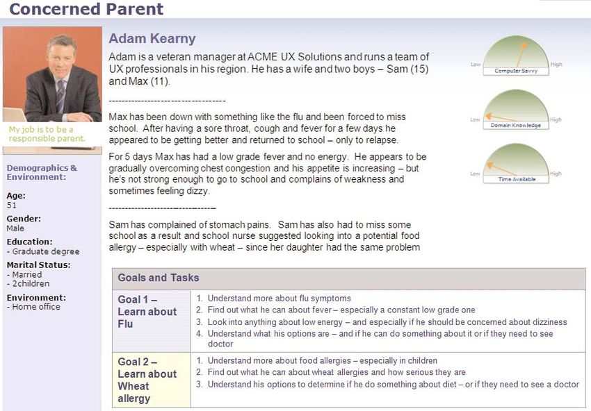
User Experience Metrics / Connecting UI design and business

What’s new            In this paper, we present new refinements in the UX metric dimensions and
                      discuss the scenario-based UX metrics approach. This approach creates a more
                      robust method for approaching reviews —by adhering to a persona/scenario
                      method.

                      We also discover that by standardizing the metrics and adhering to the scenario-
                      based approach, we build custom scorecards that are derived from customer
                      goals which are more tuned to the needs of the business.

                      Finally, we suggest that a standard methodology opens up opportunities for
                      integrating other customer research data sources like usability testing and web
                      analytics.

The general UX        The general UX metrics scorecard was developed to allow reviewers to survey a
                      site or application and quantify the design in terms of best practice. Two inde-
metrics scorecard     pendent reviewers score the site on a set of metrics organized into 5 dimensions:

                      › Navigation—Do the roads get me where I need to go effectively? Do the signs
                        point the way and keep me on the right path?

                      › Content—Is the content easy to comprehend and digest? Does it help me make
                        a decision?

                      › Presentation—Does the design engage and guide my eye and mind effectively?

                      › Interaction—Do the ways I interact fit my expectations and help me act appro-
                        priately?

                      › Value and Usefulness—Does the content or feature ultimately deliver value?

White Paper                    User Experience Metrics                                            6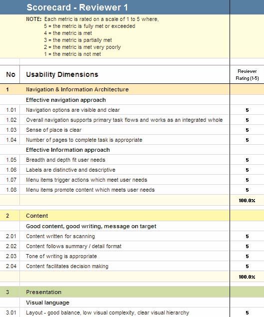
User Experience Metrics / Connecting UI design and business

                      Below is a portion of the scorecard. Individual metrics are grouped into categories
                      and scored on a 5 point scale. Individual metrics are scored within each category,
                      resulting in a category score. These category scores are combined into an overall
                      total.

                      In practice, each reviewer trained in the metrics, dives into the site and explores
                      the design, taking note of their experience as they go. Scores are then aggregat-
                      ed across reviewers and presented as an average to the overall dashboard.

White Paper                    User Experience Metrics                                               7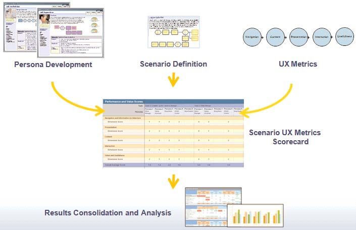
User Experience Metrics / Connecting UI design and business
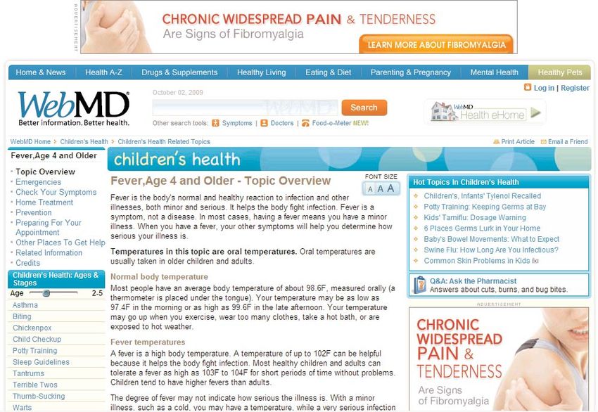
The general UX Let me give an example of this scorecard in action by reviewing a public site—
WebMD.com. I spent a few hours surveying the site and entered my scores and
metrics scorecard comments into the scorecard. This was an initial impression done with one
in practice reviewer. My purpose here is to show how the scorecard works.
First, WebMD had an overall UX best practice score of 86 of 100. The scores are
broken down by design dimension, indicating the Content, Interaction, and Value
score very high—well above 80%, while Navigation & Information Architecture
(IA), and Presentation dimensions score between 50 and 80.
Our experience reviewing websites suggests that sites scoring above 80% are
doing an exceptional job of UX; those scoring between 50 to 80% have mixed UX
(some good, some not good), and those scoring below 50% have generally very
poor UX.
In this case, WebMD is doing very well overall. But the business and UX teams
reviewing these numbers would ask, what is accounting for the relatively lower
scores in Navigation/IA and Presentation?
White Paper User Experience Metrics 8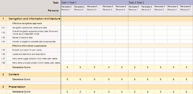
User Experience Metrics / Connecting UI design and business

                      When I reviewed WebMD I allowed myself to move around exploring how the site
                      felt to me and what it offered. Instinctively, I was wearing two hats—the designer
                      and the consumer.

                      As a designer, I noted the navigation model—an L-shaped navigation model with
                      left hand link list, and this felt comfortable to me. As I explored, I noticed that it
                      was used consistently, so I could learn it and get on with finding what I was look-
                      ing for. As a consumer, I decided to look for information on the flu , because my
                      son has it now. I didn’t actually see it at first—in both the left hand link list and
                      the A-Z menu it is under ‘cold and flu’.

                      One of my jobs as a reviewer is to assess if the navigation model is effective
                      (are the roadways in the UI helping me move easily to where I need to go) and if
                      the IA (the signage on the roadway) is helping guide me to what I’m looking for
                      or might be interested in).

                      I drilled down into the cold and flu link and find myself in the Cold and Flu Health
                      Center. It is here (tier 2 of the site) where I start to realize the immense task
                      these designers have. There is a relatively limitless and interconnecting amount
                      of content that must be organized, not to mention the sponsored links and ads
                      required by this business model.

White Paper                    User Experience Metrics                                                 9
User Experience Metrics / Connecting UI design and business

                      A quick glance above the fold (below), and I notice no less than 12 distinct groups
                      of links that have a sense of redundancy, making it very challenging to decide
                      where to go.

                      We often say that the difference between density and clutter is good grouping.
                      The designers are doing a good job of grouping links and content. The page feels
                      very dense—which is good for frequent users who prefer to see everything at
                      once. However, I don’t frequent the site that much.

                      I also make a note to myself about visual complexity—measured by the number
                      of unique horizontal alignment points. I feel the visual design is breaking into the
                      higher end of complexity making it difficult to comprehend what is here.

                      Here, I learn that cold and flu are actually very different in many ways (thank
                      you WebMD!) but making me wonder, as a consumer, why they were combined in
                      the IA.

White Paper                    User Experience Metrics                                              10
User Experience Metrics / Connecting UI design and business
On this page, there is a level of redundancy that begins to create a sense of
unease in me. To get an overview of the flu or flu symptoms, I must decide
between 5 different links that have the same general title—’flu symptoms’. Should
I choose the links on the upper left or lower left, the one at the top of the page as
buttons, the ones in the body of the page as links, or the ones on the right under
hot topics?
I begin to wonder why there is so much redundancy—why the information I need is
not in one convenient place. In this case, I’m feeling a bit overwhelmed.
White Paper User Experience Metrics 11User Experience Metrics / Connecting UI design and business
I decide I’d like to find out more about temperature because my son’s temperature
was high yesterday and is actually lower than normal today. I’m reading the page
on flu symptoms and learn that high fever starts at 101. I see the link on ‘fever’
and click to learn more.
White Paper User Experience Metrics 12User Experience Metrics / Connecting UI design and business
I’m taken to the children’s health section, re-located out of the flu section and into
a new section with navigation and links irrelevant to what I’m looking for. I was
anticipating learning about how temperature related to flu. The presentation is
completely different and the children’s health section doesn’t seem to be the
appropriate place to discuss temperature as it relates to flu.
The job of the reviewer is to capture the experience of the site through a combina-
tion of scoring the UX metrics and adding qualitative observations to tell the story
of that experience. Let me summarize my qualitative observations as I explored
questions about flu symptoms, fever, and temperature.
Pages Visited Screen Observations
Home Page Fairly simple starting point
Flu combined under cold
Cold and Flu Center High Density
High Redundancy
Visual Complexity begins
Flu Guide Continued redundancy
Lacking sense of place
Lack of continuity
Children’s Health Surprising re-location
New presentation
White Paper User Experience Metrics 13User Experience Metrics / Connecting UI design and business
These observations are greatly oversimplified. Obviously there is a much deeper
effort made to call out the observations with specific issues and recommendations
in an actual review.
For demonstration purposes I’ve captured a piece of the scorecard here with my
scores for the first dimension- Navigation and Information Architecture. There are
4 metrics for each of these categories.
One Navigation metric is “Navigation options are visible and clear.” I have given
that metric a mixed score of 3. This reflects some confusion during the experience
from the home page down through Tier 2 to Tier 4. Another Navigation metric is
“Sense of place is clear.” I have scored this metric a 2 based on based on lack of
strong cues in Tier 2 to 3 and the experience of re-locating me in the children’s
health center from the fever link. I’ve given a 5 for the number of pages I’ve tra-
versed—the site favors fewer steps by providing such a broad and rich Tier 1 and 2.
The Information Architecture Metrics scored between a 4 and 5. Clearly a lot of IA
work has been done to create topical categories as well as needs-based links that
help me drilldown into a health issue. However, in my search, the combination of
cold and flu into one link at the top created confusion for me, and finding it sepa-
rated at a lower level reinforced my confusion. Also, as I explored the tier one
menus and tier 2 link groups, though well grouped visually, I had difficulty discrim-
inating individual items. I wondered where to go and how someone would learn
them.
White Paper User Experience Metrics 14User Experience Metrics / Connecting UI design and business
The Presentation Metrics scored between 3 and 4. I mentioned the issue of densi-
ty—here I scored visual hierarchy and complexity as mixed (3) because my eye was
not able to determine a clear focus due to the number of link groups. The use of
color and typography lacking a clear strategy—too many colors, fonts, font sizes
and techniques for emphasis create a lack of guidance for the user.
Finally, I’m not including the Interaction Dimension of metrics here but I will men-
tion that dimension later as we cover scenario-based scoring.
Summary of My intention here is not to give a complete discussion of the metrics scorecard
but rather to demonstrate a few things. First, to show the process a reviewer
general UX metrics follows and how the scorecard is structured, following independent dimensions of
scorecarding UX with specific metrics according to best practice principles. The reviewer must
be trained in the metrics and how to apply them consciously and explore the site
to score the metrics sufficiently.
General UX metrics Several teams at HFI have employed and evolved the UX Metric scorecards.
While the general UX dimensions have stayed much the same, the individual
scorecards for metrics have adapted to a variety of domains. We currently support five unique
specific UI scorecards:
1) Web site and web applications (running in browser)
environments
2) Desktop GUI application (running in a window)
3) SMS (Short Message Service)
4) WAP (Wireless Application Protocol)
5) IVR (Interactive Voice Response)
The scenario-based As we used the UX metrics scorecards, we developed insights into how to
improve the process and the scorecard, leading to the scenario-based scorecard
UX metrics scorecard approach. This approach allows us to standardize on what the reviewers cover in
approach their review by taking a persona /scenario approach. It also creates a basis for
building a wide variety of domain-specific scorecards while standardizing the
underlying UX metrics.
White Paper User Experience Metrics 15User Experience Metrics / Connecting UI design and business
In practice, each reviewer takes the perspective of a set of agreed-upon personas
and scenarios. Two reviewers role play and each ‘scenario’ is scored. Each review-
er’s scores are aggregated into a dashboard ultimately reflecting scores along 3
factors—UX Dimension, Persona, and Scenario.
We start with a persona– a characterization that defines a target user group we
are representing. Within this characterization are the key components of the tar-
get group that differentiate it from other user groups. Included in this definition
are the key scenarios which reflect what is important from both the user and busi-
ness perspectives. This is key because it defines the composition of the scorecard.
White Paper User Experience Metrics 16User Experience Metrics / Connecting UI design and business
The Scenario-based Scorecard is derived from the General UX Metrics Scorecard
but built to facilitate scoring by persona and scenario. Below is a sample of the
scorecard. In practice we have tried a variety of approaches and have settled on a
model whereby each reviewer enters a single score on a scale of 1 to 5 for each of
the 5 categories of metrics—for each persona and task.
White Paper User Experience Metrics 17User Experience Metrics / Connecting UI design and business
The scenario-based For demonstration purposes, I asked two reviewers to conduct a quick scorecard
review on WebMD.com role-playing the “concerned parent” persona above and fol-
UX metrics scorecard lowing two scenarios—”sick child with flu/fever” and “sick child with potential
in practice wheat allergy”.
Following is an example flow one of the reviewers encountered when assessing
the “sick child with flu/fever scenario”.
In an attempt to find information about flu symptoms and a persistent fever, the
reviewer ended up skipping around the site, sometimes feeling lost or not nearing
their goal. After visiting a total of 8 different screens, she assumed the informa-
tion she needed was not available in the format she expected to find it.
Experiencing a site from the perspective of a specific persona and set of scenarios
allows reviewers to glean important insights on key areas of the site.
The scorecard summary on the next page summarizes the average scores for both
reviewers.
White Paper User Experience Metrics 18User Experience Metrics / Connecting UI design and business
The upper table reflects summary scores for both scenarios. The numbers called
out in pink fall below 50%—the UX dimensions for Navigation/IA and
Presentation.
In the second table, scores are broken out by each scenario, allowing a finer
grain view. Both tasks are scoring similarly at 55%, though the scores for task
one reveal that the issues with Navigation/IA and Presentation are more signifi-
cant in that task.
In order to arrive at these scores, reviewers need to have a clear understanding
of who the users are and what they’re trying to accomplish. In other words, the
unique requirement of the scenario scorecard approach is it requires the busi-
ness and the UX team to formalize an understanding of their customers and their
goals. For some organizations, significant work has gone into this, but for most,
this step is a important new step.
Obviously, the sample size (one persona and two tasks) is not sufficient to get a
complete picture of the site UX. In fact, getting a representative sampling of the
personas and scenarios is an essential key to conducting a meaningful review
and setting up a meaningful ongoing UX metrics framework.
The scenario-based review reinforced the importance of addressing the same
problems I started to see in my cursory review using the UX metrics scorecard.
White Paper User Experience Metrics 19User Experience Metrics / Connecting UI design and business
In any review, there is a deep discussion around the basis for these scores and
opportunities for improving low scores. The summary scorecard serves to sum-
marize and quantify that important qualitative feedback in a way that can be
quickly understood and tracked over time.
Scenario-based UX The scenario-based scorecard approach has several important advantages over
the general metrics approach. In this approach we’ve taken the power of the UX
metrics scorecarding metrics and added the perspective of the user and the scenario. This provides
summary the foundation for measuring UX in a structured way, in terms that makes sense
to the UX team and the business, i.e. are actionable. The ability to create UX
scorecards that reflect the ‘channel’ needs are endless and powerful. The ability
to present UX metrics in consolidated ways, across systems, is also possible.
So far we’ve limited our data source to expert reviews—an obvious limitation.
Usability Testing and Web analytics are critical data sources. The UX metrics
scorecarding framework provides a common 'test plan' and methodology that is
both customer-centric (via commitment to the personas) and targets the goals
and tasks (via scenarios) critical to overall user and business success.
Conducting UTs with the same test protocol that we give our experts provides the
first step in synthesis. Below are fictitious UX scores to demonstrate integration
of expert review metrics and those obtained through usability testing—hypotheti-
cally for Q1 and Q2.
White Paper User Experience Metrics 20User Experience Metrics / Connecting UI design and business
What is required to obtain this type of integration is to standardize how the data
coming from a usability test is scored. We have accomplished this simply by ask-
ing our test moderators to characterize the normal usability testing data into the
5 dimensions of the UX. This same standardization can be done in the context of
survey design—where questions are targeted toward feedback along the lines of
the 5 dimensions.
Web analytics evaluated at path and page levels can also theoretically be inte-
grated. We have developed page level scorecards for some domains, i.e. e-com-
merce. This can be done for other domains (financial self-serve, etc.).
Finally, benchmarking UX against direct competitors is possible by adopting a
standardized framework for ‘assessing’ the user experience using common test
protocols (standardized personas and scenarios).
White Paper User Experience Metrics 21User Experience Metrics / Connecting UI design and business
The table above represents hypothetical scores for the target site and one com-
petitor, combining data collected from both expert review and usability testing
done over one quarter.
UX metrics as part of Moving from unstructured to structured UX environments requires a connection
between the business and the UX team—a place where vision meets execution.
a customer-centric Mature UX teams know they need a constant source of data to stay relevant—and
strategy data that’s shaped to make effective business decisions. We have to avoid design
by opinion.
In between the business metrics reporting conversion and retention rates, sales
and wallet share, and the web analytic metrics reporting most visited pages, click
through, and drop-off rates, lays the UX team’s window into the customer’s expe-
rience.
Even with the rich toolsets we employ today, including A/B testing, usability test-
ing, and ethnography studies—the job is one of understanding the intersection
between experience and design. Our approach to what works, for users and for
the business, requires a way to think about design, evaluate and communicate
that to the business, and to have a robust and repeatable process to measure
and manage UX on an ongoing basis.
As one client remarked last year when he was presented with user experience
metrics, “I have plenty of opinions around here—what I need is some perspective”.
UX Metrics provide a language and a potential perspective that helps a UX team
speak about experience and design in both a qualitative and quantitative way.
The requirement of any mature UX group is to foster a culture of customer-cen-
tricity and speak in the language of business—the language of metrics.
White Paper User Experience Metrics 22User Experience Metrics / Connecting UI design and business
About the author Phil H. Goddard, Ph.D., CUA
VP, Western Region
Human Factors International
Phil Goddard is VP, Western Region, with 16 years experience in usability, 15 of
those with HFI.
Phil was on the Research Faculty at the University of Maryland, College Park, and a
Post Doctoral Fellow with the National Institute of Health, and the Medical College
of Pennsylvania. He has a Ph.D. in Cognitive Psychology, an M.S. in Cognitive
Psychobiology, and a B.S. in Psychology/Biology.
As director of training, Phil developed HFI’s training curriculum and usability ana-
lyst certification program (CUA). He has published in scientific journals in the field
of aging and cognitive performance, and served as reviewer for NCI’s usability
guidelines.
Phil is expert in all facets of usability engineering and user experience design
including techniques for concept design, feasibility, customer definition, sites and
application design and assessment, strategic development, usability metrics, usabil-
ity infrastructure development, management, consulting, and mentoring.
Recent projects have included: financial services, health insurance, consumer user
interface, corporate intranets, and e-commerce and corporate identity sites.
Recent clients include: Dell, Macys, Wal-Mart, Toyota, Chevron, Symantec, Kaiser-
Permanente, Indymac Bank, DirecTV, Wellpoint, and CapGroup.
White Paper User Experience Metrics 23Human Factors International 410 West Lowe, P.O. Box 2020 Fairfield, IA 52556 Phone: 800.242.4480 Fax: 641.472.5412 hfi@humanfactors.com www.humanfactors.com © 2008 Human Factors International, Inc.
You can also read