AN APPLE WATCH DASHBOARD FOR HIGHMED HEART INSUFFICENCY PATIENTS
←
→
Page content transcription
If your browser does not render page correctly, please read the page content below
146                German Medical Data Sciences 2021: Digital Medicine: Recognize - Understand - Heal
                                                                                     R. Röhrig et al. (Eds.)
                                                                      © 2021 The authors and IOS Press.
            This article is published online with Open Access by IOS Press and distributed under the terms
                       of the Creative Commons Attribution Non-Commercial License 4.0 (CC BY-NC 4.0).
                                                                                doi:10.3233/SHTI210553

 An Apple Watch Dashboard for HiGHmed
       Heart Insufficency Patients
          Magdalena SMIESZEKa,b,1 , Aljoscha KINDERMANNa,b, Ali AMRb,c,d,
                  Benjamin MEDERb,c,d,e and Christoph DIETERICHa,b,c,1
       a
         Klaus Tschira Institute for Integrative Computational Cardiology, Germany
     b
       Department of Internal Medicine III, University Hospital Heidelberg, Germany
                  c
                   German Center for Cardiovascular Research (DZHK) -
                       Partner site Heidelberg/Mannheim, Germany
  d
    Institute for Cardiomyopathies Heidelberg (ICH), University Hospital Heidelberg,
                                    Heidelberg, Germany
                e
                 Department of Genetics Stanford University, Stanford, USA

           Abstract. Wearables are commercially available devices allowing continuous
           monitoring of users’ health parameters. Their easy availability, increasing accuracy
           and functionality render them relevant for medical practice, specifically for
           longitudinal monitoring. There are clear benefits for the health care system, such as
           the opportunity of timely interventions by monitoring a patient during his daily life,
           resulting in a cost reduction in medical care and improved patient well-being.
           However, some tools are essential to enable the application of wearables in medical
           daily practice. For example, there is a need for software solutions that allow
           clinicians to quickly and easily analyze data from devices of their patients. The goal
           of this study was to develop a dashboard for physicians, which allows rapid data
           interpretation of longitudinal data from the Apple Watch. The prototype dashboard
           is an interactive web-based visualization platform utilizing Plotly. The dashboard
           displays the most important parameters like heart rate, steps per day, activity,
           exercise collected by the Apple Watch in a user-friendly and accessible way. Clear
           visualization makes it easy to identify trends or deviations in the data and see how
           these changes in daily behaviour affect patients’ health. Our software is a key
           component to monitor patients with heart failure who participate in the HiGHmed
           use case cardiology project.

           Keywords. Wearable, Apple Watch, Dashboard, Visualization, Data Analysis,
           HiGHmed

1. Introduction

1.1. Background

The popularity of wearable devices is constantly growing. Currently, the smartwatch
shipment is estimated at 68.6 million units per year, and this number is expected to reach
157.2 million by 2026 [1]. The Apple Watch is the most purchased smartwatch outselling

     1
        Corresponding authors: Christoph Dieterich, Magdalena Smieszek, Analysezentrum III, Im
Neuenheimer Feld 669, 69120 Heidelberg, Phone: +49 6221 56 36884, Email: christoph.dieterich@uni-
heidelberg.de, magdalena.smieszek@uni-heidelberg.de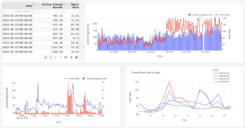
M. Smieszek et al. / An Apple Watch Dashboard for HiGHmed Heart Insufficency Patients   147

companies such as Samsung, Fitbit and Xiaomi [2]. It is also one of the few smartwatches
allowing to take an electrocardiogram (ECG) [3]. The most accurate smartwatches when
it comes to measuring parameters such as heart rate are the Apple Watch and Fitbit [4].
The study “Wearables in cardiology: Here to stay” shows that there is user interest to use
wearables not only for fitness tracking but also in medical practice [5]. Wearables enable
longitudinal remote monitoring of patients with high frequency and high resolution. With
the ability to collect pulse, daily activity, and ECG, they are of particular interest in the
context of cardiovascular diseases. Many landmark studies focused on whether these
devices were suitable for use in the detection of atrial fibrillation [6,7]. Recently,
researchers are trying to find new applications for ECGs from wearables, for example by
estimating the distance between ECG components, such as the QTc interval, which can
be useful for monitoring patients during antiarrhythmic drug therapy, or the ST segment,
whose changes can indicate acute coronary syndromes [8,9]. Smartwatches are also
instrumental to remotely monitor a patient from their home environment after surgery or
during medication therapy [10,11].

1.2. Objective and Requirements

Analyzing wearable data also raises the need for adequate software solutions, allowing
medical scientists and especially physicians to work with the collected data. While many
physicians are data-conscious, they usually lack the time to get into statistical
programming. Thus, graphical user interfaces which also avoid manual pre-processing
of the input data are preferred. Therefore, the goal of this software project was to create
a versatile tool allowing physicians to quickly interpret patient data, which originate from
the Apple Watch. The platform should provide the user with the ability to analyze data
without the need for time-consuming and complicated data pre-processing, which
includes converting the downloaded XML file from the Apple Watch into a format more
readable for data analysis tools, extracting from the XML file only the data that will be
useful in future analysis, and determining the type of individual data. The possibility of
loading data from multiple devices simultaneously allows the analysis of data from more
than one patient, to be able to compare patients in a study collective and to quickly detect
problematic health deviations. The program needs to be an interactive and intuitive tool
that visualizes data in a clear and readable way. It includes the possibility to show trends
in the data and allows the user to track deviations of parameters from the norm. In this
way, the intention is to facilitate the interpretation of how patients' everyday behavior
influences changes in their health status.

2. State of the art

2.1 Related Works and short comings

Currently, there is no platform available that allows physicians to analyze data collected
by the Apple Watch in a meaningful and efficient way. While there are existing solutions
to look at Apple Watch data, they do not fulfill requirements to be used in medical data
analysis.
     We tested multiple published approaches, however we found these not sufficient for
the intended task: One solution uses a program called Grafana to visualize Apple Watch
data, however, this approach comes with various limitations [12]. The program requires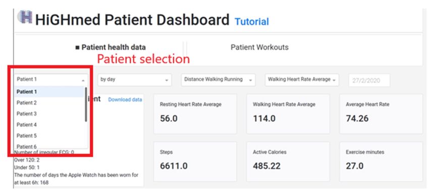
148     M. Smieszek et al. / An Apple Watch Dashboard for HiGHmed Heart Insufficency Patients

the user to load each patient’s data separately from an XML file. Only one patient can be
viewed at a time, an overview on multiple patients at once is not supported. However,
the most severe limitation comes from the fact that only fitness data can be viewed, while
other important health parameters including ECG results are not included. Another
approach uses Kibana and Elasticsearch for data visualization [13]. However, here the
developer mainly describes how to download data from Apple Watch and convert it into
CSV format. The visualization in this approach is just an additional feature and is very
limited containing only heart rate and steps count. Moreover, the installation of this
program is complicated. Equivalent to the Grafana based approach, this solution only
allows to view data from one patient at a time.
     Other options for visualizing and analyzing Apple Watch data are open-source tools
such as Apache's Superset or Google data studio [14,15]. However, these tools, are
graphically limited, allowing only very basic plotting. In general, all open-source data
visualization tools also require cumbersome preprocessing of the exported XML file into
a CSV file using custom solutions that are implemented in Python or R, which is
particularly problematic for users not familiar with programming.
      Other available programs, such as Tableau for data visualization that would make
it easier for physicians to analyze Apple Watch data, are only commercially available
[16].
     Taken together, these approaches have limited functionality and are intended rather
for individual users to visualize their own data on a computer. So far, we did not find a
platform that focuses on visualization and analysis of Apple Watch data that provides
the required functionality to be used by physicians to analyze wearable health data of
their patients.
     Our goal was to create a program to be used by physicians to visualize and analyze
data from multiple patients simultaneously. The advantage of the multi-patient view is
that it facilitates faster analysis of trends and patterns of how patients' behavior affects
their health parameters. Moreover, our solution allows to load data from multiple patients
(multiple XML files) simultaneously and switching through their data using selectors.
The goal is to visualize not only fitness data but also health parameters. In particular, the
tool is intended for the analysis of ECGs, a functionality which is not available in other
programs. Additionally, the tool was built in a way that the data loading does not require
user intervention in data preparation. It creates ready-made interactive graphs with
calculations that allow the user to group data and show changes and trends e.g. heart rate
over the last months or days.
     In summary, our program is an open-source ready-to-use dashboard for analyzing
data from Apple Watch XML exports, thus allowing a quick and clear visualization and
interpretation.

3. Concept

Apple Watch dashboard is a web application programmed using Python version 3.7 and
an open-source Dash Plotly version 1.19.0 [17,18]. To store data the tool uses the latest
version PostgreSQL image available on Docker Hub [19]. We use Docker version
20.10.2 container to wrap all program dependencies [20]. The data to test our software
was collected using Apple Watch models of series 4 and 5 with watchOS version 6 or
later and iPhones 7 and 8 with iOS 13 or newer.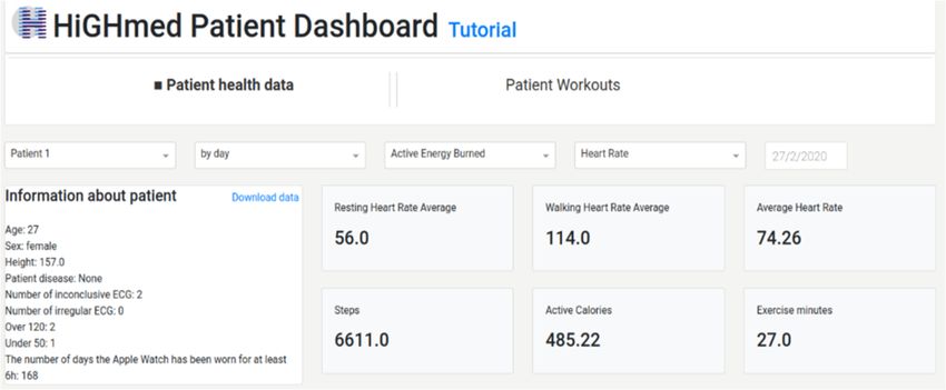
M. Smieszek et al. / An Apple Watch Dashboard for HiGHmed Heart Insufficency Patients   149

3.1. Data preparation

The Apple Watch offers the ability to export health data directly through the iPhone. The
data are downloaded in XML format, which usually requires some manipulation of the
file or the use of additional applications to allow the visualization of this data in programs
such as Grafana, Tableau. By contrast, our program automatically converts the XML
files into the data format required for an import into the database. The program also gives
the option to load previously processed data from a CSV file in which each row contains
patient id, data, type of collected parameter, and value. A more detailed description of
how to download the data from the Apple Watch and load it to the dashboard is described
on our GitHub repository2.

3.2. Frontend

As a front end, we are using Dash Plotly open-source which is a useful framework for
creating interactive analytics charts for web applications [17]. The advantage of this
approach is that most of the charts and actions do not require additional code in any
languages other than Python. Another advantage is that Plotly is written on top of the
Python based web framework Flask [21]. This makes it easy to connect with other
programs that use the Flask framework. In our case, it was important because in the future
we want to integrate the dashboard with our MedEx application, which is built with Flask
[22].

4. Implementation

The tool has been implemented for use in daily medical practice as well as in research.
The dashboard enables the user to observe the most important daily information collected
by the Apple Watch. Additionally, it allows following medium- to long-term patterns in
the patient's behavior and their impact on their health.
     It includes selectors to navigate between graphs and to select the patient and the time
window for the data. The graphs are interactive, allowing the user to select and zoom in
on the area that is of most interest to them. The charts are also interlinked, meaning that
the area selected in one chart affects what is shown in the other charts.
     The tool does not require any coding or data cleaning skills on the user’s side, the
preprocessing as well as finding trends in data work automatically. The use of Docker
allows easy deployment of the tool on multiple operating systems.

4.1. Selector & information about a patient

At the top of the page (Fig.1) there are selectors, the first selector is used to choose the
patient whose data is to be visualized, the second selector is used to set how the
parameters are grouped by day/week/month. The following selector relates to the
parameters to be displayed in graphs shown on Fig. 3 and the last selector sets the time
window for which the parameters are calculated.

      2
        Supplement: https://github.com/dieterich-lab/AppleDashboard: Description of the data transfer
steps from Apple Watch to our dashboard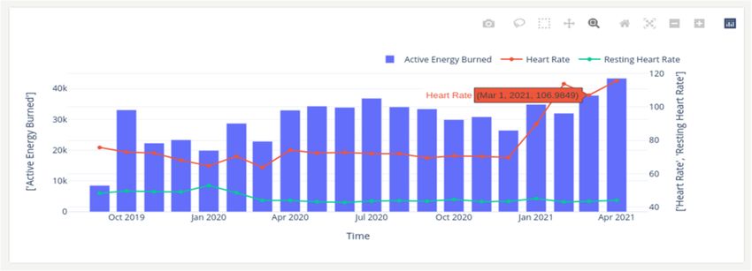
150       M. Smieszek et al. / An Apple Watch Dashboard for HiGHmed Heart Insufficency Patients

Figure 1. Dropdown selection allowing the user to navigate between the Apple Watch data of multiple patients.

     Below the selector is a section with a card component (Fig.2). The first card shows
the most important information about the patient height, age, how all ECGs have been
classified that have been collected by the Apple Watch. The values in this card update
based on which patient is selected. In this panel, the user can also choose to download
the data in a tabular csv format to share the results or to conduct additional analyzes.
Next to the information card, there are six cards with the most important parameters:
Resting/walking heart rate, step count, activity time, calories burned. The average or sum
of these values is calculated whenever a patient is selected and can be grouped by
day/week/month.

Figure 2. Selectors, cards displaying the most important general information about a selected patient as well
as the most important measurement parameters.

4.2. Apple Watch parameters & trends plotting

The second section (Fig.3) displays one table and three charts, the first one showing
calculated values for the entire range of data collected and can be grouped by
day/week/month depending on the selected option in the selector (Fig.1). The second
graph shows the values collected on a single day, and the last graph shows the heart rate
trend over the last 4 days/weeks/months depending on how data are grouped. The first
M. Smieszek et al. / An Apple Watch Dashboard for HiGHmed Heart Insufficency Patients 151
graph is interconnected with the following two: Choosing a day/week/month in the
former one will plot the data in the subsequent graphs according to this selected time
window. Figure 3 illustrates how the tool can be used to visualize a correlation between
activities and heart rate.
Figure 3. Chart showing daily Active Energy calories burned and heart rate during a selected time span, second
chart with the same values for one selected single day, the last chart shows the heart rate trend of the 4 last
days.
We present an example of how exploratory data analysis using visualization can be useful
to get a first interpretation about the clinical relevance of wearable measurements. The
tool can be used to quickly evaluate how a change in patient behaviour can affect health
parameter values, illustrating why the possibility to visualize several parameters
simultaneously can be useful in patient health analysis.
Figure 4 shows the heart rate, resting heart rate and active energy grouped by month.
The graph indicates that the heart rate (red line) has increased to over 100 bpm in the last
few months. This might seem alarmingly as the heart rate in a healthy person should be
between 50-100 bpm. However, the graph also shows the resting heart rate (green line).
The values don’t increase notably in respective months. Based on this example a possible
conclusion can be that the patient is healthy, but has changed his daily behaviour and
most likely started to do more intensive exercise. The example shows that even without
sophisticated calculations, but only by exploratory analysis with data visualization we
can have first inside in patient daily behaviour and get first conclusion.152 M. Smieszek et al. / An Apple Watch Dashboard for HiGHmed Heart Insufficency Patients
Figure 4. Graph showing daily Active Energy calorie burned and heart rate and resting heart rate grouped by
month.
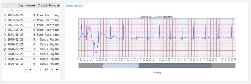
4.3. ECG table & plotting
The last section (Fig. 5) contains a table with all ECG measurements collected by the
Apple Watch for one patient. These ECGs are annotated with a classification in regard
to measurement outcome (Sinus rhythm, atrial fibrillation, heart rate over 120/ under 50,
inconclusive). The table allows the user to select one ECG for plotting. The plot of the
selected ECG is displayed next to the table, giving the user the option to zoom into areas
of interest and also slide through the ECG graph. Additionally, it is also possible to
download the data that is plotted on the graph.
Figure 5. Graph of a single selected ECG and a table with all ECGs and their classification collected by the
Apple Watch.
5. Lessons learned
We created the Apple Watch dashboard to make it easier for clinicians to access data
from the device and to create an easy-to-read and interactive data visualization that
speeds up data interpretation.
Currently, there is no similar dashboard to analyze Apple Watch data. All current
approaches require users to conduct time-consuming and potentially technically
demanding preprocessing steps in advance. Additionally, available dashboard solutions
usually involve the creation of the dashboard design prior to usage. Our dashboard is a
ready-made tool that also enables the user to analyze data from more than one patient.M. Smieszek et al. / An Apple Watch Dashboard for HiGHmed Heart Insufficency Patients 153
The tool does not demand coding on the user’s side. One of the concerns of physicians
when using smartwatches in their practice is that they will require additional time [23].
However, thanks to the clear and interactive visualization combined with the graphs
showing trends or the most important information about the patient, this program allows
for a quick interpretation of data. It can be used to track how daily physical activity
interacts with parameters such as heart rate collected by the Apple Watch. Additionally,
it provides a way to observe how a patient's daily behavior is associated with parameters
collected during a patient's hospital visit. Potentially our program could also be used to
track health parameters of patients undergoing medication therapy as was suggested in
previous studies [10,11]. All of these capabilities allow for better monitoring of patient
health outside of the hospital. First demonstrations with clinicians resulted in general
appreciation of the tool. Extended usability evaluations are planned in future phases of
the project.
The dashboard is open source and can be used by doctors, researchers as well as
even individual Apple Watch users. We plan to use our tool in the HiGHmed study, as
well as in other studies with the Apple Watch conducted at Heidelberg University Clinic.
HiGHmed is a project that aims to improve patient care by implementing innovative
solutions using medical informatics [24]. Therefore, we are currently working on a
tighter integration with data collected within the HiGHmed use case cardiology, and thus
add new ways to connect to the Medical Data Integration Centres based on OpenEHR or
FHIR protocols.
In the future, we plan to extend the functionality of our dashboard. We consider to
introduce more functions to notify the user in case of patient parameters deviating from
the norm. This could also include alerts triggered by machine learning algorithms. We
also plan to connect the dashboard with the MedEx tool [22], which was created to
analyze data collected during routine clinical trials. With this solution, the doctor will be
able to link and compare data collected from the same patients during his clinic visit with
the data collected by Apple Watch in a single program.
5.1. Software Deployment
Currently our tool is accessible within a GitHub3 repository and ready for deployment
via pipenv or by using docker-compose. The GitHub repository also provides
documentation on how to execute these deployment options. Additionally, we provide
information on how to transfer the data collected with the Apple devices to the dashboard.
We intend to make the Docker package available on Docker Hub in the future.
Deployment of our tool using Docker allows to create independent and isolated
environments, making it easy to run the application on multiple systems.
6. Conclusion
The large-scale use of wearable devices in medicine could be useful in the future to
monitor patients in their home environment and intervene more quickly for disease
prevention. Using data from these devices could reveal new aspects of how a patient's
everyday behavior affects their health outside of a hospital. However, at this point, there
3
https://github.com/dieterich-lab/AppleDashboard154 M. Smieszek et al. / An Apple Watch Dashboard for HiGHmed Heart Insufficency Patients
are not yet many tools that allow for rapid analysis of data from these devices. Easy and
clear data visualization complemented by additional analysis in our tool is expected to
facilitate this task. It is important that the tool has the ability to analyze large amounts of
data, is easy to use and widely available.
Declarations
Authors’ Contributions: MS provided the data, developed the dashboard software and
drafted the manuscript, AK drafted the manuscript. AA provided advice to MS and AK.
BM developed the HiGHmed Apple Watch concept. CD supervised software
development and manuscript writing. All authors finalized and approved the manuscript.
Acknowledgements: We would like to thank all members of the Dieterich Lab and
the Use Case Cardiology team for their great input and insightful discussions. The work
of MS, AK, AA, BM and CD was kindly supported by the BMBF-funded HiGHmed
consortium (Medical Informatics Initiative Germany). CD would like to thank the Klaus
Tschira Stiftung gGmbH (grant 347 00.219.2013) for providing all necessary compute
infrastructure.
Conflict of Interest: The authors declare, that there is no conflict of interest.
Abbreviations
QTc duration - is the time from the start of the Q wave to the end of the T wave
measured on an electrocardiogram.
ST segment - represents the interval between ventricular depolarization and
repolarization.
References
[1] Smartwatch Market - Growth, Trends, COVID-19 Impact, and Forecasts (2021 - 2026) n.d.
https://www.researchandmarkets.com/r/bw1rfv (accessed March 12, 2021).
[2] SUJEONG LIM. Global Smartwatch Market Revenue up 20% in H1 2020, Led by Apple, Garmin
& Huawei n.d. https://www.counterpointresearch.com/global-smartwatch-market-revenue-h1-2020/
(accessed March 19, 2021).
[3] Sawh M. ECG smartwatches: How they work and the best on the market n.d.
https://www.wareable.com/health-and-wellbeing/ecg-heart-rate-monitor-watch-guide-6508
(accessed March 19, 2021).
[4] Pasadyn SR, Soudan M, Gillinov M, Houghtaling P, Phelan D, Gillinov N, et al. Accuracy of
commercially available heart rate monitors in athletes: A prospective study. Cardiovasc Diagn Ther
2019;9:379–85. https://doi.org/10.21037/cdt.2019.06.05.
[5] Dagher L, Shi H, Zhao Y, Marrouche NF. Wearables in cardiology: Here to stay. Hear Rhythm
2020;17:889–95. https://doi.org/10.1016/j.hrthm.2020.02.023.
[6] Perez M V., Mahaffey KW, Hedlin H, Rumsfeld JS, Garcia A, Ferris T, et al. Large-scale assessment
of a smartwatch to identify atrial fibrillation. N Engl J Med 2019;381:1909–17.
https://doi.org/10.1056/NEJMoa1901183.
[7] Pereira T, Tran N, Gadhoumi K, Pelter MM, Do DH, Lee RJ, et al. Photoplethysmography based
atrial fibrillation detection: a review. Npj Digit Med 2020;3. https://doi.org/10.1038/s41746-019-
0207-9.
[8] Maille B, Wilkin M, Millon M, Rességuier N, Franceschi F, Koutbi-Franceschi L, et al. Smartwatch
Electrocardiogram and Artificial Intelligence for Assessing Cardiac-Rhythm Safety of Drug Therapy
in the COVID-19 Pandemic. The QT-logs study. Int J Cardiol 2021.
https://doi.org/10.1016/j.ijcard.2021.01.002.
[9] Indolfi C, Spaccarotella CAM, Polimeni A, Migliarino S, Principe E, Curcio A, et al. Multichannel
Electrocardiograms Obtained by a Smartwatch for the Diagnosis of ST-Segment Changes. JAMAM. Smieszek et al. / An Apple Watch Dashboard for HiGHmed Heart Insufficency Patients 155
Cardiol 2020;5:1176–80. https://doi.org/10.1001/jamacardio.2020.3994.
[10] Christle JW, Hershman SG, Soto JT, Ashley EA. Mobile Health Monitoring of Cardiac Status 2020.
https://doi.org/10.1146/annurev-biodatasci-030220.
[11] Al-Alusi MA, Ding E, McManus DD, Lubitz SA. Wearing Your Heart on Your Sleeve: the Future
of Cardiac Rhythm Monitoring. Curr Cardiol Rep 2019;21. https://doi.org/10.1007/s11886-019-
1223-8.
[12] Bertrand Y. Visualize your 2019 physical activity in a Grafana dashboard n.d.
https://dev.to/yannbertrand/visualize-your-2019-physical-activity-in-a-grafana-dashboard-31fb
(accessed March 19, 2021).
[13] Mark Koster. How to Export, Parse and Explore Your Apple Health Data with Python n.d.
http://www.markwk.com/data-analysis-for-apple-health.html (accessed July 23, 2021).
[14] Data Analysis Of Your AppleWatch Workouts n.d. https://towardsdatascience.com/data-analysis-of-
your-applewatch-workouts-672fe0366e7c (accessed March 19, 2021).
[15] Welcome | Superset n.d. https://superset.apache.org/ (accessed March 23, 2021).
[16] Tableau Software n.d. https://www.tableau.com/ (accessed March 30, 2021).
[17] Inc. PT. Collaborative data science n.d. https://plotly.com/ (accessed March 31, 2021).
[18] Python Software Foundation. Python Language Reference, version 3. n.d. https://www.python.org/
(accessed March 23, 2021).
[19] The world’s most advanced open source database |PostgreSQL n.d. https://www.postgresql.org/
(accessed March 30, 2021).
[20] Merkel D. Docker: lightweight Linux containers for consistent development and deployment. Linux
J 2014;2014:2.
[21] Grinberg M. Flask Web Development, 2nd Edition. O’Reilly Media, Inc.; n.d.
[22] Kindermann A, Stepanova E, Hund H, Geis N, Malone B, Dieterich C. MedEx – Data analytics for
medical domain experts in real-time. Stud. Health Technol. Inform., vol. 267, IOS Press; 2019, p.
142–9. https://doi.org/10.3233/SHTI190818.
[23] Pearl R. 5 Things Preventing Technology Adoption In Health Care n.d.
https://www.forbes.com/sites/robertpearl/2014/09/11/5-things-preventing-technology-adoption-in-
health-care/?sh=5991b6b96889 (accessed March 30, 2021).
[24] Home | HiGHmed (n.d.) n.d. https://www.highmed.org/ (accessed March 19, 2021).You can also read