Black Lives Matter: A New Perspective from Twitter Data Mining - POLICY PAPER
←
→
Page content transcription
If your browser does not render page correctly, please read the page content below
POLICY PAPER
                     October 2020

Black Lives Matter: A New
Perspective from Twitter
Data Mining

Saad BADAOUI

PP-20/28
About Policy Center for the New South
  The Policy Center for the New South (PCNS) is a Moroccan think tank aiming to
contribute to the improvement of economic and social public policies that challenge
Morocco and the rest of the Africa as integral parts of the global South.

  The PCNS pleads for an open, accountable and enterprising «new South» that defines
its own narratives and mental maps around the Mediterranean and South Atlantic
basins, as part of a forward-looking relationship with the rest of the world. Through
its analytical endeavours, the think tank aims to support the development of public
policies in Africa and to give the floor to experts from the South. This stance is focused
on dialogue and partnership, and aims to cultivate African expertise and excellence
needed for the accurate analysis of African and global challenges and the suggestion
of appropriate solutions.

  As such, the PCNS brings together researchers, publishes their work and capitalizes
on a network of renowned partners, representative of different regions of the world.
The PCNS hosts a series of gatherings of different formats and scales throughout the
year, the most important being the annual international conferences «The Atlantic
Dialogues» and «African Peace and Security Annual Conference» (APSACO).

  Finally, the think tank is developing a community of young leaders through the
Atlantic Dialogues Emerging Leaders program (ADEL) a space for cooperation and
networking between a new generation of decision-makers and entrepreneurs from
the government, business and social sectors. Through this initiative, which already
counts more than 300 members, the Policy Center for the New South contributes to
intergenerational dialogue and the emergence of tomorrow’s leaders.

Policy Center for the New South

Suncity Complex, Building C, Av. Addolb, Albortokal Street, Hay Riad, Rabat, Morocco.
Email : contact@policycenter.ma
Phone : +212 5 37 54 04 04 / Fax : +212 5 37 71 31 54
Website : www.policycenter.ma

©2020 Policy Center for the New South. All rights reserved
The views expressed in this publication are those of the authors and do not reflect those of their
institutions.
Black Lives Matter: A New
  Perspective from Twitter
         Data Mining

                                     Saad BADAOUI*

* Senior Data Scientist at the Policy Center for the New South (s.badaoui@policycenter.ma). I am deeply
   grateful to Mehdi BENOMAR and Dominique GUILLO for helpful comments. All errors remain mine.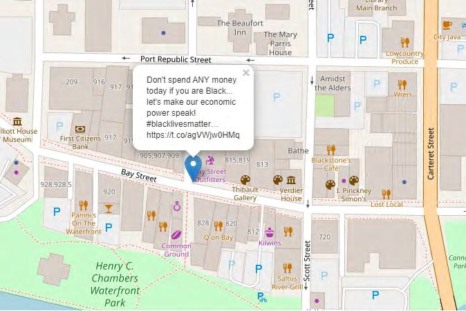
About the Author, Saad BADAOUI

  Saad BADAOUI is a Senior Data Scientist at the Policy Center for the New South. He has
a PhD in Applied Data Sciences and Financial Mathematics from Imperial College London
where he published his papers in leading three stars academic journals. He has a combined
experience of more than 12 years working on diverse analytical problems both in academia
and the industry.

  Saad was a Senior Quantitative Index Analyst at a start-up where he designed and constructed
indexes for large financial institutions in Wall street, he then lead a team of junior researchers
at Fidelity Investments where he worked on various data analytics problems using machine
learning and statistics. Before joining the Policy Center for The New South, he was Head of
Research at BlackRock where he was responsible for developing, coordinating and driving the
research agenda for the EMEA region. Saad is passionate about data sciences and believes
that if we can’t measure a problem with data then we can’t improve it.
Abstract

  Social media is increasingly used by oppressed and helpless communities as a voice to create
change and increase awareness about social injustice. In this paper, we study the Black Lives
Matter movement, one of the fastest-growing social movements in the United States, through
the Twitter lens by collecting around 600,000 tweets with both the #BlackLivesMatter and
#BLM hashtags, published from March to July 2020. Our study shows that this movement has
received unprecedented attention in a matter of few days. Furthermore, our quantitative text
analysis reveals some interesting trends from the data. First, we show, perhaps unsurprisingly,
that the murder of George Floyd was the catalyst behind the unusual activity on Twitter.
Second, President Donald Trump is the most mentioned person in the tweets, acting as a direct
appeal to the President to restore justice and equal rights. Finally, we show clear evidence of
growing frustration from the Black community through the frequent use of terms related to
policy brutality, violence, and fear.
Black Lives Matter: A New Perspective from
Twitter Data Mining
1. Introduction
The Black Lives Matter movement was created in July 2013 in the United States of America by the
Black community campaigning against racism and discrimination. The movement was sparked by the
murder of 17-year-old Trayvon Martin in February 26, 2012, and the acquittal the following year of his
killer, George Zimmerman, who fatally shot him (Figure 1).
Figure 1: An Example of a Tweet After the Trayvon Martin Murder
Many tragic events followed, among which was the killing of George Floyd. After the death of Floyd
on May 25, 2020, asphyxiated by a police officer in Minneapolis, the Black Lives Matter movement
received unprecedented support from the international community and brought together millions of
people in cities around the world in expressing their anger against police brutality and racism. Public
reactions quickly emerged on Twitter, where millions of tweets, retweets, replies, and likes were
generated in a record time. Two hashtags particularly stood out during this period #BlackLivesMatter
and #BLM.
The #BlackLivesMatter hashtag (Figure 2) in particular, often utilized around major news events
related to race, violence, and criminal justice, was used an average of just under 3.7 million times
per day from May 26, 2020, to June 7, 2020, according to a Pew Research Center analysis of publicly
available tweets1 . As we will show in our data, once protests over Floyd’s death began in Minneapolis
and spread across the US, daily use of the hashtag passed 1 million in the US radius alone.
1. “Use of the #BlackLivesMatter hashtag hits record levels amid global protests over George Floyd’s death while in police custody”
https://www.pewresearch.org/fact-tank/2020/06/10/blacklivesmatter-surges-on-twitter-after-george-floyds-death/ft_2020-06-
10_blm_01_new/
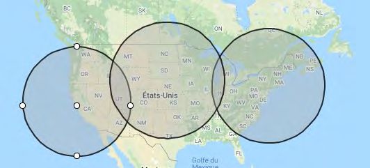
Policy Center for the New South 7Black Lives Matter: A New Perspective from Twitter Data Mining Figure 2: #BlackLivesMatter Hashtag after the Death of George Floyd These significant numbers illustrate the growing importance of social media and how these tools can give a voice to underrepresented and oppressed communities. From a data-analysis perspective, it is interesting to extract some of these tweets over time in order to analyze the textual data and the features hidden in it. 2. Building the Corpus Through Web-Scraping The #BlackLivesMatter and #BLM hashtags are contained in millions of tweets and the data collection exercise can be time consuming and tedious. To make it more manageable, we filtered tweets by geo-locating those sent from the New York, Nebraska, and San Francisco areas and drawing a circle with a radius of 1200 km in each region2 . In this manner, we covered most of the US (East, Center and West), including Minneapolis (Figure 3). It is not possible to cover all tweets as Twitter focuses on relevance, not completeness. By geo-filtering, we reduced the data-collection burden and avoided crashing the server too frequently. We extracted data by web-scraping Twitter from March 1 to July 14, 2020. 2. Note that it is not possible to extract tweets by specifying a country’s name. The extraction works by geolocation where we define a coordinate (latitude and longitude) and a radius. 8 Policy Paper 20/28
Saad BADAOUI

Figure 3: Target Regions for Tweet Collections

  We removed retweets, keeping only original tweets and replies. Each tweet has a unique ID, so we
excluded duplicates by keeping one unique ID per tweet. Moreover, some duplicates have different IDs,
so we further shrunk our dataset by retaining one unique text for every unique ID. In total, we collected
626,471 tweets out of which 287,318 were kept. For each tweet, we extracted nine characteristics (ID,
username, text, date of creation, geo-location, mentions, number of retweets, number of likes, and
hashtags). A typical tweet is mostly a text message within a limit of 140 characters. #hashtags convey
the subject of the tweet. Retweeting is denoted by ‘RT’ and is a measure of the tweet’s popularity.
Finally, one can like a tweet by making it ‘favorite’.

  While our sample set does not cover all tweets worldwide, it is exhaustive enough to reflect mixed
views and the broader support that the movements received, at least nationally in the US.

3. Quantitative Text Analysis
    3-1 Descriptive Statistics

  In this section, we present some figures and simple statistics on the #BlackLivesMatter tweets. The
aim is to get a better sense of the important digital reinforcement that the movement received over
time in order to fuel social progress and advance the fight for equality. We plot the number of tweets
per day and the sums of likes and retweets per day, before and after the death of George Floyd (i.e.
from March 1 to mid-July 2020). The time period is long enough to illustrate the substantial change in
the tweet frequency, as shown in Figure 4 and Figure 5.

  Figure 4 shows that the number of tweets increased substantially after the death of George Floyd
on May 25, 2020, with a peak between June 1 and June 5, 2020. The jump is so substantial that the
number of tweets before looks insignificant. Note that the number of protests against violence and
racism increased during June 2020, which may explain the explosion in the number of tweets.

Policy Center for the New South                                                                        9
Black Lives Matter: A New Perspective from Twitter Data Mining Figure 4: Total Number of Tweets per Day for #BlackLivesMatter and #BLM Hashtags Similar patterns can be observed in Figure 5, where the total number of likes and retweets in June 2020 was very high, reaching a combined figure of more than a million. Retweets represent a way to measure popularity and this is strong evidence of the unprecedented support that the Black Lives Matter movement received. Furthermore, it appears that the number of retweets is much higher that the number of likes, which may explain why so many tweets in our dataset are redundant. Figure 5: Total Number of Retweets and Likes per Day for #BlackLivesMatter and #BLM Hashtags 10 Policy Paper 20/28
Saad BADAOUI
3-2 Dynamic Maps
Twitter enables users to specify a location for individual tweets. In fact, some users do not share
the exact location of their tweets. However, our dataset is large and contains enough tweets with
available geolocation.
We first processed the collected tweets by extracting the geolocation. Then, we plotted the tweets
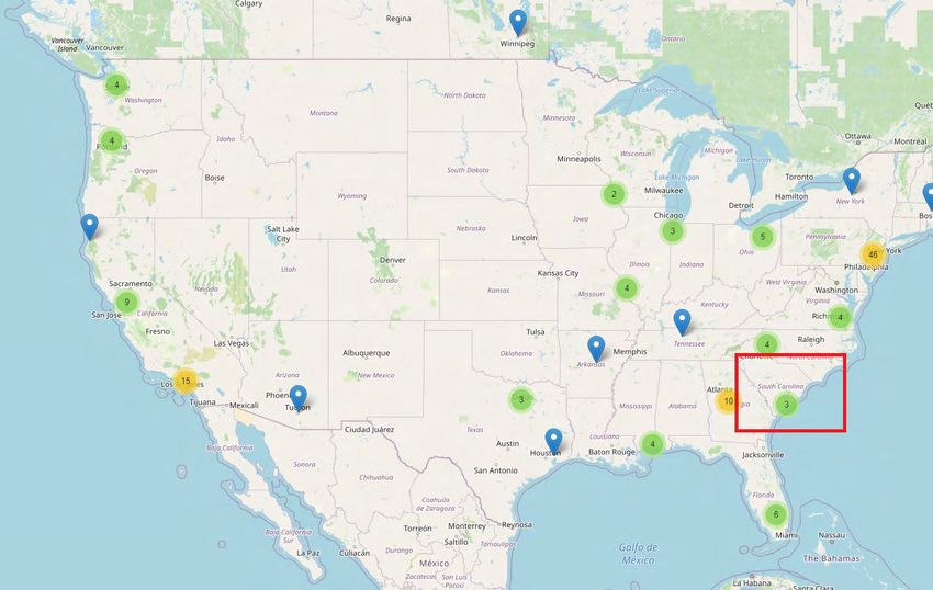
on a dynamic map. Figure 6 presents a helicopter view of the various tweet locations. The focus is on
the US, where our data was collected.
Figure 6: Geolocation of Individual Tweets in the US (Zoomed out) 3
Figure 6 shows tweets across the US, reflecting how the movement spread out geographically from
an initial concentration in Minneapolis to other U.S. cities and to Canada. The blue arrow represents
the location of a specific tweet. The green dot represents a cluster of blue arrows and the yellow dot a
cluster of green dots. The red quadrant represents the region of South Carolina where we display, for
illustration, the exact geolocation of a tweet in Figure 7.
3. We used the Folium library to generate an interactive map.
Policy Center for the New South 11Black Lives Matter: A New Perspective from Twitter Data Mining Figure 7: Example of a Tweet (“Don’t spend ANY money if you are Black…”) Located in South Carolina in the USA (Zoomed in) In what follows, we analyze the word frequency in order to uncover what words were most used in the tweets. 3-3 Word, Mention and Hashtag Frequency Distributions In this section, we show the most used terms in the tweets after cleaning the data4 . By extracting the important words, we can get a sense of what the consensus view is inside the corpus or collection of tweets. Figure 8 shows the twenty most-utilized terms in the tweets, excluding the terms ‘backlivesmatter’ and ‘blm’5 . Interestingly, some of the most frequent words relate to police brutality and various incidents that the black community has endured over the years. For instance, the words ‘black’, ‘lives’, ‘protest’ and ‘police’ are in the top ranking. We also see that ‘georgefloyd’ has been repeatedly mentioned (16,032 times), implying that the murder of George Floyd was the catalyst for the unusual activity in the social network. 4. Cleaning the tweets involves removing stop words (i.e. words with very little meaning in a sentence such as and, the, a, an, and others), punctuation and other symbols. 5. ‘Blacklivesmatter’ and ‘blm’ are, by construction, the most frequent words in the data with a frequency of 218,072 and 95,594 respectively, because these terms are associated with the hashtags. It therefore makes sense to exclude them from the analysis and focus on the terms that come after. 12 Policy Paper 20/28
Saad BADAOUI

Figure 8: Term Frequency Distribution in the Tweets

  In addition to term frequency, we also analyzed the hashtags. The point of this exercise was to see
which hashtags are most associated with the two hashtags we are currently studying. Figure 9 shows
the plot of the most-utilized hashtags after excluding #BlackLivesMatter and #BLM6.

  We observe that the top two hashtags (#georgefloyd and #justiceforgeorgefloyd) are related to
George Floyd, with a frequency of 15,986 and 9,818 respectively. This is further evidence that his
murder was a major reason behind the digital support that the movement received almost overnight
from various communities asking for justice (as illustrated by the hashtag #nojusticenopeace, utilized
6,473 times).

  Finally, it is worth mentioning that the hashtag of Breonna Taylor also topped the list7. Taylor was
fatally shot in her apartment on March 13, 2020, by Louisville police officers executing a search
warrant. The Floyd event was reminiscent of what happened to her and that is the reason why people
wrote her name extensively in the tweets.

6. The hashtags #BlackLivesMatter and #BLM are used respectively 435,742 and 92,327 times.
7. Breonna Taylor hashtag (#breonnataylor) was used 4,388 times.

Policy Center for the New South                                                                    13
Black Lives Matter: A New Perspective from Twitter Data Mining

Figure 9: Hashtag Frequency Distribution in the Tweets

  We also searched for the key people most mentioned in the tweets. Figure 10 shows the mention
frequency distribution.

  Perhaps unsurprisingly, the person that is most mentioned in the tweets, with a frequency of 3403
times, is ‘@realdonaldtrump’ the official Twitter username of US President Donald Trump.

14                                                                                   Policy Paper 20/28
Saad BADAOUI
Figure 10: Mention Frequency Distribution in the Tweets
This mention frequency states the obvious as this is not the first time that fingers have pointed at
President Trump and his inability to unite a divided country8.
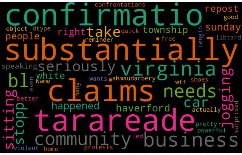
3-4 Word Cloud Analysis
A word cloud is a popular word visualization technique. It is commonly used to highlight popular or
trending terms based on frequency of use and prominence.
8. “How Trump and the Black Lives Matter Movement Changed White Voters’ Minds” https://www.nytimes.com/2020/06/27/us/
politics/trump-biden-protests-polling.html.
Policy Center for the New South 15Black Lives Matter: A New Perspective from Twitter Data Mining Figure 11: Word Cloud with Tweets Figure 11 shows that some powerful words emerge from the word cloud visualization, including ‘violent’, ‘claims’, ‘confrontations’, ‘right’, ‘needs’, and ‘protests’, which again illustrates the perpetual struggle, the fight for justice and the need to be heard on the part of the Black community in America. It is interesting and surprising that Tara Reade (who accused US presidential candidate Joe Biden of a sexual assault) also shows up in Figure 11. Although the connection with Floyd’s murder is not obvious at a first glance, possible links could be with the #MeToo hashtag, which surged in 2017 after the sexual allegations against Harvey Weinstein, and with the Black women movement9 against social injustice. In similar fashion to the Black Lives Matter movement, many sexual assaults and racist acts in the US were either unreported, or ignored by the police and the government. We also see that the state of Virginia comes out as being the most supportive state of the Black Lives Matter movement10. A text mining analysis would not be complete without a sentiment analysis which is done in the next subsection. 9. “Black women are often overlooked by social justice movements, a new study finds” https://edition.cnn.com/2020/07/18/us/ black-women-overlooked-social-justice-movements-trnd/index.html. 10. “Twitter data shows Virginia tops all states for Black Lives Matter support” https://www.wfxrtv.com/news/commonwealth- news/twitter-data-shows-virginia-tops-all-states-for-black-lives-matter-support/. 16 Policy Paper 20/28
Saad BADAOUI

    3-5 Sentiment Analysis

 We did a sentiment analysis on the tweets after cleaning the data of hashtags, emoticons, and
punctuation. We did two types of sentiment analysis.

  First, we did a polarity analysis, which refers to the process of determining the attitude or the
emotion of the writer (i.e. whether it is positive, negative, or neutral). The polarity function we used
results in a float in the range of [-1,1] where 1 means a positive statement and -1 means a negative
statement. For interpretation, we set the text to positive if it is greater than 0, neutral if it is equal to
zero, and negative if it is less than zero (Figure 12).

Figure 12: Polarity Analysis of the Tweets

  Although it is difficult to judge people’s emotions based on Figure 12 alone, because it depends on
the context in which users wrote the tweets, the figure gives an idea about how mixed emotions were
after the George Floyd incident.

  Second, we carried out a subjectivity analysis, which refers to a personal opinion, emotion, or
judgment, whereas objectivity refers to a factual information. The subjectivity is a float within the
range [0, 1] where 0 is very objective and 1 is very subjective. We set the text as subjective if it is
above 0.5 and objective if it is lower than or equal to 0.5.

Policy Center for the New South                                                                           17
Black Lives Matter: A New Perspective from Twitter Data Mining
Figure 13: Subjectivity Analysis of the Tweets
Figure 13 shows that most of the tweets are objective (orange colour), implying that they are related
to factual information and not subjective views. This result makes sense, because all tweets are mainly
about police brutality, injustice, and violence.
3-6 Cluster Analysis and Visualization
Finally, we present a cluster analysis in which we group tweets based on their features. From previous
analyses, we saw that, even though we excluded retweets and duplicates, tweets share similar terms,
hashtags, and mentions. Hence the need for a cluster analysis in which we group tweets into clusters
based on closeness or ‘distance’ between them.
Before clustering, we need to convert words into numbers11 as computers only recognize digits. We
then introduced a score or a weight, which is a statistical measure that evaluates how important a
word is to a tweet in a collection of tweets12 . The importance increases proportionally to the number
of times a word appears in the document, but is offset by the frequency of the word in the corpus13 .
Once the relative importance of the words was scored and the tweets were represented as mutually
comparable vectors, we clustered them based on their similarity by allocating a cluster number to each tweet.
11. This process is called text vectorization and is a fundamental step in analysing text.
12. We apply the TF-IDF (term frequency-inverse document frequency) by removing the ‘stopwords’ and considering only the top
1000 words ordered by term frequency across the entire corpus of tweets. TF is the ratio of the number of times a word occurred in a
document/tweet to the total number of words in the document. IDF is the logarithm of (total number of documents/tweets divided by
number of documents/tweets containing the word). The product of TF and IDF gives the TF-IDF. In other words, we assign to the term
a weight in the document/tweet that is (1) highest when the term occurs many times within a small number of documents/tweets (thus
carrying more information in these tweets), (2) lower when the term occurs in many documents/tweets (thus carrying less important
signals) and (3) lowest when the term occurs in all documents/tweets/corpus.
13. Each value in the vector depends on how many times a word or a term appears in the tweet (TF) and on how rare it is amongst all
tweets/documents (IDF).
18 Policy Paper 20/28Saad BADAOUI
In fact, the tweets mostly reflect anger, frustration, and demand for justice, and we expect them to
be grouped within a small number of clusters. In what follows, we present a cluster analysis with 2
and 3 clusters14 .
Table 1: Cluster Analysis of the Tweets
Analysis on 3
Analysis on 2 Clusters
Clusters
# of Tweets Top 5 Words Used in each # of Tweets per Top 5 Words Used in
Clusters
per Cluster Cluster Cluster each Cluster
blacklivesmatter blacklivesmatter
blm blm
Cluster 1 21,634 georgefloyd 21,634 georgefloyd
black black
right right
blm blacklivesmatter
blacklivesmatter blm
Cluster 2 6,267 protest 265,684 black
black protest
people people
blacklivesmatter
blm
Cluster 3 259,417 black
protest
people
The analysis shows that one cluster captures the majority of the tweets. This result is not surprising
as the tweets share similar characteristics. Secondly, the clusters share common words which imply
that the centroids (or centers of the clusters) are very close to each other, consistent with the fact that
the tweets are similar in meaning (while somewhat different in content).
Our analysis shows evidence that two clusters are enough to capture the vast majority of the hidden
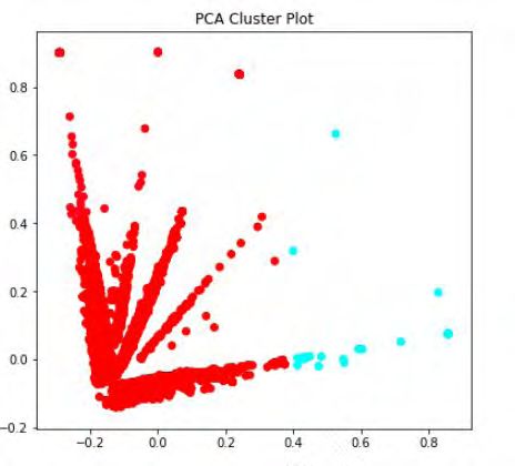
structures behind the tweets. Figure 14 visualizes those two clusters15 .
14. We do the cluster analysis using the k-means algorithm. The k-means is a method used for cluster analysis, especially in data
mining. It aims to partition a set of observations into a number of clusters (k), resulting in the partitioning of the data into cells or
clusters. It can be considered a method of finding out which group a certain object really belongs to.
15. We generate the clusters using the principal component analysis which is a size-reduction method that is often used to reduce the
size of large data sets, by transforming a large set of variables into a smaller one that still contains most of the information contained
in the large set.
Policy Center for the New South 19Black Lives Matter: A New Perspective from Twitter Data Mining Figure 14: Visualisation of the Clusters Each dot in Figure 14 represents a tweet. For clarity, we don’t show all tweets but only a few thousand (randomly chosen). The red dots represent cluster 1, while the blue dots cluster 2. We see that although the clusters are close to each other (probably due to sharing some common features) they do not overlap, implying that there is a clear distinction between the two clusters. Consistent with our previous findings, the red cluster has more dots as it contains the majority of the tweets. 20 Policy Paper 20/28
Saad BADAOUI

4. Conclusion
  Using natural language processing, we analyzed tweets related to the Black Lives Matter movement,
one of the fastest-growing social movement in the US. This movement has seen a significant change
in its digital activity since the death of George Floyd and has received unprecedented international
support in a short amount of time. Some interesting trends emerge from our analysis. First, in the US
radius alone, we observe that the daily use of the #BlackLivesMatter hashtag surpassed 1 million.
Second, the text frequency analysis reveals that the most mentioned person in the tweets is Donald
Trump. This is perhaps not surprising as this is not the first time that the Black community is pointing
at the President of the US in asking for justice. Last but not the least, the text analysis also shows
clear evidence of the strong condemnation of George Floyd’s murder through the frequent use of two
popular hashtags: #nojusticenopeace and #georgefloyd.

References
  •    Larry Buchanan, Quoctrung Bui and Jugal K. Patel “Black Lives Matter May Be the Largest
       Movement in U.S. History” New York Times July 2020
  •    Mary Blankenship and Richard V. Reeves “From the George Floyd moment to a Black Lives Matter
       movement, in tweets” Brookings Institute July 2020
  •    Monica Anderson, Michael Barthel, Andrew Perrin and Emily A. Vogels “#BlackLivesMatter
       surges on Twitter after George Floyd’s death” Pew research Center June 2020

Appendix: A Technical Note on Twitter Data Collection Methods
  To the best of our knowledge, there are two standard ways to collect Twitter data. The first method
is through Twitter APIs (application programming interfaces) and the second is through web-scraping.

  As far as the APIs are concerned, we have the REST API which allows the user to go back in time and
search for already-published tweets. However, the REST API has some limitations. It does not return
tweets older than seven days, and the search API is not meant to be an exhaustive source of tweets.
As Twitter says “the focus is on relevance not completeness”, which not only implies that not all
published tweets can be collected, but also that tweets and users may be missing from search results.
On the other hand, we have the Streaming API which looks into the future, meaning that a stable
connection needs to be open with Twitter to collect data before the event. This way one can retrieve
all tweets that match the filter criteria as they are published.

  In fact, neither the first nor the second API method was fit for our purpose because of both the
seven-days data limitation and the fact that the event needs to be known in advance before data
collection begins.

  Therefore, for our purpose, we collected the data through web-scraping which is the second method
of collection. Web-scraping allows the extraction of tweets visible on the Twitter website.

Policy Center for the New South                                                                      21
Policy Center for the New South Complexe Suncity, Immeuble C, Angle Boulevard Addolb et rue Albortokal, Hay Riad, Rabat - Maroc. Email : contact@ocppc.ma Phone : +212 5 37 27 08 08 Fax : +212 5 37 71 31 54 Website : www.policycenter.ma
You can also read