Climate and Water Resources Summary for the Wellington Region - Summer 2021 summary Autumn 2021 outlook - Greater Wellington Regional ...
←
→
Page content transcription
If your browser does not render page correctly, please read the page content below
Climate and Water Resources Summary for
            the Wellington Region

              Summer 2021 summary
               Autumn 2021 outlook

Release date: 23 March 2021

Environmental Science Department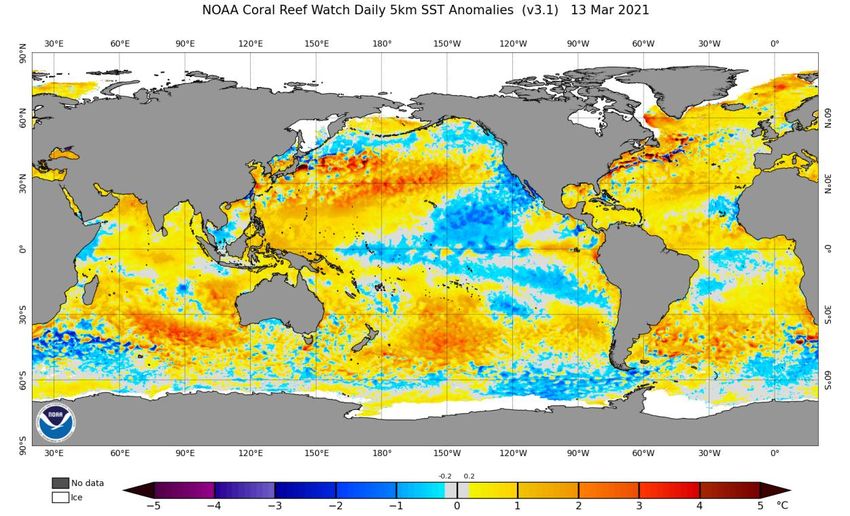
It was a very variable La Niña summer. The season started unusually green, after the
rainiest spring on record in Wellington. This was followed by a mostly dry January and
February. As a result, most of the region was showing either dry or very dry conditions
early in March, according to the New Zealand Drought Monitor from NIWA. We can see
that currently most of the North Island follows the same dry pattern, but not nearly as
severe as this time last year.

DISCLAIMER
This report has been prepared by Environmental Science staff of Greater Wellington Regional Council (GWRC) and as
such does not constitute Council policy.
In preparing this report, the authors have used the best currently available data and have exercised all reasonable skill
and care in presenting and interpreting these data. Nevertheless, GWRC does not accept any liability, whether direct,
indirect, or consequential, arising out of the provision of the data and associated information within this report. Furthermore,
as GWRC endeavours to continuously improve data quality, amendments to data included in, or used in the preparation
of, this report may occur without notice at any time.
GWRC requests that if excerpts or inferences are drawn from this report for further use, due care should be taken to
ensure the appropriate context is preserved and is accurately reflected and referenced in subsequent written or verbal
communications. Any use of the data and information enclosed in this report, for example, by inclusion in a subsequent
report or media release, should be accompanied by an acknowledgement of the source.

Overview

Overview

Summer 2021
Summer 2021 highlighted a very unusual La Niña pattern. Under normal La Niña
summers, we tend to observe a consistent north-easterly flow with warmer than
average temperatures, greater humidity and thunderstorms inland. This year, we had a
remarkable alternation between cold south-westerlies and warm north-easterlies,
accompanied by large variations in temperature and rainfall. These extremes have more
or less cancelled each other out over the three-monthly period, and the seasonal
temperature was just about average. During a heat spike in late January, Masterton
reached the hottest temperature on record, with 35.6oC on the 27th (records since
1906). In Paraparaumu, the minimum temperature of 3.1 oC recorded on the 18th of
February was the second equal lowest on record, for measurements starting in 1953.
The total January rainfall in Masterton (6mm) was the second lowest for January
(records since 1926). The drought monitor index from NIWA shows that, as of mid-
March, most of the region was either dry or very dry.

Climate drivers
The La Niña phenomenon is now slowly dissipating, and most of the other climate
drivers are about normal. Even though La Niña is weakening, its influence is still
predicted to be felt during most of autumn. This means that we can still expect a
somewhat frequent incursion of easterly flows, and a reduced westerly frequency. Some
models are also predicting that La Niña might linger in the background and return again
in the second half of the year.

Climate outlook for autumn 2021
Most international climate models are predicting that autumn in our region will have a
near normal rainfall and temperature pattern for the seasonal average, although
subjected to higher than normal fluctuations throughout the season, oscillating
between westerly and easterly flows. A blocking area of high pressure is expected to
become relatively persistent to the south-east of the country. This could lead to a
moderating easterly flow ‘slowing down’ the westerly fronts at times. On average,
autumn temperatures are predicted to be about normal to slightly above average. A less
windy than average season is expected as a result of the residual La Niña influence, with
colder than average nights inland, and possible early frosts. Rainfall may sit about
normal for the seasonal average, but the season starts very dry in March, and may
gradually return to a more normal autumn rainfall pattern, with a high chance of heavy
rainfall events in April and May.

Live regional climate maps (updated daily): Daily updated climate maps of regional
rainfall and soil moisture are provided on GWRC’s environmental data webpage
(graphs.gw.govt.nz/#dailyClimateMaps).
Contents

Contents
Overview                                                                     i
Summer 2021                                                                  i
Climate drivers                                                              i
Climate outlook for autumn 2021                                              i

1.      Climate drivers                                                     1
1.1     El Niño – Southern Oscillation (ENSO)                               1
1.2     Sea Surface Temperature anomalies                                   1
1.3     Southern Annular Mode (SAM)                                         2

2.      What is the data showing?                                            4
2.1     Regional temperature                                                 4
2.2     Regional wind                                                        5
2.3     Regional soil moisture                                               6
2.4     Regional rainfall                                                    7
2.5     Climate change and variability indicators                            8
2.6     Observed rainfall and soil moisture conditions for selected sites   11
2.6.1   Rainfall accumulation for hydrological year (1 June to 31 May)      11
2.6.2   Soil moisture content (since 1 June 2020)                           14

3.      Outlook for autumn 2021                                             17

Acknowledgements                                                            18

Online resources                                                            18
Climate Drivers

1.    Climate drivers
1.1   El Niño – Southern Oscillation (ENSO)
      The ensemble projections of the Australian climate model below show that the ENSO
      phenomenon is predicted to slowly become neutral towards winter. La Niña has
      been weaker than originally predicted, with a mixed and variable influence over our
      summer weather patterns. A high degree of interchange between westerly fronts
      and easterly, blocked flows, should continue during most of autumn.

      Figure 1.1: Averaged modelled projections (in green) show that ENSO is expected to
      slowly return to normal during autumn. Source: Australian Bureau of Meteorology.

1.2   Sea Surface Temperature anomalies
      The Sea Surface Temperature (SST) anomalies and the total sea ice extent (in white)
      are shown in Figure 1.2, as of 13th March 2021.

      The pattern shows a decaying La Niña phenomenon in the Equatorial Pacific, and
      warmer than average SSTs east of New Zealand. The Tasman Sea and the south-
      eastern Australian region show a variable pattern with several eddies of colder than
      normal water, implying a more pronounced westerly flow and transient fronts to the
      west of New Zealand. In fact, most of the southern part of Australia had colder than
      average temperatures in summer, and is expected to continue to experience colder
      than average flow into autumn. New Zealand, caught between this pattern and the
      warmer waters to the east, had mostly near normal temperatures and rainfall, as a
      seasonal average. However, this “normal” seasonal pattern was subjected to a much

                                                                               Page 1 of 18
Climate Drivers

      larger variability than normal, caused by the frequent oscillation between easterly
      and westerly flows during summer.

      Figure 1.2: Sea surface temperature (SST) anomalies as of 13 March 2021. Sea ice
      coverage is shown in white. Water temperatures around New Zealand are about average.
      We can see warmer waters to the east, and pockets of cooler waters in the Tasman Sea.
      The Equatorial Pacific (ENSO) is showing a decaying La Niña pattern. The sea ice extent
      (in white) was below average until mid-February, but it has started to abruptly expand
      since, turning to above average as of mid-March. This pattern could indicate the effect of
      a stronger westerly flow around Antarctica. Source: NOAA.

1.3   Southern Annular Mode (SAM)
      The SAM is the natural pressure oscillation between mid-latitudes and the Antarctic
      region. Normally, positive SAM is associated with high pressures around the North
      Island keeping the weather stable and dry/cloud-free (especially in summer),
      whereas the opposite is expected when the SAM is in the negative phase.

      The SAM has been predominantly positive in summer, as expected for a La Niña
      event, with mainly below average rainfall in the Wellington Region. Figure 1.3 shows
      that the summer sea level pressure pattern was characterised by a combination of
      high pressures to the south and low pressure east of New Zealand. A small high
      pressure anomaly about the north-western corner of New Zealand is also seen.
      Overall, this complex pattern helps explain our variable and unusual La Niña summer,
      with New Zealand remaining in between different clashing forces of air flow, coming
      about from the various pressure anomalies.

                                                                                 Page 2 of 18
Climate Drivers

     Figure 1.3: Mean sea level pressure anomaly map (hPa) for summer 2021. The ‘H’
     indicates the central position of the anomalous high pressure areas mostly to the south
     of Australia and New Zealand. This pattern was associated with a positive Southern
     Annular Mode, and a variable wind flow over New Zealand. Source: NCEP Reanalysis.

                                                                               Page 3 of 18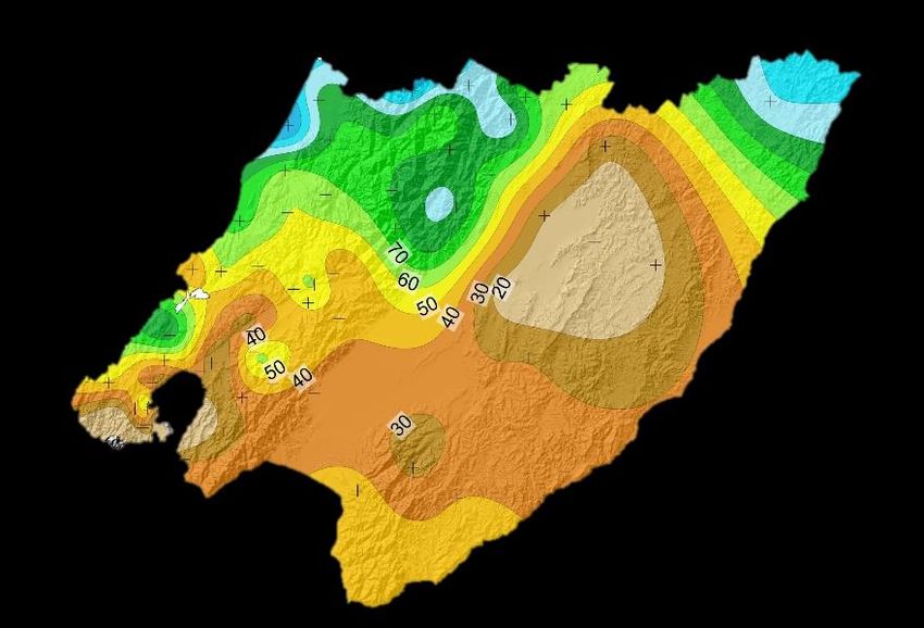
What is the data showing?

2.        What is the data showing?
2.1       Regional temperature
          Figure 2.1 shows the seasonal minimum and maximum temperature anomalies
          (against the 1981-2010 reference period) for the region based on all monitoring sites
          available from GWRC, NIWA and MetService (all meteorological stations indicated
          by dots).

          In general, we can see a pattern of colder than average night time minimum
          temperatures and warmer than average day time maximum temperatures
          throughout the region, especially inland. This pattern tends to correlate with below
          average rainfall and reduced cloud cover typical of a positive Southern Annular
          Mode, as discussed earlier.

                  Minimum
                  Temperature

      Figure 2.1: Daily Average
      Minimum and Maximum
      temperature anomalies (in
      degrees Celsius) for DJF 2021.
      All anomalies calculated against
      the 1981-2010 reference period.
      Source: GWRC, using station data
      from GWRC, NIWA and MetService
      networks.

                                                                       Maximum
                                                                       Temperature

                                                                                 Page 4 of 18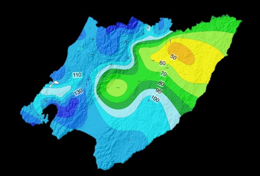
What is the data showing?

2.2   Regional wind
      Figure 2.2 shows the mean seasonal wind anomalies (against the 1981-2010
      reference period). Most of the region experienced below average wind speeds,
      particularly in the interior. This pattern was associated with a slight reduction of the
      frequency of westerlies, as a result of La Niña. Lower wind speeds correspond to a
      reduced mixing in the atmosphere, and the result is a greater temperature variation
      during day and night earlier observed in Figure 2.1. During the day, the solar
      radiation can warm the surface air layer more efficiently, under low wind conditions.
      Whereas at night, under low wind conditions there will be more longwave radiation
      lost into space, with consequently greater cooling (in the absence of cloud cover).

      DJF 2021
      Wind speed Anomalies

      Figure 2.2: Daily mean wind anomalies (as percentage departure from the average) for
      DJF 2021. All anomalies calculated against the 1981-2010 reference period.
      Source: GWRC, using station data from NIWA and MetService

                                                                               Page 5 of 18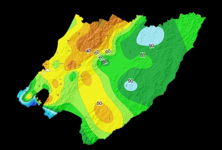
What is the data showing?
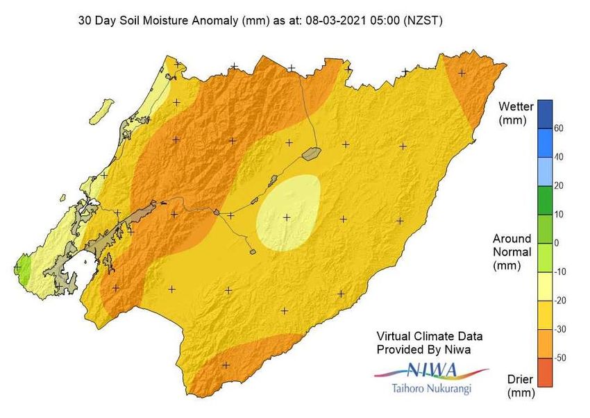
2.3 Regional soil moisture
Figure 2.3 shows that the soil moisture levels were below normal for most of the
region at the beginning of autumn. With the demise of La Niña, there is an
expectation of a more normal autumn rainfall pattern lessening the risk of returning
to the drier conditions seen last year.
Live regional climate maps (updated daily): Climate maps for regional rainfall and
soil moisture (updated daily) are provided online at GWRC’s environmental data
webpage http://graphs.gw.govt.nz/#dailyClimateMaps
Figure 2.3: 30 Day soil moisture anomaly as at 8th March 2021. Most of the region shows
below average soil moisture levels. Source: GWRC, using selected Virtual Climate Station
Network (VCSN) data kindly provided by NIWA. Note that this data is indirectly calculated
by modelling and interpolation techniques, and does not necessarily reflect the results
obtained by direct measurements. This map only provides a general indication of the spatial
variability
Page 6 of 18What is the data showing?
2.4 Regional rainfall
Figure 2.4 shows the regional monthly spring rainfall expressed as a percentage of
the long-term average. Rainfall during December was average to above average in
western and southern areas and below average to the northeast. January and
February were very dry across much of the region. Some parts of the Wairarapa had
only 20-30% of average January rainfall.
The overall seasonal pattern for summer showed near average conditions to the
west and below average conditions to the east.
December
January
February
Summer (DJF)
%
Figure 2.4: Rainfall for December (upper left), January (upper right), February (lower left) and
Summer DJF (lower right) 2020 as a percentage of the long-term average. Source: GWRC
Page 7 of 18What is the data showing?
2.5 Climate change and variability indicators
The graphs below (Figure 2.5) show summaries of seasonal climate change and
variability for Wellington and the Wairarapa using reference climate stations, chosen
based on length of data record and availability.
The key climate variables shown are; mean temperature, total sunshine hours, mean
wind, total rainfall and total number of rain days (above 0.1 mm). Temperature
measurements go back to the 1910s, allowing for a meaningful analysis of climate
change trends. Most other variables also have long periods of measurement greater
than 50 years, except sunshine hours and wind for the Wairarapa; these are only
available for less than two decades, which is a very short period climatologically and
does not allow for an analysis of trends.
The red and blue bars show the extreme years of the entire measurement period.
Red indicates seasons that were warmer, drier, sunnier and less windy than average
(i.e., extreme hot/dry), and blue indicates seasons that were colder, wetter, cloudier
and windier than average (i.e., extreme cold/wet). The reference climatological
average (1981-2010) is shown by a horizontal bar where available.
An analysis of linear trends associated with climate change is plotted onto the graph
only when the trends are statistically significant from zero at 99% confidence level.
The climate change and variability summary for summer is:
Statistically significant trends are seen only for temperature and wind, meaning
that summer is getting warmer as a result of ongoing climate change, and less
windy on average in Wellington. The long-term summer warming trend is about
one degree per century for both Wellington and Masterton
Summer 2021 temperatures were about average for both Wellington and the
Wairarapa
Sunshine hours were close to average
Seasonal average wind speed was about normal for Wellington
Seasonal rainfall was below average, and number of rain days was about normal,
for Wellington.
Page 8 of 18What is the data showing?
Page 9 of 18What is the data showing?
Figure 2.5: Climate change and variability graphs for spring in Wellington and the Wairarapa. The
thick horizontal line shows the 1981-2010 average (where available), and the dashed line shows the
linear trend. Trends are plotted only when statistically significant at 99% confidence level. For all
graphs, the bright red and blue bars show the extreme min and max values for each time series (red
for warm, dry, sunny and calm and blue for cool, wet, cloudy and windy). The key variables shown
are: mean temperature, total number of sunshine hours, mean wind speed, total rainfall and total
number of rain days (>0.1mm). Missing bars means that no reliable mean seasonal data was
available for that particular year. The last bar of each graph shows the last available data for the
currently analysed season, unless there are missing data.
Page 10 of 18What is the data showing?
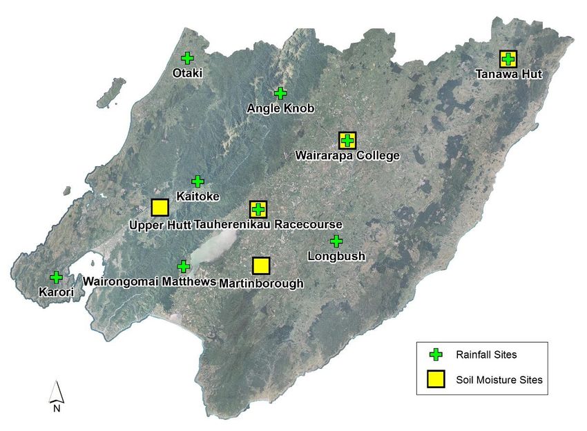
2.6 Observed rainfall and soil moisture conditions for selected sites
Figure 2.6 shows the location of selected GWRC rainfall and soil moisture monitoring
sites. Plots of accumulated rainfall and soil moisture trends are provided in the
following pages.
Figure 2.6: Map of GWRC rainfall and soil moisture monitoring locations
2.6.1 Rainfall accumulation for hydrological year (1 June to 31 May)
The following rainfall plots show total rainfall accumulation (mm) for the
hydrological year at several locations. For comparative purposes, cumulative plots
for selected historic years with notably dry years have been included as well as the
site average.
Many of the GWRC telemetered rain gauge sites in the lower lying parts of the
Wairarapa have only been operating since the late 1990s so the period of data
presented is limited to the last two decades. For each historical record plotted, an
indication of ENSO climate state (El Niño, La Niña or neutral) at that time is also given.
Page 11 of 18What is the data showing?
GWRC does not operate a rain gauge in the southern-most parts of the Wairarapa
Valley that is suitable for presenting data in this report. This means that we cannot
be confident that the rainfall patterns seen elsewhere extend to this part of the
region other than the VCSN data already presented.
Overall, total rainfall accumulations in most areas have ended the summer season
above the average line, the exceptions being the Tararua Range and south eastern
hill country. The very wet conditions experienced during November are evident as a
sharp upwards movement on the rainfall accumulation graphs.
Kāpiti Coast and Southwest (Wellington City)
1600 1600
Karori Sanctuary (Wellington City) Otaki Depot (Coastal Plain)
1400 1400
1200 1200
Cummulative Rainfall (mm)
1000 1000
800 800
600 600
1982/83 (El Nino) 1997/98 (El Nino)
1997/98 (El Nino) 2002/03 (El Nino)
400 400
2007/08 (La Nina) 2007/08 (La Nina)
2014/15 (Neutral) 2015/16 (El Nino)
200 200
2016/17 (Neutral) 2016/17 (Neutral)
Mean (1990-2019) Mean (1990-2019)
0 0 2019/20
2019/20
2020/21 2020/21
-200 -200
Hutt Valley and the Tararua Range
3000 8000
Kaitoke Headworks (Hutt River catchment) Tararua Range (Angle Knob)
7000
2500
6000
2000
5000
Cummulative Rainfall (mm)
1500 4000
1000 1997/98 (El Nino) 3000
1997/98 (El Nino)
2002/03 (El Nino) 2002/03 (El Nino)
2007/08 (La Nina) 2000
500 2007/08 (La Nina)
2014/15 (Neutral) 2014/15 (Neutral)
2017/18 (Neutral) 1000
2017/18 (Neutral)
0 Mean (1990-2019) Mean (1990-2019)
2019/20 0
2019/20
2020/21 2020/21
-500 -1000
Page 12 of 18What is the data showing?
Wairarapa
1800 1200
Waiorongomai at Matthews Tauherenikau at Alloa/Racecourse
1600
1000
1400
800
Cummulative Rainfall (mm)
1200
1000 600
800
400
600 2002/03 (El Nino)
2013/14 (Neutral)
2007/08 (La Nina)
400 2014/15 (Neutral) 200 2017/18 (Neutral)
2017/18 (Neutral) 2014/15 (Neutral)
200
Mean (2009-2019) 0 Mean (1990-2019)
0 2019/20 2019/20
2020/21 2020/21
-200 -200
1000 1400
Masterton (Wairarapa College) Whareama at Tanawa Hut
900
1200
800
700 1000
Cummulative rainfall (mm)
600 800
500
600
400
2002/03 (La Nina) 1997/98 (El Nino)
300 400
2007/08 (La Nina) 2002/03 (El Nino)
200 2007/08 (La Nina)
2015/16 (El Nino)
200 2014/15 (Neutral)
2017/18 (Neutral)
100 2017/18 (Neutral)
Mean (2002-2019)
0 Mean (1992-2019)
0 2019/20 2019/20
2020/21 2020/21
-100 -200
Page 13 of 18What is the data showing?
1200
Waikoukou at Longbush
1000
800
Cummulative rainfall (mm)
600
400 2007/08 (La Nina)
2013/14 (Neutral)
200 2015/16 (El Nino)
2017/18 (Neutral)
0 Mean (1990-2019)
2019/20
2020/21
-200
Live cumulative plots (updated daily): Real-time graphs for cumulative rainfall are
available online at GWRC’s environmental data webpage
(http://graphs.gw.govt.nz/). Select a rainfall monitoring site, then choose
Cumulative Historic from the Interval selector, then optionally change the period
from the last 12 months to the hydrological year (July – June) as required
2.6.2 Soil moisture content (since 1 June 2020)
The following soil moisture graphs show the seven day rolling average soil moisture
content (%) since 1 June 2020. This is plotted over an envelope of the range of historic
recorded data (and the median) at the site to provide an indication of how the current
soil moisture compares with that for a similar period in past years.
While the soil moisture plots are useful for tracking change within the current season
and comparing relative differences between years, the absolute moisture content (%)
for any given site and date should not be considered accurate. Many of the GWRC soil
moisture sites have not yet been fully calibrated to provide accurate absolute
measures of soil moisture.
The cycle of a wet December, followed by a dry January and February is evident in the
soil moisture graphs, particularly for the Masterton and Martinborough monitoring
sites.
Page 14 of 18What is the data showing?
Wairarapa
60 70
Northeastern Wairarapa hills (Tanawa Hut) Masterton (Wairarapa College)
50 60
Soil Moisture Content (%) - 7 day average)
50
40
40
30
30
20
20
Historic range (min to max)
10 20th to 80th percentile Historic range (min to max)
10 20th to 80th percentile
Median (2003-2019)
Median (2002-2019)
2020/21
0 2020/21
0
35 60
Tauherenikau Racecourse Martinborough (NIWA)
30
50
Soil Moisture Content (% - 7 day average)
25
40
20
30
15
20
10
Historic range (min to max)
Historic range (min to max) 10 20th to 80th percentile
5 20th to 80th percentile
Median (2002-2019)
Median (2013-2017)
2020/21 2020/21
0 0
Page 15 of 18What is the data showing?
Upper Hutt
40
Upper Hutt (Savage Park) Live soil moisture plots (updated daily): Real-
time “envelope” graphs for soil moisture are
Soil Moisture Content (%) - 7 day average)
35
available online at GWRC’s environmental
data webpage
30
(http://graphs.gw.govt.nz/). Select a soil
moisture monitoring site, then choose
25
Envelope Graph from the Interval selector,
then optionally change the period from the
20
last 12 months to the hydrological year (July –
Historic range (min to max) June) as required.
15 20th to 80th percentile
Median (2003-2017)
2020/21
10
Page 16 of 18Seasonal Outlook
3. Outlook for autumn 2021
La Niña is expected to continue to weaken, but still influence the autumn pattern
with occasional easterly flows, blocking high pressures, and reduced frequency
of westerlies;
Sea Surface temperatures are expected to remain variable, with warmer than
average waters east of New Zealand;
A variable rainfall pattern starting out dry at the beginning of the season and
progressing towards closer to normal as the season progresses;
High chance of heavy rainfall events in April and May, including easterly events;
Average to above average temperature, but colder than average at night inland,
with possible early frosts.
Whaitua* Variables Climate outlook for autumn 2021
Average to above.
Temperature:
Wellington
Harbour & Hutt About average, with low confidence for the total
Valley seasonal accumulation. Starts very dry, high month
Rainfall: to month variability. High chance of extreme rainfall
events in April and May.
Average to above.
Temperature:
Te Awarua-o- About average, with low confidence for the total
Porirua seasonal accumulation. Starts very dry, high month
Rainfall: to month variability. High chance of extreme rainfall
events in April and May.
Temperature: Above average daytime, below average night time.
Kāpiti Coast Average to above, with low confidence for the total
seasonal accumulation. High chance of extreme
Rainfall: rainfall events in April and May.
Above average daytime, below average night time.
Temperature:
Ruamāhanga Average to below, with low confidence for the total
seasonal accumulation. Starts very dry, high month
Rainfall: to month variability. High chance of extreme rainfall
events in April and May.
Average to above.
Temperature:
Wairarapa Coast Average to below, with low confidence for the total
seasonal accumulation. Starts very dry, high month
Rainfall: to month variability. High chance of extreme rainfall
events in April and May.
*See http://www.gw.govt.nz/assets/Environment-Management/Whaitua/whaituamap3.JPG for whaitua
catchments
Page 17 of 18Acknowledgements
We would like to thank NIWA for providing selected VCSN data points for the calculation of
the regional soil moisture map and for supplementing the rainfall percentage maps in data
sparse areas.
Online resources
GWRC online climate mapping tools:
Live regional climate maps (updated daily): Climate maps for regional rainfall and soil
moisture (updated daily) are provided online at GWRC’s environmental data webpage
(graphs.gw.govt.nz/#dailyClimateMaps)
Drought check: http://www.gwrc.govt.nz/drought-check/
Interactive climate change and sea level rise maps: This webpage provides easy to
plot climate change mapping that illustrates the predicted future impacts of climate
change in the Wellington Region. Maps are available for every season, for mid (2040)
and late century (2090). A total of 21 climate variables can be plotted, for every
greenhouse gas emission scenario modelled by the IPCC. Dynamical downscaling
provided by NIWA: https://mapping1.gw.govt.nz/gw/ClimateChange/
Key Reports:
Main climate change report (NIWA 2017)
http://www.gw.govt.nz/assets/Climate-change/Climate-Change-and-Variability-
report-Wlgtn-Regn-High-Res-with-Appendix.pdf
Main climate drivers report (Climate Modes) (NIWA 2018)
http://www.gw.govt.nz/assets/Our-Environment/Environmental-
monitoring/Environmental-Reporting/GWRC-climate-modes-full-report-NIWA-3-Sep-
2018-compressed.pdf
Climate change extremes report (NIWA 2019)
https://www.gw.govt.nz/assets/Climate-change/GWRC-NIWA-climate-extremes-
FINAL3.pdf
Climate Portals
GWRC Climate change webpage
http://www.gw.govt.nz/climate-change/
GWRC Seasonal climate hub
http://www.gw.govt.nz/seasonal-climate-hub/
Page 18 of 18You can also read