Current GISS Global Surface Temperature Analysis
←
→
Page content transcription
If your browser does not render page correctly, please read the page content below
Current GISS Global Surface Temperature Analysis
J. Hansen, R. Ruedy, M. Sato, and K. Lo
NASA Goddard Institute for Space Studies, New York, New York, USA

Abstract. We update the Goddard Institute for Space Studies (GISS) analysis of global surface
temperature change. We use satellite nightlight measurements to identify measurement stations
located in extreme darkness. These stations are used to adjust temperature trends of urban and
peri-urban stations for non-climatic factors and to help verify that urban effects on analyzed
global change are small. As the GISS analysis combines available sea surface temperature
records with meteorological station measurements, we test alternative choices for the ocean
record, showing that global temperature change is sensitive to estimated temperature change in
polar regions where observations are limited. We compare global temperature reconstructions of
GISS, NCDC, and HadCRUT. We conclude that global temperature continued to rise rapidly in
the past decade, despite large year-to-year fluctuations associated with the El Nino-La Nina cycle
of tropical ocean temperature.

1. Introduction
         Analyses of global surface temperature change are routinely carried out by several
groups, including the NASA Goddard Institute for Space Studies, the NOAA National Climatic
Data Center (NCDC), and a joint effort of the Hadley Research Centre and the University of East
Anglia Climate Research Unit (HadCRUT). These analyses are not independent, as they must
use much the same input observations. However, the multiple analyses provide useful checks
because they employ different ways of handling data problems such as incomplete spatial and
temporal coverage and non-climatic influences on measurement station environment.
         Here we describe the current GISS analysis of global surface temperature change. We
first provide background on why and how the GISS method was developed and then describe the
input data that go into our analysis. We discuss sources of uncertainty in the temperature records
and provide some insight about the magnitude of the problems via alternative choices input data
and adjustments to the data. We discuss a few of the salient features in the resulting temperature
reconstruction and compare our global mean temperature change with that obtained in the NCDC
and HadCRUT analyses. Given our conclusion that global warming is continuing unabated, and
that this conclusion differs from some popular conceptions, we discuss reasons for such
perceptions including the influence of short-term weather and climate fluctuations.

2. Background of GISS Analysis Method
        GISS analyses of global surface temperature change were initiated by one of us (JH) in
the late 1970s and first published in 1981 [Hansen et al., 1981]. The objective was an estimate
of global temperature change that could be compared with expected global climate change in
response to known or suspected climate forcing mechanisms such as atmospheric carbon
dioxide, volcanic aerosols, and solar irradiance changes.
        A principal question at that time was whether there were sufficient stations in the
Southern Hemisphere to allow a meaningful evaluation of global temperature change. The
supposition in the GISS analysis was that an estimate of global temperature change with useful
accuracy should be possible because seasonal and annual temperature anomalies, relative to a
long-term average (climatology), present a much smoother geographical field than temperature

                                                   1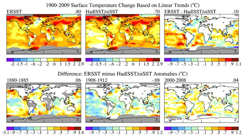
itself. For example, when New York City has an unusually cold winter, it is likely that
Philadelphia is also colder than normal.
         The correlation of temperature anomaly time series for neighboring stations was
illustrated by Hansen and Lebedeff [1987] as a function of station separation for different latitude
bands. The average correlation coefficient was shown to remain above 50 percent to distances of
about 1200 km at most latitudes, but in the tropics the correlation falls to about 35 percent at
station separation of 1200 km. The GISS analysis specifies the temperature anomaly at a given
location as the weighted average of the anomalies for all stations located within 1200 km of that
point, with the weight decreasing linearly from unity for a station located at that point to zero for
stations located 1200 km or further from the point in question.
         The GISS analysis thus interpolates among station measurements and extrapolates
anomalies as far as 1200 km into regions without measurement stations. Resulting regions with
defined temperature anomalies are used to calculate a temperature anomaly history for large
latitude zones. The global temperature anomaly time series is then calculated as the average for
all zones, with each zone weighted by its true (complete) area.
         Hansen and Lebedeff [1987] calculated an error estimate due to incomplete spatial
coverage of stations using a global climate model that was shown to have realistic spatial and
temporal variations of temperature anomalies. The average error was found by comparing global
temperature variations from the spatially and temporally complete model fields with the results
when the model was sampled only at locations and times with measurements. Calculated errors
increased toward earlier times as the area covered by stations diminished, with the errors
becoming comparable in magnitude to estimated global temperature changes at about 1880.
Thus we restrict GISS temperature anomaly estimates to post-1880.
         The GISS analysis uses 1951-1980 as the base period. The United States National
Weather Service uses a three-decade period to define "normal" or average temperature. At the
time we began our global temperature analyses and comparisons with climate models that
climatology period was 1951-1980. It seems best to keep the base period fixed, because many
graphs have been published with that choice for climatology. It is a good choice for another
reason: many of today's adults grew up during that period, so they can remember what climate
was like then. Besides, a different base period only alters the zero point for anomalies, without
changing the magnitude of the temperature change over any given period.
         GISS analyses beginning with Hansen et al. [1999] include a homogeneity adjustment to
minimize local (non-climatic) anthropogenic effects on measured temperature change. Such
effects are usually largest in urban locations where buildings and energy use often cause a
warming bias. Local anthropogenic cooling can also occur, for example from irrigation and
planting of vegetation, but on average these effects are probably outweighed by urban warming.
The homogeneity adjustment procedure [Figure 3 of Hansen et al., 1999] changes the long-term
temperature trend of an urban station to make it agree with the mean trend of nearby rural
stations. The effect of this adjustment on global temperature change was found to be small, less
than 0.1°C for the past century. Discrimination between urban and rural areas was based on the
population of the city associated with the meteorological station. Location of stations relative to
population centers varies, however, so in the present paper we use the intensity of high resolution
satellite nightlight measurements to specify which stations are in population centers and which
stations should be relatively free of urban influence.
         The GISS temperature analysis has been available for many years on the GISS web site
(www.nasa.giss.gov), including maps, graphs and tables of the results. The analysis is updated
monthly using several data sets compiled by other groups from measurements at meteorological
                                                 2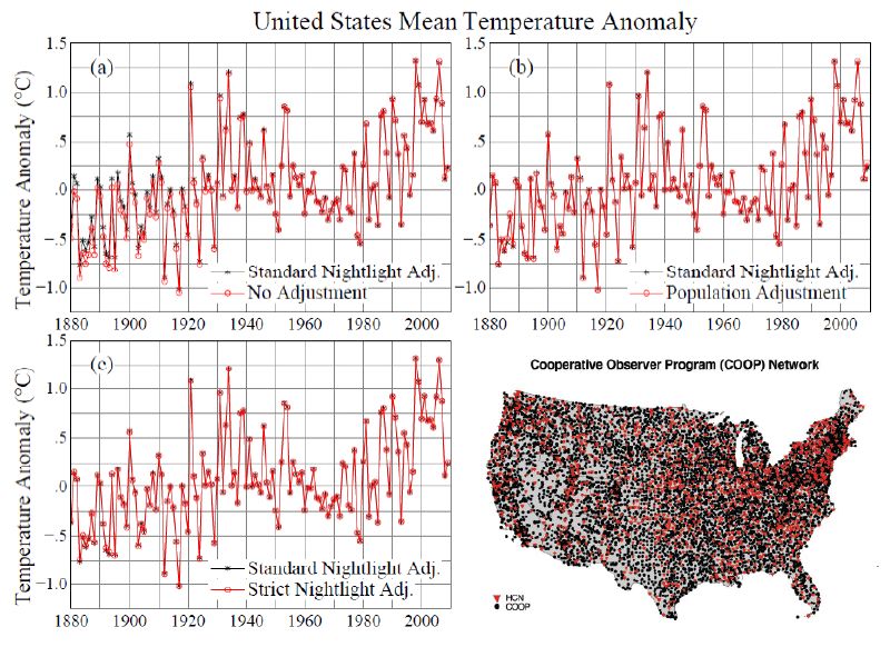
stations and satellite measurements of ocean surface temperature. Ocean data in the pre-satellite
era is based on measurements by ships and buoys. The computer program that integrates these
data sets into a global analysis is freely available on the GISS web site.
        Here we describe the current GISS analysis and present several updated graphs and maps
of global surface temperature change. We compare our results with those of HadCRUT and
NCDC, the main purpose being to investigate differences in recent global temperature trends and
the ranking of annual temperatures among different years.

3. Input Data
        The current GISS analysis employs three independent input data streams that are publicly
available on the internet and updated monthly. In addition the analysis requires a data set for
ocean surface temperature measurements in the pre-satellite era; we now show results using
alternative choices for pre-satellite ocean data Measurements for land areas are of surface air
temperature, which is usually measured at a height of two meters. Ocean measurements are of
the water temperature at or near the sea surface. Although air and water temperatures differ,
temperature change of slightly different surface levels should be similar in most situations
because of tight coupling between the surface and near surface air. We refer to this combined
data product as surface temperature change.

3.1. Meteorological Station Measurements
         The source of monthly mean station measurements for our current analysis is the Global
Historical Climatology Network (GHCN) version 2 of Peterson and Vose [1997], which is
available monthly from NCDC. GHCN includes data from about 7000 stations. We use only
those stations that have a period of overlap with neighboring stations (within 1200 km) of at least
20 years (see Figure 2 of Hansen et al., 1999), which reduces the number of stations used in our
analysis to about 6300.
         We use the unadjusted version of GHCN. However, note that a subset of GHCN, the
United States Historical Climatology Network (USHCN), has been adjusted via a
homogenization intended to remove urban warming and other artifacts [Karl et al., 1990;
Peterson and Vose, 1997]. Also bad data in GHCN were minimized at NCDC [Peterson and
Vose, 1997; Peterson et al., 1998b] via checks of all monthly mean outliers that differed from
their climatology by more than 2.5 standard deviations. About 15 percent of these outliers were
eliminated for being incompatible with neighboring stations, with the remaining 85 percent being
retained.
         The current GISS analysis adjusts the long-term temperature trends of urban stations
based on neighboring rural stations, and we correct discontinuities in the records of two specific
stations as described below. Our standard urban adjustment now utilizes satellite observations of
nightlights to identify whether stations are located in rural or urban areas. The urban adjustment,
described below, is carried out via our published computer program and the publicly available
nightlight data set.
         Our analysis also continues to include specific adjustments for two stations, as described
by Hansen et al. [1999], these stations being located in isolated regions where sufficient
neighboring stations are not available for the automatic adjustment. The two stations have
obvious discontinuities that would give rise to artificial global warming without a homogeneity
adjustment. The stations, St. Helena in the tropical Atlantic Ocean and Lihue, Kauai, in Hawaii,
are located on islands with few if any neighboring stations, so their records have a noticeable
                                                3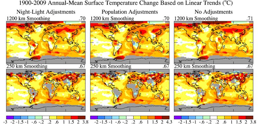
impact on analyzed regional temperature change. The St. Helena station, based on metadata in
MCDW records, was moved from 604 m to 436 m elevation between August 1976 and
September 1976. Thus, assuming a temperature lapse rate of 6°C/km, we added 1°C to St.
Helena temperatures before September 1976. Lihue had an obvious discontinuity in its
temperature record around 1950. On the basis of minimizing the discrepancy with its few
neighboring stations, we added 0.8°C to Lihue temperatures prior to 1950.
        In the current monthly updates of the GISS analysis when we find what seems to be a
likely error in a station record, our procedure is to report the problem to NCDC for their
consideration and possible correction of the GHCN record. Our rationale is that verification of
correct data entry from the original meteorological source is a person-intensive activity that is
best handled by NCDC with its existing communications network. Also it seems better not to
have multiple versions of the GHCN data set in the scientific community.
        The contiguous United States presents special homogeneity problems. One problem is
the bias introduced by change in the time of daily temperature recording [Karl et al., 1986], a
problem that does not exist in the temperature records from most other nations. High energy use,
built up local environments, and land use changes also cause homogeneity problems [Karl et al.,
1990]. The adjustments included by NCDC in the current USHCN data set [version 2, Menne et
al., 2009] should reduce these problems. As a test of how well urban influences have been
minimized, we illustrate below the effect of our nightlight-based urban adjustment on the current
USHCN data set.

3.2. Antarctic Research Station Measurements
        Measurements at Antarctic research stations help fill in what would otherwise be a large
hole in the GHCN land-based temperature record. Substantial continuous data coverage in
Antarctica did not begin until the International Geophysical Year (1957). However, the period
since 1957 includes the time of rapid global temperature change that began in about 1980.
        The GISS analysis uses the Scientific Committee on Antarctic Research (SCAR) monthly
data [Turner et al., 2004], which are publicly available.

3.3. Ocean Surface Temperature Measurements
         Our standard global land-ocean temperature index uses a concatenation of the Hadley
Research Centre ship-based analysis of sea surface temperatures (HadISST1) [Rayner et al.,
2003] for 1880-1981 and satellite measurements of sea surface temperature for 1982-present
(OISST.v2) [Reynolds et al., 2002]. The satellite measurements are calibrated with the help of
ship and buoy data [Reynolds et al., 2002].
         Ocean surface temperatures have their own homogeneity issues. Measurement methods
changed over time as ships changed, most notably with a change from measurements of bucket
water to engine intake water. Homogeneity adjustments have been made to the ship-based
record [Parker et al., 1995; Rayner et al., 2003], but these are necessarily imperfect. The spatial
coverage of ship data is poor in the early 20th century and before. Also it has been shown that
changes in ship measurements during and after World War II cause an instrumental artifact that
contributes to the relative peak of ocean temperature in the HadISST1 data set in the early 1940s
[Thompson et al., 2008]. Ocean coverage and the quality of sea surface temperature
measurements have been better since 1950 and especially during the era of satellite ocean data,
i.e., since 1982. Satellite data, however, also have their own sources of uncertainty, despite their
high spatial resolution and broad geographical coverage.
                                                 4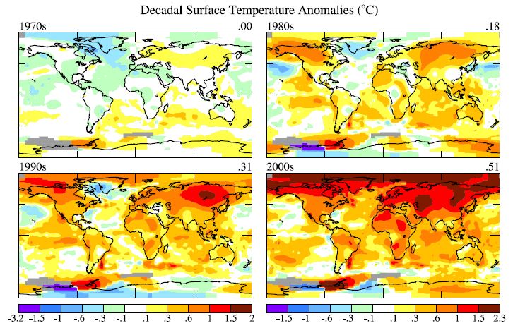
Thus we compare the global temperature change obtained in our standard analysis, which
concatenates HadISST1 and OISST.v2, with results from our analysis program using alternative
ocean data sets. Specifically, we compare our standard case with results when the ocean data is
replaced by the Extended Reconstructed SST (ERSST.v3) [Smith et al., 2008] for the full period
1880-present, and also when HadISST1 is used as the only ocean data for the full period 1880-
present. In the Supplementary Material we compare the alternative ocean data sets themselves
over regions of common data coverage to help isolate differences among input SSTs as opposed
to differences in the area covered by ocean data.

4. Urban Adjustments
         Station location in the meteorological data records is provided with a resolution of 0.01
degrees of latitude and longitude, corresponding to a distance of about 1 km. This resolution is
useful for investigating urban effects on regional atmospheric temperature. Much higher
resolution would be needed to check for local problems with the placement of thermometers
relative to possible building obstructions, for example. In many cases such local problems are
handled via site inspections and reported in the "metadata" that accompanies station records, as
discussed by Karl and Williams [1987], Karl et al. [1989], and Peterson et al. [1998a].
         Of course the thousands of meteorological station records include many with uncorrected
problems. The effect of these problems tends to be reduced by the fact that they include errors of
both signs. Also problems are usually greater in urban environments, so an urban adjustment
based on nightlights should tend to reduce the effect of otherwise unnoticed non-climatic effects.
         We use a nightlight radiance data set [Imhoff et al., 1997] that is publicly available
[http://www.ngdc.noaa.gov/dmsp/download_rad_cal_96-97.html] (measurements made between
March 1996 and February 1997)] at a resolution of 30" x 30", which is a linear scale of about 1
km. In Figure 1(a) the global radiances are shown after averaging to 30' x 30' resolution, i.e., a
pixel (resolution element) in Figure 1(a) is an average over 3600 high resolution pixels. This
averaging reduces the maximum radiance from about 3000 µW/m2/sr/µm to about 670
µW/m2/sr/µm.
         Imhoff et al. [1997] investigated the relation between nightlight radiances and population
density in the United States. We find that radiances of less than 32 µW/m2/sr/µm correspond
well with the "unlit" category of Imhoff et al. [1997] within the United States, as can be seen by
comparing Figure 1(b) here with Plate 1 of Hansen et al. [2001]. The "unlit" regions, according
to Imhoff et al [1997] correspond to populations densities of about 0.1 persons/ha or less in the
United States.
         The relation between population and nightlight radiance in the United States is not valid
in the rest of the world, as energy use per capita is higher in the United States than in most
countries. However, energy use is probably a better metric than population for estimating urban
influence, so we employ nightlight radiance of 32 µW/m2/sr/µm as the dividing point between
rural and urban areas in our global nightlight test of urban effects. Below we show, using data
for a region with very dense station coverage, that use of a much more stringent for darkness
does not significantly alter the results.
         We first compare two alternatives for the urban correction. One case uses the definition
of rural stations used by Hansen et al. [1999], i.e., stations associated with towns of population
less than 10,000 (population data available at ftp://ftp.ncdc.noaa.gov/pub/data/ghcn/v2). The
second case defines rural stations as those located in a region with nightlight radiance less than
32 µW/m2/sr/µm.

                                                5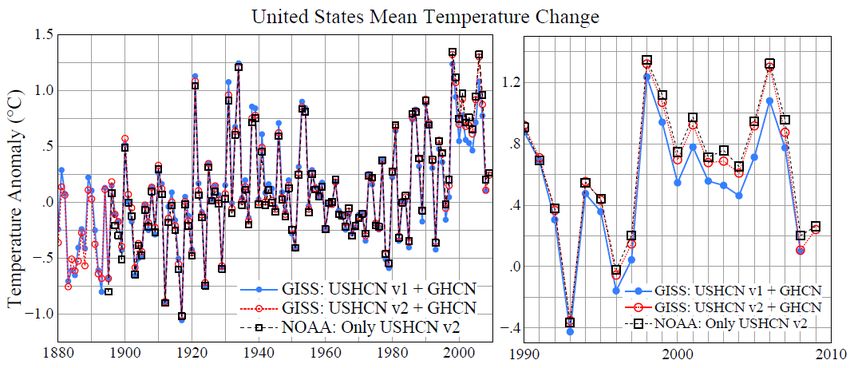
Figure 1. (a) Satellite-observed nightlight radiances at a spatial resolution of 30 minutes x
   30 minutes, (b) locations of USHCN stations in extreme darkness, nightlight radiance less
   than 1 µW/m2/sr/µm, and (c) a region shown at the data resolution of 30 seconds x 30
   seconds [Imhoff et al., 1997]. Blue dots indicate meteorological stations associated with
   towns having population less than 10,000. In our new standard nightlight treatment stations
   in the yellow and pink regions are adjusted for urban effects.

This nightlight criterion is stricter than the population criterion in the United States, i.e., many
sites classified as rural based on population below 10,000 are classified as urban based on
nightlight brightness, as illustrated by the fact that some of the blue dots (towns of population
less than 10,000) in Figure 1c fall within the urban areas defined by nightlights (yellow area).
However, as we will see, the opposite is true in places such as Africa, i.e., a population criterion
of less than 10,000 results in fewer rural stations than the nightlight criterion.

                                                  6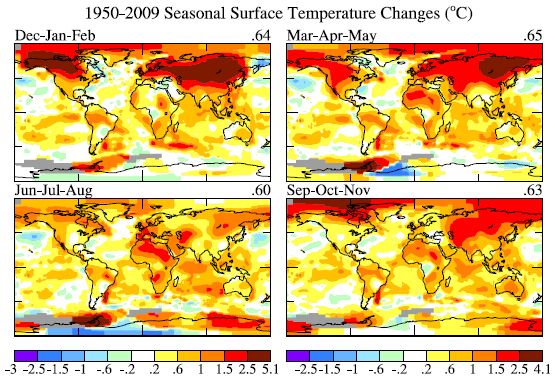
Figure 2. Comparison of alternative urban adjustments. The top row uses the standard 1200 km
radius of influence for each station while the second row reduces the radius of influence to 250
km, so that the influence of adjustments on individual stations can be ascertained. The
temperature change due to the adjustments is shown in the two bottom maps.

        Our adjustment of urban station records uses nearby rural stations to define the long-term
trends while allowing the local urban station to define high frequency variations, nominally as
described by Hansen et al. [1999], but with details as follows. If an urban station has at least
three rural stations within 500 km, all of these are used for the adjustment with closer stations
receiving greater weight, as described above. If there are not three stations within 500 km, but
there are three or more stations within 1000 km, these stations are used for the adjustment. The
mean temperature trend of the rural stations is computed as a two-segment broken line, as in
Hansen et al. [1999] but the knee of the broken line is variable (rather than being fixed at 1950)
chosen so as to minimize the difference between the urban and rural records.

                                                7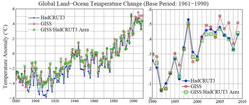
Figure 3. Global-mean annual-mean land-ocean temperature index for three alternative
treatments of the urban adjustment.

          Figure 2 shows the resulting temperature change over the period 1900-2009 for urban
adjustment based on nightlights, urban adjustment based on population, and no urban
adjustment. The effect of urban adjustment on global temperature change is only of the order of
0.01°C for either nightlight or population adjustment. The small magnitude of the urban effect is
consistent with results found by others [Karl et al., 1988; Jones et al., 1990; Peterson et al.,
1999; Peterson, 2003; Parker, 2004]. Our additional check is useful, however, because of the
simple reproducible way that nightlights define rural areas. We previously used this nightlight
method [Hansen et al., 2001], but only for the contiguous United States.
          The most noticeable effect of the urban adjustment in Figure 2 is in Africa and includes
changes of both signs. The large local changes are not due to addition of an urban correction to
specific stations, but rather to the deletion of urban stations because of the absence of three rural
neighbors. African station records are especially sparse and unreliable [Peterson et al., 1998b;
Christy et al., 2009]. Thus the large local temperature changes between one adjustment and
another may have more to do with variations in station reliability rather than urban warming.
Given the paucity of reliable station records in Africa and South America [Peterson et al., 1997],
it is difficult to have confidence in the illustrated temperature trends on those continents.
          Figure 3 compares the global mean temperature versus time for the two alternative urban
adjustments and no urban adjustment. The main conclusion to be drawn is that the differences
among the three curves are small. Nevertheless, we know that the adjustment is substantial for
some urban stations, so it is appropriate to include an urban adjustment.
          How can we judge whether the nightlight or population adjustment is better in the sense
of yielding the most realistic result? One criterion might be based on which one yields more
realistic continuous meteorological patterns for temperature anomaly patterns. Nightlights
arguably do very slightly better based on that criterion (Figure 2). Independently, we expect
nightlight intensity to be a better indication than population of urban heat generation.
Nightlights also preserve a greater area with defined temperature anomalies (Figure 2). Finally,
                                                  8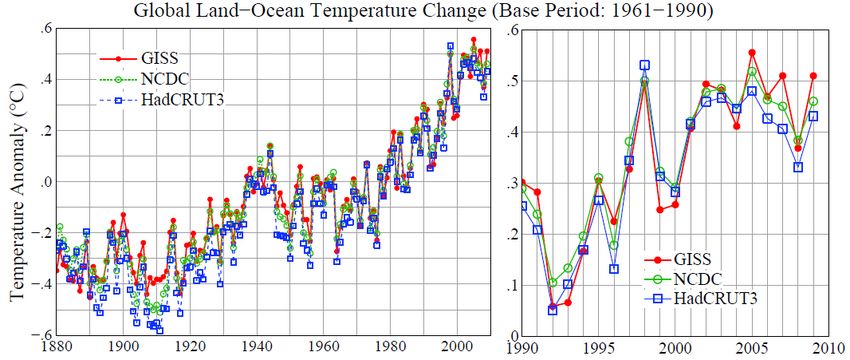
Figure 4. Temperature change in the United States for alternative choices of urban adjustment.

stations can be more accurately associated with nightlight intensity (within about 1km) than with
population, and the nightlight data are easily accessible, so anyone can check our analysis.
        For these reasons, beginning in January 2010 the standard GISS analysis employs global
nightlights in choosing stations to be adjusted for urban effects. Use of nightlights is a well-
defined objective approach for urban adjustment, and the nightlight data set used for the
adjustment is readily available (see http address above). In the future, as additional urban areas
develop, it will be useful to employ newer satellite measurements.
        The small urban correction is somewhat surprising, even though it is consistent with prior
studies. We know, for example, that urban effects of several degrees exist in some cities such as
Tokyo, Japan and Phoenix, Arizona, as illustrated in Figure 3 of Hansen et al. [1999]. Although
such stations are adjusted in the GISS analysis, is it possible that our 'rural' stations themselves
contain substantial human-made warming? There is at least one region, the United States, where
we can do a stricter test of urban warming, because of the high density of meteorological
stations. The United States is a good place to search for greater urban effects, because of its high
energy use and a consequent expectation of large urban effects.
         In Figures 4 and 5 we compare no adjustment, population adjustment, and two nightlight
adjustments. The standard nightlight adjustment defines rural as nightlight radiance less than 32
µW/m2/sr/µm and stringent darkness is the lowest radiance class in the satellite data set, beneath
the detection limit of about 1 µW/m2/sr/µm. There were about 300 stations in the contiguous
United States meeting this strict darkness criterion (Figure 1b), sufficient to yield a filled-in
United States temperature anomaly map even with the station radius of influence set at 250 km.
We use the 250 km radius of influence to provide higher resolution in Figure 4, compared with
1200 km radius of influence, and we exclude smoothing from the plotting package so that results
are shown at the 2°×2° resolution of the calculation, thus allowing more quantitative inspection.
                                                 9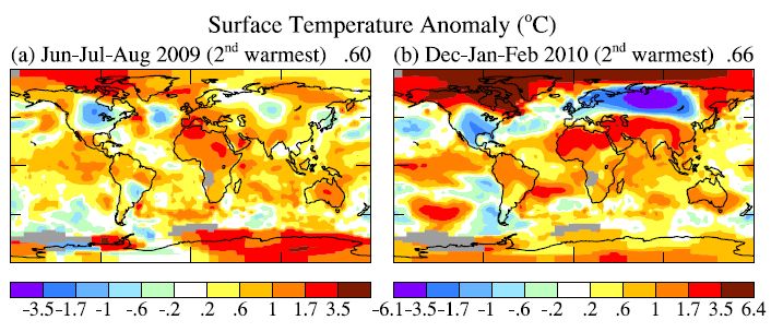
Figure 5. Comparisons of mean temperature anomalies in the contiguous 48 United States for
the standard GISS nightlight adjustment and alternative. The map on the lower right shows the
high density of meteorological stations in the United States, with red being stations in the U.S.
Historical Climatology Network and black being Cooperative stations [Menne et al., 2009].

        The largest urban adjustment is in the Southwest United States, where a warming bias is
removed. In a few locations the adjustment yields greater warming, which can result from either
the spatial smoothing inherent in adjusting local trends to match several neighboring stations or
neighboring rural stations that have greater warming than the urban station . The standard
nightlight adjustment removes slightly more warming than does the population adjustment. The
important conclusion is that the strict nightlight adjustment has no significant additional effect,
compared with the standard nightlight adjustment. The 1900-2009 temperature change over the
contiguous United States, based on linear fit to the data in Figure 5, is 0.70°C (no adjustment),
0.64°C (population adjustment), 0.63°C (standard nightlight adjustment), and 0.64°C (strict
nightlight adjustment). If only USHCN stations are employed (as in NCDC analyses) we find a
1900-2009 temperature change of 0.73°C (no adjustment) and 0.65°C (standard nightlight
adjustment).
        Global temperature change in this paper, unless indicated otherwise, is based on the
standard nightlight adjustment. We conclude, based on results reported here and the other papers
we referenced, that unaccounted for urban effects on global temperature change are small in
comparison to the ~0.8°C global warming of the past century. Extensive confirmatory evidence
(such as glacier retreat and borehole temperature profiles) is provided by IPCC [2007].

                                                10
Figure 6. Global temperature change in the GISS global analysis for alternative choices of sea
surface temperature.
5. Alternative Ocean Data Sets
Figure 6 compares global temperature change for three choices of ocean surface
temperature: (1) HadISST1 [Rayner et al., 2003] for 1880-1981 and OISST.v2 [Reynolds et al.,
2002] for 1982-present, (2) ERSST.v3 [Smith et al., 2008] for the full period 1880-present, (3)
HadISST1 for 1880-2008. In all three cases the land data is based on the GISS analysis of
GHCN and Antarctic (SCAR) data.
The first of the ocean data sets, the combination HadISST1+OISST.v2, is used in the
GISS analysis for our standard land-ocean temperature index. Results based on HadISST1 alone
and HadISST1+OISST.v2 are in close agreement in the 1982-present period during which they
might differ (Figure 6b). We use OISST for the satellite era, as opposed to HadISST1, in part
because OISST is available weekly in near real time.
ERSST, a newer SST analysis covering the period 1880 to the present, is also available
in near real time. SST values in data sparse regions in ERSST are filled in by NCDC using
statistical methods, dividing the SST anomaly patterns into low-frequency (decadal scale)
anomalies, by averaging and filtering available data points, and high-frequency residual
anomalies [Smith et al., 2008]. The concept is that the SST reconstruction may be improved by
constraining temperature anomaly fields toward realistic modes of variability.
ERSST yields 0.04°C greater global warming (based on linear trends) than HadISST1 or
HadISST1+OISST over the period 1880-2009 (Figure 6a). Over 1980-2009 ERSST yields
global warming about 0.03°C greater than either HadISST1 or HadISST1+OISST (Figure 6b).
Figure 7 illustrates the geographical distribution of the differences between ERSST and the other
data sets. Satellite data used for OISST has high spatial and temporal resolution, but that does
not necessarily lead to more accurate temperature trends. Aerosols and clouds, for example,
cause calibration difficulties for the satellite measurements [Reynolds et al., 2002].
It is apparent that the greater warming in ERSST on the century time scale occurs
primarily in the South Pacific and South Atlantic oceans. The difference between the two
reconstructions is large enough in the Pacific Ocean that it may be possible to discriminate
between them based on proxy measures of climate change, for example from ocean sediments.
11Figure 7. Temperature change in the GISS global analysis using ERSST and HadISST1+OISST
and differences in specific periods.
A newer Hadley SST data set, HadSST2 (Rayner et al., 2006) has cooler SSTs in 1908-
1912, comparable to the lower temperatures in ERSST. Both HadSST2 and ERSST use newer
versions of the International Comprehensive Ocean-Atmosphere Data Set [ICOADS; Worley et
al., 2005]. Presumably the newer ICOADS data is superior, as it is based on more data with
better geographical coverage. However, the HadSST2 resolution (5°×5°) is too crude for our
purposes. HadISST1 has 1°×1° resolution and ERSST has 2°×2° resolution.
In data-rich areas such as the North Atlantic Ocean in recent years there are sufficient in
situ measurements to help assess the accuracy of the alternative SST reconstructions. Hughes et
al. [2009] found better agreement of HadISST1+OISST than ERSST with spatial variability of in
situ observations in recent decades that include high spatial and temporal resolution. Thus this
assessment is dependent mainly on small scale variability and does not necessarily mean that
ERSST has not improved the large-scale long-term temperature trends.
In recent years, as shown for 2000-2008 in the lower right part of Figure 7, the greater
warming in ERSST occurs especially in the Eastern Pacific Ocean. These differences between
the alternative ocean analyses are large enough that it may be possible to use in situ
measurements to help determine which ocean temperature reconstruction is more accurate.
Until better assessments of the alternative SST data sets exist, the GISS global analysis
will be made available for both HadISST1 and ERSST, in both cases with these long-term data
sets concatenated with OISST for 1982-present. HadISST1+OISST will continue to be our
standard product unless and until verifications show ERSST to be superior.
We compare the alternative ocean data sets over their regions of common data coverage
in our Supplementary Material. Differences among the data sets, although noticeable, are less
than uncertainties described by the data providers. The differences are also small enough that the
choice of ocean data set does not alter conclusions of our paper.
12Figure 8. Decadal surface temperature anomalies relative to 1951-1980 base period.
6. Current GISS Surface Temperature Analysis
The results in this section use HadISST1+OISST with the switch to OI in 1982. A
smooth concatenation is achieved by making the 1982-1992 OISST mean anomaly at each
gridbox identical to the HadISST1 1982-1992 mean for that gridbox. When ERSST is
substituted for HadISST1 the results are very similar, but with slightly larger global warming.
Both results are available on our website.
Figure 8 shows the global surface temperature anomalies for the past four decades,
relative to the 1951-1980 base period. On average, successive decades warmed by 0.17°C. The
warming of the 1990s (0.13°C relative to the 1980s) was reduced by the temporary effect of the
1991 Mount Pinatubo volcanic eruption.
Warming in these recent decades is larger over land than over ocean, as expected for a
forced climate change, because the ocean responds more slowly than the land due to the ocean's
large thermal inertia. Warming during the past decade is enhanced, relative to the global mean,
by about 50 percent in the United States, a factor of 2-3 in Eurasia, and a factor of 3-4 in the
Arctic and the Antarctic Peninsula.
Warming of the ocean surface has been largest over the Arctic Ocean, second largest over
the Indian and Western Pacific Oceans, and third largest over most of the Atlantic Ocean.
Temperature changes have been small and variable in sign over the North Pacific Ocean, the
Southern Ocean, and the regions of upwelling off the west coast of South America.
13Figure 9. Global surface temperature anomalies relative to 1951-1980 mean for (a) annual and
5-year running means through 2009, and (b) 12-month running mean through February 2010.
Figure 9a updates the GISS global annual and 5-year mean temperatures through 2009.
Results differ slightly from our prior papers because of our present use of the global nightlights
to adjust for urban effects, but the changes are practically imperceptible. The nightlight
adjustment reduces the 1880-2009 global temperature change by an insignificant 0.004°C
relative to the prior population-based urban adjustment.
Global temperature in the past decade was about 0.8°C warmer than at the beginning of
th
the 20 century (1880-1920 mean). Two-thirds of the warming has occurred since 1975.
Figure 9a has become popular, eagerly awaited by some members of the public and the
media. An analogous graph, often in the form of a histogram is made available each year by the
Hadley Centre/University of East Anglia Climate Research Unit and by the NOAA National
Climatic Data Center.
We suggest, however, that a more informative and convenient graph is the 12-month
running mean global temperature (Figure 9b). From a climate standpoint there is nothing special
about the time of year at which the calendar begins. The 12-month running mean entirely
removes the seasonal cycle just as well at any time of year.
The 12-month running mean temperature anomaly (Figure 9b) provides an improved
measure of the strength and duration of El Ninos, La Ninas, and the response to volcanic
eruptions. In contrast, use of the calendar year, as in Figure 9a, can be misleading, because one
El Nino may coincide well with a calendar year while another is split between two calendar
years. The 12-month running mean also provides a better measure of the longevity of an event (a
positive or negative temperature excursion).
A clearer view of temporal variations is provided by Figure 10, which covers the shorter
period 1950-2010. The top curve is the monthly mean global temperature anomaly and the
second curve is the 12-month running mean. The red-blue Nino index is the 12-month running
mean of the temperature anomaly (relative to 1951-1980) averaged over the Nino 3.4 area in the
Eastern Pacific Ocean [Philander, 2006]. Because the monthly Nino index is much smoother
than monthly global temperature, we can usefully extend the index to the present. The final
point is the 2-month mean (Dec-Jan) Nino 3.4 anomaly, the penultimate point is the 4-month
(Oct-Jan) mean anomaly, and so on.
14Figure 10. Global monthly and 12-month running mean surface temperature anomalies relative
to 1951-1980 base period, and the Nino 3.4 index. Data extend through February 2010.
The well-known strong correlation of global surface temperature with the Nino index is
apparent in Figure 10. The correlation is maximum with 12-month running mean global
temperature lagging the Nino index by 4 months. Given this lag and the fact that the Nino index
has continued to rise in the 6 months since the date of the final 12-month running mean
point in Figure 10, it is nearly certain that a new record 12-month global temperature will be set
in 2010.
As for the calendar year, it is likely that the 2010 global surface temperature in the GISS
analysis also will be a record for the period of instrumental data. However, record global
temperature for the calendar year might not occur if El Nino conditions deteriorate rapidly by
mid 2010 into La Nina conditions.
7. Comparison of GISS, NCDC and HadCRUT Analyses
Expectation of possible record global temperature raises the question about differences
among the several global surface temperature analyses. For example, GISS and NCDC have
2005 as the warmest year in their analyses, while HadCRUT has 1998 as the warmest year. Here
we investigate differences arising from two factors that we think are likely to be important: (1)
the way that temperature anomalies are extrapolated, or not extrapolated, into regions without
observing stations, and (2) the ocean data sets that are employed.
Figure 11 compares the GISS, NCDC, and HadCRUT analyses. The characteristic
causing most interest and concern in the media and with the public is their different results for
the warmest year in the record, as noted above.
A likely explanation for discrepancy in identification of the warmest year is the fact that
the HadCRUT analysis excludes much of the Arctic, where warming has been especially large in
15Figure 11. GISS, NCDC and HadCRUT global surface temperature anomalies. Base period is
1961-1990 for consistency with Figures 12 and 13 and base periods used by NCDC and
HadCRUT. Last two decades are expanded on the right side.
the past decade, while GISS and NCDC estimate temperature anomalies throughout most of the
Arctic. The difference between GISS and HadCRUT results can be investigated quantitatively
using available data defining the area that is included in the HadCRUT analysis.
Figure 12 shows maps of GISS and HadCRUT 1998 and 2005 temperature anomalies
relative to base period 1961-1990 (the base period used by HadCRUT). The temperature
anomalies are at a 5°×5° (latitude-longitude) resolution in Figure 12 for the GISS data to match
the resolution of the HadCRUT analysis. In the lower two maps we display the GISS data
masked to the same area (and resolution) as the HadCRUT analysis.
Figure 13 shows time series of global temperature for the GISS and HadCRUT analyses,
as well as for the GISS analysis masked to the HadCRUT data region. With the analyses limited
to the same area, the GISS and HadCRUT results are similar. The GISS analysis finds 1998 as
the warmest year, if analysis is limited to the masked area. This figure reveals that the
differences that have developed between the GISS and HadCRUT global temperatures during the
past decade are due primarily to the extension of the GISS analysis into regions excluded from
the HadCRUT analysis.
The question is then: how valid are the extrapolations and interpolations in the GISS
analysis? The GISS analysis assigns a temperature anomaly to many gridboxes that do not
contain measurement data, specifically all gridboxes located within 1200 km of one or more
stations that do have defined temperature anomalies. The rationale for this aspect of the GISS
analysis is based on the fact that temperature anomaly patterns tend to be large scale, especially
at middle and high latitudes.
16Figure 12. Temperature anomalies (°C) in 1988 (left) and 2005 (right). Top row is GISS
analysis, middle row HadCRUT analysis, and bottom row the GISS analysis masked to the same
area and spatial resolution as the HadCRUT analysis. Areas without data are gray. "Global"
means (upper right corner) are averages over area with data. [Base period is 1961-1990]
The HadCRUT analysis also makes an (implicit) assumption about temperature
anomalies in regions remote from meteorological stations, if the HadCRUT result is taken as a
global analysis. The HadCRUT approach area-weights temperature anomalies of the regions in
each hemisphere that have observations; then the means in each hemisphere are weighted equally
to define the global result [Brohan et al., 2006]. Thus HadCRUT implicitly assumes that the
Arctic area without observations has a temperature anomaly equal to the hemispheric mean
anomaly. Given the pattern of large temperature anomalies in the fringe Arctic areas with data
(Figure 12), this implicit estimate would seem to understate Arctic temperature anomalies.
Qualitative support for the greater Arctic anomaly of the GISS analysis is the following.
The Arctic temperature anomaly patterns in the GISS analysis, regions warmer and cooler than
average when the mean anomaly is adjusted to zero, are realistic-looking meteorological
patterns. More quantitative support is provided by satellite observations of infrared radiation
17Figure 13. Global surface temperature anomalies (°C) relative to 1961-1990 base period for
three cases: HadCRUT, GISS, and GISS anomalies limited to the HadCRUT area.
from the Arctic [Comiso, 2006]. Although we have not yet attempted to integrate this infrared
data record, which begins in 1981, into our temperature record, the temperature anomaly maps of
Comiso [2006] have the largest positive temperature anomalies (several degrees Celsius) during
the first decade of this century over the interior of Greenland and over the Arctic Ocean in
regions where sea ice cover has decreased. Because no weather stations exist in central
Greenland and within the sea ice region, our analysis may understate warming in these regions.
An exception is the station on Sakhalin Island, which is located in a region of decreasing sea ice
cover and which does show relatively large warming in the past decade.
We obtain a quantitative estimate of uncertainty (likely error) in the GISS analysis due to
incomplete spatial coverage of stations using a time series of global surface temperature
generated by a long run of the GISS climate model runs [Hansen et al., 2007]. We sample this
data set at meteorological station locations that existed at several times during the past century.
We then find the average error when the model's data for each of these station distributions is
used as input to the GISS surface temperature analysis program.
Table 1 shows the derived error. As expected, the error is larger at early dates when
station coverage was poorer. Also the error is much larger when data are available only from
meteorological stations, without ship or satellite measurements for ocean areas. In recent
decades the 2-σ uncertainty (95 percent confidence of being within that range, thus ~2-3 percent
chance of being outside that range in a specific direction) has been about 0.05°C. Incomplete
coverage of stations is the primary cause of uncertainty in comparing nearby years, for which the
effect of more systematic errors such as urban warming is small.
Additional sources of error, including urban effects, become important when comparing
temperature anomalies separated by longer periods [Brohan et al., 2006; Folland et al., 2001;
Smith and Reynolds, 2002]. Hansen et al. [2006] have estimated the additional error, by factors
other than incomplete spatial coverage, as being σ ≈ 0.1°C on time scales of several decades to a
century, but this estimate is necessarily partly subjective. If that estimate is realistic, the total
uncertainty in global mean temperature anomaly with land and ocean data included is similar to
the error estimate in the first line of Table 1, i.e., the error due to limited spatial coverage when
only meteorological stations are available. However, biases due to changing practices in ocean
18Table 1. Two-sigma (2σ) error estimate versus time for meteorological stations and land-ocean
index
1880-1900 1900-1950 1960-2008
Meteorological Stations 0.2 0.15 0.08
Land-Ocean Index 0.08 0.05 0.05
measurements may cause even greater uncertainty on the century time scale [Rayner et al.,
2006].
In comparisons of nearby years to each other the errors due to changes of measurement
practices and urban warming should be small, so the total error in such year-by-year comparisons
is probably dominated by the substantial error from incomplete spatial coverage of
measurements. Under that assumption, let’s consider whether we can specify a rank among the
recent global annual temperatures, i.e., which year is warmest, second warmest, etc. Figure 9a
shows 2009 as the second warmest year, but it is so close to 1998, 2002, 2003, 2006, and 2007
that we must declare these years as being in a virtual tie as the second warmest year. The
maximum difference among these years in the GISS analysis is ≈0.03°C (2009 being the
warmest among those years and 2006 the coolest). This total range is approximately equal to our
1σ uncertainty of ≈0.025°C.
The year 2005 is 0.06°C warmer than 1998 in the current GISS analysis including
nightlight adjustments. How certain is it that 2005 was warmer than 1998? Given σ ≈ 0.025°C
for nearby years, we estimate the probability that 1998 was warmer than 2005 as follows. The
actual 1998 and 2005 temperatures are specified by normal probability distributions about our
calculated values. For each value of the actual 1998 temperature there is a portion of the
probability function for the 2005 temperature that has 2005 cooler than 1998. Integrating
successively over the two distributions we find that the chance that 1998 was warmer than 2005
is 0.05, i.e., there is 95 percent confidence that 2005 was warmer than 1998.
The NCDC analysis finds 2005 to be the warmest year, but by a smaller amount. Thus a
similar probability calculation for their results would estimate a greater chance that 1998 was
actually warmer than 2005. NCDC reports 2009 as being the fifth warmest year
(http://www.ncdc.noaa.gov/sotc/?report=global). Although the latter result seems to disagree
with the GISS conclusion that 2009 tied for the second warmest year, this is mainly a
consequence of the GISS preference to describe as statistical ties those years with global
temperature differing by only about one standard deviation or less.
19Figure 14. Jun-Jul-Aug 2009 and Dec-Jan-Feb 2010 surface temperature anomalies (°C).
8. Weather variability versus climate trends
Public opinion about climate change is affected by recent and ongoing weather. North
America had a cool summer in 2009, perhaps the largest negative temperature anomaly on the
planet (Figure 14a). Northern Hemisphere winter (Dec-Jan-Feb) of 2009-2010 was unusually
cool in the United States and northern Eurasia (Figure 14b). The cool weather contributed to
increased public skepticism about the concept of "global warming", especially in the United
States. These regional extremes occurred despite the fact that Jun-Jul-Aug 2009 was second
warmest (behind Jun-Jul-Aug 1998) and Dec-Jan-Feb 2009-2010 was second warmest (behind
Dec-Jan-Feb 2006-2007).
Northern Hemisphere winter of 2009-2010 was characterized by an unusual exchange of
polar and mid-latitude air. Arctic air rushed into both North America and Eurasia, and, of
course, was replaced in the polar region by air from middle latitudes. Penetration of Arctic air
into middle latitudes is related to the Arctic Oscillation (AO) index [Thompson and Wallace,
2000], which is defined by surface atmospheric pressure. When the AO index (Figure 15a) is
positive surface pressure is low in the polar region. This helps the middle latitude jet stream
blow strongly and consistently from west to east, thus keeping cold Arctic air locked in the polar
region. A negative AO index indicates relatively high pressure in the polar region, which favors
weaker zonal winds, and greater movement of frigid polar air into middle latitudes.
December 2009 had the most extreme negative Arctic Oscillation since the 1970s. There
were ten cases between the early 1960s and mid 1980s with negative AO index more extreme
than -2.5, but no such extreme cases since then until December 2009. It is no wonder that the
public had become accustomed to a reduction in the extremity of winter cold air blasts. Then, on
the heels of the December 2009 anomaly, February 2010 had an even more extreme AO, the
most negative AO index in the 1950-2010 period of record (Figure 15).
20Figure 15. (a) Arctic oscillation (AO) index, data from
(http://www.cpc.noaa.gov/products/precip/CWlink/daily_ao_index/monthly.ao.index.b50.current.ascii.table).
Blue dots are monthly means and black curve is the 60-month (5-year) running mean. (b) AO
index at higher temporal resolution and corresponding temperature anomaly in contiguous 48
United States.
The AO index and United States surface temperature anomalies are shown with monthly
resolution in Figure 15b for two 6-year periods: the most recent years (2005-2010) and the
period (1975-1980) just prior to the rapid global warming of the past three decades. Extreme
negative temperature anomalies, when they occur, are usually in a winter month. Note that
winter cold anomalies in the late 1970s were more extreme than the recent winter cold
anomalies.
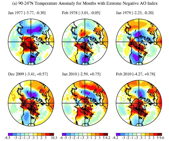
Maps of monthly temperature anomalies are shown in Figure 16. Figure 16a is a polar
projection for 24-90°N with 1200 km smoothing to provide full coverage, while 250 km
resolution without further smoothing is possible for the contiguous United States (Figure 16b)
because of high station density there. Note that monthly mean negative anomalies exceeded five
degrees Celsius over large areas in the cold months of the late 1970s, while negative temperature
excursions are more limited in 2009-2010.
21Figure 16. Temperature anomaly from GISS analysis for months with extreme negative AO
index. Parenthetical numbers are the AO index and (a) the mean temperature anomaly for 24-
90°N and (b) for the contiguous 48 states.
22Figure 17. Arctic Oscillation index and United States (48 states) surface temperature anomaly
for December-January-February (above) and June-July-August (below).
Monthly temperature anomalies in the United States in the winter are positively
correlated with the AO index (Figures 16a and 17a), with any lag between the index and
temperature less than the monthly temporal resolution (Figure 16a). Thompson and Wallace
[2000], Shindell et al. [2001] and others point out that increasing carbon dioxide causes the
stratosphere to cool, in turn causing on average a stronger polar jet stream and thus a tendency
for a more positive Arctic Oscillation.
There is an AO tendency of the expected sense (Figure 16a), but the change is too weak
to account for the trend of temperatures. Indeed, Figure 17 shows that the warming trend of the
past few decades has led to mostly positive seasonal temperature anomalies, even when the AO
is negative. In the United States only one of the past 10 winters and two of the past 10 summers
were cooler than the 1951-1980 climatology, a frequency consistent with the expected "loading
of the climate dice" [Hansen, 1997] due to global warming. Notable change of these
probabilities is a result of the fact that local seasonal-mean temperature change due to long-term
trends (Figure 18) is now comparable to the magnitude of local interannual variability of
seasonal mean temperature (Figure 14b).
23Figure 18. Global maps 4 season temperature anomaly trends (°C) for period 1950-2009.
Monthly temperature anomalies are typically 1.5 to 2 times greater than seasonal
anomalies. So loading of the climate dice is not as easy to notice in monthly mean temperature.
Daily weather fluctuations are even much larger than global mean warming. Yet it is already
possible for an astute observer to detect the effect of global warming in daily data by comparing
the frequency of days with record warm temperature to days with record cold temperature. The
number of days with record high temperature now exceed the number of days with record cold
by about a two to one ratio [Meehl et al., 2009].
24Figure 19. (a) Global and (b) United States analyzed temperature change in the GISS analysis
before and after correction of a data flaw in 2007. Results are indistinguishable except post-2000
in the United States.
9. Data flaws
Figure 19 shows the effect of an error that came into the GISS analysis with the changes
in the analysis described by Hansen et al. [2001]. One of the changes was use of an improved
version of the USHCN station data records including adjustments developed by NCDC to correct
for station moves and other discontinuities [Easterling et al., 1996]. Our error was failure to
recognize that the updates to the records for these stations obtained from NCDC electronically
each month did not contain these adjustments. Thus there was a discontinuity in 2000 in those
station records, as prior years contained the adjustment while later years did not.
The error was readily corrected, once it was recognized in 2007. Figure 19 shows the
global and United States temperatures with and without the error. The error averaged 0.15°C
over the contiguous 48 states. Because the 48 states cover only about 1½ percent of the globe,
the error in global temperature was about 0.003°C, which is insignificant and undetectable in
Figure 19.
This error was widely reported in the media, frequently with the assertion that NASA had
intentionally exaggerated the magnitude of global warming, with a further assertion that
correction of the error made 1934 the warmest year in the record rather than 1998. Confusion
between global and United States temperature was perhaps inadvertent. But as Figure 19 shows
the United States temperatures in 1934 and 1998 (and 2006) were and continue to be too similar
to conclude that one year was warmer than the other.
Uncertainty in comparing United States temperatures for years separated more than half a
century is surely larger than 0.1°C. As shown above, the GISS adjustment for urban effects in
the United States by itself approaches that magnitude, even when it is based on USHCN records
that are already adjusted by NCDC to account for several sources of bias (inhomogeneity). Their
pairwise comparison of urban and rural stations is expected to remove much of the urban effect
[Menne et al., 2009].
Temperature records in the United States are especially prone to uncertainty, not only
because of high energy use in the United States but also other unique problems such as the bias
due to systematic change in the time at which observers read 24-hour max-min thermometers.
These problems and adjustments to minimize their effect have been described in numerous
papers by NCDC researchers [Karl et al. 1986, 1987, 1988, 1989; Quayle et al., 1991; Easterling
et al., 1996; Peterson et al., 1997, 1998a, 1998b].
25Figure 20. GISS analysis of Untied States temperature change (48 states) using USHCN.v1
(version 1) and USHCN.v2 (v2 became available from NCDC in July 2009; v2 replaced v1 in
the GISS analysis in November 2009) and NCDC analysis (web or other reference) for
USHCN.v2. NCDC analysis uses only USHCN stations, while the GISS analysis includes use of
non-USHCN GHCN stations, with nightlight adjustments of all urban and periurban stations.
When alterations, improvements, or adjustments occur in any of the three input data
streams (from meteorological stations, ocean measurements, or Antarctic research stations), the
results of the GISS global temperature analysis change accordingly. Monthly updates of the
GHCN (including USHCN) data records include not only an additional month of data but late
station reports for previous months and sometimes corrections of earlier data. Thus slight
changes in the GISS analysis can occur every month, but these are small in comparison with the
global and United States temperature changes of the past century or the past three decades.
Occasionally changes of input data occur that are detectable in graphs of the data. This
has occurred especially for United States meteorological station data, as NCDC has worked to
improve the quality and homogeneity of those records. Figure 20 illustrates the effect of changes
in the USHCN data that occurred when we switched (in November 2009) from USHCN version
1 to USHCN version 2, the latter being a NCDC update of their homogenization of USHCN
stations). The effect of this revision of USHCN data is noticeable in the United States
temperature (Figure 20), but it is small compared to century time scale changes. The effect on
global temperature is imperceptible, of the order of a thousandth of a degree.
Based on our experience with the data flaw illustrated in Figure 19, we made two changes
to our procedure. First, we now (since April 2008) save every month the complete input data
records that we receive from the three data sources. Although the three input data streams are
publicly available from their sources, and a record is presumably maintained by the providing
organizations, they are now also available from GISS. Second, we published the computer
program used for our temperature analysis, which is available on our web site.
An additional data flaw occurred in November 2008. Although the flaw was only present
in our data set for a few days (November 10-13), it resulted in additional lessons learned. The
GHCN records for many Russian stations for November 2008 were inadvertently a repeat of
October 2008 data. The GHCN records are not our data, but we properly had to accept the blame
for the error, because the data was used in our analysis. Occasional flaws in input data are
normal, and the flaws are eventually noticed and corrected if they are substantial. We have an
26You can also read