Exemplary Audit Report - vonage.com
←
→
Page content transcription
If your browser does not render page correctly, please read the page content below
Exemplary Audit Report – vonage.com
Prepared by Robert Drózd on 15 July 2007. Reviewed and published on 11 October 2009.
For more information, see: www.webaudit.pl

This work is licensed under a Creative Commons Attribution-Noncommercial-No Derivative Works 2.5 Poland License:
    1.   You may copy, distribute and transmit this work
    2.   You must provide the name of author: Robert Drózd – Webaudit.pl

    3.   You may not use this work for commercial purposes.
    4.   You may not alter, transform, or build upon this work.
More: http://creativecommons.org/licenses/by-nc-nd/2.5/pl/

ROBERT DRÓZD – WEBAUDIT.PL                                                                                   PAGE 1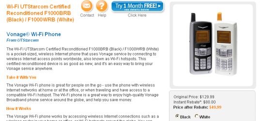
Introductory remarks (from 2007)
This document contains an exemplary report from the analysis of a few pages of vonage.com.
I have to stress that I do not usually conduct audits with the one and only information given: a
website address. The first step in almost every proceeding is context analysis. For instance, as far as
Vonage is concerned, I would have to know the following:
        What is the user profile of such website?
        How do people get to the website, what expectations do they have?
        What are the possible scenarios of use or use cases?
        What are the business goals for the website: – is it only selling through the website, or is it
        also intensification of offline sales (pop-up windows described later in this report may
        indicate that there are also other goals).
If a website belongs to some exotic market, I also have to get to know this market first.
Without that knowledge we can't assess the organization of the homepage, the structure of
information, nor the choice of content on specific pages. And basing only on knowledge about the
Polish Internet telephony market might lead to entirely wrong conclusions.
Even if we compare the homepages of the 3 English versions of the website: http://www.vonage.com
, http://www.vonage.co.uk and http://www.vonage.ca - we will see that each of them is organized in
a different way, though the services and products are quite similar. This suggests that certain
assumptions regarding the nature of the markets may have been taken into consideration.

So, what's in this report?
I tried to focus on the parts of the website which can by analyzed without specific knowledge of the
Internet telephony market in the United States.
For analysis of usability issues I chose the “Products” page and the individual Products pages. I
couldn't use my default methodology of "cognitive walkthrough", because I had too little knowledge
to prepare trustworthy user profiles or scenarios. So I confined myself to static "heuristic review",
which is much simpler and less time-consuming.
During my analysis I didn’t find any “three stars” problem. After a few hours’ work I cannot say that
there are any issues severe enough to spoil the business aims of the website.
To look at accessibility problems I analyzed the homepage. Only a few issues have been recognized.
When doing full audits I check the whole website against WCAG guidelines.

ROBERT DRÓZD – WEBAUDIT.PL                                                                          PAGE 2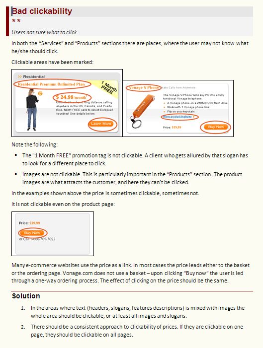
Table of contents
Usability problems
  Bad clickability ................................................................................................................................5
  Use of specialist language without explanation ...............................................................................6
  No contact customization ...............................................................................................................7
  No zoom facilities for product images .............................................................................................8
  The same title of all pages ...............................................................................................................9
Accessibility problems
  No ALT text for almost all images .................................................................................................. 11
  Pop-ups not secured against anti-popup blockers ......................................................................... 12
  Poor homepage performance on limited bandwidth ..................................................................... 13
  The homepage is too heavy........................................................................................................... 14
Appendix
  Pingdom Tools report.................................................................................................................... 16

ROBERT DRÓZD – WEBAUDIT.PL                                                                                                                  PAGE 3
How to read usability reports?
                                 Problem name.

                                 The importance of the problem for the
                                 website:
                                 ***   - has to be corrected; a critical
                                 problem, that may make a customer leave
                                 the website. Severe business consequences
                                 may follow.
                                 ** - should be corrected, a significant
                                 problem, annoying, though not critical
                                 * - may be corrected, a minor problem
                                 related to user experience

                                 What that problem means to the user.

                                 Detailed problem description.

                                 Ways to solve the problem.

ROBERT DRÓZD – WEBAUDIT.PL                                       PAGE 4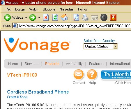
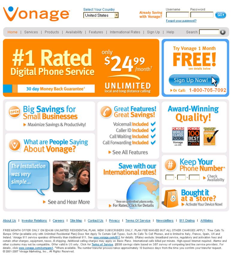
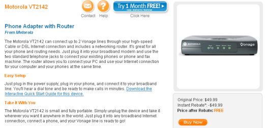
Bad clickability
**
Users not sure what to click
In both the “Services” and “Products” sections there are places, where the user may not know what
he/she should click.
Clickable areas have been marked:
Note the following:
The "1 Month FREE" promotion tag is not clickable. A client who gets allured by that slogan has
to look for a different place to click.
Images are not clickable. This is particularly important in the “Products” section. The product
images are what attracts the customer, and here they can’t be clicked.
In the examples shown above the price is sometimes clickable, sometimes not.
It is not clickable even on the product page:
Many e-commerce websites use the price as a link. In most cases the price leads either to the basket
or the ordering page. Vonage.com does not use a basket – upon clicking “Buy now” the user is led
through a one-way ordering process. The effect of clicking on the price should be the same.
Solution
1. In the areas where text (headers, slogans, features descriptions) is mixed with images the
whole area should be clickable, or at least all images and slogans.
2. There should be a consistent approach to clickability of prices. If they are clickable on one
page, they should be clickable on all pages.
ROBERT DRÓZD – WEBAUDIT.PL PAGE 5
Use of specialist language without explanation
**
Users don’t like to feel stupid…
The “Products” section begins with the tip: “Start your Vonage service by choosing a phone or router
that's right for your needs.”

I understand that vonage.com is targeted towards home and small business users. Typical users
usually have little specialist knowledge from the field of technology and they may ask “what is a
router anyway?!”
The site does not offer immediate explanation. Yes, there is a Glossary in the Help section:
http://www.vonage.com/help.php?category=68&nav=68, but chances are that customers will not
look for help – they will just look for another Internet telephony supplier.

Solution
The terms from networking and telephoning industry which are not widely used should be explained
immediately. This can be an underlined word, like this:
Start your Vonage service by choosing a phone or router that's right for your needs.
After placing the mouse cursor over the word (or clicking it), a pop-up with glossary term would
appear.

ROBERT DRÓZD – WEBAUDIT.PL                                                                         PAGE 6
No contact customization
*
A customer is forced to take additional, often unnecessary steps
There’s an easily noticeable “Contact” button on the top of each Product page.

A user would expect that upon clicking the button he/she will be able to ask a question concerning
the current product. Unfortunately, what happens is that a generic “Customer care” wizard appears:

What is striking, the user can’t even ask about the product he saw a while ago. There’s no good topic
choice for product features.

Solution
Customize customer care wizard to show the help topics which are relevant to the current page. In
this case – all the topics that concern phones and generally products.
General topics (as “service cancellation”) should be proposed as a secondary option.
Customer care wizard would require a deeper analysis.

ROBERT DRÓZD – WEBAUDIT.PL                                                                      PAGE 7
No zoom facilities for product images
*
Lack of additional information
Product detail pages feature big and professional product photos.
They lack an option to see larger images after clicking on an image.

As stated in the previous point, a part of Vonage target group are home users. Typical home users
may simply choose devices according to their look.

Solution
All such photographs should be possible to enlarge. There should be more images showing each
product, for instance close-ups and photos taken from various angles.
There are only a few products sold at vonage.com, so providing additional images should not pose a
big difficulty.

ROBERT DRÓZD – WEBAUDIT.PL                                                                     PAGE 8
The same title of all pages
*
Complicated bookmarking and saving of the pages.
Each product page has the same title as displayed in the browser bar.
For instance, the page for product VTech IP8100 - Cordless Broadband Phone
http://www.vonage.com/device.php?type=IP8100&refer_id=WEBPR0706010001W1

This may lead to a few minor usability problems:
    1.   Customer adds the page to his or her favorites/bookmarks – the default suggested name for
         the bookmark is not “VTech IP8100” but “Vonage – A better service for less”. It is OK if only
         one page is added. If a user adds another page – it will have the same name in the
         Bookmarks.
    2.   The customers who choose to save the phone information page on their hard drive will see
         only the generic name of the webpage as the name of the file.
    3.   That generic page name will also appear in search engines results. In the following example
         the title does not state clearly that it is related to this particular model only.

Solution
Provide a meaningful page title for all products pages.

ROBERT DRÓZD – WEBAUDIT.PL                                                                       PAGE 9
Accessibility problems
The meaning of the star grades in accessibility report is similar to that of usability report.
*** - has to be unconditionally corrected
** - should be corrected
* - may be corrected
The number of stars is not related to possible business consequences; it is a result of comparison of
two factors:
1. The weight of accessibility problem;
2. The number of potential website users that may be affected by this accessibility problem.
Three stars would appear only in two cases:
1. the content or functionality is completely inaccessible in certain situations (e.g. the website
breaks the WAI guidelines on the A level);
2. the accessibility problem applies to large groups of users;
Needless to say, this particular website has a plethora of accessibility problems. It is not adapted at
all to be used by screen readers. Also the code is erroneous, a simple W3C check returns over 100
errors. Here I focused on the load time analysis and the problems which directly affect user
experience.
ROBERT DRÓZD – WEBAUDIT.PL PAGE 10No ALT text for almost all images
**
Affects people who have slow connections, turn off images or use screen readers
The homepage is composed of image blocks which indicate various offers.
Almost none of these images has been accompanied with alternative text, which could be used to
discern their meaning when the image is still being loaded or when viewing of images is completely
switched off. Images without ALT have been outlined:
Solution
The image blocks on the homepage are shown as CSS backgrounds for links which encompass the
whole block.
The Website developers:
should add an ALT text for the image inside every link
can use one of the CSS “Image replacement techniques” to place the text for users who turn off
styles:
o http://kryogenix.org/code/browser/lir/
o http://www.stopdesign.com/articles/replace_text/
ROBERT DRÓZD – WEBAUDIT.PL PAGE 11Pop-ups not secured against anti-popup blockers ** Users of all the modern Internet browsers won’t see the pop-up After clicking “Buy now” in the products area the user is redirected to the first stage of ordering process. The website tries to open a pop-up with an internal advertisement. Current modern browsers have built-in blocker for such pop-up windows. This applies to: Internet Explorer 6 under Windows XP SP2 (with all updates) Internet Explorer 7 Mozilla Firefox (at least since version 1.5) So, in the beginning of the ordering process the customer will see only the message that pop-up has been blocked. By the way, the rationale for choosing a pop-up content is questionable. User has just entered an online ordering process – and the pop-up: is not clickable! advises to call the number, i.e. to turn to a completely different sales channel. Solution If there is a solid reason for using pop-ups, various techniques can be used: A pop-up window which opens by means of one of the available anti-blocker tricks. I can provide some of them if needed. There is no 100% effective technique, though. Using top-layers, i.e. pop-ups that are hidden inside the HTML code and managed through CSS. In this particular case it seems to be reasonable not to use pop-up windows. The first stage of ordering process does have a room for placing internal advertisement directly on the page. ROBERT DRÓZD – WEBAUDIT.PL PAGE 12
Poor homepage performance on limited bandwidth
*
Users using dial-up or mobile connections wait too long
On the T1-standard bandwidth (1536kbit/s) the homepage loads in 5-7 seconds, which is a good
result.
I have evaluated the homepage performance on limited bandwidth:

Connection speed                            Internet Explorer 6                         Mozilla Firefox 2

512kbit                                     8 sec.                                      11 sec.
128kbit (the slowest DSL or                 24 sec.                                     34 sec.
dual-channel ISDN)
56kbit (GPRS, dial-up)                      56 sec.                                     88 sec.

Measurements were taken in a natural work environment (e-mail client in the background) with
bandwidth limiting software. The browser used was Internet Explorer 6 with emptied cache. An
average from 3 samples was computed.
Measurements taken with Mozilla Firefox showed generally slower performance (even by 40%).
According to OneStat.com, Firefox share in the U.S. is now reaching 20% so this browser also has to
be taken into consideration.
(Data from June 2007, see: http://www.onestat.com/html/aboutus_pressbox53-firefox-mozilla-browser-market-share.html)

Conclusion
The target group for the Internet telephony are users with broadband connection. This is why this
issue is not highly significant.
Still, a detailed page weight analysis (see below) showed that there’s room for improvement in
loading times for users who might just check out the offer using slower connections.
Note that the website does not state clearly what the minimal speed they require for their telephony
services. I do not mark it as a problem, because I don't know what is considered "broadband" in the
U.S.

ROBERT DRÓZD – WEBAUDIT.PL                                                                                             PAGE 13
The homepage is too heavy
*
Long waiting time for the page to show up under slow connections
The homepage of vonage.com is composed from the following elements:

Element                                              Size (kB)

HTML source                                          52 kB
including style blocks (CSS)                         22 kB
including script blocks (JavaScript)                 13 kB

Images                                               150 kB
External scripts                                     72 kB
External styles                                      none
Total:                                               274 kB

Measurements were taken manually and using the Pingdom Tools website. See Appendix for detailed
report.
I’ll outline possible ways to optimize the size of these elements.

HTML Source
Reducing the size of HTML source is particularly important. The page structure is based on tables.
This means, some browsers (Internet Explorer among them), would not show anything before
loading full HTML source. A blank area would only appear.

This may take up to 9-10 seconds on dial-up and mobile connections (56kbit).
In HTML source there is only 17kB of plain HTML. It extensively uses inline styles:

Most of these styles can be converted to cascading style sheets and placed outside the page. This
would save about 2kB in page size.

ROBERT DRÓZD – WEBAUDIT.PL                                                                     PAGE 14
Style blocks – there is 22kB of CSS in the source, which is more than actual content takes! To make
things worse, these styles are repeated in the source of each page.
The styles should be moved to an external style sheet, which would be loaded only once. This would
speed up the whole site.
Javascript blocks – there are only a few scripts that have to be embedded into the source (such as
web statistics on this particular website). The other ones should also be removed from the source
and moved into an external javascript file. This can save about 6-7kB.
All in all, the suggested changes should reduce the HTML source by 60%, from 52kB to about 21kB.
On mobile and dial-up connections this would reduce the “waiting-for-anything” time from 9 to 4
seconds.
A long-term suggestion is to rewrite the template for the website in a modern, standard-compliant
way:
separating content from presentation
removing tables
This would generally both reduce the size and speed up the rendering of the page.
Other elements
Images are generally well optimized. Certain savings can be obtained on the biggest ones, for
instance – the slogan on the main page is actually a GIF animation.
This could be cut into three separate images, only one of which would be animated.
External scripts – two full libraries of 48kB and 15kB are loaded – both only once during the website
visit. I didn’t analyze them thoroughly, but there is always an option to use a software which
compacts the javascript code.
For instance the tool from http://www.cfoster.net/jscrunch/ reduced the prototyp.js file from 48kB
to 46kB. There’s no big gain here.
Solution
To sum up the recommendations above:
1. move blocks of CSS from the source to an external file
2. move blocks of JS from the source to an external file
3. remove inline CSS where possible
4. consider rewriting the code in a way which would separate content from presentation
ROBERT DRÓZD – WEBAUDIT.PL PAGE 15Appendix Pingdom Tools report The report shows how fast the homepage elements were loaded and what their size was. ROBERT DRÓZD – WEBAUDIT.PL PAGE 16
You can also read