From decoration to industrial design: Gio Ponti and color in architectural innovation - Color Culture ...
←
→
Page content transcription
If your browser does not render page correctly, please read the page content below
67

From decoration to industrial design:
                                                                                                                                                    1
                                                                                                                                                     Michela Rossi
                                                                                                                                                    michela.rossi@polimi.it
                                                                                                                                                    1
                                                                                                                                                     Giorgio Buratti

Gio Ponti and color in architectural                                                                                                                giorgio.buratti@polimi.it
                                                                                                                                                    [corresponding author]

innovation                                                                                                                                          1
                                                                                                                                                     Department of Design,
                                                                                                                                                    Politecnico di Milano

ABSTRACT
Gio Ponti (1891-1979) was one of the first Italian architects who actively dealt with
industrial design, combining the classical tradition of craftsmanship with the request
for modernity. Mainly known for his work as an architect, he was also a painter
and decorator and he paid attention to colour throughout all his life, promoting its
importance in all of the sectors of design through his educational journal activity.
This paper focuses on the role of colour in Ponti’s work, “surveying” his complete
collection (1941-47) Lo “Stile” nella Casa e nell’Arredamento, also known as “Stile”,
the magazine he created after his disagreement with the publisher of “Domus”, a
previous periodical he had directed since its foundation in 1928 and continued to
direct after Stile’s closure. The purpose is to verify the consistency between the
role of colour in Ponti’s design work and his writings. He began his professional
activity decorating ceramics, where colour is substantial. Then he devoted his
activity to furnishing accessories, domestic interior and building elements, in the
significant years between World War II and the reconstruction period (1940-1959).
His educational aim was to spread a new aesthetic concept. The magazine was
addressed above all to ladies, to whom Ponti attributed a main role in characterizing
the house, recognizing their attention to art and culture besides a spontaneous
ability to create functional and elegant domestic environments where colour joins
a note of cheerfulness. The objective were different from the other contemporary
architecture periodicals and the magazine was new both in contents and graphics,
where the communicative power of drawing was enhanced through a widespread
use of colour.

KEYWORDS
Italian house, Interior design, Colour design, Colour and decoration, Ceramics and
architecture.

Received 12 March 2018; Revised 23 October 2018; Accepted 08 November 2018
CITATION: Rossi M. and Buratti G. (2018) ‘From decoration to industrial design: Gio Ponti and color
in architectural innovation’, Cultura e Scienza del Colore - Color Culture and Science Journal, 10, pp.
67-76, DOI: 10.23738/ccsj.i102018.08

Michela Rossi is full professor in the faculty of the School of Design in Politecnico di Milano (Italy), where holds the Drawing Studio in the
course of Interior Design since 2008. She graduated in Architecture (1985) at the University of Florence and gained her Ph.D. at the University
of Palermo (1993) in Architectural Survey and Representation. In 1998 she becomes assistant professor in the faculty of Architecture of the
University of Florence. In 2002 she is associate professor in the faculty of the School of Architecture of the University of Parma. She focused
her research on shape grammar and typology in the various architecture scale: first the brickwork design in west tradition; later the landscape
drawing in artificial environment; last but not least she applied to the relations between color and Architecture in design of formal structures.
Giorgio Buratti is Ph.D. in Design in the School of Design in Politecnico di Milano (Italy), where he graduated in 2000 with full marks. In the
same year he obtained his master’s degree in ergonomics and he is teacher assistant in several courses. From 2015 he is adjunct professor
in Politecnico di Milano. He focused his research on the understanding of generative algorithms and parametric modelling system to generate
articulated surfaces and high level complexity geometry. He is interested on relations between color and perception, in design development
of biological patterns and formal structures and in digital fabrication technologies.

Cultura e Scienza del Colore - Color Culture and Science | 10 | 2018                                                        ISSN 2384-9568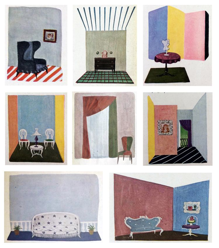
68                                           DOI: 10.23738/ccsj.i102018.08                                                            Rossi M. and Buratti G.

                                             1. GIO PONTI AND COLOUR.                                 approach toward citizens’ aesthetic education
                                                WORKS AND WRITINGS                                    with his practical design work. To this aim,
                                                                                                      a “survey” was carried out on the complete
                                             Gio Ponti was one of the most prominent                  collection [3] of the new magazine he created
                                             personalities of Milanese architecture in the            to enhance innovation in design. The purpose
                                             twentieth century. His interests ranged from             is to verify the consistency of Ponti’s design
                                             architecture and building to interior design,            work with his writings in the significant years
                                             encompassing also furniture and pottery design,          between the war and the reconstruction period.
                                             as well as other industrial products, which made         Therefore, this paper focuses on Ponti’s concept
                                             him an emblematic exponent of what would later           and on how colour interacts with design. Given
                                             become the Italian Design. He began his long             his many works, the pictures refer only to
                                             professional life as a decorator and designer first,     those fundamental for this topics. Wider and
                                             and then continued as an architect, intertwining         copyrighted documentation is provided in the
                                             ceramics due to his passion for colour.                  references or on line (www.gioponti.org).
                                             As well documented by the first retrospective
                                             exhibitions held at the end of his life and short        2. FROM CERAMIC TO DESIGN
                                             after his death, he initially expressed in ceramics
                                             the particular meaning that colour had in all of         Ponti began his professional activity decorating
                                             his works. [1] Indeed, about twenty years later,         ceramics, where colour is substantial. He then
                                             two recent exhibitions in Milan-Rome and in              devoted his activity to furnishing accessories,
                                             Turin confirmed the relationship with this art. [2]      domestic interior cladding and building
                                             Alongside his successful design activity, he was         elements. For over 50 years, Ponti designed
                                             involved in publishing and teaching, spreading           all types of ceramic products for the house:
                                             a new concept of design, with the aim to renew           furnishings, kitchenware, covering materials
                                             the renovation of architecture and design.               and sanitary fixtures, as evident from the
                                             Owing to a general recognition of his relevance          chronology of his works (Figure 1). He always
                                             in innovating Italian architecture and developing        mediated his interest between the decorative
                                             Italian Design, Ponti’s entire work is known             value of the material and the design rationality
                                             and well documented. It needs no further                 of its industrial production. In fact, ceramics
                                             presentation. A wide literature covers different         have an implicit reference to decoration, which
                                             design topics starting from his debut in the             in 1893 Alois Riegl defined as “one of the most
                                             1920s as artistic director of Richard-Ginori up to       basic needs of man,” even stronger than the need
                                             his death in 1979, and his daughter’s complete           to protect one’s body. The same decoration idea
                                             biography as well as the latest one (Rostagni            is evident in the design and colour that follow
                                             2016). Ponti’s written heritage is well witnessed        the surface plastic articulation of the objects
                                             by his important editorial work that emerges in the      without betraying the form. Therefore, Ponti
                                             two journals he founded and directed: “Domus”,           chose these objects as a field of experimentation
                                             created in 1928 and still ongoing, (Miodini), and        in the search for a balance between the values
                                             “Lo “Stile” nella Casa e nell’Arredamento”, better       of tradition and the need to promote the renewal
                                             known by the later title “Stile”. Ponti edited the       of society through taste, lifestyle and innovative
                                             latter for a shorter period of time, from 1941 to        production systems.
                                             1947, during the war and the first reconstruction        Despite his passion for this art - which already
                                             period, when he disagreed with the publisher of          Camillo Boito indicated as a national excellence
                                             “Domus”, the previous periodical he had directed         with prerogatives capable of enhancing
                                             since its foundation and continued to direct after       traditional products - Ponti was never a
     Figure 1 - Chronology. The chart        Stile’s closure. (Martignoni 2002).                      ceramist in the true sense of the term. His
     shows how, during his career Gio
                                             This paper aims to broaden previous research             work emphasizes the designer as a catalyst
     Ponti, transformed ceramics from
     traditional to industrial products,     (Rossi, Mele and Iarossi 2015; Rossi and Buratti,        for innovating customs in the production
     merging the decorative value with the   2016 and 2017) on the role of colour in Ponti’s          system. In the first phases of the Italian design,
     planning rationality                    professional activity by comparing his critical          he transformed the elements of decoration,

                                             ISSN 2384-9568                    Cultura e Scienza del Colore - Color Culture and Science | 10 | 2018 | 67 - 76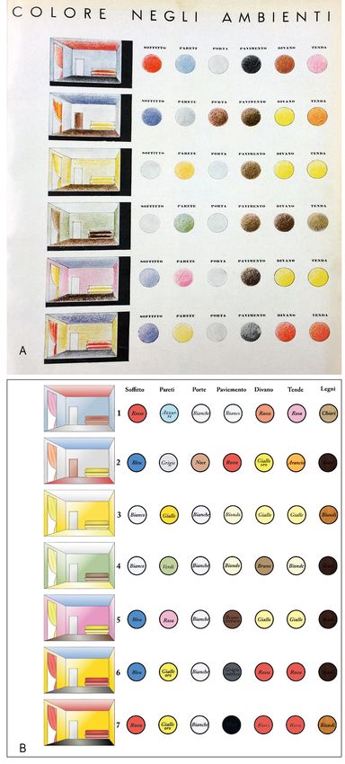
From decoration to industrial design: Gio Ponti and color in architectural innovation                                                                        69

namely sign and colour, into two fundamental                    “quello che si fa oggi, con la tecnica di oggi,
project parameters. Indeed, Ponti led this                      per l’uso di oggi… perché l’arte decorativa
ancient and traditional art from craftsmanship                  non è il disegno fatto su un piatto, ma la
to industry, inventing prefabricated architectural              forma, la qualità, la destinazione stessa del
components and home pottery suitable for                        piatto ed infine la sua presenza nelle nostre
industrial production lines.                                    case”.
From this viewpoint, also the collaboration                     [“what you do today, with today’s technique,
with Richard-Ginori is exemplary. From 1923                     for today’s use ... because decorative art is
to 1930, Ponti was the art director of this                     not the drawing done on a plate, but the form,
age-old factory, still stuck in its eighteenth-                 the quality, the destination of the dish itself
century historical models as it was founded                     and finally its presence in our homes”.] (Ponti
in 1737 in Doccia, near Florence. In 1922                       1929)
Augusto Richard, who felt the need to renew the
production system, called Ponti for an unofficial           Colour replaced decoration with new qualities
collaboration and asked him to re-launch the                as a result of the modern industrial processing.
brand by modernizing the company’s repertoire,              It became the variant that diversified the high-
taking care of luxury porcelain and majolica                quality industrial product. The new productions
furnishings. Ponti designed a new series for                were characterized by vivid blue, red, green and
the “Exposition Internationale des Arts Décoratifs et       yellow backgrounds, on which decorative motifs
Industriels Modernes” (International Exhibition             stood out in a more neutral colour, according to
of Modern Decorative and Industrial Arts) in                an apparently random program that suggested
1925 in Paris, developing the ornament and the              the idea of a unique piece (Figure 2).
colour programme for some sets of decorated
objects with the aim to enhance the company’s               2.1 ARCHITECTURAL DESIGN
catalogue. The new products were designed                   In 1931 the theme of ceramics intertwined with
with the purpose to be realizable on commission             interior decoration on the walls of the canteen
or in small series after the exhibitions, with              of Palazzo Mezzanotte in Milan, which hosts the
the idea of developing an industrial production             stock exchange, and of the Tavern of the Monza
afterwards. Owing to the Expo, Ginori’s new                 circuit. (Miodini 2001). In fact, the two buildings
wares had an unexpected success with public                 are characterized by a rich ceramic decoration
and critics. In fact, the organizing committee’s            with figurative images. They are hand-painted
jury awarded the Grand Prix to the Italian firm,            in red, brown and gold on an ivory background,
confirming Ponti as an innovator capable of                 showing big pictures on 14x14 cm tiles (Rotti
changing craftsmen’s old skills into modern                 2004). Colour is an original and exclusive
industry, redeveloping tradition in Industrial              feature of craft decoration, but Ponti’s new use
Design.                                                     of a ceramic coating on the interior finishing of
                                                            an elegant hall, such as marble and mosaics,
According to Ponti, modernity had to do with                opened the way to the widespread use of

                                                                                                                    Figure 2 - From crafts to
                                                                                                                    design. Colour and shape become
                                                                                                                    interchangeable parameters to
                                                                                                                    optimize a newly conceived industrial
                                                                                                                    production. Ponti chooses fifteen
                                                                                                                    shades of color to obtain a notable
                                                                                                                    product diversification, improving the
                                                                                                                    commercial possibilities.

Cultura e Scienza del Colore - Color Culture and Science | 10 | 2018 | 67 - 76                     ISSN 2384-9568
70   DOI: 10.23738/ccsj.i102018.08                                                            Rossi M. and Buratti G.

     ceramics in architecture, at the time uncommon           2.2 DOMESTIC INTERIORS
     in the Italian tradition. (Portoghesi, Pansera           In interiors, Ponti considered colour as a
     1982, Bojani 1987).                                      main feature of the house. However, colour is
     Between the 1950s and the 1960s Ponti                    extraneous to the real substance of architecture,
     also reinvented the coating of façades with              which is colourless as it is the art of composing
     ceramic tiles in a fruitful relationship with the        volumes (Ponti 1957). This clarification, written
     industrialization of architecture, using smaller         in mature age, recalls Le Corbusier’s statement
     tiles with a smooth surface and angles reflecting        and recognizes areas in which colour becomes
     the light in different ways. In fact, soft shades        important and must be used correctly. His
     of green, blue, brown and pale grey interact             notes on the use of colour are found in “Amate
     playfully with the landscape depending on the            l’Architettura,” which may be considered as a
     weather, because of the natural colour of the            cultural will confirming the ability to distinguish
     sky. In 1956 he designed diamond tiles for Joo           the peculiarities of the different scales which
     Ceramiche, creating a covering that changes              contributed, in a fifty-year-long activity, in
     colour when reflecting the light, and which he           defining the autonomy of Interior Design from
     then applied on the façades of many buildings            Architecture. (Ponti 1957)
     in Italy and abroad: Villa Diamantina in Caracas         Ponti was a great populariser, one of the first
     (which owes its name to the shape of the                 to realize that education to style could be
     coating tiles), the San Carlo Hospital in Milan,         important in affirming an architecture capable of
     the Cathedral of Taranto, and the Montedoria             interpreting the needs of contemporary society.
     Building in Milan, which randomly alternates             The article “The colours in furniture,” published in
     four types of emerald green tiles, obtaining a           Corriere della Sera (Ponti 1933), well describes
     vibrating effect on the surface of the façades.          his idea of colour in domestic spaces. Some
     In the same period, he designed an innovative            months after the presentation in “Domus”, he
     set of sanitary ware for Ideal Standard, the             addressed the wider public of the main Italian
     main Italian producer, abandoning the classical          newspaper with the same approach and similar
     previous shape for a new design, linked to               indications, and with small differences in the
     functionality, which achieved an unprecedented           choice of colour and combinations. (Rossi,
     commercial success. [4]                                  Buratti 2016). The comparison with what stated
     In the following years, he invented an external          later in the pages of “Stile” allows to verify his
     coating with enamelled pebbles reinterpreting            evolution over time. In fact, colour as a central
     the traditional Ligurian flooring. Presenting this       issue is emphasized in the magazine founded
     new ceramic product in “Domus” No. 328, he               by Ponti, which he directed (with the exception
     explained that Architecture had simplified its           of the last year) and published from 1941 to
     surfaces, while covering them with incorruptible         1947 in the years of the war, a period marked
     materials, because plasters age badly, especially        by a radical change in society, customs, and
     in cities where the air is polluted. Therefore, they     therefore interior design. The magazine slowly
     required glossy materials washable by rain.              changes its approach toward design issues,
     Moreover, he designed the surface of the tiles to        first adapting to the war situation, then thinking
     acquire plastic values and to give lightness and         about the following reconstruction period. Ponti
     grace to the huge volumes of modern buildings            reversed the narrowness of the moment, with an
     through the reflections of light and the sky (Ponti      architecture that was forced to live on projects
     1957).                                                   without construction in order to disseminate the
     For Ceramiche Sant’Agostino, Ponti renewed               modern taste. Moreover, he prepared the ground
     the catalogue with several geometric designs             for his post-war affirmation (Martignoni 2002).
     in three blue or green tones. In Hotel Parco dei         With regard to colour, the architect stated
     Principi in Sorrento he paved more than one              that the choice of in house decor reflected
     hundred rooms with different combinations and            people’s temperament and autonomy or their
     ever-different designs (Ponti 1964). A similar           dependence on prejudices and fashion. In
     solution in green was used in the rooms of               fact, he suggested that the choice of interior
     Parco dei Principi in Rome. The ceramic gives            decoration is very personal and enlivened by
     a luminous identity to the interiors, highlighting       the presence of bright colours. Colours are a
     the choice of a single colour in several shades          gift that put blood in circulation and a typical
     as an element capable of unifying spaces. About          and revolutionary element of today’s lifestyle
     ten years later, the ceramic floors of Salzburger        of which Italians have never been afraid. He
     Nachrichten’s offices were a hymn to colour,             continued by providing several indications for an
     thanks to the abstract geometric composition             autonomous choice with a correct distribution,
     that fit to the irregular shape of the rooms’            illustrating seven different possibilities of
     floors, combining tiles with different colours and       juxtaposition on the different elements of a room,
     patterns.                                                as if they were musical chords. Ponti argued that
                                                              the blank spaces of walls lend themselves to a

     ISSN 2384-9568                    Cultura e Scienza del Colore - Color Culture and Science | 10 | 2018 | 67 - 76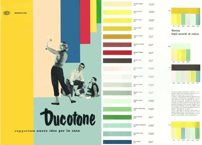
From decoration to industrial design: Gio Ponti and color in architectural innovation                                                            71

                                                                                                         Figure 3 - Colour in interior
                                                                                                         environments. Ponti’s proposal of
                                                                                                         chromatic harmonies between the
                                                                                                         different elements that define living
                                                                                                         spaces. The image A is from Domus
                                                                                                         1933, n. 61, p. 23, while image B
                                                                                                         is the author’s reworking based on an
                                                                                                         article published in the same year in
                                                                                                         Corriere della Sera.

Cultura e Scienza del Colore - Color Culture and Science | 10 | 2018 | 67 - 76          ISSN 2384-9568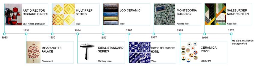
72 DOI: 10.23738/ccsj.i102018.08 Rossi M. and Buratti G.
well-orchestrated play of colours, in which also widen distances and create discomfort, because
the ceiling participates. Indeed, for the latter, he the limits of the walls are imperceptible and one
suggested striking colours, while proposing very feels lost like on the pack. He also advised for
light colours in the entrances and corridors and the floor and the ceiling not to be both light or
fresh and energetic colours in the rooms, inviting dark, suggesting “a direction from light to dark”: a
readers to dare bold combinations. For studios black floor is a lake on which things float, while
and small rooms, he recommended intense a light floor supports them; a coloured linoleum
colours, while for the kitchens blue and yellow. floor is like a lawn and requires a light ceiling.
The result is a different colour for each room, Architecture is achromatic, but its interior lives
where the combinations between the different through colour. (Ponti 1957)
rooms offer a harmonious composition like the Between the two writings of 1933 and 1957, there
palette of a painting. A very similar scheme, with is the happy parenthesis of “Stile”, characterized
only six colours and six elements, had already by an elegant graphic image, lightened by fresh
appeared in “Domus” (Figure 4) (Ponti 1933). drawings and with colour accompanying the
Years later he returned to the use of colour in illustrations (Figure 3). The magazine differs from
interiors design in his considerations published in its competitors for its cultural approach, open
“Amate l’architettura,” claiming that a white ceiling to costume and other arts: painting, sculpture,
is a void and needs to be closed by coloured cinema, but also cooking, gardening, table
walls, and accentuated by an intense coloured equipment, literature and music. Moreover, and
floor. The ceiling covers the room like a lid, it is above all, it differs for the fact that it addressed
its sky. Therefore, it can be dark, intense and ladies. Ponti recognized the latter’s intellectual
ornate, because it becomes a page to read while vivacity and cultural interest superior to that of
fantasizing. The sky closes in, while fog or snow their husbands, prompting them to take charge
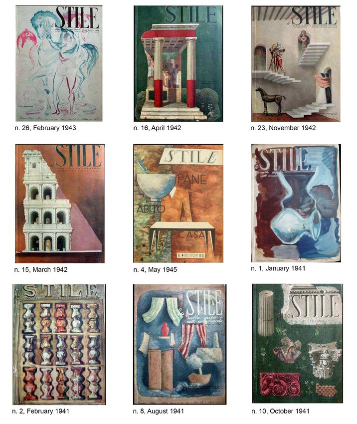
Figure 4 - Magazine Stile. Some of
the 68 issues studied for this article.
Gio Ponti directs the magazine from
1941 to 1947 (year of closure),
practically taking care of everything:
from page-setting, cover design,
to columns, often signed with
pseudonyms (photos by the author,
Politecnico di Milano, Central Library).
ISSN 2384-9568 Cultura e Scienza del Colore - Color Culture and Science | 10 | 2018 | 67 - 76From decoration to industrial design: Gio Ponti and color in architectural innovation 73
of their education in art and of their taste for the or instrument of our life and of our charming
formal concepts of modernity. (Ponti, 1957) house.”]
3. “STILE”, COLOUR IN INNOVATING The pages offer many references to colour,
ITALIAN LIVING which was covered in depth throughout the
entire period of the publication.
Between the two writings of 1933 and 1957, In the article “La casa colorata da nuovi tessili” (The
there is the happy parenthesis of “Stile”. The house coloured by new textiles) (Ponti 1941), the
magazine was founded, directed and published author invites readers to free themselves from
by Ponti from 1941 to 1947, during the years that any prejudices and suggestions of “cerebrals
marked a radical change in society, customs, origin,” which lead to use pearl-grey shades,
and therefore in interior design. It differed from pale greens, hazel brown and violet. He also
its competitors for its cultural approach, which refuses the “millinery” suggestions deriving from
was open to costume and other arts: painting, the combinations of cubist paintings that used
sculpture, cinema, but also cooking, gardening, “stronger” colours, such as brown (rather tête-
table equipment, literature and music. It was not de-nègre) with white and blue (Picasso) and
addressed to the selected public of architects, Barolo red (Ponti 1941).
but to who Ponti developed a chromatic code that re-
proposed a notion of clarity and simplicity. It was
“non separa arte e arti, per far cogliere le consistent with the contemporary technologies,
parentele fra le moltissime cose che sono but it also symbolized the change in progress:
espressione, ornamento o strumento della
nostra vita e della nostra incantevole casa”. “Se noi siamo sempre dichiaratamente per
[“does not separate art and the arts, to la casa colorata, anzi vivamente colorata,
understand the relationships among the noi lo siamo ora per un’altra ragione e per
many things that are expression, ornament altri colori. Siamo per la casa colorata perché
Figure 5 - Color and patterns.
Study of the relationship between
the walls and the furnishing elements
(from “The house coloured by new
textiles”, Stile, 1941, n. 11).
Cultura e Scienza del Colore - Color Culture and Science | 10 | 2018 | 67 - 76 ISSN 2384-956874 DOI: 10.23738/ccsj.i102018.08 Rossi M. and Buratti G.
amiamo la luce, perché abbiamo schietto by dark and solid-coloured walls, the furniture
gusto per le cose squillanti e forti, e perché should be of a light colour and covered with
amiamo non più un colore, ma i colori […] il bright fabric, or of a dark colour if the walls are
mondo va verso il colore”. light solid-coloured (Figure 5). The relationship
[If we are always explicitly for the coloured between colour patterns and materials is also
house, indeed intensely coloured, now we are fundamental: if the furniture has a solid colour,
for another reason and for other colours. We the walls are to have a predominant articulated
are for the coloured house because we love colour pattern allowing the environment to be
light, because we have straightforward taste recognized. The use of the same colour palette
for the bright and strong things, and because with different relationships depending on the
we love no longer a colour, but colours [...] the environment has a special meaning. Materials
world goes towards colour] (Ponti, Corriere and textiles with bright printed patterns and light
della Sera, December 31th, 1933). and strong colours such as
His palette contained different kinds of colours “verde smeraldo, rosso barolo, blu carta
and his writings suggested how to choose, apply da zucchero, giallo oro, bruno chiaro e
and combine hues rather than stating which scuro, cobalto siano i protagonisti di queste
colours are better depending on circumstances. composizioni e concorrano tutte a creare
The same paper highlights how bicycles, nella casa un ambiente felice”
typewriters, cars and the entire developing world [“emerald green, Barolo red, robin’s-egg
of industrial products are forsaking achromatic blue, golden yellow, light and dark brown,
colours for an increasing number of different cobalt blue are the protagonists of these
nuances. The possibility of a serial production compositions and they all contribute to a
with new industrial materials, in particular happy home”]. Ponti, G. (1941)
textiles that “create colour and matter together,”
appears in the house’s colour palette through Ponti integrated the technological evolution
Figure 6 - Ducotone. Advertising contrasts and intonations of elements in the in the design process. Flipping through the
material of Ducotone varnishes: pages of “Stile”, the attention to colour as an
different rooms.
starting from the new colours that
technological innovation offers, Ponti Ponti deepened the relationship between the economic aesthetic device is evident even
studies new possible harmonies for architectural shell and the furnishing elements. in the advertisements, which promoted new
the modern home. (photo by author, Fabrics are to be harmonized with the ceiling, products highlighting the interest of architecture
Politecnico di Milano, Central Library).. playing with colour. When spaces are bounded in innovative plasters and wall paintings. During
ISSN 2384-9568 Cultura e Scienza del Colore - Color Culture and Science | 10 | 2018 | 67 - 76From decoration to industrial design: Gio Ponti and color in architectural innovation 75
World War II, the finishing of interior surfaces capable of changing the image of houses in an
changed: cement plaster progressively replaced immediate, cheap ant therefore effective way.
lime plaster and new materials with different The magazine’s graphic layout also stresses
optical and chemical characteristics blended in his personal search for colour. The journal
with mineral pigments and traditional binders. seeks the reader’s interest through drawings
Also the type of light and interior luminaires and vivid colours, which were instrumental for
changed (Jean 2013). focusing the readers’ attention on the content
After the war, reconstruction pressed and the of a page. Pure primary colours characterize the
industry answered with innovation. The last background of technical drawings, otherwise too
years of “Stile” coincided with the introduction much addressed to a specialist audience, while
of new technologies in the construction sector pastel shades complete the lively illustrative
by international chemical companies such as drawings of the columns, such as the one edited
Keim or Du Pont. [5] They opened branches and by Lina Bo Bardi and Giuseppe Pagano.
laboratories in different countries, distributing Ponti was not a ceramist. He approached
their products on a huge scale. Following Ponti’s ceramics as a designer, developing decoration
innovation task, Architecture experimented and shape by designing industrial products
new materials with different applications, while with innovative features fitting the needs of the
advertisement acted as a technical updating. modern living. He stated that his works were “not
Paints developed for the automotive gained the works as a ceramist, but design for ceramics.” The
building industry as they were easy to use, quick early experience in ceramic design permeated
in drying and not necessarily requiring technical his entire work, influencing his global approach
experience. to colour, industry and architectural innovation.
Around the end of the war, Duco’s nitrocellulose Therefore, on the one hand, the designer applied
paint produced by Du Pont was advertised in colour to industrial products as a means for
“Stile” with different slogans, recalling the war variation; on the other hand, the architect
and reconstruction background (Rossi Buratti applied colour to his interior projects and façade
2016). The stable presence of Duco paints cladding, promoting the dissemination of new
highlights an innovative value in providing products and materials. Indeed, design, industry
information to readers. In fact, advertisements and colour enter into construction sites with
not only celebrated the product’s qualities, but reinvented products to meet contemporary
they also provided information on the product, needs. Ceramics are freed from the handmade
illustrating the colour of the new paints and and decorative component of the single
their proper use according to surface materials, piece and the unique design highlighting how
finishing textures and exposure conditions industrial standardization allows designers to
(Figure 6). Hence, they rather celebrated the role be free to combine design and colour. “Stile”
of design in the power of industry. witnesses how colour is the fil rouge of Ponti’s
design work.
4. CONCLUSION.
COLOUR AND DESIGN In this paper Michela Rossi handled Gio Ponti
chromatic production in ceramics, Giorgio Buratti
Gio Ponti’s writing activity and his long has deepened the use of colour in industrial
professional work as a designer document a production and interior design. Both authors
constant attention to colour, conceived as an studied the writings and color relationship of
intrinsic element of design (Ponti 1990) and Domus and Stile magazines from 1933 to 1943.
industrial product. With “Stile”, he focused on
women’s attention to the importance of colour FUNDING
in home interior, conceiving home decoration
as a lady’s personal expression, as dresses are This research did not receive any specific grant
in fashion. On the other hand, his work with from funding agencies in the public, commercial,
ceramic art - joining shape, design and colour - or not-for-profit sectors.
stresses the importance he assigned to colour in
developing industrial design with new products CONFLICT OF INTEREST
for architecture and interior.
Ponti got rid of the “fake old” and the “ugly The author declares that nothing has affected his
modern” balancing traditional techniques and objectivity or independence in the production of
new products, with the aim to speed up the this work. Neither the author nor his immediate
dissemination of a new concept of colour in family member have any financial interest in
design, which was able to overcome craftsmen’s the people, topics or companies involved by this
hostility. The magazine “Stile” provided a article. Neither the author nor his immediate
significant example of a “wide-ranging” use of family member had a professional relationship
colour as an integration of a domestic daily life with the people and companies cited in this
Cultura e Scienza del Colore - Color Culture and Science | 10 | 2018 | 67 - 76 ISSN 2384-956876 DOI: 10.23738/ccsj.i102018.08 Rossi M. and Buratti G.
article. Neither the author nor his immediate Ponti G. (1933). “Il colore nell’arredamento”, Corriere della
family member are involved in a legal dispute Sera, December 31th.
with the people and the companies cited in this Ponti, G. (1957). “Un rivestimento per l’architettura”,
article. No conflict of interest including financial, Domus 328, p. 45.
personal or other relationship with other people
and organization within three years of beginning Ponti, G. (1957). “Amate l’Architettura”. Milano: Rizzoli
Editore. pp. 63, 80, 141.
the submitted work that could inappropriately
influence, or be perceived to influence, this work. Ponti, G. (1964). “Giochi coi rivestimenti di Salerno”.
Domus 414.
NOTES Ponti, L.L. (1990). “Gio Ponti. L’opera”. Milano: Leonardo
Editore.
[1] L’opera di Gio Ponti alla manifattura di Doccia’ in
Faenza (1977); “Gio Ponti alla manifattura di Doccia” in Ponti, G. (1941). “La casa colorata dai nuovi tessili”, Stile,
Florence (1982); “Gio Ponti Ceramica e architettura” n. 11., pag.24
(1987) in Faenza and “Gio Ponti alla Cooperativa di Imola”
(1993) in Imola. Portoghesi, P; Pansera, A. (1982). Gio Ponti alla manifattura
di Doccia, Milano: SugarCo.
[2] “Gio Ponti. Il fascino della ceramica [Fascination for
Ceramics]”, in Milan and in Rome (2011) and “Gio Ponti Roccella, G. (2009). Gio Ponti. Maestro della leggerezza.
e la Richard Ginori. L’eleganza della modernità” in Turin Colonia: Taschen.
(2016).
Rossi, M, Mele, G., Iarossi M.P. (2015). “Design as
[3] Politecnico di Milano, Central Library manifesto of Stile. Gio Ponti and representation codes
[4] Ponvas, Ponlav, Ponbid, 1954. The series of three bath for the project renewal”. Bertocci, S.; in Bini, M. (ed).
accessories sold 400,000 pieces per year. The Reason of Drawings. Tought Shape and Model in the
Management of Complexity. Roma: Gangemi.
[5] Keimfarben GmbH was the inventor in 1872 of silicate
technology and it is still one of the main paint producer; Rossi, M, Buratti, G. (2016). “Il colore nell’abitare secondo
the chemical industry Du Pont Inc., founded in 1802 as Gio Ponti. Tra guerra e ricostruzione, le pagine della
explosives and gun power factory, in first XX century rivista Stile”, in Marchiafava, V. (ed) Colore e colorimetria.
specialized in polymers with several important new Contributi multidisciplinari. Milano: Associazione Italiana
materials (neoprene, nylon, Teflon and later Lycra, Corian Colore. Vol XII A.
and many others).
Rossi, M, Buratti, G. (2017). “Di-segno, forma e colore -
L’articolazione cromatica delle ceramiche di Gio Ponti”.
BIBLIOGRAPHY In Marchiafava, V. (ed) Colore e colorimetria. Contributi
multidisciplinari. Milano: Associazione Italiana Colore. Vol
Bojani, G.C., Piersanti, C., Rava, R., (ed) (1987) Gio Ponti: XIII A.
ceramica e architettura. Firenze: Centro Di, 1987. Catalogo
della mostra a Faenza. Rostagni, C. (2016). Gio Ponti, Stile di. Milano: Mondadori
- Electa
Jean, G. (2013). “La manualistica sul colore ad uso
di architetti e imbianchini”, in La conservazione delle Rotti, L. (2004). Gio Ponti a Palazzo Mezzanotte. Milano:
policromie nell’architettura del XX secolo. Lugano-Firenze: Motta.
SUPSI| Nardini Editore. “Gio Ponti: ceramiche 1923-1930: le opere del Museo
Ginori di Doccia: catalogo della mostra”: Firenze, 19
Martignoni, M. (2002). Gio Ponti. Gli anni di Stile 1941- marzo-30 aprile 1983. Firenze: Electa, 1983.
1947. Milano: Abitare Segesta Edizioni.
“Gio Ponti alla Cooperativa Ceramica d’Imola. 120°
Miodini, L. (2001). Gio Ponti. Milano: Electa. anniversario dell’azienda. 1874-1994” (1993). Imola:
Cooperativa Ceramica d’Imola, Stampa Imolarte, 1993.
Ponti, G. (1929). “La mostra d’arte decorativa di Monza”. in Gio Ponti Archives (www.gioponti.org) (accessed 2018)
Realtà, March 1st 1929.
Ponti, G. (1933). “Colore negli ambienti”, Domus, n. 61, p.
23.
ISSN 2384-9568 Cultura e Scienza del Colore - Color Culture and Science | 10 | 2018 | 67 - 76You can also read