From GIS data sets to Cartographic Presentation - Responsible persons: Boris Stern, Helmut Flitter, Lorenz Hurni, Samuel Wiesmann - GITTA ...
←
→
Page content transcription
If your browser does not render page correctly, please read the page content below
Geographic Information Technology Training Alliance (GITTA) presents:

               From GIS data sets to
          Cartographic Presentation

Responsible persons: Boris Stern, Helmut Flitter, Lorenz Hurni,
Samuel Wiesmann
From GIS data sets to Cartographic Presentation

Table Of Content
  1. From GIS data sets to Cartographic Presentation ................................................................................... 2
     1.1. Map Presentation of GIS datasets .................................................................................................... 3
        1.1.1. Map Creation from GIS datasets within GIS ............................................................................ 3
        1.1.2. Map Layout settings with GIS datasets within GIS .................................................................. 4
        1.1.3. Map Output with GIS datasets within GIS ............................................................................... 5
        1.1.4. Map Creation with GIS datasets within CAC software ............................................................ 6
        1.1.5. Map Presentation with GIS datasets within CAC software ....................................................... 7
        1.1.6. Map Layout settings with GIS datasets within CAC software .................................................. 8
        1.1.7. Summary .................................................................................................................................... 8
     1.2. Solutions for Digital Mapping .......................................................................................................... 9
        1.2.1. What Digital Mapping is ........................................................................................................... 9
        1.2.2. Digital Mapping Specificity .................................................................................................... 10
        1.2.3. What Dynamic Mapping is ..................................................................................................... 15
        1.2.4. Software, Languages and Formats for Dynamic Mapping ...................................................... 17
     1.3. Solutions for Analog Mapping ....................................................................................................... 18
        1.3.1. GIS Paper Map Production ..................................................................................................... 18
        1.3.2. The Printing process ................................................................................................................ 18
        1.3.3. Printing Presses ........................................................................................................................ 20
        1.3.4. Raster Image Processor ........................................................................................................... 22
        1.3.5. Printed Media versus Electronic Media ? ............................................................................... 23
        1.3.6. Analog Mapping Self Evaluation ............................................................................................ 24
     1.4. Summary ......................................................................................................................................... 25
     1.5. Recommended Reading .................................................................................................................. 26
     1.6. Bibliography ................................................................................................................................... 27

http://www.gitta.info - Version from: 11.5.2016                                                                                                             1
From GIS data sets to Cartographic Presentation

1. From GIS data sets to Cartographic
Presentation
A mapmaker holds different versions of a map in his computer memory, and views them as necessary on
the screen. From these different pictures, he can consider at best 2-3 of them; this is enough to have a new
knowledge from the comparison, or to discover differences. Essential advantages of working on the screen,
are that we can get separate details out, on which to them underlying data can fall back or carry out changes
directly in the graphic or in the data. It is also possible to vary the picture construction in manifold of ways
or reshape the whole symbolisation.
Personal computers are more and more involved as publishing systems that produce maps, but also newspapers
and magazines. In this lesson, we will give you an overview of the concepts, tools and processes that are known
to print maps and other graphics well.
Learning Objectives
 •    Know what are, and how to use map templates within a GIS
 •    Know how to create and present GIS data sets within GIS and CAC software well
 •    Know what exactly digital mapping is
 •    Tell the difference between a dynamic map and an animated map
 •    Master map design for screen maps
 •    Know the software, languages and formats for effective dynamic mapping
 •    Know the main used PrePress File Format as well as the main printer characteristics
 •    Know what exactly a Raster Image Processor is

http://www.gitta.info - Version from: 11.5.2016                                                               2
From GIS data sets to Cartographic Presentation

1.1. Map Presentation of GIS datasets
Map Presentation
As we saw in the previous unit, mapping software can be divided in two types: Geographic Information Systems
(GIS) and Computer Aided Cartography (CAC) software. As a map presentation with GIS datasets consists
mainly of conveying with a mapping software some complex thematic information to the map user in an exact,
clear, and easily readable manner, this unit will introduce in the map creation process within those two mapping
software.
Thus, in this learning unit, you will learn how to create and present well GIS data sets within GIS and CAC
software.

1.1.1. Map Creation from GIS datasets within GIS
Map Creation within GIS
With GIS, it is easy to create maps to convey your message. Indeed, most GIS provide several tools to put data
on a map and display it in an effective manner. Furthermore, GIS gives you quick results without having to
read hundreds of documentation pages. Thus, if your goal is to complete your tasks while investing a minimum
amount of time and effort, mapmaking with GIS is your solution. However, as seen in the previous lesson,
most of the maps created semi-automatically within GIS are disappointing, or even false.
As for each map creation process, before you sit down to create a map, you need to think about its purpose:
 •     What do you want your map to show?
 •     Does the map need to stand on its own, or will it be part of a larger presentation?
 •     Who is the audience for the map?
 •     Etc.
Answering these questions will help you determine how to organise and present the information on your map.
You can find some further information about the map conception stage in the unit “Map Conception ” of the
lesson “Cartographic Data Representation”.
No matter what kind of map you want to make and what kind of GIS you use, you always begin the same
way, by creating a new map document. Then, you can either create an empty map with nothing on it or use a
map template as a starting point. Map templates typically contain a predefined page layout that arranges map
elements such as North arrows, scale bars, and logos. This means you just have to add your data and can then
immediately print your map. Otherwise, you have to follow the entire map creation stage.

What kind of map creation tools are provided by GIS?
Discover in the following animation the map creation tools provided by most of GIS.

     Only pictures can be viewed in this version! For Flash, animations, movies etc. see online version.
     Only screenshots of animations will be displayed. [link]

http://www.gitta.info - Version from: 11.5.2016                                                               3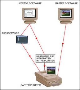
From GIS data sets to Cartographic Presentation

1.1.2. Map Layout settings with GIS datasets within GIS
Map Layout settings within GIS
GIS provides several tools to lay out your map in an effective manner. Furthermore, GIS lets you work in data
view or layout view:
 •    Data view focuses on a single data frame: useful for exploring or editing data.
 •    Layout view shows how the map page looks: useful for composing and printing a map for display. For
      example, you can change the size and orientation of the page in the layout view.

Map templates
If the map is part of a series, you may have a template to work from, or you may create a new template for the
series. Map templates make it easy to produce maps that conform to a standard, and they save time by letting
you do the layout work for all of the maps in the series at once. You can also use the map templates that come
with GIS to quickly make a map that looks good, with a minimal amount of layout work on your part. Just
choose a template that has the look you want, add your data, and make whatever changes you want, and your
map is done. Map templates make it easy to reuse the same layout or even the same data on a series of maps.
You can use the templates that come with GIS to make maps quickly. All you need to do is add data, a title,
and any other supporting information that you choose. Templates can also contain data, special symbols and
styles, custom toolbars, and macros such as Visual Basic forms and modules. GIS comes with many predefined
templates to choose from when making your maps. Also, any map you make can be saved as a template.

Example of map templates
The left picture presents you the map template as define in the GIS, whereas the right picture shows you a map
created automatically with this map template.

Map template                                             Map template example (ESRI)

Setting up the page
GIS makes it easy to change the size of the page if needed, but it is wise to have the final product in mind when
you begin designing the map. If the virtual page does not match the page size and orientation you have planned
for your map, you can change the page setup. Usually, the virtual page size is the same as your system printer
default page size, but you can set the page to be one of many standard sizes, or you can define a custom page
size for your map. You can optionally visualise the following PDF: setting_up_the_page.pdf (15 Kb) to get
more information about the possibilities of setting up your map within a GIS.

http://www.gitta.info - Version from: 11.5.2016                                                                4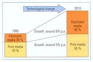
From GIS data sets to Cartographic Presentation

1.1.3. Map Output with GIS datasets within GIS
Showing the results of your work is easy with GIS. You can create great looking publication-quality maps and
create interactive displays that link charts, tables, drawings, photographs, and other elements to your data. But
also embed them in reports, publish them on the Web, export them to standard formats, or print them out to
hang on the wall.

Print a map
Once you have created a map, you will probably want to print it. But before you start the printing, it is better
to preview it in order to be sure that the map page and printer page sizes are correctly matched. If you want to
print a map that is not set to be the same as the printer page size, there are two scenarios:
 •    If the map is smaller than your printer page size, go ahead and print or choose a smaller page size on
      your printer.
 •    If the map is larger than the printer’s default page size, you have several options. You can change the
      page size of the printer, change the printer that you’re using, or change the page size of the map.

Export a map
Once you have created a map, you may want to export it from a map document to another file type. You can
export maps as several types of image files. These include:
 •    EMF (Enhanced Windows Metafiles) are Windows native vector, or vector and raster, graphics. They
      are useful for embedding in Windows documents because they can be resized without distortion.
 •    BMP (Windows Bitmap) files are simple, native Windows raster images. They do not scale as well as
      EMF files.
 •    EPS (Encapsulated PostScript) files are primarily used for vector graphics and printing.
 •    PDF (Portable Document Format) files are designed to be consistently viewable across different
      platforms. They are commonly used for distributing documents on the Web.
 •    JPEG (Joint Photographic Experts Group) files are compressed image files. They are commonly used
      for images on the Web because they are more compact than many other file types.
 •    Etc.

GIS Export Functions
Find below a screenshot of the export functions from a GIS. This screenshot shows you the export format
possibilities.

http://www.gitta.info - Version from: 11.5.2016                                                                5
From GIS data sets to Cartographic Presentation
GIS export functions example
1.1.4. Map Creation with GIS datasets within CAC software
As we have seen it in the lesson “Mapping with GIS and Cartographic Software”, the CAC software, which are
the ideal and optimal software for high-quality mapping, do not allow the intrinsic use of GIS datasets. You
need some special, and sometimes very expensive, plugins to allow spatial data files to be used to create maps
inside these vector graphics programs. These plugins allow all cartographic tasks to be performed where they
should be done, in a powerful graphics environment. Find below two examples of such plugins:
• Mapublisher from Avenza: http://www.avenza.com/mapublisher
• GIS data publishing with Lorik-Sotware: http://lorienne.com/en/portfolio-item/gis-data-publishing/
What kind of map creation tools are provided by GIS-CAC plugins?
Discover in the following animation a list of plugin categories to import GIS data into CAC software. Click on
them to see the GIS and cartographic functionalities they allow within the CAC software.
http://www.gitta.info - Version from: 11.5.2016 6From GIS data sets to Cartographic Presentation
Only pictures can be viewed in this version! For Flash, animations, movies etc. see online version.
Only screenshots of animations will be displayed. [link]
1.1.5. Map Presentation with GIS datasets within CAC software
The key to making maps with CAC software are the GIS data file formats the GIS-CAC plugins supports.
GIS files are precise geographic data files that contain vector information and associated data attribute values.
GIS-CAC plugins' ability to import such files into CAC software, while retaining both geographic vector
and attribute information make it very easy to produce high quality maps. Indeed, all GIS data attributes and
geographic parameters are maintained during import and are fully accessible and editable during map creation.
Some classic industry leading GIS file formats, which should be imported, are:
• Arclnfo Export (.e00)
• Arclnfo Ungenerate (.lin, .pnt, or .pol)
• ArcView Shapefile (.shp + .dbf + .shx)
• AutoCAD (.dxf)
• Maplnfo(.mid + .mif)
• MicroStation DGN (.dgn)
• USGS DLG - SDTS (.ddf)
• MicroStation DGN
• DXF format
• ASCII point files
• Georeferenced JPEG and TIFF files
• Etc.
Data Considerations
When importing GIS data within your CAC software, there are a number of important considerations to keep
in mind:
• When receiving data it is especially important to obtain as much metadata about the files as possible,
especially concerning projections. Some information which should always accompany the data are:
• Units of measure (meters, kilometers, miles etc.)
• Projection name
• State plane
• Ellipsoid
• Central meridian and central parallel
• UTM zone
• Latitude of true scale
• Etc...
http://www.gitta.info - Version from: 11.5.2016 7From GIS data sets to Cartographic Presentation
• If you receive projected data you must be aware that when importing projected data you should select
the same units as were used in the projection process.
1.1.6. Map Layout settings with GIS datasets within CAC software
CAC software themselves do not provide any tools to help you to lay out maps in a correct manner. This is
properly done by the plugins. They help you to create:
Legend
Map legends include tools for quickly and accurately creating legends from the data found in the map attribute
table, but also to apply strokes, fills and fonts to map elements according to user specified legend criteria.
You can create a custom legend for your map based on its attribute information using the parameters you have
defined. You can also assign legend info automatically in order to create a custom legend for your map based on
its attribute information. This does not require you to specify a criteria or expression for each legend element.
Map Labelling
One of the most useful features, is the ability to create labels for map objects using values from the attribute
tables. There are two methods of adding labels to your map:
• One way is to first select all the features you want labelled and label all of them by a specified attribute
value.
• An alternate method involves applying labels individually.
Some other Layout settings tools are, for example:
• Automatic scale bar creation: Allows to include a dedicated scale bar creation tool that makes it easier
to quickly and accurately add a scale bar to your map, complete with captions and subintervals.
• Automatic map index creation: Makes the tedious process of map index creation easy. Allows the
automatically generation a text file counting each labelled attribute and its corresponding cell location.
This text file can then easily be imported into various software.
• Map Scale Tool: mathematically converts the earth’s curved, three-dimensional surface to flat map
sheets; the transformation feature converts the native coordinate system to scaled map sheets.
1.1.7. Summary
We saw in this unit how easy it is to create maps with GIS and CAC software. Nevertheless, even if you get
quick results, you should never forget the main objectives of your map.
http://www.gitta.info - Version from: 11.5.2016 8From GIS data sets to Cartographic Presentation
1.2. Solutions for Digital Mapping
Digital Mapping
Maps are an indispensable form of information display. Until recently, maps were exclusively designed and
constructed to be printed on paper. The printing of maps on paper was economical, and this facilitated their
distribution. However, paper maps may not represent the best way to convey information. Computers have
been used for many years to assist the cartographer in making maps on paper. Nowadays the computer is being
used directly for the display of maps. Indeed, computers are making more interactive and dynamic methods
of map display possible.
In this unit, you will discover what digital mapping is, but also see how the computer can be used to create
a more dynamic form of map use.
Most of the presented text are a compilation of the following publications:
• (Jenny et al.)
• (Springer 1999).
• (Peterson 1995)
1.2.1. What Digital Mapping is
Beginning in the early 1960s and concurrent with research in cartographic communication, cartography was
greatly influenced by computer technology. The adaptation to this new technology occurred very quickly, even
though early methods of graphic output produced crude depictions. But until recently, the computer has been
used primarily to automate the production of maps on paper, therefore it was mainly viewed as a tool to make
the creation of maps easier for the cartographer. This view of the computer changed around 1980. Computer
mapping software begins to incorporate an interactive, in some case animated, form of cartography – a type of
map use that is not possible with the printed map. The computer is being used not only as a tool to help make
maps on paper but as a medium of communication. So finally, what is Digital Mapping?
Digital Mapping is a computer technology that generates, stores, and processes maps in terms of two states:
positive (1) and non-positive (0) in order to display them visually on an electronic medium like a monitor, a
beamer, etc. Digital Mapping consist:
http://www.gitta.info - Version from: 11.5.2016 9From GIS data sets to Cartographic Presentation
Digital mapping description
Attention: A digital map differs from a virtual map, in that, according to Moellering, that a virtual map
is a digital preliminary, that is not yet completed or permanent.
Example of Dynamic Digital Mapping
Discover the following example of dynamic digital mapping with your mouse: select meta-information by
rolling over the map with your mouse.
Only pictures can be viewed in this version! For Flash, animations, movies etc. see online version.
Only screenshots of animations will be displayed. [link]
1.2.2. Digital Mapping Specificity
Digital Mapping Limitations
The visual limitations of the computer monitor are immediately apparent when compared with a finely printed
image. Until computer screens get closer to producing images as fine as on paper, you have to use new
techniques and overcome these limitations by seeking solutions through innovative map design. We are going
to depict here the restrictions of digital map display, but above all see how to overcome them with adapted
design techniques.
http://www.gitta.info - Version from: 11.5.2016 10From GIS data sets to Cartographic Presentation
Screen Dimensions
While nowadays most desktop computers are capable of displaying 1280 by 1024 pixels with 32-bit colour,
the default settings on these machines out of the box are usually 1024 by 768 or even 800 by 600. The average
user will not change this, so you are forced to design digital maps with the low-resolution user in mind.
With limited resolution, many designs can end up looking clunky. A judicious use of colour can minimise some
of these problems along with concise data selection and deliberate typography.
Overall the best way to make digital maps clear and readable is to reduce the map elements shambles.
Pixel size and screen resolution.
Discover how screen size, pixel number, and resolution are interrelated by pushing the three buttons with your
mouse.
Only pictures can be viewed in this version! For Flash, animations, movies etc. see online version.
Only screenshots of animations will be displayed. [link]
Screen colours
Computer monitors are poor imitators of nature. Indeed, the additive colour space of RGB (Red Green Blue)
does not come close to covering the gamut of colours perceivable to the human eye. Furthermore, you might
be surprised by the colour restitution when viewing your map on a different computer. In fact, colours are not
rendered in the same way on different monitors.
The following hardware related reasons can be identified:
• According to www.thecounter.com, around 3% of all clients surf the web with a monitor set to display
only 256 different colours (8-bit), 40% view web pages with thousands of colours (16-bit High Colour),
and the rest uses millions of colours (24 or 32-bit True Colour).
• There are differences in the quality and design of the hardware between monitors of different
manufacturers and different types (CRT or flat screen).
• The age of the monitor; different monitor adjustments (brightness, contrast, colour, temperature, etc.);
and the ambient light.
Other reasons are software related:
• Operating systems use different gamma curves. This mathematical function maps RGB colour values to
voltages of the display card. The gamma value mainly influences the brightness of the image. Colours
on a Windows PC appear darker and more intensive (gamma value of approximately 2.2) than on a Mac
(gamma value of 1.8).
• Different web browsers and plug-ins can interpret colour values differently.
You cannot foresee any of these factors. The following recommendations can at least partially solve this
problem:
• Design your graphics for the most widespread combination of operating system and web browser used
by your targeted audience. Currently, around 90% of all web surfers use a combination of some variant
of Microsoft Windows and Internet Explorer (www.thecounter.com).
http://www.gitta.info - Version from: 11.5.2016 11From GIS data sets to Cartographic Presentation
• Determine whether systems with only 256 different colours must be supported. This may be a
requirement, if an important part of the targeted audience originate from southern countries. If support
for 8 bit systems is not needed, ignore the web-safe colour palette that was very useful with Internet
Explorer and Netscape Navigator a few years ago.
• If the majority of your audience uses Microsoft Windows to view your digital map, you should adjust
your monitor to simulate an average office PC with a mediocre screen (gamma value of 2.2, with millions
of colours); and use the RGB colour space if supported by your graphics software.
• Clearly differentiate colours for thematic mapping, i.e. use larger colour contrasts for screen maps than
for paper maps. The reason is again the unpredictable colour rendering: Two close colours might appear
very distinctive on a certain screen, but might be hardly discernible on another. To better differentiate
succeeding thematic classes with grades of colour, you may also reduce their number.
Some general advice concerning colour design for digital mapping:
• Always preview your map at various resolutions and bit depths, and when possible on different monitors.
• As much as possible, try to find muted or light colours.
• Do not feel the need to use black for all labels; try a dark maroon or a muted dark blue instead.
• Use colours close in value to each other to make some map elements recede to the background.
• Look for colours in the same basic hue range to tie themes together.
• Avoid saturated colours of different hues that are close in value, as they will produce visual vibration.
Colour differences between Mac and PC
The following pictures show you the colour differences between Mac and PC operating systems.
On the left, the map viewed on a Mac screen seems to be lighter then the map viewed on a PC screen (on
the right).
Colour differences example between Mac and PC (Kartenquelle: Studentenarbeit FHBB)
Screen and antialiasing
For screen display, vector data are converted to raster images. Simple algorithms used for rasterizing vector data
create an aesthetic step effects in edges. The “antialiasing” correction consist relatively complex mathematical
operations that create semi-transparent transitional borders at the edges of objects and thereby produce a more
appealing appearance. However, the conversion process from vector data to raster image is much more time
consuming when antialiasing is used.
Antialiasing on a map.
The following pictures show you the difference between a map exerpt with and without antyaliasing. The
readability of the map without antyaliasing (left) is not very good, whereas the right map with antyaliasing
is easy to read.
http://www.gitta.info - Version from: 11.5.2016 12From GIS data sets to Cartographic Presentation
Excerpt from MapQuest’s web map of Same excerpt with antialiasing (rendering with Adobe Illustrator).
Zurich without antialiasing (mapquest)
Screen and fonts
The selection of an appropriate font for a web map is a difficult task, since a balance between often contradicting
criterions has to be found. Therefore, you have to analyse existing fonts for their suitability to be used for web
maps. As for paper maps, a font must be easily legible and should also be optically pleasing. You can find
some further information concerning fonts for digital mapping in the unit “Typography” of the lesson “Layout
Design” (Basic Module).
Font effects on a digital map.
Discover in the following animation some useful advice for choosing the adequate font for your digital map.
Only pictures can be viewed in this version! For Flash, animations, movies etc. see online version.
Only screenshots of animations will be displayed. [link]
Screen and minimal dimensions
The symbolisation of graphical objects for digital maps has to be adapted to the peculiarities of screens. Line
widths, minimum sizes for point symbols and minimum distances between graphical elements have to be larger
than on paper maps in order to be optically well discernible. This is a consequence of low screen resolution
and the use of antialiasing.
Reference values for sizes and distances will be suggested in the following paragraph. However, the
suggested values do not replace visual control of the map when displayed with the respective software
program or plug-in. The future will certainly provide us with better monitors, improved browsers, and
more advanced viewer technologies. Therefore, you must constantly update your knowledge.
Lines width on the screen
Sometimes, you might be surprised not to see the expected difference of the width of two lines on the screen.
Indeed, the quality of the antialiasing algorithm can differ between distinct graphics programs and browser
plug-ins. The following example shows Bézier curves with increasing width rendered with by the Macromedia
Flash Player and the Adobe SVG Viewer. The SVG Viewer on the left renders lines that are narrower than half
a pixel more accurately than the Flash Player (on the right).
http://www.gitta.info - Version from: 11.5.2016 13From GIS data sets to Cartographic Presentation
Only pictures can be viewed in this version!
0.25 For Flash, animations, movies etc. see online
version. Only screenshots of animations will
0.50 be displayed. [link]
0.75
1
1.25
1.5
1.75
2
Line width (in pix el)
viewed via SVG Viewer
Furthermore, with the Adobe SVG Viewer, line widths do not increase linearly, but grow irregularly. Lines
between 0 and 0.14 pixel are always rendered with the same width and in grey colour. Between the pair’s
0.22/0.24 pixel and 0.3/0.32 pixel differences of the apparent line with become recognisable. Other renders
may have completely different characteristics.
Map design and screen
Because the distance the user keeps to the display device when studying a digital map is approximately 80 cm,
whereas a paper map is typically held at a distance of only 30 cm:
• Distances between map elements and minimum sizes of signatures should be chosen larger rather then
smaller.
• Information density should be adapted according to the enlargement of the symbolisation. Spiess
recommends a reduction of the information density by a factor of 2 to 3.
• Since the entire map cannot be displayed on the computer screen in three times its size on paper, lines,
areas and point signatures as well as text labels have to be adapted respectively.
• The geometry of map elements must be much more generalised for screen display.
Notice in the following example, the very distinctive density of information between the paper map and the
digital map.
http://www.gitta.info - Version from: 11.5.2016 14From GIS data sets to Cartographic Presentation
Traditional road map on paper (Kümmerli & Frey 2003) A similar map that was optimised for screen display.
Discover in the following animation, the minimum dimension and the minimum distance in a digital map.
Only pictures can be viewed in this version! For Flash, animations, movies etc. see online version.
Only screenshots of animations will be displayed. [link]
Only pictures can be viewed in this version! For Flash, animations, movies etc. see online version.
Only screenshots of animations will be displayed. [link]
1.2.3. What Dynamic Mapping is
Dynamic mapping
Dynamic mapping can be considered as digital pro-active mapping, which is sufficiently well integrated to
be presented via a single interface, or manipulated by a single program. The purpose for exploring spatial
data via dynamic mapping is to reveal unknowns and is typically accomplished via a high degree of human
interaction; animation is frequently an important component of data exploration. However, standalone spatial
data exploration is also possible.
Interactive Mapping
Interactive Mapping is a special form of digital mapping, where the map changes according to the user inputs
(interaction object). This is why the interactive map is characterised by an intuitive user interface consisting
of graphical icons, pointing devices, and the near instantaneous display of maps. It includes “tools” to further
zoom in on the map or open different areas. The types of interaction with a map can be categorised as graphic
attribute-based:
• Interacting with a graphic could involve travelling through a map display, or make the map larger.
• Attribute-based interactions involve the manipulation of the map features through a separate database.
For example, the display of a particular street by clicking on the street name.
http://www.gitta.info - Version from: 11.5.2016 15From GIS data sets to Cartographic Presentation Types of map interaction: • Change in scale: zoom-in or zoom-out display, • Change in symbolisation: size, colour of a symbol. • Change in perspective: oblique view, etc. • Etc. Example of SVG based map interaction Find below an example of SVG based map interaction. Click on the map to get the interactive map and explore the various interactions with your mouse. Animated Mapping: Animation is a “graphic art that occurs in time”. It is a dynamic visual statement that evolves through movement or change in display. The most important aspect of animation is that it depicts something that would not be evident if the frame were viewed individually and this without any user inputs after the departure of the animation. A basic distinction can be made between temporal and non-temporal cartographic animation: • Temporal animations are limited to the display of change over time. • Non-temporal animations include all other forms of animation in cartography. The animation variables include both graphical manipulations and sound (sound can be used to accentuate an animation). The graphical variables of animation could include size, shape, position, speed, viewpoint, distance, scene, texture, pattern, shading, colour, etc. Animated Map Example Find below an example of animated map. http://www.gitta.info - Version from: 11.5.2016 16
From GIS data sets to Cartographic Presentation

                                       Animated Map Example (Anonymous)

1.2.4. Software, Languages and Formats for Dynamic Mapping
Computers offer a variety of tools for the creation of interactive and animated maps. These tools are existing
programs in computer mapping, graphic design, image processing multimedia, and computer animation. In
addition, tools are also computer languages for scripting or programming.

Software, Languages and Formats Examples
Discover the most important software, languages and formats for dynamic mapping creation on the following
animation. Push over the graphic elements with your mouse to get further information.

   Only pictures can be viewed in this version! For Flash, animations, movies etc. see online version.
   Only screenshots of animations will be displayed. [link]

http://www.gitta.info - Version from: 11.5.2016                                                            17
From GIS data sets to Cartographic Presentation 1.3. Solutions for Analog Mapping Analog Mapping Printing technology has caused revolutionary changes in the printing industry in the 1990s with more computer control, newer printers, etc. Designing maps requires careful planning to accommodate sophisticated printing technology, and needs to work closely with a service bureau to successfully reach design goals. We cannot adequately approach a design task without at least an elementary knowledge of how maps are printed out after they leave the office, and this requires some background information on printing technology. Because map production and reproduction play an important role in the overall design process, you will be introduced in this unit to the analogue mapping characteristics and needs. 1.3.1. GIS Paper Map Production Map Production GIS outputs are rarely mass production, frequently only one copy is demanded. Nevertheless sometimes only a printed map or a copied plan remains as the single alternative. Nowadays, an important rule is played by qualitatively pleasing coloured "hard-copy" or plots, which come directly from screenshots. But such maps suffer from the low resolution which corresponds to that of the screen. Better resolutions can be reached with real plots, whose quality is only limited by the resolutions of the plotter. 1.3.2. The Printing process Printing Process? The printer is one of the most important peripherals of your GIS because it allows you to print out data on paper. The choice of printers is huge, ranging from modest black and white ink-jet printers, to heavy-duty colour laser or high resolution imagesetters capable of reproducing negatives for use in high-quality printing. We are going to study here the printers and printing technologies that exist on the market, so that you could determine at the end of this lesson the best printing method, according to your quality and quantity objectives. Production Methods Discover the low and the high quantity production methods by clicking on the grey buttons with your mouse. Only pictures can be viewed in this version! For Flash, animations, movies etc. see online version. Only screenshots of animations will be displayed. [link] PrePress Prepress refers to the preparation of digital files for printing. It comes after the design and page layout stage and concerns the fundamentals of digital imaging, font and file management, and desktop publishing. http://www.gitta.info - Version from: 11.5.2016 18
From GIS data sets to Cartographic Presentation

PrePress File Format
Before submitting a digital file for printing, confirm what file formats your printer can accept. Some printers
prefer application files but may not be able to accept files from all applications or all versions. In lieu of original
application files, most printers can accept (and some prefer) PostScript or PDF files.
 •    PDF files: PDF stands for Portable Document Format. As the name implies, it is a data format that can
      be used to describe documents. In prepress, PDF is used more and more as a format to exchange data
      between applications and to proof material before going to press. You can for example, convert your
      map to PDF in order to see a rough proof on screen.
 •    PostScript files: Postscript is the page description language that includes the instructions for an
      imagesetter to replicate pages on your computer to film, printing plates or even laser printers. These
      instructions can include fonts, printer’s marks, text, graphics and halftones.
Learn more (optionally) about PrePress on : http://desktoppub.about.com/ (accessed the 26/04/2004)

The Printer Characteristics

Resolution
The resolution of a printer is synonym of the printing quality. This resolution is measured in dots per inch (dpi).
Take the example of a printer having a resolution of: 1400 X 720 dpi (dots by inch). The first value indicates
the number of dots present on a horizontal line having a length of one inch. So, the horizontal line of one inch
of length will consist of 1400 dots. The second value indicates the number of dots present on a vertical line
having a length of one inch. So, the vertical line of one inch of length will consist of 720 dots. You will have
understood that the higher the resolution of the printer is high, better the quality of printing is.
        A good printing resolution will be higher than 600 X 600 dpi.

Printing Speed
The printing speed indicates the speed in which the printer prints a page. This speed is expressed in page per
minute (ppm). Take the example of a ink-jet printer having the following characteristics:
 •    Speed of printing in monochrome mode: 6 ppm
 •    Speed of printing in colour mode: 2 ppm
 •    Speed of printing in mode photo: 1 ppm
The first value means that the printer can print text with a speed of six pages per minute. The second value
means that it can print in colour, a mixture of texts and graphs or drawings with a speed of two pages per
minute. The third value means that the printer can print a colour photo with a speed of one page per minute.

Ink-Jet Printers and Plotters
Ink-jet printers can be black-and-white or with colours. They allow a good sharpness and precision work
(in black and white or in colour). Some models allow printing of photography quality images. The Ink-jet
technology is used for standard printers size (dinA3 or dinA4 paper), but also for plotters (dinA0 paper).
Some Ink-Jet Printers advantages and inconveniences are:
 •    Advantages: They offer low-cost quality colour outputs and do not create a lot of noise.
 •    Inconveniences: The print quality of ink-jet printers is lower than that of laser printers, and they tend to
      be very slow. However, they provide a low-cost solution for printing colour maps.

http://www.gitta.info - Version from: 11.5.2016                                                                     19
From GIS data sets to Cartographic Presentation
How Ink-Jet Printers work
Only pictures can be viewed in this version! For Flash, animations, movies etc. see online version.
Only screenshots of animations will be displayed. [link]
Laser Printers
Laser printers have a very good precision, are fast, and print in black-and-white and in colour. However, laser
printers are more expensive than ink-jet printers.
Some Laser Printers advantages and inconveniences are:
• Advantages: Laser printers offer a very good printing quality, are fast and can print out 25 pages per
minute.
• Inconveniences: Laser printers are generally in black-and-white because colour lasers cost too much.
Laser printers are the workhorses of desktop publishing, and they are getting faster and cheaper all
the time.
How Laser Printers work
Only pictures can be viewed in this version! For Flash, animations, movies etc. see online version.
Only screenshots of animations will be displayed. [link]
1.3.3. Printing Presses
Printing Presses ?
If your publication requires more than 800 or so copies, it’s almost certainly cheaper to print it on a printing
press than it is to reproduce it by photocopying or other means. Printing presses must be prepared for a print
job: plate must be done and mounted on the press, so it is not economical for short runs, although the break-
even point is changing as presses become more automated.
The Imagesetters
Imagesetters use essentially the same technology as laser printers do, but they print at a much higher resolution
on photosensitive paper or film, instead of using toner on plain paper. These films are used by printers (the
men, not the hardware) to create the plates that go on the printing press.
How Imagesetters work
There are imagesetters of the flat bed design, capstan imagesetters, and internal and external drum imagesetters.
In all of them, exposure takes place with the laser beam, spot by spot across the whole area being exposed. The
following illustration describes the functioning of a Capstan Imagesetter. Click to enlarge.
http://www.gitta.info - Version from: 11.5.2016 20From GIS data sets to Cartographic Presentation
How an Imagesetter works (Pfiffner 1994)
"[..] the laser beam strikes the photosensitive paper or film directly. The unexposed film is stored in a roll in
the light-tight supply cassette. It is pulled through the path of the laser beam by capstan rollers. " (Pfiffner
1994, p. 140)
The Direct-to-Plate Imaging
Direct-to-plate imaging cuts out the time and expense of making film negatives by producing the printing plates
directly from the digital data, using a device very similar to a laser printer.
In spite of the volume of investment required, it is expected that this technology will be used more
and more in the printing companies.
How Direct-to-Plate Imaging Works
The following illustration describes the functioning of a Direct-to-Plate Imaging system. Click to enlarge.
How a Direct to Plate System works, according to (Pfiffner 1994)
"The publication files are produced as they would be for final film output [1], but instead of being sent to
an imagesetter, they are sent to a digital platemaker [2]. The platemaker works like a laser printer but uses
a special photosensitive plate material" (Pfiffner 1994, p. 178) to produce printing plates that are ready for
mounting directly on the press [3].
The Direct-to-Press Imaging
In Direct-to-Press Imaging, the plates are produced in-line, inside the press: blank plates are mounted on the
press, then imaged in place. The data for the print job is used to generate the printing plate via a direct job
process with the appropriate imaging system and plate materials.
How Direct-to-Press Imaging Works
The following illustration describes the functioning of a Direct-to-Press Imaging system. Click to enlarge.
http://www.gitta.info - Version from: 11.5.2016 21From GIS data sets to Cartographic Presentation
How a Direct to Press System Work , according to (Pfiffner 1994)
The publication files are prepared for final output [1], and send to the press computer for the RIP [2], which
send the appropriate data to the imaging head for each colour. "Special blank plates are mounted on the press,
and then the imaging heads burn the page onto the plate " (Pfiffner 1994, p. p178) [3].
1.3.4. Raster Image Processor
RIP structure and functions
Dynamic mapping can be considered as digital pro-active mapping, which is sufficiently well integrated to be
presented via a single interface, or manipulated by a single program. The purpose for exploring spatial data via
dynamic mapping is to reveal unknowns and is typically accomplished via a high degree of human interaction;
animation is frequently an important component of data exploration. But standalone spatial data exploration
is also possible.
The vector image is convert by a Raster Image Processor (software or hardware) to be readable for the printer.
While the raster image can be directly read by the printer.
RIP Processing (Pfiffner 1994)
http://www.gitta.info - Version from: 11.5.2016 22From GIS data sets to Cartographic Presentation
1.3.5. Printed Media versus Electronic Media ?
Printed Media and Electronic Media in the Present
Production technologies for Printed Media enable high quality and economic production. Moreover, Printed
media are particularly easy to use in many locations and almost every environment, without recourse to any
special equipment. Nevertheless, the information content of print media is static/fixed and cannot be quickly
changed interactively. In comparison, Electronic Media, which include the latest developments in the internet
and World Wide Web, allow the integration of audio and video, which is speech, music and animations, into
the information document along with text, graphics, and image information. This gives the user many ways
of interacting with the information: it is possible to make selections and add components – the content is
dynamic. Special equipment, however, is required for using electronic information. The transfer of information
via electronic media creates a varied array of interesting and useful applications. Therefore, with the following
example, electronic media provide innovative alternatives to print media.
The Rocket eBook (NuvoMedia), has a convincing, user friendly size. Its memory capability is sufficient to
download extensive electronic books from networks or data storage machines (Kipphan 2001, p. 1114).
ebook (Kipphan 2001)
Printed Media and Electronic Media in the Future
Because of innovation and changes in technology, business and society, the demand for information via printed
media and electronic media is clearly increasing world-wide. But, the ratio between the market shares of print
media and electronic media is becoming more balanced. There is now a strong move towards electronic media,
and long term predictions point to a 50:50 ratio between print media and electronic media.
http://www.gitta.info - Version from: 11.5.2016 23From GIS data sets to Cartographic Presentation
conclusion (Kipphan 2001)
However, it is appropriate to conclude with a few statements made in the past, which spoke against the spread
of print:
• Around 1920: Radio will replace print
• Around 1950: TV will replace print
• Around 1980: The computer will replace print
• Around 1990: The Internet will replace print
As we know today, these predictions soon turned out to be glaringly incorrect. Each of these statements was
based on a fascination with new technologies, which eventually led to speculative, one-sided predictions that
new media would replace the old.
1.3.6. Analog Mapping Self Evaluation
Only pictures can be viewed in this version! For Flash, animations, movies etc. see online version.
Only screenshots of animations will be displayed. [link]
http://www.gitta.info - Version from: 11.5.2016 24From GIS data sets to Cartographic Presentation 1.4. Summary The purpose of this lesson has been to introduce you to some of the many aspects related to Cartographic Presentation. However, you must know that electronic map production does not replace the creative design efforts. http://www.gitta.info - Version from: 11.5.2016 25
From GIS data sets to Cartographic Presentation

1.5. Recommended Reading
 •   Dent, B. D., 1999. Cartography - Thematic Map Design. WCB McGraw-Hill.
     Especially Chap. 16 and 17.

 •   ESRI. ARCGIS Tutorials [online]. Available from: http://desktop.arcgis.com/en/arcmap/10.3/main/get-
     started/arcgis-tutorials.htm/.
 •   Kipphan, H. , 2001. Handbook of Print Media. Springer.

http://www.gitta.info - Version from: 11.5.2016                                                      26
From GIS data sets to Cartographic Presentation
1.6. Bibliography
• Anonymous. Available from: http://www.nartc.net/pnw_team3/monumentfire_071402/
map_animated_fire_prog_071902.html.
• Avenza System Inc., 2000. MaPublisher, a Suite of Cartographic and Geographic Information System
Plug-ins for Adobe Illustrator - User Guide.
• Dent, B. D., 1999. Cartography - Thematic Map Design. WCB McGraw-Hill.
• ESRI, 2004. ArcGIS 9 – Using ArcMap.
• ESRI. ESRI, GIS and Mapong Software [online]. Available from: http://www.esri.com.
• ESRI. ARCGIS Tutorials [online]. Available from: http://desktop.arcgis.com/en/arcmap/10.3/main/get-
started/arcgis-tutorials.htm/.
• Jenny, B., Raeber, S.. Graphical Design for web maps. In: Webmapping 2001. FH Karlsruhe.
• Kipphan, H. , 2001. Handbook of Print Media. Springer.
• Kümmerli & Frey, 2003. Schweiz, offizielle Strassenkarte, 1:275000.
• Mahnig, H., Wimmer, A., 1998. Zurich: Political participation and exclusion of immigrants
in a direct democracy. In: Third International Metropolis Conference, 1998-12-29. [http://
www.international.metropolis.net/events/israel/papers/wimmer.html, accessdate: 2005-06-06 ]
• mapquest. mapquest [online]. Available from: http://www.mapquest.com [Accessed 2004-06-06].
• Peterson, M. P., 1995. Interactive and Animated Cartography. Prentice Hall Series.
• Pfiffner, P. B., 1994. How Desktop Publishing works. Ziff-Davis Press.
• sity of Virginia. Geostat Center: ence Recources [online].
Download: http://fisher.lib.virginia.edu/reference/help/esri/
• Springer, N. , 1999. Designing Dynamic Maps. Cartographic Perspectives, Journal of the
North American Cartographic Information Society, 33, 60-62. [Especially p.61-62 (http://
www.springercartographics.com/article.asp accessed on may 2004)]
• www.thecounter.com.
Download: http://www.thecounter.com
http://www.gitta.info - Version from: 11.5.2016 27You can also read