Geovisualisation as a process of creating complementary visualisations: static two-dimensional, surface three-dimensional, and interactive - de ...
←
→
Page content transcription
If your browser does not render page correctly, please read the page content below

GEODESY AND CARTOGRAPHY                                                                             © Polish Academy of Sciences
Vol. 66, No 1, 2017, pp. 45-58                                                                     DOI: 10.1515/geocart-2017-0009

        Geovisualisation as a process of creating complementary
    visualisations: static two-dimensional, surface three-dimensional,
                               and interactive
                              Tymoteusz Horbiński*, Beata Medyńska-Gulij
                                                 Adam Mickiewicz University in Poznan
                                      Institute of Physical Geography and Environmental Planning
                                                Department of Cartography and Geomatics
                                               10 Krygowskiego St., 61-680 Poznan, Poland
                                      e-mails: tymoteusz.horbinski@amu.edu.pl, bmg@amu.edu.pl

                                              * Corresponding author: Tymoteusz Horbiński

Received: 09 February 2017 / Accepted: 12 May 2017

          Abstract: In the following paper, geovisualisation will be applied to one spatial
          phenomenon and understood as a process of creating complementary visualisations: static
          two-dimensional, surface three-dimensional, and interactive. The central challenge that
          the researchers faced was to find a method of presenting the phenomenon in a multi-
          faceted way. The main objective of the four-stage study was to show the capacity of
          the contemporary software for presenting geographical space from various perspectives
          while maintaining the standards of cartographic presentation and making sure that the
          form remains attractive for the user. The correctness, effectiveness, and usefulness
          of the proposed approach was analysed on the basis of a geovisualisation of natural
          aggregate extraction in the Gniezno district in the years 2005–2015. For each of the three
          visualisations, the researchers planned a different range of information, different forms of
          graphic and cartographic presentation, different use and function, but as far as possible
          the same accessible databases and the same free technologies. On the basis of the final
          publication, the researchers pointed out the advantages of the proposed workflow and the
          correctness of the detailed flowchart.

Keywords: geovizualisation, complementary visualisations, static two-dimensional
map, interactive map, surface three-dimensional model, natural aggregate extraction.

1. Introduction

Geovisualisation might be treated as activities aimed at revealing the previously
unknown spatial information in a highly interactive computer graphics environment
(Slocum et al., 2009). The main emphasis in geovisualisation studies is placed on
                                                                                             Unauthenticated
                                                                             Download Date | 2/2/20 11:52 PM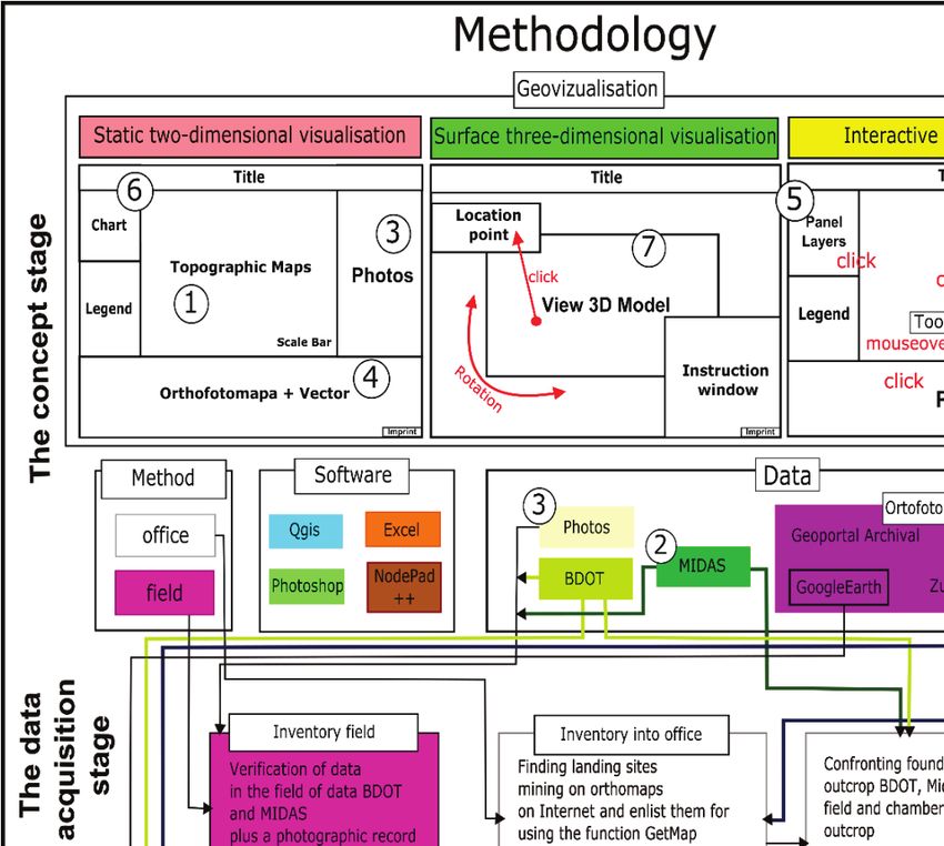
46                        Tymoteusz Horbiński, Beata Medyńska-Gulij

representing spatial phenomena, visualisation, and interface (Dykes et al., 2005). The
main feature of spatial data is the location of objects, but visualisation techniques
should also facilitate the comparison of other, more complex, constituent of a geo
feature. By enabling interaction with the type of data that is of interest to both public
users and professionals, geovisualisation contributes to the creation of publicly
available Internet websites (Calka and Cahan, 2016).
    According to Gahegan (2005), it is possible to use different forms of
geovisualisation. In spatial data research, it is vital to use cartographic materials
(e.g., simple statistical maps) that lead the user to better understand the spatial
data and draw clear conclusions (Bielecka et al., 2014). The vital role of the map
in the geovisualisation process is undebatable. The development of multimedia
and interactive forms of communication, especially on the Internet, is the most
dynamically growing aspect of geovisualisation. In the geovisualisation process,
maps and other forms of cartographic presentation are supplemented with simple and
complex graphical forms of statistical data presentation. The most frequently used
forms of graphical visualisation are charts and diagrams, whose task is to complement
the cartographic message and facilitate a comprehensive presentation of geographic
phenomena (Medyńska-Gulij, 2015).
    What becomes problematic in the geovisualisation process is the combination of
various mapping methods and other graphical methods of data visualisation within
a single statistical map. In a pragmatic approach, it is important to adjust the number
and type of mapping methods on a single map to how the statistical maps are used and
to the needs of the user of the created visualization (Medyńska-Gulij and Cybulski,
2016; Wielebski, 2014). Another approach might be to create multiple visualisations
from various perspectives from which the given phenomenon may be perceived
(Medyńska-Gulij and Dickmann, 2015).
    In the following paper, geovisualisation will be demonstrated on the basis of
one spatial phenomenon and understood as a process of creating complementary
visualisations: static two-dimensional, surface three-dimensional, and interactive.
The main challenge was to point out a method of presenting the phenomenon in
a multi-faceted way. The key question was the scope of the contemporary software
for presenting geographical space from various perspectives while maintaining the
standards of cartographic publications.
    A map is a graphical, mathematically defined model of reality, representing it
in accordance with the adopted scale and using symbols to present the features of
objects and the spatial relations between them. Main elements of the map include:
thematic content, title, legend, scale, and base content. In this paper, the notion of
the map is identified with cartographic visualisation, which deals with the analysis
and presentation of spatial data with the help of cartographic techniques, spatial
information systems, and computer graphics tools (Żyszkowska, 2000).
    Interactive visualisation is understood as a method of influencing the transfer
of information in the process of its use; thus, it determines the relation between
the visualisation and its user. The interactivity implies, on the one hand, that the
                                                                           Unauthenticated
                                                           Download Date | 2/2/20 11:52 PM
Geovisualisation as a process of creating complementary visualisations       47

visualisation can influence the user, and on the other hand, that the user can influence
the range and form of the information presented in the visualisation (Macioch and
Malmon, 2010). Examples of interactive visualisations were analysed by Maiellaro
and Varasano (2017), who focused solely on the one-page site.
     2D static or analogue visualisation is a graphical presentation of spatial data
on tangible or intangible features. The presentation might take the classical form
of a paper printout or be presented on a computer screen (Medyńska-Gulij, 2015).
Various examples of 2D static visualisation were presented by Wielebski (2014), who
focused on the road network.
     3D surface visualisation is a closed 3D model presenting a chosen fragment of
the terrain at a particular moment in time. Prechtel (2014) pointed out that despite
great accessibility of data and the successful work on standardising the 3D modeling,
it is not standard practice to present the end users with large-format references to
topography in the form of 3D models. He proposed an automated strategy for creating
closed 3D representations of a complete urban landscape.
     The authors of the following paper set out to present the process of the
complementary creation of geovisualisations for a single spatio-temporal phenomenon
by a parallel creation of three consistent visualisations: static two-dimensional,
surface three-dimensional, and interactive. Another important objective was to test the
available coding method, which was used to create individual parts of the visualisation
and to combine them into one geovisualisation. Yet another aspect was the use of free
software and official databases while working on both the individual components and
the final product. The element that was emphasised the most was the workflow design
with a minimum of redundancy and formats used. In order to verify the correctness,
effectiveness, and usefulness of the proposed workflow, the researchers tested it by
attempting a visualisation of the natural aggregate extracton in the Gniezno district in
the years 2005-2015.

2. Methodology

                                   2.1 The concept stage

The research was conducted in four stages: the concept stage, the data acquisition
stage, the data processing stage, and the publication stage (Figure 1). In the concept
stage, three models were created for the various publication methods – it was done
in such a way that the user of the final cartographic product could use each of the
publications on its own, but also two or all three of them at the same time. That was
why the particular components of the models (such as the title, the legend, photographs)
were located in similar places on every model. The physical phenomenon of changes
in extraction area size and the progress of open pit recultivation was presented on
the basis of the Gniezno district. The time period to be covered was was steered
by the possibility of acquiring data from spatial databases (with special emphasis
                                                                          Unauthenticated
                                                          Download Date | 2/2/20 11:52 PM
48                         Tymoteusz Horbiński, Beata Medyńska-Gulij

on geoportals) (Bielecka and Medyńska-Gulij, 2015). For the purposes of this study,
the timespan from 2005 to 2015 was taken into account. The authors decided to
accomplish this goal via the most efficient of the possible methods of data acquisition
and processing, i.e, via a parallel conversion of raw data and its use for the three
visualisations, in order to make the time-consuming process of spatial data processing
as effective as possible.
    For each of the three visualisations, the researchers proposed a different information
range, different forms of graphic and cartographic presentation, and different use and
function, but as far as possible the same databases and technologies.

● Static two-dimensional visualisation:
− Information range (title): The area of natural aggregate extraction and its changes
   in the years 2005-2015 – for the chosen open pit mine.
− Components: the map title, the cartographic content, a photograph field, an
   orthophotomap field for every year, the legend, the scale bar, the chart, the
   imprint.
− Forms of graphic and cartographic presentation: the outline range of the open pit
   mine over a topographic map base, a bar chart, an orthophotomap, photographs
   from a pedestrian perspective, the legend.
− Form of publishing and use of the product: permanent record in the form
   of an A3 printout and a PDF file, a complete (read-only) document to be
   used for a report on the state of the phenomenon and the spatio-temporal
   changes.
− Sources of data: acquisition in the office (BDOT [Baza Danych Obiektów
   Topograficznych – Polish for „A Database of Topographic Objects”], MIDAS)
   and in the field (field inventory of the extraction range over an orthophotomap
   and a topographic map base; photographic documentation of the area and the
   recultivation of the open pits).
− Software: graphical, GIS, spreadsheet.

● Surface Three-dimensional visualisation:
− Information range (title): A 3D model of the chosen open pit mine in the year
   2015.
− Components: the title, the 3D model, an instructions window, a point location
   window, the imprint.
− Form of graphic and cartographic presentation: an orthophotomap superimposed
   over a DEM image – a 3D model; a table with coordinates defining the location
   of a given point.
− Form of publishing and use of the product: The model is saved in the form of
   a JavaScript code which opens as an Internet website; interactivity: a possibility
   of watching the virtual landform (containing the data for one time period) by
   rotating it on the screen, without introducing changes.
                                                                            Unauthenticated
                                                            Download Date | 2/2/20 11:52 PM
Geovisualisation as a process of creating complementary visualisations 49
− Interactive elements: the possibility of rotating the model and observing it from
multiple perspectives (with the instructions window displaying information on
how to use the model); the coordinates of the clicked point of the model appearing
in the point location window.
− Function: Attractive presentation of the area of a given open pit in a single
year.
− Sources of data: office acquisition of elevation data (x,y,z) and the orthophotomap
from Google Earth.
− Software: GIS, spreadsheet, converter.
Fig. 1. The workflow for the process of the complementary creation of visualisations:
static two-dimensional, surface three-dimensional, and interactive
Unauthenticated
Download Date | 2/2/20 11:52 PM50 Tymoteusz Horbiński, Beata Medyńska-Gulij
● Interactive visualisation:
− Information range (title): The area of natural aggregate extraction and its changes
in the years 2005–2015 in the Gniezno district.
− Components: the map title, the cartographic content: a topographic map (Open
Street Maps base), photographs, a panel layers, the legend, the scale bar, the
imprint.
− Form of graphic and cartographic presentation: the phenomenon presented in
the form of a website featuring interactive vectors with attribute data coded in
information bubbles.
− Form of use of the product: an Internet website; interactivity: the possibility to
choose a layer in the layers panel, a pop-up assigned to each marker, appearing
once the marker is left-clicked, and a tooltip displayed when the user hovers the
cursor over the marker, the possibility to see the photo in a bigger size when it is
left-clicked.
− Interactive elements: markers, the layers panel, and photographs.
− Function: Presentation of the extraction area for several chosen years (with the
additional option of updating the information in the future) and the state of the
recultivation visualised in the photographs.
− Sources of data: acquisition in the office (BDOT, MIDAS) and in the field
(field inventory of the extraction area over an orthophotomap base, topographic
maps, and photographic documentation of the state and recultivation of the
open pits).
− Software: graphical, GIS, spreadsheet, text editor.
2.2 The data acquisition stage
Already in the concept stage, the researchers used many geoportals and programs.
Figure 2 shows the flowchart of creating the key elements of the visualisation.
Websites geoportal.gov.pl and Google Earth were used most extensively, as the
orthophotomap databases of those websites feature the option of searching out maps
from various years. The reason for choosing multiple geoportals was to obtain as
wide a scope of data for the chosen time period as possible. The thematic data
selected to enrich the geovisualisation was the data from BDOT (A Database of
Topographic Objects), the MIDAS geoportal of the Polish Geological Institute
– National Research Institute, etc.
The data acquisition stage began with the preliminary review of information
available on the geoportals (Figure 2). Then, the researchers made their choice of the
open-pit mines to be included in the study. In order to make it possible to process
the data further, the researchers downloaded fragments of the orthophotomaps using
the Print Screen and GetMap functions. An interesting option enabling the user to
download map fragments is the GetMap function offered by the website geoportal.gov.
pl. Via an ordinary ‘https://’ link, the function allows the user to select in the browser
Unauthenticated
Download Date | 2/2/20 11:52 PMGeovisualisation as a process of creating complementary visualisations 51
window a section of the map from a particular time period. In the case of images that
were too big or had been obtained using the Print Screen function, the Photoshop
software was used for cropping (Horbiński, 2016). The method of accessing data as
proposed by the authors is only an easier alternative to the official way of obtaining
it from centers publishing such information. Data obtained using the Print Screen
and Get Map functions is not used for further publication. It only serves as a part
of the workflow and is included in the final version of the geovisualisation only to
a small extent. This way of obtaining data is very time-efficient and completely free
of charge.
Fig. 2. The flowchart of creating key components of the visualization
Unauthenticated
Download Date | 2/2/20 11:52 PM52 Tymoteusz Horbiński, Beata Medyńska-Gulij
2.3 The data processing stage
To present the results, the authors used certain programmes and file extensions.
However, the workflow (Figure 1) and the flowchart (Figure 2) enable the use of
different software and extensions instead. The subsequent stages of the research work
are aimed at proving the appropriateness of the proposed workflow; the authors are
not suggesting the use of exactly the same software.
The preliminary work on the acquired data involved the conversion of the
orthophotomap images with the extension .jpg or .png obtained with the Print Screen
or Get Map functions to a format that would be readable by the Qgis software. The
condition was that the image had to have a cartographic representation. Images were
georeferenced to the WGS84/EPSG:4326 coordinate system. The transformation type
used was first degree polynomial for at least 3 points, while the resampling method
used – nearest neighbour. The resulting file had the .geotiff extension. It is possible
to omit this step while retaining the georeference for images obtained from Google
Maps. However, in order to avoid simultaneously following two parallel courses of
research work, the authors focused on choosing one method to accommodate all the
obtained orthophotomaps.
The next step was to generate files with an .shp extension showing the
borders of the studied phenomenon. The vectorisation process was divided into
creating the borders with the help of polygons, and giving them attributes. The
area size of a given polygon (needed for the latter statistical calculations and
the resulting chart) could be obtained via the AREA operation in the attribute
calculator tool.
As far as the vectors were concerned, the researchers distinguished between the
attribute data (exported into an .xls file) and the vectors themselves. The data was
used to plot a chart of area changes in Microsoft Excel, to be used later as part of the
static 2D visualisation. The attribute information in the interactive visualisation was
used in the pop-ups on the Internet website. Vectors from the .shp file were converted
into the .goejson format using the function “Save as”, because such a file may be
used while building a web page and has a practical application in HTML website
design. By launching the .geojson file in Notepad++ and adding a JavaScript code
(var ‘object’={content of the .geojson file}) (Duckett, 2014), an interactive vector
was created.
The surface three-dimensional visualisation was created according to the authors’
idea of using the data (x, y, z) uploaded into the Google Earth platform. Such an
approach is beneficial when one has no access to the appropriate equipment for
lidar data processing (i.e., when the speed of the processor is not sufficient). For
comparison, Lidar data, which might be obtained for a fee in various institutions,
contains (beside the x, y, z coordinates) also 13 other pieces of information about the
points in question, such as their colour, category (water, ground, low/medium/high
vegetation, not classified), etc.
Unauthenticated
Download Date | 2/2/20 11:52 PMGeovisualisation as a process of creating complementary visualisations 53
It was noticed that in Google Earth, when the user hovers the cursor over a map
fragment, three coordinates (x, y, z) appear. This data was recorded in the form of
a trail resulting from the use of the path drawing function. The path was plotted within
the area of the studied phenomenon and at some distance from this area. It was best if
the shape created by this line was a square or a rectangle – such a shape would make it
easier to fit the DEM file into the frames of the 3D model in the latter stage of the study.
The reason why the researchers opted for this function was that drawing the path causes
an automatic generation of points with x, y, z coordinates at certain distance intervals.
This was used by the authors of the study to create a regular Grid network in reprocess
uploaded date. The path was saved as a .kml file. In the next stage, the .kml file was
converted to a .csv file using TCX Converter. The stage involved also overwriting
the Z coordinate with the use of the function Track Modify → Update Altitude. This
was necessary as the .kml file did not directly record the altitude above sea level, and
after the conversion, the ALT column (coordinate z) in the resulting .csv file would
be empty.
The .csv file has many superfluous columns that are not needed in the later
stages of the 3D model creation. That is why the researchers decided to limit them
(using Microsoft Excel) to three columns – LAT (latitude), LONG (longitude), and
ALT (altitude). The .csv file containing the three columns was then imported into
the Quantum Gis software. The text file was converted to .shp layer points with the
function „Create a layer from a delimited text file”. This process was necessary to
visualise the obtained points in the Qgis software. The points were then to be used
for Grid creation.
With the aid of Geoprocessing→Tools→Saga Gis→Natural Neighbour, the points
were transformed into a Grid with a cell size of 0.0007(arcsecond). Due to the limited
capabilities of the computer, an incomplete DEM file was created. This problem was
solved with the SAGA Gis option „Close one cell gaps”, which patches the gaps by
comparing their height to the size of the surrounding pixels. The cell size yielded by
this function was 0.0007(arcsecond). Having obtained a complete DEM file, it was
possible to proceed to creating the 3D model.
For that purpose, the researchers used a Qgis plug-in called „Qgis2treejs”.
This plug-in makes it possible to create a 3D model on the basis of a DEM image
displayed in the preview window of the programme. The conversion was performed
on the DEM file containing the Z coordinate (ALT). Based on this coordinates, a 3D
model was created in JavaScript code, saved as a HTML file. In order to improve the
visual attractiveness of the image, a georeferenced fragment of the orthophotomap
was superimposed in the window DEM→Display type→Image file. The whole model
was displayed in cell size 0.0007(arcsecond), like in the case of patching the gaps, in
order to avoid distorting the real image. For the purpose of the static two-dimensional
visualisation, a grayscale DEM image was created.
Unauthenticated
Download Date | 2/2/20 11:52 PM54 Tymoteusz Horbiński, Beata Medyńska-Gulij
3. Publication
The publication stage consisted in adjusting the particular elements of the three
visualisations so that they fit the models designed in the concept stage (Figure 3). For
the purpose of the publication, several key modifications were made. One of them
was to extend the analysis to include not only the data from orthophotomaps, but
also data from the BDOT database and the MIDAS geoportal. This data enriched the
geovisualisation of changes in natural aggregate extraction and brought on another
modification of the scheme – i.e., dividing the work methods into office work and
field work and expanding the data acquisition stage. In the diagram, the meaning
of the colours was retained and the same software was used. Key elements were
marked with numbered bubbles, which were then interactively placed on the models,
on the flowchart, and on the screen shots of the final versions. Arrows show the
particular activities during the research, directions of data conversion, changes
in file formats and the intermediate forms of the created components of the three
visualisations.
The static two-dimensional visualisation on an A3 sheet is an example of
a traditional form of cartographic communication that is of great significance to
professionals and researchers in the process of compiling reports. For printing
purposes, the file has a .pdf extension, but for the purpose of being integrated into
the one final geovisualisation the image was converted into a .html file. The whole
sheet is composed of several parts. The base map is the previously mentioned map
generated on the basis of the BDOT layers. The graph presenting the correlation
between the water level and the area of the mine (labelled „Graph” on the model) is
a statistical presentation of attribute data. The base map window was made complete
by adding the legend and the scale. Photographs presented in the visualisation are,
in principle, three representative photos of the mine, showing the current state as of
2015. Those visualisations are complemented by a combination of 6 orthophotomaps
with superimposed lines indicating the borders of the open pits. The images are
ordered chronologically, from left to right, showing changes in extraction from
2005 to 2012.
An attractive way to present the information is via a surface three-dimensional
model of a single open pit, with the option of clicking on any point and rotating
the model. The specially applied orthophotomap base makes it possible for the user
to see the mine in conditions resembling the real landscape. A change can be made
only by recreating the DEM file or changing the data used in its creation. The next
step towards developing such a model is to combine it with the VR (Halik, 2014)
technology and to change the source of data used in the creation process – the data
might be obtained, for example, with the help of the UAV technology (Smaczyński,
2016).
Unauthenticated
Download Date | 2/2/20 11:52 PMGeovisualisation as a process of creating complementary visualisations 55
Fig. 3. The workflow for creating a geovisualisation of natural aggregate extraction in open-pit mines
in the Gniezno district.
Unauthenticated
Download Date | 2/2/20 11:52 PM56 Tymoteusz Horbiński, Beata Medyńska-Gulij
To ensure full interactivity of the visualisation, it was created in an Internet
browser, using the HTML, JavaScript, and CSS (Cascading Style Sheets) codes.
The layers panel is divided into two parts. The base is a readable OpenStreetMap,
which is an entry map leading to the website and a base for the Leaflet library. The
second part of the panel is composed of 6 interactive buttons with year labels, which,
once clicked, display polygon vectors for the borders of extraction areas and surface
waters located within the open-pit mine. The polygons, thanks to a coded function,
have an additional interactive feature. A click on an area polygon yields a pop-up
with attribute data (name and area). Photos are a panel of 50 photographs presenting
the current extraction area. The panel is equipped with a scroll bar, which makes it
possible to see all the miniatures of the photos. Every miniature has an interactive
feature. When clicked, its shows the user the photo in a bigger size, with the name
and number of the open pit in question. When the full image view is on, there is an
additional function of moving on to the next photograph without leaving the panel.
Thanks to this function, the visualisation takes the form of a gallery.
4. Conclusion
The three published visualisations can be used separately, but what the authors had
in mind was for them to be used complementarily as one geovisualisation. For the
purpose of creating a single version of the geovisualisation, the authors decided to
add buttons to the interactive visualisation – a hyperlink to surface three-dimensional
and static two-dimensional visualisations. As mentioned before, in order to enable the
combination, the .pdf file with the static two-dimensional visualisation was converted
to a website format. An advantage of this step was the resulting favourable location of
the information – all the study results presented as a single website with hyperlinks.
Obviously, this meant that the quality of the static two-dimensional visualisation had
to be compromised, but the visualisation gained in the communicative potential and
the audiences.
Nowadays, when cartography develops mostly with an emphasis on vector files
and the publication of maps on the Internet, less and less attention is being paid to
static two-dimensional publications. Paper maps are an important element and input
material for creating geovisualisations (Medyńska-Gulij, 2015) and are useful in
terms of documenting the given phenomenon (Horbiński, 2016). Such publications
have important features and can be useful e.g. for presenting buildings and urban
features in AR (Lorek, 2016). The static two-dimensional visualisation discussed in
the article has a open form (possibility of adding or updating information) that was
designed for purposes such as environment management, e.g., plans of development
or reduction of the presented phenomenon.
Interactive visualisation leaves room for changes; its composition is open. This
is a big asset, as it allows modifying and updating the data. In case of further
developments the information content could be expanded to include point phenomena
Unauthenticated
Download Date | 2/2/20 11:52 PMGeovisualisation as a process of creating complementary visualisations 57
and the statistical data presented could be further developed. The presented content
would be greatly improved by introducing animations, e.g., in the point signatures
and the corresponding legends. Adjusting the visualisation to the requirements
of Responsive Web Design, with great emphasis on presenting the content on
tablets and smartphones, will be the direction of development for the cartographic
design.
The proposed workflows shown in Figure 2 can be treated as universal ones
for the presentation of phenomena regarding changes in area and forms of land use
cover. However, for this to be possible, it is necassary to use the same (or equivalent)
software that was used in the study. Qgis is free software and a quickly developing
programme; hence, there is a possibility of fine-tuning the elements of the surface
three-dimensional visualisation in the future.
Through the proposed workflows and testing them against real data, the authors
attempted to demonstrate that the creation of three visualisations is a complementary
process of creating a geovisualisation in which a lot of attention should be paid to the
user, but also to the effectiveness and the technological efficiency of the method. There
is room for developing the proposed solutions in the future, e.g., by consolidating the
3D model and the Internet visualisation into a single file with one extension. A file
format that might be used in future studies is the .czml format of the CESIUM library,
which has a structure similar to that of the .geojson file and can therefore store the X,
Y, Z coordinates, also offering the possibility to present the terrain in a 3D form. The
Cesium Library offers also many possibilities for implementing all the three forms
of visualisation. However, in order to make use of its full potential, proficiency at
JavaScript coding is necessary.
Acknowledgments
The paper is the result of research on visualization methods carried out within statutory
research in the Department of Cartography and Geomatics, Adam Mickiewicz
University in Poznan, in Poland.
References
Bielecka, E. and Medyńska-Gulij, B. (2015). Zur Geodateninfrastruktur in Polen. Geodata Infrastructure
in Poland, Kartographische Nachrichten. Volume 65/4:201–208.
Bielecka, E. Leszczynska, M. and Hall, P. (2014). User perspective on geospatial data quality. Case
study of the Polish Topographic Database. The 9th International Conference “ENVIRONMENTAL
ENGINEERING” 22–23 May 2014, Vilnius, Lithuania, selected papers, eISSN 2029-7092 /
eISBN 978-609-457-640-9. Available online at http://enviro.vgtu.lt, DOI: http://dx.doi.org/10.3846/
enviro.2014.193.
Calka, B. and Cahan, B. (2016). Interactive map of refugee movement in Europe, Geodesy and
Cartography. Volume 65/2:139–148, DOI: https://doi.org/10.1515/geocart-2016-0010.
Unauthenticated
Download Date | 2/2/20 11:52 PM58 Tymoteusz Horbiński, Beata Medyńska-Gulij
Cybulski, P. (2016). Design rules and practices for animated maps online, Journal of Spatial Science.
Volume 61/2:461–471. DOI: http://dx.doi.org/10.1080/14498596.2016.1147394.
Duckett, J. (2014). JavaScript i JQuery interactive front-end web development, Helion.
Gahegan, M. (2005). Beyond tools: visual support for the entire process of GIScience, Exploring
Geovisualization, Elsevier Science, 83–99, Amsterdam.
Halik, Ł. (2014). Zmienne graficzne sygnatur punktowych w mobilnym systemie rozszerzonej
rzeczywistości. UAM, Poznań.
Halik, Ł. Lorek, D. and Medyńska-Gulij, B. (2015). Kartowanie terenowe w technologii GPS-GIS,
Badania Fizjograficzne Seria A – Geografia Fizyczna. Volume V /A66:67–74. DOI: 10.14746/
bfg.2015.6.7.
Halik, Ł. and Medyńska-Gulij, B. (2016). The differentiation of point symbols using selected
visual variables in the mobile augmented reality system, The Cartographic Journal. DOI:
10.1080/00087041.2016.1253144.
Horbiński, T. (2016). Dokumentacja kartograficzna zmian wydobycia kruszywa naturalnego w powiecie
gnieźnieńskim w latach 2005–2015, Badania Fizjograficzne Seria A – Geografia Fizyczna. DOI:
10.14746/bfg.2016.7.4.
Lorek, D. (2016). Multimedia integration of cartographic source materials for researching and presenting
phenomena from economic history, Geodesy and Cartography. Volume 65/2:271–281. DOI:
10.1515/geocart-2016-0015.
MacEachren, A.M. (1994). Visualization in modern cartography: Setting the agenda [w:] Vizualization
in Modern Cartography, MacEachren A.M., Taylor D.R. (red.), Oxford.
Macioch, A. and Malmon, G. (2010). Funkcje interaktywne współczesnych map elektronicznych. Polski
Przegląd Kartograficzny. Volume 44/4:331-353.
Maiellaro, N. and Varasano, A. (2017). One-Page Multimedia Interactive Map, International Journal of
Geo-Information. DOI: 10.3390/ijgi6020034.
Medyńska-Gulij, B. Dickmann, F. Halik, Ł. and Wielebski, Ł. (2015). Mehrperspektivische Visualisierung
von Informationen zum räumlichen Freizeitverhalten. Ein Smartphone-gestützter Ansatz zur
Kartographie von Tourismusrouten. Multiperspective visualisation of spatial spare time activities.
A smartphone-based approach to mapping tourist routes, Kartographische Nachrichten. Volume
67/6:323–329.
Medyńska-Gulij, B. and Cybulski, P. (2016). Spatio-temporal dependencies between hospital beds,
physicians and health expenditure using visual variables and data classification in statistical table,
Geodesy and Cartography. Volume 65:67–80. DOI: 10.1515/geocart-2016-0002.
Medyńska-Gulij, B. (2015). Kartografia. Zasady i zastosowania geowizualizacji, PWN Warszawa.
Prechtel, N. (2015). On strategies and automation in upgrading 2D to 3D landscape representations,
Cartography and Geographic Information Science. 45:244–258. DOI: http://dx.doi.org/10.1080/15
230406.2014.987696.
Smaczyński, M. (2015). Wizualizacja dynamiki zmian liczby uczestników imprezy masowej
z wykorzystaniem dronów, Badania Fizjograficzne Seria A – Geografia Fizyczna. Volume VI/
A66:157–172. DOI: 10.14746/bfg.2015.6.12.
Slocum, T.A. McMaster, R.B. Kessler, F.C. and Howard, H.H. (2009). Thematic Cartography and
Geovisualization, 3rd ed., Pearson Prentice Hall, Upper Saddle River.
Wielebski, Ł. (2014). Mapping techniques of spatio-temporal relationships for a centric road network
model, Kartographische Nachrichten. Volume 64/5:269–276.
Żyszkowska, W. (2000). Semiotyczne aspekty wizualizacji kartograficznej, Wydawnictwo Uniwersytetu
Wrocławskiego.
Unauthenticated
Download Date | 2/2/20 11:52 PMYou can also read