In.To. COVID-19 Socio-epidemiological Co-causality
←
→
Page content transcription
If your browser does not render page correctly, please read the page content below
In.To. COVID-19 Socio-epidemiological Co-causality Elroy Galbraith Hokkaido University Matteo Convertino ( matteo@ist.hokudai.ac.jp ) Tsinghua University https://orcid.org/0000-0001-7003-7587 Jie Li Hokkaido University Victor Del-Rio Vilas WHO Article Keywords: Posted Date: June 1st, 2021 DOI: https://doi.org/10.21203/rs.3.rs-571447/v1 License: This work is licensed under a Creative Commons Attribution 4.0 International License. Read Full License
1           In.To. COVID-19 Socio-epidemiological
 2                       Co-causality
 3          Elroy Galbraitha , Matteo Convertinoa,b∗ , Jie Lia , Victor Del
 4                                   Rio-Vilasc
       a
 5         Nexus Group, Faculty and Graduate School of Information Science and
 6                   Technology, Hokkaido University, Sapporo, JP
       b
 7         Institute of Environment and Ecology, Tsinghua Shenzhen International
 8                 Graduate School, Tsinghua University, Shenzhen, China
                              c
 9                                SEARO/WHO, New Delhi, India

10                                         May 26, 2021

11      Corresponding author: ∗ M. Convertino, Tsinghua Shenzhen International Graduate
12   School, University Town of Shenzhen, Tsinghua Park, Nanshan District, Shenzhen 518055
13   P.R. China, email: matconv.uni@gmail.com
14

15      Keywords: infodemiology, infoveillance, positivity, healthcare pressure, misinformation

                                                  1
16                                            Abstract

17      Social media can forecast disease dynamics, but infoveillance remains focused on

18   infection spread, with little consideration of media content reliability and its relationship

19   to behavior-driven epidemiological outcomes. Sentiment-encoded social media indicators

20   have been poorly developed for expressed text to forecast healthcare pressure and infer

21   population risk perception patterns.

22      Here we introduce Infodemic Tomography (InTo) as the first web-based interactive

23   infoveillance cybertechnology that forecasts and visualizes spatio-temporal sentiments

24   and healthcare pressure as a function of social media positivity (i.e., Twitter here), con-

25   sidering both epidemic information and potential misinformation. Information spread is

26   measured on volume and retweets and the Value of Misinformation (VoMi) is introduced

27   as the impact on forecast accuracy where misinformation has the highest dissimilarity

28   in information dynamics. We validate InTo for COVID-19 in New Delhi and three other

29   SE Asian cities. We forecast weekly hospitalization and cases using ARIMA models and

30   interpolate spatial hospitalization using geostatistical kriging on inferred risk percep-

31   tion curves between tweet positivity and epidemiological outcomes. Geospatial tweet

32   positivity tracks accurately ∼60% of hospitalizations and forecasts hospitalization risk

33   hotspots along risk aversion gradients. VoMi is higher for risk-prone areas and time

34   periods, where misinformation has the highest predictability, with high incidence and

35   positivity manifesting popularity-seeking social dynamics.

36      Hospitalization gradients, VoMi, effective healthcare pressure and spatial model-data

37   gaps can be used to predict hospitalization fluxes, misinformation, capacity gaps and

38   surveillance uncertainty. Thus, InTo is a participatory instrument to better prepare and

39   respond to public health crises by extracting and combining salient epidemiological and

40   social surveillance at any desired space-time scale.

                                                  2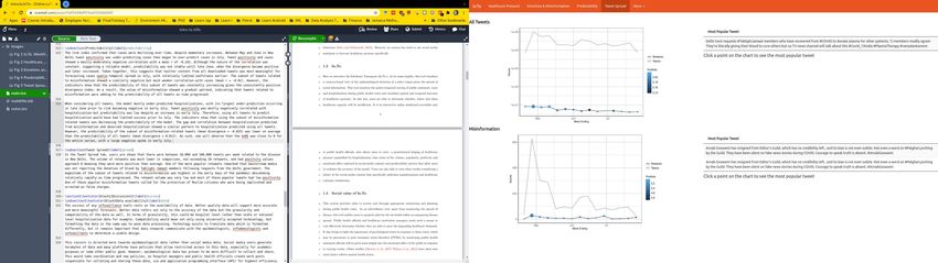
41       “’Not everything that can be counted counts

42   and not everything that counts can be counted”’

43   Albert Einstein

44

45   1     Introduction

46   1.1    COVID-19 and Infoveillance

47   The spread and magnitude of COVID-19 is reflected in social media production and senti-

48   ments with the lowest ever recorded trend in population positivity (see the Hedonometer at

49   https://hedonometer.org/timeseries/en_all/). Not only are social media messages the

50   saddest they have been since happiness monitoring began (see Dodds et al. (2011)), but the

51   volume of misinformation has grown exponentially (Gallotti et al., 2020; Islam et al., 2020).

52   These observations provide evidence of the relevance of socio-technological systems like so-

53   cial media to predict epidemiology. Empirical evidence for many diseases before COVID-19

54   and previous analytical findings made clear the linkage between risk perception and infection

55   patterns (Maharaj and Kleczkowski, 2012a); thus, highlighting the co-causality of social and

56   epidemiological information beyond their predictability.

57       Aware of these linkages, global response to COVID-19 by health authorities includes risk

58   communication messages, e.g. on increasing social distancing and using masks to reduce inter-

59   person transmission. Similarly, messages on enhancing early identification, isolation and care

60   for patients all in a bid to “flatten the curve” shed light on the importance of surveillance

61   and public health capacities (Thunström et al., 2020). The search for social surveillance

62   tools that could help public health officials to monitor, forecast, plan, evaluate and prepare

63   for public health demand started well before COVID, e.g. with seasonal influenza in USA

64   coupled to predictive multimodeling (see Paul et al. (2014), Santillana et al. (2015) and

65   McGowan et al. (2019)), due to the recognition of the limitations – e.g. delays, misreporting

66   – of traditional epidemiological surveillance systems. In analogy, social media signals are

67   also used to forecast, a priori or in near real-time, extreme environmental phenomena such

68   as earthquakes (Sakaki et al., 2010), which highlights the relevance of temporal and spatial

69   social media for surveillance.

70       Concurrently to the spread of COVID-19 epidemic, health authorities are combating an

71   infodemic, strictly defined as the rapid exponential increase in the volume of potentially

                                                   3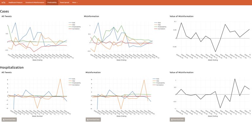
72   misleading information about an event (WHO et al., 2020). Misinformation, considered as

 73   objectively false or inaccurate information, is of difficult detection and classification because

 74   it is highly affected by perception bias. Misinformation can tangibly and negatively impact

 75   response strategies and health-seeking behaviors (Ung, 2020; Otto and Eichstaedt, 2018; Ma-

 76   haraj and Kleczkowski, 2012b) which may lead to increased infections and hospitalization.

 77   Against this background, infodemiology and infoveillance (Eysenbach, 2009) emerge as a

 78   strong public health response to the COVID-19 pandemic. Infodemiology applies principles

 79   of epidemiology to the study of emergence and spread of misinformation, while infoveillance

 80   applies information technology solutions to the monitoring and forecast of disease spread

 81   as well as visualization of salient outputs (from main patterns to predictions). Prior to

 82   COVID-19, scientists have been able to use internet dynamics and message sentiments to

 83   monitor public health related phenomena and forecast disease spread (Ginsberg et al., 2009;

 84   Eysenbach, 2009; Bragazzi, 2013; Eichstaedt et al., 2015; Santillana et al., 2015; Radin and

 85   Sciascia, 2017). However, no model or information system used social media sentiments to

 86   forecast sentiments (as continuous variables versus categorical emotions) and healthcare pres-

 87   sure (cases and hospitalization) together, over space and time; epidemiology and information

 88   patterns have always been disjoined, yet neglecting the ability to quantify the effective impact

 89   of information – and misinformation alike – on populations.

 90

 91   1.2    Information-Prediction Nexus

 92   A different perspective on public health forecasting is brought by proposing an assumption-

 93   free minimalist model that is focused on patterns rather than processes of the phenomena

 94   considered. The employed information-theoretic models (perfectly fitting the general aims

 95   of infoveillance) are using the necessary and sufficient social data as sentinels of change,

 96   coupled to epidemiological information, to maximize prediction accuracy for the patterns

 97   investigated. Information theoretic models like the one proposed here are the least biased

 98   models (mechanisms-free) for capturing which set of information is relevant for predicting

 99   patterns. Other underlying causal factors, such as local language and socio-environmental

100   factors of the population considered, are certainly important in the domain of physical reality

101   but not in the information domain of predictions. Therefore, the focus is on predictive

102   causality rather than true causality (Li and Convertino, 2020); a principle that, however,

103   should be associated to any model considering the fundamental reality of any model as a

104   microscope of reality rather than its utopian replica.

                                                     4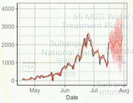
105      With the aforementioned reasoning in mind, social and epidemiological processes (and yet

106   data about them) are linked by information and misinformation that is revealing patterns

107   of people behavior in terms of sentiments (informative of risk perception) and cases, respec-

108   tively. Additionally, strong predictive causality in process-related variables has been shown to

109   coincide with physical causality; yet, computation that screens and weights information can

110   be used to infer co-causality between two signals robustly, without imposing any assumption

111   a priori on model structure.

112      In the current COVID-19 context, we are interested in knowing whether modern social

113   media are predictive of explosive epidemics, and more precisely which social chatter features

114   are the most predictive of epidemiological patterns. Moreover, whether social chatter features

115   can be accurately used as early warning predictors of risk before cases occur, and how early

116   can forecasts be made. Motivated by these questions we developed InTo as an exploratory tool

117   to quantify how much perceived risk inferred from social chatter in advance was predictive of

118   actual observed risk in cases and extreme cases (or hospitalization) reported by official public

119   health surveillance. This modus operandi and modern infoveillance tool, beyond assessing

120   how much waves in socio- and health-scapes copredict each other via joint “infoscapes”, can

121   validate classical surveillance systems (which provide data that are byproducts of behavioral

122   models, oftentimes affected by strong bias) considering the temporal gap between model and

123   data for multiple surveillance criteria (Vilas et al., 2017). Theoretically, the smaller the gap

124   over time the higher the surveillance accuracy.

125   1.3    InTo: Infodemic Tomography

126   Infodemic Tomography (In.To. or InTo hereafter) was developed as a cybertechnology to

127   forecast one week in advance COVID-19 related cases, hospitalizations, population positiv-

128   ity, misinformation impact and spreading, healthcare satisfaction and space-time surveillance

129   uncertainty by leveraging geospatial Tweets and epidemiological data in New Delhi. InTo

130   analyzes and visualizes “tomograms” or snapshots of epidemiological and information dy-

131   namics for the selected geographies. Thus, InTo is proposed as a Digital Health platform

132   for Participatory, Predictive, Personalized, Preventive and Precise Health (“P5”), that is an

133   “upgrade” with respect to the “P4” purview of health, such as in Alonso et al. (2019), via

134   the precise identification and provision of systemic health-related information to individuals

135   and populations alike. Weather forecasting is the general epitome of InTo considering its

136   focus on predicting patterns of healthcare pressure as a function of dynamically updated

137   information; thus the InTo dashboard is ideally like an App visualizing the most updated

                                                     5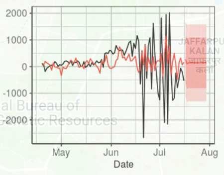
138   weather forecasts.

139      Previous efforts have focused on internet-based social media for incidence surveillance and

140   outbreak forecasting (Barros et al., 2020). Some of these efforts incorporated hospital visit

141   data in their models (Ram et al., 2015) but none of them coupled social and epidemiological or

142   healthcare information together. InTo goes beyond temporal incidence predictions because it

143   aims to investigate changes in socio-epi patterns over time and space and the value of spatial

144   social chatter by dynamically calibrating the model as data from social and epidemiological

145   surveillance is updated. In this optic and in relation to the early forecasting nature of InTo,

146   the predicted hospitalization is informative of people potentially in need of hospitalization

147   one week in advance. Gradients of hospitalization over space are indicative of patient hospital

148   loads. In an hydroclimatological analogy, gradients of healthcare pressure are like gradients

149   in atmospheric pressure dictating where ill people/rain will likely flow, and exceedance of

150   pressure over healthcare capacity are like floods.

151      Considering previous efforts, InTo is the first cyberinfrastructure to forecast COVID-19

152   specific healthcare pressure (as difference between point- and city-scale predicted cases and

153   hospitalization) as a function of text positivity where the latter is a variable quantifying

154   potential happiness in words shared via social media, i.e. Twitter in this context. Although

155   InTo is not the first to examine the relationship between Twitter sentiments and diseases,

156   previous efforts were based on extracting few categorical emotions or using volume of social

157   media entries as predictive functions (Haghighi et al., 2017; Roccetti et al., 2017; Eichstaedt

158   et al., 2015; Wilson et al., 2014b). InTo instead is the first effort, set of models and par-

159   ticipatory dashboard to use quantitative measures of continuous sentiments (associated also

160   to potential misinformation) as positivity to forecast healthcare pressure over space and one

161   week in advance, coupled to the evaluation of those forecasts within an information-theoretic

162   framework.

163      In the development of InTo we chose to call happiness, introduced by Dodds et al. (2011).

164   as positivity because it is semantically a more general word that does not imply happiness

165   (strict sensu) and relates more effectively to risk behavioral patterns (related to the objective

166   relative risk conditional to the geographical area considered), at least conceptually. Gradi-

167   ents in positivity as a function of cases or hospitalizations define risk perception patterns on

168   which predictive models are calibrated to produce forecasts. Linear predictive models are

169   used to perform infection and hospitalization predictions whose predictive power is tested

170   via non-linear predictability indicators (i.e., Transfer Entropy measuring the time delayed

171   uncertainty reduction between positivity and epidemiological variables, as discussed in the

                                                     6
172   Material, Methods and Implementation section). These indicators are based on probability

173   distribution functions of the variables of interest and yet they consider uncertainty distribu-

174   tion attributable to other unexplained uncertainty sources. In this broad framework, properly

175   calibrated positivity fluctuations are good sentinels of relative hospitalization risks – and yet

176   good predictors – as much as heat index fluctuations are good sentinels of extreme temper-

177   ature hospitalization (Liu et al., 2018) to mention an analogous public health effort focused

178   on detecting optimal indicators for risk communication.

179       The paper presents the workflow in Fig. 1 and implementation of InTo by using the case

180   of New Delhi to demonstrate its applicability and utility for COVID-19 and in general for

181   any disease. Part of the demonstration includes results of validation exercises conducted to

182   evaluate the developed models. We then discuss limitations of InTo, especially in terms of

183   data availability, representativeness and model complexity. We conclude by outlining future

184   work for InTo.

185

186   2     Case Study Results

187   Here we present InTo as an infoveillance system for the case of New Delhi during the COVID-

188   19 pandemic between April and July 2020. New Delhi is chosen as the prototypical city to

189   display because of its highly coupled social and epidemiological dynamics as empirically

190   found from data. In InTo, once the user selects their city of interest, results of analyses are

191   displayed as a series of visualizations divided into four main sections corresponding to tabs

192   of the dashboard: Healthcare Pressure, Emotions and Misinformation, Predictability and

193   Tweet Spread (Figs. 2-6).

194   2.1    Healthcare Pressure

195   The layout of the Healthcare Pressure tab is displayed in Figures 2 and 3. In New Delhi be-

196   tween April 15 and July 30 public positivity captured from COVID-19 related tweets ranged

197   between 5.6 and 6.0 with a slight downtrend from 5.85 at the beginning of the period to 5.73

198   at the end. Meanwhile, there was a trend reversal in new cases and the cumulative hospital-

199   ization, with new hospitalizations showing an increase in the magnitude of fluctuations closer

200   to the end of the period. Positivity was at its lowest in June when cumulative hospitalizations

201   was at its highest but positivity was highest in July when hospitalization began to increase

                                                     7
202 again. By using the linear relationship between hospitalization and positivity (see ARIMA
203 model at Eq. 5.3), on July 30th we predicted next week’s hospitalization to decrease by
204 381 hospitalizations (i.e. new hospitalizations displayed in the left plot of the dashboard),
205 and cases to increase by 549. Cumulative hospitalization and cases were about 20,000 and
206 1500 on July 30th (left plots in the dashboard). In Figure 8 we present the results of using
207 positivity from all tweets to forecast daily new hospitalization and daily new cases. Spatial
208 forecasts related to misinformation are not shown spatially. Considering the spatial distribu-
209 tion of positivity and hospitalization in the two weeks before forecasting, via geostatistical
210 kriging (Eqs. 5.4-5.7) we forecasted two large clusters of hospitalization in the North-West
211 and South-East and a smaller cluster in the center of New Delhi. In the high healthcare
212 pressure areas colored in red, we estimated that there would be almost 200 new individuals
213 in need of hospitalization (see color bar in the dashboard screen). These are calculated via
214 the geokriging model (Eqs. 5.4-5.7).
215 In order to highlight spatial gradients of hospitalization (meaningful of potential mobility
216 gradients of people in need of hospitalization mediated by the presence of healthcare facil-
217 ities; see Fig. 3) we decided to visualize healthcare pressure HPi , that is calculated as the
218 difference between locally expected hospitalization and average hospitalization (E.q. 5.8).
219 The numbers displayed on the top of the dashboard refer to expected new hospitalization
220 and hospitalization change from ARIMA (Eq. 5.3) for the entire city. HPi is visualized in
221 a green-red color shade (where red is for the highest HPi ) for M randomly generated points
222 (10,000) over the city which are interpolated using the geokriging using the semivariogram
223 of positivity. The area encompassed by each point is in the range 0.5-1.0 km2 , depending on
224 the spacing between points; thus, our forecasts provide a high spatial resolution compared to
225 surveillance systems. The 200 newly predicted hospitalizations displayed in the dashboard
226 constitute the peaks above the average (or the maximum healthcare pressure) in the entire
227 city. The average is ∼12 according to the geokriging, and that corresponds to the ARIMA
228 average shown on the top of the dashboard (see Fig 2). The average new hospitalizations
229 matches matches very closely the observed hospitalizations from surveillance (i.e. 11). Note
230 that ∼200 hospitalizations are for few areas in the city and these extreme values are well
231 above the average value for the period considered. The total number of hospitalization in a
232 selected area can be calculate as sum of new hospitalizations for all the points in that area.
233 Considering these results for the week displayed, hospital managers may wish to focus
234 their attention to the North-West and South-East areas of New Delhi (lacking healthcare ca-
235 pacity as displayed by the geolocated and visualized hospitals in Fig. 2) where individuals in
8236 need of hospitalizations are potentially looking for treatment in other areas, and thus estab-
237 lishing hospitalization fluxes. Positivity fluctuates around the same city-specific mean, while
238 cumulative hospitalization grows exponentially over the course of the epidemic. Theoretical
239 Gaussian and exponential variograms were the best fit for positivity and for cumulative hos-
240 pitalization, as expected considering their time dynamics (left plots in the dashboard in Fig.
241 2).
242 Figure 3 shows a snapshot of forecasts in mid July 2020 when very distinct clusters of
243 hospitalizations are identified. The figure serves to highlight how gradients in hospitalization
244 pressure are meaningful of potential mobility of people in need of hospitalization and this
245 expected mobility is dependent on local healthcare capacity that determines the ability to
246 treat patients in need. Effective healthcare pressure can be calculated by considering lo-
247 cal healthcare capacity (as number of beds, ventilators or other resources needed to treat
248 patients) and expected hospitalization.
249 2.2 Emotions, Top Words, and Misinformation
250 Emotions, from emotion inference algorithms (see Section 5.3), are extracted from the sys-
251 temic information (all the tweets), misinformation tweets, and healthcare-specific tweets
252 throughout the epidemic. Tweets for each category are reported on the right of the tab
253 (Fig. 4) and some of these tweets can be directly reported to InTo as misinformation by so-
254 cial media (Twitter) users. Below we report results that can be inferred by using InTo, such
255 as specific events, word pairs, users and associated emotions. When considering all tweets,
256 the dominant emotion over time was trust, followed by fear and anticipation; joy and sadness
257 were the next most frequent; surprise and disgust were expressed the least. This distribution
258 was observed for the subset of tweets related to misinformation as well, however there was
259 one day, on June 10th, when these tweets expressed more fear than they did trust. As for
260 tweets related to healthcare, trust was usually most expressed, but it was not as dominant
261 as in the case of all tweets or misinformation. Furthermore, sadness seemed to be expressed
262 much more among these tweets, especially in early June. On June 10, the saddest day con-
263 sidering healthcare tweets, the most retweeted tweet was from a user who felt abandoned
264 and helpless after struggling to help his sister and her two small children after her husband
265 had died from the disease. Similar tragic tweets reported the lowest positivity. The most
266 frequent healthcare tweets were also about the lack of beds, inability of hospitals to provide
267 proper service, and the possibility of public health officials to hide the true number of cases.
268 Worryingly, users were also taking the opportunity to request blood donors via Twitter. On
9269 July 22nd 2020, the most frequent pairs of words referenced were about “public health ad-
270 vice” and “self-quarantine at home”. A review of the raw tweets showed that many of the
271 tweets were actually tweets of news articles made by organizations rather than individuals.
272 Such tweets tended to be “neutral” in their positivity (i.e. centered around 5 without an
273 increasing or decreasing trend), with values ranging between 4 and 6. This emphasizes the
274 tendency of organizations, versus individuals, in manifesting risk-neutral perception patterns
275 corresponding to average values of positivity.
276 2.3 Predictability and Forecasting
277 Predictability indices (Section 5.5) are reported in Figure 5 for both cases and hospitalizations
278 as values over 100; yet, percentage changes are easily quantifiable. The risk index confirmed
279 that cases were declining over time, despite momentary increases. This index showed the
280 same trend for the full tweet and misinformation datasets because it is based on the same
281 data (the time series are reported twice to compare infection and hospitalization trends
282 against systemic information and misinformation indices). A model-based risk indicator can
283 be calculated to visualize the risk in terms of predicted values rather than data only.
284 Between May and June tweet positivity was under-predicting cases but then began to
285 over-predict cases in July. Tweet positivity and cases showed a mostly moderately negative
286 correlation (mean corr= -0.24). Although the value of the correlation was constant, suggesting
287 a reliable model or stable dynamics, predictability was not stable until late June, when the
288 predictability indicator became very small indicating lack of non-linearity, and thus implying
289 high reliability in the linear forecasting of cases via the ARIMA model. All results suggest
290 that tweet positivity from all downloaded tweets was most meaningful for forecasting the
291 spatio-temporal spread in July, with relatively high uncertainty earlier. July has the highest
292 correlation coefficient (in magnitude), lowest gap and non-linear predictability, as well as the
293 lowest VoMi (Eq. 5.13). The subset of tweets related to misinformation showed a similarly
294 negative though much weaker correlation with cases (mean corr = -0.01). This is concordant
295 to the much higher non-linear predictability of misinformation manifesting the decreasing
296 forecasting accuracy of ARIMA for this tweet subset.
297 When considering all tweets, the model mostly under-predicted hospitalizations, with its
298 largest under-prediction occurring in late June after hospitalization became the largest in
299 the end of May (bottom left plot of Fig. 5). The largest over-prediction was observed in
300 late July after hospitalization risk became very large. Yet, very large spikes in risk seemed
10301 to produce very large gaps in predictions. These large gaps are driven by misinformation
302 as shown by the VoMi assessment that is higher at the end of the monitored period. The
303 value of misinformation (Eq. 5.13) showed a gradual uptrend, indicating that tweets related
304 to misinformation were decreasing the forecasting accuracy (based on linear correlation) of
305 all tweets for cases and hospitalization as time progressed. Tweet positivity was mostly
306 negatively correlated with hospitalization but predictability was low, especially for hospital-
307 ization. This underlines the fact that there is more linearity between new hospitalization and
308 positivity than cases and positivity, and yet the ARIMA forecasts are more reliable for new
309 hospitalization. Despite this average result we observe that larger fluctuations in indicators
310 are seen for hospitalization than cases, likely underlying the necessity to include other pre-
311 dictors for extreme hospitalization events. Lastly, time series of indicators for all tweets and
312 misinformative tweets are quite similar due to the low detection of misinformation; nonethe-
313 less time-point values are different as manifested by VoMi because misinformation, although
314 small, exist and impact forecasts.
315 2.4 Tweet Spread
316 The Tweet Spread tab (Fig. 6) shows the volume of tweets and retweets, as well as their
317 positivity, for the systemic information and misinformation set. There were between 10,000
318 and 100,000 tweets per week related to COVID-19 in New Delhi. The volume of retweets was
319 much lower in comparison, not exceeding 10 retweets, and had positivity values approach
320 6 meaning they were more positive than the average neutral value of 5. Additionally, both
321 tweet volume, retweets and positivity are slowly decreasing over time which manifest the
322 lower COVID information production and decreasing positivity.
323 The number of misinformation tweets was the highest in the early days of the pandemic
324 descending relatively rapidly as time progressed. The retweet volume was very low com-
325 pared to the full tweet set (the difference is about three orders of magnitude) and most of
326 the popular misinformative tweets had low positivity. One of these popular misinformation
327 tweets called for the protection of citizens of different religions who were being implicated
328 and arrested on false charges. This tweet underlines the fact that misinformation is not nec-
329 essarily carrying deceiving information but also information about perceived wrong behavior
330 in populations. Thus, misinformation can capture more the dichotomy between common and
331 divergent groups in the area analyzed. The large difference in volume of all tweets (∼ 105 ) and
332 misinformative tweets (that are less than 103 , two orders of magnitude less than all Tweets)
333 explains why time series dynamics of predictability indicators for the systemic information
11334 and misinformation predictors (Fig. 5) is very similar but time point values are different.
335
336 2.5 Model Calibration and Validation
337 Results of the model validation over space (for the optimal predictor set) are displayed in
338 Figure 7. Plot A shows the forecast of spatial hospitalization based on geospatial tweet
339 positivity and city scale hospitalization. Predicted hospitalization based on Tweet positivity
340 suggested there would be high hospitalization pressure HP (Eq. 5.8) in areas, such as Narella,
341 Gurugram and Dwarka (SW part of the city), which were unaccounted for by the monitoring
342 system just focused on bed occupancy (and yet on models based on that occupancy shown
343 in plot C and D). The highest peak of HP is 160 and the average of healthcare pressure
344 over space is very close to the average of hospitalization at the city scale. However, the
345 geographical distribution of healthcare pressure is different from the distribution of hospi-
346 tals because geokriging is extending spatially the positivity-hospitalization relationship (that
347 shows an inverse proportionality between these variables) that is beyond hospital locations.
348 Nonetheless, tweet locations highly predict hospital locations as binary variables (Fig. 7B).
349 When performing interpolation via geokriging based on hospital-scale data alone (Fig.
350 7D), high hospitalization was predicted in the center of the city, with gradients of hospital-
351 ization decreasing outwards. This predicted hospitalization reflects (∼ 80%) the distribution
352 of bed occupancy as expected. The predicted hospitalization considering hospital-scale occu-
353 pancy and positivity (Fig. 7C) matches 85% the hospitalization based on hospital data only
354 (Fig. 7D). The former is however predicting higher hospitalization in other areas beyond
355 hospital areas, and this emphasizes the fact that the model is also predicting healthcare pres-
356 sure as individuals likely in need of hospitalization. Note that the range of hospitalization for
357 predictions of plots C and D in Fig. 7 are the same with maximum cumulative hospitalization
358 equal to ∼65 for the period 21 July-11 August 2020.
359 Figure 8 shows the calibration and validation of the ARIMA model which is useful for
360 selecting the optimal set of predictors. The results of ARIMA forecasts with different models
361 in terms of predictors are shown for cases, cumulative and new hospitalizations for New
362 Delhi. ACF is ARIMA based on epidemiological data only, while all other ARIMA models
363 are based on positivity, Tweet volume, Tweet volume and positivity combined. The model
364 that minimizes the mean absolute percentage error (MAPE, in insets) is based on positivity
365 only because of its highest predictive power for fluctuations in healthcare pressure (cases and
12366 hospitalization). However, the model with volume and positivity has similar MAPE because
367 of the ability of volume to predict the largest extreme variations in hospitalization. MAPE is
368 larger for new hospitalization than cumulative hospitalizations due to the larger stochasticity
369 of the former than the latter over time. The departure of forecasted values from observations
370 is the gap index in the dashboard (Fig. 5).
371 The (p, d, q) parameters of the ARIMA model (Section 5.4.1) manifesting seasonality,
372 memory and fluctuations are on average [0, 1, 1] for all models including ACF, [0, 1, 2] toward
373 the end of the monitored period that highlights the increase importance of fluctuations,
374 and [1, 1, 2] for volume and positivity that highlights the higher seasonality of tweet volume
375 and ability to capture larger extremes. (p, d, q) parameters increase if misinformation is
376 used when predicting hospitalization and cases, and this is in synchrony with our findings
377 that non-linear predictability increases because of the higher memory long-range effects of
378 misinformation. Average results of social and epidemiological variables for New Delhi are in
379 Table 1 considering different areas of the city and time periods.
380 3 Discussion
381 We have demonstrated the use of InTo to calculate tweet positivity to forecast and predict
382 the spatio-temporal spread of COVID-19 healthcare pressure. However, the model can be
383 applied to any disease or public health phenomena of interest via properly tuning the fore-
384 casting models. In New Delhi we inferred that the population was relatively positive in the
385 messaging, expressing mostly trust, despite the high case load and hospitalization. This weak
386 negative correlation manifesting risk aversion – due to the expected decrease in positivity for
387 increases in hospitalization – was statistically useful for predictability purposes considering
388 both geostatistical kriging and ARIMA models that use correlation values (Eq. 5.3. and 5.7).
389 We showed that hospitalizations could be expected to concentrate in certain areas of the
390 city, suggesting those clusters to be the focus of additional public health surveillance and
391 healthcare resources since new hospitalizations may occur. We found that misinformation
392 does affect the accuracy of the model and provides another illustration of the impact of
393 misinformation: it can impact even our ability to properly forecast healthcare pressure but
394 not necessarily negatively (in terms of reduction of prediction accuracy) throughout the
395 pandemic. This impact was found to be positive, yet improving prediction accuracy, at the
396 beginning of the epidemic (despite the higher volume of misinformation) and negative at the
397 end of the epidemic likely because the delayed effect of misinformation spreading.
13398 3.1 Data Uncertainty
399 The success of any infoveillance tools rests also on the availability of data. Better quality data
400 can likely support more accurate and more meaningful forecasts. Better data refers not only
401 to the representativeness of the data but also to the granularity and compatibility of the data
402 as well in relation to what is predicted. In terms of granularity, this could be hospital level
403 rather than state or national level hospitalization data for example. We showed in Fig. 7 that
404 the geostatistical kriging model performs much better – in terms of predicted hospitalization
405 – when spatially explicit hospital data are provided, particularly when the objective is also
406 to capture reported bed occupancy rather than average expected hospitalization at the city
407 scale solely. Compatibility would mean not only using universally accepted terminology, but
408 formatting the data in the same way to ease data processing. Certainly a huge discrepancy
409 exist between social and epidemiological data (considering spatial and temporal resolutions as
410 well as data volume), and then data processing becomes a time consuming process potentially
411 carrying systematic uncertainties. Technology exists to translate data which is formatted
412 differently, but it remains important that data stewards communicate with epidemiologists,
413 “infodemiologists” and decision makers to determine a usable design. This is particularly
414 important in the context of pandemics and emerging infectious diseases although localized.
415 Our concern is directed more towards epidemiological data rather than social media data.
416 Social media users generate terabytes of data and many platforms have policies that allow
417 restricted access to data, especially for academic purposes or some other public good purpose.
418 However, epidemiological data has proven to be more difficult to collect and share. This would
419 take effective coordination as hospital managers and public health officials collate and share
420 data via application programming interfaces (API) for highest efficiency and timeliness in
421 generating results.
422 3.2 Population Representativeness of Data
423 An issue connected with data availability is the matter of representation, that is, the extent
424 to which the data include enough heterogeneity to reflect the complexity of the population
425 for which the data set is assembled. This is particularly relevant to social media data such
426 as Twitter data. The demographics of users can differ significantly by biology, socio-cultural
427 and economic class, location and the availability of technological infrastructure (Silver et al.,
428 2019; Sadah et al., 2015; Vashistha et al., 2015; Duggan and Brenner, 2013) so individ-
429 ual/community experiences and perspectives can differ from the wider population (Mellon
14430 and Prosser, 2017). Even the choice of language might limit the representativeness of data
431 used in the model: InTo currently uses English, which is spoken in India, but not by a ma-
432 jority. One also has to consider the inclusivity of the search term. Our use of ’OR’ instead of
433 ’AND’ made our search more inclusive rather than restrictive thereby increasing the potential
434 volume of tweets returned. Other choices would have certainly provided other predictability
435 indices; and then one of the future improvements would be extracting the set of constraining
436 hashtags that maximize predictions overall among all possible choices of hashtags. However,
437 this choice would require a much higher computational cost and, in addition, fitting data the
438 closest (versus providing the full range of feasible predictions in a Maximum Entropy perspec-
439 tive) is not always the optimal choice due to the presence of systematic uncertainty in data.
440 Therefore, our current InTo version is not necessarily bounding the model-data gap consid-
441 ering all feasible factors (from language to hashtags), nor a fully causal investigation, but a
442 model defining the simplest and most informative inputs and outputs to represent dynam-
443 ics of population patterns. Further work will define more clearly importance of underlying
444 factors and the absolutely optimal model form.
445 Tweets in a city contain information of spatially separated events about the same process;
446 thus spatial spread of COVID and top tweeted pairs can be calculated over geolocated Tweets.
447 Posting time and content (related to volume and positivity) is very weakly dependent on the
448 social media platform. Additionally, social media users tend to interact outside of their usual
449 social networks or real-world socio-economic class much more on these platforms (Silver et al.,
450 2019), creating opportunities for groups absent from these platforms to be heard in a latent
451 way. Furthermore, tweets report information that may not be reported by official media
452 and/or that may circulate in real life events (e.g. just spoken information). This is also the
453 reason for which InTo can be used by users as a reporting information/misinformation tool
454 via registering their Twitter account. We suggest this “Digital Health” feature particularly
455 relevant for healthcare workers.
456 Twitter penetration can differ between and within countries, but tweets still show high
457 relevance for predicting spatio-temporal patterns of infections and hospitalization. Addition-
458 ally, emotional affects are highly linked to local non-Twitter media and languages, as we see
459 high volumetric correlation with local newspapers articles and retweets of English tweets in
460 local languages. Certainly, demographic and other features of the tweeting population are
461 relevant for how the virus spread but not the whole complexity is needed for forecasting
462 purposes in the short and long term. Nonetheless, this version of InTo is a proof of con-
463 cept version and will likely investigate and include other social media platforms, languages,
15464 information features, visualization options, diseases and socio-environmental phenomena in
465 future versions for investigating processes and practical applications.
466 3.3 Predictive Causality and Forecasting
467 Even when considering the issues of data availability and representativeness, the advantage of
468 InTo is that it focuses on patterns rather than causation. InTo does not purport to have found
469 nor to be exploiting a causal relationship between tweet positivity and healthcare pressure.
470 Rather, it exploits spatio-temporal patterns and correlations that might not be physically
471 significant (although arguable in an information dynamic sense), but that are nonetheless
472 practically useful probabilistically. The relationship between sentiments and behaviors are
473 quite complex, and there are many other variables in the complex reality of phenomena
474 considered that are however not all needed when forecasting population outcomes. There
475 are population factors such as sex, socio-economic status, proximity to affordable healthcare
476 facilities and the availability of insurance or some other means of paying that certainly impact
477 real processes of individuals. There may even be socio-political realities at play that force
478 individual behavior. However, the key goal of InTo – in a complex system science purview
479 – is the prediction of population patterns considering the most essential predictors without
480 making any assumption on the underlying processes. Complicating the model comes at a
481 cost, not just in the acquisition of data – because such data may not be available or costly to
482 acquire – but also in the applicability of the resultant model that would be highly sensitive,
483 extremely hard to calibrate and full of unchartable uncertainties. A model that enables
484 reliable forecasts with a reasonable level of accuracy given a variety of scenarios should be
485 the ultimate aim of any information system model.
486 In InTo a forecast refers to the estimation of future outcomes (in short term) which
487 uses data from previous outcomes, combined with recent or future trends. Forecasts like
488 those from the application of ARIMA models imply time series and future point estimates,
489 while predictions do not. A prediction is based on probabilistic patterns (e.g. probability
490 distributions, trends, and total uncertainty reductions) and yet of “possible outcomes” in
491 the long-term. This is the case of geokriging and the pattern that can be obtained by using
492 the predictability indicator (Eq. 5.12). Forecasting does not imply predictability nor the
493 contrary, but in principle, optimized forecasting implies strong predictability for the whole
494 time period considered. Vice versa, predictability of patterns does not guarantee the ability to
495 have highly accurate time point estimates. InTo is providing both in order to support public
496 health in almost real-time decision making and long term sensitivity of social surveillance for
16497 epidemiological outcomes.
498 3.4 Value of Misinformation
499 Identifying misinformation is a chief concern in infodemiology via infoveillance, not to mention
500 in other areas of society like sociology and politics. Methods that use the probabilistic and
501 lexical features of text in order to determine whether they represent misinformation (Li et al.,
502 2019) abound. These methods depend on datasets that contain messages which have already
503 been labelled misinformation by experts a priori. The set of misinforming messages considered
504 by inTo includes tweets already directly labelled as or questioned to be misinformation by
505 users, having most likely already gone through a vetting process. The advantage of this
506 approach is the use of a human- and crowd-based classification which overcomes the challenges
507 of assumption-driven lexical analysis by model. Interestingly, a posteriori we confirmed (via
508 reviewing Tweets one by one and considering their incorrect or false information) that the vast
509 majority (∼ 95%) of misinformative tweets are truly misinformation and this misinformation
510 set showed much larger dissimilarity – in terms of word diversity, volume divergence and
511 asynchronicity – with respect to cases and hospitalization than the full tweet set. This
512 emphasizes how dynamical properties of information are essential in categorizing different
513 types of information, as well as how crowd-based self-reporting is relevant. In the literature
514 there are still some debates about this topic but those seem platform dependent. For example,
515 Jiang and Wilson (2018) suggested that user comments do not provide sufficient predictive
516 power when attempting to classify misinformation, but a recent study (see Serrano et al.
517 (2020)) successfully utilized user comments on YouTube videos instead of parsing these videos
518 to classify misinformation with high accuracy.
519 Our results found that misinformation-related tweets provided at times more time-point
520 accurate forecasts of healthcare pressure than forecasts based on all tweets. We observe
521 that misinformation positivity shifts the forecast error based on all tweets to higher positive
522 values (implying positive VoMi); yet, misinformation is slightly contributing to overprediction
523 but considering its magnitude this overprediction is positive in consideration of surveillance
524 underreporting and other systematic errors. This is not to say that misinformation is good
525 in an absolute sense; in fact, it remains important that accurate facts are disseminated to
526 people as the consequence of acting on incorrect information could imply wrong behavior
527 leading to higher cases and hospitalization. Rather these findings show that misinformation
528 – in its positivity rather than volume or messages – is useful for forecasting. This is related
529 to the use of positivity as a novel aspect in characterizing social media content and to the
17530 fact that positivity fluctuations of quickly generated misinformation tend to have long-term
531 consequences on the predictability of the unfolding epidemic (misinformation that of course
532 can have impact on the social behavior of populations). This is manifested for instance
533 by a higher predictability indicator of misinformation (Fig. 5) as well as the higher (p, d, q)
534 parameters of the ARIMA model (Section 5.4.1). Additionally, the full tweet information may
535 contain too much “entropy” of messages that do not quite reflect people sentiments about
536 the epidemic despite not being misinformation. Thus, public health organization could use
537 positivity embedded in misinformation to protect the public, and then seek to eradicate.
538 3.5 Social Value of InTo
539 The most immediate value to society of InTo is through appropriate social media signal
540 monitoring and by complementing traditional epidemiological surveillance which allows opti-
541 mal healthcare planning during public health crises. As a novel and innovative infoveillance
542 cyberinfrastructure (because available online and systematized in its function), apart from
543 monitoring the spread of social chatter, InTo enables the public health system to properly
544 plan for inevitable fluxes of people in need of care.
545 Public health officials and healthcare institutions need a way to cost-effectively determine
546 whether they are able to meet the impending healthcare demands via considering both in-
547 formation and disease epidemics that we showed to be non-trivially and strongly coupled.
548 Additionally, InTo enables public health officials to evaluate customer satisfaction of the
549 healthcare system during the epidemic/pandemic. This is performed by evaluating senti-
550 ments of words related to healthcare in terms of emotions, positivity and specific content of
551 social chatter. Content that can point out specific hospitals, physicians and treatments, as
552 well as users. Thus, individuals are able to review what the general public posts as problems
553 on social media about the local healthcare infrastructure and global issues. Also, information
554 about which institutions are operating beyond their capacity, and what particular depart-
555 ment may be operating poorly or successfully is available. Yet, InTo responds the need
556 of predictive, personalized and precise health in an unprecedented way by both capturing
557 information-driven salient population patterns and individual needs.
558 By monitoring public expressions, InTo provides some insights into emotional affects of
559 the population in response to disease spread. This can also illuminate the importance of
560 psychological states in response to these crises, which may be precursors to post traumatic
561 stress disorders (PTSD). Other studies (Mowery et al., 2017; Wilson et al., 2014a) showed
18562 how word choices reflect mental health states in long term and these may be predicted by
563 performing a systemic functional network analysis of the tweet text extracted by InTo. This
564 would also further link latent social and epidemiological outcomes explicitly.
565 Finally, InTo enables to monitor the spread of misinformation during public health and
566 social crises, as well as evaluate the impact of any intervention, in the form of risk communi-
567 cation, they enact. InTo provides volumetric measures of misinformation generation on social
568 media over time and geographical domain, as well as quantifies how misinformation affects
569 forecasts of case and hospitalization (i.e. VoMI) that potentially relate to real-world misbe-
570 havior dependent on circulating misinformation. Therefore, the performance of interventions
571 against misinformation can be measured by the volume of misinformation that is reduced
572 as well as by the uncertainty reduction in forecasts. In this sense, InTo provides an extra
573 evaluation of the surveillance system by considering misinformation as extra uncertainty or
574 uncertainty reduction, depending on its negative or positive impact, on prediction accuracy.
575 Comparison of multiple information sources and model predictions across multiple criteria
576 over time time, is a rigorous and efficient way to evaluate surveillance systems and likely
577 detect the most reliable source of data (Vilas et al., 2017).
578
579 4 Conclusions
580 Infodemic Tomography (InTo) is proposed as a cybertechnology to monitor and visualize
581 the spatio-temporal co-causal variability of social media positivity and healthcare pressure
582 (as cases, hospitalization and misinformation separately) during epidemics and public health
583 crises. The most salient points to mention about InTo are listed below.
584 • A clear linkage between epidemiological and information dynamics (in terms of posi-
585 tivity) is detected via linear and non-linear patterns that are potentially revealing risk
586 perception or information availability in populations. These patterns are useful for pre-
587 dictions of epidemic dynamics, complementing traditional surveillance, and analyses
588 of social media dynamics (generation, absorption, spreading, diversity and positivity)
589 that have the potential to design risk communication strategies which aim to enhance
590 or correct information shared in the target populations.
591 • Location of tweets is deemed relevant to predict hospitalization where it is officially re-
592 ported (interestingly, ∼60% of predictions of hospitalizations coincide with the reported
19593 total bed occupancy in the test city of New Delhi and in locations where people are
594 potentially in need of hospitalization. Yet, geospatial tweets (and associated positivity)
595 are convenient transfer functions of epidemiological information to small space-time
596 scales and inform about potential fluxes of healthcare demand that are useful for dy-
597 namic healthcare management. Forecasts of cases and hospitalization are provided at
598 very high resolution (∼ m2 ) one week in advance by using a linearized ARIMA model.
599 Risk and gap indicators are provided to measure the trend and model-gap difference
600 of the epidemic weekly. A predictability indicator (normalized transfer entropy) is de-
601 veloped to monitor the uncertainty reduction of Twitter positivity for epidemiological
602 dynamics, thus to test the predictive causality versus the forecasting of the ARIMA
603 model.
604 • Misinformation is extracted by directly mining population-reported misinformation (via
605 misinformation-related hashtags) and can be tested a posteriori via manual classifica-
606 tion with public health officers cooperation and automated model-driven testing of
607 dissimilarity (divergence, asynchronicity and diversity) from the systemic COVID-19
608 information over time. The Value of Misinformation (VoMi) is introduced as the im-
609 pact on forecast accuracy calculated as the difference of gap indices (potentially negative
610 over time) for the systemic and misinformation datasets. VoMi trends are city-specific
611 and negative if they are increasing over time because they imply high impact of mis-
612 information on short-term forecasting. VoMi is typically low or negative because it
613 is highly non-linear and yet, not very informative of forecasting sudden events, but it
614 carries higher predictability (as uncertainty reduction) for delayed long-term extremes
615 and probabilistic patterns.
616 InTo encapsulates the future of public health management with the the fusion of multiple
617 surveillance streams: from traditional epidemiological and healthcare data to model-inferred
618 social sentiment data. As technology develops and the public creates and consumes informa-
619 tion via internet, epidemiology will need to consider the spread of social information not only
620 as a problematic element but as a solution for disease tracking and optimal risk communica-
621 tion. For instance, ad-hoc social messages by authorities can counteract misinformation that
622 is sensed online, as well as social media inferred cases (or model predicted) can complement
623 traditional public health surveillance. InTo shows that sentiments from digital messages can
624 forecast the incidence and spread of healthcare pressure for areas besieged by a public health
625 crisis. In terms of forecast, it is near-real time, accurate, reasonably inexpensive and easy to
626 use in a computational sense. Infoveillance tools like InTo can only get better with higher
20627 quality data from traditional surveillance systems on which validation should be performed,
628 but more importantly with the collaboration between developers and stakeholders to effec-
629 tively create solutions that are useful for effective decision and policy making. Future work
630 will potentially entail expanding social media platforms and diseases to be monitored. Other
631 validation experiments to improve InTo accuracy and utility are needed in data-rich areas.
632 Via collaborations with public health officers, stakeholders and volunteers with interests in
633 social computing we will seek for releasing InTo as a globally implemented cyberinfrastructure
634 for public health research and practice.
21635 5 Material, Methods and Implementation
636 5.1 Twitter Data Mining and Preprocessing
637 Data collection occurred weekly beginning in April 2020. Only English language tweets
638 within a geographical bounding box (reflecting the target geographical area of the cities) were
639 retrieved from Twitter using the rtweet package (Kearney, 2019). The choice of English was
640 dictated by the lack of robust computational tools usable for other language translations
641 (also considering the big-data size of tweets) and the complexity of the languages for the
642 country considered (i.e., Hindi, Marathi, Thai, and Indonesian); the latter would make the
643 uncertainty in positivity scoring of words very high.
644 Search terms are hashtags that were identified given their rank on a list of the most pop-
645 ular Twitter terms on a daily and weekly scale (the search was done by comparing https:
646 //getdaytrends.com/ and https://trends24.in/). Our search query for the COVID sys-
647 temic information was constrained to the hashtags “covid OR coronavirus OR quarantine OR
648 stay home OR hospital OR covid OR covid19 OR covid-19 OR coronavirus OR quarantine
649 OR stayhome OR hospital”. Thus, we downloaded close to 30,000 tweets daily between April
650 15 and July 30, 2020 for New Delhi (defined as “National Capital Territory of Delhi” by Twit-
651 ter in the box 28◦ 41′ 25.9′′ N, 76◦ 83′ 80.7′′ E to 28◦ 88′ 13.4′′ N, 77◦ 34′ 84.6′′ E). We identified the
652 misinformation dataset by extracting a subset of our downloaded tweets that contained the
653 terms “misinformation”’, “false”, “fake” or “lie”, directly reported by people in their tweets.
654 These were tweets in which a user either identified information or other messages as mis-
655 information or questioned whether that message or information was misinformation. We
656 also identified tweets related to healthcare information by extracting those tweets contain-
657 ing the key terms “hospital” or “test”. To preprocess these data we removed punctuation
658 marks and uniform resource locators (urls) using the tidytext package (Silge and Robin-
659 son, 2016), and we replaced abbreviations, symbols, contractions, ordinals and numbers with
660 the words they represent using the qdap package (Rinker, 2020). tidytext was also used
661 to unnest the unigrams (single words) and bigrams (sequential word pairs) from each tweet.
662 Lastly, word stemming was conducted using the wordStem function of the SnowballC package
663 (https://cran.r-project.org/web/packages/SnowballC/SnowballC.pdf) for being able
664 to score affine words in terms of positivity rather than disregarding these words.
22You can also read