Map Line-ups: using graphical inference to study spatial structure
←
→
Page content transcription
If your browser does not render page correctly, please read the page content below
Hadley Wickham, Dianne Cook, Heike Hofmann, and Andreas Buja
Map Line-ups: using graphical inference to
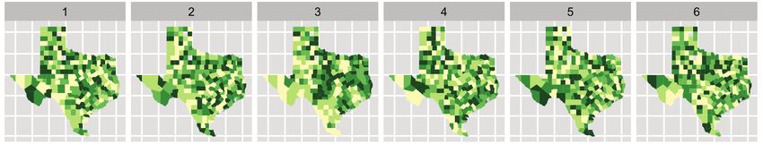
Fig. 1. One of these plots doesn’t belong. These six plots show choropleth maps of cancer deaths in Texas, where darker colors =
more deaths. Can you spot which of the six plots is made from a real dataset and not simulated under the null hypothesis of spatial
independence? If so, you’ve provided formal statistical evidence that deaths from cancer have spatial dependence. See Section 8 for
study spatial structure
the answer.
Abstract— How do we know if what we see is really there? When visualizing data, how do we avoid falling into the trap of apophenia
where we see patterns in random noise? Traditionally, infovis has been concerned with discovering new relationships, and statistics
with preventing spurious relationships from being reported. We pull these opposing poles closer with two new techniques for rigorous
statistical inference of visual discoveries. The “Rorschach” helps the analyst calibrate their understanding of uncertainty and the “line-
up” provides a protocol for assessing the significance of visual discoveries, protecting against the discovery of spurious structure.
Index Terms—Statistics, visual testing, permutation tests, null hypotheses, data plots.
1 I NTRODUCTION
What is the role of statistics in infovis? In this paper we try and an- graphic plates of actual galaxies. This was a particularly impressive
swer that question by framing the answer as a compromise between achievement for its time: models had to be simulated based on tables
curiosity and skepticism. Infovis provides tools to uncover new rela- of random values and plots drawn by hand. As personal computers be-
Roger Beecham, Jason Dykes, Aidan Slingsby, Cagatay
tionships, tools of curiosity, and much research in infovis focuses on
making the chance of finding relationships as high as possible. On the
came available, such examples became more common.[3] compared
computer generated Mondrian paintings with paintings by the true
Turkay, Jo Wood, giCentre, City University London
other hand, most statistical methods provide tools to check whether a
relationship really exists: they are tools of skepticism. Most statistics
artist, [4] provides 40 pages of null plots, [5] cautions against over-
interpreting random visual stimuli, and [6] recommends overlaying
research focuses on making sure to minimize the chance of finding a normal probability plots with lines generated from random samples of
relationship that does not exist. Neither extreme is good: unfettered the data. The early visualization system Dataviewer [7] implemented
curiosity results in findings that disappear when others attempt to ver- some of these ideas.
IEEE TRANSACTIONS ON VISUALIZATION AND COMPUTER GRAPHICS, VOL. 16, NO. 6, NOVEMBER/DECEMBER 2010 973 WICKHAM ET AL: GRAPHICAL INFERENCE FOR INFOVIS 975
3 P ROTOCOLS OF GRAPHICAL INFERENCE self-administer such a test, particularly with appropriate software sup-
Graphical Inference for Infovis This section introduces two new rigorous protocols for graphical infer- port, as described in Section 6.
Even when not administrated in a rigorous manner, this protocol is
ence: the “Rorschach” and the “line-up”. The Rorschach is a calibra-
tor, helping the analyst become accustomed to the vagaries of random still useful as a self-teaching tool to help learn which random features
Hadley Wickham, Dianne Cook, Heike Hofmann, and Andreas Buja data, while the line-up provides a simple inferential process to produce we might spuriously identify. It is particularly useful when teaching
a valid p-value for a data plot. We describe the protocols and show ex- data analysis, as an important characteristic of a good analyst is their
amples of how they can be used, and refer the reader to [1] for more ability to discriminate signal from noise.
detail.
3.2 Line-up
3.1 Rorschach The SJS convicts based on difference between the accused and a set of
The Rorschach protocol is named after the Rorschach test, in which known innocents. Traditionally the similarity is measured numerically,
subjects interpret abstract ink blots. The purpose is similar: readers and the set of known innocents are described by a probability distri-
are asked to report what they see in null plots. We use this protocol to bution. The line-up protocol adapts this to work visually: an impartial
calibrate our vision to the natural variability in plots in which the data observer is used to measure similarity with a small set of innocents.
is generated from scenarios consistent with the null hypothesis. Our The line-up protocol works like a police line-up: the suspect (test
intuition about variability is often bad, and this protocol allows us to statistic plot) is hidden in a set of decoys. If the observer, who has not
Fig. 1. One of these plots doesn’t belong. These six plots show choropleth maps of cancer deaths in Texas, where darker colors = seen the suspect, can pick it out as being noticeably different, there is
reduce our sensitivity to structure due purely to random variability.
more deaths. Can you spot which of the six plots is made from a real dataset and not simulated under the null hypothesis of spatial evidence that it is not innocent. Note that the converse does not apply
independence? If so, you’ve provided formal statistical evidence that deaths from cancer have spatial dependence. See Section 8 for
Figure 4 illustrates the Rorschach protocol. These nine histograms
summarize the accuracy at which 500 participants perform nine tasks. in the SJS: failing to pick the suspect out does not provide evidence
the answer.
What do you see? Does it look like the distribution of accuracies is they are innocent. This is related to the convoluted phraseology of
the same for all of the tasks? How many of the histograms show an statistics: we “fail to reject the null” rather than “accepting the alter-
Abstract— How do we know if what we see is really there? When visualizing data, how do we avoid falling into the trap of apophenia
where we see patterns in random noise? Traditionally, infovis has been concerned with discovering new relationships, and statistics interesting pattern? Take a moment to study these plots before you native”.
with preventing spurious relationships from being reported. We pull these opposing poles closer with two new techniques for rigorous continue reading. The basic protocol of the line up is simple:
statistical inference of visual discoveries. The “Rorschach” helps the analyst calibrate their understanding of uncertainty and the “line-
up” provides a protocol for assessing the significance of visual discoveries, protecting against the discovery of spurious structure. • Generate n − 1 decoys (null data sets).
Index Terms—Statistics, visual testing, permutation tests, null hypotheses, data plots. • Make plots of the decoys, and randomly position a plot of the
true data.
• Show to an impartial observer. Can they spot the real data?
1 I NTRODUCTION In practice, we would typically set n = 19, so that if the accused is
innocent, the probability of picking the accused by chance is 1/20 =
What is the role of statistics in infovis? In this paper we try and an- graphic plates of actual galaxies. This was a particularly impressive
0.05, the traditional boundary for statistical significance. Comparing
swer that question by framing the answer as a compromise between achievement for its time: models had to be simulated based on tables
curiosity and skepticism. Infovis provides tools to uncover new rela- of random values and plots drawn by hand. As personal computers be-
20 plots is also reasonably feasible for a human observer. (The use of
tionships, tools of curiosity, and much research in infovis focuses on came available, such examples became more common.[3] compared smaller numbers of n in this paper is purely for brevity.) More plots
making the chance of finding relationships as high as possible. On the computer generated Mondrian paintings with paintings by the true would yield a smaller p-value, but this needs to be weighed against
other hand, most statistical methods provide tools to check whether a artist, [4] provides 40 pages of null plots, [5] cautions against over- increased viewer fatigue. Another way of generating more precise p-
relationship really exists: they are tools of skepticism. Most statistics interpreting random visual stimuli, and [6] recommends overlaying values is to use a jury instead of a judge. If we recruit K jurors and
research focuses on making sure to minimize the chance of finding a normal probability plots with lines generated from random samples of k of them spot the real data, then the combined p-value is P(X ≤ k),
relationship that does not exist. Neither extreme is good: unfettered the data. The early visualization system Dataviewer [7] implemented where X has a binomial distribution B(K, p = 1/20). It can be as small
curiosity results in findings that disappear when others attempt to ver- some of these ideas. as 0.05K if all jurors spot the real data (k = K).
ify them, while rampant skepticism prevents anything new from being The structure of our paper is as follows. Section 2 revises the basics Like the Rorschach, we want the experiment to be double-blind -
discovered. of statistical inference and shows how they can be adapted to work Fig. 4. Nine histograms summarizing the accuracy at which 500 partici- neither the person showing the plots or the person seeing them should
Graphical inference bridges these two conflicting drives to provide visually. Section 3 describes the two protocols of graphical inference, pants perform nine tasks. What do you see? know which is the true plot. The protocol can be self-administered,
a tool for skepticism that can be applied in a curiosity-driven context. the Rorschach and the line-up, that we have developed so far. Section 4 provided that it is the first time you’ve seen the data. After a first
It allows us to uncover new findings, while controlling for apophenia, discusses selected visualizations in terms of their purpose and associ- It is easy to tell stories about this data: in task 7 accuracy peaks viewing of the data, a test might still be useful, but it will not be in-
the innate human ability to see pattern in noise. Graphical inference ated null distributions. The selection includes some traditional statisti- around 70% and drops off; in task 5, few people are 20-30% accu- ferentially valid because you are likely to have learned some of the
helps us answer the question “Is what we see really there?” cal graphics and popular information visualization methods. Section 5 rate; in task 9, many people are 60-70% accurate. But these stories features of the data set and are more likely to recognize it. To main-
The supporting statistical concepts of graphical inference are devel- briefly discusses the power of these graphical tests. Section 8 tells you are all misleading. It may come as a surprise, but these results are tain inferential validity once you have seen the data, you need to recruit
oped in [1]. This paper motivates the use of these methods for infovis which panel is the real one for all the graphics, and gives you some all simulations from a uniform distribution, that is, the distribution of an independent observer.
and shows how they can be used with common graphics to provide hints to help you see why. Section 7 summarizes the paper, suggests accuracy for all tasks is uniform between 0 and 1. When we display The following section shows some examples of the line-up in use,
users with a toolkit to avoid false positives. Heuristic formulations of directions for further research, and briefly discusses some of the ethi- a histogram of uniform noise, our expectation is that it should be flat. with some discussion of how to identify the appropriate null hypoth-
these methods have been in use for some time. An early precursor cal implications. We do not expect it to be perfectly flat (because we know it should esis for a specific type of plot and figure out a method of generating
is [2], who evaluated new models for galaxy distribution by gener- be a little different every time), but our intuition substantially under- samples from the appropriate null distribution.
ating samples from those models and comparing them to the photo- 2 W HAT IS INFERENCE AND WHY DO WE NEED IT ? estimates the true variability in heights from one bar to the next. It is
fairly simple to work out the expected variability algebraically (using 4 E XAMPLES
The goal of many statistical methods is to perform inference, to draw
a normal approximation): with 10 observations per bin, the bins will To use the line-up protocol, we need to:
• Hadley Wickham is an Assistant Professor of Statistics at Rice University, conclusions about the population that the data sample came from. This
have a standard error of 30%, with 100 observations 19% and 1000,
Email: hadley@rice.edu. is why statistics is useful: we don’t want our conclusions to apply only
observations 6%. However, working through the math does not give • Identify the question the plot is trying to answer.
• Dianne Cook is a Full Professor of Statistics at Iowa State University. to a convenient sample of undergraduates, but to a large fraction of
the visceral effect of seeing plots of null data.
• Heike Hofmann is an Associate Professor of Statistics at Iowa State humanity. There are two components to statistical inference: testing • Characterize the null-hypothesis (the position of the defense).
To perform the Rorschach protocol an administrator produces null
University. (is there a difference?) and estimation (how big is the difference?). In • Figure out how to generate null datasets.
plots, shows them to the analyst, and asks them what they see. To keep
• Andreas Buja is the Liem Sioe Liong/First Pacific Company Professor of this paper we focus on testing. For graphics, we want to address the
Statistics in The Wharton School at the University of Pennsylvania. the analyst on their toes and avoid the complacency that may arise if
question “Is what we see really there?” More precisely, is what we see
they know all plots are null plots [8] the administrator might slip in This section shows how to approach each of these tasks, and then
Manuscript received 31 March 2010; accepted 1 August 2010; posted online in a plot of the sample an accurate reflection of the entire population?
a plot of the real data. For similar reasons, airport x-ray scanners demonstrates the process in more detail for two examples. Section 4.1
24 October 2010; mailed on 16 October 2010. The rest of this section shows how to answer this question by providing
randomly insert pictures of bags containing guns, knives or bombs. shows a line-up of a tag cloud used to explore the frequency distribu-
For information on obtaining reprints of this article, please send a short refresher of statistical hypothesis testing, and describes how
Typically, the administrator and participant will be different people, tion of words in Darwin’s “Origin of Species” and Section 4.2 shows a
email to: tvcg@computer.org. testing can be adapted to work visually instead of numerically.
and neither should know what the real data looks like (a double- line-up of a scatterplot used to explore the spatial distribution of three
Hypothesis testing is perhaps best understood with an analogy to
blinded scenario). However, with careful handling, it is possible to point throws in basketball.
1077-2626/10/$26.00 © 2010 IEEE Published by the IEEE Computer Society
Line-ups

1   2    3     4

5   6    7     8

9   10   11   12

Map Line-ups

high

low

Moran’s I = 0.4

Moran’s I = 0.0              Moran’s I = 0.4
200

160

120

 80

 40

  0
      -0.8   -0.7   -0.6   -0.5   -0.4   -0.3   -0.2   -0.1   0   0.1   0.2   0.3   0.4   0.5   0.6   0.7   0.8

Moran’s I 0.9
1   2   3   4

5   6   7   8
1   2   3   4

5   6   7   8
empirical tests
questions
You can also read