Prototyping with SAP Build - a Walk-Through Guide as of July 2018, Version (1807)
←
→
Page content transcription
If your browser does not render page correctly, please read the page content below
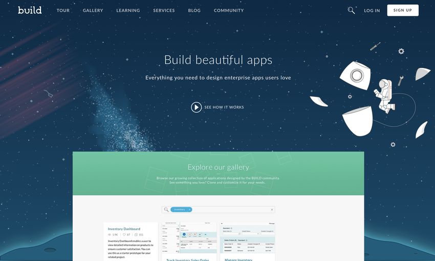
Prototyping with SAP Build
         a Walk-Through Guide
     as of July 2018, Version (1807)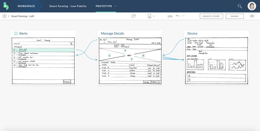
Purpose:
The purpose of this guide is to enable you to explore the features of SAP Build by
creating a prototype of a real app. You will create a low-fidelity prototype, comprising
images and clickable areas, develop this into a realistic prototype, and import it into
SAP Web IDE, where your development team can use it as the code-base of the app.
By following this guide, and completing the exercises within, you will learn how to the
do the following:
   - Create a low fidelity prototype in minutes
   - Share your prototype with users and gather feedback
   - Integrate data into your prototype by importing sample data, adding objects,
       and defining data properties and formulas
   - Import your prototype in WebIDE

Assets for these exercises are available here:
https://www.build.me/splash/sites/default/files/Prototyping_with_BUILD_Assets_0.zip

                                           2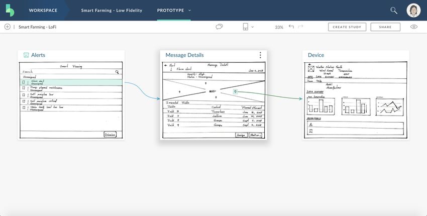
Revision Log

Context .................................................................................................................................5
Part 1 - SAP Build User interface explained .........................................................................6
   10 minutes
Part 2 - User profile ............................................................................................................11
   5 Minutes
Part 3 – Low Fidelity prototyping ......................................................................................14
   15 minutes
Part 4 - Feedback Studies...................................................................................................21
   Create a Study .......................................................................................................................... 21
   15 minutes
   Take a user study ..................................................................................................................... 25
   5 minutes
   Review Study results ............................................................................................................... 28
   10 minutes
Part 5 – Working with Ui5 Prototypes...............................................................................31
   List of Alerts page .................................................................................................................... 31
   40 minutes
   Message Details page .............................................................................................................. 40
   40 minutes
   Device page .............................................................................................................................. 49
   40 minutes
Part 6 - Import into WebIDE ..............................................................................................60
   Configure Destinations in SAP Cloud Platform and SAP Web IDE...................................... 60
   10 minutes
   Import your SAP Build project in SAP Web IDE .................................................................... 64
   5 minutes

                                                                     3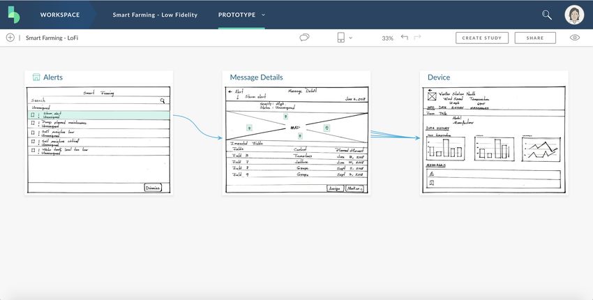
Revision Log
 Version   Date       Who                   Remarks
 1         20160316   Thomas DUBREUIL Initial version – SAP Build Beta 4
 2         20160629   Thomas DUBREUIL SAP Build Beta 5 screenshots
                                      Reorganized sections
                                      Added goals and intent
 3         20160710   Thomas DUBREUIL Added additional goals
 4         20161018   Thomas DUBREUIL Minor updates
 5         20161118   Thomas DUBREUIL Minor updates
 6         20170119   S PERE & JL     Updated with January 2017 SAP Build
                      TERREE          Version
 7         20170208   Brian Murray    Copy edit
 8         20170213   Thomas Dubreuil       Formatting
                                            Part 1 Edit
 9         20170425   Thomas Dubreuil       Updated with March 2017 SAP Build
                                            Version
 10        20170518   Thomas Dubreuil       Updated with May 2017 SAP Build
                                            Version
 11        20170719   Thomas Dubreuil       Updated with June 2017 SAP Build
                                            Version
 12        20180719   Joelle El Hayek       Updated with July 2018 SAP Build
                                            Version
 13        20180727   Thomas Dubreuil       Edits and updates

                                        4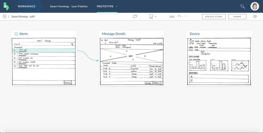
Context

Our mission at SAP Design is to deliver solutions to scale design and enable our internal
and external customers to build the right apps with the right experience. With our
solutions, we want to help our users on their journey towards Digital Transformation
and the Intelligent Enterprise.
SAP Build is a complete set of cloud-based tools to design and build your enterprise
app, available at https://www.build.me .

With SAP Build, you don’t have to be a designer or a developer to design apps with a
great user experience. SAP Build offers the following:
   • A series of comprehensive Learning Cards that teach you Design Thinking
       methodologies for designing applications that have a great user experience (UX).
   • Access to the knowledge and expertise of the SAP Build user-community and
       experts via the SAP Build Community pages and SAP Build blog.
   • Access to hands on help from design professionals via the SAP User Experience
       (UX) Design Services.
   • A public Gallery of projects that showcases design materials, including personas
       and journey maps, and fully-responsive prototypes, that will inspire you, and
       that you can clone and use as the basis for your own project!
   • The Prototype tool that enables non-technical users to create interactive
       prototypes that conform to the best design practices.
   • The Feedback tool that enables you to gather feedback from users about your
       design images and prototypes so that you can iterate and constantly improve.
   • The ability to jumpstart development without writing a line of code by importing
       and integrating your prototype code into an Integrated Development
       Environment such as SAP Web IDE.

With SAP Build, your company can adopt the design-driven methodology that SAP
recommends and promotes. It enables everyone to build highly-usable prototypes
without being constrained by a lack of dedicated UX designers or specialized HTML5
developers.
For SAP employees, SAP Build supports the design-led development (DLD) process by
streamlining design-gate (D-Gate) submissions and reviews.

SAP Build is available in SAP Cloud Platform, where it is hosted and operated by SAP.

You can use a limited version of SAP Build for free. You can purchase SAP Build to get
the following advantages:
   • A tenant dedicated to your company
   • An Admin user to manage access
   • An unlimited number of users
   • An unlimited number of projects per user
   • The ability to create studies on html5 prototypes
   • The legal right to deploy in production an application designed with SAP Build

                                           5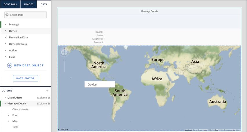
Part 1 - SAP Build User interface explained
10 Minutes

Let us walk you through the SAP Build User interface, and look at how it is organized,
and how the different components are related.

Note that Chrome is the only browser supported for prototyping.

Right after you log in, you’ll see your SAP Build Home page. From here you can
navigate to different parts of the tool. This schema shows some of the most common
paths between pages or modules.

You just need to remember these following two features and you’ll never get lost:

      1:          The icon on the top left always returns you to your Home page.

                                          6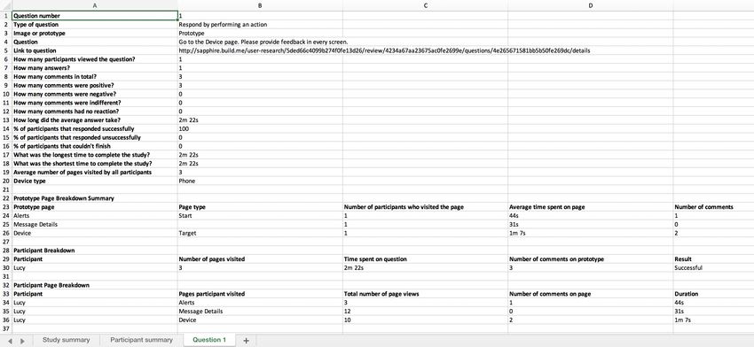
2: Once you’re in a project, the Toolpicker in the header bar enables you to
switch between the Persona tool, the Prototype tool, the Files tool, and the Feedback
tool.

Now to the UI Editor. It is organized with a central canvas, a toolbar on top and
panels on either side.

Each area has a different purpose

On top of the Canvas, a Toolbar allows for:

•   Change options of the display of the prototype (size, theme, grid, snap, zoom)
•   Show/Hide side panels
•   Undo/Redo
•   Create a study, Publish and preview the prototype

                                          7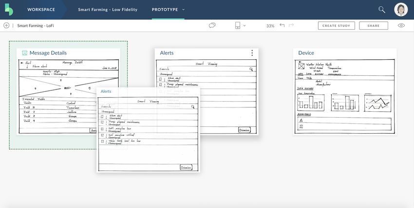
From the top left panel, you can drag images, controls and data onto the canvas to
compose your prototype.

•   The CONTROLS Tab lists all available controls for the prototype. The controls are
    organized by type and ready to be dragged onto the canvas or in the Outline.
    There are many controls, Search is a best practice.

•   The IMAGES Tab displays images you can drop onto the canvas. If you want to
    upload more files, use the menu in the header bar to navigate to the Files section.

•   The DATA Tab displays your data model objects and properties and lets you
    navigate to the Data Editor.

                                           8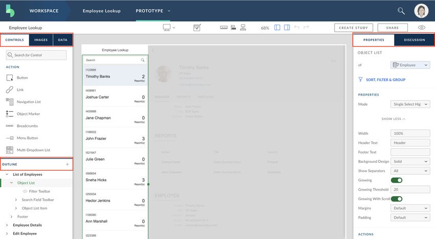
The OUTLINE in the BOTTOM LEFT Panel lists pages and a hierarchy of all objects in
them. Use it as an alternative way to select, reorder, rename or delete controls. It also
supports Copy and paste with keyboard shortcuts (Ctrl-c and Ctrl-v).

Use the DISCUSSION Tab in the RIGHT Panel to ask questions or leave comments
for other Team members. Discussions happen at page level.

The PROPERTIES Tab in the RIGHT Panel is divided into three sections.

•   PROPERTIES, where you can adjust the way a control looks in the canvas. Note
    that you can also use it as an alternate way to bind data. By default, some barely-
    used properties are hidden in the Show More subsection.

    •   ACTIONS where you define the actions following an event on the control, for
                   example a Navigation when a button is pressed.

                                           9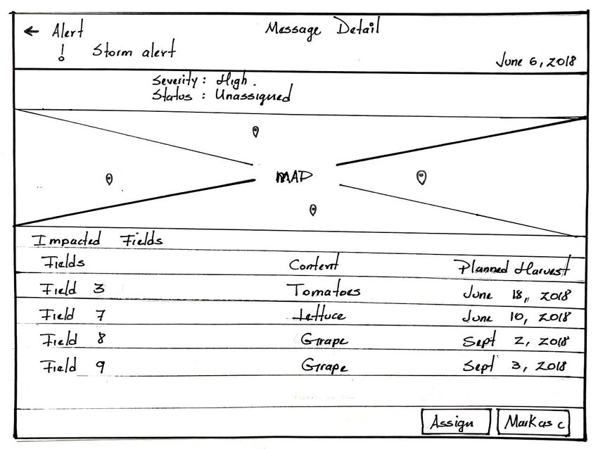
•   CHILDREN where you can micro manage the hierarchy of controls. You can zoom
        in, add or delete controls that are children of the one you are looking at.

                          Happy prototyping!

                                        10
Part 2 - User profile
5 Minutes
In this section, you will learn how to manage your user profile settings and
information. This is important because:
- All users may not be allowed to access all organizations. For example, if you
create a project in a private organization and do not have the appropriate
security settings, you may not be able to share it with people outside this
organization. In doubt, ask your SAP Build Admin user!
- You can add a profile picture, so your colleagues know what you look like!
What to do Screenshot
Connect to https://www.build.me
If you don’t have a SAP Build account,
select the Sign Up button. You require a
valid email address to confirm your
account.
In the future, you’ll pick the Log In
button to log in instead.
Once logged in, select your avatar in the
top right corner, and select User Profile.
11Verify that your name, email, job title and
company name are correct. Edit your
details if necessary.
Select Photo and upload a new avatar
picture from your files.
1. Select the Organization Tab. In the
drop-down, pick one of the following
default organizations:
• Standard (public tenant)
• Your company name (only
available to paying customers)
2. If the organization you are looking for
is not listed, paste the following in
address bar of your browser:
https://www.build.me/go/
If you are allowed to access the
organization, reopen your user profile, it
should be added to the dropdown list
12Select Communication.
Check the box “I agree to receive SAP
Build newsletter and other product
information.”; we are now friends!
Just kidding, adjust the messaging to
your preferences. For the sake of the
exercises in this guide, keep
“Collaboration” checked!
Click Save
13Part 3 – Low Fidelity prototyping
15 minutes
In this section, you will learn how to create an interactive prototype from sketches
using pre-existing images.
Assets for this exercise are available here:
https://www.build.me/splash/sites/default/files/Prototyping_with_BUILD_Assets_0.zip
In this example, you are building an application that enables farmers to better manage
their fields by reviewing the auto generated alerts and taking appropriate actions.
This application comprises three screens:
Images
Screen 1: A list of alerts ordered by
priority
Screen 2: The details for a single alert
showing a navigable map with clickable
sensors in the impacted fields.
14Screen 3: The detailed information from
the sensor
Procedure Screenshot
Login to SAP Build.
Your Workspace is displayed. Create a
new project.
In the popup Start from Scratch section,
select Create New Project
15Name the project Smart Farming
Select Start with Image.
A new empty prototype has been created
in your project. Name it “Smart Farming –
Low Fidelity“
Drop the images directly from your
downloaded assets folder onto to your
browser window:
- Page 1.jpg (List of Alerts)
- Page 2.jpg (Message Details)
- Page 3.jpg (Device)
Important Note: If you have the images
on your phone, you can also use the SAP
Build Mobile Upload feature, instead of
Drag/Drop or Desktop Upload. You will
still need Chrome tough.
16Each thumbnail represents a page in your
prototype. On each thumbnail, double-
click the page name, and enter the
following names:
• Alerts
• Message Details
• Device
Note: You can also rename the pages by
selecting the icon on the right of the
title bar to display the menu, and then
selecting Rename. This icon only appears
on mouseover.
Using this menu, you can also:
Change the orientation of the image by
selecting Rotate Image.
Replace a certain image with a different
one by selecting Replace.
Create an exact copy of a certain image
by choosing Duplicate.
To reorder the pages, select the title bar
above a thumbnail and drag and drop the
it to a new position.
Display the page in the following order,
left to right:
• Alerts
• Message Details
• Device
Note: The first page cannot be moved.
Drop another page on it to move it …
17On the Alerts page thumbnail, select,
drag, and release on the cell containing
Storm Alert to create a hotspot.
Immediately next, click the Message
Details page thumbnail to create a link
with the floating arrow.
On the Message Details page thumbnail,
select, drag, and release on one of the 4
pins on the map create a hotspot.
Immediately next, click the Device page
thumbnail to create a link with the
floating arrow.
Repeat the last two steps for the
remaining 3 pins on the map.
Note: If you make a mistake you can
resize, move, and delete hotspots.
Create hotspots on the back button on
each thumbnail image and link them to
the previous page.
18These screens being designed for a
Tablet application, select the Tablet
(Landscape) device in the toolbar. This
enables users to view the application at
the correct screen size.
Click the Chat Bubbles icon in the
toolbar start a conversation thread and
exchange ideas, thoughts, and feedback
about each screen with the people on
your project team.
Select the Preview button under your
avatar and ensure that the prototype is
working as expected and that you can
navigate to and from every page using
the hotspots that you defined.
Select Back to Page Map to return to the
page map.
19Select Share to publish a URL for the
published project that you can share with
others.
Click the Download Tab. You can use it
to get a standalone version of your
HTML prototypes in a compressed .zip
file
Select Create Study to begin creating a
feedback study based on this prototype.
20Part 4 - Feedback Studies
In this section, you will learn how to share a prototype with users and ask for
feedback. You will then participate in the study - as if you were a target user - and
then review the feedback.
Create a Study
15 minutes
You will learn how to create questions that ask users to perform an action on an
interactive prototype, and how to create questions about static images.
What to do Screenshot
1. Name the study Design
Validation.
2. Enter the following description:
Please test and provide your
feedback regarding the design of
this prototype.
3. Select Create and go to
Feedback.
21The prototype is now included in the
study as your first question.
Click the tile to open the question
1. In the right panel, enter the
following text for the question:
Go to the page with detailed
information from the sensor.
Please provide feedback in every
screen.
2. Select Respond by performing
an action. This type of answer
also allows annotations by end
users.
3. Make sure Study format is set to
Tablet (Landscape)
Action questions require a Start and a
Target.
On the canvas, select Device as the
Target.
22Select Done to return to the Feedback
page.
Click New Question
This enables you to add an additional
question to the study.
You can use this to create questions
about images, or about prototypes within
this project. For example, you can ask
people if they would like to use your
application with a multiple-choice
answer.
Notice there are two tabs:
• Images
• Prototypes
Click Cancel to close.
Preview the study to view what your
target users will see in a new tab.
Review the study, and then close the
preview tab.
Publish the study.
Remember, you can’t modify published
studies.
23Your study is now published
Okay
There are no participants to your study...
Time to invite a few colleagues
Click Invite new participants.
You can enter colleagues’ email
addresses and invite them to participate
in the feedback study.
Note: Email addresses can be pasted
from a comma or semi colon separated
list. The format of the entered emails will
also be validated.
When you’ve added all the email
addresses you want, select Invite.
Note that you can also invite yourself.
24Take a user study
5 minutes
You will learn how to take the user study as if you are one of the participants.
Study thumbnails are displayed on the
Feedback page. You can go there from
the header toolbar
Note: On the study tile, you can see that
you have 0 participants, 0 comments, and
0 answers. This is because nobody has
participated yet.
Hover your mouse on the Hamburger
menu icon to retrieve the URL of your
study, double click to select it and press
Ctrl + C on Windows (or Cmd + C on
Mac) to copy it.
To take the study, paste the study URL in
a new browser tab...
Select Start Study.
Interact with the prototype application
and attempt to complete the
instructions/answer the question.
Select Drop Comments.
251. Select on an area on the image to
leave comments and sentiments.
2. Save the comments.
3. When you have left all your
comments, click Done.
4. As the prototype is now active
again, navigate by selecting the
hotspot on Storm Alert.
Repeat leaving feedback on the Message
Details page and on the Device screen.
Note that the more clicks you use, the
more results you will have later in
Review Results, so do not hesitate to
navigate back and forth.
Select Finish if you think you’ve
answered the question.
Select Done to close the study
26Close the browser tab
27Review Study results
10 Minutes
You will review the feedback left by the participants and get insight on their behavior,
sentiments, and navigation while using your prototype
What to do Screenshot
Open your Alerts page
Note that in our example one user took
the study, leaving 3 comments
Select the Design Validation tile to
review study results.
Review the study results
In the Questions tab, you can see the
number of users who finished the study
All of the participants (1) successfully
navigated to the final page. It took on
average 2m 22s to do this. The
participant on average visited 3 pages of
the application to do this.
28Open the question to navigate and
review comments and sentiments for all
screens.
Select on a comment in the right panel to
see where it was placed in the prototype.
Note: If several users take the study, you
will see a list of all comments for all users
for this screen.
Unselect Comments to return to the
interactive prototype.
Select Heatmap to view a visual
representation of where users clicked on
the prototype.
Unselect Heatmap to return to the
interactive prototype.
Select the Breakdown tab.
Here you can see summary statistical
information about each prototype page.
Select the Page Flow tab.
Here you can get insights into how the
users navigate between prototype pages.
29Select the Statistics tab.
Here you can see overall statistics about
a HTML prototype perform-an-action
question, and information about
participants who attempted to complete
the question.
Close the study details popup
You can also click on Download Results
from the main Feedback page to
download a summary of the received
feedback.
The summary is in Excel format and
contains several sheets: Study Summary,
Participant Summary, and Question
Summary.
30Part 5 – Working with Ui5 Prototypes
In this section, you will learn how to work with common UI5 controls, align items, and
use realistic sample data, so that your prototype is as close as possible to the final
app.
For user validation, we recommend that you create feedback studies to gather
feedback each time you make significant changes.
We’ll start with making the UI looking close to the target prototype, then we’ll add
realistic data, then polish the prototype to display the data correctly. We’ll do this
page by page;
If you accidentally run into some unexpected manipulation of controls, do not panic!
You can restore the previous state using the Undo function from this toolbar icon
or, if you prefer that, use the good old Ctrl-z keyboard shortcut.
Note: If you do not want to start from scratch, you can clone an existing prototype
from the SAP Build Gallery and then customize to fulfill your needs! But during this
exercise, you will be starting from scratch.
List of Alerts page
40 Minutes
Summary of work to be done in this page (after creating your project, inviting
participants, and choosing the appropriate template)
- Add the images for this project (to be used later on page 3)
- Add meaningful data from the data model
- Rename the 1st page
- Create and customize the list items
- Make sure the Search bar works as expected
- Set the navigation and transition from this page to the Message Details page
What to do Screenshot
Go to your Workspace. Create a New
Project and name it Smart Farming – High
Fidelity
Note: You could also reuse the Smart
Farming project from Part 3 and create a
new prototype in it:
31Select Invite Team to invite colleagues to
participate to your project.
It is a good idea to invite all the people
that you want to participate in the
elaboration of the prototype, including
designers, key users, and developers.
Invited people are notified in their SAP
Build home page and by email.
Note: you need to be a team member to
import the code of the prototype in
WebIDE
Select Start with Template to start
building your prototype.
Name your prototype Smart Farming
Prototype.
Choose the Flexible Column Layout
template.
32You will be redirected to the page map of
your new project.
Navigate to the first page of your
prototype to start editing it.
Choose the Images tab on the top left
menu to add the images needed for this
prototype.
33Drag/drop all the four images from your
downloaded assets folder.
34Before we start with working on the user
interface, let’s talk about data in SAP
Build so you understand better what we
are doing here.
The data model will be used to display
realistic data into the prototype. It also
allows context to be kept while
navigating, making the prototype more
meaningful to the users. It will also make
your prototype ready to work with
prototyping Actions like
Create/Read/Update/Delete of Data.
A data model can be seen as a database
that the prototype will use to display
information. Data Model range from a
single object to many! We will explore the
Data editor later in this exercise.
Choose the Data tab on the top left menu
to add the data file needed for this
prototype.
Click on Import and choose the Smart
Farming Excel data file from your
downloaded assets folder. Your data
objects will now be displayed.
35Next, you will start editing the first page
of your prototype and make it ready to
display the data from the data model.
Go to the OUTLINE section at the bottom
of the Left Panel. Double click Page 1 and
rename it to List of Alerts.
Right click on the Object List in the page
Outline and Delete it. In this project we
will be using a Standard List instead.
36Choose the Controls tab at the top of the
left Panel and search for “Standard”. Drag
and drop the Standard List to your page
right under the List Page Header.
Note: there is a tooltip that will display if
you hover your mouse on the control in
the left panel. When available, there is
link to the SAP Fiori Guidelines for that
control.
Double click on the List Page Header and
rename it to List of Alerts.
Note: In line editing is available
everywhere there is no data bound.
Select your newly added Standard List
and bind the Message data object to it
using the Properties menu on the right,
simply by choosing Message from the
drop-down list of available data objects.
Note: You can also do the data binding by
dragging the Message data object from
the Data tab on the left onto the first List
Item.
Now you will customize the list items.
Select the first item in the list or in the
Outline, and bind the appropriate data
fields to it from the Properties menu on
the right as follows:
-Title: Desc
-Description: Status
-Info: Date
37Now let’s add the binding for the message
icon.
The Icon field is one that you need to add
yourself to the data model a it is not in
the Excel file you added. We will calculate
it based on the message type.
To do so, navigate to the Data tab on the
left menu and choose Data Editor. Click
on the Message object in the data model
to edit it. You will see its data fields on
the right. Choose New Property and add
Icon of type String.
Note: If you want to edit your Data, you
can do so in the “SAMPLES” Tab.
Best practice is to create the structure of
the Data Model in SAP Build, export it to
Excel, edit the data and reimport the
Excel file back to SAP Build.
Click on the newly added property and
choose Create Formula.
In the Formula Dialog, Drag and drop an
If-Else condition and populate it with the
appropriate properties, values, and
operators as shown in the screenshots on
the right.
Note:
Message Type is a Property
= is an Operator
Alert, sap-icon://warning and sap-
icon://message-information are Values
38Now leave the Data editor and bind the
newly created “Icon” property to the
“Icon” field of the Standard List Item.
Note: You can use Drag and Drop or bind
from the control properties in the right
panel.
Result should look like this:
Now you will add the Actions needed for
this page.
Select the Search bar and choose Add
Action from the Properties menu on the
right. Customize the action as follows:
- Interaction: Live Change
- Action: Search
- Collection: Standard List of Message
- Search On: All properties
Next select the standard list of items and
customize its actions as shown on the
right, so that clicking an item on the list
will open the Details page (Page 2).
Note: as we are using a Data Model with
this prototype, the Data displayed in page
2 will depend on the item clicked in the
List of Alerts page. This we call
Navigation with Context.
You can now click on preview and make
sure that searching for a list item and
navigating from Page 1 to Page 2 both
work as expected.
39Message Details page
40 Minutes
Summary of work to be done in this page:
- Rename the page
- Add and customize the Object Header of the page
- Add and customize the Form containing the message details
- Add and customize the Map containing the sensors
- Customize the Table containing the Impacted Fields information
- Customize the Footer buttons and make sure they work as expected
- Set the navigation and transition from this page to the Device page
What to do Screenshot
Now, you will start editing the second
page of your prototype.
Go to the page Outline. Double click Page
2 and rename it to Message Details.
Similarly, rename the page header to
Message Details inline
Select the Object Header in the Outline
to start editing it.
Do the data binding by dragging the
Message data object from the Data tab on
the left to the selected Object Header.
Now set the values of its Properties as
shown in the screenshot on the right.
40Your Object Header should look as
follows:
Choose the Controls tab and search for
Form. Drag and drop it to your page right
under the Object Header.
As a title is not needed for this section,
right click on the Title Form Title in the
page Outline and Delete it.
Then set the Default Line Height property
on the right to OFF, to align the rows of
the form with labels on top.
Now select the Form Section in the page
Outline to begin customizing it.
Select the first Row in the section. Double
click the Label and rename it to Severity.
41In the OUTLINE, make sure the first row
is selected
On the Right Panel you will see a
CHILDREN section.
Expand Fields (1),
Add a Text control
Delete the Input
Note: This could be done with drag and
drop, in the UI or in the Outline. Now you
know another way to place controls
Select the newly added text and bind it to
the Severity field using from the
Properties tab on the top right
Similarly, edit the 3 remaining rows as Before data binding:
follows:
-Row 2:
Rename the Label to Status
Delete the Drop-Down List, add a Text
Bind the Text to the Status data property
-Row 3:
Rename the Label to Assigned to After data binding:
Delete the Drop-Down List, add a Text
Bind the Text to the Owner data property
-Row 4:
Rename the Label to Comment
Bind the Text to the Comment data
property
42Choose the Controls tab and search for
Map. Drag and drop it to your page right
under the Form.
Now select the newly added Map and do
the data binding by dragging the Device
data object from the Data tab on the left
on to it.
Then change its Property value on the
right to Device via Device.
This way, we will display spots for each
device associated with a message, based
on the relationship between the two
objects.
Click on Show More in the properties to
set the center of the Map and the initial
Zoom Level
We already know the center of the Map
comes from the Data, so bind it to the
GPSCoords
Set initial zoom level to 12 (but this is up
to you if you like to scroll!)
Repeat for Zoom level: 12
43Staying in the Properties tab on the right,
scroll down to the Children section.
Expand the Visual Objects and click on
Spots.
Next expand the Items section and click
on Spot.
Now customize the properties of each
spot as shown in the screenshot on the
right in order to display the spots at the
correct coordinates on the map.
Set the ACTION for the Spots so that
clicking one will take you to the next page
Now you will start customizing the table
below the map. Select it, right click and
choose Add Toolbar to add a title.
Rename the title to Impacted Fields.
44Delete each of the toolbar icons on the
right.
Note: you can also select the icons in the
layout editor and press Backspace on
your keyboard
Now select each of the 3 columns and
rename their headers to Field, Content,
and Planned Harvest from left to right.
Bind the table to the Field data object
using the Properties menu on the right.
Note: use Drag and drop if you prefer
Now you will bind the controls in the first
row to the data.
When binding, always use the first row
and the result will be automatically
replicated in other rows.
Select the Item Identifier control in the
first column (Field) and bind it to the
Name data property.
Select the Text control in the second
column (Content)bind it to the Content
data property.
Select the Item Number control in the
third column (Planned Harvest) and bind it
to the HarvestDate data property.
Remove the Unit Value (USD)
45When you are done, your table will look
as follows in the screenshot on the right
Next you will customize the existing
footer.
Now customize the Cancel button to
become one that will help the user mark
an alert as complete. Select the button
and edit its Properties as shown in the
screenshot on the right.
The button will now look like this
Change the Action associated with that
button to “Change Value” on the property
“Status”, with value “Complete”.
This will change the Status of the Alert to
Complete.
Add a second action. Set it to show a
confirmation message that the status has
been changed.
Now customize the Save button to
become one that will help the user assign
an alert to someone.
Select the button and edit its Properties
as shown in the screenshot on the right.
Your footer should now look like this
46Add an action to the Assign button such
that it opens a new dialog when clicked.
Choose Dialog 1 under Dialog Name. You
will notice that a new page (Dialog 1) gets
added in the outline.
Now navigate to the newly added dialog
(Dialog 1) from the Outline to start editing
it.
Rename the title to Assign
Choose the Controls tab and search for
Form. Drag and drop it inside your Dialog.
In the page Outline, right click the Form
Title and Delete it.
47Also, from the page Outline, right click on
each of the third and fourth Form Rows
to delete them.
Rename the first label to Assign to and
the second label to Comment.
Now Drag and Drop a Text Area control
from the CONTROLS TAB to the the
Form Row “Comment” in the OUTLINE.
Delete the Drop-down list
In order to be able to change a data
model value from this dialog, it must be
bound to the Data object
Select the Dialog and bind it to the
message object
48Add three actions to the OK button as
shown in the screenshot on the right.
The first action is to change the Status of
the Alert to In Progress.
The second is to save the changes.
The third is to close the dialog.
Now add two actions to the Cancel
button as shown in the screenshot on the
right.
The first action is to cancel the changes.
The second is to close the dialog.
You can now click on preview to make
sure that the actions on the dialog work
as expected – and that your assigned
owner and added comment are
successfully reflected on the Message
page.
Device page
40 Minutes
Summary of work to be done in this page:
- Rename the page
- Customize the Object Header of the page
- Add and customize the Form containing the device information
- Add and customize the Bar and Line Charts
- Add and customize the Feed List
What to do Screenshot
49Now, you will start editing the third page
of your prototype.
Go to the page Outline. Double click Page
3 and rename it to Device.
Select the Object Page Header and
modify its properties in the CHILDREN
section:
Delete the Button under Actions
Add a Link under Bread Crumbs Links.
Rename the Bread Crumb Link to Back
instead of Link.
You will use this link to navigate to the
previous page, so set the associated
action to Navigate Back
50This page will display data from a Device.
Select the whole page and bind it to the
Device data object from the Properties
menu on the right.
Select the Object Page Header in the
page Outline and customize it from the
Properties menu by setting its properties
Image -> Picture
Title -> Name
Subtitle -> Model
In the page Outline, Delete the Vertical
Box
Similarly, right click and Delete the Hello
and Welcome label.
51Now Delete the Footer Bar that is inside
the Header.
Your header will look as follow in the
screenshot on the right.
Now let’s start to work on the content of
the page. Object pages are organized with
sections and subsections for easy
navigation.
Select the first Sub Section to start
customizing it. Change its title to Info.
Note: as this is the only subsection in the
section, the subsection title is promoted
in the toolbar as a section title
Then choose the Controls tab and search
for Form. Drag and drop it to your page
inside the first Sub Section.
Delete the default label “Some random
text” in the subsection so that the Form is
properly aligned in the section.
Select the newly added Form and Delete
the title from the Properties menu.
52Then delete the last two form rows so
that the form is left with only two rows
instead of four
Customize the first row:
Change the value of the label to Model.
Replace the input with a Text and bind it
to the Model field.
Then customize the second row:
Change the value of the label to
Manufacturer.
Replace the input with a Text and bind it
to the Manufacturer field.
Set the Default Line Height to off to align
the rows in your form with labels on top
53Your form will look as follows in the
screenshot on the right.
Now let’s work on the next section.
In the OUTLINE, open the second section
of the object page and select the
subsection it contains.
Change its title to Data History.
Then choose the Controls tab and search
for Column Chart.
Drag and drop it to your page inside the
Sub Section.
Delete the “Some random text” label so
that the chart is aligned to the left in the
section.
Drag and drop a second Column Chart
next to the first one.
Finally search for Line Chart in the
Controls tab.
Drag and drop it to your page next to the
two other charts.
Now you will customize each of the 3
charts and do the appropriate data
binding
Select the first Column Chart.
First thing to do is to bind the chart with a
data set. Do this from the Chart
properties, bind the Chart with the
Temperature DataSet
54Set Chart Dimension in the Properties
menu as Date.
Note: if you cannot see the binding,
refresh the page.
Note: Dimensions and measures can be
found in CHILDREN or OUTLINE
Then set its Chart Measure in the
Properties menu as Value
Set the Label to °F
Your first Column Chart will look as
follows on the screenshot on the right.
Bind the second column chart with the
Rain Dataset
55Set its Chart Dimension in the Properties
menu as Date
Then set its Chart Measure in the
Properties menu as follows in the
screenshot on the right.
Your second Column Chart will look as
follows on the screenshot on the right.
56Bind the Line Chart to the Hygrometry
Dataset
Set the Chart Dimension to the Date
property
Set the Chart Measure to the Value
property with the Label %
Your third Line Chart will look as follows
on the screenshot on the right.
57Now select the Sub Section in the Third
Section to start customizing it. Change its
title to Messages.
From the CONTROLS Tab drag and drop
a Feed List in the MESSAGES Subsection
Delete the “Some random text” Label as
we will not be using it.
Bind the newly added Feed List to the
DeviceTextData field.
Select the first item in Feed List and
customize the properties with the
following bindings:
Icon -> Type
Sender -> Date
Text -> Text
58Your Feed List will look as follows in the
screenshot on the right.
You can now click on preview to make
sure that everything works as expected.
When everything works as expected, we
need to publish the project to be able to
run the next section: Import into WebIDE
Hit the SHARE button in the toolbar
Wait for the URL to be displayed before
closing
59Part 6 - Import into WebIDE
In this section, you are going to import your prototype to Web IDE to turn it into an
app and deploy it.
This task is normally performed by a developer. In order to get access to the
prototype from SAP Web IDE, the developer needs to be a member of the team in
SAP Build. This is also a good way to ensure feasibility. If not possible, the prototype
can still be exported as a Zip file from SAP Build.
SAP is offering a new release of SAP Web IDE (herein, “SAP Web IDE, multi-cloud
version”), side by side with the standard SAP Web IDE, which is no longer being
developed. When you navigate to the SAP Cloud Portal cockpit services, you will see
two different tiles, SAP Web IDE and the new SAP Web IDE, multi-cloud version.
The procedure below details the steps to be taken when working with SAP Web IDE
Multicloud. For SAP Web IDE standard, please refer to the SAP Build documentation.
Configure Destinations in SAP Cloud Platform and SAP Web IDE
10 Minutes
If you are using a licensed version of SAP Build you can skip this section. All
destinations were created automatically when the SAP Build service was enabled for
your company SAP CP account.
If you are a freemium user, you need to do some configuration steps in SAP CP for
SAP Build and WebIDE to be able to communicate effectively.
What do do Screenshot
The first thing to do is create the “Link”
between SAP Web IDE and SAP Build in
SAP Cloud Platform. For this, we will
create a “Destination” that will tell
WEBIDE where to import the prototypes
from.
In SAP Build, click your avatar and select
Help.
60From the menu on the left, expand:
SAP Web IDE
>Extend Prototypes with SAP Web IDE
>Destinations
>Import Destinations
Download the SAP Build_Production
http://sap.github.io/SAP
destination by clicking the Link
Build_User_Assistance/Destinations/SAP
Note: Build_Production
Ui5 destinations are useful for SAP
employees only
Other destinations are only required
when using SAP Web IDE standard
version
Open SAP Cloud Platform and login to
your account
Note: If you do not have a SAP Cloud
Platform account, go to
https://account.hana.ondemand.com/ to
get a trial account.
61Once logged in SAP Cloud Platform,
Open “Destinations” from the left menu
Import the destination that you
previously exported from SAP Build user
assistance
Go to Services from the left menu and
search for SAP Web IDE.
Check that SAP Web IDE Full-Stack
version is enabled. If it isn’t, click the tile
to enable it
62Click the tile to display the links.
Go to SAP Web IDE service.
In Features, enable Import prototype
from SAP Build.
Make sure you Save at the bottom of the
page.
The configuration is done.
Refresh your SAP Web IDE to reflect the
changes.
63Import your SAP Build project in SAP Web IDE
5 Minutes
You will now import the SAP Build prototype into SAP Web IDE to get starter UI5
code through some config.
What do do Screenshot
Select New project from Template on
the SAP Web IDE Home page.
In the drop down select SAP Build
Project.
Select Next.
Name your project.
Select Next.
Note: Spaces are not allowed in the
project name.
64Login if required. You need to login using
the email address and the password that
you use to login to SAP Build
Select your SAP Build system and your
published project.
The SAP Build system is your profile
organization, as described in Chapter 1
Select Finish.
Right click your project in the Projects
folder.
Select Run as Unit Test to run it.
Review the code for your project.
65Congratulations, you did it!
We hope you’ve enjoyed this exercise… please leave comments on.
- Twitter @BuildwithBuild
- By posting a comment on https://standard.build.me/community
- Or sending a mail to contact.build@sap.com
66You can also read


