Sentinel-1 Toolbox Time-series analysis with Sentinel-1 - Issued July 2020 Updated June 2021 Andreas Braun - Esa STEP
←
→
Page content transcription
If your browser does not render page correctly, please read the page content below
Sentinel-1 Toolbox

Time-series analysis with Sentinel-1

                                                               Issued July 2020
                                                             Updated June 2021

                                                                   Andreas Braun

Copyright © 2021 SkyWatch Space Applications Inc. https://skywatch.co
                            http://step.esa.int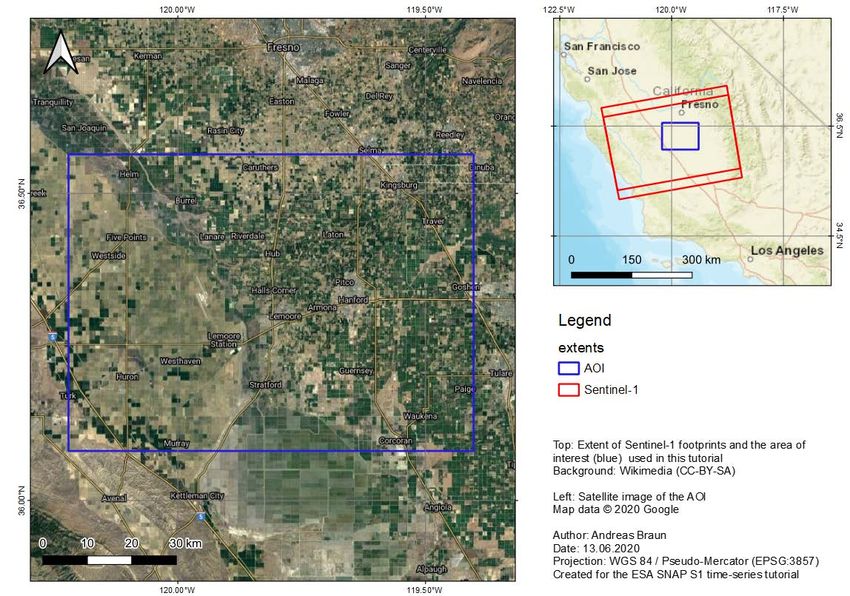
Time-series analysis with Sentinel-1

About this tutorial
The goal of this tutorial is to demonstrate a workflow for the retrieval of information from multi-temporal data
of the Sentinel-1 radar satellite. It introduces the preprocessing of a larger number of input products with
the Graph Builder and the Batch Processing functionalities as well as selected multi-temporal analysis tools
for the discrimination of agricultural crops.

This tutorial requires basic understanding of radar data and its processing, for example as provided by the
SAR Basics Tutorial (PDF) or the S1TBX Introduction (video). Also, the S1TBX Graph Building Tutorial is
recommended.

For an introduction into multi-temporal analysis of SAR data in the context of crop mapping, the following
materials and references are recommended.

•    LeToan, T. (2018): Multitemporal analysis of SAR data. ESA Land Training 2018 (PDF)
•    Castro Gómez, A., Fitrzyk M., Patruno J (2019): Crop monitoring with dual-pol S1 data. ESA
     Advanced Course on radar polarimetry 2019 (URL)
•    EO College (2016): Agricultural applications with SAR data (URL), Crop type classification (URL)
•    ESA (1995): Satellite radar in agriculture. Experiences with ERS-1. SP-1185 (PDF).
•    McNairn H., Shang J. (2016): A Review of Multitemporal Synthetic Aperture Radar (SAR) for crop
     monitoring. In: Multitemporal Remote Sensing, pp 317-340. Springer, Cham (URL).

Background and preparation
Download the data

The data used in this tutorial can be downloaded from the Copernicus Open Access Hub at
https://scihub.copernicus.eu/dhus (free registration required). Search and download the following products:

1     07.02.2016      S1A_IW_GRDH_1SDV_20160207T015835_20160207T015900_009834_00E65A_8709
2     02.03.2016      S1A_IW_GRDH_1SDV_20160302T015835_20160302T015900_010184_00F077_94FD
3     26.03.2016      S1A_IW_GRDH_1SDV_20160326T015835_20160326T015900_010534_00FA6A_4D6A
4     19.04.2016      S1A_IW_GRDH_1SDV_20160419T015836_20160419T015901_010884_0104D5_1255
5     13.05.2016      S1A_IW_GRDH_1SDV_20160513T015840_20160513T015905_011234_010FDE_6DB9
6     06.06.2016      S1A_IW_GRDH_1SDV_20160606T015842_20160606T015907_011584_011B33_23C5
7     30.06.2016      S1A_IW_GRDH_1SDV_20160630T015843_20160630T015908_011934_012632_E440
8     24.07.2016      S1A_IW_GRDH_1SDV_20160724T015844_20160724T015909_012284_01319D_F35D
9     17.08.2016      S1A_IW_GRDH_1SDV_20160724T015844_20160724T015909_012284_01319D_F35D
10    10.09.2016      S1A_IW_GRDH_1SDV_20160910T015847_20160910T015912_012984_0148C8_4B3D
11    28.10.2016      S1A_IW_GRDH_1SDV_20161028T015847_20161028T015912_013684_015F23_9EE6
12    15.12.2016      S1A_IW_GRDH_1SDV_20161215T015846_20161215T015911_014384_017502_79F6

Instead of entering the product IDs, you can also search for the following criteria (Figure 1) and download
all available products:

Sensing period        01.02.2016 – 31.12.2016
Product type          GRD
Polarization          VV+VH
Sensor mode           IW
Orbit direction       ascending (enter in the text field, see Figure 1)
Area                  36.3, -119.75 (draw polygon in this area, see Figure 1)

                                                                                                              2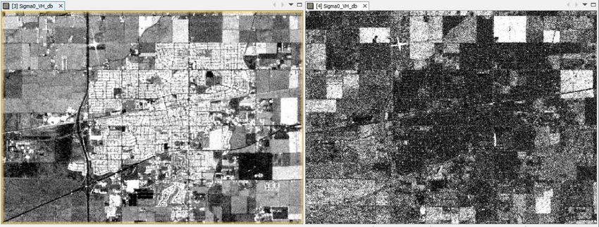
Time-series analysis with Sentinel-1

Please note: Since September 2018, the Copernicus Open Access Hub has transitioned into a Long Term
Archive which means that products of older acquisition dates have to be requested first. Please find more
information about this here: Activation of Long Term Archive (LTA) Access: and here: Open Access Hub
User Guide.

Still, some official data mirrors offer batch downloading to facilitate the automated retrieval of multiple files.
Some examples are ASF Search, PEPS or CODE-DE.

                                   Figure 1: Retrieval of suitable images

As some of the required steps are computationally intensive, it is good to store the data at a location which
offers good reading and writing speed. If your computer has an internal SSD (how to find out) processing
should be done there to ensure best performance. Network drives or external storage devices are not
recommended. Also, paths which include special characters should be avoided. In this tutorial, the data is
stored under C:\Temp\timeseries\.

Notes on data selection

The backscatter response of agricultural areas is very sensitive to a number of parameters:

    1.   The angle between the look direction of the satellite and the row orientation [ref]
    2.   Shape, size and volume of the crops with respect to the transmitting and receiving polarization
    3.   Stalk or root lodging [ref] and ear bending [ref] of cereals
    4.   Rainfalls lead to higher soil moisture and larger contribution of surface scattering from the ground,
         especially over grasslands and spiked grains [ref]

To minimize the impact of #1, it is highly advisable to only use images of the same track (relative orbit;
here: 137) for multi-temporal analyses. The observed backscatter variations over time are then mainly a
result of seasonal and phenologic changes (#2). We use VH polarization in this tutorial because of their
higher sensitivity to vegetation structures. Outliers along the time-series can still be caused by #3 and #4
but are often clearly identifiable within a series of data, as it will be shown in the following.

                                                                                                                3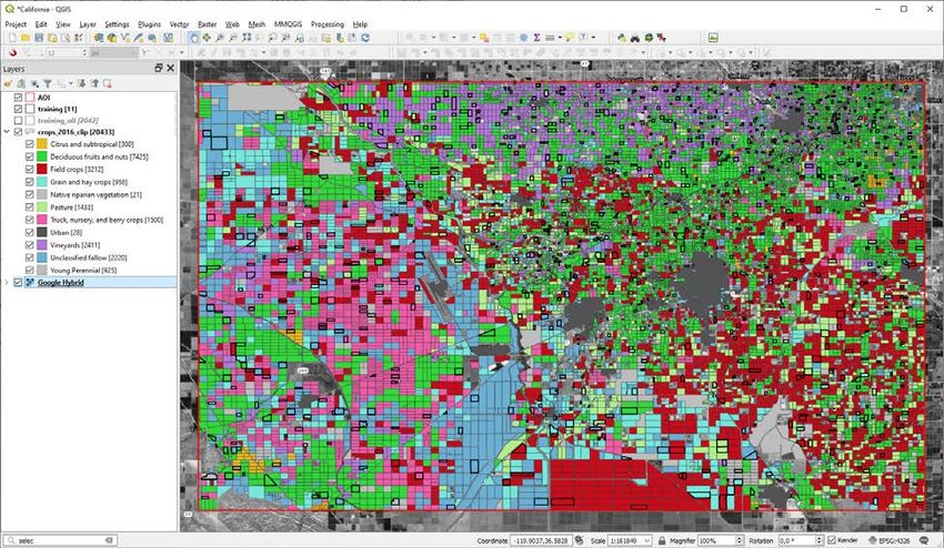
Time-series analysis with Sentinel-1

For the analysis of backscatter variations over a given time, the selected input products should be
representative for the temporal dynamics expected in the area. For this reason, 12 products were selected
which cover one entire growing season, starting from February and ending in December. Generally, the
more images are used, the more precise is the later analysis, but depending on the region of interest, some
parts of the year might not produce much backscatter variation.

For this reason, the user must find a balance between a sufficient number of images and a tolerable
amount of data to be processed. In this tutorial, the temporal distance between the images is 24 days from
February to September and 48 days from October to December, because little variation is expected in the
winter months.

Location of the data

The data used in this tutorial lies in King’s County, California, roughly between San Francisco and Los
Angeles. Figure 2 shows the extent of the Sentinel-1 data (red) and of the subset used in this tutorial (blue).
The latter includes the city of Hanford, and its surrounding landscapes which are dominated by agricultural
farmlands (among others: corn, wheat, alfalfa, cotton, pistachios, almonds) and pasture for cattle and goats
[ref].

                                  Figure 2: Extent and location of the data

                                                                                                             4
Time-series analysis with Sentinel-1

Preprocessing
The preprocessing in this tutorial is not done step-by-step, because the number of input products requires
an automated processing. This is facilitated by the Graph Builder which allows to define a series of
consecutive operations which are required to have the S1 GRD products prepared for this multi-temporal
analysis. In SNAP, this defined series of operations is called a graph and stored as an XML file. In a second
step, this graph is applied to all 12 input products with the Batch Processing to have them all prepared
without further user input.

As previously stated, this tutorial will focus on the analysis of time-series and not go into detail about SAR
preprocessing. The reader is advised to familiarize with the other tutorials first, for example the S1TBX
Graph Building Tutorial.

Preparation of the graph

It is not necessary to load all 12 input products into
SNAP but recommended for the creation of the
graph to have one of them opened so all parameters
can be selected correctly and with respect of the
input data structure.
Use the     Open Product button in the top toolbar
and browse for the location of the downloaded
data. Select the first zip files (07.02.2016) and
press Open Product.

In the Products View you will see the opened
product. Each Sentinel-1 product consists of
Metadata, Vector Data, Tie-Point Grids, Quick-
looks and Bands (which contains the actual raster
data in VV and VH polarization, Figure 3)

As the data is still compressed in the zip file, it is
not advised to open the bands in their current state,
because it takes a considerable time until SNAP
loads the raster. If you still want to check the data
before    proceeding       double-click     on    the
Intensity_IW1_VV band to view the raster data.

Another way to identify the location of your study
area within the product, you can use the World
View or World Map (to see its full extent on a base
                                                          Figure 3: Product Explorer and World Map
map) or open the Quicklook.

Now open the Graph Builder via the icon       in the toolbar or via the menu > Tools > Graph Builder. At first,
it only contains Read and Write operators which are always required to create a complete graph. In the
following, we will add the different steps as parts of the processing chain and connect them in a suitable
order.

Please note that the graph tool can show errors or incomplete options unless all parts are correctly
connected. It is therefore recommended to add all operators and connect them before the parameters are
adjusted. The final graph will look like shown in Figure 4.

                                                                                                             5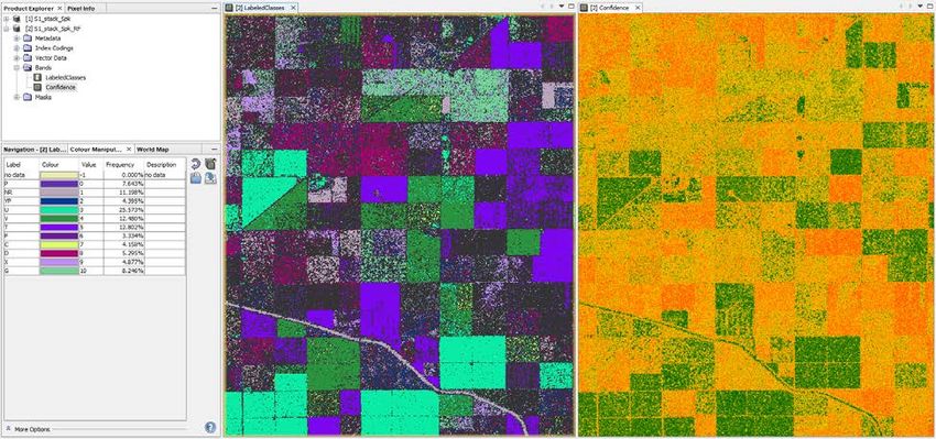
Time-series analysis with Sentinel-1

          Figure 4: Graph for the preparation of Sentinel-1 data and definition of a subset

To create the graph, please add the following operators (by right-clicking in the graph window and following
the paths given below. Connect the operators in a second step as shown in Figure 4.

    1. Radar > Radiometric > Thermal Noise Removal
    2. Radar > Apply Orbit File
    3. Radar > Radiometric > Calibration
    4. Radar > Geometric > Terrain Correction > Terrain-Correction
    5. Raster > Data Conversion > LinearToFromdB
    6. Raster > Geometric > Subset

Select the product from 02.07.2016 in the Read tab. Under Thermal Noise Removal, select VH polarization
only and select SRTM 1Sec (AutoDownload) in the Terrain Correction tab. In the Subset tab switch to
Geographic Coordinates and enter the following WKT in the textbox at the bottom (Figure 4). You can check
for validity of the WKT definition by clicking “Update”. Leave the parameters in the other tabs as predefined.

Save the graph using the button            or via File > Save Graph as S1.xml

                                                                                                            6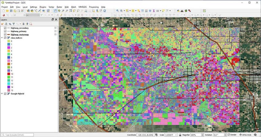
Time-series analysis with Sentinel-1

Execution of the graph

Now we want to apply the graph to all input images. Clean your SNAP workspace using File > Close all
Products. Then open the Batch Processing via the icon        in the toolbar or via the menu > Tools > Batch
Processing.

To load all products in the list, select the plus icon , navigate to the directory where you downloaded the
Sentinel-1 products and select all 12 zip files. They appear in the list as shown in Figure 5. Next, load the
graph file by clicking Load Graph and select S1.xml which you have created in the previous step. The
different tabs are now visible in the window as well (maybe arranged slightly different).

Lastly, enter a valid target directory at the bottom of the I/O Parameters tab and make sure that Keep
source product name is checked. Start the processing with Run. The tool now executes the graph for
every input product which can take a while. On a machine with 8 GB RAM and all data stored on the SSD
this process lasted 20 minutes.

In the end, the 12 products processed by the Batch Processing appear in SNAP (Subset_S1A_[…].dim)
At this point, SNAP has consumed a lot of memory and some of it might not have been clearly released
from the cache. Therefore, it is a good point to close all datasets, close SNAP and start it again.

                                    Figure 5: Batch Processing tool

                                                                                                           7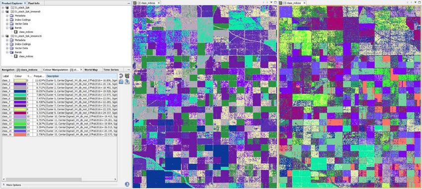
Time-series analysis with Sentinel-1

Creating a multi-temporal stack
Each of the pre-processed products now contains the calibrated backscatter intensity (Sigma0) in VH
polarization, geocoded and projected to WGS84. As all images were acquired from the same relative orbit
(here: 137) and terrain corrected, no larger geometric shifts are assumed between the images. They can
be combined into a multi-temporal stack using Radar > Coregistration > Stack Tools > Create Stack.

To load all products in the list, select the plus icon , navigate to the directory where the outputs of the
Batch Processing were stored. Select all 12 BEAM DIMAP products (Subset_S1A_[…].dim) to load them
into the list as shown in Figure 6.

If the acquisition dates are not automatically displayed in the third column, click the Refresh button . Then
use the arrows to sort all input products according to their acquisition date. This is not ultimately necessary,
but it makes some of the subsequent tasks easier.

In the second tab 2-CreateStack, select Product Geolocation as Initial Offset Method. This is because the
data is already geocoded and expected to have good geometric accuracy. In the Write tab, select a suitable
target directory and enter S1_stack as output name. Leave BEAM DIMAP as output format, because it
preserves the acquisition date of each band in the metadata. Confirm your settings and start the creation
of the stack by clicking Run. As a result, you get a product containing all 12 images (Figure 7, left).

                                       Figure 6: Creation of a stack

                                    Figure 7: Multi-temporal stack (left)

                                                                                                              8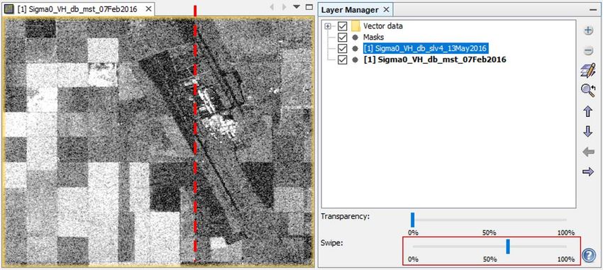
Time-series analysis with Sentinel-1

Comparing images of different dates
Open the first band by double-clicking Sigma0_VH_db_mst_07Feb2016. The displayed image is a grey-
scale representation of backscatter intensity in the area, roughly ranging between -45 dB and +5 dB. As
we have selected VH polarization, high backscatter intensity is an indicator for the presence of vegetation,
because of the higher contribution of volume scattering. Besides their intensity, the different surfaces are
characterized by different shapes, patterns and degrees of speckle.

To compare images of two different dates, double-click on the second image in the stack
Sigma0_VH_db_slv1_02Mar2016 to open it. To view both images side by side, click on the icon Tile
Horizontally     or via the menu > Window > Tile Horizontally. The images are now displayed next to each
other (Figure 13). Make sure that the two options Synchronize view         and Synchronize cursor       in
the Navigation panel on the bottom left. This allows you to navigate through one image and have the extent
of the others adjusted for best comparability.

                           Figure 8: Viewing two bands with tiled windows

Note: The image contrasts are automatically applied by
SNAP. If you want to compare diffeent images, make
sure that their colors are scaled over the same value
range in the Color Manipulation tab.

You can edit the color range between the displayed
minimum (black) and maximum (white) by clicking on
the number (Figure 13). Repeat this for both images by
selecting them in the view to grant that the colors of
both views represent the same values.

In the example of Figure 8 a growth of crops is
indicated by the brighter colors of many fields which
lead to a higher backscatter in the cross-polarized
band. It also nicely shows how the row-like structures
of early stages of tgrowth are replaced by more
homogenous patterns of crop coverage.
                                                                  Figure 9: Color Manipulation

                                                                                                          9
Time-series analysis with Sentinel-1

Multi-temporal speckle filter
As shown in Figure 8, many areas which are supposed to have a homogenous backscatter intensity are
characterized by granular patterns. These salt-and-pepper effects are speckle which is inherent in any SAR
image and caused by many different constructive and destructive contributions to backscatter intensity of
different scattering mechanisms below the pixel resolution. Adaptive speckle filters were designed to
enhance the image quality by suppressing random variations in the image while maintaining sharp edges.

The large advantage of multi-temporal speckle filters is that they are not only based on the spatial
distribution of backscatter intensity but also the temporal profile of a pixel to determine if it is affected by
speckle or not. Accordingly, gradual trends in pixel values over time are preserved but strong jumps
between two images are suppressed based on temporal statistics.

Open Radar > Speckle Filter > Multi-temporal Speckle Filter and select S1_stack as input product. In the
second tab, select the Boxcar filter from the drop-down menu and leave the filter size as 3x3 pixels. A new
filtered product (S1_stack_Spk) is created which has the same band names as the input, but now speckle
has been reduced.

You can compare the image before and after filtering by using the Split Window function again (Figure
10). As always, the different types of filters will produce slightly different results. Also, the impact of filter
sizes and other parameters can strongly affect how the result looks. It is suggested to explorer and compare
some filters and configurations to find the most suitable for the respective application.

This is especially challenging for agricultural analyses, because even if the different fields are covered by
the same crop type, they have interior variations resulting from different crop heights, different degrees of
coverage and different contributions of soil moisture. Sometimes, these variations are even enhanced by
some filters.

        Figure 10: Sentinel-1 image before (left) and after (right) multi-temporal speckle filter

                                                                                                               10
Time-series analysis with Sentinel-1
Overlay images in the Layer Manager
Another way to compare images is offered by the Layer Manager . Open one band and then click on the
plus button in the Layer Manager. This leads you to a dialogue where you select Image of Band / Tie-
Point-Grid (Figure 11, left) and then click Next. In the second dialogue, you have the chance to select a
second band from the stack which will then be added to the view (Figure 11, right).
Figure 11: Adding bands to the view using the Layer Manager
Once multiple products are added to the view (Figure 12, right side), the one at the top can be selected and
its transparency can be changed using the slider at the bottom of the Layer Manager. Alternatively, the top
image can be swiped with the second slider to allow the partial overlay of both bands. This is not a
quantitative kind of analysis, but it allows to visually identify changes between images, for example caused
by growth of vegetation between both dates of acquisition.
Figure 12:Overlay of images using the Layer Manager
11Time-series analysis with Sentinel-1
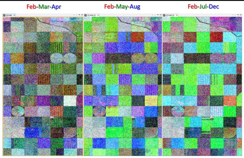
Multi-temporal image composites
To display the multi-temporal information
content of the stack, right-click on the product
and select Open RGB Image Window. Select
bands of three different dates for each color
(Figure 7, left) and click OK.
Each color tone therefore represents if an area
has high backscatter at the designated
acquisition date. Pixels of similar color are
therefore likely to have the same type of
agricultural use. Water areas are constantly
dark because they have low backscatter
throughout all images. In turn, urban areas are
white in all RGB combinations because their
backscatter is constantly high in every image
(Figure 15).
Figure 13: RGB image view
Figure 14 shows RGB composites for different periods: 3 months (left), 9 months (middle) and 11 months
(right). It shows how the temporal signature of crop fields changes over time because of changing
backscatter intensity caused by development of the stems, leaves and grains of the crops. This temporal
signature is a significant indicator for the respective crop type because each follows a distinct progress.
Figure 14: RGB composites over different periods
12Time-series analysis with Sentinel-1
Figure 15: Artificial structures are white in multi-temporal RGB composites
Temporal Statistics
Another way to look at a series of images is to calculate their temporal statistics. This can be done via
Radar > Coregistration > Stack Tools > Stack Averaging. It calculates one new band as a statistical
representation of the entire input stack. Calculate the following statistics:
Input Statistic Target product name
S1_stack_Spk Mean Average S1_stack_Spk_avg
S1_stack_Spk Minimum S1_stack_Spk_min
S1_stack_Spk Maximum S1_stack_Spk_max
S1_stack_Spk Standard Deviation S1_stack_Spk_std
The result of Mean Average shows a very sharp and speckle-free representation of the input stack, but
with no further temporal information. The result of Standard Deviation shows the areas which change the
most over the investigated period (Figure 16). Urban areas have a high temporal average and maximum,
but very low standard deviation and agricultural areas have different means and high phenologic variations.
All measures can be valuable inputs for the interpretation of the image and the assignment of crop types.
Figure 16: Temporal mean (left) and standard deviation (right)
13Time-series analysis with Sentinel-1
Importing bands of other products
The temporal average and standard deviation were created as separate products. In order to have in their
information inside the multi-temporal stack, we import their bands. Right-click on S1_stack_Spk and select
Band Maths.
Enter Sigma0_VH_db_avg as target band name, disable the Virtual option and go to Edit Expression to
open the Expression Editor. As all products have the same dimensions, you can select them in the drop-
down menu at the top (Figure 17) to access bands of other products. Add the average band to the
Expression field by clicking it under Data sources. Confirm with OK twice and it will be added to the multi-
temporal stack. Repeat this for the temporal standard deviation and minimum and name the bands
Sigma0_VH_db_std, Sigma0_VH_db_min and Sigma0_VH_db_max respectively.
Figure 17: Import of bands from other products
Lastly, select S1_stack_Spk in the Product Explorer and
chose File > Save Product to make these changes
permanent.
The temporal statistics are now part of the stack and can
be used for visualization and classification purposes. One
example is given in Figure 19, where temporal average,
maximum and standard deviation are combined for an
HSV composite. Instead of additive color mixing (RGB),
the different colors are created based on backscatter
intensity translated into hue, saturation, and value [ref]. In
the example, the hue is determined by the average, the
saturation by the maximum and the value (brightness)
based on the standard deviation. It is harder to interpret,
but reveals additional similarities, differences and patterns
between the different crop areas.
Please note: As the data was transformed to the
logarithmic scale [dB] during the pre-processing, the
temporal statistics are not identical to the mathematical
average and standard deviation, because these are Figure 18: Multi-temporal stack with
calculated based on linearly scaled data. temporal statistics
14Time-series analysis with Sentinel-1
Figure 19: HSV composite of temporal average, maximum and standard deviation
Working with the Time Series tool
Preparation
The Time Series tool helps to visualize the values of a pixel or an area over a given period in a line plot. It
is therefore a great tool to visualize the temporal variation of backscatter intensity of surfaces as a function
of their backscatter characteristics. We use the VH polarization as an indicator for the volume structure of
crops over the growing season. The Time Series tool requires two things
1. An opened image view, for example an RGB composite or the temporal average as calculated
above. This is only used for navigation and the selection of pixels.
2. The images of the acquisition dates as separate products (as they were produced by the Batch
Processing). These are the input for the list displayed in Figure 20).
Open the tool vie in the toolbar or via
the menu View > Tool Windows > Radar
> Time Series. A new window occurs in
the bottom left part of the user interface
(you can drag it to another position if you
want). To configure the tool, click on the
Settings icon and a new window
appears.
To load all products in the list, select the
plus icon , navigate to the directory
where the preprocessed files (the
products from the Batch Processing
(Subset_S1A_[…].dim). They will
appear in the list as shown in Figure 20.
Once all products are in there, you can
click Apply and then Close.
Figure 20: Configuring the Time Series tool
Please note: The time series will not
work if a stack with bands of multiple
acquisition dates is loaded here.
15Time-series analysis with Sentinel-1
Display time-series of single pixels
Once you loaded the different images into the tool (the do not need to
be opened inside SNAP but have the same dimensions as the raster
which is loaded for visualization). To visualize the temporal variation of
backscatter of single pixels, please select the Filter bands icon and
make sure that Sigma0_VH_db is selected as the unit you want to
display over time (Figure 21).
Secondly, make sure that the option Show at cursor position is
selected (displayed in orange). If you now move your mouse over the
opened image, the backscatter values of a pixel are showed for each
acquisition date and connected to a line. This line is the temporal
signature of the pixel which is often an indicator for the phenologic Figure 21: Selection of input
variation of crops over time.
As demonstrated in Figure 22, urban areas have constantly high values with little variation while agricultural
areas have a pronounced seasonality which follows a periodic curve. This curve is often connected to the
development of stems, leaves and grains, as well as their maturity and harvesting. And each crop type can
have a typical curve which is characterized by various factors:
1. The intensity and date of the minimum
2. The intensity and date of the maximum
3. The shape and steepness of the increasing backscatter (linear, convex or concave)
4. The drop of backscatter after maturity and harvesting (abrupt or gradual)
However, the curves can still be affected by speckle, rain events or other atypical phenomena.
Figure 22: Temporal signature of a building (left) and an agricultural area (right)
Please note: As SNAP accesses all 12 products for each position of the cursor, the Time Series tool can
consume a lot of memory and make SNAP slow. It is therefore recommended to switch the option Show
at cursor position off when you are navigating over the field and also entirely close the tool after you
finished investigating the curves.
16Time-series analysis with Sentinel-1
Compare time-series of multiple pixels (same surface)
To compare the temporal behavior of pixels, the Pin Manager can be used. It is found in the toolbar or
via the menu > Tools > Windows > Pin Manager. A new window is opened. You can create new pins with
the Pin placing tool in the toolbar . As long as it is selected, each pixel you click at will receive one pin.
You can remove pins by selecting them in the Pin Manager or shift them by switching to the common mouse
cursor .
To examine the impact of speckle on the temporal signature of a homogenous surface, place several pins
within the same field and select Show for all pins . In the given example (Figure 23), the pins show
variations of 7.5 dB within the same acquisition dates, even if they belong to the same crop type. The only
common pattern is the strong increase of nearly 5 dB between October and December.
Figure 23: Display of multiple pixels within the same field
Using the Mask Manager
The Mask Manager allows to apply logic or mathematic expressions on the pixels of an image product
to see which of them fulfill certain conditions. A raster product must be opened in the current view for the
tools of the Mask Manager to become active.
To test the applicability of the backscatter increase between October and December observed in Figure 23,
we open the Mask Manager and we create a new mask expression using this button . In the expression
dialogue, enter the expression (Figure 24):
Sigma0_VH_db_slv11_15Dec2016 - 4.5 > Sigma0_VH_db_slv10_28Oct2016
This means, we want to identify all pixels where the value in December is at least 4.5 dB larger than the
value in October. This would match the pattern of the temporal signatures of the field in Figure 23. Confirm
the expression with OK.
17Time-series analysis with Sentinel-1
Figure 24: Masking pixels with a backscatter increase of 4.5 dB between October and December
This creates a mask which is true for all pixels which match this criterion. It will appear as red transparent
area in the currently opened raster. Name and color can be changed in the list of masks (Figure 25). Let us
call this mask “winter” because it defines the pixels which have a strong increase towards the winter months.
As shown in Figure 25, the squared field next to the circular field observed with the pins in Figure 23 has
the same backscatter increase while the other fields do not match this expression. Still, the two fields do
not entirely match the mask definition while some single pixels outside are also marked. This is a result of
speckle or other backscatter variations.
This can be tackled by refining mask expression, for example by lowering the 4.5 dB to include more pixels
or combining several criteria (e.g. based on the temporal average or characteristics of other acquisition
dates). It is therefore possible to select two masks and combine them with logical expressions: Union (OR)
, Intersection (AND) , difference , or complement .
Note: To change the expression of a mask, double-click on Maths and the Expression editor opens again.
Changes in the Description field have no consequences.
Once you created a mask, select the product, and make the changes permanent with File > Save product.
Figure 25: Masking similar pixels with the Mask Manager
18Time-series analysis with Sentinel-1
Compare time-series of multiple pixels (different surfaces)
The Pin Manager can also be used to compare the temporal signature of pixels from different surfaces.
This helps to understand the backscatter characteristics of several plots over the entire period, and allows
to estimate if they are similar for some periods.
We first remove all existing pins by selecting them and then select Remove selected pins . Then we
digitize one pin for three different agricultural plots. You can give them different colors and names in the
Pin Manager, in our example we name them “black”, “white” and “grey”, based on their average backscatter
value (Figure 26).
Instead of the cursor-driven visualization of temporal signatures, select Show for all pins . This creates
one line for each digitized pin, slightly colored by the color given in the Pin Manager.
Figure 26: Comparing time-series of different pins
Comparing temporal signatures of different plots helps to understand their typical temporal behavior and
also to select threshold for their later discrimination. In this example, the black area (blue pin) does not
exceed the value of -20 dB throughout the entire year, the white area (red pin) is constantly above -19.5 dB
and the grey area (green pin) has a pronounced seasonal pattern with a strong peak between April and
July while it is moderately low during the rest of the year.
Again, we can use the Mask Manager to quantify these simple criteria to identify fields with similar
characteristics. Create three masks with the following expressions.
black (blue pin): Sigma0_VH_db_max < -19.5
white (red pin): Sigma0_VH_db_min > -19
grey (green pin): Sigma0_VH_db_std > 4
The result is shown in Figure 27. It marks all fields which also have the defined backscatter variations. Of
course, these comparably simple expressions do not grant that these fields have the same crop cover, but
they are a first indicator which of them are similar and match the given criteria. These can then be refined
or split into smaller classes using the mask combinations as suggested above.
19Time-series analysis with Sentinel-1
Figure 27: Identification of fields with specific temporal characteristics
You can calculate the area of the created masks via the menu > Raster > Masks > Mask Area. In the
subsequent dialogue, you are asked for the selection of one mask (here “white”) and proceed with OK. The
new window will show the number of pixels and the area in square kilometers (Figure 28).
Figure 28: Calculation of mask areas
Display time-series of entire polygons / working with vectors
Create a new vector container called “field” using New Vector Data Container . It will appear in the
Layer Manager (currently not filled with a geometry, but already defined ).
Figure 29: Creation of new vector containers
20Time-series analysis with Sentinel-1
If you want to digitize geometries of multiple classes, it is important
that you first define them as vector data containers as previously
explained and then select the folder “Vector data” in the Layer
manager, as displayed in Fehler! Verweisquelle konnte nicht
gefunden werden..
Once you select the Polygon Drawing Tool and click in the
map, you will be asked which of the vector containers you want to
edit or fill with geometries (Figure 30). This allows to digitize multiple
polygons which belong to the same class (container) and to
effectively manage vectors of multiple classes.
Select a container and proceed with OK. You can then digitize
polygons and finish with a double-click. You can modify or delete Figure 30: Selection of a vector
data container for digitization
existing polygons using the Selection tool (Figure 31). In this
tutorial, a polygon is created covering a homogenous crop area.
Figure 31: Editing existing vectors
To display the time series of an entire polygon, select Show averaged ROI in the Time Series tool. This
will open a new window which asks you if you want to calculate the Mean or Standard Deviation for all
pixels within the polygon per analyzed date. Select Mean and proceed with OK. Make sure that your mouse
cursor is inside the map view, because it keeps the plot updated. If this does not work, you can additionally
activate Show at cursor position (appearing thin line besides the bold lines of polygons, Figure 32).
21Time-series analysis with Sentinel-1
Figure 32: Displaying average pixel values of polygons
22Time-series analysis with Sentinel-1
These polygon averages are more robust, less prone to speckle and also more representative for the
majority of all pixels within one field. As they represent only averages of all existing pixels, they cannot be
used to identify thresholds (as many pixels might differ from the line), but the temporal behavior of the
corresponding crop type becomes visible more clearly.
Furthermore, they help to compare multiple areas at a time. The points which are connected to the temporal
lines have the same color as the corresponding polygons. In the example of Figure 32, the red area has
the highest backscatter throughout the year while the green one is constantly low and the purple field has
the strongest seasonal variation with a strong increase between April and July.
Accordingly, the purple field is probably covered by some crop which undergoes a physical development
during the year (planting, growing, ripening, harvesting) while red and green are more constant coverages,
such as pasture or meadows.
To save memory, we now close the Time Series tool.
Unsupervised classification
The temporal information present at each pixel throughout the
stack can help to aggregate fields of similar characteristics. An
unsupervised classification creates classes of statistically similar
pixels. Select from the menu > Raster > Classification >
Unsupervised Classification > K-Means Cluster Analysis.
In the first tab, select
Source product: S1_Stack_Spk
Target product: S1_Stack_Spk_kmeans16
In the second tab, select 16 clusters (instead of 14) and leave the
other parameters as predefined. If no source band is selected, all
bands in the stack are used to compute the clusters. In our case,
this means, besides the 12 dates, also the four temporal statistics
are used for the characterization of the pixels.
This process can take some while! It is therefore an option to
digitize a rectangle and select it under ROI-mask. This allows you Figure 33: Unsupervised clustering
to limit the analysis to a defined part of the raster.
The result will be displayed in the Product Explorer after the processing is finished. It is a product with only
one band class_indices (Figure 34). If you display it via double-click, random colors are assigned to the
pixel classes. You can modify the color and name of each class in the Color Manipulation tab.
As you see in Figure 34 (right side), 16 classes result in a good discrimination of the single crop types. As
we have selected 16 clusters and 30 iterations, all pixels are assigned to the closest cluster centers which
were created as defined in the settings [ref].
Please note: The k-means classification is based on a random initialization of cluster centers. Calculations
based on the same input data and settings can therefore potentially lead to slightly different results. One
way to reduce this effect is to increase the number of iterations.
The figure also shows that if the number of classes is too high, homogenous areas can be composed of
multiple classes. One option is to re-classify or aggregate the classes in the Band Maths (Figure 35) or by
lowering the number of clusters. Figure 34 compares the classification result based on 8 or 16 clusters
(calculated from the same stack, composed of the 12 backscatter bands and the 4 additional temporal
statistics). The comparison shows that less clusters result in larger homogenous areas, but potentially
strong aggregations.
23Time-series analysis with Sentinel-1
Figure 34: Unsupervised clustering with 8 (left) and 16 (right) classes
It is advised to test the sensitivity of the underlying dataset to the number of clusters based on a subset
first, before classifying the entire product.
Figure 35 gives an example, how single values can be replaced in the Band Maths. It is solved by an IF –
THEN – ELSE syntax which states that, if a pixel has the value 3 it will be replaced by 5 in the newly created
raster. All other pixels will remain the same (assured by ELSE).
Figure 35: Reclassification of single pixel values
24Time-series analysis with Sentinel-1
Exporting data
If you want to continue the processing or visualization of your data in another software (such as QGIS,
ArcMap, ENVI, Erdas IMAGINE, Matlab ect...) you can use one of the output formats listed under File >
Export.
However, exporting to other formats has disadvantages: Firstly, the BEAM DIMAP format is the only format
which grants the correct storage of all metadata. For example, the parameters which were selected in the
different operators can be viewed in the metadata of each product under Metadata > Processing Graph.
Each node stands for one operation and contains sources and parameters. The better solution to directly
open the data which was processed in SNAP. BEAM DIMAP products are fully compatible according to the
OGC standards and can directly read in most software packages, such as QGIS or ArcMap.
Each BEAM DIMAP product consists of two elements:
.dim This file contains all metadata in a XML structure
.data This directory contains all raster products (.img + .hdr), tie-point grids and vectors (as WKT)
In our example, the raster of the classification can be found under
C:\Temp\timeseries \S1_stack_Spk_kmeans16.data\class_indices.img (Figure 36)
If you want to open a raster in external software,
navigate to your products location, go inside the .data
folder and you find all raster belonging to this product,
stored as .img files with their corresponding header
files (.hdr). QGIS, ArcMap and ENVI can directly read
these .img products without further need for
conversion. An example of the classification result
imported into QGIS is shown in Figure 37.
Figure 36: BEAM DIMAP components
Figure 37: Unsupervised classification imported in QGIS
25Time-series analysis with Sentinel-1
Supervised classification
Preparation of training data
A supervised classification requires a-priori knowledge of your data. In our case, this means we need to
know what crop types grow on each site. Fort this, we use data from the Statewide Crop Mapping of the
California National Resources Agency: https://data.cnra.ca.gov/dataset/statewide-crop-mapping
Navigate to “2016 Statewide Crop Mapping GIS Shapefiles” (Figure 38) and also download the PDF which
contains the description of the classes on page 15.
Figure 38: Retrieval of reference data
For this tutorial, the shapefile was prepared in QGIS according to the following steps:
1. Reprojection to WGS84 (EPSG:4326) to match the coordinates of the raster products in SNAP
2. Clip to the analyzed area
3. Applied a symbology based on the attribute Symb_class
4. Random selection of 10% of polygons of all classes (Figure 39, n=2042)
5. Dissolve these polygons based on the attribute Symb_class; leaves 11 multi-part polygons
6. Export of the randomly selected polygons as training.shp. The result is shown in Figure 40.
Figure 39: Stratified random selection of polygons from all classes
26Time-series analysis with Sentinel-1
Figure 40: Preparation of the training polygons (black outlines) in QGIS
Preparing the raster bands
Whenever SNAP conducts a supervised classification, it stores the classifier in a separate file. This causes
problems when the feature bands used to train the classifier have the same name. This is often the case
for multi-temporal analyses like this where every band begins with Sigma0_VH_db and causing an error at
later steps: . This can be solved by renaming the input bands
of the stack in the band properties, for example by ascending leading numbers, as shown in Figure 41
Figure 41: Renaming of input bands for the classification
27Time-series analysis with Sentinel-1
After you have renamed all input raster bands as demonstrated in Figure 41, click on File > Save Product
to make the changes permanent.
Loading the training vectors
The training data must be loaded into the same product which contains the bands which serve as features
for the classification. We therefore select S1_Stack_Spk in the Product explorer. From the menu select
Vector > Import > Shapefile (this only works if the name of the product is selected, not one of the bands).
A new window opens which lets you navigate to the training.shp file which was created in the previous
step (Figure 42, left). After you select it, select the attribute Symb_class from the drop-down menu and
confirm with Yes (Figure 42, right). This creates one polygon per class in the vector folder of the product
(Figure 43). Please delete any other (manually digitized) geometries before proceeding and select File >
Save Product to permanently store the geometries in the product.
The result should now look like shown in Figure 43.
Figure 42: Import of shapefiles
Figure 43: Multi-temporal stack with imported training data
28Time-series analysis with Sentinel-1
Conduct the classification
The Random Forest classifier (under
Raster > Classification > Supervised
Classification) is suitable here,
because it is based on thresholding
and can be applied to input features of
different scaling (Sigma0 and the
temporal statistics) [ref]. Load the
stack S1_Stack_Spk into the list of
input products in the first tab.
In the second tab, make sure that you
select all imported classes under
Training vectors but don’t select the
pins (Figure 44).
Raise the Number of trees to 25. If
you select no Feature bands, all
bands in the stack will be used for the
training of the classifier.
Click on Run to start the training and
classification of the product. As there
are many polygons and input bands,
this can also take some time.
The Random Forest classifier now
extracts all pixels under the training
polygons and tries to find thresholds
which allow to separate the different Figure 44: Random Forest classifier
input types as best as possible.
This is done in a hierarchical tree-like way (e.g. when S1_VH_db_avg is larger than -20 and
Sigma0_VH_db_slv8_17Aug2016 is smaller than -15 then assign class V).
Once the processing is finished, a new product is created containing a band called LabeledClasses,
which is the result of the classification and Confidence band as a side product of the Random Forest
classification. To view the classification, double-click the bands. You will see that the pixels are now
assigned to one of the training classes. You see the legend in the Color Manipulation tab, which also
displays the relative frequency of each class (Figure 45).
However, the Random Forest classifier does not automatically assign a class to each pixel – some of the
pixels remain transparent. This is for all pixels which could not be classified with a confidence higher than
0.5. This can have various reasons:
1. The pixel has statistical values which do not match any of the training data
2. The pixel was assigned to many different classes during the 25 iterations without a clear minimum
3. The training area representing this pixel was inhomogeneous and not representing the majority its
actual areas.
Accordingly, too many training polygons can be harmful to the classification. In turn, too few or small ones
are also not suitable for training. Check the confidence band (Figure 45, right side, scaled from red [0] to
green [1]) to identify those areas which have low confidence and try to modify the training data accordingly.
Another option is to raise the confidence threshold in the band properties of LabeledClasses.
29Time-series analysis with Sentinel-1
Figure 45: Classification (left) and confidence (right) of the Random Forest classifier
Evaluation of the classifier
If Evaluate classifier was selected in the Random Forest operator (Figure 44), a text window will open
during the classification dialogue which gives information on how well the rule-set of the classifier was able
to describe the training data based on the 16 feature bands. It does not validate the accuracy of the entire
prediction, but only how well the training data was classified based on the hierarchical thresholding of the
Random Forest classifier.
In this file Cross Validation is a class-wise description of accuracy metrics. Let’s look at two of them
in the following, pasture (P) and vineyards (V). For an interpretation of these values, please see here:
• Accuracy and precision
• Sensitivity and specificity
class 0.0: P class 4.0: V
accuracy = 0.9732 accuracy = 0.9862
precision = 0.8011 precision = 0.9214
correlation = 0.8556 correlation = 0.9180
errorRate = 0.0268 errorRate = 0.0138
TruePositives = 427 TruePositives = 422
FalsePositives = 106 FalsePositives = 36
TrueNegatives = 4439 TrueNegatives = 4509
FalseNegatives = 28 FalseNegatives = 33
According to these numbers, vineyards have higher training accuracy and precision than pasture areas and
also lower error rates. Evaluating these numbers helps to improve the training areas for selected classes
to increase their confidence in the result.
The output on Distribution lists how many training pixels were selected for each class. In our case,
each of the eleven classes was sampled with 910 pixels randomly selected from the training polygons which
makes a share of 9.1 %. In sum they make the 5000 pixels as selected in the Random Forest classifier
(Figure 44).
30Time-series analysis with Sentinel-1
The Testing feature importance score helps to understand which bands are the most important
for the discrimination of crop types from time-series data. It ranks the input bands according to some
selected statistics of variable importance. In this case, the images from May, March, July, and December
were the most important ones. This means, backscattering differs the most at these dates between all
crops.
rank feature accuracy Gain Ratio [ref]
1 05_Sigma0_VH_db_slv4_13May2016 0.0222 0.2591
2 03_Sigma0_VH_db_slv2_26Mar2016 0.0195 0.2277
3 08_Sigma0_VH_db_slv7_24Jul2016 0.0111 0.3397
4 12_Sigma0_VH_db_slv11_15Dec2016 0.0108 0.2749
Accuracy assessment
An accuracy assessment compares the output of a classification with independent reference data.
Accordingly, it can only be conducted when there is reference information available which is not related to
the training data (as evaluated in the previous section). In the following example, we calculate the accuracy
of the prediction of class “G – Grain and hay crops”. We import these pixels from the reference dataset into
SNAP and compare them to the classification of class G. This can be done in the Mask Manager.
To assess the accuracy of class G, we need two masks. One of the classifications (class_grain, defined
with the Mask Manager) and one of the reference (ref_grain, imported as vector).
Figure 46: Accuracy assessment in the Mask Manager
The accuracy measures are now a combination of both masks whose number of pixels can be queried as
demonstrated in Figure 28.
Measure (new mask) Expression Number of pixels
TruePositive class_grain AND ref_grain 1112948
FalsePositive ref_grain AND NOT class_grain 2220843
TrueNegative NOT ref_grain AND NOT class_grain 42045840
FalseNegative NOT ref_grain AND class_grain 3411089
Lastly, the accuracy of class G is TP + TN / (TP + TN + FP + FN) = 0.884
and the precision is calculated as TP / (TP / FP) = 0.334
Accordingly, 88.4 % of the pixels classified as grain and hay crops (364 km²) are correct. However, the low
precision of 33.4 % indicates a large over-estimation, so that the actual area covered by crops is
considerably smaller (268 km²).
31Time-series analysis with Sentinel-1
For more tutorials visit the Sentinel Toolboxes website
http://step.esa.int/main/doc/tutorials/
Send comments to the SNAP Forum
http://forum.step.esa.int/
32You can also read