SpotiVis Bachelor's degree Project - Finding new ways of visualizing the spread of
←
→
Page content transcription
If your browser does not render page correctly, please read the page content below
Bachelor’s degree Project

SpotiVis
- Finding new ways of visualizing the spread of
popular music

                                   Author: Dennis Fredsson
                                   Supervisor: Rafael Messias Martins
                                   Semester: Spring 2021
                                   Subject: Computer Science
Abstract
Simply by reading data and statistics of the charting positions of popular songs
on global and national music charts, it is hard to understand how the popularity
of songs, albums, or artists within pop music truly behave over time. However,
analyzing the data using visualizations as means of communication might
provide us with new points of view and new insights into how the popularity
of contemporary popular music behaves over a longer period. This is the
hypothesis that we intend to investigate in this thesis. An interactive
visualization application (presented as a website) has been developed based on
data from “Daily Top 200” lists provided by Spotify. A survey was then used
to evaluate the application, with the results suggesting that new and interesting
insights into the trends in the popularity of music can be gained from the
proposed prototype.

   Keywords: Visualization, Music, Spotify, Pop, Popular music, Chart,
Streaming Service

                                        2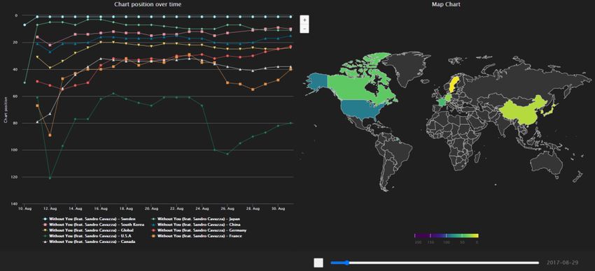
Contents
1  Introduction ________________________________________________ 4
  1.1 Background ___________________________________________ 4
  1.2 Related work __________________________________________ 6
  1.3 Problem formulation ____________________________________ 7
  1.4 Motivation ____________________________________________ 8
  1.5 Results _______________________________________________ 9
  1.6 Scope/Limitation _______________________________________ 9
  1.7     Target group _________________________________________ 10
  1.8     Outline ______________________________________________ 11
2 Method __________________________________________________ 12
  2.1     Research Project ______________________________________ 12
  2.2     Research methods _____________________________________ 14
     2.2.1 Gathering data _______________________________________ 14
     2.2.2 Analyzing and visualizing data __________________________ 14
     2.2.3 Validating ___________________________________________ 15
  2.3     Reliability and Validity _________________________________ 17
  2.4     Ethical Considerations__________________________________ 18
3 Theoretical Background _____________________________________ 19
4 Research project – Implementation_____________________________ 23
  4.1 Gathering Data __________________________________________ 23
  4.2 Visualizing data _________________________________________ 25
     4.2.1 Presentation layer _____________________________________ 25
     4.2.2 Data access layer _____________________________________ 32
5 Results ___________________________________________________ 33
  5.2 Aggregated results _____________________________________ 33
6 Analysis__________________________________________________ 38
7 Discussion & Future Work ___________________________________ 43
8 Conclusions _______________________________________________ 45
References ___________________________________________________ 46
Appendix A __________________________________________________ 52
     Link to the visualization tool ________________________________ 52
Appendix B __________________________________________________ 53
     Value of Visualization form _________________________________ 53
Appendix C __________________________________________________ 54
     Gathering participants message (note: translated from Swedish) _____ 54
Appendix D __________________________________________________ 55
     Google forms ICE-T questionnaire ____________________________ 55

                                     3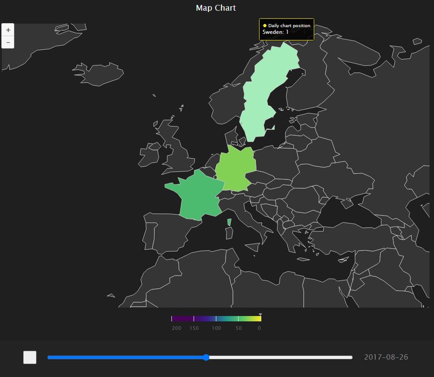
1     Introduction
This is a Bachelor’s thesis in Computer Science, with a focus on visualization.
The thesis aims to develop a visualization system to provide new insights into
the "pulse of popular music" on a national as well as global level, using
temporal data from the music listening service Spotify.

Merely looking at the data from national music charts, or “top lists”, around
the world, day by day, might not be an effective way of obtaining the big
picture of how a song or an artist performs over time on national charts around
the world. This is partly due to the large amount of data available.
SpotifyCharts.com contains more than 30 million data points across its
timeline starting on 1 January 2017, considering the different Top 200/Viral
50 lists, updated daily/weekly, in the 70 countries which has this data available.
Exploring and interpreting such a large data set, given its geospatial
characteristics, can be hard without appropriate support [1] [2].

Today, music labels use quite simple metrics to improve and analyze their data
[3]. This thesis aims to investigate how visualization can be used to interpret
and analyze data gathered from Spotify, in an attempt to gain a new perspective
on how the spread of popular music ensues. Although we only take a small
initial step into this area, we believe that the use of interactive visualization
can, in the long term, potentially help music professionals use this type of data
to their advantage to optimize or maximize the spread and popularity of new
releases.

1.1           Background
Spotify is one of the world’s leading audio and music streaming services,
originating from Sweden. As of today, over 30 million songs are available for

                                        4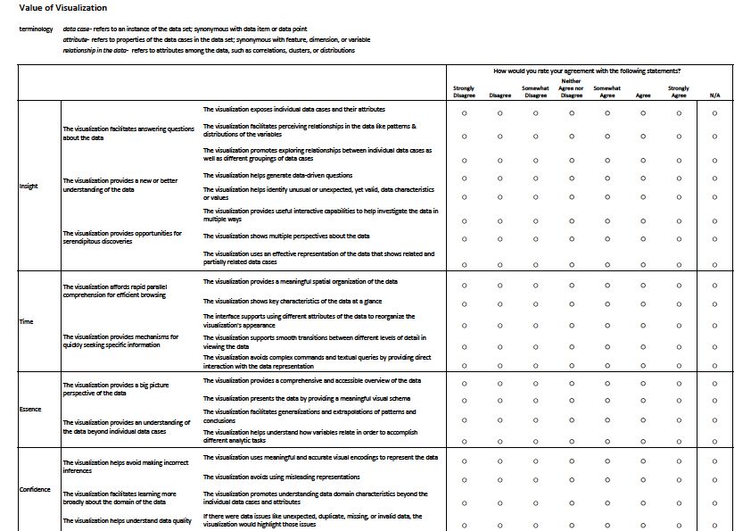
listening, supported on all the most popular platforms (desktop and mobile).
Since their advent, streaming services such as Spotify have provided easy
access to music for the listeners. A computer or a phone with an internet
connection is all that is necessary to access the massive music library which
Spotify brings to its users. In the U.S, the introduction of technology offering
the ability to stream music has increased the number of people listening to
music from 2016 to 2017 and, in each year spanning from 2015 to 2017, the
amount of music consumed by each individual has also dramatically increased
[4] [5].

In order to provide a way of measuring the current most popular songs of today,
music charts provided by websites/magazines such as Billboard [6] in the
U.S.A, or Sverigetopplistan [7] in Sweden gather metrics and compiles them
into a list of the current most popular songs. These metrics historically included
sales of singles or albums, but with the advent of the music streaming industry,
they now include digital metrics as well, such as digital sales, downloads, and
streams. In this thesis, the charts used as brickwork for the data gathered are
curated by Spotify itself and thus employ only digital streams as a metric.
Spotify provides these charts through their website SpotifyCharts.com [8].

Visualization is any technique for creating images, diagrams, or animations to
communicate a message [9]. This visual imagery provides an effective way of
communicating both abstract and concrete ideas. Transforming temporal daily
chart data into imagery through visualization to find new pathways of
conveying chart performance of a piece of popular music is the challenge we
are dealing with in this thesis.

                                        5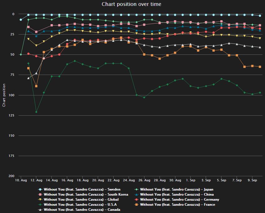
1.2           Related work
Music visualization is a large area of research, with a diverse range of subareas
touching on different aspects of the challenge [10]. Some works focus, for
example, on the structure of music itself, such as highlighting notable features
in modern musical compositions [11] or conveying information about interval
quality, chord quality, or chord progression in digital music [12]. These are not
directly related to this thesis, since we focus on the visualization of a large-
scale music collection instead of individual songs.

Regarding the visualization of music collections, the existing works mainly
focus on various attributes of musical information aiming to provide new
perspectives on personal musical archives that go beyond simple plain file lists
[10]. They assist in tasks such as editing, exploring, and navigating these
collections. Muelder et al. [13] use visualization to provide a graph-based
visual interface of a music listener’s digital music collection, based on the
content of the music itself instead of pre-defined tag information (since they
can often be incorrect or misleading). Songrium, a music browsing assistance
service, uses visualization to explore what is referred to as a “Web of Music”.
This Web of Music showcases the relationship between original pieces of
music and derivative songs, offering a way to discover new music for the
listener [14]. This thesis differs from these examples in that the features that
we use for the visualizations do not come from the music attributes themselves,
but from the geospatial trends in popularity of the songs and artists (i.e. their
ranks, over time, in the top lists around the world).

There has also been research done in visualizing music collections regarding
popularity. Mashima et al. [15] gathered data from last.fm (a music
recommendation service) from one point in time (July 2009) and visualized the
popularity of the top 250 artists by mapping their similarity to 2D coordinates

                                        6
and using font size to represent popularity. Sprague et al. [16] designed a
“democratic music jukebox” with the purpose of giving all individuals present
at social gatherings an equal influence over the music played. The collected
votes were then visualized to group participants with similar music taste
together, spreading social awareness. Zhang et al. [17] and Baur et al. [18]
[19] performed work involving individual listeners’ listening history to
develop visualizations of each user’s music listening history. These papers are
related to this thesis, but they either do not include large-scale temporal or
geospatial factors, or use popularity in terms of one user’s (or a small group of
people’s) preferences. In this thesis, we define popularity as how popular a
song is from a music chart perspective, including data from all Spotify listeners
in a region (or on a global level).
As a summary of the discussed related work, the majority of visualization
methods for musical information are founded upon differing types of content-
or context-based attributes or quantifying the similarity between various pieces
of music. Geographical data is rarely taken into consideration, and visualizing
listening habits in conjunction with geospatial data in a scientific manner is not
a common method (as noted by Hauger et al. [20]). The solution proposed in
this thesis is based on the visualization of music popularity trends in time and
space, which is a subarea of information visualization. A discussion on this
background is presented in Chapter 3.
1.3 Problem formulation
The service SpotifyCharts.com offers a large amount of useful data to music
enthusiasts, but it does not offer visualization or any other type of aggregation
or summarization of their data. This means that record companies, artists, or
anyone who has an interest in the area have to rely on browsing the charts
individually, in their original textual form, to gain an understanding of how,
7for example, a single by an artist performs on the music charts nationally, and
around the world. Individual charts can show, at any single time, a small
number of the most popular songs for a specific geographical region (or a
global aggregation) in a short time span—either a day or a week. This interface
does not facilitate other more complex exploratory tasks, such as: getting an
overview of the data over larger time spans; comparing the performance of
different songs and/or artists over time; or connecting the time and space
characteristics of the popularity of songs and/or artists.
This identified gap can be decomposed into the following two research
questions:
1. How can we develop a tool that provides visual representations of data
from music charts to support exploratory analyses of trends over time
and space?
2. Can the created visual representations provide valuable insights on the
chart performances of songs and artists?
These research questions are henceforth referred to in this thesis as RQ1 and
RQ2.
1.4 Motivation
Contemporary music charts on a national level have been around for many
decades. In the U.S, Billboard published its first national music chart on July
27, 1940 [21], while in Sweden the first national music chart was in 1975 with
Sverigetopplistan [7]. However, given the related work discussed in the
previous section, it seems that compiling these temporal music charts into
visualizations has not attracted much interest. This could be, in part, due to the
8lack of access of the general public to the data which supports these music
charts, something which Spotify has changed since the company provides
music charts like these both in the Spotify client and through
SpotifyCharts.com [8].
This thesis aims to propose one possible solution for representing and
interacting with temporal music charts. Our main goal is to expand upon the
tools supplied today for monitoring and gathering information of charting of
popular music, for example, Spotify’s “Discover” section where users can find
and browse songs and artists. We believe that visualization is an interesting
and under-explored way to analyze this type of data and, through the
development and evaluation of our prototype, we aim to provide an initial step
of design ideas and a solution that could help raise interest in the area.
1.5 Results
We propose a new way of representing music charts over time, in the form of
visualizations realized through a tool developed during the process of creating
this thesis. We evaluate this developed tool via a method that involved
demonstrating it for test subjects, asking them to perform certain tasks with the
tool, and then asking the subjects to fill out a standard questionnaire (ICE-T)
as defined by Wall et al.’s Value-Driven Visualization Evaluation [22]. This
methodology is further discussed in Section 2.2.3.
1.6 Scope/Limitation
Scope. The music chart data collected is limited to the streaming service
Spotify, and in temporal terms only as far back as 1 January 2017. Therefore,
the examples showcased, and songs, albums, or artists selected are based on
what artists and songs were in the top 200 music charts for the period 1 January
92017 – 31 December 2020. In terms of national charts available, it is also
limited to the countries where Spotify is available. Furthermore, due to the
sheer amount (70 countries) of national music charts available, not all countries
are included. The biggest music markets in terms of export and import are
prioritized. This is further discussed in Section 4.1.
Limitations. The tool proposed in this thesis is an initial prototype (or a proof
of concept) that uses simple and familiar visualizations. The user experience
and the visualizations could be improved with more development iterations,
including gathering requirements for the tool directly with the target users,
which was not done. The user study used to measure the value of the
visualization tool was a small-scale procedure, with only eight participants in
total, and no information on their background or music interests was gathered.
More participants would have allowed us to obtain more statistically
significant results. Additionally, the prototype was not compared to any other
existing similar tool, because we could not find a suitable candidate during our
literature review and search for related works. Such a comparison might have
brought to light more interesting results, weaknesses, and opportunities for
improvement.
1.7 Target group
In this thesis, we consider music consumers as our target group, i.e. anyone
who might be interested in using tools that provide insight into music charts
and their trends. Other potential target groups for spatiotemporal visualizations
of music charts could be music streaming services, such as Spotify1; music
1
https://www.spotify.com/
10companies, such as Universal Music2; or music creators and/or artists (but they
are not considered in this initial work).
1.8 Outline
This report is organized as follows. In Chapter 2 we discuss the methodological
framework and research methods employed. Chapter 3 provides a theoretical
background for the project and the knowledge gap which it intends to reduce.
In Chapter 4 we discuss the implementation of the data-gathering script, the
implementation of the visualization tool, and the demonstration and survey
which results we present in Chapter 5. Chapters 6 and 7 analyze and discuss
the results and knowledge gained from this thesis work, as well as discuss
potential future work. In Chapter 8 we conclude the thesis work.
2
https://www.universalmusic.com/
112 Method
2.1 Research Project
The catalyst of this thesis work was the knowledge gap identified between
historic music charts on a global and national level, and the limited existing
visual representations of these music charts over time. In the interest of
reducing this knowledge gap, a design science methodology was employed. In
design science (DS), there are six clearly defined steps [23]:
1. Problem identification and motivation
In this thesis, the problem, as mentioned, is the identified gap
between the availability of data from music charts for popular
music and the lack of available tools to visualize spatiotemporal
trends in these music charts in new ways. The motivation for this
was to expand upon the subject and to provide the groundwork for
future research in the area.
2. Definition of the objectives for a solution
The objective of the solution to this problem was to provide a tool
for creating visualizations from gathered data to supply the target
users with new insights into the development of the gathered music
charts over time and space. In a short summary, the requirements
that guided the design of the visualization tool were to support
users in: (1) Getting an overview of the chart data over large time
spans; (2) Comparing the performance of different songs and/or
artists over time; and (3) Connecting the time and space
characteristics of the popularity of songs. These requirements were
not gathered in any formal or structured way, and were derived
12mainly from the characteristics of the dataset itself and the
experiences of the thesis author and supervisor.
3. Design and development
The artifact is the visualization tool that supports creating
visualizations of these music charts, in accordance with user input
of what artist, song, and time limitations may be of interest to the
target user. Gathering the data necessary for this became an
objective in itself to fit into the greater objective of producing this
prototype.
4. Demonstration
After producing some versions of the prototype of the artifact to be
created, the artifact was deployed to be evaluated by the target
users specified in Section 1.7 (i.e. music consumers and the public
in general). The artifact was hosted online, available via a web
address, to act as a demonstration of the artifact.
5. Evaluation
To evaluate the artifact, the Value-Driven Visualization Evaluation
methodology (visvalue, in short) was used [22], which is centered
around a standard questionnaire for user feedback on visualizations
(the ICE-T). Details are provided in Section 2.2.3.
6. Communication
The results of the aforementioned evaluation were communicated
in Chapters 5 and 6 of this thesis.
132.2 Research methods
The methods used in this thesis can be subdivided into three main parts:
2.2.1 Gathering data
The website SpotifyCharts.com [8] provided a way to easily access temporal
data for historic daily or weekly Spotify charts. The lists available are: Daily
top 200, Weekly top 200, Daily viral 50, and Weekly viral 50. These charts are
available and updated daily in the Spotify client; however, the client itself does
not provide historical data, only the current, contemporary charts which are
updated on a daily/weekly basis. The charts available in the ordinary Spotify
client are also limited to the top 50 songs of the day.
The Daily top 200-chart lists the 200 most listened songs on Spotify of the past
day. Furthermore, these charts are divided into each separate Spotify market.
There is a global chart, and national charts such as the US, Great Britain, South
Korea, Sweden, etc. (around 30-40 national charts in total).
In order to gather this data, a script written in the programming language
Python3 is used to download chart data from a selection of the available
markets on SpotifyCharts [8]. This data is then stored in a database.
Since the visualizations created by the tool depends entirely on this data, this
part of the method is one important piece in the process of answering RQ1.
2.2.2 Analyzing and visualizing data
When all the data is gathered, it must be analyzed and visualized in manners
that aim to tell a story that is not apparent from just looking at the raw data.
The large amount of data was pre-processed into a new representation of the
3
https://www.python.org/
14data. This was achieved through the development of a web application written
in JavaScript4. The implementation of this proposed visualization prototype is
a central part of answering RQ1 and is discussed in more details in Chapter 4.
2.2.3 Validating
To assess the value of the prototype, this thesis employed Value-Driven
Visualization Evaluation (or visvalue, in short). This methodology was created
with the intention to help researchers, designers, and practitioners to determine
the value of visualizations. It is centered around the ICE-T questionnaire,
which is composed of four different sections: Insight, Confidence, Essence,
and Time, which in turn are composed of questions that are answered on a 7-
point Likert scale, where 1 represents “Strongly Disagree” and 7 represents
“Strongly Agree”. The template of the ICE-T questionnaire is supplied in
Appendix B of this thesis [22] [24].
In more details, the ICE-T’s four sections are, according to Wall et al. [24]:
• I – “A visualization’s ability to spur and discover insights and/or
insightful questions about the data.”
• C – “A visualization’s ability to generate confidence, knowledge, and
trust about the data, its domain and context.”
• E – “A visualization’s ability to convey an overall essence or take-away
sense of the data.”
• T – “A visualization’s ability to minimize the total time needed to
answer a wide variety of questions about the data.”
To interpret the scores of the ICE-T questionnaire, Wall et al. [24] suggest that
an average score of 5 or above in any of the four ICE-T categories speak for a
strength in the visualization, while an average score of 4 or lower represents a
4
https://www.javascript.com/
15weakness in the visualization. Based on their research, for visualizations to be
deemed as valuable and/or good, they should result in an overall collective
average score of 5 or higher, while visualizations that result in an overall
collective average score of 4 or lower should be reconsidered and have their
design revised. We revisit this score interpretation in Chapter 6 where the
questionnaire results are analyzed.
The overall procedure consisted of (1) gathering individual participants to
partake in the evaluation, (2) demonstrating the prototype, (3) suggesting some
specific tasks for participants to perform, then (4) each of the participants filled
the ICE-T questionnaire to evaluate their experience of using the
demonstration.
Participants were gathered via Linnaeus University’s workspace in Slack,
known as CoursePress. There, in the #general channel, which as of June 4,
2021, has 4,625 members, a message was posted inviting potential participants
and explaining this thesis work, its intent, what was expected of each
participant, and a screenshot of the application. Participants were then gathered
either by reacting to the post with a “hand up” reaction, or by sending a direct
message. The message posted is featured in Appendix C of this thesis.
The experiment was conducted asynchronously and remotely, due to the
COVID-19 pandemic which was ongoing during the writing of this thesis.
Each volunteer was sent a Google Forms link containing a link to the web-
hosted prototype visualization tool, the instructions for the tasks to be
performed (creating certain visualizations to motivate showcasing particular
functionalities), and the ICE-T questionnaire formatted into Google Forms-
questions. Each participant was also allowed to play with the tool in any way
they wanted, in addition to these instructions. Eight participants in total
16performed the instruction tasks, filled in all the ICE-T questions, and
completed the user study. A link to this form, and a reproduction of its
components and structure is featured in Appendix D.
The validation part of the methodology used in this thesis is intended to support
in answering RQ2.
2.3 Reliability and Validity
Concerning the reliability of this thesis work, it is important to mention some
points, mainly touching upon the gathering of data and the representation of
data in the visualization tool.
When gathering the data, there were some issues of gaps in the timelines. For
example, when downloading the daily music charts for the national chart of
Brazil, there appeared to be some sort of temporary outage on the end of
Spotify, where data for an extended period of time would be missing (a few
months, in this case). To address this, the script had to be run again at a later
date to fill the gaps in the incomplete temporal data. Furthermore, there is no
guarantee that SpotifyCharts will continue its operations in the future, which
would undermine the entire data-gathering part of this thesis work, since it
completely relies on SpotifyCharts and its supply of temporal music charts.
However, we possess a local backup of the data gathered, so this dilemma
would only affect future data.
Moving on, the design process of the visualization tool was in its nature
exploratory. This exploratory process is an inherent part of Design Science
[23]. It is almost impossible for an exploratory process to yield the same
results, even if all the variables that were surrounding it were the same. In our
case, they include the author, the time during which the work is performed, and
17the contemporary technology. This also presents us with some problems for
reliability, which must be taken into consideration.
Regarding the survey which was used to evaluate the value of the thesis work,
the reliability may also be negatively affected by the people who participated
in this survey. The number of people who participated, the individual
personality of each test subject, and something as simple as the mood the test
subject was currently in when filling out the survey questionnaire are all factors
that may have impacted the reliability of the results yielded.
When considering the validity of this thesis, the evaluation method of visvalue
[22] is of great assistance. The score of each of the sub-questions of the survey
questionnaire can be compiled and analyzed, and the value of the visualizations
determined. This way of evaluating visualizations was developed with keeping
the integrity of validity intact in mind. Using a standardized, well-supported
instrument is superior to developing a custom, specifically made questionnaire
for this thesis. Although the usage of a standardized questionnaire might not
completely represent the tool in every way, we employed a methodology that
has been validated and proposed by the scientific community as a qualitative
way to evaluate visualizations, so we eliminate the risk of making a
customized, but imprecise and invalid form.
2.4 Ethical Considerations
The ethical considerations of this thesis were related to the validating part of
the methodology. The confidentiality and anonymity of each of the test
subjects were secured through a Google forms-questionnaire, which offers
functionality to make answers to the questionnaire completely anonymous.
This utility was used to realize the form supplied through visvalue and
distribute it to participants.
183 Theoretical Background
The concept of using visualization and visual analytics to analyze and provide
a way of understanding time-dependent data has been shown to be successful
for a long time [25]. Visual analytics can be defined as a multifaceted research
area where scientists that specialize in information visualization, scientific
visualization, and geographic visualization intimately work together with
researchers from analytical backgrounds, for instance, statistical analysis and
modeling, geographical analysis and modeling, and machine learning and data
mining, in finding new solutions to complicated problems on a societal scale.
Geo-spatial visual analytics (or geovisual analytics, in short) aims to solve
problems involving geographical space and events, objects, and processes
populating this geographical space. Since the majority of the objects occupying
space either arise or change in time, geovisual analytics must give apt
attentiveness to time and the relationship between space and time [26].
Visual analytics intends to merge the strengths of electronic data processing,
such as the modern computer is capable of, and human processing [1], which
“can be characterized as an information-processing system, which encodes
input, operates on that information, stores and retrieves it from memory, and
produces output in terms of actions.” [2] Visualization, as a medium for
humans and computers to converse and cooperate through graphic
representations, is the manner through which this can be achieved. To analyze
Spatio-temporal (which infers to time and space, where spatial refers to space
and temporal refers to time) data and producing solutions to Spatio-temporal
problems, seamless and sophisticated synergies are essential [1].
Today, analysis of temporal data which changes through space and time is not
limited to professional analysts [1]. To give an example related to this thesis
work, Spotify offers a yearly analysis of the users listening habits through their
19“YYYY Wrapped”-feature [27] (where YYYY is the current year, 2020 at the
time of writing of this thesis). Spotify itself defines it as “a special hub in the
app with some cool stats on the songs, artists, and podcasts you discovered
throughout 2020.” [27]. This supports that numerous citizens would be
interested in taking part in the Spatio-temporal analysis [1].
From the point of view of the researcher, the goal is to find techniques to
mitigate the complexity of the topical data and discover ways to make
analytical tools available and easily used for the wide community of
prospective users, to encourage Spatio-temporal thinking and contribute to
solving a wide array of problems [1].
To provide a way for users to interact and explore geographical spatial-
temporal information, user interfaces (or UI, for short) can be used as tools to
fulfill that goal. Suitable user interfaces for uncovering the potential of spatial-
temporal geovisual analytics tools are integral if they are to be used efficiently
and effectively [28].
In the visualization tool developed in conjunction with the writing of this
thesis, which is outlined in Section 4.2, a map of the world is featured. In this
map chart, each country where respective Daily Top 200 data was available,
was colored in accordance with how high the actual data attribute for that
respective country was. By data attribute, that entails a song by an artist, on a
scale from 1-200, which represents the position of the particular song on the
Daily Top 200 on that particular date which was currently selected in the map
chart.
The colormap chosen to represent this 1-200 interval, was the Viridis colormap
[29]. The reasoning behind the usage of this particular colormap was that it is
20a perceptually uniform colormap, i.e. a colormap where equal steps in data are
perceived by the human brain as equal steps in the color space, which has been
found as the best choice regarding colormap for the majority of applications
[30]. This can be motivated by research that has found that the human mind
perceives changes in lightness as changes in data much better than, for
example, changes in hue. Therefore, colormaps that have uniformly increases
in lightness over the scale of the colormap are clearer for the viewer. The
perceptually uniform colormap is an excellent example of such a colormap
[29] [30].
This “world map”-visualization of geographical data was prompted by virtue
of the usage of maps offering a recognizable and familiar way to present data
separated by regions, such as continents or countries, which can be overlayed
with coloring or heat maps in order to relay information to the viewer [15]. The
usage of a world map, in particular, was motivated by the fact that the data
gathered spanned countries on almost every continent, and thus could not be
limited to only, for example, Europe.
Furthermore, since in our case the geo-spatial data also changes over time,
cartographic animation has been employed. This has emerged as an effective
visualization technique through its innate capability to show interrelations
between geo-spatial data’s locations, attributes, and time. While these types of
animations have been employed in communicating geo-spatial temporal
information, they also have been impeded by the lack of interactivity for the
user [31]. In light of this, we have provided the user with tools to interact with
the geo-spatial temporal data after its initial manifestation.
The other part of the visualizations employed in the tool outlined in Section
4.2 features a line chart. This line chart was motivated because it a simple and
21familiar visualization technique for time series data. These charts are in nature
intuitive and make it easy to discern key events corresponding to lines on the
x- and y-axis [32]. The simplicity and comprehensibility of a line chart are
important to our application of such a chart, in which the x-axis represents time
in the shape of isolated dates, and the y-axis the charting position of a song.
However, because of this inherent simplicity, this is a further provocation of
employing the aforementioned map chart as a way to complement this
uncomplicated way of visualizing data.
224 Research project – Implementation
4.1 Gathering Data
Firstly, to realize the implementation of the tool to be used to target the goal of
this thesis, the raw data from Spotify had to be gathered and compiled into a
manageable collection. To accomplish this, a script in the programming
language Python [33] was developed. The reasoning for using this particular
programming language is the experience of the author with the language, and
because of the existence of a very useful (and related) python package by the
name of fycharts [34]. A python package can be defined as pre-defined bits
and pieces of code that can easily be integrated with newly developed code.
What fycharts provided was a way to extract chart data from the Daily Top 200
music chart lists from SpotifyCharts.com. This package was developed to fill
the gap left by Spotify when the streaming service deprecated their official
Spotify charts API [34] (short for Application Programming Interface). One
could say that this, then, was the “unofficial Spotify Charts API”. The API
provides ways to easily target Daily Top 200-lists, delimited by country, start
of date range, and end of date range.
The application developed with the aid of fycharts downloaded national Daily
Top 200 music chart lists which were provided by SpotifyCharts.com and
compiled these lists into a database. The date range for the data stored in this
database was 2017-01-01 to 2020-12-31. This interval was chosen due to
SpotifyCharts.com’s temporal data only dating back to the beginning of 2017.
The end of the date range was chosen regarding the time constraints imposed
on this thesis work, which was February through May 2021. Instead of
intermittently updating the chart data, for example, monthly, the decision was
made to use the end of 2020 as an end of the date range. This is also in part
23because 3 full years was sufficient, and a more well-defined interval to be used
in the visualization tool, instead of having a few months of 2021-data featured
as well.
We mentioned earlier the usage of a database. The decision of using a database
was made due to the ease of accessing data through SQL [35], which is an
industry-encompassing and tested tool to communicate with and fetch data
from a database. SQL provides many ways of filtering data according to, in our
example, artist, song, start date, end date, and national region, and in addition
in a fast manner.
However, there were some complications in relation to the development and
usage of this data-gathering application. Before all national Daily Top 200 lists
could be gathered, SpotifyCharts.com implemented some changes to how data
could be fetched from their website. A DDoS mitigation service (in
SpotifyCharts.com’s case, Cloudflare) [36] was employed by the website, to
prevent malicious attacks intended to overflow the website with excessive
requests and as a result – create a denial-of-service in which the website
becomes unavailable to its intended users.
There were some efforts made in this thesis work to find a way around this
protection service to gather more national Daily Top 200 lists for usage in the
upcoming visualization tool – however, due to time constraints of this thesis, a
decision was made against it. Therefore, in the visualization tool, not all
national markets where Spotify is available are fully featured. Additionally, in
a few select cases, such as data from the Brazil market, there are some instances
of data being incomplete.
244.2 Visualizing data
The second part of the implementation of this thesis consisted of developing a
tool for visualizing the data gathered in the previous sub-chapter in order to
support the investigation of spatiotemporal trends.
This visualization tool was developed in the programming language JavaScript
[37], divided into a client-side application as the presentation layer accessible
through a web browser, and a server-side application as the data access layer.
This software structure is often referred to as front-end and back-end,
respectively in the software development industry. The user interface of the
presentation layer is shown in Figure 1.
4.2.1 Presentation layer
Figure 1. An overview of the complete user interface.
The front-end part of the application handles interpreting data that is requested
and delivered from the back-end. These requests and what exact data are to be
requested are defined by the user by a small interface when accessing the
application through a web browser. The user can input; Artist, Song, Start date,
25and End date. The user can then press a button with the label “search”, the
application forwards these filters and communicates with the server-side to
fetch the requested data according to these parameters. This part of the user
interface is shown in Figure 2.
Figure 2. The input part of the user interface.
The website then presents the data in two ways: one way is by showing a line
chart with each national music chart where the requested song and/or artist has
charted over time for that specific period, the other way is a geovisual
representation where each national music chart is instead shown as each
respective country on a world map, with a colormap scale representing the
position for a specific song released by a specific artist, and a playable “time
slider to visualize changes over time. These different avenues of visualization
are shown in Figure 3 and Figure 5, respectively.
26Figure 3: A snapshot of the line chart representation of the web application
for visualizing temporal music charts. The song “Without You (feat. Sandro
Cavazza)” by the artist “Avicii” is showcased as an example, during its first
month of charting between its release on 2017-08-10 and 2017-09-10.
The line chart depiction of the data features a y-axis defining the chart position
on a scale of 1-200, representing the daily position of a song in the Spotify
Daily Top 200-list. The x-axis of the line chart represents the date, an interval
defined by the user as discussed previously. For each song, artist, and national
music chart combination a line is generated. Most of the time, several lines are
generated and are distinct by their varying coloring. At the bottom of the line
chart, a legend is shown explaining to the user what line pertains to what song
by an artist in a specific country. The line chart demonstration features
interactive functionalities in the form of hovering over lines and specific data
points to isolate them, and the ability to exclude lines entirely from the chart
27to improve visibility in the user interface. This functionality is demonstrated in
Figure 4.
Figure 4: The same showcased example as in Figure 2, however, most of the
national markets have been excluded, and additionally, the mouse cursor
hovering over the “U.S.A – Aug 23, 2017” data point is used to highlight the
specific line, and to prominently show the chart position for that specific day.
The map chart representation of the search result data features a depiction of a
map of the world, where each time series of an artist and song search over a
specified period is instead represented by coloring each respective country in
different intensities according to how high the song charted on a scale from 1-
200. The user, additionally, is presented with a slider at the bottom of the
visualization with an associated “play/pause” button. The user can either press
this button, to play an automatic animation where the map changes the coloring
28of countries interactively according to each respective charting position, or use
the mouse cursor to drag the slider left and right to provide a way to control
more specifically what date to represent in the chart. This map chart is shown
in Figure 5.
Figure 5. The map chart part of the visualization tool.
This answers how we visualize temporal and geospatial data over time for a
specific song, which is part of RQ2. For specific artist searches, the
visualization focuses on the line chart part of the tool, due its ability, for
example, to display single releases before an upcoming album. This is
highlighted in Figure 6.
29Figure 6. The Swedish artist “Veronica Maggio” chart performance in
Sweden from 2019-03-22 to 2019-08-01. This showcases the performance of
singles released before the upcoming album, which came out on 2019-06-14.
Moreover, the map chart features interactive functionalities beyond the time-
slider feature. Each country can be hovered over by utilizing the mouse cursor
to show the current chart position more specifically, and buttons labeled “+”
and “-“ can be used to zoom in on specific geographical regions. These
capabilities are shown in Figure 7.
30Figure 7. The map chart is zoomed in on Europe, and the mouse cursor is
hovering over the Nordic country Sweden to show the specific chart position
for that current day.
The scale of 1-200 on the map projection is visualized using the colormap
Viridis. As previously discussed in Chapter 3, this particular colormap has been
chosen on the grounds of it being a perceptually uniform colormap, which has
been proven to be a clearer and superior choice to many other, available
colormaps [29] [30].
The visualizations presented in the web application utilizes the framework
HighCharts [38], which is a JavaScript library supporting a plethora of
different charts and visualizations for JavaScript developers to feature in their
31applications. Without using this library, the visualizations featured in this web
application would most likely not have been realized, due to the sheer amount
of time that would have been required to implement the types of visualizations
utilized. Given that time was a finite resource in this thesis work, HighCharts
was of great assistance.
There was a very large number of JavaScript visualization libraries available
during the development of this software application. The reasoning behind the
choice of using HighCharts in particular was because of the library’s excellent
“Charts in Motion” functionality [39], which was a considerable catalyst for
actualizing the “map chart over time”-part of the visualization tool developed.
4.2.2 Data access layer
Regarding the server-side part of the application, this layer interprets the user-
defined requests discussed in the previous sub-chapter and communicates with
a database containing all gathered, locally stored data from SpotifyCharts.com
to respond to the client with the requested data. To achieve this, SQL was
employed to fetch data from a database, as previously discussed in this chapter.
325 Results
The results presented in this section were gathered from eight participants,
which evaluated the prototype according to the methodology described in
Section 2.2.3. The ICE-T form used in the study is composed of 21 questions,
all on a Likert scale from 1-7, where each number represents:
1 = Strongly Disagree
2 = Disagree
3 = Somewhat Disagree
4 = Neither Agree nor Disagree
5 = Somewhat Agree
6 = Agree
7 = Strongly Agree
Unanswered question = Not Applicable
The questions are divided into four categories: Insight (8 questions),
Confidence (5 questions), Essence (4 questions), and Time (4 questions).
5.2 Aggregated results
As suggested by the authors of the method [24], we begin by presenting the
aggregated results for each level of the hierarchy, with both mean and median
scores. These results are shown in Tables 1 to 4. The questions have been
numbered according to the first letter of each question’s respective category (I,
C, E, or T) and their order in the form. These abbreviations are also used in
Chapter 6, in the discussion of the results.
The overall mean score, considering all questions/categories, was 5.35, and
the overall median score was 5.0.
33Table 1: ICE-T scores for the Insight category.
Question Mean Median
score score
I.1 The visualization exposes individual data cases and their 5.75 6.0
attributes
I.2 The visualization facilitates perceiving relationships in the 5.87 6.0
data like patterns & distributions of the variables
I.3 The visualization promotes exploring relationships between 6.00 6.5
individual data cases as well as different groupings of data cases
I.4 The visualization helps generate data-driven questions 4.75 5.0
I.5 The visualization helps identify unusual or unexpected, yet 5.75 5.5
valid, data characteristics or values
I.6 The visualization provides useful interactive capabilities to 5.25 5.0
help investigate the data in multiple ways
I.7 The visualization shows multiple perspectives about the data 4.62 4.5
I.8 The visualization uses an effective representation of the data 5.37 5.5
that shows related and partially related data cases
Aggregated scores for Insight category 5.42 5.0
Table 2: ICE-T scores for the Confidence category.
Question Mean Median
score score
C.1 The visualization uses meaningful and accurate visual 6.12 7.0
encodings to represent the data
C.2 The visualization avoids using misleading representations 5.75 6.5
C.3 The visualization promotes understanding data domain 4.28 4.0
characteristics beyond the individual data cases and attributes
C.4 If there were data issues like unexpected, duplicate, missing, 2.71 2.0
or invalid data, the visualization would highlight those issues
Aggregated mean score for Confidence category 4.71 5.0
34Table 3: ICE-T scores for the Essence category.
Question Mean Median
score score
E.1 The visualization provides a comprehensive and accessible 5.25 5.0
overview of the data
E.2 The visualization presents the data by providing a 6.12 6.0
meaningful visual schema
E.3 The visualization facilitates generalizations and 5.00 5.0
extrapolations of patterns and conclusions
E.4 The visualization helps understand how variables relate in 5.75 6.0
order to accomplish different analytic tasks
Aggregated mean score for Essence category 5.53 6.0
Table 4: ICE-T scores for the Time category.
Question Mean Median
score score
T.1 The visualization provides a meaningful spatial organization 6.00 6.0
of the data
T.2 The visualization shows key characteristics of the data at a 5.75 5.5
glance
T.3 The interface supports using different attributes of the data 4.87 5.0
to reorganize the visualization's appearance
T.4 The visualization supports smooth transitions between 4.87 4.5
different levels of detail in viewing the data
T.5 The visualization avoids complex commands and textual 6.00 6.5
queries by providing direct interaction with the data
representation
Aggregated mean score for Time category 5.50 6.0
The detailed distributions of the participant-given ICE-T scores per
question/category are presented in Figures 8 to 10. In more details, the scores
for the Insight category are shown in Figure 8; the scores for the Confidence
35and Essence categories are shown together in Figure 9; and the scores for the
Time category are shown in Figure 10.
Figure 8: Distributions of ICE-T scores for the Insight category.
Figure 9: Distributions of ICE-T scores for the Confidence and Essence
categories.
36Figure 10: Distributions of ICE-T scores for the Time category.
376 Analysis
To analyze the data gathered in this thesis, the questions formulated in Section
1.3 are used as support for this section. Additionally, the results of ICE-T
questionnaire answered by survey participants in Chapter 5 are analyzed.
RQ1: How can we develop a tool that provides visual representations of data
from music charts to support exploratory analyses of trends over time and
space?
Collecting the data needed for the visualization was mostly successful. Large
amounts of spatiotemporal data were gathered and stored into a database,
which utilized SQL to query the gathered data for analysis. This database was
then successfully used as the basis for a web-based visualization prototype.
A prototype of a visualization tool featuring a time series (as a line chart) and
a geographical chart as coordinated views, both displaying changes over time
in the data, was the result of the effort of answering this question. The
motivation behind the usage of the types of charts employed was discussed in
Chapter 3. This, together with implementation descriptions presented in
Chapter 4, are our answers to the first research question of this thesis, RQ1.
However, since this is quite a broad question, the discussion on how valuable
these visualizations are (according to the value-driven methodology by Wall et
al. [24]) is probably a more important aspect of the thesis.
38RQ2: Can the created visual representations provide valuable insights on the
chart performances of songs and artists?
To provide evidence for this question, we discuss here the results for each of
the questionnaire’s categories (as featured in Chapter 5), then conclude with a
discussion on the general aggregated results at the end of this chapter.
Insight:
In terms of insight into the data featured in the visualizations, the survey results
in this category showed answers generally trending more towards Agree than
Disagree. The median score of the answers was 5.0 (“Somewhat Agree”),
while the average answer calculated from all questions in this category results
in 5.42 (between “Somewhat Agree” and “Agree”). Following Wall et al.’s
[24] interpretation that a score of 5 or more represents a strength of the
visualization, the data suggests that the prototype provided overall good insight
into visualizing the data.
In terms of strengths, questions I.1, I.2, I.3, I.5 all performed above the average
of 5.42. This evidence seems to allude to that the visualization performed well
in isolating data cases, the relationships between the data in these data cases,
and identifying unexpected outcomes when generating visualizations. This,
most likely, has to do with the functionality of isolating single song + artist
combinations in the tool, as well as surprising the user with representing the
raw data in the shape of the visualizations.
The weaknesses of providing insight into the data via visualization were related
to promoting data-driven questions and showing multiple perspectives about
the data. This could be because whilst a new way of viewing the data is
provided, it does not promote further thinking or give rise to new questions in
39relation to the visualization. Furthermore, the perspectives shown in this
current iteration of the tool, are quite one-dimensional in what they portray. It
should be mentioned, however, that these “weaknesses” still trend towards
Agree, above the midpoint of “Neither Agree nor Disagree”.
Confidence:
The confidence category had a median score of 5.0, but was the lowest scoring
category out of the four regarding the average score, with 4.71 (between
“Neither Agree nor Disagree” and “Somewhat Agree”). This suggests that
confidence is the category with the most potential for improvement.
The strongest links in terms of confidence, as alluded to by questions C.1 and
C.2, relate to meaningful and accurate representations of the data, and avoiding
the use of misleading representations. This could be because of the linear
scaling of the y-axis in the line chart, and the usage of the Viridis colormap in
the geographical bisection of the visualization.
The one question which without a doubt resulted in the lowest score of the
study was C.4, which relates to data issues such as duplicate, missing, or
invalid data, and whether the visualization would reveal such issues or not.
This could be related to issues with gaps in the timelines, especially in the case
of Brazil, which was mentioned and discussed in Section 2.3. In addition, if a
song which had a big gap in charting, such as songs that only chart during the
Christmas weeks of the year, was displayed in the visualizations, a line would
still be drawn over the entire calendar year, even if there were no chart entries
of that particular song from, for example, January to November.
40Essence:
The essence category also resulted in favorable results, with a median score of
6.0 and an average of 5.53 (between “Somewhat agree” and “Agree”).
The scores of the individual questions were quite close to each other in this
category, which suggests that in terms of essence, the tool was quite consistent
in a positive way. The strongest quality, supported by question E.2, seems to
relate to the tool providing a meaningful visual schema, which could be by
virtue of the type of charts chosen and especially how these charts complement
each other to provide value.
The weakest link in the essence category, based on question E.3, concerns
generalizations of patterns. Since similar song performance “curves” are not
grouped, but separated by time, this could be a contributing factor to this
weakness. If the line chart had a way of aggregating similar curves, this could
most likely result in a higher average score for this particular question.
Time:
Finally, when it comes to the time category of the ICE-T form, the survey
results similarly showed answers generally trending more towards Agree than
Disagree. The median score was 6.0 and the average answer calculated from
all questions in this category resulted in 5.5 (between “Somewhat Agree” and
“Agree”). This suggests that the tool does a good job of portraying time.
The strengths here are supported by the results of questions T.1, T.2, and T.5.
The data points to spatial organization, showing key characteristics, and
avoiding text-based queries and complex commands to interact with the tool
are all strengths. This could be due to the map chart representation, a clear way
41of showing the user the actual data attributes, and the “point-and-click”
interaction functionalities available once a search has been performed.
In terms of weaknesses, supported by the results of questions T.3 and T.4, the
visualizations scored lower when it came to supporting different attributes of
the data to reorganize the appearance of the visualization, and supporting
smooth transitions between viewing different levels of detail in the data. This
could a result of the data attributes featured being quite limited, and to view a
different level of detail, for example, a wider or narrower time span, the user
has to do a new search instead of, for example, being able to zoom in on the
line chart.
Overall:
To conclude this chapter, we analyze the overall results of the evaluation in
light of Wall et al.’s [24] recommendations on how to interpret ICE-T answers.
As mentioned before, the authors of the methodology point out that good
visualizations should strive for an overall average score of 5 or more. With a
mean overall score of 5.35, and a median of 5.0, we believe that the data from
the ICE-T suggests that the developed prototype fulfilled its goal of being an
initial viable spatiotemporal visualization tool for music charts. As such, this
concludes our answer for RQ2 with a positive outcome.
42You can also read