The geographic spread of COVID-19 correlates with the structure of social networks as measured by Facebook - arXiv
←
→
Page content transcription
If your browser does not render page correctly, please read the page content below
The geographic spread of COVID-19 correlates with the
                                                   structure of social networks as measured by Facebook∗
                                                             Theresa Kuchler†             Dominic Russel‡              Johannes Stroebel§
arXiv:2004.03055v2 [physics.soc-ph] 20 Aug 2020

                                                        We use aggregated data from Facebook to show that COVID-19 was more likely to
                                                        spread between regions with stronger social network connections. Areas with more
                                                        social ties to two early COVID-19 hotspots (Westchester County, NY, in the U.S.
                                                        and Lodi province in Italy) generally had more confirmed COVID-19 cases as of the
                                                        end of March. These relationships hold after controlling for geographic distance to
                                                        the hotspots as well as for the income and population densities of the regions. As
                                                        the pandemic progressed in the U.S., a county’s social proximity to recent COVID-
                                                        19 cases predicts future outbreaks over and above physical proximity. These results
                                                        suggest data from online social networks can be useful to epidemiologists and others
                                                        hoping to forecast the spread of communicable diseases such as COVID-19.

                                                  To forecast the geographic spread of communicable diseases such as COVID-19, it is valuable
                                                  to know which individuals are likely to physically interact (Piontti et al., 2018). In particular,
                                                  since social ties shape patterns of physical interaction, the strength of social connections
                                                  between cities and regions are important for determining a localitys level of risk for future
                                                  outbreaks. Yet, the geographic structure of social networks is difficult to measure on a
                                                  national or global scale. In this paper, we use aggregated data from Facebook to measure
                                                  social connections between regions. We show that these connectedness measures can help
                                                  forcecast the geographic spread of COVID-19.
                                                      We construct a measure of social connectedness between U.S. counties and between Ital-
                                                  ian provinces. This Social Connectedness Index captures the probability that Facebook users
                                                  in a pair of these regions are Facebook friends with each other (Bailey et al., 2018b). We
                                                  hypothesize that regions connected through many friendship links are likely to have more
                                                  physical interactions between their residents, providing opportunities for the spread of com-
                                                  municable diseases. Indeed, our measure has been shown to be predictive of travel patterns
                                                      ∗
                                                        Date: August 24, 2020. The data on social connectedness data used in this paper (as well as similar
                                                  data for a wide range of other geographies) are accessible to other researchers by emailing sci data@fb.com.
                                                  The authors have a research consulting relationship with Facebook. Since this project only uses data that
                                                  is available to the broader research community, nobody at Facebook reviewed the contents of this paper.
                                                      †
                                                        New York University, Stern School of Business. Email: tkuchler@stern.nyu.edu
                                                      ‡
                                                        New York University, Stern School of Business. Email: drussel@stern.nyu.edu
                                                      §
                                                        New York University, Stern School of Business. Email: johannes.stroebel@nyu.edu (Corresponding)

                                                                                                       1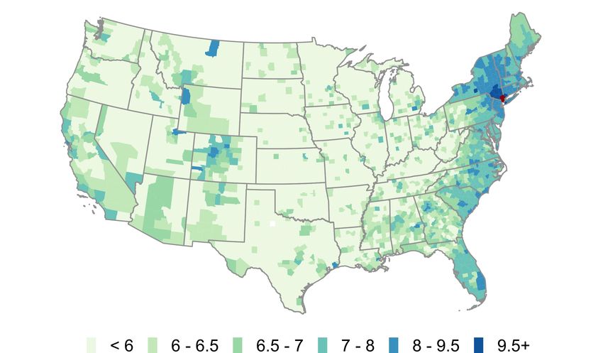
across Europe (Bailey et al., 2020c) and within urban areas (Bailey et al., 2020a), suggesting
it contains important information about real-world interactions. Most directly, Coven and
Gupta (2020) use our Social Connectedness Index to show that counties with higher levels
of social connectedness to New York were more likely to be destinations for those fleeing the
city during the pandemic. This provides direct evidence for our hypothesized mechanism.
    After introducing our Social Connectedness Index, we show that regions with stronger
social ties to early COVID-19 hotspots Westchester County, NY, in the United States, and
Lodi province in Italy have more documented COVID-19 cases per resident as of March
30, 2020. This relationship is robust to controlling for the geographic distance to these
early “hotspots, as well as a number of demographic characteristics of the regions. These
case studies highlight that social connectedness might have served as a valuable predictive
measure in addition to physical distance and other existing epidemiological model inputs.
    We then exploit the changing geography of the pandemic in the U.S. to conduct a more
systematic analysis. We construct regional measures of COVID-19 exposure through social
connectedness (“social proximity to cases) and through physical distance (“physical proxim-
ity to cases). We find a county’s growth in social proximity to cases in one time period is
strongly correlated with the county’s growth in actual cases in the next time period. Even
after controlling for physical proximity to cases and other regional demographics, a doubling
in social proximity to cases in one two-week period corresponds to a 22.5% increase in actual
cases per 10,000 residents in the next two-week period. This positive relationship holds for
every two-week period between March 30 and July 20, 2020. To mimic a real-world use
case, we also conduct a simple out-of-sample prediction exercise. We find that models that
include our measure of social proximity to cases are better able to predict a region’s future
case growth than those that rely on geographic distance and other demographics alone.
    Our use of the Social Connectedness Index to forecast COVID-19 outbreaks adds to an
active body of research that studies how different aspects of social media and internet-usage
patterns can be used for tracking and preventing disease (for an overview, see Aiello et al.,
2020). One strand of this literature uses the content of individuals’ internet searches or social
media posts; most famously, Google Flu Trends used search queries related to influenza for
early outbreak detection (Ginsberg et al., 2009). Other researchers have also used content
from Twitter posts (Rodrı́guez-Martı́nez and Garzón-Alfonso, 2018; Jahanbin and Rahma-
nian, 2020), Facebook likes (Gittelman et al., 2015), Wikipedia searches (Generous et al.,
2014), and Instagram posts (Correia et al., 2016) to predict public health outcomes. A sec-
ond strand of research, which has received much attention during the COVID-19 pandemic,
uses geolocation data to track individuals’ movement patterns. These data have been used
to explore the determinants and effects of social distancing behavior (for an overview, see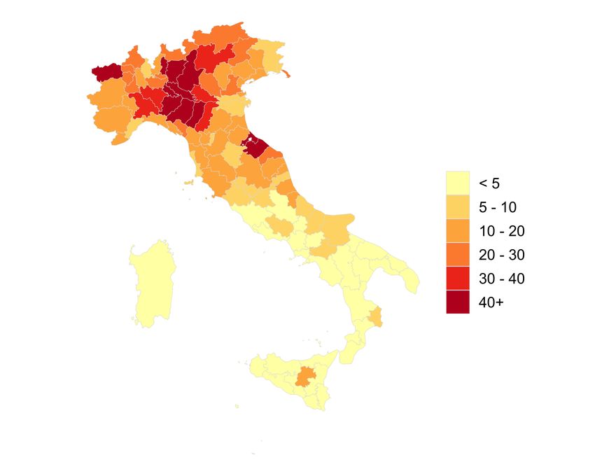
Giuliano and Rasul, 2020), as well as forecast disease spread (see e.g. Bengtsson et al., 2015;
Wesolowski et al., 2012, 2015; Peixoto et al., 2020). A third strand uses crowdsourced infor-
mation, including surveys, to monitor disease symptoms and detect potential outbreaks (see
Facebook Symptom Survey; Smolinski et al., 2015; Paolotti et al., 2014).
    In comparison to this literature, our stable network-based measure is less likely to suffer
from changes in internet behavior or seasonality, both of which have hampered Google Flu
Trends (Olson et al., 2013). In addition, our measures do not require individuals to have
experienced symptoms, which potentially allows us to identify at-risk localities before disease
transmission.1 Finally, because our measures are based only on aggregated connections
(instead of individual movement), they are easily accessible to researchers and consistently
available for a large number of geographies around the world.
    More generally, our results add to a literature that has applied aspects of network theory
to build spatial epidemiological models (for overviews, see Keeling and Eames, 2005; Keeling
and Rohani, 2011; Danon et al., 2011). Works in this literature move beyond the basic
assumption that individuals within a population are fully mixed, or equally likely to interact;
instead, they better represent the dynamics of real-world connections (see e.g. Newman, 2002;
Klovdahl, 1985; Klovdahl et al., 1994; Mossong et al., 2008; Yang et al., 2020). While some
of these studies parameterize models with information on local networks, we are unaware
of any that introduces a measure with comparably high levels of coverage and granularity.2
Our hope is that our unique measure of social connectedness can help parameterize future
epidemiological work. In addition, we hope that the Social Connectedness Index can advance
the literature on the determinants and effects of urban and regional social networks (see
Bailey et al., 2020a; Kim et al., 2017; Büchel and von Ehrlich, 2016; Mossay and Picard,
2011; Brueckner and Largey, 2008; Glaeser et al., 1992).
    It is important to note that our objective in this paper is not to incorporate social
connectedness data into a state-of-the-art epidemiological model. Instead, we provide a
unique measure to assess regions’ outbreak risk, answering the call of Avery et al. (2020),
among others, who highlight the “urgent need” for “creative and entrepreneurial methods”
of interpreting and sharing data to model coronavirus spread. To that end, the data in this
paper, as well as similar data for a wide range of other geographies, are accessible by emailing
sci.data@fb.com. We encourage interested researchers to do so.
   1
      However, it suggests that our data might partner well with these measures. For example, if one can
detect an early outbreak using surveys, they could then predict (and potentially prevent) the next outbreak
using information on social connectedness.
    2
      For example, the Social Connectedness Index is available at the ZCTA level in the U.S., the NUTS3
level in Europe, the GADM2 level in the Indian Subcontinent, and the GADM1 level throughout much of
the rest of the world.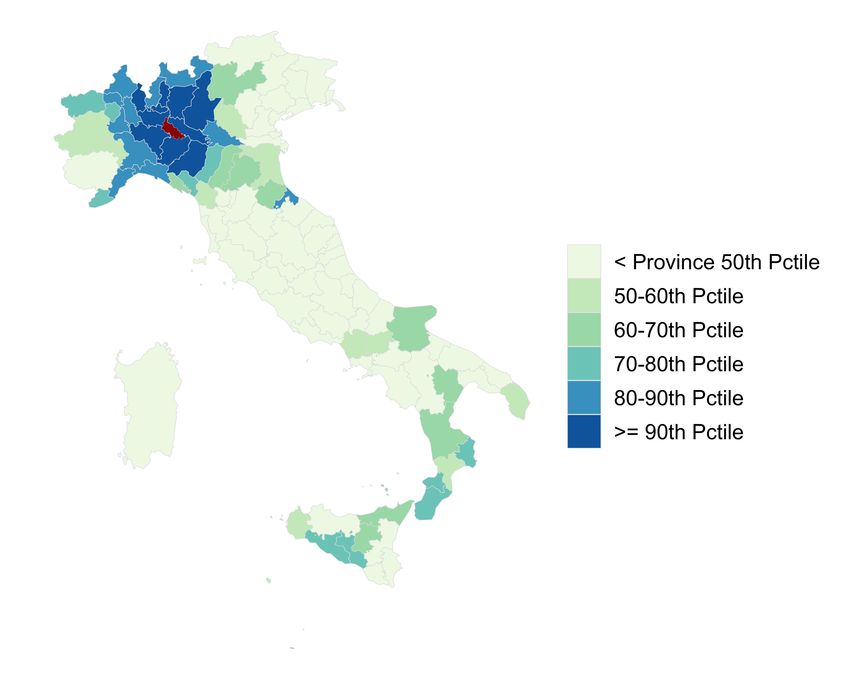
1    Data Description
To measure the intensity of social connectedness between locations, we use a de-identified
and aggregated snapshot of all active Facebook users and their friendship networks from
March 2020. As of the end of 2019, Facebook had nearly 2.5 billion monthly active users
around the world: 248 million in the U.S. and Canada, 394 million in Europe, 1.04 billion in
Asian-Pacific, and 817 billion in the rest of the world (Facebook, 2020). The data therefore
has extremely wide coverage, and provides a unique opportunity to map the geographic
structure of social networks around the world. Locations are assigned to users based on their
information and activity on Facebook, including their public profile information, and device
and connection information. Establishing a connection on Facebook requires the consent
of both individuals, and there is an upper limit of 5,000 on the number of connections a
person can have. As a result, Facebook connections are generally more likely to be between
real-world acquaintances than links on many other social networking platforms.
    Our measure of the social connectedness between two locations i and j is the Social
Connectedness Index (SCI) introduced by Bailey et al. (2018b):

                                                   F B Connectionsi,j
                   Social Connectednessi,j =                              .                (1)
                                                F B U sersi ∗ F B U sersj

Here, F B Connectionsi,j is the total number of Facebook friendship links between Facebook
users living in location i and Facebook users living in location j. F B U sersi and F B U sersj
are the number of active users in each location. Social Connectednessi,j thus measures the
relative probability of a Facebook friendship link between a given Facebook user in location
i and a given Facebook user in location j: if this measure is twice as large, a given Facebook
user in region i is twice as likely to be friends with a given Facebook user in region j.
    In previous work, we have shown that this measure predicts a large number of important
economic and social interactions. For example, social connectedness as measured through
Facebook friendship links is strongly related to patterns of sub-national and international
trade (Bailey et al., 2020b), patent citations (Bailey et al., 2018b), and investment decisions
(Kuchler et al., 2020). More generally, we have found that information on individuals’
Facebook friendship links can help understand their product adoption decisions and their
housing and mortgage choices (Bailey et al., 2018a, 2019a,b).
    Data on COVID-19 cases in the United States by county come from Johns Hopkins
University Center for Systems Science and Engineering. Similarly, data for COVID-19 cases
for each Italian province come from the Italian Dipartimeno della Protezione Civile. As with
any data on cases, some bias may be introduced by differential testing across regions.
2 Early Hotspot Analysis
In this section, we explore how the domestic spread of confirmed COVID-19 cases is related
to social connectedness to two early COVID-19 “hotspots”: Westchester County, NY in the
U.S., and Lodi Province in Italy. Westchester County includes New Rochelle, a community
that had the first major COVID-19 outbreak in the eastern United States (Chappell, 2020).
As of March 20th, the county had over 9,300 cases, second only to nearby New York City.
Additionally, a number of articles reported wealthy residents from Westchester and the New
York area had fled to other parts of the U.S. (Tully and Stowe, 2020), providing a vector that
could potentially spread the disease. Indeed, geneticists and epidemiologists later found that
travel from New York seeded much of the first wave of U.S. COVID-19 outbreaks (Carey and
Glanz, 2020). Social connections to Westchester may thus provide particularly important
information for tracking COVID-19 spread, especially given that Coven and Gupta (2020)
found that connectedness to New York predicted travel patterns from the city early in the
pandemic. Lodi is an Italian province of around 230,000 inhabitants in the heavily impacted
region of Lombardy. It contains Codogno, where the earliest cases of COVID-19 in Italy
were detected, and was at the center of Italy’s outbreak (Horowitz et al., 2020).
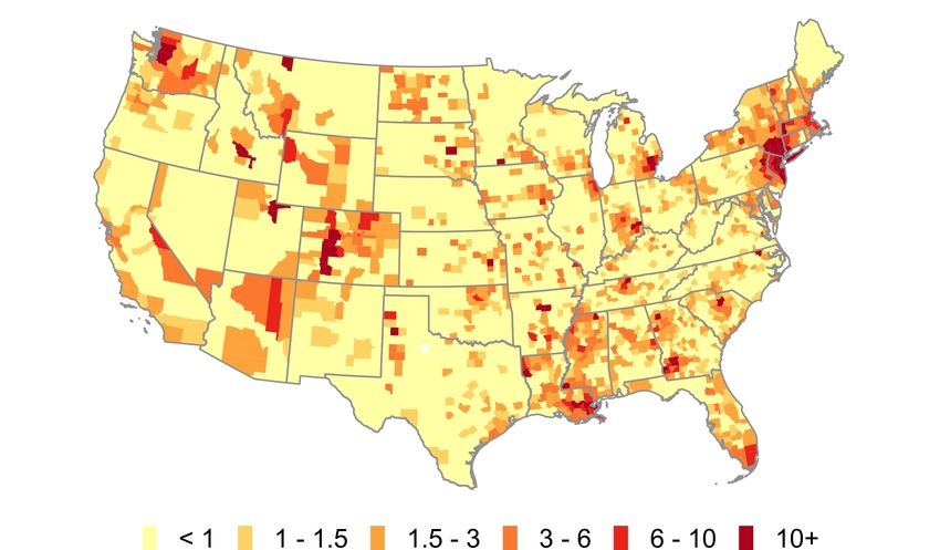
Panel (a) of Figure 1 shows a heatmap of the social connectedness of Westchester County,
NY, to all other U.S. counties; darker colors correspond to stronger social ties. Panel (b)
shows the distribution of COVID-19 cases per 10,000 residents across U.S. counties on March
20, 2020, with darker colors corresponding to higher COVID-19 prevalence. These maps show
a number of similarities. Perhaps most notably, coastal regions and urban centers appear to
have both high levels of connectedness to Westchester and larger numbers of COVID-19 cases
per resident. But a number of more subtle patterns emerge as well. Both measures are high
in the communities along the coasts of Florida (in particular along the southeastern coast,
near Miami), in western and central Colorado (in particular in areas with ski resorts), and
in the upper northeast. These areas are all popular vacation destinations and second home
locations for many well-heeled residents of Westchester. Indeed, the governors of Florida
and Rhode Island both publicly lamented the number of New York area residents fleeing
to their states and spreading COVID-19 (Mower, 2020; Carlisle, 2020). By contrast, many
areas that are geographically closer but less socially connected to Westchester, such as in
western Pennsylvania and West Virginia, had fewer confirmed COVID-19 cases on March
20, 2020. There are also a number of patterns of COVID-19 prevalence that connectedness
to Westchester alone cannot explain. Areas surrounding King County, WA (Seattle), for
example, have relatively low levels of connectedness to Westchester, but were an independent
early hotspot of COVID-19. Some states in the southern U.S. where residents were slowerFigure 1: Social Network Distributions from Westchester and COVID-19 Cases in the U.S.
(a) Log of SCI to Westchester County, NY (b) COVID-19 Cases per 10k Residents by County
(c) Westchester binscatter without controls (d) Westchester binscatter with controls
6
5 4
Cases per 10k people
Cases per 10k people
4
2 3
2
1
0
0
4 5 6 7 8 9 4 5 6 7 8
log(Social Connectedness) log(Social Connectedness)
Note: Panel (a) shows the social connectedness to Westchester for U.S. counties. Panel (b) shows the number
of confirmed COVID-19 cases by U.S. county on March 30th, 2020. Panels (c) and (d) show binscatter plots
with counties more than 50 miles from Westchester as the unit of observation. To generate the plot in Panel
(c), we group log(SCI) into 100 equal-sized bins and plot the average against the corresponding average
case density. Panel (d) is constructed in a similar manner. However, we first regress log(SCI) and cases
per 10,000 residents on a set of control variables and plot the residualized values on each axis. Red lines
show quadratic fit regressions. The controls for Panel (d) are 100 dummies for the percentile of the county
distance to Westchester from the Nation Bureau of Economic Research; population density and median
household income made available from (Chetty et al., 2016); and dummies for the six National Center for
Health Statistics Urban-Rural county classifications.to limit travel also have higher case densities than would be predicted purely by social
connectedness to Westchester (Glanz et al., 2020).
The two bottom panels of Figure 1 explore the relationship between COVID-19 preva-
lence and social ties to Westchester more formally. Panel (c) shows a binscatter plot of
social connectedness to Westchester County and the number of COVID-19 cases per 10,000
residents. We exclude those counties within 50 miles of Westchester County: while those
areas have strong social links to Westchester, they are also close enough geographically such
that their populations might interact physically with Westchester residents even in the ab-
sence of social links (e.g., in supermarkets and houses of worship). There is a strong positive
relationship between COVID-19 prevalence and social ties to Westchester. Quantitatively,
a doubling of a county’s social connectedness to Westchester is associated with an increase
of about 0.88 COVID-19 cases per 10,000 residents. The R-Squared of this relationship is
0.093, suggesting that, in a statistical sense, 9.3% of the cross-county variation in COVID-19
cases can be explained by counties’ social connectedness to Westchester.
One concern with interpreting these initial correlations is that they might be primarily
picking up other factors that affect the spread of COVID-19, and that are correlated with
social connectedness. Specifically, even after dropping counties within 50 miles of Westch-
ester, the correlations might be primarily picking up geographic distance to Westchester
(which is related to the number of friendship links to Westchester). As a result, including
social connectedness might not improve predictive power for models that already control
for some of these other variables. In Panel (d), we therefore present a binscatter plot of
the relationship between social connectedness to Westchester County and COVID-19 cases
that controls for a number of these possible confounding variables (in addition to excluding
nearby counties). Most importantly, we non-parametrically control for the geographic dis-
tance between each county and Westchester County by including 100 dummies for percentiles
of that distance. We also control for income, population density, and a classification of how
urban/rural a county is. Even conditional on these other factors, Panel (d) shows a strong
positive relationship between COVID-19 cases as of March 30, 2020 and social connectedness
to Westchester County. With these controls, a doubling of a county’s social connectedness
to Westchester is associated with an increase of about 0.80 COVID-19 cases per 10,000 res-
idents. The total R-Squared of the statistical relationship is 0.190, while the incremental
R-Squared from controlling for social connectedness to Westchester is 0.037.
It is important to highlight that the purpose of this exercise is to demonstrate the pre-
dictive power of social connectedness measured via online social networks for COVID-19
prevalence. We chose the current set of control variables to highlight that the Social Con-
nectedness Index has such predictive power over and above a number of variables on whichFigure 2: Social Network Distributions of Lodi and COVID-19 Cases in Italy
(a) Percentile of SCI to Lodi Province, Italy (b) COVID-19 Cases per 10k Residents by Province
(c) Lodi binscatter without controls (d) Lodi binscatter with controls
50
30
40
25
Cases per 10k people
Cases per 10k people
30
20
20
15
10
10
0
5
9 9.5 10 10.5 11 9.4 9.6 9.8 10 10.2 10.4
log(Social Connectedness) log(Social Connectedness)
Note: Panel (a) shows a measures of Social Connectedness to Lodi for Italian provinces. Panel (b) shows
the number of confirmed COVID-19 cases by Italian province on March 30th, 2020. Panels (c) and (d) show
binscatter plots with provinces more than 50 kliometers from Lodi as the unit of observation. To generate the
plot in Panel (c) we group log(SCI) into 30 equal-sized bins and plot the average against the corresponding
average case density. Panel (d) is constructed in a smaller manner. However, we first regress log(SCI) and
cases per 10,000 residents on a set of control variables and plot the residualized values on each axis. Red lines
show quadratic fit regressions. The controls for Panel (d) are 20 dummies for the quantile of the province
distance to Lodi; GDP per inhabitant; and population density.data is already easily available, and that may partially proxy for social connections in models
of communicable disease spread. The observed increase in predictive power thus suggests
that the Social Connectedness Index might serve as a valuable measure above some existing
proxies for social interactions.3
Figure 2 explores the analogous relationships for Lodi province in Italy.4 The provinces
with highest COVID-19 case densities and connectedness to Lodi are in the surrounding
Lombardy region, as well as the nearby Piemonte and Veneto regions. There are also rela-
tively high levels of both connectedness to Lodi and COVID-19 cases in Rimini, a popular
tourist destination along the Adriatic sea. A number of provinces in southern Italy send
workers and students to the industrial Lombardy region, and therefore have strong social
ties to that region. While some of these areas have seen a number of COVID-19 cases, they
are not disproportionally larger, perhaps reflecting the efforts of Italian authorities to re-
strict the movement of individuals (Kington, 2020). Panels (c) and (d) repeat the binscatter
exercise from Figure 1. We exclude provinces within 50 kilometers. In Panel (d) we control
for geographic distance using 20 dummies for the quantile of the distance from each province
to Lodi, as well as GDP per inhabitant and population density. Again we find that the So-
cial Connectedness Index appears to have predictive power above these other measures that
might commonly be used to proxy for social interactions. Quantitatively, a doubling of SCI
corresponds to an increase of 16.6 COVID-19 cases per 10,000 residents after controlling for
these relevant factors. The incremental R-Squared of including social connectedness to Lodi
over the other control variables is 0.057.
These cases studies illustrate the potential usefulness of our measure of social connect-
edness for predicting disease spread. In the next section, we use a time series of case growth
from March through July to explore this relationship in more detail.
3 Time Series Analysis
In this section, we exploit the changing geography of the pandemic in the U.S. to more
systematically investigate the predictive value of the Social Connectedness Index in fore-
casting the spread of COVID-19. Specifically, we construct two metrics: “Social Proximity to
Cases”, a county-level measure of exposure to COVID-19 cases through social networks, and
3
This is not to suggest that the Social Connectedness Index is the only such measure, and we believe
that further advances can be made using other data sources, such as cell-phone location pings. But the social
connectedness index has a number of advantages, including the fact that it is easily accessible to researchers
and consistently available for a large number of global geographies.
4
Because Italian provinces on the island of Sardinia do not align with European NUTS3 regions (the
level at which we measure social connectedness), we include Sardinia as a single observation in our analysis.“Physical Proximity to Cases”, a county-level measure of exposure through physical prox-
imity. While the two measures will be related (because individuals generally have stronger
social ties to those who are geographically nearby, as documented in Bailey et al., 2018b),
the examples in the previous section illustrate that some geographically distant places —
such as Westchester and the east coast of Florida — can have strong social ties. These
relationships, and many others which would not be predicted by physical distance, are the
unique predictive value added by the social connectedness data.
Key Variable Construction. We construct our measure of social proximity to cases as:
X Social Connectednessi,j
Social P roximity to Casesi,t = Cases P er 10kj,t ∗ P (2)
j h Social Connectednessi,h
Cases P er 10kj,t is the number of confirmed COVID-19 cases per 10,000 residents in county
j as of time t. The sums j and h are over all counties. Analogously, we construct a measure
of a county’s physical proximity to cases as:
X 1
P hysical P roximity to Casesi,t = Cases P er 10kj,t ∗ (3)
j
1 + Distancei,j
Here, Distancei,j is the physical distance between counties i and j measured in miles.
Empirical Specification. We first study the relationship between actual case growth in
different time periods and “lagged” (i.e. in past time periods) growth in our measures. We
hypothesize that if social connectedness is an important predictor of the path of COVID-19
spread, a lagged measure of social proximity to new cases will have a positive relationship
with new case counts in the next period. For each county i and time period t, we then
estimate the equation:
log(∆ Cases per 10k + 1)i,t = β1 ∗ log(∆Cases per 10k + 1)i,t−1
+ β2 ∗ log(∆Cases per 10k + 1)i,t−2
+ β3 ∗ log(∆Social P roximity to Cases)i,t−1
+ β4 ∗ log(∆Social P roximity to Cases)i,t−2
+ β5 ∗ log(∆P hysical P roximity to Cases)i,t−1
+ β6 ∗ log(∆P hysical P roximity to Cases)i,t−2
+ Xi,t + i,t (4)Here, t is defined as one of the eight two-week time periods between March 30 and July
20, 2020. For each time period t, prior two-week periods are denoted t − 2 and t − 1 (for
example, March 3-16 and March 16-30 for the first period starting March 30). We always
include two lags of own case growth, and explore the effects of lagged changes of social and
physical proximity to cases. Xi,t are a set of time-specific fixed effects, including percentiles
of population density and median household income. In our strictest specification we also
add time by state fixed effects.
Empirical Results. Table 1 shows that growth in social proximity to cases in one period
has a strong positive relationship with actual case growth in the next. In columns 1 and 4,
we see this relationship exists without controlling for physical distance. In columns 2 and
5, however, we show that past physical proximity to cases is also strongly correlated with
present case growth, a relationship which may confound the previous one. To address this,
in columns 3 and 6 we include both measures. While the coefficient on social proximity to
cases falls somewhat (suggesting some of the relationship is due to physical proximity), the
relationship remains highly significant in both the the statistical and real-world sense. In
our strictest specification, which includes state fixed effects interacted with week, a doubling
of social proximity to cases in one period corresponds to a 22.5% increase in actual cases per
10,000 residents in the next period. That this result persists in the presence of state fixed
effects allows us to rule out concerns that it may be due to differences in state-level public
health measures.
We next conduct a similar analysis, but report coefficients separately for each time period,
allowing us to study how the relationship between social connections and new COVID-19
cases changes over the course of the pandemic. Table 2 shows that in every two-week period
from March 30 to July 20, a one time period lagged measure of social proximity to cases was
a statistically significant predictor of actual case growth. The magnitudes of the coefficients
suggest that a doubling in social proximity to cases in one two-week period corresponds to
between a 9.8% and 50.7% increase in actual cases in the next time period, after controlling
for physical proximity to cases and all of our other previous controls.
In columns 1 and 2, which describe disease spread in March and the first days of April,
the relationship is particularly strong. A possible explanation is that COVID-19 spread
through areas with strong social ties before widespread social distancing. For example, trips
between Westchester and coastal Florida may have been common before public recognition
of the outbreak, but relatively infrequent later. Indeed, as social distancing peaked through
April and early May5 the importance of social proximity to cases falls while the importance
5
For quantitative measures of these social distancing patterns see the Facebook Data for GoodTable 1: COVID-19 Case Growth and Prior Proximity to Cases
log(Change in Cases per 10k Residents + 1)
2 Week Lag: 0.592*** 0.434*** 0.437*** 0.325***
log(Change in Social Proximity to Cases + 1) (0.071) (0.106) (0.043) (0.054)
4 Week Lag: -0.067 0.067 -0.077*** 0.020
log(Change in Social Proximity to Cases + 1) (0.050) (0.084) (0.020) (0.029)
2 Week Lag: 1.266** 1.054** 1.622*** 1.266***
log(Change in Physical Proximity to Cases + 1) (0.408) (0.372) (0.163) (0.212)
4 Week Lag: -1.170** -1.028** -1.287*** -1.092***
log(Change in Physical Proximity to Cases + 1) (0.408) (0.374) (0.264) (0.305)
2 Week Lag: 0.319*** 0.635*** 0.376*** 0.330*** 0.549*** 0.376***
log(Change in Cases per 10k Residents + 1) (0.043) (0.022) (0.052) (0.032) (0.025) (0.038)
4 Week Lag: 0.052 0.069*** 0.008 0.079*** 0.062*** 0.040*
log(Change in Cases per 10k Residents + 1) (0.032) (0.016) (0.040) (0.012) (0.010) (0.017)
Time X Pop Density FEs Y Y Y Y Y Y
Time X Median Household Income FEs Y Y Y Y Y Y
Time X State FEs Y Y Y
Sample Mean 1.593 1.593 1.593 1.593 1.593 1.593
R-Squared 0.641 0.638 0.650 0.684 0.682 0.686
N 25,056 25,056 25,056 25,048 25,048 25,048
Note: Table shows results from regression 4. Each observation is a county, two-week period (between March
30 and July 20, 2020). The dependent variable in all columns is log of one plus the number of new COVID-19
cases per 10,000 residents. Columns 1 and 3 include log of growth in social proximity to cases lagged by
two and four weeks (one and two time periods). Columns 2 and 4 include analogous measures of physical
proximity to cases. Columns 3 and 6 include both measures. All columns include controls for two-week and
four-week lagged changes in cases, as well as time-specific fixed effects for percentiles of county population
density and median household income. Columns 3-6 include additional time-specific fixed effects by state.
Standard errors are clustered by time period. Significance levels: *(pTable 2: COVID-19 Case Growth and Prior Proximity to Cases, by Two-Week Period
log(Change in Cases per 10k Residents + 1)
March 31 - April 14 - April 28 - May 12 - May 26 - June 9 - June 23 - July 7-
April 13 April 27 May 11 May 25 June 8 June 22 July 6 July 20
2 Week Lag: 0.731*** 0.379*** 0.141** 0.189*** 0.577*** 0.182** 0.320*** 0.259***
log(Change in Social Proximity to Cases + 1) (0.093) (0.087) (0.059) (0.061) (0.062) (0.073) (0.057) (0.070)
4 Week Lag: 0.384 -0.224* 0.137* 0.023 -0.111* 0.208*** 0.046 0.101
log(Change in Social Proximity to Cases + 1) (0.449) (0.129) (0.082) (0.060) (0.061) (0.074) (0.057) (0.063)
2 Week Lag: 1.259*** 0.699* 2.105*** 1.232*** -0.074 2.270*** 1.361*** 2.025***
log(Change in Physical Proximity to Cases + 1) (0.182) (0.395) (0.283) (0.261) (0.314) (0.434) (0.350) (0.427)
4 Week Lag: -2.425*** -0.273 -1.593*** -0.892*** 0.412 -2.742*** -1.556*** -1.871***
log(Change in Physical Proximity to Cases + 1) (0.745) (0.463) (0.291) (0.282) (0.288) (0.443) (0.329) (0.403)
2 Week Lag: 0.174*** 0.403*** 0.556*** 0.466*** 0.278*** 0.365*** 0.306*** 0.320***
log(Change in Cases per 10k Residents + 1) (0.059) (0.050) (0.036) (0.036) (0.035) (0.041) (0.033) (0.037)
4 Week Lag: -0.136 0.136* -0.019 0.068* 0.126*** -0.017 0.005 0.021
log(Change in Cases per 10k Residents + 1) (0.256) (0.076) (0.047) (0.037) (0.035) (0.039) (0.033) (0.034)
Pop Density FEs Y Y Y Y Y Y Y Y
Median Household Income FEs Y Y Y Y Y Y Y Y
State FEs Y Y Y Y Y Y Y Y
Sample Mean 1.234 1.253 1.331 1.369 1.422 1.579 2.031 2.524
R-Squared 0.600 0.571 0.642 0.647 0.667 0.621 0.678 0.706
N 3,131 3,131 3,131 3,131 3,131 3,131 3,131 3,131
Note: Table shows time-specific results from regression 4. Each observation is a county. The dependent
variable is log of one plus the number of new COVID-19 cases per 10,000 residents in one two-week period
between March 30 and July 20, 2020. All columns include log of growth in social and physical proximity to
cases, as well as actual cases, lagged by two and four weeks (one and two time periods). All columns include
time-specific fixed effects for state, and percentiles of population density and median household income.
Significance levels: *(pthe added predictive value of social proximity to cases by building separate models that
include and exclude this measure. Because we do not use the “test” data in the training ex-
ercise, a reduction in prediction error would be reflective of a true improvement in real-world
predictions (as opposed to an increase in R2 in our previous analyses).
Table 3: Predicting COVID-19 spread in U.S., with and without Social Proximity to Cases
RMSE: Linear Regression RMSE: Random Forest
Without Social With Social Diff. from Social Without Social With Social Diff. from Social
Proximity to Cases Proximity to Cases Proximity to Cases Proximity to Cases Proximity to Cases Proximity to Cases
(1) April 14 - April 27 2.523 2.598 0.075 1.597 1.497 -0.099
(2) April 28 - May 11 1.082 1.168 0.086 0.922 0.845 -0.077
(3) May 12 - May 25 0.742 0.729 -0.014 0.754 0.726 -0.028
(4) May 26 - June 8 0.742 0.716 -0.026 0.701 0.678 -0.024
(5) June 9 - June 22 0.826 0.798 -0.027 0.795 0.770 -0.025
(6) June 23 - July 6 0.886 0.865 -0.022 0.862 0.840 -0.022
(7) July 7 - July 20 0.813 0.792 -0.020 0.802 0.786 -0.016
Note: Table shows results from county-level predictions of COVID-19 case growth. The predicted outcome
is log of one plus the number of new COVID-19 cases per 10,000 residents. Columns 1-3 show root mean
squared errors (RMSEs) from a linear regression model trained on data from all weeks prior to the week of
interest. Columns 4-6 show analogous results from a random forest model. The model inputs in columns 1
and 4 are population density; median household income; and log of growth in physical proximity to cases
and actual cases, lagged by two and four weeks (one and two time periods). Columns 2 and 5 add social
proximity to cases. Columns 3 and 6 show the change in RMSE from adding social proximity to cases.
Table 3 shows the results of this prediction exercise. Columns 1-3 describe the prediction
error from a simple linear regression model that includes the measures in Table 2 with non-
binned measures of population density and median household income. Column 1 includes
the two lagged measures of social proximity to cases and column 2 excludes them. Each
row shows the root mean squared error (RMSE) from a model trained using data from all
periods before the period of interest, then tested on that next period. In the first two periods
— which include the most limited training data — the RMSE is relatively large for both
models. Then, as the training sample gets larger, the RMSE is consistently between 0.71
and 0.89 log new cases per 10,000 residents. Column 3 shows that in each of these last five
rows, the RMSE is lower from including social proximity to cases, suggesting that it does
significantly improve our predictions.
The results in columns 4-6 are generated using a random forest, an ensemble prediction
algorithm commonly used in data science applications. The algorithm allows us to find non-
linear relationships, without overfitting, by aggregating mean predictions from a number of
regression trees generated over sample subsets of both observations and input variables.6
The out-of-sample predictions of the random forest model generally outperform those of
6
In our analysis we use 500 trees. For more information on random forests, see Breiman (2001).the linear model. In addition, including measures of social proximity to cases leads to an
improved forecasts of COVID-19 cases throughout the course of the epidemic.
The methodology used for these predictions are relatively simple and should not be
interpreted as a full epidemiological model. However, the results in Table 3 strongly suggest
that our measure of social connectedness may prove useful in future epidemiological work.
4 Conclusion
In the context of threats from communicable disease, a region’s ability to determine optimal
public health responses depends on its ability to forecast the risk of an outbreak (Reich
et al., 2019). A primary determinant of this risk is the likelihood of physical interactions
between the region’s residents and residents of other areas with severe outbreaks. Information
on the geography of social connections, which shape patterns of physical interactions, are
therefore crucially important for public health officials. In this paper, we use de-identified
and aggregated data from Facebook to measure social connections between regions, and
find it be an important predictor of future outbreaks during the COVID-19 pandemic. We
show that areas more connected to early pandemic hotspots in the U.S. and Italy had, on
average, higher case counts by March 20, 2020, even after controlling for physical distance
and other demographics. Furthermore, the inclusion of social proximity to cases improves
predictions of COVID-19 spread during the first four months of the U.S. pandemic, over and
above models that include only physical proximity to cases and other controls. Our results
should not be interpreted as an attempt to create a state-of-the-art epidemiological model;
instead, our hope is that our new measure provides a tool for epidemiologists and public
health officials hoping to forecast the spread of communicable diseases such as COVID-19.
References
A. E. Aiello, A. Renson, and P. N. Zivich. Social media- and internet-based disease surveil-
lance for public health. Annual Review of Public Health, 41:101–118, 2020.
C. Avery, W. Bossert, A. Clark, G. Ellison, and S. F. Ellison. Policy implications of models
of the spread of coronavirus: Perspectives and opportunities for economists. Technical
report, National Bureau of Economic Research, 2020.
M. Bailey, R. Cao, T. Kuchler, and J. Stroebel. The economic effects of social networks: Ev-
idence from the housing market. Journal of Political Economy, 126(6):2224–2276, 2018a.M. Bailey, R. Cao, T. Kuchler, J. Stroebel, and A. Wong. Social connectedness: Measure- ments, determinants, and effects. Journal of Economic Perspectives, 32(3):259–80, 2018b. M. Bailey, E. Dávila, T. Kuchler, and J. Stroebel. House price beliefs and mortgage leverage choice. The Review of Economic Studies, 86(6):2403–2452, 2019a. M. Bailey, D. M. Johnston, T. Kuchler, J. Stroebel, and A. Wong. Peer effects in product adoption. Working Paper 25843, National Bureau of Economic Research, 2019b. M. Bailey, P. Farrell, T. Kuchler, and J. Stroebel. Social connectedness in urban areas. Journal of Urban Economics, page 103264, 2020a. M. Bailey, A. Gupta, S. Hillenbrand, T. Kuchler, R. Richmond, and J. Stroebel. International trade and social connectedness. Working paper, 2020b. M. Bailey, T. Kuchler, D. Russel, B. State, and J. Stroebel. Social connectedness in europe. Working paper, 2020c. L. Bengtsson, J. Gaudart, X. Lu, S. Moore, E. Wetter, K. Sallah, S. Rebaudet, and R. Piar- roux. Using mobile phone data to predict the spatial spread of cholera. Scientific reports, 5:8923, 2015. L. Breiman. Random forests. Machine learning, 45(1):5–32, 2001. J. K. Brueckner and A. G. Largey. Social interaction and urban sprawl. Journal of Urban Economics, 64:18–34, 2008. K. Büchel and M. von Ehrlich. Cities and the structure of social interactions: Evidence from mobile phone data. Working Paper, 2016. B. Carey and J. Glanz. Travel from new york city seeded wave of u.s. out- breaks. New York Times, 2020. URL https://www.nytimes.com/2020/05/07/us/ new-york-city-coronavirus-outbreak.html. M. Carlisle. Rhode island governor announces national guard will go ‘door-to-door’ to iden- tify new yorkers to slow covid-19 spread. Time, 2020. URL https://time.com/5812069/ rhode-island-new-york-coronavirus/. B. Chappell. Coronavirus: New york creates ‘containment area’ around cluster in new rochelle. NPR, 2020. URL https://www.npr.org/sections/health-shots/2020/03/10/ 814099444/new-york-creates-containment-area-around-cluster-in-new-rochelle.
R. Chetty, J. N. Friedman, N. Hendren, M. R. Jones, and S. R. Porter. The opportunity atlas:
  Mapping the childhood roots of social mobility. National Bureau of Economic Research
  Working Paper No. 25147, 2016.

R. B. Correia, L. Li, and L. M. Rocha. Monitoring potential drug interactions and reactions
  via network analysis of instagram user timelines. In Biocomputing 2016: Proceedings of
  the Pacific Symposium, pages 492–503. World Scientific, 2016.

J. Coven and A. Gupta. Disparities in mobility responses to covid-19. NYU Stern Working
   Paper, 2020.

L. Danon, A. P. Ford, T. House, C. P. Jewell, M. J. Keeling, G. O. Roberts, J. V. Ross,
  and M. C. Vernon. Networks and the epidemiology of infectious disease. Interdisciplinary
  perspectives on infectious diseases, 2011, 2011.

Facebook. Facebook form 10-k, 2019 annual report, 2020. URL http://d18rn0p25nwr6d.
  cloudfront.net/CIK-0001326801/45290cc0-656d-4a88-a2f3-147c8de86506.pdf.

Facebook Symptom Survey. URL https://dataforgood.fb.com/tools/symptommap/.

N. Generous, G. Fairchild, A. Deshpande, S. Y. Del Valle, and R. Priedhorsky. Global disease
  monitoring and forecasting with wikipedia. PLoS Comput Biol, 10(11):e1003892, 2014.

J. Ginsberg, M. H. Mohebbi, R. S. Patel, L. Brammer, M. S. Smolinski, and L. Brilliant.
   Detecting influenza epidemics using search engine query data. Nature, 457(7232):1012–
   1014, 2009.

S. Gittelman, V. Lange, C. A. G. Crawford, C. A. Okoro, E. Lieb, S. S. Dhingra, and
  E. Trimarchi. A new source of data for public health surveillance: Facebook likes. Journal
  of medical Internet research, 17(4):e98, 2015.

P. Giuliano and I. Rasul. Compliance with social distancing during the covid-19 crisis, 2020.
  URL https://voxeu.org/article/compliance-social-distancing-during-covid-19-crisis.

E. L. Glaeser, H. D. Kallal, J. A. Scheinkman, and A. Shleifer. Growth in cities. Journal of
  Political Economy, 100(6):1126–1152, 1992.

J. Glanz, B. Carey, J. Holder, D. Watkins, J. Valentino-DeVries, R. Rojas, and
  L. Leatherby.       Where america didn’t stay home even as the virus spread.
  New York Times, 2020. URL https://www.nytimes.com/interactive/2020/04/02/us/
  coronavirus-social-distancing.html.
J. Horowitz, E. Bubola, and E. Povoledo. Italy, pandemic’s new epicenter, has lessons for
   the world. New York Times, 2020. URL https://www.nytimes.com/2020/03/21/world/
   europe/italy-coronavirus-center-lessons.html.

K. Jahanbin and V. Rahmanian. Using twitter and web news mining to predict covid-19
  outbreak. Asian Pacific Journal of Tropical Medicine, 13, 2020.

M. J. Keeling and K. T. Eames. Networks and epidemic models. Journal of the Royal Society
 Interface, 2(4):295–307, 2005.

M. J. Keeling and P. Rohani. Spatial models. In Modeling infectious diseases in humans and
 animals, pages 232–290. Princeton University Press, 2011.

J. S. Kim, E. Patacchini, P. M. Picard, and Y. Zenou. Urban interactions. Working Paper,
   2017.

T. Kington. As italy extends quarantine zone, many flee; angry official tell them to go
  back. Los Angeles Times, 2020. URL https://www.latimes.com/world-nation/story/
  2020-03-08/italy-extends-quarantine-across-north-many-flee.

A. S. Klovdahl. Social networks and the spread of infectious diseases: the aids example.
  Social science & medicine, 21(11):1203–1216, 1985.

A. S. Klovdahl, J. J. Potterat, D. E. Woodhouse, J. B. Muth, S. Q. Muth, and W. W.
  Darrow. Social networks and infectious disease: The colorado springs study. Social science
  & medicine, 38(1):79–88, 1994.

T. Kuchler, L. Peng, J. Stroebel, Y. Li, and D. Zhou. Social proximity to capital: Implica-
  tions for investors and firms. Working paper, 2020.

P. Mossay and P. M. Picard. On spatial equilibria in a social interaction model. Journal of
  Economic Theory, 146(6):2455–2477, 2011.

J. Mossong, N. Hens, M. Jit, P. Beutels, K. Auranen, R. Mikolajczyk, M. Massari, S. Salmaso,
   G. S. Tomba, J. Wallinga, et al. Social contacts and mixing patterns relevant to the spread
   of infectious diseases. PLoS Med, 5(3):e74, 2008.

L. Mower. New yorkers flying to florida to self-quarantine for 14 days, gov. desantis says.
  Tampa Bay Times, 2020. URL https://www.tampabay.com/news/health/2020/03/23/
  huge-amounts-of-new-yorkers-flocking-to-florida-gov-desantis-says-in-refusing-lock-down/.
M. E. Newman. Spread of epidemic disease on networks. Physical review E, 66(1):016128,
 2002.

D. R. Olson, K. J. Konty, M. Paladini, C. Viboud, and L. Simonsen. Reassessing google flu
  trends data for detection of seasonal and pandemic influenza: a comparative epidemiolog-
  ical study at three geographic scales. PLoS Comput Biol, 9(10):e1003256, 2013.

D. Paolotti, A. Carnahan, V. Colizza, K. Eames, J. Edmunds, G. Gomes, C. Koppeschaar,
  M. Rehn, R. Smallenburg, C. Turbelin, et al. Web-based participatory surveillance of
  infectious diseases: the influenzanet participatory surveillance experience. Clinical Micro-
  biology and Infection, 20(1):17–21, 2014.

P. S. Peixoto, D. Marcondes, C. Peixoto, and S. M. Oliva. Modeling future spread of
  infections via mobile geolocation data and population dynamics. an application to covid-
  19 in brazil. PloS one, 15(7):e0235732, 2020.

A. P. Piontti, N. Perra, L. Rossi, N. Samay, and A. Vespignani. Charting the Next Pandemic:
  Modeling Infectious Disease Spreading in the Data Science Age. Springer, 2018.

N. G. Reich, L. C. Brooks, S. J. Fox, S. Kandula, C. J. McGowan, E. Moore, D. Osthus, E. L.
  Ray, A. Tushar, T. K. Yamana, et al. A collaborative multiyear, multimodel assessment
  of seasonal influenza forecasting in the united states. Proceedings of the National Academy
  of Sciences, 116(8):3146–3154, 2019.

M. Rodrı́guez-Martı́nez and C. C. Garzón-Alfonso. Twitter health surveillance (ths) system.
 In Proceedings: IEEE International Conference on Big Data, volume 2018, page 1647.
 NIH Public Access, 2018.

M. S. Smolinski, A. W. Crawley, K. Baltrusaitis, R. Chunara, J. M. Olsen, O. Wójcik,
 M. Santillana, A. Nguyen, and J. S. Brownstein. Flu near you: crowdsourced symptom
 reporting spanning 2 influenza seasons. American journal of public health, 105(10):2124–
 2130, 2015.

T. Tully and S. Stowe. The wealthy flee coronavirus. vacation towns respond: Stay
  away. New York Times, 2020. URL https://www.nytimes.com/2020/03/25/nyregion/
  coronavirus-leaving-nyc-vacation-homes.html.

A. Wesolowski, N. Eagle, A. J. Tatem, D. L. Smith, A. M. Noor, R. W. Snow, and C. O.
  Buckee. Quantifying the impact of human mobility on malaria. Science, 338(6104):267–
  270, 2012.
A. Wesolowski, T. Qureshi, M. F. Boni, P. R. Sundsøy, M. A. Johansson, S. B. Rasheed,
  K. Engø-Monsen, and C. O. Buckee. Impact of human mobility on the emergence of
  dengue epidemics in pakistan. Proceedings of the National Academy of Sciences, 112(38):
  11887–11892, 2015.

C. Yang, R. Wang, F. Gao, D. Sun, J. Tang, and T. Abdelzaher. Quantifying projected
  impact of social distancing policies on covid-19 outcomes in the us. arXiv preprint
  arXiv:2005.00112, 2020.
You can also read