VISUALIZATION OF CLIMATE SCIENCE SIMULATION DATA - MPG.PURE
←
→
Page content transcription
If your browser does not render page correctly, please read the page content below
EDITOR: Amit Agrawal, amit.agrawal@me.com
     GUEST EDITOR: Francesca Samsel, fsamsel@tacc.utexas.edu

     DEPARTMENT: TOOLS AND PRODUCTS

     Visualization of Climate Science Simulation
     Data
             € ber and Michael Bo
     Niklas Ro                  € ttinger, German Climate Computing Center, Hamburg, Germany
     Bjorn Stevens, Max Planck Institute for Meteorology, Hamburg, Germany

         Climate simulations belong to the most data-intensive scientific disciplines and
         are—in relation to one of humankind’s largest challenges, i.e., facing anthropogenic
         climate change—ever more important. Not only are the outputs generated by
         current models increasing in size, due to an increase in resolution and the use of
         ensembles, but the complexity is also rising as a result of maturing models that are
         able to better describe the intricacies of our climate system. This article focuses on
         developments and trends in the scientific workflow for the analysis and
         visualization of climate simulation data, as well as on changes in the visualization
         techniques and tools that are available.

     C
                 limate research has come a long way, from          processes being incorporated into the models and out-
               models and observations that coarsely describe       put as data, also add to the total sum. One tool that is
               Earth’s atmosphere and ocean in the past, to         particularly good at data reduction is visualization, yet
     dense satellite data and km scale global simulations that      the data we are working with these days is so detailed
     explicitly resolve clouds and precipitation today. The sim-    that we often do not see the forest for the trees.
     ulations that are carried out at DKRZ, the German Cli-              Large data comes in different forms, requiring differ-
     mate Computing Center in Hamburg, Germany, span a              ent solutions each to be applied in order to visualize the
     wide range from regional to global, from short to very         information within. While a few years back 80 km global
     long, and from low to very high resolution.                    simulations had been considered state of the art, pro-
         A commonality of all simulations is the multivariate       ducing about 2 GB of data per simulated day, nowadays
     nature of the data that is written out, with a multitude of    we are working on 1 km global simulations requiring to
     time-varying 2-D and 3-D variables describing the states       store at least 8 TB of data per simulated day with the
     of the atmosphere, ocean, cryosphere, and biosphere.           same number of time steps1, 2 (see Figure 1). Yet at the
     The development of expressive, yet comprehensive, visu-        same time, the analysis of small-scale processes that
     alizations by combining information from several differ-       can now be resolved demand a particularly higher fre-
     ent variables to unlock correlations and trends can            quency output in order to be visualized properly, thus
     sometimes be considered more an art than science.              further increasing the amount of data by a large factor.
     Over the last decades, the output generated by climate         As storage capacities are tight, one needs to carefully
     models has grown exponentially. This is essentially due        choose what to store and what not.
     to higher spatial and temporal resolutions. The introduc-           Another form of large data emanates from very
     tion of ensemble techniques, as well as additional             long simulations, such as within the German Govern-
                                                                    ment funded project PALMOD, which simulates the
                                                                    climate from the last interglacial to the Anthropocene,
                                                                    i.e., a complete glacial cycle of about 120 k years.3
     This work is licensed under a Creative Commons Attribution     While the spatial resolution of the model is low, data
     4.0 License. For more information, see https://                extraction and the visualization of many thousand
     creativecommons.org/licenses/by/4.0/
                                                                    time steps, and especially finding key events in this
     Digital Object Identifier 10.1109/MCG.2020.3043987
     Date of current version 12 January 2021.                       long dataset, is not a trivial task (see Figure 2).

42   IEEE Computer Graphics and Applications            Published by the IEEE Computer Society           January/February 2021
TOOLS AND PRODUCTS
FIGURE 1. Photo-realistic visualization of a global ICON atmo- FIGURE 2. Depicted in this visualization from a paleoclimate
sphere simulation at 2.5 km resolution. Clouds are a 2-D com- simulation is a so-called Heinrich event, in which large quanti-
position of vertically integrated liquid cloud water and ice, ties of ice flow into the Atlantic and weaken the circulation,
and rendered using a physically based rendering (PBR) with a drastic effect on the climate in Europe. (Source: Florian
approach. Ziemen, DKRZ; used with permission.).
A third form of large data is generated by ensem-
access and rendering. As these GPU nodes share the
ble simulations, in which a climate model is started
file system with the supercomputer, no data has to
several times with varied initial conditions. By sam-
leave the data center, and the entire workflow stays
pling the uncertainty in the initial conditions, the
in-house.
ensemble provides means to derive additional statisti-
Our primary applications for postprocessing, analy-
cal information such as the internal climate variability
sis, and visualization are the climate data operators
and hence the uncertainty or robustness of a result.
CDO (https://code.mpimet.mpg.de/projects/cdo), the
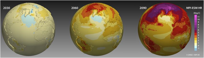
The Max Planck Institute for Meteorology (MPI-M)
netCDF operators NCO, NCL (https://www.ncl.ucar.
grand ensemble4 (MPI-GE) is to date the largest cli-
edu), Python/matplotlib, among of course other librar-
mate projection ensemble of a single state-of-the-art
ies such as DASK and XArray, but also ParaView,5
comprehensive earth system model; it consists of 100
Met3D,6 and VaPOR.7 In our work, we try to employ
members each for three CMIP5 scenarios, a 2000 year
open-source software as much as possible, and also
preindustrial control run, a simulation of the historical
foster the open-source community through collabora-
past from 1850 to 1995, and a 150 year generic green-
tions and user training. For a broader overview on
house gas increase experiment (see Figure 3).
tools and developments for data visualization in this
Of course, not all simulations that are performed at
field, we refer to the review by Rautenhaus.8
DKRZ are very large; in terms of raw numbers, the
The classic workflow in climate science is the one
majority are not. Our archive already holds about
of posthoc data analysis and visualization: During the
140 PB of climate simulation data for long-term stor-
simulation, and depending on storage capacities
age. With increasing computing capacity and progres-
available, as much data are written out as possible.
sively complex simulations, this number will rise at an
Later, the data are processed, analyzed, and visual-
even higher rate. The only question that remains is:
ized, and some of the data may also get archived in
How are we coping with this huge amount of data in
tape libraries for long-term storage. However, the
the near future? This article tries to answer this ques-
widening of the gap between computational perfor-
tion, by discussing the climate Visualization Workflow,
mance and I/O bandwidth invalidates this concept,
as well as the Visualization Techniques employed,
even more so for larger simulations, as only fractions
thereby illuminating both aspects with respect to
of the data can be stored for later posthoc analyses.
past, current, and future approaches.
Especially for very data-intensive experiments, scien-
tists must think ahead and formulate the research
VISUALIZATION WORKFLOW questions they would like to get answered with the
Besides a supercomputer and a large parallel file sys- simulations beforehand, as well as carefully plan
tem, DKRZ also hosts a dedicated visualization cluster which data to store and which to not. This is very
as an integral part of the HPC system. The visualiza- similar to the data acquisition process in measure-
tion nodes are equipped with GPUs, and are config- ment campaigns, and needs now to be transitioned
ured with X, VirtualGL, and VNC to facilitate remote to the simulation planning.
January/February 2021 IEEE Computer Graphics and Applications 43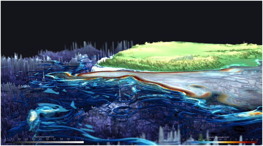
TOOLS AND PRODUCTS

      FIGURE 3. Simulations carried out in the context of the Coupled Model Intercomparison Project 6 (CMIP6) for the upcoming
      sixth IPCC report are a good example for long-term ensemble climate projections. The visualization shows projected tempera-
      ture changes for 2030, 2060, and 2090 for the pessimistic scenario SSP585.

          Especially for these big flagship simulations, the            processing capabilities. The performance limitations of
      workflow is about to change. With the advent of                   the human eye are estimated to be around 6 Mb/s,
      ICON—the ICOsahedral Nonhydrostatic model9 that                  whereas the throughput of the visual sensory system, i.e.,
      is jointly developed by the MPI-M, the German                    perception and cognition, is considerably less. The optical
      Weather Service (DWD), and DKRZ—the necessity                    nerve throughput is in the order of 20 kB/s, therefore,
      arose to read and visualize these ICON datasets on               looking at petabytes of visualized data will not get us any
      the original unstructured grid. As ParaView is open              further. We need to reduce the amount of data tremen-
      source and being used by many institutions from various          dously, and ideally steer the scientists’ attention to areas
      scientific disciplines, we decided to extend ParaView             and time steps that are relevant, i.e., which show unex-
      with a customized reader to directly import and visualize        pected changes, outliers, or undiscovered phenomena.
      ICON netCDF/grib compressed data. Our reader                         For the computational part of large data visualization,
      employs the climate data interface CDI (https://code.            two primary concepts have evolved: in situ visualization
      mpimet.mpg.de/projects/cdi), also developed by MPI-M,            as well as progressive data storage, access, and render-
      as underlying netCDF library, and is not only able to read       ing. Both have their respective advantages and limita-
      all three ICON grids (triangles, quads, and hexagons),           tions, but help us to manage the output that is generated
      but also the output of other models such as IFS and              by extremely large and high-resolution experiments.
      DYNAMICO. Currently, it is being further extended to                 In situ visualization processes and visualizes the
      support a variety of different models employed in cli-           data as it is being computed. This has the advantage
      mate and weather research.                                       that both the I/O and the time to solution are drasti-
          Jupyter Notebooks have established themselves as             cally reduced. In our experience, developing and
      indispensable assets for the analysis and visualization of       experimenting with an in situ adaptor for our Fortran
      data, not just within climate science. They are easy to          ICON model based on ParaView/Catalyst, and running
      use and share, and can be employed for preprocessing             it together with the simulation in a tightly coupled
      and postprocessing, data analysis and visualization, as          setup, the performance overhead required for the
      well as to document the entire process. In general, web-         processing and visualization is almost negligible10. At
      based visualizations are gaining more momentum, not              the moment, there are a lot of ongoing developments
      only for communication and public outreach, but also as          and community efforts aiming in the same direction.
      a tool for scientists to analyze their data using various        A number of those support web-based solutions,
      web-based services. Beneficial thereby is that these              such as the Cinema (https://cinemascience.github.io)
      services run on servers that are also connected to the           extension of Catalyst, which implements an image-
      large file system, accessing all data in-house without any        based data visualization, but also allows data artifacts,
      data movement.                                                   and in its newest addition also deferred rendering.
                                                                           Nevertheless, one of the major advantages of in
      Large Data Visualization                                         situ visualization is at the same time also its biggest
      One barrier that poses real challenges is the one put up         flaw: Only a fraction of the simulated data is stored,
      by storage constraints of the HPC system itself, but also        either as reduced data and/or rendered as images. If
      by limitations of the human mental perception and                the structure or feature that a scientist is interested

 44                 IEEE Computer Graphics and Applications                                                  January/February 2021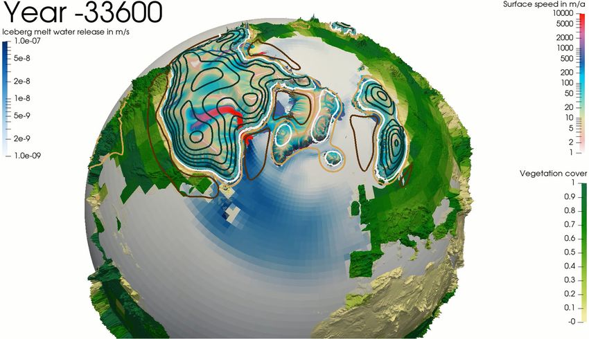
TOOLS AND PRODUCTS

in is not contained in the data stored, or visible in one
of the visualizations, the simulation may need to be
rerun with revised parameters. But as the degree of
parallelism of HPC systems grows, this problem might
mitigate in the future, and it will be more favorable to
rerun simulations over storing all the data. Future
workflows might also expose steering as an option, in
which the user controls parameters of the simulation
directly from within the visualization application. We
are currently taking our first steps to experiment with
this feature.
    Progressive data storage and rendering can help
remedy some of the issues associated with in situ
visualization, although it does not solve the I/O prob-
lem, as still almost the same amount of data needs
to be stored to disk for a posthoc analysis. Here, the
data are decomposed, often by using wavelets, to            FIGURE 4. Excerpt from our DYAMOND++ VR film (https:
reconstruct a level-of-detail tree of the data, ideally     //youtu.be/5Y_oDaFRLaI), looking from central Europe over
also applying lossy data compression at the same            the Atlantic and onto an Icelandic low. The clouds are a 3-D
time11. Later, the part with the lowest resolution is       composition of liquid cloud water and cloud ice, cut in half to
loaded and visualized first. The user can either load        visualize a large-scale precipitation band (blue) over the U.K.
new details on demand or load them automatically            The ocean’s surface shows salinity, whereas the land surface
by zooming into the data. Important thereby is to
                                                            depicts temperature.
preserve the interesting features in the lower resolu-
tion versions, so that one knows where to zoom in to
                                                            possibility to train a neural network online, by rout-
further explore the data. A visualization package that
                                                            ing the training data directly over the in situ Cata-
excels at this is VaPOR, which is developed by NCAR,
                                                            lyst adaptor to an AI training framework.
the National Center for Atmospheric Research in
                                                                In general, we hope that these algorithms, along
Boulder, CO, USA. In a collaboration with NCAR, we
                                                            with an automation of the visualization pipeline, can
work on data decomposition and visualization tech-
                                                            help us to tame the data output by high-resolution
niques for unstructured datasets to allow our scien-
                                                            models and ensemble simulations.
tists to also utilize the progressive data access and
rendering that is offered by VaPOR.7
                                                             VISUALIZATION TECHNIQUES
                                                            Climate scientists are still fond of 2-D data visualiza-
Visualization Automation                                    tion, as are physicians when looking at their CT and
Artificial neural networks and automated algo-               MRT scans. Some still prefer printing all their variables
rithms are increasingly attracting the attention of         onto paper and comparing the images side by side.
the data analysis and visualization community, but          However, over the past decade, new visualization
have also caught the attention of various domains           techniques enabling an interactive visual data analysis
that either deal with and/or generate large data-           have emerged and quickly transitioned from scientific
sets. At DKRZ, we are experimenting with AI work-           visualization research into publicly and free available
flows to automatize not only the analysis and                interactive visualization tools.
visualization but also to improve the efficiency of              At DKRZ, visualizations are created for a number of
the simulation itself. On the analysis side, a neural       reasons, i.e., exploration, verification, and communication
network can be used to supervise the progression            of simulation results. Most simulations have scripts run-
of a simulation, and may stop it in case of errors to       ning along that create standard 2-D visualizations, which
conserve computational resources. It can also be            are automatically generated and published onto a web
used to detect outliers and interesting events and          server to track the plausibility of the ongoing experiment.
directly steer the scientists’ attention, as well as to     Later, scientists explore the data posthoc using various
learn to differentiate patterns in the data, such as        and very common 2-D and/or 3-D data visualization tech-
cloud types, and track their development and evo-           niques in order to find or verify structures, features, and
lution over time. We also experiment with the               correlations. Statistical data analysis plays a big role in

January/February 2021                                             IEEE Computer Graphics and Applications                     45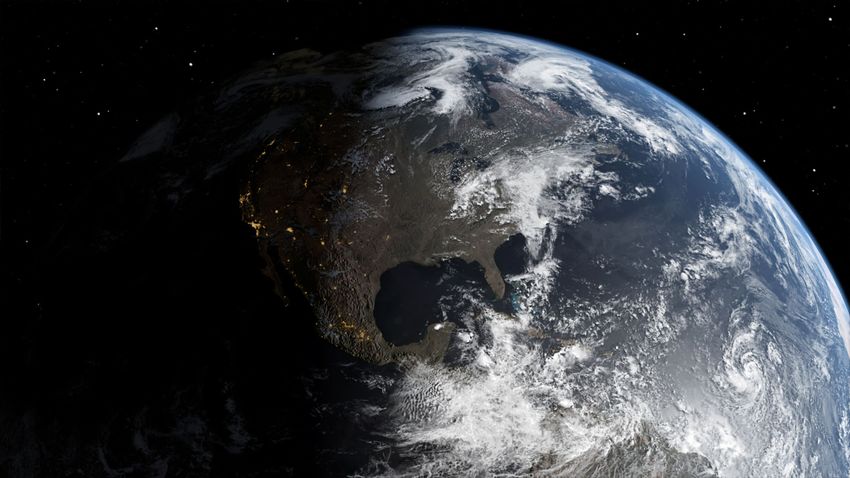
TOOLS AND PRODUCTS

      FIGURE 5. Visualization of 3-D liquid cloud water and cloud ice as vertical cross section through Germany along 10 East using
      volume rendering with path tracing (OSPRay) enabled. Visible are large Cumulonimbus and Nimbo Stratus cloud systems, as
      well as lower clouds.

      climate science. A lot of work is spent on data postpro-
      cessing, i.e., to derive monthly or yearly means, to com-
      pute differences, or to filter and subset the data. For 2-D
      and 221 D visualizations, scripting-based tools such as NCL
      and Python are employed, whereas ParaView, VaPOR,
      and Met3D are used for 3-D data visualization. Interactive
      data analysis and visualization are especially important
      for scientists browsing their data in an intuitive, natural
      way, looking for new structures and/or correlations, but
      also for debugging the climate model though data
      inspection. Animations and stills are created to commu-
      nicate and discuss the results with fellow scientists, as       FIGURE 6. Visualization of the Agulhas current at the south-
      well as for public outreach and to inform the general pub-      ern tip of Africa. Visualized are eddies using streamlines
      lic (see Figure 4).                                             depicting the ocean’s velocity, as well as sea surface height
           A universal difficulty thereby is the multivariate          as semitransparent black and white overlay, rendered using
      nature of the data, which further increases with the
                                                                      raytracing (OptiX) and with the depth of field to steer the
      visualization of ensembles, as also the certainty/
                                                                      viewers’ attention.
      uncertainty of the data needs to be visually expressed.
      While in the past, the visualization of climate data was
      generally centered around a representation of one or
      two variables to show their development over time,              renderings by a number of magnitudes. Two raytracing
      visualizations now tend to be more complex. This is             backends are now being shipped with ParaView: OSPRay
      partially due to a maturing of the simulation models,           from INTEL,12 Figure 5, and OptiX from NVIDIA,13 Figure 6,
      which are now able to describe more (small scale) pro-          among other great improvements, such as a PBR, the
      cesses, but is also due to advances in visualization            use of materials and shaders, as well as the possibility to
      science. In a balance between functionality and aes-            directly render to VR headsets and produce visualiza-
      thetics, one needs to find a way that the variables that         tions for large dome displays (see Figure 4). Those quali-
      are shown complement each other in telling the                  tative improvements directly benefit the perception of
      underlying story of science. The clouds in Figure 4, for        increasingly complex simulations through better depth
      example, are cut in half, yet by observing the blue pre-        perception and spatial recognition.
      cipitation band, the surface temperature, as well as                Additionally, raytracing outperforms OpenGL raster-
      the salinity, one can estimate the stretching of the            ization for very large triangle counts, depending on
      clouds over Europe.                                             screen resolution and settings due to early ray termina-
                                                                      tion, making it the ideal choice for the visualization of
                                                                      extremely large simulation datasets.
      Improving Visual Quality
      For ParaView, the integration and addition of new fea-
      tures has increased exponentially lately, benefiting the         Feature Detection
      entire visualization community. These additions also            In order to make the invisible visible and accessible
      include advances to lift the visual quality of the              to the user, the main structures and features of a

 46                  IEEE Computer Graphics and Applications                                                 January/February 2021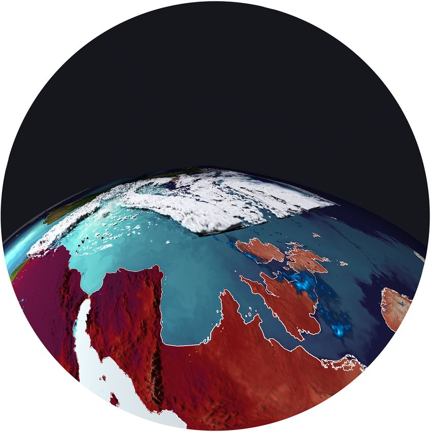
TOOLS AND PRODUCTS

dataset need to be revealed. A visualization of the        develop tools that assist us in harvesting this infor-
raw simulation output is only feasible for smaller         mation without getting lost in the noise. We need
simulations; in larger simulations, users are literally    tools that are able to steer the scientists’ attention
drowned by data, and unable to perceive the entire         to specific areas and time steps of interest, even
visualization, while not getting lost in the details. In   though these areas and time steps may vary from
these cases it is helpful to extract and visualize the     scientist to scientist depending on the underlying
important phenomena, for example, coherent                 research question.
Lagrangian structures, to characterize the primary
flow field dynamics. Other examples in climate sci-
ence are an eddy detection for ocean and a cloud            REFERENCES
classification for high resolved atmospheric data.              1. B. Stevens et al., “DYAMOND: The dynamics of the
The eddy detection can be used for an eddy census                 atmospheric general circulation modeled on non-
and a quantitative visualization of eddies, revealing             hydrostatic domains,” Prog. Earth Planet Sci., vol. 6,
a number of insights to oceanographers, whereas                   2019, Art. no. 61.
cloud classification helps atmospheric scientists to            2. B. Stevens et al., “Large-eddy and storm resolving
quickly find specific cloud types and transitions, as               models for climate prediction: The added value for
well as to form a better understanding of cloud                   clouds and precipitation,” J. Meteorol. Soc. Jpn.,
building and precipitation processes.                             vol. 98, no. 2, pp. 395–435, 2020.
    Related to this is of course the area of topology:         3. M. Latif, M. Claussen, M. Schulz, and T. Brucher,
A topological analysis can reveal structures in the               “Comprehensive earth system models of the last
data and correlations between variables and/or                    glacial cycle,” Eos, vol. 97, 2016.
processes that would otherwise be hidden. A good               4. N. Maher et al., “The Max Planck Institute Grand
example is fiber surface, an extension of the classic              Ensemble: Enabling the exploration of climate
iso-surface to many variables. 3-D fiber surfaces are              system variability,” J. Adv. Model. Earth Syst., vol. 11,
constructed by intersecting the iso-surfaces of the               no. 7, pp. 2050–2069, 2019.
different variables used; indicating the volume, in            5. U. Ayachit, The ParaView Guide: A Parallel
which the thresholds of the respective iso-surfaces               Visualization Application. Clifton Park, NY, USA:
are met or surpassed. For the analysis of climate                 Kitware, 2015.
simulation data, this can be used to visualize,                6. M. Rautenhaus, M. Kern, A. Schafler, and
for example, relations between several hydrometeo-                R. Westermann, “Three-dimensional
rological quantities and the wind field, in order to               visualization of ensemble weather forecasts—Part
show the updraft of moisture as the primary                       1: The visualization tool Met.3D (version 1.0),”
power supply of a cumulonimbus cloud system in a                  Geosci. Model Develop., vol. 8, pp. 2329–2353,
high-resolution atmospherical simulation.14                       2015.
                                                               7. S. Li et al., “VAPOR: A visualization package
                                                                  tailored to analyze simulation data in earth
 THE FUTURE                                                       system science,” Atmosphere, vol. 10, no. 9, 2019,
While the prediction of the future is not easy, an                Art. no. 488.
extrapolation from the past is nonetheless possible:           8. M. Rautenhaus et al., “Visualization in meteorology—
Climate scientists will continue to crank up the resolu-          A survey of techniques and tools for data analysis
tion of the models, thereby resolving and including               tasks,” IEEE Trans. Vis. Comput. Graphics, vol. 24,
more (small scale) processes into the simulation, as              no. 12, pp. 3268–3296, Dec. 2018.
well as conduct more ensembles. Yet also the simula-           9. M. A. Giorgetta et al., “ICON-A, the atmosphere
tions will hit a barrier soon and changes within the              component of the ICON Earth system model: I.
simulation workflow itself are not too far away in the             Model description,” J. Adv. Model. Earth Syst., vol. 10,
future.                                                           pp. 1613-1637, 2018.
    With growing data sizes, we need to pay more              10. N. Rober and J. F. Engels, “In-Situ processing in
attention to both data analysis and visualization, as             climate science,” in Proc. 4th Workshop In Situ Vis.,
this is what will be used in the end. No simulation               2019, pp. 612–622.
is run just because it can be done, but because               11. M. I. Jubair et al., “Icosahedral maps for a
one wants to gain knowledge and learn from what                   multiresolution representation of earth data,” in
is hidden within the data. With growing data sizes,               Proc. Conf. Vision, Model. Vis., Bayreuth, Germany,
we need to automate the analysis pipeline and                     2016.

January/February 2021                                           IEEE Computer Graphics and Applications                       47
TOOLS AND PRODUCTS

          12. I. Wald et al., “OSPRay—A CPU ray tracing                           €
                                                                         MICHAEL BOTTINGER         leads the visualization and public
              framework for scientific visualization,” IEEE Trans.        relations group and his research is focused on scientific visu-
              Vis. Comput. Graphics, vol. 23, no. 1, pp. 931–940, Jan.
                                                                         alization of climate model data. He received the Diploma in
              2017.
                                                                         geophysics and started as a Scientist with the Max Planck
         13. S. Parker et al., “OptiX: A general purpose ray
                                                                         Institute for Meteorology, Hamburg, Germany, in 1988, before
              tracing engine,” ACM Trans. Graph., vol. 29, no. 4,
              2010.                                                      joining the German Climate Computing Center (DKRZ), Ham-
         14. C. Blecha et al., “Fiber surfaces for many variables,”      burg, Germany, in 1999. Contact him at boettinger@dkrz.de.
              Comput. Graph. Forum, vol. 39, no. 3, pp. 317–329,
              2020.                                                      BJORN STEVENS is a Director of the Max Planck Institute for
                                                                         Meteorology, Hamburg, Germany, where he leads the Atmo-
              €
      NIKLAS ROBER is a Climate Visualization Expert with
                                                                         sphere in the Earth System Department. He is also a Profes-
      the German Climate Computing Center (DKRZ), Hamburg,
                                                                         sor with the University of Hamburg, Hamburg, Germany. His
      Germany, which he joined in 2009. His research interests
                                                                         main interest is in the way atmospheric water—particularly
      include visualization and analysis of simulation data, espe-
                                                                         in the form of clouds—shapes the climate. Contact him at
      cially the visualization of extremely large and unstructured
                                                                         bjorn.stevens@mpimet.mpg.de.
      climate datasets. He received the Ph.D. degree in computer
      science and an MBA. He is the corresponding author of this         Contact department editor Amit Agrawal at amit.agrawal@
      article. Contact him at roeber@dkrz.de.                            me.com.

 48                   IEEE Computer Graphics and Applications                                                   January/February 2021
You can also read


