Developing Calligraphic Courtesan Script. Handwriting and Printing connection in Segovia during the Fifteenth century
←
→
Page content transcription
If your browser does not render page correctly, please read the page content below
Open Information Science 2021; 5: 45–62

Research Article

Eduardo Juárez Valero*

Developing Calligraphic Courtesan Script.
Handwriting and Printing connection in Segovia
during the Fifteenth century
https://doi.org/10.1515/opis-2021-0004
received December 1, 2019; accepted November 25, 2020.

Abstract: During the investigation of the Research Group Señoríos Medievales Segovianos in the Archive of the Diocese
of Segovia an unusual document was digitized. It was a building license for Bishop Juan Arias Dávila to improve
University facilities. This document was written in a different script: The Calligraphic Courtesan Script. related to
traditional Courtesan script; this document was written in an especially clear writing style not connected with the usual
cursive gothic styles in Castilla. This article tries to connect this clearness in the writing style with the presence of Juan
Parix from Heidelberg in Segovia, who brought the first Spanish printing press to Segovia.

Keywords: Calligraphic Courtesan Script; Juan Parix from Heidelberg; Printing Press; Gothic Handwriting; Cursive
handwriting; Digital Paleography.

1 Introduction: Johannes Parix and the first Printing Press in Segovia
In 1472, the printer Johannes Parix from Heidelberg at the request of Bishop Juan Arias Dávila started to work in Segovia
(DE LOS REYES, 2005: 123-148) (DE LOS REYES, 2006: 251-252) (DE LOS REYES, 2009: 67-110). He resided in the city for
5 years to 1476 when he moved to Toulouse, France, where he finally died in 1502 (ODRIOZOLA, 1975: 281-308). The
reasons why he came to Segovia are nowadays a historiographical problem. It could have been that he was contracted
by Bishop Arias Dávila to participate in the establishing of the new University around 1466. The need for teaching
materials could be the reason for Johannes Parix’s arrival in Segovia (JUÁREZ, 2015: 199-244).
     Thus, Johannes Parix was printing from 1472 to 1476 working for diocese of Segovia, creating 8 printing editions.
The first of that series, El Sinodal de Aguilafuente, was the first book ever printed in Spain and started a tradition and
typology connected to the rest to the other creators of writing. In this sense it is necessary to consider the influence
of Johannes Parix in Segovia and the surrounding region in order to understand the main objectives of this article.
It has been shown by Fermín de los Reyes Johannes that Parix was present in Italy before his arrival in Segovia (DE
LOS REYES, 2004: 27-61). Due to this, Parix was able to use Italian typographies and letter styles in his 8 creations
while he was working for the diocese of Segovia. This specific typography related to ancient Roman epigraphic capitals
which would affect writing style in the ecclesiastic chancellery of Segovia, transforming the traditional documental
handwriting style. That hybrid documental handwriting can be seen in various Fifteenth Century paper and parchment
documents preserved in the Segovian ecclesiastic Archives.
     Thus, the main objective of this article is to prove connections between Johannes Parix’s presence in Segovia and
the new style of handwriting, which brought the traditional Castilian XVth Century writing so close to Italian style such
as Humanistic handwriting.
     However, it is difficult to prove the connection because the principal bibliography has understood the specific
writing style as a normal evolution of writing traditions influenced by cultural internationalization and political

*Corresponding author: Eduardo Juárez Valero, University Carlos III de Madrid, Madrid, Spain, E-mail: ejuarez@bib.uc3m.es

   Open Access. © 2021 Eduardo Juárez Valero, published by De Gruyter.                This work is licensed under the Creative Commons
Attribution-NonCommercial-NoDerivatives 4.0 License.
46        Eduardo Juárez Valero

relationships during the final years of the Middle Ages (GALENDE, 1998: 187-230) (MASTRUZZO, 2005: 29-40). In
that sense, some traditional Paleography researchers have described a combination between the Italian Humanistic
handwriting with the Castilian Fifteenth Century one, calling it Humanistic-Courtesan Handwriting (MARÍN, 1992: 75).
    Nevertheless, this article will try to establish Parix’s influence on the traditional Castilian style by quantifying
as many forms of analysis as possible (GUMBERT, 2000: 9-28). It is difficult to accept the non-influence of Johannes
Parix’s Printing press on Segovian Chancelleries and the local evolution of traditional handwriting during the final
years of the XVth Century. Consequently, I will demonstrate the main characteristics of normal cursive handwriting used
in Segovia during the period of Johannes Parix’s presence, called Courtesan script. Other possibilities of influencing
handwritings, such as Vatican Cursive Gothic or Italian Humanistic scripts, will be analyzed in order to find further
possible connections with the main objective of this article. Finally, I will try to define a new concept to this hybrid
typology, the Calligraphic Courtesan script.
    During the whole process of analysis, the techniques of Digital Humanities will be used. All the documents used
in this article were digitalized as part of the research project Señoríos Medievales Segovianos, supported by public
and private Institutions1, and developed from 2012 to the present day. To show the basic ductus, specific letters were
extracted from parchment and paper documents and the strokes digitalized with the intention of understanding the
basis of the handwritings and their connections.
    Finally, the results of the present article should be understood as a local consequence of the influence of printing
and how technologies can transform something as everyday as the normal writing style.

2 Courtesan Writing in Castilla during XVth Century
At the end of XIVth Century Castilian handwriting had suffered a radical cursive evolution (DEL CAMINO, 2018: 149-161).
The spread of different Chancelleries, the success of the Universities in the bigger cities and the complex evolution of
the social relationships throughout the whole country provoked a specific transformation in the public writing style
activities. It is accepted that Courtesan Writing had been the regular style of handwriting in Castilla since 1425, created
and established between 1400 and 1425 (CASADO, 2014: 193-209) (RIESCO, 2004: 475-496).
     The main characteristic of this writing style is the quickly written and extremely cursive strokes. From the
first moment its design was evidenced as a formal administrative means of communication. The complexity of the
bureaucratic public administration, the need for increasingly legal proofs and administrative instruments provoked the
writing evolution of the XIVth gothic cursive known as Albalaes handwriting (CASADO, 1996: 327-346) (GURRUCHAGA,
1995: 241-252).
     This type of handwriting was a traditional cursive, but it showed an evident influence of formal codex letters visible
in the proportional writing box and hieratic position of the upper strokes.
     From 1380 to 1400, coinciding with the establishment of a new dynasty in Castilla, the House of Trastámara,
administrative organization became more and more complicated, resulting in a writing evolution. The structure
of Albalaes writing started to change to a new way of handwriting, less sophisticated and more cursive, quick and
unpredictable. For about twenty years it was impossible to be sure if there was a new type of handwriting or if it was the
same, the Albalaes script, with some new characteristics. Because of that, paleographers decided to call this transition
pre-courtesan handwriting (SÁEZ, 1995: 9-18) (VIGIL, 2013: 283-289).
     Around 1410 courtesan handwriting was formed, established and its use spread to all the Chancelleries and notary
office throughout the Kingdom of Castilla (GALENDE, SALAMANCA, 2012). Considering the main characteristics of
this type of handwriting, it is easy to identify just by considering the letter S. Courtesan S was a quick and cursive
interpretation of a curved letter. In the past, scribes used to write this letter with a continuous and vertical stroke
finishing with a soft exiting curve.
     However, as fast as writing was transforming the idiosyncrasy of letters, letter S was changing its shape into a
double-curved S, especially when scribes used it in the final position of a word.

1 Researching Project “Señoríos Medievales Segovianos”, was supported by researching grant of La Obra Social de Caja Segovia (2012-2013)
and Diputación de Segovia (2013-2015).
Developing Calligraphic Courtesan Script   47

Figure 1: Albalaes handwriting. 1381. Diocese of Segovia Archive. Sig. p.8.

Figure 2: Pre-Courtesan handwriting. 1396. Diocese of Segovia Archive. Sig. p.43.

Figure 3: Vertical gothic cursive S. 1381: “sennor”. Diocese of Segovia Archive. Sig. p.8.

Figure 4: Double-curved pre-courtesan S letter. 1381: “dios”. Diocese of Segovia Archive. Sig. p.8.
48        Eduardo Juárez Valero

Figure 5: One-stroked sigmatic courtesan S letter. 1426. Diocese of Segovia Archive. Sig. 622-1.

Figure 6: Narrow writing box degenerated and ligated groups of letters. 1481: “otrosy por que agora e”. Diocese of Segovia Archive. Sig. 655-10.

This new S, born at the end of the Albalaes writing cycle, had two curves but not in the same form as had been used
during the first period of Castilian cursive gothic handwriting. The Pre-courtesan S letter had two curves written with
only one stroke, as can be seen in Image 4, at the end of the word dios. According to the complication of the XVth
handwriting, letter S, written always in one stroke, started to be represented as The Greek sigma lower case letter. This
letter S, the sigmatic cursive letter S, is a sign of Castilian courtesan handwriting.
     Although, sigmatic letter S is a main feature of this Castilian handwriting, high cursiveness transformed singular
aspects of gothic writing forming a new writing model. Scribes started to use narrow writing boxes and more ligated
letters because of the faster style of writing. By the middle of the XVth Century, writing with groups of ligated letters was
normal and up and down strokes began to transform and lose their traditional shape.
     This type of writing was mainly used in normal administrative, economic and legal documents, and it is truly
difficult to find any examples of Castilian Courtesan handwriting in Codices or books. Nevertheless, it is possible to
find documentary codices written in Courtesan writing, but only because they were used in bound series of regular
administrative, economic or legal documents.
     With regard to writing materials, Castilian Courtesan writing used paper as normal, it being hard to find that type
of writing on parchment. It is possible to find some parchments written in the Courtesan style, but it is unusual due to
the informal essence of this handwriting. Therefore, it is correct to describe Courtesan writing as XVth Century paper
documents using traditional handwriting associated with the everyday bureaucratic processes. On the other hand,
formal documents were often written in librarian or slow written typologies such as Round Documental Gothic writing
(TORRENS, 1995: 354-380) or, Privilege Handwriting (BLAKE, 1989: 39-59) (ARIAS, 2012: 33-41), in which were less
frequent during the XVth Century.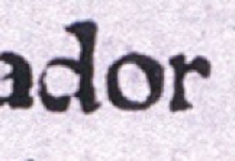
Developing Calligraphic Courtesan Script   49

Figure 7: Documental Round Gothic Writing. 1483. Diocese of Segovia Archive. Sig. p.13.

Figure 8: Two types of XVth Century documental handwritings in the same parchment. 1481. Diocese of Segovia Archive. Sig. p.13.

Figure 9: Procesal handwriting. 1557. Diocese of Segovia Archive. Sig. 168.

However, it was usual to find these two types of handwriting, formal and informal typologies, especially in notarial
documentation. The formal style, Documental Round Gothic writing, was used in the main text of notarial documents,
while the informal typology, Courtesan handwriting, was used to validate and sign documents by notaries.
    Nonetheless, Courtesan Handwriting evolved during the final year of the XVth Century due to the excessive
cursiveness. Indeed, that excessive speedy way of writing transformed Courtesan Handwriting into a specific Castilian
cursive writing called Procesal handwriting (HERRERO, 2011: 15-47) (HERRERO, RIVERO, 2006), the final step of
Castilian Gothic handwriting before the triumph of Italian Humanistic script, probably due to the extreme difficulty of
understanding the corrupted gothic writings.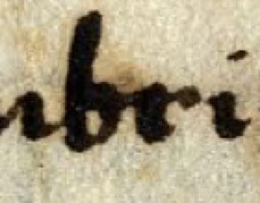
50        Eduardo Juárez Valero

Figure 10: Colophon written by Pedro García de la Torre in traditional Courtesan. Diocese of Segovia Archive. 1480. Sig. 767-6

Figure 11: Example of general abbreviation sign: “ en la muy noble”. Diocese of Segovia Archive. 1480. Sig. 767-6

3 Calligraphic Courtesan Handwriting: close to a definition
During the digitalizing process in the archive of the Diocese of Segovia as part of the Researching Project Señoríos
Medievales de Segovia, one of the documents written in a strange type of Courtesan writing was digitalized. It appeared
to be traditional Courtesan writing but the document exhibited some characteristics contrary to the traditional form
of writing in courtesan handwriting. The document itself is a town-council permission to do some construction beside
the city walls in order to expand the Bishop’s house with the intention of using it as a local University facility2. Written
on January 7th, 1480, the document was created on paper and prepared by the City Council of Segovia. It was written by
Pedro García de la Torre, Public Notary of the City Council of Segovia.
     Received by the Diocese of Segovia and addressed to Juan Arias Dávila, Bishop of Segovia from 1461 to 1497, at the
time of his death in Rome (GALINDO, 1988), the document was written in 45 lines, 41 written in this strange Courtesan
script with the last four lines in traditional Courtesan writing, corresponding exactly to the lines written by the Public
Notary.
     Therefore, we can conclude that Pedro García de la Torre used to write in a traditional way because of the document’s
colophon and another scribe used a new type of writing or he was influenced by something and started to write in that
different Courtesan writing style.
     Nonetheless, the main part of this document presents a particular mode of courtesan writing. Through analysis, the
presence of a regular writing box is clear. Smaller than usual, this document was written with the writing spaced valued
as something precious. In other words, if it had been written in traditional handwriting, another structure of the writing
material would have been used. This document uses an actual printing design, being written on the narrow part of the
paper sheet. However, if it had been written in normal or traditional Courtesan writing, the scribe would have used the
wider part of the writing material.
     In addition, the writing box is smaller and narrower than normal, making it difficult to use the principal characteristic
of traditional courtesan handwriting: cursiveness. With the above conditions, the scribe used small, narrow and tight

2 Diocese of Segovia Archive (ADS), Council permission to work on Bishop Arias Dávila College, January 7, 1480. Sig. 767-6.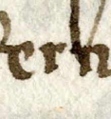
Developing Calligraphic Courtesan Script 51
Figure 12: “estar con su sennor”.
Figure 13: “çerca”. Ligated letters: ST, SE, CE and CA. Diocese of Segovia Archive. 1480. Sig. 767-6.
characters in order to write in a fast way. Because of that, it is difficult to find prominent links or ligated groups of
letters. It is possible to describe some regular abbreviated characters but not in the traditional way. Regular Courtesan
abbreviations were a large stroke parallel to the writing box or curved final stroke ligated to the first or last letter of
the word. In this case it is usual to see a curved stroke separated from the word which shows a slowness in the writing
process.
Regarding links and regular letter connections, there are some regular and traditional examples, especially
between C and E, C and O or S with E or T, but document writing, in general, demonstrates a slower writing process,
in a regular or automatic mode, presented as the principal intention of writing . It is unusual, for example, to see E, S
and T unconnected in order to write the pronoun esta or verb estar. In this particular Courtesan hand, the scribe only
connected S and T but not E or A.
With regard to isolated letters, this strange Courtesan handwriting shows regular and square letters. It is surprising
how regular the results of this type of Courtesan writing are, when compared with regular typology. This Courtesan A
tends to be written with two curved strokes and not with one as was usual. Sigmatic S tends to a hieratic position and
not fill the whole space of the word as the scribe always tried to write it in the same regular and unusual way. Something
similar can be said regarding G, straight and vertical, not connected to the next letter. H appears similar as in a regular
form, but the lower stroke is very short and not connected to the next letter. R is the most similar to the traditional one,
but, in this case, the length of the lower stroke is exactly the same when repeated. Finally, D is written in one stroke, but
is not connected with next letter as was usual.
In addition, letter shape respects meticulously the dimension of the line, the writing box and rest of letters on the
same line, in the whole of the document. It is difficult to find a letter invading the upper or lower lines, mixed strokes
or word stretching or narrowing as a main description the courtesan hand is regular. Therefore, there must be a reason
to explain why the scribe decided to compose Courtesan writing in that way.
This special care exhibited writing regular letters, words and paragraphs shows a clear normalized tendency to a
different Courtesan writing style which could be called Calligraphic Courtesan Writing. However, who or what started
that tendency? Why did Segovian scribes write in that way? Was the tendency a local incident or was a regional writing
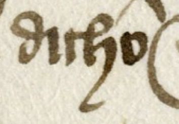
trend?52 Eduardo Juárez Valero Figure 14: “Segouia”. Figure 15: “corregidor”. Figure 16: “dicho”. S, G, RR, A, D and H. Diocese of Segovia Archive. 1480. Sig. 767-6. Figure 17: Respecting the writing box and regular letter shapes: “la qual pueda salir segund que agora está/ la dicha cámara poniendo en ella rexas de/ ventana más pequeña en el entresuelo que está”. Diocese of Segovia Archive. 1480. Sig. 767-6.
Developing Calligraphic Courtesan Script   53

4 From Regular to Calligraphic Courtesan: influence of the printing press
on handwriting
In order to understand this writing anomaly, we are obliged to think about the presence of Johannes Parix from Heidelberg
in Segovia for five years, who was elaborating a new form of sharing information and knowledge. Working on didactic
and study materials for Bishop Arias Dávila’s University in Segovia, initiating the famous incunabula collection of the
Cathedral of Segovia (VALVERDE, 1930: 251), the influence of Parix’s Printing Press on scribes and hand-writers of the
Diocese of Segovia such as Pedro García de la Torre and his co-workers appears obvious.
     Nevertheless, it would be interesting to study if this influenced all of the handwriting community or if was something
local. In Ewan Clayton’s view, the impact of printing on that society was great and a new era of literacy began that
would have change the world. Therefore, to think that such an impact could start from the first moment, should not be
unreasonable (CLAYTON, 2015: 99-102). In that sense, as ecclesiastical and civilian copyists and scribes were writing
constantly using many documental typologies, it is requisite to compare all those forms of writing with the intention of
establishing the influence of the printing press in Segovian Chancelleries.
     In attempting to prove this hypothesis, I have selected three different examples created at the same time as the
Calligraphic Courtesan script studied in the present article, written in 1480. The first is an agreement document signed
in Segovia, on April 4th, 1481 written in traditional or regular Courtesan handwriting by Francisco García de la Torre,
brother of the Calligraphic Courtesan document scribe, Pedro García de la Torre3. It will be interesting and instructive
to compare the differences between the writing style of the two brothers and how the same influences could affect two
closely related but different writing styles.
     The second document selected in this article is a Papal Bull, written a year later, during the papacy of Sixtus IV,
on April 13th, 1479, to the Diocese and Bishop of Segovia. This parchment was written by order of a scribe named B.
Capotiris in perfectly formed Vatican documental cursive gothic writing4. This document was received by the Diocese of
Segovia at almost the same time as the Calligraphic Courtesan document was written. Therefore, it will be interesting to
examine it in order to determine all the influences bearing on this unusual handwritten document.
     The third is the last will and testament of Bishop Juan Arias Dávila, written in Rome in 1497. This singular document
was written in Italian Humanistic style, so close to the types used in the Sinodal de Aguilafuente by Johannes Parix from
Heidelberg5.
     The final document selected is part of the first impression made by Johannes Parix from Heidelberg on the Segovian
Printing Press. This sample is composed of two pages of the first Spanish incunabulum, El Sinodal de Aguilafuente,
printed in 14726. This incunabulum was created with the information obtained from the clerical synod celebrated in
Aguilafuente, Segovia, where Pedro García de la Torre assisted as notary of the city of Segovia. It is probable that
the information printed by Johannes Parix from Heidelberg would have been taken from notes written by Antonio
de Villacastín, ecclesiastic notary, as well as Pedro García de la Torre. In consequence, we are obliged to assume the
influence of this incunabulum on Pedro García de la Torre’s way of writing.
     Therefore, in order to analyze the main characteristics of the controversy suggested in the present article, it
is necessary to begin the analysis with the most significant courtesan letter, the S. Traditional or regular low case
Courtesan S used to be written with a sigmatic shape and, depending on the cursiveness, more or less inclined over the
writing line. Sometimes cursiveness is so important that the S uses an exaggerated space in the writing box or displays
an important inclination over the rest of the letters in the word, breaking any type of proportionality.
     In the case of Vatican Gothic S, there are significant differences between upper- and lower-case S. The first one is
written as a doble curve S with a slow and heavy ductus.
     Lower case Vatican Gothic S was written in the traditional cursive gothic style, similar to the Albalaes hand, with
two lower strokes in order to write a straight S. However, it is possible to find another type of lower-case S: the ending
word S in the selected document. In that case, S is written as a lower double curve S, exactly as it was written by scribes
in Castilian Chancellery during the XIVth century.

3   ADS, Bishop Concord, Segovia, April 4, 1481, Sig. 655-10.
4   ADS, Sixtus IV Bulla to Diocese of Segovia, Rome, April 13, 1479, sig. p.16.
5   ADS, Bishop Juan Arias Dávila last will, Rome, 1497.
6   Biblioteca Capitular de Segovia: Sinodal de Aguilafuente, Segovia: Juan Párix, c. 1472.
54 Eduardo Juárez Valero
Figure 18: Upper- and Lower-case regular Courtesan S. 1481: “sus”. Diocese of Segovia Archive. Sig. 655-10.
Figure 19: Upper case Vatican Gothic. 1479: “Segouia”. Diocese of Segovia Archive. Sig. P. 16.
Figure 20 and 21: Lower case S types in Vatican Gothic writing. 1479. Diocese of Segovia Archive. Sig. P. 16.
The Calligraphic Courtesan writing studied in this article presents a consistent typology of S: the sigmatic one. However,
upper case S tends to be more hieratic as a common scribe would have written the isolated letter instead of regular
Courtesan ligated letters. On the other hand, when he wrote lower case S, the difference between regular courtesan
samples is visible: lower size and unhurried writing in Calligraphic Courtesan.
The Italian Humanistic script presents a regular straight S when used at the beginning or in the middle of the word
and a sigmatic but vertical or hieratic shape when it appears at the end of the word (RUIZ, 2011: 47-73).
However, it is possible to find the double-curved S at the end of some words which demonstrate a real connection
with gothic writing or an archaism in the writing style used by Vicente de la Carrera, ecclesiastic notary and influenced
by traditional Castilian writing forms. This influence is clear in Vicente de la Carrera’s own written part of the document,
where the notary used cursive Italian Humanistic script, reminiscent of Castilian Cursive gothic writing (RUIZ, 1999: 155-
156).
Nevertheless, the Italian Humanistic style did not appear in Segovia before Johannes Parix started to work with his
printing press (GALENDE, 1998: 187-230). It is possible that some documents arrived in the Segovian chancellery written
in some typologies of Italian cursive Humanistic script but most of them were written in different types of cursive
gothic writing. Because of that, the impact of the printing press types must have been enormous. The clearness of thoseDeveloping Calligraphic Courtesan Script 55 Figure 22: “esta”. Figure 23: “Segouia”. Upper- and Lower-case Calligraphic Courtesan writing. 1480. Diocese of Segovia Archive. Sig. 767-6. Figure 24: “menbris”. Figure 25: “salubriter”. Lower case Italian Humanistic Writing S. 1497. Diocese of Segovia Archive. Sig. ADS AVT. Figure 26: Vicente de la Carrera cursive Humanistic writing. 1497. Diocese of Segovia Archive. Sig. ADS AVT.
56        Eduardo Juárez Valero

Figure 27: “sennores”.

Figure 28: “sennor”. Different types of printing S. 1472. Johannes Parix’s Sinodal de Aguilafuente. Cathedral of Segovia Archive.

Table 1: Comparing different types of G.

Regular Courtesan        Italian Humanistic     Vatican Gothic                Parix’s printing                 Calligraphic Courtesan

1481. Segovia            1497. Roma             1479. Roma                    1472. Segovia                    1480. Segovia

printing types and the isolated letter could have affected the writing style of all the scribes in contact with the Segovian
ecclesiastic chancellery.
     In the other characteristic letters, the influence of the printing press types is considerable. G is traditionally an
unchanged letter and similar in most of the writing styles during the Middle Ages. However, Calligraphic Courtesan G is
very close to that of the printing press because of the aforementioned clearness. It is written with two strokes, however,
the lower one is not connected with the next letter as was usual in the other writing styles studied with the exception
of Parix’s type.
     H was written linked to the previous letter and with a long final lower stroke sometimes very long and connected
with other letters or even words. In the case of the Calligraphic Courtesan H, it is written with a preceding link but not
with the exit lower stroke. It appears to be a bit short as if the scribes were trying to avoid that connection or keep the
letter isolated.
     R is a clear case of the influence of the printing press on Calligraphic Courtesan. R is written in two strokes, one
vertical and the other shorter and curved, in the similar way as printed in Johannes Parix’s works and in the Humanistic
writing style more than 20 years later.
     However, in some cases, this Calligraphic Courtesan style uses the traditional hammer R of regular courtesan
handwriting. Furthermore, it is possible to find some examples of capital R where it is necessary to write an initial
strong R or double and ligated R when that character appears in the middle of the word.
     In this specific case, that type of capital R was written only at the beginning of the word, but in the Segovian case of
Calligraphic Courtesan, it is possible to find that capital R in the middle of the word which is very unusual because it is
not acceptable write such a large letter in a cursive style. To write that letter in the middle of a word requires the scribe
to stop the fluent writing and waste time writing a capital letter where it would be easier to use a double R.
     A further interesting case is the use traditional ST link. It was normal to find this writing form in Iberian handwriting
for close to five centuries. Because of this, it is expected to find that link in Parix’s printing as a reminiscence of the
handwriting. This type script has been extensively studied in printing press work (MARTÍN, 2003). However, ST link
Developing Calligraphic Courtesan Script 57
Table 2: Comparing different types of H.
Regular Courtesan Calligraphic Courtesan Parix’s printing
1481. Segovia 1480. Segovia 1472. Segovia
Table 3: Comparing different types of R.
Parix’Printing Calligraphic Courtesan Italian Humanistic
1472. Segovia 1480. Segovia 1497. Roma
Table 4: Comparing different types of cursive R.
Regular Courtesan Calligraphic Courtesan Regular Courtesan Calligraphic Courtesan
1481.Segovia 1480. Segovia 1481.Segovia 1480. Segovia
appears to be a little forced in Parix’s printing, extending out of the writing box even above the high line of a four-
lined writing box. This peculiar case is clearly visible at first sight because it is a non-regular printing type or almost
conventional in this isolated letter system.
The ST link in Calligraphic Courtesan handwriting presents an abnormal dimension, higher than usual and
extending out of the four-lined writing box. Although it is sometimes normal because of the cursiveness, this is not the
case here. The Segovian Calligraphic Courtesan sample is a slow writing style and cursiveness could not be the answer
to this writing imbalance.
Finally, A demonstrates the fight between cursiveness and calligraphy and the slower writing style present in
Segovian Calligraphic Courtesan handwriting. Johannes Parix used two types of A in Sinodal de Aguilafuente printing.
Lower case A is a traditional Carolingian one, printed with capello and constructed with two opposite curves. Regular
Courtesan handwriting A tends to be written with two strokes, the lower one curved and closed with a short stroke58 Eduardo Juárez Valero Figure 29: “rregidor” Figure 30: “arrimadiso”. Capital R at the beginning and in the middle of the word. 1480. Diocese of Segovia Archive. Sig. 767-6 Figure 31: ST link. Johannes Parix’s Sinodal de Aguilafuente: “estando”. Cathedral of Segovia Archive. Figure 32: High ST link. 1480: “costu…”. Diocese of Segovia Archive. Sig. 767-6.
Developing Calligraphic Courtesan Script   59

Table 5: Comparing different types of lower-case A.

Parix’s Printing      Regular Courtesan       Calligraphic Courtesan     Regular Courtesan      Calligraphic Courtesan

1472. Segovia         1481. Segovia           1480. Segovia              1481. Segovia          1480. Segovia

Table 6: Comparing different types of capital A.

Parix’s printing         Regular Courtesan            Calligraphic Courtesan         Calligraphic Courtesan

Segovia. 1472            Segovia. 1481                Segovia. 1480                  Segovia. 1480

parallel to the writing line, showing extreme cursiveness. Lower case Calligraphic Courtesan A exhibits a mixture of
two styles. It is written using the main characteristics of cursive writing, but it is written rather slowly with two opposite
and curved strokes.
     A similar problem is present in the form of writing capital A. Parix’s printings tends to use a Roman capital letter
printed with an angled type, common in most of the typographies nowadays. However, there are really two different
types of capital A. The first is traditional Gothic handwriting capital A, very common in library and documental codices.
The second one is opposite to the previously described. That A is written in one continuous stroke above the upper line
of the writing box. The shape of this A is quite close to Roman capital A used by Parix in the Sinodal de Aguilafuente
with one difference: Calligraphic Courtesan capital A has not got a horizontal stroke. Nevertheless, that type of A
was common in Regular Courtesan handwriting more related to the spread of library codices and the invention of the
printing press than the presence of Johannes Parix in Segovia (MÉNDEZ, 1796). However, the scribe’s effort in trying
to write this type of A in a cursive document is significant, and it could be found in similar form in another European
writing context (GURRADO, 2018: 97-110).
     However, all of this evidence can also be discussed or argued from the opposite point of view but the evidence of
the isolated-writing-letter trend in Calligraphic Courtesan document is clear and its connection with the presence of
Johannes Parix’s Printing Press in Segovia is, in my opinion, irrefutable because Courtesan handwriting was in essence
a cursive and non-formal way of writing. In that sense, it was usual to find corrupted and ligated letters because of the
haste of the scribes in writing the documents. Linked letters, groups of ligated letters breaking words, letters written in
only one stroke, abbreviated signs ligated to lower strokes, every type of cursive degeneration was possible in Regular
Courtesan handwriting. Therefore, the trend to write isolated words making Courtesan handwriting slower should be
understood as a sign of the influence of the presence of the printing press in Segovia during the six years before the
document studied were written by Pedro García de la Torre.
60 Eduardo Juárez Valero
Figure 33: “del concejo e pueblos de la dicha çibdat” and 35: “conçejo auía enbiado a estar con su sennoría”. Samples of isolated-letter
trend in Calligraphic Courtesan handwriting. 1480. Diocese of Segovia Archive. Sig. 767-6.
5 Conclusions
It is difficult to establish how much the printing press of Johannes Parix from Heidelberg influenced the handwriting
style of the Segovia scribes, but it is impossible not to think about the profound impact it must have provoked in
that small Castilian city. There are no documents or written references regarding the process of the printing press
establishment. No letters or diaries of that important event have yet been discovered, but it is impossible to escape the
influence. Scribes such as Pedro García de la Torre were probably in touch with Johannes Parix due to his work as an
ecclesiastic scribe in the Diocese of Segovia. His brother, Francisco García de la Torre, worked in the same position in
the Council of Segovia. It might be that Francisco met Juan Parix or was aware of the results of his printing work, but
he wrote in regular courtesan handwriting throughout his whole life. His brother Pedro changed his writing style in at
least one preserved document while working in the same city at the same time. Therefore, the simplest explanation to
account for this anomaly in the writing styles is that he would have known or been aware of the work Parix was doing.
However, to conclude, it is important to understand and surmise the principal connections between Calligraphic
Courtesan and Parix’s printing press types:
– The first characteristic recognized is the clarity of the handwriting. Pedro García de la Torre wrote regular and
proportional letters maintaining the writing box and letters space.
– Some letters such as H or R are written inside the writing box eliminating the exit strokes normally ligated with the
next letter, something unusual in Courtesan handwriting.
– The case of sigmatic S is especially significant. This letter is written disproportionally large, occupying most of the
word space. In the example studied, sigmatic S appears less proportionate than usual. Pedro García de la Torre
sometimes wrote that letter in the hieratic position, always respecting the four-lined writing box in a systematic
attempt to present this usually extremely cursive letter as a normalized S.
– The lack of ligated letters or the presence of only the traditional ST ligature throughout the document allows us
to consider a calligraphic trend. Regular Courtesan handwriting presents many ligated letters, words written in
smaller groups breaking the word unity. This trend is not present in this document. It is possible to find broken
words but with letters so close that it is irrelevant in order to read the word.
– It is impossible to assume that the presence of Juan Parix from Heidelberg did not influence the Segovian scribes
and copyists during the 1470’s. In addition, the scribe Pedro García de la Torre was working at the same time as
his brother, Francisco García de la Torre, was working in the same institution where Parix developed his printing
techniques, so the possibility of the connection between this two forms of communicating printed or written
information is very clear.
Unfortunately, there are no further examples of this Calligraphic Courtesan Handwriting in the Segovian Diocese
Archive or in the Segovian Cathedral Archive. It might be possible to find other examples in the Segovian Council
Archive but many of the documents, codices and written items from that archive were destroyed during the Communard
Uprising at the beginning of the XVIth Century as well as during the War of Independence in XIXth Century. It would beDeveloping Calligraphic Courtesan Script 61
interesting to prove that the influence of the printing press in the calligraphic trend on handwriting use in the centre of
Spain, was greater than the Italian Humanistic trend, but the lack of documentation makes it difficult. Who knows if
future research in other writing centers such as Sevilla or Valencia, connected to the development of the printing press
will shed more light on this interesting part of the history of Spanish writing.
References
Arias, R. B. (2012). Estudio paleográfico de los privilegios rodados del Archivo Histórico Municipal de Escalona. la España Medieval, 35,
33–41.
Blake, R.J. (1989). Radiografía de un cambio lingüístico en la Edad Media. Revista de filología española, 69-1/2, 39-59.
Camino Martínez, M. C. del (2018). La formación de una gótica cursiva en la Corona de Castilla. De la Herencia Romana a la procesal
castellana: diez años de cursividad, Actas del IV encuentro internacional del Seminario Permanente Escrituras Cursivas, 149-161.
Casado, B. (1996). Notas sobre la llamada letra de albalaes. Espacio, Tiempo y Forma. Serie III, Historia Medieval, 9, 327–346.
Casado, B. (2014). Nuevas aportaciones sobre la “letra cortesana”, nombre dado a este tipo gráfico por la corte de Castilla. Espacio, Tiempo
y Forma. Serie III, Historia Medieval, •••, 193–209. https://doi.org/10.5944/etfiii.27.2014.12641
Clayton, E. (2015). Historia de la escritura. Madrid: Alfaguara.
Galende Díaz, J. C. (1998). La escritura humanística en la Europa del Renacimiento. Espacio, Tiempo y Forma. Serie III, Historia Medieval, 11,
187–230.
Galende Díaz, J. C., Salamanca López, M. J. (2012). Una escritura para la modernidad: la letra cortesana. Cagliari: consiglio Nazionale delle
Ricerche e Istituto di Storia dell’Europa Mediterranea.
Galindo García, A. (COORD.) (1988). Arias Dávila, Obispo y Mecenas. Segovia en el siglo XV. Salamanca: Universidad Pontificia.
Gumbert, J. P. (2000). Letras y coordenadas: enfoque cartesiano a una disciplina humana. Signo. Revista de historia de la cultura escrita 7,
9-28.
Gurrado, M. (2018). Les écritures cursives dans les libres, premières experiences: les manuscrits datés français entre 1250 et 1420. De la
Herencia Romana a la procesal castellana: diez años de cursividad, Actas del IV encuentro internacional del Seminario Permanente
Escrituras Cursivas, 97-110.
Gurruchaga Sánchez, M. (1995). La nomenclatura de las escrituras góticas cursivas castellanas en la manualística al uso: Un repaso crítico.
Signo. Revista de Historia de la Cultura Escrita, 6, 241–252.
Herrero Jiménez, M. (2011). La procesal que no entendía Satanás. El fin de ciclo. Casado, B. y López Villalba, J.M. (2011). Paleografía III: La
Escritura Gótica (Desde la imprenta hasta nuestros días) y la Escritura Humanística (pp. 15–47). Madrid: UNED.
Juárez Valero, E. (2015). El estudio de Juan Arias Dávila, obispo de Segovia. Edad Media: revista de historia, 16, 199-244.
Marín Martínez, T., Ruiz Asencio, J.M. (1991) Paleografía y Diplomática. Vol. 2, Madrid: UNED, 75.
Martín Abad, J. (2003). Los primeros tiempos de la imprenta en España (c. 1471-1520). Madrid: Ediciones del Laberinto.
Mastruzzo, A. (2005). Problemi metodologici e prospettive di ricerca nello studio della tradizione grafica corsiva. UCLA. Litterae Caelestes, 1,
29–40.
Méndez, F. (1796). Typographia española o historia de la introducción, propagación y progresos del arte de la imprenta en España. Madrid:
Ibarra.
Odriozola, A. (1975). Los libros impresos por Juan Párix en Segovia y Toulouse y los atribuibles a Turner y Parix en esta última ciudad.
Homenaje a don Agustín Millares Carlo, Vol. 1, 281-308.
Pérez Herrero, E., & Rivero Suárez, B. (2006). Escritura manuscrita y letra procesal (Canarias en el siglo XVI). Las Palmas de Gran Canaria:
Anroart Ediciones.
de los Reyes Gómez, F. (2004). La primera imprenta en España estuvo en Segovia. Madrid: Delibros.
Reyes Gómez, F. de los (2004). El modus confitendi y Andrés Escobar. Andrés de Escobar, Modus Confitendi, manual para la confesión,
27-61.
de los Reyes Gómez, F. (2009). La iglesia y la introducción de la imprenta en España. Memoria Ecclesiae, 32, 67–110.
de los Reyes Gómez, F. (2006). Related activities with the Sinodal de Aguilafuente. Revista General de Información y Documentación, 16(2),
251–252.
de los Reyes Gómez, F. (2005). Segovia y los orígenes de la imprenta española. Revista General de Información y Documentación, 15(1),
123–148.
Riesco Terrero, A. (2004). La típica “letra cortesana” de los reinos de la Corona de Castilla en los tiempos de los Reyes Católicos. Hidalguía:
la revista de genealogía, nobleza y armas, nº 304-305, 475-496.
Ruiz Albí, I. (2011). La escritura humanística documental durante el siglo XVI. Casado, B. y López Villalba, J.M. (2011). Paleografía III: La
Escritura Gótica (Desde la imprenta hasta nuestros días) y la Escritura Humanística (pp. 47–73). Madrid: UNED.
Ruiz, E. (1999). La escritura humanística y sus tipos derivados. Riesco Terrero, A. (1999). Introducción a la paleografía y la diplomática
general. Madrid, 155-156.
Sáez Sánchez, C. (1995). Diego Gómez de Sandoval y la escritura precortesana en Sicilia (1415-1416). Signo. Revista de Historia de la Cultura
Escrita, 2, 9–18.62 Eduardo Juárez Valero
Torrens, M. (1995). La paleografía como instrumento de datación. La escritura denominada littera textualis. Cahiers d’etudes hispaniques
medievales, 20-1, 354-280.
Valverde del Barrio, C. (1930). Catalogo de incunables y libros raros de la Sta (p. 251). Segovia: Iglesia Catedral de Segovia.
Vigil Montes, N. (2013). Las variantes de la escritura gótica cursiva utilizadas en la escribanía capitular ovetense durante siglo XV. Galende
Dïaz, J.C. (Coord) (2013). I Congreso de investigadores noveles en Ciencias Documentales. Madrid: Universidad Complutense de
Madrid, 283-289.You can also read