EIT Community Web Design Guidelines - EIT RawMaterials
←
→
Page content transcription
If your browser does not render page correctly, please read the page content below

EIT Community Web Design Guidelines

Introduction
We are a driving force in innovation, with strong stakeholder connections.
We provide unique opportunities for individuals fromacross the knowledge
triangle to realise innovations that will help find solutions to global challenges,
boost the economy and ensure Europe’s growth.

These Web Design Guidelines should be used in conjunction
with the EIT Community Brand Book
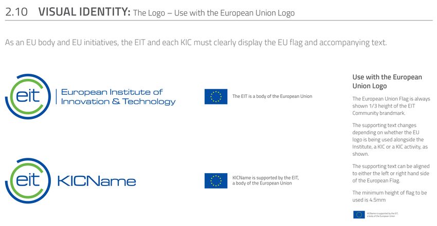
Table of Contents

      Overview
1     Logo Assets                        2.6   Photography in Use

1.1   Logo Usage                         2.7   Incorrect Usage of Photography

1.2   Isolation Area for Logo            3     Additional Visual Assets
1.3   Incorrect Logo Usage               3.1   Buttons – Layout and Styling

1.4   Use with the European Union Logo   3.2   Links

1.5   EIT Community                      3.3   Icons and Glyphs

2     Basic Visual Assets                4     Layout
2.1   Colour Palettes                    4.1   Grid Format

2.2   Typeface                           4.2   Responsive Grid

2.3   Typeface in Use                    4.3   Page Structure

2.4   Incorrect Usage of Typography      4.4   Navigation

2.5   Photography                        4.5   Responsive Navigation

                                         4.6   Examples
Overview
The purpose of the Web Design Guidelines is to explain the use of
the EIT Community’s online brand style and to reinforce consistent
application of the visual elements in all digital communications.
Guidelines on the use of the logo are included.

For any questions relating to these guidelines, please contact the EIT Communications team at the
EIT Headquarters in Budapest: eit-communications@eit.europa.eu
1 Logo Assets
1.1   Logo Usage
1.2   Isolation Area for Logo
1.3   Incorrect Logo Usage
1.4   Use with the European Union Logo
1.5   EIT Community
1.1
Logo Usage

The logo is an important and valued graphic element
and must be used consistently and appropriately.
Even minor variations will undermine and compromise                                       Regular Size     320px
the image of the EIT Community branding.

The proportion and arrangement of the symbol and
word-mark have been specifically determined. The
logo should never be recreated or altered, which could
cause inconsistencies that dilute brand strength.

                                                                                   Medium Size     275px

                                                                 Minimum size for Print
Please note: The logo should only be reproduced from
the artwork provided.
                                                         14mm

                                                                 Minimum size for Web

                                                          32px

EIT Community Web Design Guidelines                                                                                5
1.2
Isolation Area for Logo
The EIT logo should have 10px minimum clear space
around it. This clear space isolates the logo from
competing graphic elements such as other logos, copy,
photography or background patterns.
The minimum clear space for the logo is defined as
the width of the first “E” in the word-mark. This
minimum space should be maintained as the logo is
proportionally enlarged or reduced in size.
10px
3X 3X
3X 3X
EIT Community Web Design Guidelines 61.3
Incorrect Logo Usage
It is important that the appearance of the logo
remains consistent. The integrity of the logo must be
respected at all times. Don’t stretch, condense or
otherwise alter or manipulate it. Any modification of
the logo confuses its meaning and diminishes its
impact.
To illustrate this point some of the more likely Do not stretch the logo to change Do not use background colours Do not change the colour
mistakes are shown. the proportion
Always use clear resolution logos.The logo should
never appear blurry or fuzzy.
Do not change the position of Do not use the logo over Do not add extraneous effects
the mark imagery to the logo
EIT Presentation
Do not rotate the logo Do not use the icon tinted or knocked Do not use the EIT logo to create
back in a background any type of pattern or mosaic
EIT Community Web Design Guidelines 71.4
Use with the European
Union Logo
The European Union Flag is alwaysshown 1/3 height
of the EIT Community brandmark. The supporting text
The EIT is a body of the European Union
changes depending on whether the EU logo is being
used alongside the Institute, a KIC or a KIC activity, as
shown.
The supporting text can be aligned to either the left or
right hand side of the European Flag.
KICName is supported by the EIT,
The minimum height of flag to be used is 4.5mm. a body of the European Union
EIT Community Web Design Guidelines 81.5
EIT
EIT Community
3
For the needs of the EIT, there is a visual language that puts
forward a consistent way of presenting the EIT Communities
Climate-KIC
(KICs).
The basic structure of this language is based on the capital
H
letter "E" which is assocated with the EIT. All of the EIT
Community (KICs) marks are designed as monograms taken EIT Health
from the innovation community title.
1. EIT
2. Climate-KIC EIT ICT Labs
3. EIT Health
4. EIT ICT Labs
5. EIT Raw Materials
6. KIC InnoEnergy
EIT Raw Materials
R
7. EIT Alumni
KIC InnoEnergy
EIT Alumni
EIT Community Web Design Guidelines 92 Basic Visual Assets 2.1 Colour Palettes 2.2 Typeface 2.3 Typeface in Use 2.4 Incorrect Usage of Typography 2.5 Photography 2.6 Photography in Use 2.7 Incorrect Usage of Photography
2.1
Colour Palettes

To give variety and flexibility, we have a palette of ten colours
                                                                    Primary Palette
to be used for backgrounds, typography and panels to add a
fresh, dynamic consistency to EIT Community’s             digital                 EIT              EIT           EIT              EIT
                                                                    EIT
content.                                                                          Green            Dark Grey     Light Grey       White
                                                                    Blue

The cool and neutral colours in the primary palette keep the
focus on the content without distracting the eye.

The Secondary Palette can be used for specific content in
order to differentiate it from the rest of the site, such as
“About the EIT Community”, “What’s in it for you?” and “EIT
Communities”.

Please note: Do not use a colour picker from this document.
Instead, use the provided HEX and RGB values.

                                                                    RGB            RGB             RGB           RGB              RGB
                                                                    R0 G68 B148    R107 G183 B69   R88 G89 B91   R238 G238 B238   R255 G255 B255

                                                                    HEX            HEX             HEX           HEX              HEX
                                                                    004393         #6BB745         57585A        #EEEEEE          #333333

EIT Community Web Design Guidelines                                                                                                                11
Secondary Web Colours
RGB RGB RGB RGB RGB
R0 G54 B18 R0 G101 B178 R3 G18 B65 R21 G45 B121 R115 G196 B238
HEX HEX HEX HEX HEX
#003612 #0065B2 #031241 #152D79 #73C4EE
122.2
Typeface
The default typeface for EIT Community websites and other
communication materials is Titillium.
Titillium Regular
The Titillium type family is used in the four weights shown
ABCDEFGHIJKLMNOPQRSTUVWXYZ
here for all EIT Community communications. In specific,
Titillium is available in four styles: Light, Regular, Semibold, abcdefghijklmnopqrstuvwxyz
Bold.
1234567890!@£$%^&*()_+
The typefaces can be downloaded for free at:
http://www.fontsquirrel.com/fonts/Titillium
Light Regular Semibold Bold
Ee Ee Ee Ee
Please note: Replacing fonts with alternatives should not be
done under any circumstances.
EIT Community Web Design Guidelines 132.3
Typeface in Use
1.
h1. Headline Semibold 31px
The hierarchy presented on the right will ensure that any h2. Heading 2 Light 31px
new deliverable has a consistent typographic structure that
is representative of the EIT Community . h3. Heading 3 Light - 24px
When using fonts, it’s important to create visual contrast
(based on font weight, size, style and colour).
h4. Heading 4 Semibold - 20px
These are only suggestions. Each document will vary h5. Heading 5 Semibold - 17px
depending on specifications, amount and type of informa-
tion being communicated, and the style of document. H6. HEADING 6 SEMIBOLD - 15px
Consistency, continuity and readability are always impor-
tant.
The main text used on EIT Community websites uses the 2. Copy 15px Titillium Regular 21px line-height Lorem ipsum dolor
following font style:
Titillium Light
sit amet, consectetur adipisicing elit, sed do eiusmod tempor
Size: 15px incididunt ut labore et dolore magna aliqua. Ut enim ad minim
Line-height: 21px
Tracking: default
veniam.Duis aute irure dolor in reprehenderit in voluptate velit
esse cillum dolore eu fugiat nulla pariatur.
h2, h4, h5 and h6 are coloured with the EIT Green
h3 and h5 are coloured with 80% of the EIT Green
EIT Community Web Design Guidelines 142.4
Incorrect Usage of Typography
Our typography style complements other visual elements
within our guidelines and key messages.
The correct application is important in order for our commu- INNOVATION Innovation Innovation
nications to achieve a consistent look. Please avoid the COMMUNITITES Communities Communities
following incorrect uses of typography.
Do not set headlines in all caps Do not use multi-coloured text Do not use the wrong font
Innovation Innovation Innovation
Communities Communities Communities
Do not use wide or tight tracking Do not mix type weights within Do not use coloured text above a
headlines photo
Do not use colour combinations Do not justify text Do not use too many colours and
that aren’t easy to read weights at once
EIT Community Web Design Guidelines 152.5 Photography Photography plays a vital part in supporting the brand, but it must be the right type of photography. It helps to make the site visually dynamic, communicate a uniform visual identity for EIT Community and emphasise the content. Both in-house and purchased stock imagery must comply with the following: 1. Proper ownership of artwork copyright . 2. Photos used must be of high quality, vibrant and rich. 3. Choose photos that reflect the brand personality of innovation, sustainable growth, education and research. 4. Aim for clean and simple composition with a clear point of focus. 5. When photographing people in work environments, use real people in real places. 6. While full-colour photography is preferred, black and white photography may also be used. 7. Look for images that are ‘natural’, try to avoid ‘staged’ images that show cliches and stereotypes. Use imagery that adds value and is relevent to the content. EIT Web Design Guidelines December 2014 15
2.6
Photography in Use

Images on the site are generally in jpg format with a
resolution of 72 dpi. They appear in various dimensions
depending on their purpose. The following range of photogra-
phy types is recommended:

o Real people in real situations

o Professional photos associated to the content

o Business – work collaboration scenarios

o Expansive landscapes

o EIT Community events
                                                                Header Image
Header Images
Large (1900px × 880px) high quality images are used
into the header and on the Homepage as background
(1900px × 1433px)

Content Images
The standard image for the site is landscape:
880px × 390px
Portrait-style images are also used, for example for publica-
tions: min width: 280px

Images can also be accompanied by a caption.                    Content Image - Landscape style

                                                                                                  Content Image - Portrait style

EIT Community Web Design Guidelines                                                                                                17
2.7
Incorrect Usage of Photography
Please avoid the following when selecting photography and
using imagery for EIT Community communications.
Do not use photography that is too Do not use photography that is too Do not use saturated colors in the
dark light photo
Do not use busy compositions Do not use photography that evoke Do not use photos that have been
humour stretched larger than its original size.
Do not use photos that have been Do not use photos that were obviously Do not use collage of many photos
stretched disproportionally posed or shot in a studio with models
EIT Community Web Design Guidelines 183 Additional Visual Assets 3.1 Buttons – Layout and Styling 3.2 Links 3.3 Icons and Glyphs
3.1
Buttons - Layout and Styling

Primary Buttons
These buttons should be used for primary actions only
(ie. submitting a form).
                                                            Primary Button
Button Styling:            Border: 3px solid #4163CF
                           Padding: 16px 4px
                           color: #4163CF
                                                                     BUTTON               BUTTON                 BUTTON                BUTTON
                           text-transform:uppercase
                                                            Normal             Hover / Active           Normal                Hover / Active

Action Buttons                                              Action Buttons
1. The action buttons should not be placed at the end of
  the article. Share and Print buttons should be
  positioned next to the article title or on the side of               Share                    Share
  the main content but still above the fold.
                                                            Normal                Hover

2. For social networks use the official logo, colours and
  appearance.                                                          Print                    Print
                                                            Hover

                                                                       Share                                              Print
                                                            Active

Please note: Avoid creating a title that is too long.

EIT Community Web Design Guidelines                                                                                                             20
3.2
Links
Example:
Links should be used according to the following usability
1.
guidelines:
1. Keeping your links blue:
Standard link colour: #4163CF 2.
Standard link – hover state: #333
2. Underlining is essential on hover, if you use link
colours such as white on blue background.
3. External links should be marked with a little icon at
the end of them because these links take users to a
different website. Also, external links should open in
new tabs.
3.
Please note: You should generally avoid any shade of blue
color for text unless it's a link. In addition, keeping link styling
consistent throughout the site is extremely important.
EIT Community Web Design Guidelines 213.3
Icons and Glyphs
Icons have been used on the website for ease of navigation and
Content Types Icons
visual support. Clean, flat, modern icons are designed.
On the right, you can find a list of potential icons. Additional
icons that match these style guidelines may also be used.
Icons can be presented in any of the primary, secondary
Innovation Highlight News Event Publication Conference Material
palettes or accent colours.
If layering icons on top of coloured backgrounds, use the
colour combinations seen in the colour palettes within this
guide (ie: white icons when background is EIT Community’s Photo Gallery Video Procurement Career Blog
blue).
Action Icons
Print Share Search External Url Menu
Top Bottom Left Right To top
Location Time Collapse Expand
EIT Community Web Design Guidelines 224 Layout 4.1 Grid Format 4.2 Responsive Grid 4.3 Page Structure 4.4 Navigation 4.5 Responsive Navigation 4.6 Examples
4.1
Grid Format

The EIT Community grid system                           15px         1200px max-width
All EIT Community templates are built using the same,
12-column grid.

The EIT Community grid guidelines are:                         25%                 75%

Max-width: 1200px
Columns: 12
Width: 100%
Sidebar width: 25%
Main Content width: 75%

EIT Community Web Design Guidelines                                                      24
4.2
Responsive Grid

The grid format used by the EIT Community is adaptive, using
a Responsive Web Design technique. The main principle of
Responsive Web Design (RWD) is to detect and anticipate a
variety of device and browser-specific settings and deliver
content optimised for the best viewing experience.

The viewports which are currently used for the responsive
layout transitions are:
1280px, 1024px, 768px, 600px, 480px

EIT Community Web Design Guidelines                            25
4.3
Page Structure                                                        100%

                                                    1

1. Header area
 Consists of primary navigation.
                                                        25%                  75%

2. Content Area
  Consists of sidebar and main content.

                                                    2
3. Footer Area
  Consists of footer navigation and contact area.

                                                    3         66.6%                33.3%

                                                                      100%

EIT Community Web Design Guidelines                                                        26
4.4
1
Navigation
2
1. Primary Navigation
The primary navigation allows visitors to choose between
the main content sections in the site.
On scroll it will change its size and remain fixed on the top for 3
wide viewports. The inner elements will also adjust their size
with a transition.
2. Mega Menu
Mega menu is a big overlay panel with custom formatting 4
and grouping of the menu options. The user places
the mouse on any of the 1st level menu options and the
mega menu appears presenting all the available options
below (2nd and 3rd level).
3. Breadcrumb
Breadcrumb is a type of secondary navigation scheme that
reveals the user’s location in the website.
4. Secondary Navigation & Related Content
The secondary navigation displays the pages within each
section.
5
5. Footer Navigation
The footer navigation makes popular links available on every
page. It also provides certain links such as terms & condi-
tions, sitemap, privacy policy, contact us.
EIT Community Web Design Guidelines 274.5 Responsive Navigation The navigation is also responsive and changes depending on the screen size and viewport used. Tablet Navigation - Mobile Navigation On smaller screens, the primary navigation becomes Responsive Multi-Level Navigation. A “menu” button which displays our menu vertically, displaying sub-menus when parent element is clicked/touched. The menu is dispalyed by clicking the menu button. All menu-items have submenus. A little right arrow informs visitors about the menu item that has “children” items. EIT Community Web Design Guidelines 28
4.6
Examples

Large Display Dimensions: 1920 × 1080 pixels

Medium Display Dimensions: 1280 × 800 pixels

Ipad Landscape Dimensions: 1024 × 768 pixels

Iphone 4 /4s Portrait Dimensions : 320 × 480 pixels

EIT Community Web Design Guidelines                   29
We ask that you follow these guidelines where relevant so
we can build and maintain the EIT Community ’s identity.

                                                            EIT Community Web Design Guidelines
                                                                                 eit.europa.eu
You can also read


