Group 47 Twitter Political Influence - Presidential Election 2012
←
→
Page content transcription
If your browser does not render page correctly, please read the page content below
Group 47
                Twitter Political Influence - Presidential Election 2012

                                        CS224W Final Report
                                       James Fosco, Charlie Fierro
                                    [jcfosco,cfierro]@cs.stanford.edu

                                            December 9, 2012

Abstract

     With the growing use of online social media, it’s use in politics is starting to become extremely
important. Analysis of the wealth of data contained in these online social networks can be used to gather
more data about people’s political leanings than ever before. In this paper, we analyze the spread
of information during the 2012 presidential election to determine the most important topics to the US
population. We want to be able to determine which political issue has larger outbreaks during the political
campaigns and is thus more important in determining the presidential election. Ranking the importance of
political issues to the US population will reveal how to better maximize a political campaign and possibly
predict election results.
     Gathering twitter data on 8 different topics from the most recent presidential election we analyze what
the data can tell us, and how it may possibly be used. We see that by measuring the number of mentions
of specific topics we can accurately match the top issues identified in the independent research polls.
We also identify the size of the graphs for all political issues as following a power law distribution. We
then perform some sentiment analysis and show that the public’s opinion on a candidates issues can be
analyzed from the tweets gathered. Finally we show that using the temporal data associated with all of
the tweets we can see trends that demonstrate peaks of interest in the campaign, and could possibly be
used to help predict the outcome of elections.

1. Introduction

Outbreaks within a network are representative of the flow of an idea and how it spreads over a network.
Analysis of outbreaks and cascades has been used for many purposes such as advertising, epidemics,
security, and influence propagation. How an outbreak spreads over nodes is an indicator of how
contagious a contaminant is, and useful for controlling and maximizing a particular reward.
     In this paper, we analyze the spread of information during the 2012 presidential election to determine
the most important topics to the US population. We want to be able to determine which political issue has
larger outbreaks during the political campaigns and is thus more important in determining the presidential
election. Ranking the importance of political issues to the US population will reveal how to better
maximize a political campaign and possibly predict election results.
     Correlating information that is spread on social networks with polls and real election results will allow
us to examine the plausibility of using social networks to aid in the message that a campaign spreads.
Political campaigns want to maximize their advertising spending. They may also want to focus their
advertising and emails to include specific references to issues that a demographic cares about. This
information is possible to get through many services, but we will be specifically focusing on Twitter.
     Another possible use of this type of information is informing public officials on what issues to focus
on. The people have been given more power with the advent of the internet and websites such as the

                                                                                                            1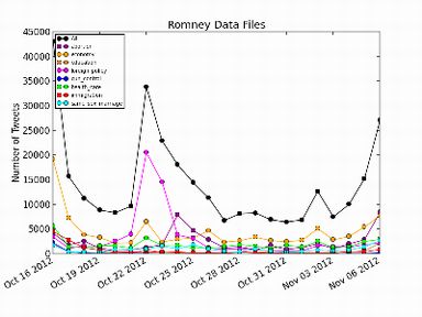
white house petition website, but by getting data that users themselves are directly submitting, and doing
analysis on this information the data about what people care about will be more accurate as it reaches a
large audience. This would allow elected officials to focus their efforts where the public wants.

2. Prior Work

Very little analysis on the use of Twitter data for political analysis has been done before. Topsy, the
service we used to gather the tweets, and Twitter do have a “Political Index” feature where analysis is
done on tweets to rank the candidates, and where they track the mentions of various political topics [13].
Although this work is being done, an analysis of its practicability has not been made public. In addition, to
aid us in using Twitter data we used some of the methods found in some academic papers by M. Cha et
al. 2010 [11] and A. Goyal et al. 2010 [12].
     These two papers present research performed on the influence that certain individuals can
exert in social networks. The first paper, M. Cha et al. 2010 [11], looks at measuring the influence
of twitter users at a general level and specifically on three different topics. The second paper,
A. Goyal et al. 2010 [12], focuses on proving that influence is measurable and real in social
networks. It does this with the flickr network and analyzes certain “actions” that users can take.
          Although the two papers look at two different social networks, and analyze the influence that
users exert in different ways, they both show several valuable methods for exploring social networks for
the influence that various users can exert, and measuring these as accurately as possible. They show
that influence is measurable, and that interesting conclusions can be drawn from the successful
measuring of influence in social networks.
     M. Cha et al. used retweets, mentions and replies in the twitter network to measure influence, and
develop a ranking of the most influential users on Twitter. We use a similar method to them in order to
generate our graphs for the analysis of issue importance. In the second paper, A. Goyal et al. explore
measuring influence probabilities in social networks through actions taken by individuals. Using different
actions they look at the probability that your friends doing a specific action can influence you to also
perform a specific action. A similar analysis may be possible for mentioning certain political topics.

3. Data Gathering

We collected over 800,000 tweets posted from October 16, 2012 through November 6, 2012. We
collected tweets that discussed a major political issue and contained words or phrases related to the
2012 Presidential Election. Tweets were first mined by looking for words or phrases that were related to
common political topics. These collected tweets were then filtered using words that would suggest the
tweet was both about the Election 2012 and a particular issue. Table 1 shows the topics that we decided
to explore, as well as the keywords that we used to search for tweets that would be in each category.
These keywords were chosen by looking at the online polls of topic importance that are presented in

                                                                                                            2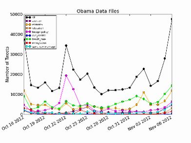
section 4 later in the paper. Some of these polls contained sub-categories that we used as keywords,
such as tax, jobs, and deficit for the topic of the economy. For other keywords we searched Google for
news articles regarding the election and those topics. Some keywords found using this method include:
“legitimate+rape”, “todd+akin”, and “richard+mourdock” for abortion; “fewer+horses+and+bayonets” for
foreign policy; and “obamacare” for health care.

            Topic                                     Keywords Searched For

     The Economy          economy, income+taxes, bush+tax+cuts, stimulate+economy, job+creation,
                          federal+deficit, unemployment, jobs, tax, deficit

      Health Care         health+care, obamacare, medicare, medicaid, health+insurance

     Foreign Policy       foreign+policy, middle+east, afghanistan, iraq, iran, syria, drones,
                          fewer+horses+and+bayonets

        Education         education, higher+education, equal+opportunity, no+child+left+behind,
                          student+loans, common+core, college+education

        Immigration       immigration, illegal+immigration, border+control, dream+act, illegal+immigrants,
                          immigration+reform

           Abortion       abortion, legitimate+rape, todd+akin, war+on+women, pro+life,
                          pro+choice,richard+mourdock, birth+control

 Same-Sex Marriage        same+sex+marriage, gay+marriage, same+sex+couples, gay+rights, LGBT

      Gun Control         gun+control, 2nd+amendment, second+amendment, assault+weapons+ban,
                          gun+laws, armed+citizen
Table 1.

    Because Twitter only allows searching of the previous 7 days of tweets we used a service called
Topsy [7] in order to search historical twitter data. Using a python script and the Topsy online API we
were able to collect the Twitter account name, the post ID, the timestamp of the post, and the text of the
post. We eliminated duplicate tweets in individual topics, but not across topics. Collected tweets were
then filtered using the following whitelisted words:

    ●      president, barack, obama, mitt, romney, election, debate, democrat, republican, gop, campaign,
           ryan, biden

     Tweets were only kept if they contained one of the whitelisted words. This eliminates posts such
as this tweet by thomas doane: “@Social_Co_Pilot only u can help the elderly by fighting EPSEOKD
(Elderly Person SEO Comprehension & Knowledge Deficit) http://t.co/YHGAbsco”. This tweet talks
about a "knowledge deficit", but not a trade, budget or other deficit which would pertain to the election.
While this method will result in some false negatives (tweets that are discarded despite being about the
election), it has almost 0 false positives (tweets not about the election that were kept), and is easy and
fast to implement in a scripting language such as AWK.
     Construction of the graphs was straightforward. The dataset was first organized by mapping each
user to their respective tweets. This allowed for easier data manipulation as well as graph building. Every
user was then added to the graph, and their tweets created an edge if it contained a reply or mention.
A mention would create a directional edge from the tweeting user to the mentioned user. A reply would

                                                                                                             3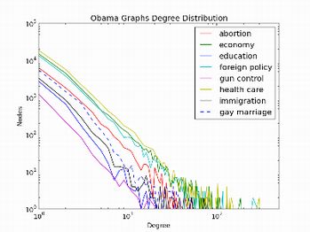
create an edge from the replied user to the tweeting user. A mention can be recognized as a users
attempt to bring up a topic to other users and hence the original conversation starter. In a reply, however,
the initial conversation most likely began with the replied user. These steps were carried out for every
topic separately to create a topic graphs that could be closely analyzed.
     Using these graphs, we gathered statistics about the graphs for each topic. This data is presented
in table 2. We looked at the number of nodes and edges, and the in and out degrees of the nodes in the
graphs. We note that the economy represents a majority of the data we collected, with 23% of all nodes
in the graphs. Following the economy in size is foreign policy, then health care and then abortion. The
smallest graph was gun rights, and the second smallest was education.

                                         Topic Graphs Statistics
                            Size          Number of       Highest in-     Highest out-    Average in/out-
                                           Edges            degree          degree           degree

            Total          474,871         309,017           5,842           1,364             0.6508

           Economy         109,368          81,957           5,842           1,364             0.7494

      Health Care          86,478           61,414           2,347            810              0.7102

     Foreign Policy        94,249           67,723           4,525           1,082             0.7186

       Education           24,939            9,237           955              302              0.3704

      Immigration          25,466           11,853           1,188            252              0.4654

           Abortion        81,185           46,592           2,011            406              0.5739

  Same-Sex Marriage        43,576           27,439           2,056            389              0.6297

       Gun Rights           9,610            2,802            96               67              0.2916
Table 2.

     Plotting the degree distributions of the graphs shows that all 8 graphs follow the power law
distribution as described in chapter 18 of Easley and Kleinberg’s book [9]. This power law means that
there are relatively few nodes that have a high degree, and a large number of nodes with a much smaller
degree. Figure 1 shows the degree distribution plots for all 8 graphs. We see that the distributions for the
economy, health care, and foreign policy are all above the other degree distributions. This shows that the
nodes in these graphs are more highly connected than the graphs for the other topics.

                                                                                                            4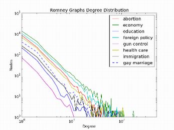
Figure 1.

    We also examine the differences in the data between the two opposing candidates Barack Obama
and Mitt Romney. To do this we simply took the data that we already had and filtered it further. For
Obama we put tweets into this dataset if they explicitly contained “Barack” or “Obama”. For Romney we
used “Mitt” and “Romney”. The statistics for this data is presented in tables 3 and 4. It is immediately
notable that the Obama graphs have more nodes and edges, and that the sizes of the individual graphs
between the two candidates also differ. Obama’s largest graph is health care, whereas Romney’s largest
graph is his economy graph.

                                      Obama Graphs Statistics
                       Size           Number of        Highest in-     Highest out-    Average in/out-
                                       Edges             degree          degree           degree

       Total          255,240          156,324           5,842             1,364           0.6124

     Economy          59,521            38,648           5,842             1,364           0.6493

    Health Care       70,622            49,043           2,328             810             0.6944

  Foreign Policy      52,305            32,291           4,525             1,082           0.6174

     Education        10,334            3,869             955              302             0.3744

    Immigration       13,157            5,924            1,190             252             0.4503

      Abortion        24,191            14,024           1,265             250             0.5797

    Same-Sex          19,868            10,964           1,666             389             0.5518
     Marriage

    Gun Rights         5,242            1,561              84               60             0.2978
Table 3.

                                                                                                         5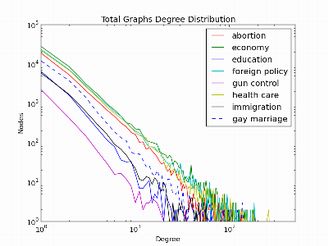
The degree distributions amongst these two datasets also follow a power law distribution and these
distributions are presented in figures 2 and 3.

                       Figure 2.

                                     Romney Graphs Statistics
                       Size          Number of        Highest in-      Highest out-   Average in/out-
                                      Edges             degree           degree          degree

       Total          202,261          110,887           4,774            1,266           0.5482

     Economy          52,872           37,550            4,774            1,266           0.7102

    Health Care       26,948           13,727            1,219             707            0.5094

  Foreign Policy      42,361           25,609            2,771             547            0.6045

     Education         9,108            2,986             366              73             0.3278

    Immigration       11,952            5,067             467              120            0.4239

      Abortion        39,263           17,039            1,209             401            0.4340

    Same-Sex          16,047            8,044            1,254             82             0.5013
     Marriage

    Gun Rights         3,710             865              96               23             0.2332
Table 4.

                                                                                                        6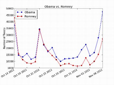
Figure 3.

The results of the six polls presented in table 5 show a clear ranking of issue importance. The economy
consistently ranks as the most important issue in every poll. The polls consulted ranged from potentially
reader biased polls such as the Fox News [2], CBS [5], and Washington Post [4] polls to polls conducted
by independent research groups such as Gallup [1], Rasmussen [3], and the Pew Research Center [6].
Despite this range of polls, the economy was consistently identified as the most important issue.
     The second and third most important issues identified were health care and foreign policy, both
receiving many second and third place results in polls. The fourth most important issue was education,
followed by immigration in fifth, and abortion in sixth. Both of the last two issues, same-sex marriage and
gun rights, received so little votes that they are both tied for last. One interesting outlier is the Fox News
Poll [2] which ranked gun rights as 5th most important, in front of education, in contrast to all other polls.
This demonstrates the importance of using multiple sources for poll data so as not to receive biased data.

                                                     Online Topic Importance Polls1
      Topic            Gallup          Fox News           Rasmussen           Washington            CBS Swing            Pew Research      Our Data2
                       Poll [1]         Poll [2]            Poll [3]          Post Poll [4]        State Poll [5]        Center Poll [6]

   Economy             49.97%            33.56%                  138%               53%                57.67%                    87%       1, 24.41%

  Health Care           4.37%             7.20%                  66%                 7%                52.67%                    74%       3, 18.87%

    Foreign             6.85%            13.10%                  87%                 3%                26.67%                    60%       2, 20.66%
     Policy

   Education            2.15%             6.29%                  61%                 1%                   N/A                    69%       7, 4.36%

1 Please see the reference for each of the polls which explains the methodology used in the polls and what the percentages indicate.

2 Rank, percentage of the total edges and nodes of all graphs.

                                                                                                                                                7
Immigration 1.88% 7.20% 45%
the polls used, thus allowing us to rank some issues higher than they should be. It also could be the
case that even though Twitter is a representative sampling of the public’s thoughts, it is not completely
representative. It could under-represent certain groups such as seniors and conservatives.
     One statistic that demonstrates this is the number of twitter followers that @mittromney and
@barackobama have. On November 6, 2012 (election day) @mittromney had 1,761,442 followers
while @barackobama had 22,009,574 followers [10]. This large differential can be partially attributed to
Obama being the president for the previous 4 years, but is still representative of the online activities of
the two parties. If Twitter does not represent exactly the same distribution as the polls, then the smaller
graphs will be more easily influenced by the minor differences between the sample groups. Because the
popularity of issues seems to follow a power law, slight differences in sample groups amongst methods
for ranking issue popularity will change the ranking of the large number of less popular issues.
     Through analysis of the popularity of various topics on Twitter the most important issues to
American’s become obvious. Using this information candidates can focus their efforts on spreading
their views on these important topics before focusing on other less important topics. However ranking
becomes less reliable past the top 3 to 4 topics, and issues ranking lower than this should not be
discounted.

                                       Graph Sentiment Analysis

In addition to analyzing the importance of various issues we ran a sentiment analysis on the tweets that
we collected, organizing them into positive tweets and negative tweets. The Bing Liu Opinion Lexicon [8]
provided a great source of positive and negative words to use for a Bayesian classifier. Each tweet had
to surpass a strict threshold to be considered a positive or negative tweet, and the lexicon provided an
ample number of words (2006 positive, 4783 negative) to classify each tweet.
    The sentiment analysis of each topic graph shows how positively and negatively each topic was
discussed during the campaign. A large number of tweets show that a political issue is not seen favorably
and thus a major concern for the future. On the other hand, a large number of positive tweets show that
an issue looks promising or not as major concern for the next four years. Alone this data can be used to
indicate whether a candidate should make more of an effort with a topic or should try addressing other
issues first.

                                     Topic Graphs Sentiment Analysis
                        Total (+) Tweets     Total (-) Tweets      Total (+) Users      Total (-) Users

        Total               161,241              177,305              102,146               101,009

      Economy               43,274                44,092               23,974               20,963

     Health Care            29,753                32,979               18,261               17,905

    Foreign Policy          32,788                39,947               19,013               20,895

      Education              7,415                3,593                 6,439                3,024

     Immigration             8,236                8,001                 5,995                6,228

      Abortion              19,809                37,418               13,442               23,772

 Same-Sex Marriage          18,426                8,267                13,667                5,553

                                                                                                          9
Gun Rights 1,540 3,008 1,355 2,669
Table 6.
More interestingly, however, is the sentiment analysis of each candidates’ graphs. By analyzing each
candidate separately, it can be determined whether the candidate is seen capable of tackling a political
issue or would do a poor job. The polarity of each topic can be used to determine whether the candidate
is doing a good job campaigning for the issue or has not discussed it in a positive way.
Obama Graphs Sentiment Analysis
Total (+) Tweets Total (-) Tweets Total (+) Users Total (-) Users
Total 84,901 78,399 56,091 49,175
Economy 20,792 20,208 13,554 11,373
Health Care 23,067 24,085 15,150 13,845
Foreign Policy 17,205 18,203 11,619 11,142
Education 3,001 1,273 2,763 1,179
Immigration 5,353 3,347 419 2,673
Abortion 5,745 7,741 4,519 5,987
Same-Sex Marriage 8,873 1,695 7,284 1,322
Gun Rights 865 1,847 783 1,654
Table 7.
From the data in table 7 it can seen that Obama has addressed many of the issues favorably enough
to have received more positive tweets than negative. Still, however, many topics have a close number of
negative tweets that indicate whether more time should be spent discussing his stance on the issue. For
economy, health care, and foreign policy, the largest political issues, it can been seen that Obama has
done a fair job campaigning for each. It would be difficult to have a large skew toward positive or negative
and the close numbers show that he has garnered enough supporters for each. The less popular issues
have more significant differences between positive and negative tweets, and only in abortion are there
significantly more negative tweets than positive. These numbers show that Obama has also been able
to address the less popular issues in a positive way. While he may not have significantly gained more
positive tweets for the popular issues, which are almost always divided, he has campaigned significantly
well for the smaller issues and not lost support there.
Romney Graphs Sentiment Analysis
Total (+) Tweets Total (-) Tweets Total (+) Users Total (-) Users
Total 53,387 65,360 37,545 44,313
Economy 17,945 19,190 10,924 10,318
Health Care 6,396 10,001 4,697 6,827
10Foreign Policy 11,881 13,691 7,956 9,003
Education 2,111 1,399 1,951 1,256
Immigration 2,526 3,631 2,002 3,129
Abortion 8,564 12,602 6,685 9,750
Same-Sex Marriage 3,553 3,820 2,942 3,049
Gun Rights 411 1,026 388 981
Table 8.
From Romney’s data it can clearly be seen that Romney has not won over many of the users on
various topics. While he has gained almost an close split of positive and negative tweets for economy
and foreign policy, this is not the case for health care. The health care data shows that he has not yet
explained his stance in a favorable light has a much larger proportion of negative tweets. Furthermore,
Romney has not been able to garner many positive tweets for the smaller issues. While Obama only
showed weakness in the issue of abortion, Romney has not campaigned enough in the smaller issues to
have gained supporters. While these issues may be considered less popular, they appear to be easier to
sway during campaigns, and Obama has been able to address more issues successfully.
By comparing candidates, it can be seen who is considered more experienced and knowledgeable
to address a particular topic. This provides another way to view who is winning the race and where each
candidate should put in more work.
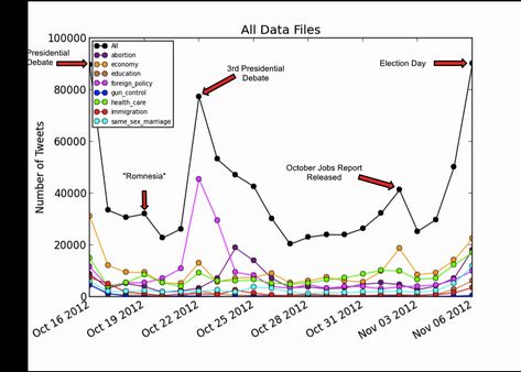
Analysis of Tweet Volume Over Time
Building on our analysis of the importance of certain issues we decided to look at using the temporal
values associated with our data to examine shifting attitudes about issues over time. Figure 4 represents
the number of tweets collected in all of our data plotted over time. We see that there are five peaks that
represent high Twitter volume days for political tweets. Figure 4 has these days labeled to show what
events took place to generate the higher volume. The first day is the second presidential debate, with
foreign policy dominating the discussion. The second peak is when Obama accused Romney of suffering
from “Romnesia” regarding his own health care plan. This is correlated with an increase in health care
tweets. Peak three is the third presidential debate. Peak 4 is brought on by a large increase in economy
related tweets because of the release of the October Jobs Report, and the final peak is election day.
These peaks, and correlating them to real events demonstrates that people respond to real events on
Twitter, thus allowing us to use Twitter to analyze these events.
11Figure 4.
More interesting however is the individual trends that each candidate has in the data that specifically
mentions them. FIgure 5 represents the number of tweets that specifically mention Obama, and figure 6
represents the number of tweets that specifically mention Romney. We see some differences right away.
For much of the time we collected data health care was Obama’s largest group, whereas It never was
for Romney. This would suggest that people think much more about the health care debate when they
think of Obama than when they think of Romney. The difference between the overall data and the obama
data suggests that although the economy is the most important topic overall, Obama’s individual stance
on health care is very important to voter’s too. For an analysis on whether these tweets are positive or
negative see the graph sentiment analysis section above. Just from the numbers however we can see
that people care about Obama’s position on health care.
People also appear to care more about Romney’s stances on economic issues than Obama.
Romney’s economic stances are talked about less than Obama’s, 52,872 Tweets to 59,521 Tweets, but
Romney’s most talked about issue is the economy. Romney also has an unusually large jump in abortion tweets on
October 24th, stemming from the comments made by Richard Mourdock, who is running for senate in Indiana. The
sentiment analysis done above show’s this abortion data to be largely negative.
12Figure 5.
Figure 6.
13We also thought it would be interesting to examine the tweet counts for the two candidates over all the
issues, and see if we can spot any interesting patterns. Figure 7 represents this data, and we see that for
the first 10 to 12 days Obama and Romney are very close, making a call on who is winning at the time
very difficult. However a pattern seems to emerge around October 28th of a clear separation between the
two candidates that only widens as the days get closer to the election. People knew that Obama had won
by the end of the day on November 6, which is why Obama spiked that day. But Obama did have a larger
number of tweets about him for the week leading into the election in which he ultimately prevailed. This
is not a clear indicator of how the candidate is doing, but could be used to help the campaigns further
understand their overall current position in the race. More data (and more elections) would need to be
tracked to assess the validity of ranking candidates based on tweet volume, but the data clearly shows
the winner of this race having a higher tweet volume leading into the election.
Figure 7.
5. Future Work
Our project has demonstrated that there are several more specific area’s into which analysis of Twitter
data can be taken for political analysis. One can look at ranking issues, finding out how the public
perceives candidates stances on certain issues, and look at possibly predicting election results by
combining the above three areas.
One difficult part about collecting this data is choosing the keywords that are used to search for the
data. These words clearly have an effect on what data is seen, and the words must be fair to receive
unbiased data that can be used for analysis. Future work in this area should look into an automated way
to choose these terms, or a way of assessing the fairness of all the terms used.
We could also extend our study to multiple elections for Senate and House seats to see if the
same findings apply on smaller elections. This would also provide a larger election sample size to help
demonstrate the accuracy of predicting results based on Twitter volume of the candidates prior to the
14election day. A more detailed sentiment analysis on the individual days tweets could also be used to help
predict how each candidate is doing in the public’s eye.
References
[1] Most Important Problem. Gallup. http://www.gallup.com/poll/1675/most-important-problem.aspx.
November 18, 2012.
Open ended (may respond with whatever topic they wish) poll asking what the most important
problem facing America is. Normalized to be out of 100%. Gallup is considered to be a reliable
baseline source.
[2] 2012 Hot Issues. Fox News. http://www.foxnews.com/politics/elections/2012/hot-campaign-issues.
November, 2012.
Fox News reader poll on most important topics in the election. Out of 100%. Fox news readers
are
more typically politically conservative than liberal, potentially biasing the poll.
[3] Importance of Issues. Rasmussen Reports.
http://www.rasmussenreports.com/public_content/politics/mood_of_america/
importance_of_issues.
September 21, 2012.
Rasmussen is an independent public opinion polling company founded in 2003. We consider this
source unbiased. Reported are the percentage of people marking that issue as very important.
[4] What is the single most important issue in your choice for president? Washington Post.
http://www.washingtonpost.com/politics/polling/open-important-president-single/2012/05/22/
gIQAx
GshU_page.html. May 22, 2012.
This Washington Post poll is considered unbiased and accurate, but was taken in May of 2012,
which limits its applicability. The poll was an open ended, asking people to respond with what
they think is the most important issue in their choice for president. Out of 100%.
[5] Poll: Economy, health care top issues in 3 battleground states. CBS News.
http://www.cbsnews.com/8301-250_162-57498660/poll-economy-health-care-top-issues-in-3-
battleg
ound-states/. August 23, 2012.
This CBS poll reports the number of people responding that an issue as extremely important. We
averaged the percentages across the three states surveyed (Florida, Ohio, and Wisconsin).
Because the poll was only taken in three states it’s applicability is limited.
[6] For Voters It's Still the Economy. Pew Research Center.
http://www.people-press.org/2012/09/24/for-voters-its-still-the-economy/. September 24, 2012.
Reported is the percentage of voters saying that the issue is very important in their vote for
president. The Pew Research Center is known to publish reliable information.
[7] Topsy. Topsy Labs. http://topsy.com/. API accessible at https://code.google.com/p/otterapi/.
[8] Opinion Mining, Sentiment Analysis, and Opinion Spam Detection. Liu.
http://www.cs.uic.edu/~liub/FBS/sentiment-analysis.html
[9] Easley, David and Kleinberg, Jon. Networks, Crowds, and Markets: Reasoning About a Highly
Connected World. https://www.cs.cornell.edu/home/kleinber/networks-book. 2010.
[10] Twitter Counter. http://twittercounter.com.
[11] M. Cha, H. Haddadi, F. Benevenuto, K.P. Gummadi. Measuring user influence in
Twitter: The million follower fallacy. In Proc. ICWSM, 2010.
[12] A. Goyal, F. Bonchi, L.V.S. Lakshmanan. Learning influence probabilities in social
15networks. In Proc. WSDM, 2010.
[13] Sharp, Adam. A new barometer for the election. Twitter Blog.
http://blog.twitter.com/2012/08/a-new-barometer-for-election.html. August 1, 2012
16You can also read