High resolution forecasts of short duration extreme precipitation - forecasting
←
→
Page content transcription
If your browser does not render page correctly, please read the page content below
High resolution forecasts of short
duration extreme precipitation - forecasting
  quality and sensitivity to parameterization for two
                   Norwegian cases

               Master thesis in meteorology

                    Ingvild Thynes Villa
                           June 2021

                 University of Bergen
             Faculty of Mathematics and Natural Sciences
                         Geophysical Institute
Abstract
Due to global climate change, the intensity and frequency of short duration extreme precipitation
are expected to increase. Short duration extreme precipitation events in Norway are often convective
precipitation happening during the summer. In this thesis, the short duration extreme precipitation
events in Jølster (2019) and Nøtterøy (2020) were investigated. The goal was to examine what
happened the day of the events and how well they were forecasted—also bringing in a discussion
on how to do verification of rare locale extreme events. The verification revealed that the radar
observation was deviating strongly from the point observations for both events, which impacted
the verification result. The neighborhood verification for Jølster indicated that the overall forecast
for the area around Jølster was good. However, the ”nearest point” verification method showed
that no high values were forecasted at Jølster. This method also showed that some of the ensemble
members for Nøtterøy were very good. Simulation with the WRF model showed that changes in
turbulence and microphysical schemes had a minor impact on the forecasted event. Indicating that
both of the events were mainly large-scale driven.

                                                  i
Acknowledgements

I would like to thank my supervisor, Asgeir Sorteberg, who guided me through writing an MSc
thesis during a global pandemic. With home office and remote communication, there where always
time to answer questions and help me.

Also, a big thanks to my co-supervisor, Kjersti Konstali. Thanks for helping me running WRF
(I would not have managed without you), answering stupid questions, and reading my thesis one
time too many.

A huge thanks to my main squad at GFI; 2 hour-long lunch breaks and ”halv dag” made the
six years at GFI go by way too fast. It would never have been the same without you guys.

And, last but not least, thanks to my family for always supporting me. I would never have been
able to combine soccer and a Master’s degree without your help and full support.

                                              ii
Contents

1 Introduction                                                                                                                                        1

2 Theory                                                                                                                                              3
  2.1 Extreme precipitation . . . . . . . . . . . . . . . .              .   .   .   .   .   .   .   .   .   .   .   .   .   .   .   .   .   .   .    3
  2.2 Stability parameters . . . . . . . . . . . . . . . . .             .   .   .   .   .   .   .   .   .   .   .   .   .   .   .   .   .   .   .    6
  2.3 IVF-values . . . . . . . . . . . . . . . . . . . . . . .           .   .   .   .   .   .   .   .   .   .   .   .   .   .   .   .   .   .   .    8
  2.4 METs hazard warning methodology . . . . . . . .                    .   .   .   .   .   .   .   .   .   .   .   .   .   .   .   .   .   .   .    9
  2.5 Verification . . . . . . . . . . . . . . . . . . . . . .           .   .   .   .   .   .   .   .   .   .   .   .   .   .   .   .   .   .   .   10
      2.5.1 What is a good forecast? . . . . . . . . . .                 .   .   .   .   .   .   .   .   .   .   .   .   .   .   .   .   .   .   .   10
      2.5.2 Neighborhood verification . . . . . . . . . .                .   .   .   .   .   .   .   .   .   .   .   .   .   .   .   .   .   .   .   10
      2.5.3 Methods for dichotomous (yes/no) forecasts                   .   .   .   .   .   .   .   .   .   .   .   .   .   .   .   .   .   .   .   11

3 Numerical models                                                                                14
  3.1 The Weather Research Forecast Model (WRF) . . . . . . . . . . . . . . . . . . . . . 14
      3.1.1 WRF physics options . . . . . . . . . . . . . . . . . . . . . . . . . . . . . . . 14
  3.2 AROME . . . . . . . . . . . . . . . . . . . . . . . . . . . . . . . . . . . . . . . . . . . 17

4 Observational based data                                                                                                                           19
  4.1 Radar . . . . . . . . . . . . . . . . . . . . .    .   .   .   .   .   .   .   .   .   .   .   .   .   .   .   .   .   .   .   .   .   .   .   19
      4.1.1 Scattering and radar theory . . . . .        .   .   .   .   .   .   .   .   .   .   .   .   .   .   .   .   .   .   .   .   .   .   .   19
      4.1.2 Errors and challenges in radar data          .   .   .   .   .   .   .   .   .   .   .   .   .   .   .   .   .   .   .   .   .   .   .   20
  4.2 Observation data . . . . . . . . . . . . . . .     .   .   .   .   .   .   .   .   .   .   .   .   .   .   .   .   .   .   .   .   .   .   .   20
  4.3 Lightning data . . . . . . . . . . . . . . . .     .   .   .   .   .   .   .   .   .   .   .   .   .   .   .   .   .   .   .   .   .   .   .   20

5 Methods                                                                                            22
  5.1 Neighborhood verification . . . . . . . . . . . . . . . . . . . . . . . . . . . . . . . . . 22
  5.2 Point verification - closest point . . . . . . . . . . . . . . . . . . . . . . . . . . . . . . 24

6 Results                                                                                                                                            26
  6.1 Jølster 30.07.19 . . . . . . . . . . .   . . . . . . . . . . . . . .                   .   .   .   .   .   .   .   .   .   .   .   .   .   .   26
      6.1.1 Event description - synoptic       and mesoscale analysis                        .   .   .   .   .   .   .   .   .   .   .   .   .   .   26
      6.1.2 Validation of the forecasts .      . . . . . . . . . . . . . .                   .   .   .   .   .   .   .   .   .   .   .   .   .   .   31
      6.1.3 WRF simulation . . . . . .         . . . . . . . . . . . . . .                   .   .   .   .   .   .   .   .   .   .   .   .   .   .   39
  6.2 Nøtterøy 21.08.20 . . . . . . . . . .    . . . . . . . . . . . . . .                   .   .   .   .   .   .   .   .   .   .   .   .   .   .   44
      6.2.1 Event description - synoptic       and mesoscale analysis                        .   .   .   .   .   .   .   .   .   .   .   .   .   .   44

                                                  iii
6.2.2   Validation of the forecasts . . . . . . . . . . . . . . . . . . . . . . . . . . . . .   48
        6.2.3   WRF simulation . . . . . . . . . . . . . . . . . . . . . . . . . . . . . . . . . .      57

7 Discussion                                                                                            61

8 Conclusion                                                                                            64

Appendices                                                                                         66
  .1  WRF theroy . . . . . . . . . . . . . . . . . . . . . . . . . . . . . . . . . . . . . . . . . 67
      .1.1 WPS . . . . . . . . . . . . . . . . . . . . . . . . . . . . . . . . . . . . . . . . . 67
      .1.2 Governing equations . . . . . . . . . . . . . . . . . . . . . . . . . . . . . . . . 68

                                                   iv
1. Introduction

In the last 100 years, the annual precipitation in Norway has increased by 18% [Hanssen-Bauer
et al., 2015]. We see the trend in all the seasons, but a bit less for the summer. Parts of this trend
can be directly linked to the increase in temperature through the Clausius Clapeyron equation, but
not everything. Running global climate models, simulating the climate change the last 150 years,
only shows around 1/5 of the increase observed. This can either be explained by the fact that the
model is not good enough simulating climate change sensitivity or that many observed changes
are not related to human-made emission and natural influences (ex. solar radiation), but chaotic
multidecadal variations [Sorteberg, 2014].

The positive trends are not only present in the total accumulated precipitation in Norway, both the
frequency and intensity of short duration rainfall have increased at most Norwegian measuring sites
in the last fifty years as well [Førland E. J., 2018]. In Norway, two main reasons are causing extreme
precipitation. The first one is a low pressure coming in from the Atlantic ocean bringing heavy
rainfall along the west coast. The second reason is heavy showers called convective precipitation,
which mainly occurs during the summer [Michel et al.]. Predicting these extreme events becomes
more and more crucial as the frequency and intensity increase. An increase in these events can
potentially lead to an increase in flash floods’ magnitude and frequency. There is a need for more
knowledge to help society build up infrastructure and buildings prepared to face the challenges
these weather events bring [Westra et al., 2014].

Norway is 1699 km long, from the northernmost to the southernmost point, and covers several
climate zone. We have, in general, a warmer climate than other places at the same latitude. This
is due to the heat brought by the North Atlantic current and the low pressures coming in from
the Atlantic, bringing warm air northward [Seager et al., 2002]. The low pressure does not only
transport heat but also moisture. The climate in Norway is quite moist, with much precipitation
compared to the global average. The average amount of precipitation in Norway is about 50%
higher than the earth’s average.

Weather forecasting in the Nordic regions spans a wide range of phenomena and scales. Nor-
way includes continental, maritime, and polar conditions, together with complex coastlines and
varying topography on land. All of these factors imply local variations in weather. Regional varia-
tion benefits from a good description of small-scale phenomena and forcing [Müller et al., 2017].

Knowing how a changing climate is expected to lead to more frequent short duration extremes
and the challenges with forecasting these events, I wanted to look closer into this topic. I ended

                                                  1
up investigating two different events of extreme precipitation in Norway. I assess how well they
were forecasted, bringing in a discussion on verification methods of rare, extreme events. Running
the Weather Research and Forecasting (WRF) model, I wanted to investigate the different events
sensitivity to turbulence (planetary boundary layer) and cloud physics (microphysical) numerical
scheme. Is the simulation of extreme events sensitive to the choice of numerical schemes? This will
give us an impression of the leading mechanism of the events. If changes in turbulence schemes
only give small changes in the event’s outcome, we can assume that turbulence is not a primary
driving mechanism for the event.

The different events happen in 2019 in Jølster and at Nøtterøy in 2020. Both events happened
during summertime and can be considered short duration events. However, the synoptic situation
was different, together with the extent in space and time for the various events. For the event in
Jølster, a large amount of precipitation was observed over a large area and longer duration. At
Jølster the event had dramatic consequences, leading to a casualty caused by a landslide. As the
events get more and more intense due to climate change, these events can be expected to happen
more frequently. Nøtterøy was a very local event, and the event in Nøtterøy gave a new Norwegian
record in the amount of accumulated precipitation measured in one hour. The hour before and the
hour after, almost no precipitation was measured, so this event had a very short duration.

The thesis is divided into eight chapters. The first chapter is the introduction. Chapter 2 in-
cluding relevant theory about extreme precipitation, verification and stability parameters. Chapter
3 introduces the two different numerical models; WRF and AROME. Chapter 4 includes a descrip-
tion of radar and information about the lightning and ground observation used. Chapter 5 explains
the method used to verify the forecasts. Chapter 6 includes all of the results. In chapter 7 the
results are discussed, and chapter 8 brings it all together with a summary of my findings and some
thoughts about future work.

                                                2
2. Theory

2.1 Extreme precipitation
To form precipitation water vapor needs to condense into cloud droplets. Further condensation
leads to growth of the cloud droplet turning them in to rain droplets. When these rain droplets
are sufficiently big, gravity makes them fall towards the surface, resulting in precipitation. For the
condensation to take place, the air needs to be saturated. There are two ways the air can become
saturated, either by adding moisture or by cooling the air [Hakim, Gregory J. Patoux, 2017].

Figure 2.1: Precipitations can be provoked by the four different weather situations showed. First one
show stream over a mountain, second show ascent along a front, third show ascent air over a low pressure
and the fourth show ascent due to warming [Sorteberg et al., 2018].

In general, we can say that there is typically four different weather situations that lead to precipi-
tation (Figure 2.1): Airflow over a mountain, ascent along a front, ascent over a low pressure and
heating leading to ascent. Ascent causes the air to cool. When the air cools, its ability to hold
moisture is reduced. This can lead to saturation of the air, and subsequent condensation. This leads
to the formation of clouds, which again leads to precipitation [Sorteberg, 2014]. The amount of
water vapor the air can hold before forming clouds is decided by the Clausius-Clapeyron equation.
The equation gives the relation between temperature and saturation specific humidity. For typical
air masses over Norway, the equation shows that a reduction in the temperature of 1K reduced the
amount of water vapor the air can hold by 6-7% .

                                                   3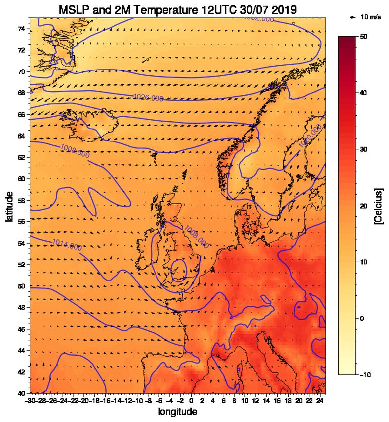
Figure 2.2: Overview of different regions in Norway [Michel et al.].

We can divide precipitation into two main types; dynamic and convective precipitation. Con-
vective precipitation occurs when air rise vertically by convection. Dynamical precipitation occurs
when air rises by a dynamical force. A dynamical force can for example be a front or a surface
pressure system. While dynamic precipitation only needs lift and saturated air, convective precip-
itation needs instability in addition. Instability occurs when the parcel of air is lighter than its
surroundings. Instability can happen either if a fluid is cooled from above or heated from below.
The atmosphere is unstable when warm and light air is situated under colder and heavier air. If
the air close to the ground is lighter than its surroundings, it will rise and cool, and condensation
occurs. Formation of cumulus and cumulonimbus clouds can then find place. Convective precipi-
tation is short-lived and often results in very local precipitation, which is the case when we have
events of short duration extreme precipitation.

Convective storms are generated by moist air, lift and instability. Convective storms can be cate-
gorized into different groups. The simplest one are weak storms that grows and die within an hour,
called single cells. They do not necessarily produce severe weather, but are important because they
are the building block for the larger convective storms. For convective storms to become severe
a significant increase of wind speed, or change in direction with height, is needed. This gives the
storm system a tilt, which avoids the cancellation between the updraft and downdraft as they are in
different locations. When the updraft and downdraft happens in different regions, this both reduces
the water loading in the updraft and there will be a positive feedback between up and downdraft
(Figure 2.3).

Short duration extreme precipitation is often damaging due to the intensity of the event. The
intensity of the event is dependent on three different processes. The first process is how much of
the water vapor is condensed. This depends on how fast the water vapor condensates and how
much water vapor there is available. The second process is the ability to gain more moisture. To
be able to continue to condensate, the air is dependent on moist air to be added into the process of
forming precipitation. The third, and last process, is how efficient the formation of precipitation is.

                                                   4
Figure 2.3: Illustration of a thunder storm [Krider, 2019].

For warm clouds, rain droplets are formed by a process known as collision and coalescence, forming
droplets big enough for gravity to bring them down. For cold clouds, the Bergeron Findeisen process
is forming droplets by growing ice crystals. When the ice crystals get large enough, they fall down
and can then collide with other ice crystals, giving further growth. How efficient these processes are,
depend on the microphysics in the clouds, how the droplet sizes are distributed in the clouds, and
if there are clouds above. If there are clouds above with precipitation, the droplets can collide with
the droplets in the lower clouds and bring them with them on their way down [Sorteberg et al., 2018].

In some cases, the updraft needed for the air close to the ground to rise is not present. We then have
a conditionally unstable situation. The atmosphere is stable for a saturated air parcel, but unstable
for dry air [Leffler, 2015]. This is due to differences in the wet and dry adiabatic lapse rate. We
then need a release mechanism, for example topography, that forces the air to rise. Condensation
and rainfall is then triggered. This is called a trigger mechanism. These trigger events can cause
extreme amount of precipitation [Houze, 1997].

Figure 2.4 shows the distribution of the 60 minute and 360 minute 20 year return value (precipitation
that statistically is predicted to occur one time every 20 year - for more details see Section 2.3)
in Norway. There is a clear difference in where the extremes are expected to be highest for the
two different time intervals. For the one hour return value South Norway stands out with values
around 30 mm/h for a larger area. For the 6 hours return value the area with the highest expected
return values are on the west coast in southern Norway. But we also observe that there is a minor
area on the west coast of southern Norway with values up to 30 mm for one hour return value.
Thunderstorms are not as common in Norway as further south in Europe , but during the summer
months in the afternoon, especially in Agder, Telemark, and Østlandet it is common [Reitan, 2005].

                                                  5
Figure 2.4: One hour (left) and six hours (right) accumulated precipitation with return period of 20 years
(precipitation that statistical can occur one time every 20 year), based on available observation [Sorteberg
et al., 2018].
2.2 Stability parameters
Stability parameters are a measure of the static stability in the atmosphere and are used in meteo-
rology to quickly identify regions with a high probability for the development of thunderstorms or
heavy rainfall. There are many different stability parameters, which all have different advantages
and disadvantages. One common disadvantage for all of these stability parameters is discussed by
Brooks [2009]; they do not take into account the local variations and different seasons. Knowledge
about the area in consideration of stability parameters, is important.
When evaluating stability indices, it is important to take into consideration that no stability index
functions perfectly well by itself. Best usage of the indices is by evaluating them together with
other information. They are not able to fully describe the state of the atmosphere, and alone they
can therefore give misleading results [Schultz, 1989]. They do not take into account the trigger
mechanisms for lifting, which for conditionally unstable situation is very important. They only
represent the potential and latent instability of a layer in the atmosphere [van Zomeren and van
Delden, 2007]. However, this information is very useful together with other information and is
therefore commonly used for detecting thunderstorms.
Convective available potential energy (CAPE) is the amount of buoyant energy available to pro-
duce strong updrafts. CAPE is a well known stability index and is widely used when evaluating
the stability of the atmosphere [Ahrens, 2015]. When calculating CAPE we assume parcel theory
and look at the difference between the temperature of the parcel and the environment (Equation
(2.1)). A parcel of air is defined an imaginary small body of air. Parcel theory assumes that the
air parcel retains its shape and general characteristics as it moves up (or down in the atmosphere).
This assumption will have errors when calculating for the atmosphere but will work well in a core
of a thunderstorm updraft. Inhibit convection (CIN) is, in many ways, the opposite of CAPE
6(Equation 2.2). While CAPE represents the positive energy area, CIN represents the negative area.
This is the amount of negative buoyant energy that is available to suppress the upward vertical
acceleration. The larger the CIN, the stronger force is needed to lift the parcel to the level of
free convection (LFC). If we have high values of CIN this can suppress convective development,
despite high CAPE values [Pier, 2018]. Table 2.1 and 2.2 show what stabilities and probabilities of
thunderstorm development to expect for different values.
∫ EL
CAP E = −Rd Tparcel − Tenv dln(p) (2.1)
LF C
∫ LF C
CIN = −Rd Tparcel − Tenv dln(p) (2.2)
SF C
CAPE Stability
3500-4000 Extremely unstable
Table 2.1: Stability categories associated with different values of CAPE.
CIN Probability of thunderstorm development
200 Risk of thunderstorm low.
Table 2.2: Stability categories associated with different values of CIN.
Total Totals (TT) index is another stability parameter commonly used. TT index consists of the
Vertical Totals and the Cross Totals (Equation 2.3). The Vertical Totals are the difference between
the temperature at 850 mb and the temperature at 500 mb. The Cross Totals are the difference in
the dew point temperature at 850 mb and the temperature at 500 mb. This means that the TT
index takes both the static stability at 850 mb (Vertical Totals) and the moisture at 850 mb (Cross
Totals) into account. Table 2.3 show what the different TT indices indicate of probability for thun-
derstorm. One of the challenges with this index arise if the moisture is below the 850mb level. Then
the index would not be representative of the instability in the atmosphere [Khole and Biswas, 2007].
T Tindex = T (850mb) − T (500mb) + T d(850mb) − T (500mb) (2.3)
K index also uses the dew point temperature at 850 mb and the temperature at 850 mb and 500
mb (Equation 2.4). K index includes the dew point depression at 700 mb, which is the difference
7TT index Thunderstorm Probability
Figure 2.5: Meteorological institute hazard warning methodology. The matrix shows which color the
event is categorized dependent on the observation, probability, and possibility of an event. There are three
different levels shown; Observed has the possibility of 100%, likely means possibility >5̃0% and possible
means 35/40%-50%. For example, if there is a possibility of an extreme amount of precipitation, an orange
warning is sent out. However, if it is likely for an extreme event to appear, red is sent out.

density of the ground measurements, the short available time series, methodology and climate
change. There are many different statistical methods to calculate the IVF statistics. The decision
made when choosing the basic data, type of extreme value distribution, and method for estimating
the parameters of the selected distribution varies, and no ”best” method is agreed upon. In Norway
there are 90 tipping bucket rain gauges with time series longer than 10 years, meaning that there
are large areas not covered. These short duration precipitation events are often very local, with low
density of measurements the statistic can be very dependent of which events are observed. Another
problem is related to increase of precipitation due to climate change. This should be taken into
consideration, but because of the lack of data, data and timeseries from for example 1970 is used
the same way as the ones from recent time, not considering climate change at all.

2.4 METs hazard warning methodology
During the summer of 2018 the Meteorological Institute (MET) started a new method of hazard
warning, which includes warning for short time duration precipitation. This methodology is based
on the standard CAP (Common Alerting Protocol), and is commonly used for nature hazards.
This method involves warnings divided into colours. The colors are yellow, orange and red, com-
bine degree of color and probability (Figure 2.5). Yellow indicates ”be aware” and the weather is
categorised as challenging, orange means ”be prepared” and means server weather. The last one,
and most serious is red, meaning ”secure values” and indicates extreme situation [Meteorologisk
Institutt, 2019].

Communicating the danger of extreme precipitation is a highly prioritised job at The Meteorolog-
ical Institute. The Meteorological Institute stated in the report made after the event in Jølster
that they have not established a methodology or a way of how to clearly communicate to the user
when the weather is of an unpredictable character. The Meteorological Institute is working on a

                                                     9
better methodology that is better at updating the user continuously, close to the event and when
the event is in progress [Meteorologisk Institutt, 2019].
2.5 Verification
2.5.1 What is a good forecast?
The question ”What is a good forecast?” can seem like an easy question to answer but is in fact
very complex. You could say that a good forecast is a forecast that predicts exactly what is going
to happen. This defines a perfect forecast. The challenges come when the forecast is not per-
fect. Since the atmosphere is a chaotic system, a perfect forecast is basically impossible. Is it
important that the precipitation is predicted in the right place, or is it more important that the
average amount of precipitation is as accurate as possible? Or perhaps the most important part is
that it covers the extreme events so people can be warned of possible danger. All these examples
show some of the differences and difficulties that may lie in the assessment of what a good forecast is.
Murphy [1993] discuss the complexity of defining what a good forecast is and introduce three
different types of goodness. How you define what a good forecast is, impact the result you are
seeking when doing research on improving the forecast. In the paper, Murphy also discusses the
challenges with establishing a well-defined goal when working on improving the performance of a
forecast. The three different types of goodness are named consistency (type 1), quality (type 2),
and value (type 3). Type 1, consistency, is based on the correspondence between the forecast and
the forecaster’s best judgment derived from her/his knowledge base. Type 2 compares the forecast
conditions to the observed conditions at the valid time of the forecast. The last type of goodness
(type 3) is when the forecast is used to increase economic and/or other benefits. The forecast is
considered good when the input from the forecast is put into decision-making processes and, for
example, given an economic growth.
In this thesis the verification used is the type 2 goodness. Looking at the correspondence between
forecast and observation, meaning that a forecast of high quality has a close correspondence with
the observations. The most traditional way is to do computation measures of the overall correspon-
dence between forecasts and observations. The mean absolute error, skill scores, and mean-square
error are examples of these measures. This type of verification can be done in different ways. This
will be introduced in the next section.
2.5.2 Neighborhood verification
There are different ways to do verification of a weather forecast. Which method to use depends on
what data is available, the length of the time series, the purpose of the verification, the resolution
of the forecast, etc. The standard method for continuous and categorical verification statistics com-
puted from point match-ups is often a good solution when doing verification. The method has been
used for many years and is well understood. But there are some challenges related to this method.
As the resolution of the models gets better, the models need to hit within a smaller range [Rossa
et al., 2008]. The difference between expecting the model to hit within a few kilometers grid square
(high resolution model) compared to for example 10km grid square (non-high resolution model) is
large.
10When looking at short duration extreme precipitation, we are often looking at convective pre-
cipitation. For a model to be able to simulate convection, it needs to have high resolution. It
then follows that the forecast has to be more precise to be considered a good forecast. Traditional
methods, like point verification as an example, would not give credit to extremes captured by a high
resolution model that are just shifted a bit in time or space. But various neighborhood methods
can, by looking in the neighborhood around each grid point for the events, give credit to the forecast
for ”almost” hitting with the prediction [Gilleland et al., 2009].
How important is it that the forecast hits perfect within a range of a few kilometers? As men-
tioned earlier, it depends on the purpose of the verification. Considering extreme precipitation,
it is often hard to say exactly where the event will appear. Often unstable air is observed over a
larger area but it is hard to know what will be the trigger mechanism, and therefore hard to know
where the event will happen. But with high values of precipitation, exactly what grid square the
event will happen might not be the most important thing. Knowing what area is in danger, to be
able to send out a warning can be more important. Therefore, it can be useful to use neighborhood
verification.
Neighborhood verification uses a spatial window (neighborhood) surrounding the observation point
and/or the forecast. There are different ways of treating the points within the window. For ex-
ample, you can include averaging (upscaling), thresholding, or generation of a probability density
function [Rossa et al., 2008]. The thresholding approach is used for this thesis. Looking at extreme
precipitation, it is of interest if the forecast is good at forecasting high values. The threshold is set
for both the forecast and the observation. This gives the opportunity to classify every point into
a hit, false alarm, correct negative, and missed event. By using the thresholding approach, we end
up with a dichotomous forecast (See section 2.5.3).
There are different methods of defining the neighborhood. Figure 2.6 show three different methods
of determining the neighborhood using the thresholding approach. Figure 2.6 (d), for example,
define the neighborhood within a given area, only for the observed events and not for the fore-
casted event. A hit is recorded if the following two criteria is fulfilled; 1) the forecast value in the
point is above or equal to the threshold, and 2) the observed precipitation at any given point in
the neighborhood is at, or above the threshold. Comparing this to the method used in Figure 2.6
(e), the neighborhood is defined in the same way, but now also for the forecasted event [Schwartz,
2017] . A hit is recorded if both observation and forecast events occur anywhere in the neighborhood.
The frequency of the event can be very sensitive to both the size of the neighborhood, as well
as the value of the threshold [Gilleland et al., 2009]. It can therefore be useful to consider a range
of spatial resolutions and intensity thresholds.
2.5.3 Methods for dichotomous (yes/no) forecasts
A dichotomous forecast is a forecast saying either ”no, the event will not happen” or ”yes, it
will happen”. Using the thresholding example with extreme precipitation, the forecast either says
”yes, it will rain more than or equal amount of the threshold” or ”no, it will not rain more than
11Figure 2.6: Hypothetical (a) forecast and corresponding observations, where forecast (observed) events
have occurred in hatched (filled) grid boxes. Contingency table (Table 2.5) classification of the grid boxes
based on (a) using (b) point verification, (c)-(e) different methods of neighborhood verification. [Schwartz,
2017]
12Observed
yes no Total
yes hits (a) false alarms (b) forecast yes
Forecasted
no missed event (c) correct negative (d) forecast no
Total observed yes observed no Total
Table 2.5: Contingency table for categorical forecasts of a binary event. [Stephenson, 2000]
the threshold”. We use a contingency table to verify these kinds of forecast (Table 2.5). By this
definition, a perfect forecast only have hits and correct negatives, and no missed events or false
alarms. By using the contingency table, one can easily calculate different categorical statistics
[Stephenson, 2000].
Bias score give us an indication of whether the forecast tends to overcast or undercast. It measures
the ratio of the frequency of forecast events to the frequency of observed events. The range goes
from zero to infinity, where 1 indicates a perfect score. A BIAS below 1 indicates a tendency of
undercasting, while a BIAS above 1 indicates overcasting [Stephenson, 2000]. The ones used in this
thesis are introduced below.
hits + f alse. alarms
BIAS = (2.5)
hits + misses
Hit rate, also named probability of detection, completely ignores false alarms but is sensitive to hits.
It is good for rare events and can therefore be useful for extreme precipitation. It compares the
ratio between hits and hits and misses. The range is from 0 to 1, where 1 is the perfect score. Values
close to 1 indicate that the number of hits is much larger than the number of misses. Since it ignores
false alarms, the hit rate should be used in conjunction with the false alarm ratio. [Stephenson,
2000]
hits
Hit. rate = (2.6)
hits + misses
False alarm ratio (FAR) is sensitive to false alarms but completely ignores the misses. The range
goes from 0 to 1, where 0 is the perfect score. FAR close to 0 means that the number of hits is
much larger than the number of false alarms [Stephenson, 2000]. The ratio answers the question;
what fraction of the ”yes” events that were predicted did not occur?
f alsealarms
F AR = (2.7)
hits + f alsealarms
133. Numerical models
3.1 The Weather Research Forecast Model (WRF)
The Weather Research Forecast model (WRF) is a numerical weather prediction (NWP) and at-
mospheric simulations system that can generate atmospheric simulations using both real data (Ob-
servations or analyses) or idealized conditions. The WRF modeling system consists of four major
programs: WRF pre-processing system (WPS), WRF data analysis (WRF-DA), Advanced Research
WRF (ARW) solver, and Post-processing and visualization tools. For more detailed information
than given in this section about WRF; see Appendix .1. The following information about WRF
is from WRF modeling system User´s Guide [Wang et al., 2018]. For this thesis, WRF is used to
simulate the two different extreme precipitation events using real data (analyses) and there sensi-
tivity to changes in numerical schemes.
The model domain for the WRF was run for a area of 52°- 66°north and -6 °- 21 °east. The simula-
tion starts at 00 UTC the day of the event and ends 00 UTC the day after. For all the simulations,
the fifth generation of the European Center for Medium-Range Weather Forecast (ECMWF) re-
analysis was used, ERA5. The runs where run with a time step of 8 second. Containing 51 vertical
levels, with a grid size of 2km x 2km. The horizontal grid is defined by Lambert projection with
center in 58.959°N and 7.599°E.
3.1.1 WRF physics options
There are different physics options available in the ARW, I will go into detail in two of them: The
Planteray Boundary layer (PBL) and the Microphysics. Table 3.1 show an overview of the different
WRF runs.
Planetary Boundary layer schemes
The part of the troposphere that is directly influenced by the Earth’s surfaces is known as the
planetary boundary layer (PBL). This layer responds to forcing from the surface with a timescale
of an hour or less [Stensrud, 2007]. The purpose of the schemes is to distribute surface fluxes with
boundary layer eddy fluxes and allow for PBL growth by entertainment. It is also referred to as the
turbulence scheme. The scheme is responsible for the boundary layer and the vertical sub-grid-scale
fluxes due to eddy transports in the whole atmospheric column [Skamarock et al., 2008]. For the
thesis three different schemes are used. An overview and short description of the three different
PBL schemes used in this study are given below.
14Figure 3.1: Model domain WRF show with red square (52°- 66°north and -6 °- 21 °east).
Yonsei Invierity (YSU) PBL (1) (Hong et al. [2006]) is the new generation of MRF PBL (Hong and
Pan [1996]) which uses countergradient terms to represent fluxes due to non-local gradients. This
new generation adds an explicit treatment of the entrainment layer at the PBL top. It is defined
using a critical bulk Richardson number of zero (not 0.5 as before). Topographic drag effects and
top-down mixing was added as an option or improved the last couple of years [Skamarock et al.,
2008].
Mellor-Yamada-Janjic (MYJ) PBL (2) is a one-dimensional prognostic turbulent kinetic energy
(TKE) scheme with local vertical mixing. The TKE production/ dissipation differential equation
is solved iteratively [Skamarock et al., 2008].
Mellor-Yamada–Nakanishi–Niino (MYNN) (6) (Nakanishi and Niino [2009]) is a second-order tur-
bulence closure scheme. It is based on the Mellor-Yamada (MY) PBL scheme but modified by
revising key closure constants and introducing a new diagnostic equation for the turbulence master
length scale [Huang and Peng, 2017].
These three schemes have some crucial differences and are therefore interesting to compare. The
15Runs mp_physics bl_pbl_physics sf_sfclay_physics
1 8 1 1
2 8 2 2
3 1 1 1
4 1 2 2
5 8 6 5
6 26 1 1
Table 3.1: An overview of the different WRF runs and which schemes correspond to which runs.
MYJ and the MYNN scheme have local mixing, while the YSU scheme has non-local mixing. MYJ
and MYNN have a turbulent kinetic prediction, while the YSU has a more traditional K-closure.
Microphysics
The explicitly resolved cloud, water vapor, and precipitation processes are included in the micro-
physics option. The microphysics is treated as an adjustment process by directly updating the state
variables. So it is carried out at the end of the time-step. The different schemes include different
numbers of moisture variables. It is also referd to as the cloud physics. Some also include mixed
phase and/or ice phase processes. An overview and short description of the three microphysics
schemes used in this study are given below.
Kessler scheme (1) (Kessler [1969]) is the most simple microphysics scheme you get. This scheme
includes no ice, which means no ice phase or mixed phase processes. It includes only warm clouds
and takes water vapor, cloud water, and rain into account.
New Thompson et al. scheme (8) (Thompson et al. [2008]) is a much more advanced scheme
then the Kessler. This scheme includes ice, snow, and graupel processes. This is very suitable for
simulations with high resolution. It also consists of both ice phase and mixed phase processes.
The scheme has been developed for especially mid-latitude convection, orographic, and snowfall
[Skamarock et al., 2008].
WRF Singel-Moment 7-Class Microphysics Scheme (WSM7) (26) (Bae et al. [2019]) introduce
a 7-class prognostic water substance. It includes, as for the 6-class, water vapor, clouds, rain,
ice, snow, and graupel. Additionally, it introduces hail hydrometeor as the 7th prognostic water
substance. Together with the 7-class microphysics, it predicts cloud condensation nuclei (CCN),
number concentrations of clouds, and rain. (Hong et al. [2010]).
The main difference between the three different schemes is that the Kessler scheme only contains
warm rain, while the New Thompson scheme and WSM7 include more advanced prognostic water
substances. The Kessler scheme only includes idealized microphysics. WSM7 is different from the
New Thompson with both the high number of water substances and the prediction of CCN, number
concentration of clouds, and rain.
163.2 AROME
A Meteorological Cooperation on Operational Numerical Weather prediction (MetCoOp) version
of the Météo-France Applications of Research to Operations at Mesoscale (AROME) model was,
in 2014, put into operation by a cooperative effort of the Swedish and Norwegian meteorological
services. This is the model used by the Meteorological Institute in Norway, and is in this thesis
used to determine how well the events were forecasted. A short introduction of the model will be
given in this chapter, but for the particular interested, a much more detailed description is given
by Seity et al. [2011] and Müller et al. [2017].
The MetCoOp-AROME model covers Scandinavia and the Nordic sea with a 2.5 km horizontal
resolution (Figure 3.2). The horizontal grid is defined by Lambert projection with center at 63.5°N
and 15°E. The model has 65 vertical layers determined by a mass-based, terrain-following hybrid
vertical discretization. Every 6 hour (00,06,12,18 UTC) a 66 hour forecast is produced. The model
updates the atmospherical and land surface variables every 3 hours, used for data assimilation.
Lateral and upper boundaries are from the ECMWF. Due to the delayed availability of ECMWF
forecasts, the forecast used as boundaries is 3 to 6 h earlier than the actual forecast for the inter-
mediate and main forecast cycles [Müller et al., 2017].
The cloud microphysics is base on the Kessler scheme, explained in section 3.1.1 and the three-class
ice parameterization (ICE3) scheme. The Kessler scheme is used for the warm (liquid) processes,
while the ICE3 scheme parameterizes the cold processes. ICE3 includes cloud ice, graupel, and
snow, and more than 25 processes are parameterized by the scheme [Pinty and Jabouille, 1998].
In the MetCoOp-AROME, some modifications are made for the ICE3 scheme. This to correct for
known errors, especially the T2m winter bias, and to improve the clouds at low levels.
HARMONIE with RACMO Turbulence (HARATU) is the turbulence scheme used in AROME.
HARATU is based on a scheme that was initially developed for a regional climate model called
RACMO. The scheme uses a framework with prognostic equations for turbulent kinetic energy
combined with a diagnostic length scale [Bengtsson et al., 2017].
17Figure 3.2: Figure showing entire model domain of AROME-MetCoOp and land topography (elevation
[m]) [Müller et al., 2017].
184. Observational based data 4.1 Radar To evaluate the events, radar data from MET was used. Radar stands for radio detection and rang- ing. For our use, we are trying to detect and ranging the precipitation. A radar sends microwaves with a given wavelength/frequency and measures the backscatter portion of this radiation. The signal returning includes many different types of information; the traveling time, the phase shift, the backscattered power, and the received radiation’s polarization. This gives information about the type of hydrometeors, the amount of the hydrometeors, and wind speed through the Doppler effect [Reuder, 2019]. 4.1.1 Scattering and radar theory The Rayleigh scattering theory can be used for particles that are spherical and small compared to the wavelength (D
ratio, and it can be hard to determine. The standard approach uses the Z-R relationship derived
from Marshall and Palmer [1948] in the form of the power law, Z = aRb . a and b depend on a
number of different factors. This conversion from reflectivity to rain rate leads to both systematic
and random significant error [Sivasubramaniam et al., 2018]. Discussion on this topic follows in the
next subsection.

4.1.2 Errors and challenges in radar data
Different sources are causing an error in radar precipitation measurements. There are errors in
both the reflectively measurements and the conversion from reflectively to precipitation rate. From
the reflectively measurements, the error may originate from ground and sea cluster, beam blocking,
anormal propagation, bright band, and non-meteorological echos (for example, a bird) [Elo, 2012].

Errors in the conversion from reflectivity to precipitation rate are linked up to the use of Z-R
ratio. As mention earlier, there is no universal R-Z ratio. Precipitation occurs in the form of snow,
rain, and a mixture of them in a cold climate. The different phases of the precipitation can cause
problems. This can partly be solved using two sets of R-Z relations, one for rain and one for snow.
However, both the European radar project OPERA and the Norwegian radars use only one R-Z
ratio [Sivasubramaniam et al., 2018].

Another important point when looking at radar data is that we have to assume spherical droplets,
which often is not the case. With a theory that is very sensitive to errors in diameter, this can have
large consequences for the result.

4.2 Observation data
Observation data from https://seklima.met.no/observations/ is used, includeing observation and
measurements that are available for the Meteorological Institute. The observations used have
measurements for precipitation every hour. The different stations used are shown in Figure 4.1.
The colored dots show stations that are used more frequently in this thesis than the rest. The red
dot show Vassenden, which is around 20km from Jølster. The yellow dot show Kroken in Stryn.
For Nøtterøy the stations at Vestskogen (blue) and Gjekstad (green) are shown.

4.3 Lightning data
The lightning data is from blitzortung.org. The data is used to detect convection and give an
impression of how good the radar data is. Lightning detectors on the ground observe the lightning.
There are 14 detectors on the mainland of Norway. These registers the very low frequency from the
lightning. It will only be registered if more than one detector measures it. Using the information
from the signal at different lightning detectors, the strength and location of the lightning can be
calculated [Meteorologisk Institutt, 2017].

                                                 20
Figure 4.1: Map with an overview of the different ground measurements used. Some stations are shown
with different colors: Vassenden (red), Kroken (yellow), Vestskogen (blue), and Gjekstad (green). These
stations are used more frequently during the thesis.
215. Methods
5.1 Neighborhood verification
There are different ways of defining neighborhoods when using neighborhood verification. For ex-
ample, you can have a neighborhood only in space, or in both time and space. It can be defined
only for the observations or for both the observation and the forecast. In this thesis, I have used a
definition called the ”neighborhood maximum” (NM) approach (Figure 2.6 (e)). The neighborhood
is defined for both the observation and the forecast [Schwartz, 2017]. This implies that it is a hit
if both forecast and observed events occur anywhere in the neighborhood. This also implies that a
correct negative is recorded when neither observed nor forecast events occur within the neighbor-
hood (Table 5.1).
Neighborhood maximum definition
a (hit) b (false alarm) c (missed events) d (correct negative)
Forecast condition Fk ≥ q for some k∈ Fk ≥ q for some k∈ Fk < q for some k∈ Fk < q for some k∈
Si Si Si Si
Observation condi- Ok ≥ q for some k∈ Ok < q for some k∈ Ok ≥ q for some k∈ Ok < q for some k∈
tion Si Si Si Si
Table 5.1: Criteria for filling contingency table for the i’th grid point. S denotes the unique set of grid
points within the neighborhood of i, q represents a precipitation accumulation event threshold, and F and
O represent the forecasts and observations at i. q can either be an absolute threshold (e.g. 1.0 mm/h) or
a percentile threshold (e.g. the 90th percentile) [Schwartz, 2017].
Since we define our neighborhood for both the forecast and the observation, we get more hits than
the other neighborhood verification types. More hits can indicate a better forecast. But this also
indicates that we will get more false alarms and missed events and fewer correct negative. It can
therefore be hard to argue which definition one should use.
Table 5.1 does not include the definition of verification in time. When doing the different veri-
fication runs, I also included a neighborhood for time in some of them. This means that you allow
your forecast and observation to be a bit inaccurate both in space and in time. If I define my
neighborhood to be one hour back in time and one hour forward in time (giving a neighborhood of
3 hours), the forecast can show precipitation at t-1 while the observations show that the rain came
22at t+1, but it would still be considered a hit.
Running the verification I was not only interested in verifying the forecast, but also to get an impres-
sion of the different result comparing point verification and neighborhood verification. Therefore, I
ran a verification with two different thresholds, 2 year and 5 year return values for the location for
every event. I did this for point verification, neighborhood verification with different sizes of the
neighborhood and neighborhood verification including a time neighborhood. An overview of the
different verification runs is shown in Table 5.2.
Overview of verification
Verification type Threshold Neighborhood Neighborhood
space time
Point verification 2/5 year return value
Neighborhood verification 2/5 year return value 7 km
(space)
Neighborhood verification 2/5 year return value 12 km
(space)
Neighborhood verification 2/5 year return value 7 km 3h
(space and time)
Neighborhood verification 2/5 year return value 12 km 5h
(space and time)
Neighborhood verification 2/5 year return value 12 km 7h
(space and time)
Table 5.2: An overview of the different verification method used in the thesis. All runs are done for both
2- and 5-year return values as the threshold.
AROME produces a forecast 00,06,12 and 18 UTC during a day and creates a forecast 66 hours
forward in time. To evaluate how the goodness of the forecast changes in terms of when it was
produced, I ran verification for every prediction made from 12 UTC two days before the event to
00UTC the day of the event. For Jølster, the 18UTC forecast the day before the event was not
usable, so verification for that time is missing.
The verification run is produced using AROME as the forecast and radar images were used as
the observation. The radar data has a resolution of 1 km when reading in the data, while the
AROME data has a resolution of 2.5 km. Since they have different resolutions, an interpolation had
to be done to use the different verification methods. The interpolation method ”nearest-neighbor
interpolation” was used to interpolate the AROME forecast to 1 km resolution. This interpolation
method makes the new grid and gives every point in the new grid the value to the nearest old grid
point. The verification is done from and area from 3°E to 15°E, and from 55°N to 63 °N.
This verification method allows us to calculate categorical statistics. The result of the categor-
ical statistics calculated for every event is from an area of 100km x 100km. The square is centered
at the location of the event.
235.2 Point verification - closest point
Another verification method that can be useful when working with forecast verification of extremes
is to look at the closest point forecasted above a given threshold. Suppose you, for example, have
a ground observation with high values. In that case, you can validate the forecast by finding how
far it is to the closest point with forecasted values similar to the observation. Point verification is
introduced in earlier chapters, but then in terms of comparing every grid point of forecast to every
grid point of an observation (in my case radar data). This closest point method is also a type of
point verification, but this method is not dependent on the radar data in contrast to the method
introduced earlier. This method only depends on the forecast validation, its resolution, and the
threshold you set.
This method is used for both the AROME forecast and for the WRF runs. Every grid point
within a circle of 1° radius is found. It then follows that all forecasted precipitation further than
1° away from the center is not considered a ”hit”. All the points within the circle above the given
threshold are counted, and the distance to the different points is collected. This gives us informa-
tion on the distance to the closest point, and the area covered where the forecast predicted above
the threshold. Figure 5.1 is an illustration of how it is done. I used the IVF return values for 2 and
5 years as thresholds when verifying both AROME and WRF.
When calculating the closest point, the average distance of the three closest points is used. This is
to make sure that it was not only one grid cell forecasting above the threshold. The resolution of
the model also needs to be considered. If the closest distance is less than the model’s resolution, it
can be considered spot on. The better the resolution of the model is, the more accurate distance
you will get.
24Figure 5.1: Illustration picture of how the point verification - ”closest point” is done. Figure showing
AROME forecast for Nøtterøy. The center of the circle is placed in Nøtterøy. The yellow dots show grid
points with forecast above the threshold, while red dots show the grid points below the threshold.
256. Results
For this thesis, two different events of extreme precipitation in Norway were investigated. The first
event happened in Jølster, located on the west coast of Norway during summer 2019. The second
event happened in 2020 at Nøtterøy in southern Norway. The results from Jølster is presented first
(Chapter 6.1), followed by the result from Nøtterøy (Chapter 6.2).
The two chapters are build up similarly, where the first section presents a description of the event
based on radar data, observation, ERA5 reanalysis data, and AROME analysis data. The second
section displays verification of the AROME forecast, studying how well the event were forecasted.
This leads us to the topic of ensemble members and spatial correlation. The last part looks at the
sensitivity of the events to turbulence (pbl) and cloud physics (microphysical) numerical scheme by
presenting the result from the WRF runs.
6.1 Jølster 30.07.19
30 July 2019 started as a perfect summer day in Jølster, with sun, and temperatures almost reaching
27°C. But later that day an extreme event of short duration precipitation took place. At Vassenden,
around 20km from Jølster, 33.1 mm/h was measured at 17UTC. This is a extremely high value,
considering that the estimated 30 years IVF-value for Jølster is 21.6 mm/h. The event triggered
several landslides, one which caused a casualty. From The Meteorological Institute only a yellow
warning message was sent out, which is the first of three levels of danger. There were large amount
of precipitation over extensive parts of the southwestern part of Norway. Due to the tragic conse-
quences of the event located in Jølster, I found it natural to focus on this area. In this chapter, we
will take a closer look at what happened that day.
6.1.1 Event description - synoptic and mesoscale analysis
On the 28th of July, we observe a low pressure of 1002 hPa coming in from the south, moving
towards Great Britain (Figure 6.1). The low pressure moves further toward Great Britain and
southern Norway and reaches 992 hPa at the 29th of July. A high pressure is located west of
Finnmark in the Barents sea, with a central pressure of 1032 hPa. The situation of a low pressure
over Great Britain and high pressure south of the northern parts of Norway gives easterlies winds in
southern Norway. With a cyclonic rotation over Great Britain and a anti cyclone rotation at higher
latitudes, the winds generated by the different pressure system at latitude of southern Norway are
in the same direction. This strong pressure gradient generates strong winds. The temperature
decreases over the west and southern part of Norway from 29th of July to the 30th of July. The
26most intense precipitation came in the period 14-16 UTC the 30th of July. When referring to the
timestep the event took place, I will refer to 15 UTC.
Figure 6.1: ERA5 reanalysis data showing 2 meter temperature (shaded) in Celcius, wind at 10m height
in m/s, and the mean sea level pressure (contours) in hPa for the period before the event. The figure show
12UTC three days before the event (upper left), two days before the event (upper right), one day before the
event (lower left) and the day of the event (lower right).
27The local analyses show a decrease at around 0.013 g/kg in specific humidity and an increase of
37% in relative humidity from midnight on the 29th to midnight on the 31st (Figure 6.2). Relative
humidity almost reach 100% 31th of July 00UTC. The increase in relative humidity indicates moist
and/or cold air coming in over Jølster. The decrease in specific humidity illustrates that the air is
not mainly moist, but cold. The cold air is brought by the winds generated from the high pressure
(Figrue 6.1), bringing cold and dry air from the north. Comparing the specific humidity with the
temperature, we see that they evolve identical, which substantiate that the air is mainly cold, and
relatively dry. When cold air comes in over a relatively hot surface, the atmosphere becomes unsta-
ble. The temperature decreases by almost 8 degrees from the 29th to the 31st. All theses changes
in the different parameters can be considered as distinct changes considering the duration of the
changes.
Figure 6.2: Evolution in time of relative humidity [%], specific humidity [g/kg] and temperature [K] for
Jølster. Data presented is AROME analysis data at 850 hPa. The values shown are a mean of 50 km x 50
km area centered at Jølster. The event in Jølster is defined to be most intense in the period 14-16 UTC
30/07.
28Stability indices
Convective available potential energy (CAPE) is a very commonly used stability indices for deter-
mining the intensity of deep convection, described in chapter 2.2. For the event at Jølster, there
were generally high values of CAPE over large parts of western Norway (Figure 6.3). At 12UTC the
30th of July we observe values between 1000 - 2500 J/kg over a large area, indicating moderately
unstable air, in additions to a smaller area with values >2500 J/kg which indicates very unstable
air. The high values of CAPE decreases with time, presumably by the convective available energy
being used to form precipitation. It is interesting to note that the CAPE values do not reveal any-
thing in the large-scale analysis which indicates a higher likelihood for an extreme event in Jølster
is greater than anywhere else on the west coast of Norway. At 12UTC we also observe low values
of CIN at Jølster, indicating high chances of thunderstorm development.
Another index that is useful to look at when detecting area with risk of heavy precipitation is
the K index (Chapter 2.2). Values over 30 indicates a high likelihood of thunderstorm activity
[Galvin, 2016]. In the area of Jølster the values varies between 31 and 33. Values between 30 and
40 correspond to potential for thunderstorm with heavy rain (Table 2.4). Other areas on the west
coast of Norway have significant higher values than the area of Jølster. The overall observation of
the K index shows much of the same as the CAPE, with high values over a large part of western
Norway (Figure 6.4). There is nothing indicating that Jølster is in larger risk of convective storms
than other places on the west coast of Norway for this stability indices as well.
After evaluating the synoptic situation and the stability indices, the low- and high pressure positions
which sets up easterlies over western Norway which brings cold air over western parts of Norway,
creating an unstable situation. When cold air comes in over a warmer surface, it can create a
conditionally unstable situation, and we then need a trigger mechanism to initiate the convection.
These events are tough to forecast, which we will take a closer look at in chapter 6.1.2. In the next
section, we will look at observations and radar data available for the time of the event.
Observations
For further investigation of the event stations in the area around Jølster, together with the light-
ning the day of the event and the data from the radar (Figure 6.2). Both maps show max hourly
precipitation observed by the radar at every grid point on the 30th of July. Figure 6.2 (left) shows
available ground measurements, as well as the hourly radar maximum in every grid point. The
radar observes no high values at or close to Jølster. The highest value observed by the radar that
day is 47.6 mm/h, and is located in the blob a bit south-west of Jølster. There is observed much
precipitation over a relatively large area. In three hours, the station at Stryn measured 63.21 mm.
At Vassenden, around 20km from Jølster, the measurement shows 33.1 mm in one hour at 14 UTC.
After this, the station breaks down, maybe due to the heavy amount of precipitation. High values
were observed over most parts of the west coast of Norway. At Fossmark in Hordaland, 33 mm in
one hour was observed.
The map to the right shows both hourly radar maximum in every grid point and the lightning
detected the day of the event. The lightning is plotted with a shading color to show at which time
of the day the event happened. Lightning is a very good indication of where convection happened.
In the period between 15 UTC and 19 UTC, over 6000 lightning strikes were observed at Vestlandet.
29You can also read