Interactive and Narrative Data Visualisation for Presentation-based Knowledge Transfer
←
→
Page content transcription
If your browser does not render page correctly, please read the page content below
Communications in Computer and Information Science (CCIS)739, 2017
The final publication is available at Springer via
http://dx.doi.org/10.1007/978-3-319-63184-4_13

         Interactive and Narrative Data Visualisation for
             Presentation-based Knowledge Transfer

                           Reinout Roels, Yves Baeten and Beat Signer

                            Web & Information Systems Engineering Lab
                               Vrije Universiteit Brussel, Pleinlaan 2
                                      1050 Brussels, Belgium
                                   {rroels,bsigner}@vub.ac.be

               Abstract. In recent years, presentation tools such as Apple’s Keynote
               or Microsoft PowerPoint play an important role in knowledge transfer.
               Despite the fact that over the last decade we have witnessed various
               technological advances and new media types, existing presentation tools
               still mainly support the presenter-driven delivery of static content. On
               the other hand, research in information visualisation illustrates that in-
               teractive data exploration and storytelling can significantly improve the
               extraction and transfer of knowledge from raw data sets. Our goal is to
               improve data-driven knowledge transfer in presentation tools by applying
               existing information visualisation concepts. Therefore, we derived a set
               of general requirements for interactive information visualisation in pre-
               sentation tools. A prototype of a presentation tool which addresses these
               requirements has been developed based on the MindXpres presentation
               platform. Ultimately, the presented requirements might serve third-party
               slideware vendors as input for improving support for data-driven knowl-
               edge transfer in existing presentation tools.

               Keywords: Presentations, Slideware, Narrative Visualisation, Interac-
               tive Visualisation, Data Exploration

         1   Introduction

         The field of information visualisation investigates graphical data representations
         that reinforce human cognition and help us in detecting causal relationships
         between data. Recent technological advances led to more dynamic and inter-
         active information visualisations. Current development therefore emphasises on
         providing users more control over the visualisation process in order to enable
         the interactive exploration and discovery of meaningful relations between data
         points.
             Storytelling has shown to be an effective approach for sharing insights gained
         by studying specific data sets [17]. Facts that have been tied together as part of
         a story are easier to present as well as more memorable by the audience. There-
         fore, we have seen the rise of so-called narrative visualisations or visualisations
         that help us to tell stories with data [26]. For example, educational textbooks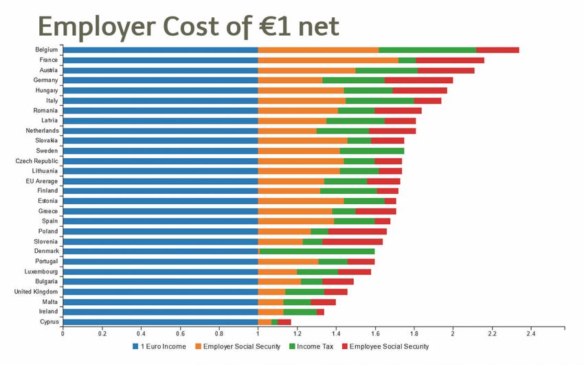
often contain various charts and diagrams in order to support the message that
the text is trying to convey. These narrative visualisations have been adapted
for recent media and are becoming more dynamic. For instance, news on the
television might use animated graphs to show changes in oil prices or election
results whereas online news articles might be complemented by user-controllable
interactive visualisations.
     A common medium used for narrative visualisations are the slide decks cre-
ated with presentation tools such as PowerPoint. With more than 30 million
PowerPoint presentations produced every day [18], we cannot deny the role that
presentation tools play in knowledge transfer. These tools allow us to display
content such as text, images or charts. Nevertheless, unlike other digital media,
presentation tools do not exploit recent techniques for interactive information
visualisation to their full potential. We have seen little evolution in the core
ideologies of presentation tools which were originally designed for the produc-
tion of physical photographic slides. For example, most slide decks are still linear
sequences of spatially restricted slides with static content. However, from a tech-
nological point of view, there is no reason why some of these limitations should
still apply. Visualisation techniques such as zoomable user interfaces allow us
to get rid of spatial boundaries. Furthermore, hardware such as tablets, smart-
phones or digital pens support the non-linear presentation of content and enable
various forms of real-time interactions with a presentation’s content. Neverthe-
less, existing workarounds for implementing this functionality either require too
much time and effort or force the presenter to use some third-party tools during
presentation time which interrupts the flow of the narrative.
     We address some of the discussed shortcomings of current presentation tools
and introduce an interactive data visualisation solution for the MindXpres pre-
sentation tool. By applying well-established concepts from information visualisa-
tion and visual storytelling, we aim to provide more effective narrative visualisa-
tions in presentations. Our interactive data visualisation solution for MindXpres
supports the predefinition of a series of views for a given data set as well as
transitions between these views in order to support the narrative. In contrast
to existing presentation tools, the visualised data and visualisation parameters
can be changed between each step of the narrative. For instance, the chart type
(e.g. bar chart or pie chart) can be changed, filters can be applied on the data
or the focus might be adjusted. Furthermore, the same functionality remains
available at presentation time, allowing the presenter to break free from any
predefined visualisation series in order to explore and discuss the data without
restrictions. By applying established information visualisation guidelines and
techniques, the resulting presentation helps the audience to strengthen their
mental model and enhances the effectiveness of knowledge transfer. In addition,
our proposed approach does not only reduce the time needed to create com-
pelling narratives based on a raw data set, but also results in a shift towards
audience-driven narratives.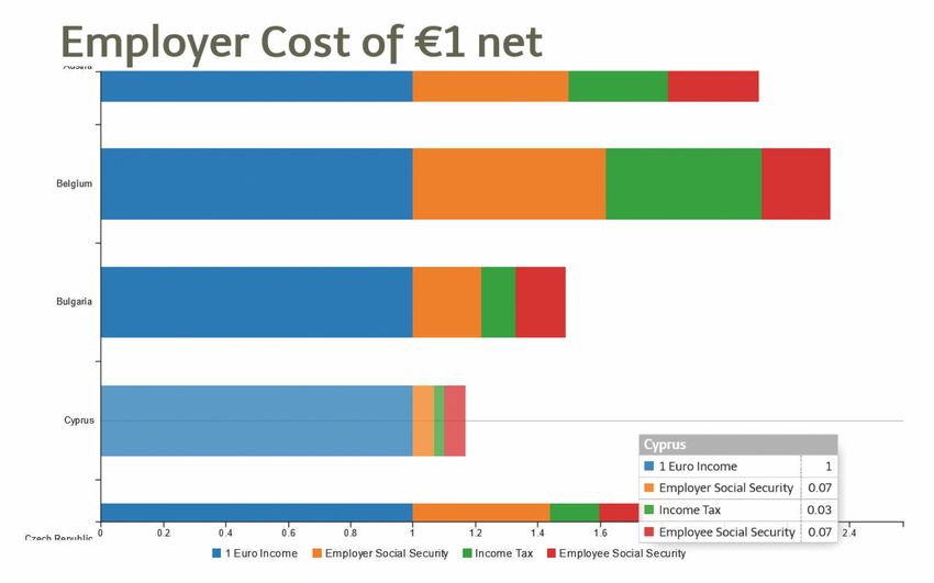
In Sect. 2 we discuss information visualisation and narrative visualisation
concepts in more detail, relate them to existing presentation tools and discuss
shortcomings of existing presentation tools. We then propose enhancements for
some of these shortcomings in Sect. 3 and derive a number of general require-
ments for interactive narrative information visualisation in presentation tools.
Section 4 provides some details about our prototype implementation for the
MindXpres presentation tool, which is followed by a use case in Sect. 5 in order
to illustrate some of our prototype’s functionality. We conclude with a discussion
and outline of future work.

2     Background
The advent of modern media such as television and computers have enabled
more dynamic and interactive visualisations. Similar to these visualisations we
see on television also major newspapers have adopted the concept of graphical
storytelling and sometimes allow users to interact with the visualisation. For in-
stance, the BBC1 , The Telegraph2 and The New York Times3 accompany some
of their articles with interactive visualisations. An article in The Economist
calls it “melding the skills of computer science, statistics, artistic design and
storytelling” [1]. In this section we take a look at existing information visual-
isation and narrative visualisation concepts and explain why they work well.
After presenting some related tools, we outline their limitations in the context
of presentation-based knowledge transfer.

2.1    Interactive Visualisation
An important goal of information visualisation is to strengthen a viewer’s un-
derstanding of the underlying data, which might be hard to interpret in its raw
form. Abstract data representations can offer a high-level overview and help us
to reinforce our mental model [34]. Such graphical representations make use of
our highly developed ability to process the continuous stream of information-
rich signals captured by our eyes [32]. Concepts such as shape, colour, size or
distance are intuitive to us and the interpretation of some of these concepts
comes naturally. Research in this domain led to Gestalt psychology, a research
field that identified a series of laws helping us to understand these natural in-
terpretations [12]. For instance, when comparing objects in a visualisation, it
is clear that a larger object represents a larger quantity or something of higher
importance. Similarly, objects that are spatially close to each other are likely
to be more related than objects with a larger distance in between them. The
field of information visualisation tries to exploit these findings in order to fa-
cilitate knowledge transfer. Few [13] proposed a classification of eight messages
1
    http://www.bbc.com/news/11628973
2
    http://www.telegraph.co.uk/news/interactive-graphics/
3
    http://www.nytimes.com/interactive/2015/us/year-in-interactive-
    storytelling.html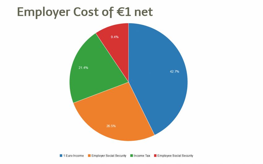
that one might want to show using quantitative data, together with the type of
visualisation that is suitable for each message. The messages include time series,
rankings, part-to-whole, deviation, distribution, correlation, geospatial messages
and nominal comparison.
     The formation of a mental model can further be augmented by allowing the
user to interact with the data [32]. The significance of interaction while process-
ing information was illustrated in Gibson’s cookie cutter experiment [15] and is
often used as a classic example to prove the relevance of interaction in infor-
mation visualisation. Gibson concluded that our brain performs better as active
explorer, even if the act of exploring requires additional coordination and pro-
cessing. Interaction techniques in information visualisation can be seen as the
features that provide users with the ability to directly or indirectly manipulate
and interpret representations. Note that this also includes menu interfaces that
allow users to manipulate the representation and, for instance, switch to another
chart type or sort a bar chart in descending order [33]. Furthermore, Dix and
Ellis [9] emphasise two important principles in interacting with visualisations.
The first principle “same representation, changing parameters” states that users
should be able to interactively change parameters of the presentation. The sec-
ond principle “same data, changing representation” implies that a user should be
able to switch between conceptually different data visualisations. Various repre-
sentations can be appropriate for different types of data and each representation
needs to be tuned for its purpose.
     There are various academic studies about different interaction techniques
such as zooming or filtering which resulted in the categorisation of frequently
used techniques in information visualisation. One of the widely accepted clas-
sifications was independently proposed by both Siirtola [28] and Yi [33]. Even
though the authors did not collaborate, the proposed interaction categories are
very similar:

 –    Select: mark something as interesting
 –    Explore: show something else
 –    Reconfigure: show a different arrangement
 –    Encode: show a different representation
 –    Abstract/Elaborate: show more or less details
 –    Filter : show something conditionally
 –    Connect: show related items

2.2     Narrative Visualisation
Interactive visualisation techniques cover the exploration and analysis of data
but there is also a need for presenting and communicating data effectively. As
stated by Kosara, “tying facts together into a story is one of the most effective
ways of presenting them and making a point” [17]. The main reason for using sto-
ries is the fact that they are known to be a popular way of conserving information
and passing it on. Not only do narratives preserve and advertise information,
they also act as an adhesive between facts to make them memorable [3]. Segel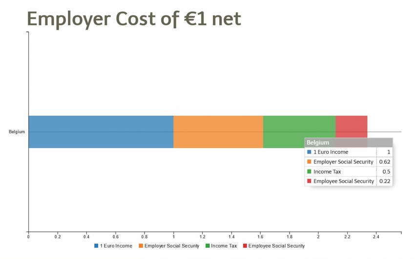
and Heer [26] further provide a classification of the different approaches and
design techniques used in news media to visually tell stories.
    In the context of presentations, narrative visualisations are mainly author
driven. The scenes and scenarios are linear and predefined by the presenter,
messages and conclusions are explicitly mentioned and the audience has little
to no influence on the story. This contrasts with reader-driven narratives found
in other contexts where there is no prescribed ordering, the free interaction and
exploration is central and possible interpretations are left to the reader. Segel
and Heer state that ideally, visual narrative genres must balance a narrative—
intended by the author—with story discovery by the reader [26]. Kosara confirms
that this also holds true for collaborative settings where stories can not only be
used to support discussion and decision making, but also during the analysis
process. Hence, stories can serve as a source for drawing conclusions, similar to
the narrated history of an event [17].
    Note that narrative visualisations can be manipulated to emphasise specific
messages during free exploration. For instance, Hullman and Diakopoulos [16]
identified a number of approaches and design techniques for prioritising particu-
lar interpretations in visualisations. These findings imply that narrative visuali-
sations can be designed to deliver a predefined message without explicitly giving
the message away.

2.3   Existing Visualisation Tools

Even though the visualisation of information in graphs is an important feature
of current presentation tools, existing presentation solutions clearly lack the in-
teractive or narrative aspects discussed earlier in this section. PowerPoint makes
it easy to visualise numbers stored in a spreadsheet and provides a lot of freedom
in terms of chart types and styling options. Nevertheless, the final result of this
process is always a static graph. Of course, as with any content in PowerPoint,
it is possible to apply transitions (e.g. fade in or slide out) and motion path
animation effects. These effects can either be applied to the complete chart or,
depending on the type of chart, to smaller parts within the chart. By using these
transitions and motion path animations as a workaround, authors can compose
basic narratives by, for example, making parts of a pie chart appear one by one.
However, this approach has several shortcomings. First of all, it requires a major
authoring effort since animations have to be manually applied to the different
parts in order to achieve the desired effect. Furthermore, things might get even
more complicated when changes have to be made at a later stage. In order to
switch to another chart type, it might further be necessary to define multiple
versions of the graph with the corresponding transitions between them. Second,
if we depend on these transition effects, the result consists of a predefined se-
quence of states and there is no way to deviate from this fixed path. While it can
be desirable to predefine a path through the data, it might also be beneficiary
to have the flexibility to show alternative unprepared variations when answering
unexpected questions. Last but not least, it is important to note that a chart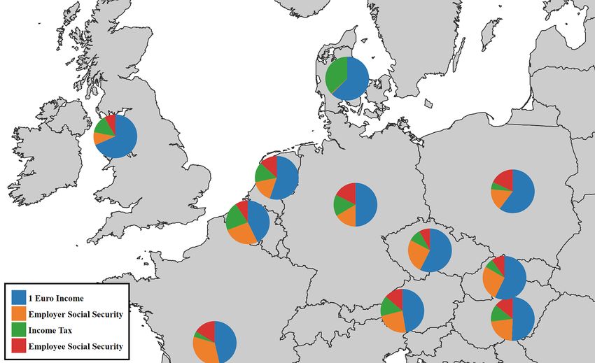
is rendered only when the underlying data or configuration is changed at au-
thoring time, but from then on the chart has to be considered a collection of
static images. This implies that any effects only operate on the graphical level
but cannot do anything that would require the components of the chart to adapt
between steps. We can make the bars of a bar chart appear one by one but it
is impossible to apply modifiers to the information or configuration that defines
the graph. For example, we cannot just switch to another chart type, change the
scale of a graph or filter out specific values as a step in the animation. There are
third-party plug-ins such as oomfo4 or think-cell5 which add even more options
for creating charts, but one has to be aware that these third-party plug-ins typ-
ically only add additional authoring and styling features for designing what will
ultimately result in a static chart with the same limitations. So far we have only
discussed charts in PowerPoint but we came to similar conclusions for alternative
presentation tools such as Apple’s Keynote6 or Prezi7 .
    In terms of academic work, there are a number of tools based on the interac-
tive visualisation principles discussed earlier. Notable examples are VICKI [7],
Spotfire [2] and GGobi [29]. While these are promising tools founded on the
principles of proven concepts, they also show a number of shortcomings which
make them less suited for use in presentations. First of all, these solutions were
built as standalone applications and their interfaces are not optimised for use
during a presentation. The presenter has to leave the presentation and switch
to another application which interrupts the flow. These tools also consist of
multiple windows and have complex menus that do not translate well to the lim-
ited resolution offered by most projectors. In addition, significant interaction is
needed to operate the tools, requiring the presenter to focus on the software and
use the keyboard or mouse to go through a series of actions to switch between
desired visualisations. It is evident that these solutions focus on the interactive
exploration part, but the ability to use them as narrative visualisation tools
is rather limited. Commercial solutions with similar restrictions include IBM’s
Many Eyes [31] and Tableau8 . Note that the previously mentioned GGobi also
provides an Application Programming Interface (API) that allows programmers
to embed and pragmatically interact with visualisations. There are other devel-
opment frameworks such as UC Berkeley’s prefuse visualization toolkit9 for the
Java programming language or the popular D310 JavaScript library. While these
frameworks offer a broad range of features for modern data visualisation, they
are usually used for building standalone applications. More importantly, they
require the programming of the desired visualisation which is not suitable for
the majority of presenters.

 4
     http://oomfo.com
 5
     http://www.think-cell.com/en/products/
 6
     http://www.apple.com/mac/keynote/
 7
     https://prezi.com
 8
     http://www.tableau.com
 9
     https://github.com/prefuse/Prefuse
10
     http://d3js.org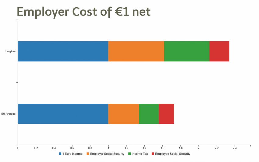
Hans Rosling’s 2006 TED talk entitled ‘The Best Stats You’ve Ever Seen’ [25]
is an excellent example of the fact that it is possible to build a presentation
around dynamic and interactive data visualisation. During his talk, Rosling made
the point that there is so much data related to human development trends but
it is difficult to educate people and transfer knowledge about current issues if we
cannot present these statistics in an accessible way. For his presentation, he used
a proprietary tool (now forming part of the Gapminder11 suite) that allowed him
to animate and visualise data over time, switch between chart types or highlight
areas of interest and annotate them. The success of the talk can partly be at-
tributed to Rosling’s energetic personality and compelling arguments, but also
his novel approach to presenting data gained a lot of attention [17] and has been
explored in great detail. Robertson later showed that animated transitions can
have a negative effect on a viewer’s ability to follow trends [19], but because these
animated transitions are entertaining and capture the attention, they work well
in front of a live audience. While Rosling’s 2006 TED talk was definitely a major
step in the right direction, the Gapminder series of tools also has some short-
comings. First of all, once more they are standalone applications and require
a presenter to switch between presentation and tool. More importantly, these
tools were specifically built for educating people about certain topics related to
human development. This implies that the data sets are fixed and the function-
ality and visualisations are tweaked for drawing conclusions from geographic and
demographic data over time. Other tools have been built for specific use cases,
including the MediaViz [8] platform for visualising data relevant to online media
studies. Similarly, ArtVis [10] is a tool for exploring European art over time on a
map-based visualisation. GeoTime [11] represents another geography-based vi-
sualisation tool focussing on creating a visual story out of geo-temporal events.
While GeoTime is one of the few tools where the creation of a narrative out of
a raw data set lies in its core, its use is limited due to the focus on geo-temporal
data only.
     The discussed related work highlights the added value of interactive and nar-
rative visualisations even if we have to conclude that existing presentation tools
do not offer the necessary support for applying such narrative visualisations in
practice. There are some workarounds such as creating multiple static charts
with manually-defined transitions between them, but often presenters are not
willing to make this effort and rather opt for a less dynamic narrative. Alterna-
tively, it is possible to use stand-alone tools which were not designed to be used
in the context of live presentations and can therefore not easily be applied as
tools for narrative visualisations.

3      Requirements

Research in the field of information visualisation and narrative visualisation
shows that the use of specific visualisation techniques can lead to improved
11
     http://www.gapminder.org/downloads/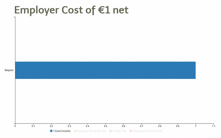
knowledge transfer. However, as discussed earlier we see that existing presenta-
tion tools do not exploit these visualisation techniques to their full potential. Our
goal is to close this gap and to apply lessons learned from interactive information
visualisation as well as narrative visualisation in order to improve presentation-
based knowledge transfer. Based on the presented related work and the short-
comings of existing presentation solutions discussed in Sect. 2, we derived a set
of requirements for interactive information visualisation in presentation tools:

R1: Integration in presentation tools As slide decks are one of the most fre-
quently used media for transferring knowledge in education and business settings,
it is preferable to directly integrate interactive visualisations into a presentation
rather than relying on third-party applications. If an interactive visualisation is
not integrated into the presentation tool, the presenter is forced to switch be-
tween applications which takes time and interrupts the presentation flow.

R2: Focus on proven techniques and guidelines Popular presentation
tools put their main focus on aesthetics and looks but the offered features are
not always beneficial in terms of knowledge transfer. For instance, the ability
to show three-dimensional bar charts or pie charts has been proven to cause
longer interpretation times and may even be interpreted incorrectly [27,14]. Sim-
ilarly, Tufte [30] argues that most graphical bells and whistles (what he calls
“chartjunk”) increase the signal-to-noise ratio and dilute the message one wants
to deliver. Presentation tools should not only create visually appealing visual-
isations but also support the presenter in creating visualisations that focus on
strengthening the viewer’s mental modal and transferring knowledge more effi-
ciently. Therefore, a presentation tool should offer features based on the message
that the presenter is trying to pass on, for instance based on Few’s classifications
introduced earlier [13]. Note that this is not only relevant for static visualisations
but should also apply to the currently non-existent interactive features by, for
example, basing ourselves on Siirtola’s classification of relevant tasks for data
exploration [28].

R3: Interactive visualisations as support for oral narratives When using
interactive and dynamic visualisations as support for an oral narrative, it is de-
sirable to be able to predefine a sequence of views for a given data set and to step
through these views during the presentation. In addition to simple enter and exit
animations offered by existing tools, it is important to be able to apply the two
interaction principles by Dix and Ellis [9] introduced earlier. This implies that it
should be possible to modify parameters in between the steps of a presentation
(e.g. change the scale or apply a filter on the data) and to change the data rep-
resentation (e.g. by switching to another chart type). By allowing the presenter
to define such a sequence of states, they can synchronise the visualisation state
with the oral narrative at preparation time and ensure that limited interaction
with the computer is needed during the presentation.
R4: Unscripted data exploration In addition to stepping through the pre-
defined states of a visualisation, the presenter should also be able to change
the representation or parameters at any time during a presentation. Segel and
Heer [26] pointed out the importance of balancing the narrative intended by
the author with story discovery by the reader. This also applies to certain pre-
sentation styles where questions or discussions with the audience can drive the
presentation. Therefore, a presentation tool should also allow the presenter to
interact with the visualisation during the presentation with the same set of inter-
actions offered at authoring time. Since the resolution (screen real estate) and
interaction is limited during a presentation, special care needs to be taken to
offer the available interactions in a way that does not clutter the visualisation
and can be controlled without intensive user input.

R5: Interactivity after the presentation As mentioned earlier, readers or
audience members should not be excluded from the interaction. This does not
only apply during a presentation but should be valid for a slide deck’s entire
lifetime. For example, in higher education slide decks are often offered as part
of the study material. A student reviewing the slides at home should at least be
able to play back the visualisation as it was defined by the presenter. Ideally,
students should also have the option to freely navigate the data in order to clarify
any doubts they may have and to strengthen their mental model by exploring
the data set. Another use case is the inverted or flipped classroom setting where
activities that are typically considered homework become central during class
and the teacher merely guides the completion of these activities [4]. By offering
students the interactive slide decks that were used in the pre-recorded lectures,
they are not only able to replicate situations from the videos, but they also have
a tool for further data exploration in order to come to their own conclusions.

4   Implementation

In this section we discuss the technical details of the interactive and narrative
visualisation extension for the MindXpres presentation tool by revisiting the
requirements presented in Sect. 3 and showing how our prototype addresses
these requirements.
    Requirement R1 states that the visualisation should be integrated in the
presentation tool in order that the presenter does not have to switch between
external third-party applications. Our interactive data visualisation prototype
has been implemented as a plug-in for the MindXpres presentation tool [23,20].
MindXpres was developed to overcome the limited extensibility of well-known
slideware tools such as PowerPoint or Keynote and to offer a rapid prototyping
platform for novel presentation ideas. While PowerPoint offers an Application
Programming Interface (API), it enforces the usage of a linear sequence of slides
with relatively static content which makes it difficult to experiment with radically
new ideas for next generation presentation tools. In contrast, the highly modular
MindXpres architecture allows any component to be replaced and new compo-
nents and functionality can easily be added. For instance, users may choose to
use a plug-in that visualises content using a zoomable user interface (ZUI) or
they can use a plug-in that visualises the same content in a classic linear fashion
as in existing slideware.
MindXpres Resources
Compiler
Document (online + offline)
MindXpres Presentation Bundle
Presentation Engine
Core Assets
Content Engine Presentation
Plug-ins Content
Graphics Engine
Themes
Communication Engine
Fig. 1: MindXpres architecture
As shown in Fig. 1, the core MindXpres engine provides various abstrac-
tions that allow plug-in creators to focus on their ideas instead of having to
reimplement the basic functionality. The graphics engine, for example, provides
functionality related to the visualisation of content which drive features such as
the ZUI and interactive rich media visualisation plug-ins. The communication
engine allows instances of a MindXpres presentation to form networks which en-
ables plug-ins to communicate across devices and supports audience-driven func-
tionality such as polls, quizzes or screen mirroring [22]. MindXpres uses HTML5
and related technologies for enhanced portability and plug-ins are written en-
tirely in JavaScript. Although a graphical editor is under development, MindX-
pres presentations are currently defined in an XML-based declarative language
similar to the LATEX language that is used for the authoring of text documents.
Listing 1.1 shows an example of a presentation in the XML authoring language.
The goal is that a user can focus on the authoring of the content whereas the
presentation tool deals with the layout and styling. While MindXpres comes
with a default set of plug-ins for basic components such as images, bullet lists,
videos or slides, it is easy to add plug-ins for new content types. Note that these
plug-ins also extend the vocabulary used in the MindXpres document format.
More specifically, a plug-in can add new XML tags to be used in the document
format and the plug-in then takes responsibility for visualising content placed
within these tags.1 < presentation >
2 < slide title = " Vannevar Bush " >
3 < bulletlist >
4 < item > March 1890 - June 1974
5 < item > Founder of Raytheon
6
7 < image file = " bush . jpg " / >
8 < quote source = " As We May Think (1945) " >
9 A record , if it is to be useful to science , must be continuously
10 extended , it must be stored , and above all it must be consulted .
11
12
13
Listing 1.1: MindXpres presentation in XML
In the past, MindXpres has been used for implementing new presentation
components such as for the interactive visualisation of source code [21]. For the
presented interactive data visualisation, we have taken a similar approach by
implementing a data visualisation plug-in for MindXpres. Since MindXpres is
based on client-side web technology, we did not have to start from scratch but
could make use of existing visualisation libraries. As a starting point, we used
Bostock’s Data-Driven Documents (D3) JavaScript library [5] which supports
complex data-driven visualisations through code. The library uses the widely
supported SVG, HTML and CSS standards to generate the desired visualisa-
tion. D3 is a powerful solution offering control over every possible aspect, but it
is also quite complex to use since even a simple static bar chart requires tens, if
not hundreds of lines of code [6]. For this reason, we also use the C3.js JavaScript
library12 , a D3-based reusable chart library that provides abstractions for most
of the common chart types out of the box. Based on C3’s API, one can con-
trol the state of a chart such as focusing on a data series, selecting data points,
showing or hiding the data series or updating the data. With these features it is
possible to change the chart in response to events such as user input or temporal
triggers. Since MindXpres makes it possible to create highly dynamic and inter-
active plug-ins to integrate content directly in the slides (or other containers),
Requirement R1 is easily met.
Requirement R2 is the driving force behind the set of features and function-
ality that is offered to end users. We have already described how techniques
and guidelines that contribute to the transfer of knowledge should be priori-
tised and this is reflected in what a user can do and sees as an end result. First
of all, the default representations of the various charts and graphs are styled
according to existing guidelines such as those by Tufte [30]. These guidelines
include, for instance, the use of plain backgrounds or colour schemes that are
composed of contrasting colours. We further made sure that enough graph and
chart types are supported in order to represent all types of data characteristics
a presenter might want to show to their audience. Therefore, we based ourselves
on Few’s classification [13] which defines the following ways for showing specific
data characteristics:
12
http://c3js.org– Nominal Comparison: compare categorised data in no particular order
– Time Series: visualise series of data over time
– Ranking: compare categorised data ordered by size
– Part-to-Whole: display categorised data as a ratio of the total
– Deviation: compare categorised data to a specific reference measure
– Frequency Distribution: show the count of occurrence in specific ranges
– Correlation: show statistical relationship between pairs of variables
Bar charts enable nominal comparisons, rankings, frequency distributions
(histograms) and deviation (since bars can also go below the horizontal axis).
Line charts further allow us to visualise time series, and the area under each
line can optionally be filled with a colour. As an addition to bar charts, box
plots can also be used for showing deviation. Pie charts, regular bar charts and
stacked bar charts allow the user to visualise how categories relate to the to-
tal amount of data. Finally, scatter plots are provided for showing correlation.
Related work such as GapMinder, ArtVis [10], GeoTime [11] and MediaViz [8]
further highlights that geographical data should not be ignored. Our visualisa-
tion plug-in therefore supports different map-based visualisations such as bubble
maps, choropleth maps as well as maps with pie chart overlays.
Requirement R3 demands that the visualisation and parameters should be
changeable so that different views of the same data can be presented efficiently.
The data to be used in a visualisation can be specified in two ways. It can either
be directly defined in the MindXpres XML language or an external file can
be provided. By default, D3 supports the loading of data in plain text, JSON,
XML, HTML, CSV and TSV format. We have extended this list of formats
with support for Excel spreadsheets by implementing a compile-time trigger in
the MindXpres plug-in. The compiler converts any referenced spreadsheet data
to JSON and bundles it with the presentation, which makes it easier for the
JavaScript plug-in to process the data at runtime.
After providing a data set, the author can define the visualisation’s starting
state. This includes the setting a chart type, specifying the parts of the data to
be shown initially as well as configuring specific chart components such as the
zoom level, axes or legends. Subsequently, the author can define additional visu-
alisation states to match their narrative. During the presentation, the presenter
will be able to step through these states and the plug-in automatically applies
the settings specified for each state. Note that any part of the configuration can
change between states. This includes the data set, chart type as well as other
parameters that cannot be changed in conventional presentation tools. In order
to hide the complexity of the used D3 and C3 libraries, we provide abstractions
for useful configuration changes in accordance to the interaction techniques pro-
vided by Yi et al. [33]. Table 1 highlights a list of abstractions implemented by
our prototype, which make it easier for a presenter to define the transformations
needed to bring the visualisation to the next desired state. Further, Listing 1.3,
which is discussed in more detail later, shows an example of how a visualisation
and its states are defined in the XML language. In this example the data is re-
trieved from an external file but the visualisation states are defined in the XMLTable 1: Implemented abstractions for manipulating a visualisation
Parameters Description and Abstractions
highlighting highlighting and fading out specific elements
[focus, defocus]
visibility showing and hiding specific elements
[show, hide]
data sources load and unload data sets
[load, unload, unload all]
data display data or group display settings
[show, hide, set name, set colour]
axis settings assign data group and display settings to axes
[group, label, min, max, range]
filtering apply or remove filter to data
[apply filter, remove filter]
selecting selecting or unselecting data
[select, unselect]
representation transform visualisation to a specified chart or map type
[set chart type]
grouping combine columns or groups into a new group
[make group]
sorting sort data based on specified group
[sort]
gridlines settings for horizontal or vertical grid lines
[set spacing, enable, disable]
regions select intervals on an axis for side by side display
[add, remove]
legend legend visibility and groups to be included
[show, hide, set groups]
tooltip turn tooltip on or off
[show, hide]
view area view manipulation (zooming or panning)
[set zoom, set x, set y]
chart size resize the chart to a given height and width
[resize]
chart rendering request a refresh or clear everything
[redraw, clear]
language. Note that the data could also be defined in the XML document itself
and on the other hand the configuration could be defined in an external file.
While quantitative data can all be treated in the same way for operations such
as averaging, grouping, filtering and visualising, additional work was required to
support data representing geographical locations. When an abstraction related
to geographical data is invoked, the relevant subset of data is automatically ex-Fig. 2: Interaction menu at presentation time
amined. If the data is numerical and within a certain range, it is assumed that
the data represents coordinates and nothing further needs to be done. In the
case that the data is in textual form, reverse geocoding is applied. This implies
that the text is converted into coordinates in order that strings that represent a
location (e.g. “Belgium” or “Fifth Avenue New York ”) can be used in the visu-
alisation. In the current implementation the reverse geocoding is performed via
the Google Maps Geocoding API13 which requires a connection to the Internet.
However, in future implementations we could also provide a local database for
offline lookups. The result of the reverse geocoding process is a set of coordinates
that can be used in the visualisation. The map-based visualisations are also based
on D3.js. Our plug-in includes a file that contains the topological data needed
for visualising countries and continents. These boundaries can also be used by
the plug-in to classify coordinates by region. An extension called D3 Geo Pro-
jection14 allows us to easily map geographic coordinates to pixel coordinates in
the map viewport while taking the map’s current projection method, scale and
rotation into account. It was further necessary to define some operations specif-
ically for coordinates, such as operations for calculating the distance between
coordinates or finding the centre of a list of coordinates (the centroid).
In order to fulfil Requirement R4, the presenter is free to apply unscheduled
abstractions at any time during a presentation. Some of the abstractions are
13
https://developers.google.com/maps/documentation/geocoding/start
14
https://github.com/d3/d3-3.x-api-reference/blob/master/Geo-
Projections.mdtriggered via the mouse. For example, by hovering over an element, the element
is highlighted and the corresponding tooltip is shown. Similarly, data groups can
be hidden or shown by clicking on the relevant group in the legend. However,
note that not all interactions can be offered via non-intrusive mouse actions. For
this reason we have integrated an interaction menu that allows the presenter to
perform any of the offered interaction abstractions during the presentation as
illustrated in Fig. 2.
Last but not least, Requirement R5 has been addressed by allowing the
audience to play back the visualisation at home and freely explore it. Since
MindXpres is based on web technologies, a MindXpres presentation bundle can
easily be made accessible online and accessed by any device running a web
browser. A viewers can iterate through the predefined states as set up by the
presenter, but they also have access to the menu for manually applying any of
the provided abstractions. This helps a viewer to strengthen their mental model
as they are free to examine the data from different angles in case something is
not clear.
5 Use Case
In order to demonstrate the benefits of our interactive data visualisation plug-
in, we present a short scenario that demonstrates how one can use the plug-in
to create a narrative visualisation. In contrast to existing presentation tools,
a presenter only needs to create one visualisation with one data set for which
they define a sequence of views that support their oral narrative. This not only
requires much less time and effort than existing workarounds, but it also makes
it easier to apply changes at a later point in time. In the presented scenario,
the goal is to compare the tax and social burdens of salaried employees in the
27 member states of the European Union. As a starting point, a JSON file that
contains the relevant data for the year 2014 is used [24]. A small snippet of the
JSON content is shown in Listing 1.2. A dynamic and interactive visualisation is
then used to illustrate the extra money an employer has to pay in order that an
employee will receive exactly one euro after taxes. Since the presentation is going
to be delivered to a Belgian audience, the presenter starts with an explanation
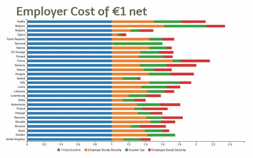
of the tax situation in Belgium. At first, a simple chart is shown in Fig. 3a with
a blue bar representing the one euro the employee receives.
1 [
2 [ " Austria " ,1 ,0.5 ,0.32 ,0.29] ,
3 [ " Belgium " ,1 ,0.62 ,0.5 ,0.22] ,
4 [ " Bulgaria " ,1 ,0.22 ,0.11 ,0.16] ,
5 ...
6 [ " Spain " ,1 ,0.39 ,0.21 ,0.08] ,
7 [ " Sweden " ,1 ,0.42 ,0.33 ,0] ,
8 [ " United Kingdom " ,1 ,0.14 ,0.2 ,0.12]
9 ]
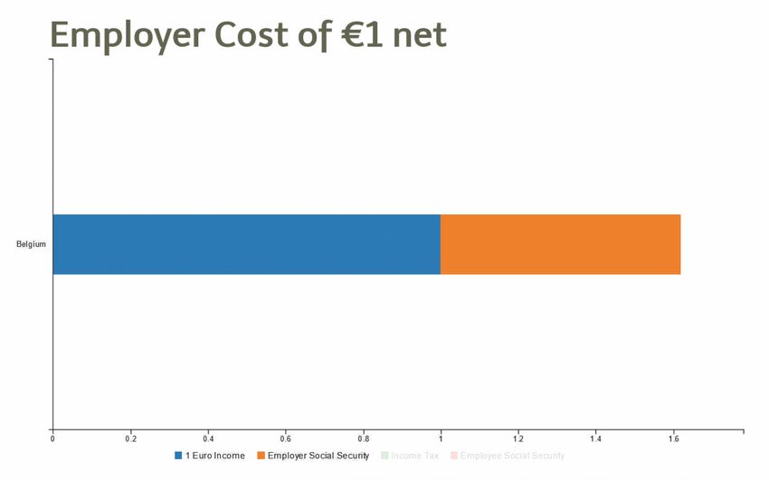
Listing 1.2: A snippet of the JSON data used in the scenarioIn a next step, the presenter introduces the concept of employer social security
and adds it to the chart in the form of the orange extension to the original blue
bar in Fig. 3b, in order to provide an idea of the proportions. Note that the scale
of the horizontal axis automatically adjusts and now shows a linear scale from
0 to the total costs of 1.6 euro so far. The same procedure is repeated for the
income tax (green) and the employee social security (red), introducing one item
at a time in order to keep the audience focussed on the explanations (Fig. 3c).
The exact values of the different parts that make up the bar are shown in a
small table when the mouse cursor is hovered over the bar. In a next step, the
presenter transforms the visualisation into a pie chart which shows the ratio of
each part as a percentage, revealing that an employee only receives 42.7% of
what the employer pays as shown in Fig. 3d.
In order to get a better understanding of what these values mean, the presen-
ter switches back to a bar chart and compares the Belgian with the average EU
employer costs as illustrated in Fig. 3e. In order to show the variation in employer
costs across Europe, the presenter can zoom out and show all the countries in
the data set side by side as highlighted in Fig. 3f. By default the countries are
ordered alphabetically and if the list is too long to fit on the screen, the presenter
can drag up and down to scroll in the list. Note that at any point the presenter
can zoom back to a single country, for instance Cyprus, in order to explain why
it is the country with the lowest employer costs as shown in Fig. 3g. Finally,
the presenter decides to show the full list again, but this time sorted by total
employer costs in order to point out the cheapest and most expensive countries
from the perspective of an employer as highlighted in Fig. 3h.
So far the presenter has only used graphs to explore the data and spatial
properties have not been taken into account. For instance, it might be interesting
to see whether the location plays a role and if countries that are close to Belgium
have similar high taxes. Figure 4 shows an alternative map-based visualisation
with Belgium and its neighbouring countries. For each country the centroid is
calculated and a pie chart containing the different tax ratios is shown in the
centre of the country’s boundaries. Note that the presenter never had to deal
with any coordinates as the tool automatically applied reverse geocoding based
on the country names contained in the country column of the data set and
deduced that the granularity of the categorisation was at the level of countries.
Note that even without the narrative, a viewer might still derive the implicit
messages that the presenter would normally present orally (e.g. “Belgium em-
ployees receive less than half of what the employer pays”, or “employer costs in
Belgium are very high compared to the rest of Europe”). This is in line with the
findings of Hullman and Diakopoulos who state that narrative visualisations can
be designed to deliver predefined implicit messages [16]. It further demonstrates
the potential value of our interactive data visualisation plug-in for audience
members who review the slides after the delivery of a presentation (e.g. students
using the slides as study material) as they can play back the sequence and come
to the intended conclusions without the oral narrative.(a) One Euro received by employee (b) Add employer social security
(c) Add income tax and employee social (d) Switch to pie chart
security
(e) Compare with EU average (f) All countries (alphabetically)
(g) Zoom in (h) All countries (sorted by value)
Fig. 3: Various graph-based phases of a visualisation for EU employer costsFig. 4: A map-based visualisation of the EU employer costs
Listing 1.3 shows how the discussed scenario has been defined in the XML-
based MindXpres authoring language. The illustrated XML snippet forms part of
a larger XML document defining the entire presentation. The infovis tag on the
first line tells the MindXpres compiler and runtime engine that our information
visualisation plug-in has to be invoked in order to process the child tags and
render the relevant content. The data tag then specifies the data file to be used
by the plug-in. Finally, a list of visualisation states or views are provided.
1 < infovis >
2 < data file = " tax_eu . csv " >
3 < config >
4 < view >
5 < chart type = " bar " variant = " stacked " / >
6 < axis dim = " x " group = " socialtax " / >
7 < axis dim = " y " group = " countries " / >
8 < filter group = " countries " value = " Belgium " / >
9 < show group = " socialtax " sub = " income " / >
10
11 < view >
12 < show group = " socialtax " sub = " security1 " / >
13
14 ...
15 < view >
16 < show group = " socialtax " sub = " security2 " / >
17
18 < view >
19 < chart type = " pie " / >
20
21 ...
22
23
Listing 1.3: XML definition of visualisation statesBy default the first view in the list will be used as an initial state, resulting
in the chart shown in Fig. 3a. The succeeding views contain instructions on
how to adapt the visualisation for subsequent visualisation states. In this case,
subgroups of data are made visible and since the chart type is a stacked bar
chart, they will be added to the relevant bars. When the author wants to switch
to a pie chart, the chart tag is used to set a new chart type. Note that any
settings from previous views, such as the filter put in place to select only data
from Belgium, are still valid. In this case, axis settings are also kept but are
ignored as they are not relevant for a pie chart. Nevertheless, when we switch
back to a bar chart in a later view, the earlier axis settings still apply. The rest
of the states shown in the scenario are achieved in a similar manner and are
mainly the result of applying filter and sorting instructions.
6 Discussion and Conclusion
Information visualisation has become more dynamic and interactive by adapting
to recent media for content delivery. We started by discussing the benefits of
dynamic and interactive visualisations and have presented the relevant concepts
that contribute to their success. In particular we have shown how narratives
can be used to make data more memorable and how a viewer’s mental model
can be strengthened by allowing them to interact with the data. However, we
identified that the benefits of such interactive visualisations are currently not
applied to their full potential in the context of presentation tools. This can
partially be attributed to a lack of technical support. For instance, in a popular
presentation tool such as PowerPoint there are many different chart types, but
the result is always a static view which is unsuitable for data exploration or
narrative visualisation. There are a number of workarounds including the use of
basic enter and exit animations but unfortunately one cannot make changes to
the underlying data or visualisation parameters during these animations.
Related work shows many interesting tools for the exploration of data but
hardly any of them have been adapted for usage in a presentation. In particular,
these tools are often specialised stand-alone applications with a complex user
interface and have little to no support for creating visualisations that support
a narrative. Based on the investigated related work and established interactive
and narrative visualisation techniques, we derived a set of five requirements for
interactive data visualisation in the context of presentations. We have further
presented the implementation of an interactive and narrative visualisation pro-
totype that meets these requirements and has been realised as a generic data
visualisation plug-in for the MindXpres presentation tool. The discussed plug-
in allows presenters to directly embed interactive and narrative visualisations
into their presentation. In order to support a variety of different data sets and
visualisation styles, we have defined a number of generic abstractions for chang-
ing specific aspects of a visualisation. The presenter can use these abstractions
to predefine a series of visualisation states supporting their story but they can
also be applied freely during the delivery of a presentation. Note that the pro-vided abstractions are not restricted to the data representation (e.g. chart type
or zoom level) but also allow the underlying data to be manipulated. For in-
stance, data can be filtered, sorted or added in order to better fit the message
the presenter is trying to deliver. Thereby, interactive visualisations as support
for an oral narrative can be created with minimal effort, in contrast to existing
slideware such as PowerPoint where a new graph would have to be created for
each state. Our approach also shows benefits when changes have to be made to
the narrative and when the visualisations need to be adapted. Since nowadays
slide decks form an important part of the reference material that is provided
to students, the plug-in not only allows them to play back the visualisation at
home but further enables them to freely explore the data in order to clarify any
questions they might have and to strengthen their mental model.
The features that our solution offers to end users are based on well-established
techniques and guidelines for information visualisation. For example, we ensured
to provide support for all the message types that can be visualised using quanti-
tative data, as defined by Few [13]. This has been achieved by supporting a wide
range of common chart types (and their variations) such as line, bar or pie charts
as well as scatter plots. Furthermore, we support map-based visualisations such
as bubble charts and choropleth maps to illustrate spatial date relations. Our
current solutions also supports all the interaction techniques defined by Yi [33]
except for techniques related to the connect principle, which would allow viewers
to show items which are related to a selected one. The support of this principle
has proven to be non-trivial as there is no similarity metrics that works for all
data and contexts. Further investigation is needed to see how we might abstract
this particular interaction technique in the future.
In correspondence with the declarative content authoring approach of the
MindXpres presentation platform, the presented plug-in extends the XML-based
MindXpres authoring language in order to define interactive and narrative vi-
sualisations based on raw data sets. However, in the near future we foresee a
graphical authoring component. The interaction menu for real-time modifica-
tions shown earlier in Fig. 2 has potential for being used at authoring time. A
visualisation sequence could, for instance, be defined as a sequence of snapshots
created by using the menu to specify the desired visualisation states.
In conclusion, the presented MindXpres extension represents a major step
towards applying the benefits of interactive data exploration and storytelling
to the domain of presentation tools. The benefits of applying interactive and
narrative visualisations in presentations has been illustrated in a use case where
we also highlighted the flexibility of our approach. Even if our current prototype
has been developed as a plug-in for the MindXpres presentation platform, we are
convinced that our findings and proposed abstractions for data exploration are
general enough and can also be applied to other presentation tools. Furthermore,
the requirements that we have defined for interactive information visualisation
in presentation tools might serve third-party slideware vendors as input for im-
proving their existing products in order to improve the oral knowledge transfer
when presenting specific data sets.References
1. Show Me - New Ways of Visualising Data. The Economist.
http://www.economist.com/node/15557455 (February 2010), accessed: 2016-06-
29
2. Ahlberg, C.: Spotfire: An Information Exploration Environment. ACM SIGMOD
Record 25(4), 25–29 (1996)
3. Austin, M.: Useful Fictions: Evolution, Anxiety, and the Origins of Literature.
University of Nebraska Press (2011)
4. Bishop, J.L., Verleger, M.A.: The Flipped Classroom: A Survey of the Research.
In: ASEE 2013, 120th American Society for Engineering Education Conference
(2013)
5. Bostock, M., Ogievetsky, V., Heer, J.: D3 Data-Driven Documents. IEEE Trans-
actions on Visualization and Computer Graphics 17(12), 2301–2309 (2011)
6. Bostock, M.: Let’s Make a Bar Chart. http://bost.ocks.org/mike/bar/ (Novem-
ber 2013), accessed: 2016-06-29
7. Dawkes, H., Tweedie, L.A., Spence, B.: VICKI: The VIsualisation Construction
KIt. In: AVI 1996, Workshop on Advanced Visual Interfaces. ACM (1996)
8. Devezas, T., Nunes, S., Rodrı́guez, M.T.: MediaViz: An Interactive Visualiza-
tion Platform for Online Media Studies. In: HIC 2015, International Workshop
on Human-centric Independent Computing. ACM (2015)
9. Dix, A., Ellis, G.: Starting Simple: Adding Value to Static Visualisation Through
Simple Interaction (1998)
10. Dumas, B., Moerman, B., Trullemans, S., Signer, B.: ArtVis: Combining Advanced
Visualisation and Tangible Interaction for the Exploration, Analysis and Browsing
of Digital Artwork Collections. In: AVI 2014, 12th International Working Confer-
ence on Advanced Visual Interfaces. ACM (2014)
11. Eccles, R., Kapler, T., Harper, R., Wright, W.: Stories in GeoTime. In: VAST
2007, IEEE Symposium on Visual Analytics Science and Technology. IEEE (2007)
12. Ellis, W.D.: A Source Book of Gestalt Psychology. Psychology Press (1999)
13. Few, S.: Show Me the Numbers: Designing Tables and Graphs to Enlighten. Ana-
lytics Press, 2nd edn. (2004)
14. Fischer, M.H.: Do Irrelevant Depth Cues Affect the Comprehension of Bar Graphs?
Applied Cognitive Psychology 14(2), 151–162 (2000)
15. Gibson, J.J.: Observations on Active Touch. Psychological Review 69(6), 477
(1962)
16. Hullman, J., Diakopoulos, N.: Visualization Rhetoric: Framing Effects in Narrative
Visualization. IEEE Transactions on Visualization and Computer Graphics 17(12),
2231–2240 (2011)
17. Kosara, R., Mackinlay, J.: Storytelling: The Next Step for Visualization. Computer
46(5), 44–50 (2013)
18. Parker, I.: Absolute PowerPoint: Can a Software Package Edit Our Thoughts. The
New Yorker 28, 76–87 (2001)
19. Robertson, G., Fernandez, R., Fisher, D., Lee, B., Stasko, J.: Effectiveness of Ani-
mation in Trend Visualization. Visualization and Computer Graphics, IEEE Trans-
actions on 14(6), 1325–1332 (2008)
20. Roels, R., Baeten, Y., Signer, B.: An Interactive Data Visualisation Approach
for Next Generation Presentation Tools: Towards Rich Presentation-based Data
Exploration and Storytelling. In: CSEDU 2016, 8th International Conference on
Computer Supported Education. SCITEPRESS (2016)You can also read