Making a Figure Using Adobe Illustrator
←
→
Page content transcription
If your browser does not render page correctly, please read the page content below
Making a Figure Using Adobe Illustrator®
by John D. Winter
The last page of this handout is a copy of a map, which we shall consider to be a draft of a field map
that you drew up in either pencil or pen. Let’s suppose that you want to make a computer drawing of
this map because it will be:
Neater (at least you hope it will be).
Easier to modify with new data or style changes.
Possible to create multiple copies with different formats, such as a geologic map (color for
presentations and B&W for publication), a structure map, a sample map etc., without having to
start each again from scratch.
Begin by scanning the map on the flat-bed scanner in the computer lab. [If you plan to practice on the
attached map you can simply copy it in Acrobat Reader and paste it into Illustrator] Be sure the scanner
is turned on and the computer connected to it is also up and running. Scans are best created from within
Adobe Photoshop. Run Photoshop and choose File > Import > Epson Twain 4 (5 on Macs). If the
scanner screen has only 3-4 buttons on it, select Advanced to expand your options and give you more
control. Place your map face down on the scanner bed and try to align it as well as you can. Orientation
that reads like a normal page of text is commonly called “portrait” mode in the PC world. Our draft
map is rotated 90o on the page so that it is wider than it is high (called “landscape” mode). You cannot
scan in landscape mode, but you can make a portrait mode map and rotate the final image later using
Photoshop. For Image Type select Black &White Photo. The Destination doesn’t matter. Although
Line Art is actually more appropriate for our drawing, because it is only 100% black and 100% white,
B&W Photo gives us a range of grays, which generally produces a clearer image to work with. We use
black-and-white, rather than color, because it is appropriate for our B&W map, and it creates a smaller
file size. Some applications run exceedingly slowly when large files are imported. To avoid this
problem, always use the lowest resolution that will work for your needs when scanning. For instance, a
black and white drawing scanned at 300 dpi (dots/inch) resolution might take up 1.4 meg while the
same image scanned at 70 dpi resolution might be only 50 K. Similarly 600 dpi makes HUGE files
with resolution better than you generally need. The smaller the size of the original scan, the faster you
can move around on the screen once the image is loaded in your graphics software. Thus it might be
wise to sacrifice some detail and set Resolution to 100 dpi.
When you have set things up the way you want, click the Preview button. When the preview scan is
complete a somewhat crude image will be visible in the image area on the right. Select the area you
want to scan by clicking on the upper left corner, holding the mouse button, and dragging a selection
rectangle to cover exactly the area you want to scan. You can adjust your original choice by selecting
and dragging the little marks on the sides of the selection rectangle. Dragging a corner will adjust two
sides at once. Clicking outside the box will delete and supersede your selection rectangle with a new
one. Select a box size that includes your whole image, but does not waste file space by including
unwanted stuff or by having a large margin. You can see an enlarged view of your final box image by
clicking the Zoom button. This will re-scan the image and enlarge it so that your selected box fills the
image area. Try to align your image fairly well at this point, rotating the image slightly and using
successive preview scans, although you can rotate it later in Photoshop and Illustrator. Once you have
things just the way you want them, click on the Scan button to get an image into Photoshop at the
resolution you specified. When finished, the scanner will quit and put you back into Photoshop where
you can see your image.
Using Illustrator 1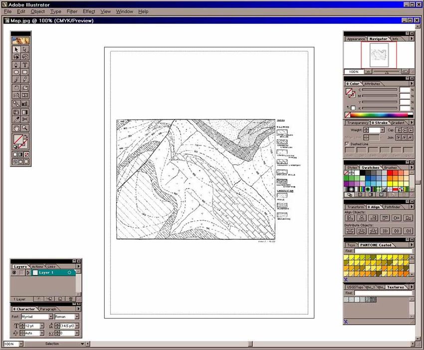
In Photoshop, you may then want to adjust the exposure a bit, using Image > Adjust and either
Autolevels (if you want to see Photoshop’s choices) or (preferably) Brightness/Contrast (whereby
you can control the results). You can undo any trials by clicking Edit > Undo (or Ctrl-Z on the
keyboard). If you want to rotate your scan 90o because you had to rotate it to fit the scanner platen,
select Image > Rotate Canvas, and select the type of rotation that will make your map aligned
correctly. Then select File > Save As, to bring up a screen that permits you to choose the format of
your final scan file. Having multiple format choices permits you to choose a file format type that is
recognized by the software package that you plan to use the image with (in this case, Illustrator). They
are all variations of “bitmap” (“raster”) image files. A bitmap means that your scanned image consists
of an array of tiny dots. Because you chose B&W Photo for your scan, each dot is assigned a particular
level of grayness, typically on a scale of 256 gray levels from white to black. You can recognize bitmap
images when you view them. N-S and E-W lines are nice solid lines because the rows and columns of
dots align nicely. Diagonal lines or curves, when magnified, show “jaggies,” revealing the computer’s
attempt to mimic the line with the best fit of row-column dots. By the way, by choosing 100 dpi
resolution, you selected a relatively coarse spacing of rows and columns (fewer dots). Higher resolution
means smaller dots, hence more dots and a larger file size; but curves are smoother with less
pronounced jaggies. Color images have to assign more information to each dot, and the resulting file
size gets rapidly larger, depending on the number of colors you want. Illustrator can read several
formats. Select JPEG (jpg) as the format, because it has an algorithm that pares down the file size
considerably. JPEG allows you to vary the extent of file compression, and I find that a Quality value of
3 is a nice compromise between appearance and file size. Give your file a name (I chose MAP.jpg for
mine). Save the file to a diskette or zip disk, or to the server on L:\pub\MAP.jpg). You can then
download the image from the server to a Mac or other PC on the network.
We now have our map in digitized form as a file, either on a diskette or on the server, so we are set to
run Illustrator. Click the Illustrator icon and wait for what seems like 5 minutes for Illustrator to come
up. Figure 1 shows the Illustrator work area. It has the indispensable “toolbar” in the upper left corner,
and several “palettes” dedicated to specific tasks and controls. I have a large monitor, so I prefer to
keep it cluttered with the “palettes” I use. These palettes can cover the image that you are creating,
however, so people with smaller monitors may prefer to hide some of the palettes and call them up
only when needed. To bring your map into the Illustrator workspace, select File > Open, navigate to
your file, and double-click your map file. [Or File > New for a new document and paste in the map]
What we plan to do in this exercise is to convert a bitmap image map to “vector-based” graphics. In a
vector-based image the lines and curves are not a sequence of dots, but mathematical representations of
true lines and curves. These and other objects, such as text and closed forms are fully editable. You can
change the size, location, shape, orientation, color and type of fill of each object independently. To do
this for our map, however, we shall have to trace each element individually. Drawing in a vector-based
program is not like those simple drawing programs that you may have used years ago. Trying to draw a
decent “freehand” curve or line is practically impossible. Rather, we draw straight lines by selecting the
initial and final points of the line, and letting the program connect them. Curves are simply a series of
closely-spaced, individually-selected points, but the points may be connected by straight line segments,
or controllable curves.
Before we draw on the bitmap, it is a good idea to create a separate layer to draw on. Layers allow you
to work on a subset of the objects that you create in your drawing. You can draw, select, edit, move,
reshape, etc. only objects created on the layer that you choose to be active. All other objects can be
shown, but not selected or manipulated. This way you can avoid selecting the wrong things or moving
them accidentally. We can thus place our bitmap on one layer and do our tracing on another one. This

                                                                                        Using Illustrator   2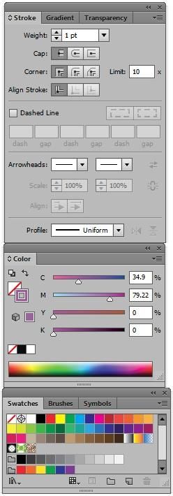
Toolbar

                            Figure 1. The Adobe Illustrator Workspace.

way we won’t accidentally select and/or move our bitmap to a new location when we think we’re
moving something else. When you print your final product, layers may be superimposed, so there is
really no down-side to making as many layers as you please. You can hide layers too. For example,
you may put your sample localities on a layer, and print a map with sample localities, and another
without them. The bitmap is on our default layer 1. To make a new layer 2 for our work we select the
Layers tab in the palette in the lower left of Figure 1. Then click on the Create New Layer button
along the bottom of the palette. This adds a Layer 2 horizontal bar in your Layers palette. You simply
click on the Layer 1 or Layer 2 bar to make either “active” (the layer in which you select objects and
work). Select Layer 1 (with your bitmap), and click the gray Lock box so that you cannot accidentally
move the map. Then make Layer 2 active.
Let’s begin by drawing a long E-W horizontal line across the page to use as an aid to see if your
scanning job was good and the map is aligned properly N-S-E-W. Select the pen tool in the toolbar
(Figure 2). It’s the little pen-quill icon (fifth icon down). The little + sign in the lower right of some
icons indicates that there is a selection of sub-tools that can be accessed by Alt-clicking (PC users) or
command-clicking (Mac users) the icon. Alternatively, if you click and pause over an icon, a list of
sub-tools appears that you can also select from. Select (click) the pen tool and move the cursor toward

                                                                                        Using Illustrator   3
your map. The cursor should become a pen with an * beside it as you move it to the
drawing area. Click (and release) the pen cursor near the NW corner of the
boundary rectangle of your map. It should leave a small marker (“anchor”) on the
spot where you clicked. Hold down the Shift key, and then click again near the NE
corner of your map boundary. The Shift key constrains your line to horizontal,
vertical, or 45o increments. Your line should now appear. Return to the toolbar and
select the selection tool (black arrow, top icon). Return to the workspace and click
the tip of the selection arrow anywhere along your new line. This will “highlight”
the line, surrounding it with a blue bounding-box, with handles (little open
squares) at the corners and in the middle of each side.
You can add “palettes” to your workspace using the Window menu. Figure 3 shows
three such palettes that allow you to control some important features of any selected
object (in this case your line). The features of
your line may be different at the moment, but the
object to which Figure 3 refers has purple stroke
(line) and colorless fill. Colorless (transparent) is
represented by that red diagonal slash. Suppose,
for example, a rectangular box were chosen,
rather than our line. The stroke color refers to the
color of the bounding line of the box, and the fill
color refers to the color within the bounding line.
For a single straight line such as ours, however,
the fill is irrelevant. You can select either the fill
or the stroke icon in the Color palette (middle
palette in Figure 3) and change the color by
selecting any color you like from the Color
palette. Let’s change the color of our line. With
the line itself selected in the workspace, click on
fill the stroke-color square icon in the Color palette
(it is also on the toolbar). Then select any color in
the palette by clicking within the rainbow area
toward the bottom. White and black and no-color
(transparent) are always available just above the
stroke rainbow area. To make our E-W line black (if it
isn’t already so) simply click on the black icon. If
you like, you can fine-tune a selected color choice Figure 2. The
by either dragging the triangular markers in the Toolbar.
color bands above the rainbow in Figure 3, or by typing a value
between 1-100 at the right end. Figure 3 assumes that you are
working in CYMK colors, but you can change this to RGB,
Grayscale, etc. by clicking the black wedge at the right end of the
Color tab bar at the top of the palette. You can change the stroke
weight (line width) using the Stroke palette (top palette in Figure
3), where you can also create dashed lines, arrowheads, and control
how line-segment corners are handled. For now, let’s settle for a
Figure 3. The Stroke, Color, black line with a stroke of 1 point.
and Swatches Palettes.
Using Illustrator 4Once you have selected an object such as your line with the selection tool, you can then click on the
line and move it by dragging it (holding down the mouse button as you move it). Alternatively, you can
click on one of the handles (little squares) at the ends and drag one of them separately to resize the line
if you didn’t get it exactly at the correct size the first time. When the cursor is over a handle it changes
to a straight line with arrowheads at each end. This indicates that you may now drag the bounding box
(and hence the object) to a new size. Notice also that the cursor changes to two little curved arrows if
you move it just outside a corner of your selected object. When the cursor looks like this, it indicates
rotation mode. It you click and drag when the curved arrows are present to rotate your object. In
summary, you can recolor, reposition, resize, or reorient any vector object after you have created it.
You can also undo any past action by clicking Edit > Undo in the upper menu (or Ctrl-Z on the
keyboard). Move and adjust the line to that it runs along the northern map boundary line.
We can now use our perfectly E-W line as a guide to rotate the map image so it is aligned just right in
landscape mode. If the northern map boundary is not perfectly aligned with your line, click on Layer 1
in the Layer palette to make the layer with the bitmap active. Unlock the layer so that you can modify
the map. Click with the selection tool (black arrow cursor) anywhere on your map image to select it. It
should develop a blue bounding box. Then move the cursor to just outside the corner handle until it
turns to a curved arrow shape. Carefully drag-rotate the map until the border lines up E-W. An
alternative way to rotate a selected object is to click in the menu area at the top to select Object >
Transform > Rotate (or in Windows, right-click the object and select Transform > Rotate). Then
type in a value in x.x degrees. Either way, rotate the map so that the true northern border becomes
parallel to your E-W line. You may have to do this in several steps and move your line as well as you
get close. You can resize as well by dragging a corner inward or outward. Shift-drag will maintain the
N-S vs. E-W proportions. When you have the map as you like it, Lock Layer 1 again, move to Layer 2,
and select and delete the line (Delete key).
Let’s begin by drawing the border box around the map itself. Select the rectangle tool (8th icon down in
the toolbar, Figure 2). The cursor should become a “+” cross-hairs sign as you move it to the upper left
corner of the existing map frame. Place the center of the + exactly on the corner of the frame, click and
drag the cursor diagonally to the lower right corner, and release it. This will draw a perfect rectangle.
Your great success at rectangle drawing may be somewhat mitigated if the rectangle is filled with a
solid color (or white) and covers your map. Objects are fully editable, remember. So, if the fill or
stroke are not to your liking, you can change the stroke color and weight, and the fill to transparent.
Remember to change any object, you must first click the selection tool in the toolbar (top icon in Figure
2) and select the object. Then select either stroke or fill in the toolbar before you can change the
attributes for either. You will probably have to select the rectangle by clicking exactly on the boundary
line, not simply any point within the rectangle. If your rectangle is filled and covers your map, select
the rectangle and then click the fill color icon in the Color palette (Figure 3) and select the transparent
(red diagonal line) icon. You should then see your map again inside the rectangle that you have drawn.
We will have to devise a way to distinguish things we have traced from those yet to be traced. One easy
way to do this is to do all of our new work in some highly contrasting color, such as bright red (which
you can change later). Let’s change our boundary box to red stroke. Be sure the rectangle is selected
and click the stroke icon in the Color palette before choosing some nice bright red color. The standard
Swatches palette (bottom of Figure 3) includes a bunch of standard fills, and keeps a record of the
color choices you have made by adding them as you go along. You can select any fill or stroke color or
pattern from among these swatches if you like. You may find a nice red among them if you don’t want
to bother with the color spectrum in the Color palette. The Swatches palette also lets you keep a
uniform color among several objects, because you can pick from a limited set of colors, rather than
Using Illustrator 5selecting from a more continuous spectrum. Frame boxes should be heavy lines, too, so select the
stroke icon in the toolbar and choose 2-point width in the Stroke palette. It should now be easy to
distinguish the rectangle you have drawn from the original map bitmap border. If the new box isn’t the
exact size you want, select the appropriate handle and drag it to expand or contract the side or corner of
the box. Now you will see where your extra care in orienting your scan pays off.
Next we trace the topographic contours. These are more complicated than the box, because they are
curved lines. Illustrator can draw curves in either of two ways. For beginners it may be easier to trace a
curve as a set of closely-spaced straight-line segments. This is accomplished by selecting the pen tool
in the toolbar, and simply clicking (and releasing) a series of points along the curve you want to trace.
Of course this does not approach a true curve unless you space the segment anchor points pretty
closely, especially where the curves get tight. Proper point spacing is an art, and will take some practice
and experience to do it well and efficiently. Too close a spacing is very tedious, and makes a larger file
size with all the points to record. Too few points makes an inaccurate rendering and a jerky line. I can
only get you started here. Do NOT try to get an exact fit right away, because Illustrator will allow us to
smooth our segmented line (curve the linear segments) after we have finished drawing it.
Unfortunately, we can’t tell exactly what it will look like when smoothed until we have finished the
initial trace. Hence the “art” aspect.
Illustrator has a better way to draw curves, but this way takes even more practice, I think. You can try it
in a blank area to see how it works. Click-release a point to start your curve (all points on a curve are
called anchor points, but the first and last points are more specifically called endpoints). Then move
an inch or two and click again to create an anchor point, but while you’re holding the mouse button
down, drag the cursor some direction generally (but not exactly) away from the first point. This creates
a “bezier”, a tangent to the curve. Notice how the curve shape varies as you vary the length and
orientation of the bezier. Pick some nice curve and release the mouse button to keep the choice, and
repeat the process at another point to create a randomly curved path. You can use any combination of
smooth (dragged) and corner (single click) anchor points. With practice (a lot of it), this method gives
you precise control of a curved path with fewer anchor points, but it can be frustrating to learn as a
beginner. You can also edit individual anchor points later, adjusting an anchor point’s position, as well
as the orientation and length of the beziers in either direction. You can also add and delete anchor
points along an existing path, as well as change anchor points from smooth to corner or vice/versa.
Let’s begin with the 900’ elevation contour in the NW corner of the map and use the straight-line
segment beginners technique. Use the zoom tool (magnifying glass icon in Figure 2) and drag a box
across the area in the NW corner to zoom into that area and make your tracing easier. Try to get a view
that has the whole length of the 900’ contour. To zoom out, use Ctrl-minus in increments, or Ctrl-zero
for the full view. If your toolbars clutter up the work area too much you can hide (and return) them
using the Tab key. Next select the pen tool in the toolbar and click at the beginning of your contour
line (for example where it begins at the west margin of your red rectangle) and single click 3 or four
points spaced along the contour line. You should see a line developing as you draw. If the fill is not
transparent, you will see a distracting fill develop as well. You can get rid of that by selecting a
transparent fill. If you reach the margin of your field of view before you have finished the curve, either
zoom out (Ctrl-minus) or click in the scroll-bar area to move the field of view at the same
magnification. You can do either while still working on your drawing, and simply continue with the
next anchor point. When you have placed your final endpoint, either select any other tool, or Ctrl-click
with the pen tool anywhere in the work area. The latter method finishes a path, but retains the pen tool
so that you can begin another path more quickly. When you have finished the segmented path, you can
select it with the selection tool and a blue selection box will form around it to indicate that it is done
Using Illustrator 6and selected. If you really mess it up just delete the whole path and start over. Practice all you like.
Likewise, if you do anything else you suddenly regret (my un-favorite is to accidentally select and
move the wrong object), simply click on Edit > Undo or Ctrl-Z and Illustrator will undo your last
action (multiple Ctrl-Z’s can remove at least 20 of your last actions). When you have a nice segmented
line following the 900’ contour, select the path and change the stroke to 1 pt and make it the same red
color as your rectangle from the Swatch palette. In the Stroke palette, make the line a dashed one by
checking the Dashed Line box and typing in 4 pt dash with 2 pt gap. You can now convert the
straight-segmented line to a curved one by clicking Object > Path > Simplify, and specifying the
Precision (generally 90 or better, but you can experiment and undo). Of course, all of these edits can
only take place when the object is selected.
Suppose you think the red smoothed curve you’ve created doesn’t quite fit the original as well as you’d
like. You can adjust it, rather than draw a new one. Click the direct-selection tool (the white arrow, in
Figure 2), which allows you to select any point on a path and modify it separately. This can be a little
frustrating at first, because it is hard to tell if you have selected only a single point, a pair of points (by
selecting the line segment between them). Practice: try dragging the direct-selection tool over your
path, but don’t click anything. Notice the VERY little green words by your cursor that say “path” when
your arrow tip is over a non-anchor path segment and “anchor” when you hover directly over an anchor
point. The illustration shows a curve with two end-points (naturally) and three interior anchor points,
all unfilled and editable. If you direct-select by
clicking on a path segment between two anchors
(top curve) you will see the two bezier segments
(straight tangent line segments with handles at
each anchor point) that bound your selected path
segment. If, however, you direct-select an
anchor (bottom curve) you will see both beziers
for that anchor as well as the beziers for the next
two anchors in each on the path. You can direct-
select the endpoint of any active bezier to
modify the path shape. You can also move the
anchor itself for the anchor you selected. Zoom
in on any segment of a curve you have drawn and practice selecting anchors and modifying curve
segments. You can undo (Ctrl-Z) any action you didn’t like. By adjusting the location of the anchors
and the bezier fit you can really control curves quite accurately. You can also add anchor points by Alt-
clicking the pen tool in the toolbar (Figure 2) until the pen with a plus appears. Use it to click on the
path where you want new anchor points. Click-and-drag to create anchors with beziers. Alt-click to a
pen tool with a minus to delete existing anchor points. The biggest initial challenge to Illustrator is
creating good curves. Practice!
Trace the 800’ and 700’ contours in the same way. Make the curves simplified, red, 1 pt. dashed lines.
Note that the 600’ contour has a sharp V at the stream crossing. When you smooth it the sharp V may
be lost. You can get the sharp V back by Alt-clicking the pen tool until the > icon appears. The > tool
converts anchor points from smooth to corner and vice/versa. Click the smooth point at the V to
convert it to a corner point.
Let’s label the 600’ contour. Select the type tool from the toolbar (the “T” icon) and move the cursor
(now an I-beam) to the place you want the text. Type “600” and then click the select tool to
automatically select what you’ve typed. Text color is a fill color, not a stroke, color. You can change
the color of selected text by clicking the red swatch when the fill icon is selected in the toolbar (Figure
Using Illustrator 72). The stroke must be transparent for a decent crisp text appearance. You can then use the Character-
Paragraph palette (in the lower left of Figure 1) to choose font, size, bold, italic, etc. Although not of
any use now, you can use the Paragraph tab to choose text alignment, etc. for multi-line text. You can
double-click the text at any time to edit it and correct misspellings, etc. Superscripts and subscripts
require a separate text element at a different size. Note that your text and the contour line are
overprinted, making it hard to read the text with a line passing through it. You could have made the
contour line in two segments, but the following method is easier: select the rectangle tool (sixth icon
down) and draw a rectangle around the 600. Make the rectangle slightly wider that the text. Select the
rectangle and make the fill white, and the stroke transparent. Because you drew the rectangle after the
text, it covers the text now. Each new object is placed immediately in front of (on top of) the last object
created, so every object you create is part of a hierarchy from front to back. What we want is the text on
top of the rectangle, and the rectangle on top of the contour line, so that the rectangle makes the break
in the line for us. With the rectangle selected, hold down the Crtl key and hit the “[“ key which moves
the selected object back one position in the scheme of in-front vs. behind. Hit Ctrl-[ until you get the
text in front of the rectangle. You could do the same thing from the menu using Object > Arrange >
Send Backward. Ctrl-] moves a selected object forward, and Ctrl-Alt-[ or ] moves a selected object all
the way to the back or front, respectively. Once your text is in front of the rectangle and the rectangle
makes a clear area around the text, we want to rotate both the text and the rectangle so that the text is
parallel to the contour line at the position you choose to place it. You can rotate both the text and the
rectangle by selecting them together. You can generally do so by dragging a “marquee” (a selection
rectangle) around a small area that touches both objects (and only the objects you want). If you get too
many objects selected, you and Shift-click any unwanted objects to un-select them, or Shift-click any
other objects to include them. If there are a lot of objects around, this can be a rather creative act. It
may be easier to drag the objects so some blank area of the workspace (even individually), and select
them together over there. Once you have only the text and rectangle selected, you should see handles
on both objects (and only on them). You can then rotate them as you would any single object. Better
yet, you can group the text and box so they can be handled as a single entity. Once (only) both objects
are selected, click Object > Group (or Ctrl-G) to combine them. Now you can select the text + box
together any time. Then move them to where you want them on the contour line and rotate the group
until the 600 text is parallel to the contour line.
Once you have a nice label in a box, you may want to use it for the 700, 800, and 900 contours created
earlier. Select the grouped text+box and drag the group to the 700’ contour line. Hold down the Alt key
as you drag to make a copy of the dragged object(s). So now you may have copied the 600 label to the
700’ contour. All we have to do is edit the text to say 700. Illustrator can edit text in grouped
selections, so, select the type tool and click-drag over the “6” in the 600 text on the 700’ line to edit it.
Type 7 over the 6. Repeat the process for the 800 and 900 foot contours.
Trace and label all the contours (or at least as many as you care to do in this exercise) in a similar
fashion. You can draw the rivers the same way. Rivers are more irregular and require more anchor
points. You can make them heavier (1.5 or 2 pt.) and a different type of dash (or make the stroke blue if
your output will be in color). Illustrator has an annoying habit of attempting to add a new curve to older
curves when you click a new curve anchor point near an old curve anchor point. This is a nice feature
when you really do intend to add onto a pre-existing curve, but a pain when you don’t. You can avoid
this problem either by placing new curves on a new layer and lockig older layers, or by selecting either
individual old objects or all old objects (Ctrl-A or Select - All) and locking them (Object-Lock or
Ctrl-2). You can later Object - Unlock All to make the old objects editable.
Using Illustrator 8Next we address the geologic units. You may want to create Layer #3 for them (although it is not
necessary). These units are represented by closed forms with different fill styles. Give some thought to
the shapes of your areas. Note that a single curve marks the boundary between two geologic units, but
the curve forms the boundary of both, and is thus part of both closed forms. Drawing a single boundary
between two units twice seems a waste of time, and if your traces are not exact duplicates, they may
look messy when superimposed. As you will see, you can avoid this duplication in most cases by
thinking about the sequence in which you draw your objects, and which ones are in front of others. As
far as the present exercise is concerned we shall limit our consideration to the four units in the north
and northeastern portion of the map. This should illustrate the concepts well enough.
To draw the four units as efficiently as possible, begin with the unit that you want behind the others. In
this case it would be the Llandovery limestone. Select the pen tool and begin where the southern border
of the Llandovery meets your red boundary box along the northern border. Click the first endpoint and
single-click anchor points along the curve. When you reach the eastern boundary click once on the
border and then click the NE corner of your border rectangle. Finally go west again and click on top of
the first endpoint that you began with. A small open box appears beside the pen tool when it is properly
positioned over the first endpoint so that you close the curve. This completes the closed object, and it
will fill with some color or pattern, depending on what you have chosen recently. It may be white from
your work with the text box. Make the stroke red and smooth it (Object-Path > Simplify). You may
then have to edit the boundary corners and change them to corner to get back the sharp anchors in the
NW, NE and SE corners. You may also want to adjust or add to the smoothed anchor points to make a
better fit to the original. If we fill the closed path, the result is a large Llandovery unit that fills the NE
corner of the map area. Clearly we don’t want this, but we can then cover the NE portion of the
Llandovery sequentially with the three Ordovician units. We thus avoid having to trace the northern
contact of each unit, as the southern contact of each new unit in front of it becomes that. By doing
some careful planning at this stage you can save yourself lots of work and messiness later. As an
example, the figure on the next page shows how you can “stack” several simplified elements to make a
nice geologic map. Select the new closed Llandovery object and change the fill to transparent so that
you can see through it to continue to work on the original map.
Next draw the southern boundary of the Ordovician Shale in the same way. Begin at the NW border
and draw until the SE point where it meets the Mudstone. Note that if you now extend the east side of
the Shale due north, the eastern embayment of the Shale unit will not be fully covered by the Mudstone
when you add it later. You can be sure it is filled by clicking your next anchor point along the northern
border farther to the east within the Mudstone unit. Then click on the initial endpoint to close the
object. Make the fill transparent, the line red, and smooth/corner the appropriate points. Edit the
anchors to get your best fit to the original. Several lines will now be superimposed along the northern
boundary. Be sure that they all fit well or the composite line will look messy. Having a thick border
rectangle helps cover minor irregularities, and you can move it to the front (Ctrl-Alt-]) later to make it
look neat. Zoom in with the magnifying tool for more exact placements.
Next trace and reformat the Mudstone. Only the final Sandstone has to be traced in its entirety, but this
object is small. Doing only these 4 units should suffice to give you the idea of how to create maps. You
can extend the approach to the rest of the map if you care for more practice. Leave the objects unfilled
for the moment.
Filling the closed objects will complete the map area. It’s probably easier, faster, and clearer to select
and delete the bitmap first. Once you do this, select all your lines and change them from red to a black
color. You can select all the objects with some common characteristic by selecting one object, and
then, for example, Edit > Select > Same Stroke Color to choose all the objects with the same stroke
Using Illustrator 9color as the one first selected. Illustrator is very good at fills, but the flexibility comes with a price in
complexity. Filling with solid colors or scales of gray is easy. Simply select a unit, such as the
Llandovery, and choose a nice color for the fill. Then select the other units and make them different
colors. Now you can see how our planning of overlaying them pays off. If you have them in the proper
order, front to back, they should superimpose well, and look like the original map. If one is out of
sequence, you can adjust it by moving it forward or backward in the sequence with Alt-[ or Alt-].
As a wonderful bonus for geological units in black-and-white publications, Illustrator (at least older
versions) has all the USGS-approved rock-type fills (see the lower right palette in Figure 1). These fills
use the Litho_1 and Litho_2 tabs. The fills, however, are transparent between the black fill graphics,
and you thereby lose the overlay capacity that we worked to achieve in our units. All is not lost,
however. I’ll show you how to get a geo-fill and a color fill too.
As an example, let’s choose the Sandstone unit. Select the unit by clicking the selection tool on its
boundary. Then click in the fill icon in the toolbar, and select Litho_2, and sandstone cross-bedded fill.
The pattern gives us some nice dot-stipples, indicating cross-bedded sand, but we can now see the
Llandovery right through it. Windows people can right-click the selected unit, and choose Transform
> Move. Otherwise select Object > Transform > Move from the menu. Type 0 (zero) in the
Horizontal box, tab, and 0 in the Vertical box, and tab again. Then click Copy to make an exact copy
of the unit directly in front of the original. Make the fill white, and stroke transparent on the copy, and
then Alt-[ to move it behind the original. Now you have the cross-bedded sandstone fill over a solid
white background. You could make the background any color you please, actually, and still get the
cross-bedding stippling. This technique is great for color maps. I have included a small example below.
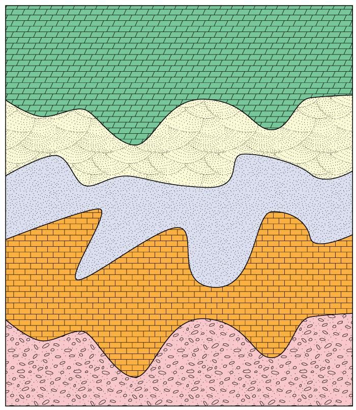
Stacking overlayed objects to create a geologic map
One more trick: you can Transform > Scale any unit, and change its size. For example, suppose you
wanted the sandstone stippling to be finer. Select the unit with the pattern (not the color one if you
made a separate copy), Scale it to 200% (leave the Strokes and Effects box is unchecked). Then fill
the expanded unit with sandstone fill (again if necessary). Finally, select Transform > Scale again, and
reduce it by 50% (the opposite of the first step), but this time be sure that the Patterns box is now
Using Illustrator 10checked (leave Strokes and Effects unchecked). This returns the original object to the same size it used
to be, but reduces the scale of the fill. You could rotate the fill in a similar manner using Transform >
Rotate to match the NW-SE orientation of the limestone fill in the Llandovery.
Next draw rectangles for the legend and add the appropriate text and any lines to separate things. You
can align the rectangles by selecting them all (Shift-Click each or drag a selection rectangle across all
of them). Then select the Align palette (Figure 1) to align them as you like (align all along their left
sides, for example). You can also distribute them vertically using the Align palette so that their
spacing is uniform. Do the same for the text.
Once you have what you like, add a north arrow, scale, etc. and you’re done. Arrowheads can be added
to lines drawn with Effect > Stylize > Add Arrowheads from the menu. All of the objects can now be
modified to your heart’s content. Save the Illustrator file as you see fit and print the image on the Laser
or color printer. This is only a very cursory introduction to the many powerful features of Adobe
Illustrator, but it should get you well on your way to a good map. You can explore other features as you
progress, by experimenting and using the Help engine.
You can insert an Illustrator drawing directly into a Word document as well. This is best done by
converting the Illustrator drawing to a jpg file, using File > Save for Web (older versions of Illustrator
use File > Export). Select JPEG and High (for the resolution), and then select the Image Size tab.
Make your drawing about 1000 pixels wide (typically for printing), and then save the file somewhere.
Be sure you have also saved the file as an Illustrator file, so that you can edit and modify it later. The
JPEG is just another bitmap for printing. For computer-screen only images you could pick a lower
resolution and save some disk space.
In Word, move the cursor to where you want the graphic, and drag a text-box the approximate width
that you want the image to be. Text boxes are drawn with the A-box in the drawing palette. Next place
your cursor in the text box and select Insert > Picture > From File from the menu. Select your jpg and
in it goes. Select the text box and Format it. Be particularly sure to do Layout > Advanced and select
the Absolute Position with respect to Page, both horizontally and vertically. Also choose the type of
text wrapping you prefer. I like to get rid of the Text Box > Internal Margins and the Line margin of
the text box as well. You can add a caption by highlighting the graphic in the text box, hitting the right-
arrow key, and hitting Enter. Then you can type in the text box below your image.
Good luck!
Using Illustrator 11Using Illustrator 12
You can also read