Measuring access to public transport in European cities
←
→
Page content transcription
If your browser does not render page correctly, please read the page content below

Working Papers
A series of short papers on regional research
and indicators produced by the Directorate-General
for Regional and Urban Policy

WP 01/2015

                                                     Regional Working Paper 2015

                                                     Measuring
                                                     access to public
                                                     transport
                                                     in European
                                                     cities
                                                     Hugo Poelman and Lewis Dijkstra

                                                     Regional and
                                                     Urban Policy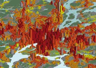
> Executive Summary
Within Europe there have been multiple attempts to collect data on the supply and
access to public transport in cities. So far none of these attempts have produced
comparable results because they were (1) not based on comparable geographies,
(2) did not take into account the spatial distribution of the population and (3) did not
take account of the frequency of public transport. As a result, the number of vehicles,
trips or length of the routes could not be interpreted in a meaningful way.

This paper describes a new methodology that solves both of these two obstacles using
a new EU-OECD city definition, high-resolution data on population distribution and ‘big
data’ on public transport stops and trips. Because of these three new ingredients,
it produces comparable indicators of the access to and supply of public transport
in cities. These indicators allow for the first time a comparison of the offer of public
transport that is easily accessible to the urban population. This allows cities
to benchmark themselves against other cities of a similar size. This is particularly
relevant given that Cohesion Policy allocated EUR 6 billion during the 2007-2013
period to clean urban transport; an amount which we expect to increase significantly
during the 2014-2020 period.

Disclaimer: This Working Paper has been written by Lewis Dijkstra and Hugo Poelman,
European Commission Directorate-General for Regional and Urban Policy (DG REGIO)
and is intended to increase awareness of the technical work being done by the staff
of the Directorate-General, as well as by experts working in association with them, and
to seek comments and suggestions for further analysis. The views expressed are the
authors’ alone and do not necessarily correspond to those of the European Commission.
M E A S U R I N G A C C E S S TO P U B L I C T R A N S P O R T I N E U R O P E A N C I T I E S          1

                                      > Contents
                                      1.		Introduction                                              2
                                      2.		Three big obstacles overcome                              2
                                      3.		How did we measure the access to public transport?        3
                                      4.		What cities offer the best access to public transport?    4
                                      5.		Conclusion                                               10

                                      Methodological annex                                         11
                                      1.		Input data                                               11
                                      2.		Method                                                   12
                                      3.		Conclusions                                              15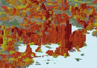
2

    1         INTRODUCTION                                               areas outside the commuter belt. For example, the city of Paris
                                                                         only captures two million inhabitants of the densely populated
                                                                         urban centre of seven million inhabitants. The city of Zaragoza
                                                                         encompasses an area of 974 km2 even though its urban centre
    Monitoring of passenger mobility patterns and trends in urban        is only 41 km2. Any indicator will differ substantially when
    areas is an important element in assessing issues of                 measured only for the most central part of the city, as compared
    sustainable development of cities and their surroundings.            to the city plus vast tracts of rural areas. For example, the length
    A recent European Environment Agency (EEA) report (EEA,              of the routes will be really short in the city centre, but
    2013) provides a comprehensive overview of available                 frequencies, modal share of urban transport and ridership will
    indicators on urban passenger transport in Europe. Focusing          be extremely high. In a city like Zaragoza, the length of the routes
    on topics of modal split, commuting time and transport costs,        will be much longer, but frequencies, modal share and ridership
    these indicators are typically collected from surveys in a limited   are likely to be much lower than in its centre.
    number of cities. These surveys are expensive to conduct and
    typically follow administrative borders, which hinder comparisons    Maps 1.1-3 show the urban centres of Brussels, Dublin and
    between cities.                                                      Malmö. In Brussels, the urban centre is only a little bit larger
                                                                         than the city boundary (Brussels Capital Region). In Dublin, the
    This paper describes the results of a new methodology that           urban centre extends well beyond the city limits. In Malmö, the
    creates comparable indicators on the level of services provided      city limits are further removed from the urban centre.
    by public transport without the need for a survey. The impacts       As a result, the data for Brussels will capture the offer of public
    of increasing frequencies or adding new lines and stops can easily   transport in the urban centre relatively well. In Dublin, it will
    be measured. The methodology also allows for benchmarking            only capture the offer in the most central part of the urban
    between cities in Europe.                                            centre, while in Malmö it will capture the situation in the urban
                                                                         centre and its wider surroundings.

    2
      THREE BIG
                                                                         To compare the offer of public transport, it makes more sense
                                                                         to compare the offer in the urban centre than in the city, as the

      OBSTACLES
                                                                         latter may include the suburbs or only the most central part
                                                                         of the urban centre.

      OVERCOME                                                           2.2	The distribution of population
                                                                              within a city
    The new methodology solves three distinct problems: (1) the lack
    of a harmonised geographic definition, (2) the lack of information   Two cities with a same population, area and number
    about the population distribution and (3) no information about       of transport stops can still have a radically different access
    the frequency of public transport.                                   to public transport. If development has been oriented towards
                                                                         public transport stops, by encouraging higher densities and
    Why are these three issues crucial to meaningful comparisons?        more development close to public transport and limiting
                                                                         development further away from stops, it will have a high level
                                                                         of accessibility. If on the contrary, the population distribution
    2.1	A harmonised definition of a city                               is fairly uniformly distributed without concentrations around
                                                                         transport stops, access will be much lower. For example, Map
    The administrative boundary of a city can encompass the central      2.1 and 2.2 show population distribution in Dublin. Map 2.1
    business district or include a much wider area, including rural      shows the actual situation with a significant clustering

    Map 1.1-3: Urban centres and city boundaries

    0        5 km                                    0     5 km                                   0          5 km

                     Brussels                                      Dublin                                          Malmö
              City              Urban centre (high-density cluster)            LAU2 / LAU1 units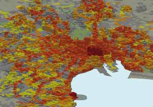
M E A S U R I N G A C C E S S TO P U B L I C T R A N S P O R T I N E U R O P E A N C I T I E S 3
Map 2.1-2: Dublin actual and uniform population distribution
! ! ! ! ! !
! ! ! ! !! ! ! ! ! ! !! !
! ! !! ! ! ! !! !
!! ! ! !! ! ! !! !! ! ! !! ! ! !!
! ! !! ! ! ! !! !
! ! ! ! ! ! !
! !
!! !! !
! !! ! !
! ! !
! ! ! ! ! ! !
! !
!! !! !
! !! ! !
! ! !
! ! ! ! ! ! ! ! ! !
!! ! ! ! ! !! ! ! ! ! !! ! ! ! ! !! ! ! ! !
! ! !! ! ! !! ! ! !! ! ! !! ! ! !! ! ! !!
! !! ! !! ! ! ! ! !! ! !! ! ! !
! ! ! !! ! ! ! ! !! ! ! ! ! !! ! ! ! !! ! ! ! ! !! ! ! ! ! !! !
!
!
! !! ! ! ! ! !
! ! ! !! ! !! ! !
!
! !! ! ! ! ! !
! ! ! !! ! !!
! ! ! ! ! ! ! ! ! !
! ! ! !! ! ! ! ! ! ! ! ! ! ! ! !! ! ! ! ! ! ! ! !
! ! ! ! ! ! !! ! ! ! ! ! ! !!
!
! ! ! ! ! ! ! !
!
! !! !
! ! ! ! ! ! ! ! !
!
! !! !
!
! !! ! ! ! ! ! ! ! ! ! !
!! ! ! !! ! ! ! ! ! ! ! ! ! !
!!
!! ! ! ! ! ! !! ! ! ! ! !! ! ! ! ! ! !! ! ! ! !
!! ! !
! ! ! ! ! ! !! ! !! ! !! ! !
! ! ! ! ! ! !! ! !! !
! ! ! ! ! !
! ! ! ! !! ! !! ! ! !! !! ! ! ! ! ! !! ! !! ! ! !! !! !
! ! ! !! ! ! ! ! ! ! !! ! ! !
! ! ! !
! ! !! ! ! !! ! !! ! ! ! !! ! ! !! ! ! !! ! !! ! ! ! !!
! ! !
! ! ! ! ! ! ! !! ! !! ! ! ! ! !
! ! ! ! ! ! ! !! ! !! ! !
! ! ! ! !! ! ! ! ! ! ! ! !! ! ! !
! ! ! ! ! ! ! ! ! !
! !! ! !! ! !! ! ! ! ! ! !
!
! ! ! !! ! !! ! !! ! ! ! ! ! !
!
! !
! ! ! ! ! ! ! ! ! ! ! !
! ! ! !! ! ! ! ! ! !! ! !
! ! ! ! ! ! ! !! ! !! ! ! ! ! ! ! ! !! ! !!
! ! ! ! ! ! ! ! ! ! ! ! ! ! ! !
! ! ! !! !! ! ! !! ! ! ! ! ! !! !! ! ! !! ! !
! ! ! ! ! ! ! !
! ! ! !! ! ! !! !
!! !!! !
!
! ! ! ! !! ! ! !! !
!! !!! !
!
!
!! !! !! ! ! ! ! ! !! !! !! !! ! ! ! ! ! !!
! ! ! ! ! !! ! ! ! ! ! ! ! ! !! ! ! !
! ! !! ! !!! ! ! ! ! !! ! !!! ! !
! ! !! ! !! ! ! !! ! ! ! !! ! !! ! ! !! !
! ! ! ! ! ! ! !! ! ! ! ! ! ! ! !!
! ! ! !! ! ! ! ! ! ! !! ! ! !
!
! !! !! ! !!
!
! !! !! ! !!
! !! ! ! ! ! ! ! !
!
! ! ! ! !! ! ! ! ! ! ! !
!
! ! !
! ! !! !! ! ! !
! ! !
! !
! !!! ! ! ! !! !! ! ! !
! ! !
! !
! !!! !
! !! ! !!
! !
!! ! ! !! ! !! !!
! !! !
!
! !
!! ! ! !! ! !! !!
! !! !
!
! ! ! ! !! !!
! !
! ! !! ! ! ! ! ! ! !! !!
! !
! ! !! ! !
! ! ! !! ! ! ! ! ! ! ! ! ! ! ! ! ! ! ! !! ! ! ! ! ! ! ! ! ! ! ! !
! ! ! ! !!! !! ! ! ! ! ! !! ! ! ! ! !!! !! ! ! ! ! ! !!
! ! ! ! ! ! !
! !! ! ! !!
! ! !!
! ! ! ! ! !! ! ! !!
! ! !!
! ! ! ! !
!! ! !
!! !! ! ! ! ! ! ! !! !! ! !
!! !! ! ! ! ! ! ! !!
! ! ! ! !! ! ! ! ! !!
!
!
!
! ! ! !!
! !! ! ! ! !
! ! !
!
!
! ! ! !!
! !! ! ! ! !
! !
!! ! ! ! ! ! ! ! ! ! !! ! ! ! ! ! ! ! ! !
! !
! !! ! !
!
!
!
!! ! !! ! ! !
! !! ! !
!
!
!
!! ! !! !
! ! ! ! ! ! !! ! ! ! ! ! ! !!
! !
!! ! !! ! !
!! ! !!
!! ! !! ! ! ! !! ! !! !! ! !
!
! ! ! ! ! ! !! ! ! ! !!
!
! ! ! ! ! ! ! ! ! ! !!
!
!
! !
!
! ! !
! ! ! ! ! !! ! ! !! ! !
!
! !
!
! ! !
! ! ! ! ! !! ! ! !! !
! ! ! ! ! ! ! ! ! ! ! ! ! ! ! ! ! ! ! ! ! ! ! ! !
! ! ! ! !! ! !
! !
! ! ! ! !
!
! ! ! !
!
! ! ! ! !! ! !
! !
! ! ! ! !
!
! ! ! !
! ! !! ! ! !! !! ! ! ! ! ! ! !! ! ! !! !! ! ! ! !
! ! ! !! !! !! ! ! ! ! ! ! ! !! !! !! ! ! ! !
! ! ! ! ! !! ! ! ! ! ! ! !! !
!
! ! !! !! !! ! ! ! ! ! ! ! ! ! !
! ! !
! ! !! !! !! ! ! ! ! ! ! ! ! ! !
! !
!
! !
! ! !! ! !!! ! ! ! ! !
!
! ! ! ! ! ! ! !
! ! ! !! ! !!! ! ! ! ! ! ! ! ! ! ! !
! ! !! !!! ! ! ! ! !
! !! ! ! ! ! !!! !! ! ! ! ! !
! !!
! ! ! !
! !
! ! !! ! !!! ! ! !! ! !
! !!
! ! ! ! !
! !
! ! ! !! ! !!! ! ! !! ! !
! !!
! ! ! ! !
!! ! ! ! ! ! ! !! ! !! ! ! ! ! ! ! !! !
! ! ! ! !! !! !! ! !! ! ! ! ! !!! ! ! ! ! ! ! ! ! !! !! !! ! !! ! ! ! ! !!! ! ! ! !
!! ! !! !! ! !! ! ! ! ! ! !! !! ! !! !! ! !! ! ! ! ! ! !!
! ! !! ! !
!
! ! !
! ! ! !! ! !
!
! ! !
!
!!
!
! ! ! ! ! !! ! ! ! ! !! ! !
!
! !
!
! !
!!
!
! ! ! ! ! !! ! ! ! ! !! ! !
!
! !
!
! !
! ! ! !
! ! ! !! ! ! ! ! ! ! ! ! ! !
! ! ! !! ! ! ! ! ! !
! ! ! ! ! ! !
! !! ! ! ! ! ! !! ! !! ! !
!!
! ! ! ! !! ! ! ! ! !
! !! ! !! ! !
!!
! ! !
! ! ! !! ! ! ! !! !
! ! ! ! ! !! ! ! !! !! ! ! ! ! ! ! !
! ! !! ! ! !! !! ! ! !
! ! !
!
! !! ! ! ! ! ! ! ! ! ! ! !
!
! !! ! ! ! ! ! ! ! !
! ! ! ! ! ! ! ! ! ! !! ! ! ! ! ! ! ! ! ! ! ! !! !
! ! !! ! ! !! ! ! ! ! ! ! !! ! ! !! ! ! !! ! ! ! ! ! ! !!
! ! ! ! ! !
! ! !!!! !! !! ! ! !! ! ! ! ! !!!! !! !! ! ! !! ! !
! !! ! ! !! !! ! !! ! !! ! !! ! ! !! !! ! !! ! !!
! ! ! ! !! ! ! ! ! ! ! !! ! !
! !! !! ! ! ! !! ! !
!! ! ! ! !! ! ! ! !! ! !
!! ! !
!! !! !! !! ! ! ! !! !! !! !! !! ! ! !
!
! !! ! ! ! ! ! !
! !
! ! ! ! ! !
! !! ! ! ! ! ! !
! !
! ! ! ! !
! ! ! ! ! ! !! !! ! ! ! ! ! ! ! !! !! !
! ! !! ! !! !!!!!
!
! !! ! ! ! ! ! ! !! ! !! !!!!!
!
! !! ! ! ! !
! ! ! ! ! !! !! ! ! !
! ! ! ! ! ! ! ! ! ! !! !! ! ! !
! ! ! ! !
! !! ! ! ! !
! !! ! ! ! ! ! ! !! ! ! ! !
! !! ! ! ! ! !
!
! ! !! !
! ! !! !
! !! ! !
! !
! ! !! ! !
! ! !! !
! ! !! !
! !! ! !
! !
! ! !! !
! ! ! ! ! !
! ! !
! ! !! ! !
! ! ! ! ! !
! ! !! ! !
! ! !
! ! ! ! ! ! !! ! ! ! ! ! ! ! ! !! ! !
! ! ! !! ! !! ! ! ! ! ! ! ! ! !! ! !! ! ! ! ! !
! ! !!! ! ! ! ! !!! ! !
! ! !! ! !! ! ! ! ! ! ! !! ! !! ! ! ! !
!!! ! ! !! ! !! !!! ! ! !! ! !!
! ! !! ! !!
! ! ! ! ! ! ! ! ! !!
! !
! ! !! ! !!
! ! ! ! ! ! ! ! ! !!
! !
! ! ! ! ! ! ! ! ! ! ! ! ! !
! ! !! ! ! ! ! !! ! ! ! !
!
! ! !! ! ! ! ! !! ! ! ! !
!
! ! !! ! ! !! ! ! ! ! ! ! !! ! ! !! ! ! ! !
! ! ! ! ! ! ! ! ! !
! !
! ! !! !
!
! !
! !
!! !! !
! !
! ! !! !
!
! !
! !
!! !! !
! ! ! ! ! !!! ! ! !
! ! ! ! ! !
! ! ! ! ! ! !!! ! ! !
! ! ! ! ! !
!
! ! ! ! ! ! ! ! ! ! ! ! ! ! ! !
! ! ! ! ! ! ! !
! ! ! ! ! ! ! ! ! ! ! !
!! ! ! ! ! !! ! ! ! !
! ! ! ! ! !
!! !! ! ! ! !
! ! !! ! ! ! ! ! !
!! !! ! ! ! !
! ! !!
! !! ! !! ! ! !! ! !! !
! ! ! ! ! ! ! ! ! ! !
!
! ! ! ! ! ! ! ! ! ! !
!
! ! ! !
!! ! ! ! !
! !! ! ! ! ! ! ! ! !! ! ! ! !
! !! ! ! ! ! ! ! !
! ! ! ! !! ! ! ! ! !! ! ! ! ! ! !! ! ! ! ! !! !
! ! ! ! ! ! ! ! ! ! ! ! ! ! ! ! ! !
! !! ! ! ! !! !
!
! ! ! !! ! ! ! !! !
!
! !
! ! !! ! ! ! ! !! ! !
! ! ! !! ! ! ! ! !! !
! ! ! !! ! ! !
! ! ! ! ! ! ! !! ! ! !
! ! ! !
! ! ! ! ! ! ! ! ! ! ! !
! ! ! !! !! ! ! ! ! !
!! ! ! ! ! ! !! !! ! ! ! ! !
!! ! !
! ! ! ! ! !
! ! ! ! ! !
! !! ! !! ! !! ! !!
! ! ! ! ! ! ! ! ! ! ! !
! ! ! ! ! ! ! !
!
!
! !! !
!
!
! !! !
! ! !! ! ! ! ! !
! ! ! !! ! ! ! ! !
!
!
! ! ! ! ! ! ! !
! ! ! ! ! ! !
! ! ! ! ! ! ! ! ! ! ! !
! ! ! ! ! ! ! ! ! ! ! ! ! !
! ! ! ! !! ! ! ! ! !!
! !! ! ! ! !! ! ! !! ! ! ! !! !
!! ! ! ! ! !! ! ! ! ! ! !! ! ! ! ! !! ! ! ! ! !
! !! ! ! ! ! !! ! ! !
! !! !! ! !! ! !! !! ! !!
! ! ! ! ! ! ! ! ! !
! ! ! ! ! !! ! ! ! ! ! ! !! !
! ! ! ! !! ! ! ! ! !!
!! ! ! ! !
! !
! !
! ! !! ! ! ! !
! !
! !
! !
! ! ! ! !! ! ! ! ! !!
!! ! ! ! ! ! ! ! ! ! ! ! ! !! ! ! ! ! ! ! ! ! ! ! ! !
! ! ! ! ! ! !! ! ! ! ! ! ! ! ! ! ! !! ! ! ! !
! ! ! ! ! !! ! ! ! ! ! !!
! !! ! ! ! ! ! !! ! ! ! !
Stops Stops
! ! ! ! ! ! !! ! ! ! ! ! ! ! ! !! ! !
! ! ! ! ! ! ! ! ! ! ! ! ! ! ! ! ! ! ! !
! ! ! ! ! ! ! ! ! ! ! !
! ! ! ! ! ! ! ! ! ! ! ! ! ! ! ! ! ! ! ! ! !
! ! ! !
! !
!
!
! ! ! ! !! !! !! ! ! ! !
!
!
! ! ! ! !! !! !! ! !
! ! ! ! ! ! ! !
! ! ! ! ! ! !! !! ! ! ! ! ! ! ! !! !! !
!! ! ! ! ! !! ! ! ! !
! !! ! ! ! ! !! ! ! !
! ! ! ! ! ! ! !
1 dot = 60 1 dot = 60
!! ! ! ! ! !
! ! ! ! ! ! ! !! ! ! !
! ! ! ! !
!! ! ! ! ! !! ! ! !
!
!! ! ! ! ! ! ! ! ! ! ! !! ! ! ! ! ! ! ! ! ! !
! ! !! ! !! ! ! !! ! ! ! ! !! ! !! ! ! !! ! !
! ! ! ! ! !! !! ! ! ! ! ! ! ! !! !! ! !
0 2 km
! !
inhabitants 0 2 km inhabitants
! ! ! ! ! ! ! !! ! ! ! ! ! ! ! !!
! ! ! !! ! ! ! ! ! ! ! !! ! ! ! !
! ! ! ! !! ! ! ! ! ! !! !
!
!! ! ! ! ! ! !! ! ! ! ! !! !
!! ! ! ! ! ! !! ! ! ! ! !!
! ! ! ! ! ! ! !! ! ! ! ! ! ! ! ! !! !
! ! ! ! ! ! ! !! !! ! ! ! ! ! ! ! ! ! !! !! ! !
! !! ! ! ! ! ! ! !! ! ! ! ! !
!
!
!
! ! !
! ! ! !! ! ! !
!
!
! ! !
! ! ! !! ! !
! !! ! !!
! ! ! ! ! !! ! ! !
! ! ! ! ! ! !! ! ! !
!
! ! ! ! ! ! ! !
! ! ! ! ! !
!
! ! !! !! ! ! !
! ! !! !! ! !
! ! ! ! ! ! ! ! ! !
! ! ! ! ! ! ! !
! ! !! ! ! ! ! ! !! ! ! !
! ! ! ! ! !
3 HOW DID
of population along some transport lines. Map 2.2 shows what
the situation would look like if the population was uniformly
WE MEASURE
distributed.
THE ACCESS
This map illustrates why comparisons of access to public
transport should take into account population distribution.
TO PUBLIC
In a city with a concentrated population, only a few stops are
needed to provide a high level of access, while in cities with
TRANSPORT?
a more dispersed population, far more stops will be needed
to offer a merely adequate level of access.
2.3 Frequency of departures First we calculated how many people could easily walk to a public
transport stop. For bus and trams, we assumed that people would
Anyone who has waited a long time for a bus will understand that be willing to walk five minutes (417 metres) to a bus or a tram
the frequency of departures makes a big difference. If departures stop. For a train or a metro, we assumed people would be willing
are every five minutes, most people will not aim to catch to walk 10 minutes (833 metres) as they generally offer a higher
a specific departure but just catch the next bus or metro. speed. The walking distance was calculated using a street
network. This means that it takes into account the density of the
Also when comparing cities, the frequencies of departures and street network and obstacles such as rivers, steep slopes,
how these are distributed across the lines and stops have to be highways or railroads, which cannot easily be crossed on foot.
taken into account. With the same number of departures, a city
could provide most of its population with a medium frequency We took into account the number of departures on a normal
or could provide half with a high frequency and the remaining weekday between 6:00 and 20:00. We calculated the average
with a low frequency. Given that some stops have only one per hour to create frequency classes. We grouped stops that
departure an hour while others have one or more departures were less than 50 metres apart, which means that in most
a minute, merely measuring the proximity to a public transport cases departures in both directions on the same route were
stop would hide these differences. taken into account. So for example, a bus stop with only one
route with six departures an hour would have three departures
The benefit of this methodology is that it is based on micro in one direction and three in the other.
data, in other words the data is not pre-aggregated. This paper
shows how the full range of frequencies can be analysed We created five groups based on access and departure
without any need for additional data. frequency:
1. No access: people cannot easily walk to a public transport
stop, in other words it takes more than 5 minutes to reach
a bus or tram stop and more than 10 minutes to reach
a metro or train station.
2. Low access: people can easily walk to a public transport stop
with less than four departures an hour.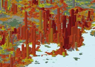
4
3. Medium access: people can easily walk to a public transport increase the share of population with access. However, adding
stop with between 4 and ten departures an hour. more stops tends to have a decreasing impact. Existing public
transport stops tend be concentrated in areas with high
4. H
igh access: people can easily walk to a bus or tram stop with population density. New stops will be added in areas with
more than 10 departures an hour OR people can easily walk increasingly lower densities and thus provide access to fewer
to a metro or train station with more than 10 departures and fewer people.
an hour (but not both).
Clustering of population along transport stops is easier
5. Very high access: people can easily walk to a bus or tram to achieve when a neighbourhood is being designed, as
stop with more than 10 departures an hour AND a metro replacing existing houses with a taller development is often
or train station with more than 10 departures an hour. faced with local opposition. This is why new development
should take into account the location of current and future
Very high access is only possible in cities with a metro and/or public transport stops.
a train network and depends heavily on the extent of this
network. Low street density can limit the share of people that have
access to a particular stop. Again getting this right from the
start is easier than having to retrofit connections once
4 WHAT CITIES
a neighbourhood has been constructed. The overall impact
of this, however, is limited. Once the network density is high, the
OFFER THE BEST
access cannot be further improved by increasing density.
ACCESS TO PUBLIC
Graph 1: Typology of service frequencies in large urban centres /
Access to public transport in large European cities
TRANSPORT?
Share of population of the urban centre, in %
100
90
80
70
Here we will focus on the results per urban centre, because 60
as shown above this is the most comparable geographical 50
definition (1). In the attached tables, the indicators are included 40
30
for all available urban centres, cities, greater cities, functional 20
urban areas and NUTS3 regions. 10
0
Graphs 1 and 2 show the results for a selection of larger- and
rs
el
Be lin
Bu ag
t
He am
a
an lin
oc r
lm
n
a
es eille
o
Am pes
te
av
rin
ah
hin
ss
fo
b
r
Ha
o
es
Be
rd
Du
nh
Pr
To
kh
ng
ru
s
da
At
ch
ux Mar
medium-sized urban centres. On average, access levels
nk ste
n
/B
be
lsi
St
Kø
M
ell
in larger cities are higher than in medium-sized cities, but there
i/
lsi
Br
He
is substantial diversity within each group. The share
n No access n Low n Medium n High n Very High
of population with (very) high access in this selection of larger
urban centres varies from 38 % in Dublin to 84 % in Brussels,
while this level varies from 12 % in Eindhoven to 77 % in Malmö In the Dutch cities, the share of population with (very) high
in the selected medium-sized urban centres. Very high access access tends to be lower than in cities of the same size in other
tends to be quite rare in medium-sized cities, because most countries. This is likely due to the high share of trips by bicycle
of them do not have a metro system and the rail network in Dutch cities, which reduced demand for public transport,
consists usually of only one or two stations in the urban centre. which in turn will reduce frequencies and the number of stops.
On the other extreme, the share of population without any easy 100
Share of population of the urban centre, in %
90
access to public transport does not follow a particularly strong
80
pattern throughout the selected cities. Within this selection 70
of urban centres, the share of population without access 60
is slightly lower in the large centres than in the medium-size 50
centres. Centres with a large population share with (very) high 40
30
access tend to have a low share with no access, but this
20
depends on the share of population with low or medium access, 10
which varies substantially from less than 10 % in Marseille 0
to over 40 % in Dublin among the larger centres.
en
Ch n
Ha i
lem
se
ge
Bo in
Gö ux
rg
tw t
n
n
t
ö
o
n
ch
ide
pe
llin
m
ler
ec
Ge
bo
ou
ea
ov
Liè
re
al
er
ar
cz
Ta
Le
ar
te
dh
ul
rd
Ut
M
Sz
To
Ein
An
The share of population without access depends on three main n No access n Low n Medium n High n Very High
components: (1) the number of stops, (2) the clustering
of population close to stops and (3) the density of the street Graph 2: Typology of service frequencies in medium-sized urban
network. Increasing the number of public transport stops will centres / Access to public transport in mid-sized European cities
1 Urban centres as defined in Dijkstra and Poelman (2012). The extent of the urban centres only depends on population density and population size measured
at grid cell level, and does not suffer from distortions due to the variety in administrative definitions of cities.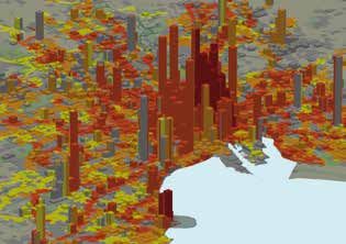
M E A S U R I N G A C C E S S TO P U B L I C T R A N S P O R T I N E U R O P E A N C I T I E S                                                                   5

Maps 3 and 4 present the same typology of frequencies for all cit-                               indicates the share of total population not having any easy
ies in the Netherlands, Belgium, Estonia, Finland, Sweden and                                    access to public transport. The same starting point can
Denmark. The size of the pie charts reflects the population size                                 be read as ‘Y % of population has access to at least one
of the urban centres. It shows that in each country the capital and                              departure an hour’. The graphs also help to compare the
the other large cities have the highest access to public transport.                              median number of hourly departures between cities: the
                                                                                                 number of departures to which 50 % of the urban population
The relationship between the distribution of the frequency                                       has easy access. Amongst the selected larger cities, this
of services and the residential population can be explored                                       population-weighted median number of departures an hour
on graphs 3 and 4. The lines can be read as ‘Y % of the total                                    varies between 7.4 in Dublin and 28.3 in Brussels. In the
population of the urban centre has easy access to more than                                      example of the Netherlands, the pattern of the major cities
X departures an hour’: a steep slope shows a relatively low                                      is relatively similar, although the median frequency is still
and/or unequal availability of departures. The gap on the                                        higher in the biggest city of the three (Amsterdam, with
vertical axis between the starting point of the lines and 100 %                                  a  median value of 17.2).

Map 3: Access to public transport in urban centres in Denmark, Sweden, Finland and Estonia
6
Graph 3: Frequency of departures and cumulative population Graph 4: Frequency of departures and cumulative population
distribution in major urban centres (Dublin, Helsinki, Brussels) distribution in major urban centres (Den Haag, Rotterdam,
Amsterdam)
median median
100
100
median
median
90
90
80
Den
Haag
cumula&ve
percentage
80
Dublin
cumula&ve
percentage
70
Helsinki
/
Helsingfors
70
RoCerdam
60
Bruxelles
/
Brussel
60
Amsterdam
50
50
40
40
30
30
20
20
10
10
0
0
0
10
20
30
40
50
60
0
10
20
30
40
50
60
departures
departures
Y%
of
population
has
access
to
more
than
X
departures
per
hour Y%
of
population
has
access
to
more
than
X
departures
per
hour
Map 4: Access to public transport in urban centres in Belgium and the Netherlands
Share of population by typology of Leeuwarden Groningen
service frequencies in Urban Centres
Service levels
No access
Low
Medium
High
Very high Alkmaar Hoorn
Purmerend
Lelystad Zwolle
Haarlem Amsterdam
Almere
Haarlemmermeer Almelo
Leiden Hilversum Hengelo
Apeldoorn Deventer
's-Gravenhage Alphen aan Enschede
den Rijn Utrecht Amersfoort
Zoetermeer
Gouda
Ede
Rotterdam Arnhem
Dordrecht
Nijmegen
's-Hertogenbosch
Breda
Bergen Tilburg
Roosendaal
op Zoom
Eindhoven
Helmond
Oostende Venlo
Brugge
Antwerpen
Gent
Bruxelles
Kortrijk / Brussel Sittard-Geleen
Leuven Heerlen
Maastricht
Liège
Mons Charleroi Namur
0 50 KmM E A S U R I N G A C C E S S TO P U B L I C T R A N S P O R T I N E U R O P E A N C I T I E S 7
Graph 5: Frequency of departures and cumulative population Graph 6: Frequency of departures and cumulative population
distribution in medium-sized urban centres (Göteborg, distribution in medium-sized urban centres (Leiden, Gent, Malmo)
Bordeaux, Tallinn)
median median
100
100
median
median
90
90
80
Göteborg
80
Leiden
cumula&ve
percentage
cumula&ve
percentage
70
Bordeaux
70
Gent
60
Tallinn
60
Malmö
50
50
40
40
30
30
20
20
10
10
0
0
0
10
20
30
40
50
60
0
10
20
30
40
50
60
departures
departures
Y%
of
population
has
access
to
more
than
X
departures
per
hour Y%
of
population
has
access
to
more
than
X
departures
per
hour
Map 5: Population-weighted median number of departures an hour in urban centres
Population-weighted
median number of hourly
departures in Urban Centres
Number of departures
1-4
4 - 10
10 - 20
20 - 30
Urban centre size (inhabitants)
50000 - 100000
100001 - 250000
250001 - 500000
500001 - 1000000
1000001 - 5000000
> 5000000
0 500 km8
Some examples of medium-sized cities again show substantial Graphs 7-9: Frequency of departures and cumulative distribution
differences in distribution. Median values in cities with of residential population and workplace-based employment
a population between approx. 350 000 and 500 000 vary from in urban centres
11.3 in Bordeaux to 20.2 in Tallinn. In cities with a population
around 250 000, we see values between 6.0 in Leiden and 18.0 Dublin
in Malmö. The graphs also show that some medium-sized cities 100
median
90
actually perform better than some of the bigger ones in terms populaBon
80
cumula&ve
percentage
of the distribution of frequencies. 70
employment
60
Map 5 shows the relationship between urban centre size, 50
expressed in population, and the median hourly frequency for 40
30
all cities under review. When considering all urban centres 20
of more than 100 000 inhabitants, population size clearly helps 10
to predict the median hourly frequency (R² = 0.39). Amongst the 0
0
10
20
30
40
50
60
capital cities in this group, Athens and Dublin are negative
departures
outliers, while Brussels, Copenhagen and Tallinn score
substantially better than predicted.
Y%
of
population
(employed)
has
access
to
more
than
X
departures
per
hour
So far, our analysis has focused on the availability of services Helsinki
/
Helsingfors
100
to residential population. Ideally, the assessment should also 90
median
consider the relationship between public transport services and 80
populaBon
cumula&ve
percentage
daytime population. Unfortunately, spatially detailed data 70
employment
60
on the distribution of urban daytime population are still very
50
scarce. Nevertheless, for a limited set of cities we were able 40
to use data on workplace-based employment (2). Here, 30
we explored the relationship between the spatial distribution 20
of the frequency of services and workplace-based employment. 10
0
Graphs 7-9 compare the results for employment with those for 0
10
20
30
40
50
60
population. In the three selected urban centres, easy access departures
to public transport is substantially better for jobs than for
residential population. Values of median hourly departures Y%
of
population
(employed)
has
access
to
more
than
X
departures
per
hour
(weighted by the spatial distribution of jobs) vary between 17.4 Stockholm
in Dublin, 29.8 in Helsinki and 41.2 in Stockholm (3). 100
90
median
80
populaBon
cumula&ve
percentage
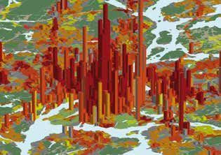
A three-dimensional representation of the spatial distribution 70
employment
of employment or population (Maps 6-11), combined with the 60
typology of public transport frequencies confirms the finding that 50
access to public transport tends to be better for jobs than for 40
30
residential population. The 3-D maps are coloured according
20
to the typology of frequencies, developed in section 3. Population 10
and jobs are shown at a spatial resolution of 250 m x 250 m grid 0
cells, where the height of the bars is proportional to population 0
10
20
30
40
50
60
departures
density or jobs density. Good public transport access is easier
to implement for jobs than for residential population, because
Y%
of
population
(employed)
has
access
to
more
than
X
departures
per
hour
of the higher spatial concentration of jobs. The relatively low and
dispersed population densities observed in many areas of Dublin,
as compared to the pattern in Stockholm or Helsinki, also help
to explain the relatively low values of access to transport, found
in Dublin.
2 Data at grid cell level (250 x 250 m cell size): register-based employment for Finland (2006) and for urban areas in Sweden (2006); census-based employment
for Ireland (2011).
3 The employment level in the urban centres of Dublin and Helsinki is quite similar (448 000 in Dublin, 482 000 in Helsinki). In Stockholm it amounts to 711 000 jobs.M E A S U R I N G A C C E S S TO P U B L I C T R A N S P O R T I N E U R O P E A N C I T I E S 9
Maps 6-11: Population density, job density and typology of frequencies in Dublin, Helsinki and Stockholm
Dublin: population Dublin: jobs
Helsinki: population Helsinki: jobs
Stockholm: population Stockholm: jobs10
5 CONCLUSION
Cohesion Policy is a substantial source of investments in clean existing public transport offer, instead of spending large
urban transport. Between 2007 and 2020 a significant share amounts on constructing a new metro line. This method can
of EU funding has been, and will be, allocated to this priority. also be used to compare the impact of different strategies
A better understanding of public transport in European cities to improve public transport in a transparent and quantitative
can help target these investments in the cities and neighbour- manner, which can support the decision making process.
hoods where it adds the most value.
The only major constraint facing this new method is data avail-
This new method of analysing access to public transport is an ability. High resolution data on population distribution is in most
important step forward because it overcomes several obstacles cases available. Open access to data on public transport in the
which hindered meaningful comparisons in the past. It allows right format however is still insufficient. For example, several
us to analyse cities in an identical manner taking into account public transport operators provide Google with the timetable
the extent of the urban centre, the distribution of population data, but do not provide open access to this data. The street
and the exact location of public transport stops, and the fre- network is sufficiently developed in most European cities, but
quency of departures. This type of analysis can also help cities for some the data still needs to be further improved.
to benchmark themselves with other cities of a similar size. The Fortunately, more and more data has become available over
impacts of higher frequencies, extension of lines and new lines the past five years and we expect this to continue. We encour-
can also be easily simulated with this new approach. age all interested parties to share data on public transport with
us so that we can extend this analysis to more cities in Europe.
Our analysis has highlighted the substantial variation between
cities of the same size. For example, Brussels is currently con- Last but not least, high-resolution data on the locations of jobs
sidering a new metro line. This analysis shows that Brussels at the workplace is still quite rare. More high-resolution data
already has the highest share of population with a (very) high on employment locations could enhance this analysis and
access to public transport. This suggests that it may be more would be critical to support decisions on further investment
efficient for Brussels to find ways of increasing the speed of the in public transport.M E A S U R I N G A C C E S S TO P U B L I C T R A N S P O R T I N E U R O P E A N C I T I E S 11
> METHODOLOGICAL ANNEX
1 INPUT DATA
1.1 Public transport data The analysis requires data on two aspects of public transport:
the location of stops and stations, and the frequency
In the context of this analysis, we define public transport as the of departures at these stops. For each stop we register the
collection of regular and scheduled services operated by bus, precise geographic coordinates and the available transport
tram, metro, suburban rail or mainline rail, especially in an mode(s). In addition, we need data on the frequency of
urban environment, but potentially also in non-urban areas. departures during a typical weekday. Frequency data can
be derived from individual departure records when available,
or from departure counts aggregated per hour or per day.
Frequency of public transport services
Map 1: Study area of the analysis of public transport services
Data availability
data available
no data Canarias
Guadeloupe Guyane
Martinique
Mayotte Réunion
Açores Madeira
© EuroGeographics Association for the administrative boundaries REGIOgis12
Triggered by open data initiatives (e.g. European Commission a cell size of 250 x 250 m or 100 x 100 m, preferably based
(2011)), various public transport operators and organisations on registered and georeferenced population counts, or by
integrating operators' information by region or country have census tract, enumeration district, neighbourhood, or local
started to disseminate data on stops location and services administrative unit. Nevertheless, because of its good
offered. While a variety of dissemination formats persists, connectivity with the street network, our preferred unit
many of these datasets have become available according of analysis in the context of this project is the building block,
to the General Transit Feed Specification (GTFS) (4). This defined as a polygon containing built-up areas, and delimited
specification provides a relatively simple model of public by streets or other features. In urban centres, these building
transport schedules and related geographic information. blocks correspond to the polygons of the Copernicus Urban
Atlas land use layer, based on satellite imagery with main
Amongst other items, the specification contains a table of stops reference year 2006 (7). A combination of the aforementioned
including their location (5). Other tables from the model need detailed population distribution input data and Urban Atlas
to be related to the stops in order to retrieve the departure polygon characteristics resulted in population estimates for
times per stop, to select the relevant days of operation, and each of the Urban Atlas polygons (Batista e Silva e.a., 2013).
to select the transport mode available at each stop. In areas where Urban Atlas data were not available, we used
an estimation of population by 100 x 100 metre grid cell,
By combining data from more than 20 sources, provided in at by combining the EU-wide 2006 population grid at 1 km²
least seven different formats, we were able to derive indicators resolution (8) with a 100 * 100 metre downscaled grid (9).
for all major cities in Belgium, Denmark, Estonia, Ireland, the
Netherlands, Finland and Sweden, and for selected cities As some calculations in subsequent steps of the workflow will
in Czech Republic, Germany, Greece, France, Italy, Hungary, assume area-weighted distributions inside polygons, it is
Poland and the UK (6). Data availability has been assessed preferable that all layers used in this project are stored in an
in 2013-2014. More data may have been available, especially equal-area projection (10).
in national formats, involving additional conversion work falling
beyond the scope of this project.
2 METHOD
1.2 Street network
To be able to assess the ease of access to the stops, 2.1
Combining frequency data
a comprehensive road network is needed. The road segments with stops locations
should include attributes allowing for a selection of streets
accessible by pedestrians. The coverage and content of the From the data on the frequency of services, we select the
TomTom MultiNet data was considered to be appropriate for the departures between 6:00 and 20:00 during a typical working
analysis in the selected cities and regions. For each of the areas day. The actual day depends on the availability of the schedules
under review we have built a geographical information system in the input datasets. We took care to avoid public holidays and
(GIS) road network dedicated for use by pedestrians. periods of national/regional school holidays. For further
analysis, we distinguished two groups of transport modes:
1) bus and tram (11), and 2) metro, suburban train and mainline
1.3 Population distribution train. We created this distinction to take into account the
differences in operational speed of the vehicles. We decided
In order to evaluate the relevance of the public transport offer to combine tram services with bus services, despite the fact
for the urban population, we need to include data on a spatially that some new or modernised tramlines can perform better
detailed distribution of residential population inside the cities than bus lines. We assume that tram services are often subject
or regions. The spatial resolution of the population distribution to similar congestion issues as buses, especially in city centres.
should be high enough to allow for a meaningful combination
with relatively small service areas that will be created around For each stop location and for each of the two groups
public transport stops. of transport modes, we calculate the average number
of departures per hour (12). But depending on the input datasets,
Depending on the areas under review, possible population the definition of the location of the stops can vary. For instance,
distribution data are available at the level of grid cells with if a bus stop is located at both sides of a street (i.e. a stop for
4 For a detailed description of the specification, see: https://developers.google.com/transit/gtfs/. Some countries use national standards (often more elaborate
than the GTFS specification): e.g. UK TransXChange, Finland kalkati.net.
5 XY coordinates according to the WGS84 coordinate reference system.
6 Reference years of the public transport data depend on the data sources, and varied between 2011 and 2014.
7 For more information, see: http://www.eea.europa.eu/data-and-maps/data/urban-atlas/mapping-guide
8 GEOSTAT 2006 grid, see: http://epp.eurostat.ec.europa.eu/portal/page/portal/gisco_Geographical_information_maps/publications/geostat_population_grid_report
9 Grid produced by DG JRC (Institute for Environment and Sustainability) for internal analytical purposes.
10 Lambert Azimuthal Equal Area projection (GCS ETRS 1989), EPSG:3035.
11 When input data also contained schedules of ferry services, these were included in the bus and tram group.
12 An additional indicator could reflect peak hour frequencies, by calculating the maximum value of the number of departures an hour (between 6:00 and 20:00),
without pre-selecting when the peak hours occur during the day. As this indicator could not be calculated from all datasets available, we decided not to pursue
its calculation at this stage.M E A S U R I N G A C C E S S TO P U B L I C T R A N S P O R T I N E U R O P E A N C I T I E S 13
each direction), some datasets will consider this to be one 2.2
Creating service areas
single stop, while others will provide separate data for the around stops
actual location of each of the stops. The same diversity can
happen when representing bus stations or platforms of railway In this step we create accessibility areas (‘service areas’) around
or metro stations. In order to create more homogeneity in the each of the stops. These zones are considered to provide easy
data and to enhance the comparability of the results, walking access to the stops. We define them as a five-minute
we identified all stops located within 50 metres distance from walk (at 5 km/h) to bus and tram stops, and as a ten-minute
another stop. These stops will be considered as one single walk to stops of high-speed modes (metro and train). The
cluster of stops. A single point located at the centre of the service areas are created using all streets of the road network
clustered stops represents each cluster. For each of the clusters, accessible to pedestrians. While many of the resulting service
we calculate the sum of the hourly average numbers areas will roughly look like a circular neighbourhood, using the
of departures. All further steps of the method will use the street network instead of creating areas by Euclidian distance
clustered stops. Hence, in the further description we will simply takes into account the existence of barriers (e.g. motorways,
call them stops. railways, water bodies) better and also helps to better represent
the influence of the density of the urban street network.
Map 2: Hourly average number of departures by clustered stop in Stockholm
Stockholm
Average number of departures per hour
Train/Metro Bus/Tram
1 - 10 1 - 10
11 - 25 11 - 25
26 - 50 26 - 50
51 - 75 51 - 75
0 5 10 Km
> 75 > 7514
Each of the service area polygons is characterised by the sum • Low: less than 4 departures an hour for at least 1 group
of the hourly average number of departures available at the of modes, but no access to more than 4 departures an hour;
stop around which it is created. The service areas tend to partly • No access: no easily accessible departures (by none of the
overlap each other, especially in an urban environment. In these modes).
overlapping areas, people have the choice between two or more
stops nearby, where the departure frequency can be different. The areas corresponding to this typology are now intersected
If this situation occurs, we assume that the stop with the most with the areas containing the population counts. The population
frequent departures is the most probable choice. For this by intersected polygon is estimated by simple areal weighting.
reason, we intersect the service areas within each of the groups From the intersected areas we can easily obtain a distribution
of transport modes, and to each of the overlapping areas of population by category of service frequency, aggregated
we attribute the maximum value of the hourly average number by area of interest (e.g. city, urban centre, commuting zone).
of departures. Mapping this result shows the best available
level of service (within each of the groups of transport modes)
at any area within the city. 2.4 Creating a distribution
of frequencies of all services
2.3 Creating a typology of service In addition to the creation of a typology of frequencies, we will
frequencies summarise the frequencies of all accessible services, again
aiming to combine it with the distribution of population. Starting
In order to obtain meaningful indicators, aggregated at the level from the two sets of service areas created in step 2.2, we cre-
of cities, we will combine the information about the frequency ate a single set of service areas by intersecting the service
of departures with the distribution of population inside the city. areas of bus and tram with those of train and metro. The result-
First, we will develop a simplified typology of service frequen- ing polygons contain information about the maximum number
cies by group of transport mode. Within each group (bus and of departures by bus and tram and about the maximum number
tram / metro and train) we reclassify the frequencies into four of departures by metro and train. For each of these polygons
categories of service levels. we calculate the total number of easily accessible departures,
regardless of the transport mode used, as being the sum
Table 1: Frequency classes by group of transport modes of both maxima. By intersecting this result (13) with the areas
containing the population figures, we obtain the geographical
Rail and metro/Bus and tram distribution of population according to the overall average level
No services Outside service areas of services available at walking distance. This information can
be easily summarised in a frequency table by city, urban centre,
Low frequency Less than 4 departures an hour
or any other area of interest. As we can expect that the fre-
Medium frequency >= 4 and < 10 departures an hour quency distribution will be rather skewed and contain a-typical
High frequency More than 10 departures an hour outliers, we will also derive the population-weighted median
number of departures an hour from this table.
By intersection of the reclassified service areas of both groups
of transport modes, we obtain a set of areas containing the
combination of the frequency classes, i.e. a matrix of 16 possible
classes. Some of these 16 classes are grouped to obtain a final
typology with 5 categories of frequencies:
• Very high: access to more than 10 departures an hour for both
groups of modes;
• High: access to more than ten departures for one group
of modes, but not for both;
• Medium: access to between 4 and 10 departures an hour for
at least one group of modes, but no access to more than
10 departures an hour;
Table 2: Typology of service frequencies Metro and train
High frequency Medium frequency Low frequency No services
High frequency VERY HIGH HIGH HIGH HIGH
Medium frequency HIGH MEDIUM MEDIUM MEDIUM
Bus and tram
Low frequency HIGH MEDIUM LOW LOW
No services HIGH MEDIUM LOW NO ACCESS
13 Frequencies are converted to integer values before intersecting, in order to obtain a manageable number of output polygons.M E A S U R I N G A C C E S S TO P U B L I C T R A N S P O R T I N E U R O P E A N C I T I E S 15
3 CONCLUSIONS degree of openness still varies enormously within Europe. It is
currently not possible to extend this analysis to many more
cities or regions. Where detailed public transport data are
effectively available, they challenge the quality and availability
The described methodology has allowed exploring and of spatially (very) detailed data on population and employment
synthesising the relationship between the offer of (urban) distribution. Under the current circumstances, discrepancies
public transport and the distribution of population and jobs, in terms of reference dates are inevitable: data on public
using a maximum of standardised and harmonised input data. transport offer tend to be more recent (and often updated more
We described the offer in terms of service frequency, but frequently) than population distribution data. Forthcoming
the timetable data also offer opportunities to assess results of the Copernicus Urban Atlas 2012, geo-referenced
the efficiency of the network by studying the speed of the population data from the census 2011, including grid-based
available services. We plan to investigate this particular data, and high-resolution spatial modelling of building
topic further. footprints are each very promising sources for further analysis
in the context of urban public transport. In parallel, openness
While data availability on the offer and location of public of public transport related data is well worth being further
transport, both in terms of geographical coverage and promoted, in order to enable a more balanced analysis of urban
timeliness, has been boosted by open data initiatives, the areas throughout the European territory.
Map 3: Typology of service frequencies in Stockholm
Stockholm
Typology of service frequencies
No access
Low
Medium
High
0 5 10 Km
Very high16
> REFERENCES
Greece (Athens): urban transport: http://www.gtfs-data-
exchange.com/agencies, retrieved February 2013; rail timetable
data: www.trainose.gr, retrieved January 2013.
Batista e Silva, F., Poelman, H., Martens, V. and Lavalle, C.,
Population estimation for the Urban Atlas polygons, JRC Technical France: rail timetable data: SNCF: http://ressources.data.sncf.
Report EUR 26437 EN, European Commission Joint Research com/explore/, retrieved July 2013; urban transport Bordeaux:
Centre, Ispra, 2013. (http://publications.jrc.ec.europa.eu/ http://data.lacub.fr/data.php?themes=10, retrieved September
repository/bitstream/111111111/30408/1/qms_h08_intesa_ 2013; urban transport Toulouse: http://data.toulouse-metropole.
deliverable_2_2_eur_26437.pdf) fr/, retrieved September 2013; urban transport Marseille:
Agence d'Urbanisme de l'Agglomération Marseillaise, data
Dijkstra, L. and Poelman, H., Cities in Europe, the new OECD-EC provided October 2013.
definition, European Commission, Brussels, 2012. (http://ec.europa.
eu/regional_policy/sources/docgener/focus/2012_01_city.pdf) Italy (Torino): urban transport data: http://opendata.5t.torino.it/
gtfs/, retrieved January 2013.
European Commission, Open data. An engine for innovation, growth
and transparent governance. Communication from the Commission Hungary (Budapest): urban transport: http://www.gtfs-data-
to the European Parliament, the Council, the European Economic exchange.com/agencies, retrieved February 2013.
and Social Committee and the Committee of the Regions,
COM(2011)882 final, Brussels, 2011. (http://eur-lex.europa.eu/ Netherlands: integrated data: OV-9292 data 2013,
LexUriServ/LexUriServ.do?uri=COM:2011:0882:FIN:EN:PDF) http://9292opendata.org/, retrieved May 2013.
European Environment Agency (EEA), ‘A closer look at urban Poland (Szczecin): urban transport: http://www.zditm.szczecin.pl,
transport. TERM 2013: transport indicators tracking progress retrieved March 2014; rail: http://rozklad-pkp.pl/, retrieved March
towards environmental targets in Europe’, EEA Report n° 11/2013, 2014.
2013. (http://www.eea.europa.eu/publications/term-2013/at_
download/file) Finland: integrated data: http://developer.reittiopas.fi/pages/en/
kalkati.net-xml-database-dump.php, retrieved December 2012.
European Forum for GeoStatistics (EFGS), ‘GEOSTAT 1A –
Representing census data in a European population grid’, Final Sweden: integrated data: http://www.trafiklab.se/api/gtfs-
report of the ESSnet project, 2012. (http://epp.eurostat.ec.europa. sverige, retrieved December 2012.
eu/portal/page/portal/gisco_Geographical_information_maps/
documents/ESSnet%20project%20GEOSTAT1A%20final%20 United Kingdom: location of stops and stations: National Public
report_0.pdf) Transport Access Node (NaPTAN), 2011, http://data.gov.uk/
dataset/nptdr, retrieved January 2013; timetable data: National
Public Transport Data Repository (NPTDR) TransXchange data
> PUBLIC TRANSPORT
2011, http://data.gov.uk/dataset/nptdr, retrieved January 2013.
DATA SOURCES
Additional data: rail station locations: EuroRegionalMap,
EuroGeographics Association; rail timetable data: http://
reiseausfunkt.bahn.de/.
Belgium: bus and tram Vlaams Gewest: VVM – De Lijn: data
provided under licence, January 2013; bus and tram Région
>A
CKNOWLEDGMENTS
Wallonne: SRWT-TEC: data provided September 2013; urban
transport in Brussels: STIB/MIVB: data provided September 2013;
rail timetable data: Infrabel, from www.railtime.be, retrieved
2012-2013. This study would not have been possible without the help and
advice from many people. We especially want to thank Olivier
Czech Republic (Praha): urban transport: http://www. Draily for implementing the methodology in an ESRI ArcGIS
infoprovsechny.cz, retrieved March 2014. environment; Pierre Moermans, Emile Robe and Frank Wouters
for developing and implementing conversion methods from
Denmark: stops location and departure data, http://www. GTFS and other public transport data formats to produce data
rejseplanen.dk, retrieved 2010. useable in a GIS environment; Gerry Walker and Dermot
Corcoran (CSO Ireland) for facilitating the use of the Irish
Germany (Berlin): integrated urban transport data: http://www. employment data; and Laure Leser, Rina Tammisto, Sune
gtfs-data-exchange.com/agencies, retrieved February 2013. Djurhuus and Vincent Tinet for providing useful advice
on accessing public transport data for Belgium (Wallonia),
Estonia: integrated data: http://www.peatus.ee/gtfs/, retrieved Finland, Denmark and France (Marseille), respectively.
February 2013.
Ireland: integrated data by operator: National Transport Authority,
http://dublinked.ie/datastore/by-agency/NTA.php, retrieved October
2013.17 > ANNEXES Indicators on access to public transport in European cities(http://ec.europa.eu/regional_policy/sources/docgener/ work/access_public_transport_city_indicators.xls)
You can also read