SketchStory: Telling More Engaging Stories with Data through Freeform Sketching
←
→
Page content transcription
If your browser does not render page correctly, please read the page content below
SketchStory: Telling More Engaging Stories with Data
through Freeform Sketching
Bongshin Lee, Rubaiat Habib Kazi, and Greg Smith
(a) (b) (c)
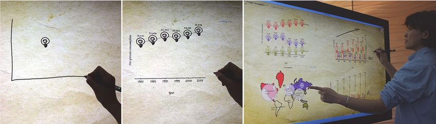
Fig. 1. Telling a story using SketchStory: (a) A presenter sketches out an example icon and chart axis, (b) Upon recognition of the
chart axis, SketchStory completes the chart with underlying data by synthesizing from example sketches, and (c) The presenter
interacts with the charts.
Abstract—Presenting and communicating insights to an audience—telling a story—is one of the main goals of data exploration.
Even though visualization as a storytelling medium has recently begun to gain attention, storytelling is still underexplored in
information visualization and little research has been done to help people tell their stories with data. To create a new, more
engaging form of storytelling with data, we leverage and extend the narrative storytelling attributes of whiteboard animation with pen
and touch interactions. We present SketchStory, a data-enabled digital whiteboard that facilitates the creation of personalized and
expressive data charts quickly and easily. SketchStory recognizes a small set of sketch gestures for chart invocation, and
automatically completes charts by synthesizing the visuals from the presenter-provided example icon and binding them to the
underlying data. Furthermore, SketchStory allows the presenter to move and resize the completed data charts with touch, and filter
the underlying data to facilitate interactive exploration. We conducted a controlled experiment for both audiences and presenters to
compare SketchStory with a traditional presentation system, Microsoft PowerPoint. Results show that the audience is more
engaged by presentations done with SketchStory than PowerPoint. Eighteen out of 24 audience participants preferred SketchStory
to PowerPoint. Four out of five presenter participants also favored SketchStory despite the extra effort required for presentation.
Index Terms—Storytelling, data presentation, sketch, pen and touch, interaction, visualization
1 I NTRODUCTION
One of the main goals of Information Visualization (InfoVis) is to narrative visualization [39]. As an emerging medium, narrative
help people gain insights—finding underlying patterns and visualization can borrow techniques from existing storytelling
relationships between bits of data hidden by raw quantity—more sources (e.g., comics, posters, etc.) [39], and extend them to develop
easily through their innate perceptual and cognitive capabilities. a more engaging form of storytelling.
Accordingly, over the last two decades, the InfoVis research In a form of narrative visualization called whiteboard animation
community has focused on developing techniques and systems that (also known as video scribing) [36], the presenter produces a
facilitate gaining insights by representing abstract information in sequence of dynamic sketches along with synchronized narration to
interactive, visual forms. Although effectively presenting or vividly tell a story. There is anecdotal evidence that this may be
communicating these insights to others is often one of the main end- more effective for delivering information than traditional
goals of data exploration, until recently insight presentation and presentations. LectureScribe allows people to create animated
communication has been relatively less explored by the InfoVis whiteboard lectures by capturing handwriting along with voice [10].
research community. But there is now a growing interest in novel Dean has used LectureScribe to develop supplementary content for
forms of storytelling techniques with data, commonly known as undergraduate and graduate algorithms courses in the computer
science department. Informal feedback from his students in these
courses suggests that these animated whiteboard lectures were very
Bongshin Lee is with Microsoft Research. E-mail: effective as a learning aid. Rom also claims that people like seeing
bongshin@microsoft.com. other people’s pictures, and that, in most presentation situations,
Rubaiat Habib Kazi is with National University of Singapore. E-mail: audiences respond better to hand-drawn images than to polished
rubaiat@comp.nus.edu.sg. graphics [35]. The narrated, animated content creation and
Greg Smith is with Microsoft Research. E-mail: gregsmi@microsoft.com. expressive graphic style makes whiteboard animation a very unique
Manuscript received 31 March 2013; accepted 1 August 2013; posted online and engaging form of storytelling. As such, it has attracted both
13 October 2013; mailed on 4 October 2013. audiences and artistically-inclined presenters, and has become
For information on obtaining reprints of this article, please send increasingly popular in domains such as advertising and education
e-mail to: tvcg@computer.org. (e.g., [24][36]). However, producing high-quality whiteboard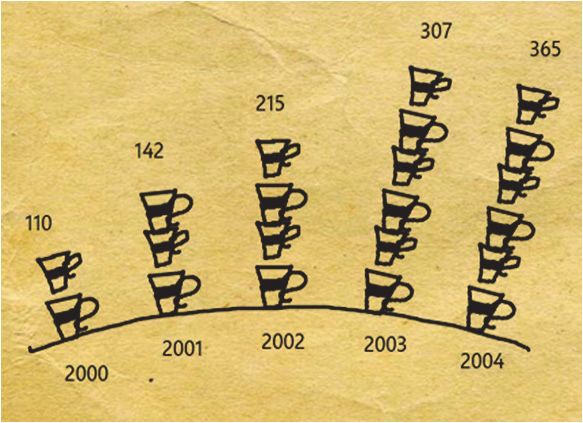
animation is time-consuming and potentially expensive; furthermore,        asynchronous storytelling. However, SketchStory was specifically
its power to communicate with data is limited by its reliance on the       designed with more engaging, real-time storytelling as its main goal.
presenter’s numeric and artistic ability to formulate and depict the
underlying numbers in a visually compelling way during a live              2.2      Sketch-based Interaction for Communication,
performance.                                                                        Design, and Information Visualization
    To create a novel and more engaging storytelling tool with data,       Ever since Sutherland introduced the Sketchpad concept in 1960s
we explore how to leverage and extend the narrative storytelling           [41], sketch-based interaction has been extensively studied. Given
attributes of whiteboard animation using pen and touch interactions.       the central role of sketching in design process and visual thinking,
In this paper, we present SketchStory (Figure 1), a data-enabled           previous research on sketch-based interaction has infused a wide
digital whiteboard specifically designed to support telling more           range of graphical applications for supporting pre-productive,
engaging stories with data through freeform sketching. It facilitates      exploratory activities. For example, sketch-based interaction has
the creation of charts in real-time by synthesizing from the               been explored for communicating early design ideas [27], 3D
presenter’s sample sketches, preserving the expressiveness and             graphics modelling [1][20], animation authoring [9], interactive
organic style of visual graphics. SketchStory helps the presenter stay     interface prototyping [25][28], texture illustration [22], and in special
focused on telling her story by eliminating the burden of manual data      purpose applications such as MathPad2 [26] and VectorPad [3].
binding. It allows the presenter to record a sequence of charts along          In the context of InfoVis, sketch-based interaction was first used
with example icons before the presentation, and to invoke them with        to support data queries with sketches. For example, QuerySketch
simple sketch gestures in real-time. Furthermore, it enables the           [47] and QueryLines [37] enable people to specify queries of time-
presenter to add freeform annotation and to interact with the charts       series data by drawing a freeform line graph as a target pattern.
created during the presentation. This helps invite discussion,             Recognizing the benefits—promoting thinking, insight, and
explanation, and further exploration.                                      inspiration—of the act of sketching [43], the InfoVis community has
    Pursuing an iterative design strategy, we first conducted a            recently started to employ sketch-based interaction for data
formative study with six presenter participants. This helped us            exploration. For example, NapkinVis uses pen gestures to support
understand the usability and unique affordances of the SketchStory         fast and effortless visualization construction [6] and SketchVis
approach for presenting a story with data. We improved the system          leverages hand-drawn sketch input to quickly explore data in simple
based on the lessons learned from the usability study. We then             charts without using menus or widgets [4]. To further advance these
conducted a controlled experiment to compare SketchStory with              approaches, Walny et al. investigated the use of pen and touch for
Microsoft PowerPoint [34], one of the most commonly used                   data exploration on interactive whiteboards [46]. Their study on the
presentation tools, for both audiences and presenters. Results show        distinctive role of pen and touch interaction shows that people can
that the audience is more engaged with the presentation done with          transfer knowledge from interaction with the physical world, leading
SketchStory than PowerPoint. Eighteen out of 24 audience                   to more natural and learnable interaction techniques. SketchStory
participants preferred SketchStory to PowerPoint. Four out of five         continues the efforts of SketchVis [4] and Walny et al.’s study [46]
presenter participants also favored SketchStory even while                 in exploring pen and touch interaction for creation and manipulation
acknowledging the extra presentation effort it required. In addition to    of data charts. However, it is specifically designed for narrative
these promising results, we identified future research directions          storytelling with data, leveraging the expressiveness and freeform
gleaned from both studies.                                                 nature of sketch for the creation of interactive, organic data charts.

2   R ELATED W ORK                                                         2.3      Non-Photorealistic Rendering for Visualization
                                                                           Apart from the role of sketching in rapid visual design, Non-
2.1      Storytelling with Information Visualization                       Photorealistic Rendering (NPR) or sketchy rendering styles have
Storytelling allows visualization to reveal information effectively        been explored extensively to illustrate 2D shapes and 3D objects
[13]. Conversely, as Wojtkowski and Wojtkowski pointed out, it can         across a wide range of domains for practical and aesthetic
be very effective to tell stories with data visualization [49].            advantages [40]. In addition, NPR techniques are found to affect
Therefore, storytelling with data has begun to gain more attention as      viewers emotionally [15][38]. Sketchy renderings are preferred for
storytellers integrate visualizations into their narratives. The InfoVis   depicting early design results, as they elicit higher engagement,
research community organized a workshop “Telling Stories with              participation, greater clarity, and active discussion [38]. More
Data” two years in a row (2010 and 2011), focusing on exemplars of         recently, Wood et al. [51] demonstrated the use of NPR specifically
stories told with data and the techniques used to construct the stories.   in statistical data visualizations and hypothesize its potential role in
Recently, Segel and Heer reviewed the design space of this emerging        constructing visualization narratives. Compared to traditional data
class of visualizations called narrative visualizations [39]. They         visualizations, their study indicated increased engagement and active
identified seven genres of narrative visualization—magazine style,         participation with NPR data charts. The ability to evoke emotional
annotated chart, partitioned poster, flow chart, comic strip, slide        response and to provoke active participation, and the distinct visual
show, and video—from an analysis of 58 examples. Within this               appeal of NPR are encouraging to our work as we pursue similar
characterization, SketchStory spans the genres of annotated chart,         goals with our narrative storytelling tool. Therefore, SketchStory
partitioned poster, and video.                                             employs integration of sketching and data chart rendering, where the
    Several visualization systems have been incorporating                  sketched input is used for rendering the data charts.
storytelling into their design, primarily through graphical history and
annotation. For example, the sense.us system provides bookmark             3     S KETCH S TORY D ESIGN
trails, a graphical list of bookmarks, with graphical annotation to
support storytelling [17]. Tableau’s graphical histories allow people      Our main goal was to explore a novel genre of narrative visualization
to review, collate, and export the main insights of their visual           technique specifically for real-time storytelling and presentation.
analysis [16]. Recently, Tableau Public supports the publication of        Hence we assume that the presenter has already found a story during
interactive visualizations on the web, enabling storytelling with data     a prior exploration phase. Target users of SketchStory are people
visualization [42]. GeoTime Stories enables analysts to create and         who want to present a story that can be told with a set of data charts.
present annotated stories within visualizations using a customized         Even though good sketching skills may result in better presentations,
text editor for a story document containing links to visualization         they are not required. We looked into the strengths and limits of
snapshots [11]. These systems augment their exploration function by        popular and pervasive storytelling techniques with data, and explored
providing storytelling capabilities through an extension, mainly for       ways to harness the strengths and to overcome the limitations.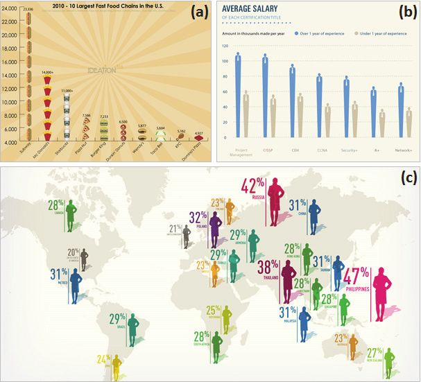
3.1      A New Form of Storytelling with Data                               infographics, whiteboard animation builds on visual explanation with
Data visualization melds the skills of computer science, statistics,        expressive graphics, yet it augments the storytelling aspect by
artistic design, and storytelling to make massive amounts of data           linearly and verbally developing the graphical elements. Viewers
more easily accessible. However, it remains an open question how to         consume the content one step at a time, following a logical sequence
support richer and more diverse forms of storytelling with data [39].       that makes the story easier to understand. Whiteboard animation is
In this section, we identify three desirable properties of storytelling     increasingly attracting audiences and storytellers and getting more
with data; expressiveness, narrative sketching, and interactivity.          popular in commercials, communications, presentations, and tutorials
                                                                            (e.g., [24][36]).
3.1.1      Expressiveness in Infographics                                       Several attributes of whiteboard animation make it a memorable,
Information graphics (or infographics) are graphical representations        effective, and engaging method for visual communication. First, the
of information, data, or knowledge. Infographics are commonly used          dynamic re-enactment of a presenter’s sketch (or whiteboard
by reporters, computer scientists, and statisticians for communicating      presentation) conveys the order of action sequences by directing
conceptual information in a broad range of domains. To clearly              viewer attention from one object to the next, building anticipation as
communicate complex information in an aesthetically pleasing way,           in a story. Second, skilled hand-drawn sketches generate organic and
they often employ icons and other visual elements that are                  expressive graphics, allowing a personal, unique storytelling process.
customized to the dataset (Figure 2).                                       Viewers of sketched drawings are inclined to focus on the high-level
    We believe the communicative power of customized infographics           aspects such as the overall structure and flow since they tend not to
stems from two key factors. First, a close mapping between the              focus on unnecessary details (e.g., precise font size, alignments)
graphical representations and the underlying data helps people make         [5][14]. Third, as with other performance art media [21], the process
connections between them and facilitates understanding. Prior               of creation drives attraction and aesthetic appreciation. The
neurological studies indicate that fictional, metaphoric                    storytelling attributes of whiteboard animation go beyond
representations of facts and narratives activate many parts of the          entertainment to engagement, making it an effective medium to plant
brain [30]. Despite some criticisms [12] of Bateman et al.’s                ideas, emotions, and thoughts in viewers’ minds [19]. Fourth, the use
methodology, their study suggests that people’s recall of embellished       of real-time narration and a canvas displaying the full visual
charts (after a two- to three-week gap) is significantly better than that   interaction history provides constant contextual information to
of plain charts without sacrificing description accuracy [2]. Second, a     augment the communicative process.
custom visual design allows presenters the artistic freedom to create           However, creating traditional whiteboard animations is expensive
a unique, personalized chart taking full advantage of an innate visual      and labour intensive; individual lines and text all need to be
language that is largely universal.                                         manually drawn, requiring intensive editing and post-processing of
    Often created with sophisticated graphical tools such as                the recorded video. Any quantitative data presented visually is, in
Photoshop and Illustrator, these visualizations can be both                 effect, “made up” by the artist during the drawing process rather than
aesthetically pleasing and highly expressive. On the other hand, they       being backed by the underlying numbers in a more formal way.
are largely static, missing out on the full breadth of communicative        Finally, even though whiteboard animation is perceived to be more
power available to a live storyteller.                                      engaging than the regular video, it is still not interactive.

3.1.2    Narrative Sketching in Whiteboard Animation                        3.1.3      Interactivity in Information Visualization
Whiteboard animation is another compelling visual communication             Interaction plays a critical role in InfoVis particularly for exploring
technique, where the presenter simultaneously narrates and sketches         large and complex datasets. For example, dynamic queries [48] are
a sequence of line art elements to vividly tell a story (Figure 3). Like    one of the most commonly used interaction techniques for interactive
                                                                            visualizations. They enable people to formulate queries by
                                                                            manipulating embedded widgets (e.g., check boxes, range sliders),
                                                                            and immediately see the query results. Also, InfoVis systems often
                                                                            combine multiple views through interactive brushing and linking to
                                                                            enhance the individual visualizations [29]. Since changes made in
                                                                            one visualization are automatically reflected in other linked
                                                                            visualizations, more information can be gleaned than considering the
                                                                            component visualizations independently [23].
                                                                                Furthermore, interactivity in storytelling with data invites
                                                                            verification, further questioning, and exploration of alternative
                                                                            explanations [39]. Recognizing the importance of this interaction,
                                                                            there are on-going efforts to make infographics interactive. For
                                                                            example, news organizations such as the New York Times and
                                                                            Washington Post employ dynamic infographics on their websites.
                                                                            Also, tools like Many Eyes [45] and Tableau Public [42] enable
                                                                            publishing interactive visualizations on the web more easily. But
                                                                            these efforts do little to aid narrative communication of the story.
                                                                            While general purpose, low-level rendering APIs (e.g., Java2D,
                                                                            Processing) are also available, construction of even simple charts is
                                                                            tedious and they lack narrative communication as well.

Fig. 2. Examples of expressive and iconic data representation in
infographics: (a) A tally chart shows the consumption of fast foods
using food icons that represents each food type [31], (b) A bar chart
uses a corporate executive icon instead of the traditional rectangle
to represent average salaries [44], and (c) Custom icons                    Fig. 3. Manual sketching of data representation in whiteboard
representing geographic data overlaid on a map [50].                        animation [36].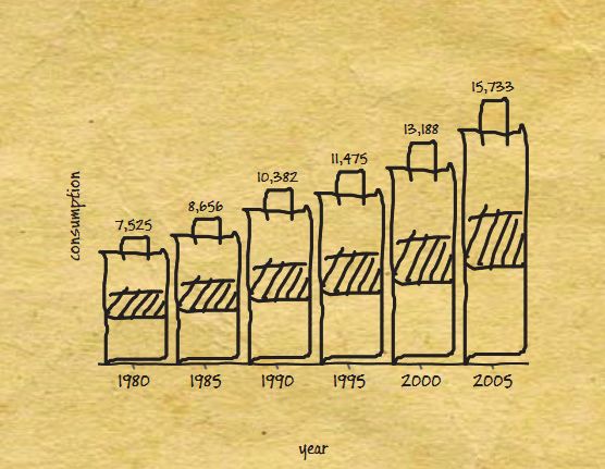
3.2      Design Rationale                                                 3.3     Choice of Data Charts in SketchStory
Our goal was to create a new, more engaging way of telling stories        To help us decide the design of data charts in SketchStory, we
with data by inheriting and extending the advantages of the               informally examined the common data charts used in infographics; a
successful storytelling techniques described in the previous section.     more formal survey was beyond the scope of this paper. There are
In this section, we describe our design rationales behind the design      disparate sources for infographics examples including data art
of SketchStory. These reflect the lessons learned from recent             websites, visualization blogs, newspapers, and scientific articles. To
previous research (SketchVis [4] and Walny et al.’s study [46]) and       avoid subjective selection, we extracted the first 100 image search
the usability study we conducted with the initial SketchStory design,     results for the keyword “infographics,” from two search engines
which will be described in Section 5.1.                                   (Bing and Google, dated 24th December, 2012). Of the resulting 187
                                                                          infographics (13 appeared in both results lists), 149 (79.6%) of them
3.2.1      Support Real-time Content Creation with Animated               depict numeric data. Each infographics consists of one or multiple
           Sketch                                                         graphical elements representing data: charts, symbols, stylized text,
With traditional presentation tools such as Microsoft PowerPoint and      or customized visuals. We tabulated each of these elements; a total
Apple Keynote, the audience is often visually exposed to content          of 795 graphical data representations were logged in these 149
significantly before the presenter verbally presents it unless she uses   infographics (on average, 5.3 data representations per infographics).
sub-slide appearance animations. To attract attention and create              We grouped the elements into 9 categories—bar (20.8%), pie
anticipation, SketchStory uses a real-time approach to content            (18%), tally (9.4%), scale (8.8%), stacked bar (6.8%), map (5%),
creation like many other performance art techniques do [21]. In           line (2.9%), area (2%), and tag cloud (1.1%). The remaining 25%
addition, SketchStory combines the expressive visual language of          were too customized to fit into any of these categories; they were
infographics and dynamic sketch with narrative communication of           tabulated as custom. For all data charts, we also logged them as
whiteboard animation. To enable the presenter to generate expressive      custom iconic vs. standard representation. Despite the fact that iconic
and custom representations that can be better aligned with her            data charts require graphical tools (Photoshop, Illustrator, etc.) and
narration (i.e., story), SketchStory lets the presenter provide any       can be laborious to create, we found 24% of the data charts to be
desired representation as an example visual element (Figure 5a). It       iconic, which further motivates our design goal to facilitate the
then synthesizes a full chart from the example sketch. Furthermore,       creation of iconic data charts.
SketchStory completes the chart with animation to make it look like           We began by incorporating the three most popular chart types
the presenter is sketching the chart at a faster speed.                   (bar, pie, and tally) into SketchStory, and then included line chart
                                                                          and scatterplot because they were straightforward variants of the bar
3.2.2     Aid Narrative Communication by Reducing Manual                  chart. We also included map both because we wanted to explore the
          Burden                                                          particular expressiveness of maps and because we wanted to be able
It is burdensome to manually draw an entire presentation or to            to use maps as interactive objects for dynamic filtering.
interactively specify settings (e.g., chart type, axis, etc.) for each
chart during the presentation. To alleviate this burden, SketchStory’s    4       S KETCH S TORY
design enables the presenter to pre-specify a sequence of charts and
invoke each one with sketch interaction in real-time. Furthermore, to     4.1      Story Preparation
reduce the burden of manually drawing each icon during the                Once a presenter finds a data-based story to tell with existing data
presentation, SketchStory allows the presenter to optionally pre-         exploration tools, the story can be recorded within SketchStory as a
record an example icon for each chart and save it with the other chart    sequence of charts in an XML metadata file, where each chart
settings. The presenter can focus on narration while SketchStory          specifies settings such as a chart type, data columns, and potentially
takes care of the visual presentation at whatever level of detail the     a pre-recorded example icon. Once saved, to make a change in the
presenter wishes.                                                         story the presenter has to manually edit the metadata file using a text
    SketchStory recognizes a small number of simple, easy-to-             editor. For example, a chart or example icon could be removed, a
remember sketch gestures for creating (or invoking) different types       chart type or data columns could be changed, and the sequence of
of pre-specified charts. For example, the presenter can draw an ‘L’       charts could be changed. During presentation, the recorded sequence
shape to invoke a chart with x and y axes, or draw a circle to invoke     is available to the presenter as a dropdown of chart thumbnails,
a pie chart (Figure 4). SketchStory also recognizes touch gestures for    where the next chart in the sequence is indicated by a visible check
moving and resizing charts. For example, the presenter can resize a       mark (Figure 4, right).
chart with a one- or two-hand pinch gesture. Previous research shows          To support dynamic filtering during presentation, SketchStory
that, when both pen and touch interactions are supported, people          enables the presenter to create visual keywords: a mapping between a
clearly distinguish between appropriate pen and touch interactions        set of strokes and a textual keyword. Visual keywords are recorded
[18][46]. SketchStory leverages this by using the pen for drawing         as separate XML files and referenced in the story metadata file. For
charts or annotations and touch for manipulating them, thereby            example, Figure 6c shows the creation of visual keywords to
avoiding having two explicit modes for sketching and manipulation.        represent the two genders, female and male. The two selected strokes
3.2.3     Provide Interactivity and Contextual Information                for a female head and body (shown with green highlighting) are
          through a Canvas                                                about to be mapped to the “Female” attribute value. To make
                                                                          drawing visual keywords easier, SketchStory allows people to trace
In contrast to most traditional presentation tools, SketchStory uses      their strokes on top of an imported background image.
the notion of a canvas to present information, and supports freeform
annotation anywhere on the canvas for emphasis and decoration             4.2           SketchStory Interaction1
(Figure 6b). This is to help the audience understand the context of
the whole story and derive relationships between the visual               4.2.1     Creation of Expressive Data Charts
components. Furthermore, to make storytelling more dynamic and            The interaction for chart generation consists of two simple steps; the
responsive, SketchStory supports interactivity—missing from most          presenter 1) sketches an example icon (Figure 5a) and then 2) draws
infographics and whiteboard animations—by tightly coupling all the        the sketch gesture (Figure 5b, Figure 4, left) in the desired size and
charts on a canvas and allowing data filter changes in real-time.         location for the chart. SketchStory recognizes the sketch gesture and
                                                                          automatically completes the chart according to the chart settings
                                                                          specified in the presentation sequence (Figure 5c). To support the
                                                                          1   Our supplementary video demonstrates SketchStory interaction.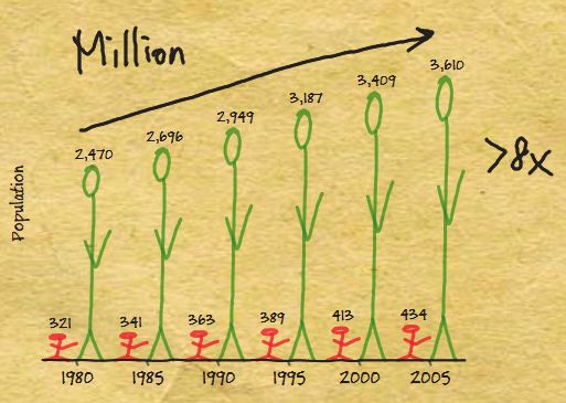
(a)                               (b)

Fig. 4. Preview of the part of the sequence of charts for the energy
consumption story (right) and sketch gestures to invoke them (left).
case where the presenter does not want to use an iconic
representation, the first step is optional. If the presenter does not                       (c)                              (d)
provide an example icon either during the presentation or in the chart     Fig. 5. Creation of a chart: (a) Drawing an example icon, (b) Drawing
settings, SketchStory creates a standard chart (Figure 5d).                an axis, and Automatic completion of the chart by SketchStory with an
    The four chart types that involve x and y axes (bar chart, tally       example icon (c) and without an example icon (d).
chart, line chart, and scatterplot) are invoked using an “L” sketch
gesture; the pie chart is invoked with a circle gesture; and the map is
invoked with a rotated “L” gesture (Figure 4, left).                   4.3     Implementation Details
4.2.2      Interactivity through Visual Keywords                       SketchStory    is implemented in C# using WPF (Windows
                                                                       Presentation Foundation) and handles both pen and touch input. It
SketchStory supports dynamic filtering, a very common interaction runs on any pen and touch enabled Windows device since it relies on
technique in InfoVis, through visual keywords (i.e., shaped strokes standard input event handlers.
or icons). Visual keywords can depict an existing geographical map,       On initialization, SketchStory loads all data files in a designated
or an iconic representation of keywords, to preserve the expressive folder (which can be changed) and provides the available data stories
graphical style of the visuals. For example, Figure 6a shows six with their friendly names in a listbox control on the toolbar.
visual keywords to represent six different regions (e.g., Almia, SketchStory consumes a tab-delimited format for its raw data files,
Parador, etc.). The presenter can perform dynamic filtering during where each row of input is one data item and the tab-separated
presentation by interacting with the strokes instead of entering the values represent the item’s column values. Each data file requires an
keyword. For example, when the presenter selects a visual keyword additional companion XML metadata file that describes the ordering,
by tapping the icon (Figure 6a), SketchStory updates other charts on name, type (e.g., ordinal or numeric), and optional mapping files for
the canvas according to the keyword associated with that selected each column. This metadata file also contains a presentation
icon (Figure 6b). SketchStory toggles the selection when the sequence, where individual settings are serialized, specifying chart
presenter taps the visual keywords.                                    type, chart data columns, chart icon strokes, and other visual chart
4.2.3      Freeform Annotation and Chart Management                    options (e.g., show or hide x/y axis, legend, outline, etc.) for each
                                                                       chart in the sequence. A mapping file is an additional XML
SketchStory supports freeform annotation anywhere on the canvas document consisting of a series of pen strokes with associated visual
because it is useful for explanation, emphasis, and decoration. For keywords that correspond to column values for a particular data
example, the presenter can write down the unit for data values or column. Strokes for both icons and visual keywords are persisted in
draw an arrow to emphasize the trend (Figure 6b). SketchStory also the form of XML polyline objects as a sequence of x, y points.
allows the presenter to move and resize charts with touch interaction.    Once the data is loaded, whenever the presenter adds a stroke to
For example, the presenter can make a chart bigger with pinch an empty area of the canvas with the pen, SketchStory attempts to
gestures to focus on the chart. When the presenter moves a chart, the segment the stroke into a polyline using a corner-finding algorithm
annotations drawn within the chart boundary move with the chart.                                               [7] and then matches the
                                                                                                               stroke against the chart-
                                                                                                               invocation gesture set. If
                                                                                                               there is a match, SketchStory
                                                                                                               fills in the chart’s data
                                                                                                               according to the next
                                                                                                               settings object in the current
                                                                                                               data story’s chart sequence
                                                                                                               and renders the completed
                                                                                                               chart with animation. If the
                                                                                                               chart invocation gesture
                                                                                                               surrounds an existing set of
              (a)                              (b)                                      (c)                    strokes on the canvas, that
                                                                                                               set is cloned and used as the
Fig. 6. Visual keywords—mapping between strokes and keywords—for dynamic filtering, and annotation:            example chart icon.
(a) scale chart overlaid on a fake region map used for the controlled experiment, (b) chart with annotation, and
(c) creation of visual keywords for a gender map.
5     E V ALU ATI ON                                                              In order to familiarize with the data and facts, the participants
We conducted two studies to evaluate SketchStory. We first ran a              first practiced the presentation once without narration. Then we
preliminary usability study to identify major usability issues and to         asked them to tell the story to the experimenter with narration. This
investigate unique affordances of SketchStory for presenters. We              presentation phase took 40–65 minutes.
improved the SketchStory interaction based on the lessons learned                 Finally, we asked participants to fill out a post-experiment
from the first study. We then conducted a controlled experiment to            questionnaire about their experience with SketchStory. We also
compare SketchStory with PowerPoint, a traditional presentation               asked a few open-ended follow-up questions about their experience.
system, in terms of subjective level of engagement for both                   Sessions lasted an average of an hour with a maximum of 1.5 hours.
audiences and presenters.                                                     We captured video and audio of the participants presenting the story.
                                                                              5.1.4      Results and Discussion
5.1      Usability Study
                                                                              Overall, participants liked SketchStory as a way of telling stories
5.1.1      Initial SketchStory Prototype                                      with data, and found it to be easy to learn and use. In a 7-point Likert
SketchStory initially focused on stories about trends (i.e., changes          scale, with 1 = strongly disliked and 7 = strongly liked, the average
over time), relying on time (e.g., year) as the default x-axis. The           rating was 5.5. Participants also rated it 5.2 for ease of learning (1 =
SketchStory interaction for chart generation consisted of three modal         very difficult to learn and 7 = very easy to learn) and 4.7 for ease of
steps. First, the presenter selected the desired value attribute (i.e., the   use (1 = very difficult to use and 7 = very easy to use). In particular,
numerical data for the y-axis) from the data attribute menu; the              participants liked the notion of using a data-enabled canvas instead
currently selected data attribute was shown under the menu. Second,           of sequential slides. The underlying data and synthesis techniques
the presenter switched to an example icon mode and sketched one or            made it easy for them to create charts and aided the narrative
more example icons. Finally, the presenter switched to a chart axis           storytelling. For example, P3 said “This is my canvas, and it is
mode and drew the baseline for the desired chart.                             preloaded with my data, and I can create charts and interact with
    SketchStory initially supported four types of data charts; tally          them with a few strokes, which is very helpful for real time
chart, bar chart, line chart, and map. After the presenter sketched the       storytelling.” P3 also acknowledged the ease of content creation:
baseline in the third step, SketchStory clustered the example strokes         “Having the dataset embedded with the tool made me comfortable
into icons. Based on the example icon and baseline stroke,                    destroying elements as they were no longer needed because I can
SketchStory automatically generated a chart using heuristics (e.g., a         create them so easily later. When something takes a long time to
line chart if a single icon does not intersect with the baseline or a bar     create, you are not comfortable removing it from the canvas.”
chart if the single icon intersects with the baseline).                           Participants also liked the interactivity and connection between
                                                                              the data charts created with sketching. P3 commented, “I like the fact
5.1.2     Participants and Study Setup                                        that the visual elements are connected to each other. Interacting with
We recruited six participants (3 females) comfortable with sketching          the maps affects other charts in the canvas.” P2, a UX researcher
from an industrial company. P1, P2, and P5 were UX (user                      with a design background, explained the benefits of interactivity by
experience) designers; P3 and P4 were program managers; and P6                comparing SketchStory with Photoshop; “I spend so much time in
was a researcher. Participants were also proficient with digital design       Photoshop or Illustrator meticulously drawing my graphs but I can’t
and presentation tools such as Photoshop and PowerPoint. They                 go back and change the graph if someone asks a question. But, here
received $20 worth of lunch coupons for their participation. We               my drawings can change according to their questions.”
conducted the study on a 3.2 GHz Windows 7 desktop machine with                   The freeform aspect of sketching facilitated the creation of
12 GB RAM and a 27" Perceptive Pixel Display [32] that supports               expressive and personalized data representation. For example, P5
both pen and touch interaction at a resolution of 2560x1440.                  commented that “The iconic data representation helps me to connect
                                                                              with the viewers.” Participants also liked the organic graphic style
5.1.3      Procedure                                                          and visual feel of the data charts.
At the start of each session, we asked participants to fill out a pre-        5.1.5      Improvements based on the Usability Issues
experiment questionnaire to collect their background about
sketching, design, and presentation skills.                                   Participants found it challenging to create content and perform
    Then we gave the participants a brief introduction to SketchStory         narration simultaneously, especially the first time. Four participants
with a printed tutorial. The 10–15 minute training was broken into            suggested some preparation beforehand would facilitate the
two phases. In the first phase, the participants sketched different           storytelling by reducing real-time sketching burden and cognitive
types of charts and visual elements, following the step-by-step               load (and stress) during storytelling. Specifically, one participant
illustration of the tutorial. This phase familiarized the participants        (P3) pointed out that the nuances (i.e., heuristics) used for chart
with the interface, features, and different types of visual elements          generation were confusing and he found himself unsure what chart
and data charts within the scope of SketchStory. In the second phase,         the system would generate from his sketches. We observed that this
the participants replicated an example presentation to convey a               was mainly due to the three modal steps for chart creation.
simple story to the experimenter with a training dataset. This phase          Participants often forgot to switch to appropriate mode while
familiarized the participants with the storytelling aspects of                sketching example icons and axis baselines. To address this problem,
SketchStory. The experimenter did not intervene unless the                    we removed the manual mode switching; we enabled the presenter to
participants had trouble using the system.                                    record the sequence of charts before the presentation, and to invoke
    After the training, we directed the participants to a new story we        them with the simple sketch gestures during the presentation.
prepared with a dataset–global energy consumption data between                    Three participants expressed concerns about their sketching
1980 and 2005 [33]. We asked the participants to tell a story with            quality in real-time and wanted the system to beautify their sketches.
this data around the following key points:                                    Two participants were concerned that sketching in real-time would
   1. Global energy consumption doubled.                                      create cognitive load and opined that they would like to record the
   2. Global population increased but less than 50%.                          icons for data charts before the presentation. Therefore, we also
   3. Per-person energy consumption has also increased.                       enabled the presenter to pre-record the example icon as part of the
   4. North America and Asia-Pacific are the top two consumers.               chart specification. Sketch beautification remains future work.
   5. While Asian population is more than 8 times higher than North               Finally, two participants indicated that annotations should move
      America’s, on average American person consumes more than 7              with the data charts during move operations. As described above, in
      times more energy than Asian person.                                    the new version of SketchStory, the annotations drawn within the
                                                                              chart boundary move along with the chart.
5.2      Controlled Experiment                                             read basic charts such as line chart, bar chart, and pie chart.
Our goal was to examine the subjective level of engagement of              Participants were given a software gratuity for their participation.
SketchStory for both the audience and presenters as compared to a              We conducted the study as a within-subjects design in a small
traditional presentation system, PowerPoint. In addition, we wanted        conference room. Each presenter gave a presentation with both
to explore how well presenters could learn and use SketchStory.            systems—SketchStory and PowerPoint—to an audience; the
                                                                           audience watched both presentations as a group. The audience size
5.2.1       Datasets and Stories                                           was four or five participants. To avoid an ordering effect, we
To compare two systems, we prepared two stories with two datasets          counterbalanced the order of the two systems, but we fixed the order
[8][33] downloaded from the web. One is the story about global             of stories. To measure the level of engagement, we collected
energy consumption we used for the first usability study. The other        participants’ subjective ratings for each system.
story is about global income statistics between 1985 and 2010. To              Each presenter gave both presentations on an Intel Xeon W3550
ensure that both stories had comparable length, structure, and             3.07 GHz Windows 8 desktop machine with 12 GB RAM and a 55"
complexity, we extracted parts of the datasets and tweaked some            Perceptive Pixel Display [32] that supports both pen and touch
numbers. To avoid participants using prior knowledge, we also              interaction at a resolution of 1920x1080; both presentations were not
created two fake region maps and replaced the region names with            projected onto the wall.
fictitious country names. For example, Figure 6a shows a region map        5.2.3      Procedure
used for the energy consumption story. Both datasets consist of 5
data columns (country, year, population, energy consumption/gross          Presenter participants arrived an hour earlier than audience
national income, and per-person consumption/GDP per-capita), with          participants because they needed to learn the SketchStory system as
30 rows in total (5 regions and 6 time points per country).                well as both stories. At the start of each session, we explained the
    Both stories had six key messages to convey. For the income            goal and overall procedure of the study and how datasets were
statistics story, we had the following six key points:                     prepared. We then asked the presenters to fill out a pre-experiment
  1. Gross national income has increased overall.                          questionnaire to collect their background about presentation skills.
  2. Global population has increased steadily and linearly.                    We then trained the presenters for two stories. As for the story,
  3. GDP per-capita has also steadily increased overall.                   we explained a storyline and the six key messages to convey during
  4. Celtica and Aslan are the two countries with most gross income.       their presentations. We gave the presenters printout notes that had
  5. While Celtica’s population is more than double of North               the sequence of screenshots or slides with the key messages, and
      America’s, Aslan’s GDP is more than double of Celtica’s.             allowed them to write down their own notes. As for the system
  6. Celtica and Aslan’s national income was once flipped in 2000.         training, since all presenters were already familiar with PowerPoint,
    For the SketchStory condition, we used three chart types—bar           we trained them only SketchStory. However, for the PowerPoint
chart, line chart, and map—for four charts with annotation, filtering,     condition, the presenters practiced the touch swipe gestures because
and zooming capabilities. We also recorded an example icon for one         they were not familiar with the touch-enabled large screen. They
chart; presenters had to draw two example icons during their               practiced both presentations multiple times, spending about 30~40
presentations. We suggested possible annotations but did not force         minutes for SketchStory and about 10 minutes for PowerPoint.
presenters to use them. For the PowerPoint condition, we embedded              When the audience arrived an hour later, we first explained the
standard charts created with Microsoft Excel; each slide contained         goal of the study and how datasets were prepared to the audience in a
one chart except for one page comparing and contrasting the                separate room. We then brought the audience to the conference room
difference between two charts (for the key point #5). Because              where the presenter was waiting. Before the first presentation, we
PowerPoint and Excel do not support maps by default, we instead            emphasized that we wanted to evaluate the system, not the presenter,
used a pie chart, and greyed out slices of the pie chart right before      even though it might be difficult to separate the two.
drilling down into two countries to help the audience follow the               Then the presenters told the first story to the audience. After the
transition in the PowerPoint condition (Figure 7).                         presenter finished the story, both the audience and presenters were
                                                                           given a short questionnaire about the presentation they just watched
5.2.2     Participants, Study Design, and Equipment                        and gave, respectively. The same procedure was repeated with the
We recruited 24 (14 males) audience participants fluent in English.        second story and system. On average, the presenters spent about 3
The average age was 38.7, ranging from 28 to 47 years of age. In           minutes for the SketchStory presentation and about 2 minutes for the
addition, to examine presenters’ reactions to SketchStory, we              PowerPoint presentation.
recruited 5 (4 males) presenter participants. The average age was              At the end of the session, we asked both the audience and
34.6, ranging from 31 to 43 years of age. We required presenter            presenters to select which system they preferred overall and explain
participants to be native English speakers and comfortable with            why. In addition, we asked the presenter participants to select which
giving presentations. Furthermore, they were screened to be already        system required more efforts and explain why. We captured video
familiar with PowerPoint and to give presentations regularly (at least     and audio of the session. The experiment took about one hour for the
once a month). Both audience and presenter participants were               audience participants and two hours for the presenter participants.
screened for color-blindness and deafness, and required normal or          5.2.4     Results and Discussion: Audience
corrected-to-normal eyesight. They were also required to be able to
                                                                           After each presentation, audience answered four questions intended
                                                                           to measure the subjective level of engagement using a 7-point Likert
                                                                           scale, with 1 = Strongly disagree and 7 = Strongly agree for Q1
                                                                           (enjoyment) and Q4 (perception about presenter’s enjoyment), and
                                                                           with 1 = Not engaged at all and 7 = Highly engaged for Q2
                                                                           (engagement with the story) and Q3 (engagement with the system).
                                                                           Figure 8 shows the average subject responses from the audience for
                                                                           both systems. We analyzed these subjective responses using
                                                                           Friedman Chi-Square tests, and found significant differences in all
                                                                           four questions. Audience indicated that they enjoyed the presentation
                                                                           more with SketchStory than PowerPoint (χ2(1, N = 24) = 14.73, p <
Fig. 7. For the PowerPoint condition, we greyed out slices of the pie      .001), and they felt the presenter enjoyed giving the presentation
chart right before drilling down into two countries to help the audience   more with SketchStory than PowerPoint (χ2(1, N = 23) = 8.90, p =
follow the transition.                                                     .003). In addition, they were more engaged with the story (χ2(1, N =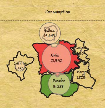
24) = 6.37, p = .012) and system (χ2(1, N = 24) = 10.89, p = .001)        higher than 5.2 from the first study). For both SketchStory and
with SketchStory than PowerPoint. We also analyzed the response to        PowerPoint, they also tended to agree with the statement “It was
Q2 for both stories and did not find a significant difference between     easy to give a presentation with this system” (Q1: 5.8; higher than
them (χ2(1, N = 24) = 1.32, p = .25). This indicates that the perceived   4.7 for ease of use for SketchStory from the first study). Presenters’
engagement of both stories was the same, but SketchStory made the         reaction was similar for Q4: “I am satisfied with my presentation
audience feel more engaged for the same story.                            with this system.” However, SketchStory tended to be ranked higher
    In addition, 75% (18 out of 24) of our audience participants chose    for Q2 (fun) and Q3 (perception of audience engagement).
SketchStory as their preferred presentation system. When asked why,           Four out of five presenters chose SketchStory as their preferred
their reasons were: more engaging, interactive, dynamic, better           presentation system even though all five presenters indicated that
storytelling, more organic, more personal, annotation, and one            SketchStory required more effort. They seem to think that
screen. Their comments upheld our design rationale to achieve more        SketchStory helped keep the audience more engaged. For example,
engaging presentations. For example, P10’s comment touches many           PP1 stated that “It felt as though I was bringing the audience with
of these: “I liked how he [the presenter] could draw a picture to         me on a journey versus ‘presenting to (at)’ them.” PP5 mentioned
have the graph present itself. The view of all the data presented on      that “It is almost like I’m telling a story rather than stating facts,
one screen, options to choose to focus on a particular piece of data.     which is more fun/entertaining/informative/memorable for everyone
Being able to add text as you go—specifically highlighting what is        involved.” Not surprisingly, the most common reason given for more
being discussed. It’s much more interactive and able to keep my           effort was the fact that they had to draw the icons to populate the
attention more interesting than a static presentation.”                   graphs. Two presenters also commented that, for SketchStory, they
    More specifically, P2’s comment demonstrates that SketchStory’s       had to be more familiar with the content.
real-time content creation successfully created anticipation: “The
system makes you want to see what was next. I felt it kept your           6   D ISCUSSION    AND   F UTURE W ORK
attention better.” In addition, P24’s comment shows that
interactivity on a canvas helped people follow the story: “The ability    The encouraging results of the controlled study indicate that the
to interact with the data and the more organic presentation made it       SketchStory design supports more engaging storytelling. The results
easy to follow the story. Having the entire presentation on one           from both studies also point out the unique affordances and potential
screen allowed greater context in understanding the story.”               of the approach, and provide exciting possibilities in the direction of
    Interestingly, several audience also commented about presenters’      novel and engaging storytelling with data.
perspective. For example, P7 stated that “It allowed the presenter            Integration with Exploration and Better Authoring Capability:
opportunities to engage his audience, not just present to them.” P11      Participants commented about the capabilities of data-bound
stated his desire to try SketchStory: “I enjoyed watching the             sketching for data exploration. For example, two participants in the
presentation, and I would be eager to give a presentation using this      first study mentioned that they would like to change the chart type
system [SketchStory].”                                                    dynamically (e.g., from bar chart to line chart). We have extended
    It seems that low-quality sketching can cause distraction,            SketchStory to support chart type changes for the charts with x and y
hindering the audience from being more engaged. Six audience              axes through simple sketch gestures. For example, you can draw a
participants chose PowerPoint as a preferred system mainly because        bar and an ‘M’ shape in the chart area to switch to a bar chart and
of the readability. They mentioned that PowerPoint was “easier to         line chart, respectively. However, an example icon good for one
read,” “legible,” and “easier to see and read.” Another reason by two     chart type is not necessarily right for the other. For example, thin-
audience participants was familiarity. For example, P14 stated that       and-tall icons are good for bar charts but not so great for line charts.
“The ease of visibility understanding the flow, the cleanness of the          To ease the problem of mode switching, SketchStory enables the
graphics in each slide the boldness of the fonts much easier to follow    presenter to record a sequence of charts before the presentation, and
along with it as I was more familiar with it.”                            to invoke them with simple sketch gestures during the presentation.
                                                                          However, SketchStory currently does not support editing of the
5.2.5     Results and Discussion: Presenter                               recorded story, requiring the presenter to manually edit the metadata
After each presentation, presenters answered five questions               file with a text editor. Since this is tedious and error-prone, a logical
measuring subjective ease of learning, ease of use, and engagement;       next step is to support a better authoring capability within
they answered only four questions for PowerPoint because we did           SketchStory. We believe incorporating exploration capabilities will
not ask about ease of learning. We again used a 7-point Likert scale,     facilitate story authoring. For example, the presenter could create a
with 1 = Strongly disagree and 7 = Strongly agree. Figure 9 shows         story from a canvas during the exploration phase by dragging a chart
the average subject responses from presenters for both systems.           into a separate story pane. The order of charts could be changed with
Since we did not have enough presenters for statistical analysis, we      simple drag-and-drop interaction. In addition, changes in chart
report only descriptive statistics. For SketchStory, presenters tended    settings on a canvas could be easily reflected to the story. We have
to agree with the statement “It was easy to learn” (Q5: 6.0 average;      been expanding SketchStory accordingly to provide a seamless
                                                                          experience from fluid data exploration to engaging presentation.

Fig. 8. Average subjective responses from the audience to 7-point         Fig. 9. Average subjective responses from presenters to 7-point Likert
Likert scale questions; 1 = Strongly disagree or Not engaged at all and   scale questions; 1 = Strongly disagree or Not engaged at all and 7 =
7 = Strongly agree or Highly engaged. All differences are significant.    Strongly agree or Highly engaged.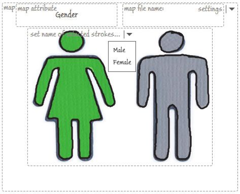
Burden vs. Control: Interestingly, most presenter participants         for a short, simple story but not sufficient for long, complex ones.
preferred SketchStory even though it required more work. This              SketchStory also works best when presenters can find and draw
means that lowering perceived workload does not always lead to the         icons that best match their story. To enable richer presentations
optimal experience. We suspect this is because of the trade-off            covering broader types of stories, we need to add a more powerful
between burden and control. For example, we could minimize the             data layer that can handle more complex data and extend the gestures
burden during the presentation by allowing presenters to record            and interactions to support additional chart types (e.g., scale charts,
additional chart settings such as the size and location of the charts,     stacked bar charts, etc.) and more sophisticated visualizations. A
and then to invoke them with simple click-through. However,                scrollable or zoomable canvas could help SketchStory support a
presenters then lose an additional measure of control during the           longer story. However, it may lose the one-page overview of the
presentation, and the experience approaches that of the traditional        story. How to extend SketchStory to support more complex stories
presentation. It is important to note that some presenter participants     remains future work.
liked having the control and believed that it helped them keep the             Limitations of Controlled Experiment: As an initial step, our
audience more engaged.                                                     controlled experiment compared only the live presentation aspect of
    In the current implementation, the presenter can see the chart         SketchStory with PowerPoint, excluding the story preparation (e.g.,
sequence in a dropdown list and change the order at any time by            authoring) aspect. Further comparisons with presentation tools with
selecting a different thumbnail. However, for fluid presentations,         more flexible storytelling features would shed more light on the
presenters need to remember the sequence without interrupting their        strengths and weaknesses of the SketchStory design. As briefly
flow. Existing commercial presentation tools like PowerPoint and           mentioned above, we have been extending SketchStory to
Keynote provide a presenter view mode, where the presenter could           incorporate data exploration along with authoring of the sequence of
preview the next slide along with a current slide on a computer            charts. Further evaluations on the usability and effectiveness of the
screen. It would be useful to explore how to help presenters better        chart sequence authoring would help us better understand the
remember or recall the flow.                                               feasibility of the SketchStory approach.
    Sketch Rendering: During the implementation of tally chart                 In addition, our experiment does not address whether the main
rendering for initial SketchStory, we had a trade-off between data         effect of participants’ preference is due to the sketchy rendering
precision and aesthetics. For instance, in Figure 10, data values of       style, due to the interactive, animated generation of charts, or due to
307 and 365 have an equal number (five) of icons. We originally            the combination of both. Also, presenter participants spent more time
decided not to clip or distort icons for two reasons. First of all, we     practicing SketchStory because they already felt comfortable with
wanted to provide more aesthetically pleasing drawings; clipped            PowerPoint. This could have made differences in their presentation
icons looked untidy. We identified similar practices by infographics       quality. Furthermore, our experiment could not control the novelty
designers during our analysis phase, preferring aesthetics to precision    effect; people might have preferred SketchStory because it is new
(e.g., Figure 2a). Ultimately, our main goal was to support                and different than existing presentation tools. Therefore, future
storytelling scenarios that demonstrate major trends without               research is needed to tease out these factors.
depending on exact precision. Second, given the imprecise nature of            Participants acknowledged that SketchStory’s capability of
sketching, we believed that people would be more forgiving of              digitizing whiteboards could be useful in other domains. For
imprecision in sketched content. In fact, during our first usability       example, they mentioned that the SketchStory approach would be
study, participants did not complain about imprecision. Rather, they       great for lectures and group meetings because it allows for dynamic
used annotations to point out major trends. However, how the               group interaction. In the controlled experiment, we mainly
sketchy and iconic rendering of data charts affect the perceived           investigated the subjective level of engagement for stories with data.
accuracy requires further investigation.                                   It would be useful to investigate effectiveness of the SketchStory
    Regarding the sketchy rendering style, one participant                 approach for content understanding or idea generation, not just in
commented that SketchStory would be more useful for less business-         data story presentations but also in other contexts such as education.
based presentation, such as art or gaming. People may infer a sketchy
style to be more fun and entertaining rather than official and serious.    7   C ONCLUSION
It would be interesting to investigate the possible connotations for
sketchy rendering more formally in future work.                            Inspired by successful storytelling techniques, we explored a novel
    Some audience participants preferred PowerPoint because                approach to telling stories with data by melding the expressive visual
SketchStory looked untidy and cluttered for them. Furthermore, one         language of infographics with the narrative storytelling attributes of
major issue with SketchStory for the audience was readability; each        whiteboard animation. We presented SketchStory, an interactive
chart did not have a title like a PowerPoint slide and the fonts for the   whiteboard system integrating real-time freeform sketching
numbers and labels were too small. An audience participant                 capabilities with the fluid synthesis of interactive, organic data-
mentioned that it would be nice to have the capability of maximizing       bound charts. We first conducted a usability study to understand how
one chart since it would alleviate the readability problem. It could be    people would use this new form of storytelling. We improved the
helpful to incorporate existing sketch beautification algorithms and       system based on the lessons learned from the first study. For
to support adaptive font size.                                             example, to reduce the burden of manual manipulation during the
    Scalability: The current SketchStory design is not scalable in         presentation, SketchStory allows the presenter to record a sequence
terms of the complexity of data and types of story. It currently           of charts before the presentation, and invoke them with simple sketch
handles only tabular datasets with simple data charts and is suitable      gestures in real-time. We then conducted a controlled experiment to
                                                                           compare SketchStory with Microsoft PowerPoint, one of the most
                                                                           commonly used presentation tools. Results show that the audience is
                                                                           more engaged with the presentation done with SketchStory than
                                                                           PowerPoint, and that most presenters favored SketchStory even
                                                                           though they acknowledged the extra effort required to present with
                                                                           SketchStory. In addition, our results provide new possibilities for
                                                                           future work in sketch-based narrative storytelling with data.

                                                                           A CKNOWLEDGM ENTS
                                                                           The authors would like to thank Kris Crews and Jake Knapp for their
                                                                           help with video, and Eun Kyoung Choe for her help with figures. We
Fig. 10. Example tally chart generated by initial SketchStory.             also thank Sumit Gulwani for the code for corner-finding algorithm.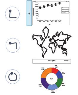
You can also read