NurseView Smart Glasses for Nurses - ID4170 Advanced Concept Design Andreas Lif (4584406) - Delft Design Labs
←
→
Page content transcription
If your browser does not render page correctly, please read the page content below
NurseView
 Smart Glasses for Nurses

   ID 4170 Ad vanced C oncep t Design
         And reas Lif (4584406)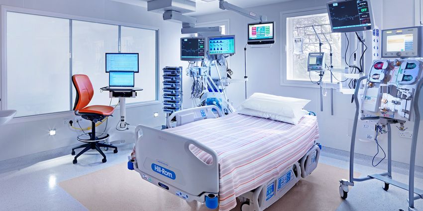
ID 4170 Ad vanced C oncep t Desi gn
      And reas Lif (4584406)

       C lient: Er asm us M C
    C DP C oach: Er ik v an Kuijk
   C om p any C oach: Elif Ozcan

   Faculty of Ind ustr ial D esign
  Delft Univer sity of Technology
            2016/ 2017
1 . I n trodu c tion
        1 .1 A s s i g n m en t						5
       1 .2 A ppro ach an d V i s i o n 				5
       1 .3 Co n cept S u m m ary					6
2 . Con c lu sion s
      2 .1 S tate o f th e A rt						9
       2 .2 Co g n i ti ve Erg o n o m i cs 				 10
       2 .3 U s er In s i g h ts 						11
       2 .4 Cu l tu ral A s pects 					 12
       2 .5 Tech n o l g y							14
       2 .6 A n th ro po m etry						15
3 . Pre se n ta tion
      3 .1 D es i g n 							17
       3 .2 D i m en s i o n s 						18
       3 .3 In teracti o n 							19
       3 .4 Eco n o m i cs 						 21
4 . E va lu a tion
       4 .1 P ro to type							23
       4 .2 U s er Tes ts 							24
       4 .3 Nu rs e F eedback					25
5 . R e fe re n c e s
1. Introduction

1 . 1 Assign m e n t 1 .2 A p p ro a c h a n d V i s i on
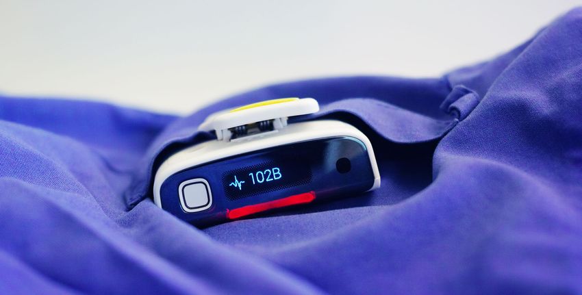
The Intensive Care Unit (ICU) of a hospital is a After an extensive literature review of the problem,
noisy environment. Because the patients there further research followed from a cultural,
are in need of critical care, they are constantly ergonomic and technological point of view.
monitored and treated with the help of machines For the cultural study this meant looking at the
that sound alarms if something is wrong. historical development of an ICU as well as
However, it turns out that a lot of the alarms are how medical devices are perceived in the light
unnecessary and studies have shown that false of todays consumer electronics which has seen
alarms, or those that require no action on behalf such a rapid development in the last decade.
of the nurses, range between 80 - 99% (1). In terms of ergonomics, the focus was mainly on
The excessive amounts of alarms has given rise sensory and cognitive aspects. User tests were
to a phenomenon known as alarm fatigue which conducted to review if alarms could be delivered
menas that nurses get desensitised to alarms by other means than audio.
and start to tune them out. This can cause them Promising technologies was also investigated to
to miss critical alarms, which is a serious threat broaden the horizon of what is possible.
to patient safety.
From the results of the research phase a design
The purpose of this project, commissioned
vision took shape that would guide the creation
by Erasmus MC hospital in Rotterdam, was to of three concepts out of which one would be
develop concepts that could create a silent ICU selected for further development
and reduce the problems with alarm fatigue for
the nursing staff. The design vision was to localise alarms
by eliminating problems with overhearing
colleagues’ alarms and to create a calm for the
nurses by reducing their cognitive load through a
clear alarm hierarchy.
5
1 . 3 Con cep t S u m m a r y
The final concept, NurseView, is a pair of smart
glasses that aim to replace the communication
devices of todays hospitals. It works by providing
the user with a heads up display, which allows it
to deliver alarms to only the person who needs it,    Localised Alarms
going unnoticed by everyone else.                     Alarms are localised to each individual nurse, eliminating overhearing of colleagues’
The heads up display uses Zeiss Smart Glass           alarms, by delivering them via a state of the art heads up display.
technology which allows for a design similar to
that of regular glasses. It also allows the glasses
to work with regular prescriptions, so there’s no
need for users with visual impairment to wear
lenses underneath.
Audio is also available for critical alarms through   Alarm Hierarchy
bone conduction technology embedded in one            An alarm hierarchy is created by compressing non-critical alarms into icons in the
of the temples, which makes sure that the sound       Dashboard, located in the users’ periphery, where they are easily available at a glance
is only heard by the intended receiver and not the    but don’t demand the immediate attention of the user.
entire ward.
The glasses improve up traditional hospital
communication devices in three innovative ways,
making up it’s Unique Selling Points, listed to the
right.
                                                      Touchless Interaction
                                                      The user can interact with the device without touching it, by covering a proximity sensor
                                                      on the side of it with their hand, which improves on hygiene and usability, especially in
                                                      situations where you cannot reach for a pager.

                                                                6
Interaction with the device is easy and as
mentioned works by covering a proximity sensor
on the side of the glasses.
Having a very simple interaction method like this
accomplishes two things. It makes the product
easy to use, which is important for a paradigm
shifting device. If it’s too complicated to use, it
may be overwhelming for the user who will then
likely reject it.
It also intentionally limits the functionality of the
device and creates a focus on making sure it
does accomplishes it’s core functionality really
well, instead of trying to do too much.

                                                        7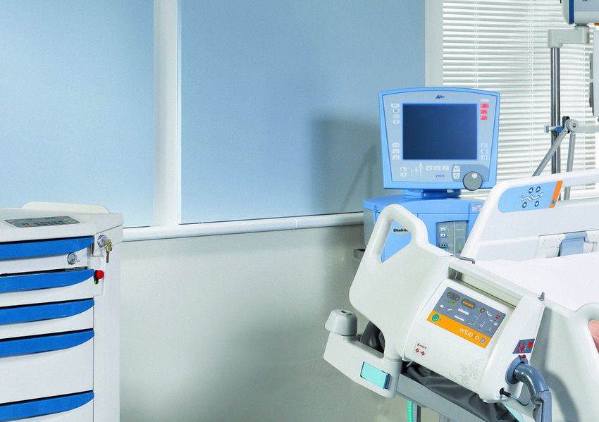
2. Conclusions

      8
2 . 1 State of th e A r t
As it became clear that new means of
communicating alarms to the nurses was
needed, research started on determining the
state of art. It was entirely possible, and actually
the case, that Erasmus MC was not using the
latest technology available. To not reinvent the
wheel it was necessary to look at what the best
solutions available offered.
A company that advertised ambitions of reducing
alarm fatigue was Ascom with their Myco
smartphone.
Strengths of this product includes the use
of a top display, serving the most important
information at a quick glance. It also features
the use of icons on for rich information. Focus            C on clu s ion s
is also on infrastructure of connecting machines,
centralising alarm management and escalation               The groundwork for a central alarm system and
options.                                                   escalation of alarms already exists.

Despite these strengths, it falls short in a number        Alarms should not be primarily delivered by
of ways. Alarms are still delivered primarily by           sound, but rather by haptics or visuals.
sound, which means that overhearing is still               The product should have a very clear focus
an issue. Making use of the top display means              on solving the problem really well and not be
attaching it by a clip to your clothing, which             bloated with unnecessary extra functions that
means that the haptic functionality is unreliable          may distract more than help.
at best and enforces the continued reliance on
sound. Another drawback is a lack of focus.
Advertising portrays it as being purpose built,
but the home screen tells a different story entirely
with all the (seemingly unnecessary) apps vying
for the users attention.

                                                       9
2 . 2 Cogn it iv e Er gon om i c s
The book “Calm Technology Principles and
Patterns for Non-Intrusive Design” by Amber
Case served as a major source of inspiration for
the final concept. In it, she details problems of
information overload and provides a list of eight
guiding principles to achieve a design that uses
technology in a calm way.
Two of these principles were of special relevance
for project and key insights from each of them
are summarised below.

Technology should inform and create                     Technology should use the periphery                  C on clu s ion s
calm                                                    An example of a calm experience is when you          Because the ICU is a loud environment in a
When designing a notification it is important to        are driving a car and a light pops up on the         public space, sound should only be used as a
consider the environment in which it will be used.      dashboard, telling you that you need to fill up      redundant means of communicating alarms.
Is it a loud or quiet space? Public or private? Can     the tank. These kinds of notifications informs       Make use of the user’s periphery for alarms that
it be communicated without distracting from the         something about your primary task and gives          are not critical. This will ensure that the nurses are
primary focus of the user? If the notification fails,   you a sense of calm. It does not require your full   not interrupted more than absolutely necessary.
is there a redundancy? (2)                              attention (3).
                                                                                                             If an alarm does not require the immediate action
“Ideally, technology should allow us to shift our attention to it very                                       of a nurse, it should not demand their immediate
briefly, get the information we need, and shift back, letting us attend                                      attention.

to more things in our environment without being overwhelmed.”

										Amber Case

                                                                               10
2 . 3 User I n s igh t s apps: “It looks good, but it looks like it has way implemented along with non-critical alarms
too many functions. It should only have what is and potentially help relieve the stress by not
To truly understand the needs of the user, a necessary for the job.” needing to keep all of those things in ones head.
nurse with years of experience from a neonatal It also further validates the conclusion from the
Intensive Care Unit was consulted. Several Another “feature” of the Myco is the ability to show ergonomic studies that it’s good to be able to
interviews were conducted, mostly over video a graph of an alarming vital, which was thought keep certain information in the periphery and
chat, which provided valuable insights based on to be important, but in her opinion was not: “[A check it every once in a while, which is essentially
real world experience. This included things like graph] may be good to see a trend, but those what she is doing with her pen and paper.
a nurse’s workflow, typical sources of alarms, don’t change that quickly, so it doesn’t really tell
what triggered them and categorisation in terms you anything. I think it would just be distracting.”
of urgency, but also the addition of features that but added that “It would be great if it could
had not been thought of otherwise. show the threshold value within parentheses or
something next to the current value, because
Talking about alarm fatigue in general she that can vary from patient to patient”.
definitely recognised the problems with false
alarms: “There’s usually something that causes In terms of urgency of alarms, she mentioned
the alarm, but it could be a value that dips that for instance infusion pumps often alarmed
right below the threshold for a few second and for things that were not really urgent at all: “If a
then goes back. Then there’s really no action syringe is running low it beeps to let me know, but C on clu s ion s
needed”. When that happens several times for I may be busy with something else, and I know Live feed of vitals are very useful, as are threshold
the same patient, she said she knew what it was that nothing serious will happen because of it. values.
as soon as she heard the alarm, but that there It’s just not critical”, also adding that it could be
especially stressful when several of those alarms Graphs of vitals are not really useful for an alarm.
was probably no real danger.
went off at the same time. Features should only include what’s necessary.
She also responded very positively to the idea of
having a live feed of the vital value: “That would When speaking of other things that could help Some alarms are not critical, f.i. infusion pumps.
be great! Then I wouldn’t have to go to the reduce stress, she mentioned that she always Being able to set reminders for certain activities
monitor to check every time”. She also added has to carry a piece of paper and a pen to keep could help relieve stress.
to this that it would be great if those threshold track of scheduled activities with patients, such
alarms “would just disappear” if the value went as temperature checks, respiratory checks,
back to a safe level. medication times and added “it would be great
if I could type that in somewhere and just get a
She also helped point out some of the strengths reminder when it’s time”.
and weaknesses with the previously mentioned
Ascom Myco, such as the many unnecessary The latter is something that could be easily
112 . 4 Cu ltur a l A s p ect s
After the concept choice of smart glasses
was made, it was important to look at what
implications this meant in terms of social norms
and user acceptance. Perhaps it could be
difficult to persuade the nursing staff to adopt a
tool that they would wear in such a personal way.
There were also things to consider with regards
to normal glasses. Would people who need
glasses need to wear lenses underneath? This
could be a problem since lenses are typically
more expensive than glasses in the long run.
Some people also struggle with lenses as they
can cause eyes to feel irritated and dry.
What comes to most peoples mind when they
think of smart glasses is probably Google Glass,
which was the company’s bet on augmented
reality which failed very quickly and saw much
scrutiny in its short lifetime.
A more recent example is Snap Inc.’s Spectacles,
which are sunglasses that can be used to record
and upload short videos to the company’s
popular social media Snapchat. While the jury is
still out on this one, there hasn’t been any major
controversy yet and has seen a lot of consumer
enthusiasm, creating long lines where they are
sold in balloon covered yellow pop up vending
machines.
This raised the question of why one product failed
while the other one seemed to be succeeding?
12Looking first at Google Glass some of the things
that were associated with it was very expensive
at €1500.
It was also exclusive since you had to be a “Google
Explorer” to even have the option of buying one.
It also had a very obvious camera that did not
have a traditional status indicator, showing if it
was recording or not. From an aesthetic point
of view, it looked like a very technical product,
especially when worn without actual glass.
If you put all of these things together you got
a very mysterious, elitist, “techy” product that
raised legitimate privacy concerns.
Snap Inc. on the other hand seemingly learned
from the mistakes of Google. The Spectacles are
relatively cheap at €130. They have an indicator
light for the camera, come in different colours a C on clu s ion s
shape that looks fun rather than technical and, Users that wear regular glasses may not want to
maybe most important, do not look very different wear lenses underneath for comfort, health and
form a regular pair of sunglasses. economic reasons.
While the latter may not be as important for in a The addition of a camera can raise some privacy
hospital environment where the glasses are part concerns, especially if used without a status
of your uniform, it can still affect user’s feelings indicator.
and identity as a professional and therefor
Strive for a design that looks as much like normal
impact user acceptance, which is an important
glasses as possible for better user acceptance.
consideration in a paradigm shifting product.
132 . 5 Techn olgy
Google glass served as a very good proof of
concept in terms of technical specifications and
component size. From a teardown image that
included an item with a known size (American
quarter) it was easy to estimate the size of
battery, projector module etc. and use these
measurements as a base for the design.
Appropriate technologies for the heads up
display was searched for based largely on
the conclusions of the cultural study. A new
technology from Zeiss, called Smart Glass,
was clearly the best fit as it was developed with
the specific requirement that it should not look
significantly different from normal glasses.
The glass can be customised to work with C on clu s ion s
prescriptions, eliminating the need to wear
lenses, and works by reflecting an image into Google glass can be used as a proof of concept
the eye so that it can be positioned anywhere for technical specifications and component sizes.
in the field of view of the user. This means you Zeiss Smart Glass is a good technology that
are not limited to projecting something on the meets the requirements based on conclusions
glass that would be too close to read for most from previous studies.
people. It also means that part of the content can
be positioned in the the periphery of the user and
the rest on the edge of the main field of view. This
allows it to comply with the conclusions from the
ergonomic study.
142 . 6 An thro p om e tr y
In order to keep a competitive price point, one
goal of the product was large scale production.
To achieve this, it likely would need to be sold
all over the world, which means that the target
group in terms of anthropometry was not limited
geographically.
The main source of measurements for this
purpose was dined.nl (4), where international
male and female adults were chosen as target
group and percentiles were set between 5% and
95% to cover most people. This resulted in a
head width of 123 - 173 mm.
Unfortunately it was difficult to find a source with
anthropometric data that was useful to determine
the temple length. For this reason a size guide C on clu s ion s
from an optician website was used (5) which
stated that the most common lengths are 135, A relatively large span of head widths and temple
140, 145 and 150 mm. lengths needs to be covered.
Since both temple length and head width covers A modular design offers greatest flexibility without
a relatively large span, the glasses would either having a large number of SKUs.
have to be adjustable or come in dfferent sizes.
Adjustable parts wear over time and add bulk,
while different sizes means many SKUs since
you would have to accomodate two variables.
A solution to this would be to use a modular
design with one frame that comes with several
exchangable temples that would vary in both
length and total width.
153. Presentation
163 . 1 Desig n
A modular design was chosen for several
reasons. It allowed for compatibility with
different head sizes without the use of adjusting
mechanisms that would add bulk and wear out
from continuous use.
By instead making the temples detachable
from the rest of the frame, the product could be
selected to fit each individual.
Making these easy to detach also meant that
simple repairs as a broken temple could be
quickly fixed instead of having to replace the
entire frame.
By storing the battery in one of the temples and
the electronics in the other, this also allowed for
a good solution for battery replacement. Though
the primary way to charge is inductive wireless
charging, it is still possible that a user can
forget to charge, which would leave the product
unusable if there was no way to change battery.
173.2 Dime nsions
Dimensions were chosen to accommodate
component sizes similar to those used in Google
Glass, which would ensure sufficient battery life
and processing power.
It also took into account the results from the
anthropometric study, where the frame’s width
was chosen as the average head width, which
allowed for the smallest variation between the
widest and narrowest temples.
183 . 3 I n terac t ion
The main way of interacting with NurseView is by holding your hand in front
of the proximity sensor on the side of the device. The interactions are kept
simple and functionality is intentionally limited to the main functionality.
A critical alarms pops up in the user’s field of view with a subtle animation to
grab the user’s attention. If the user covers the proximity sensor, the alarm
is acknowledged. If the alarm is not acknowledged within a few seconds
an auditory beep is heard through the bone conducting transducer. This
is a redundancy feature in case the user, for whatever reason, should not
notice the visual alarm.
19Non-critical alarms, or reminders from user input, appear in the Dashboard
located right at the edge of the user’s periphery. These alarms are color
coded based on how much time is left with green having more time left
than orange. They are also sorted in order of urgency with the most urgent
being to the left, since most things in our (western) society progress from
left to right such as reading, play/forward/back buttons on media devices
etc.
The user can then expand these alarms to get more information at a glance,
by covering the proximity sensor. As long as the sensor is covered, the
expanded view is shown, and when the user lowers their hand, it animates
back to the normal collapsed view. In the expanded view alarms are shown
in order of urgency with the topmost being the most urgent, as most things
also progress from top to bottom.
203 . 4 E con om ic s
Prices of electrical components and labour (assuming producting in China)
were estimated by a cost breakdown of Google Glass components done
in May 2014 (6), assuming (a undervalued) 1:1 conversion rate from U.S.
dollars to euros and rounding up to the nearest euro. It is a reasonable
assumption that components would cost the same or less today and
deliver equal or better performance.
The production cost of the materials for the frame and temples were
estimated using the 1-3-9 method (7) or injection moulded polycarbonate.
According to this method the manufacturing cost of a component can be
estimated to 3 times the material cost for volumes of 10 000 or more.
As detailed information about the Zeiss Smart Glass was not available, the
cost for this was a rough estimate and should be taken as such. A post for
unforeseen costs was also added to make sure it is not an underestimate.
Finally it should be noted that 216 euro is the estimated cost of production.
This means that the cost for the customer would be around three times
that, about 650 euro, according to the 1-3-9 method.
214. Evaluation
224 . 1 Pro to ty p e
The most interesting thing to evaluate was the
heads up display. Because the technology used
does not simply project something on the glass,
but rather reflects an image that can be positioned
at a set depth in the user’s field of view, it was
difficult to create a realistic representation using
photographs or video.
Instead, a prototype was made based on the
illusion Pepper’s Ghost. A interface was created
and loaded onto a smartphone which was
placed to the side of the user at a 90 degree.
A transparent plastic sheet was placed at a 45
degree angle to both the screen and the user,
which causes the interface to be reflected in the
plastic, but still allows the user to see through
it. This gives a more a three dimensional sense
of the placement of the screen and is also very
similar to how the actual product would work.
234 . 2 User Te s t s
It was clear that the readability of the text greatly
depended on how much contrast was created its
background. Because of this, several interfaces
was created with different coloured text on both
black and white backgrounds, a total of 10
combinations.
Tests subjects were then asked, in a brightly lit
indoor environment, to walk around (because
movement is an important aspect to simulate)
and look through the plastic sheet and rate
the different interfaces in terms of readability,
distraction while focusing on something other
than the display and overall aesthetics. Ratings
were done on a scale of 1 to 5, with 5 being the
most readable/distracting/aesthetically pleasing.
K e y Insight s
Tests were conducted on a total of five people,
two male and three female, of age 22 - 26. The text was considered readable even while in motion.
Since the Zeiss Smart Glass allows for the use The black background was preferred over the white, because it was easier on the eyes, although
of prescription glass, visual impairment (which equally good contrast could be achieved for the white background as well.
tends to increase with age), was not considered
Warmer colours also tended to be preferred over cooler ones for the same reason, which is something
a problem.
to take into consideration if using a traditional red, yellow, green colour scheme to indicate the level
The test group was not large enough for of urgency.
statistically relevant results, but a few insights
There also seemed to be a trade off between readability and distraction when focusing on something
was made nonetheless, presented to the right.
other than the display. When readability scored higher, distraction typically scored lower, and vice
versa.This is something that needs to be tweaked in further development to find the optimum
compromise between the two.
244 . 3 Nu rse F e e d b a c k
The same nurse who had been continuously
interviewed during the development of the project
was shown the final concept as and asked for
feedback. She was shown renders of how the
product would look as well as a short video clip “I th i n k th e g l as s es l ook ne a t! So nic e to not ha ve to
of the interaction with the interface. di g th ro u g h th e po cket for a p a ge r.”
She said it was really clever to have the battery in
- Emma (Nurse )
one the temples and that they could be changed
for different sizes.
Another thing she liked was how the interface
animated. In the video clip critical alarms were
animated with a pulsing effect.
Furthermore she said it would be interesting to try
in order to see if Dashboard would be distracting
or not. For future development the placement
of the display is very import and something that
needs to be optimised. As mentioned before it
is designed to be placed so that the Dashboard
appears in the periphery while alarms pop up just
inside the main field of view.
She also liked the functionality of displaying more
information for alarms by covering the proximity
sensor.
255. References
261. Monitor Alarm Fatigue An Integrative Review, 2012. Maria Cvach.
2. Calm Technology Principles and Patterns for Non-Intrusive Design, 2016. Amber Case. pp. 20 - 21
3. Calm Technology Principles and Patterns for Non-Intrusive Design, 2016. Amber Case. pp. 21 - 28
4. Anthropology in Design.
www.dined.nl [Accessed 2017-02-02]
5. Find Your Size.
https://www.fetcheyewear.com/find-your-fit/size [Accessed 2017-02-02]
6. Google Glass Teardown.
http://www.techinsights.com/about-techinsights/overview/blog/google-glass-teardown/ [Accessed 2017-02-02]
7. The Mechanical Design Process, 2010. Ullman, David G. pp. 325 - 328
27ID 4170 Ad vanced C oncep t Desi gn
And reas Lif (4584406)
28You can also read