Vuzix Blade Dev Kit User Experience (UX) Design Guidelines
←
→
Page content transcription
If your browser does not render page correctly, please read the page content below

Vuzix Blade®
                       Dev Kit
                       User Experience (UX)
                       Design Guidelines

                        V2.11
                        October 2, 2020

                        This document contains information proprietary and
                        confidential to Vuzix Corporation, or a third party whom Vuzix
                        may have a legal obligation to protect such information from
                        unauthorized disclosure, use, or duplication. Any disclosure,
                        use, or duplication of this document or of any of the
                        information contained herein for other than the specific
                        purpose for which it was disclosed is expressly prohibited,
                        except as Vuzix has otherwise agreed in writing. All copies of
                        this document are the sole property of Vuzix and will be
                        returned promptly upon request.

Vuzix | Confidential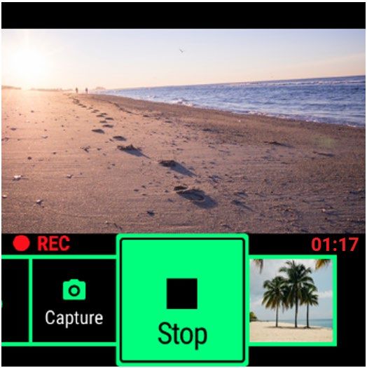
Table of Contents
UX Philosophy & Principles ...................................................................................................................................................... 3
   Tap and Swipe........................................................................................................................................................................ 3
   Center Focus .......................................................................................................................................................................... 3
App UI Architecture.................................................................................................................................................................... 4
Hardware Interactions ............................................................................................................................................................... 5
   Button (Power)........................................................................................................................................................................ 5
       Overview ............................................................................................................................................................................. 5
       Behavior .............................................................................................................................................................................. 5
   LED .......................................................................................................................................................................................... 5
       Overview ............................................................................................................................................................................. 5
   Touchpad ................................................................................................................................................................................ 6
       Overview ............................................................................................................................................................................. 6
       Behavior .............................................................................................................................................................................. 6
UI Interaction Elements ............................................................................................................................................................. 7
   Apps ......................................................................................................................................................................................... 7
       Overview ............................................................................................................................................................................. 7
       Behavior .............................................................................................................................................................................. 8
   Action Bar ................................................................................................................................................................................ 8
       Overview ............................................................................................................................................................................. 8
       Behavior .............................................................................................................................................................................. 8
   Warning Bar ............................................................................................................................................................................ 8
       Overview ............................................................................................................................................................................. 8
   Notifications ............................................................................................................................................................................ 9
   Overview ................................................................................................................................................................................. 9
       Behavior .............................................................................................................................................................................. 9
   Lists ........................................................................................................................................................................................ 10
       Overview ........................................................................................................................................................................... 10
       Behavior ............................................................................................................................................................................ 10
   Sliders .................................................................................................................................................................................... 10
       Overview ........................................................................................................................................................................... 10
       Behavior ............................................................................................................................................................................ 10
   Confirmation.......................................................................................................................................................................... 11
       Overview ........................................................................................................................................................................... 11
   Status ..................................................................................................................................................................................... 11
       Overview ........................................................................................................................................................................... 11

Vuzix | Confidential                                                                                                                                                                           1
Visual Design ............................................................................................................................................................................ 12
   Animation .............................................................................................................................................................................. 12
   Color....................................................................................................................................................................................... 12
       Core Color Pallet .............................................................................................................................................................. 12
       Color Considerations ....................................................................................................................................................... 12
   Typography ........................................................................................................................................................................... 13
   Layouts .................................................................................................................................................................................. 14
   Themes – Light & Dark ....................................................................................................................................................... 16
       LIGHT THEME ................................................................................................................................................................. 16
       DARK THEME .................................................................................................................................................................. 16
   Icons....................................................................................................................................................................................... 17
Imagery ...................................................................................................................................................................................... 18
Voice Interactions / Voice Assistants .................................................................................................................................... 19
   Overview ............................................................................................................................................................................... 19
   Command List ...................................................................................................................................................................... 19
Gestures .................................................................................................................................................................................... 21
Device Feedback ..................................................................................................................................................................... 25
   Single Side of Blade vibration ............................................................................................................................................ 25
BLE/Wi-Fi .................................................................................................................................................................................. 26
   Bluetooth ............................................................................................................................................................................... 26
   Bluetooth Low Energy (BLE) .............................................................................................................................................. 26
   Wi-Fi ....................................................................................................................................................................................... 26
Micro SD Card .......................................................................................................................................................................... 26

Vuzix | Confidential                                                                                                                                                                          2
UX Philosophy & Principles
The overall user experience (UX) design philosophy for the BladeOS was to keep the user interaction simple.
Voice interaction allows for hands free actions and the touch pad enables quick touch interaction. The touchpad
only requires two types of interactions:

Tap and Swipe

                         Tap                                                    Swipe

    Tap will:                                                Swipe – is the primary method of Navigation.
           •    Turn on the display.                         Swipe will navigate:
           •    Opens an App or performs an Action                 • Apps
                                                                   • Actions
                                                                   • Photos/Videos

This simple “tap and swipe” UX philosophy drives a consistent easy to learn and use method for the Blade.

Center Focus
The UI Design is based on keeping one item in focus and moving items/actions/lists into that center focus area as
the user swipes. For example, when navigating your Apps, the BladeOS displays one App in focus. When
navigating your Actions, the BladeOS displays the currently highlighted Action in focus. This interaction is the key
to the simplicity of the user interface; users DO NOT MOVE FOCUS from object to object they move objects
INTO THE CENTER FOCUS AREA.

Vuzix | Confidential                                                                                             3
App UI Architecture
The Blade utilizes a customized version of an Android OS(BladeOS) that utilizes the Android API to allow apps to
be devloped and deployed to it.
The BladeOS enables 3rd party developers to easily add Apps to the Blade glasses. The diagram below shows
the basic method for getting an App onto your Vuzix Blade™.

Software developers can add their Blade App to the Vuzix App Store, which will make it available to all Blade
users.
The Vuzix Companion App continuously syncs with the Vuzix App Store, allowing a user to search, view and
install a Blade apps onto their Blade. The BladeOS then displays these apps on the Vuzix Blade™.

Vuzix | Confidential                                                                                            4
Hardware Interactions
Button (Power)

Overview
The Blade has one physical button (1), a power button. This button can be used to power ON and power OFF the
Blade.
Power NOTE: To save battery life, only turn on the display when needed.

Behavior
Pressing the Power button will power ON the Blade. A quick press and release of the Power button will turn the
display ON or OFF depending on the current state. A “Press and Hold” will display a Power Off Confirmation
Action Bar allowing the user to power OFF the Blade. A Press and Hold for 5-6 seconds will automatically Power
OFF the Blade without displaying the confirmation.

LED

Overview
The Blade has 2 LEDs (2 & 3). The green Power LED (2) is the visual indicator the Blade’s power state. The red
Recording LED (3) is the visual indicator that the camera app is being accessed or a video is being recorded by
the Blade.
   1. Power LED (Green) – indicates POWER status of the Blade glasses.
         a. While Charging
                i. Slow Blink – Power < 90%
               ii. Off – Power >= 90%
         b. Booting
                i. On
         c. Powered on
                i. Fast Blink – Power < 15%
               ii. Off – Power >= 15%

Vuzix | Confidential                                                                                          5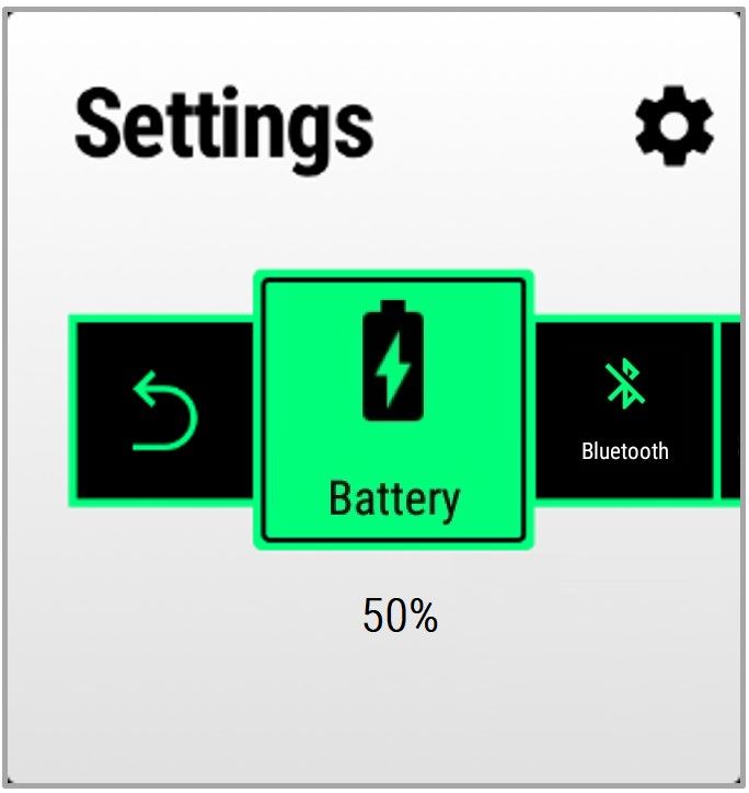
2. Camera Access LED (Red) – indicates Camera is active (Preview, Stream, Video Recording, Picture
      Taking) on the Blade.
         a. LED ON – Blade glasses are accessing the camera features.
         b. LED OFF – Blade glasses are NOT accessing the camera.

Touchpad

Overview
The touchpad allows for interaction with the Blade. Taps and Swipes are the primary gestures required to interact
with the Blade glasses. Additional touchpad gestures are supported as shortcuts for common interactions.

Behavior
There are two primary interactions:

                        Tap                                                   Swipe

    Tap will:                                               Swipe – is the primary method of Navigation.
           a. Turn on the display.                          Swipe will navigate:
           b. Opens an App or performs an Action                  c. Apps
                                                                  d. Actions
                                                                  e. Photos/Videos

Vuzix | Confidential                                                                                          6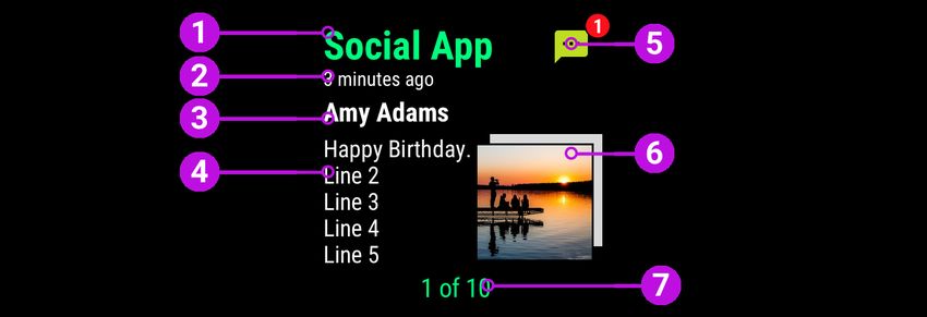
UI Interaction Elements
Apps

Overview
The BladeOS displays a list of apps horizontally allowing users to view different product features. Additional apps
can be added through the Vuzix Companion App and the Vuzix App Store. The BladeOS is designed to display
one app at a time and users can view additional apps by swiping the touchpad or using voice commands. A list of
apps is displayed across the bottom of the display (as mini-icons) to inform the user where they are within the
overall list of apps. The app object (as shown below) is made up of several UI elements:

   1. App Name (Vertical right aligned)
   2. App Widget – Square space allowing an App to display its key features, status or an icon
   3. List of Apps (bottom) – These mini-icons displayed in a horizontal list at the bottom of the UI with the
      current App slightly larger and highlighted.
To maintain the BladeOS philosophy of simplicity, only offer “required” UI elements in the Blade app and move
more complicated interactions and features to the associated mobile app settings screen in the Vuzix Companion
Mobile App. For example, transferring photos and videos can overcomplicate the user experience on the Blade
glasses; those features are placed in the Photos screen in the Vuzix Mobile Companion App. The media transfer
feature does not appear anywhere in the BladeOS and helps simplify the overall presentation and interactions for
users. When a feature borders the edge of the screen you should consider reducing the margin as to minimize its
impact on the field of view. There is likely padding on most of your elements by default and removing or reducing
it when it borders the edge of the screen will create a more functional viewing experience.

Vuzix | Confidential                                                                                             7
Behavior
Apps are displayed in a horizontal list when the display turns on. Users can navigate each app by swiping the
touchpad forward or backward or using voice commands.
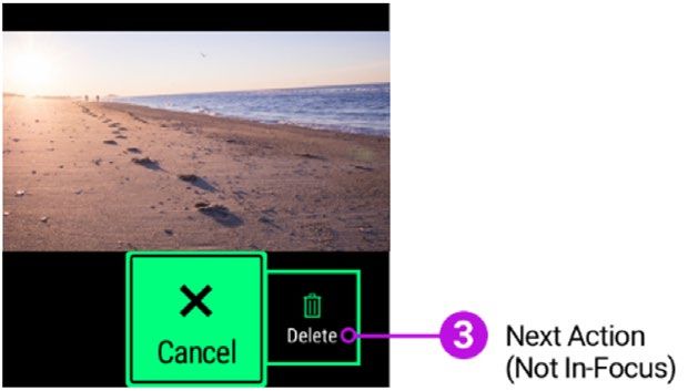
Action Bar
Delete Picture?
Notification - Action Bar Camera App - Action Bar Photo App - Action Bar
Overview
The action bar displays a horizontal list of buttons shown at the bottom of the display. The UI architecture has a
“center-focus” user interface providing the user feedback as to what action will be taken if the touchpad single tap
or voice command is spoken. Actions move into the center focus UI region when the user swipes the touchpad.
When designing your app, be sure to ALWAYS make the left most action the “Back” action. This will allow the
user to navigate to the previous screen (up 1 level) * in a consistent way throughout the interface.
* Back is not required if there are only 2 actions where one of those actions will take the user up 1 level. For
example, in the Photo App - Delete Picture UI, the Cancel also performs the Back function. The user can also go
back by using a gesture (2 finger tap).
Behavior
The user can display the Action bar by tapping the touchpad once. The user can navigate through the various
actions by swiping the touchpad or giving a voice command. The primary action has center focus so when the
user “taps” on the touchpad, the action (in focus) is performed.
Warning Bar
Overview
The warning/information bar is displayed across the top portion of the UI. The warning/information bar is reserved
to display information to the user that something is wrong (i.e., low storage) or to give the current status of the
system (i.e., battery percentage, compass).
Vuzix | Confidential 8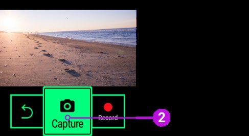
Notifications

 Message App Notification Full screen                        Message App Notification Banner

Overview
To keep users informed, smartphones utilize notifications to display information.

A full screen notification (as shown above) has several key UI Elements:
   1. App name – Name of the app that sent the notification.
   2. Time – When that notification was received.
   3. Title – Name of the person who sent the notification.
   4. Details – Textual information within the notification.
   5. App Icon – Visual representation of the App that sent the notification and optional indicator if a new
      notification.
   6. Picture/Attachment – Visual preview of any pictures, videos or attachments. If there are multiple
      pictures/attachments, display them as a “stack”.
   7. Notification # - Current notification number in relation to the total number of notifications.

Behavior
Notifications are collected in the “Home” App and are displayed one at a time. The most recent notifications are
displayed first and the user can swipe forward (back to front – displaying the next notification using a push left
animation). A simple swipe (front-to-back or back-to-front) allows the user to easily navigate to each notification.
A shortcut gesture (two-finger swipe forward) will clear the currently displayed notification and display the next
notification in line. Users can “Clear All” notifications by the shortcut gesture (two-finger swipe backward) on any
notification.

Vuzix | Confidential                                                                                               9
If the notification enables the user to reply, a “Reply” action button will be displayed allowing the user to respond to the notification. Some notifications may appear with an Action bar displayed allowing the user to quickly take action. Lists Overview A List UI control is used to display a set of choices, for example, a list of “Settings” or a list of “Contacts.” The “center focus” UI interaction is used for lists and is consistent with the overall interaction style of the BladeOS. Selecting the list item in the center focus area will be open that item. Additional information about that list item can optionally be displayed below. Behavior Swiping back and forward navigates the list of choices. Tapping or issuing a voice command will select that choice. Sliders Overview The Slider UI element allows the user to select from a range of fixed values. The slider should be displayed in a horizontal manner to support the natural “swiping” (forward and backward) of the touchpad. Sliders can either be shown having discrete values (small range of values, around 10 or fewer) or a continuous slider (when the range is large). Behavior Swiping (forward and backward) automatically changes the value. The UI interaction of swiping forward increases the selected value (i.e., 5 to 6 to 7 to …10). Tapping on the touchpad (“Back Action button in focus”) or issuing a voice command (Save or Back) will save the current setting value and go back up one level. Vuzix | Confidential 10
Confirmation

Overview
Confirmation UI’s allow the user to confirm an action. An action bar is displayed with two choices (i.e., Cancel and
Delete). If a destructive action (i.e., Delete picture) is performed, the confirmation UI default action should be
defaulted to the Cancel action and not Delete. This presentation helps avoid accidental deletion (negative
consequences) for your end users.

Status

Overview
Displaying an apps status is done within the App’s widget or within the app itself. For example, the Home widget
displays the fact that the Blade has received notifications. Within the Camera app, a strip above the action menu
is used to indicate the Blade is recording video (red circle and REC).

Vuzix | Confidential                                                                                             11
Visual Design
Animation
Animations on the Blade should be primarily used to help the user navigate your app. Animated screen transitions
(like navigating between Widgets on the App Rail or presenting a notification) help the user understand the
structure of the interface.
Be sure to keep animations extremely brief and very simple. Unlike smartphones, the Blade experience is meant
to be “glance-able” and unobtrusive, keeping the user informed in the quickest way.
App Animations should have a specific purpose, like drawing attention to a single piece of information; adding
complex animations because they look cool will simply clutter your app and frustrate your users. Subtle, delightful
animations that enhance the user experience can help you make the most of the limited screen space and help
users focus on what’s important.

Color
Color is a critical component of making apps usable on the BladeOS. High contrast and saturated colors will work
best for the Blade’s transparent display system.
The primary colors chosen for the BladeOS are MINT GREEN and WHITE. These colors were specifically chosen
because they are easy to see against variable backgrounds and transparency of the Vuzix™ Blade screen. Other
colors like yellow and red are also core colors but should be reserved for alerts, warnings and new notifications.
While this may seem like a limited core color pallet, these colors work great to maximize the readability, legibility
and overall customer experience with the Blade smart glasses system.

Core Color Pallet

While this is the core OS color pallet, you can certainly use other colors including your brand colors to distinguish
it from other apps. Be sure to choose your colors carefully, ESPECIALLY when displaying text. Since the Blade
display is transparent, colors will “shift” and change when displayed in different environments and lighting
conditions. What looks great inside a dimly lit office with solid gray walls will look completely different outdoors on
a sunny, cloud-free day with trees and cars in the background.
Your customers will be using your app in many different environments and may be in motion (walking, jogging,
etc.); be sure to test your design in many different situations including the outdoors to ensure your designs are
useable and text is readable.

Color Considerations
Be aware of color-blind users and how different people perceive color. Be sure to choose an effective pallet that
clearly presents your apps information. Do not ONLY rely on color to communicate a message. Supplement your
app with graphics, and labels to clearly communicate status, state, and actions.

Vuzix | Confidential                                                                                                12
The key consideration when choosing color is the environment your app will be used. For example, if your app is
going to be used primarily in sunny conditions (like a sailing app), you will want to optimize your color pallet for
bright conditions.
Blade provides two standard themes that are optimized for outdoor and indoor lighting conditions. When
designing your app, you can define appropriate colors and backgrounds that will help your users interact with your
app and these themes. See THEMES section for details.

Typography
The BladeOS uses Google’s open source fonts Roboto and Roboto Condensed.
https://fonts.google.com/specimen/Roboto
https://fonts.google.com/specimen/Roboto+Condensed
The Roboto family offers a wide variety of weights and styles that are not only easy to read but accessible to
everyone.

Good typography is way more than just picking the right font. While Roboto is designed to be an easy to read
sans-serif typeface, apply good design principals to your typography to ensure the best app experience for your
customers.
Size your type to be readable.
Customers will be using your app while on the go and large type is generally easier to read than small (light)
letterforms.
Use “notification style” type where users need to read several lines of text. We recommend no smaller than a 40
px text size for this situation. Roboto Condensed can be used to maximize the number of words you can fit on the
screen while maintaining readability.

Vuzix | Confidential                                                                                              13
The absolute minimum type size recommended anywhere in your app is 25 px (Roboto Condensed 25 px is used
for non-focused action bar buttons in the BladeOS as a reference.) While still legible, using this size for large
quantities of text would definitely not be recommended.

Adding too many type styles and sizes to your layouts will make your app look complex. Limit the number of type
style and sizes and focus your designs on the key piece of information that is most important to your user. In the
directions app example below the primary focus is on the directional icon. The distance to travel in that direction is
next in importance. Both pieces of information share a common color and are juxtaposed so the user can quickly
understand the message. The detailed text and units (miles) are supplementary and share the same typeface and
size.

Avoid using thin weight fonts like Roboto Thin and Roboto Condensed Light at small sizes. A good example of
using Roboto Thin is the title of widgets. The Photos widget below uses Roboto Light and is 90px in size, making
it easy to read.

Layouts
Blade Apps are launched from a widget screen on the “Rail.”
The widget functions as a summary for the purpose or status of your App. The user, at a glance, should be able to
clearly understand the function and status of your App. We recommend the following layouts as a good starting
point for building your app’s widget screen.

Vuzix | Confidential                                                                                               14
Consistent layouts with ample spacing around your critical information will help make your app easy to read and
understand for your customers.
Avoid displaying too much information on the screen at one time. Design your app layouts and information to be
glanced at. Reserve buttons and actions to action bars that can be called up with a simple tap. The screen space
within your app is limited to 480 x 480 pixels so be sure to use most of your screen space while keeping your app
uncluttered and your user informed.

 When you do need to add elements to your screen space be sure to remove as much padding on the edge of
 the screen as possible to keep the margin small. This is just another way to make the most of your screen
 space.

                            No padding                          3mm Padding

Vuzix | Confidential                                                                                           15
Themes – Light & Dark The BladeOS has two color themes: Light and Dark. LIGHT THEME (Outdoor use) LIGHT is designed specifically for seeing your Blade display clearly in bright conditions. This mode uses an opaque white to gray linear gradient at a 90° angle from top to bottom. This gradient is used in other places including the background of the widgets found on the App Rail and the background for the Action Bar. This opaque field of color provides high contrast to help the displayed information stand out from the bright background. Not only does the LIGHT THEME use different gradient backgrounds but can also use different icons (fill colors like SOLID WHITE on BLACK - transparent). Be sure to not only test your screens indoors, but outdoors as well. DARK THEME (Indoor use) Vuzix | Confidential 16
Since the Blade uses a “projection system” similar to a conference room projector, the color BLACK is actually
displayed as “no color at all,” fully transparent.
The DARK THEME works great in indoor conditions and resembles a traditional transparent “heads-up display”
presentation. MINT GREEN and WHITE colors work best for text, icons and borders are easy to distinguish from
complex indoor environments.

Icons
The Icons used on the BladeOS leverage the Google Material Design Icon set. This collection of icons uses bold
geometric, symmetrical shapes that are easily recognizable even when scaled to small sizes (like the icons on the
Blade Icon Rail).

Consistency across the icons in your app will help your users with recognition and recall. Although not mandatory,
it is recommended that you consider utilizing the Material Design icons system. This will ensure consistency and
legibility of the icons used in your App.

The Rail icons that appear below your widget represent your app. Rely on simplicity for this icon. Use a unique
shape and don't add too many details; an overly complex icon, especially at this small size (30 x 30 px @ 1x), will
look muddy and be difficult to recognize. Provide a single focal point or image and avoid any text in your icons.
Full words will be too small to read; an alternative to icons is to simply use the first letter of your app (mnemonic)
as the key design element. The letter will function as a unique icon and relate back to your brand.
The core Blade Apps appear MINT GREEN in the selected state, and WHITE in the non-selected state. We
recommend following this convention if you choose to maximize the recognition and contrast; however, you may
choose to use your brand colors.
The same style of icon is used on Action Buttons and in Settings.

Vuzix | Confidential                                                                                               17
High contrasting icons void of gradients and shadows will work best on the Blade display. Try to achieve a
balance of solid light and dark areas in your icons to provide maximum contrast. These icons will have
accompanying text below, so your customers will not just be relying on your icon to understand the action.

Imagery
The Imagery you plan to use within your app can help you differentiate your app from others. As discussed in the
color section, images using saturated colors and high contrasting images will work best for the Blade display.

Both Illustrations and photography can be used to communicate different concepts. Photography works best to
communicate specific things, like people, and places. Illustrations tend to communicate complex concepts and
abstract metaphors.
In either case be sure to pick images that not only communicate your message, but also work well with the Blade
display system. Like animations, adding imagery to your app to simply “make it look cool” will likely add
unnecessary complexity and get in the way of your customers understanding of the important information you’re
displaying.

Vuzix | Confidential                                                                                           18
Voice Interactions / Voice Assistants
Overview
The Vuzix Blade provides advanced speech recognition, enabling hands-free voice navigation of the user
interface. Natural voice control allows the user to perform many common Blade actions.
Vuzix also includes advance capabilities to use other 3Rd Party Voice assistance like Amazon Alexa and Google
Assistant.
To initiate voice recognition, say the trigger phrase “Hello Vuzix” plus a command “Take a picture.”

Command List
      •   Hello Vuzix - Activates the listener
      •   Hello Blade - Activates the listener
      •   Go Left - Basic directional navigation
      •   Move Left - Basic directional navigation
      •   Go Right - Basic directional navigation
      •   Move Right - Basic directional navigation
      •   Go Up - Basic directional navigation
      •   Move Up - Basic directional navigation
      •   Go Down - Basic directional navigation
      •   Move Down - Basic directional navigation
      •   Pick This - Activates the item that currently has focus
      •   Select This - Activates the item that currently has focus
      •   Confirm - Activates the item that currently has focus
      •   Okay - Activates the item that currently has focus
      •   Open - Activates the item that currently has focus
      •   Scroll Down - Basic directional navigation
      •   Scroll Left - Basic directional navigation
      •   Scroll Right - Basic directional navigation
      •   Scroll Up - Basic directional navigation
      •   Cancel - Navigates backward in the history stack
      •   Close - Navigates backward in the history stack
      •   Go Back - Navigates backward in the history stack
      •   Done - Navigates backward in the history stack
      •   Go Home - Triggers the Home action
      •   Quit - Triggers the Home action
      •   Exit - Triggers the Home action
      •   Stop - Stops the scrolling action

Vuzix | Confidential                                                                                        19
• Show Menu - Brings up context menu for current UI screen
• Next - Advances to the next item in an ordered collection of items
• Previous - Goes backward by one item in an ordered collection of items
• Go Forward - Navigates forward in the history stack
• Page Up - Navigates up one page
• Page Down - Navigates down one page
• Volume Up - Increases volume by 5
• Volume Down - Decreases volume by 5
• Speech Settings - Opens Speech Settings menu
• Speech Commands - Opens the current Speech Command list
• Command List - Opens the current Speech Command list
• Hey Google - Opens Google Assistant*
• Hey Alexa - Opens Alexa Assistant**
• Get Assistant - Opens user selectable assistant***
• Start Recording - Opens Camera app to the record function (to begin recording, use the 'Select This' or
'Pick This' command)
• Take a Picture - Opens Camera app to the picture function (to take a picture, use the 'Select This' or
'Pick This' command)
• View Notifications - Opens the Notification Manager
• Open Notifications - Opens the Notification Manager
• Clear Notifications - Clears all Notifications
• Voice Off - Stops the listener
Vuzix | Confidential 20Gestures
Gestures are BladeOS specific shortcuts utilized by the touchpad. Below are some BladeOS specific shortcuts
(Table 1).
Table 1. BladeOS Shortcuts
Wake Up/Select If Blade is sleeping, the tap wakes the Blade
[One Finger, Single up.
Tap] While the screen is on, selects item in focus.
Menu Fires the Menu key.
[One Finger Hold for a
Second] Keyboard - When on Keyboard, brings the
menu for that key or character.
Scrub Video and Navigate the horizontal list.
Keyboard Navigation
[One Finger, Swipe When video is playing, swiping moves the
forward and backward] video scrubber forward/backward, where
total length of video is mapped to total
length of touchpad
Keyboard - When keyboard is displayed,
swiping moves the control forward/backward
between keys.
Vuzix | Confidential 21Keyboard Navigation Navigate the vertical list.
[One Finger, Swipe up
and down] Keyboard - When keyboard is displayed,
swiping up and down changes the rows.
Back Close Action Bar – If action bar displayed,
[Two Finger, Single closes action bar and goes back one
Tap] screen.
Close Apps – If App list displayed, slides the
apps into right side of glasses and turns off
display.
Home Navigates to the list of Apps and focuses on
[Two Finger, Hold for first App in list (Home).
One Second]
Delete or Clear Photos/Videos - Delete action, displays the
Current and Display confirmation to delete a photo or video.
Next
[Two Finger, Swipe Notification - Clears currently displayed
forward] notification and displays next notification.
Allows for clearing of “individual”
notifications without having to “tap” to view
actions and “tap” again to clear.
Keyboard - Adds a space in the input field.
Apps - Depends on the app that is currently
being used.
Vuzix | Confidential 22Backspace Backspace.
[Two Finger, Swipe
backward] Keyboard - When keyboard is displayed, 2
finger swipe backwards deletes the previous
char.
Volume Up/Down Increases (up) or Decreases (down) volume.
[Two Finger, Up or
Down] Also applies if App is running in the
background.
Mute Mutes system volume
[Two Finger, Swipe
Down and Hold for
One Second]
Vuzix | Confidential 23Screen-Off Turns the screen off [Three Finger Tap] Virtual Assistant Shortcut to any virtual assistant on the [Three Finger, Hold for Blade (i.e. Alexa) One Second] Vuzix | Confidential 24
Device Feedback
Model 494 Only: The Blade Upgraded is equipped with stereo speakers to allow users to enjoy audio content,
without needing a connected headset. With the addition of the speakers on this model, the Blade Upgraded
devices no longer have haptic feedback available.
Model 447 Only: The Blade features dual haptic feedback motors to supplement the visual user interface. These
“vibrations” are meant to support “success” and provide feedback for “awareness” and “attention.”
Haptic feedback is currently available on both sides of the Blade.
Developers can utilize the Haptic Feedback to represent their desired actions or attentions.

Single Side of Blade vibration
Vibrations on either the left or side of the Blade are used to direct “action” to the Touchpad. These vibrations can
be customized by the developer using the Haptics API developed by Vuzix. To control both sides simultaneously,
developers can use the standard Android Vibrator API.
Example of Usage:

   •   Single vibrations can be used for simple feedback of attention and awareness.
   •   Double vibrations can be used for attention. The double vibrations should be performed within 250
       milliseconds of each other.

Vuzix | Confidential                                                                                              25
BLE/Wi-Fi The Blade glasses support two methods of wireless communication: Bluetooth Low Energy and Wi-Fi. Bluetooth Bluetooth allows for communication between the glasses and other Bluetooth enable devices. Bluetooth is required to be ON to communicate with the other device, initiate Pair or manage other Bluetooth settings. Bluetooth pairing can be initiated from either the device or the Blade. To check the Bluetooth status, go to the Settings App and its Widget should display the status. In addition, open the “Settings, Bluetooth” and view the “Pair” choice. If paired successfully, a paired indicator will be displayed along with the smartphone name. If not paired, a “Not Paired” status would be displayed. Bluetooth Low Energy (BLE) Bluetooth Low Energy allows for communication between the glasses and other BLE devices. Bluetooth is required to be ON to receive communications from your other devices. To check the BLE status, go to the Settings App, Bluetooth should display the status. In addition, open the “Settings, Bluetooth” and view the “Pair” choice. If paired successfully, a paired indicator will be displayed along with the device name. If not paired, a “Not Paired” status would be displayed. Wi-Fi Wi-Fi enables the Blade glasses to communicate directly with the internet or an intranet. To check the Wi-Fi status, open the “Settings” and view the “Wi-Fi” choice. The associated values (ON/OFF and Network name/No Wi-Fi network) are values displayed below the settings. Wi-Fi connectivity may be required for certain apps to work successfully. The Blade only supports the 2.4 GHz Wi-Fi band. Micro SD Card The user can “extend” the storage capacity of the Blade by adding a Micro SD card. The current maximum supported SD-Card is 512GB in FAT32 format. Vuzix | Confidential 26
You can also read


