Regional Dynamics of Income Inequality in Peru* - BCRP
←
→
Page content transcription
If your browser does not render page correctly, please read the page content below
Regional Dynamics of Income
Inequality in Peru*
By Luis Eduardo Castillo
This Draft: March 2020
This paper discusses the dynamics of income inequality across regions in Peru between
2007 and 2017. Aiming to
ll a gap in the usual inequality diagnosis, the article starts
by describing the trends in income inequality for each region, and then focuses on (i)
identifying the fraction of aggregate inequality that has been explained by inequality
between and within regions, and (ii) quantifying the contributions of demographic and
socioeconomic factors to these trends. All measurements are done using data from
ENAHO, the National Household Survey of Peru.
As regions in Peru are usually understood through political and geographical
(longitudinal) categories, I employ both criteria for the purpose of this discussion. The
rst
nding is that all but two political regions (Loreto and Madre de Dios) and all
geographical regions in Peru experienced a reduction in inequality between 2007 and 2017
as measured by the Gini coe
cient, but the equality gains are highly heterogeneous and
seem to have slowed down since 2012. Meanwhile, using Theil indices, I show that most of
aggregate inequality in Peru is explained by inequality within regions, although the between
component is becoming more relevant just as inequality reduction decelerates. Finally,
using counterfactual distributions, I
nd that the share of adults in the household, labor
income, and public monetary transfers have been among the most important drivers of
inequality reduction across most regions and in Peru as a whole.
Keywords: Inequality, Gini index, Theil index, Inequality decomposition, Peru
1 Introduction
Although the consensus is that income inequality has grossly declined during the last two
decades in Peru and some studies have used quantitative approaches to understand the main
factors behind this trend (see, for example, Herrera (2017); Yamada et al. (2016); Azevedo
et al. (2013)), little attention have been put towards applying these methods to describe the
dierent dynamics of inequality at the regional level.
1 This clearly represents a problem for
fully understanding the inequality phenomenon, given that each region's income distribution
has speci
c characteristics that arise from very dierent economic and demographic structures,
as well as from idiosyncratic income shocks (e.g., redistributive policies). An aggregate
decomposition is not then a satisfactory explanation of the divergent trends among regions.
*
The views expressed in this paper are those of the author and do not necessarily represent the views of the
Central Reserve Bank of Peru. I would like to thank Mario Huarancca, Judith Guabloche and the participants
at the BCRP seminar for their insightful discussions.
Central Reserve Bank of Peru. Email: luiseduardo.castillo@bcrp.gob.pe
1
Although Seminario et al. (2019), Escobal and Ponce (2012), and Gonzales de Olarte (2010) report dierent
trends in income inequality across regions in Peru, the furthest they go in terms of decomposition analysis is
to decompose aggregate inequality into within- and between- contributions.
1
In this regard, the main purpose of this paper is to analyze the regional disparities in income
inequality evolution in Peru between 2007 and 2017. As regions are usually di
ned through
political and geographical categories, I employ both de
nitions for this analysis.
Speci
cally, the paper will focus on answering the following two questions:
1. What fraction of aggregate income inequality in Peru during the aforementioned period
has been explained by intra- and inter- regional inequality?
2. What are the main sources of the observed changes in income inequality in each region
in Peru and how much have they contributed relative to each other?
To accomplish the
rst task, I employ two of Theil's Generalized Entropy indices for
inequality decomposition. These measures, as stated by Fields (2001), are strongly- Lorenz-
consistent (just as the widely-used Gini coe
cient) but have the advantage that the aggregate
value of inequality can be directly decomposed into a weighted average of (i) the inequality
within subgroups, and (ii) the inequality between subgroups. The two indices used for this
analysis are Theil's L index, in which the individual weights are given by the share of the
population, and Theil's T index, in which the weights are the income shares of each region.
Meanwhile, the inequality decomposition at the regional level is made following the strategy
of Azevedo et al. (2013). This technique builds up on an accounting structure in which
household per capita income is expressed as a function of demographic characteristics and
of labor and non-labor income. The strategy consists in creating counterfactual income
distributions by replacing one-by-one the observed value of each indicator in period 1 with the
value of the same indicator in period 0. The inequality measure of the resulting distributions
are then interpreted as the levels of inequality that would have prevailed if only those factors
had not changed.
2 This process is repeated for every possible decomposition path to allow us to
get an average estimate of the contribution of each characteristic to the observed distributional
changes, which are known as the Shapley-Shorrocks values.
3 Although the results do not allow
for the identi
cation of casual eects, they are useful to identify empirical regularities and
recognize the most important elements in inequality evolution from a statistical standpoint.
For the purpose of this research, the socio-demographic characteristics that are being
analyzed are the share of adults and share of employed adults in the household (employment
ratio). Household income per capita is divided into labor and non-labor income, and non-labor
income per capita is further divided into three components: public monetary transfers, rental
gains and other non-labor income.
The project is relevant for the Peruvian context because inequality has traditionally been
recognized as a pervasive feature of its society, and the aggregate gains in equality may be
hiding large heterogeneities that would potentially lead to negative outcomes at the economic,
social and political level if ignored. Addressing the divergences in inequality evolution at the
regional dimension would eectively identify the regions that are being left behind and could
potentially ignite a new interest towards creating a more comprehensive narrative of the
income distribution in Peru. Furthermore, the identi
cation of key factors behind inequality
trends must be considered when designing policies to curb it.
2
E.g., the dierence between the inequality measure of the observed distribution in period 1 and the one
of the counterfactual distribution created by plugging in the period 0 values of labor income is equal to the
contribution of this factor to the variation in inequality.
3
Ibid.
2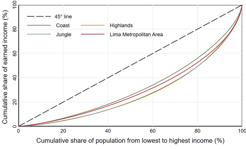
The
rst
nding is that inequality has decreased on aggregate in Peru, but that this trend
has slowed down since 2012. At the regional level, although this story is true for almost all
regions, there are high variations accross them. When decomposing the aggregate inequality
gure into between- and within-regional components, the analysis shows a worrisome result:
the between factor has steadily increased since 2012 both when using political and geographical
regions as basis for the regional classi
cation. This means that the divergence in income
between regions has become more relevant to explain aggregate inequality, just as gains in
equality has become smaller. Nonetheless, the between component is still less than 15 percent.
Meanwhile, the quantitative decomposition of inequality shows that, when taking into
account the whole window of analysis (2007-2017), there are four almost equally important
factors that explain the reduction in inequality across most regions and at the national level:
fraction of adults in the household, labor income, current public transfers, and other non-labor
income (mostly composed of private transfers). These results are positive in the sense that
they suggest that the poorest households in each region have bene
ted from the demographic
boom, economic growth and social policies to catch up with richer households.
However, when using a shorter time frame (2012-2017), the direction of the contribution
varies. In the last
ve years of the analysis, although public transfers and the adult ratio are
still grossly equalizing forces, labor income ends up increasing inequality in most political
regions. This highlights the importance of public policy in curbing inequality when economic
and producitivity growth is slower, but in the longer term policy makers should promote the
access to productive jobs among the poorest households to keep doing so.
4
The remainder of this paper is arranged as follows. Section 2 presents the literature review,
giving a brief analysis of the literature on income inequality in Peru and its regions. Section 3
describes the ENAHO, the household survey from which the data come from. Then, Section 4
starts to analyze the inequality phenomenon in Peru by computing inequality measures, and
by showing the within and between-region decomposition of inequality (i.e., the answer to the
rst research question). Next, Section 5 presents the contributions of socio-demographic and
economic factors to regional inequality, computed using counterfactual distributions. Finally,
Section 6 gives the
nal remarks.
2 Literature review
2.1 Evolution of inequality in Peru
Since this paper is focused on studying the evolution of inequality, it is worth looking at
studies that have measured inequality trends in Peru. In this regard, an appropriate starting
point are the o
cial inequality
gures published by Instituto Nacional de Estadística e
Informática (INEI) (2018).
5 INEI measures inequality both for real household income and
expenditure per capita using ENAHO (the same household survey used for this paper). In the
income dimension, they show that between 2007 and 2017 the Gini coe
cient decreased by
7 percentage points, but that the trend markedly changed after 2012. In fact, between 2007
and 2012, the Gini coe
cient declined from 50 to 45 percent, while it only got to 43 percent
in 2017. A similar trend is corroborated by Herrera (2017).
4
The deceleration of economic activity and productivity growth in Peru since 2012 is reported in Castillo
and Florián (2019).
5
INEI is the Peruvian National Institute of Statistics and Informatics.
3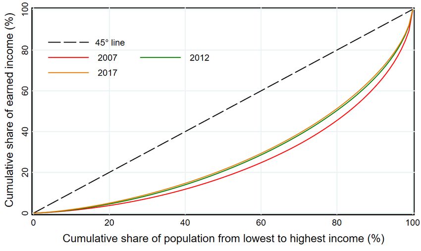
The main critique of using household survey data for measuring inequality is that the upper
end of the income distribution may be underrepresented (Yamada and Castro, 2006). This
limitation is in fact later discussed in Section 3. There have been attempts in the literature
to
nd more precise
gures both by (i) computing the Gini index with completely alternative
data and (ii) using additional information to correct for the skewness in the household income
distribution of the surveys. On the
rst type, we have Alarco et al. (2019) who
nd dierent
inequality trends depending on the type of data. For instance, using productive wealth series
taken from Credit Suisse, they report an increase in inequality since 2013 (they
nd a similar
trend using bank deposit data, but here it is clear that there is a huge underrepresentation
of poorer households due to scarce
nancial deepness in Peru). Meanwhile, when using data
from INEI on wages and mixed incomes, they
nd a reduction of inequality between 2007 and
2016 of 1,0 and 1,4 percentage points, respectively.
On the second type of studies, Yamada and Castro (2006) assume lognormality of the
income and consumption distributions and replace the mean value found in the household
survey's data with the mean of the same variables in the o
cial national accounts to compute
an adjusted Gini coe
cient. In 2004, for instance, they
nd a dierence of 21 percentage
points between the estimate using household survey data and the adjusted one. Later, Yamada
et al. (2016) use a similar technique to study the 2007 2014 period but employ a new
de
nition of disposable income that includes subsidies and taxes. They also account for a
considerable underestimation of the Gini coe
cient with household survey data (between 7
and 16 percentage points depending on the year), but the main takeaway is that the decreasing
trend remains. In fact, Yamada et al report a more rapid decrease in inequality than INEI.
Other studies include Mendoza et al. (2011), who use a similar strategy as Yamada and
Castro to examine the 1985-2010 period but employ GDP and GNP data for the mean
substitution. Meanwhile, Cruz Saco et al. (2018) use an approach that assumes that the
ENAHO is representative for the
rst nine deciles of the income distribution, and that the
dierence between mean income in the household survey and in the national accounts must
be inputted only to the top decile. Their results, together with the others that have been
mentioned, are presented in Table 1 below.
Table 1. National Gini estimates from other studies
2007 2008 2009 2010 2011 2012 2013 2014 2015 2016 2017
INEI (2018) 0,50 0,48 0,47 0,46 0,45 0,45 0,44 0,44 0,44 0,44 0,43
Alarco et al (2018)
Productive wealth 0,75 0,73 0,77 0,71 0,82 0,80 0,81 - - - -
Wage income 0,19 0,19 0,21 0,20 0,20 0,20 0,19 0,18 0,18 0,18 -
Mixed income 0,18 0,17 0,19 0,17 0,16 0,15 0,15 0,15 0,17 0,18 -
Cruz-Saco et al (2017) 0,68 0,67 0,65 0,65 0,67 0,66 0,66 0,66 0,67 - -
Yamada et al (2016) 0,65 0,61 0,58 0,57 0,55 0,53 0,52 0,51 - - -
Mendoza et al (2011)
Correction with GDP 0,64 0,64 0,63 0,60 - - - - - - -
Correction with GNP 0,62 0,62 0,61 0,59 - - - - - - -
Source. Own elaboration.
Now, having examined Gini estimations of inequality in the literature, the next question
that is worth asking is if there have been any attempts to explain the downward trend in
inequality with quantitative approaches. On this note, Jaramillo and Saavedra (2010), using
a counterfactual simulation strategy, show that non-labor income inequality (monetary and
in-kind government transfers, and private transfers) was the main factor behind inequality
reduction between 1997 and 2006, being even more relevant than labor income (which basically
4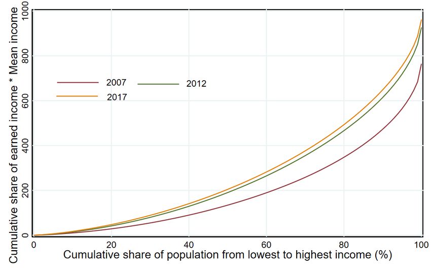
remained the same in the period of analysis). In a later study, Jaramillo and Saavedra (2011)
use the Theil's T-index decomposition to analyze the within- and between-group contributions
to inequality, where the groups are de
ned by gender, age, education level of the head of the
household, and urban/rural area. They report that aggregate inequality is mostly explained
by within-group inequality, and that the highest between-group contributions occurred with
education (30 percent) and urban/rural area (20 percent).
Meanwhile, Yamada et al. (2016) decompose their Gini estimations into private and public
income sources. They
nd that private income had a stronger equalizing role in 2007-2011
than in 2011-2014. They report that public transfers were key to reducing inequality during
the whole period of analysis but were especially crucial between 2011 and 2014, where they
explained around 60 percent of all the change in the Gini coe
cient.
Finally, Azevedo et al. (2013) compute the Shapley-Shorrocks contribution of demographic
and income sources to inequality for 14 Latin American countries, including Peru (using data
from SEDLAC).
6 They reveal that, in Peru, 61 percent of the reduction in the Gini coe
cient
between 2000 and 2010 was due to labor income, and 27 percent was due to an increase in
the share of adults in the households (these two are the top equalizing factors). They further
show that the share of employed adults actually increased inequality. Herrera (2017) uses the
same methodology as Azevedo et al to explain inequality evolution between 2004 and 2015,
but separating public transfers from other types of non-labor income. The author concludes
that labor income and public transfers were important factors behind inequality reduction.
2.2 Regional disparities in inequality
All the previous studies aimed at describing and explaining inequality on the aggregate level.
But, what about the regional evolution of inequality? As it was mentioned in the introduction,
studies of this type are scarcer, and usually focus exclusively on describing the trends instead
of understanding the contribution of the factors behind them.
Starting again with the o
cial numbers, INEI (2018) publishes the Gini estimates for real
household income per capita at the regional level, using for its classi
cation a geographical
criteria.
7 In Table 2, it is shown that, according to their estimates, all regions experienced
a decrease in inequality between 2007 and 2017. As with the national trend, the decline
was steeper between 2007 and 2012 than in the last
ve years of analysis. When ranking
regions, the coast appears to be the most equal, while there is no clear dominance between
the highlands and the jungle. INEI does not publish the indices for political regions.
Regarding the explanation of regional divergence in inequality, Seminario et al. (2019)
compute the Gini, Theil and Williamson indices for regional GDP between 1795 and 2017
(the authors reconstruct historic GDP data for political regions in Peru). They show that,
in all these measures, regional inequality increased between 2000 and 2017 (even after
removing Lima from the computations). They also employ the Theil index to decompose
the aggregate inequality measure into within- and between-regions contributions, dividing
Peru into three regions for this exercise: northern, southern and central. They
nd that the
within component explained around 51 percent of aggregate inequality in 2016.
On a similar note, Escobal and Ponce (2012) use income data to compute within- and
6
Their counterfactual distribution strategy is the same as the one in this paper (see Section 5).
7
Their classi
cation, however, is not identical to the one used in this paper. In particular, I take the Lima
Metropolitan Area out of the coast due to its demographic and economic relevance (see Section 4).
5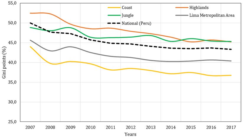
Table 2. Regional Gini estimates from INEI (2018)
2007 2008 2009 2010 2011 2012 2013 2014 2015 2016 2017
Geographical region
Coast 0,46 0,42 0,43 0,42 0,41 0,41 0,40 0,40 0,40 0,40 0,40
Highlands 0,52 0,52 0,49 0,48 0,49 0,48 0,47 0,46 0,45 0,46 0,45
Jungle 0,49 0,48 0,49 0,46 0,46 0,46 0,47 0,45 0,46 0,45 0,45
Lima Metropolitan Area 0,46 0,43 0,44 0,43 0,42 0,41 0,41 0,40 0,40 0,41 0,40
Peru 0,50 0,48 0,47 0,46 0,45 0,45 0,44 0,44 0,44 0,44 0,43
Source. Own elaboration from Instituto Nacional de Estadística e Informática (INEI) (2018).
between-regions contributions, using the same classi
cation as INEI (2018). They
nd that
the between contribution was about 12 percent in 2007. Finally, Gonzales de Olarte (2010)
reports the Gini coe
cient between 2004 and 2007 for the 25 political regions, and shows
that the evolution has been largely heterogeneous. None of these studies addresses regional
inequality between 2007 and 2017.
3 Data
The data used throughout this paper came from the Encuesta Nacional de Hogares sobre
Condiciones de Vida y Pobreza (ENAHO), a household survey taken annually in Peru since
2004.
8 The survey's purpose is to shed light on households' living conditions.9 Although there
has been updates and revisions of the survey to include new questions or to improve its design,
most of the essential structure has remained intact since 2007. The variables needed for the
present analysis are presented in Table 3 below.
Table 3. Description of relevant variables in ENAHO
Variable Description
MIEPERHO Total number of members of the household
a
P208A Age of the individual
P204 Dichotomic variable indicating if the individual is member of the household
PERCEPHO Total number of people receiving any type of income (i.e. adults who perceive income)
INGMO1HD Gross monetary income of the household
b
INGHOG1D Gross total income of the household (includes income in the form of goods)
c
INGTPU02 Income from current public transfers
INGTRAHD Income from all current domestic transfers
INGRENHD Rental income
OCU500 Categorical variable for employment status
Note. All monetary variables are expressed in real terms with the de
ators in the module Sumaria.
a It excludes domestic workers and individuals subleasing a room in the household.
b This variable includes labor income, domestic and foreign current transfer (INGTRAHD and INGTEXHD,
respectively), and rental income (INGRENHD). We then need to create a new variable that just comprises
labor income by subtracting the other variables.
c The strategies to monetarize goods are published in the Technical Note of the ENAHO.
8
The ENAHO provides both cross-section and panel data, and all the results are publicly available through
INEI's website (http://iinei.inei.gob.pe/microdatos/).
9
For instance, in the 2017 questionnaire, the 371 questions covered household characteristics, household
member's characteristics, education, health, employment, income, expenditures, participation in social
programs, citizen involvement and individual opinions and perceptions on government and living conditions.
6All these variables are self-reported (even the number of members of the household) and
this may cause some measurement errors. This caveat is particularly relevant for the income
variables, which are constructed from multiple other questions regarding speci
c sources of
income. However, for the purpose of this analysis, I will assume that the values are good
proxies of the actual number, and so the ordinal and cardinal dierences hold.
Another particular issue with using the ENAHO for measuring inequality is that the
households in the top of the income distribution may be underrepresented. Such as Alarco
et al. (2019) discuss, the richest household in the survey reports an annual income which
is probably a small fraction of the actual income of the richest household in the country.
Some strategies to overcome this feature have been discussed in the literature review, but
they require us to assume speci
c shapes of the income distribution that would induce new
measurement errors. Instead, if we assume that the direction of the trend remains (which is
not a bold assumption after revising the results reported in Section 2), then the survey can
still give us valuable insights on the evolution of inequality and on the direction of the relative
contributions of factors to this dynamic, which are the focus of this paper.
The population from which the sample is taken consists of all the privately-owned
households and their inhabitants in rural and urban areas.
10 The sample sizes (in terms
of households) in each wave of the ENAHO are shown in Table 4 below.
Table 4. Sample size of ENAHO waves
Wave of ENAHO Number of Surveyed Households
2007 22 204
2008 21 502
2009 21 753
2010 21 496
2011 24 809
2012 25 091
2013 30 453
2014 30 848
2015 32 188
2016 35 785
2017 34 584
Note. This is the number of households for whom the income
variables are published in the Sumaria module.
The survey has a strati
ed, three-staged clustering sample design.
11 . The strati
cation is
made at the population level (8 ranges of population), but the survey is representative also
for urban/rural areas, geographical domains, and for the 25 political regions.
4 Overview of income inequality in Peru
This section presents a detailed description of the inequality phenomenon in Peru. In the
rst subsection, the analysis is focused on the evolution of inequality on the aggregate and
10
The survey thus excludes individuals living in collective households (e.g. hotels, retirement houses).
11
The relevant variable for clustering is CONGLOME (household conglomerate) and for the strati
cation,
ESTRATO (population strati
cation).
7regional level (using the Lorenz curve and Gini coe
cient). The second subsection analyses
the between-within decomposition of inequality across regions. For all these exercises, and for
the remainder of the paper, real gross total household income per capita is employed.
12
4.1 Evolution of inequality
Figure 1 shows the Lorenz curves for Peru in 2007, 2012 and 2017.
13 The
rst noticeable
feature of the graph is that the curve for the income distribution in 2007 is clearly dominated
in the Lorenz sense by both the ones from 2012 and 2017. Domination in the Lorenz sense
occurs when a Lorenz curve is never below and somewhere above the other. Meanwhile, when
comparing the 2012 and 2017 curves, it is also possible to see that the 2017 curve dominates
the one from 2012.
14 Then, the main takeaway of the graph is that any measure of inequality
that is Lorenz-consistent (such as the Gini coe
cient, entropy measures and Atkinson index)
will unanimously yield a decrease in inequality when comparing 2007, 2012 and 2017.
Figure 1. Lorenz curve comparison. Peru, 2007 - 2017.
It is worth mentioning that Lorenz-consistency is a potent property for inequality measures,
because it indicates that the inequality ranking with that index will always coincide with
the one from Lorenz dominance analysis. This in turn implies that the index encompasses
re
exibility, transitivity, anonymity, income homogeneity, population homogeneity, and the
transfer principle, which are all desired properties for inequality measures (see Fields (2001)).
The graph above then displays a positive message about income inequality evolution in
Peru, at least when considering 5-year variations. However, before proceeding to discuss more
about the inequality trends and regional heterogeneities, it is worth asking if these gains in
equality are accompanied also by gains in welfare. The Generalized Lorenz curve framework
12
The variable is constructed from INGHOG1D.
13
All the Lorenz curves and the inequality measures are computed using the Distribuive Analysis Stata
Package (DASP). For further information on the package, see Araar and Duclos (2013).
14
This is harder to distinguish visually because the curves seem to overlap for a signi
cant portion of the
range, and the distance between the two curves is shorter than the one between the 2012 and 2007 curves.
8is a useful tool to address this enquiry, since it rescales the Y-axis of the Lorenz curve by
multiplying it by mean real income. That way, the shape of the curve still gives information
about inequality, but the dominance analysis now considers the level of income. As shown in
Figure 2, welfare has indeed improved when comparing 2007, 2012 and 2017.
Figure 2. Generalized Lorenz curve comparison. Peru, 2007 - 2017.
Now, returning to the inequality analysis, the initial Lorenz curve graph leaves two
particular questions unanswered. On the one hand, it cannot establish cardinal comparisons
of inequality between years (although visually it gives some information such as that the gains
in equality between 2007 and 2012 should be larger than between 2012 and 2017). On the
other hand, since the graph only compares the Lorenz curve from the income distribution in
three speci
c years, there is no guarantee that the inequality decline in between these 5-year
gaps has been steady.
15
Given these considerations, Figure 3 presents the evolution of inequality according to the
Gini coe
cient, which is a Lorenz-consistent measure widely used in inequality analysis.
16
This index provides both ordinal and cardinal comparisons, and the point estimates allow us
to easily detect trends in inequality through time.
As shown in the graph, inequality in Peru decreased around 7,0 percentage points between
2007 and 2017, while it only diminished one percentage point between 2012 and 2017 (these
dierences are computed considering exclusively the point estimates of the Gini coe
cient).
The change in the slope of the curve is also noticeable. Between 2007 and 2012, there is a
sharp and steady reduction in the Gini index. Meanwhile, from 2012 onwards, the downward
movement has been very smooth, and it appears as if inequality has remained close to being
stable when incorporating the con
dence intervals in the analysis.
After analyzing the evolution of inequality on aggregate, the next task is to verify that
15
Although in theory possible, a comparison of Lorenz curves for each of the 11 years being analyzed would
be ine
cient.
16
Appendix 7.1 shows the table with the point estimates and con
dence intervals.
9Figure 3. Gini index evolution. Peru, 2007 - 2017.
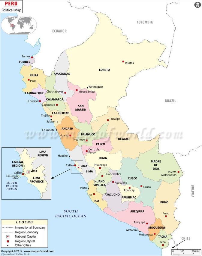
the observed trends are the same at the regional level. Before proceeding with the regional
analysis, the next set of
gures intends to facilitate the discussion by presenting maps of
Peru. For the purpose of this discussion, Peru is divided into 25 political regions (Callao is
considered a region of its own, and Lima Province, which is politically autonomous, is included
into the Lima region to make the classi
cation more comparable to what is usually found in
the literature).
Nonetheless, there is an alternative classi
cation of regions based on geographic
characteristics. This classi
cation divides the territory into three geographical (longitudinal)
regions: coast (the land between the Paci
c Ocean and the Andean mountains), highlands
(the territory on the Andes), and jungle (the rainforest between the Andean mountains and
Brazil).
17 In Panel (b), the yellow, brown and green area correspond to the coast, highlands
and jungle, respectively.
Although the political regions are mostly populated in one particular geographical region,
almost all of them are located simultaneously in more than one. Given the popularity of this
classi
cation in Peruvian academic discussions, I will also run estimations with this regional
division of the households. In this analysis, however, I separate the Lima Metropolitan Area
(the union of Callao and Lima province) from the coast and considered it a dierent category
due to its relevance both in economic and demographic terms (around a third of the population
lives in this area, and most of the economic activity of the country too). This classi
cation
will be referred sometimes as geo-regions throughout the remainder of this paper.
17
The Andean mountains cross Peru from the eastern part of Piura to the western part of Amazonas all the
way down to the eastern part of Tacna to the eastern part of Puno.
10Table 5. Maps of Peru.
Panel (a) Political map including Callao and Lima province. Panel (b) Political map including geographical division.
11
Source. Figure taken from Maps of Worlds. Source. Figure taken from Chowell et al. (2009)Figure 4 now shows the evolution of inequality across political regions for 2007, 2012 and
2017 according to the Gini index. Regions have been ordered from highest to lowest levels
of inequality in 2017 to ease the interpretation of the graph. The reduction in inequality
between 2007 and 2017 has been experienced by all political regions except Loreto and Madre
de Dios. The magnitude of the change, however, varies considerably among the ones who
saw gains in equality. There are regions whose reduction has surpassed the 10-percentage
points threshold, such as La Libertad and Huancavelica, while other regions have practically
experienced no change in the index, like Tacna. This exempli
es the expected variability in
inequality evolution across regions.
Figure 4. Gini index evolution by political regions. Peru, 2007 - 2017.
Similarly, there is high divergence in the change in the Gini index between 2012 and 2017.
For most regions, the reduction of inequality continued, but in a smaller amount than the
one observed between 2007 and 2012 (this is visually appreciated by comparing the distance
between the blue dot and the yellow asterisk, and the distance between the asterisk and the
red triangle). However, there are some regions (Cusco, Junín, Loreto, Tacna and Ucayali),
who actually experienced an increase in inequality between the last
ve years of the analysis.
To further appreciate the divergence in trends, Appendix 7.2 shows the point estimates of the
Gini coe
cient for each region between 2007 and 2017.
Further studies could relate the observed heterogeneities across regions with other variables.
Just as an example, Figure 5 presents a scatter plot of the Gini index in 2007 vs the reduction
of the index between 2007 and 2017. There seems to be a positive correlation, hinting at some
sort of base eect (and possible convergence).
12Figure 5. Variation in Gini index vs index in 2007 by political regions
Now, I proceed to make a similar analysis with the geographical regions. Given the smaller
number of categories (4 instead of 25 regions), it is now possible to start the analysis with
Lorenz-domination between regions. Figure 6 presents the Lorenz curves for geographical
regions in 2017. The coast dominates all other regions by the Lorenz criterion, and the Lima
Metropolitan Area (LMA) does the same with the two remaining regions. The ranking between
highlands and jungle is not possible because the two curves cross each other.
Figure 6. Lorenz curves by geo-regions. Peru, 2017.
13To establish if the above dominance relationship has remained the same across time,
and if the trends are similar, Figure 7 illustrates the evolution of the Gini index per
geographical region (Appendix 7.4 shows these values together with the standard deviation
of the estimates).
Figure 7. Gini index evolution by geo-regions. Peru, 2007 - 2017.
It is clear that the previous ranking remains, at least when using the Gini measure. The
coast is not only the region with consistently the lowest levels of inequality, but it is also the
one who has experienced one of the sharpest decreases between 2007 and 2017 (around 7,3
percentage points). Meanwhile, LMA has lower levels of inequality than the highlands and
the jungle, but its inequality reduction has been more gradual than the coast. The picture is
particularly interesting because, excluding LMA, the coast is the richest region in per capita
terms, followed by the jungle and then the highlands. As the ranking of income level coincides
with the ranking of inequality, any measure of well-being should also yield this order.
Furthermore, the previous observed feature of less decline between 2012-2017 than in the
2007-2012 period also holds for this regional classi
cation. Nonetheless, it is particularly
interesting the dynamics of the highlands, which continued to experience a sharp decrease
in inequality during the last
ve years of analysis (around 3 percentage points). This got the
region closer to the jungle, and in the last couple of years, the dierence between the two
is statistically not signi
cant. Again, the above graph hints at the importance of considering
regional divergence in inequality analysis.
4.2 Between - within regions decomposition of inequality
The between-within decomposition of aggregate inequality is made with Theil's L and T
indices, which are Lorenz consistent measures. The indices are variants of the Generalized
Entropy measures in which the α parameter (the parameter that de
nes the sensitivity to
the tails of the distribution) takes the value of 0 (L-index) and 1 (T-index). These entropy
measures allows us to decompose the inequality measure into a weighted average of (i) the
14inequality within each region, and (ii) the inequality between regions.
18
Regarding the speci
cs of the decomposition procedure,
rst each region's individual
inequality measure is computed. Then, these values are added up with a given weight whose
construction depends on the nature of the index. In Theil's L index, the weights are the share
of the population. In Theil's T index, they consist of the share of total income. The weighted
sum of the individual measures is then called the within contribution to inequality. The
dierence between the aggregate measure of inequality and this within factor is de
ned as
the between contribution. The contributions are then expressed in relative terms by dividing
them by the total value of the aggregate measure.
Figure 8 shows the relative between contribution to inequality after conducting the
decomposition across political regions between 2007 and 2017 with the two aforementioned
indices. As seen in the graph, the between contribution has remained below 15 percent
throughout the period of analysis. This means that most of aggregate inequality is explained
by the divergence in income inside each region.
Figure 8. Between-contributions. Political regions, 2007 - 2017.
However, there seems to be a signi
cant increase in the between contribution since 2012.
Under both types of measure, 2011 saw the lowest between contribution, but since then it
has increased by around 2,0 percentage points. Thus, income divergence between regions has
become more important to explain overall inequality in Peru just as the gains in equality in
the country started to slow down. This means that not only did most regions stopped moving
towards a more equal income distribution since 2012, but that, during this process, some
regions were increasingly being left behind in income terms.
An additional noticeable feature is that the between contribution using the T index is
systematically lower than with the L index. As seen in Appendix 7.5 and 7.6, one explanation
for this discrepancy is the higher weight of the Lima region to the within component when
18
This is the decomposition in the sense of Bourguignon (1979). The Gini index does not allow for this type
of decomposition, but can only diaggregate the inequality measure with respect to the income sources.
15using the income share instead of the population share. As mentioned before, Lima province
(the capital), which is included in the Lima region, encompasses signi
cant part of the
economic activity of the country. Since Lima region as a whole ranks close to the middle
of the regional inequality ranking, it follows that a higher ponderation of its individual index
will increase the within contribution of regions (thus lowering the between factor).
Figure 9 presents the same graph as before but with the geographical division.
19 The results
are very similar to the ones in the previous analysis. Again, the between contribution is lower
with the T index, and this corresponds to the higher weight of LMA (both LMA and Lima
have surprisingly similar measures of inequality). The trend in the between contribution is
also the same: there has been an increase of this factor since 2011 (around 3,0 percentage
points with both indices).
Figure 9. Between contributions. Geo-regions, 2007 - 2017.
5 Factors behind regional income inequality
This section now presents the decomposition of inequality per region into socioeconomic and
demographic factors. The
rst subsection gives a detailed description of the methodology
used to create counterfactual distributions and to compute each factor's contribution. The
next subsection displays the results and their analysis.
5.1 Methodology
The strategy for inequality decomposition builds on Azevedo et al. (2013), in which
counterfactual simulations are used to compute the contribution of each demographic and
income component. This method relies on an accounting structure proposed by de Barros
et al. (2006), in which per capita household income Ypc is expressed as follows:
19
Appendix 7.7 presents the relative contributions of each geographical region per index.
16" ! #
nA nE 1 X L 1 X NL nA nE L 1 NL
Ypc = yi + yi = ȳ + ȳ (1)
n nA nE nA n nA E nA A
i∈E i∈A
In the above expression, n represents total members of the household, nA /n is the share of
L
adults in that household, nE /nA is the share of employed adults, and y and y
NL are labor and
L
non-labor income, respectively. Meanwhile, ȳE is the average labor income of employed adults,
NL
and and ȳA is the average non-labor income of all adults.
20 Thus, this accounting structure
recognises that the per capita income of the household is equal to the income earned by
adults divided by the number of people living in it, while the income of adults can be divided
according to its sources (labor income from adults with a job, and non-labor income).
21
For the purpose of this research, average non-labor income is divided into smaller
PT
components: average current public transfers (ȳA ), average rental monetary income (ȳA ),
R
ONL ).
and the average of other non-labor income (ȳA
Since the cumulative density function of households' income F depends on Ypc , and any
measure of inequality θ (e.g. Gini index, Theil's indices) depends on this cumulative density
function, then θ could be expressed as follows:
nA nE L NL nA nE L PT R ONL
θ = θ (F (Ypc )) = θ , , ȳ , ȳ =θ , , ȳ , ȳ , ȳ , ȳ (2)
n nA E A n nA E A A A
Given that the levels of all the indicators above are known in period 0 and period 1, the
counterfactual distributions for period 1 are constructed by replacing the observed magnitudes
of the indicators in period 0 one at a time. Hence, after plugging in the period 0 level of an
indicator, the inequality measure of this new counterfactual distribution can be interpreted
as the inequality level that would have prevailed in the absence of a change in that indicator
between period 0 and period 1. It is clear then, as stated by Azevedo et al. (2013), that
this decomposition strategy does not identify causal eects, but instead intends to describe
the elements that are quantitatively more important in distributional changes (i.e., it
nds
empirical regularities in the data).
The measure of inequality θ that will be used for this analysis is the Gini coe
cient.
As an example of how this works, given the observed Gini index for period 1, θ1 , and a Gini
index constructed from an income distribution
where all
the variables except average labor
nA nE L NL
income correspond to period 1, θ̂1 = θ , , (ȳ )0 , ȳA , the dierence θ1 − θ̂1 , would be
n nA E
the contribution of labor income to the change in inequality between period 0 and period 1 for
this particular decomposition path (i.e., replacing labor income
rst). Then, if we replaced the
value of the share of adults in period 0 and get a new Gini measure θ̂2 , the dierence θ̂1 − θ̂2
would be the contribution of the share of adults to inequality for this particular decomposition
path (i.e, replacing labor income
rst and the share of adults, second).
20
Notice that the subscript indicates the population from which the average is taken from: A for adults and
E for employed adults.
21
In the Peruvian context, adults would be understood as the individuals 14 years old or above who in
theory are the only ones that are able to work (this assumption, however, is not perfect because Peru is known
to have high rates of child labor, specially in rural areas, even for South American standards).
17The
rst obvious problem that arises with this method is that, in the absence of panel
data, there is no clear way in which to input the values from period 0, since it is di
cult to
identify which household in period 1 should be the equivalent of a household in a previous
year. Azevedo et al suggest addressing this problem by: (i) ordering the households by their
household income per capita in both periods, (ii) taking the average value of the indicator for
each quantile in period 0, and
nally (iii) assigning this average value to the households of
the same quantile in period 1. In these computations, 200 quantiles are employed.
The second problem is that the results suer from path-dependence, meaning that the order
in which each characteristic is inputted matters for the calculation of its contribution. Given
that there are 6 variables, there are in fact 6! paths for decomposition. To solve for this,
Azevedo et al calculate the decomposition across all possible paths, and then compute the
average results for each component, which are called the Shapley-Shorrocks estimates.
22
5.2 Results
Figures 10 and 11 present the contributions of each of the six factors to the gains in equality
between 2007 and 2017 for the political regions. Gains in equality are just the negative of the
variation in the Gini coe
cient, and the results are expressed in this way so that a positive
contribution means that the factor contributed to the reduction in inequality.
23
In Figure 10, the contributions are expressed in percentage points, thus being absolute
contributions (i.e., the stacked bars sum up to the total equality gains in Gini points). In
Figure 11, the contributions are expressed as a fraction of the total equalities gains, thereby
being relative contributions. In this
gure, the green and yellow upward arrows are used for
positive relative contributions above 10 and between 0 and 10 percent, respectively; while the
red and gray downward arrows are displayed for negative relative contributions below -10 and
between -10 and 0 percent, respectively.
The
gures show common patterns between individual regions, as well as between the
regional results and the national decomposition. The
rst noticeable feature is that the adult
ratio has contributed positively to equality in almost all the studied political regions and
at the aggregate level. This indicates that the demographic transition in Peru has been a
remarkable equalizing force. According to estimates of INEI, the population over 14 years
(allowed to work by law), has increased sharply since the 2000s.
24 The present analysis is
telling us that the bene
ts of this demographic boom and contraction of the dependency ratio
has been strongly experienced by poorer households in most regions.
However, the positive eect on equality of this demographic boom appears to have not
been corresponded by the share of employed adults. In fact, in most regions (and in Peru as
a whole), this factor has increased inequality, which means that households at the bottom of
the distribution have been less capable of getting jobs relative to richer households.
22
All the procedure can be done with the Stata ado ADECOMP, developed by Azevedo et al. (2012).
23
The magnitude of the change in Gini points may not be identical to the one from the previous analysis
because the ADECOMP tool drops some observations when constructing the counterfactual distributions.
24
This can be easily seen in: http://webapp.inei.gob.pe:8080/sirtod-series/.
18Figure 10. Absolute contributions to gains in equality (Gini points).
Political regions, 2007 - 2017.
Figure 11. Relative contributions to gains in equality (%). Political
regions, 2007 - 2017.
19Second, both labor income and other non-labor income (which is mainly constituted of
private transfers) have lessened inequality in most regions. In fact, at the national level, labor
income contribution is the highest among all factors. This is a jubilant outcome, because it
means that economic growth occured in such a way that the labor income and private transfers
of poorer households expanded enough in relative terms to reduce inequality.
Finally, from a policy standpoint, the most important result comes from the contribution
of monetary public transfers. In all but one political region (Madre de Dios), public monetary
transfers were instrumental in the decline of inequality. For instance, in 10 of the 25 regions,
public transfers represented more than a quarter of the reduction in the Gini coe
cient. This
hints at the possibility that social policy had been targeted well enough to have distributional
eects. The hint is stronger when seeing that some regions with the strongest relative
contribution are among the poorest ones (Apurímac, Ayacucho, Cajamarca and Puno).
Now, regarding the geographical division of the regions, Figure 12 presents the relative
contributions to the gains in equality for this classi
cation. In the
gure, we see that the main
story holds for geographical regions: adult ratio, labor income, other non-monetary income and
public monetary transfers have contributed positively to equality, while the adult employment
ratio has increased inequality.
Having a smaller set of regions allows us to easily compare the magnitudes of these eects.
On the one hand, it is easy to see that labor income has contributed the most in LMA
and in the coast, which is not surprising considering that these regions are the richest and
most productive ones, and probably the poorer households there have experienced some of the
highest income growth in the country. On the other hand, the contribution of public monetary
transfers is larger in the highlands and in the jungle, and practically non-existent in LMA.
This again hints at the story of good targeting because it means that social policies aimed at
curbing inequality are having most eect among the traditionally poorest households.
Figure 12. Absolute contributions to gains in equality (Gini points).
Political regions, 2007 - 2017.
20Figure 13. Relative contributions to gains in equality (%).
Geographical regions, 2007 - 2017.
The analysis in Section 4 showed that there was a shift in the inequality trend from 2012
onwards. In this regard, it is worth replicating the previous exercise for the 2012-2017 period
to see how the contribution of each factor diers when accounting only for the last
ve years
of analysis. Figures 14 and 15 present these results for the political regions.
There is a noteworthy change in the story of the factors when taking into account this time
frame. Labor income, which was a prominent equalizing force when comparing 2007 with
2017, has actually increased inequality between 2012 and 2017 in many regions. Moreover,
the negative relative magnitude is quite high throughout them. Then, the income growth
dierential between poorer and richer households must have shortened in this period.
Figure 14. Absolute contributions to gains in equality (Gini points).
Political regions, 2012 - 2017.
21Figure 15. Relative contributions to gains in equality (%). Political
regions, 2012 - 2017.
To exemplify the previous statement, between 2007 and 2017, average income per capita
annual growth of the households in the lowest decile in Peru was over
ve percentage points
higher than the one of the households in the top decile. Meanwhile, between 2012 and 2017,
the dierence was just around two percentage points, and many of the other lower deciles
actually had an income growth similar to the top decile (see Figure 16). This change may be
even worse in some regions.
Figure 16. Growth incidence curves. Peru, 2012 & 2017.
* The estimations are based on ENAHO.
22There are however two positive conclusions. First, the adult ratio still contributed to reduce
inequality in most regions, and this demographic eect has been accompanied by the adult
employment ratio, which also decreased inequality in many regions when using this time frame.
Second, and of vital importance for policymakers, public monetary transfers also continued to
help reduce inequality in most regions (17 out of 25). Just as economic activity slowed down,
social policy became more relevant to help curb inequality.
Now, regarding the geographical division, Figures 17 and 18 present the decomposition
between 2012 and 2017. As in the previous case, the scenario has also varied. Labor income is
not a uniformly equalizing force anymore, but the dierence with respect to the political region
division is that here it only contributes negatively to LMA (which is probably capturing the
negative eect in Callao). In the other regions, labor income still fosters equality, but in a much
lower relative magnitude than before. The graph also allows to distinguish the importance of
public monetary transfers in this period. Again, the highlands and the jungle were the most
bene
ted by them, which is cheerful in terms of the targeting of these transfers.
Figure 17. Absolute contributions to gains in equality (Gini points).
Geographical regions, 2012 - 2017.
Figure 18. Relative contributions to gains in equality (%).
Geographical regions, 2012 - 2017.
236 Final remarks
This paper sheds light upon the regional dimension of inequality in Peru, both at the political
and geographical level. This has been accomplished with three complementary analysis:
(i) the description of trends of inequality at the regional level, (ii) the within-between
decomposition of regional inequality, and (iii) the inequality decomposition into contributions
of socioeconomic and demographic factors.
The initial descriptive part revealed that Peru has experienced indeed an important decrease
in inequality between 2007 and 2017, but that the decline has not been steady. In fact, two
important time periods were distinguished: the 2007-2012 marked by sharp reductions in
inequality, and the 2012-2017, in which inequality barely changed. This evolution is supported
in the literature. When looking at the trends within each region, the same story repeated itself:
the last
ve years of the analysis implied a far smaller reduction in inequality.
The regional analysis also evidenced the large heterogeneities in inequality evolution across
both political and geographical regions. Regarding the
rst ones, further research is needed
to understand the causal mechanisms behind the heterogeneity. Meanwhile, with respect to
the later ones, the analysis showed that the two richest regions (the coast and the Lima
Metropolitan Area) were also the ones with higher equality. This means that any measure of
well-being will see the coast and LMA ranking before the highlands and the jungle.
The second analysis, which corresponds to one of the main questions proposed at the
beginning of the paper, showed a worrisome feature: the between contribution of inequality has
risen steadily since 2011 for any measure of the Theil index and for any of the two regional
classi
cations. This implies that as the inequality reduction within regions decreased, the
importance of income divergence between regions became more important to explain the
aggregate phenomenon. Policymakers looking to curb inequality should pay attention to this
feature, because it means that some political regions are being increasingly left behind in the
income distribution as economic and productivity growth in Peru is slowing down.
Meanwhile, the last quantitative analysis exposed the relative importance of
socioeconomical and demographic factors in the inequality narrative at the national and
regional level. When looking at the gains in equality between 2007 and 2017, it was possible
to detect the importance of the demographic boom (fraction of adults in the households) and
income growth (labor and private transfers) in curbing inequality. All regions bene
ted from
the increase in the share of adults, and most of them saw a relative rapid increase in private
income at the lower end of the income distribution. However, when the window of analysis
was reduced to the last
ve years of the time frame (2012-2017), labor income contributions
turned weaker, and in some regions it even helped increase inequality.
The last result suggests the importance of promoting productive jobs for the lower income
households, and this is especially true when considering the fraction of employed adults. The
employment ratio has not been a unanimous equalizing force across regions (both politically
and geographically), meaning that in the 10-year and 5-year time frame, many of the poorest
households saw an increase in their employment ratio not as high as in the richer ones. Thus,
policymakers preoccupied by the recent slowdown in inequality reduction should consider the
importance of creating productive jobs for the poorest individuals.
Finally, the decomposition exercise proved the importance of social policies in inequality
reduction. In particular, public monetary transfers have helped curb inequality considering
any time frame or regional classi
cation in most regions and at the national level. In fact,
24during the last
ve years of the analysis, it was the second most important equalizing factor
taking Peru as a whole. This hints at the good targeting of social policies, given that the
highest contributions appear in the poorest regions, both politically (e.g. Apurímac, Ayacucho,
Cajamarca and Puno) and geographically (the highlands and the jungle). Thus, these policies
are having a strong redistributive eect that could be positive for long-term development.
References
Alarco, G., Castillo, C., and Leiva, F. (2019). Riqueza y desigualdad en el Perú, Visión
Panorámica. Oxfam.
Araar, A. and Duclos, J.-Y. (2013). User Manual for Stata Package DASP: Version 2.3.
Technical report.
Azevedo, J. P., Inchauste, G., and Sanfelice, V. (2013). Decomposing the recent inequality
decline in Latin America. Policy Research Working Paper Series 6715, The World Bank.
Azevedo, J. P., Nguyen, M. C., and Sanfelice, V. (2012). ADECOMP: Stata module to
estimate Shapley Decomposition by Components of a Welfare Measure. Statistical
Software Components, Boston College Department of Economics.
Bourguignon, F. (1979). Decomposable Income Inequality Measures. Econometrica,
47(4):901920.
Castillo, L. E. and Florián, D. (2019). Measuring the output gap, potential output growth and
natural interest rate from a semi-structural dynamic model for Peru. Working Papers
2019-012, Banco Central de Reserva del Perú.
Chowell, G., Munayco, C. V., Escalante, A. A., and McKenzie, F. E. (2009). The spatial and
temporal patterns of falciparum and vivax malaria in Perú: 19942006. Malaria Journal,
8(142).
Cruz Saco, M. A., Seminario, B., and Campos, C. (2018). Desigualdad (Re)considerada Peru
1997-2015. Journal of Economics, Finance and International Business, 2(1):1352.
de Barros, R. P., de Carvalho, M., Franco, S., and Mendonça, R. (2006). Uma Análise das
Principais Causas da Queda Recente na Desigualdade de Renda Brasileira. Discussion
Papers 1203, Instituto de Pesquisa Econômica Aplicada - IPEA.
Escobal, J. and Ponce, C. (2012). Polarización y segregación en la distribución del ingreso en
el Perú: trayectorias desiguales. Technical report.
Fields, G. S. (2001). Distribution and Development, A New Look at the Developing World.
Russel Sage Foundation, New York, and The MIT Press, Cambridge, Massachusetts.
Gonzales de Olarte, E. (2010). Descentralización, divergencia y desarrollo regional en el Perú
del 2010. In Rodríguez, J. and Tello, M., editors, Opciones de política económica en el
Perú 2011-2015, Capítulos de Libros PUCP / Chapters of PUCP books, chapter 6, pages
175204. Fondo Editorial - Ponti
cia Universidad Católica del Perú.
Herrera, J. (2017). Poverty and economic inequalities in peru during the boom in growth:
2004-14. In G. Carbonnier, H. Campodónico, S. T. V., editor, Alternative Pathways to
Sustainable Development: Lessons from Latin America, pages 138173. Brill | Nijho,
Leiden, The Netherlands.
25You can also read