Teachers' perception of Jupyter and R Shiny as digital tools for open education and science - arXiv
←
→
Page content transcription
If your browser does not render page correctly, please read the page content below
Hanč et al.

                                                     RESEARCH

                                                 Teachers’ perception of Jupyter and R Shiny
                                                 as digital tools for open education and science
                                                 Jozef Hanč1* , Peter Štrauch1 , Eva Paňková1 and Martina Hančová2
arXiv:2007.11262v2 [physics.ed-ph] 23 Jul 2020

                                                 *
                                                   Correspondence:
                                                 jozef.hanc@upjs.sk                      Abstract
                                                 1
                                                   Institute of Physics, Faculty of
                                                 Science, Pavol Jozef Šafárik          During the last ten years advances in open-source digital technology, used
                                                 University, Košice, Slovakia           especially by data science, led to very accessible ways how to obtain, store,
                                                 Full list of author information is      process, analyze or share data in almost every human activity. Data science tools
                                                 available at the end of the article
                                                 †
                                                   Equal contributor                     bring not only transparency, accessibility, and reproducibility in open science, but
                                                                                         also give benefits in open education as learning tools for improving effectiveness
                                                                                         of instruction.
                                                                                           Together with our pedagogical introduction and review of Jupyter as an
                                                                                         interactive multimedia learning tool we present our three-years long research in
                                                                                         the framework of a complex mixed-methods approach which examines physics
                                                                                         teachers’ perception of Jupyter technology in three groups: Ph.D. candidates in
                                                                                         physics education research (PER) (N = 9), pre-service physics teachers
                                                                                         (N = 33) and in-service physics teachers (N = 40).
                                                                                           Despite the fact that open-source Jupyter notebooks are natural and easy as
                                                                                         email or web, the results suggest that in-service teachers are not prepared for
                                                                                         Jupyter technology and open analysis, but positively accept open education data
                                                                                         presented via another open-source data science tool, R Shiny interactive web
                                                                                         application, as an important form of immediate feedback and learning about the
                                                                                         quality of their instruction.
                                                                                           Simultaneously our instruction results in the frame of the Flipped Learning also
                                                                                         indicate that young beginning PER researchers and pre-service physics teachers
                                                                                         can master key digital skills to work with Jupyter technology appreciating its big
                                                                                         impact on their learning, data and statistical literacy or professional development.
                                                                                           All results support the ongoing worldwide effort to implement Jupyter in
                                                                                         traditional education as a promising free open-source interactive learning tool to
                                                                                         foster learning process, especially for the upcoming young generation.
                                                                                         Keywords: data science tools; learning tools; interactive multimedia; data
                                                                                         visualization; data analysis; user experience questionnaire; flipped learning

                                                                                       Introduction
                                                                                       During the last decade, new digital technologies such as mobile devices, cloud in-
                                                                                       frastructure, open data, artificial intelligence, decentralized and social networks
                                                                                       (Downes, 2019) caused that we live in the digital and data-intensive age. Ninety
                                                                                       percent of all data has been created in the last two years (Boaler, 2020; Marr, 2018).
                                                                                       Data touches all aspects of our lives. The world economy, our jobs, our health, our
                                                                                       environment and our roles as citizens increasingly depend on the knowledge, skills
                                                                                       and technology required to work with, understand, and effectively use data (Boisvert
                                                                                       et al, 2016).
                                                                                         In April 2020 GitHub (GitHub, Inc., 2020; Warner, 2018), the world largest web
                                                                                       cloud platform for storing, social coding and collaborating on any open code or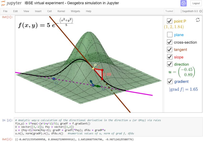
Hanč et al.                                                                                                 Page 2 of 32

               digital content, reached a further milestone, 50 million developers working on over
               100 million repositories — 3,000 times more than after its starting year 2008.
                  Simultaneously, during last years open-source software and data science tools,
               namely programming languages Python and R together with environments for work-
               ing with them — especially Jupyter and RStudio, have conquered the data science
               world (kaggle, 2020) providing everybody free, open, revolutionary and very acces-
               sible ways how to gather, store, process, analyze, present or share data in almost
               every human activity.
                  Speaking about science, in the near future, the European Open Science Cloud
               (EOSC, eosc-portal.eu), officially launched at the end of 2018, will offer to mil-
               lions of European researchers, professionals, but also university students, in science,
               technology, the humanities and social sciences a virtual environment with open and
               seamless services for storage, management, analysis and re-use of open research
               data, interoperable among all scientific domains or EU member states. By federat-
               ing, the EOSC will connect existing and being built scientific data infrastructures,
               currently dispersed and isolated across disciplines and borders of EU states. One
               of the key and easily accessible open digital research environments in EOSC (see
               e.g. the infrastructure EOSC project OpenDreamKit, 2015-2019, opendreamkit.org)
               should become the mentioned technology of Jupyter Notebooks. The highest ambi-
               tion of the EOSC is to change the way we do science, to open it.
                  As for education, in 2015 from US a worldwide Call for Action to promote data
               literacy swept the world (Boisvert et al, 2016; EDC Oceans of Data Institute, 2015).
               Its signatories call for “a revolution in education, placing data literacy at its core, in-
               tegrated throughout K-16 education nationwide and around the world. By enabling
               learners to use data more effectively, we prepare them to make better decisions and
               to lead more secure, better-informed and productive lives.”
                  On February 2020, Jo Boaler, a professor of mathematics education at Stanford,
               invited a group of fifty mathematicians, data scientists, teachers and education
               policy leaders to start a movement, a YouCubed initiative, which will modernize
               the K-12 math curriculum and will prepare high school students to the data age
               (Boaler, 2020; Spector, 2020).

               Jupyter in science and education
               One of the current main data science tools for open science is Jupyter technology of
               interactive multimedia notebooks — shortly and officially called Jupyter Notebooks.
               From the viewpoint of users, the technology is natural and easy as email or web. It
               was released in 2014 in the frame of Project Jupyter (jupyter.org, Kluyver et al, 2016;
               Project Jupyter et al, 2018) as a free, open alternative to the well-known Mathe-
               matica Notebooks from commercial software Wolfram Mathematica (wolfram.com).
               As for the technology platform, Project Jupyter evolved from IPython, a personal
               side project of a Jupyter-project co-founder and former nuclear physicist, Fernando
               Peréz.
                 Jupyter is an open source, free interactive web computing environment, accessi-
               ble through any modern web browser, that enables users to use, modify or create
               interactive multimedia web documents which mix live code (over 100 computer lan-
               guages with a focus on Python, called kernels), interactive computations, equations,
               simulations, plots, images, narrative texts, annotations, audios or videos.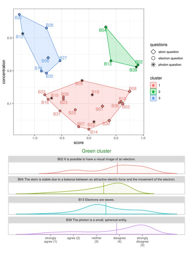
Hanč et al.                                                                                                        Page 3 of 32

                 Over the last 5 years, Jupyter Notebooks have become the most widely used as an
               environment for performing scientific calculations, open analysis, data processing
               and scientific reporting (Frederickson, 2019). Data and analysis of the recent Nobel
               prize-winning detections of gravitational waves (2015), predicted by Einstein in
               1915, were released as a Jupyter Notebook. At the same time we are witnesses of
               an explosion of scientific and technical articles dealing with Jupyter’s application
               in science, technology and education (Fig. 1).

                Figure 1 Annual numbers of scientific publications dealing with Jupyter in four scholar databeses
                during 2015-2019. Our review as bar plots was effectively created using Scientific Python in a
                Jupyter notebook (data analysis library pandas).

                 As we can see in hundreds of scholarly papers connected to education (Fig. 1),
               e.g. Weiss (2017) – chemistry, Koehler and Kim (2018) – mathematics, Odden et al
               (2019) – physics, Wright et al (2020) – biology, Cardoso et al (2019) – engineer-
               ing, Jupyter is widely applied in open STEM and STEAM education (Khine and
               Areepattamannil, 2019), supporting data literacy and including also programming,
               statistics, data science, cognitive science, computer science, machine learning, digi-
               tal humanities, scientific computation or robotics (Barba et al, 2019).
                 Today, Jupyter notebooks, as living interactive “storytelling” documents, is
               the technology behind many innovative educational programs and also became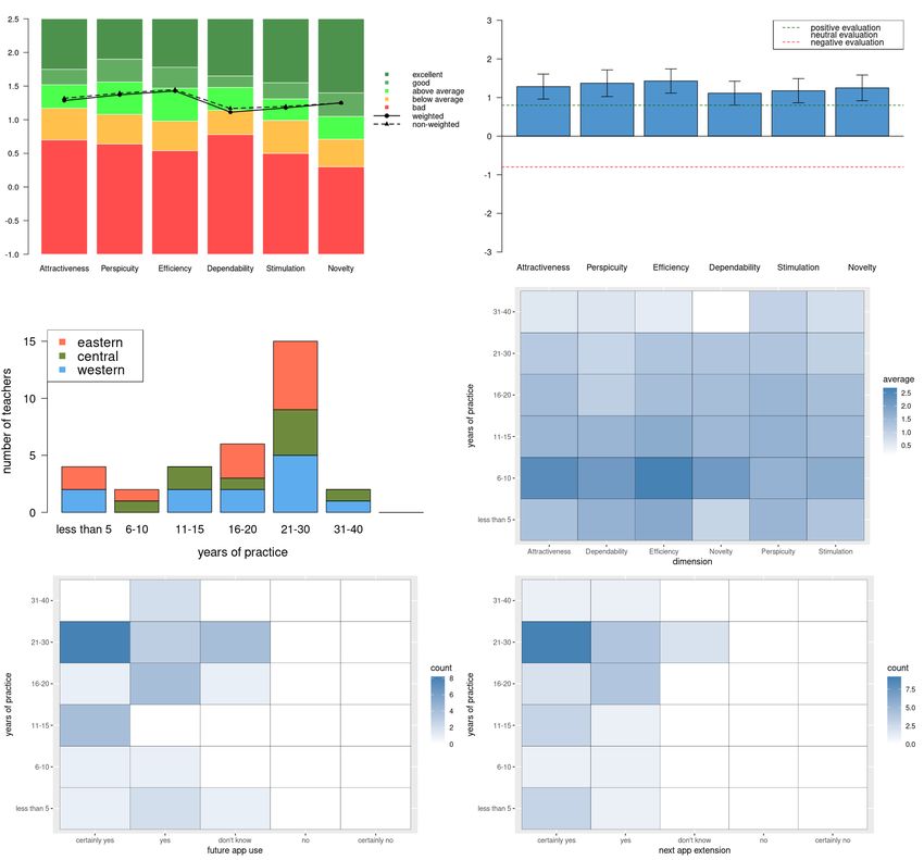
Hanč et al.                                                                                                            Page 4 of 32

               platform-of-choice for tutorials, workshops, online lessons, and even books. One
               of the best elaborated book examples is an open GitHub handbook Teaching and
               Learning with Jupyter (Barba et al, 2019) covering topics like why and how to use
               Jupyter in education, pedagogical instruction designs and case studies elicited from
               authors’ real experience or technical details of Jupyter implementation in practice.
               Another example is Coursera (coursera.org), a world-wide MOOC platform, offering
               many free courses and guided projects using Jupyter as a key learning tool.
                 The revolutionary significance of Jupyter for open science and education also
               became the subject of philosophical reflections, e.g. from a writer and programmer
               J. Sommers (Somers, 2018) or a Nobel prize laureate P. Romer (Romer, 2018) or a
               Canadian philosopher and open education visionary S. Downes (Downes, 2019).

               Jupyter as a tool of interactive teaching methods
               Finally in this introductory section, we would like to point out three important, but
               less known, Jupyter features in connection with three modern interactive instruc-
               tion approaches which are “designed to promote conceptual understanding through
               interactive engagement of students in heads-on (always) and hands-on (usually)
               activities which yield immediate feedback through discussion with peers and/or
               instructors” (Fraser et al, 2014; Hake, 1998; Paňková et al, 2016; Redish, 2014).

               Inquiry based science education. Jupyter allows educators to narrate a “conversa-
               tion” between the student, concepts and data with goals such as building a model,
               carrying out a virtual experiment (simulation) or visualizing any data or process,
               all with or without programming. Pedagogically, such activities can be designed in
               the sense of IBSE (Constantinou et al, 2018; Heering et al, 2012).
                 To be more specific, Jupyter has the so-called widget functionality which provides
               the notebook user access to slide bars, toggle buttons or text-boxes. Such elements
               can hide the code and allow us to create a notebook app or simulation with a
               primary goal to explore or visualize model, computation or data. Another very
               useful feature of Jupyter Notebook as a multimedia web document, is embedding
               functionality allowing to embed any available digital content from Web (via IPython
               command IFrame or HTML). Regarding IBSE virtual experimentation and modeling,
               authors of the paper embed own or available interactive cloud Geogebra simulations
               (see our example in Fig. 2 )[1] and mix with Jupyter calculations in their university
               math or physics subjects (Bu and Schoen, 2011; Hall and Lingefjärd, 2016; Hanč
               et al, 2011).

               Peer instruction and Question driven instruction. In physics education, Peer in-
               struction (Crouch and Mazur, 2001; Fraser et al, 2014; Mazur and Watkins, 2009)
               and Question driven instruction (Beatty and Gerace, 2009; Beatty et al, 2006) are
               two well-known and very similar interactive methods[2] which promote student ac-
               tive learning based on constructivism ideas, formative assessment and cooperative
               [1]
                   GeoGebra (geogebra.org, Hohenwarter et al, 2018) is the leading dynamic mathematics software
               for STEM education allowing to create own interactive simulations without programming knowl-
               edge. Now it is offering over 1 million free activities, simulations, exercises, lessons and games for
               supporting STEM education and innovations worldwide.
               [2]
                   Both methods were established at the beginning of 1990s during the testing clickers in real school
               conditions at US universities and they are based on repeated peer-instruction or question cycles:
Hanč et al. Page 5 of 32
Figure 2 A Jupyter notebook example with an embedded interactive 3D Geogebra simulation and
a SageMath code which can be applied as part of virtual experimentation in the frame of IBSE.
learning. The key technological element of PI or QDI is e-voting which can be
realized effectively by virtual clickers (e.g. via cloud service polleverywhere.com)
and embedded in a Jupyter notebook or it can be also done very easily in Jupyter
notebooks using Activity extension (Barba et al, 2019; Blank and Silvester, 2020).
Flipped learning. Interactive methods like IBSE, PI and QDI can be integral parts
of group space activities[3] in the flipped learning (Bergmann and Sams, 2012; Nouri,
2016; Talbert and Bergmann, 2017), which is according to Talbert “a pedagogical
framework in which the first contact with new concepts moves from group learning
to individual learning space in the form of structured activity, and the resulting
group space is transformed into a dynamic, interactive learning environment where
the educator guides students as they apply concepts and engage creatively in subject
matter”. As for a screencast technology for creating teaching materials used in the
first-contact, pre-class work of students (their home preparation), Jupyter offers
Graffiti extension (Downes, 2019; Kessler, 2020). This Jupyter extension allows to
create interactive screencasts or “live videos” inside Jupyter Notebooks that student
can watch and pause any time. During any pause, student can interactively “play”
with the recorded instructor’s work and combine it with own work and ideas.
(1) posing a question (problem) by the instructor; (2) small-group work of students on solutions –
peer instruction; (3) collecting answers of students by e-voting; (4) displaying the answers without
revealing the correct answer; (5) class-wide discussion; (6) closure (e.g. summarizing the key points
or giving an explanation).
[3]
All these methods are regularly used by the authors during group space activities in flipped
math and physics at secondary school and college levels (Hanč, 2013; Paňková and Hanč, 2019b;
Paňková et al, 2016).Hanč et al. Page 6 of 32
Research purpose and design
Typically, many of the found scholar papers (Fig. 1) are informal case studies, which
are generally based on best teaching practices and wisdom of authors. According to
a distinguished cognitive psychologist Richard Mayer (Mayer, 2008) such applied
approach in instruction usually leads to a set of empirical-based design principles
but with limited applicability since they are not directly or weakly connected to
the cognitive or psychological theory of learning which would provide solid grounds
how or why they work.
From the perspective of cognitive learning theory (Mayer, 2014a), Jupyter note-
book as a learning tool belongs to multimedia (online) which combines words and
pictures in static and dynamic form Mayer (2019). Simultaneously Jupyter note-
books are key elements of computer-based learning or online learning (Mayer, 2019)
when instruction is delivered on a digital device with intention to support learning.
It means that any successful application of Jupyter with general applicability must
respect the cognitive theory of multimedia and online learning whose principles
and processes were discovered during last thirty years and can be found in Mayer
(2014b, 2019)[4] . Our basic review of research literature in Fig. 1 demonstrates
that up-to-date only a few scholar papers refer or try to apply or connect their
educational research in Jupyter application with the mentioned cognitive principles.
Other caveats of the considered empirical research are connected to the fact that
the current cognitive theories of multimedia and online learning themselves would
benefit from stronger incorporation of affect, motivation and metacognition where
research is in its infancy (Mayer, 2019).
Research purpose. Therefore the purpose of our research was to explore the
teacher’s perception of Jupyter as a digital technology during and after their higher
education with the focus on affective aspects of learning. We examined teacher’s
perceptions from two viewpoints. The first viewpoint concentrated on the teacher’s
personal experience and reflections on how the use of Jupyter contributed to the
understanding of learning content, what self-progress and how transferable were
own application of technology in other context. The second viewpoint focused on
the teacher’s overall, comprehensive impression and satisfaction from user, “cus-
tomer” experience representing affective aspects — own emotions and attitudes
when experiencing Jupyter. Particularly, we were interested in feelings of Jupyter
attractiveness, difficulty to get familiar with it, efficiency during work with it, mo-
tivation in using it and capturing user’s attention.
Research design. Our three-years long research was set in the framework of a
complex mixed-methods approach with the convergent design where we combined
results of three parallel research studies providing all our available complementary
sources of quantitative and qualitative data, in order to best understand the research
problem (Creswell and Clark, 2017; Johnson and Christensen, 2016). We describe
the studies conducted from June 2017 to June 2020 in the next three sections when
we also address in detail for each study: background, context, particular design,
participants, procedure, methods and results with the corresponding discussion.
[4]
It seems that The Cambridge Handbook of Multimedia Learning (Mayer, 2014a) is the only
comprehensive research-based reference monograph on multimedia and online learning.Hanč et al. Page 7 of 32
Data collection and analysis tools. Diagnostic, data collection and analysis meth-
ods will be described in the given studies. As for technology, all statistical analysis
in all three studies with data visualization, manipulation, and processing were car-
ried out in open-source data science tools — Jupyter Notebooks with kernels (1)
scientific Python (Jones et al, 2001; Oliphant, 2007, SciPy,) and (2) R (R Develop-
ment Core Team, 2020) using free available Python libraries: numpy (Walt et al,
2011), pandas (McKinney, 2010), matplotlib (Hunter, 2007) and R libraries: Rcm-
drMisc (Fox et al, 2020b), sjstats (Lüdecke, 2020), dplyr, readxl, scales (Wickham
et al, 2019, 2020a,b), cluster (Maechler et al, 2019), factoextra (Kassambara and
Mundt, 2020), hmisc (Harrell Jr and others, 2020), psychometric (Fletcher, 2010),
repr (Angerer et al, 2020) and shiny (Chang et al, 2019).
Our open data analysis in the form of Jupyter notebooks together with all used
tool and data files are stored and freely available at one of our GitHub repository
devoted to this paper (Hanč et al, 2020b) in the frame of our GitHub research
project Jupyter in Physics Education and Research (Hanč et al, 2020a).
Study I: Ph.D. candidates in physics education research
Background and context
In 2017, during one of the last preparatory Ph.D. seminars before the thesis defense,
we observed that in their presentation only one of our six Ph.D. candidates in
Physics Education Research (PER) has applied data science tool R in own data
analysis. All of them were our first students who completed the course, taught by JH
in the collaboration with MH from a statistical department at our university, where
the main goal was the use of advanced statistical methods in the R Commander
(Fox, 2016; Fox et al, 2020a), a simple point-and-click graphical interface for R.
The finding was really disturbing since the course was pedagogically designed in
the frame of flipped learning applying interactive and active-learning methods. It
became a starting motive of our research to investigate what are the main reasons
of the failure, why and how to change it.
Participants
The study involved PER graduate students (N = 9) with the master degree in
teaching physics with other science subject, in that case math or biology. At our
department of physics education the students were enrolled in the Ph.D. course
Statistical methods in Educational Research where they experienced R with R Com-
mander and Excel (up to 2017) or later R in Jupyter as a kernel. The left part of
Table 1 in the results section shows sample characteristics.
Design and methods
The qualitative case study had two sequential phases. In the first phase (May-June
2017), we retrospectively analyzed the use of statistical methods and digital tech-
nologies applied by 6 participants in their Ph.D. thesis or projects (Table 1). Our
research methods included the content analysis of Ph.D. theses (or Ph.D. project if
the student did not yet complete the thesis) and a short qualitative interview con-
taining two questions connected to key obstacles in using R with R commander and
reasons for choosing an alternative (for the exact question wording see Appendix.)Hanč et al. Page 8 of 32
In the second phase (June 2017-June 2020), based on results of the first one, we
decided for an intervention. In the same year (2017) we chose interactive Jupyter
notebooks as the main tool for teaching and learning advanced statistical methods in
PER. Moreover, three remaining participants, after completing the revised course,
more regularly reported and discussed their progress in the application of chosen
methods and tools. We interacted with them and observed them longitudinally
during the whole period 2017-2020.
Results and discussion
The right part of Table 1 presents a summary of our content analysis focusing on
applying advanced statistical methods, not only basic descriptive and inferential uni-
variate statistics (column stats) and new digital technologies (cloud, special tools),
not only Excel spreadsheets. Excel remained the main analysis tool and if necessary,
students used special Excel add-ons, a trial version of XLSTAT (Addinsoft, 2020)
and RSRPS (Zaiontz, 2019). Thanks to collaboration in her Ph.D. research, one
student had access with professional statistical help to SPSS software (IBM Corp.,
2015), the very powerful commercial, but also expensive statistical software[5] . One
student also processed his pilot research data in online web service Data Explorer
at PhysPort (McKagan et al, 2019, physport.org), a webpage of AAPT to empower
physics faculty to use effective research-based physics teaching.
Table 1 Using digital tools for data processing and analysis in PhD projects and thesis (N = 9)
sample characteristics content analysis results
phase nick g phd date stats cloud? spreadsheets special sw
PhD1 F thesis 2017 basic local Excel none
PhD2 F thesis 2017 basic local Excel R
PhD3 F thesis 2017 adv. local Excel SPSS
I
PhD4 F thesis 2017 basic local Excel RSRP
PhD8 M project 2017 basic cloud Excel PhysPort
PhD5 F thesis 2019 adv. local Excel XLSTAT
PhD9 M project 2019 basic local Excel none
PhD6 F thesis 2020 adv. cloud Excel,Google R,Jupyter
II
R,PhysPort,
PhD7 M thesis 2020 adv. cloud Excel,Google
Jupyter
Regarding the qualitative interview here is a summary of main results representing
participants responses with typical examples:
• onetime use: “Since I met R and R Commander only in this one-semester long
course, and after one year of not using, I simply forgot it.”
• installation problems: “I started to apply R but after reinstallation, I was not
able to run it.”
• difficult reproducibility: “During the course, I understood all the important
things and everything looked so simple. But when it came time to analyze my
data, I could not fit it to my data.”
• steep learning curve: “I was trying really hard to use some R scripts from Web
to apply more advanced methods, but it was difficult to understand.”
[5]
In the first decade of this century, SPSS was one of the most popular in psychology, social
sciences, market research, business and government (Salkind, 2010, e. SPSS). Today, it is still very
widespread providing relatively easy access to modern and advanced statistical methods.Hanč et al. Page 9 of 32
• easier way: “Excel is for me still more simple and natural than R Comman-
der.”; “I found a great online tool [PhysPort] for my data and during real
analysis I saw that I really did not need R for my Ph.D.”,
• ignoring advanced methods: “My Ph.D. research did not need methods shown
in the course.”
After our intervention situation was changed. Two of three Ph.D. candidates (the
paper’s coauthors – PS, EP) fully relied on collecting, processing and analyzing data
on Jupyter and R[6] . In thr previous Ph.D. works students used methods and tools
for analysis almost in a purely pragmatic way, only reproducing existing procedures.
Now, thanks to better and “more durable“ understanding which naturally resulted
from working with Jupyter and its interactive and “storytelling” features, both
students used advanced data visualization or analysis, even in new creative ways.
One of such examples is illustrated in Fig. 3 from the Ph.D. thesis of EP (Paňková
and Hanč, 2019a). We explain the corresponding details in the following discussion
of the study results. The second example is presented in our parallel studies (Study
III comes from the Ph.D. thesis of PS) dealing with a weighted benchmark analysis
and plots of our data collected by UEQ (User Experience Questionnaire).
The second phase of our qualitative longitudinal study brought us another valu-
able information. Our three-year longitudinal research outlined the process of adapt-
ing Jupyter technology suitable for a teacher or a researcher in education. Using
data science tools, we mapped the adaptation of Jupyter technology in our research
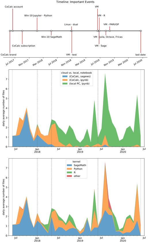
and teaching practice via a longitudinal, time-series representation (Brockwell and
Davis, 2016) graphically summarized and visualized by Fig. 4. We analyzed all
Jupyter notebooks, created by all authors of the paper, by type, kernel and date us-
ing SciPy with pandas, a Python data analysis package originally developed in the
context of financial time series modeling, with an extensive set of tools for working
with time series data (VanderPlas, 2016).
The pandas stacked area plots in Fig. 4 display the evolution of the daily aver-
age number notebooks created by authors (the overwhelming majority of Jupyter
notebooks with R kernel was created by PS, with SageMath and Python kernels
by JH) with respect to a timeline. The timeline shows the list of important events
– signing up to an online service or software installations. The first moment when
we started to use Jupyter is connected to June 2017 when we signed up a CoCalc
account (cocalc.com) to the last one, our submission of the paper (June 2020).
To avoid any problem with local installations mentioned by participants in the first
phase, it seems as the best choice to start with Jupyter using one of the current cloud
services with zero setup. We choose CoCalc (event: CoCalc account in Fig. 4)[7] .
After a few months, we subscribed to a basic paid plan since the free trial running
on free servers can be sometimes very slow (event: CoCalc subscription).
[6]
The third one is planning to use data science tools in his research, but now from personal reasons
he has a study break.
[7]
CoCalc is a virtual online cloud workspace for calculations, research, collaboration and author-
ing documents combining the best free mathematical software and document editors. The service
allows e.g. running Jupyter technology with many kernels (SageMath, Python, R, Julia etc.) and
with real-time collaboration and communication tools directly in a web browser with zero setup.
However, there are also another very similar and easy cloud ways to run Jupyter without any soft-
ware installation (Data School, 2019), e.g. you can use Binder (binder.org) from Project Jupyter
(Project Jupyter et al, 2018), Kaggle kernels (kaggle.com/kernels), Microsoft Azure notebooks
(notebooks.azure.com) or Google Colab (colab.research.google.com).Hanč et al. Page 10 of 32
Figure 3 An example of advanced multivariate analysis method using R in Jupyter: Hierarchical
cluster analysis AGNES based on concentration factor (Bao and Redish, 2001) and score
computed and visualized using R software (R packages cluster, factoextra) supplemented by a
continuous density estimation for the distribution of student’s mental images behind quantum
physics concepts (R package likert) in the cluster.
With improving skills and better understanding we dared to try local installations
(Win-10 events). Being more familiar with the technology, we found that getting
more benefits like more comfortable installation, work or better open-source pack-
ages means the transition to an open-source Linux operating system, in our case
Fedora (event:Linux). Finally, our experience showed that leaving Windows is not
an option for us. After two years we found a solution perfectly fitting requirements
of effective research and teacher work – the use of virtual machine Linux installation
(via Oracle VM VirtualBox) which allow us to run Linux on Windows without shut-Hanč et al. Page 11 of 32
Figure 4 An example of advanced data visualization: Timeline and time-series plots — so-called
stacked area plots, created in Scientific Python (data analysis package pandas) mapping
adaptation of Jupyter technology by authors of the paper during last three years (2017–2020).Hanč et al. Page 12 of 32
ting down Windows and combine the best features from the Windows and Linux
world (VM events locally installing different Jupyter kernels: Sage, R, Julia, Octave,
Fricas, PARI/GP).
Discussion. Results of our small qualitative case study suggest that a one-semester
long course in using data science tools for Ph.D. PER candidates in the context of
advanced statistical methods is not enough to start using them as main tools in
their own research and analysis. Possible reasons indicated by the results include a
short time (before our intervention for our students it was the first and only course
in this field of expertise), steep learning curve and difficult reproducibility if we use
the point-and-click environment.
Students typically return to Excel as a natural and rescue option. This appears in
accordance with the general notion that Excel is probably still the most widespread
digital tool for collecting, storing and processing educational data (Heiberger and
Neuwirth, 2009; Wilcox, 2017). However, young researchers use Excel, frequently
with special add-ons allowing readily apply many advanced and modern methods,
despite or unaware of the fact that overwhelming majority of their spreadsheets
usually appear poorly or very hardly reproducible, with always present errors as it is
in any point-and-click graphical interface depending on human factor(Baumer et al,
2017; Panko, 1998)[8] . This way of working with research data has been seen in wider
circumstances and still belongs to not-negligible problems of current education-
research publications (van der Zee and Reich, 2018). As for the shortness of learning
time, our conclusion agrees with McKiernan (2017) who also pointed out that one
semester for mastering skills with data tools is not enough.
Only after our intervention consisting in the exchange of learning tools, from the
point-and-click environment (R Commander) to interactive multimedia documents
(Jupyter Notebooks), and the following continual advising, watching progress of
our participants, we saw the full acceptance of data science tools which led also
to creativity of participants. This result is connected with findings in Odden and
Caballero (2019); Odden et al (2019) where writing computational essays using
Jupyter supports creative thinking.
As for the significance of participants’ results, we can comment on the case in
Fig. 3. let us shortly explain the green cluster with higher concentration C (≥ 0.2)
and higher centered score S (≥ 0.25). The higher C means concentrating students’
answers to less number of question choices (in density visualization it means peaks).
The higher score S says that concentration is on the disagreement side with the
statement. Therefore questions in the green cluster have approximately similar,
higher concentration of students answers ’to one choice representing the disagree-
ment.
In PER the cluster analysis is still rare and perceived as difficult and “magic”.
EP was able to implement the hierarchical cluster analysis in her Ph.D. research,
generally described in EMC Education Services (2015); Kassambara (2017), only
after the Jupyter adaptation. We believe that the main reason why only several PER
[8]
We must say that R Commander has the build MarkDown system for writing easily reproducible
and transparent reports. However, under the influence of guidebook (Heiberger and Neuwirth,
2009) we did not pay attention to this feature which became evident and very natural in Jupyter.Hanč et al. Page 13 of 32
groups applied and reported this method up to now (e.g.Ireson (1999, SPSS), Ding
and Beichner (2009, SAS), Battaglia et al (2019, own C-code), Springuel et al (2019,
Python code) consists in fact that all publications are missing the key components of
open science (van der Zee and Reich, 2018) – analysis in an expensive commercial
software or no available public data or no details of data analysis in a readable,
easily reproducible code.
To complete our comments on cluster analysis, Both “convinced” Ph.D. candi-
dates strongly appreciated transparency and reproducibility of Jupyter notebooks
consisting in the possibility to make own notes in along with computational proce-
dures, analysis, plots, equations or algorithms. According to their experience, there
was practically no problem to retrieve ideas developed in a notebook even a few
months or a year after the end of work. Another highly valued feature was flexibility
of open data science tools like R which is also generally accepted view when they
are compared with commercial softwares like SPSS (Wilcox, 2017).
Before getting the first knowledge about Jupyter in June 2017, from the mentioned
EOSC project OpenDreamKit, all paper’s authors, also teachers by their master de-
gree (Math-Phys), had basic algorithmic skills and digital experience mainly with
point-and-click statistical or mathematical environments. During three years, we
successfully started with Jupyter, then naturally switched from the cloud to local
work, from Windows to Linux and from two key kernels (SageMath, Python) to
more kernels (R, Julia, Octave, etc.) – the mode which is also typical and effective
for the majority of current data scientists (kaggle, 2020). We apply Jupyter note-
books as an education tool and also as a scientific tool in our statistical, time-series
research (Hančová et al, 2020) and educational research (Ph.D. theses of EP and
PS). Finally, it is important to say that observed time-series seasonal pattern (local
maxima during summer months, minima during winter months) appears very spe-
cific and they are strongly determined by nature of university academic workflow
and environment (July, August – vacations; December, January – exam periods).
Study 2: Pre-service physics teachers
Background and context
The previous case study showed us valuable deep qualitative insights and detailed
experience dealing with the use and perception of Jupyter technology from the view-
point of ordinary educational researchers, from his first contact with the technology
to its more advanced application. We were fully aware that type of the study, size of
the sample and specific study circumstances would not allow valid generalizations.
Therefore, using the results of the first phase of Study I, in the same year (2017),
we grounded our approach in the following longitudinal quantitative study where
the main goal was to explore teacher’s perception of Jupyter in more standard
conditions with a larger available sample of participants. In that case we decided
to use the standardized, reliable quantitative diagnostic instrument called User
Experience Questionnaire (Laugwitz et al, 2008; Schrepp et al, 2017), shortly UEQ.
This marketing tool is widely used to measure a subjective, overall impression and
satisfaction of user or “customer” experience with an interactive digital product.
According to originators, the UEQ is the first tool covering user experience withHanč et al. Page 14 of 32
the product satisfying three important requirements – a quick assessment; covering
comprehensive impression; simple and immediate way to express affective attitudes.
Particularly, the tool measures overall attractiveness of the product, its usability
aspects (efficiency, perspicuity, dependability) and motivational aspects (stimula-
tion, novelty). Perspicuity expresses how easy is to get familiar with the product
and to learn how to use it. Efficiency stands for efficient and quick interaction with
the product. Dependability expresses how the user feels in control of the interaction.
Stimulation means motivation to use it and novelty measures how the innovativeness
and creativeness of the product capture user’s attention.
Participants
The participants were all future, pre-service teachers of physics, who always study
physics in combination with other science or humanity subject, taking the first-year
compulsory course of their bachelor study program, called Fundamentals of calculus
for physicists at the Institute of Physics at P. J. Šafárik University in Košice,
Slovakia. We collected data after the course during three following years (2018-
2020) from a total of N = 33 students (19 females, 14 males). Table 2 describes a
numerical summary of participant demographics with respect to a year, gender and
study field. The fourth factor, high or low achiever (Table 3), was determined by a
grade average (Nouri, 2016): high means an average from A to B, low represents an
average from C to F.
Table 2 Student demographics (N = 33) in quantitative longitudinal study II.
study field
year g Math-Phys Phys-Bio Phys-Chem Phys-Comp Phys-Geo all
F 1 6 0 0 0 7
2017
M 4 2 1 0 0 7
F 3 2 0 1 0 6
2018
M 4 1 0 1 0 6
F 3 2 0 0 1 6
2019
M 1 0 0 0 0 1
total 16 13 1 2 1 33
Table 3 The longitudinal distribution of the sample as high or low achievers.
study field Math-Phys Phys-Bio Phys-Chem Phys-Comp Phys-Geo all
achiever high low high low high low low
2017 4 1 2 6 1 0 0 14
2018 4 3 0 3 0 2 0 12
2019 3 1 1 1 0 0 1 7
total 11 5 3 10 1 2 1 33
Design and methods
Instructional design of the course. The course, a bridge between secondary school
and college level of mathematics and its study, focuses on the conceptual under-
standing, getting clear ideas and mastering basic computational and application
skills connected with fundamentals concepts of calculus: function, derivative, in-
tegral, differential equation and complex number in one and especially their moreHanč et al. Page 15 of 32
sophisticated versions in more dimensions. Our approach conceptually applies ideas
of the Calculus reform (Haver, 1999) which took place during the 80’s and 90’s of
the previous century and completely re-thought the calculus curriculum for non-
majors in math leading to such innovative college textbooks like (Hughes-Hallett
et al, 2016).
After completing all essential and necessary preparation, from 2012 we teach the
course in the frame of the Flipped learning (Bergmann and Sams, 2012; Talbert
and Bergmann, 2017) using mentioned interactive teaching methods engaging stu-
dent participation and active learning (Freeman et al, 2014). As for technology,
we teach face-to-face, collaborative space group activities in a PC room whereas
home preparation, individual space structured activities mainly based on interac-
tive video lessons, are managed principally via Google Classroom as LMS and set
of other supporting technologies, e.g. Edpuzzle (edpuzzle.com) or smartphones.
An exploration, invention and application of mathematical concepts were realized
by students with the help of two mathematical softwares Geogebra in the visual
and graphical domain and Maxima in the analytical domain. More details about
our approach from content and pedagogical viewpoint can be found in Hanč (2013,
2016); Paňková et al (2016).
Our major intervention made during June 2017-September 2017 consisted in re-
placing digital learning tools for active learning. Particularly, we transformed the
majority of learning materials, Pdfs created in LATEX typographical system, directly
to one uniform format — online, interactive or static, Jupyter notebooks (Kuep-
pers, 2017). The most important change was our transition from the point and click
mathematical softwares Maxima to SageMath[9] as a Maxima replacement.
Data collection. The basic available demographics and background information
were obtained from our academic information system at the university. All personal
information, respecting rules of GDPR, were deleted and basic identification was
coded by random codes.
Since the flipped math depends heavily on digital technologies and requires some
basic level of digital literacy from students, at the course beginning they filled out
our self-developed Digital Experience Questionnaire as an online Google form giving
us contact information and their digital experience background. The questions are
connected to own digital devices they can bring and use in collaborative activities
during the face-to-face instruction, what in home preparation and what digital
background in math education they bring from a secondary school (exact questions’
wording is in the Appendix and our GitHub storage).
At the end of the course, the mentioned UEQ tool was administrated, again
electronically as an online Google form. Being recommended by UEQ originators,
we translated the UEQ into Slovak[10] . Its long version, used by us, contains 26 items
grouped in six dimensions described above. In the UEQ, responses are in the form
[9]
SageMath is a free open-source Python-based mathematics software containing Maxima as its
part (Beezer et al, 2013; Stein and others, 2020; Zimmermann et al, 2018) and now it is one of
kernels in Jupyter. Originally SageMath was created as a free open source, viable alternative to the
popular commercial computer algebra systems or scientific computing environments like Wolfram
Mathematica (wolfram.com), Maple (maplesoft.com), MATLAB (mathworks.com).
[10]
Up to these days, there are more than 30 language mutations of the original German version,
including our Slovak version, all available at ueq-online.org.Hanč et al. Page 16 of 32
of the semantic differential where a respondent via a seven-point scale expresses to
what extent he agrees with the given characteristic of the tool described by two
opposite adjectives, e.g. annoying 1 2 3 4 5 6 7 enjoyable.
To address the first personal viewpoint of how Jupyter contributed in the un-
derstanding of learning content, what self-progress and how transferable were own
application of technology we extended UEQ by three 5-point Likert-scale questions
(see the Appendix). The data collection was done three times with respect to the
given conditions.
Data analysis. In statistical data analysis we applied the exploratory analysis
based on basic descriptive numerical and advanced graphical summarizations al-
lowed by data science tools (R and Python) and combined with standard ANOVA
procedures (Maxwell et al, 2017) to test their statistical significance. The UEQ data
has a special procedure for analysis described in (Laugwitz et al, 2008) with the
following benchmark evaluation of a digital product for each dimension:
• excellent, your product is in the 10% best product range,
• good, 10% of the best placed are higher and 75% of the products
are rated worse than your product,
• above average, 25% are better and 50% worse than your product,
• below average, 50% are better and 25% worse than your product,
• bad, only 25% of the products are worse than your product.
For UEQ data analysis we have also created our own R package containing functions
suitable for our analysis. It can be found with all data, analysis and explanations
in corresponding Jupyter notebooks at our GitHub repository (Hanč et al, 2020b).
Results and discussion
Initial Digital experience. The longitudinal summary results of the Digital Expe-
rience Questionnaire data from 2017-2020 are depicted by Fig. 5[11] . We can see
that all students have access to several digital devices. Every student has their own
smartphone (mainly Android). At home he can operate with a notebook (almost
100%; 80% have own one) or at least with a PC. The dominant operating system
is Win10. A small part of students can use or bring a tablet. From the educational
viewpoint, teaching and learning in secondary school math still rely on classical
means (calculators, paper, chalk, blackboard). During a secondary school math in-
struction, the half of students met PC-oriented technology (computers, notebooks,
projectors, interactive whiteboard IWB), only 1/3 of them used web-based technol-
ogy (LMS, email, videos or simulations) and a small number (15%) touch-sensitive
technology (smartphones and tablets).
User Experience Questionnaire. From the original total N = 33 students 15% did
not finish the first semester at their original bachelor study program. Specifically,
5 females: 2 (2017, low ach., Physics-Biology), 2 (2018, low ach., Physics-Biology,
[11]
Unlike other figures in the paper, the total percentages in the plots do not add up to 100
% due to possible multiple student responses. Responses displayed by each bar were considered
independently with respect to the total possible number N = 33.Hanč et al. Page 17 of 32
Figure 5 Pre-service teacher’s digital experience: own digital devices they can bring and use in
the course, what in home preparation and what digital technology experienced in secondary school
math education. Stacked bar plots were created in Scientific Python (data analysis package
pandas).
Physics-Computers), 1 (2018, high ach., Math-Physics) transferred to another study
field (1 from Math-Physics to Math) or left our university (remaining 4).
Therefore the UEQ data contains answers from N ∗ = 28 students (14 females, 14
males). Due to department politics, we always interview each student why he/she
is leaving our study program and nobody saw our course as the key reason. Typical
reasons were different expectations or too difficult introductory physics.
The first viewpoint of participants’ perception represented by our three extra
questions to UEQ (see graphical summary in Fig. 6) show positive personal reflec-
tions of students in the meaning of Jupyter for their learning. Explicitly, more than
70% agreed that Jupyter Notebooks in our educational approach helped them a
lot in understanding what they have learned. Overwhelming 90% reported great
improvement in the used digital technology. Almost 80% see a high potential of
Jupyter use in other subjects. The longitudinal distributions of students’ answersHanč et al. Page 18 of 32
are qualitatively similar, although in understanding and improvement plots 2019-
year modus is closer to the neutral level in comparison with previous years modi
(2017, 2018).
Figure 6 Pre-service teacher’s perception of technology role in understanding the learning
content, in an improvement of own digital skills and in other subjects (possible transfer).
The collected UEQ data, capturing students’ impression, feelings and affective
attitudes, led to the following benchmark results and interpretation summarized by
Table 4. The means of dimensions are also displayed in Fig. 7 (solid line all ) which
presents the UEQ benchmark results with respect to four factors – year, gender,
study program and achievement.
Table 4 The UEQ benchmark results – average (M), standard error (SE) and interpretation.
dimension M (SE) benchmark Interpretation
Attractiveness 0.92 (0.19) below average 50% better, 25% worse
Perspicuity 0.78 (0.16) below average 50% better, 25% worse
Efficiency 1.47 (0.17) good 10% better, 75% worse
Dependability 1.24 (0.16) above average 25% better, 50% worse
Stimulation 1.08 (0.20) above average 25% better, 50% worse
Novelty 1.43 (0.15) excellent range of the best 10%
These results demonstrate that no affective aspect of Jupyter is bad. Jupyter
technology leaves the best personal impression in motivational aspect Novelty. The
second most valuable for students is efficient and quick work with Jupyter. On the
contrary, Perspicuity, the usability aspect how easy to learn Jupyter, appears as a
dimension with the weakest personal affective attitude. Very similar below average
impression is connected to overall attractiveness of Jupyter as the digital product.
Here it is worth to say that we aggregated all non-mathematical combinations
to one level called shortly Phys. This step is dictated not only by small numbers
of students in Physics-Chemistry, Physics-Computers, Physics-Geography, but it is
justified also conceptually since all non-math major programs have practically the
same math and physics education, but different from the Math-Physics program
with much wider and rigorous math education.Hanč et al. Page 19 of 32
Figure 7 The UEQ benchmark plots with respect to four factors – year, gender, study program
and achievement. Plots were created in R (own UEQ package).
Multiway ANOVA[12] was used to test the significance of all four mentioned fac-
tors. As the graphical representation in Fig. 7 indicates, ANOVA confirmed the sta-
tistical significance of factor “achievement” at Attractiveness (p = 0.020, η 2 = 0.192
– large effect size), Perspicuity (p = 0.048, η 2 = 0.142 – medium effect size), Stim-
ulation (p = 0.043, η 2 = 0.135 – medium effect size) and Novelty (p = 0.017,
η 2 = 0.159 – large effect size). Factor “gender” has a significant large effect at
Novelty (p = 0.007, η 2 = 0.212).
The reliability of UEQ reached a high value – Cronbach’s α = 0.90 for the whole
questionnaire and with respect to given dimensions alphas were between 0.55 and
0.84. The only dimension with questionable alpha was Dependability (α = 0.55).
All other values satisfy the generally accepted condition α > 0.7 for reliable group
measurements.
Discussion. Our results, based on the questionnaires and our teaching observa-
tions, show that our future physics teachers as incoming secondary school students
did not experience any digital technology as a key active learning tool in secondary
school math education. Moreover, only a small proportion of them have required
digital skills enhancing an effective and successful university study, especially in the
mode of Flipped Learning. These findings explain why 90% of students reported
feelings of the great improvement in digital technology after our course.
Together with another implication from Study I, that one-semester long mathe-
matical course with new technology can be refused by students, results also tell us
that we have to be very careful in any digital innovation. Improper instructional
students’ expectations and motivation with wrong meta-cognitive models about
[12]
As for the used inferential statistical analysis of the UEQ data, where each student evaluation is
represented by six dimensional vector, MANOVA appears as a more suitable and powerful method.
However we could not to apply it due to the insufficient size of our sample.Hanč et al. Page 20 of 32
the role of learning tools (digital technology in our case) can be one of the decisive
factors of low students’ learning gains or failure (Hattie, 2015, 2009).
To avoid such situation and change students’ expectations in the right direction
as much as possible, we realized several supporting steps from the beginning of our
research which we believe became important determiners of our successful inno-
vations. We prepared a new version of our supplementary supporting course called
Students’ digital literacy. The original goal of the course was to provide the sufficient
level of digital literacy in today’s modern technologies (smartphone, tablet, social
media via LMS, online web-technologies like Google drive) for better and more
effective learning, active life in higher education and later professional activity.
From 2017, regarding all university students – future science teachers including
given physics teachers, we incorporated in the course a special module for work
and training with Jupyter and Geogebra. Since Jupyter does not have a special
intuitive menu like point-and-click interfaces, one of the digital literacy goals also
became developing very effective searching and working skills how to use practical
cheat-sheets for Jupyter and its kernels which we collected and prepared in Slovak.
Although creators and long-term Jupyter users feel Jupyter technology as simple
as email or web (Project Jupyter et al, 2018), our results suggest that there is a
need to devote special attention to low achievers for whom Jupyter can be one of
other unattractive obstacles in their study. Our interaction with such students led
us to the finding that this is probably a problem of expectations. Low achievers have
typically a negative attitude to math and automatically transmit it to everything
which is connected with math.
Concerning technological aspects, before 2017, our digital learning tools Max-
ima and Geogebra were treated by us and students as two independent tools. Now
we have integrated SageMath with embedded Geogebra simulations and Jupyter
widgets apps (in SageMath called Interacts) in Jupyter Notebooks as a unifying in-
teractive multimedia environment[13] . Interesting experience of our students showed
that in the case of sufficiently large screens (at least 5 inches – such smartphones
are also called phablets) interactive Jupyter notebooks can be actively read and
watch as study materials in home preparation.
Finally, as for generalizations, this intervention single-case study without control
group has again limits in external validity of results. However, our comparison of
placement physics and math tests’ results from our future physics teachers with
results from secondary schools’ population (see our third research study) suggest
that our conclusion should represent upper limit what can be achieved.
To complete our study report, we would like to mention that in our previous pub-
lication (Štrauch and Hanč, 2017) we showed high effectiveness of our flipped math
course in the cognitive learning dimension, especially in the conceptual understand-
ing of taught math concepts. From the content viewpoint, the form of course was
also principal. It provided form, tools and time for us and for students to get clear
and transparent ideas about those math concepts which in such an early course
with the traditional instructional model were considered as impossible to expose,
understand or learn.
[13]
Technologically we run Jupyter with SageMath in three complementary modes: Binder for in-
dividual explorations, CoCalc for cooperative activities and SageMathCell (sagecell.sagemath.org)
for very quick calculations. At home students usually install a Windows local version of the Jupyter
with SageMath kernel.Hanč et al. Page 21 of 32
Study 3: In-service physics teachers
Background and context
The third parallel study, one of the main fresh, unpublished results of Ph.D. re-
search of PS, deals with in-service physics teachers and their perception of the
meaning of data and data science tools. Generally, as for in-service teachers, there
is a substantial body of research papers how quantitative and qualitative data can
foster and improve effective teacher decisions and behavior (see the special issue,
Vol. 60, November 2016 in journal Teaching and Teacher Education, esp. Lai and
McNaughton, 2016; Mandinach and Gummer, 2016; Poortman et al, 2016). Simulta-
neously, data use belongs to the common and key characteristics of high-performing
schools (Ebbeler et al, 2016).
Data literacy for teaching, the ability to transform, collect, control and understand
all types of educational data for better instruction, becomes essential. Every teacher
should be also an action researcher armed at least by basic level of methodology
knowledge and data literacy in his work for lifelong learning (Johnson and Chris-
tensen, 2016). Such action research will lead not only to a better understanding
and improvement of own teaching practice, but above all to the greater satisfaction
from work and a positive attitude to be better at their own profession.
Therefore the central goal of the Ph.D. thesis was to examine, verify and provide
such data science tools, Jupyter as our first choice, for in-service teachers in real
practice which would help them easily and effectively to collect, process and use
their own educational data. Specifically, we focused on data about students’ pre-
conceptions, misconceptions and mental models in physics understanding as one of
the decisive factors in the quality of physics teaching (Fraser et al, 2014; Redish,
2014).
Participants
Participants were a random sample of n = 40 in-service physics secondary school
teachers. Random sampling was a part of our national cross-sectional survey (May
2018-June 2018, 919 students) dealing with student conceptual understanding in
mechanics with a stratified two-sample cluster sampling design according to an ap-
plied algorithm used in TIMSS (PISA) surveys (see a scheme in Fig. 8). Particularly,
we took a random sample from all eligible Slovak grammar schools (N = 284), from
H = 3 layers (strata), natural geographical Slovak regions – western, central and
eastern. From collected students’ data we knew that all teachers successfully used
our data science tool, however, online questionnaire feedback provided only n∗ = 33
teachers (83% response rate). The left middle histogram in Fig. 10 in the result sec-
tion shows demographic information about the sample of teachers (9 males and 24
females).
Design and methods
Pilot study. We realized a pilot study in using Jupyter on a few small samples of
our active physics teachers during physics teacher clubs. It showed negative feed-
back. Today, many requirements and complexity of teaching as a profession often
lead to a very busy teacher, so in-service teachers are usually poorly concentrated on
any longest adaptation of new technology also in the case of a simple one. Therefore,
we left Jupyter and tried to find even a simpler data science tool.You can also read