The Cognitive Style of PowerPoint
←
→
Page content transcription
If your browser does not render page correctly, please read the page content below
The Cognitive Style of PowerPoint
                                "Not waving but drowning." Stevie Smith

IN corporate and government bureaucracies, the standard method for
making a presentation is to talk about a list of points organized onto
slides projected up on the wall. For many years, overhead projectors lit
up transparencies, and slide projectors showed high-resolution 35mm
slides. Now "slideware" computer programs for presentations are nearly
everywhere. Early in the 2ist century, several hundred million copies
of Microsoft PowerPoint were turning out trillions of slides each year.
   Alas, slideware often reduces the analytical quality of presentations.
In particular, the popular PowerPoint templates (ready-made designs)
usually weaken verbal and spatial reasoning, and almost always corrupt
statistical analysis. What is the problem with PowerPoint? And how
can we improve our presentations?

When Louis Gerstner became president of IBM, he encountered a big
company caught up in ritualistic slideware-style presentations:
  One of the first meetings I asked for was briefing on the state of the [main-
  frame computer] business. I remember at least two things about that first
  meeting with Nick Donofrio, who was then running the System/39O
  business. One is that I . . . experienced a repeat of my first day on the job.
  Once again, I found myself lacking a badge to open the doors at the
  complex, which housed the staffs of all of IBM'S major product groups,
  and nobody there knew who I was. I finally persuaded a kind soul to let
  me in, found Nick, and we got started. Sort of.
  At that time, the standard format of any important IBM meeting was a
  presentation using overhead projectors and graphics that iBMers called "foils"
   [projected transparencies]. Nick was on his second foil when I stepped to
  the table and, as politely as I could in front of his team, switched off the
  projector. After a long moment of awkward silence, I simply said, "Let's
  just talk about your business."
  I mention this episode because it had an unintended, but terribly powerful
  ripple effect. By that afternoon an e-mail about my hitting the Off button on
  the overhead projector was crisscrossing the world. Talk about consternation!    1
                                                                                     Louis V. Gerstner, Jr., Who Says Elephants
  It was as if the President of the United States had banned the use of English    Can't Dance? Inside IBM's Historic Turn-
  at White House meetings.1                                                        around (2002), p. 43.

There is a lot going on here: the humiliation ceremony authorizing entry
into the Corporate Palace, a new president symbolically demonstrating
that things were going to be different from now on, and a blunt action
indicating that there might be better ways to do serious analysis than
reading aloud from projected lists— "Let's just talk about your business."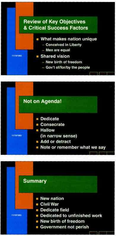
The Cognitive Style of PowerPoint
Gerstner's idea, "Let's just talk about your business," means an exchange of
information, an interplay between speaker and audience. Yet PowerPoint
is entirely presenter-oriented, and not content-oriented, not audience-oriented.
The claims of PP marketing are addressed to speakers: "A cure for the
presentation jitters." "Get yourself organized." "Use the AutoContent
Wizard to figure out what you want to say." The fans of PowerPoint
are presenters, rarely audience members.
    Slideware helps speakers to outline their talks, to retrieve and show
diverse visual materials, and to communicate slides in talks, printed
reports, and internet. And also to replace serious analysis with chartjunk,
over-produced layouts, cheerleader logotypes and branding, and corny
clip art. That is, PowerPointPhluff.
    PP convenience for the speaker can be costly to both content and
audience. These costs result from the cognitive style characteristic of the
standard default PP presentation: foreshortening of evidence and thought,
low spatial resolution, a deeply hierarchical single-path structure as
the model for organizing every type of content, breaking up narrative
and data into slides and minimal fragments, rapid temporal sequencing
of thin information rather than focused spatial analysis, conspicuous
decoration and Phruff, a preoccupation with format not content,
an attitude of commercialism that turns everything into a sales pitch.

Extremely Low Resolution of PowerPoint
PP slides projected up on the wall are very low resolution—compared to
paper, 35mm slides, and the immensely greater capacities of the human
eye-brain system. Impoverished space leads to over-generalizations,
imprecise statements, slogans, lightweight evidence, abrupt and thinly-
argued claims. For example, this slide from a statistics course shows
a seriously incomplete statement. Probably the shortest true statement
that can be made about causality and correlation is "Empirically observed
covariation is a necessary but not sufficient condition for causality." Or perhaps
"Correlation is not causation but it sure is a hint." Many true statements
are too long to fit on a PP slide, but this does not mean we should
abbreviate the truth to make the words fit. It means we should find
a better way to make presentations.
   With so little information per slide, many many slides are needed.
Audiences consequently endure a relentless sequentiality, one damn
slide after another. When information is stacked in time, it is difficult to
understand context and evaluate relationships. Visual reasoning usually
works more effectively when the relevant information is shown adjacent
in space within our eyespan. This is especially the case for statistical
data, where the fundamental analytical act is to make comparisons.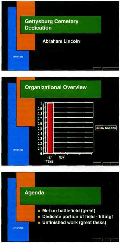
C O G N I T I V E S T Y L E OF P O W E R P O I N T     5

   The statistical graphics generated by the PowerPoint ready-made                             MEDIAN NUMBER OF ENTRIES IN DATA
                                                                                               MATRICES FOR STATISTICAL GRAPHICS
templates are astonishingly thin, nearly content-free. In 28 books on
                                                                                               IN VARIOUS PUBLICATIONS, 2OO3
PP presentations, the 217 data graphics depict an average of 12 numbers
each. Compared to the worldwide publications shown in the table at                             Science                            > 1,000

right, the statistical graphics based on PP templates are the thinnest                        Nature                              > 700

of all, except for those in Pravda back in 1982, when that newspaper                           New York Times                         120

operated as the major propaganda instrument of the Soviet communist                            Wall Street Journal                    112

party and a totalitarian government. Doing a bit better than Pravda is                         Frankfurter Allgemeine Zeitung          98

not good enough. Data graphics based on PP templates show 10% to 20%                           New England Journal of Medicine         53

of the information found in routine news graphics. The appropriate                             The Lancet                             46

response to such vacuous displays is for people in the audience to speak                      Asahi                                   40

out: "It's more complicated than that!" 'Why are we having this meeting?                       Financial Times                         40

The rate of information transfer is asymptotically approaching zero,"                          Time                                   37
                                                                                               The Economist                          32
                                                                                               Le Monde                                28
                                                                                               28 textbooks on PowerPoint
Bullet Outlines Dilute Thought                                                                 presentations (1997-2003)              12
Impoverished resolution coerces slide-makers into using the compressed                         Pravda (1982)                            5
language of presentations—the bullet list of brief phrases. Bullets, little
                                                                                               Here is a graphic from Pravda (May 24,
marks sometimes decorative or cute, signal the beginning of each phrase                        1982), in the low-content, high-Phluff
for those unable to recognize it. Sometimes the bullet hierarchies are so                      style now emulated by PP templates:
complex and intensely nested that they resemble computer code.
    By insisting that points be placed in an orderly structure, the bullet
list may help extremely disorganized speakers get themselves organized.
The bullet list is surely the most widely used format in corporate and
government presentations. Bullets show up in many paper reports, as
presenters simply print out their PP slides.
    For the naive, bullet lists may create the appearance of hard-headed
organized thought. But in the reality of day-to-day practice, the PP                           Additional evidence on data matrices for
                                                                                               various publications, including Pravda, is
cognitive style is faux-analytical. A study in the Harvard Business Review                     reported in Edward R. Tufte, The Visual
found generic, superficial, simplistic thinking in the bullet lists widely                     Display of Quantitative Information (1983,
used in business planning and corporate strategy. What the authors are                         2001), p. 167. In this table above, the
                                                                                               medians are based on at least 20 statistical
saying here, in the Review's earnestly diplomatic language, is that bullet                     graphics and at least one full issue of each
outlines can make us stupid:                                                                   publication. Except for scientific journals,
                                                                                               most of these publications use standard
  In every company we know, planning follows the standard format of                            formats issue after issue; replications of
  the bullet outline... [But] bullet lists encourage us to be lazy in three                    several of the counts above were within
  specific, and related ways.                                                                  10% of the original result.

  Bullet lists are typically too generic. They offer a series of things to do
  that could apply to any business....

  Bullets leave critical relationships unspecified. Lists can communicate
  only three logical relationships: sequence (first to last in time); priority                 2
  (least to most important or vice versa); or simple membership in a set                          Gordon Shaw, Robert Brown, Philip
                                                                                               Bromiley, "Strategic Stories: How 3M
  (these items relate to one another in some way, but the nature of that                       is Rewriting Business Planning," Harvard
  relationship remains unstated). And a list can show only one of those                        Business Review, 76 (May-June, 1998),
  relationships at a time.2                                                                    pp. 42-44-
By leaving out the narrative between the points, the bullet outline
ignores and conceals the causal assumptions and analytic structure of the
reasoning. In their Harvard Business Review paper on business planning,
Shaw, Brown, and Bromiley show that even simple one-way causal
models are vague and unspecified in bullet outlines. And more realistic
multivariate models with feedback loops and simultaneity are way over
the head of the simplistic bullets:

  Bullets leave critical assumptions about how the business works unstated.
  Consider these major objectives from a standard five-year strategic plan:

                • Increase market share by 25%.
                • Increase profits by 30%.
                • Increase new-product introductions to ten a year.

  Implicit in this plan is a complex but unexplained vision of the organi-
  zation, the market, and the customer. However, we cannot extrapolate
  that vision from the bullet list. The plan does not tell us how these
  objectives tie together and, in fact, many radically different strategies
  could be represented by these three simple points. Does improved
  marketing increase market share, which results in increased profits
  (perhaps from economies of scale), thus providing funds for increased
  new-product development?

       Market share           Profits      New-product development

  Or maybe new-product development will result in both increased
  profits and market share at once:
                                            -»• Market share
         New-product development
                                                 Profits

  Alternatively, perhaps windfall profits will let us just buy market share
  by stepping up advertising and new-product development:

      Profits      > New-product development         > Market share3          3
                                                                               Gordon Shaw, Robert Brown, Philip
                                                                              Bromiley, "Strategic Stories: How 3M is
                                                                              Rewriting Business Planning," Harvard
   Bullet outlines might be useful in presentations now and then, but         Business Review, 76 (May-June, 1998),
                                                                              p. 44. © 1998 Harvard Business School
sentences with subjects and verbs are usually better. Instead of this type    Publishing Corporation, all rights reserved.
of soft, generic point found in many business plans

        if Accelerate the introduction of new products!

it would be better to say who might do it and how, when, and where they
might do it. Then several sentences together in a row, a narrative, could
spell out the specific methods and processes by which the generic feel-
good goals of mission statements might be achieved. Presentations for
strategic planning might go beyond the words in lists and sentences by
using annotated diagrams, images, sketches of causal models, equations,
tables of numbers, and multivariate evidence.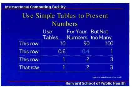
C O G N I T I V E S T Y L E OF P O W E R P O I N T   7

As in corporate planning, bullet outlines are also far from the optimal
format for scientific and engineering analysis. Indeed such outlines may
well be pessimal.
    Our evidence begins with a case study of 3 PowerPoint presentations
directed to NASA officials who were making some important decisions
during the final flight of the space shuttle Columbia. Those presentations
contained several intellectual failures in engineering analysis. In addition,
the cognitive style of PP compromised the analysis. Furthermore, the PP
damage to these presentations turns out to reflect widespread problems in
technical communication by means of PP, according to the final report
of the Columbia Accident Investigation Board.
   During the spaceflight of the shuttle Columbia in January 2003,
Boeing Corporation engineers prepared 3 quick reports assessing possible
damage to the left wing resulting from the impact of several chunks of
debris 81 seconds after liftoff.4 Although the evidence is uncertain and
thin, the logical structure of the engineering analysis is straightforward:

debris kinetic energy       debris hits locations        level of threat to the
(function of mass,          of varying vulnerability     Columbia during
velocity, and angle         on left wing                 re-entry heating
of incidence)                                            of wing

The Columbia Accident Investigation Board found that the reports                    4
                                                                                     Carlos Ortiz, Arturo Green, Jack McClymonds,
unfortunately provided an over-optimistic assessment of the danger                 Jeff Stone, Abdi Khodadoust, "Preliminary
                                                                                   Debris Transport Assessment of Debris Impacting
facing the damaged Columbia as it orbited. All 3 reports have standard             Orbiter Lower Surface in STS-ioy Mission,"
PP format problems: elaborate bullet outlines; segregation of words and            January 21, 2003; P. Parker, D. Chao, I. Norman,
numbers (12 of 14 slides with quantitative data have no accompanying               M. Dunham, "Orbiter Assessment of STS-ioy
                                                                                   ET Bipod Insulation Ramp Impact," January 23,
analysis); atrocious typography; data imprisoned in tables by thick nets           2003; Carlos Ortiz, "Debris Transport Assessment
of spreadsheet grids; only 10 to 20 short lines of text per slide.                 of Debris Impacting Orbiter Lower Surface in
                                                                                   STS-ioy Mission," January 24, 2003. The Boeing
   And now, on the next page, let us take a close look at the key slide in         reports are published in official records of the
the Boeing PowerPoint reports on the Columbia.                                     Columbia investigation.

                tamag<
                analy:
                • tile tn
On this single Columbia slide, in a PowerPoint festival of            The Very-Big-Bullet sentence does not seem
bureaucratic hyper-rationalism, 6 different levels of hierarchy       to make sense.
are used to classify, prioritize, and display 11 simple sentences:
  Level i     Title of Slide                                                          Spray On Foam Insulation
  Level 2       • Very Big Bullet
  Level 3          — dash
  Level 4               * diamond
  Level 5                    • little bullet
  Level 6                       ( ) parentheses ending level 5

The analysis begins with the dreaded "Executive Summary."
A conclusionis presented as a headline title: "Test Data
Indicates Conservatism for Tile Penetration." This turns out
to be unmerited reassurance. Executives, at least those who
don't want to get fooled, had better read far beyond the title.

The "conservatism" is not about the predicted tile damage -^~
but rather about the choice of models that might be used to
predict damage! But why, after 112 nights, are models being
calibrated during a crisis? How can "conservatism" be
inferred from a loose comparison of a computer model and
some thin data? Divergent evidence means divergent evidence,
not inferential security. Claims of analytic "conservatism"
should be viewed with skepticism. Such claims are sometimes
a rhetorical tactic that substitutes verbal fudge factors for
quantitative assessments.

As the analysis continues, the seemingly reassuring conclusion
of the headline fades away.
                                                              ^-
These lower-level bullets at the end of the slide reveal that
the headline conclusion is irrelevant and diverting. This third-
level point notes that "Flight condition [that is, the Columbia]
is significantly outside of test database." How far outside?
The final bullet will tell us.
                                                                         A reference to a foam insulation piece that
This fourth-level bullet concluding the slide says that, by the          separated from the bipod ramp tying the orbiter
way, the debris that struck the Columbia is estimated to be              to the large liquid fuel tank. Instead of "ramp,"
1920/3 = 640 times larger than data used in the tests of the             say "estimated volume of one of several pieces
model! Thus a better headline would be "Review of Test Data              of debris that might have damaged the wing."
Indicates Irrelevance of Two Models." There is an interesting
dynamic to this slide: the headline is an exercise in misdirection,
which the text then awkwardly and slowly eviscerates.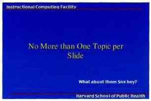
C O G N I T I V E S T Y L E OF P O W E R P O I N T   9

                                                         The vaguely quantitative words "significant" and
                                                         "significantly" are used 5 times on this slide, with de facto
        A model to estimate damage to                    meanings ranging from "detectable in largely irrelevant
        the tiles protecting the left wing               calibration case study" to "an amount of damage so that
                                                         everyone dies" to "a difference of 64O-fold." None of
                                                         these 5 usages appears to refer to the technical meaning
                                                         of "statistical significance."

                                                         The low resolution of PowerPoint slides promotes
                                                         the use of compressed phrases like "Tile Penetration."
                                                         As is the case here, such phrases may well be ambiguous.
                                                         The low resolution and large font generate 3 typographic
                                                         orphans, lonely words dangling on a separate line:
                                                                  Penetration significantly        3cu. in

                                                         This vague pronoun reference "it" alludes to damage
                                                         to the left wing, which caused the destruction of the
                                                         Columbia. The slide weakens important material with
                                                         ambiguous language (sentence fragments, passive voice,
                                                         multiple meanings of "significant"). The 3 reports
                                                         were created by engineers for high-level NASA officials
                                                         who were deciding whether the threat of wing damage
                                                         required further investigation before the Columbia
                                                         attempted to return. Satisfied that the reports indicated
                                                         that the Columbia was not in danger, the officials made
                                                         no further attempts to assess the threat. The slides were
                                                         part of an oral presentation, later circulated as e-mail
                                                         attachments.

                                                         In this slide the same unit of measure for volume
                                                         (cubic inches) is shown a different way every time
                                                                    3cu. In       1920cu in      3 cu in
                                                         rather than in clear and tidy exponential form 1920 in3.
                                                         Perhaps the available font cannot show exponents.
                                                         Shakiness in conventions for units of measurement should
                                                         provoke concern.* Slides with hierarchical bullet-outlines
*In their final report (p. 191), the Columbia Accident   do not handle statistical data and scientific notation
Investigation Board developed this point about units     gracefully. If PowerPoint is a corporate-mandated format
of measurement: "While such inconsistencies might        for all engineering reports, then some competent scientific
seem minor, in highly technical fields like aerospace    typography (rather than the PP market-pitch style) is
engineering a misplaced decimal point or mistaken        essential. In this slide, the typography is so choppy and
unit of measurement can easily engender inconsisten-     clunky that it impedes understanding.
cies and inaccuracies."
10

   In the reports, every single text-slide uses bullet-outlines with 4 to 6
levels of hierarchy. Then another multi-level list, another bureaucracy
of bullets, starts afresh for a new slide. How is it that each elaborate
architecture of thought always fits exactly on one slide? The rigid slide-
by-slide hierarchies, indifferent to content, slice and dice the evidence
into arbitrary compartments, producing an anti-narrative with choppy
continuity. Medieval in its preoccupation with hierarchical distinctions,
the PowerPoint format signals every bullet's status in 4 or 5 different
simultaneous ways: by the order in sequence, extent of indent, size of
bullet, style of bullet, and size of type associated with various bullets.
This is certainly a lot of format for a simple engineering problem.
   This approach also makes a common error in design: information
architectures mimic the hierarchical structure of the bureaucracy
producing those architectures. Indeed, the report of the Columbia
Accident Investigation Board suggests that the distinctive cognitive
style of PowerPoint reinforced the hierarchical filtering and biases of
the NASA bureaucracy during the crucial period when the Columbia
was injured but still alive:
                                                                                  5
         The Mission Management Team Chair's position in the hierarchy             Columbia Accident Investigation Board,
     governed what information she would or would not receive. Information        Report, volume i (August 2003), p. 201.
     was lost as it traveled up the hierarchy. A demoralized Debris Assessment
     Team did not include a slide about the need for better imagery in their
     presentation to the Mission Evaluation Room. Their presentation included
     the Crater analysis, which they reported as incomplete and uncertain.
     However, the Mission Evaluation Room manager perceived the Boeing
     analysis as rigorous and quantitative. The choice of headings, arrangement   Below, page layout in Richard P. Feynman,
     of information, and size of bullets on the key chart served to highlight     Robert B. Leighton, and Matthew Sands,
     what management already believed. The uncertainties and assumptions that     The Feynman Lectures on Physics (1963),
     signaled danger dropped out of the information chain when the Mission        chapter 38, page 5.
     Evaluation Room manager condensed the Debris Assessment Team's
     formal presentation to an informal verbal brief at the Mission Management
     Team meeting.5

    At the same time, lower-level NASA engineers were writing about
the possible danger to the Columbia in several hundred e-mails (with
the Boeing reports in PP format sometimes attached). The text of 90%
of these e-mails simply used paragraphs and sentences; 10% used bullet
lists with 2 or 3 levels. That is, the engineers were able to reason about
the issues without employing the multi-level hierarchical outlines of
the original PP pitches.
    Do complicated topics require ever more layered bullet structures?
Scientists and engineers—and everyone else for that matter—have
communicated about complex matters for centuries without hierarchical
bullet outlines. Richard Feynman wrote about much of basic physics-
mechanics, optics, thermodynamics, quantum behavior—in a 6oo-page
book with only 2 levels: chapters and headings within chapters. —*•
C O G N I T I V E S T Y L E OF P O W E R P O I N T   11

   Richard Feynman had also experienced the bullet-outline format
style of NASA in his service on the commission that investigated the first
shuttle accident, the Challenger in 1986. Feynman wrote:
   Then we learned about "bullets"—little black circles in front of phrases                 6
                                                                                             Richard P. Feynman, 'What Do You Care
   that were supposed to summarize things. There •was one after another of                  What Other People Think?" (New York,
   these little goddamn bullets in our briefing books and on slides.6                       1988), pp. 126-127.

For some scientists and engineers, Feynman might serve as the decisive
authority on this matter. Indeed, for those who have read Feynman's
books, a good way to try to think clearly about evidence and explanation
is to ask "What would Feynman do?"
    The analysis of the key Columbia slide (shown here on pages 8-9)
                                                                                            7
was posted at my website in March 20037 Nearly all this material was                         "Columbia Evidence—Analysis of Key
then included by the Columbia Accident Investigation Board in their                         Slide," March 18, 2003, Ask E.T. Forum,
                                                                                            www. edwardtufte. com
final report published in August 2003. In a section called "Engineering
by Viewgraphs," the Board went quite beyond my case study of the
key PP slide with these extraordinary remarks:
   As information gets passed up an organization hierarchy, from people who
   do analysis to mid-level managers to high-level leadership, key explanations
   and supporting information is filtered out. In this context, it is easy to
   understand how a senior manager might read this PowerPoint slide and
   not realize that it addresses a life-threatening situation.
   At many points during its investigation, the Board was surprised to receive
   similar presentation slides from NASA officials in place of technical reports.
   The Board views the endemic use of PowerPoint briefing slides instead of
   technical papers as an illustration of the problematic methods of technical              8
                                                                                             Columbia Accident Investigation Board,
   communication at NASA.8                                                                  Report, volume i (August 2003), p. 191.

Clearly the Board had their fill of lightweight PP presentations!

For the Boeing PowerPoint reports and for the many PP presentations
by NASA to the Board, the hierarchical bullet-outline failed to bring
clarity, focus, or credibility to the presentations. On the contrary, the
argument and evidence appeared broken up into small, arbitrary and
misleading fragments.
   And the Harvard Business Review study of corporate planning found
that the widely used bullet outlines did not bring intellectual discipline
to planning—instead the bullets accommodated the generic, superficial,
and simplistic.
   PowerPoint will not do for serious presentations. Serious problems
require serious tools. Indeed, presenters may instantly damage their
credibility by using PP for serious problems—as was the case for the
NASA officials with their PP pitches and PP decks so naively presented
to the very serious Columbia Accident Investigation Board.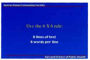
12

High-Resolution Visual Channels Are Compromised by PowerPoint
A talk, which proceeds at a pace of 100 to 160 spoken words per minute,
is not an especially high resolution method of data transmission. Rates of
transmitting visual evidence can be far higher. The artist Ad Reinhardt
said, "As for a picture, if it isn't worth a thousand words, the hell with it."
People can quickly look over tables with hundreds of numbers in, say,
financial or sports pages in newspapers. People read 300 to 1,000 printed
words a minute, and find their way around a printed map or a 35mm slide
displaying 5 to 40 MB in the visual field. Often the visual channel is an
intensely high-resolution channel.
    Yet, in a strange reversal, nearly all PowerPoint slides that accompany        WORDS ON TEXT-ONLY POWERPOINT SLIDES
talks have much lower rates of information transmission than the talk              26 slides in the 3 Columbia reports
itself. Too often the images are content-free clip art, the statistical graphics   by Boeing, median number of words
                                                                                   per slide                                    97
don't show data, and the text is grossly impoverished. As shown in this
table, the PowerPoint slide typically shows 40 words, which is about 8 seconds-    1,460 text-only slides in 189 PP
                                                                                   reports posted on the internet and
worth of silent reading material. The slides in PP textbooks are particularly      top-ranked by Google, March 2003,
disturbing: in 28 textbooks, which should use only first-rate examples,            median number of words per slide             40
the median number of words per slide is 15, worthy of billboards, about
                                                                                   654 slides in 28 PowerPoint textbooks,
3 or 4 seconds of silent reading material.                                         published 1997-2003, median number
    This poverty of content has several sources. First, the PP design style,       of words per slide                           15
which typically uses only about 30% to 40% of the space available on
a slide to show unique content, with all remaining space devoted to
Phluff, bullets, frames, and branding. Second, the slide projection of text,
which requires very large type so the audience can read the words.
Third, presenters who don't have all that much to say (for example, among
the 2,140 slides reported in our table, the really lightweight slides are
found in the presentations made by educational administrators).
    A vicious circle results. Thin content leads to boring presentations.
To make them unboring, PPPhluffis added, damaging the content,
making the presentation even more boring, requiring more Phluff....
    What to do? For serious presentations, it will be useful to replace
PowerPoint slides with paper handouts showing words, numbers, data
graphics, images together. High-resolution handouts allow viewers to
contextualize, compare, narrate, and recast evidence. In contrast, data-
thin, forgetful displays tend to make audiences ignorant and passive, and
also to diminish the credibility of the presenter. Thin visual content
prompts suspicions: "What are they leaving out? Is that all they know?
Does the speaker think we're stupid?" "What are they hiding?"
Sometimes PowerPoint's low resolution is said to promote a clarity of
reading and thinking. Yet in visual reasoning, art, typography, cartography,
even sculpture, the quantity of detail is an issue completely separate from the
difficulty of reading.9 Indeed, at times, the more intense the detail, the
greater the clarity and understanding—because meaning and reasoning                9
                                                                                     Edward R. Tufte, Envisioning Information
are contextual. Less is a bore.                                                    (1990), pp. 36-51.
C O G N I T I V E STYLE OF P O W E R P O I N T 13
Metaphors for Presentations
Years before today's slideware, presentations at companies such as IBM
and in the military used bullet lists shown by overhead projectors. Then,
in 1984, a software house developed a presentation package, "Presenter,"
which was eventually acquired by Microsoft and turned into PowerPoint.
This history is revealing, for the metaphor behind the PP cognitive
style is the software corporation itself. That is, a big bureaucracy engaged
in computer programming (deeply hierarchical, nested, highly structured,
relentlessly sequential, one-short-line-at-a-time) and in marketing (fast
pace, misdirection, advocacy not analysis, slogan thinking, branding,
exaggerated claims, marketplace ethics). To describe a software house is to
describe the PowerPoint cognitive style. Why should the structure, activities,
and values of a large commercial bureaucracy be a useful metaphor for
our presentations? Could any metaphor be worse? Voice-mail menu
systems? Billboards? Television? Stalin?
The pushy PP style imposes itself on the audience and, at times, seeks
to set up a dominance relationship between speaker and audience. The
speaker, after all, is making power points with bullets to followers. Such
aggressive, stereotyped, over-managed presentations—the Great Leader
up on the pedestal—are characteristic of hegemonic systems:
The Roman state bolstered its authority and legitimacy with the trappings
of ceremony Power is a far more complex and mysterious quality than
any apparently simple manifestation of it would appear. It is as much a matter
of impression, of theatre, of persuading those over whom authority is wielded
to collude in their subjugation. Insofar as power is a matter of presentation, its
cultural currency in antiquity (and still today) was the creation, manipulation, 10
Jas Eisner, Imperial Rome and Christian
and display of images. In the propagation of the imperial office, at any rate, Triumph: The Art of the Roman Empire AD
art was power.10 100-450 (1998), p. 53-
A better metaphor for presentations is good teaching.11 Teachers seek to 11
For various and sometimes divergent
explain something with credibility, which is what many presentations ideas about teaching and presentations, see
Joseph Lowman, Mastering the Techniques
are trying to do. The core ideas of teaching—explanation, reasoning, Jinding of Teaching (1995); Wilbert J. McKeachie
things out, questioning, content, evidence, credible authority not patronizing and Barbara K.Hofer, McKeachie's Teaching
Tips (2001); Frederick Mosteller, "Class-
authoritarianism—are contrary to the hierarchical market-pitch approach. room and Platform Performance," The
Especially disturbing is the introduction of the PowerPoint cognitive American Statistician, 34 (February 1980),
style into schools. Instead of writing a report using sentences, children 11-17 (posted at www.edwardtufte.com);
and Edward R. Tufte, Visual Explanations
learn how to make client pitches and info-mercials, which is better than (1997), pp. 68-71.
encouraging children to smoke. Elementary school PP exercises (as seen
in teacher's guides, and in student work posted on the internet) typically
show 10 to 20 words and a piece of clip art on each slide in a presentation
consisting of 3 to 6 slides—a total of perhaps 80 words (15 seconds of silent
reading) for a week of work. Rather than being trained as mini-bureaucrats
in PPPhluffand foreshortening of thought, students would be better off
if the schools simply closed down on those days and everyone went to
The Exploratorium. Or wrote an illustrated essay explaining something.The Gettysburg PowerPoint Presentation The PP cognitive style is so distinctive and peculiar that presentations relying on standard ready-made templates sometimes appear as over-the-top parodies instead of the sad realities they are. Here is an intentional and ferocious parody: imagine Abraham Lincoln had used PowerPoint at Gettysburg.... Urn, my name is Abraham Lincoln and, urn, I have to reboot As we see in the Organizational Overview slide, four score and seven years ago our fathers brought forth on this continent a new nation, conceived in liberty and dedicated to the proposition that all men are created equal. Now we are engaged in a great civil war, testing whether that nation or any nation so conceived and so dedicated can long endure. Next slide please. We are met on a great battlefield of that war. We have come to dedicate a portion of that field as a final resting place for those who here gave their lives that that nation might live. It is altogether fitting and proper that we should do this. But in a larger sense, we cannot dedicate, we cannot consecrate, we cannot hallow this ground. The brave men, living and dead who struggled here have consecrated it far above our poor power to add or detract. Next slide please. The world will little note nor long remember what we say here, but it can never forget what they did here. It is for us the living rather to be dedicated here to the unfinished work which they who fought here have thus far so
C O G N I T I V E STYLE OF P O W E R P O I N T   15

nobly advanced. It is rather for us to be here
dedicated to the great task remaining before us—
that from these honored dead we take increased
devotion to that cause for which they gave the last
full measure of devotion, that we here highly
resolve that these dead shall not have died in vain,
that this nation under God shall have a new birth
of freedom, and that government of the people,
by the people, for the people, next slide please,
shall not perish from the earth.

This PowerPoint presentation was created by
Peter Norvig; see www.norvig.com. Norvig
notes that these slides were quickly constructed
by means of the PP "AutoContent Wizard."

Just fancy that, "AutoContent." In an essay
in The New Yorker (May 28, 2001), Ian Parker
describes the AutoContent Wizard as "a rare
example of a product named in outright
mockery of its target customers" (p. 76).
16
PowerPoint and Statistical Evidence
To investigate the performance of PP for statistical data, let us consider
an important and intriguing table of cancer survival rates relative to
those without cancer for the same time period. Some 196 numbers and
57 words describe survival rates and their standard errors for 24 cancers:
Estimates of relative survival rates, by cancer site12 12
Redesigned table based on Hermann
Brenner, "Long-term survival rates
% survival rates and their standard errors of cancer patients achieved by the end
5 year 10 year 15 year 20 year of the 2Oth century: a period analysis,"
The Lancet, 360 (October 12, 2002), 1131-
Prostate 98.8 0.4 95.2 0.9 87.1 1.7 81.1 3.0 1135. Brenner recalculates survival rates
Thyroid 96.0 0.8 95.8 1.2 94.0 1.6 95.4 2.1 from data collected by the U.S. National
Cancer Institute, 1973-1998, from the
Testis 94.7 I.I 94.0 1.3 91.1 1.8 88.2 2.3
Surveillance, Epidemiology, and End
Melanomas 89.0 0.8 86.7 I.I 83.5 1.5 82.8 1.9 Results Program.
Breast 86.4 0.4 78.3 0.6 71.3 0.7 65.0 1.0
Hodgkin's disease 85.1 1.7 79.8 2.0 73.8 2.4 67.1 2.8
Corpus uteri, uterus 84.3 1.0 83.2 1.3 80.8 1.7 79.2 2.0
Urinary, bladder 82.1 1.0 76.2 1.4 70.3 1.9 67.9 2.4
Cervix, uteri 70.5 1.6 64.1 1.8 62.8 2.1 60.0 2.4
Larynx 68.8 2.1 56.7 2.5 45.8 2.8 37.8 3.1
Rectum 62.6 1.2 55.2 1.4 51.8 1.8 49.2 2.3
Kidney, renal pelvis 61.8 1.3 54.4 1.6 49.8 2.0 47.3 2.6
Colon 61.7 0.8 55.4 1.0 53.9 1.2 52.3 1.6
13
Non-Hodgkin's 57.8 1.0 46.3 1.2 38.3 1.4 34.3 1.7 PP-style chartjunk occasionally shows up
Oral cavity, pharynx 56.7 1.3 44.2 1.4 37.5 1.6 33.0 1.8 in graphics of evidence in scientific journals.
55.0 1.3 49.3 1.6 49.9 1.9 49.6 2.4
Below, the clutter half-conceals thin data
Ovary
with some vibrating pyramids framed by an
Leukemia 42.5 1.2 32.4 1.3 29.7 1.5 26.2 1.7 unintentional Necker illusion, as the 2 back
Brain, nervous system 32.0 1.4 29.2 1.5 27.6 1.6 26.1 1.9 planes optically flip to the front:
Multiple myeloma 29.5 1.6 12.7 1.5 7.0 1.3 4.8 1.5
Stomach 23.8 1.3 19.4 1.4 19.0 1.7 14.9 1.9
Lung and bronchus 15.0 0.4 10.6 0.4 8.1 0.4 6.5 0.4
Esophagus 14.2 1.4 7.9 1.3 7.7 1.6 5.4 2.0
Liver, bile duct 7.5 I.I 5.8 1.2 6.3 1.5 7.6 2.0
Pancreas 4.0 0.5 3.0 1.5 2.7 0.6 2.7 0.8
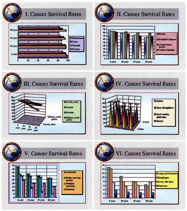
Applying the PowerPoint templates for statistical graphics to this nice
straightforward table yields the analytical disasters on the facing page.
"Sweet songs never last too long on broken radios," wrote John Prine.
These PP default-designs cause the data to explode into 6 separate For such small data sets, usually a simple
chaotic slides, consuming 2.9 times the area of the table. Everything is table will show the data more effectively
than a graph, let alone a chartjunk graph.
wrong with these smarmy, incoherent graphs: uncomparative, thin Source of graph: N.T.Kouchoukos, et al.,
data-density, chartjunk, encoded legends, meaningless color, logotype "Replacement of the Aortic Root with
branding, indifferent to content and evidence. Chartjunk is a clear a Pulmonary Autograft in Children and
Young Adults with Aortic-Valve Disease,"
sign of statistical stupidity; use these designs in your presentation, and New England Journal of Medicine, 330
your audience will quickly and correctly conclude that you don't (January 6,1994), p. 4. On chartjunk, see
Edward R. Tufte, The Visual Display of
know much about data and evidence.13 Poking a finger into the eye of Quantitative Information (1983, 2001),
thought, these data graphics would turn into a nasty travesty if used for chapter 5.C O G N I T I V E S T Y L E OF P O W E R P O I N T 17 a serious purpose, such as cancer patients seeking to assess their survival chances. To deal with a product that messes up data with such systematic intensity must require an enormous insulation from statistical integrity and statistical reasoning by Microsoft PP executives and programmers, PP textbook writers, and presenters of such chartjunk.
i8

   The best way to show the cancer data is the original table with its good
comparative structure and reporting of standard errors. And PP default
graphics are not the way to see the data. Our table-graphic, however,
does give something of a visual idea of time-gradients for survival for
each cancer. Like the original table, every visual element in the graphic
shows data. Slideware displays, in contrast, usually devote a majority of
their space to things other than data.
C O G N I T I V E STYLE O F P O W E R P O I N T

PowerPoint Stylesheets

The PP cognitive style is propagated by the templates, textbooks, style-
sheets, and complete pitches available for purchase. Some corporations
and government agencies require employees to use designated PPPhlufF
and presentation logo-wear. With their strict generic formats, these
designer stylesheets serve only to enforce the limitations of PowerPoint,
compromising the presenter, the content, and, ultimately, the audience.                        Jane said, "Here is a ball.
   Here we see a witless PP pitch on how to make a witless PP pitch.                           See this blue ball, Sally.
Prepared at the Harvard School of Public Health by the "Instructional                          Do you want this ball?"
Computing Facility," these templates are uninformed by the practices
                                                                                                Sally said, "I want my ball.
of scientific publication and the rich intellectual history of evidence
                                                                                                My ball is yellow.
and analysis in public health. The templates do, however, emulate the
                                                                                                It is a big, pretty ball."
format of reading primers for 6 year-olds.

Stylesheet-makers often seek to leave their name on your show;      This must be the Haiku Rule for formatting scientific lectures.
"branding," as they say in the Marketing Department. In case        At least we're not limited to 17 syllables per slide. Above this
you didn't notice, this presentation is from the "Instructional     slide, the rule can be seen in action—in a first-grade reading
Computing Facility." But where are the names of the people          primer. The stylesheet typography, distinctly unscientific, uses
responsible for this? No names appear on any of the 21 slides.      a capital X instead of a multiplication sign.

But this breaks up the evidence into arbitrary fragments. Why       Why is this relevant to scientific presentations? Are there other
aren't we seeing examples from actual scientific reports? What      principles than ease of following? Didn't the Harvard Business
are the Sox (a rather parochial reference) doing here? The inept    Review article indicate that bullet outlines corrupted thought?
PP typography persists: strange over-active indents, oddly chosen   Text, imaging, and data for scientific presentations should be at
initial caps, typographic orphans on 3 of 4 slides.                 the level of scientific journals, much higher resolution than speech.
20
14
Some 39 tables appear in our collection of
28 PP textbooks. These tables show an average
(median) of 12 numbers each, which approaches
the Pravda level. In contrast, sports and financial
pages in newspapers routinely present tables
with hundreds, even thousands of numbers.
Below, we see a simple weather table from a
newspaper. The table guidelines at left require
that 31 separate PowerPoint slides must be used
to show these data!
Africa Yesterday Today Tomorrow
Algiers 82/ 66 0.55 85/ 60 S 85/ 61 S
Cairo 99/ 70 0 101/ 76 S 96/ 76 S
Cape Town 64/ 54 0.16 63/ 49 PC 60/ 50 Sh
Dakar 87/ 77 0.75 86/ 81 PC 85/ 81 PC
Johannesburg 69/ 42 0 73/ 42 S 71/ 47 S
Nairobi 75/ 55 0 78/ 56 PC 78/ 56 PC
Tunis 80/ 69 - 87/ 73 PC 85/ 71 PC
Asia/Pacific Yesterday Today Tomorrow
Auckland 59/45 0.12 58/ 44 Sh 58/ 44 Sh
Bangkok 91/ 82 0 91/ 79 Sh 91/ 77 Sh
Beijing 85/ 57 0 84/ 60 S 78/ 65 PC
Bombay 88/ 75 0.28 87/ 77 T 88/ 78 T
Damascus 96/ 55 0 98/59S 96/623
Hong Kong 91/ 77 0 88/ 81 PC 92/ 78 PC
The stylesheet goes on to victimize statistical data, the fundamental Jakarta 89/ 77 0 90/ 77 PC 89/ 77 PC
Jerusalem 87/ 64 0 88/66S 88/69S
evidence of public health. The table shows 12 numbers which is lousy Karachi 86/ 80 0 92/ 78 PC 92/ 79 S
for science (or sports, or finance) but normal for PowerPoint.14 Table Manila
New Delhi
86/ 75 -
89/ 80 Tr
84/ 75 R
88/ 76 Sh
87/ 78 R
92/ 76 Sh
Riyadh 98/ 69 0 102/ 74 S 101/75S
design is a complex and intriguing matter in typographic work, but there Seoul 78/ 64 2.09 83/ 65 PC 77/ 66 R
Shanghai 75/ 69 0.06 86/ 76 Sh 86/ 73 PC
is nothing thoughtful about the design here. The unsourced numbers are Singapore 87/ 78 Tr 89/ 76 R 89/ 78 Sh
Sydney 68/ 53 0 71/51 PC 71/ 48 PC
not properly aligned, the row and column labels are awful, the units of Taipei 84/ 77 2.28 87/ 73 PC 88/ 72 PC
Tehran 93/ 73 0 87/ 73 S 87/ 73 S
measurement not given. In this stylesheet, there lurks a casual, flippant, Tokyo 89/ 77 0 91/ 79 Sh 83/ 80 Sh
Europe Yesterday Today Tomorrow
almost smirky attitude toward data. That attitude—what counts are power Amsterdam 56/ 50 0.39 66/ 51 PC 64/ 52 Sh
and pitches, not truth and evidence—also lurks within PowerPoint. Athens
Berlin
87/ 75 0
64/ 55 0.31
90/75S
61/ 49 R
88/ 71 S
68/ 52 PC
Consider now a real table. John Graunt's Bills of Mortality (1662) is Brussels
Budapest
62/ 54 Tr
72/ 59 0
66/ 53 PC
75/ 55 S
65/ 52 Sh
67/ 53 Sh
the foundation work of public health, introducing scientific methods to Copenhagen
Dublin
59/51 0.08
66/ 54 0.12
63/ 51 Sh
66/ 55 Sh
63/ 52 PC
63/ 47 PC
medical and demographic data. Graunt calculated the first tables of life Edinburgh
Frankfurt
63/ 46 0.02
65/ 54 0.01
63/46R
65/ 54 Sh
64/ 48 PC
66/ 50 PC
expectancy, compared different causes of death, and even discussed Geneva
Helsinki
69/57 0.04
63/ 45 0
64/ 56 Sh
62/ 46 PC
65/ 50 PC
63/ 45 PC
defects in the evidence. His renowned "Table of Casualties" (at right) Istanbul
Kiev
84/ 60 0.01
66/ 46 0
79/ 69 Sh
64/ 47 S
78/ 67 S
64/ 46 S
shows 1,855 different counts of death from 1629 to 1659. How fortunate Lisbon
London
84/ 62 0
71/ 53 0.08
91/ 65 S
66/ 53 Sh
90/67S
69/ 55 PC
that Graunt did not have PowerPoint and the assistance of the Harvard Madrid 86/46 0 87/ 55 S 87/ 57 S
Moscow 55/41 0 64/40S 62/ 44 S
School of Public Health Instructional Computing Facility. Their guide- Nice 78/ 62 0.01 78/ 65 S 78/ 63 S
Oslo 62/ 48 0 57/ 47 PC 59/ 45 PC
lines (above) imply the construction of 155 separate PowerPoint slides Paris 68/57 0 69/ 56 PC 68/ 57 PC
Prague 64/ 55 0.04 56/49T 63/ 49 Sh
to show the data in Graunt's original table! Rome 75/ 62 - 79/ 61 S 76/ 60 Sh
St. Petersburg 59/ 39 0 66/ 46 S 65/ 47 PC
For tables, the analytical idea is to make comparisons. The number Stockholm 64/ 46 0 61/ 49 PC 63/ 45 PC
Vienna 64/ 59 0.16 65/ 53 PC 66/ 52 Sh
of possible pairwise comparisons in a table increases as the square of the Warsaw 69/ 46 0 62/ 51 Sh 65/ 49 PC
number of cells.15 In Graunt's table, 1,719,585 pairwise comparisons, 15
A table with n cells yields n(n - i)/2
of varying relevance to be sure, are within the eyespan of the inquiring pairwise comparisons of cell entries.
mind. In contrast, the 155 tiny tables on 155 PP slides would offer only
10,230 pairwise comparisons, about 6 in 1,000 of those available in John Graunt, National and Political Obser-
vations mentioned in a following index, and
Graunt's original table. These PP tables would also block all sorts of made upon the Bills of Mortality. With refer-
interesting comparisons, such as time patterns over many years. What ence to the Government, Religion, Trade,
Growth, Ayre, Diseases, and the several
Graunt needs to do for his presentation at Harvard is simply to provide Changes of the said City (London, 1662).
printed copies of his original table to everyone in the audience. "The Table of Casualties" follows folio 74.C O G N I T I V E STYLE OF P O W E R P O I N T 21
22

Creeping PowerPoint: PP Slide Formats for Paper Reports
and Computer Screens
In addition to outlining and accompanying a talk, PP slides          CHARACTER COUNTS AND DENSITY PER PAGE-IMAGE
often serve other functions—printed out on paper to make                                                   CHARACTERS      DENSITY:
                                                                                                            PER PAGE    CHARACTERS /IN 2
a report, attached to e-mails, posted on the internet. The PP
slide format now shows up on paper and computer screen.              BEST SELLING BOOKS

These slides, especially those following ready-made templates,       Physicians ' Desk Reference           13,600            168
replicate and intensify all the problems of the PP cognitive         Your Income Tax                       10,400            118
style onto paper and computer screen. Again the short-run            World Almanac                          9,800            232
                                                                     Joy of Cooking                         5,700            108
convenience for the presenter (and for PowerPoint) comes at an
                                                                     Baby and Child Care                    2,500             95
enormous cost to the content and the audience.                       The Merck Manual                       4,700             42
    As those who have flipped through pages and pages and            Guinness Book of World Records         4,600            162
pages of printed out PP slides already know, such reports are        Consumer Reports Buying Guide          3,900            112
physically thick and intellectually thin. Their resolution is        How to Cook Everything                 3,900             53
remarkably low. The table at right compiles data comparing           Elmore Leonard, Maximum Bob            3,100            115
                                                                     Carl Hiassen, Basket Case              2,800            104
the information densities of one image-equivalent for books
(one page), for the internet (one screen), and for PP (one slide).   NEWS SITES ON THE INTERNET

In terms of character density, printed reports in PP format          Google News                            4,100             44
typically perform at 2% to 10% of the typographic richness of        New York Times                         4,100             43
nonfiction bestsellers! Looking from the top lines down to the       Los Angeles Times                      4,000             42
bottom lines of the table, we see that a single printed page         MSN Slate                              3,300             36
in the Physicians' Desk Reference shows more than 50 PP slide-       CNN                                    3,300             35
                                                                     Yahoo                                  3,200             34
equivalents of information.
                                                                     USA Today                              2,700             29
    People see, read, and think all the time at intensities vastly   Time                                   2,700             28
greater than those presented in printed PP reports. Instead          ABC News                               2,500             27
of showing a long sequence of tiny information-fragments             MSNBC                                  2,400             26
on slides, and instead of dumping those slides onto paper,
                                                                     POWERPOINT SLIDE FORMAT
report writers should have the courtesy to write a real report       ON PAPER OR COMPUTER SCREEN
(which might also be handed out at a meeting) and address
                                                                     Columbia reports by Boeing               630              7
their readers as serious people. PP templates are a lazy and
                                                                     1,460 text slides in 189 PP reports      250              3
ridiculous way to format printed reports.
                                                                     654 text slides in 28 PP textbooks         98             1
    PP slides also format material on the internet. Presenters
                                                                     Content-free slides                         0             0
post their slides; then readers, if any, march through one slide
after another on the computer screen. And you thought PP
talks were incoherent. Popular news sites on the internet show
10 to 15 times more information on a computer screen than
a typical PP slide posted on a computer screen. The shuttle
Columbia reports prepared by Boeing, when sent around by
e-mail in PP format, were running at information densities
of 20% of news sites on the internet (table above right).
   The PP slide format has probably the worst signal/noise
ratio of any known method of communication on paper or
computer screen. Extending PowerPoint to embrace paper
and internet screens pollutes those display methods.
C O G N I T I V E STYLE OF P O W E R P O I N T 23
Sequentially of the Slide Format
With information quickly appearing and disappearing, the slide transition
is an event that attracts attention to the presentation's compositional
methods. The slide serves up a small chunk of promptly vanishing infor-
mation in a restless one-way sequence. It is not a contemplative analytical
method; it is like television, or a movie with frequent random jump cuts.
Sometimes quick chunks of thin data may be useful (flash-card memo-
rizing), other times not (comparisons, links, explanations). But formats,
sequencing, and cognitive approach should he decided by the character of the
content and what is to be explained, not by the limitations of the presentation
technology. The talk that accompanies PP slides may overcome the noise
and clutter that results from slideville's arbitrary partitioning of data,
but why disrupt the signal in the first place? And why should we need to
recover from a technology that is supposed to help our presentations?
Obnoxious transitions and partitions occur not only slide-by-slide
but also line-by-line. We have seen the problems with the bullet list.
Worse is the method of line-by-line slow reveal (at right). Beginning
with a title slide, the presenter unveils and reads aloud the single line
on the slide, then reveals the next line, reads that aloud, on and on, as
stupefied audience members impatiently await the end of the talk.
It is helpful to provide audience members with at least one mode of
information that allows them to control the order and pace of learning—
unlike slides and unlike talk. Paper handouts for talks will help provide
a permanent record for review—again unlike projected images and talk.
Another way to break free of low-resolution temporal comparisons is to
show multiple slides, several images at once within the common view.
Spatial parallelism takes advantage of our notable capacity to reason
about multiple images that appear simultaneously within our eyespan.
We are able to select, sort, edit, reconnoiter, review—ways of seeing
quickened and sharpened by direct spatial adjacency of evidence.
Now and then the narrow bandwidth and relentless sequencing of
slides are said to be virtues, a claim justified by loose reference to George
Miller's classic 1956 paper "The Magical Number Seven, Plus or Minus
Two." That essay reviews psychological experiments that discovered
people had a hard time remembering more than about 7 unrelated pieces
of really dull data all at once. These studies on memorizing nonsense 16
George A. Miller, "The Magical Num-
then led some interface designers to conclude that only 7 items belong ber Seven, Plus or Minus Two: Some
Limits on Our Capacity for Processing
on a list or a slide, a conclusion that can only be reached by not reading Information," Psychological Review, 63
Miller's paper. In fact the paper neither states nor implies rules for the (1956), 81-97 (posted at www.well.com/
amount of information to be shown in a presentation (except possibly for user/smalin/miller.html). At Williams
College in September 2000,1 saw George
slides consisting of nonsense syllables that the audience must memorize Miller give a superb presentation that
and repeat back to a psychologist). Indeed, the deep point of Miller's work used the optimal number of bullet points
on the optimal number of slides—zero in
is to suggest strategies, such as placing information within a context, that both cases. Just a nice straightforward talk
help extend the reach of memory beyond tiny clumps of data.16 with a long narrative structure.What to do about PowerPoint Imagine a widely used and expensive prescription drug that claimed to make us beautiful but didn't. Instead the drug had frequent, serious side effects: making us stupid, degrading the quality and credibility of our communication, turning us into bores, wasting our colleagues' time. These side effects, and the resulting unsatisfactory cost/benefit ratio, would rightly lead to a worldwide product recall. Improving Our Presentations Presentations largely stand or fall depending on the quality, relevance, and integrity of the content. The way to make big improvements in a presentation is to get better content. Designer formats will not salvage weak content. If your numbers are boring, then you've got the wrong numbers. If your words or images are not on point, making them dance in color won't make them relevant. Audience boredom is usually a content failure, not a decoration failure. At a minimum, a presentation format should do no harm to content. Yet again and again we have seen that the PP cognitive style routinely disrupts, dominates, and trivializes content. PP presentations too often resemble the school play: very loud, very slow, and very simple. The practical conclusions are clear. PowerPoint is a competent slide manager and projector for low-resolution materials. And that's about it. PP has some occasionally useful low-end design tools and way too many PhlufF tools. No matter how beautiful your PP ready-made template is, it would be better if there were less of it. Never use PP templates for arraying words or numbers. Avoid elaborate hierarchies of bullet lists. Never read aloud from slides. Never use PP templates to format paper reports or web screens. Use PP as a projector for showing low-resolution color images, graphics, and videos that cannot be reproduced as printed handouts at a presentation. Paper handouts at a talk can effectively show text, numbers, data graphics, images. Printed materials, which should largely replace PP, bring information transfer rates in presentations up to that of everyday material in newspapers, magazines, books, and internet screens. A useful paper size for handouts at presentations is 11 by 17 inches (28 by 43 cm), folded in half to make 4 pages. This piece of paper can show images with a resolution of 1,200 dpi and up to 60,000 characters of words and numbers, the content-equivalent of 50 to 250 typical PP slides of text and data. Thoughtfully planned handouts at your talk tell the audience that you are serious and precise; that you seek to leave traces and have consequences. And that you respect your audience.
C O G N I T I V E STYLE OF P O W E R P O I N T      25

 In day-to-day practice, PowerPoint templates may improve 10% or 20%
 of all presentations by organizing inept, extremely disorganized speakers,
at a cost of detectable intellectual damage to 80%. For statistical data,
the damage levels approach dementia. Since about 1O10 to 1O11 PP slides
 (many using the templates) are made each year, that is a lot of harm to
communication with colleagues. Or at least a big waste of time.
    The damage is mitigated since meetings relying on the PP cognitive
style may not matter all that much. By playing around with Phluff
rather than providing information, PowerPoint allows speakers to pretend
that they are giving a real talk, and audiences to pretend that they are listening.
This prankish conspiracy against substance and thought should always
provoke the question, Why are we having this meeting?
    As a consumer of presentations, you should not trust speakers who rely            Military parade, Stalin Square, Budapest,
on the PP cognitive style. It is likely that these speakers are simply serving        April 4,1956. Photograph by AP/Wide
                                                                                      World Photos.
up PowerPointPhluff to mask their lousy content, just as this massive
tendentious pedestal in Budapest once served up Stalin-cult propaganda
to orderly followers feigning attention.
You can also read