Civic Statistics and iNZight: Illustrations of Some Design Principles for Educational Software
←
→
Page content transcription
If your browser does not render page correctly, please read the page content below
-- Pre-print draft (July 2021) --
 Do not post to other websites or circulate without authors' written
                               consent
         This manuscript is copyrighted (C) to the authors

 To appear as Chapter 10 in the book: Statistics for Empowerment
   and Social Engagement: teaching Civic Statistics for informed
 citizenship. (Chief Editor: Jim Ridgway). Forthcoming early 2022
                            from Springer.

 Civic Statistics and iNZight: Illustrations
      of Some Design Principles for
          Educational Software
                          Authors:
      Chris Wild, The University of Auckland, New Zealand

             Jim Ridgway, University of Durham, UK

Abstract: The PCS project has made good use of iNZight in exploring
topics such as migration, gender inequality, childhood malnutrition,
and natural disasters. Further examples of Civic Statistics topics that
have been addressed using iNZight are provided here, along with a
range of examples of creative ways to display data. The chapter
outlines the advantages of technology enhanced statistics education
and software requirements; maps some analyses which are central to
Civic Statistics and shows how these can be conducted using iNZight.
Examples include working with multivariate data, exploring
subgroups within data, using multiple representations, analysing and
reanalysing, and telling stories grounded in evidence. Often with
complex social/civic datasets it is necessary to explore changes over
time, and to explore spatial patterns. Here, we describe software
features that facilitate data exploration for naïve users that include
both direct guidance and hooks to encourage engagement and further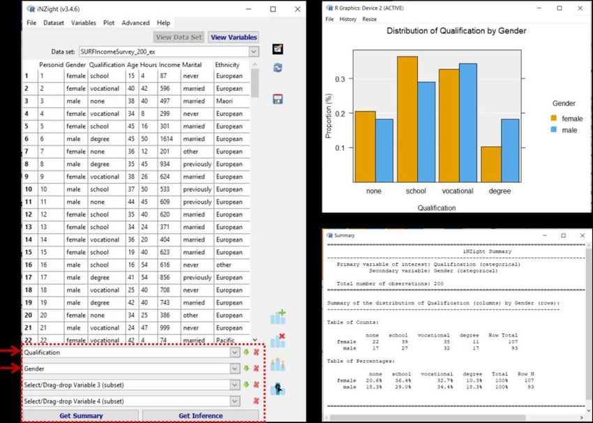
2

learning, and also features for advanced users, such as the automatic
generation of R code for documentation and software reuse. Software
for analyzing data is evolving rapidly to accommodate new sorts of
data, new techniques for analysis, and new methods to present data.
Therefore, the chapter concludes by describing developments to
iNZight that are in progress.

Keywords: Software design, Multivariate data; Multiple
representations; Disaggregation; Complexity reduction, Complex
survey designs

Proposed citation for this chapter: Wild, C. J., & Ridgway, J. (2022).
Civic Statistics and iNZight : Illustrations of Some Design Principles for
Educational Software. In J. Ridgway (Ed.), Statistics for Empowerment and
Social Engagement: teaching Civic Statistics for informed citizenship.
Springer.

A Book Overview and Table of Contents follows on pages 3-5
page.

The Chapter itself begins on page 6.
3

Book Overview: J. Ridgway (Ed.). (2022). Statistics for Empowerment and
Social Engagement: teaching Civic Statistics for informed citizenship.
Springer.

Effective citizen engagement with social issues requires active participation
and a broad understanding of data and statistics about societal issues.
However, many statistics curricula are not designed to teach relevant skills nor
to improve learners' statistical literacy.

This book offers practical approaches to working in a new field of knowledge -
Civic Statistics - which sets out to engage with, and overcome well
documented and long-standing problems in teaching quantitative skills. The
book includes 23 peer-reviewed chapters, written in coordination by an
international group of experts from ten countries. The book aims to support
and enhance the work of teachers and lecturers working both at the high school
and tertiary (university) levels. It is designed to promote and improve the
critical understanding of quantitative evidence relevant to burning social issues
– such as epidemics, climate change, poverty, migration, natural disasters,
inequality, employment, and racism.

Evidence about social issues is provided to the public via print and digital
media, official statistics offices, and other information channels, and a great
deal of data is accessible both as aggregated summaries and as individual
records. Chapters illustrate the approaches needed to teach and promote the
knowledge, skills, dispositions, and enabling processes associated with critical
understanding of Civic Statistics presented in many forms. These include
statistical analysis of authentic multivariate data, use of dynamic data
visualisations, and deconstructing texts about the social and economic well-
being of societies and communities. Chapters discuss ideas regarding the
development of curricula and educational resources, use of emerging
technologies and visualizations, preparation of teachers and teaching
approaches and sources for relevant datasets and rich texts about Civic
Statistics, and ideas regarding future research, assessment, collaborations
between different stakeholders, and other systemic issues.
4

                                   Contents

Chapter Title                                           Authors (with corresponding author email)
Foreword Democracy needs statistical literacy           Gerd Gigerenzer (gigerenzer@mpib-
                                                        berlin.mpg.de)
  Ch 1    Why engage with Civic Statistics?             Jim Ridgway (jim.ridgway@durham.ac.uk)
Part I: Redesigning Statistics Education
  Ch 2    Back to the future – rethinking the purpose   Joachim Engel (engel@ph-
          and nature of statistics education            ludwigsburg.de), Jim Ridgway
  Ch 3    A conceptual framework for Civic Statistics   Iddo Gal (iddo@research.haifa.ac.il), James
          and its educational applications              Nicholson, Jim Ridgway
  Ch 4    Implementing Civic Statistics –               Iddo Gal (iddo@research.haifa.ac.il), Jim
          An agenda for action                          Ridgway, James Nicholson, Joachim Engel

Part II: Tools, Data Sets, Lessons, and Lesson Preparation
  Ch 5    Interactive data visualizations for            Jim Ridgway (jim.ridgway@durham.ac.uk),
          teaching civic statistics                      Pedro Campos, James Nicholson, Sónia
                                                         Teixeira
  Ch 6    Data sets: examples and access for Civic       Sónia Teixeira (sonia.c.teixeira@inesctec.pt),
          Statistics                                     Pedro Campos, Anna Trostianitser
  Ch 7    Lesson plan approaches: Tasks that motivate Anna Trostianitser
          students to think                              (anna.trostianitser@gmail.com), Sónia
                                                         Teixeira, Pedro Campos
  Ch 8    Seeing dynamic data visualizations in action: Peter Kovacs (kovacs.peter@eco.u-
          Gapminder tools                                szeged.hu), Klara Kazar, Eva Kuruczleki
  Ch 9    Data visualization packages for non-           Daniel Frischemeier (dafr@math.uni-
          inferential Civic Statistics in high school    paderborn.de), Susanne Podworny, Rolf
          classrooms                                     Biehler
 Ch 10    Civic Statistics and iNZight: Illustrations of Chris Wild (c.wild@auckland.ac.nz), Jim
          some design principles for educational         Ridgway
          software
 Ch 11    Exploring Climate Change Data with R           Nuno Guimarães
                                                         (nunoricardoguimaraes@gmail.com), Kimmo
                                                         Vehkalahti, Pedro Campos, Joachim Engel
 Ch 12    Covid-19 shows why we need Civic               Jim Ridgway (jim.ridgway@durham.ac.uk),
          Statistics: illustrations and classroom        Rosie Ridgway
          activities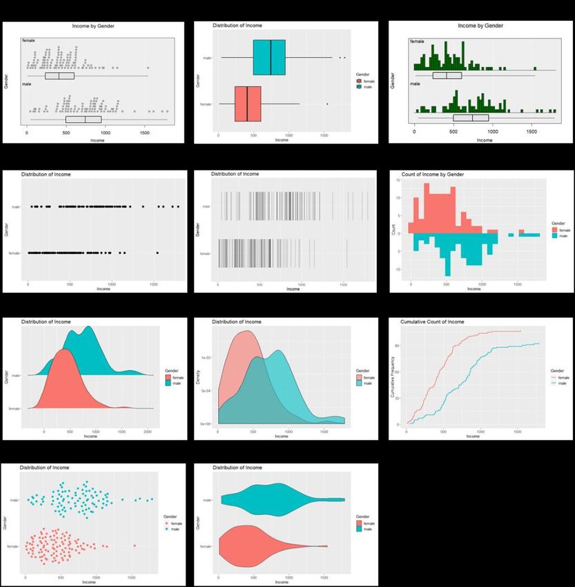
5

Part III: Implementing Civic Statistics
 Ch 13    Critical understanding of Civic Statistics:       Iddo Gal (iddo@research.haifa.ac.il)
          Engaging important contexts, texts, and
          opinion questions
 Ch 14    Implementing Civic Statistics in business         Peter Kovacs (kovacs.peter@eco.u-
          education: Technology in small and large          szeged.hu), Klara Kazar, Eva Kuruczleki
          classrooms
 Ch 15    Civic Statistics for prospective teachers:        Susanne Podworny (podworny@math.upb.de),
          developing content and pedagogical                Daniel Frischemeier, Rolf Biehler
          content knowledge through project work
 Ch 16    Civic Statistics for prospective teachers:        Achim Schiller, Joachim Engel (engel@ph-
          developing critical questioning of data-          ludwigsburg.de)
          based statements in the media
 Ch 17    Civic Statistics at School: Reasoning with        Christoph Wassner (wassner@martin-
          real data in the classroom                        behaim-gymnasium.de), Andreas
                                                            Proemmel
 Ch 18    Preparing for a data-rich world: Civic            James Nicholson
          Statistics across the curriculum                  (j.r.nicholson@durham.ac.uk), Joachim Engel,
                                                            Josephine Louie
 Ch 19    Dynamic, interactive trees and icon arrays        Laura Martignon (martignon@ph-
          for visualizing risks in Civic Statistics         ludwigsburg.de), Daniel Frischemeier,
                                                            Michelle McDowell, Christoph Till
Part IV: The Futures of Civic Statistics
 Ch 20    Reflections on Civic Statistics — A               Karen François (karen.francois@vub.be),
          triangulation of citizen, state and statistics:   Carlos Monteiro
          past, present and future
 Ch 21    Connecting data science, data                     Leid Zejnilovic (leid.zejnilovic@novasbe.pt),
          movements, and project-based learning             Pedro Campos
          with a social impact
 Ch 22    Data science, statistics, and Civic Statistics:   Jim Ridgway (jim.ridgway@durham.ac.uk),
          Education for a fast changing world               Pedro Campos, Rolf Biehler
 Ch 23    Civic Statistics in context: mapping the          Jim Ridgway (jim.ridgway@durham.ac.uk),
          global evidence ecosystem                         Rosie Ridgway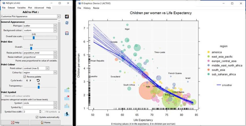
6

Chapter 10
Civic Statistics and iNZight:
Illustrations of Some Design
Principles for Educational
Software
  Chris J. Wild, The University of Auckland, New Zealand
  c.wild@auckland.ac.nz
  and
  Jim Ridgway, The University of Durham, UK
  jim.ridgway@durham.ac.uk

Abstract

The PCS project has made good use of iNZight in exploring topics such as
migration, gender inequality, childhood malnutrition, and natural disasters.
Further examples of Civic Statistics topics that have been addressed using
iNZight are provided here, along with a range of examples of creative ways to
display data. The chapter outlines the advantages of technology enhanced
statistics education and software requirements; maps some analyses which are
central to Civic Statistics and shows how these can be conducted using iNZight.
Examples include working with multivariate data, exploring subgroups within
data, using multiple representations, analysing and reanalysing, and telling
stories grounded in evidence. Often with complex social/civic datasets it is
necessary to explore changes over time, and to explore spatial patterns. Here, we
describe software features that facilitate data exploration for naïve users that
include both direct guidance and hooks to encourage engagement and further
7

learning, and also features for advanced users, such as the automatic generation
of R code for documentation and software reuse. Software for analyzing data is
evolving rapidly to accommodate new sorts of data, new techniques for analysis,
and new methods to present data. Therefore, the chapter concludes by describing
developments to iNZight that are in progress.

Keywords: software design, multivariate data; multiple representations;
disaggregation; complexity reduction, complex survey designs

10.1 Introduction
Readers of this book will already be aware of the explosive growth in the
availability and importance of data in understanding and managing almost all
aspects of our society. The buzz words come in and fade away, e.g., the data
deluge, big data, open data. Some (like open data) have lasting value because
they describe something unique. Others just convey a sense of progress,
urgency, opportunity, and sometimes alarm and dread.

Things we never knew could be considered as data are now very successfully
being mined for insights and predictive value – sources such as text, images,
sound files, and network data. The International Data Science in Schools Project       1

is proposing that much of this should be part of the high school curriculum.
Different data types and structures demand different ways of thinking and
looking. Accompanying the rapid expansion of the data universe has been an
explosion of new and improved ways to visualize and analyze data. The barriers
to participation are becoming ever lower. There is a steady stream of wonderful
new visualization functions and packages becoming available in R, Python and
JavaScript doing away with the need for low-level programming.

While technology is making it easier to perform specific tasks, it is also rapidly
expanding the spectrum of things that non-specialists can do. Because each new
data-type or graphic-type demands new ways of conceptualizing data and
interacting with software, the universe of possibilities that are accessible to non-
specialists is rapidly expanding in size and complexity.

   1
       http://www.idssp.org/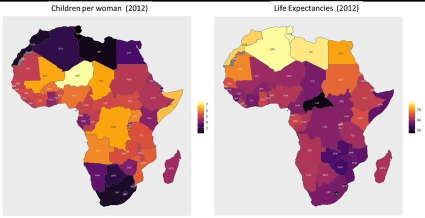
8

    While this stream of new opportunities is exciting, users can become overloaded
    cognitively – “It is all just too much. I just can’t get my head around it”.
    Strategies are needed which enable everyone to ride the wave of progress while
    managing individual expanding mental universes.

    An important complexity-reducing factor comes from the advance of
    technology. Many of the mechanical procedures underpinning important
    concepts are no longer worth mastering. Any particular mechanical skill tends to
    be death-dated because software is continually automating these procedures.
    Creating histograms by hand offers an obvious example; one can argue that
    some hand-crafting is useful pedagogically, but not that this is an essential
    process for exploratory data analysis. The most important capabilities for the
    long term are an awareness of what is possible, thinking skills (such as
    imagining/question posing/interpreting/critiquing/concluding) and
    communication skills; in contrast to the mechanical procedures that were such a
    focus in the past. There are clear advantages to learners from not having to
    master so many technical procedures. However, these gains are insufficient to
    compensate for the explosive growth in the data world. We need more
    complexity-reduction strategies to enable representative citizens to engage
    effectively with evidence.

    In Chapter 7, Trostianitser, Teixeira and Campos outline some uses of iNZight
    contained in lesson plans accessible via CivicStatMap2, namely, the use of
    iNZight for exploring:
●   The migration data for Nigeria taken from the UN 2015 Millennium
    Development Goals.
●   The IPUMS Gender Equity data set for 2000 and 2005 for Brazil and the USA.
●   Data on malnutrition in children from the Hunger and Commitment Index
    (HANCI).
●   Data on natural disasters from the Center for Research on the Epidemiology of
    Disasters – Emergency Events Database (EM-DAT).
●   Data from the OECD Program for the International Assessment of Adult
    Competencies (PIAAC).

      2
          https://iase-web.org/islp/pcs/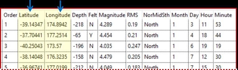
9

    In this chapter, further examples are given, which illustrate ways in which
    software can be used to support the sorts of analysis essential for wrangling with
    evidence relevant to Civic Statistics. The intention is not to provide a tutorial on
    the use of a particular package (tutorials can be found embedded in PCS lesson
    plans); rather it is to point to some principles of software design and
    implementation that are of general interest.

    10.1.1 Design Principles for Educational Software

    A seminal paper by Biehler (1997; see also 2019) discussed the criteria by which
    software to support learning statistics and doing statistics should be judged.
    Implicitly, this sort of analysis serves as a guide for future software
    developments. McNamara (2019) built on Biehler’s (1997) work, and set out
    eight desirable features of educational software, which have been built into
    iNZight. These are:
●   Accessibility - software should be affordable, work with a variety of operating
    systems, and should be easy to install.
●   Easy entry for novice users - novice users should be able to see how to use the
    software, and what it does; using the software, users should receive immediate
    gratification i.e. an intelligible and immediate response to commands.
●   Data as a first-order persistent object - Software should be able to access data
    presented in common formats (e.g. flat files, hierarchically ordered data, using
    APIs). There should be a good and transparent workflow for cleaning data.
    Users should always be able to view their raw data.
●   Support for a cycle of exploratory and confirmatory analysis - to use Tukey’s
    (1977) words. Biehler (1997) referred to draft results. Essentially, software
    should support activities such as question posing, critique, interpreting,
    concluding, and imagining.
●   Flexible plot creation - there should be a facility to plot data in a variety of
    ways.
●   Support for randomisation - software should support tools such as
    randomisation tests, and visual representations of uncertainty e.g. via bootstrap.
●   Interactivity at every level - Biehler (1997) argued the case for direct
    manipulation rather than modifying a script, and that software tools should
    support graphs as an interface to the data. Another desirable aspect of
    interactivity is access to multiple coordinated views – so (say) highlighting an
    element in one display leads to relevant changes in every display.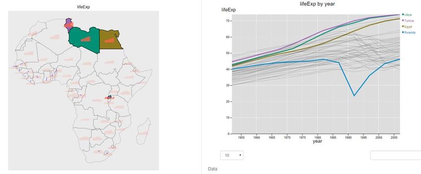
10

● Inherent documentation - there is a need to show the pathway of any analysis,
  and also the logic of what has transpired - Jupyter notebooks (Toomey, 2017)
  provides an example. Biehler (1997) criticised the absence of inherent
  documentation in Velleman’s (1989) DataDesk – the latest version generates R
  code from user actions.
● Simple support for narrative publishing, and reproducibility -
  communication is an essential aspect of any analysis. Users need to be able to
  share code and analyses, to say what was done, and to be able to use the same
  analysis on a new data set. Tools for exporting graphics and analyses should be
  provided.

   Implicit in McNamara’s and Biehler’s analyses is the need to provide
   sophisticated tools for experienced users (and that this collection of tools will be
   extensible). Both authors comment that there are few if any examples of
   packages that satisfy all the design criteria, and support both learners and
   practitioners, although some - such as Fathom3 - fulfilled many of these
   essential criteria.

   iNZight satisfies all these criteria; in addition, iNZight sets out to entice users to
   learn more about data exploration and analysis. Users might not know quite what
   they want to do, or the opportunities available to facilitate exploration and
   analysis; iNZight suggests relevant data visualisations and analyses. iNZight has
   many interesting features, and is free to use; we think it is legitimate to devote a
   whole chapter of this book to this tool, to demonstrate software design principles
   and their implementation. Moreover, the features that iNZight shows can also be
   seen as necessary and valuable for many data explorations in Civic Statistics - so
   these features can also be seen as illustrations of norms and requirements for
   future software that combines easy access for beginners with substantial data
   analytic capacities. In our examples we also use data from Gapminder, to show
   that Gapminder analyses can be supported by iNZight and expanded because of
   the richer data analytical environment.

      3
          https://fathom.concord.org
11
10.1.3 What is iNZight?
iNZight4 (Elliott et al., 2021; Wild et al., 2021) is a free, open-source , data
5
visualization and analysis tool that can be used by people at any stage of
statistical development. It is a tool for beginners in the sense that it makes simple
things very easy to do – it started off life as a tool for school children. However,
it is also possible to do sophisticated things very rapidly, such as creating
dynamic and interactive displays, wrangling with data, and doing complicated
statistical modelling. Some capabilities are directly relevant to Civic Statistics,
such as the ability to represent data from complex sample-surveys properly, and
to deal with multiple response data (i.e. data from surveys where respondents
can select as many answer-options to a question as they please).
iNZight comes in two versions, a desktop version that needs to be installed on a
computer and an online version (called iNZight Lite ) that runs in a web browser
6
when users are connected to the internet. Many parts of iNZight also make the
underlying R code available. This has three major advantages: first, as an audit
trail –audit trails are particularly important for seeing if, when and how the data
itself has been modified (e.g. by removing outliers); second as a reproducibility,
sharing and work-efficiency aid – a sequence of analysis steps can be shared or
repurposed and re-implemented almost instantly simply by running the code;
and third as a useful tool for those learning to program in R – viewing system-
generated code can be a useful productivity-aid enabling people to find out
quickly how to do things in R.
10.2 Key Software Functionality for Civic Statistics
In this section, we describe some of the functionality essential for working with
Civic Statistics.
10.2.1 Easy Exploration of Multivariate Data
It is important for users to engage in multivariate data exploration easily, and to
experience “Aha” moments. In iNZight, as soon as you choose to look at a
variable, or a relationship between variables, iNZight will offer a graph. Users
can refine the choices made to create new displays.
4
https://inzight.nz/
5
https://github.com/iNZightVIT
6
https://lite.docker.stat.auckland.ac.nz/12 10.2.2 Minimizing Cognitive Load Most statistics packages are driven via a graphical user interface (GUI). GUI- based tools typically assume that users know the names of the desired graphics and forms of analysis they want to use. This can be a significant barrier to participation and access for novices; they cannot explore data unless they know and remember the name of a procedure and how it is used. iNZight takes account of the data being explored, and offers default presentations and analyses (and, of course, provides the ability to look at alternatives and make changes). 10.2.3 Provoking Learning An advantage of a GUI-based system is that when the system recognizes it is in a particular situation, the interface can then change to offer up choices corresponding to useful things that can be done, or looked at, in that situation. When confronted with controls it is a natural human impulse to ask, “I wonder what that does?” So a good interface can act as a prompt for doing more, or finding out what more can be done, to draw the user into learning more. Linking “I wonder what that does?” to a good help system facilitates discovery and just- in-time learning. 10.2.4 Offering R-code: Reproducibility and a Bridge from GUIs to Coding GUI systems often fail to create audit trails of what has been done during an analysis. It is especially important to have records of where data has been changed for some reason (e.g., by deleting outliers) and what predates or follows such changes. GUI systems can also be bad at enabling others to reproduce an analysis that has been done, or allowing users to quickly re-run all the steps of an analysis, for example because the data has been updated or corrected since the original analysis. Saving the underlying R-code solves these problems. It also offers a useful aid to learning R, and a useful productivity-aid for people to find out quickly how to do things in R when they want to write R code (at the time of writing this is limited to all of the basic iNZight operations including data wrangling, and amongst the advanced modules, to the statistical-modelling module - but extensions are underway). For a fuller discussion of many of these issues, and in particular of the comparative strengths of GUIs and coding; see Wild (2018), Burr et al. (2021).
13

When the display editable code boxes feature is switched on in iNZight, the
graphics, summary and inferential statistics features in basic iNZight show the
code that created the current display and allow this code to be stored or modified
and rerun. In addition to changing the output, the interface choices are also
instantly repopulated to match the code instructions. The learning strategies
being implemented include: “the code that makes it”: code is always in view to
foster learning by osmosis; and the mappings between GUI settings, argument
values of the function calls and output are direct and immediate in order to foster
seeing the relationships between them.

10.2.5 Specific Support for Civic Statistics
Civic Statistics often engages with survey data. Survey data from authoritative
sources is collected using complex survey designs involving features such as the
oversampling of some (usually small but important) subgroups, stratified
sampling and cluster sampling. Graphics and analyses that do not take these
sample-design factors into account should always raise credibility red-flags, as
they can be very misleading. With iNZight, the program will take account of any
sample-design information provided (Elliott et al., 2021).

10.3 Illustrating iNZight
This section provides examples of the functionality of iNZight as a tool for
engaging with Civic Statistics.

10.3.1 Making Simple Things Really Simple
Here, a small set of workforce data is explored. In its basic mode, iNZight
requires data with a standard, rectangular, cases/units (rows) by variables
(columns) structure. Initially, only the left-hand window in Fig. 10.1 is
populated (the lower right-hand window has not yet been created). The display
shows the data and various command capabilities. These command actions are
initiated by the variables that have been selected in the boxes at the lower left of
Fig. 10.1 and determined by variable type (either numeric or categorical).
14

Fig. 10.1 Basic operation of iNZight

As soon as we select Qualification (a categorical variable) in the first box, a bar
chart of the Qualification distribution appears. When we also select Gender
(another categorical variable) in the second box the display changes to the side-
by-side bar chart at the upper right to display the relationship between
Qualification and Gender.

Pressing the Get Summary button at the bottom left creates a window of
summary statistics (here the cross-classification between these two categorical
variables presented both in terms of counts and proportions). Similarly, clicking
Get Inference pops up a window of inferential information. For two categorical
variables, the latter gives things like Chi-square test results and confidence
intervals for differences in proportions. This epitomizes the cycle of exploration
for iNZight at its most basic. When variables are selected, a relevant graph is
created. Get Summary and Get Inference deliver just what they say.

If the variable chosen had been numeric (e.g. Income), then a different type of
plot and different types of information would have been given (e.g., extremes,
quartiles, medians, means, and standard deviations as summary information; and
as inferential information: t-tests or an analysis of variance, tests and confidence
15

intervals for differences between group means or medians). There are options for
changing default behaviour. In general, iNZight decides what to deliver instantly
using the variable-types of the combination of variables selected - however, it
also gives users options for changing the default behaviour.

Users have to know enough to be able to read and interpret the computer output,
and to know whether what has been produced is sensible. However, users’
efforts are focused on making meaning – in contrast to fighting software to get
output.

10.3.2 Facilitating Exploration
In this Section, we illustrate ways in which software can facilitate exploration by
offering a variety of ways to display data, and via the creation of interactive
displays.

The Add to Plot facility (see Fig. 10.2) allows users to scroll through the types
of graph applicable for the currently-chosen variables via the Plot type box. The
options offered are taken from the relevant graphs from the Financial Times
Visual Vocabulary with some additions.
                    7

Fig. 10.2 Default plot for Income by Gender plus the Add to Plot control panel

To illustrate, we explore the relationship between Income and Gender in the
Workforce data set. For this small data set (up to about 3,000 observations) the
default is side-by-side dot plots with boxplot summaries underneath them, as in
Fig. 10.2. If we ask for Add to Plot the left-hand control panel is replaced by the

   7
       https://www.vizwiz.com/2018/07/visual-vocabulary.html
16 lower panel in Fig. 10.2. We can use the Plot type selection box to choose the name of a plot type we know we want, or we can scroll through all the alternative representations (here, those in Fig. 10.3); graphs can be oriented either horizontally or vertically. Fig. 10.3 Plot type options for relationship between a numeric and categorical variable Interactive plots are particularly useful because of the ability they give the viewer to query or relate features in a plot or set of plots. Such plots can be both more engaging and more informative than static plots. Fig. 10.4 is a static image from the interactive version of the graph shown in Fig. 10.1. It shows the graph and the two-way table it was produced from. In the interactive plot, hovering the mouse over a bar gives information about the bar (as shown). But there is also
17

interactivity between the graph and the table. For example, clicking on the
legend colour-square for females fades the data for males, thus highlighting the
female distribution, and also highlights the corresponding percentages in the
female row in the table. This shows, among other things, that the female
percentages add to 100%, which is important for understanding the plot.

Fig. 10.4 Static image from the interactive version of the graph in Fig. 10.1

Fig. 10.5 shows something a little more sophisticated – an interactive graph from
iNZight’s maps module. The data is 4-yearly, country-level data from
Gapminder . The left-hand graph shows the life expectancies over time for the
             8

countries as little time-series positioned on each country. The right-hand graph
shows all of the time series for all of the countries in detail. Clicking on a
country on the map highlights its time series on the right-hand plot. Clicking on
an interesting looking time series, such as the one for Rwanda (blue) which
shows a big dip in life expectancies in the 1990s, highlights the country it came
from on the map. In this case, the dip in life expectancy reflects deaths in the
Rwandan civil war and the genocide against the Tutsi. Hovering over a series
shows the country name, year and the life expectancy value at the mouse-pointer
location.

   8
       https://www.gapminder.org/data/
18
Fig. 10.5 Interactive graphs showing changes in average life expectancy over
time for African countries
Here, the interactive graphics work entirely independently of the system that
produced them, and so can be saved as html files and embedded in webpages (or
given to someone else).
10.3.3 Disaggregation: Exploring Subgroups with Static and
Dynamic Graphs
Here we will use a data set of about 10,000 cases from the NHANES survey of
9
the US population. Fig. 10.6 shows the relationship between having smoked
marijuana regularly at some point and having smoked cigarettes seriously (has
smoked over 100 cigarettes) for everyone in the data set who answered the
questions. It can be seen that cigarette smokers are much more likely to have
smoked marijuana than nonsmokers. But is this relationship true for different
subgroups?
9
https://www.cdc.gov/nchs/nhanes/index.htm19 Fig. 10.6 Marijuana smoking by cigarette smoking (whole data set) Selecting AgeDecade in the 3rd variable slot in the lower left panel produced Fig. 10.7 - the same sort of graph, but for each age-decade group separately. The operation of disaggregation is sometimes called facetting (here we have “facetted by the variable AgeDecade”). This allows us to see that the marijuana- cigarette relationship is very similar regardless of age group. In general, facetting is good for investigating whether, or in what way, a pattern changes over subgroups determined by some variable such as ethnicity, education level, or sex (here AgeDecade). Fig. 10.7 Marijuana smoking by cigarette smoking faceted by AgeDecade
20
Fig. 10.8 goes a step further and also facets by Race (American for Ethnicity).
Mostly the relationship looks similar regardless of age or race. However, having
chopped up the data set into 20 subgroups, some of the sample sizes are small
and so one would not be surprised to see differences attributable to random
variation.
Fig. 10.8 Marijuana smoking by cigarette smoking facetted by AgeDecade and
Race
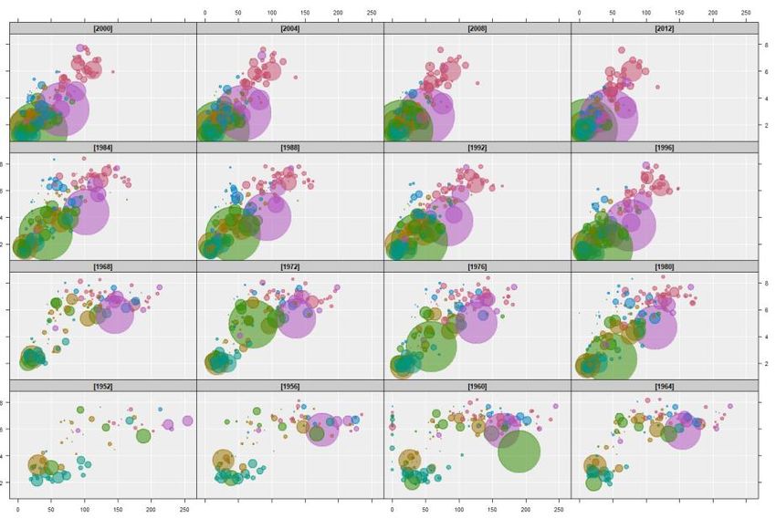
Fig. 10.9 shows a more sophisticated example, where disaggregation leads to
important insights. It shows Fertility by Infant mortality for the world’s
countries facetted by Year. The years increase from the bottom left. It is hard to
see the changes over time, but if you play the images one at a time from oldest to
most recent (e.g. using iNZight’s play button) you get a version of the famous
Hans Rosling bubbles motion chart , which plays like a movie (see Chapter 8 for
10
examples of classroom uses of Gapminder from Kovacs, Kazar, and
Kuruczleki). Here the changes become obvious. This is just the cartoonist’s-
10
https://www.gapminder.org/tools/#$chart-type=bubbles&url=v121
sketchbook effect, or any regular movie, i.e. a played sequence of still images.
This can be done for any type of plot.
Fig. 10.9 Fertility by Infant mortality for the world’s countries facetted by Year
10.4 Essential Analyses for Civic Statistics
Here, we give examples of analyses that are essential tools in the repertoire of
anyone engaged with Civic Statistics. We illustrate analysis of multiple response
data, time series data, and spatial data.
10.4.1 Multiple Response Data
How do young people spend their time online? Fig. 10.10 shows a small
segment of data from a 2011 student survey . Highlighted is the data from a
11
multiple-response question that asked In the last seven days, which of these
online activities have you done? (You may tick more than one). This ‘single
question’ elicits responses that need to be coded on many variables, one for each
activity chosen. It was asked as a single item because these are a set of things
that “belong together”. The fact that the resulting data has multiple variables,
11
https://new.censusatschool.org.nz/22 however, can make it hard to get an overview of the results. iNZight’s Multiple Response module was developed to address this problem. Fig. 10.10 Some multiple-response data In Fig. 10.11 we have told the program to treat a set of these variables together by selecting them jointly in the control panel. A graph pops up at the right giving all the proportions of positive responses for each variable in one picture. Fig. 10.11 Proportions of students reporting various sorts of activity online As argued earlier, disaggregation is an essential activity if data are to be understood. Here, the data get a lot more interesting when facetted by age and gender as in Fig. 10.12. We see interesting (apparent) age trends such as the dropping off in participation in playing games online by older students, with the fall being steeper and further for girls than boys. Girls appear to take to music and socializing more than, and earlier than, boys. There is an important statistical issue for the software to address, namely that with multiple-response data, tests and confidence intervals for differences in proportions need to take account of the (differing) correlations between them.
23
Fig. 10.12 Online-activity responses facetted by age and gender
10.4.2 Time Series
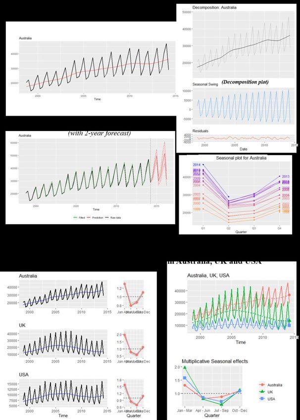
Fig. 10.13 shows time series graphs of quarterly data on the average visitor
numbers in New Zealand from Australia, the UK and the US in the period 1998-
201412. iNZight’s time-series module takes data from a single series or compares
several series and supports additive and multiplicative methods for seasonal
series, including forecasts. Visitor numbers are clearly very heavily seasonal
with considerably larger numbers in the January-March quarter and lower in
July-September – except for Australian visitors for whom the lowest numbers
are in April-June. For the UK, there are over twice as many visitors in the
southern summer than the southern winter. There are also some very noticeable
differences in the time trends – with Australia climbing relatively steadily but
the UK and the US numbers tipping into a decline – probably attributable to the
global financial crisis (though the US numbers show recovery towards the end of
the time period). Again, these displays show the importance of being able to
represent data in different ways, and that disaggregated data does not always
show the same patterns as aggregated data.
12
http://infoshare.stats.govt.nz/infoshare/24 Fig. 10.13 Average numbers of visitors present in New Zealand, 1998-2014
25

10.4.3 Maps
Data most commonly plotted on maps relates to either location or region. Here,
we give an example of the use of each, starting with location. The commonest
way of specifying a location is by its latitude and longitude. Additional variables
give information about what happened there. Fig. 10.14 shows a fragment of
data on earthquakes in New Zealand in the year 200013; we have information
about where the epicenter of the quake was (latitude and longitude), how deep
underground it was, how strong it was, when it occurred, and several other
variables.

Fig. 10.14 An example of location data: earthquakes in New Zealand in 2000

As is typical for location data, we start by plotting the locations of the
earthquakes onto a suitable map – but that just tells us where things were,
nothing else about them. There are many ways of coding more information on to
these points. Fig. 10.15 codes the intensity of the earthquake to point-size, and
the depth to a colour scale.

   13
        https://www.gns.cri.nz/
26
Fig. 10.15 Earthquakes in New Zealand in 2000
In New Zealand, there are about 15,000 earthquakes each year, all are related to
the movement of tectonic plates. In Fig.10.15 we see a strong, roughly 45 degree
pattern of quake locations - unsurprising, given that associated volcanoes created
the islands. The deepest epicentres occurred in the South Island (a subduction
zone) and the shallowest epicentres occur in the North Island, where the opposite
flow of plates occurs.
Our second example illustrates the use of data plotted by region. By ‘region’ we
mean entities such as countries of the world or states/counties/electoral districts
within a country. The associated variables usually give summary measures for
each region.
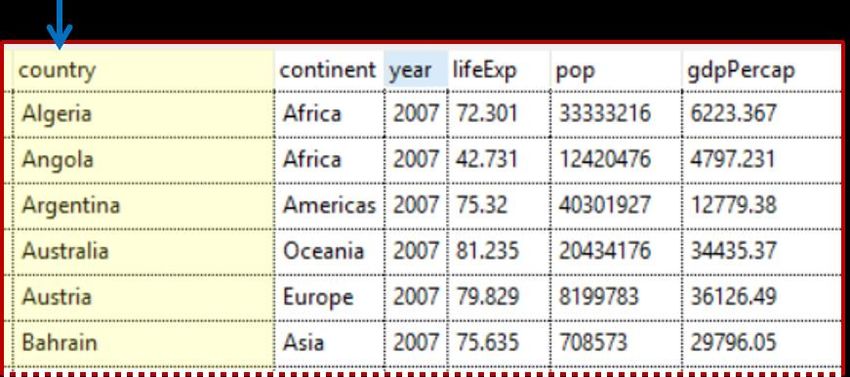
Fig. 10.16 shows a fragment of data from Gapminder on different countries of
14
the world which includes: the year the data relates to, average life expectancy,
population size, and GDP per capita. Fig. 10.17 offers so-called “choropleth
plots” of the average fertility levels (children per woman) and average life
expectancies for the countries in Africa in 2012. This is the most commonly
used plot-type for regional data. Values of the variable are coded by a colour
scale which is then used to colour the regions on the map. In Fig. 10.17 the most
obvious feature is the very low fertility rates in the north and the south of Africa
compared with the central regions. This is pattern is partially reversed for the life
expectancies with higher life expectancies in the north.
14
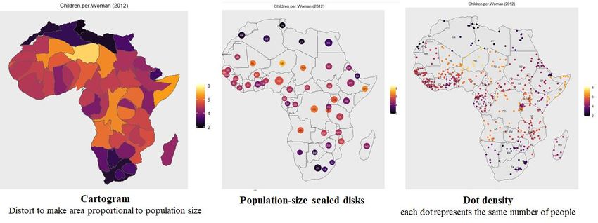
https://www.gapminder.org/data/27 Fig. 10.16 A fragment of data on the world’s countries from Gapminder Fig. 10.17 Fertilities and Life Expectancies in Africa in 2012 With choropleth plots, large regions are visually prominent. This is problematic when large (rural) regions with small populations are presented alongside small (urban) regions with large populations. This is less pronounced with African countries than with American (US) states, where choropleth plots of election results give a very misleading impression (dominated by large, sparsely- populated states in the middle of the country). Fig. 10.18 shows some of the methods people have devised to try to get around this problem. Fig. 10.18 Three methods that attempt to overcome conflations of area with number
28

10.4.4 Communicating by Customizing: Making Aesthetic Changes
and Adding Information to Plots
An essential aspect of Civic Statistics is the ability to communicate effectively.
Here, we show how a standard output can be customized so that findings can be
interpreted more readily by others. Country-level data has been downloaded
from Gapminder for 2016; we are exploring the relationship between the
average number of children each woman in a country has, and the life
expectancy of the population in that country. Once relevant variables have been
chosen, iNZight creates a scatterplot (Fig. 10.19) – the default for a relationship
between two numeric variables.

Fig. 10.19 Relating Children per woman to Life Expectancy for countries in
2016

Fig.10.20 shows the results of using some of the facilities of Add to Plot – the
command panel controlling some of this is shown on the left. The plotted
symbols have been sized to show the population size of the country; the points
have been coloured according to the Region of the world to which the country
belongs; country-name labels have been placed by some of the very big
countries and by some of the outlying countries; “rugs” have been added
alongside the axes to show the positions of the X-values and Y-values of the
points; a smooth trend-curve has been added (solid blue line) together with about
20 bootstrapped smooths (dashed lines).
29

Fig. 10.20 Augmenting the scatterplot in Fig. 10.19

Some of the aesthetic changes are as follows: the title and X- and Y-axis labels
have been changed from the default (which simply picks up the variable names
from the data set) into something that reads better; the background has been
lightened; the points (disks) have been made semi-transparent and colored
according to a chosen palette; and the overall sizes of things have been reduced
somewhat.

10.4.5 Give Me the R Code for That
It is important that analyses of data can be reproduced, and (if necessary) re-used
on other data sets. This is problematic if data are modified during the processes
of exploration and analysis – for example, if outliers are removed, or some
values are interpolated. In iNZight, the R code that implements user actions is
automatically stored, and the stored code is made available to the user – both to
provide an audit trail of changes made to the data and for possible use in R
programs to automate such changes in the future. (To give more internal detail,
when a user asks for a data-wrangling operation to be performed, the system first
constructs the R code to do it, and then both executes and stores that code).

In addition, the controls for the plot types shown in Fig. 10.3 have buttons for
storing and displaying the R-code that produced them. Fig. 10.21 shows a stored-
code display window containing saved plots. Clicking on a plot thumbnail
30

regenerates the plot in the graphics window. The code can be copied for external
use and even modified and re-run in the current iNZight session.

Fig. 10.21 Stored R-code displayed for three plots

10.5 Future-proofing Software
A book chapter is a snapshot in time whereas a software project is always a work
in progress. By the time you read this, whatever you gleaned about the
capabilities of iNZight will now be out of date. So we will conclude by briefly
describing some of the things that are under development. The guiding
principles are to develop the software environment in a principled way, and also
to monitor important developments in the field, and to implement them in
iNZight.
In the Advanced Modules space, the iNZight project is working on modules for
text harvesting and text analytics, network data, longitudinal data and small-area
estimation. All of these are directly relevant to Civic Statistics.
Work is also underway on extending graphical displays to include multivariate
graphics (in the sense of multiple Y-variables), and to provide much greater
functionality for exploring and analysing time series data.
New modules for analysing hierarchical data, and data from designed
experiments are under development.
We are also working on modules for supervised learning (predictive modelling)
and unsupervised learning (primarily cluster analysis).
In the code-writing space we intend to increase the number of iNZight functions
that write R code. We have prototypes of parts of iNZight Lite writing shell R-
31

Markdown documents, which combine text and executable R-code and are a
good way to write documents that combine discussion and analysis. The shell
document delivered by iNZight can then be further refined independently of
iNZight (but in conjunction with R). We hope also to close the loop between
iNZight Lite and coding using cloud implementations of R.
The iNZight project’s source code can be found in the Github repository15. We
welcome collaborators.

10.6 Conclusions
We began by describing some desirable features of software to support learning
and doing statistics, then set out to show how these features have been
implemented in iNZight. A key message is the importance of engaging users and
fostering their skills in statistical enquiry skills whatever their level of statistical
knowledge. iNZight is particularly well suited to the analysis of data relevant to
Civic Statistics, by facilitating multiple representations, handling multivariate
data that can be dynamic, spanning time and places, collected in a variety of
ways. Wrangling with Civic Statistics data requires analysis, reanalysis and
reflection; tools to record analyses and data moves are essential for successful
analysis. We are living in interesting times, and face new challenges in
understanding an increasingly connected and complex world characterised by
new artefacts, events, new sorts of data, new kinds of analysis, and new ways of
communicating with each other. Tools to support our intellectual development
must continue to evolve, and to be accessible to both naïve and sophisticated
users.

References

Biehler, R. (1997). Software for learning and doing statistics. International
Statistical Review, 65(2), 167-189.

Biehler, R. (2019). Software for learning and for doing statistics and probability
– Looking back and looking forward from a personal perspective. En J. M.
Contreras, M. M. Gea, M. M. López-Martín y E. MolinaPortillo (Eds.), Actas

   15
        https://github.com/iNZightVIT
32 Burr, W., Chevalier, F., Collins, C., Gibbs, A. L., Ng, R., and Wild, C. J. (2021). Computational skills by stealth in introductory data science teaching, Teaching Statistics, Special issue on Teaching Data Science and Statistics: foundation and introductory, 43, SI1, S34–S51. https://doi.org/10.1111/test.12277 Elliott, T., Wild, C., Barnett, D., Sporle, and A. (2021). iNZight: A Graphical User Interface for Data Visualisation and Analysis through R. https://inzight.nz/papers/2021_jss.pdf. McNamara, A. (2019). Key Attributes of a Modern Statistical Computing Tool, The American Statistician, 73:4, 375-384, DOI: 10.1080/00031305.2018.1482784 Toomey, D. (2017). Jupyter for Data Science – Exploratory analysis, statistical modelling, machine learning, and data visualization with Jupyter. Birmingham: Packt Publishing. Tukey, J.W. (1977). Exploratory data analysis. Reading: Addison-Wesley. Velleman, P. F. (1989). Learning data analysis with Data Desk. New York: W.H. Freeman. Wild, C.J. (2018). Gaining iNZights from data. (Invited paper) In Proceedings of the 10th International Conference on the Teaching of Statistics, M. AlejandraSorto (ed), International Statistical Institute: https://iase-web.org/icots/10/proceedings/pdfs/ICOTS10_9A3.pdf?1531364299 Wild, C. J., Elliott, T., and Sporle, A.. (2021). On democratizing data science: some iNZights into empowering the many. Harvard Data Science Review 3(2). https://hdsr.mitpress.mit.edu/pub/8fxt1zop/release/1 .
You can also read