Data Visualization to solve COVID-19 - Journal of Physics: Conference Series - IOPscience
←
→
Page content transcription
If your browser does not render page correctly, please read the page content below

Journal of Physics: Conference Series

PAPER • OPEN ACCESS

Data Visualization to solve COVID-19
To cite this article: Pronoy Roy et al 2021 J. Phys.: Conf. Ser. 1797 012016

View the article online for updates and enhancements.

                                This content was downloaded from IP address 46.4.80.155 on 31/03/2021 at 22:34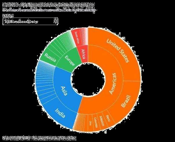
IOCER 2020                                                                                                      IOP Publishing
Journal of Physics: Conference Series                         1797 (2021) 012016          doi:10.1088/1742-6596/1797/1/012016

                     Data Visualization to solve COVID-19

                           Pronoy Roy1, Ankit Das, Indranil Mondal, Dr. Saikat Maity
                           Dept. of Computer Science & Engineering, JIS University.
                                                   1
                                                       pronoyroyabc@gmail.com

                     Abstract. This electronic document describes how data visualization can be used to solve
                     problems related to Coronavirus using graphical representation of information and data. This
                     article mentions several well-known methods to contain the coronavirus pandemic and discusses
                     how these methods can be effectively implemented across the country. The focus has been given
                     more to the implementation in local level than a country wide implementation. The article
                     describes a comprehensive way to predict the next hotspot in a district wise level using projection
                     graphs. The article also describes The Delhi model using data projection and analysis. The
                     conclusions derived from theses analyses can be implemented effectively in district wise level
                     to flatten the Coronavirus curve and develop herd immunity in category wise zones.

                     Keywords— coronavirus, community spread, data visualization, flattening the curve, herd
                     immunity.

1. Introduction

This electronic document is created in Microsoft Word Online for online view, it explains how data
visualization can help us minimize the damage caused by covid-19. Data Visualization is the way of
representing data using different types of graphs, charts, and various other methods. It helps us recognize
any underlying pattern in a given set of data and help us predict results using the set of data. Data
Visualization helps us to understand the behavior of a particular data set using visual representation
which enables us to understand the subject (which is represented by the dataset) in a much proper and
engaging way.
    The districts lying in Category 1 should be the top priority of the Government, a complete lockdown
for infinite number of days has to be implemented, only the sale of essential commodities should be
permitted that too for a limited number of hours in a day (8 AM to 5 PM). The districts lying in Category
2 should be of moderate priority, a complete lockdown should be implemented on alternate days and
partial lockdown from 9 A.M to 6 P.M in the consecutive days after a complete lockdown, there should
not be any restrictions in the sale of essential commodities. The districts lying in category 3 should be
of least concern, social distancing should be the remedy for coronavirus in these areas. By this way the
resources could be properly focused on the areas which needs them the most and thereby achieving the
objective of developing herd immunity and thus, flattening the curve.

Figure 1 is a wagon wheel, which is a country wise representation of the total number confirmed cases
around the world. The continents Africa, Asia, Europe and America are represented by Red, Blue, Green
and Orange respectively. Under different continents different countries are represented. This type of
Data Visualization gives us an overall summary of the spread of the virus without going much into the

              Content from this work may be used under the terms of the Creative Commons Attribution 3.0 licence. Any further distribution
              of this work must maintain attribution to the author(s) and the title of the work, journal citation and DOI.
Published under licence by IOP Publishing Ltd                          1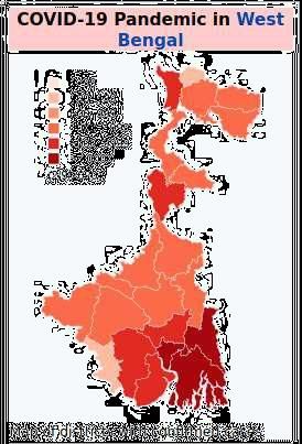
IOCER 2020                                                                                   IOP Publishing
Journal of Physics: Conference Series           1797 (2021) 012016     doi:10.1088/1742-6596/1797/1/012016

details. This type of Visualizations also gives us an insight about the economic opportunities and the
health care facilities present in different countries.

Figure 1 A wagon wheel, which is a country wise representation of the total number confirmed cases
around the world.

2. Use of data visualization to solve Covid crisis

2.1      Local lockdowns

The Coronavirus outbreak has shaken the World economy, Indian economy too is struggling. In this
situation a Nationwise lockdown is not the answer. Instead focus should be given on local lockdowns,
where the focus should be on those districts where there are maximum number of cases, the districts
with moderate number of cases should be the second priority of the Government and the districts with
least number of cases should be given the least priority. For example, consider the map above, we can
categorize the districts according to the number of cases Category 1- The districts having above 5000
cases, Category 2- The districts having above 1000 cases, Category 3- The districts having below 1000
case. Based on the category of a district or a zone different types of lockdowns each with different level
of restrictions can be implemented. This in return will contain the virus only to the most affected areas
and will also ensure the circulation of money in least affected areas thereby reducing the damage on the
economy.
         Figure 2 is the map of West Bengal which shows the areas with most affected people and also
the areas which are relatively less affected. This type of Visualizations can help us to easily categorize
the affected areas. This Visualization uses different shades of the same colour to differentiate the affected
areas for e.g. 1-99 is represented by whitish red, 1000-4999 is represented by primary red and >= 10000
is represented by dark red.

                                                      2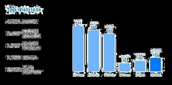
IOCER 2020                                                                                 IOP Publishing
Journal of Physics: Conference Series          1797 (2021) 012016    doi:10.1088/1742-6596/1797/1/012016

Figure 2 The map of West Bengal which shows the areas with most affected people and also the areas
                               which are relatively less affected.

2.2       Prediction of next hotspot

Data Visualization can be used to predict ‘the next’ hotspot. The curve of a potential hotspot can be
flattened before reaching its full potential by predicting the number of cases and recovery rates of a
particular area and comparing them with other areas. In this way the government can focus their
attention and resources in the most affected areas. Updating projections daily along the daily data will
enable us to see the big picture and will help us buying time. Projection of recovery rates and daily
deaths along with daily cases will help us check whether the safety precautions taken by the government
is working effectively or not. Local lockdown as already mentioned in this article will also be very
effective in containing the coronavirus in the ‘next’ hotspot.

Figure 3 represents daily Covid cases in the district of Paschim Medinipur in a bar graph format, the rise
and fall of the daily cases can be easily seen. The districts with the most number of cases can also be
seen in the figure. The figure also does a percentage comparison of rise and fall of daily cases. For e.g.
there was a 78.3% drop in the number of daily cases on 16th August in comparison to 15th August.

                                                     3
IOCER 2020 IOP Publishing
Journal of Physics: Conference Series 1797 (2021) 012016 doi:10.1088/1742-6596/1797/1/012016
Figure 3 Daily Covid cases in the district of Paschim Medinipur in a bar graph format, the rise and fall
of the daily cases can be easily seen.
2.3 The Delhi model
As Corona positive cases keeps on increasing in India, Delhi is seeing a fall in the number of active
cases. From being one of the worst Covid hit state in India to becoming one of most recovering state in
the country, The Delhi model is based on the principal of three T s, Testing, Tracing and Treatment.
These measured can be implemented in local level across various states of India. The increase in testing
number is the key factor responsible for higher recovery rate. The same should be done in local levels,
if enough testing kit is not present then only patients with mild to adequate symptoms should be tested.
Home isolation for mild symptoms is another key factor behind Delhi’s success. As there are limited
number of hospital beds in rural areas, the patients with mild symptoms should be home isolated and
only people with severe need should be hospitalized. Sero-surveys in local level can decrease the rate
of infection. The detection of herd immunities in local levels will be easier with Sero-surveys.
Figure 4 Daily confirmed cases within a period of time
Figure 4 indicates daily confirmed cases within a period of time, 4235 indicates total number of
confirmed cases on 13th September, -86 indicates that there has been 86 less cases on 13th September
as compared to 12th September. The dates are represented on x-axis and the number of confirmed cases
is represented on y-axis. this can be used to understand whether the measures taken by authorities to
control the spread of the virus are working properly or not. If the graph increases then that would indicate
the authorities need to change the methods of containing the virus and similarly if the graph decreases
then that would mean that there is successful implementation of proper methods to contain the virus and
these methods can be applied in other areas to control the curve in the same way.
4IOCER 2020 IOP Publishing
Journal of Physics: Conference Series 1797 (2021) 012016 doi:10.1088/1742-6596/1797/1/012016
Figure 5 Daily increase or decrease in total number active cases within a period of time
Figure 5 indicates the daily increase or decrease in total number active cases within a period of time, the
dates are represented on x-axis and the number of cases is represented on y-axis. The number 69 on the
top left corner indicates the number of active cases on 19th August which is 147 less than 18th August.
Increase in number of active cases would mean low recovery rate of the affected patients. Increase in
daily active cases will cause shortage of beds and increase in work hours of doctors and nurses.
Figure 6 Recovery rates of the patients.
Figure 6 indicates the recovery rates of the patients. The dates are represented on the x-axis and the
number of recovered patients is represented on y-axis. The number 1320 in the top left corner indicates
the total number of recovered patients on 19th August, the number +174 indicates that the recovered
cases on 19th August is 174 more than on 18th August. Higher Recovery rates indicates proper measures
been taken and implemented by the authorities and it also ensures the proper functioning of the
healthcare machinery.
Figure 7 Daily number of deaths
Figure 7 indicates the daily number of deaths. The x-axis represents the dates and the number of daily
deaths is represented by y-axis. The number of deaths on 19th August is 9 which is 3 less than 18th
August. As we can see there was a sudden rise in number of deaths somewhere in between 1st June and
1st July. Data Visualization can help us tremendously to keep these numbers in check.
5IOCER 2020 IOP Publishing
Journal of Physics: Conference Series 1797 (2021) 012016 doi:10.1088/1742-6596/1797/1/012016
Figure 8 Number of testing in a daily basis
Figure 8 indicates the number of testing in a daily basis. The numbers in the top left corner indicates
that 20815 people were tested on 19th August which is 549 more than the people tested on 18th August.
The dates are represented on the x-axis and the number of tested people is represented on the y-axis.
2.4 Conclusion
Data Visualization is an amazing tool to study a specific dataset. If the knowledge gathered from Data
Visualization is properly utilized and various methods mentioned in this article is properly implemented
then we can definitely recover from Coronavirus at a faster rate.
2.5 Acknowledgment
We would like to express my special thanks of gratitude to our Head of the Department “Dr. Saikat
Maity” who gave us the golden opportunity to do research on this wonderful topic “Data Visualization
to solve Covid 19” which also helped us in understanding a lot of things. We are really thankful to him.
We would also like to thank Covid 19 India (https://www.covid19india.org/ ) for providing us with
different data visualizations. It is an amazing website which can provide an accurate data visualization
of different districts of India. We are also thankful to flourish and Wikipedia.
References
[1] Figure 1- https://flourish.studio/covid/
[2] Figure 2- https://en.wikipedia.org/wiki/COVID-19_pandemic_in_West_Bengal
[3] Figure 3- https://www.covid19india.org/
[4] Figure 4- https://www.covid19india.org/
[5] Figure 5- https://www.covid19india.org/
[6] Figure 6- https://www.covid19india.org/
[7] Figure 7- https://www.covid19india.org/
[8] Figure 8- https://www.covid19india.org/
[9] The Delhi model- https://www.firstpost.com/health/covid-19-crisis-how-delhi-model-if-implemented-
well-can-help-curb-pandemics-spread-in-rural-areas-8719801.html
6You can also read