Harnessing the Power of Scientific Python to Investigate Biogeochemistry and Metaproteomes of the Central Pacific Ocean
←
→
Page content transcription
If your browser does not render page correctly, please read the page content below
106                                                                                                         PROC. OF THE 17th PYTHON IN SCIENCE CONF. (SCIPY 2018)

         Harnessing the Power of Scientific Python to
      Investigate Biogeochemistry and Metaproteomes of
                   the Central Pacific Ocean
                                   Noelle A. Held§‡ , Jaclyn K. Saunders‡§ , Joe Futrelle‡ , Mak A. Saito‡∗

                                                      https://youtu.be/WYmAu0GiSU4

                                                                                      F

Abstract—Oceanographic expeditions commonly generate millions of data                     Introduction
points for various chemical, biological, and physical features, all in different
formats. Scientific Python tools are extremely useful for synthesizing this data to       Oceanography is concerned with understanding the ocean as a
make sense of major trends in the changing ocean environment. In this paper,              holistic and dynamic system, integrating information from disci-
we present our application of scientific Python to investigate metaproteome data          plines such as biology, chemistry, geology, and physics. But just
from the oxygen-depleted Central Pacific Ocean. The microbial proteins of this            how to incorporate this multivariate data is a key challenge in the
region are major drivers of biogeochemical cycles, and represent a living proxy           field. For example, research expeditions commonly generate mil-
of the ancient anoxic ocean. They also provide a look into the trajectory of
                                                                                          lions of data points, all with different formats, scales, and primary
the ocean in the face of rising temperatures, which cause deoxygenation. We
                                                                                          research goals. Scientific Python tools can help oceanographers
assessed 103 metaproteome samples collected in the Central Pacific Ocean
on the 2016 ProteOMZ cruise. This data represents ~60,000 identified proteins
                                                                                          synthesize multivariate information to make sense of trends; here
and over 6 million datapoints, in addition to over 6,600 corresponding chemical,          we present an application to investigate metaproteome data from
physical, and biological metadata points.                                                 the oxygen poor central Pacific Ocean.
     An interactive data analysis tool which enables the scientific user to visual-           The tropical Pacific Ocean contains a naturally low-oxygen
ize and interrogate patterns in these large metaproteomic datasets in conjunc-            region called an oxygen minimum zone (OMZ) (Figure 1). Bi-
tion with hydrographic features was not previously available. Bench scientists            ological and chemical processes in the OMZ are different from
who would like to use this oceanographic data to gain insight into marine                 surrounding oxygenated waters. For example, nitrification (use of
biogeochemical cycles were at a disadvantage as no tool existed to query
                                                                                          ammonia or other organic nitrogen sources to fuel processes that
these complex datasets in a visually meaningful way. Our goal was to provide a
                                                                                          typically use oxygen, in simplified form the reaction NH4 -> NO2 -
graphical visualization tool to enhance the exploration of these complex dataset;
specifically, using interactive tools to enable users the ability to filter and au-
                                                                                          > NO3 ) is a key process in the OMZ but not present in oxygenated
tomatically generate plots from slices of large metaproteomic and hydrographic            waters [ULLOA2012]. OMZs may represent a living proxy of
datasets. We developed a Bokeh application [BOKEH] for data exploration which             the past anoxic ocean. They are also a picture into the future.
allows the user to hone in on proteins of interest using widgets. The user can            Climate change driven by anthropogenic carbon dioxide emissions
then explore relationships between protein abundance and water column depth,              is causing ocean waters to be warmer and more stratified. This
hydrographic data, and taxonomic origin. The result is a complete and interactive         leads to deoxygenation processes and predicted expansion of
visualization tool for interrogating a multivariate oceanographic dataset, which          OMZs [WRIGHT2012]. Thus, understanding the biogeochemistry
helped us to demonstrate a strong relationship between chemical, physical,
                                                                                          of existing, natural OMZs is important for predicting conditions
and biological variables and the microbial proteins expressed. Because it was
impossible to display all the proteins at once in the Bokeh application, we
                                                                                          in the future ocean.
additionally describe an application of Holoviews/Datashader [HOLOVIEWS],                     We travelled to the oxygen poor Pacific ocean in winter 2016
[DATASHADER] to this data, which further highlights the extreme differences               to study biological and chemical processes on the ProteOMZ
between oxygen rich surface waters and the oxygen poor mesopelagic. This                  research cruise (https://schmidtocean.org/cruise/investigating-life-
application can be easily adapted to new datasets, and is already proving to be           without-oxygen-in-the-tropical-pacific/). To explore the biogeo-
a useful tool for exploring patterns in ocean protein abundance.                          chemical processes in this region, we collected over 103 metapro-
                                                                                          teomics samples at various locations and depths, representing
Index Terms—oceanography, microbial ecology, biogeochemistry, omics, visu-                56,577 identified proteins and over 6 million individual data
alization, bokeh, datashader, holoviews, pandas, dask, jupyter                            points. In addition, we collected over 6,600 corresponding chem-
                                                                                          ical and physical metadata points (18 variables) which provide
                                                                                          context to the biological protein data. Proteins are the molecu-
§ Massachusetts Institute of Technology, Cambridge, MA                                    lar machines driving biogeochemical transformations within mi-
‡ Woods Hole Oceanographic Institution, Woods Hole, MA
* Corresponding author: msaito@whoi.edu
                                                                                          crobial cells; as such, protein datasets provide a rich look at
                                                                                          ecosystem function. To our knowledge this is the largest marine
Copyright © 2018 Noelle A. Held et al. This is an open-access article                     metaproteomics dataset to date.
distributed under the terms of the Creative Commons Attribution License,
which permits unrestricted use, distribution, and reproduction in any medium,                 In this paper, we describe our efforts to create an integrated
provided the original author and source are credited.                                     proteomics and metadata visualization tool. The application is
HARNESSING THE POWER OF SCIENTIFIC PYTHON TO INVESTIGATE BIOGEOCHEMISTRY AND METAPROTEOMES OF THE CENTRAL PACIFIC OCEAN                 107

Fig. 1: Oxygen concentrations in the world ocean at 300m depth.
Warm colors indicate more oxygen, cool colors indicate less. The
sampling locations of the ProteOMZ cruise are overlaid as yellow
stars. ProteOMZ samples the oxygen-depleted tropical Pacific region.
Oxygen data: World Ocean Atlas [GARCIA2014]

intended as an exploratory tool for user-driven discovery of
patterns in oceanographic protein abundance in relationship to
hydrographic and ecological context. Using Bokeh [BOKEH] as
the main visualization library, we developed an application that
integrates multivariate data into interactive plots and tables. We               Fig. 2: Station map for the hydrographic data.
begin by describing the data model, which emerged both from the
inherent properties of the data and the constraints of the Bokeh
library. We then describe an example in which we demonstrate           and chemical parameters such as ammonium concentrations. The
major phylogenetic and functional differences between oxygen           visualization was written with Bokeh in the the Jupyter Notebook
rich surface waters to oxygen poor mesopelagic waters. Due to          interface and produces a standalone html document as the output.
performance constraints, the Bokeh application can only display        This allows the document to be shared with colleagues and,
a subset of the data. Therefore we additionally describe an ap-        importantly, does not require them to have bokeh or even python
plication of Datashader implemented in Holoviews and Jupyter           installed on their machine. The visualization consists of a map
Notebook to visualize patterns in the entire dataset. This notebook    rendered in Google Maps using the gmap function in Bokeh
further demonstrates functional partitioning between oxygen rich       (Figure 2a) and scatter plots showing the vertical distribution of
and poor waters, emphasizing the extremity of these biogeochemi-       the hydrographic parameters throughout the water column, with
cal differences. We conclude with a brief discussion of the benefits   surface values at the top (Figure 2b). The plots are arranged with
and drawbacks of our data construction and library choices, as well    gridplot. This visualization is fed from a hydrographic data CSV
as some recommendations for developers and scientists working          file, where the data for each variable is in a separate column. This
with these libraries.                                                  facilitates ingestion into Bokeh’s ColumnDataSource, allowing the
                                                                       plots to be linked. Thus, when the user selects data from one plot,
                                                                       corresponding data for that location is highlighted in the other
Methods and Results
                                                                       plots.
In situ sampling and data acquisition
Samples were collected in January-February 2016 at 14 locations        Bokeh Application
(stations) in the tropical Pacific ocean. At each station, large       The main product of this work is a fully interactive Bokeh server
volume in situ pumps were deployed at multiple depths in the           application, which integrates protein quantitative data, protein
water column. For each pump, hundreds of liters of water were          annotations, and hydrographic data. For full interactivity among
passed through stacked 51 µM , 3 µM and 0.2 µM filters. The data       plots, Bokeh requires data to be in a single 2D ColumnDataSource.
described here is for the 0.2-3 µM filter range which includes most    Thus, the first challenge we faced was how to compress our
single cell phytoplankton and free living heterotrophic bacteria.      multidimensional data into a 2D format that could be accessed by
More detail on proteomics analyses can be found in [SAITO2014].        multiple plots and updated via widgets. The protein quantitative
The full sample collection and analysis methods for this dataset in    data is a CSV formatted output which is generated directly from
particular will be reported in an upcoming publication.                the common proteomics analysis program Scaffold [SCAFFOLD].
                                                                       For illustrative purposes in this paper we use a truncated CSV
Visualizing Hydrographic Data                                          file containing 15,000 of the nearly 60,000 identified proteins.
We developed a visualization platform to explore the hydrographic      However, we have had success using the entire 60,000 protein
data, which includes physical parameters such as temperature           dataset.
108                                                                                        PROC. OF THE 17th PYTHON IN SCIENCE CONF. (SCIPY 2018)

Fig. 3: Hydrographic data as a function of water column depth. The file is exported by Bokeh as a standalone html document, allowing it to
be easily shared with collaborators.

    The CSV file is read as a pandas dataframe [PANDAS] and               and see that it is a nitrate oxidoreductase protein (Figure 6). The
consists of 103 rows (one per each unique sampling location and           protein vs. hydrographic data chart displays protein abundance as
depth) and over 15,000 columns, where each column represents              a function of various hydrographic features, which can be selected
a different protein that was identified in the field sample. This         by a widget. With the hydrographic widget we select nitrate
15,000 protein dataset is a subset of the the full protein dataset        (NO3), a product of nitrification, and see that abundance of nitrate
of 60,000 proteins. The protein annotation information is read as         oxidoreductase is positively correlated with nitrate (Figure 7). The
a separate file and includes taxonomic and functional information         protein is negatively correlated with its reactant ammonium (NH4 ),
about each protein in the dataset. Finally, the hydrographic data         and also with the intermediary product nitrite (NO2 ). Consistent
consists of 103 rows, again, one per each unique sampling location        with the idea that nitrification is prevalent in oxygen minimum
and depth) and 16 columns each containing a hydrographic or               zones , we see that the protein is negatively correlated with oxygen
chemical parameter also measured on the expedition. We com-               (O2 ) concentrations.
bined all three of these dataframes into a combined data model,               Selecting a station additionally populates a vertical profile of
allowing the entire application to be fed from ColumnDataSources          the total number of unique proteins identified (line) and number
generated from slices of a single Pandas dataframe (Figure 4). This       of peptide-to-spectrum matches expressed on a log scale (bubble)
facilitates connectivity among the plots via tools such as hover          at each depth sampled. In proteomics, we do not measure proteins
and tap, and allows the user to explore all the visualizations using      but instead parts of proteins called peptides, which are then
widgets for protein annotation and hydrographic data.                     matched to spectra that are predicted in silico from a genome
    We now describe a use case to demonstrate the utility of the          database. The peptide-to-spectrum match indicates the total num-
application (Figure 5-8). On initial load, the user can see a map of      ber of peptides identified (non unique). Typically the number of
the ProteOMZ 2016 sampling locations (Figure 5). The user can             peptide-to-spectrum matches is related to the number of unique
select a Station via a widget and display a vertical distribution         peptides identified; we see this reflected in the data at Station
of all of the proteins identified at this station throughout the          5. For instance, we see that at depths 200m and below there
water column, from surface to deep. Hovering over a protein in            are more proteins and more peptide-to-spectrum matches than in
the vertical distribution profile displays its identity. The vertical     surface waters. However, though the number of unique proteins
distribution, protein annotation table, and protein vs. hydrographic      is approximately constant between 200 and 500m, the number of
data charts are directly linked since they are fed through the            PSMs varies.
same ColumnDataSource. Selecting a protein via the TapTool                    So far we have looked only at protein function, but a user
highlights it in the vertical profile, protein annotation table, and in   may also be interested in taxonomic origin of the proteins. At
the Protein vs. Hydrographic data chart. A user who is interested         Station 5, we see in the Diversity of Microbial Proteins bar
in a specific protein can select it from the table, which updates         graph that most of the proteins we identified are from the group
the vertical line profile to highlight that protein. For instance, we     “Other Bacteria,” which encompasses most heterotrophic bacteria
can select the most abundant protein in the dataset at Station 5          including the nitrifying bacteria (Figure 8). There are also many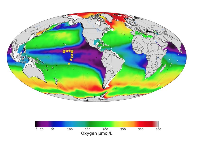
HARNESSING THE POWER OF SCIENTIFIC PYTHON TO INVESTIGATE BIOGEOCHEMISTRY AND METAPROTEOMES OF THE CENTRAL PACIFIC OCEAN                   109

Fig. 4: Data model for integrating protein abundance, protein annotation, and hydrographic data into a single Bokeh ColumnDataSource,
allowing for interactivity among the visualizations in the application.

Prochlorococcus and Pelagibacter proteins in the dataset, which         that are abundant in the surface converge to 0, or "disapper"
is consistent with the fact that these cells are among the most         around 120m. At Station 5, the warm sunight euphotic mixed
abundant in the ocean [EGGLESTON2016]. A user can select                layer ends at approximately 120m. These surface proteins are most
a specific taxon with the taxon widget; for example, we can             likely attributed to Prochlorococcus, an abundant bacterium that
select “Prochlorococcus” from the taxon widget and redisplay            lives only in sunlight waters. Below 120m, proteins attributed to
the data (Figure 5). We can now see that Prochlorococcus, a             heterotrophic bacteria become abundant.
photosynthetic cyanobacterium, is present primarily in the sunlit
surface waters above 120m. If we display “Other Bacteria,” we can
see that indeed that the heterotrophic nitrifying bacteria are highly   Discussion
abundant in the oxygen-depleted waters beginning around 200m.           We designed a data integration and discovery tool for the Pro-
Thus with just a few clicks we can explore major taxonomic and          teOMZ research expedition. In just a few clicks, the application
functional regimes throughout the oxic and suboxic water column.        allows users to explore trends in protein abundance, probe rela-
                                                                        tionships between protein abundance and hydrographic data, and
Application of Datashader                                               dial in to biological processes of interest. As an example we
We quickly discovered that attempting to display over 15,000            describe how we were able to rapidly investigate the taxonomic
lines on a single Bokeh plot was infeasible. We thus display only       and functional differences between oxygen replete surface waters
the top 5% most abundant proteins but allow the user to adjust          and the oxygen minimum mesopelagic. Since the application uses
this percentage via the Percentile slider. When the application is      data from a common proteomics data file format, it will be simple
run via Bokeh server on a single laptop, only the top 5-10% of          to plug new oceanographic datasets into this application as they
proteins can be displayed without significantly slowing down the        become available.
visualizations. This alone is powerful - over 1000 proteins are             A key challenge to this project was building a data model
displayed on the initial load, and the widgets allow the user to        that worked most efficiently with the libraries we selected. For
hone in on taxa and processes of interest such that meaningful          instance, the Bokeh ColumnDataSource imposed a 2D structure
information is still easy to find. However, it is clear that the data   on our multi-dimensional data. In Datashader we faced a similar
is oversampled and thatproteins that are especially low abundance       issue, in which we discovered that aggregating 15,000 individual
such as cell signalling and regulatory proteins are systematically      lines is prohibitively slow; by simply reformatting the data so
"lost" in this visualization.                                           the aggregation treats the data as individual points we could
    We used Datashader implemented in Holoviews and a Jupyter           significantly improve performance. Learning about the constraints
notebook to view the dataset in its entirety to see if major patterns   of these libraries was an important step in the process of creating
in protein abundance emerge when all 15,000 test dataset lines          this application, especially because we pushed the limits of the
are displayed. To improve performance in Datashader line, we            libraries. This required deep reading of user guides, API docu-
re-formatted the dataframe to be two columns (x and y values)           mentation, and Q/A repositories. We thus have two suggestions -
with each protein/depth set separated by NaNs. The dataframe was        1) that scientists (and others) understand and carefully consider
converted to a Dask dataframe [DASK] for performance reasons.           the data models and preferences of the libraries they plan to use
Though this data model requires us to copy the “Depth” data             before they begin the project and 2) that documentation of the data
15,000 times, the performance improvement in the Datashader             models and best practices in data formatting be more explicitly
aggregation steps make this step worthwhile.                            referenced in library user guides and be made easier to understand
    One question we can ask of the data is whether patterns emerge      for the non-expert.
among proteins that are more or less abundant than average. We              Another challenge we faced were problems with API stability.
normalized the protein quantitation data by dividing each column        In large part this is due to the fact that we chose to work with
by its average, such that the resulting data represents the fold-       libraries that are still in V0 release. We quickly learned to version
change in the protein in relationship to its mean over the entire       control our code and used virtual environments to retain specific
water column. In the visualization, a value of 1 on the x axis          package versions. Luckily, since the projects are open source
suggests that protein abundance is equal to the mean; below 1 the       it is relatively easy to find information about recent changes,
protein is less abundant than average and above 1 the protein is        though this is not without frustration. For instance, the Bokeh
more abundant.                                                          application originally contained a donut chart, which has since
    In the datashader plot, the data is overlaid on itself such         been deprecated. We look forward to more stable releases of the
that areas with more saturated color indicates a high number of         Bokeh, Holoviews, and Datashader libraries, especially because
proteins with similar fold-change in concentration (Figure 8). This     we are now incorporating some of these visualizations into the
shows the partitioning of microbial proteins on depth. Proteins         upcoming Ocean Protein Portal (http://proteinportal.whoi.edu/), a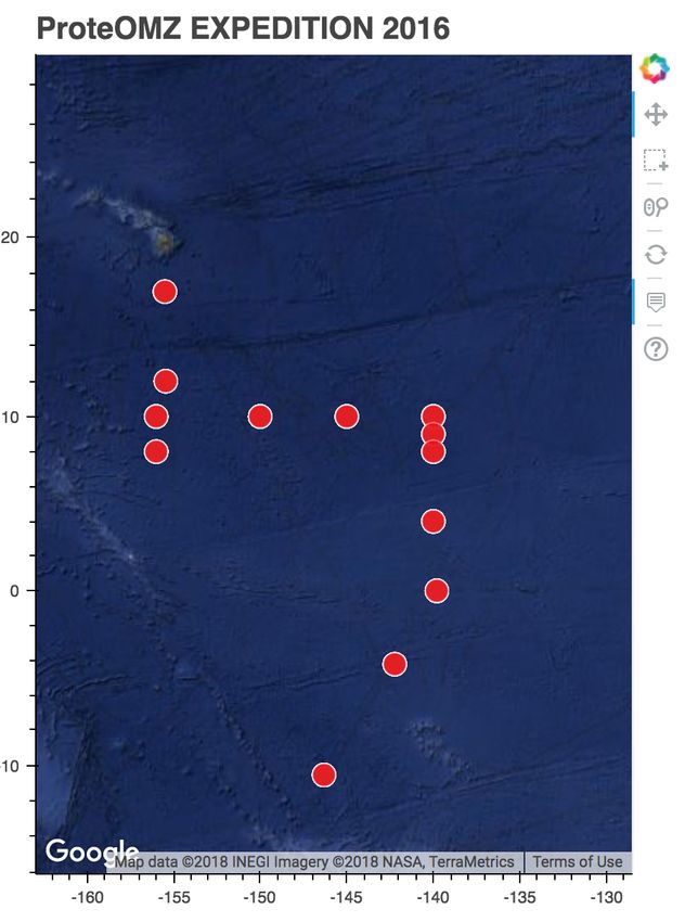
110                                                                                         PROC. OF THE 17th PYTHON IN SCIENCE CONF. (SCIPY 2018)

                                                 Fig. 5: Initial load of the Bokeh application.

                          Fig. 6: Selecting on a single protein and investigating relationship to hydrographic data.

Fig. 7: Filtering on the taxon, we can see that Prochlorococcus proteins are present only in the upper 120m of the water column at this station.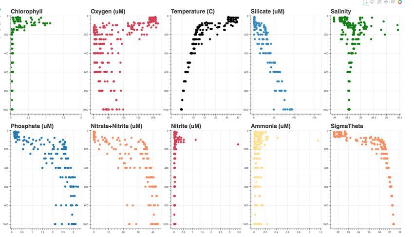
HARNESSING THE POWER OF SCIENTIFIC PYTHON TO INVESTIGATE BIOGEOCHEMISTRY AND METAPROTEOMES OF THE CENTRAL PACIFIC OCEAN                          111

  Fig. 8: Selecting “Other Bacteria,” we can see that the nitrifying bacteria become prevalent around 200m in the oxygen minimum zone.

                                                                           are beautiful “out of the box.” This is an advantage when we share
                                                                           these visualizations not only with other scientific experts, but also
                                                                           with the general public during outreach events.
                                                                               The visualizations we built are already proving to be useful.
                                                                           We discuss above just one high level example in which the appli-
                                                                           cation helps us to explore taxonomic and functional differences
                                                                           between oxic and suboxic water masses. Finer level analyses
                                                                           are sure to uncover even more exciting trends. We are already
                                                                           plugging in new datasets to the application. As mentioned above,
                                                                           many of these visualizations (in addition to some new ones,
                                                                           such as Holoviews Sankey plot) are being incorporated into the
                                                                           upcoming Ocean Protein Portal, which will make them even more
                                                                           accessible to the scientific community.

                                                                           Code
                                                                           Hydrography        Visualization:  https://github.com/maksaito/
                                                                           proteOMZ_hydrography_visualization       Bokeh      Application:
                                                                           https://github.com/maksaito/proteOMZ_visualization_app_public
                                                                           Datashader notebook: https://github.com/naheld/15000lines_
                                                                           datashader

                                                                           Acknowledgements
Fig. 9: Datashaded version of the vertical protein distribution plot,
displaying all 15,000 proteins at Station 5. Each protein abundance is     This work is supported by a National Science Foundation Gradu-
displayed as the difference from its average, so a value of >1 indicates   ate Research Fellowship under grant number 1122274 (N. Held)
a protein that is more abundant. A large number of Prochlorococcus         and a NASA Postdoctoral Program Fellowship (J. Saunders). It is
proteins is present in the upper 120m; this collection of proteins         also supported by the Gordon and Betty Moore Foundation grant
disappears at the base of the euphotic zone. A large number of
proteins is present in approximately the same fold change abundance
                                                                           number 3782 (M. Saito) and National Science Foundation grant
throughout the mesopelagic region.                                         EarthCube 1639714.

                                                                           R EFERENCES
data sharing and discovery interface for marine metaproteomics             [BOKEH]            Bokeh Project. http://bokeh.pydata.org/.
data.                                                                      [DASK]             Dask Project. https://dask.pydata.org/en/latest/.
                                                                           [DATASHADER]       Datashader Project. http://datashader.org/index.html.
     The main benefit of building these visualizations using Sci-          [EGGLESTON2016]    Eggleston, E. M., & Hewson, I. (2016). Abundance
entific Python tools is that scientists who are not primarily                                 of two Pelagibacter ubique bacteriophage genotypes
programmers can easily manipulate and maintain the code. The                                  along a latitudinal transect in the north and south At-
                                                                                              lantic Oceans. Frontiers in Microbiology, 7(SEP), 1–9.
code is relatively straightforward, largely due to the fact that the                          https://doi.org/10.3389/fmicb.2016.01534
Bokeh and in particular Holoviews backends do much of the heavy            [GARCIA2014]       Garcia, H. E., R. A. Locarnini, T. P. Boyer, J. I.
lifting. This makes it easier for colleagues to adapt the code to                             Antonov, O.K. Baranova, M.M. Zweng, J.R. Reagan,
their own datasets. The linked charts in the Bokeh application                                D.R. Johnson, 2014. World Ocean Atlas 2013, Volume
                                                                                              3: Dissolved Oxygen, Apparent Oxygen Utilization,
allow for intuitive (read: more efficient) exploration of the data. In                        and Oxygen Saturation. S. Levitus, Ed., A. Mishonov
addition, charts generated by Bokeh, Datashader and Holoviews                                 Technical Ed.; NOAA Atlas NESDIS 75, 27 pp.
112 PROC. OF THE 17th PYTHON IN SCIENCE CONF. (SCIPY 2018)
[HOLOVIEWS] Holoviews Project. http://holoviews.org/.
[PANDAS] Pandas Project. https://pandas.pydata.org/.
[SAITO2014] Saito, M. A., McIlvin, M. R., Moran, D. M., Goepfert,
T. J., DiTullio, G. R., Post, A. F., & Lamborg, C. H.
(2014). Multiple nutrient stresses at intersecting Pacific
Ocean biomes detected by protein biomarkers. Science
(New York, N.Y.), 345(6201), 1173–7. https://doi.org/
10.1126/science.1256450
[SCAFFOLD] Scaffold, Proteome Software http://www.
proteomesoftware.com/products/scaffold/
[ULLOA2012] Ulloa, O., Canfield, D. E., DeLong, E. F., Letelier, R.
M., & Stewart, F. J. (2012). Microbial oceanography
of anoxic oxygen minimum zones. Proceedings of the
National Academy of Sciences, 109(40), 15996–16003.
https://doi.org/10.1073/pnas.1205009109
[WRIGHT2012] Wright, J. J., Konwar, K. M., & Hallam, S. J. (2012).
Microbial ecology of expanding oxygen minimum
zones. Nature Reviews Microbiology, 10(6), 381–394.
https://doi.org/10.1038/nrmicro2778You can also read