International Migration and World Happiness - Amazon S3
←
→
Page content transcription
If your browser does not render page correctly, please read the page content below
12

Chapter 2                                                                           13

International Migration
and World Happiness
John F. Helliwell, Canadian Institute for Advanced
Research and Vancouver School of Economics,
University of British Columbia
Haifang Huang, Associate Professor, Department of
Economics, University of Alberta
Shun Wang, Associate Professor, KDI School of Public
Policy and Management
Hugh Shiplett, Vancouver School of Economics,
University of British Columbia

The authors are grateful to the Canadian Institute for Advanced Research,
the KDI School, and the Ernesto Illy Foundation for research support, and to
the UK Office for National Statistics and Gallup for data access and assistance.
The authors are also grateful for helpful advice and comments from Claire Bulger,
Jan-Emmanuel De Neve, Neli Esipova, Carol Graham, Jon Hall, Martijn Hendriks,
Richard Layard, Max Norton, Julie Ray, Mariano Rojas, and Meik Wiking.
World Happiness Report 2018

Introduction                                          using these six factors – the scores are instead
                                                      based on individuals’ own assessments of their
This is the sixth World Happiness Report. Its
                                                      subjective well-being. Rather, we use the variables
central purpose remains just what it was in the
                                                      to explain the variation of happiness across
first Report in April 2012, to survey the science
                                                      countries. We shall also show how measures of
of measuring and understanding subjective
                                                      experienced well-being, especially positive
well-being. In addition to presenting updated
                                                      emotions, supplement life circumstances in
rankings and analysis of life evaluations through-
                                                      explaining higher life evaluations.
out the world, each World Happiness Report has
had a variety of topic chapters, often dealing        Then we turn to the main focus, which is migration
with an underlying theme for the report as a          and happiness. The principal results in this
whole. For the World Happiness Report 2018 our        chapter are for the life evaluations of the foreign-
special focus is on migration. Chapter 1 sets         born and domestically born populations of every
global migration in broad context, while in this      country where there is a sufficiently large
chapter we shall concentrate on life evaluations      sample of the foreign-born to provide reasonable
of the foreign-born populations of each country       estimates. So that we may consider a sufficiently
where the available samples are large enough to       large number of countries, we do not use just the
provide reasonable estimates. We will compare         2015-2017 data used for the main happiness
these levels with those of respondents who were       rankings, but instead use all survey available
born in the country where they were surveyed.         since the start of the Gallup World Poll in 2005.
Chapter 3 will then examine the evidence on
specific migration flows, assessing the likely
happiness consequences (as represented both           Life Evaluations Around the World
by life evaluations and measures of positive          We first consider the population-weighted global
and negative affect) for international migrants       and regional distributions of individual life
and those left behind in their birth countries.       evaluations, based on how respondents rate their
Chapter 4 considers internal migration in more        lives. In the rest of this chapter, the Cantril ladder
detail, concentrating on the Chinese experience,      is the primary measure of life evaluations used,
by far the largest example of migration from the      and “happiness” and “subjective well-being” are
countryside to the city. Chapter 5 completes our      used interchangeably. All the global analysis on
migration package with special attention to Latin     the levels or changes of subjective well-being
American migration.                                   refers only to life evaluations, specifically, the
Before presenting our evidence and rankings of        Cantril ladder. But in several of the subsequent
immigrant happiness, we first present, as usual,      chapters, parallel analysis will be done for
the global and regional population-weighted           measures of positive and negative affect, thus
distributions of life evaluations using the average   broadening the range of data used to assess
for surveys conducted in the three years 2015-2017.   the consequences of migration.
This is followed by our rankings of national          The various panels of Figure 2.1 contain bar
average life evaluations, again based on data         charts showing for the world as a whole, and for
from 2015-2017, and then an analysis of changes       each of 10 global regions,1 the distribution of the
in life evaluations, once again for the entire        2015-2017 answers to the Cantril ladder question
resident populations of each country, from            asking respondents to value their lives today on
2008-2010 to 2015-2017.                               a 0 to 10 scale, with the worst possible life as a 0
Our rankings of national average life evaluations     and the best possible life as a 10. It is important
will be accompanied by our latest attempts to         to consider not just average happiness in a
show how six key variables contribute to explaining   community or country, but also how it is
the full sample of national annual average scores     distributed. Most studies of inequality have
over the whole period 2005-2017. These variables      focused on inequality in the distribution of
are GDP per capita, social support, healthy life      income and wealth,2 while in Chapter 2 of World
expectancy, social freedom, generosity, and           Happiness Report 2016 Update we argued that
absence of corruption. Note that we do not            just as income is too limited an indicator for the
construct our happiness measure in each country       overall quality of life, income inequality is too
limited a measure of overall inequality.3 For data, on either positive or negative affect. The
example, inequalities in the distribution of situation changes when we consider social
health care4 and education5 have effects on life variables. Bearing in mind that positive and
satisfaction above and beyond those flowing negative affect are measured on a 0 to 1 scale,
through their effects on income. We showed while life evaluations are on a 0 to 10 scale, social
there, and have verified in fresh estimates for this support can be seen to have similar proportionate
report,6 that the effects of happiness equality are effects on positive and negative emotions as on
often larger and more systematic than those of life evaluations. Freedom and generosity have
income inequality. Figure 2.1 shows that well- even larger influences on positive affect than on
being inequality is least in Western Europe, the ladder. Negative affect is significantly reduced
Northern America and Oceania, and South Asia; by social support, freedom, and absence of
and greatest in Latin America, sub-Saharan corruption. 14
Africa, and the Middle East and North Africa.
In the fourth column we re-estimate the life 15
In Table 2.1 we present our latest modeling of evaluation equation from column 1, adding both
national average life evaluations and measures of positive and negative affect to partially implement
positive and negative affect (emotion) by country the Aristotelian presumption that sustained
and year.7 For ease of comparison, the table has positive emotions are important supports for a
the same basic structure as Table 2.1 in World good life.10 The most striking feature is the extent to
Happiness Report 2017. The major difference which the results buttress a finding in psychology
comes from the inclusion of data for 2017, that the existence of positive emotions matters
thereby increasing by about 150 (or 12%) the much more than the absence of negative ones.11
number of country-year observations. The resulting Positive affect has a large and highly significant
changes to the estimated equation are very impact in the final equation of Table 2.1, while
slight.8 There are four equations in Table 2.1. The negative affect has none.
first equation provides the basis for constructing
As for the coefficients on the other variables in
the sub-bars shown in Figure 2.2.
the final equation, the changes are material only
The results in the first column of Table 2.1 explain on those variables – especially freedom and
national average life evaluations in terms of six key generosity – that have the largest impacts on
variables: GDP per capita, social support, healthy positive affect. Thus we infer that positive
life expectancy, freedom to make life choices, emotions play a strong role in support of life
generosity, and freedom from corruption.9 Taken evaluations, and that most of the impact of
together, these six variables explain almost freedom and generosity on life evaluations is
three-quarters of the variation in national annual mediated by their influence on positive emotions.
average ladder scores among countries, using That is, freedom and generosity have large
data from the years 2005 to 2017. The model’s impacts on positive affect, which in turn has a
predictive power is little changed if the year major impact on life evaluations. The Gallup
fixed effects in the model are removed, falling World Poll does not have a widely available
from 74.2% to 73.5% in terms of the adjusted measure of life purpose to test whether it too
R-squared. would play a strong role in support of high life
evaluations. However, newly available data from
The second and third columns of Table 2.1 use
the large samples of UK data does suggest that
the same six variables to estimate equations
life purpose plays a strongly supportive role,
for national averages of positive and negative
independent of the roles of life circumstances
affect, where both are based on answers about
and positive emotions.
yesterday’s emotional experiences (see Technical
Box 1 for how the affect measures are constructed).
In general, the emotional measures, and especially
negative emotions, are differently, and much less
fully, explained by the six variables than are life
evaluations. Per-capita income and healthy life
expectancy have significant effects on life
evaluations, but not, in these national averageWorld Happiness Report 2018
Figure 2.1: Population-Weighted Distributions of Happiness, 2015–2017
.25
Mean = 5.264
.2 SD = 2.298
.35
.15 Mean = 6.958
.3 SD = 1.905
.25
.1
.2
.15
.05 .1
.05
0 1 2 3 4 5 6 7 8 9 10 0 1 2 3 4 5 6 7 8 9 10
Northern America & ANZ
World
.35 .35 .35
Mean = 6.635 Mean = 6.193 Mean = 5.848
.3 SD = 1.813 .3 SD = 2.448 .3 SD = 2.053
.25 .25 .25
.2 .2 .2
.15 .15 .15
.1 .1 .1
.05 .05 .05
0 1 2 3 4 5 6 7 8 9 10 0 1 2 3 4 5 6 7 8 9 10 0 1 2 3 4 5 6 7 8 9 10
Western Europe Latin America & Caribbean Central and Eastern Europe
.35 .35 Mean = 5.343 .35
Mean = 5.460 SD = 2.106 Mean = 5.280
.3 SD = 2.178 .3 .3 SD = 2.276
.25 .25 .25
.2 .2 .2
.15 .15 .15
.1 .1 .1
.05 .05 .05
0 1 2 3 4 5 6 7 8 9 10 0 1 2 3 4 5 6 7 8 9 10 0 1 2 3 4 5 6 7 8 9 10
Commonwealth of Independent States East Asia Southeast Asia
.35 .35 .35
Mean = 5.003 Mean = 4.425 Mean = 4.355
.3 SD = 2.470 .3 SD = 2.476 .3 SD = 1.934
.25 .25 .25
.2 .2 .2
.15 .15 .15
.1 .1 .1
.05 .05 .05
0 1 2 3 4 5 6 7 8 9 10 0 1 2 3 4 5 6 7 8 9 10 0 1 2 3 4 5 6 7 8 9 10
Middle East & North Africa Sub-Saharan Africa South AsiaTable 2.1: Regressions to Explain Average Happiness Across Countries (Pooled OLS)
Dependent Variable
Independent Variable Cantril Ladder Positive Affect Negative Affect Cantril Ladder
Log GDP per capita 0.311 -.003 0.011 0.316
(0.064)*** (0.009) (0.009) (0.063)***
Social support 2.447 0.26 -.289 1.933
(0.39)*** (0.049)*** (0.051)*** (0.395)***
Healthy life expectancy at birth 0.032 0.0002 0.001 0.031 16
(0.009)*** (0.001) (0.001) (0.009)***
17
Freedom to make life choices 1.189 0.343 -.071 0.451
(0.302)*** (0.038)*** (0.042)* (0.29)
Generosity 0.644 0.145 0.001 0.323
(0.274)** (0.03)*** (0.028) (0.272)
Perceptions of corruption -.542 0.03 0.098 -.626
(0.284)* (0.027) (0.025)*** (0.271)**
Positive affect 2.211
(0.396)***
Negative affect 0.204
(0.442)
Year fixed effects Included Included Included Included
Number of countries 157 157 157 157
Number of obs. 1394 1391 1393 1390
Adjusted R-squared 0.742 0.48 0.251 0.764
Notes: This is a pooled OLS regression for a tattered panel explaining annual national average Cantril ladder responses
from all available surveys from 2005 to 2017. See Technical Box 1 for detailed information about each of the predictors.
Coefficients are reported with robust standard errors clustered by country in parentheses. ***, **, and * indicate
significance at the 1, 5 and 10 percent levels respectively.World Happiness Report 2018
Technical Box 1: Detailed Information About Each of the Predictors in Table 2.1
1. GDP per capita is in terms of Purchasing 3. Social support is the national average
Power Parity (PPP) adjusted to constant of the binary responses (either 0 or 1)
2011 international dollars, taken from to the Gallup World Poll (GWP)
the World Development Indicators question “If you were in trouble, do
(WDI) released by the World Bank in you have relatives or friends you can
September 2017. See Appendix 1 for count on to help you whenever you
more details. GDP data for 2017 are not need them, or not?”
yet available, so we extend the GDP
4. Freedom to make life choices is the
time series from 2016 to 2017 using
national average of binary responses to
country-specific forecasts of real GDP
the GWP question “Are you satisfied or
growth from the OECD Economic
dissatisfied with your freedom to
Outlook No. 102 (Edition November
choose what you do with your life?”
2017) and the World Bank’s Global
Economic Prospects (Last Updated: 5. Generosity is the residual of regressing
06/04/2017), after adjustment for the national average of GWP responses
population growth. The equation uses to the question “Have you donated
the natural log of GDP per capita, as money to a charity in the past month?”
this form fits the data significantly on GDP per capita.
better than GDP per capita.
6. Perceptions of corruption are the average
2. The time series of healthy life expectancy of binary answers to two GWP questions:
at birth are constructed based on data “Is corruption widespread throughout the
from the World Health Organization government or not?” and “Is corruption
(WHO) and WDI. WHO publishes the widespread within businesses or not?”
data on healthy life expectancy for Where data for government corruption
the year 2012. The time series of life are missing, the perception of business
expectancies, with no adjustment for corruption is used as the overall
health, are available in WDI. We adopt corruption-perception measure.
the following strategy to construct the
7. Positive affect is defined as the average
time series of healthy life expectancy
of previous-day affect measures for
at birth: first we generate the ratios
happiness, laughter, and enjoyment for
of healthy life expectancy to life
GWP waves 3-7 (years 2008 to 2012,
expectancy in 2012 for countries
and some in 2013). It is defined as the
with both data. We then apply the
average of laughter and enjoyment for
country-specific ratios to other years
other waves where the happiness
to generate the healthy life expectancy
question was not asked.
data. See Appendix 1 for more details.
8. Negative affect is defined as the average
of previous-day affect measures for worry,
sadness, and anger for all waves. See
Statistical Appendix 1 for more details.Ranking of Happiness by Country is equal to the number of years by which healthy
life expectancy in Tanzania exceeds the world’s
Figure 2.2 (below) shows the average ladder
lowest value, multiplied by the Table 2.1 coefficient
score (the average answer to the Cantril ladder
for the influence of healthy life expectancy on
question, asking people to evaluate the quality of
life evaluations. The width of these different
their current lives on a scale of 0 to 10) for each
sub-bars then shows, country-by-country, how
country, averaged over the years 2015-2017. Not
much each of the six variables is estimated to
every country has surveys in every year; the total
contribute to explaining the international ladder
sample sizes are reported in the statistical
differences. These calculations are illustrative
appendix, and are reflected in Figure 2.2 by the
rather than conclusive, for several reasons. First,
horizontal lines showing the 95% confidence
the selection of candidate variables is restricted
regions. The confidence regions are tighter for 18
by what is available for all these countries.
countries with larger samples. To increase the
Traditional variables like GDP per capita and
number of countries ranked, we also include four 19
healthy life expectancy are widely available. But
that had no 2015-2017 surveys, but did have one
measures of the quality of the social context,
in 2014. This brings the number of countries
which have been shown in experiments and
shown in Figure 2.2 to 156.
national surveys to have strong links to life
The overall length of each country bar represents evaluations and emotions, have not been
the average ladder score, which is also shown in sufficiently surveyed in the Gallup or other
numerals. The rankings in Figure 2.2 depend only global polls, or otherwise measured in statistics
on the average Cantril ladder scores reported by available for all countries. Even with this limited
the respondents. choice, we find that four variables covering
different aspects of the social and institutional
Each of these bars is divided into seven
context – having someone to count on, generosity,
segments, showing our research efforts to find
freedom to make life choices and absence of
possible sources for the ladder levels. The first
corruption – are together responsible for more
six sub-bars show how much each of the six
than half of the average difference between each
key variables is calculated to contribute to that
country’s predicted ladder score and that in
country’s ladder score, relative to that in a
Dystopia in the 2015-2017 period. As shown in
hypothetical country called Dystopia, so named
Table 19 of Statistical Appendix 1, the average
because it has values equal to the world’s lowest
country has a 2015-2017 ladder score that is 3.45
national averages for 2015-2017 for each of the six
points above the Dystopia ladder score of 1.92.
key variables used in Table 2.1. We use Dystopia as
Of the 3.45 points, the largest single part (35%)
a benchmark against which to compare each
comes from social support, followed by GDP per
other country’s performance in terms of each of
capita (26%) and healthy life expectancy (17%),
the six factors. This choice of benchmark permits
and then freedom (13%), generosity (5%), and
every real country to have a non-negative
corruption (3%).13
contribution from each of the six factors. We
calculate, based on the estimates in the first Our limited choice means that the variables we
column of Table 2.1, that Dystopia had a 2015- use may be taking credit properly due to other
2017 ladder score equal to 1.92 on the 0 to 10 better variables, or to other unmeasured factors.
scale. The final sub-bar is the sum of two There are also likely to be vicious or virtuous
components: the calculated average 2015-2017 circles, with two-way linkages among the variables.
life evaluation in Dystopia (=1.92) and each For example, there is much evidence that those
country’s own prediction error, which measures who have happier lives are likely to live longer,
the extent to which life evaluations are higher or be more trusting, be more cooperative, and be
lower than predicted by our equation in the first generally better able to meet life’s demands.14
column of Table 2.1. These residuals are as likely This will feed back to improve health, GDP,
to be negative as positive.12 generosity, corruption, and sense of freedom.
Finally, some of the variables are derived from
It might help to show in more detail how we
the same respondents as the life evaluations and
calculate each factor’s contribution to average
hence possibly determined by common factors.
life evaluations. Taking the example of healthy life
This risk is less using national averages, because
expectancy, the sub-bar in the case of TanzaniaWorld Happiness Report 2018
individual differences in personality and many Although four places may seem a big jump, all
life circumstances tend to average out at the the top five countries last year were within the
national level. same statistical confidence band, as they are
again this year. Norway is now in 2nd place,
To provide more assurance that our results are
followed by Denmark, Iceland and Switzerland in
not seriously biased because we are using the
3rd, 4th and 5th places. The Netherlands, Canada
same respondents to report life evaluations,
and New Zealand are 6th, 7th and 8th, just as
social support, freedom, generosity, and
they were last year, while Australia and Sweden
corruption, we tested the robustness of our
have swapped positions since last year, with
procedure (see Statistical Appendix 1 for more
Sweden now in 9th and Australia in 10th position.
detail) by splitting each country’s respondents
In Figure 2.2, the average ladder score differs
randomly into two groups, and using the average
only by 0.15 between the 1st and 5th position,
values for one group for social support, freedom,
and another 0.21 between 5th and 10th positions.
generosity, and absence of corruption in the
equations to explain average life evaluations in Compared to the top 10 countries in the current
the other half of the sample. The coefficients on ranking, there is a much bigger range of scores
each of the four variables fall, just as we would covered by the bottom 10 countries. Within this
expect. But the changes are reassuringly small group, average scores differ by as much as 0.7
(ranging from 1% to 5%) and are far from being points, more than one-fifth of the average
statistically significant.15 national score in the group. Tanzania, Rwanda
and Botswana have anomalous scores, in the
The seventh and final segment is the sum of
sense that their predicted values based on their
two components. The first component is a fixed
performance on the six key variables, would
number representing our calculation of the
suggest they would rank much higher than
2015-2017 ladder score for Dystopia (=1.92). The
shown by the survey answers.
second component is the 2015-2017 residual for
each country. The sum of these two components Despite the general consistency among the top
comprises the right-hand sub-bar for each countries scores, there have been many significant
country; it varies from one country to the next changes in the rest of the countries. Looking at
because some countries have life evaluations changes over the longer term, many countries
above their predicted values, and others lower. have exhibited substantial changes in average
The residual simply represents that part of scores, and hence in country rankings, between
the national average ladder score that is not 2008-2010 and 2015-2017, as shown later in
explained by our model; with the residual more detail.
included, the sum of all the sub-bars adds up
When looking at average ladder scores, it is also
to the actual average life evaluations on which
important to note the horizontal whisker lines at
the rankings are based.
the right-hand end of the main bar for each
What do the latest data show for the 2015-2017 country. These lines denote the 95% confidence
country rankings? Two features carry over from regions for the estimates, so that countries with
previous editions of the World Happiness Report. overlapping error bars have scores that do not
First, there is a lot of year-to-year consistency in significantly differ from each other. Thus, as already
the way people rate their lives in different countries. noted, the five top-ranked countries (Finland,
Thus there remains a four-point gap between the Norway, Denmark, Iceland, and Switzerland) have
10 top-ranked and the 10 bottom-ranked countries. overlapping confidence regions, and all have
The top 10 countries in Figure 2.2 are the same national average ladder scores either above or
countries that were top-ranked in World Happiness just below 7.5.
Report 2017, although there has been some
Average life evaluations in the top 10 countries
swapping of places, as is to be expected among
are thus more than twice as high as in the bottom
countries so closely grouped in average scores.
10. If we use the first equation of Table 2.1 to look
The top five countries are the same ones that
for possible reasons for these very different life
held the top five positions in World Happiness
evaluations, it suggests that of the 4.10 point
Report 2017, but Finland has vaulted from
difference, 3.22 points can be traced to differences
5th place to the top of the rankings this year.
in the six key factors: 1.06 points from the GDPFigure 2.2: Ranking of Happiness 2015–2017 (Part 1)
1. Finland (7.632)
2. Norway (7.594)
3. Denmark (7.555)
4. Iceland (7.495)
5. Switzerland (7.487)
6. Netherlands (7.441)
7. Canada (7.328)
8. New Zealand (7.324)
9. Sweden (7.314)
20
10. Australia (7.272)
11. Israel (7.190) 21
12. Austria (7.139)
13. Costa Rica (7.072)
14. Ireland (6.977)
15. Germany (6.965)
16. Belgium (6.927)
17. Luxembourg (6.910)
18. United States (6.886)
19. United Kingdom (6.814)
20. United Arab Emirates (6.774)
21. Czech Republic (6.711)
22. Malta (6.627)
23. France (6.489)
24. Mexico (6.488)
25. Chile (6.476)
26. Taiwan Province of China (6.441)
27. Panama (6.430)
28. Brazil (6.419)
29. Argentina (6.388)
30. Guatemala (6.382)
31. Uruguay (6.379)
32. Qatar (6.374)
33. Saudi (Arabia (6.371)
34. Singapore (6.343)
35. Malaysia (6.322)
36. Spain (6.310)
37. Colombia (6.260)
38. Trinidad & Tobago (6.192)
39. Slovakia (6.173)
40. El Salvador (6.167)
41. Nicaragua (6.141)
42. Poland (6.123)
43. Bahrain (6.105)
44. Uzbekistan (6.096)
45. Kuwait (6.083)
46. Thailand (6.072)
47. Italy (6.000)
48. Ecuador (5.973)
49. Belize (5.956)
50. Lithuania (5.952)
51. Slovenia (5.948)
52. Romania (5.945)
0 1 2 3 4 5 6 7 8
Explained by: GDP per capita Explained by: generosity
Explained by: social support Explained by: perceptions of corruption
Explained by: healthy life expectancy Dystopia (1.92) + residual
Explained by: freedom to make life choices 95% confidence intervalWorld Happiness Report 2018
Figure 2.2: Ranking of Happiness 2015–2017 (Part 2)
53. Latvia (5.933)
54. Japan (5.915)
55. Mauritius (5.891)
56. Jamaica (5.890)
57. South Korea (5.875)
58. Northern Cyprus (5.835)
59. Russia (5.810)
60. Kazakhstan (5.790)
61. Cyprus (5.762)
62. Bolivia (5.752)
63. Estonia (5.739)
64. Paraguay (5.681)
65. Peru (5.663)
66. Kosovo (5.662)
67. Moldova (5.640)
68. Turkmenistan (5.636)
69. Hungary (5.620)
70. Libya (5.566)
71. Philippines (5.524)
72. Honduras (5.504)
73. Belarus (5.483)
74. Turkey (5.483)
75. Pakistan (5.472)
76. Hong Kong SAR, China (5.430)
77. Portugal (5.410)
78. Serbia (5.398)
79. Greece (5.358)
80. Tajikistan (5.352)
81. Montenegro (5.347)
82. Croatia (5.321)
83. Dominican Republic (5.302)
84. Algeria (5.295)
85. Morocco (5.254)
86. China (5.246)
87. Azerbaijan (5.201)
88. Lebanon (5.199)
89. Macedonia (5.185)
90. Jordan (5.161)
91. Nigeria (5.155)
92. Kyrgyzstan (5.131)
93. Bosnia and Herzegovina (5.129)
94. Mongolia (5.125)
95. Vietnam (5.103)
96. Indonesia (5.093)
97. Bhutan (5.082)
98. Somalia (4.982)
99. Cameroon (4.975)
100. Bulgaria (4.933)
101. Nepal (4.880)
102. Venezuela (4.806)
103. Gabon (4.758)
104. Palestinian Territories (4.743)
0 1 2 3 4 5 6 7 8
Explained by: GDP per capita Explained by: generosity
Explained by: social support Explained by: perceptions of corruption
Explained by: healthy life expectancy Dystopia (1.92) + residual
Explained by: freedom to make life choices 95% confidence intervalFigure 2.2: Ranking of Happiness 2015–2017 (Part 3)
105. South Africa (4.724)
106. Iran (4.707)
107. Ivory Coast (4.671)
108. Ghana (4.657)
109. Senegal (4.631)
110. Laos (4.623)
111. Tunisia (4.592)
112. Albania (4.586)
113. Sierra Leone (4.571)
22
114. Congo (Brazzaville) (4.559)
115. Bangladesh (4.500) 23
116. Sri Lanka (4.471)
117. Iraq (4.456)
118. Mali (4.447)
119. Namibia (4.441)
120. Cambodia (4.433)
121. Burkina Faso (4.424)
122. Egypt (4.419)
123. Mozambique (4.417)
124. Kenya (4.410)
125. Zambia (4.377)
126. Mauritania (4.356)
127. Ethiopia (4.350)
128. Georgia (4.340)
129. Armenia (4.321)
130. Myanmar (4.308)
131. Chad (4.301)
132. Congo (Kinshasa) (4.245)
133. India (4.190)
134. Niger (4.166)
135. Uganda (4.161)
136. Benin (4.141)
137. Sudan (4.139)
138. Ukraine (4.103)
139. Togo (3.999)
140. Guinea (3.964)
141. Lesotho (3.808)
142. Angola (3.795)
143. Madagascar (3.774)
144. Zimbabwe (3.692)
145. Afghanistan (3.632)
146. Botswana (3.590)
147. Malawi (3.587)
148. Haiti (3.582)
149. Liberia (3.495)
150. Syria (3.462)
151. Rwanda (3.408)
152. Yemen (3.355)
153. Tanzania (3.303)
154. South Sudan (3.254)
155. Central African Republic (3.083)
156. Burundi (2.905)
0 1 2 3 4 5 6 7 8
Explained by: GDP per capita Explained by: generosity
Explained by: social support Explained by: perceptions of corruption
Explained by: healthy life expectancy Dystopia (1.92) + residual
Explained by: freedom to make life choices 95% confidence intervalWorld Happiness Report 2018
per capita gap, 0.90 due to differences in Of the 141 countries with data for 2008-2010 and
social support, 0.61 to differences in healthy 2015-2017, 114 had significant changes. 58 were
life expectancy, 0.37 to differences in freedom, significant increases, ranging from 0.14 to 1.19
0.21 to differences in corruption perceptions, points on the 0 to 10 scale. There were also 59
and 0.07 to differences in generosity. Income significant decreases, ranging from -0.12 to -2.17
differences are the single largest contributing points, while the remaining 24 countries revealed
factor, at one-third of the total, because, of the no significant trend from 2008-2010 to 2015-2017.
six factors, income is by far the most unequally As shown in Table 35 in Statistical Appendix 1,
distributed among countries. GDP per capita the significant gains and losses are very unevenly
is 30 times higher in the top 10 than in the distributed across the world, and sometimes also
bottom 10 countries.16 within continents. For example, in Western
Europe there were 12 significant losses but only
Overall, the model explains quite well the life
three significant gains. In Central and Eastern
evaluation differences within as well as between
Europe, by contrast, these results were reversed,
regions and for the world as a whole.17 On average,
with 13 significant gains against two losses. The
however, the countries of Latin America still have
Commonwealth of Independent States was also
mean life evaluations that are higher (by about
a significant net gainer, with seven gains against
0.3 on the 0 to 10 scale) than predicted by the
two losses. The Middle East and North Africa
model. This difference has been found in earlier
was net negative, with 11 losses against five
work and been attributed to a variety of factors,
gains. In all other world regions, the numbers
including especially some unique features of
of significant gains and losses were much more
family and social life in Latin American countries.
equally divided.
To help explain what is special about social life in
Latin America, and how this affects emotions Among the 20 top gainers, all of which showed
and life evaluations, Chapter 6 by Mariano Rojas average ladder scores increasing by more than
presents a range of new evidence showing how 0.5 points, 10 are in the Commonwealth of
the social structure supports Latin American Independent States or Central and Eastern
happiness beyond what is captured by the vari- Europe, three are in sub-Saharan Africa, and
ables available in the Gallup World Poll. In partial three in Asia. The other four were Malta, Iceland,
contrast, the countries of East Asia have average Nicaragua, and Morocco. Among the 20 largest
life evaluations below those predicted by the losers, all of which showed ladder reductions
model, a finding that has been thought to reflect, exceeding about 0.5 points, seven were in
at least in part, cultural differences in response sub-Saharan Africa, three were in the Middle East
style.18 It is reassuring that our findings about the and North Africa, three in Latin America and the
relative importance of the six factors are generally Caribbean, three in the CIS and Central and
unaffected by whether or not we make explicit Eastern Europe, and two each in Western Europe
allowance for these regional differences.19 and South Asia.
These gains and losses are very large, especially
for the 10 most affected gainers and losers. For
Changes in the Levels of Happiness each of the 10 top gainers, the average life
In this section we consider how life evaluations evaluation gains were more than twice as large
have changed. In previous reports we considered as those that would be expected from a doubling
changes from the beginning of the Gallup World of per capita incomes. For each of the 10 countries
Poll until the three most recent years. In the with the biggest drops in average life evaluations,
report, we use 2008-2010 as a base period, and the losses were more than twice as large as would
changes are measured from then to 2015-2017. be expected from a halving of GDP per capita.
The new base period excludes all observations
On the gaining side of the ledger, the inclusion
prior to the 2007 economic crisis, whose effects
of six transition countries among the top 10
were a key part of the change analysis in earlier
gainers reflects the rising average life evaluations
World Happiness Reports. In Figure 2.3 we show
for the transition countries taken as a group. The
the changes in happiness levels for all 141 countries
appearance of sub-Saharan African countries
that have sufficient numbers of observations for
among the biggest gainers and the biggest
both 2008-2010 and 2015-2017.Figure 2.3: Changes in Happiness from 2008–2010 to 2015–2017 (Part 1)
1. Togo (1.191)
2. Latvia (1.026)
3. Bulgaria (1.021)
4. Sierra Leone (1.006)
5. Serbia (0.978)
6. Macedonia (0.880)
7. Uzbekistan (0.874)
8. Morocco (0.870)
9. Hungary (0.810)
24
10. Romania (0.807)
11. Nicaragua (0.760) 25
12. Congo (Brazzaville) (0.739)
13. Malaysia (0.733)
14. Philippines (0.720)
15. Tajikistan (0.677)
16. Malta (0.667)
17. Azerbaijan (0.663)
18. Lithuania (0.660)
19. Iceland (0.607)
20. China (0.592)
21. Mongolia (0.585)
22. Taiwan Province of China (0.554)
23. Mali (0.496)
24. Burkina Faso (0.482)
25. Benin (0.474)
26. Ivory Coast (0.474)
27. Pakistan (0.470)
28. Czech Republic (0.461)
29. Cameroon (0.445)
30. Estonia (0.445)
31. Russia (0.422)
32. Uruguay (0.374)
33. Germany (0.369)
34. Georgia (0.317)
35. Bosnia and Herzegovina (0.313)
36. Nepal (0.311)
37. Thailand (0.300)
38. Dominican Republic (0.298)
39. Chad (0.296)
40. Bahrain (0.289)
41. Kenya (0.276)
42. Poland (0.275)
43. Sri Lanka (0.265)
44. Nigeria (0.263)
45. Congo (Kinshasa) (0.261)
46. Ecuador (0.255)
47. Peru (0.243)
48. Montenegro (0.221)
49. Turkey (0.208)
50. Palestinian Territories (0.197)
51. Kazakhstan (0.197)
52. Kyrgyzstan (0.196)
-2.5 -2.0 -1.5 -.1.0 -.05 0 0.5 1.0 1.5
Changes from 2008–2010 to 2015–2017 95% confidence intervalWorld Happiness Report 2018
Figure 2.3: Changes in Happiness from 2008–2010 to 2015–2017 (Part 2)
53. Cambodia (0.194)
54. Chile (0.186)
55. Lebanon (0.185)
56. Senegal (0.168)
57. South Korea (0.158)
58. Kosovo (0.136)
59. Slovakia (0.121)
60. Argentina (0.112)
61. Portugal (0.108)
62. Finland (0.100)
63. Moldova (0.091)
64. Ghana (0.066)
65. Hong Kong SAR, China (0.038)
66. Bolivia (0.029)
67. New Zealand (0.021)
68. Paraguay (0.018)
69. Saudi Arabia (0.016)
70. Guatemala (-0.004)
71. Japan (-0.012)
72. Colombia (-0.023)
73. Belarus (-0.034)
74. Niger (-0.036)
75. Switzerland (-0.037)
76. Norway (-0.039)
77. Slovenia (-0.050)
78. Belgium (-0.058)
79. Armenia (-0.078)
80. Australia (-0.079)
81. El Salvador (-0.092)
82. Sweden (-0.112)
83. Austria (-0.123)
84. Netherlands (-0.125)
85. Israel (-0.134)
86. Luxembourg (-0.141)
87. United Kingdom (-0.160)
88. Indonesia (-0.160)
89. Singapore (-0.164)
90. Algeria (-0.169)
91. Costa Rica (-0.175)
92. Qatar (-0.187)
93. Croatia (-0.198)
94. Mauritania (-0.206)
95. France (-0.208)
96. United Arab Emirates (-0.208)
97. Canada (-0.213)
98. Haiti (-0.224)
99. Mozambique (-0.237)
100. Spain (-0.248)
101. Denmark (-0.253)
102. Vietnam (-0.258)
103. Honduras (-0.269)
104. Zimbabwe (-0.278)
-2.5 -2.0 -1.5 -.1.0 -.05 0 0.5 1.0 1.5
Changes from 2008–2010 to 2015–2017 95% confidence intervalFigure 2.3: Changes in Happiness from 2008–2010 to 2015–2017 (Part 3)
105. Uganda (-0.297)
106. Sudan (-0.306)
107. United States (-0.315)
108. South Africa (-0.348)
109. Ireland (-0.363)
110. Tanzania (-0.366)
111. Mexico (-0.376)
112. Iraq (-0.399)
113. Egypt (-0.402)
26
114. Laos (-0.421)
115. Iran (-0.422) 27
116. Brazil (-0.424)
117. Jordan (-0.453)
118. Central African Republic (-0.485)
119. Italy (-0.489)
120. Bangladesh (-0.497)
121. Tunisia (-0.504)
122. Trinidad & Tobago (-0.505)
123. Greece (-0.581)
124. Kuwait (-0.609)
125. Zambia (-0.617)
126. Panama (-0.665)
127. Afghanistan (-0.688)
128. India (-0.698)
129. Liberia (-0.713)
130. Cyprus (-0.773)
131. Burundi (-0.773)
132. Rwanda (-0.788)
133. Albania (-0.791)
134. Madagascar (-0.866)
135. Botswana (-0.911)
136. Turkmenistan (-0.931)
137. Ukraine (-1.030)
138. Yemen (-1.224)
139. Syria (-1.401)
140. Malawi (-1.561)
141. Venezuela (-2.167)
-2.5 -2.0 -1.5 -.1.0 -.05 0 0.5 1.0 1.5
Changes from 2008–2010 to 2015–2017 95% confidence intervalWorld Happiness Report 2018
losers reflects the variety and volatility of larger than predicted. As Figure 18 shows,
experiences among the sub-Saharan countries changes in the six factors are not very successful
for which changes are shown in Figure 2.3, and in capturing the evolving patterns of life over
whose experiences were analyzed in more detail what have been tumultuous times for many
in Chapter 4 of World Happiness Report 2017. countries. Eight of the nine regions were predicted
Togo, the largest gainer since 2008-2010, by to have 2015-2017 life evaluations higher than in
almost 1.2 points, was the lowest ranked country 2008-2010, but only half of them did so. In
in World Happiness Report 2015 and now ranks general, the ranking of regions’ predicted changes
17 places higher. matched the ranking of regions’ actual changes,
despite typical experience being less favorable
The 10 countries with the largest declines in
than predicted. The notable exception is South
average life evaluations typically suffered some
Asia, which experienced the largest drop, contrary
combination of economic, political, and social
to predictions.
stresses. The five largest drops since 2008-2010
were in Ukraine, Yemen, Syria, Malawi and
Venezuela, with drops over 1 point in each case,
the largest fall being almost 2.2 points in
Immigration and Happiness
Venezuela. By moving the base period until well In this section, we measure and compare the
after the onset of the international banking crisis, happiness of immigrants and the locally born
the four most affected European countries, populations of their host countries by dividing
Greece, Italy, Spain and Portugal, no longer the residents of each country into two groups:
appear among the countries with the largest those born in another country (the foreign-born),
drops. Greece just remains in the group of 20 and the rest of the population. The United
countries with the largest declines, Italy and Nations estimates the total numbers of the
Spain are still significantly below their 2008-2010 foreign-born in each country every five years. We
levels, while Portugal shows a small increase. combine these data with annual UN estimates for
total population to derive estimated foreign-born
Figure 18 and Table 34 in the Statistical Appendix
population shares for each country. These
show the population-weighted actual and
provide a valuable benchmark against which to
predicted changes in happiness for the 10 re-
compare data derived from the Gallup World Poll
gions of the world from 2008-2010 to 2015-2017.
responses. We presented in Chapter 1 a map
The correlation between the actual and predicted
showing UN data for all national foreign-born
changes is 0.3, but with actual changes being
populations, measured as a fraction of the total
less favorable than predicted. Only in Central and
population, for the most recent available year, 2015.
Eastern Europe, where life evaluations were up
At the global level, the foreign-born population
by 0.49 points on the 0 to 10 scale, was there an
in 2015 was 244 million, making up 3.3% of world
actual increase that exceeded what was predicted.
population. Over the 25 years between 1990 and
South Asia had the largest drop in actual life
2015, the world’s foreign-born population grew
evaluations (more than half a point on the 0 to
from 153 million to 244 million, an increase of
10 scale) while predicted to have a substantial
some 60%, thereby increasing from 2.9% to 3.3%
increase. Sub-Saharan Africa was predicted to
of the growing world population.
have a substantial gain, while the actual change
was a very small drop. Latin America was The foreign-born share in 2015 is highly variable
predicted to have a small gain, while it shows a among the 160 countries covered by the UN
population-weighted actual drop of 0.3 points. data, ranging from less than 2% in 56 countries
The MENA region was also predicted to be a to over 10% in 44 countries. Averaging across
gainer, and instead lost almost 0.35 points. Given country averages, the mean foreign-born share
the change in the base year, the countries of in 2015 was 8.6%. This is almost two and a half
Western Europe were predicted to have a small times as high as the percentage of total world
gain, but instead experienced a small reduction. population that is foreign-born, reflecting the
For the remaining regions, the predicted and fact that the world’s most populous countries
actual changes were in the same direction, with have much lower shares of the foreign-born.
the substantial reductions in the United States Of the 12 countries with populations exceeding
(the largest country in the NANZ group) being 100 million in 2015, only three had foreign-bornpopulation shares exceeding 1% – Japan at 1.7%, population, without special regard for the
Pakistan at 1.9% and the United States at 15%. For representativeness of the foreign-born
the 10 countries with 2015 populations less than population shares. There are a number of reasons
one million, the foreign-born share averaged 12.6%, why the foreign-born population shares may be
with a wide range of variation, from 2% or less in under-represented in total, since they may be
Guyana and Comoros to 46% in Luxembourg. less likely to have addresses or listed phones that
would bring them into the sampling frame. In
The 11 countries with the highest proportions of
addition, the limited range of language options
international residents, as represented by foreign-
available may discourage participation by potential
born population shares exceeding 30%, have an
foreign-born respondents not able to speak one
average foreign-born share of 50%. The group
of the available languages.20 We report in this
includes geographically small units like the Hong 28
chapter data on the foreign-born respondents
Kong SAR at 39%, Luxembourg at 45.7% and
of every country, while recognizing that the
Singapore at 46%; and eight countries in the 29
samples may not represent each country’s
Middle East, with the highest foreign-born
foreign-born population equally well.21 Since we
population shares being Qatar at 68%, Kuwait
are not able to estimate the size of these possible
at 73% and the UAE at 87%.
differences, we simply report the available data.
How international are the world’s happiest
We can, however, compare the foreign-born
countries? Looking at the 10 happiest countries
shares in the Gallup World Poll samples with
in Figure 2.2, they have foreign-born population
those in the corresponding UN population data
shares averaging 17.2%, about twice that for the
to get some impression of how serious a problem
world as a whole. For the top five countries, four
we might be facing. Averaging across countries,
of which have held the first-place position within
the UN data show the average national foreign-
the past five years, the average 2015 share of the
born share to be 8.6%, as we reported earlier.
foreign-born in the resident population is 14.3%,
This can be compared with what we get from
well above the world average. For the countries
looking at the entire 2005-2017 Gallup sample,
in 6th to 10th positions in the 2015-2017 rankings
which typically includes 1,000 respondents per
of life evaluations, the average foreign-born
year in each country. As shown in Statistical
share is 20%, the highest being Australia at 28%.
Appendix 2, the Gallup sample has 93,000
For our estimates of the happiness of the foreign- foreign-born respondents, compared to
born populations of each country, we use data 1,540,000 domestic-born respondents. The
on the foreign-born respondents from the Gallup foreign-born respondents thus make up 5.7%
World Poll for the longest available period, from of the total sample,22 or two-thirds the level of
2005 to 2017. In Statistical Appendix 2 we the UN estimate for 2015. This represents, as
present our data in three different ways: for the expected, some under-representation of the
162 countries with any foreign-born respondents, foreign-born in the total sample, with possible
for the 117 countries where there are more than implications for what can safely be said about
100 foreign-born respondents, and for 87 countries the foreign-born. However, we are generally
where there are more than 200 foreign-born confident in the representativeness of the Gallup
respondents. For our main presentation in Figure estimates of the number for foreign-born in
2.4 we use the sample with 117 countries, since it each country, for two reasons. First, the average
gives the largest number of countries while still proportions become closer when it is recognized
maintaining a reasonable sample size. We ask that the Gallup surveys do not include refugee
readers, when considering the rankings, to pay camps, which make up about 3% of the UN
attention to the size of the 95% confidence estimate of the foreign-born. Second, and more
regions for each country (shown as a horizontal importantly for our analysis, the cross-country
line at the right-hand end of the bar), since these variation in the foreign-born population shares
are a direct reflection of the sample sizes in matches very closely with the corresponding
each country, and show where caution is needed intercountry variation in the UN estimates of
in interpreting the rankings. As discussed in foreign-born population shares.23
more detail in Chapter 3, the Gallup World Poll
Figure 2.4 ranks countries by the average ladder
samples are designed to reflect the total resident
score of their foreign-born respondents in all ofWorld Happiness Report 2018
the Gallup World Polls between 2005 and 2017. life evaluations for the two population groups,
For purposes of comparison, the figure also with life evaluations of the foreign-born on the
shows for each country the corresponding vertical axis, and life evaluations for the locally
average life evaluations for domestically born born on the horizontal axis.
respondents.24 Error bars are shown for the
If the foreign-born and locally born have the
averages of the foreign-born, but not for the
same average life evaluations, then the points
domestically born respondents, since their
will tend to fall along the 45-degree lines marked
sample sizes from the pooled 2005-2017 surveys
in each panel of the figure. The scatter plots,
are so large that they make the estimates of the
especially those for sample sizes>100, show a
average very precise.
tight positive linkage, and also suggest that
The most striking feature of Figure 2.4 is how immigrant life evaluations deviate from those of
closely life evaluations for the foreign-born the native-born in a systematic way. This is
match those for respondents born in the country shown by the fact that immigrants are more
where the migrants are now living. For the 117 likely to have life evaluations that are higher than
countries with more than 100 foreign-born the locally born in countries where life evaluations
respondents, the cross-country correlation of the locally born are low, and vice versa. This
between average life evaluations of the foreign- suggests, as does other evidence reviewed in
born and domestically-born respondents is very Chapter 3, that the life evaluations of immigrants
high, 0.96. Another way of describing this point depend to some extent on their former lives in
is that the rankings of countries according to the their countries of birth. Such a ‘footprint’ effect
life evaluations of their immigrants is very similar would be expected to give rise to the slope
to the ranking of Figure 2.2 for the entire resident between foreign-born life evaluations and
populations of each country 2015-2017, despite those of the locally born being flatter than the
the differences in the numbers of countries and 45-degree line. If the distribution of migrants is
survey years. similar across countries, recipient countries with
higher ladder scores have more feeder countries
Of the top 10 countries for immigrant happiness,
with ladder scores below their own, and hence
as shown by Figure 2.4, nine are also top-10
a larger gap between source and destination
countries for total population life evaluations for
happiness scores. In addition, as discussed in
2015-2017, as shown in Figure 2.2. The only
Chapter 3, immigrants who have the chance to
exception is Mexico, which comes in just above
choose where they go usually intend to move to
the Netherlands to take the 10th spot. However,
a country where life evaluations are high. As a
the small size of the foreign-born sample for
consequence, foreign-born population shares are
Mexico makes it a very uncertain call. Finland is
systematically higher in countries with higher
in the top spot for immigrant happiness 2005-
average life evaluations. For example, a country
2017, just as it is also the overall happiness leader
with average life evaluations one point higher on
for 2015-2017. Of the top five countries for overall
the 0 to 10 scale has 5% more of its population
life evaluations, four are also in the top five for
made up of the foreign-born.25 The combination
happiness of the foreign-born. Switzerland,
of footprint effects and migrants tending to
which is currently in 5th position in the overall
move to happier countries is no doubt part of
population ranking, is in 9th position in the
the reason why the foreign-born in happier
immigrant happiness rankings, following several
countries are slightly less happy than the locally
high-immigration non-European countries – New
born populations.
Zealand, Australia and Canada – and Sweden. This
is because, as shown in Figure 2.4, Switzerland But there may also be other reasons for immi-
and the Netherlands have the largest top-10 grant happiness to be lower, including the costs
shortfall of immigrant life evaluations relative to of migration considered in more detail in Chapter
those of locally born respondents. 3. There is not a large gap to explain, as for those
117 countries with more than 100 foreign-born
Looking across the whole spectrum of countries,
respondents, the average life evaluations of a
what is the general relation between the life
country’s foreign-born population are 99.5% as
evaluations for foreign-born and locally born
large as those of the locally-born population in
respondents? Figure 2.5 shows scatter plots of
the same country. But this overall equality coversFigure 2.4: Happiness Ranking for the Foreign-Born, 2005–2017, sample>100
(Part 1)
1. Finland (7.662)
2. Denmark (7.547)
3. Norway (7.435)
4. Iceland (7.427)
5. New Zealand (7.286)
6. Australia (7.249)
7. Canada (7.219)
30
8. Sweden (7.184)
9. Switzerland (7.177)
31
10. Mexico (7.031)
11. Netherlands (6.945)
12. Israel (6.921)
13. Ireland (6.916)
14. Austria (6.903)
15. United States (6.878)
16. Oman (6.829)
17. Luxembourg (6.802)
18. Costa Rica (6.726)
19. United Arab Emirates (6.685)
20. United Kingdom (6.677)
21. Singapore (6.607)
22. Belgium (6.601)
23. Malta (6.506)
24. Chile (6.495)
25. Japan (6.457)
26. Qatar (6.395)
27. Uruguay (6.374)
28. Germany (6.366)
29. France (6.352)
30. Cyprus (6.337)
31. Panama (6.336)
32. Ecuador (6.294)
33. Bahrain (6.240)
34. Kuwait (6.207)
35. Saudi Arabia (6.155)
36. Spain (6.107)
37. Venezuela (6.086)
38. Taiwan Province of China (6.012)
39. Italy (5.960)
40. Paraguay (5.899)
41. Czech Republic (5.880)
42. Argentina (5.843)
43. Belize (5.804)
44. Slovakia (5.747)
45. Kosovo (5.726)
46. Belarus (5.715)
47. Slovenia (5.703)
48. Portugal (5.688)
49. Poland (5.649)
50. Uzbekistan (5.600)
51. Russia (5.548)
0 1 2 3 4 5 6 7 8
Average happiness of foreign born 95% confidence interval
Average happiness of domestic bornWorld Happiness Report 2018
Figure 2.4: Happiness Ranking for the Foreign-Born, 2005–2017, sample>100
(Part 2)
52. Turkmenistan (5.547)
53. Turkey (5.488)
54. Malaysia (5.460)
55. Northern Cyprus (5.443)
56. Croatia (5.368)
57. Bosnia and Herzegovina (5.361)
58. Jordan (5.345)
59. Kazakhstan (5.342)
60. Zambia (5.286)
61. Greece (5.284)
62. Egypt (5.277)
63. Hungary (5.272)
64. Dominican Republic (5.239)
65. Libya (5.187)
66. Moldova (5.187)
67. Montenegro (5.181)
68. Cameroon (5.128)
69. Lebanon (5.116)
70. Nigeria (5.090)
71. Lithuania (5.036)
72. Serbia (5.036)
73. Iraq (5.003)
74. Estonia (4.998)
75. Pakistan (4.990)
76. Macedonia (4.970)
77. Hong Kong SAR, China (4.963)
78. Tajikistan (4.955)
79. Somaliland region (4.900)
80. South Africa (4.784)
81. Kyrgyzstan (4.750)
82. Nepal (4.740)
83. Azerbaijan (4.735)
84. Mauritania (4.733)
85. Latvia (4.728)
86. Palestinian Territories (4.689)
87. Congo (Kinshasa) (4.636)
88. Yemen (4.584)
89. Sierra Leone (4.583)
90. Gabon (4.581)
91. India (4.549)
92. Ukraine (4.546)
93. Senegal (4.514)
94. Botswana (4.496)
95. Liberia (4.479)
96. Mali (4.477)
97. Congo (Brazzaville) (4.427)
98. Zimbabwe (4.413)
99. Chad (4.339)
100. Malawi (4.338)
101. Sudan (4.325)
102. Uganda (4.191)
0 1 2 3 4 5 6 7 8
Average happiness of foreign born 95% confidence interval
Average happiness of domestic bornFigure 2.4: Happiness Ranking for the Foreign-Born, 2005–2017, sample>100
(Part 3)
103. Kenya (4.167)
104. Burkina Faso (4.146)
105. Djibouti (4.139)
106. Armenia (4.101)
107. Afghanistan (4.068)
108. Niger (4.057)
109. Benin (4.015)
32
110. Georgia (3.988)
111. Guinea (3.954)
33
112. South Sudan (3.925)
113. Comoros (3.911)
114. Ivory Coast (3.908)
115. Rwanda (3.899)
116. Togo (3.570)
117. Syria (3.516)
0 1 2 3 4 5 6 7 8
Average happiness of foreign born 95% confidence interval
Average happiness of domestic born
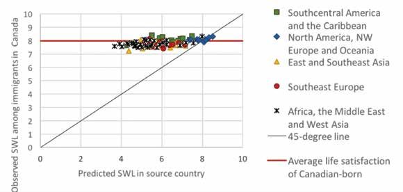
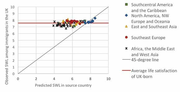
Figure 2.5: Life Evaluations, Foreign-born vs Locally Born, with Alternative
Foreign-born Sample Sizes
Foreign born sample size > 0 Foreign born sample size > 100 Foreign born sample size > 200World Happiness Report 2018
quite a range of experience. Among these 117 countries, the foreign-born are happier than the
countries, there are 64 countries where immigrant locally born.
happiness is lower, averaging 94.5% of that of
Another way of looking for sources of possible
the locally born; 48 countries where it is higher,
life evaluation differences between foreign-born
averaging 106% of the life evaluations of the
and locally born respondents is to see how
locally born; and five countries where the two
immigrants fare in different aspects of their lives.
are essentially equal, with percentage differences
All four of the social factors used in Table 2.1
below 1%.26
show similar average values and cross-country
The life evaluations of immigrants and of the patterns for the two population groups, although
native-born are likely to depend on the extent these patterns differ in interesting ways. The
to which residents in each country are ready to correlation is lowest, although still very high
happily accept foreign migrants. To test this (at 0.91), for social support. It also has a lower
possibility, we make use of a Migrant Acceptance average value for the foreign-born, 79% of whom
Index (MAI) developed by Gallup researchers27 feel they have someone to count on in times of
and described in the Annex to this Report.28 Our trouble, compared to 82% for the locally born
first test was to add the values of the MAI to the respondents. This possibly illustrates a conse-
first equation in Table 2.1. We found a positive quence of the uprooting effect of international
coefficient of 0.068, suggesting that immigrants, migration, as discussed in Chapter 3. The slope
local residents, or both, are happier in countries of the relation is also slightly less than 45%,
where migrants are more welcome. An increase showing that the immigrant vs locally born gap
of 2 points (about one standard deviation) on for perceived social support is greatest for those
the 9-point scale of migrant acceptance was living in countries with high average values for
associated with average life evaluations higher social support. Nonetheless, there is still a very
by 0.14 points on the 0 to 10 scale for life strong positive relation, so that immigrants
evaluations. Is this gain among the immigrants living in a country where the locally born have
or the locally-born? We shall show later, when internationally high values of social support feel
we set up and test our main model for immigrant the same way themselves, even if in a slightly
happiness, that migrant acceptance makes both muted way. When it comes to evaluations of the
immigrants and locally born happier, with the per institutional quality of their new countries,
capita effects being one-third larger for immigrants. immigrants rank these institutions very much as
But the fact that the foreign-born populations do the locally-born, so that the cross-country
are typically less than 15%, most of the total correlations of evaluations by the two groups are
happiness gains from migrant acceptance are very high, at 0.93 for freedom to make life
due to the locally born population, even if the choices, and 0.97 for perceptions of corruption.
per-person effects are larger for the migrants. There are on average no footprint effects for
perceptions of corruption, as immigrants see less
Footprint effects, coupled with the fact that
evidence of corruption around them in their new
happier countries are the major immigration
countries than do locally born, despite having
destinations, help to explain why immigrants
come, on average, from birth countries with
in happier countries are less happy than the
more corruption than where they are now living.
local population, while the reverse is true for
Generosity and freedom to make life choices are
immigrants in less happy countries. Thus for
essentially equal for immigrants and the locally
those 64 countries where immigrants have lower
born, although slightly higher for the immigrants.
life evaluations than the locally born, the average
life evaluation is 6.00, compared to 5.01 for the To a striking extent, the life evaluations of the
48 countries where immigrants are happier than foreign-born are similar to those of the locally
the locally born. When the OECD studied the life born, as are the values of several of the key
evaluations of immigrants in OECD countries, social supports for better lives. But is the
they found that immigrants were less happy happiness of immigrants and the locally born
than the locally born in three-quarters of their affected to the same extent by these variables?
member countries.29 That reflects the fact that To assess this possibility, we divided the entire
most of the happiest countries are also OECD accumulated individual Gallup World Poll
countries. In just over half of the non-OECD respondents 2005-2017, typically involving 1,000You can also read