Orlando Melbourne International Airport - Florida Aviation Database
←
→
Page content transcription
If your browser does not render page correctly, please read the page content below

2015
                 Airport Profile                                              BY THE NUMBERS

Orlando Melbourne
International                                                                           228,042
                                                                                   Enplanements

Airport                                                                                 220,346
Orlando Melbourne International Airport (MLB) is located in Brevard                    Passengers
County, Florida about 1.5 miles northwest of downtown Melbourne,
Florida. This airport is home to the Florida Institute of Technology flight
school as well as many commercial service travelers.
                                                                                        $195.03
                                                                                    Average Fare
Melbourne is home to the Florida Institute of Technology (FIT) as well
as Eastern Florida State College. FIT is known for its aviation program
and flight line at MLB. The beaches around Melbourne are well known
                                                                                                 2
for their surfing and fishing. Melbourne’s close proximity to Cocoa
Beach and Orlando make it a great destination for travelers seeking a            U.S. Cities Served
variety of Florida culture.
MLB continued to remain consistent with its growing trend in annual
enplanements in 2015 at 228,042. MLB’s annual passenger also
increased over 5,000 passengers to 220,346 in 2015. MLB also
continued to serve two domestic destinations, as it has since 2007.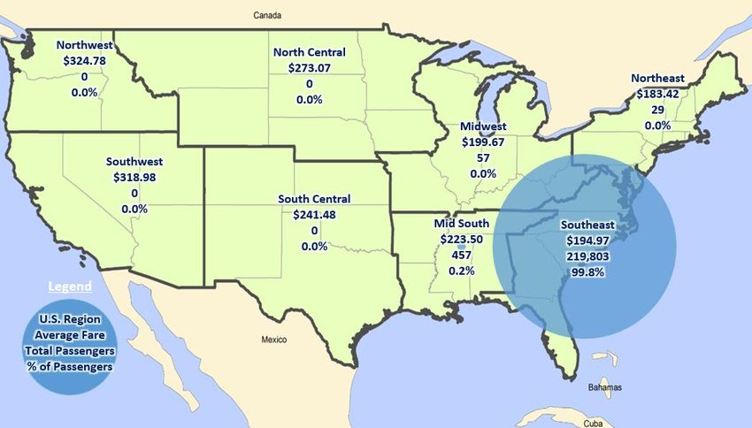
Data Explanation
For this report, three key data sources were used: Passenger Origin-Destination Survey from the U.S.
Department of Transportation, the Official Airline Guide (OAG) and Airline Reporting Corporation (ARC).
In this profile, data are combined and compared in order to identify general trends about the airport, as
well as offer certain analysis on the findings. A description of these data sources is presented below.
Throughout the text, the data sources will be further explained, but this section provides a general
overview of the data used in the development of this Airport Air Service Profile.

Air Passenger Origin and Destination (O&D) Survey
DB1B Coupon: The Airline Origin and Destination Survey (DB1B) is a 10 percent sample of airline tickets
from reporting carriers collected by the Office of Airline Information of the Bureau of Transportation
Statistics. Data from this source provides coupon-specific information for each domestic itinerary of the
Origin and Destination Survey.
T-100 Domestic Market: This data source contains domestic market data reported by both U.S. and
foreign air carriers, including carrier, origin, destination, and service class for enplaned passengers,
freight and mail when both origin and destination airports are located within the boundaries of the United
States and its territories.

Official Airline Guide (OAG)
OAG data were summarized as weekly averages for the reported year. All OAG data are for direct flights
and represents statistically significant samples of data.

Airline Reporting Corporation (ARC)
The data provided by this source represent a statistically significant and representative sample of airline
tickets purchased with a consumer form of payment through an ARC-accredited agency, including major
online travel agencies (OTAs), such as Expedia, Orbitz, and Travelocity.
The data represent a 10 percent sample, an industry standard sample size, of passengers from
participating agencies. Passenger volumes represented by the data can vary significantly by individual
markets, depending on several factors including, but not limited to, the following: 1) the overall
composition of air travelers (leisure vs. business); 2) the presence of carriers whose distribution is more
heavily weighted toward the direct vs. agency channel (e.g. low cost carriers); and 3) the presence of
carriers with limited participation in the ARC settlement system (e.g. Southwest Airlines).
The data used represent passengers and zip codes from where in Florida tickets were purchased. The
data include purchases from Florida zip codes only. Because the data in this document represent
consumer purchases of airline tickets, there is a natural bias toward leisure and unmanaged business
travel behavior and may not account for all business travel. There also may be limitations due to
misrepresentation of the passenger information in instances where a person from one zip code
purchased a ticket for another person in a different zip code.
Airline Reporting Corporation (ARC) did not assist in the preparation of this analysis, all analyses
disclosed herein were performed by Kimley-Horn and Associates, INC., the consultant to the Florida
Department of Transportation, Central Aviation Office.

1
Orlando Melbourne International Airport Air Service Summary
Introduction
Melbourne International Airport (MLB) began commercial service in 1952 when Eastern Airlines began
service there. The airport, which was originally established as a landing strip in an agricultural area, now
has three runways, measuring 3,001 feet, 6,000 feet, and 10,181 feet. With these facilities, MLB was able
to enplane 228,042 passengers in 2015 (Figure 1).

MLB is located in the East Central Continuing Florida Aviation System Planning Process (CFASPP)
region as well as FDOT District five. Also, included in this region and district are Daytona Beach
International Airport (DAB), Orlando International Airport (MCO), Orlando-Sanford International Airport
(SFB). This airport profile will illustrate statistical data about MLB including: annual enplanements, local
population, as well as many other metrics using baseline conditions reported from 2014 and 2015 data.
The following statistical information will provide a description of the most recent overall performance of
MLB and how that compares to previous years’ performance.

More information about MLB can be found at: http://www.mlbair.com/

Enplanements
                                            Figure 1. Annual Enplanements1

1
    Annual airport passenger traffic reports, provided by FDOT

2
Passengers and Fares
MLB had an increase in annual passengers between 2013 and 2015. In 2015 MLB had 220,346 annual
passengers, this is roughly a 6,000 passenger increase from the passenger count in 2014. Although MLB
had an increase in annual passengers, the airport’s average fare also increased in 2015 to $195.03. This
is nearly as $15 increase from 2014, although still below the high point of $233.61 in 2007. Figure 2
displays the annual passengers and annual average fare at MLB.

                     Figure 2. Annual Domestic Passengers and Average Fares 2

Destination Airports
MLB served two destinations in the U.S. in 2015. These two destinations included:
    ·    Hartsfield-Jackson Atlanta International Airport (ATL)
    ·    Charlotte Douglas International Airport (CLT)
Of flights departing from MLB, the destination receiving the most weekly flights was ATL. ATL is known as
being one of the busiest airports in the world as well as being a primary hub for Delta Air Lines.
Additionally, CLT is known for being a major hub of American Airlines as well as a gateway for
connections to destinations all over the United States. Figure 3 displays MLB’s nonstop domestic
destinations.

2
 U.S. Department of Transportation (U.S. DOT) Bureau of Transportation Statistics (BTS) O&D Survey & T-100 Domestic Market
All Carriers

3
Domestic Routes
Figure 4 displays MLB’s top domestic routes. For purposes of this study, a route is the complete path
taken by passengers from the starting airport (in this case MLB) to their final destination. The routes from
MLB shown below had the most frequent passengers traveling on them in 2015. Two of the routes were
direct flights. The final destinations of the routes include:

    ·   Hartsfield-Jackson Atlanta International Airport (ATL)
    ·   Charlotte Douglas International Airport (CLT)
    ·   Pittsburgh International Airport (PIT)
    ·   Ronald Reagan Washington National Airport (DCA)
    ·   Baltimore-Washington International Airport (BWI)
    ·   Philadelphia International Airport (PHL)
    ·   Newark Liberty International Airport (EWR)
    ·   Bradley International Airport (BDL)
    ·   Boston Logan International Airport (BOS)
This analysis represents the intention of travel of the majority of passengers flying out of MLB. It should
be noted that the majority of these airports are in the Northeast region of the U.S. Therefore, the
appropriate conclusion is that the majority of passengers who travel from MLB are ultimately bound for
the Northeast region of the U.S. Data for the routing analysis were obtained from Airline Reporting
Corporation (ARC).

4
Figure 3. MLB’s Nonstop Domestic Destinations 3

3
    The Official Airline Guide (OAG)

5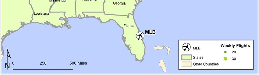
Figure 4. Top Domestic Routes 4

4
    Airline Reporting Corporation (ARC)

6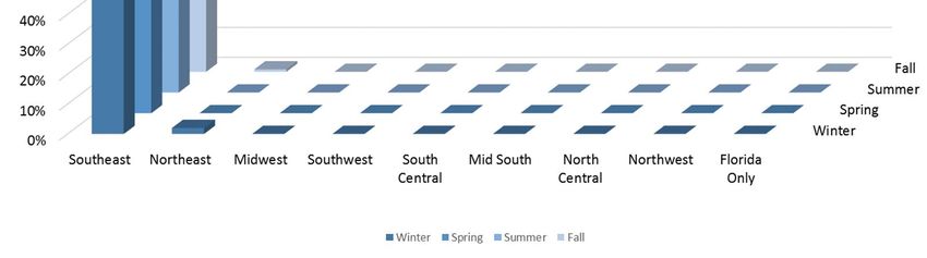
Domestic Regional Analysis
Figure 5 displays the average fare, number of passengers, and percentage of total passengers departing
MLB and bound for each of the eight regions of the United States. The data shows the 99.8 percent of
passengers departing MLB were bound for destinations in the Southeast region. The Southeast region
contains Hartsfield-Jackson Atlanta International Airport (ATL) as well as Charlotte Douglas International
Airport (CLT) which received the majority of MLB’s flights in 2015.

                                       Figure 5. Domestic Passengers and Fares 5

International Flight Departures
MLB does not currently offer international commercial service.

Aircraft Type
Of the two destinations served by MLB, both were served by regional jet aircraft, and one was served by
a large jet aircraft. The use of jet aircraft, especially large/wide-body, has a direct impact on the average
seats per flight at an airport. Generally, larger jet aircraft substantially increase the average seats per
flights. Figure 6 displays the aircraft types that served the two destinations from MLB as well as the
average seats per flight on each aircraft type.

                             Figure 6. Aircraft Types and Average Seats per Flight 6

5
    The Official Airline Guide (OAG)
6
    The Official Airline Guide (OAG)

7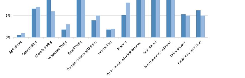
Seasonal Flight Comparison
The data show in Figure 7 further supports the identification of MLB’s destinations in the Southeast
region. The primary service to the Southeast region remains consistent across all four seasons at MLB.
Additionally, this figure confirms that MLB does not offer intrastate service to other Florida airports in any
season. As previously mentioned, the Southeast region contains both ATL and CLT, the two primary
airports MLB served in 2015. The previous routing analysis showed that after MLB travelers connected
through ATL and CLT, the majority continued to final destinations located in the Northeast region.

                                     Figure 7. Season by Region Analysis7

Average Load Factors
Average load factors represent the number of passenger miles traveled as a proportion of available seat
miles. Higher average load factor represents more
                                                           Table 1. Average Load Factor Analysis 8
total passenger boardings. The average load factor
                                                        Year         Domestic       International       Total
at MLB was 85.01, slightly higher than the U.S.
average, 82.68, for 2015. A summary of 2014 and                       Melbourne International
2015 average load factors is shown in Table 1.          2014           84.96             n/a            84.96
                                                                     2015    85.09           27.70               85.01
                                                                                All U.S. Airports
On-Flight Market Freight Statistics                                  2014    84.49           81.03               82.69
Freight statistics represent the total number of              2015           84.98           80.61               82.68
pounds of freight, property other than mail and
passenger baggage, transported by air from a given airport. Melbourne Beach International shipped
194,820 pounds of freight in 2015, roughly 20,000 pounds more
                                                                         Table 2. MLB Freight9
than 2014. A summary of 2014 and 2015 on-flight market freight
statistics is shown in Table 2. Freight statistics were derived from  Year      Freight (in pounds)
the Bureau of Transportation Statistics (BTS) T-100 segment data      2014            174,650
for the years 2014 and 2015.                                          2015            194,820

7
  The Official Airline Guide (OAG)
8
  The Bureau of Transportation Statistics (BTS) T-100 Table Data
9
  The Bureau of Transportation Statistics (BTS) T-100 Segment Data

8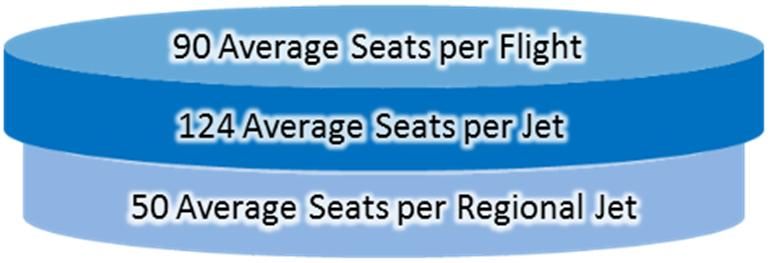
Market Leakage Study
Introduction
Florida has the highest number of large hub airports (4) of any state in the U.S. Florida also has many
commercial service airports (20), which compete over the same potential passengers. There are many
factors that play into the decision-making of passengers, ranging from cost to airport proximity to how
direct a flight is. Because of these factors, many smaller commercial airports in Florida experience market
leakage, or a loss of passengers who choose to drive further distances to airports for various reasons,
such as less expensive flights or more convenient flight options. For large airports located in large
metropolitan areas leakage may be a less significant factor because they still carry large numbers of
passengers. Conversely for smaller airports the loss of passengers to larger airports may potentially be
more significant. This analysis looks at tickets purchased in Florida zip codes to see which Florida airports
may lose business due to market leakage. The market leakage study analyzes zip codes from where a
ticket was purchased and subsequently which airport was departed from for that purchase. To better
understand the market leakage findings, key demographic data are presented as part of the market
leakage study.

Metropolitan Statistical Area (MSA)
According to the U.S. Census, an MSA is “a geographic entity based on the concept of a core area with a
large population nucleus, plus adjacent communities having a higher degree of economic and social
integration with that core.” Per this definition, looking at populations, employment, and other important
factors at the level of an MSA, should prove beneficial in better understanding the area. JAX is the only
commercial service airport in the Jacksonville MSA.

Drive Time and Population Analysis
Figure 8 displays the area around MLB that can
                                                                      Table 3. Population Within 90 Minutes 11
access the airport with a 90-minute or less                                   Population Trends
    Figure 8. 90 Minute Drive Time          Area10               2010 Total Population                  2,792,699
                                                                 2016 Total Population                  3,025,941
                                                                 2021 Total Population                  3,256,176
                                                                 2040 Total Population                  4,302,571
                                                                 2016-2021 Annual Rate of Change           1.48%
                                                                 2016-2040 Percent Change                    42%

                                                            drive time. Further, Table 3 displays the population of
                                                            that area in 2010 and 2016 as well as a projected
                                                            population of the area for 2021 and 2040. The
                                                            projected annual
                                                            rate of change, or growth rate, between 2016 and
                                                            2021 of the population in that area is 1.48 percent.
                                                            With this growth rate, this area is expected to have a
                                                            42 percent growth in population by the year 2040.
                                                            Therefore, by the year 2040, it is anticipated that
                                                            4,302,571 people will have a 90 minute or less drive
                                                            time from their homes to MLB.

10
     U.S. Census Bureau, Census 2010 Summary – ESRI Housing Profile
11
     U.S. Census Bureau, Census 2010 Summary – ESRI Housing Profile

9
Income Levels
The income distribution in the Palm Bay-Melbourne-Titusville MSA relatively follows normal trends when
compared to other MSA’s in the state. The income in an area may impact the demand for air travel in an
area. In an area that has a relatively high number of upper income households, more people may be
willing to pay more in order to travel a shorter distance to the airport. In lower income areas, people may
be likely to drive a greater distance for air travel in order to capture reduced fares. Many other factors
affect airports other than income, and in an area that has multiple large hub commercial airports within a
relatively close proximity, there may be a multitude of reasons that a household may choose to use a
given airport. A summary of income data for the MSA are in Figure 9. Income data for the MSA and State
was derived from the US Census American Fact Finder.
Figure 9. MSA and Florida Income Comparison 12
20%
18%
16%
14% Palm Bay-
12% Melbourne-
Titusville, FL
10% Metro Area
8% Florida
6%
4%
2%
0%
Less than $10,000 $15,000 $25,000 $35,000 $50,000 $75,000 $100,000 $150,000 $200,000
$10,000 to to to to to to to to or more
$14,999 $24,999 $34,999 $49,999 $74,999 $99,999 $149,999 $199,999
Employment
The primary types of employment located in an area may have an effect on air travel. For areas that have
a large number of companies that participate in professional and financial services, demand for local air
travel will likely increase because they are less concerned about the cost of flights and more concerned
about ease of access to the airport. In most cases, differences will exist between the county and the state
averages, but these discrepancies are generally not large enough to impact commercial air service
demand. The Palm Bay-Melbourne-Titusville MSA has a relatively parallel relationship with Florida’s
employment by industry percentages. A summary of employment by industry can be seen in Figure 10.
As shown, the MSA has a high employment percentage in the entertainment and food industry as well as
the finance industry compared to the rest of the state. The higher percentage in finance could result in
increased demand for local air travel and increase MLB’s annual passenger count.
12
U.S. Census American Fact Finder
10Figure 10. Employment by Industry13
Leakage
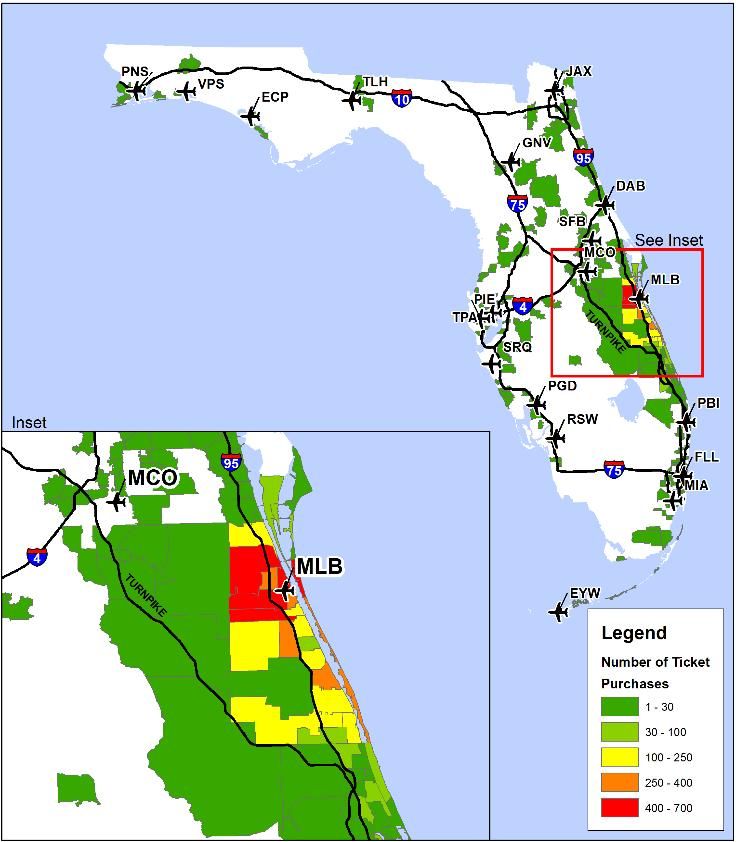
Figure 11 displays the zip codes in Florida where tickets
Figure 11. In-State Ticket Purchases14
for flights departing from MLB were purchased.
This graphic shows the purchases of tickets
primarily in the area surrounding MLB. However,
tickets have been purchased for MLB flights from
all over the state of Florida. Some areas with
noticeable aggregations of ticket purchases
include Jacksonville, Tampa, and Fort
Lauderdale. The majority of tickets purchased for
MLB flights were purchased from in-state
locations. However, 41 percent of ticket
purchases were from out of state locations. The
other states where ticket purchases were made
included but aren’t limited to:
· New York – 5%
· Virginia – 3%
· Ohio – 3%
· Pennsylvania – 3%
· Massachusetts – 2%
Based on the market leakage analysis, Melbourne
International Airport loses a significant number of
passengers to Orlando International Airport. Of
the passengers departing from Orlando
13
U.S. Census American Fact Finder
14
Airline Reporting Corporation (ARC)
11International Airport,
5.6 percent are from Figure 12. In-state Ticket Purchases 15
Brevard County. That (Represented as a Percentage of the Departing Airports Total Enplanement
percentage relates to a Volumes in 2015)
loss of passengers
from the primary 6.0% 5.6%
Melbourne
International Airport
5.0%
market. Figure 12
illustrates three of the
top airports that 4.0%
received leaked
passengers from 3.0%
Melbourne
International Airport
2.0%
market. The values 24,512 210 86
that are presented
represent the number 1.0%
and percent of 0.5%
0.2%
passengers who
purchased their ticket 0.0%
from a Brevard Orlando Palm Beach Daytona Beach
County zip code but
flew out of an alternative airport. Data presented are from a 10 percent sample from all months of 2015. 15
15
Airline Reporting Corporation (ARC)
12You can also read