PUBLIC GOOD OR PRIVATE WEALTH? - Methodology note - www.oxfam.org
←
→
Page content transcription
If your browser does not render page correctly, please read the page content below
OXFAM METHODOLOGY NOTE    JANUARY 2019

PUBLIC GOOD OR PRIVATE WEALTH?
Methodology note

www.oxfam.org

1 INTRODUCTION
This methodology note accompanies the 2019 Oxfam report Public Good or Private Wealth? It documents
and describes the in-house estimations carried out for the report in the following four areas:
1. Wealth and inequality trends
2. Unpaid care work
3. Public services
4. Taxes

For each of these areas, we document sources and methods of estimation.

Icons used
           Most of the information Oxfam uses in the calculations are open data. We point to the sources
           where data can be accessed and downloaded.

           Important reminders and caveats.

2   Methodology note
2 WEALTH AND INEQUALITY TRENDS
2.1 BILLIONAIRES AND EXTREME WEALTH
Data source
Forbes publishes a ranked list of billionaires’ net worth both annually and daily on their Real Time Ranking
of billionaires. For the present analysis, Oxfam used the annual list published in March 2018 combined with
historical data available from 2000 (when Forbes started this list). This allowed an examination of changes
in the wealth of billionaires over time, as well as the number of people joining (or leaving) the list each year.
Wealth data is presented in billions of dollars for the day/month the information is captured.
Forbes 2018 Billionaires List https://www.forbes.com/
Oxfam’s calculations
Changes in the number of billionaires and their wealth since the financial crisis
• Reference period: March 2008 to March 2018
• Adjustment: Value of wealth adjusted to be expressed in March 2018 prices
• Deflator: US Consumer Price Index (CPI) from the US Labour Bureau of Statistics (data in Annex 1)
Figure 1: Number of billionaires and value of their wealth since 2008
2,500 10,000
9,060
9,000
7,849
2,000 7,465 8,000
6,808 6,794
7,000
Number of billionaires
Wealth (USD bn)
5,823
1,500 6,000
5,120 5,021 4,977
5,000
4,091
1,000 4,000
2,833
3,000
500 2,000
1,000
1,125 793 1,011 1,210 1,226 1,426 1,645 1,826 1,810 2,043 2,208
- -
2008 2009 2010 2011 2012 2013 2014 2015 2016 2017 2018
Number of billionaires Real wealth (billions base=March 2018)
Highlight: Since 2008, the year of the financial crisis, the number of billionaires and the wealth they hold
has nearly doubled.
Methodology note 3Oxfam has also examined the number of billionaires joining and leaving the Forbes list since 2008. This
was estimated by simply counting the number of unique names in the list in each year for two consecutive
years and grouping them in three categories:
1. remain;
2. left; and
3. newcomer.
Counting unique names means that whenever a stock of wealth was transferred from one person to
another – even if they are related – it was recorded as one person leaving the list, and a new one joining;
for example, Liliane and Francoise Bettencourt were counted as one exit and one entrance. Between
2017 and 2018, 1,892 billionaires remained in the list, 316 were newcomers, and 151 left (see Figure 2).
Figure 2: Number of billionaires joining, leaving and remaining in the Forbes list since 2008
2,500
316
2,000 236 334 151
350 101
252
351 169
Number of billionaires
1,500
273 132
151
41 260 135 73
1,000 373 61 1,892
262 1,709
44 1,476 1,574
1,153 1,294
500 950 1,075
752 749
0
Remain Left Newcomers
Highlight: The net increase in the number of billionaires between 2017 and 2018 was 165. This is
equivalent to almost one billionaire every two days.
Changes in the wealth of billionaires in the last year
• Reference period: March 2017 to March 2018
• Adjustment: Value of wealth adjusted to be expressed in March 2018 prices
• Deflator: US CPI from the US Labour Bureau of Statistics (data in Annex 1)
The increase in the net wealth of billionaires is partly accounted for by the increase in the number of
billionaires included in the cohort. For this reason, to calculate the accumulation of wealth, Oxfam
considered the wealth of 1,892 billionaires who were listed in both 2017 and 2018 (see Table 1).
4 Methodology noteTable 1: Increase in wealth of billionaires between 2017 and 2018
No. Real Real Mean % Mean Mean
billionaires wealth wealth increase in increase increase in increase in
in both 2017 2018 wealth in wealth wealth wealth
years (USD bn) (USD bn) 2017–18 2017–18 per 2017–18
(USD bn) billionaire per day
(USD bn) (USD bn)
1,892 7,502 8,436 934 12% 0.5 2.5
Highlight: The wealth held by these 1,892 billionaires increased by about $900bn (12%) between 2017
and 2018. This is equivalent to an increase in total wealth of $2.5bn per day.
The magnitude of the wealth held by the wealthiest billionaire in 2018
In March 2018, Jeff Bezos’s wealth was estimated by Forbes to be $112bn (current prices of March
2018). His fortune increased by $39bn from March 2017 to March 2018, placing him top in the list and,
thus, the richest man in the world.
According to Government Spending Watch, Ethiopia’s planned health budget in 2017 was $1.235bn
(current prices of 2017). Adjusting for average US inflation between 2017 and 2018 prices using
Calculator.net’s Inflation Calculator, 1 this corresponds to approximately $1.26bn in 2018 dollars.
Government Spending Watch – Spending on Health in Ethiopia 2017
http://www.governmentspendingwatch.org (accessed in November 2018)
Highlight: One percent of the total wealth of the world’s richest person in 2018 ($1.1bn) is equivalent to
almost the whole health budget of Ethiopia in 2017, a country of 105 million people.
2.2 GLOBAL WEALTH DISTRIBUTION
Data sources
Every year, Credit Suisse publishes their Global Wealth Report and an accompanying Global Wealth
Databook. These contain estimates of the wealth holdings of households around the world since 2000.
Estimates are provided for more than 200 countries in the world; however, as no country has a single
comprehensive source of information on personal wealth, and some others have few records of any kind,
different methods are employed to estimate wealth figures when missing. As a result, wealth estimates
show different quality levels. Despite this shortcoming, Credit Suisse’s Global Wealth Data is the most
comprehensive reference allowing for an in-depth, long-term overview on how household wealth is
distributed within and across nations.
In the latest edition, data are available from 2000 to 2018. As new data on wealth are made available
each year, wealth estimates from previous years have been revised. This means that previous figures
used and reported in the new Oxfam report may not match those published in previous years.
Credit Suisse Global Wealth Report and Global Wealth Databook. Available at:
https://www.credit-suisse.com/corporate/en/research/research-institute/global-wealth-
report.html
Methodology note 5Wealth data are presented in nominal terms. For the period 2000–17, the data refer to the amount of
wealth accumulated until the fourth quarter (Q4) of each year. For 2018, data refer to the second quarter
(Q2). This information is also available for the year 2017. Oxfam has adjusted the figures on the basis of
these different reference periods to transform the value of wealth from nominal to real terms.
Oxfam’s calculations
Changes in wealth between 2017 and 2018
• Reference period: 2017 Q2 to 2018 Q2
• Adjustment: Value of wealth adjusted to be expressed in June 2018 prices
• Deflator: US CPI from the US Labour Bureau of Statistics (data in Annex 1)
Table 2: Changes in wealth, 2017–18
Wealth
(USD bn, base=June 2018)
Total Top 1% Bottom 50%
2017 Q2 311,831 147,118 1,541
2018 Q2 317,084 149,514 1,370
Change 5,254 2,396 -172
% change 1.7% 1.6% -11.1%
Highlight: The wealth of the bottom 50% of the distribution declined by 11 percentage points since the
second quarter of 2017.
Billionaires’ wealth vs the wealth of the bottom 50%
• Reference period: 2017 Q2 and 2018 Q2
• Adjustment: Value of wealth adjusted to be expressed in June 2018 prices, value of billionaires’ wealth
adjusted to be expressed in March 2018 prices.
• Deflator: US CPI from the US Labour Bureau of Statistics (data in Annex 1)
Oxfam has compared the wealth of the billionaires on the Forbes list with the wealth of the bottom 50%, as
presented in the Credit Suisse data. Figure 3 shows the total wealth in real terms of the bottom 50% in
2018 and 2017. The figure also shows the number of billionaires who together (accumulated wealth sorted
in descending order of wealth) add up to that figure.
6 Methodology noteFigure 3: Wealth of the bottom 50% of global population and the accumulated wealth of top 50
billionaires, 2017 and 2018
2018 – Q2 2017 – Q2
1,541
1,370
1 billionaire
2 billionaires
3 billionaires
4 billionaires
5 billionaires
6 billionaires
7 billionaires
8 billionaires
9 billionaires
Wealth held by the bottom 50%
10 billionaires
11 billionaires
12 billionaires
13 billionaires
14 billionaires
15 billionaires
16 billionaires
17 billionaires
18 billionaires
19 billionaires
20 billionaires
21 billionaires
22 billionaires
23 billionaires
24 billionaires
25 billionaires
26 billionaires
27 billionaires
28 billionaires
29 billionaires
30 billionaires
31 billionaires
32 billionaires
33 billionaires
34 billionaires
35 billionaires
36 billionaires
37 billionaires
38 billionaires
39 billionaires
40 billionaires
41 billionaires
42 billionaires
43 billionaires
44 billionaires
45 billionaires
46 billionaires
47 billionaires
48 billionaires
49 billionaires
50 billionaires
Combined wealth of top 50 billionaires
Highlight: Wealth is becoming increasingly concentrated: in 2017, 43 billionaires held as much wealth as
the bottom 50% of the world population; in 2018, this figure decreased to 26 billionaires.
1. These results should not be compared like-for-like against the comparisons made in previous Oxfam
reports. As mentioned earlier, every year Credit Suisse revises past wealth data, reflecting changes in
the availability and quality of household wealth data, rather than changes in wealth year to year.
2. Wealth information from both sources are for two different months: March for Forbes and June and
December for Credit Suisse in 2018 and 2017, respectively. Strictly speaking, this means that 26 (43)
billionaires had as much wealth in March 2018 (2017) as half the population did in June 2018 (2017).
Methodology note 73 UNPAID CARE WORK
The McKinsey Global Institute estimated that unpaid care work – defined as all unpaid services provided
within the household for its members, including caring, housework and voluntary community work – could
be valued at $10 trillion per year. This figure was estimated by applying a minimum wage rate to the total
hours spent in unpaid care work, so is a conservative estimate.
According to Apple’s consolidated statement of operations, the company’s annual net sales by September
2017 was $229.2bn.
Data sources
McKinsey’s report The Power of Parity: How Advancing Women’s Equality Can Add $12 Trillion
to Global Growth. https://mck.co/2K9L1mf
Apple’s consolidated statement of operations. https://apple.co/2jwkRvD
Highlight: The annual value of all unpaid care work done by women is equivalent to 43 times the annual
sales of Apple in 2017.
8 Methodology note4 PUBLIC SERVICES
4.1 COMPARING GOVERNMENT EDUCATION
SPENDING TO INCOME IN THE POOREST DECILE
Data sources
Education spending data are taken from the UNESCO Institute for Statistics (known as ‘UIS.Stat’). The
variable used is ‘initial government funding per primary student’, which includes all forms of primary level
education spending – local, regional and national, current and capital – but excludes donor funding to
education, whether project-based or education budget support. Data are for the most recent year
available of either 2014 or 2015.
UNESCO Institute for Statistics (UIS.Stat) http://data.uis.unesco.org/Index.aspx (accessed in
November 2018)
Income data is from the Global Consumption and Income Project, a dataset of income and consumption
for more than 160 countries between 1960 and 2015 (disaggregated by quintiles), built on a variety of
household surveys by a team of international academics. 2 This source was chosen because it offers more
comprehensive coverage of income distribution data than other more commonly used datasets, such as
Povcal. In this instance, Oxfam used income rather than consumption data in order to avoid the risk of
double counting spending on education. The variable adopted is ‘mean monthly per capita income for the
poorest decile of population’, at 2005 US dollars PPP, for the most recent year available of either 2014 or
2015.
Global Consumption and Income Project (GCIP). http://gcip.info/ (accessed in November 2018)
Oxfam’s calculations
Data adjustment
Both the education spending and income data series were rebased as 2011 US dollars PPP to make
them directly comparable. Rebasing of education spending data takes advantage of the fact that the
UIS.Stat database provides all spending series expressed at both constant and current US dollars PPP,
from which the conversion factor for 2011 PPP is obtained. Rebasing of income data used a ratio between
mean income at 2005 PPP and mean income at 2011 PPP, both series being available in the GCIP
dataset for all countries.
The rebasing exercise restricts the sample to those countries with data for both 2011 and either 2014 or
2015, making a total of 78 countries (full list in Annex 2).
Calculations
As a first step, government funding for primary education is compared with the mean annual income of a
person in the poorest decile. Oxfam found that government funding per primary student is a multiple of per
Methodology note 9capita income of people in the poorest quintile for the majority (70 out of 78) of countries; more detailed
results can be seen in Table 3.
Table 3: Ratio between government funding of primary education per pupil and annual income
per capita for different-sized families in the poorest quintile in 78 selected countries
Ratio between Ratio between primary Ratio between primary
primary spending spending for three pupils spending for two pupils
per pupil and annual and annual income of a and annual income of a
No. of countries income per capita of family of five in the family of three in the
with a ratio: the poorest quintile poorest quintile poorest quintile
>1:1 70 48 54
>2:1 36 15 16
>3:1 16 6 8
>4:1 9 4 5
Table 4 shows that these results hold for countries at all income levels; for instance, spending per student
is more than double the income of the poorest quintile in 15 high-income countries and in 13 upper
middle-income countries.
To obtain a more realistic assessment of the scale of the benefit provided by public spending in primary
education for poor households, we simulated two cases:
1. a family in the poorest decile composed of two adults and three children in primary school; and
2. a family in the poorest decile composed of a single parent with two children in primary school.
In both cases, household income is estimated by multiplying income per capita for the number of family
members; the benefit accruing from public education spending is given by multiplying spending per
primary pupil by the number of children in primary school. The results are summarized in Table 4.
Table 4: Ratio between government funding of primary education per pupil and annual income
per capita of the poorest quintile by countries’ income level in 78 selected countries
No. of Lower
countries Upper middle- middle- Low-
with a ratio: High-income income income income Total
>1:1 34 17 11 8 70
>2:1 15 13 5 3 36
>3:1 3 9 3 1 16
>4:1 1 6 1 1 9
10 Methodology note4.2 DEMAND FOR PUBLIC HEALTH SERVICES BY THE
BOTTOM QUINTILE
Data sources
Data for this exercise come from the Demographic and Health Surveys (DHS) Program, which collects,
analyses and disseminates representative data on population, health, nutrition and HIV in more than 90
countries through more than 300 surveys. DHS are carried out in less-developed countries only, or those
which receive (or have received) US foreign aid. For this exercise, Oxfam has used the DHS
STATcompiler, an online tool that allows users to create custom tables with demographic and health
indicators.
Demographic and Health Surveys STATcompiler https://www.statcompiler.com/en/ (accessed in
November 2018).
Oxfam’s data analysis
For the present analysis, Oxfam used the following DHS indicators on childbirth:
• Assistance during delivery: from a skilled (health) provider, includes doctors, nurses, midwives and
auxiliary midwives
• Place of delivery:
• Public sector, includes giving birth at a government hospital, health centre, health post or other
public sector institution
• Private sector, includes giving birth in a private hospital, clinic or other medical institution
• At home
• Other
The data were disaggregated by wealth quintiles. Wealth is constructed by the DHS using household
asset data via principal component analysis. 3
The analysis considered all countries with a DHS conducted in the last 10 years, giving a sample of 62
countries. In a further step, Liberia was dropped from the analysis, as the DHS does not have information
on the first indicator (percentage of live births assisted by a skilled provider). The full list of countries
included in this analysis is given in Annex 3.
Figure 4 summarizes the information for all wealth quintiles in the public and private sector, as well as
births at home and other place for all 61 countries in the exercise. Note that the total share of births
assistance by a skilled provider does not necessarily equal the sum of the shares of births delivered in
public and private health centres. This is because births could have been assisted by skilled health
providers at home or in other places, though these numbers are negligible.
Methodology note 11Figure 4: Percentage of live births delivered in public and private institutions, and percentage of
births attended by a skilled health provider, by wealth quintile in 61 low- and middle-income
countries
100% 100
90% 90
80% 80
70% 70
60% 60
50% 50
40% 40
30% 30
20% 20
10% 10
0% 0
Lowest quintile Second quintile Middle quintile Fourth quintile Highest quintile
Public Private At home + other Skilled provider
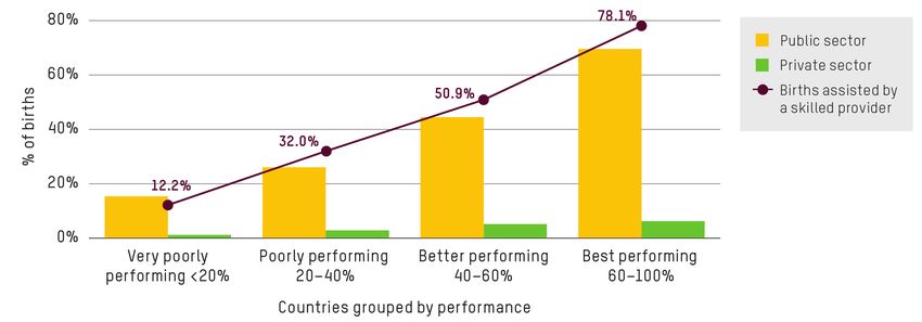
In the next step, we categorize the lowest quintile by the percentage of deliveries assisted by a skilled
health provider as follows:
• Group 1:Figure 5: Percentage of live births delivered in public and private institutions by women in the
lowest wealth quintile, according to level of skilled birth attendance in 61 low- and middle-income
countries (listed in Annex 3)
Highlight: Countries in which most women from the poorest households have skilled birth attendants
(over 60% of live births) are 10 times more likely to be assisted through the public than the private sector.
Methodology note 135 TAXES
5.1 TAX SHIFTS FROM CORPORATIONS TO
HOUSEHOLDS
Data source
The data for this section come from the OECD Global Revenue Statistics Database (OECD.Stat), which
includes information for 35 OECD and 43 non-OECD countries (see full list in Annex 4).
OECD.Stat – Global Revenue Statistics Database.
https://stats.oecd.org/Index.aspx?DataSetCode=RS_GBL
Oxfam’s calculations
Oxfam estimated annual (unweighted) averages of corporate income taxes (CIT), wealth taxes (including
property, inheritance, net wealth, and financial and property transaction taxes), personal income taxes
(PIT), payroll taxes (including social security and other payroll taxes), taxes on goods and services, and
other taxes from 2007 to 2015 – before the financial crisis until the most recent year with the most
complete data for a sample of 78 countries. 4
Tax shifts are estimated as the difference of tax revenues (as a percentage of GDP) between 2015 and
2007. Positive results point to a higher tax burden in 2015 than in 2007, negative results reflect a higher
tax burden in 2007 than in 2015. Table 5 summarizes the results.
Table 5: Composition and variation in taxes as a percentage of GDP, 2007–15
Variation 2015
2007 2015
2007–15 % total tax
Corporate income tax 3.6% 3.1% -0.5% 11.3%
Wealth taxes 1.2% 1.2% 0.0% 4.5%
Personal income tax 5.4% 5.8% 0.4% 21.2%
Payroll taxes 5.5% 6.1% 0.6% 22.2%
Taxes on goods and services 10.4% 10.8% 0.3% 39.4%
Other taxes 0.4% 0.4% 0.0% 1.3%
Total 26.4% 27.4% 0.9% 100.0%
Between 2007 and 2015, CIT revenue decreased by 0.5 percentage points of GDP, while revenues on
payroll taxes, PIT, and taxes on goods and services increased by 0.6, 0.4 and 0.3 percentage points,
respectively. This implies a shift from corporate to household taxes during this period.
Highlight: Wealth is particularly undertaxed: only about 4 cents of every dollar of tax revenue comes from
taxes on wealth.
14 Methodology note5.2 INCOME TAX PAID BY TOP AND BOTTOM 10%
Data sources
Data to estimate the share of taxes on household’ income in the UK in 2016–17 come from the Office for
National Statistics (ONS), which provides information on average annual households’ income and taxes in
the UK.
ONS – Effects of taxes and benefits on household income. https://bit.ly/2FoZbuC (for Financial
year ending 2017)
We compare the share of taxes on household income in the UK to that of Brazil. Information for Brazil was
taken from the 2014 Instituto de Estudos Socioeconomicos (INESC) report As Implicacoes do Sistema
Tributario Brasileiro nas Desigualdades de Renda (see Table 2, page 22 in https://bit.ly/2GYXCrW).
Oxfam’s calculations
Using data on average incomes, taxes and benefits by decile groups of all households (ranked by
unadjusted disposable income) for 2016–17 (Table 14 in the ONS dataset), Oxfam estimated the
proportion of household income paid in tax by adding direct and indirect taxes (which include intermediary
taxes), and dividing this figure by the total gross household income for each income decile.
Table 6: Proportion of household income paid in tax in the UK for the bottom and top income
deciles
Bottom 10% Top 10%
Average gross income (£) 9,228 123,637
Direct taxes (£) 1,483 29,688
Indirect and intermediary taxes (£) 2,999 12,682
Total taxes (£) 4,482 42,370
Effective tax rate (%) 49% 34%
INESC’s figures for Brazil, based on the Consumer Expenditure Survey for 2008–09, shows that the
proportion of household income paid in tax for the bottom 10% is 32%, and for the top 10% is 21%. The
methodology for these estimates follows a similar logic that the one for the UK and can be found on page
16 of the Fiscal Equity in Brazil report (available at: https://bit.ly/2BtD6Kl).
Methodology note 15Figure 6: Share of taxes on household incomes from the bottom and top income deciles in Brazil
and the UK
Top 10% Bottom 10%
49%
34%
32%
21%
BRAZIL (2008/09) UK (2016/17)
NOTE: Countries presented together for illustrative purposes only. They are not directly comparable, as
tax bases and years are different.
Highlight: In some countries, like Brazil and the UK, the poorest 10% of the population pay a higher
proportion of their income in tax than the richest 10%.
Data for both countries are based on official national-level statistics. The precise tax bases of
Brazil and the UK are not directly comparable
5.3 RAISING A 0.5% WEALTH TAX FOR THE TOP 1%
Data sources
Data for wealth tax revenues come from two main sources: the OECD’s Global Revenue Statistics
Database and the IMF’s macroeconomic and financial data. The total number of countries covered by
both sources is 111: 78 from the OECD and 33 from IMF (list of countries and sources in Annex 5). For
countries with data in both datasets, the OECD data was chosen. For countries with neither OECD nor
IMF data, Oxfam estimated wealth tax revenues by multiplying the effective wealth tax rate of that
country’s income group by total wealth.
OECD.Stat – Global Revenue Statistics Database.
https://stats.oecd.org/Index.aspx?DataSetCode=RS_GBL
16 Methodology noteIMF– Government Finance Statistics: Revenue.
http://data.imf.org/?sk=388DFA60-1D26-4ADE-B505-A05A558D9A42&sId=1479329334655
In addition, data for household wealth (net of debt) and wealth distribution were taken from Credit Suisse
Global Wealth Report and Global Wealth Databook.
Oxfam’s calculations
In order to estimate what an additional 0.5% tax to the wealthiest 1% individuals in each country would
amount to, Oxfam has estimated the following:
Total wealth: Estimate of wealth (net of debt) for all individual residents in a country gathered from Credit
Suisse data for the year 2015. While more recent data are available, 2015 was chosen to match the most
recent data for wealth tax revenues and social spending.
Wealth tax revenues: Government revenues at all levels (i.e. central, regional and local governments)
from all taxes on wealth, including property taxes, inheritance and gift taxes, net wealth taxes, and
property and financial transaction taxes (but excluding capital gains taxes that are accounted as income
taxes) were gathered from the OECD and IMF. Data for 2015 are used, as this is the latest year with data
for most countries (111 countries).
Effective wealth tax rate: Estimated by dividing wealth tax revenues by total wealth.
Wealth of 1% richest: Net wealth of individual residents in a country belonging to the top 1% in the
wealth distribution of that country. It is important to note that this is not the top 1% in the world, but the
richest 1% in each country. This information was gathered from Credit Suisse.
Costs of reaching specific SDGs: Oxfam has run various simulations of the costs associated with
reaching specific health- and education-related Sustainable Development Goals (SDGs) based on
estimates by the World Health Organization (WHO) and UNESCO.
Since costs in each simulation are expressed in different units – either current or constant USD for
different years – Oxfam adjusted these costs to make them comparable to the estimated extra tax
revenue, which is expressed in 2015 prices. These adjustments should not be taken at face value; rather,
they approximate the ‘real’ cost of each simulation if it were expressed in 2015 USD. Where costs were
inflated, the average inflation rate for a given year was used.
It is important to note that in each simulation, the country sample is slightly different – though in every
case only low- and lower middle-income countries were considered.
• Cost of achieving health SDGs
In the most ambitious scenario to reach SDG health system targets, the Lancet estimated that
additional investments of $134bn per year initially, reaching $371bn for 2026–2030 are required. 5
Based on WHO’s projections, this additional investment could save 100 million lives between 2016 and
2030.
Methodology note 17Figure 7: Projected number of lives saved per year in ambitious health financing scenario
10,413
9,882
9,350
8,715
8,457
8,094
7,761
7,003
6,084
5,150
4,210
3,272
2,428
1,602
723
2016 2017 2018 2019 2020 2021 2022 2023 2024 2025 2026 2027 2028 2029 2030
Source: Stenberg, K., et al (2017) Financing transformative health systems towards achievement of the health Sustainable
Development Goals, Lancet Global Health, 5: e875-87 (yearly breakdown provided by author in personal communication)
Oxfam adopts the figure for the most cost-intensive period ($371bn per year) for this exercise. The figure
is estimated based on a sample of 67 low- and middle-income countries and is expressed in 2014 prices.
Adjusting for inflation, using Calculator.net’s Inflation Calculator, the figure expressed in 2015 dollars is
$377bn per year.
• Cost of achieving education SDGs
UNESCO’s report Pricing the Right to Education. The Cost of Reaching New Targets by 2030
estimates that $39bn is needed annually to achieve universal, good quality pre-primary, primary and
secondary education in low- and middle-income countries. 6 This figure is expressed in 2012 constant
USD and is estimated on a sample of 82 low- and lower middle-income countries. Adjusting the figure
by inflation increases the cost of the simulation to $41bn per year.
In addition, UNESCO Institute for Statistics (UIS) estimates that there are about 262 million children,
adolescent and youth (between the ages of 6 and 17) out of school. 7
Therefore, the amount needed per year to achieve health system targets and universal pre-primary,
primary and secondary education until 2030 is $418bn (in 2015 prices).
Proportion of the wealth of the richest 1% equal to this SDG-funding figure: Estimated by Oxfam by
dividing this $418bn figure by $84,601bn (the net wealth of the richest 1%), which gives 0.5%
The estimations are presented for all countries grouped by income in Table 7.
18 Methodology noteTable 7: Summary of estimations for an additional 0.5% tax on the wealth of the world’s richest
1%
Income group Total Wealth tax Wealth tax Wealth of Potential
wealth revenues rate 1% richest revenue of
(USD bn, (USD bn, (USD bn, 0.5%
2015) 2015) 2015) additional
taxes on
wealth of
richest 1%
(USD bn, 2015)
Low-income
countries 341 0.6 0.18% 86 0.4
Lower middle-
income countries 9,923 25 0.25% 4,450 22
Upper middle-
income countries 58,952 265 0.45% 19,687 97
High-income
countries 206,291 1,228 0.60% 60,378 298
World
275,507 1,519 0.55% 84,601 418
Highlight: Taxing an additional 0.5% of the wealth of the richest 1% would raise considerably more
money per year than the annual cost to educate all 262 million children out of school, and provide
healthcare that could prevent 3.3 million deaths in 2019.
Like existing wealth tax revenue, the additional potential revenue could be raised through a variety of
wealth taxes, including property, inheritance, net wealth and transaction taxes.
Assuming that the richest 1% face the same effective wealth tax rate as the overall population (0.55% for
the world average), an additional burden of 0.5% means almost doubling existing wealth tax collection on
the richest 1%. Some countries already achieve effective wealth tax rates of that magnitude or even
higher for their whole population.
Methodology note 19Table 8: Top three countries by effective wealth tax rate by income group
Effective wealth tax rate
Top three high-income countries1
Luxembourg 1.29%
Uruguay 1.27%
Israel 1.21%
Top three upper middle-income countries2
Kazakhstan 1.83%
Colombia 1.42%
Russia 1.05%
Top three lower middle-income countries3
Morocco 1.09%
Uzbekistan 0.83%
Swaziland 0.79%
Top three low income-countries4
Senegal 0.48%
Afghanistan 0.24%
Democratic Republic of Congo 0.10%
Notes:
1. Out of 38 countries with available wealth tax revenue data and satisfactory wealth data.
2. Out of 11 countries with available wealth tax revenue data and satisfactory wealth data.
3. Out of 25 countries with available wealth tax revenue data and wealth data of any quality. These numbers should be used with
caution.
4. Out of 7 countries with available wealth tax revenue data and wealth data of any quality. These numbers should be used with
caution.
However, the richest 1% may not face the same effective wealth tax rate as the whole population. We
cannot estimate the effective wealth tax rate borne by the richest 1%, because there is no data about the
distribution of wealth tax revenues. While there are reasons to believe that the richest 1% faces an
effective wealth tax rate higher than the average of 0.55% (as there could be some wealth taxes that
apply above a certain threshold of wealth), 8 other factors point to the opposite: that the richest 1% have
more opportunities to avoid taxes, and they hold more of their wealth as financial wealth relative to real
estate wealth, the latter being usually taxed more. 9
Low- and lower middle-income countries would raise only 5% of the total needed, such that aid would
need to increase to transfer the additional revenue from high- to low-income countries. The main paper
addresses the role of increased aid in helping make this happen.
20 Methodology noteANNEXES
ANNEX 1: CONSUMER PRICE INDEX (CPI)
• Source: US Bureau of Labor Statistics
• Series title: All items in US city average, all urban consumers, not seasonally adjusted
• Seasonality: Not seasonally adjusted
• Survey name: CPI-All Urban Consumers (Current Series)
• Measure data type: US city average
• 1982–84=100
• All items, by month
Table 9: US CPI, Jan 2008– Jun 18
Jan Feb Mar Apr May Jun Jul Aug Sep Oct Nov Dec
2008 211.1 211.7 213.5 214.8 216.6 218.8 220.0 219.1 218.8 216.6 212.4 210.2
2009 211.1 212.2 212.7 213.2 213.9 215.7 215.4 215.8 216.0 216.2 216.3 215.9
2010 216.7 216.7 217.6 218.0 218.2 218.0 218.0 218.3 218.4 218.7 218.8 219.2
2011 220.2 221.3 223.5 224.9 226.0 225.7 225.9 226.5 226.9 226.4 226.2 225.7
2012 226.7 227.7 229.4 230.1 229.8 229.5 229.1 230.4 231.4 231.3 230.2 229.6
2013 230.3 232.2 232.8 232.5 232.9 233.5 233.6 233.9 234.1 233.5 233.1 233.0
2014 233.9 234.8 236.3 237.1 237.9 238.3 238.3 237.9 238.0 237.4 236.2 234.8
2015 233.7 234.7 236.1 236.6 237.8 238.6 238.7 238.3 237.9 237.8 237.3 236.5
2016 236.9 237.1 238.1 239.3 240.2 241.0 240.6 240.8 241.4 241.7 241.4 241.4
2017 242.8 243.6 243.8 244.5 244.7 245.0 244.8 245.5 246.8 246.7 246.7 246.5
2018 247.9 249.0 250.0 250.5 251.6 252.0
US Bureau of Labor Statistics: Consumer Price Index.
https://www.bls.gov/cpi/tables/supplemental-files/historical-cpi-u-201811.pdf
Methodology note 21ANNEX 2: LIST OF COUNTRIES WITH EDUCATION SPENDING
IN BOTH 2011 AND EITHER 2014 AND 2015
1 Afghanistan 30 Hungary 59 Romania
2 Argentina 31 Iceland 60 Rwanda
3 Australia 32 Iran 61 Saint Lucia
4 Austria 33 Ireland 62 Senegal
5 Bhutan 34 Israel 63 Serbia
6 Bolivia 35 Italy 64 Seychelles
7 Brazil 36 Jamaica 65 Slovak Republic
8 Burkina Faso 37 Japan 66 Slovenia
9 Cabo Verde 38 Korea 67 South Africa
10 Cambodia 39 Lao PDR 68 Spain
11 Chile 40 Latvia 69 Sri Lanka
12 Colombia 41 Lithuania 70 Swaziland
13 Comoros 42 Luxembourg 71 Sweden
14 Costa Rica 43 Malawi 72 Switzerland
15 Côte d'Ivoire 44 Malaysia 73 Timor-Leste
16 Cyprus 45 Maldives 74 Togo
17 Czech Republic 46 Mali 75 Uganda
18 Denmark 47 Malta 76 Ukraine
19 Dominican Republic 48 Mauritania 77 United Kingdom
20 Ecuador 49 Mauritius 78 United States
21 Estonia 50 Mexico
22 Ethiopia 51 Moldova
23 Finland 52 Mongolia
24 France 53 Nepal
25 Germany 54 Niger
26 Ghana 55 Norway
27 Guatemala 56 Peru
28 Guinea 57 Poland
29 Hong Kong 58 Portugal
22 Methodology noteANNEX 3: COUNTRIES WITH DEMOGRAPHIC AND HEALTH
SURVEYS (DHS) IN THE LAST 10 YEARS
Table 10: Countries with DHS in the last 10 years, grouped by degree of skilled birth attendance
for women in the lowest wealth quintile
Group Country DHS year % of live births assisted
by a skilled health
provider (lowest quintile)
Group 1:Group Country DHS year % of live births assisted
by a skilled health
provider (lowest quintile)
Group 4: 60– Lesotho 2014 60.1
100% Peru 2012 60.5
Zimbabwe 2015 61.7
India 2015–16 64.1
Uganda 2016 64.3
Benin 2011–12 64.4
Philippines 2017 64.5
Comoros 2012 66.3
Democratic Republic of Congo 2013–14 66.3
Gabon 2012 70.5
Namibia 2013 72.7
Guyana 2009 72.9
Tajikistan 2012 73.1
São Tomé and Príncipe 2008–09 73.6
Cambodia 2014 75.2
Burundi 2016–17 77.4
Egypt 2014 82.4
Rwanda 2014–15 84.2
Colombia 2015 86.9
Malawi 2015–16 87.0
Maldives 2009 88.6
Dominican Republic 2013 96.8
Kazakhstan 1999 98.3
Albania 2008–09 98.4
Jordan 2012 98.9
Kyrgyzstan 2012 99.2
Armenia 2015–16 99.7
24 Methodology noteANNEX 4: COUNTRIES INCLUDED IN TAX SHIFT EXERCISE
Table 11: List of OECD and non-OECD covered by the OECD Global Revenue Statistics Database
(OECD.Stat)
OECD countries Non-OECD countries Non-OECD countries
1 Australia 1 Argentina 36 South Africa
2 Austria 2 Bahamas 37 Swaziland
3 Belgium 3 Barbados 38 Togo
4 Canada 4 Belize 39 Trinidad and Tobago
5 Chile 5 Bolivia 40 Tunisia
6 Czech Republic 6 Brazil 41 Uganda
7 Denmark 7 Cameroon 42 Uruguay
8 Estonia 8 Cabo Verde 43 Venezuela
9 Finland 9 Colombia
10 France 10 Costa Rica
11 Germany 11 Côte d'Ivoire
12 Greece 12 Cuba
13 Hungary 13 Democratic Republic of Congo
14 Iceland 14 Dominican Republic
15 Ireland 15 Ecuador
16 Israel 16 El Salvador
17 Italy 17 Ghana
18 Japan 18 Guatemala
19 Korea 19 Honduras
20 Latvia 20 Indonesia
21 Luxembourg 21 Jamaica
22 Mexico 22 Kazakhstan
23 Netherlands 23 Kenya
24 New Zealand 24 Malaysia
25 Norway 25 Mauritius
26 Poland 26 Morocco
27 Portugal 27 Nicaragua
28 Slovakia 28 Niger
29 Slovenia 29 Panama
30 Spain 30 Paraguay
31 Sweden 31 Peru
32 Switzerland 32 Philippines
33 Turkey 33 Rwanda
34 United Kingdom 34 Senegal
35 United States 35 Singapore
Methodology note 25ANNEX 5: SOURCES OF WEALTH TAX REVENUE BY
COUNTRY
Table 12: List of countries and source of wealth tax revenue used in analysis
Country Source Country Source
1 Afghanistan IMF 36 Finland OECD
2 Albania IMF 37 France OECD
3 Argentina OECD 38 Georgia IMF
4 Armenia IMF 39 Germany OECD
5 Australia OECD 40 Ghana OECD
6 Austria OECD 41 Greece OECD
7 Azerbaijan IMF 42 Guatemala OECD
8 Bahamas OECD 43 Honduras OECD
9 Barbados OECD 44 Hong Kong IMF
10 Belarus IMF 45 Hungary OECD
11 Belgium OECD 46 Iceland OECD
12 Belize OECD 47 India IMF
13 Bhutan IMF 48 Indonesia OECD
14 Bolivia OECD 49 Ireland OECD
15 Bosnia and Herzegovina IMF 50 Israel OECD
16 Brazil OECD 51 Italy OECD
17 Bulgaria IMF 52 Jamaica OECD
18 Cameroon OECD 53 Japan OECD
19 Canada OECD 54 Kazakhstan OECD
20 Cape Verde OECD 55 Kenya OECD
21 Chile OECD 56 Kiribati IMF
22 China IMF 57 Korea OECD
23 Colombia OECD 58 Kosovo IMF
24 Costa Rica OECD 59 Latvia OECD
25 Côte d'Ivoire OECD 60 Lithuania IMF
26 Cuba OECD 61 Luxembourg OECD
27 Cyprus IMF 62 Macao IMF
28 Czech Republic OECD 63 Macedonia IMF
29 Dem. Republic of Congo OECD 64 Malaysia OECD
30 Denmark OECD 65 Malta IMF
31 Dominican Republic OECD 66 Mauritius OECD
32 Ecuador OECD 67 Mexico OECD
33 Egypt IMF 68 Moldova IMF
34 El Salvador OECD 69 Mongolia IMF
35 Estonia OECD 70 Morocco OECD
26 Methodology noteCountry Source Country Source
71 Myanmar IMF 106 United Arab Emirates IMF
72 Netherlands OECD 107 United Kingdom OECD
73 New Zealand OECD 108 United States OECD
74 Nicaragua OECD 109 Uruguay OECD
75 Niger OECD 110 Uzbekistan IMF
76 Norway OECD 111 Venezuela OECD
77 Panama OECD
78 Paraguay OECD
79 Peru OECD
80 Philippines OECD
81 Poland OECD
82 Portugal OECD
83 Romania IMF
84 Russian Federation IMF
85 Rwanda OECD
86 San Marino IMF
87 Senegal OECD
88 Seychelles IMF
89 Singapore OECD
90 Slovak Republic OECD
91 Slovenia OECD
92 South Africa OECD
93 Spain OECD
94 Swaziland OECD
95 Sweden OECD
96 Switzerland OECD
97 Thailand IMF
98 Timor-Leste IMF
99 Togo OECD
100 Tonga IMF
101 Trinidad and Tobago OECD
102 Tunisia OECD
103 Turkey OECD
104 Uganda OECD
105 Ukraine IMF
Methodology note 27NOTES
1 https://www.calculator.net/inflation-calculator.html
2 The methodology used to construct the database is available here:
https://papers.ssrn.com/sol3/papers.cfm?abstract_id=2480636
3 For more information, see USAID’s Guide to DHS Statistics DHS-7, available at:
https://dhsprogram.com/Data/Guide-to-DHS-Statistics/index.cfm
4 The OECD also has information for the year 2016 but this year includes only half of the countries.
5 https://www.thelancet.com/action/showPdf?pii=S2214-109X%2817%2930263-2
6 https://unesdoc.unesco.org/ark:/48223/pf0000232197
7 http://uis.unesco.org/en/news/new-education-data-sdg-4-and-more
8 See Development Finance International (2018) “Wealth Taxes: A Huge Opportunity to Reduce Inequality”
(unpublished document)
9 See Balestra, Carlotta and Richard Tonkin (2018) “Inequalities in household wealth across OECD countries:
Evidence from the OECD Wealth Distribution Database”, OECD: Working Paper 88.
https://www.oecd.org/officialdocuments/publicdisplaydocumentpdf/?cote=SDD/DOC(2018)1&docLanguage=En;
Development Finance International (2018) “Wealth Taxes: A Huge Opportunity to Reduce Inequality” (unpublished
document)
© Oxfam International January 2019
This methodological note was written by Patricia Espinoza Revollo, Chiara Mariotti, Franziska Mager and
Didier Jacobs. Oxfam acknowledges the assistance of Iñigo Macías and Oliver Pearce in its production. It
accompanies Oxfam’s 2019 report Public Good or Private Wealth? http://dx.doi.org/10.21201/2019.3651
For further information on the issues raised in this paper please email advocacy@oxfaminternational.org.
This publication is copyright but the text may be used free of charge for the purposes of advocacy,
campaigning, education, and research, provided that the source is acknowledged in full. The copyright
holder requests that all such use be registered with them for impact assessment purposes. For copying in
any other circumstances, or for re-use in other publications, or for translation or adaptation, permission
must be secured and a fee may be charged. Email policyandpractice@oxfam.org.uk.
The information in this publication is correct at the time of going to press.
Published by Oxfam GB for Oxfam International under ISBN 978-1-78748-396-5 in January 2019. DOI:
10.21201/2019.3651.
Oxfam GB, Oxfam House, John Smith Drive, Cowley, Oxford, OX4 2JY, UK.
OXFAM
Oxfam is an international confederation of 19 organizations networked together in more than 90 countries,
as part of a global movement for change, to build a future free from the injustice of poverty. Please write
to any of the agencies for further information, or visit www.oxfam.org.
28 Methodology noteYou can also read