Visualization for Villainy
←
→
Page content transcription
If your browser does not render page correctly, please read the page content below

This manuscript was presented at alt.VIS, a workshop co-located with IEEE VIS 2021 (held virtually)

                                                                                             Visualization for Villainy
                                                               Andrew M. McNutt*                            Lilian Huang†                            Kathryn Koenig‡
                                                                University of Chicago             NORC at the University of Chicago               Chicago Transit Authority

                                         A BSTRACT
                                                                                                                                                             Hostile Vis
                                         Visualization has long been seen as a dependable and trustworthy                 Non-Physical                    Emotional Harm
                                                                                                                                                                                     Direct
                                         tool for carrying out analysis and communication tasks—a view                                                    Personal Erasure
                                         reinforced by the growing interest in applying it to socially positive
                                         ends. However, despite the benign light in which visualization
                                         is usually perceived, it carries the potential to do harm to people,
                                         places, concepts, and things. In this paper, we capitalize on this
arXiv:2109.06007v2 [cs.HC] 22 Sep 2021

                                                                                                                                            Black Hat Vis               Harmful Physicalizations
                                         negative potential to serve an underrepresented (but technologically                            Poisoning the Chart                  Strobe Vis
                                         engaged) group: villains. To achieve these ends, we introduce
                                         a design space for this type of graphical violence, which allows
                                         us to unify prior work on deceptive visualization with novel data-
                                         driven dastardly deeds, such as emotional spear phishing and unsafe                                                   Tufte Coin
                                         data physicalization. By charting this vile charting landscape, we
                                                                                                                                                         Irresponsible Use
                                         open new doors to collaboration with terrifying domain experts, and                       Indirect                 of Resources             Physical
                                         hopefully, make the world just a bit worse.
                                         Index Terms: Deceptive Visualization; Data Physicalization;
                                         Block-chain; Supervillainy—Traditional and modern; Evil; Harm
                                         Optimization;
                                                                                                                              Figure 1: The design space of harm that visualizations can do.
                                         1    I NTRODUCTION
                                         Most evil done with visualization today, just like with many other
                                         domains [10], is banal. The dashboards, spreadsheets, and reports                    We therefore hold that there is an urgent need to intervene now
                                         that people make as part of their jobs are simply tools to design and            and provide countermeasures to these do-gooder efforts.
                                         carry out tasks. While the charts, graphs, and maps comprising these                 We must not be content to rest on our laurels and merely reflect on
                                         entities may serve a greater sinister purpose, their primary goal is             how visualization was a favored propaganda tool of the Nazis [21],
                                         seldom to do evil. Therefore, this paper will not mention admirable              whose terrifying assertions were swaddled in the seemingly objec-
                                         endeavors such as Palantir’s application of tools like machine learn-            tive rhetorical mode that visualizations carry (in effect deifying their
                                         ing and visual analytics [79] to drive America towards becoming                  worldview). We instead seek to forge ahead and provide cutting-
                                         a surveillance police state [77]. Neither will it mention Tableau                edge, practical tools for sowing damage, despair, and distrust in the
                                         contracting with ICE [9], an organization that has actively made life            contemporary era. We work towards these ends by developing a
                                         worse for countless vulnerable people. We omit these because, while              design space for villainous visualization within which we situate a
                                         they have effectively supported the natural and reasonable goals of              number of established evil tactics and identify several new ones. We
                                         making the world worse, the visualizations themselves are mundane;               build upon the works of scholars of applied graphical evil, such as
                                         the medium of visualization itself has not been honed and exploited              Snider [70] (who defined a number of sinister graphical forms), Cor-
                                         to unleash its maximum potential for malice. Such pedestrian acts                rell [23] (who described a family of black hat visualization attacks),
                                         of villainy are beneath us as scholars of evil.                                  and Tomlinson [74] (who described a family of design principles
                                            We instead explore the ways in which intentional harm can be                  to center—but unfortunately not increase—suffering as part of the
                                         brought upon viewers of visualization—that is, we seek to under-                 design process). This work focuses the malicious intentions of the
                                         stand how we might better use visualization for overt villainy. In               venerable CHI4Evil workshop [71] upon the visualization sphere.
                                         doing so, we aim to open a new visualization frontier, in which                  It is our hope that by carrying out this work, we will both open the
                                         evil is not incidental, but is foregrounded throughout every step of             door to collaboration with the sorts of villains who are typically
                                         visualization practice—allowing cruelty to be, in fact, the point [68].          excluded from visualization research, and enrich our partnerships
                                            We believe this is a critical juncture to carry out this sinister work.       with those normally included.
                                         Recent efforts to use visualization for social good [1, 3, 4] and the
                                         emerging thread of research focused on the ethical issues facing data
                                                                                                                          2    D ESIGN   SPACE
                                         visualization practitioners [21, 29, 67] suggest a growing interest in
                                         using visualization for the benefit of marginalized people [26, 61],             There are many ways in which one might achieve sinister ends using
                                         disabled people [45, 50, 53, 80], and people in general.                         visualizations. For instance, one may create evil by handling sen-
                                                                                                                          sitive data in a brash or offensive manner [29], or by using charts
                                             * e-mail: mcnutt@uchicago.edu                                                to create false impressions about government programs through in-
                                             † e-mail: lilianhj@uchicago.edu                                              tentionally confusing design choices [56]. Given this variation, and
                                             ‡ e-mail: koenig1@uchicago.edu                                               in the interest of bringing a greater host of evils into the world, we
                                                                                                                          create a design space that might unify these various evil possibil-
                                                                                                                          ities. We show our design space in Fig. 1, categorize several past
                                                                                                                          mechanisms of malice within it, and introduce a number of novel
                                                                                                                          tactics. This design space is formed by taking the non-malfeasance

                                                                                                                      1
This manuscript was presented at alt.VIS, a workshop co-located with IEEE VIS 2021 (held virtually)

                                      Not evil                                                                       Evil
        Stupid hat visualization                                                                                               Black hat visualization
            Poor design choices                                                                                                Design choices are
             made through lack                                                                                                 made to willfully
                  of knowledge                                                                                                 mislead or harm

                                                                                                      Evil hat visualization

Figure 2: Bad visualizations come in many forms. Some may mislead because of unfortunate design choices made from a place of sincerity—such
as the infamous “Gun deaths in Florida” chart [47]—while others are made with a more direct intention to harm.

expressed in the oft-misquoted Hippocratic oath (“first do no harm”)1
as our ethical departure point. We define our villainy in opposition
to this injunction: First, Let Us Do Harm.
    Following this axiom, we partition the space of possible harms in
twain, twice. First, we note that harm can be either physical or non-
physical; second, we partition by impact: are the wrongs wrought
directly (aimed at the viewer themselves) or indirectly (aimed at the
environment within which the viewer exists, in such a way that harm
trickles down to them)? This model takes inspiration from the tabu-
lar form of the matrix of domination [19], but rather than identifying
general venues in which to carry out structural oppression (which is
itself a worthy goal), we instead seek specific ways that visualiza-
tions can be operationalized to do harm. We select these dimensions
from the infinite space of possible insidious ingredients, not because
they perfectly capture the entire evil experience—but because they
allow us a useful vantage point from which to consider visualization
villainy. Box famously noted that “all models are wrong” [13], but
had he seen our model—which makes even malicious models, such                         Figure 3: This graphic skilfully deceives by (among other tactics)
as those enacting deep learning for phrenology [44], seem sanctimo-                   reversing the x-axis direction to falsely imply a larger effect. [2]
nious in comparison—he would have likely reappraised that some
models are alright. The remainder of the paper will be a tour of these                the data. Robinson explores the space of viral visualizations and
terrors, describing how various evil ends might be enacted in each                    maps [66], and the way that they can propagate and disseminate
of these categories.                                                                  false information, which offers an intriguing and high-impact way to
                                                                                      sow chaos. The widely-circulated “Impeach This” map exemplifies
2.1 Image Control (Non-Physical Indirect)
                                                                                      this strategy. This viral visualization ostensibly shows a county-level
Data visualizations are principally focused on communication, and                     choropleth of the 2016 United States presidential election, colored
thus the most commonly practiced strains of evil involve manipulat-                   red or blue based on the winner of the county. In addition to ex-
ing the understanding that the reader gains from viewing a visual-                    emplifying the land doesn’t vote mirage [54], the version of this
ization. There are countless visualizations that communicate their                    graphic most prominently available features several data corrup-
message poorly [5], or unintentionally misinform the reader (what                     tions, rendering “multiple blue counties won by Hillary Clinton
might be called “stupid hat” visualizations)—as noted in Fig. 2. In                   as red counties won by Trump.” [52]—as seen in Fig. 4. In this
contrast, here we focus on charts whose form is intentionally used                    vein, Pavliuc and Dykes [60] use network visualizations to celebrate
to create harm through miscommunication and misinformation.                           several state-based disinformation campaigns.
Black Hat Visualization. We begin with the most commonplace of                           This tactic derives its power from the fact that visualizations are
our assaults, which intentionally misuses the form of a visualization                 often understood as being objective depictions of the data, and are
to give a false impression. Correll and Heer [23] usefully describe a                 not recognized as the rhetorical communications [41] that they truly
family of black hat visualizations, which are typically “man in the                   are. The moralist La Rochefoucauld notes “truth does not do as
middle” attacks. In these attacks, a malicious designer manipulates                   much good in the world as the appearance of it does evil” [25];
a chart in such a way as to obscure or obfuscate the data, in order                   by swaddling ourselves in the gauze of faux-objectivity carried by
to present their own preferred message. Tactics include breaking                      charts, we have ample room to deliberately mislead and misinform.
conventions, nudging, and the use of non-sequitur visualizations
                                                                                      Poisoning the Chart. The assumption of the unassailable objectivity
(which appear to encode data as charts, but in fact merely use them
                                                                                      of visualization has great utility; however, confusion and dissent can
as decoration). Pandey et al. [59] describe a series of attacks related
                                                                                      also be invoked by piercing this veil. “Poisoning the Well” is a well
to truncated and inverted axes (as in Fig. 3), aspect ratios, and area
                                                                                      known argumentative fallacy [75] in which doubt is sown against a
encodings. Woodin et al. [78] explore the deceptive potential of
                                                                                      speaker by undermining their credibility, often by presenting infor-
inverted axes in the context of metaphor. McNutt et al. [54] describe
                                                                                      mation casting them in a negative light, regardless of whether or not
a wide family of errors that can be forced upon users from across the
                                                                                      said information is true (i.e. accusing them of some bullshit [37]).
visualization pipeline, to cause what they term visualization mirages.
                                                                                      For instance, consider a situation in which Bob tells you the water in
Lauer and O’Brien [48] describe and demonstrate the deceptive
                                                                                      a well is not poisonous. Alice comes along and tells you that Bob is a
power of a variety of misleading tactics.
                                                                                      liar, has recently poisoned several puppies, and is guilty of tax fraud.
   When readers assume that the information they are given is cor-
                                                                                      Even if you do not believe Alice, you might find yourself disinclined
rect, there is ample room to distort, cherry-pick, or simply change
                                                                                      to sample the water. This line of attack can be usefully applied to
    1 Coincidentally, the Urban Institute recently released a report recommend-       visualization by planting a seed of doubt in the medium itself, the
ing that practitioners strive to “Do No Harm” [67] to vulnerable communities          chart makers, or even the data, thereby Poisoning the Chart.
through the design of their visualizations.                                              Once a viewer is made aware that a single deception has taken

                                                                                  2
This manuscript was presented at alt.VIS, a workshop co-located with IEEE VIS 2021 (held virtually)

                                                                                   Hostile Architecture                  Hostile Visualization

                                                                                                                                   I II
                                                                                                                         12
                                                      Source: NYT                                                                                12

                                                                                                                         10                      10

                                                                                                                         8                       8

                                                                                                                         6                       6

                                                                                                                         4                       4

                                                                                                                              5   10   15   20        5   10   15   20

                                                                                                                                  III IV
                                                                                                                         12                      12

                                                                                                                         10                      10

                                                                                                                         8                       8

                                                                                                                         6                       6

                                                                                                                         4                       4
                 County level data
                 non-available                                                                                                5   10   15   20        5   10   15   20

                                                                                   Alt: Spikes on a ledge in Boston to   Alt: The information in this visualization
                                                 Blue counties                     prevent sleeping or sitting.          is not for you!
                                                 incorrectly presented             Figure 5: A common hostile architecture technique (placing spikes
                                                 as red                            where undesirables might rest) and a proposed hostile visualization
                                                                                   technique (replacing descriptive alt text with antagonistic messages).

                                                                                   accommodate this intention, we yoke together two unrelated fields
                                                                                   of design. Chivukula et al. describe artifacts of asshole design as
                                                                                   having “clear malicious or deceptive intent”, rather than merely
                                                                                   stemming from bad design decisions [17]. In a similar vein, hostile
                                                                                   architecture [62] is the practice of modifying the built environment
                                                                                   to inhibit certain activities (and often certain people) from using
                                                                                   those spaces—for instance, bus benches that prevent their users from
                                                                                   lying down on them, as a way to withhold respite from house-less
                                                Source: CNN                        people [12]. We synthesize these threads of depraved design into a
                                                                                   vector of attack for our own domain of interest: hostile visualization.
                                                                                   Instead of making exclusionary visualizations by accident, we exhort
Figure 4: The viral “Impeach This” chart cunningly stacks common de-               designers to incorporate features that directly exclude some viewers.
ceptions (conflating ranges as binaries, “land doesn’t vote”), masking                The recent trend towards designing accessible visualizations
more devious data manipulations. Sources [7, 52].                                  [45, 80] in fact provides a wide palette of inspiration for making
                                                                                   visualizations unusable for those we wish to exclude. Elavsky’s
place (even if it is brief and for a purpose), they are less likely to trust       Chartability [30], a toolkit for designing inclusive data visualiza-
any other information held by that visualization [65]. There are many              tions, provides a checklist of possible failure points that might be
ways this might be achieved, such as annotations to careful misuse                 capitalized upon. For example, instead of merely omitting alt-text
of the anchoring effect [54]. Yet such elaborate strategies may not                tags for visualizations, designers may utilize the Universal Antago-
even be necessary, as a well-placed strong-man can simply sharpie                  nistic Alt-Text: the information in this visualization is not for you!
over a perfectly normal visualization and assert that their chosen                 (Fig. 5) A designer can ensure that their plot is not color blind-
conclusions are true, thus capitalizing on political polarization to               friendly, using free online tools such as Coblis [36]—however, it
create an air of uncertainty and confusion. Lee et al. [49] document               is worth noting that focusing on color blindness as the sole com-
the development of a culture of visual analytics among a particularly              ponent of visualization accessibility can wreak harm in itself [31].
doubt-ridden group (anti-maskers), and highlight how mistrust of                   Color blindness more significantly affects white men, and we may
the establishment can generate public fervor—and, we note, even                    be able to leverage this to focus on it to the exclusion of all other
death under some fortuitous circumstances.                                         accessibility issues, thus reinforcing the dominant power structure
   Beyond sowing doubt, one might poison a chart by causing inter-                 and pulling resources away from others. Wu et al. [80] highlight
action with it to be perceived as undesirable. For instance, this might            that people with Intellectual and Developmental Disabilities may be
be carried out by engaging in aggressive patenting, such that public               preyed upon by using unfamiliar and complex visual forms. Marriott
perception of a chart form is tainted by the turbid machinery of the               et al. [53] note that people with motor disabilities can be excluded
legal system. One might simply patent several dozen commonly                       from data experiences by providing controls that are not adapted to
understood ideas, visualization techniques, or chart forms, and then               them. We suggest that exclusion can be enriched by adding controls
publicly bring suit against prominent practitioners. This is likely                to static charts which require an unwavering hand to view.
to decrease any interest in using that chart, and may even foment                     However, these promisingly evil attacks are vulnerable to coun-
distrust in prior usages of it.                                                    termeasures; recent works have proposed using machine learning
                                                                                   techniques to automatically infer the content of a chart from its
2.2   Feeling Personally Attacked (Non-Physical Direct)                            image [18]. In order to circumvent these defenses, one can take a
While it is reasonable to characterize all viewers as white-cis-able-              normal visualization, ensure that it is rendered in a raster format
bodied-young-wealthy-urban-educated-Americans (as many visual-                     (such that semantic meaning is erased from its structure), and then
izations do), sometimes individuals will audaciously exhibit identi-               apply any of many available adversarial attacks [8], such as gradient
ties departing from this natural norm. Here, we consider the ways in               masking. Ideally, this will fool the vision algorithm, such that its
which these deviant characteristics might be hijacked for harm.                    evaluation of mark placement and the like are not just inaccurate
                                                                                   but willfully mislead the reader. However, we leave an in-depth
Hostile Visualization. Many visualizations are inaccessible not on                 exploration of such concerted deception to future work.
purpose, but by accident: the designer, ignorant of accessibility
guidelines, makes decisions that render their visualizations difficult             Erasure and the Reification of Flawed Categories. Another pos-
or impossible to parse by viewers with visual impairments. While                   sible avenue for harm is in the presentation of categorical data.
such unintentional hostilities are appreciated, we propose taking                  Here, the judicious selection of which categories to include and ex-
this further and making these values explicit and deliberate. To                   clude can dismiss broad swathes of human experience, and reinforce

                                                                               3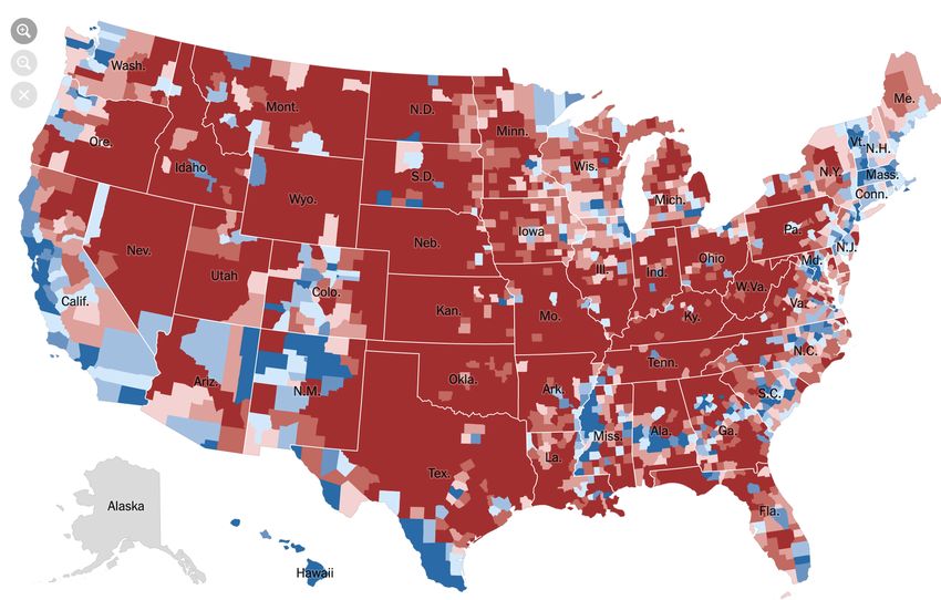
This manuscript was presented at alt.VIS, a workshop co-located with IEEE VIS 2021 (held virtually)

flawed mental models of the world. A classic example is a pie chart            2020 game Cyberpunk 2077, which contained a sequence of flashes
visualizing gender as a binary male-female dichotomy [28]. The                 similar to that used by neurologists to induce seizures [16].
decision not to include certain categories of data in a visualization,            Deploying strobing light visuals is an especially potent tactic, as it
or not to even collect data on those categories [58] in the first place,       not only renders our visualizations inaccessible to many individuals,
is a strong signal of whose existence and experiences are deemed               but it is also defensible on the grounds of aesthetic integrity. A well-
worthy of acknowledgment. Much like how the smooth surface of                  designed attack may receive support from external sources, who are
a pie crust conceals a messier but far richer interior, a glossy data          willing to defend such an effort on the grounds of “artistic vision”,
visualization that uses oversimplified, reductive categories can paper         and will voluntarily harass and bombard any detractors with more
over complexity and erase the diversity of lived experiences.                  seizure-inducing visualizations—as in the case of the journalist who
   The erasure of human experience can also be achieved in even                initially reported on the Cyberpunk 2077 issue [32]. Such external
more seemingly innocuous—but insidious—ways, as shown by                       support will let us conserve efforts on our part. All that is truly
Dragga and Voss’s Cruel Pies [27]. Even if the visualization does              needed from us is a willingness to use strobing visualizations as mere
include certain data, it can neuter the significance of that data by           cosmetic trappings, without regard for their medical ramifications
obscuring the human element—for example, by visualizing military               for some viewers. We refer the reader to South et al. [72, 73], who
casualties as mere dots or lines, or by using bright and cheerful              describe a set of highly usable methods for formulating such attacks.
colors to depict the number of deaths by gun violence. By using
identical visual language and conventions to express both frivolous            Harmful Data Physicalizations. The burgeoning community in-
figures and significant statistics, we encourage the viewer to assign          terest in data physicalization has offered a number of novel ways
them both the same weight, cultivating callousness towards issues              through which data can be expressed [42]. Data physicalizations
of social import. This data inhumanism [51] creates an abstraction             may expand a visualization’s audience to include people with visual
between viewer and data, allowing the viewer the emotional distance            impairments. However, this nascent line of work has been hamstrung
to reach impersonal conclusions—such as thinking of humans as                  by a number of problems, including a focus on literal representations
cogs in a vast delivery apparatus, with needs similar to cogs.                 of visual plots [43], which often do not convey the same information
                                                                               as their visual counterpart [50]. Furthermore, exploring the potential
Emotional Harm. There has been a prevailing interest in making                 of data physicalization has been limited by unduly valuing the safety
visualizations capable of inducing empathy in their viewer [21].               of the data consumer. Forgoing safety concerns offers intriguing
While it is a reasonable goal to force empathy on people2 —as one              opportunities to create work that leaves longer-lasting impressions
might usefully employ such manipulations for nefarious ends—prior              (as negative experiences are more memorable [11]).
work [14, 21] suggests that this effect may be out of reach. Given                In order to rectify these shortcomings, we explore the rich set
these shortcomings, we suggest that other emotional avenues might              of encodings and interaction forms which are only available in this
be considered instead. For instance, feelings such as shame, horror,           space unconstrained by consumer welfare. Bar charts can easily be
disgust, and re-triggering of trauma are all enticing reactions that           translated into a threatening tactile form by rendering each bar as a
might be fruitfully elicited.                                                  piece of sandpaper, with the level of grit encoding a data variable
   However, rather than trying to make a single visualization induce           unavailable in the rest of the chart. Thus, to fully understand the
a specific emotion in a general audience (which may be impossible,             presented data, the consumer must rub their fingers across each bar,
as the failure of empathetic visualizations has shown), we suggest             causing anywhere from mild chafing to fingerprint removal. The
that this vector of attack may be more usefully considered through             scatter plot can be converted to pointed spikes (akin to pits of Punji
a form of targeted attack, analogous to the threat vector of spear             sticks), with height and sharpness encoding additional variables,
phishing. In traditional spear phishing, an attacker targets a partic-         making this physicalization a full-body experience in which con-
ular person or organization, often through the use of specifically             sumers can literally foist themselves upon the data—a more visceral
tailored emails; interaction with these messages will frequently yield         spin on human-data interaction. This encoding would be sure to be
a malicious effect (such as capturing credentials). In visualization           memorable as the resulting indelible bodily damage would imprint a
emotional phishing, the content and design of a visualization might            copy of the chart upon each viewer. While Punji sticks are specifi-
be chosen so as to maliciously engage with topics to which a target            cally disallowed under the Geneva Convention [6], the potential for
is sensitive, or might involve visual encodings which a target finds           such information is too great to let mere international agreements
repugnant. For instance, someone with an eating disorder might be              hamper their creation. Similarly, the strokes in line charts can be
presented with a graphic using an encoding based around nauseating             rendered as blades, with sharpness encoding a variable of interest,
foods, or an earthquake survivor be tasked with understanding data             such that smaller values yield papercuts and larger values function
through a haptic encoding, or a refugee be shown literal encodings             more like a machete. Beyond such cutting-edge encodings, we can
of their destroyed home. As prior work has shown that data on                  use temperature to convey data. For instance, a categorical value
sensitive topics is often understood through a personal lens [61], this        might be usefully encoded in bowls of liquid (extending Häkkilä and
vector seems to be rife with potential for emotional manipulation              Colley’s [38] work) across the three “natural” zeros (Kelvin, Celsius,
and outright devastation. The major complication behind this attack            Fahrenheit), allowing for unprecedented sinister sensory data expe-
would be ensuring that the viewer has some motivation to engage                riences, such as death. Finally, while haptic feedback is a familiar
with the chart in the first place, which we leave for future work.             topic in HCI research, it has not (to our knowledge) been utilized
                                                                               in visualization. We propose augmenting this research to include
2.3 Graphic Violence (Physical Direct)
                                                                               traditions more commonly seen in psychology, e.g. the Milgram
In addition to their role as a communication technology, visualiza-            Experiment [55], by encoding shocking data with corresponding
tions also exist as physical objects (though often digitally presented).       electric shocks to the nervous system. This can provide a novel twist
In this section, we consider ways in which this objecthood might be            upon the concept of the surprise map [22].
utilized to inflict direct sensory violence on their viewer.                      Data physicalization can extend beyond tactile representations as
Strobe Visualization. Strobing lights can directly trigger physical            well. Previous gastronomic research has highlighted data edibiliza-
pain through visual stimulus alone. Flashing lights have induced               tion for both gathering data [15] and rendering it [76]. We extend this
epileptic seizures, not only in children watching television [73], but         research by noting that such a medium has a particularly useful, yet
also in adults playing video games, as seen during the release of the          unexplored, method of representing outliers: vomit. Edibilized data
                                                                               points that elicit a nausea response during a data meal will certainly
   2 Or   perhaps its opposite, apathy.                                        stand out, in line with the folk wisdom that the stomach operates as

                                                                           4
This manuscript was presented at alt.VIS, a workshop co-located with IEEE VIS 2021 (held virtually)
a second brain, thus utilizing a traditionally under-employed compo- want to see their quarterly earnings embossed upon a mountainside,
nent of the body’s natural computing power. Data sonification has or their annual growth carved from the husk of a sequoia tree?
been used to great effect to convey statistical information for both The time is also ripe to venture into media beyond the conven-
sighted and visually-impaired listeners [33–35], although previous tional mountainside. We could consider clearing areas of rainforest
research has, short-sightedly, only used a selection of benign tones to create images, as a new twist on crop circles, which are a well-
to sonify data. We suggest that the use of more visceral and vivid established form of visual communication. However, we only have
sounds (such as a baby crying, nails on a chalkboard, or vuvuzelas) limited time to implement this idea before the rainforests are de-
would be better connected to personal experience, and would thereby pleted by other agencies, and therefore it is worth considering our
leverage the natural instinct to take action to make the noises cease. longer-term options for exploiting natural resources.
In contrast to Reusser et al.’s [64] simulation approach to helping One especially attractive option is to simply allow the ever-
non-sighted people “feel fireworks”, we observe that the light, sound, increasing scale of data collection to run its course: the de-
and heat found in traditional fireworks can provide an intriguing struction of the environment is an autographic visualization [57]
multi-modal palette for encoding explosive experiences in general. of contemporary capitalism’s tendency towards accelerationism.
Filling data warehouses with ever increasing amounts
2.4 Evil in the Air Tonight (Physical Indirect) of disaggregated data consumes vast amounts of en-
We have mostly considered ways to harm the viewer or the people ergy. So far, hardware improvements have kept energy
around them, but of course, no individual (or group) exists in isola- consumption from rising at the same rate as data de-
tion [69]. In this section, we consider visualizations that can affect mand [46]. However, by fostering complacency, we
their viewer indirectly, as their existence or viewing is detrimental can encourage a continued escalation in the amount
to the environment in which the viewer exists. of data collection and associated energy consumption,
while the world remains indifferent. We have seen that data profes-
Tufte Coin. A classic villainous goal is to harm everyone, every- sionals are often willing to close ranks against inconvenient truths
where, simultaneously. While this may seem to be beyond the scope about the environmental impact of their work [39], which will likely
of the humble data visualization, fortunately, a tool chain for this work to our advantage.
synergy is readily available through the technology of the blockchain.
A blockchain is an inefficient form of distributed database, which 3 D ISCUSSION
has gained popularity because of its support for a poorly-conceived
In this work, we have laid out a design space of villainous visu-
financial instrument called cryptocurrency, which comes in a variety
alization techniques, with a focus on causing maximal harm. In
of so-called “coin”s. As of June 25th, 2021, each transaction of “Bit-
doing so, we unified work on deceptive visualization-based attacks
Coin” (a popular cryptocurrency) requires 662 KwH per transaction
with a suite of targeted terrors. The set of tactics described here is
(compared to 149KwH per 100k transactions for VISA) [24]. The
just the first step in the larger project of inflicting harm on those
current annual energy required by the present volume of transac-
who are merely trying to understand a graphic. There are countless
tions is on par with the yearly power consumed by all of Argentina,
additional attacks and assaults that might be carried out with and by
yielding such a vast impact that “every $1 of Bitcoin value was
data visualizations. Here we highlight several avenues of additional
responsible for $0.49 in health and climate damages in the US” [63].
atrocious attacks which might be analyzed in future work:
For our purposes, this is an excellent bang for each digital buck.
To wreak (further) global harm, we might leverage this Enumerating Dark Patterns. Dark patterns have become a focus of
thirst for power as well as the blockchain’s inefficiencies, research in HCI; however, there has been little consideration [54, 59]
such that each viewing of a visualization triggers a Bit- of what these might be in visualization. We believe that enumerating
coin transaction between two predesignated parties. Analo- dark charting patterns, with clearly understood usages and effects,
gous to a page counter, this wrapper would ensure that each will better help non-experts enact evil.
view of a visualization is recorded with guaranteed fidelity.
Curating Example Datasets. In opposition to those who argue we
T
We designate this meta-transactional view
counter as TufteCoin3 . Unlike non-fungible to- should do more good with example datasets [20], we believe we
kens (NFTs)—where there is a limit to the num- should help evil data practitioners by creating and curating datasets
ber of times permanent environmental damage whose existence and use is harmful to the people depicted within
can be done, based on the number of times a them [67]. As a modest first step, we should maintain steadfast
given owner of an NFT is willing to sell it— support for the venerable iris dataset by eugenicist Fisher, and quell
TufteCoin allows innumerable people to view the graphic simultane- the tide rising [40] to champion alternatives.
ously, thus pushing the Earth to become uninhabitable at a bound- Not Just Evil in Theory. In future, it will be necessary to verify the
lessly faster rate. Beyond merely harming the viewer’s world, this efficacy of these attacks, and to collaborate with evil practitioners
approach also ensures irreversible and inequitable harm to countless to better understand the needs of the villainous. We therefore stress
vulnerable peoples; we capitalize on the fact that climate change that it is up to us, as visualization researchers, to choose who our
exacerbates inequalities, thus causing disadvantaged groups to expe- collaborators are and whose values we infuse into our work. We
rience a disproportionate amount of the effects of climate change. believe that as a community, we should endeavor to more fully
Misuse of Limited Resources. One of the best- embrace those whose ability to do harm outstrips our own.
known villainous impulses is to visualize one’s own Now is the time to unveil this paper’s twist, and no, it is not the
identity through drastically modifying the environ- reveal that we, the authors of this paper, actually stand firmly against
ment; for example, the celebrated Dr. Evil carved villainy4 . The attacks and means of evil presented in this paper
his own face into the side of a volcano. Likewise, have swerved between the realistic and the fantastic, but the true and
in the series Futurama, a villainous governor of New York added most efficient way to do evil is to just keep on keeping on. If you
his likeness onto Mount Rushmore, thus continuing a tradition of want to do evil, elaborate attacks are unnecessary. Instead, maintain
carving heads onto mountains to celebrate a history of theft and the status quo: keep reinforcing dominant power structures, keep
exploitation. This offers an intriguing and unexplored medium for naively accepting data as fact, keep making unconsidered choices.
the production of business intelligence charts—what CEO would not Whatever you are doing: don’t think about it.
3 Resemblance to actual events, locales, or persons is entirely coincidental. 4 What kind of twist would that be?
5This manuscript was presented at alt.VIS, a workshop co-located with IEEE VIS 2021 (held virtually)
R EFERENCES [25] F. de La Rochefoucauld. Collected Maxims and Other Reflection. OUP
Oxford, 2007.
[1] Data 4 Change. https://www.data4chan.ge/. Accessed 6/10/21. [26] C. D’Ignazio and L. F. Klein. Data Feminism. Mit Press, 2020.
[2] This CNN graph on polling about violent crime. June 2021. https: [27] S. Dragga and D. Voss. Cruel pies: The Inhumanity of Technical
//www.reddit.com/r/assholedesign/comments/o6r4ek/ Illustrations. Technical communication, 48(3):265–274, 2001.
this_cnn_graph_on_polling_about_violent_crime/. Ac- [28] J. Drucker. Humanities Approaches to Graphical Display. Digital
cessed 9/7/21. Humanities Quarterly, 5(1):1–21, 2011.
[3] Visualization for Social Good. https://vis4good.github.io. Ac- [29] F. Ehmel, V. Brüggemann, and M. Dörk. Topography of violence:
cessed 6/24/21. Considerations for ethical and collaborative visualization design. In
[4] Viz for social good. https://www.vizforsocialgood.com/. Ac- Computer Graphics Forum, vol. 40, pp. 13–24. Wiley Online Library,
cessed 6/24/21. 2021. doi: 10.1111/cgf.14285
[5] WTF Visualizations. https://viz.wtf/. Accessed 6/29/21. [30] F. Elavsky. Chartability. https://chartability.fizz.studio/.
[6] Geneva Convention relative to the Protect. International Committee of Accessed 6/30/2021.
the Red Cross, August 1949. [31] F. Elavsky. Twitter thread. https://twitter.com/FrankElavsky/
[7] 2016 Presidential Election Results. https://www.nytimes.com/ status/1351311898428362754?s=20, Jan 2021.
elections/2016/results/president, Aug 2017. [32] E. Favis. A journalist had a seizure while playing ‘cyberpunk 2077.’
[8] N. Akhtar and A. S. Mian. Threat of Adversarial Attacks on Deep then she helped change the game. https://www.washingtonpost.
Learning in Computer Vision: A Survey. IEEE Access, 6:14410–14430, com/video-games/2020/12/31/cyberpunk-2077-seizure/,
2018. doi: 10.1109/ACCESS.2018.2807385 Dec 2020. Washington Post.
[9] T. E. E. Alliance. Drawing a line. October 2019. [33] J. H. Flowers, D. C. Buhman, and K. D. Turnage. Data Sonification
https://medium.com/@TableauEmpEthicsAlliance/ from the Desktop: Should Sound Be Part of Standard Data Analysis
drawing-a-line-77606d6dafff. Software? ACM Transactions on Applied Perception (TAP), 2(4):467–
[10] H. Arendt and J. Kroh. Eichmann in Jerusalem: A Report on the 472, 2005. doi: 10.1145/1101530.1101544
Banality of Evil. Viking Press New York, 1964. [34] J. H. Flowers and T. A. Hauer. “sound” alternatives to visual graphics
[11] R. F. Baumeister, E. Bratslavsky, C. Finkenauer, and K. D. Vohs. Bad for exploratory data analysis. Behavior Research Methods, Instruments,
is Stronger than Good. Review of General Psychology, 5(4):323–370, & Computers, 25(2):242–249, 1993. doi: 10.3758/BF03204505
2001. doi: 10.1037/1089-2680.5.4.323 [35] J. H. Flowers, K. D. Turnage, and D. C. Buhman. Desktop Data
[12] R. Benjamin. Which Humans? Innovation, Equity, and Imagination in Sonification: Comments on on Flowers et al., ICAD 1996. ACM
Human-Centered Design. CHI21 Keynote, May 2021. Transactions on Applied Perception (TAP), 2(4):473–476, 2005. doi:
[13] G. E. Box. Robustness in the Strategy of Scientific Model Building. In 10.1145/1101530.1101545
Robustness in Statistics, pp. 201–236. Elsevier, 1979. [36] D. Flück. Colbinder. https://www.color-blindness.com/
[14] J. Boy, A. V. Pandey, J. Emerson, M. Satterthwaite, O. Nov, and coblis/coblis.html. Accessed 6/30/2021.
E. Bertini. Showing People Behind Data: Does Anthropomorphizing [37] H. G. Frankfurt. On bullshit. Princeton University Press, 2009.
Visualizations Elicit More Empathy for Human Rights Data? In Pro- [38] J. Häkkilä and A. Colley. Towards a design space for liquid user
ceedings of the 2017 CHI Conference on Human Factors in Computing interfaces. In Proceedings of the 9th Nordic Conference on Human-
Systems, pp. 5462–5474. ACM, 2017. doi: 10.1145/3025453.3025512 Computer Interaction, pp. 1–4, 2016. doi: 10.1145/2971485.2971537
[15] M. J. Brueggemann, V. Thomas, and D. Wang. Lickable Cities: Lick [39] K. Hao. We read the paper that forced Timnit Gebru out of Google.
Everything in Sight and on Site. In Extended Abstracts of the 2018 Here’s what it says. MIT Technology Review, 2020.
CHI Conference on Human Factors in Computing Systems, pp. 1–10, [40] A. M. Horst, A. P. Hill, and K. B. Gorman. palmerpenguins: Palmer
2018. doi: 10.1145/3170427.3188399 Archipelago (Antarctica) penguin data, 2020. R package version 0.1.0.
[16] N. Carpenter. Cyberpunk 2077 sequences may cause seizures, devel- doi: 10.5281/zenodo.3960218
oper patches in new warning. Polygon, December 2020. [41] J. Hullman and N. Diakopoulos. Visualization Rhetoric: Framing
[17] S. S. Chivukula, C. Watkins, L. McKay, and C. M. Gray. “Nothing Effects in Narrative Visualization. IEEE Transactions on Visualiza-
Comes Before Profit” Asshole Design In the Wild. In Extended Ab- tion and Computer Graphics, 17(12):2231–2240, 2011. doi: 10.1109/
stracts of the 2019 CHI Conference on Human Factors in Computing TVCG.2011.255
Systems, pp. 1–6, 2019. doi: 10.1145/3290607.3312863 [42] Y. Jansen, P. Dragicevic, P. Isenberg, J. Alexander, A. Karnik, J. Kildal,
[18] J. Choi, S. Jung, D. G. Park, J. Choo, and N. Elmqvist. Visualizing for S. Subramanian, and K. Hornbæk. Opportunities and Challenges
the Non-Visual: Enabling the Visually Impaired to Use Visualization. for Data Physicalization. In Proceedings of the 33rd Annual ACM
In Computer Graphics Forum, vol. 38, pp. 249–260. Wiley Online Conference on Human Factors in Computing Systems, pp. 3227–3236,
Library, 2019. doi: 10.1111/cgf.13686 2015. doi: 10.1145/2702123.2702180
[19] P. H. Collins. Black Feminist Thought: Knowledge, Consciousness, [43] C. Jayant, M. Renzelmann, D. Wen, S. Krisnandi, R. Ladner, and
and the Politics of Empowerment. routledge, 2002. D. Comden. Automated tactile graphics translation: In the field. In
[20] M. Correll. Doing More With Sample Datasets. https://medium. Proceedings of the 9th International ACM SIGACCESS Conference on
com/multiple-views-visualization-research-explained/ Computers and Accessibility, pp. 75–82, 2007. doi: 10.1145/1296843.
doing-more-with-sample-datasets-d9ea622cecd7, Nov 1296858
2018. [44] E. O. Jr. An AI Paper Published in a Major Journal Dabbles
[21] M. Correll. Ethical Dimensions of Visualization Research. In Pro- in Phrenology. https://www.vice.com/en/article/g5pawq/
ceedings of the 2019 CHI Conference on Human Factors in Computing an-ai-paper-published-in-a-major-journal-dabbles-in-phrenology,
Systems, pp. 1–13, 2019. doi: 10.1145/3290605.3300418 Sept 2020.
[22] M. Correll and J. Heer. Surprise! Bayesian Weighting for De-Biasing [45] N. W. Kim, S. C. Joyner, A. Riegelhuth, and Y. Kim. Accessible
Thematic Maps. IEEE Transactions on Visualization and Computer Visualization: Design Space, Opportunities, and Challenges. Computer
Graphics, 23(1):651–660, 2016. doi: 10.1109/TVCG.2016.2598618 Graphics Forum, 40(3):173–188, 2021. doi: 10.1111/cgf.14298
[23] M. Correll and J. Heer. Black Hat Visualization. In Workshop on [46] W. Knight. Data Centers Aren’t Devouring the Planet’s Electric-
Dealing with Cognitive Biases in Visualisations (DECISIVe), IEEE VIS, ity—Yet. Wired, 30, Feb 2020.
2017. [47] M. Lallanilla. Misleading Gun-Death Chart Draws Fire. https://
[24] R. de Best. Bitcoin Average Energy Consumption Per www.livescience.com/45083-misleading-gun-death-chart.
Transaction Compared to that of VISA as of June 25, html, April 2014.
2021. https://www.statista.com/statistics/881541/ [48] C. Lauer and S. O’Brien. How People Are Influenced by Deceptive
bitcoin-energy-consumption-transaction-comparison-visa/, Tactics in Everyday Charts and Graphs. IEEE Transactions on Profes-
June 2021. sional Communication, 63(4):327–340, 2020. doi: 10.1109/TPC.2020.
6This manuscript was presented at alt.VIS, a workshop co-located with IEEE VIS 2021 (held virtually)
3032053 [70] G. Snider. Axes of evil. http://www.incidentalcomics.com/
[49] C. Lee, T. Yang, G. D. Inchoco, G. M. Jones, and A. Satyanarayan. 2011/10/axes-of-evil.html, Oct 2011.
Viral Visualizations: How Coronavirus Skeptics Use Orthodox Data [71] R. Soden, M. Skirpan, C. Fiesler, Z. Ashktorab, E. P. Baumer,
Practices to Promote Unorthodox Science Online. In Proceedings of M. Blythe, and J. Jones. CHI4EVIL: Creative Speculation on the
the 2021 CHI Conference on Human Factors in Computing Systems, Negative Impacts of HCI Research. In Extended Abstracts of the 2019
pp. 1–18, 2021. doi: 10.1145/3411764.3445211 CHI Conference on Human Factors in Computing Systems, pp. 1–8,
[50] A. Lundgard, C. Lee, and A. Satyanarayan. Sociotechnical Consider- 2019. doi: 10.1145/3290607.3299033
ations for Accessible Visualization Design. In 2019 IEEE Visualiza- [72] L. South and M. Borkin. Generating Seizure-Inducing Sequences with
tion Conference, pp. 16–20. IEEE, 2019. doi: 10.1109/VISUAL.2019. Interactive Visualizations. oct 2020. doi: 10.31219/osf.io/85gwy
8933762 [73] L. South, D. Saffo, and M. A. Borkin. Detecting and Defending Against
[51] G. Lupi. Data Humanism: The Revolutionary Future of Data Visual- Seizure-Inducing GIFs in Social Media. In Proceedings of the 2021
ization. Print Magazine, 30, 2017. CHI Conference on Human Factors in Computing Systems, pp. 1–17,
[52] H. Lybrand and D. Dale. Fact checking Trump’s ‘Impeach 2021. doi: 10.1145/3411764.3445510
this’ map. https://www.cnn.com/2019/10/01/politics/ [74] B. Tomlinson. Suffering-Centered Design. In Extended Abstracts of
trump-impeach-this-map-fact-check/index.html, Oct 2019. the 2020 CHI Conference on Human Factors in Computing Systems,
[53] K. Marriott, B. Lee, M. Butler, E. Cutrell, K. Ellis, C. Goncu, M. Hearst, pp. 1–19, 2020. doi: 10.1145/3334480.3381812
K. McCoy, and D. A. Szafir. Inclusive Data Visualization for People [75] D. N. Walton. Poisoning the well. Argumentation, 20(3):273–307,
with Disabilities: A Call to Action. Interactions, 28(3):47–51, 2021. 2006. doi: 10.1007/s10503-006-9013-z
doi: 10.1145/3457875 [76] Y. Wang, X. Ma, Q. Luo, and H. Qu. Data Edibilization: Representing
[54] A. McNutt, G. Kindlmann, and M. Correll. Surfacing Visualization data with food. In Proceedings of the 2016 CHI Conference Extended
Mirages. In Proceedings of the 2020 CHI Conference on Human Abstracts on Human Factors in Computing Systems, pp. 409–422, 2016.
Factors in Computing Systems, pp. 1–16, 2020. doi: 10.1145/3313831. doi: 10.1145/2851581.2892570
3376420 [77] A. Winston. Palantir has secretly been using new orleans to test its
[55] S. Milgram. Behavioral study of obedience. The Journal of Abnormal predictive policing technology. The Verge, (27), Feb 2018.
and Social Psychology, 67(4):371, 1963. doi: 10.1037/h0040525 [78] G. Woodin, B. Winter, and L. Padilla. Conceptual metaphor and
[56] N. Narea. The war of the charts: How the gop turned infographics into graphical convention influence the interpretation of line graphs. IEEE
an offensive weapon. Politico, July 2016. Transactions on Visualization and Computer Graphics, 2021. doi: 10.
[57] D. Offenhuber. Data by proxy — material traces as autographic visual- 1109/TVCG.2021.3088343
izations. IEEE Transactions on Visualization and Computer Graphics, [79] B. Wright, J. Payne, M. Steckman, and S. Stevson. Palantir: A visu-
26(1):98–108, 2019. doi: 10.1109/TVCG.2019.2934788 alization platform for real-world analysis. In 2009 IEEE Symposium
[58] M. Onuoha. On Missing Data Sets. https://github.com/ on Visual Analytics Science and Technology, pp. 249–250. IEEE, 2009.
MimiOnuoha/missing-datasets, 2018. Accessed 2021-06-13. doi: 10.1109/VAST.2009.5334462
[59] A. V. Pandey, K. Rall, M. L. Satterthwaite, O. Nov, and E. Bertini. [80] K. Wu, E. Petersen, T. Ahmad, D. Burlinson, S. Tanis, and D. A.
How Deceptive are Deceptive Visualizations?: An Empirical Analysis Szafir. Understanding Data Accessibility for People with Intellectual
of Common Distortion Techniques. In Proceedings of the 33rd Annual and Developmental Disabilities. In Proceedings of the 2021 CHI
ACM Conference on Human Factors in Computing Systems, pp. 1469– Conference on Human Factors in Computing Systems, pp. 1–16, 2021.
1478, 2015. doi: 10.1145/2702123.2702608 doi: 10.1145/3411764.3445743
[60] A. M. Pavliuc and J. Dykes. Designing Effective Network Visualization
Representations of Disinformation Operations-Improving DisInfoVis.
In EuroVis (Posters), pp. 17–19, 2020.
[61] E. M. Peck, S. E. Ayuso, and O. El-Etr. Data is Personal: Attitudes
and Perceptions of Data Visualization in Rural Pennsylvania. In Pro-
ceedings of the 2019 CHI Conference on Human Factors in Computing
Systems, pp. 1–12, 2019. doi: 10.1145/3290605.3300474
[62] J. Petty. The London Spikes Controversy: Homelessness, Urban Se-
curitisation and the Question of ‘Hostile Architecture’. International
Journal for Crime, Justice and Social Democracy, 5(1):67, 2016. doi:
10.5204/ijcjsd.v5i1.286
[63] E. Pipkin. Here is the article you can send to people when
they say “but the environmental issues with cryptoart will be
solved soon, right?”. https://everestpipkin.medium.com/
but-the-environmental-issues-with-cryptoart-1128ef72e6a3,
March 2021.
[64] D. Reusser, E. Knoop, R. Siegwart, and P. Beardsley. Feeling Fireworks:
An Inclusive Tactile Firework Display. In Proceedings of the 2019 CHI
Conference on Human Factors in Computing Systems, pp. 1–11, 2019.
doi: 10.1145/3290605.3300659
[65] J. Ritchie, D. Wigdor, and F. Chevalier. A Lie Reveals the Truth:
Quasimodes for Task-Aligned Data Presentation. In Proceedings of
the 2019 CHI Conference on Human Factors in Computing Systems,
pp. 1–13, 2019. doi: 10.1145/3290605.3300423
[66] A. C. Robinson. Elements of Viral Cartography. Cartography and
Geographic Information Science, 46(4):293–310, 2019. doi: 10.1080/
15230406.2018.1484304
[67] J. Schwabish and A. Feng. Do No Harm Guide: Applying Equity
Awareness in Data Visualization. Urban Institute Technical Report,
2021.
[68] A. Serwer. The Cruelty Is the Point: The Past, Present, and Future of
Trump’s America. One World/Ballantine, 2021.
[69] P. Simon and A. Garfunkel. I Am a Rock. CBS Records, 1965.
7You can also read