APPLICABILITY OF STANDARD GREY SCALE FOR REPORTING PERCEIVED COLOR DIFFERENCE OF PRINTS ENHANCED WITH PEARLESCENT PIGMENTS - GRID
←
→
Page content transcription
If your browser does not render page correctly, please read the page content below
https://doi.org/10.24867/GRID-2018-p9                                                  Original scientific paper

         APPLICABILITY OF STANDARD GREY SCALE FOR REPORTING
         PERCEIVED COLOR DIFFERENCE OF PRINTS ENHANCED WITH
                        PEARLESCENT PIGMENTS
                  Ivana Tomić 1    , Rafael Huertas 2 , Luis Gómez-Robledo 2 ,
                                Sandra Dedijer 1 , Ivana Jurič 1
                      1
                        University of Novi Sad, Faculty of Technical Sciences,
                Department of Graphic Engineering and Design, Novi Sad, Serbia
       2
         University of Granada, Faculty of Science, Department of Optics, Granada, Spain

Abstract: Printed materials that exhibit goniochromism pose a challenge not only for colour measurement
but also for estimating colour differences. A common procedure for determining perceived colour
difference implies assessing colour pairs by means of a standard grey scale. This method was proven to be
adequate for estimating, among others, perceived differences of low chroma goniochromatic samples
found in the automotive industry, as well as for assessing colour differences of conventional prints. In this
work, we were interested in the applicability of the same approach for estimating colour differences of
printed samples enhanced with pearlescent pigments. Such prints are regarded as goniochromatic and
depending on the type of the pigment, can exhibit very high chroma in angles close to specular reflection.
This may pose a problem in evaluating colour differences because grey scale only shows a change in
lightness. In addition, in some illumination/viewing geometries the differences between the two samples
can be higher than those presented in the grey scale. Nine colour pairs (low-chroma digitally printed
samples enhanced with three types of pearlescent pigments) were assessed in six viewing/illumination
angles by a panel of ten observers. Our results show that chroma of the samples did not influence
significantly inter- and intra-observer agreement, implying that grey scale references can be used for
determining the perceived differences between chromatic samples. SDC grey scale provided sufficient
range of colour differences only for the limited set of printed samples, leading to the conclusion that for
assessing the differences of printed samples enhanced with pearlescent pigments it is necessary to use
reference scale with higher difference range.

Key words: grey scale, colour difference, goniochromism, pearlescent pigments

1. INTRODUCTION

Iridescence or goniochromism is the property of a material or a surface which appear to change the
colour with the change of the viewing angle or the angle of illumination (Meadows et al, 2009). In
printing, the goniochromatic effect is often achieved with pearlescent pigments (Maile et al, 2005;
Weitzel, 2008), that are characterised by their interference colour – colour seen in the specular angle.
Pearlescent pigments are mostly used in packaging, where their main purpose is to enhance the printed
material. In such application, pigments are normally dispersed in the colour base or different types of
coatings and applied as the last colour in the sequence (Weitzel, 2008). The resulting impression highly
depends on the base colour, i.e. the colour printed beneath the pearlescent layer. Since the surface of
the material on which pigments are applied absorb colour that is complementary to the interference
colour, the most prominent visual effect is seen in the case when pigments are applied onto the dark
surfaces. On the other hand, the effect is almost absent if pigments are deposited on the white substrate
(Klein, 2009; Tomić et al, 2018).
The angle-dependent colour change of goniochromatic materials also leads to the higher or lower
perceived difference when two goniochromatic samples are observed in different angles. As the
description of goniochromatic materials colour requires multi-angular colour measurement (as explained
in ASTM E2539 – 12), so does the estimation of their colour differences. Assuming the movement of the
observer, the differences should be estimated for one angle of illumination (45° with respect to the
perpendicular to the sample) and six viewing angles calculated from the specular reflection and marked
as “aspecular” or “asp”: - 15°, 15°, 25°, 45°, 75° and 110°.
For visual estimation of colour differences, it is common to use a reference. It can be an anchor pair
considered as reference difference or a gray scale. In a grey scales there are a number of colour pairs
ordered in increasing or decreasing differences between them. It is commonly used for such purposes the

                                                     77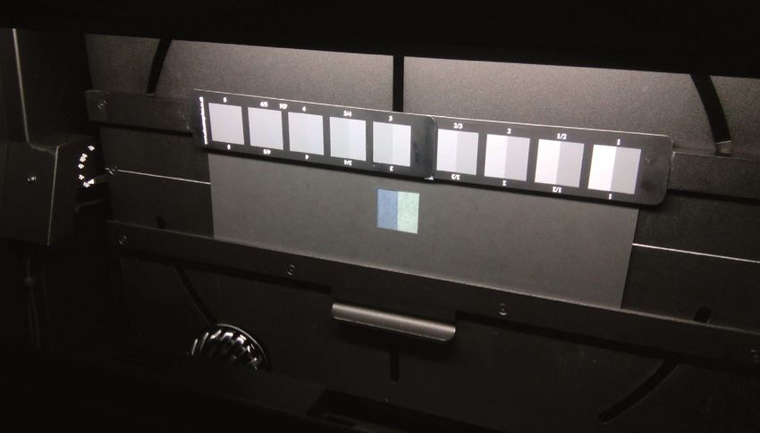
standard grey scale from the Society of Dyers and Colourists’ (SDC, 2018) which contains nine pairs of
grey chips. The pair marked as 1 indicates the highest colour difference and the pair 5 smallest difference
between the two samples. This scale is normally used to evaluate fading (ISO, 2013), but was also
successfully employed for estimating colour differences between printed samples of large colour
difference (Huang et al., 2011), as well as the goniochromatic samples used in automotive industry
(Martínez, 2013; Melgosa et al, 2014).
The biggest drawback of SDC scale is that it only shows the change in lightness. Also, it covers a certain
range of colour differences, meaning that it might be inappropriate for estimating perceived disparity
between two very distinct colour samples. In the case of printed samples enhanced with pearlescent
pigments, the range of the differences is much wider in comparison to the goniochromatic samples found
in the automotive industry. Also, the samples are often very chromatic, where the disparities in chroma
significantly contribute to the perceived colour difference.
In this work, we were interested in whether the SDC grey scale would be appropriate for estimating
colour differences of prints enhanced with pearlescent pigments, concerning the range of the presented
differences. Also, since grey scale shows mostly change in lightness, we will check if it would be less useful
for assessing the differences of very chromatic samples.

2. METHOD

2.1 Samples
As the visual effect produced by pearlescent pigments highly depends on the colour of the surface on
which they are applied, we choose three base colours – black, grey and white (paper). Choosing the
achromatic base colours ensured that the hue of the samples will be determined only by the pearlescent
pigments in the coating layer, as well as that the chroma will decrease gradually with the increase of the
viewing angle. The lightness of the base colour influenced the intensity of the perceived effect – on black
samples the chroma was very dominant in the near-specular angles, while on white it was almost absent.
The colour patches of size of 10x10 cm, of the mentioned colours were printed in Xerox DocuColor 252
digital printing machine on 300 g/m2 matte art paper - type 2 in (ISO, 2013). The colour coordinates of dry
prints are given in Table 1 (average of 3 measurements obtained with SpectroDens spectrophotometer).

Table 1: CIELAB colour coordinates of three base colours (geometry 45°/0°, illuminant D65 and Standard
        Observers CIE1964)

                        Colour                L*                  a*                   b*
                        Black                15.75               -1.64                -1.73
                         Grey                50.56               -1.8                 -1.29
                    White (paper)            93.46               0.21                 -3.1

After drying, prints were enhanced with three types of Iriodin pearlescent pigments – 221 Rutile Fine
Blue, 223 Rutile Fine Lilac and 231 Rutile Fine Green (Merck, 2018). Pigments were dispersed in the
aqueous ink base (WBA base S) in the concentration of 15%. They were deposited on the prints via screen
printing (mesh size of 68 lines/cm), where two layers of coating were deposited wet-on-wet. The drying
was done during one minute at the temperature of 140° C.
All three pigments have the same composition (mica + titanium dioxide) and only differ in the thickness of
the TiO2 layer that leads to distinct interference colours – blue, lilac and green. With the decrease of the
aspecular angle, the colour of the samples shifts to the lower wavelengths, i.e. appears more bluish.
Figure 1 shows CIELAB colour coordinates of enhanced prints measured in the aspecular angle of 45°.
The samples where the base colour was white exhibit very high lightness and low chroma (triangles
in Figure 1). With the decrease of the lightness of the base colour (grey and black samples), chroma
gradually increased.

2.2 Experimental setup
Visual assessment of printed samples was conducted in the completely dark room using Byko-Spectra
effect cabinet (BYK, 2018). This cabinet is specially designed for evaluating effect coatings and materials

                                                        78
since its tilting table allows positioning samples in 6 angles specified in ASTM E2539-12 (ASTM, 2012): -15
asp, 15 asp, 25 asp, 45 asp, 75 asp and 110 asp.
Figure 2 depicts the interior of the Byko-Spectra cabinet during the experiment. Colour sample pair was
placed in the middle of the tilting table, while the SDC grey scale was positioned above the pair. Since our
colour samples were bigger than the grey chips, to facilitate the assessment, we used a black mask with
an aperture equal to the greyscale pair’s size (Figure 2).
Figure 1: CIELAB colour coordinates of 9 colour samples used in the experiment. Triangles, circles and squares mark
samples where the base colour was: white, grey and black, respectively. Measurements were performed in the
aspecular angle of 45° asp using Photo Research 745 spectroradiometer (1° visual field) placed in the same position as
the observers in the visual experiment.
Figure 2: Experimental setup – SDC grey scale and the test colour pair with black cover
The colour pair to be assessed consisted of the samples with the same base colour as shown in table 2. In
the repetitions of experiment, the position of the samples (left or right) was randomly changed. The
CIELAB colour coordinates of the samples were obtained from the measurements of Photo Research 745
spectroradiometer (1° visual field) placed just in the same position as the observers. Since the light source
in the cabinet differs from CIE illuminants, transformations to CIELAB were made by taking into account
the reflectance of the reference white (during the measurement placed at the position of the samples).
The coordinates were obtained for each one of the viewing angles. In Table 2, colour, absolute lightness
and chroma differences for all nine pairs are given for the angle of 45° asp, while Figure 3 shows the
change of colour difference of each pair with the change of the viewing angle.
79Table 2: The colour pairs used in the study (differences correspond to the viewing angle of 45° asp)
The base colour of Pearlescent pigment colour
Colour pair the samples 1 and 2 Sample 1 Sample 2 ΔEab │ΔL*│ │ΔC*ab│
1 Black Blue Green 29.24 17.16 12.59
2 Black Blue Lilac 16.09 7.79 10.43
3 Black Green Lilac 30.31 24.27 2.07
4 Grey Blue Green 15.86 8.70 6.28
5 Grey Blue Lilac 9.77 5.28 7.06
6 Grey Green Lilac 20.06 17.04 2.15
7 White Blue Green 1.09 0.81 0.06
8 White Blue Lilac 1.83 0.99 0.23
9 White Green Lilac 2.79 2.55 0.18
Figure 3: Colour differences of the colour pairs with (a) black, (b) grey and (c) white base colour
The colour pairs with black base colour (pairs 1-3, Figure 3a) exhibit the highest colour differences, where
the disparities in both lightness and chroma were significant. On the contrary, the samples with white
background (colour pairs 7-9, Figure 3c) were the least different. In the latter case, the change
in lightness was the most prominent. It is noticeable that all the colour pair used in the experiment
had colour difference above ΔEab of 1, while the majority belonged to the range of large colour
differences (ΔEab>5).
Colour differences between the samples changed significantly with the change of a viewing angle as seen
in Figure 3. In all the cases the differences were the highest in the angle of 15°. By increasing the viewing
angle, the differences decreased, which can be attributed both to the decrease of lightness and chroma
as seen in Figure 4 and 5. While in the low aspecular angles the hue of the samples is quite dominant, in
the angles far from aspecular they appear as almost achromatic.
This trend was seen for the black and grey background pairs, while for the colour pairs with white base
colour there is an additional increase of colour differences in the angle of 75° asp (Figure 3c and Figure 6).
The increase of difference in the abovementioned angle was mainly due to the change in lightness as
shown in Figure 6.
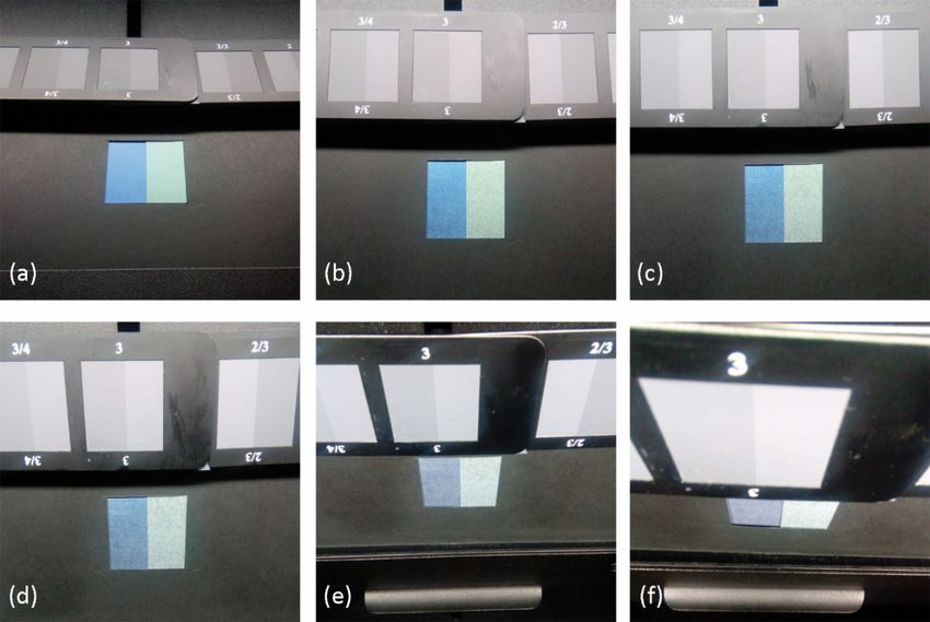
80Figure 4: The appearance of the colour pair 1 observed in the aspecular angles of (a) -15°, (b) 15°, (c) 25°, (d) 45°,
(e) 75° and (f) 110
Figure 5: Colour, lightness and chroma differences of colour pair 1 in the six viewing angles
Figure 6: Colour, lightness and chroma differences of colour pair 7 in the six viewing angles
Due to its position in the viewing cabinet, the grey scale was not illuminated uniformly (Figure 2). As it
was shown (Melgosa et al, 2016) this can result in a significant colour change of the specific grey
scale pair with the change of the viewing angle. Hence, the grey scale colour pairs were measured in
the same way as test pairs and the differences were obtained in the form of ΔEab. Minimum and
maximum differences (corresponding to the pairs 5 and 1 in SDC grey scale) in all 6 viewing angles
are presented in Table 3.
81Table 3: Measured range of ΔEab colour differences of the grey scale in different viewing angles
Aspecular angle Min ΔEab Max ΔEab
-15 1.15 12.76
15 1.87 12.29
25 1.92 12.78
45 1.81 13.70
75 0.90 15.70
110 0.62 15.10
As it can be seen the highest measured difference in the grey scale is 15.70 ΔEab in the angle of 75°. In the
rest of the angles, the differences were a bit lower. It implies that in the Byko-Spectra cabinet the SDC
grey scale would be appropriate for assessing colour pairs with maximum ΔEab of 16 CIELAB units.
2.2 Experimental setup
Ten observers (3 females and 7 males) participated in the experiment. They all had normal to corrected-
to-normal vision and normal colour vision. Four participants can be regarded as experts, while six were
naïve. The observers passed 2 minutes of adaptation to the environment looking inside the cabinet and,
prior to the assessment, were asked to evaluate 5 colour pairs to be able to familiarise with the
experiment. They were instructed to evaluate the colour pair presented in the centre of their visual field
concerning the greyscale. Intermediate values to those presented in the greyscale were allowed.
Observers were also encouraged to report differences that are out of the grey scale. Such responses were
noted as “no answer” and were processed as such.
In one session each observer assessed all 9 colour pairs in 6 viewing angles (54 assessments in total). The
session lasted approximately 30 minutes and was repeated three times. The repetitions were conducted
in different days in order not to exhaust the observers and to avoid memory effects.
The values in SDC greyscale indicate the degree of fading and are expressed on an ordinal scale. Also, in
different viewing angles, the distinctness between grey pairs was perceived differently. In consequence,
the responses given by the observers could not be used in their raw form since they did not provide any
information about the perceived colour difference. To relate observers’ responses to the visual colour
difference (ΔV) we scaled them to ΔEab, commonly used for such a task (Martínez, 2013; Melgosa et al,
2014). The colour differences between greyscale pairs in each of the viewing angles were obtained and
related to SDC values via fourth polynomial fitting (Martínez, 2013). The visual differences were then
calculated from the observers’ responses by using the corresponding polynomial.
For assessing the agreement between perceived and measured colour differences we used Standardized
Residual Sum of Squares - STRESS index (Melgosa, 2011):
STRESS =
∑ (∆E − F∆V ) i i
2
for F=
∑ ∆E i
2
(1)
∑ F ∆V 2
i
2
∑ ∆E ∆V i i
where ΔE is colour difference obtained by measurement, and ΔV - the perceived difference for the set of
colour pairs N (i=1,... N). This metric is limited in the range of 0-100, where 0 denotes perfect agreement,
i.e. no difference between measured and observed values.
The same metric was used to obtain intra- and inter-observer variability (Melgosa, 2011). To estimate the
variations in the responses of a single observer with repeated assessment (intra-observer agreement)
his/hers mean responses from three sessions were compared against responses from individual trials. The
variation in responses between observers (inter-observer agreement) was obtained by replacing ΔEi and
ΔVi with the mean responses of one observer and the mean responses of the whole group of observers.
The final values for both inter- and intra-observer agreement were the mean values from all the
observers participating in the experiment (Melgosa, 2011).
823. RESULTS AND DISCUSSION
By taking into account the measured colour differences of our colour pairs and the highest differences
measured in the grey scale in each of the viewing angles (Table 3), for assessing the reliability of
observers´ responses we divided the sample pairs into two groups. In the first group were colour pairs
with ΔEab that fall within the range of the differences presented in the grey scale (within the range group),
while in the second pairs with ΔEab that exceeds the highest difference in grey scale for the respective
angle (out of the range group).
The first group (within the range group) consisted of 25 pairs in total (counted in all angles), mostly
samples with the white base colour as well as grey and black base colour samples in the angles far from
specular. The highest chroma difference within the group was 7.89, while the highest lightness difference
was 10.85.
Second (out of the range) group had 29 pairs in total. In this group, there were no samples with white
base colour. The highest chroma difference in out of the range group was 20.69, while lightness
differences ranged up to 28.8.
The intra- and inter-observer variability were calculated for both groups of samples. Table 4 summarises
the results of intra-observer variations for each one of the observers. Results for colour pairs where
observers missed to give an answer (the perceived difference was higher than shown in grey scale in at
least one repetition) were excluded from the analysis.
Table 4: Intra-observer variability (n – naïve, e – expert)
Observer 1 2 3 4 5 6 7 8 9 10 Mean
Experience e e n n n n e e n n
Within
the range 16.67 24.24 28.13 25.91 40.40 31.90 26.18 27.73 27.74 31.62 28.05
group
Out of
the range 18.67 19.05 23.70 20.53a 19.07b 28.00 34.45 20.61c 17.86 30.24d 23.31
group
a calculated by excluding 5 pairs due to the missing answers
b calculated by excluding 1 pair due to the missing answer
c calculated by excluding 21 pairs due to the missing answers
d calculated by excluding 8 pairs due to the missing answers
The within-subject agreement for the first group of sample pairs can be regarded as satisfactory, except
in the case of observer 5. If the observer 5 were excluded from the further analysis, the mean STRESS
value would be 26.68 which is a bit higher than reported in the assessment of automotive goniochromatic
samples (Melgosa, 2014).
In most of the cases, an agreement was slightly better for pairs whose colour differences exceed the
range presented in the grey scale. It seems that observers tend to assign the value 1 of the grey scale
(higher difference) to all the test samples pairs exceeding the color difference in the grey scale, which
resulted in better agreement between repetitions. This result, however, should be taken with caution due
to a large number of pairs that were excluded from the analysis. Namely, four observers out of ten (3
naïve and 1 experienced) reported perceived differences out of the grey scale range. This was mostly the
case for the pairs observed in near specular angles (-15° asp, 15° asp and 25° asp), where the chroma was
more accentuated. None of the observers reported higher differences in the angles far from the specular,
where all the samples appeared almost achromatic.
In average, for the sample pair with differences within the SDC grey scale range, expert observers showed
better intra-agreement (STRESS of 23.7 in comparison to 30.96 for naïve). For the out of the range pairs,
the results of experts and naïve observers were almost the same.
During the experiment, the majority of the observers reported difficulties to assess the differences when
the presented colour pair appeared more chromatic (when pairs were observed in the near-specular
angles, where both of the samples exhibit higher chroma). To evaluate if the mentioned issue was
reflected in their answers, i.e. if the ratings were more certain in their assessment in cases when
presented samples appeared more achromatic, their intra-observer agreements were calculated for the
colour pairs with chroma differences lower than 1 (14 pairs in total), for colour pairs where ΔC*ab was in
83the range of 1-5 (20 pairs) and for those where their chroma difference was larger than 5 (20 pairs).
Results are presented in Figure 7.
Figure 7: Inter-observer agreements for colour pairs with a distinct range of chroma difference
Obtained results (Figure 7) indicate that the chromaticity of the samples did not influence the within-
subject agreements significantly. Even though the observers had difficulties to grade very chromatic
colour pairs, their responses in three repetitions were quite coherent.
The inter-observer agreement for within the range group was 25.43, while for the samples that exceeded
the grey scale range it was 19.36 (with 22 pairs excluded from the calculation due to at least one missing
answer). If the agreement was calculated for the observers who reported the differences for all the
colour pairs, the STRESS index was 24.23. Similar values can be found in (Melgosa, 2014; Huang, 2011).
Observers agreed well in their answers even in the case where differences were clearly out of the
reference range. This is an interesting finding, suggesting that the ratters assumed that the difference is
within the range of presented reference and judged the pairs accordingly.
Inter-observer agreements for expert and naïve observers are shown in Table 5. The expert observers
tend to agree more in their answers, both for the sample pairs within and out of the SDC grey scale
difference range (Table 5).
Table 5: Inter-observer agreements
Observers Expert Naïve
Within the range group 21.89 26.25
Out of the range group 16.39a 24.65b
a calculated by excluding 21 pairs due to the missing answers
b calculated by excluding 10 pairs due to the missing answers
In order to assess the agreement of the observers’ answers concerning chroma difference of the colour
pair, STRESS index was also calculated for the responses given to the pairs with low, middle and large
chroma differences. The results are presented in Table 6.
Table 6: Inter-observer agreements for colour pairs with a distinct range of chroma difference
│ΔC*ab│The relationship between perceived and measured colour differences was evaluated only for the colour
pairs whose differences were within the range of the SDC grey scale. The STRESS value (calculated
for all observers and based on their mean answers) was 30.86. The obtained result is significantly
lower than reported in (Melgosa, 2014) and indicate a satisfactory correlation between perceived and
measured values.
4. CONCLUSIONS
In this work, we evaluated the possibility of using standard SDC grey scale for reporting the perceived
differences of printed samples enhanced with pearlescent pigments. The goniochromism of such
samples leads to the perception of very different colours with the change of the viewing angle, where
the final impression highly depends on the base colour. Since the SDC grey scale shows only the
change in lightness, we assumed that it would be less efficient for assessing differences of highly
chromatic samples.
Our sample set consisted of achromatic prints (black, grey and white) enhanced with three types of
pearlescent pigments (Iriodin 221 Rutile Fine Blue, 223 Rutile Fine Lilac and 231 Rutile Fine Green),
enabling the perception of different hues in the angles close to specular. The chroma of the samples
decreased with the increase of the viewing angle, producing the significant change of both perceived and
measured colour difference between the samples with the change of the angle of view. The color pairs
were built with samples with the same base colour and different pigment in the coating layer.
Measured colour differences (ΔEab) of our colour pairs revealed that mostly the pairs with white base
colour (where pigments were deposited on unprinted paper), as well as few greys and black samples
observed in the angles farther from specular, exhibit the differences that were within the range of those
presented in SDC grey scale. In the real-world application (printing of packaging, for example) pearlescent
pigments are rarely printed directly on the paper/cardboard. In fact, they are often used to accentuate
the design, mostly overprinting dark and colours with dominant hue. This means that the range of the
differences between samples in practice often exceeds the difference range presented in SDC scale.
Even though half of the sample pairs were out of the range of colour difference of the SDC scale the
observers were asked to rate them. Interestingly enough, six out of ten observers did not report higher
differences. We believe that the reason for this was the fact that the differences between our colour
pairs consisted both of difference in lightness and chroma, which made the evaluation more difficult than
in other works (Melgosa 2014).
Intra- and inter-observer variability obtained for the colour pairs with differences that were within- and
out of the range of those presented in grey scale were satisfactory. Experienced observers showed better
agreements in their responses, as expected. In addition, observers gave consistent answers in three
repetitions and agreed quite well when estimating pairs with high chroma difference.
The relationship between perceived and measured (ΔEab) differences was estimated only for colour pairs
where ΔEab was within the range of grey scale. The correlation between the observers’ answers and
measured values was satisfactory, meaning that the SDC grey scale can be used to estimate differences
for pearlescent prints with differences up to 16 ΔEab.
By taking all the results into account, we can conclude that the grey scale can be used for estimating
differences of samples with dominant chroma. For assessing the perceived disparities of printed samples
enhanced with pearlescent pigments, it is necessary to use reference scale with a higher range of colour
differences than those presented in the SDC scale. Since chroma did not significantly influence the
observers’ responses, the scale can be formed with grey pairs.
5. ACKNOWLEDGEMENTS
The research is supported by the Ministry of Education, Science and Technology Development of the
Republic of Serbia, project number: 35027 “Development of software model for scientific and production
improvement in graphic industry” and by the Spanish State Agency of Research (AEI) and the Ministry for
Economy, Industry and Competitiveness (MIMECO) by means of the grant number FIS2017-89258-P with
European Union FEDER (European Regional Development Funds) support.
The samples used in this study were partially printed in Squeegy Print printing house. The authors would
like to express their sincere gratitude to Bojan Bačkalić for sharing his facilities and for his help and
comments, as well as to volunteers from the Department of Optics (University of Granada, Spain) who
participated in the visual experiment.
856. REFERENCES
[1] ASTM International: ASTM E2539 – 12. “Standard Practice for Multiangle Color Measurement of
Interference Pigments”, 2012. URL www.astm.org (last request: 2017-03-07).
[2] BYK: Light Booths, URL https://www.byk.com/en/instruments/products/?a=2&b=20&f=0&faction
(last request: 2018-08-20).
[3] Huang, M., Liu, H., Cui, G., Luo, M.R.: “Research on large color difference evaluation using printed
samples”, Proceedings of 4th International Congress on Image and Signal Processing, Vol 5.
(IEEE: Shanghai, China, 2011), pages 1753-1756. doi: 10.1109/CISP.2011.6100543.
[4] International Organization for Standardization: ISO 105-A02:1993. “Textiles -- Tests for colour
fastness -- Part A02: Grey scale for assessing change in colour”, 1993.
URL https://www.iso.org/standard/3785.html (last request: 2018-09-08).
[5] International Organization for Standardization: ISO 12647-2:2013. “Graphic technology -- Process
control for the production of half-tone colour separations, proof and production prints -- Part 2:
Offset lithographic processes”, 2013. URL https://www.iso.org/standard/57833.html
(last request: 2018-09-08).
[6] Klein, G. A.: “Industrial Color Physics”, (London, GB: Springer, 2010.), pages 91-92.
[7] Maile, F. J., Pfaff, G., Reynders, P.: “Effect pigments—past, present and future”, Progress in Organic
Coatings 54(3), 150-163, 2005. doi: 10.1016/j.porgcoat.2005.07.003.
[8] Martínez, J.: “Testing the AUDI2000 colour-difference formula”, Master thesis report - Color in
Informatics and Media Technology, Universidad de Granada, 2013.
[9] Meadows, M. G., Butler, M. W., Morehouse, N. I., Taylor, L. A., Toomey, M.B, McGraw, K.J.,
Rutowski, R. L.: “Iridescence: views from many angles”, Journal of the Royal Society Interface 6(2),
S107–S113, 2009. doi: 10.1098/rsif.2009.0013.focus.
[10] Melgosa, M., García., P. A., Gómez-Robledo, L., Shamey, R., Hinks, D., Cui, G., Luo, M. R.: “Notes on
the application of the standardized residual sum of squares index for the assessment of intra- and
inter-observer variability in color-difference experiments”, JOSA A 28(5), 949-953, 2011.
doi: 10.1364/JOSAA.28.000949.
[11] Melgosa, M., Gómez-Robledo, L., Cui, G., Li, C., Ferrero, A., Bernad, B., Campos, J., Richard, N.,
Fernández-Maloigne, C.: “Using a standard grey scale for colour change in a multi-angle colour-
assessment cabinet”, Proceedings of 4th CIE Expert Symposium on Colour and Visual Appearance,
(CIE: Prague, Czech Republic, 2016), pages 93-94.
[12] Melgosa, M., Martínez-García, J., Gómez-Robledo, L., Perales, E., Martínez-Verdú, FM., Dauser, T.:
“Measuring color differences in automotive samples with lightness flop: a test of the AUDI2000
color-difference formula”, Optics Express 22(3), 3458-67, 2014. doi: 10.1364/OE.22.003458.
[13] Merck: Iriodin®, URL https://www.merckgroup.com/en/brands/pm/iriodin.html
(last request: 2018-04-03).
[14] SDC: SDCE Grey Scale, URL https://www.sdcenterprises.co.uk/products/sdc-assessment-aids/grey-
scale (last request: 2018-08-20).
[15] Tomić, I., Dedijer, S., Novaković, D., Jurič, I.: “Artificial neural networks for optimising camera‐based
colour measurements of prints enhanced with pearlescent pigments”, Coloration Technology
134(5), 364-372, 2018. doi: 10.1111/cote.12346.
[16] Weitzel, J.: “Special effect pigments in printing inks”, In: Pfaff, G.: (Ed.) “Special Effect Pigments,
2nd Ed”, (Hannover, Vincentz Network, 2008.), pages 171-194.
© 2018 Authors. Published by the University of Novi Sad, Faculty of Technical Sciences, Department of
Graphic Engineering and Design. This article is an open access article distributed under the terms and
conditions of the Creative Commons Attribution license 3.0 Serbia
(http://creativecommons.org/licenses/by/3.0/rs/).
86You can also read