Beginning Algebra Made Useful - Charlene E. Beckmann, Ph.D. Grand Valley State University 2020
←
→
Page content transcription
If your browser does not render page correctly, please read the page content below
Beginning Algebra
   Made Useful

    Chapter 2

     Charlene E. Beckmann, Ph.D.
     Grand Valley State University
                 2020
Table of Contents
Chapter 2 Proportional Reasoning and Linear Functions ........................................................45
Activity: Function Versus Equation ................................................................................................. 45
2.1 Representations: Graphs, Data, and Algebra through Children’s Literature .............................. 45
Video: Talking About Math ............................................................................................................. 45
Activity: The Eyes Have It ................................................................................................................ 46
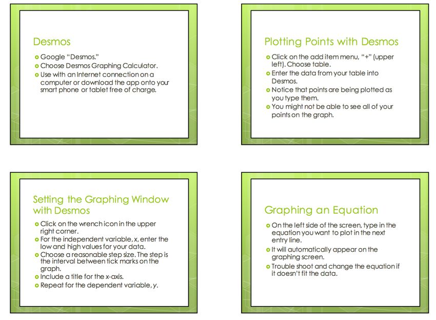
Activity: Graphing with Desmos...................................................................................................... 48
Activity: The Eyes Have It, Extended ............................................................................................... 48
2.1 Homework ............................................................................................................................... 48
2.2 Creating and Critiquing Graphs ................................................................................................ 50
Activity: Location, Location, Location ............................................................................................. 50
Activity: It’s a Matter of Scale ........................................................................................................ 51
Activity: What’s Wrong with this Picture? Critiquing Graphs ......................................................... 56
2.2 Homework ............................................................................................................................... 58
2.3 Interpreting and Creating Graphs: The Hare and the Tortoise................................................... 60
Activity: Can You Walk these Graphs? ............................................................................................ 60
Activity: The Hare and the Tortoise ................................................................................................ 62
2.3 Homework ............................................................................................................................... 64
2.4 Graphs, Tables, and Linear Functions: Analyzing a Race ........................................................... 65
Activity: Trodding Tortoise ............................................................................................................. 65
Activity: Hopping Hare .................................................................................................................... 68
2.4 Homework ............................................................................................................................... 69
2.5 Proportional Reasoning Every Day ........................................................................................... 72
Activity: Recipes and Proportional Reasoning ................................................................................ 72
Activity: Where Else Do You Use Proportional Reasoning? ............................................................ 75
2.5 Homework ............................................................................................................................... 77
2.6 Distinguishing Proportional Relationships from Other Linear Relationships ............................. 80
Activity: Giving the Tortoise a Head Start ....................................................................................... 80
Activity: Finding Equations from Tables and Interpreting Slope and y-Intercept ........................... 82
2.6 Homework ............................................................................................................................... 85
2.7 The Meanings of Slope and y-Intercept, Connecting Graphs and Equations .............................. 89
Activity: Linear Functions with Desmos – Slopes and y-Intercepts................................................. 89
Activity: Polygraphs: Linear with Desmos ....................................................................................... 91
2.7 Homework ............................................................................................................................... 91
2.8 Linear Functions: Big Ideas ..................................................................................................... 100
Activity: Big Ideas – Slope and y-Intercept ................................................................................... 100
2.8 Homework ............................................................................................................................. 102
2.9 Analyzing Tile Patterns ........................................................................................................... 105
Pattern Talk: Tile Pattern .............................................................................................................. 105
Activity: Analyzing Tile Patterns.................................................................................................... 106
2.9 Homework ............................................................................................................................. 108
Ó 2020 Beckmann, C. Beginning Algebra Made Useful
Chapter 2
Proportional Reasoning and Linear Functions
Chapter 1 provided many opportunities for you to view mathematics through a variety of
contexts in which mathematics arises and through connections among representations. In
Chapter 2, you will continue to broaden your exposure to contexts and multiple
representations, this time through those that can be modeled by linear functions. To be certain
of your facility with linear functions, near the end of the chapter, we include a few functions
that are not linear so that you consider more deeply what it means to be linear.

Activity: Function Versus Equation
Before we begin, let’s talk about the word, function. We used the word function a few times in
Chapter 1 without defining it. For our purposes, function and equation are almost
interchangeable. Equations are more general than functions. Here are some equations:
          y = 3x + 4                   2x – 3 = 3x + 4               8 = 3x + 4
          y = 5 – 7x                  14 – 7x = 5 – 7x           2(3x + 4) = 6x + 8
             y=4                           x = 11                    1 = – (–1)
Some of the equations above are also functions. Can you guess which equations are also
functions? Circle them. Why do you think these are functions and the others are not?
There are several mathematical definitions of function online. Here are two of them:
• A function is a special relationship where each input has a single output.
   (Math is Fun, https://www.mathsisfun.com/definitions/function.html, retrieved April 16, 2020.)
• A technical definition of a function is: a relation from a set of inputs to a set of possible
   outputs where each input is related to exactly one output.
   (Math Insight, http://mathinsight.org/definition/function, retrieved April 16, 2020.)
Let x be the variable representing the set of input values. Let y be the variable representing the
set of output values. Use one of these definitions to determine which of the equations above
are functions. Be ready to explain your choices.

2.1 Representations: Graphs, Data, and Algebra through Children’s Literature
Children’s literature is a rich source for mathematics connections. Though the stories are
intended for children, the underlying mathematics is more advanced. In this lesson, we will
read a story and see how it can be represented through graphs, tables, and algebra.

Video: Talking About Math
In How to Learn Math for Students, Lesson 4, watch Video 4: Talking About Math. How can you
benefit by actively working in groups both in and outside of class? Think about how well you
and your group members currently interact. What ideas do you have about how to help your
group work together more productively? Share your ideas with your group.

Ó 2020 Beckmann, C. Beginning Algebra Made Useful                                                   45
Activity: The Eyes Have It
Because variables are so important in our work with algebra, it is helpful to further develop our
facility with their use. In The Eyes Have It, you will study the relationship between the numbers
of monsters and the corresponding numbers of eyes (each monster has only two eyes) through
tables, graphs, English sentences, and algebraic equations.

Ó 2020 Beckmann, C. Beginning Algebra Made Useful                                              46
The Eyes Have It
 Read Horns to Toes and In Between by Sandra Boynton. (You can find an amusing version of the
 book on YouTube at: https://www.youtube.com/watch?v=5J2BwEu1ueY.)
 How many eyes do 3 monsters have? 4 monsters? 7 monsters? All the monsters in the book? Any
 number of monsters (with 2 eyes each)?
 1. Record the number of eyes based on the number of people in the table.
  Number of              1       2       3          4   5     6              M
  Monsters, M
  Total Number of                                                  E=
  Eyes, E
 2. Graph the data in the table. Label the horizontal axis, Number of Monsters, and the
    vertical axis, Total Number of Eyes.

     a. Starting at 0 where the two axes meet, number the tick marks on the horizontal axis
        increasing by 1 each time for each dark vertical line (every other tick mark).
     b. Choose a reasonable scale for the vertical axis. Explain why the scale is reasonable.
     c. Describe the shape of the graph.
     d. Why do you think the graph has the shape it does?
 3. Describe the relationship between the number of monsters and the total number of eyes the
    monsters have. Here is one way to phase into the use of variables:
                       The number of Eyes is two times the number of Monsters.
                              Number of Eyes = 2 x number of Monsters
                                              E=2xM
                                               E = 2M
 4. Choose a body part that humans have more than 2 of. Repeat problems 1, 2, and 3 for
    the body part you choose. You are welcome to look up numbers on the Internet if you don’t
    know them.
 5. Graph number of people versus total number of the chosen body part on the axes above.
    What do you notice?

Ó 2020 Beckmann, C. Beginning Algebra Made Useful                                               47
Activity: Graphing with Desmos Read the student page, Graphing with Desmos. Open Desmos on a computer, a smart phone, or an electronic tablet. Use the directions to plot the data from The Eyes Have It. What questions do you have? Share your graph with your group. Activity: The Eyes Have It, Extended What household items do Americans likely have in quantity? Find statistics about the average number of something each household owns. Repeat the activity in the Eyes Have It, problems 1 through 3, for the item you are interested in. Create a graph with Desmos to represent the data. Share your work on this problem with your group. • How did you decide what scale to use? • How did you find the equation to plot? • What questions do you have? 2.1 Homework 1. Go back to the first section of Lesson 1.1, How to Learn Math for Students. Complete problem 10 on page 6. You will hand in your written reflections for problem 10 in class. 2. Revisit the student page, The Eyes Have It. Using the data in problem 4 for the Human Body Parts your group chose, create a table listing the number of body parts for 2, 4, 6, 8, and 10 people. Plot the data with Desmos. Choose appropriate scales for both x and y if the scales Ó 2020 Beckmann, C. Beginning Algebra Made Useful 48
chosen by Desmos do not show all of the data. Find an equation to fit the data. Print out
    the graph and data or be prepared to share them electronically.
3. If plotting points on a coordinate grid is unfamiliar to you, or you need to dust off the skill,
   return to problem 2.
   a. Compare the graph with the data table. Which number is plotted along the horizontal
        axis? Which number is plotted along the vertical axis?             x                y
   b. Create a new table on Desmos using the values at                     4               –3
        right. Answer problem 3a again.                                   –2                5
   c. Predict the location of several more points. Enter the               0               –1
        points into the table in problem 3b to see if you are             –5               –4
        correct.
4. Movie tickets cost $8.50 each.
   a. Complete the table to show the cost of
      the numbers of movie tickets listed if each
      ticket costs $8.50.
         Number of tickets   Cost of tickets
                 0
                 1               8.50
                 2
                 3
                 4
                10
                15
                n
    b. Plot the data on the graph at right. Label
       accurate scales for both x and y so that
       you use most of the graph. Write titles on
       each axis.
    c. Describe the relationship between the number of tickets purchased and the cost of that
       number of tickets.
    d. Write the relationship in problem 4c as an equation.
5. Gasoline prices sometimes vary greatly in a day. On January 28, 2015, gasoline prices in the
   Muskegon, MI area ranged from $1.879 to $2.199 per gallon.
   a. Complete the table to find how much you would pay for the numbers of gallons of gas
      listed for each gasoline price. Round prices to the nearest penny (hundredth of a dollar).
          Number of Gallons of Gas                                  Price of Gas, P
                 Purchased, g                   $1.879 per gallon                     $2.199 per gallon
                       1
                       2
                       3
                       4

Ó 2020 Beckmann, C. Beginning Algebra Made Useful                                                         49
5
10
15
g
b. Accurately plot the data. Label scales and titles for each axis.
c. Write equations in the last row of the table that fit the data. Tell how you know your
equations are correct.
d. How many gallons of gasoline can you purchase for $10? Show your work for one of the
gasoline prices, accurate to 2 decimal places.
2.2 Creating and Critiquing Graphs
You have seen that graphs can be helpful in representing data. In Lesson 2.2, you will
specifically explore the importance of scale when graphing equations.
Activity: Location, Location, Location
Through this activity your group will create a graph to convey information about the number of
people in a location over time. You will also interpret a graph prepared by another group and
try to determine a location that fits the graph. To prepare, think about a place you go with
some regularity. How many people are in that place at various times during the day?
To maximize the interest level, each group must choose very different types of locations. It
helps if the numbers of people who go to the place each day are large. Secrecy of choice is
critical! Make sure other groups cannot overhear your group’s discussions!
Complete the following with your group:
1. Choose a location and a day of the week to analyze. Get your teacher’s approval before
continuing (to assure that your group chose a unique location).
2. Estimate how many people are likely to be in the location at the beginning of each hour of
the day, starting at 6 AM and ending at 5 AM the following day. Record the data.
3. Create a graph to accurately represent the data.
• Use the horizontal axis to indicate the hour of the day.
• Use the vertical axis to indicate the estimated number of people in the location at the
beginning of each hour.
• Do not include any information on your graph that identifies the location your team is
analyzing.
When you have accomplished the above, your teacher will share your graph with another group
and provide another group’s graph for your group to analyze.
4. For the new graph:
a. Decide what location the graph likely represents.
b. Explain to each other why the graph could represent the location you think it does.
c. Write questions you have about the graph.
Ó 2020 Beckmann, C. Beginning Algebra Made Useful 505. What features of graphs help you interpret them? What makes these features helpful? 6. Share the graph with the class when asked to do so. Ask questions to help you and others analyze the graph. Location, Location, Location is adapted from Annenberg Learner, Teaching Math: A Video Library, 5–8, The Location, http://www.learner.org/channel/schedule/printmat.html?printmat_id=123, retrieved April 16, 2019. Activity: It’s a Matter of Scale How important are the scales chosen for both the horizontal and vertical axes to the appearance of a graph or a group of graphs? Think about this question as you work together on the student page, It’s a Matter of Scale. Among groups, compare graphs for problems 3 and 4a. What do you notice? Think about these questions: • Are all of the graphs the same shape? • Why did all of the graphs look the same in problem 3? • Why do the graphs look different in problem 4a? Discuss the importance of scale. Think about the activity, Location, Location, Location. How important was scale in helping you determine the location of each place? Does the x-scale matter? Does the y-scale matter? Ó 2020 Beckmann, C. Beginning Algebra Made Useful 51
It’s a Matter of Scale
 Directions: Each group member receives a card with an equation on it and both x- and
 y-scales to use to graph the equation.
 1. Starting with zero at the origin, the point where the axes intersect, each tick mark increases
    by the amount of the scale provided. Label both the x- and y-axes showing the scale on
    the card.

 2. Create a table that fits the equation and x-scale you were given. Plot the points in the
    table on the coordinate grid. Graph the equation by connecting the points you found.
    Write the equation of the line on the graph you drew.
 3. a. Compare the graphs drawn by members of your group and class. What do you notice?
    b. Look carefully at the equations plotted and the scales used. Should the graphs appear
       as they do? Why or why not?
    c. Explain why the graphs appear as they do.

Ó 2020 Beckmann, C. Beginning Algebra Made Useful                                                52
4. Work with other members of your group.
a. Graph the equations each person was provided on the same graph using the largest x-
and y-scales provided in the set of cards.
b. What do you notice?
c. Discuss any differences in the appearances of the graphs compared to the graphs
plotted in problem 2.
d. Why do the graphs in problem 2 look different from the graphs in problem 4a?
5. Write about the importance of scale in graphing.
Ó 2020 Beckmann, C. Beginning Algebra Made Useful 53It’s a Matter of Scale Card Set
Directions: Print or copy pages 54 and 55, on separate sheets of paper. Cut the cards apart.
Each group member receives one card with all four cards in a row assigned to the same group.
Graph y = 2x Graph y = 3x
2x Graph y = 4x
2x Graph y = 5x
2x
x-min = 0 x-min = 0 x-min = 0 x-min = 0
x-max = 5 x-max = 10
5 x-max = 15
5 x-max = 25
5
x-scale = 1 x-scale = 2
1 x-scale = 3
1 x-scale = 5
1
y-min = 0 y-min = 0 y-min = 0 y-min = 0
y-max = 10 y-max = 30
10 y-max = 60
10 y-max = 125
10
y-scale = 2 y-scale = 6
2 y-scale = 12
2 y-scale = 25
2
Graph y = 0.5x Graph y = 0.25x Graph y = 0.75x Graph y = x
x-min = 0 x-min = 0 x-min = 0 x-min = 0
x-max = 5 x-max = 10 x-max = 20 x-max = 5
x-scale = 1 x-scale = 2 x-scale = 4 x-scale = 1
y-min = 0 y-min = 0 y-min = 0 y-min = 0
y-max = 2.5 y-max = 2.5 y-max = 15 y-max = 5
y-scale = 0.5 y-scale = 0.5 y-scale = 3 y-scale = 1
Graph y = 0.1x Graph y = 0.2x Graph y = 0.3x Graph y = 0.4x
x-min = 0 x-min = 0 x-min = 0 x-min = 0
x-max = 5 x-max = 10 x-max = 10 x-max = 10
x-scale = 1 x-scale = 2 x-scale = 2 x-scale = 2
y-min = 0 y-min = 0 y-min = 0 y-min = 0
y-max = 0.5 y-max = 2 y-max = 3 y-max = 4
y-scale = 0.1 y-scale = 0.4 y-scale = 0.6 y-scale = 0.8
Ó 2020 Beckmann, C. Beginning Algebra Made Useful 54Graph y = 5x Graph y = 10x Graph y = 25x Graph y = 50x
x-min = 0 x-min = 0 x-min = 0 x-min = 0
x-max = 10 x-max = 10 x-max = 10 x-max = 25
x-scale = 2 x-scale = 2 x-scale = 2 x-scale = 5
y-min = 0 y-min = 0 y-min = 0 y-min = 0
y-max = 50 y-max = 100 y-max = 250 y-max = 1250
y-scale = 10 y-scale = 20 y-scale = 50 y-scale = 250
Graph y = (1/2)x Graph y = (1/3)x Graph y = (1/6)x Graph y = (1/12)x
x-min = 0 x-min = 0 x-min = 0 x-min = 0
x-max = 5 x-max = 5 x-max = 5 x-max = 5
x-scale = 1 x-scale = 1 x-scale = 1 x-scale = 1
y-min = 0 y-min = 0 y-min = 0 y-min = 0
y-max = 2.5 y-max = 5/3 y-max = 5/6 y-max = 5/12
y-scale = 0.5 y-scale = 1/3 y-scale = 1/6 y-scale = 1/12
Graph y = 8x Graph y = 12x Graph y = 16x Graph y = 20x
x-min = 0 x-min = 0 x-min = 0 x-min = 0
x-max = 10 x-max = 10 x-max = 10 x-max = 10
x-scale = 2 x-scale = 2 x-scale = 2 x-scale = 2
y-min = 0 y-min = 0 y-min = 0 y-min = 0
y-max = 80 y-max = 120 y-max = 160 y-max = 200
y-scale = 16 y-scale = 24 y-scale = 32 y-scale = 40
Ó 2020 Beckmann, C. Beginning Algebra Made Useful 55Activity: What’s Wrong with this Picture? Critiquing Graphs
News articles and ads are sometimes accompanied by graphs. Sometimes these graphs are
deceiving. Complete the student page, What’s Wrong with this Picture?, in light of what you
have learned about scale. In each graph check to see if the x- and y-scales are correct. Are the
distances between each of the x-values to scale? Are the distances between each of the
y-values to scale? How can you tell?
Plot each graph using an electronic tool. Set the x and y scales to be the same as those used in
each graph. Compare the appearance of the graph you created with the designed graph.
Critiquing Graphs: What’s Wrong with this Picture?
1. Study the graphs. Some are accurate, some are not. For each graph:
a. Determine if it is drawn accurately. Recreate the graph electronically to help you
decide.
b. Which graphs are good representations of the data?
c. Which graphs still need work to make them more accurate? What parts of these
graphs need work? Describe any changes needed to help the viewer accurately
interpret the information provided.
Amount Needed to Equal the Consumption of Sugar Drinks by Age
Buying Power of $15,000 in 1953 273
250 252
50
Dollars in thousands
46,016.34
Kilocalories per day
200
41,750.75
40 45,077.82
42,766.80
159
31,709.30 150
141
30
Soda
Soda
100
20 16,193.33
Soda
17,386.66 71
Soda 70
10 50
Soda Soda
1963 1973 1983 1993 2003 2013 2018
2–5 6–11 12–19 20–39 40–59 60+
Year Age in years
Number of McDonald’s Restaurants in the U.S.A. Millions of Records Exposed in U.S.A. Data Breaches
2012–2017 2006–2018
471.2
222.5
169.07
14,339
14,267 14,248 19.1
17.3
14,157 14,146
14,027
2012 2013 2014 2015 2016 2017 2006 2009 2012 2015 2018
Ó 2020 Beckmann, C. Beginning Algebra Made Useful 5660th District Court
Traffic Fines and Costs Schedule
Speeding on Interstate FINE
71-75 mph 115.00
76-80 mph 125.00
81-85 mph 135.00
86-95 mph 145.00
96 mph or more 155.00
2. Consider the table above.
a. The independent variable is the variable that changes independent of any other
variable. Either you must manipulate this variable yourself, or it changes on its own; it
does not rely on the other variable. In the table, what is the independent variable?
Why do you think so?
b. The dependent variable is the variable that depends on another variable. What is the
dependent variable in the table? Why do you think so?
c. Use the graph provided to display the data in the table. In mathematics, the horizontal
axis always represents the independent variable. The vertical axis always represents
the dependent variable.
3. What are important features of an accurate, informative graph?
4. Read a data analytics co-founder’s point of view of how graphs can distort the facts:
http://www.huffingtonpost.com/raviparikh/lie-with-data-visualization_b_5169715.html,
retrieved April 21, 2020.
a. The author indicates three of the most common ways graphs can be designed to cause
data to be misleading. Are any of these ways used to create misleading graphs in
problem 1?
b. Find or create a graph (if you create the graph use real data) that misleads the public.
Explain what is misleading about the graph.
Data sources for graphs, retrieved April 20, 2020:
• Amount Needed to Equal the Buying Power of $15,000 in 1953: https://www.in2013dollars.com/New-cars/price-
inflation.
• Consumption of Sugar Drinks by Age: U.S. Department of Health and Human Services, Centers for Disease Control and
Prevention, National Center for Health Statistics, NCHS Data Brief No. 71, August 2011.
• Number of McDonald’s Restaurants in the U.S.A.: https://www.statista.com/statistics/256040/mcdonalds-restaurants-in-
north-america/.
• Millions of Records Exposed in U.S.A. Data Breaches: https://www.statista.com/statistics/273550/data-breaches-
recorded-in-the-united-states-by-number-of-breaches-and-records-exposed/.
Ó 2020 Beckmann, C. Beginning Algebra Made Useful 57Through the student page, What’s Wrong with this Picture? Critiquing Graphs, you had the
opportunity to determine important features of accurate, informative graphs. Your list should
include:
The Origin: Both the x- and y-axes must include zero. The intersection of the two axes is called
the origin. It represents (0, 0), the place where both x and y are zero.
Scale: The distance between consecutive tick marks must represent the same distance as the
distance between 0 and the first tick mark. The x-scale can be different from the
y-scale. Use as much of the graph as possible while still using a scale that is easy to interpret.
Plotting Points: Once the scale is chosen, the data points must be plotted accurately. Each point
has 2 coordinates, (x, y), where x represents a value of the independent variable and y
represents the corresponding value of the dependent variable. If the scales for x and y are
chosen so that they are easy to interpret, it is likely the points will be relatively easy to locate
and plot.
Labels: Label both axes with the quantities they represent. The x-axis (horizontal) represents
the independent variable. The y-axis (vertical) represents the dependent variable.
Title: In formal documents, a title is necessary. For our purposes, a title on the graph is required
when the graph represents data given in context.
2.2 Homework
1. Optional. Go back to the first section of Lesson 1.1, How to Learn Math for Students.
Complete problem 11 on page 6. Completing the course helps you develop and build a
growth mindset in mathematics. Keep the ideas you have learned from How to Learn Math
for Students in mind as you complete Beginning Algebra Made Useful and any future
courses you take in mathematics. Hand in your earned certificate of completion in class to
earn privileges as designated by your professor for completing the course.
2. One mile equals 2000 average steps while walking. If you walk at Number of Number of
a rate of 3 miles per hour, you will average 100 steps per minute. minutes steps taken
(Resource: https://www.verywellfit.com/pedometer-step-equivalents-for-exercises- 1 100
and-activities-3435742, retrieved April 21, 2020.)
10
a. Complete the table.
b. Plot the number of minutes versus the number of steps 20
taken. Indicate the scales and titles for each axis. 30
40
3. As of January 1, 2020, the minimum wage for non-tipped Hours Amount
employees in Michigan is $9.65 per hour. How much will you worked earned
earn if you work h hours? 1
(Resource: https://www.paycor.com/resource-center/minimum-wage-by-state, 10
retrieved April 21, 2020).
20
a. Complete the table.
30
b. Plot the number of hours worked versus the amount earned.
40
Indicate the scales and titles for each axis.
Ó 2020 Beckmann, C. Beginning Algebra Made Useful 58c. Choose another state from the website. Complete a table and graph the data for the
state you chose.
4. The graph at right indicates the average
fuel efficiency in miles per gallon for a Average Fuel Efficiency of
U.S. Passenger Cars
new car in the year shown.
a. Complete the table for the data in the
graph at right. 37.2
Miles per Gallon
33.9
30.3
Adjusted Fuel efficiency 28.7
28.5
Year year, x in mpg
1995 0
2000 5
2005
2010 1995 2000 2005 2010 2015
2015 Year
(Resource: https://www.bts.gov/content/average-fuel-efficiency-us-passenger-cars-and-light-trucks, retrieved 4/21/20.)
b. Plot the data, Adjusted Year versus Average Fuel Efficiency.
c. Is the graph accurate for the set of data you listed in problem 4a? Why or why not?
Discuss both x and y-scales and other pertinent aspects of accurate graphs.
5. Study the figure at right. Life expectancy
YEARS OF LIFE EXPECTANCY AT BIRTH
at birth indicates the number of years a
newborn would live if prevailing patterns
of mortality at the time of birth stay the 73.6 75.2 76.6 78.5 78.8
69.8 70.8
same throughout life.
Resource:
https://data.worldbank.org/indicator/SP.DYN.LE00.IN,
retrieved April 22, 2020.
a. Create a table for the data in the
figure. Year is the independent
variable. 1960 1970 1980 1990 2000 2010 2016
b. Adjust the values for the independent
variable so 1960 is year 0.
c. Plot the data, adjusted year vs. Years of life expectancy at birth.
d. Is the figure accurate for the set of data you listed in problem 5a? Why or why not?
6. Find more graphs to analyze in print or online news sources. Find at least one graph that is
complete and accurate. Find at least one graph that is misleading. In both cases, state
briefly how you know the graph is accurate or how you know the graph is misleading.
Ó 2020 Beckmann, C. Beginning Algebra Made Useful 592.3 Interpreting and Creating Graphs: The Hare and the Tortoise Activity: Can You Walk these Graphs? Use a Calculator-Based Ranger (CBR) connected to a graphing calculator to walk the graphs shown on the student page. For each graph, decide how you will move before you walk. If the graph created by the CBR does not match the graph on the student page, think more carefully about what movement the graph represents. Revise your walk to recreate the graph. What does the x-axis represent in terms of your movement? What does the y-axis represent in terms of your movement? How do you know? Ó 2020 Beckmann, C. Beginning Algebra Made Useful 60
Can You Walk these Graphs?
 1. Use a graphing calculator and a CBR walk to create these graphs. How do you need to
    move to create each graph?
             a.                                     b.

             c.                                     d.

             e.                                     f.

             g.                                     h.

 2. a. What does the x-axis represent? Why do you think so?

     b. What does the y-axis represent? Why do you think so?

 3. Challenge each other by creating other graphs to match. Also try to walk some of the
    graphs in the Distance Match application in the Easy Data program for the CBR.

Ó 2020 Beckmann, C. Beginning Algebra Made Useful                                          61
Activity: The Hare and the Tortoise
The Hare and the Tortoise extends the work you began in Can You Walk These Graphs? Now
consider a race between two unlikely contestants. You will draw a graph to represent each
contestant’s movement and explain how you know each graph is correct. You will also analyze
and interpret additional graphs of the Hare’s performance in subsequent races. Finally, you will
create your own graph and story to accompany it.
Taken together, these activities, Can You Walk These Graphs? and The Hare and the Tortoise,
help you bring your extensive familiarity with traveling from one place to another to bear on
your learning first about graphs and then about linear functions.
The Hare and the Tortoise
Aesop (translated by George Fyler Townsend)
A hare one day ridiculed the short feet and slow pace of the tortoise. The latter, laughing,
said, “Though you be swift as the wind, I will beat you in a race.” The hare, deeming her
assertion to be simply impossible, assented to the proposal; and they agreed that the fox
should choose the course, and fix the goal. On the day appointed for the race they started
together. The tortoise never for a moment stopped, but went on with a slow but steady pace
straight to the end of the course. The hare, trusting to his native swiftness, cared little about the
race, and lying down by the wayside, fell fast asleep. At last waking up, and moving as fast
as he could, he saw the tortoise had reached the goal, and was comfortably dozing after her
fatigue.
(Source: http://www.pitt.edu/~dash/type0275.html#townsend. Retrieved July 27, 2016.)
1. a. On the coordinate grid, draw a graph to illustrate the tortoise’s distance from the
starting line over the time it took her to complete the race.
b. On the same grid, draw a graph to illustrate the hare’s distance from the starting line
over the time it took him to complete the race.
c. Explain how you know each graph fits the story.
Distance from the Starting Line
Time
Ó 2020 Beckmann, C. Beginning Algebra Made Useful 622. Study Graphs A, B, C, and D. Each graph shows the hare’s movement in subsequent races.
a. Where on the axes would it make sense to mark the starting line set by the fox?
b. Where on the axes would it make sense to mark the finish line set by the fox?
c. Write a story to go with each race. Describe specifically how the hare is moving:
• Where does the hare start the race? Finish the race?
• At what time does the hare start the race? Finish the race?
• How fast is the hare moving on each time interval compared to his speed on the
other time intervals?
• What direction is the hare moving?
• How do the start and finish times and locations compare from race to race?
Graph A Graph B
Distance from the Starting Line
Distance from the Starting Line
Time Time
Graph C Graph D
Distance from the Starting Line
Distance from the Starting Line
Time Time
Ó 2020 Beckmann, C. Beginning Algebra Made Useful 633. Write your own travel story. Draw a graph to illustrate the characters’ distance from a
starting location at each time during their travels.
Distance from the Starting Line
Time
4. Reflections:
a. What clues do you look for in a travel story to help you create a graph to model the
time and travel?
b. What clues do you look for in a graph to help you interpret the graph in terms of time
and travel?
2.3 Homework
1. To get a motion detector to generate the graphs below, how would you have to walk?
Describe where the motion detector is located, your relative speed over each section of the
graph, how you must walk so that the corners appear, etc. Label points (a, b, c, d, etc.) on
the x-axis to help the reader interpret your description of your walk over each time interval.
Ó 2020 Beckmann, C. Beginning Algebra Made Useful 642. The hare’s travels were recorded in the graph at right. Use
the labels on the horizontal axis to write a plausible story to
go with the graph. Indicate the hare’s relative speed and in
what direction he was moving. Let 0 on the vertical axis
represent the starting line.
0 a b c d e
2.4 Graphs, Tables, and Linear Functions: Analyzing a Race
Activity: Trodding Tortoise
In Trodding Tortoise, continue to model motion with graphs and consider the race between the
Hare and the Tortoise in another way. This time, from knowledge of the tortoise’s speed, create
a table showing the tortoise’s distance from the Starting Line at various times during the race.
Plot points and consider the appearance of the graph as it relates to the tortoise’s speed over
several time intervals. Find an equation that models the data. Finally, consider the many ways
that the Tortoise’s speed arises in the table, graph, and equation. In the end, define slope.
Ó 2020 Beckmann, C. Beginning Algebra Made Useful 65Trodding Tortoise
During the race between the tortoise and the hare, the fox recorded the speed at which both
the tortoise and the hare were traveling. The fox observed that the tortoise plodded along at
a rate of 20 meters per minute throughout the 1000-meter race.
1. a. Complete the table below indicating the distance traveled by the tortoise in the time
elapsed.
Time elapsed in minutes, t 0 1 2 3 4 5 6 7
Distance traveled in meters, D 0
Time elapsed in minutes, t 10 15 20 25 30 35 40 t
Distance traveled in meters, D
b. Which variable is the independent variable? Why do you think so?
2. For each axis, choose a scale so the graph shows the tortoise’s complete race, points are
easy to plot, and you use as much of the graph as possible.
a. The horizontal axis represents the independent variable. Label it using the scale you
chose.
b. The vertical axis represents the dependent variable. Label it using your chosen scale.
c. Label each axis with the variable it represents.
d. Sketch a graph that represents the tortoise’s progress during the race using the data in
the table.
Distance from the Starting Line in Meters
Time in Minutes
3. a. In one minute, how far did the tortoise travel? What does this number represent in
terms of the tortoise’s movement during the race?
Ó 2020 Beckmann, C. Beginning Algebra Made Useful 66b. How can you find the distance the tortoise traveled directly from the number of minutes
that have elapsed since the start of the race?
c. Let t represent the elapsed time in minutes and D represent the distance in meters
traveled by the tortoise. Write an equation showing the relationship between t and D:
D=
d. Replace t in the equation in problem 3c with some of the values in the table. What
values did you get for D from the equation? Did the equation values for D match those
in your table? Should they match?
e. How does your answer to problem 3a relate to the equation you found in problem 3c?
4. a. Complete the table below for the tortoise’s travels for each of the time intervals
indicated.
Amount of time Change in distance during the time
Time Interval elapsed interval The tortoise’s speed
0 to 5 minutes
5 to 10 minutes
10 to 20 minutes
b. How can you find the tortoise’s speed over each time interval? Explain. Enter the speed
in the table.
c. Compare the tortoise’s speeds for the three time intervals in the table. What do you
notice?
d. Should the tortoise’s speeds for each time interval be the same? Why or why not?
e. The slope of a line is the steepness of the line. What is the slope of the line that models
the tortoise’s movement?
5. How long does it take the tortoise to complete the race? How do you know?
Ó 2020 Beckmann, C. Beginning Algebra Made Useful 67Activity: Hopping Hare
Extend what you learned through Trodding Tortoise to analyze the Hopping Hare’s motion,
data, and graph and relate these to equations that model each part of his race.
Hopping Hare
1. The fox made the following observations about the hare’s movement during the race with
the tortoise:
• The hare traveled at a constant rate of 250 meters per minute for the first 2 minutes.
• The hare’s nap started at exactly 2 minutes and lasted exactly 47.5 minutes.
• The hare woke suddenly and traveled at a constant rate of 500 meters per minute
during the last minute of the race.
a. Complete the following table indicating the distance traveled by the hare in the
elapsed time.
Amount of time Change in distance during the time
Time Interval elapsed interval The hare’s speed
250 meters per
0 to 2 minutes
minute
2 to 49.5 minutes
49.5 to 50.5 500 meters per
minutes minute
b. Use the axes you used to draw the tortoise’s progress (Trodding Tortoise, problem 2) to
draw an accurate graph to represent the hare’s progress during the race from the
information in the table and the fox’s observations. What points will help you draw an
accurate graph?
c. Draw an accurate graph for the hare’s progress during the race.
2. Write an equation relating elapsed time, t, and distance, D, traveled for the hare’s first 2
minutes of travel.
D=
3. Use the equation you found in problem 2 to answer the following questions:
a. How far did the hare travel during the first 15 seconds (0.25 minutes) of the race?
b. If the hare had continued traveling at this rate, how long would it have taken him to
complete the 1000-meter race? Would the hare have won?
c. How far could the hare have traveled if he continued at this rate for the entire 50.5
minutes?
Ó 2020 Beckmann, C. Beginning Algebra Made Useful 684. a. Find an equation relating the hare’s elapsed time and distance traveled for 2 minutes
to 49.5 minutes. Keep in mind that he is not sitting on the starting line at the beginning
of this time interval.
b. What is the slope of the equation you found in problem 4a? Why does this slope make
sense?
5. a. What is the slope of the line that shows the hare’s movement during the last minute of
the race?
b. Is the slope enough to determine an equation for the last minute of the race? Why or
why not?
6. Desmos allows you to plot equations based on time intervals.
a. Open a Desmos worksheet. Click on the ? icon (Help) in the top right corner of the
page. Click on the icon for Restrictions and learn how to use them.
b. Plot the equation for the tortoise.
c. Plot the two equations you found for the hare. For the hare’s equations, restrict x to the
intervals over which the fox observed him. What do you notice about how Desmos plots
the hare’s graph?
d. (Optional) You already know the slope for the last minute of the hare’s travels. Play
with a third equation for the final time interval of the hare’s race to approximate the
equation for this part of the hare’s race.
2.4 Homework
1. Consider your work on the student pages, Trodding Tortoise and Hopping Hare. Write about
your current understanding of slope and the relationships between slope, speed, rate of
change in a table of values, and the change in distance divided by the change in time. In
particular, how does speed show up in the table? How does it show up in the graph? How
does it show up in an equation?
2. Revisit the student page, The Eyes Have It. The relationships you investigated in The Eyes
Have It are called proportional relationships. In linear proportional relationships, you get
one quantity by multiplying the other by a constant. Are any of the Tortoise and Hare
relationships proportional? See if you can find 2 or 3 examples.
3. There are 8 sticks of gum in a small package.
a. Create a table to show the number of sticks of gum in 0, 1, 2, 3, 4, 5, 10, 15, and 22
packages if there are 8 sticks in each package.
b. Plot the data. Choose scales for both x and y so that the displayed graph uses most of
the screen. Label each axis to show what quantities each represents.
Ó 2020 Beckmann, C. Beginning Algebra Made Useful 69c. What is the relationship between the number of packages and the number of sticks of
gum?
d. Write the relationship in problem 3c as an equation.
4. Gasoline prices vary greatly over a week. Gas Buddy reported gasoline prices in the
Allendale, MI area ranging from $2.03 to $2.69 per gallon one week in September 2018.
a. Complete the table to find how much you would pay for the numbers of gallons of gas
listed for each gasoline price. Round prices to the nearest penny (hundredth of a dollar).
Price of Gas, P
Number of Gallons of Gas
Purchased, g $2.03 per gallon $2.69 per gallon
1
2
3
4
5
10
15
g
b. Use Desmos to plot the data. Label scales and titles for each axis.
c. Write equations in the last row of the table that fit the data. Tell how you know your
equations are correct.
d. How many gallons of gasoline can you purchase for $10? Show your work for one of the
gasoline prices, accurate to 2 decimal places.
5. One mile equals 2000 average steps while walking. If you walk at a rate of 3 miles per hour,
you will average 100 steps per minute. (Resource: https://www.verywellfit.com/pedometer-step-equivalents-
for-exercises-and-activities-3435742, retrieved April 21, 2020.) Revisit your table and graph from Problem 2
in the 2.2 Homework.
a. Write an equation that will help you determine the number of steps you will walk in m
minutes. Define your variables.
b. What is the slope of the graph? How do you know?
c. What does the slope mean in terms of the amount of time you walk and the number of
steps you take?
6. As of January 1, 2020, the Michigan minimum wage for non-tipped employees is $9.65 per
hour. How much will you earn if you work h hours? (Revisit your table and graph from
Problem 3 in the 2.2 Homework.)
a. Write an equation to help you determine the amount you will earn in h hours if you are
paid minimum wage in Michigan. Define your variables.
b. What is the slope of the graph? How do you know?
c. What does the slope mean in terms of the number of hours worked and the amount of
money earned?
7. Practice using Desmos to graph the examples above. If you need more help, click on the ?
icon (Help) in the upper right corner of the Desmos graphing screen. Choose Tables for a
Ó 2020 Beckmann, C. Beginning Algebra Made Useful 70tutorial on entering and graphing data. Choose Sliders to see what these do. Use a slider
with the equation, y = mx, to fit your data. Explain why the equation you find makes sense
for your data.
8. Complete the student page, Slopes and Tree Trunks. Which of the equations represents a
proportional relationship? How do you know?
Slopes and Tree Trunks
Near the Calder Plaza in downtown Grand Rapids, 5
Michigan a stand of trees is planted in a 5 by 5 grid
Row number
as shown in the image at right. Each green dot 4
represents the location of a tree. The trunks of the
trees are uniform in size. All of the trunks are straight 3
and perpendicular to the ground. 2
1. The line of sight from the origin to the trees with
coordinates (1, 1), (2, 2), (3, 3), (4, 4), and (5, 5) 1
is shown. Which of these tree trunks can you see
if you are standing at the origin, (0, 0)? Why do 1 2 3 4 5
you think so? Column number
2. Other than the tree trunks in Row 1 and Column 1, which tree trunks can you see if you are
standing at the origin? Why do you think these tree trunks are visible?
3. What is the slope of the line of sight from the origin (0, 0) to the tree trunk at point (4, 2)?
What other tree trunks are along this line of sight? How do you know?
4. At what point on one of the axes would you have to be standing in order for the tree
trunks at points (2, 5) and (1, 3) to be on the same line of sight? What is the slope of this
line of sight? What do you think the equation of this line of site is? Why do you think so?
5. Draw a line of sight through point (2, 0) parallel to the line you found in problem 4. What
trees are along this line of sight?
6. Find the slope of the equation of the line in problem 5. What do you think is the equation
of this line of site? Why do you think so?
7. How are the slopes of the lines in problems 4 and 6 related?
Ó 2020 Beckmann, C. Beginning Algebra Made Useful 712.5 Proportional Reasoning Every Day We have seen that algebra arises in making introductions, the 100s chart, number and magic number puzzles, children’s literature, and Aesop’s fable. Now we examine contexts that arise in our daily experiences. Activity: Recipes and Proportional Reasoning A proportional relationship that frequently arises in daily life is scaling recipes. As you work on the student page, think about these questions: What does slope mean in this context? How can we find the slope in each representation, context, table, graph, and equation? How are the slopes for each of the ingredients in the guacamole recipe related? Ó 2020 Beckmann, C. Beginning Algebra Made Useful 72
Proportional Reasoning with Recipes
1. a. Have you had to make more or less of a recipe? Why did you alter it?
   b. What did you do to rescale the recipe?
2. Use the guacamole recipe. Determine the amount of each ingredient you need for the
   number of recipes of guacamole shown in the first column. Complete the table below.

                                                 Guacamole

                      2 medium avocados
                      1 teaspoon sea salt
                      2 tablespoons lemon juice (~ half a lemon)
                      1/4 cup onion (~1/8 a large onion)
                      1 medium tomato
                      1/2 cup fresh cilantro leaves

                      Blend on low for 15 to 20 seconds. Do not over mix. Leave chunky.
                      Garnish with diced tomato and parsley.

                      Yields 1.5 cups

                                                               Ingredients
 Amount needed for
 n recipes with n =          Avocados               Tomatoes                 Lemons       Onions
          1
          2

                                                                               1            1
          1                       2                     1
                                                                               2            8

          2

          3

          4

          n

3. What patterns do you notice in the table?

Ó 2020 Beckmann, C. Beginning Algebra Made Useful                                                  73
4. Graph the data by plotting the points, (Number of recipes, amount of ingredient needed).
a. What scale should you
use for each axis? How
did you decide what the
scale should be?
b. Label the scale on each
axis. Write a title on
each axis showing what
it represents.
c. Graph each ingredient
using a different color.
Label each graph with
the ingredient it
represents.
5. Compare the graphs. What do you notice? List as many relationships as you can.
6. For each ingredient, find an equation that will predict the amount you will need for an
unknown number of recipes. Write the equations in the last row of the table.
7. You have 5 avocados.
a. How many recipes of guacamole can you make and use all of them?
b. How can you tell from the graph?
c. How can you tell from the table?
d. How can you tell from the equation?
8. You have 1 onion but want to save half of the onion for salsa.
a. How many recipes of guacamole can you make?
b. How can you tell from the table?
c. How can you tell from the graph?
d. How can you tell from the equation?
9. a. What does slope mean in the context of number of recipes versus amount of
ingredients?
b. How can you find the slope from a table? From a graph? From the equation? From the
recipe?
c. How are the slopes related for the ingredients in the guacamole recipe?
Ó 2020 Beckmann, C. Beginning Algebra Made Useful 74Activity: Where Else Do You Use Proportional Reasoning? We have seen that the relationship between distance and time is proportional when speed is constant. We have also seen that proportional reasoning arises in rescaling recipes. What other relationships are proportional? Work with your group to identify at least 3 other proportional relationships. Complete the student page, Proportional Linear Function Example, for each relationship your group identifies. Once you have completed the above, look for common properties among the examples you found. With your group, answer these questions: • What is a proportional relationship? • What properties do all proportional relationships have in common? • For a proportional relationship, how can you find the slope from: • A table? • A graph? • An equation? • A context? Choose one or two of your group’s proportional relationships to share with the class. Post them as directed by your teacher. Groups will cycle through them and indicate with a checkmark if they agree with your work. They will draw a circle if they have a question about your work. Ó 2020 Beckmann, C. Beginning Algebra Made Useful 75
Proportional Linear Function Example
 Title:
 Description:

 Independent variable (description and variable):
 Dependent variable (description and variable):
 1. Create a table. Briefly description the independent variable in the cell above x. Briefly
    describe the dependent variable in the cell above y. Choose eight reasonable x-values
    (not all consecutive); write them in the first column of the table. Find the corresponding
    y-values; write them in the second column of the table.

          x             y

 2. Plot the data on the graph at
    right. Label accurate scales for
    both x and y so that you use
    most of the graph. Write titles
    on each axis to show what
    quantity each axis represents.
 3. Find an equation.
    a. How can you get the value
        of the dependent variable
        from the value of the
        independent variable?
    b. Write the relationship in problem 3a as an equation.
 4. Answer these questions on the back of this page.
    a. What is the slope of the graph?
    b. How is the slope of the graph related to the equation?
    c. How is the slope of the graph related to the table?
    d. How is the slope of the graph related to the context?

Ó 2020 Beckmann, C. Beginning Algebra Made Useful                                                76
2.5 Homework
1. A step conversion chart indicates that if you walk 4 miles per hour, you would take
approximately 140 steps per minute. The same chart shows that if you cycle at 15 miles per
hour, you would take the equivalent of 160 steps per minute.
a. Complete the table for one of the sports.
Number of steps taken
Number of Minutes Walking at 4 mph Cycling at 15 mph
1 140 160
2
3
4
5
10
20
60
m
b. Write an equation that fits your data in the last row of the table. Tell how you know
your equation is correct.
c. Plot the data. Label scales and titles for each axis.
d. For your choice of exercise, how many minutes would you have to exercise to take the
equivalent of 10,000 steps? Show your work.
2. A step conversion chart showed the following information:
Cycling at C miles per hour Equivalent number, N, of steps per minute of exercise
5 55
10 93
15 160
20 200
a. Comparing C to N, is the relationship linear or non-linear?
b. How can you tell from the table?
c. How can you tell from a graph?
3. When you eat at a sit-down restaurant, it is customary to leave a tip to reward the server
for good service. Suppose you always leave a 15% tip.
a. Write in words how you would determine how much to tip a server if the amount of
your check is $30.
b. What if your check is $40?
c. What if your check is D dollars?
Ó 2020 Beckmann, C. Beginning Algebra Made Useful 77d. Write an algebraic expression to compute the amount of the tip to leave the server if
the tip is 15% of the check and your check is D dollars.
e. How can you quickly estimate a 15% tip?
f. What changes in the expression you wrote in problem 3d if you leave a 20% tip?
g. How can you quickly estimate a 20% tip?
4. A dog’s life span is a fraction of time compared to that of humans. The table below shows a
how a dog’s age might be adjusted to compare to a human’s age.
Number of actual years of life, y 1 2 3 4 5 6 7 8 y
Comparative human age (dog years), d 6.5 13 19.5 26
a. Find the pattern and fill in the missing values in the table.
b. What expression can you use to find a comparative human age for a dog that is y actual
years old?
c. Would you call a dog middle-aged if she is 7 actual years old? Why or why not?
5. a. Most of the rest of the world uses kilograms rather than pounds.
Note: 1 kg = 2.2 pounds = 2.2 lbs.
b. When traveling in the United Kingdom, I bought 2 kg of bananas. How many pounds of
bananas is this?
c. Fill in the table below:
Kilograms 0.5 1 1.5 2 2.5 3 3.5 4 10 k
Pounds p
d. Write an equation you can use to convert kilograms to pounds exactly.
e. When you buy bananas, how many pounds do you usually buy? (Three medium bananas
weigh approximately a pound.) How many kg of bananas is this number of pounds?
6. JoAnn Fabrics regularly runs sales. A recent flier included a coupon for 60% + 15% off
custom framing. How much would you pay for a framing bill of x dollars? Explain.
7. Ashley loves Salted Caramel Mocha coffee. She orders her favorite with either 2% or
coconut milk and occasionally also orders whipped cream. The number of calories for each
type of drink depends on the number of ounces of coffee in the size of cup she buys.
Number of calories, C
Number of With 2% milk and
ounces of coffee With 2% milk whipped cream With coconut milk
8 180 280 160
12 270 370 240
16 360 460 320
20 450 550 400
30
x
Ó 2020 Beckmann, C. Beginning Algebra Made Useful 78a. Plot all three sets of data on the same coordinate plane. Connect the points for each
data set. Label each graph to match the data set: 2% milk, 2% milk with whipped cream,
or coconut milk.
b. For each proportional relationship, in the last row of the table, write equations that fit
the data. Tell how you know your equations are correct based on the context.
c. Suppose the coffee shop offered a 30-ounce cup of coffee. If Ashley ordered this size,
what would be the number of calories? Include this information in the table.
d. Is there a data set that is not proportional? If so, which one? How do you know?
8. Each of the relationships can be modeled by a linear equation. For each set of data in
problems 1 through 7:
a. Graph the data on a separate coordinate plane. Find the slope of the graph. Write the
equation under the graph.
b. How does the slope of the graph relate to the equation?
c. How can you find the slope of the graph using the table?
9. a. Why do you think the examples in problems 1 through 7 are called linear relationships?
b. Think about the examples above, scaling recipes, and relationships discussed in class.
What are some general properties of linear relationships?
c. Think of another linear relationship that arises in your life. Describe the relationship.
Why do you think it is linear?
10. Practice using Desmos to graph the examples in problems 1 through 7. If you need more
help, click on the ? icon (Help) in the upper right corner of the Desmos graphing screen.
Choose Tables for a tutorial on entering and graphing data. Choose Sliders to see what
these do. Use a slider with the equation, y = mx to fit your data. Explain why the equation
you find makes sense for your data.
Ó 2020 Beckmann, C. Beginning Algebra Made Useful 792.6 Distinguishing Proportional Relationships from Other Linear Relationships
Activity: Giving the Tortoise a Head Start
So far, we have seen several examples of proportional linear relationships. In each case, the
graph modeling the relationship went through the origin. We return to The Hare and the
Tortoise to consider other possibilities. Giving the Tortoise a Head Start introduces other linear
relationships.
Giving the Tortoise a Head Start
The hare challenged the tortoise to another race. He gave the tortoise a head start to make
the race seem fair. They used the same 1000-meter course and started the race together.
1. a. The tortoise started the race 500 meters from the Starting Line. As in the original race,
she plodded at a rate of 20 meters per minute. On the grid, draw a graph of the
tortoise’s distance from the starting line over the time it took her to complete the race.
b. The hare ran at a steady rate of 250 meters per minute throughout the race. He
stopped only after he crossed the Finish Line. On the same grid, draw a graph of the
hare’s distance from the starting line over the time it took him to complete the race.
c. Who won the race? How do you know?
d. Suppose the tortoise started the race 100 meters from the Finish Line. Who would win
the race? Explain. Draw the graph on the axes below.
Distance from the Starting Line in Meters
Time in Minutes
Ó 2020 Beckmann, C. Beginning Algebra Made Useful 80You can also read