COMPARATIVE ANALYSIS OF CHROMATIC SYMBOLOGY IN ADVERTISING. NIKE IN CHINA AND SPAIN - Vivat Academia
←
→
Page content transcription
If your browser does not render page correctly, please read the page content below

Vivat Academia. Revista de Comunicación. Marzo /junio, 2018, nº 142, 51-77
                          ISSN: 1575-2844 http://doi.org/10.15178/va.2018.141.51-77

RESEARCH

     Received: 10/10/2017 --- Accepted: 28/11/2017 --- Published: 15/03/2018

COMPARATIVE ANALYSIS OF CHROMATIC SYMBOLOGY IN
ADVERTISING. NIKE IN CHINA AND SPAIN

Análisis comparativo de la simbología cromática en publicidad. Nike en
China y España

Carmen Llorente Barroso1: Complutense University of Madrid. Spain
carmenllorente@ucm.es
Francisco García García: Complutense University of Madrid. Spain
fghenche@gmail.com
Virginia Soria Jiménez: CEU San Pablo University. Spain.
virsoria@gmail.com

ABSTRACT
The different perceptions of color according to each socio-cultural context constitute
a matter of relevant interest from the point of view of advertising creativity: black &
white, for example, means mourn in different cultures and therefore must be used
with care in international advertising. Color red is important to catch the western
audience eye… but in China it is also perceived as a lucky color, which is by itself a
powerful claim for potential customers. Therefore, this piece of research has analyzed
the creative possibilities that can derive from the symbolic and cultural connotations
of colors. To this end, a comparative analysis has been proposed in the design of
which different theories on the perceptions of color have been considered in two very
different cultures: European and Asian. This model has been used to analyze a
sample of Nike graphic campaigns in order to obtain results that allow us to
corroborate, through this case, that large brands use chromatic symbology in the
design of their graphic campaigns in order to expand their possibilities of
communicative effectiveness.

KEYWORDS
Color - Nike - Advertising - Chromatic Connotations - Symbology

RESUMEN
Las diversas percepciones del color según cada contexto socio-cultural constituyen
una cuestión de relevante interés desde el punto de vista de la creatividad
publicitaria: el negro y el blanco son, por ejemplo, colores opuestos que significan

1 Carmen Llorente Barroso:       Professor and Researcher at the Department of Audiovisual
Communication and Advertising I of the Faculty of Information Sciences of the Complutense
University of Madrid carmenllorente@ucm.es

                                                                                       51
Lorente Barroso, C., García García, F., Soria Jiménez, V. Comparative analysis of chromatic
                      symbology in advertising. Nike in China and Spain

luto en diferentes culturas, y que por tanto deben ser empleados con mucho cuidado
a la hora de internacionalizar una campaña de Marketing. El color rojo es muy
importante para llamar la atención del público occidental… pero en China es además
signo de buena suerte. Lo que en sí mismo es un poderoso atractivo para muchos
potenciales compradores. Por ello, en esta investigación se han analizado las
posibilidades creativas que pueden derivarse de las connotaciones simbólicas y
culturales de los colores. Para ello se ha propuesto un análisis comparativo en cuyo
diseño se han considerado distintas teorías sobre las percepciones del color en dos
culturas muy dispares: la europea y la asiática. Dicho modelo se ha empleado para
analizar una muestra de campañas gráficas de Nike con el fin de obtener resultados
que permitan corroborar, a través de este caso, que las grandes marcas utilizan la
simbología cromática en el diseño de sus campañas gráficas con el fin de ampliar sus
posibilidades de eficacia comunicativa.

PALABRAS CLAVE
Color – Nike – Publicidad – Connotaciones Cromáticas – Simbología

ANALISES  COMPARATIVA      DA    SIMBOLOGÍA                            CROMÁTICA            EM
PUBLICIDADE. NIKE NA CHINA E NA ESPANHA

RESUME
As diversas percepções das cores segundo cada contexto sócio cultural constituem
uma questão de relevante interesse desde o ponto de vista da criatividade
publicitária. Por isso, esta investigação foi analisada as possibilidades criativas que
podem derivar-se das conotações simbólicas e culturais das cores. Para isso
propuseram uma analises comparativa em cujo desenho foi considerado distintas
teorias sobre as percepções das cores em duas culturas bem diferentes: a europeia e a
asiática. Este modelo foi empregado para analisar uma mostra de campanhas gráficas
da Nike com a finalidade de obter resultados que permitam confirmar, através deste
caso, que as grandes marcas utilizam a simbologia cromática no desenho de suas
campanhas gráficas com a finalidade de ampliar suas possibilidades de eficácia
comunicativa.

PALAVRAS CHAVE
Cor – Nike – Publicidade – Conotações Cromáticas – Simbologia

How to cite the article
Lorente Barroso, C., García García, F., Soria Jiménez, V. (2018). Comparative analysis
of chromatic symbology in advertising. Nike in China and Spain [Análisis
comparativo de la simbología cromática en publicidad. Nike en China y España].
Vivat    Academia,      Revista    de     comunicación,      nº   142,  51-78.    doi:
http://doi.org/10.15178/va.2018.142.51-78                  Recuperado              de
http://www.vivatacademia.net/index.php/vivat/article/view/1091

                                                                                                52
     Vivat Academia. Revista de Comunicación. 15 marzo/15 junio, 2018, nº 142, 51-78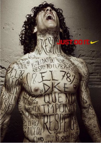
Lorente Barroso, C., García García, F., Soria Jiménez, V. Comparative analysis of chromatic
                      symbology in advertising. Nike in China and Spain

1. INTRODUCTION

   Colors are an active part of our environment and the connotations associated with
them are used by experts in different persuasive communication modalities. In
relation to this consideration, Lee and Barnes Jr. (1990, p.25) declared: "Color shapes
human perceptions of the world in which we live. Color gives us different
impressions of objects that we see."
   A color alone or by combining with other colors can assume a symbolic meaning
and evoke different emotions (Wong, 1995, p.149). These meanings respond to the
psychological effects of colors and different cultural traditions (Heller, 200 4, p.48).
Myths, taboos and customs intervene in the chromatic associations that develop
within each context. Therefore, it should be taken into account that color is a factor
influenced by both natural phenomena (Ko, 201 1, p.871) and contextual variables.
   The chromatic tradition of different cultures is very long-lived. As languages
developed, colors were being defined following, in most places, the same order
(Berlin & Kay, 199 1, p.5). Thus, white and black were defined in order to
differentiate day from night, and then red, green, yellow, blue, brown, purple, pink,
orange and gray were established (Edwards, 200 6, p 156). However, red is
considered the first color, properly speaking, the reason why "colored" is "red"
(Heller, 200 4, p.53). Since its birth and over the years, colors have been welcoming a
symbolic dimension fruit of the emotional effects that occur when entering into
relationship with them (Edwards, 200 6, p.157). In this sense, Harald Küppers (1982,
21) considers that color only exists as a sensory impression of the observer,
something that Goethe already pointed out in 1810 when observing the moral effects
of color:
           [color] [...] produces on the human soul individually a specific effect and,
           in combination, an already harmonious or characteristic effect, often also
           not harmonious, but always defined and significant that is closely linked
           to the moral sphere (Goethe, 192 2, p.203).

   Brands have always based their own construction on communication based on the
symbology of shapes and colors. Thus Nike swoosh (corporate brand emblem) has
been exalted as a symbol of victory, challenge and overcoming (Garcia Garcia &
Garcia Guardia Llorente Barroso, 2010, p. 139), using formal, symbolic and implicit
metaphors with a high degree of abstraction (Llorente Barroso & García García, 2015
a , p.489). The significance of this symbol responds, to a large extent, to the
connotations that emanate from its predominant presence in black to represent the
sports brand. In this chromaticism lies the simplicity and functionality (Heller, 2004,
pp. 140-149) of its corporate logo.
   In advertising communication, there are variables (such as sex or race) that
determine a chromatic preference, to a large extent, responsible for the effectiveness
of messages (Lee & Barnes Jr., 1990, p.26).
   The study this article presents seeks to deepen the chromatic analysis of
advertising graphics, covering the different treatments of color made by the same
brand in graphic advertising that develops in two very different contexts.
Specifically, we analyze the associations of colors to different socio-cultural features

                                                                                                53
     Vivat Academia. Revista de Comunicación. 15 marzo/15 junio, 2018, nº 142, 51-78
Lorente Barroso, C., García García, F., Soria Jiménez, V. Comparative analysis of chromatic
                        symbology in advertising. Nike in China and Spain

that determine the use of different chromatic parameters in graphic campaigns
according to the specific context in which they are launched. This study has focused
on Spain and China, countries selected for manifesting markedly contrasting
political, cultural and demographic characteristics.

2. OBJECTIVE AND HYPOTHESIS

   The main objective of this piece of research is to study the influence of socio-
cultural and psychological factors on the use of colors in graphic advertising that the
same international brand generates for different contexts.
   The hypothesis that arises is that brands use colors discriminately in their graphic
campaigns to adapt them to the connotative code of each socio-cultural context in
order to achieve the most effective communication of the message in each case.
   On the other hand, the need to specify some concepts for the correct development
of this piece of research requires the prior realization of a study of the state of the art.

3. THEORETICAL FRAMEWORK
 3 .1. Main European theories

   In the definition of colors, there are traditionally two fundamental chromatic
systems: one that deals with their light properties and another that does it with their
pigmented characteristics.
   The RGB system (Red, Green, Blue), additive synthesis or three-color process is a
discovery of Newton, who in the seventeenth century achieved the decomposition of
sunlight through a prism of glass in a range of wavelengths2 (Zelanski & Fisher, 200
1, p.13). This spectrum collected the colors violet, indigo, blue, green, yellow, orange
and red (Edwards, 200 6, p.15) that make up the chromatic circle of light colors
(Caivano, 199 5, p.13). The RGB system considers that light has a corpuscular nature
(Beléndez, 200 8, p.13) and makes it possible to recreate the white light by
    Adding three colored lights: green, blue-violet and red-orange. These three lights
are the only ones that cannot be obtained by mixing others (Carreres Ribera, 201 1,
p.20) and, if they combine, they can give rise to all the colors that the human eye can
differentiate, that is why they are also primary colors (Drew & Meyer, 200 8, p 55).
The colors originating from the sum of two primaries (yellow, cyan and magenta) are
known as secondary ( Zelansky & Fisher, 200 1, pp. 13-16). This system is used in the
reproduction of colors in digital systems (Ambrose & Harris, 200 5, p.35), which are
in accordance with their light properties.
   The CMYK system (Cyan, Magenta, Yellow, Key), subtractive synthesis or four-color
process refers to the pigment colors (Gatter, 200 5, page 39). The development of this
system was necessary to solve the graphic needs and enable the reproduction of color
images by adding inks (Ambrose & Harris, 200 6, pp. 32-33). The CMYK system
consists of four basic colors: first, cyan, magenta, yellow, which are the only

2 The wavelength is the distance between crests of a wave energy. They are expressed in nanometers
(nm.) and are visible to the human eye from 350 nm. and up to 750 nm. (period covering primary
colors) (Zelansky & Fisher, 200 1, p. 13) or 380 nm. and to 780 mn. (Sanz & Gallego, 200 1, p. 366).

                                                                                                  54
      Vivat Academia. Revista de Comunicación. 15 marzo/15 junio, 2018, nº 142, 51-78
Lorente Barroso, C., García García, F., Soria Jiménez, V. Comparative analysis of chromatic
                        symbology in advertising. Nike in China and Spain

pigments which cannot be obtained by mixing others, and, on the other hand, black
(key)3, , which cannot be achieved after modifications either, which is why it was
included as a base pigment (Gatter, 200 5, p 42). The four-color process translates the
chromatic information composed of lights (RGB), so that the primary lights match the
secondary pigment colors and the basic pigment colors match the secondary lights
(Carreres Ribera, 201 1, p.22). This system is based on some of Goethe's findings who,
unlike Newton, based his theory on qualitative methods. Newton considered colors
to be achromatic light rays (Goethe, 200 2, p. 50), however, Goethe developed a
theory based on the study of nature and its different forms of representation (Goethe,
200 2, p. 13). His great contributions to the study of color have been: the
consideration of the symbolic meanings that each color can have (Ferrer, 199 9, p.82)
and its classification according to the moral, intellectual characteristics, status and
traditions of each context (Heller, 200 4, p.127, Table 1). The practical disadvantage of
Goethe's contribution is that he did not conceive the mixtures, so he did not
differentiate the behavior of the combinations among pigments -more colors, darker
mixture- from the combinations among lights -more colors, clearer mixture- (Heller,
200 4, pp. 282-283).

Table 1.
Classification of colors and values of Goethe and its relationship with society
Categories      Purple        Red         Yellow              Green         blue          Violet
                                                                            Vulgar,       Useless,
Moral           Beautiful     Noble       Good                Useful
                                                                            ordinary      unprofitable
                              Reason,                         Sensual,      Sensual,      Fantasy,
Intellectual    Genius                    Understanding
                              feeling                         impulses      impulses      unreal
Status          Rulers        Nobles      Scientists          Bourgeois     Workers       Artists
                Of kings,                                                                 Spiritual,
                              For         Lighting and        For           For
Traditions      princes and                                                               magic and
                              nobles      science             Bourgeois     Workers
                cardinals                                                                 theology
                                    Source: Heller, 200 4, p. 117

3 .2. Main Asian theories

   Among the main Asian theories that have served to explain the meaning of colors,
two stand out: that of Feng Shui and that of Yin and Yang.
   Feng Shui4 is a philosophy that aims to create harmonious environments, capable
of generating an intimate and fluid relationship between man and his environment
and attracting health and abundance (Álvarez, 200 8, p.121). It relies on the
observation of nature, the influence of traditions (Tibet, Hindu-Buddhist, Confucian
and modern cultures) and knowledge from Buddhism, the Tao, the Book of Mutations
or I-Ching and of Chinese Astrology (Álvarez, 200 7, page 18). From the Taoist
philosophy, it takes the consideration that there are five elements among which there
is a circulation of energy that represents the entire environment and manifests the
following chromatic links (Skilton, 200 5, pp. 29-32):

3 Black is represented by the letter K referring to the real meaning of this color in the CMYK process, k
ey -key, key- (Gatter, 2005, p. 33).
4 Feng Shui means "air-water" (Alvarez, 200 7, p. 17).

                                                                                                      55
         Vivat Academia. Revista de Comunicación. 15 marzo/15 junio, 2018, nº 142, 51-78
Lorente Barroso, C., García García, F., Soria Jiménez, V. Comparative analysis of chromatic
                       symbology in advertising. Nike in China and Spain

    a) The fire element can be a reflection of aggressiveness and conflict if there is an
excess of said element, or it can symbolize emotional coldness if the opposite occurs.
It is located in all variants of red color.
    b) The earth element can create a dense and conservative environment, or
otherwise, disorder and instability. It is found in yellow and earthy colors.
    c) The wood element gives values such as responsibility and burden, or in its
opposite effect, lack of creativity and irresponsibility. It is found in plant colors.
d) The metal element generates obstinacy or confusion. Chromatically it is found in
gray, white, silver and gold.
e) The water element, as a flowing element, symbolizes dispersion and lack of it,
rivalry, pettiness or anxiety. It is found in black or dark blue.

   In relation to these associations, a part of Feng Shui deals with the importance of
the use of colors to reach equilibrium with the environment, linking each color with a
daily activity (Table 2):

Table 2
Feng Shui: activities-colors relationships

                      Everyday Activity                        Color
                      Finance                                  Violet
                      Fame and reputation                      Red
                      Marriage and association                 pink
                      New knowledge                            blue
                      Family relationships                     Green
                      Benefactors                              Gray
                      Career and profession                    Black
                      Children and Creativity                  White
                                        Source: Álvarez, 200 7, p. 51

   Yin and Yang is the Chinese philosophy that explains the world as the combination
of two opposite-complementary. Yin and Yang represent different energies that seek
a balanced balance in a continuous movement and the existence of one is impossible
without the other (Skilton, 200 5, p.12). They are "vital breaths" that govern the
destiny of the world, Yin as receptive softness and Yang as an active force (Chen, 200
8, p 68, 86). Yin is representative of the negative or the feminine, while the positive or
masculine takes its form in Yang. Yin appears associated with the Moon, the cold, the
white color, emptiness, passivity, wetness, the night, the left side and everything soft
(Skilton, 200 5, pp. 12-13). Yang represents the Sun, the heat, the black color, fullness,
activity, dryness, the day, the right side and hardness (Skilton, 200 5, pp. 12-13). The
graphic symbol of Yin and Yang , known as Tai Chi , is made up of the colors white
with a black point (Yang) and black with a white point (Yin), linked (Skilton, 200 5,
p.13 ); the points that are born in each part represent the embryos of the opposite
(Skilton, 200 5, p.14). This sign reflects that, to Asians, nothing is absolutely black or
rigorously white due to the interrelation they consider to exist among all the

                                                                                                 56
      Vivat Academia. Revista de Comunicación. 15 marzo/15 junio, 2018, nº 142, 51-78
Lorente Barroso, C., García García, F., Soria Jiménez, V. Comparative analysis of chromatic
                        symbology in advertising. Nike in China and Spain

elements that make up the context (Ferrer, 199 9, p.34). This influence also extends to
the composition of colors, since nothing can exist without its opposite-
complementary. Black and white5 have the same importance; in opposition to other
cultures, in Asia, white and black are considered both feminine and one does not
entail the opposite of the other (Heller, 200 4, p.98). White includes the symbology of
death and black the symbol of the beginning or birth (Heller, 200 4, p.98). The most
important color in China is yellow, considered the male pigment par excellence, but
so are red and green6 . Black, white and soft colors fall within the female group
(Heller, 200 4, p.98).

3 .3. Color and advertising

   Labrecque, Patrick and Milne (2013), considering the chromatic meanings and
their ability to influence thoughts, feelings and behaviors of consumers, address their
importance from the field of marketing. Referring to the complexity of their nature,
they determine that "culture influences learned color associations" (Labrecque,
Patrick & Milne, 201 3, page 194). Under this consideration, they study the cultural
influence on the chromatic associations we learn and which are responsible for the
diverse perceptions we develop when evaluating the objects having them.
   In the relationship between culture and chromatic associations, two fundamental
considerations that have led to various possibilities in the study of color and
advertising have developed (Labrecque, Patrick & Milne, 201 3, p 194;.. Gorn,
Chattopadhyay, Yi & Dahl, 199 7, p.1398):
            1. A trend that determines significant differences in the chromatic
               association according to each culture. Within this current are Block and
               Kramer (2009) and Madden, Hewett and Roth (2000).
            2. Another trend that considers the existence of chromatic meanings
               shared in all cultures, this trend being shared by authors such as
               D'Andrade and Egan (1974) or Fraser and Banks (2004).

   At the same time, Labrecque, Patrick and Milne (201 3, p.194) estimate that certain
cultural meanings attributed to colors may change over time. In this sense, they refer
to two examples; the first, related to the minimization of the negative connotations
attributed to the yellow - color used by the Nazis to identify the Jewish people - by
the Jews over the years (Kreitler & Kreitler, 1972); the second, related to the influence
of globalization and the Western culture on certain Oriental chromatic traditions;
thus, Chinese brides have changed their red dress into white (Baker, 2009).
   Referring to the specific field of advertising, Labrecque, Patrick and Milne (201 3,
pp. 195-196) highlight two fundamental points of interest:

5 The chromaticity connotations associated with Yin and Yang are unclear; while Skilton (200 5, p. 12-
13) makes an association by opposite chromatic categories, Heller (200 4, p. 98) makes an
interpretation of black-white matrix as energy stream representing the Yin and Yang set.
6 Blue is not considered a basic color in the Oriental country, but a variety of green (Heller, 200 4, p.

98).

                                                                                                      57
      Vivat Academia. Revista de Comunicación. 15 marzo/15 junio, 2018, nº 142, 51-78
Lorente Barroso, C., García García, F., Soria Jiménez, V. Comparative analysis of chromatic
                       symbology in advertising. Nike in China and Spain

            1. The importance of color as compared to black and white advertising.
               Color manifests itself as a sign of quality and efficiency, acting as an
               exhortative resource – it motivates consumers and captures their
               attention - and mnemonic – it facilitates the memory of the message.
            2. The influence of each color on consumers. Color influences one’s mood
               and the evaluations of products. In this regard, Gorn, Chattopadhyay,
               Yi and Dahl (199 7, pp. 1397-1398) determined that the highest levels of
               chroma7and value 8 influence the feelings of emotion and relaxation,
               respectively, being able to generate a more favorable attitude towards
               advertising and towards the brand.

   Color becomes a key element making it possible to build and strengthen the
relationship between consumers and brands, being part of the corporate "DNA"
(Labrecque, Patrick & Milne, 201 3, page 199). In this line, Lee and Barnes Jr. (1990)
develop a study of ads in magazines, considering the psychological effects colors
have on the emotions of human beings and in order to improve advertising
effectiveness. These authors perceived that advertising professionals did not use
color to improve the response of their target to their messages according to their sex,
but they saw a discriminated use in advertising messages aimed at different races
(Lee & Barnes Jr., 199 0, p 29).

4. METHODOLOGY

   So as to achieve the objectives and corroborate the hypothesis, a methodology
based on the comparative analysis of a sample of graphic creativities of Nike brand
for China and Spain has been proposed. For the development of this study, we
decided to choose Nike as an example, as it is an international brand that performs
graphic advertising actions of considerable notoriety in the two selected countries,
accumulating a great socio-cultural impact at the international level. Such impact is
reflected in the American lifestyle, which is why it was incorporated into the
American Marketing Association's Hall of Fame in 1991, cataloging it as an icon of
the country (Goldman & Papson, 1998, page 18). In fact, in the 1990s, Nike rose as one
of the most recognized brands in the world and an international symbol of athletics
(Spar, 2003). To a large extent, this recognition comes from the great communication
strategies of the brand and its recurrent relationship with significant cultural symbols
(Goldman & Papson, 1998) that have transferred to the brand their values and the
admiration the public has for them (Llorente Barroso Garcia & Garcia, 2015, pp. 478-
479).
   The creativities that make up the sample have been selected because they match
the criterion of importance in the use of a certain color in each of the respective

7 “Chroma refers to saturation; highly saturated colors have a greater proportion of the pigment in

them” (Gorn, Chattopadhyay, Yi & Dahl, 1997, p. 1387).
8 “Value is the degree of darkness or lightness of the color relative to a neutral scale that extends from

pure black to pure white” (Gorn, Chattopadhyay, Yi & Dahl, 1997, p. 1387).

                                                                                                       58
      Vivat Academia. Revista de Comunicación. 15 marzo/15 junio, 2018, nº 142, 51-78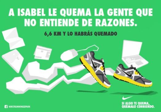
Lorente Barroso, C., García García, F., Soria Jiménez, V. Comparative analysis of chromatic
                      symbology in advertising. Nike in China and Spain

countries in which our research is focused. Mentioned importance has been
calculated based on two parameters that have allowed a selection of pieces:
      a) The approximate extension of the color in the graph.
      b) The importance of the colored object according to the position it occupies in
          it and / or its lighting.

   The analysis of each graphic piece has been divided into two major categories of
study:
   a) The chromatic expression, which has been examined from the chromatic
   systems RGB (light) and CMYK (pigment).
   b) The chromatic content of the piece, taking the denotative meaning and
   especially the connotative (symbolic) meaning of each color as the main elements
   for analysis.

   The comparative analysis has been carried out using an analytical record model
(Figure 1) that has been applied systematically to the creativities of the sample, which
has allowed an orderly compilation of results, in compliance with the level of
objectivity required by research to extract valuable results

5. RESULTS OF THE COMPARATIVE ANALYSIS OF THE INFLUENCE OF
CHROMATIC ASSOCIATIONS ON GRAPHIC ADVERTISING IN CHINA AND
SPAIN

   To facilitate the understanding of the results, they have been recorded in tables
that allow the comparative analysis to be visualized.

                                                                                                59
     Vivat Academia. Revista de Comunicación. 15 marzo/15 junio, 2018, nº 142, 51-78
Lorente Barroso, C., García García, F., Soria Jiménez, V. Comparative analysis of chromatic
                      symbology in advertising. Nike in China and Spain

5 .1. Comparative analysis of the use of blue
 Figure 2. There are no rankings for
                                                 Figure 3. MadRunning Exhibition
 ambition

 Source of execution: Wieden + Kennedy           Source of execution: Villar-Rosàs,
 Shanghai , 2010.                                2007a.
 Source of extraction:                           Source of extraction: Anuncios.com,
 info.cloth.hc360.com, 2014.                     2014.

 IMPORTANCE OF COLOR:                   IMPORTANCE OF COLOR:
     - Approximate 75% by extension         - Approximate 60% by extension
     in graph.                              in graph.
     - Importance of the colored object     - Importance of the colored
     according to its position in the       object according to its position in
     piece.                                 the piece and lighting.

 CHROMATIC EXPRESSION:                           CHROMATIC EXPRESSION:
     - RGB (Average Photoshop                        - RGB (Average Photoshop
     Histogram): 62.77 || 63,76 ||                   Histogram): 43,58 || 53,71 ||
     77.24.                                          66,77.
     - CMYK (Average Photoshop                       - CMYK (Average Photoshop
     Histogram): 67.99 || 73,12 ||                   Histogram): 57.06 || 71,78 ||
     119,48 || 153.57.                               117,26 || 132.85.

                                                                                                60
     Vivat Academia. Revista de Comunicación. 15 marzo/15 junio, 2018, nº 142, 51-78
Lorente Barroso, C., García García, F., Soria Jiménez, V. Comparative analysis of chromatic
symbology in advertising. Nike in China and Spain
DENOTED CONTENT:
DENOTED CONTENT: - In the RGB composition, blue
- In RGB composition, blue is is the light corresponding to
color light whose wavelength is wavelengths between 460 and
between 460 and 482 nm. (Sanz & 482 nm. (Sanz & Gallego, 200 1,
Gallego, 200 1, p.127). p.127). Blue is the third primary
- In CMYK composition, blue is in additive chromosynthesis (
the common denomination of RGB ).
cyan , although in China it refers - In composition CMYK is the
to moderate blue and blue-gray third primary standard in
colorations (Sanz & Gallego, 200 descending order of
1, p.132). wavelengths (Sanz & Gallego,
200 1, p.128).
CONNECTED CONTENT IN
CONNOTED CONTENT IN ASIA:
EUROPE:
The symbolic meaning of distance that
In this piece the blue takes all the
blue has, acquires greater importance in
attributes related to water. In Europe,
this graphic, in which the cold color
this color is one of the favorites in
"calm" (Chevalier & Gheerbrant, 200 7,
corporate communication to transmit
p.164) the passion of the protagonist. In
tranquility (it is used by banks ( La
China, blue is linked to Yang (Sanz &
Caixa ), beverages ( Solán de Cabras ),
Gallego, 200 1, p.128) and, in the graph,
cosmetics ( Nivea ), etc.) (Heller, 200 4,
it is compensated with manifest Yin in
p. Four. Five). The lightness that
white areas (Skilton, 200 5, p. 13 ). The
connotes this blue is related to the
protagonist of the ad symbolizes a
speed that the sport demands. Applied
"Empress of the sport", distant and
to an object, blue softens forms and
powerful. Linked to this concept of
undoes them, is the "path of the
power and power, blue is associated
undefined, where the real is
with Tibetan Buddhism, specifically the
transformed into an imaginary"
Vairocana Buddha, representative of
(Chevalier & Gheerbrant, 200 7, p.163).
transcendental wisdom (Sanz & Gallego,
In its combination with black, blue is
200 1, p.128), potentiality and emptiness
much more serious, giving the graphic
(Chevalier & Gheerbrant, 200 7, p.164).
a more powerful and masculine aspect
The gesture of the athlete symbolically
(Heller, 200 4, p 32). In addition, the
enhances the imperial emphasis of the
technological connotations offered by
composition that reflects ambition and
blue give the brand an avant-garde
immortality.
look that is often inseparable from Nike
61
Vivat Academia. Revista de Comunicación. 15 marzo/15 junio, 2018, nº 142, 51-78Lorente Barroso, C., García García, F., Soria Jiménez, V. Comparative analysis of chromatic
symbology in advertising. Nike in China and Spain
5.2. Comparative analysis of the use of red
Figure 4. Use Sports Figure 5. Momentum
Source of execution: Wieden + Kennedy Source of execution: Villar-Rosàs,
Shanghai, 2011. 2007b.
Source of extraction: wkshanghai.com, Source of extraction: Anuncios.com ,
2014. 2014.
IMPORTANCE OF COLOR: IMPORTANCE OF COLOR:
- 50% by extension in graphics. - 75% by extension in graphics.
- Importance of the colored - Importance of the colored
object according to its position in object according to its position in
the piece. the piece.
CHROMATIC EXPRESSION: CHROMATIC EXPRESSION:
- RGB (Average Photoshop - RGB (Average Photoshop
Histogram): 169.09 || 121,94 || Histogram): 146.53 || 51.50 ||
107.13. 42.49.
- CMYK (Average Photoshop - CMYK (Average Photoshop
Histogram): 176.05 || 109,90 || Histogram): 169.40 || 39,30 ||
104,70 || 229.32. 42,58 || 211.84.
DENOTED CONTENT: DENOTED CONTENT:
- In the RGB composition, red is - In RGB composition, red is the
62
Vivat Academia. Revista de Comunicación. 15 marzo/15 junio, 2018, nº 142, 51-78Lorente Barroso, C., García García, F., Soria Jiménez, V. Comparative analysis of chromatic
symbology in advertising. Nike in China and Spain
the photoreception of light with light corresponding to
a wavelength between 618 and wavelengths between 618 and
780 nm. (Sanz & Gallego, 200 1, 780 nm. (Sanz & Gallego, 200 1,
p.758). p.758) . It is the first primary
- In CMYK composition, red additive and first color of the
approaches magenta. In China, Newtonian spectrum (Sanz &
red refers to reddish-orange and Gallego, 200 1, p.759, 128).
reddish-brown colorations (Sanz - In CMYK composition it is the
& Gallego, 200 1, page 763). first secondary standard in
descending order of
wavelengths (Sanz & Gallego,
200 1, p.759).
CONNECTED CONTENT IN
CONNOTED CONTENT IN ASIA: EUROPE:
Red is the predominant color in China, In Europe, red has a more carnal and
present in its festivities and institutions passional dimension. It is linked to fire
(Heller, 2004, 59, Chevalier & and blood (Heller, 200 4, p 55). In the
Gheerbrant, 2007, 889). The chromatic combination of red with white and
associations linked to the red that yellow, "the essential symbol of vital
appear in the advertisement allow us to force" is formed (Chevalier &
consider the character as a national Gheerbrant, 200 7, page 889), very
icon. In many of the Asian legends "the much in accordance with the graphic
spirit of fire" appears dressed "with a studied. In it, red is dark and appears
red cap" (Chevalier & Gheerbrant, 200 linked to power, strength,
7, p.889), explicit attribution in the competitiveness and battle. All these
graph to mythologize the athlete. The properties are also what characterize
most important elements of the graphic the best Spanish tennis player in the
are described in reddish tones: the cap, history that the message stars, Rafael
part of the costume, the earth and the Nadal. Red embodies the "virtues of
brand or the bottom of the slogan. This war" (Chevalier & Gheerbrant, 200 7,
shade of red, red-orange, is the most p.889) of the athlete. For Spain, the
characteristic of China and the one with color red is life, but it also fights; it is
the greatest presence in advertising the passion reflected in the graphic and
there, as it expresses joy and harmony. the most representative of its patriotic
colors.
63
Vivat Academia. Revista de Comunicación. 15 marzo/15 junio, 2018, nº 142, 51-78Lorente Barroso, C., García García, F., Soria Jiménez, V. Comparative analysis of chromatic
symbology in advertising. Nike in China and Spain
5 .3. Comparative analysis of the use of yellow
Figure 6. Battle of the Nine Gates.
Figure 7. Godó: Sharapova
Final Poster
Source of execution: Villar-Rosàs,
Source of execution: DMG Beijing, 2007.
2007c.
Source of extraction:
Source of extraction: Anuncios.com,
adsoftheworld.com, 2014.
2014.
IMPORTANCE OF COLOR: IMPORTANCE OF COLOR:
- 75% by extension in graphics. - 80% by extension in graphics.
- Importance of the colored - Importance of the colored
object according to its position in object according to its position in
the piece and its illumination. the piece.
CHROMATIC EXPRESSION: CHROMATIC EXPRESSION:
- RGB (Average Photoshop - RGB (Average Photoshop
Histogram): 58,86 || 39,99 || Histogram): 177.76 || 147,90 ||
21.21. 111.67.
- CMYK (Average Photoshop - CMYK (Average Photoshop
Histogram): 86.69 || 56,50 || Histogram): 188.10 || 141,30 ||
54,74 || 114.41. 112,18 || 218.67.
DENOTED CONTENT: DENOTED CONTENT:
64
Vivat Academia. Revista de Comunicación. 15 marzo/15 junio, 2018, nº 142, 51-78Lorente Barroso, C., García García, F., Soria Jiménez, V. Comparative analysis of chromatic
symbology in advertising. Nike in China and Spain
- In the RGB composition, the - In the RGB composition, the
yellow has a wavelength wavelength of light
between 574 and 577 nm. (Sanz corresponding to 574 nm and
& Gallego, 200 1, p 45). 577 nm corresponds to yellow
- In CMYK composition, yellow (Sanz & Gallego, 200 1, p 45). It
is the second primary in is the first secondary additive
decreasing order of wavelength and ranks third in the
(Sanz & Gallego, 200 1, p 45) . In Newtonian spectrum (Sanz &
China it refers to bright yellow, Gallego, 200 1, p 45).
strong, light yellow, moderate - In CMYK composition it
yellow and orange yellow (Sanz is the second primary in
& Gallego, 200 1, p.50 ). decreasing order of wavelengths
(Sanz & Gallego, 2001, 45).
CONNECTED CONTENT IN
CONNOTED CONTENT IN ASIA: EUROPE:
In traditional Chinese culture yellow is In western cultures, yellow represents,
born of black - the light that reappears for its warm attributes linked to the
from darkness - (Sanz & Gallego, 200 1, Sun, softness, excitement and light
p 46). It was widely used in the Ming (Sanz & Gallego, 200 1, p 45). As a
dynasty (1465-1487) -the imperial warm color, it is the one that most
yellow- and in the K'ang Hsi and Ch'ing attracts the vision when perceived at a
periods (Sanz & Gallego, 200 1, p 53). A great distance (Dupont, 200 4, page
symbol of good omens and eternity, so 187). Eternity is colored yellow because
is the Empire (Sanz & Gallego, 200 1, yellow is the Sun and gold. Also
p.46). With red it is the most important because of their association with gold,
color in Asia. In the graphic they want the alchemists related yellow with the
to highlight the imperial qualities of the Great Work (Sanz & Gallego, 200 1, p
protagonist, approaching the status of 46). Therefore, it is a symbol of power
the Gods and / or the Emperors and magnificence and is used by the
(Heller, 200 4, p.97). In Chinese brand in this creativity to symbolize the
philosophy, yellow and black are winner who, in addition, wears Nike .
opposite-complementary (Chevalier & In Europe, bright yellow is not
Gheerbrant, 200 7, p.88), hence the frequently used because it is associated
chromatic composition of the piece to with negative connotations (Heller, 200
achieve the balance of the whole. 4, p.95), which explains the low purity
it presents in the graph.
65
Vivat Academia. Revista de Comunicación. 15 marzo/15 junio, 2018, nº 142, 51-78Lorente Barroso, C., García García, F., Soria Jiménez, V. Comparative analysis of chromatic
symbology in advertising. Nike in China and Spain
5.4. Comparative analysis of the use of green
Figure 9. If something burns you, burn
Figure 8. Beijing Young Masters
it running
Source of execution: Wieden +
Source of execution: Villar-Rosàs, 2011.
Kennedy Shanghai, 2007.
Source of extraction:
Source of extraction: wkshanghai.com,
benvivemkt.wordpress.com, 2014.
2014.
IMPORTANCE OF COLOR: IMPORTANCE OF COLOR:
- 50% by extension in graphics. - 85% by extension in graphics.
- Importance of the colored - Importance of the colored object
object according to its position in according to its position in the
the piece and lighting. piece.
CHROMATIC EXPRESSION: Chromatic expression:
- RGB (Average Photoshop - RGB (Photoshop Histogram
Histogram): 100.97 || 70,53 || Average): 102.80 || 208.72 ||
61.53. 135.18.
- CMYK (Photoshop Histogram - CMYK (Photoshop Histogram
Average): 113.65 || 88.33 || Average): 112.43 || 244.99 ||
78.76 || 170.71. 98.63 || 252.75.
Denoted CONTENT: Denoted CONTENT:
66
Vivat Academia. Revista de Comunicación. 15 marzo/15 junio, 2018, nº 142, 51-78Lorente Barroso, C., García García, F., Soria Jiménez, V. Comparative analysis of chromatic
symbology in advertising. Nike in China and Spain
- In composition RGB green - In composition RGB green is
responds to the wavelengths defined by wavelengths between
ranging between 529 and 497 529 marked and 497 nm. (Sanz &
nm. (Sanz & Gallego, 200 1, p. Gallego, 200 1, p. 931). It is the
931). additive primary second and
- In composition CMYK green fourth Newtonian spectrum
approaches the cyan. In China it (Sanz & Gallego, 200 1, p. 931).
is called green to bright yellow- - In composition CMYK is the
greenish-yellow colorations dark second secondary standard in
green and yellow-green live order of decreasing wavelength
(Sanz & Gallego, 200 1, p. 932). (Sanz & Gallego, 200 1, p. 931).
Connoted CONTENT IN ASIA: Connoted CONTENT IN EUROPE:
Among the few negative connotations In Spain the green is hope (Heller, 200 4,
for green it is China has its definition as p. 111). Linked to earth element, it is
violent disturbance nature (Sanz & used by the mark on the piece to give
Gallego, 200 1, p. 932). China agrees natural connotations (Heller, 200 4, p.
with other countries in the Association 106) to the sport. Healthy living is green;
green movement (Ko, 201 1, p. 862). between foods considered healthier
Green, nature and life, is a main color vegetables are predominantly green
in Chinese philosophy. -sign (Heller, 200 4, p. 107). This can also be
representative ray rise Yang - derived from the Middle Ages where
(Chevalier & Gheerbrant, 200 7, p. the toga of doctors was green (Chevalier
1057), green is dominant in the & Gheerbrant, 200 7, p. 1058). In
composition, but their superiority effect addition, other elements of the graphical
would not be the same without -black and white- refer to the current
combination with red, black and the items (computers and other
yellow. It is one of the most sacred technological elements) that make the
colors because dragons are green and sport (implicative of healthy living) pass
East are revered animals (Heller, 200 4, into the background. "A Isabel burns
p. 115). Thus, the protagonist clothing that people do not listen to reason"
imitates a dragon, symbol of strength demands the need to understand that
and eternity, its green oriental country sport is essential for a healthy life.
is for strength, power, wisdom and Therefore, "If something burns, I burn it
peace (Heller, 200 4, p. 115). running."
67
Vivat Academia. Revista de Comunicación. 15 marzo/15 junio, 2018, nº 142, 51-78Lorente Barroso, C., García García, F., Soria Jiménez, V. Comparative analysis of chromatic
symbology in advertising. Nike in China and Spain
5.5. Comparative analysis of the use of white
Figure 10 . Quien eres? Figure 11 . Davis Cup 2004
Source of performance: Wieden + Source of performance: Villar-Rosàs,
Kennedy Shanghai, 2008. 2004.
Source extraction: wkshanghai.com, Source extraction: villarrosas.com,
2014. 2014.
IMPORTANCE OF COLOR: IMPORTANCE OF COLOR:
- 25% extension graph. - 90% by extension graph.
- Importance of the object - Importance of the object
colored by their position on the colored by their position on the
piece and lighting. workpiece.
Chromatic expression:
Chromatic expression:
- RGB (Photoshop Histogram
- RGB (Photoshop Histogram
Average): 230.56 || 220,15 ||
Average): 89.49 || 82.61 || 79.68.
208.52.
- CMYK (Photoshop Histogram
- CMYK (Photoshop Histogram
Average): 98.49 || 96.56 ||
Average): 230.93 || 212.77 ||
107,59 || 153.41.
202.78 || 252.02.
Denoted CONTENT: Denoted CONTENT:
- In composition RGB white is - In composition RGB white is
the name of the visual perception the color of dark null coming
68
Vivat Academia. Revista de Comunicación. 15 marzo/15 junio, 2018, nº 142, 51-78Lorente Barroso, C., García García, F., Soria Jiménez, V. Comparative analysis of chromatic
symbology in advertising. Nike in China and Spain
of maximum clarity (Sanz & from all wavelengths of the
Gallego, 200 1, p. 172). visible spectrum (Sanz &
- In composition CMYK white is Gallego, 200 1, p. 172).
a neutral-achromatic (Sanz & - In composition CMYK is
Gallego, 200 1, p. 172). In China neutral. It is called white
called zinc white to white (Sanz Spanish to pale yellow-orange
& Gallego, 200 1, p. 174). color (Sanz & Gallego, 200 1, p.
175).
Connoted CONTENT IN EUROPE:
Connoted CONTENT IN ASIA:
European brands they want to convey
Chinese alchemists related to white with
purity using white as the highest
the initiation phase "assumption of life"
representation (Heller, 200 4, p. 156).
and the spirit level "human significance"
Western alchemists relate to the
(Sanz & Gallego, 200 1, p. 172). White
initiation phase white called "the target
solar ratio is indisputable, therefore
work" (Sanz & Gallego, 200 1, p. 172).
described as bright. East white is
In this graph, the white becomes less
mourning, but understood as hopeful
distinct tones because it is not pure
revival, bounce and -reencarnación-
white. This is related to the idea of
death (Heller, 200 4, p. 264). White can
white as the beginning of everything
represent in the graph to a new
(Chevalier & Gheerbrant, 200 7, p. 190),
candidate for battle (Chevalier &
for the land, without which man could
Gheerbrant, 200 7, p. 190). In the ad, its
not grow food, is the rebirth of
combination with the black -in East are
everything. The composition is based
not opposites colors makes its
on natural elements. Both land at the
symbolism acquires darker shades but
bottom left of creativity, such as off -
hopeful. Use in the ad can be considered
white background endow the graph of
forethought to the challenge of
a local, warm and expansive
competition. The red color in the piece
connotation (Sanz & Gallego, 200 1, p.
appears in elements that the importance
171), easily identifiable and near the
of identity stands.
sunlight.
69
Vivat Academia. Revista de Comunicación. 15 marzo/15 junio, 2018, nº 142, 51-78Lorente Barroso, C., García García, F., Soria Jiménez, V. Comparative analysis of chromatic
symbology in advertising. Nike in China and Spain
5.6. Comparative analysis of the use of black
Figure 12 . Run free Road 3 Figure 13 . Five Magnificent: Puyol
Source of performance: JWT Shanghai,
Source of performance: Villar-Rosàs,
2005.
2008.
Source extraction: adsoftheworld.com,
Source extraction: anuncios.com, 2014.
2014.
IMPORTANCE OF COLOR:
IMPORTANCE OF COLOR:
- 50% by extension graph.
- 30% extension graph.
- Importance of the object
- Importance of the object
colored by their position on the
by colored lighting.
workpiece.
Chromatic expression: Chromatic expression:
- RGB (Photoshop Histogram - RGB (Photoshop Histogram
Average): 100.30 || 99.39 || Average): 102.74 || 96.49 ||
100.20. 87.55.
- CMYK (Photoshop Histogram - CMYK (Photoshop Histogram
Average): 11.23 || 115.05 || Average): 98.49 || 96.56 ||
132.80 || 166.24. 107,59 || 122.32.
Denoted CONTENT: Denoted CONTENT:
- In composition RGB black is - In composition RGB is the
the name given to the absence of achromatic perception of
70
Vivat Academia. Revista de Comunicación. 15 marzo/15 junio, 2018, nº 142, 51-78Lorente Barroso, C., García García, F., Soria Jiménez, V. Comparative analysis of chromatic
symbology in advertising. Nike in China and Spain
color or brightness level of zero maximum darkness due to the
(null) (Sanz & Gallego, 200 1, p. absence of the photoreception
616). (Sanz & Gallego, 200 1, p. 616).
- In composition CMYK the black - In composition CMYK is the
approaches the sum of all basic color, constituted by
primary colors. cromosíntesis primary cyan,
magenta and yellow (Sanz &
Gallego, 200 1, p. 616).
Connoted CONTENT IN ASIA: Connoted CONTENT IN EUROPE:
Eastern black is a color that evokes the Europe black is strength, power,
way. For traditional taoístas, black distance and death. The use of this
refers to "rise essential moisture" refers color in the graph is explicable by their
to the collapse of the "human truth" warlike connotations. In addition, the
into the pit, from which start the black symbolizes the "renunciation of
journey to the significance of the target vanity" (Chevalier & Gheerbrant, 200 7,
(Sanz & Gallego, 200 1, p. 617). As Yin p. 747), so, Puyol is presented as a
and Yang , black and white are needed naked man prepared for battle sport.
to coexist. Therefore, in the white and As the black is the color of the threat
gray graphic elements compensate the par excellence (Chevalier &
presence of black. If anything defines Gheerbrant, 200 7, p. 748), it is a good
Chinese culture it is that nothing is choice graphics with black coloring
categorically black or all white (Heller, dyes referring to the battle that is
200 4, p. 98). Every element needs its intended to advertise. In this case, the
opposite-complementary to occur in winner will be the protagonist of the
nature. Creativity black is analyzed plot as can be interpreted by the
symbol way, because the black abismal chromatic scale chosen for the ad. To be
yellow emerged, color cradle country in black, a strength and invincible
(Heller, 200 4, p. 98). Therefore, in this power is assumed, so that victory in
case, the black is the beginning of a battle is assured. Associations to black
journey that nowhere can end, I sense developed in the West are not so
that is reinforced by the maze of roads. different from those developed in the
East as with white.
6. CONCLUSIONS AND DISCUSSION
6 1. Hypothesis contrast
The results extracted and summarized in the previous section of this proposal
confirm the hypothesis stated at the start of this paper. Cultural connotations
associated with certain colors influence the composition of graphic advertising. Thus
it can be seen, for example, that in Asia the use of yellow is important to mystify
brands and praise the characters included in them, whereas in Europe it is not
frequently used with the dimensions of the Asians and "discrete yellows" are opted
for.
71
Vivat Academia. Revista de Comunicación. 15 marzo/15 junio, 2018, nº 142, 51-78Lorente Barroso, C., García García, F., Soria Jiménez, V. Comparative analysis of chromatic
symbology in advertising. Nike in China and Spain
Confirmation of this hypothesis leads to the conclusion that advertising uses
colors strategically, adapting their use to their symbolism in each socio-cultural
context to ensure more effective communication. Thus, Nike adapts the chromatic
characteristics of its graphic campaigns depending on the peculiarities of the context
in which they are launched, because, as Goethe concluded, a color cannot be
extrapolated from its context (Goethe, 200 2, p. 13- 19). Thus, it should be noted that,
for example, in China green is a symbol of power and a fundamental color (Chevalier
& Gheerbrant, 200 7, p. 1057), while in Spain it does not have that importance and its
use is essentially linked to the natural and ecological matters (Heller, 200 4, p. 106-
107).
This confirmation is in addition to the contributions that analyze the psychological
effects of colors and their influence on emotions, such as the contributions made by
Lee and Barnes, Jr. (1990) on their perceptual differences by gender (male or female )
and race (white or black) race. Thus, this proposal is a small contribution in this effort
to improve the effectiveness of advertising messages, which supports the
consideration of color as a key hortatory and mnemonic resource, able to get the
attention of the public and the memory of the advertising message (Labrecque
Patrick and Milne, 201 3, p. 199).
6 2 . Other important lessons
Comparative analysis allows us to draw other considerations of interest:
1. Colors, which are part of visual communication, constitute "a system halfway
between what is scientific in information and what is artistic in expression" (Sanz, 200
3, p. 189). However, from the advertising standpoint, the expressive capabilities of
color to generate a connoted meaning are the ones that interest most, as they are
those that make it possible to record the brand more definitively in the mind of the
recipient. In fact, color is considered a leading element in advertising transformations
that occur in the current communicative paradigm (Nicolas Ojeda, 201 2, p. 308). It is
an element that is part of the "DNA" of the brand and allows us to build and
strengthen the brand-consumer relationship (Labrecque, Patrick and Milne, 201 ratio
3, p. 199). It is therefore necessary to continue its study associated with the
advertising communication, as the effectiveness of the message depends, in part, on
its proper use in the message.
2. The subjective dimension of color is the one that impinges most on the
construction of meaning and makes it an instrument to effectively and adaptably
communicate the message of the brands. This subjectivity complicates the study of
color, as it responds to the intervention of the subject who perceives it, who is
particularly affected by colors (Brusatin, 198 7, p. 100-101). Any interpretation of the
subject is linked to the unconscious value of what we perceive. Therefore, the latest
research on advertising focuses on understanding the workings of the mind from
neuroscience, in order to develop advertising strategies that are in line with
consumer needs (Muñoz Sánchez, 201 2, p. 47-48) and which increase profitability
without compromising creativity (Serrano Abad & Balanzó Bono, 2011).
3. The importance of colors in China is so remarkable that philosophies such as Feng
Shui or Yin and Yang have them considered for the development of decorative
72
Vivat Academia. Revista de Comunicación. 15 marzo/15 junio, 2018, nº 142, 51-78Lorente Barroso, C., García García, F., Soria Jiménez, V. Comparative analysis of chromatic
symbology in advertising. Nike in China and Spain
techniques that make it possible to achieve greater harmony between man and the
environment. Also, the chromatic aspects such theories collect affect the development
of graphic advertising pieces that are launched in China.
4. Goethe's color theory has had great importance in establishing the uses of color in
European graphic advertising, especially for its contributions on the connotative
meanings attached to the contextualization of colors. However, over time, researchers
have contemplated two possibilities in this type of analysis (Labrecque, Patrick &
Milne, 201 3, p. 194; Gorn, Chattopadhyay, Yi & Dahl, 199 7, p. 1398 ):
a) The study of the effects of color that operate both at a basic and universal
level (global context).
b) The study of the effects of color that operate at a specific level of each
culture (local context). To which the one presented in this proposal belongs.
5. Graphic advertising pieces, such as logos, help build brands using the symbolic
potential of shapes and colors. Similarly to what happens with corporate logos,
graphic advertising builds the ultimate meaning of the message "by common
rhythm" with these shapes and colors, the connotations of which have existed since
ancient times and are the result of the socio-cultural traditions (García García,
Barroso Llorente & Garcia Guardia, 2010, pp. 143-144). The construction of this
meaning is supported by rhetorical techniques specifically in elocution shapes that
facilitate better assimilation of visual connotations (Llorente Barroso & Garcia Garcia,
2015b, p. 304). Such formulas, in the articulation of the advertising message, are
based on the use of patterns "recognized by the general public or by some 'tribe' in
particular" (Nunez-Tired, 2011, p. 57), considering that audiences "are symbols and
inhabit symbols" (Rabadan Crespo, 2016, p.39).
7. REFERENCES
Álvarez, J. M. (2008). Feng Shui, el arte del diseño: Creando armonía en el espacio y en el
tiempo. Buenos Aires: Kier.
Álvarez, J. M. (2007). Feng Shui. La armonía de vivir. Buenos Aires: Kier.
Ambrose, G. & Harris, P. (2005). Color. Sensación producida por los rayos luminosos que
impresionan los órganos visuales y que depende de la longitud de onda. Barcelona:
Parramón Ediciones.
Ambrose, G. & Harris, P. (2006). Imagen. Barcelona: Parramón Ediciones.
Baker, C. (2009). Chinese wedding dress. Bellaonline. The voice of women. Recuperado
de http://www.bellaonline.com/articles/art32857.asp
Berlin, B. & Kay, P. (1991). Basic color terms: their universality and evolution. California,
Berkeley: University of California Press.
Block, L., & Kramer, T. (2009). The effect of superstitious beliefs on performance
expectations. Journal of the Academy of Marketing Science, 37, 161–196. doi:
10.1007/s11747-008-0116-y
Brusatin, M. (1987). Historia de los colores. Barcelona: Paidós Estética.
Caivano, J. L. (1995). Sistemas de orden del color. Buenos Aires: Universidad de Buenos
Aires.
73
Vivat Academia. Revista de Comunicación. 15 marzo/15 junio, 2018, nº 142, 51-78Lorente Barroso, C., García García, F., Soria Jiménez, V. Comparative analysis of chromatic
symbology in advertising. Nike in China and Spain
Carreres Ribera, R. A. (2011). El color y su percepción. Publicaciones Didácticas, 18, 19-
23. Recuperado de
http://www.seindor.com/publicacionesdidacticas.com/hemeroteca/pd_018_oct.pdf
Chevalier, J. & Gheerbrant, A. (2007). Diccionario de los símbolos. Barcelona: Herder.
D’Andrade, R., & Egan, M. (1974). The color of emotion. American Ethnologist, 1, 49–
63. doi: 10.1525/ae.1974.1.1.02a00030
Dupont, L. (2004). 1001 Trucos Publicitarios. Barcelona: Robinbook.
Chen, F. (2008). Vacío y plenitud. Madrid: Siruela.
Drew, J. T. & Meyer, S. A. (2008). Guía para diseñadores gráficos. Tratamiento del color.
Barcelona: Blume.
Edwards, B. (2006). El color. Un método para dominar el arte de los colores. Barcelona:
Urbano.
Ferrer, E. (1999). Los lenguajes del color. México: Fondo de Cultura Económica.
Fraser, T., & Banks, A. (2004). Designer’s color manual: The complete guide to color theory
and application. San Francisco, CA: Chronicle Books.
Gatter, M. (2005). Listo para imprenta. Cómo llevar los proyectos de la pantalla al papel.
Barcelona: Index Book.
García García, F., Llorente Barroso, C. & García Guardia, M. L. (2010). La
construcción globalizada del logo-símbolo y la globalización de la marca a través
del mismo. Historia y Comunicación Social, 15, 125-148. Recuperado de
http://revistas.ucm.es/index.php/HICS/article/view/HICS1010110125A/18717
Goethe, J. W. Von (1922). Teoría de los colores. Valencia: Artes gráficas Soles.
Goethe, J. W. Von (2002). Goethe y la ciencia. Madrid: Siruela.
Goldman, R. & Papson, S. (1998). Nike Culture: The Sign of the Swoosh. Thousand Oaks,
CA: Sage.
Gorn, G. J., Chattopadhyay, A., Yi, T. & Dahl, D. W. (1997). Effects of color as an
executional cue in advertising: They're in the shade. Management Science, 43(10),
1387–1400. doi:10.1287/mnsc.43.10.1387
Heller, E. (2004). Psicología del color. Cómo actúan los colores sobre los sentimientos y la
razón. Barcelona: Gustavo Gili.
Ko, Y. H. (2011). Influencing factors on color and product-function association.
Psychological Reports, 108(3), 861-873. doi 10.2466/01.09.24.PR0.108.3.861-873
Kreitler, H. & Kreitler, S. (1972). Psychology of the arts. Durham, NC: Duke University
Press.
Küppers, H. (1982). Fundamentos de la teoría de los colores. Barcelona: Gustavo Gili.
Labrecque, L. I., Patrick, V. M. & Milne, G. R. (2013). The marketers’ prismatic
palette: A review of color research and future directions. Psychology and Marketing,
30(2), 187-202. doi: 10.1002/mar.20597
Lee, S. & Barnes Jr., J. H. (1990). Using color preferences in magazine advertising.
Journal of Advertising Research, 29(6), 25-30.
Llorente-Barroso, C. & García-García, F. (2015a). La construcción retórica del swoosh
de Nike: El discurso comercial de la victoria. Prisma Social, 14, 470-513. Recuperado
dehttp://www.isdfundacion.org/publicaciones/revista/numeros/14/secciones/abierta
/a_03_discurso_comercial.html
74
Vivat Academia. Revista de Comunicación. 15 marzo/15 junio, 2018, nº 142, 51-78You can also read